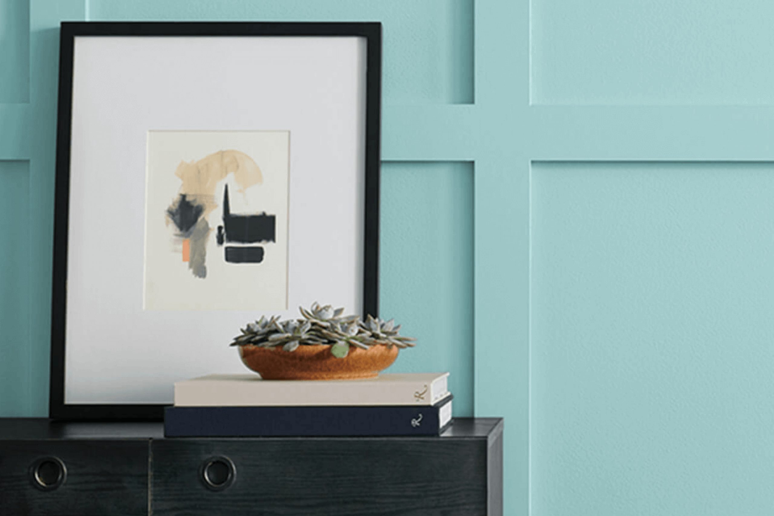
If you’re on the hunt for a fresh, soothing paint color that subtly stands out, let me tell you about SW 6485 Raindrop by Sherwin Williams. This color is a gentle blue with a touch of green, reminiscent of a clear sky after a spring rain. Its softness makes it incredibly versatile, ideal for creating a serene atmosphere in any room of your home.
When I decided to repaint my study, I chose Raindrop. The result? A calm, inviting space where I can think clearly and feel relaxed, even on the busiest days. It pairs beautifully with white trim and natural wood accents, bringing a sense of the outdoors inside.
Whether you’re sprucing up a bedroom or giving your living room a new vibe, Raindrop has the perfect blend of peace and freshness to brighten up your space.
It’s not just another blue; it’s a breath of fresh air, offering a calming presence that’s hard to overlook.
What Color Is Raindrop SW 6485 by Sherwin Williams?
Raindrop SW 6485 by Sherwin Williams is a refreshing and lively shade of blue that adds a splash of energy to any space. This color has a vibrant yet soothing effect which makes it ideal for creating a lively ambiance in various interior styles.
Raindrop works wonderfully in coastal or beach-themed decors, where its ocean-like tone complements natural light and airy layouts. It is also a great match for contemporary settings as it injects a pop of color without overwhelming the space.
This shade pairs beautifully with a range of materials and textures. In a coastal setting, Raindrop looks stunning when teamed with natural wood, linen, and other light fabrics that invoke a sense of lightness and air.
In more modern spaces, combining Raindrop with glass, glossy finishes, and metallic accents can enhance its lively character while maintaining a fresh and clean look. For a softer, more subdued environment, Raindrop can be tempered with softer whites and greys, which help balance its vibrancy and create a restful yet cheerful space.
Overall, Raindrop SW 6485 is versatile and can be incorporated into numerous design traits, adding charm and a hint of playfulness wherever it is applied.
Is Raindrop SW 6485 by Sherwin Williams Warm or Cool color?
Raindrop is a gentle blue color that brings a fresh and clean look to any room in a house. This color, like a soft sky on a clear day, can help create a relaxing ambiance. It’s especially great for bathrooms and bedrooms where calmness is often sought. Its light tone can also help make small spaces seem larger and more open.
The cool hue of Raindrop pairs well with various decor styles, from modern looks with white and gray accents to rustic themes with wooden features. It is also versatile for pairing with vibrant colors like yellows or greens, providing a beautiful backdrop that allows brighter colors to pop without overwhelming the space.
Applying Raindrop on walls can easily offset darker furnishings, making it a practical choice for those wanting a balanced contrast. Likewise, it’s soothing enough not to clash with softer, pastel accessories, making it a friendly choice for anyone looking to refresh their home with a touch of calm blue.
Undertones of Raindrop SW 6485 by Sherwin Williams
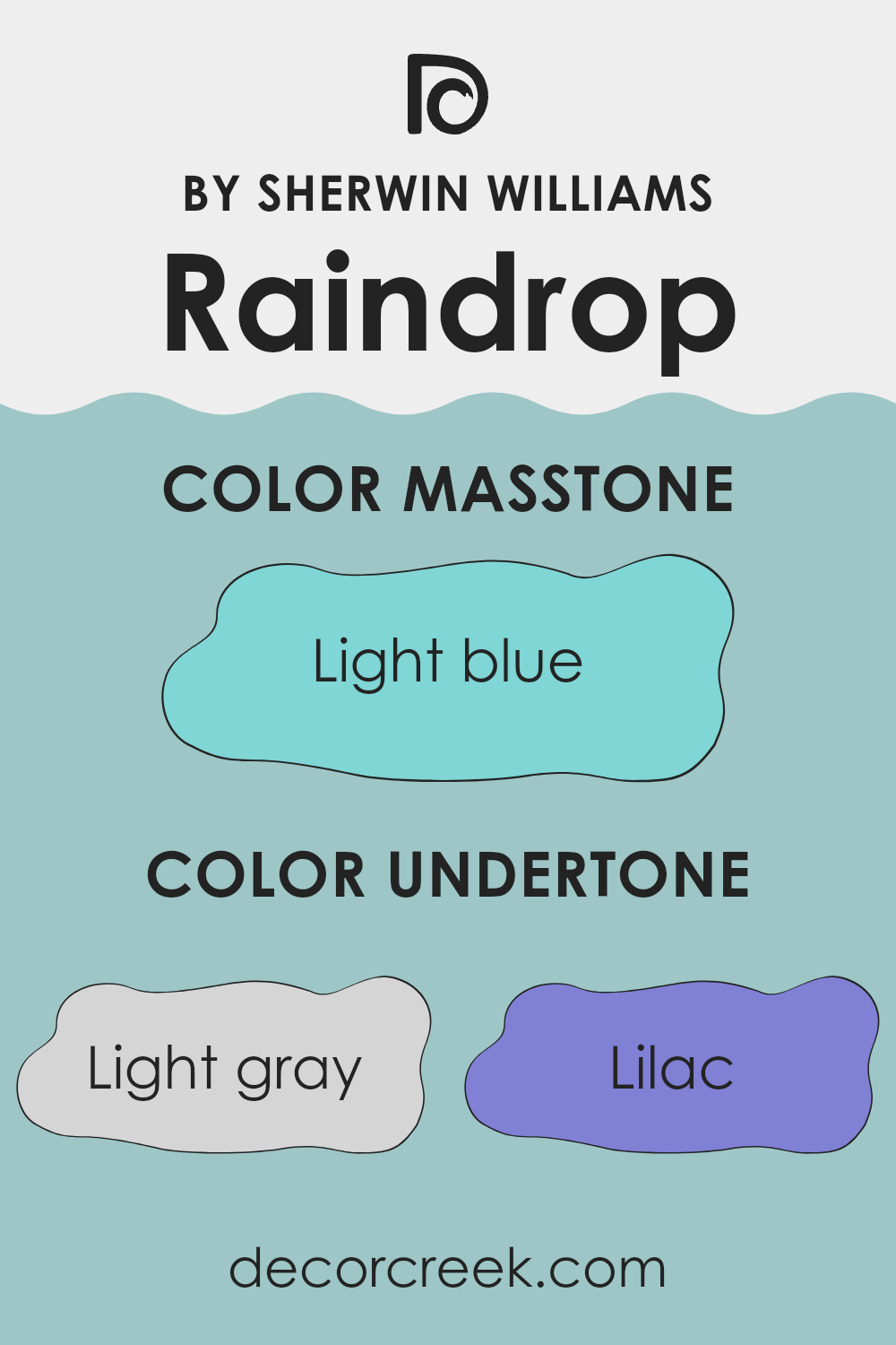
RaindropSW 6485 is a versatile paint color that incorporates a range of subtle undertones which influence how it looks in various lighting and settings. The light gray undertone provides a neutral base, making it easy to blend with other hues. Lilac and light purple add a hint of softness and warmth, which makes the room feel welcoming. Mint and light turquoise undertones bring freshness, an ideal choice for creating a brighter space.
Pale yellow gives a gentle lift to the overall coolness of the paint, adding a touch of cheerfulness. The grey undertone ensures that the color remains balanced and doesn’t lean too heavily towards being overly vibrant, which is crucial for maintaining a calm environment. Pale pink contributes a very subtle touch of vibrancy, warming up the space slightly without overpowering it.
When used on interior walls, these undertones come together to give a layered appearance, offering a complex and rich visual experience. Depending on the light—whether it’s natural or artificial—these undertones may become more pronounced or recede slightly, changing the ambiance of the room throughout the day. For instance, in a well-lit room during the daytime, the cooler undertones like turquoise and blue might stand out, giving a crisper look. In the evening, under softer lighting, the warmer undertones like lilac and pale pink might make the space feel cozier.
Overall, the mix of undertones in this paint can affect the mood and character of a room. The ability to fit into various decorative styles while subtly altering the feel of the space makes it a valuable choice for anyone looking to refresh their interiors.
What is the Masstone of the Raindrop SW 6485 by Sherwin Williams?
RaindropSW 6485 by Sherwin Williams features a light blue masstone that boasts a fresh and soft appearance. This particular shade, close to the color code #80D5D5, offers a subtle, light-hearted vibe to any room.
When used in homes, it creates a calm and clean look, making spaces feel more open and bright. This light blue is versatile and works well in various settings such as bathrooms and bedrooms, where you want a relaxed atmosphere. It pairs beautifully with whites for a crisp look or with darker blues and grays to add a bit of contrast without overwhelming the space.
Since it reflects a good amount of light, it’s also an excellent choice for smaller or darker rooms, helping to make them appear more airy and spacious. This makes RaindropSW 6485 a practical and appealing option for home decorators aiming to add a touch of lightness to their interiors.

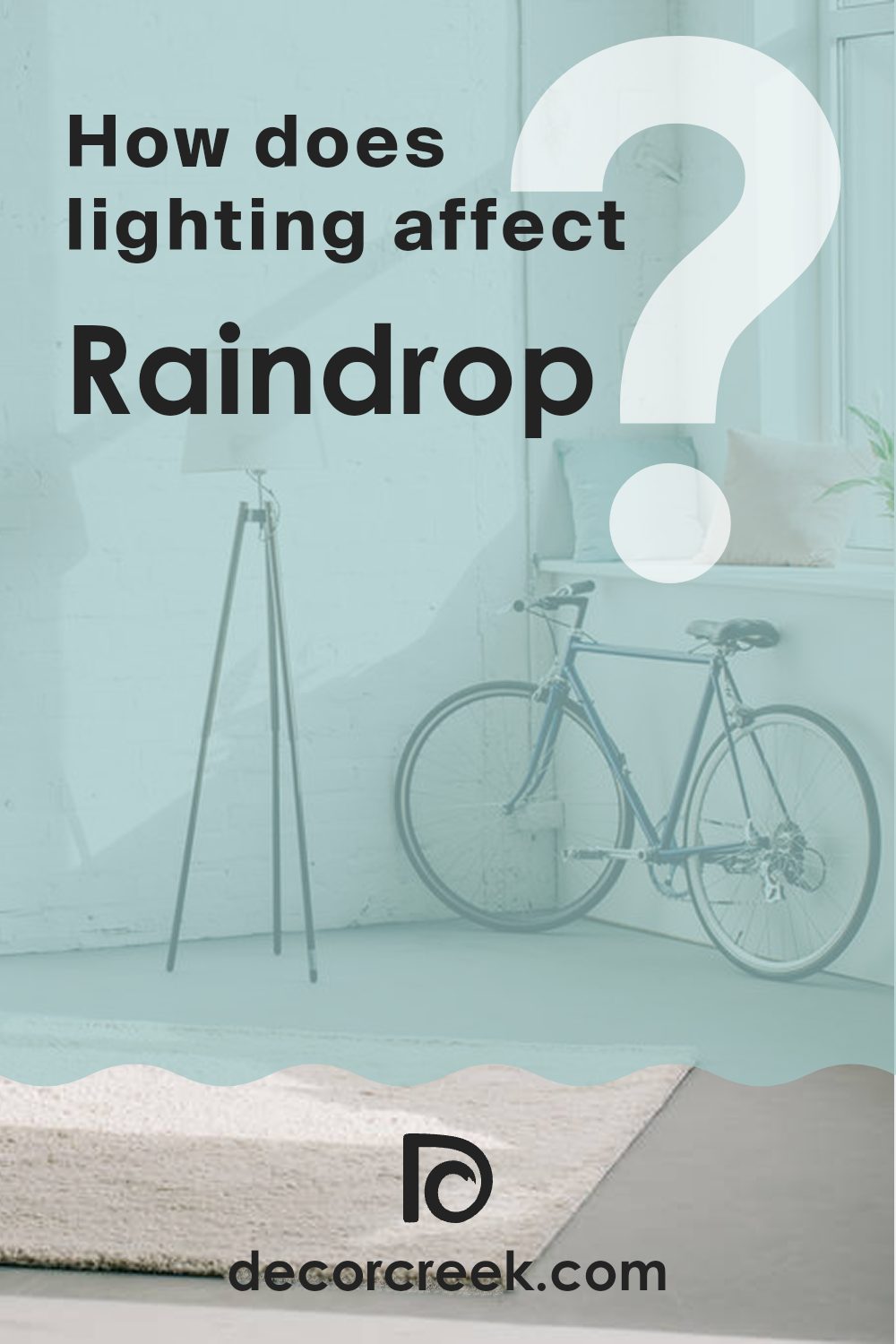
How Does Lighting Affect Raindrop SW 6485 by Sherwin Williams?
Lighting plays a crucial role in how we perceive colors in our surroundings. The same color can look quite different depending on whether it’s illuminated by natural daylight or artificial lighting. For example, imagine a vibrant shade of blue such as Raindrop by Sherwin Williams.
In artificial light, the outcomes can vary based on the type of bulb used.
Incandescent bulbs, which emit a warmer, yellower light, can make the blue appear slightly greener.
On the other hand, LED or fluorescent lighting, which is closer to natural light, tends to preserve the true blue of Raindrop, making it appear crisper and more vivid.
When it comes to natural light, the direction a room faces plays a significant role in color perception. In north-facing rooms, light is cooler and somewhat bluish, making colors like Raindrop appear slightly more muted and subdued. Rooms with north-facing light don’t get a lot of direct sunlight, so the cooler light can enhance the calming qualities of the blue.
South-facing rooms get plenty of sunlight throughout the day, which can make Raindrop look brighter and more dynamic. The abundant natural light brings out all the subtleties of the color, making it pop beautifully against this sunny backdrop.
East-facing rooms receive most of their light in the morning. During these hours, Raindrop will appear bright and cheerful, reflecting the gentle morning sunlight. As the day progresses and the natural light decreases, the color might take on a more subdued tone.
Conversely, west-facing rooms get a stronger intensity of light in the afternoon and evening. Here, Raindrop can display a very dramatic look during sunset when the light is warm and golden, giving the blue a sort of glowing quality.
Thus, lighting, whether artificial or natural, alongside the orientation of the room, significantly affects how colors like Raindrop are perceived, influencing their impact in a space.
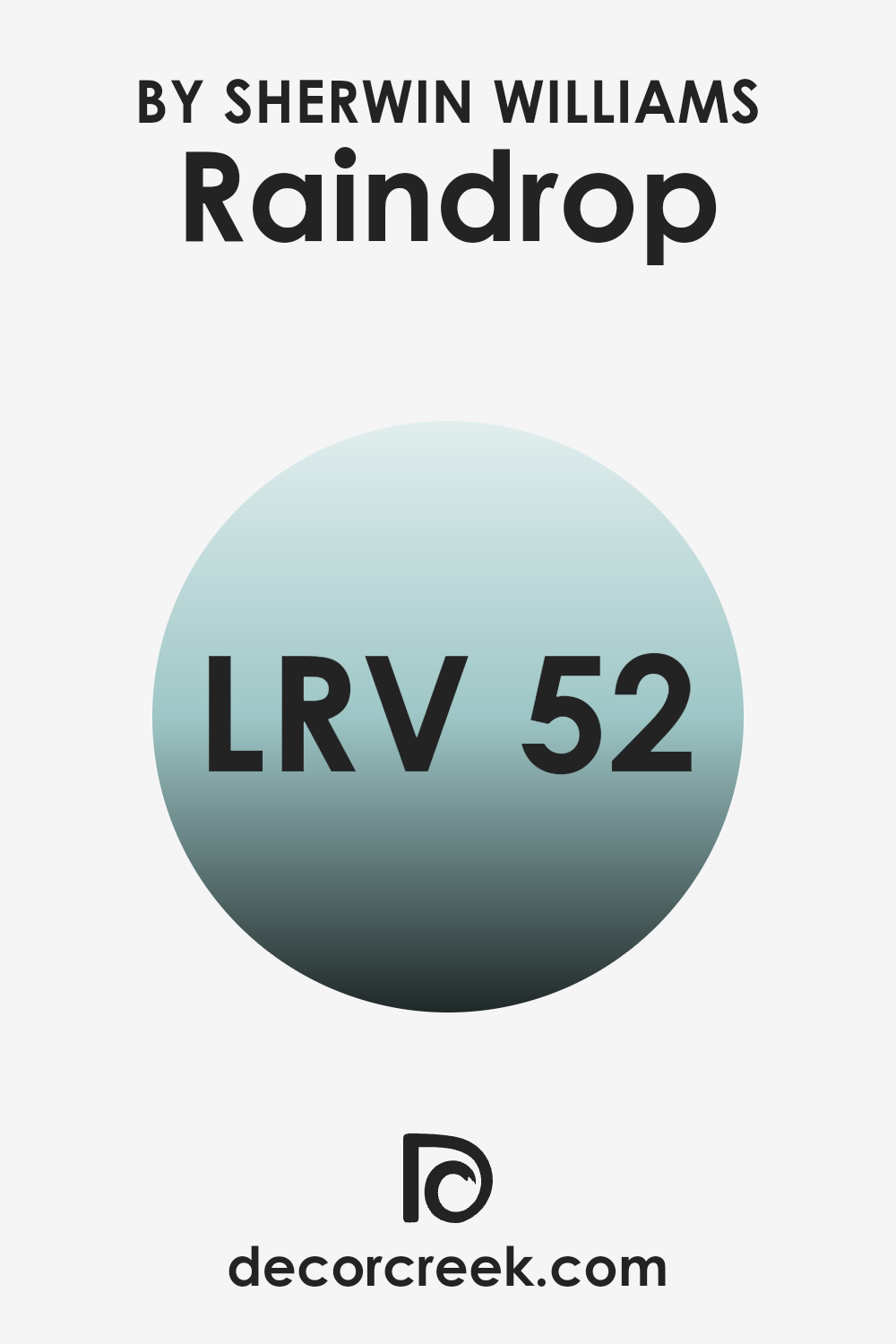
What is the LRV of Raindrop SW 6485 by Sherwin Williams?
LRV stands for Light Reflectance Value, which measures the amount of visible and usable light that a paint color reflects when it’s on the walls, versus how much it absorbs. This value is expressed on a scale where lower numbers mean a color absorbs more light and appears darker, while higher numbers mean it reflects more light and appears lighter.
This is crucial in choosing paint colors because it helps determine how a color will look once it’s on your walls. For example, a darker room might benefit from a higher LRV color to make it feel brighter and more open.
Regarding the specific color with an LRV of 51.786, this means it’s in the middle range of the LRV scale. It won’t reflect light as brightly as a color with a much higher value, nor will it absorb light like darker shades. This makes it a balanced choice for spaces that don’t have either extreme of light.
The color is versatile, providing enough brightness to subtly illuminate a room while still bringing depth and character. This middle value makes it a good option for many spaces, whether they receive lots of natural light or rely more on artificial lighting.
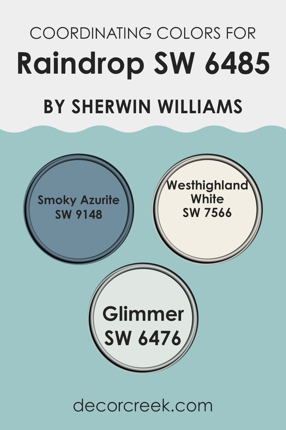
Coordinating Colors of Raindrop SW 6485 by Sherwin Williams
Coordinating colors are selected to complement and enhance the main color in a room, creating a cohesive and visually appealing look. For Raindrop SW 6485 by Sherwin Williams, a fresh and vibrant blue, three coordinating colors have been chosen to harmonize and balance its brightness. These colors are SW 9148 Smoky Azurite, SW 7566 Westhighland White, and SW 6476 Glimmer. Each one plays a distinct role in designing a balanced and beautiful space when paired with Raindrop.
Smoky Azurite SW 9148 is a deeper, dusky blue that contrasts nicely with Raindrop’s more lively tone. This color adds depth and can anchor the lightness of Raindrop, giving a room a more grounded feel. On the other hand, Westhighland White SW 7566 is a clean, crisp white that offers a sharp contrast, ensuring that the environment feels bright and airy.
This color can be used on trim or ceilings to provide a fresh lift to the space. Lastly, Glimmer SW 6476 provides a soft, light greenish-blue hue, great for creating a gentle and refreshing backdrop that allows Raindrop to stand out without overwhelming the senses. Together, these coordinating colors create a cohesive palette that complements the primary shade.
You can see recommended paint colors below:
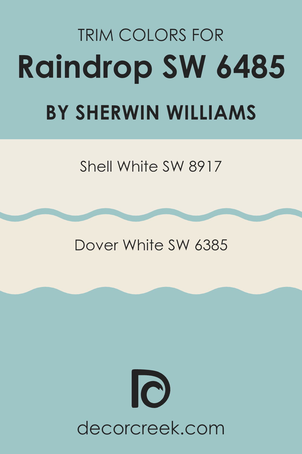
What are the Trim colors of Raindrop SW 6485 by Sherwin Williams?
Trim colors are specific shades used on the edges or borders of walls, door frames, window frames, and other architectural features. They are chosen to add contrast and highlight these areas, enhancing the overall appearance of a room. When paired with a primary wall color like Raindrop SW 6485 by Sherwin Williams, which is a vibrant and refreshing color, the right trim color can enhance the cheerful and airy feel of the space.
For instance, SW 8917 – Shell White and SW 6385 – Dover White are both popular choices for trims that can subtly complement without overshadowing the main color, ensuring a balanced and pleasing aesthetic.
Shell White SW 8917 is a soft, creamy white that provides a gentle contrast, making it a great choice for trims with Raindrop SW 6485. It offers a smooth transition between the more lively Raindrop and the trim, giving a clean and cohesive look. On the other hand, Dover White SW 6385 is a warm, inviting shade of white with a hint of yellow undertone, which can add a subtle warmth to the surroundings. When used as a trim color with Raindrop SW 6485, Dover White can help in creating a friendly and welcoming atmosphere, perfect for spaces aiming for a relaxed and fresh look.
You can see recommended paint colors below:
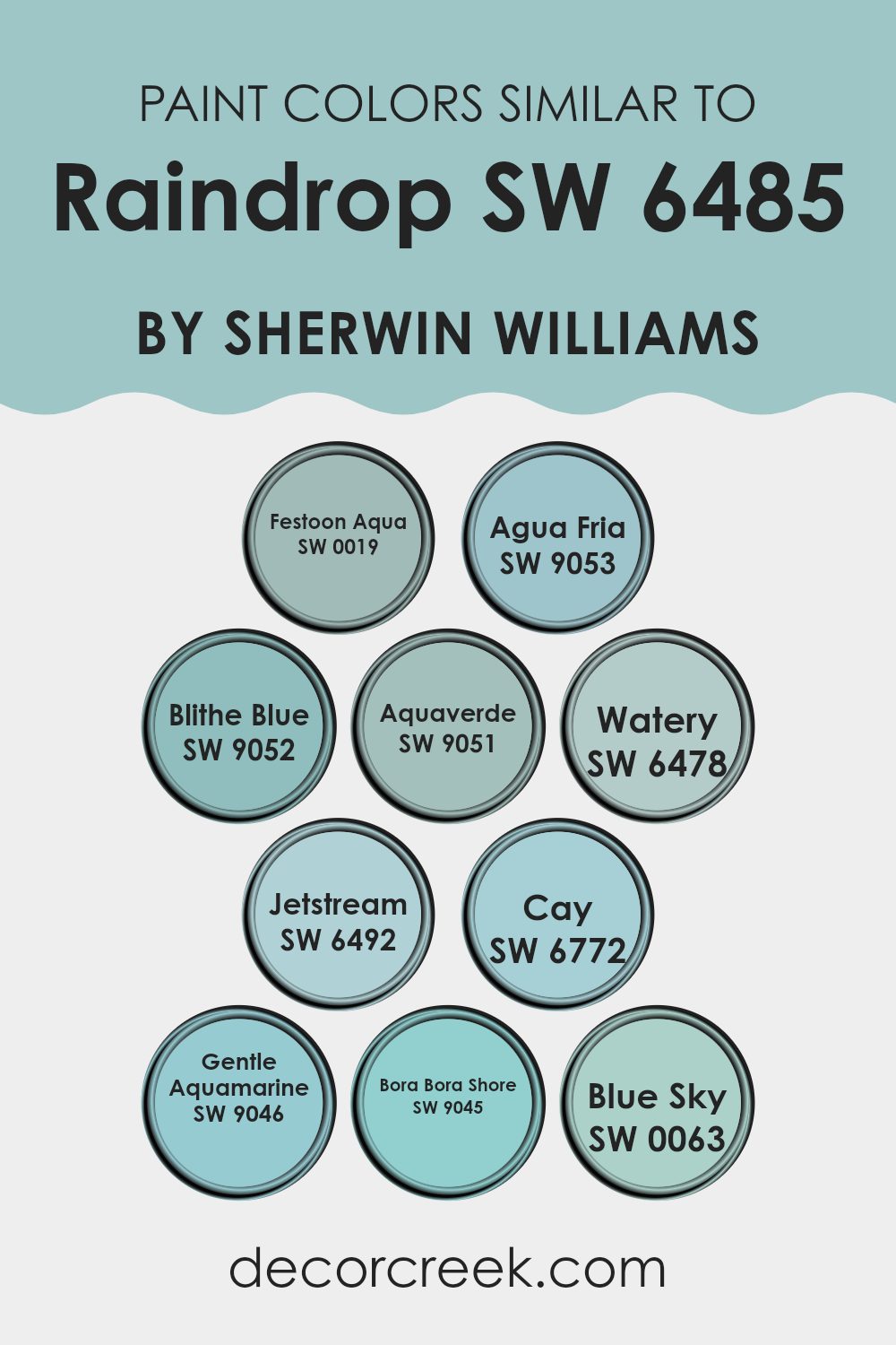
Colors Similar to Raindrop SW 6485 by Sherwin Williams
Similar colors play a critical role in design by creating a harmonious and cohesive look. When you focus on colors that closely relate to one another, such as those resembling Raindrop from Sherwin Williams, you achieve a visual flow that is gentle on the eyes and offers a subtle variance that adds interest without overwhelming a space. These similar tones work together to provide continuity, which can be particularly effective in spaces that wish to evoke a calm and cohesive atmosphere.
For instance, Festoon Aqua and Agua Fria are refreshing like a brisk morning by the sea. Blithe Blue recalls a clear, sunny sky, while Aquaverde brings to mind the soft hue of shallow tropical waters. Watery is reminiscent of a gentle, clear stream, soft and inviting.
Jetstream has a hint of freshness like a delicate breeze at dawn, whereas Cay echoes the vibrant, clear waters of a secluded island beach. Gentle Aquamarine has the subdued and delicate color of sea glass, blending beautifully with the deeper Bora Bora Shore, which reflects the shadows found in tropical waters.
Lastly, Blue Sky captures the serene and light expanse of a daylit sky, perfect for creating a light and airy feel in any room. Each of these colors, while individually unique, works synergistically to create a feeling of fluidity and natural blend in any decorative context.
You can see recommended paint colors below:
- SW 0019 Festoon Aqua
- SW 9053 Agua Fria
- SW 9052 Blithe Blue
- SW 9051 Aquaverde
- SW 6478 Watery
- SW 6492 Jetstream
- SW 6772 Cay
- SW 9046 Gentle Aquamarine
- SW 9045 Bora Bora Shore
- SW 0063 Blue Sky
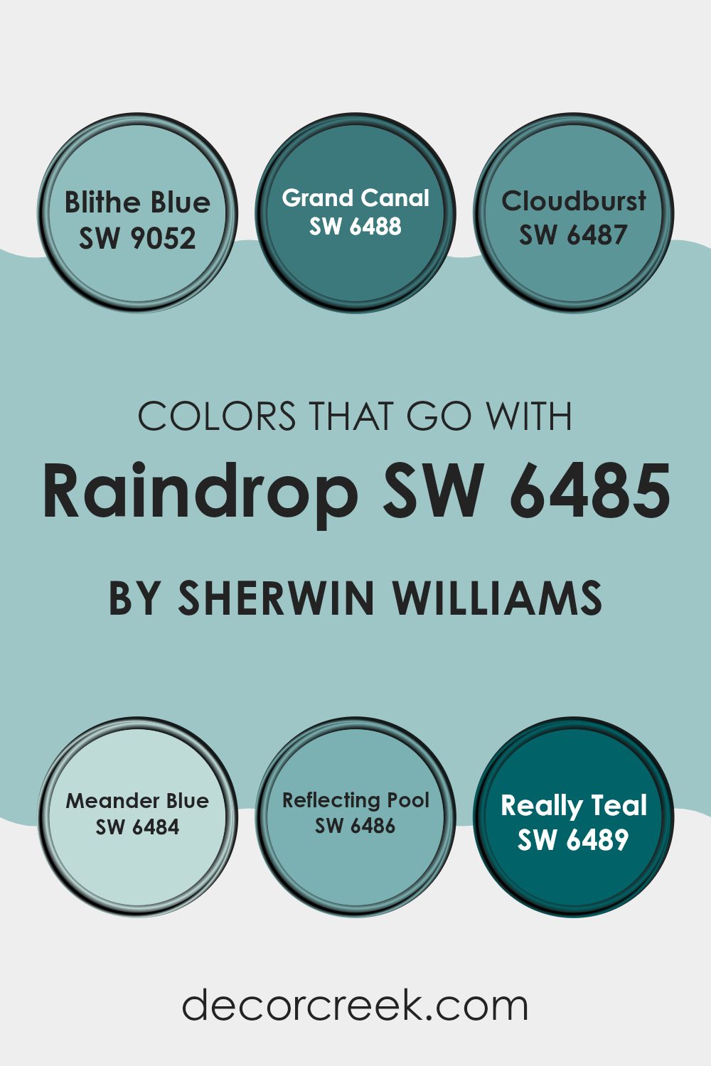
Colors that Go With Raindrop SW 6485 by Sherwin Williams
Choosing complementary colors for Raindrop SW 6485 by Sherwin Williams is crucial because it creates a harmonious palette that enhances the mood and style of any space. These colors help balance the vibrant teal hue of Raindrop, making it more versatile for use in various design settings, from lively living rooms to calming bedroom environments.
SW 9052 – Blithe Blue offers a soft, airy vibe that refreshes and contrasts subtly with Raindrop’s bolder tone. This light blue has a gentle presence that pairs well with the more dynamic Raindrop, providing a relaxed balance.
SW 6488 – Grand Canal is a deeper shade that enriches the palette, offering a robust counterpoint to Raindrop that’s perfect for generating a striking yet grounded aesthetic. SW 6487 – Cloudburst presents as a smoky gray with a hint of blue, adding a neutral but intriguing complexity that complements Raindrop’s brighter character.
SW 6484 – Meander Blue is slightly lighter than Raindrop, allowing for a layered, cohesive look that shows depth without overwhelming with intense color. SW 6486 – Reflecting Pool, as another light option, echoes the calming qualities of water, working beautifully alongside Raindrop to nurture a refreshing and inviting atmosphere.
Finally, SW 6489 – Really Teal is a vibrant complement, full of zest that matches the energy of Raindrop while maintaining a sense of individuality that adds character to any design. Together, these colors create settings that are both energetic and pleasingly coordinated.
You can see recommended paint colors below:
- SW 9052 Blithe Blue
- SW 6488 Grand Canal
- SW 6487 Cloudburst
- SW 6484 Meander Blue
- SW 6486 Reflecting Pool
- SW 6489 Really Teal
How to Use Raindrop SW 6485 by Sherwin Williams In Your Home?
Raindrop SW 6485 by Sherwin Williams is a refreshing shade of blue that brings a calm and clean look to any home. It works very well for bathrooms and kitchens where you want a feeling of freshness and cleanliness.
This shade can also be used in bedrooms to create a soft, restful environment, ideal for relaxing after a long day. For a lively space like a child’s room or a family room, pairing Raindrop with brighter colors like yellows or greens can make the room feel more playful and welcoming.
To update your living space with Raindrop, consider painting one wall as a focal point. This adds a touch of color without overwhelming the room. It’s also a great choice for furniture pieces or cabinets for a subtle pop of color. Accessories like cushions, curtains, or a rug in this color can refresh a room without needing to paint. Whether you’re painting a whole room or adding small touches, Raindrop can make your home feel clean and fresh.
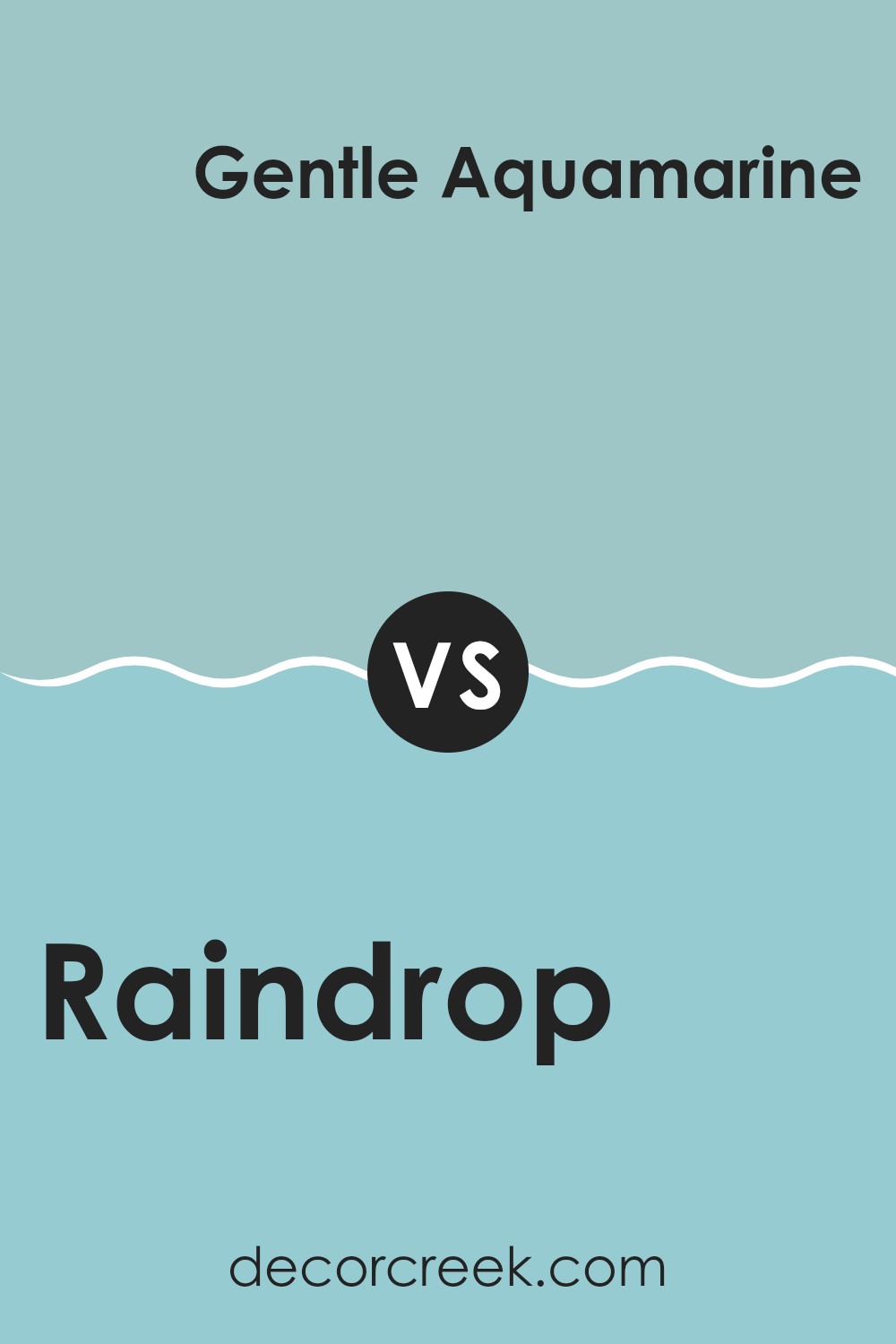
Raindrop SW 6485 by Sherwin Williams vs Gentle Aquamarine SW 9046 by Sherwin Williams
Raindrop SW 6485 and Gentle Aquamarine SW 9046 from Sherwin Williams are both soothing colors but they have different vibes. Raindrop is a deep blue that’s bold and striking. It can add a pop of color to any room and is perfect if you want something that stands out.
On the other hand, Gentle Aquamarine is a lighter, softer blue with a hint of green. It gives off a more relaxed and laid-back feel and is great for creating a calm atmosphere.
While both colors can freshen up a space, Raindrop makes more of a statement, whereas Gentle Aquamarine is subtler, making it easier to blend with various decor styles. If you’re looking to catch people’s eye, Raindrop might be the choice, but for a gentle background, Gentle Aquamarine works beautifully.
You can see recommended paint color below:
- SW 9046 Gentle Aquamarine
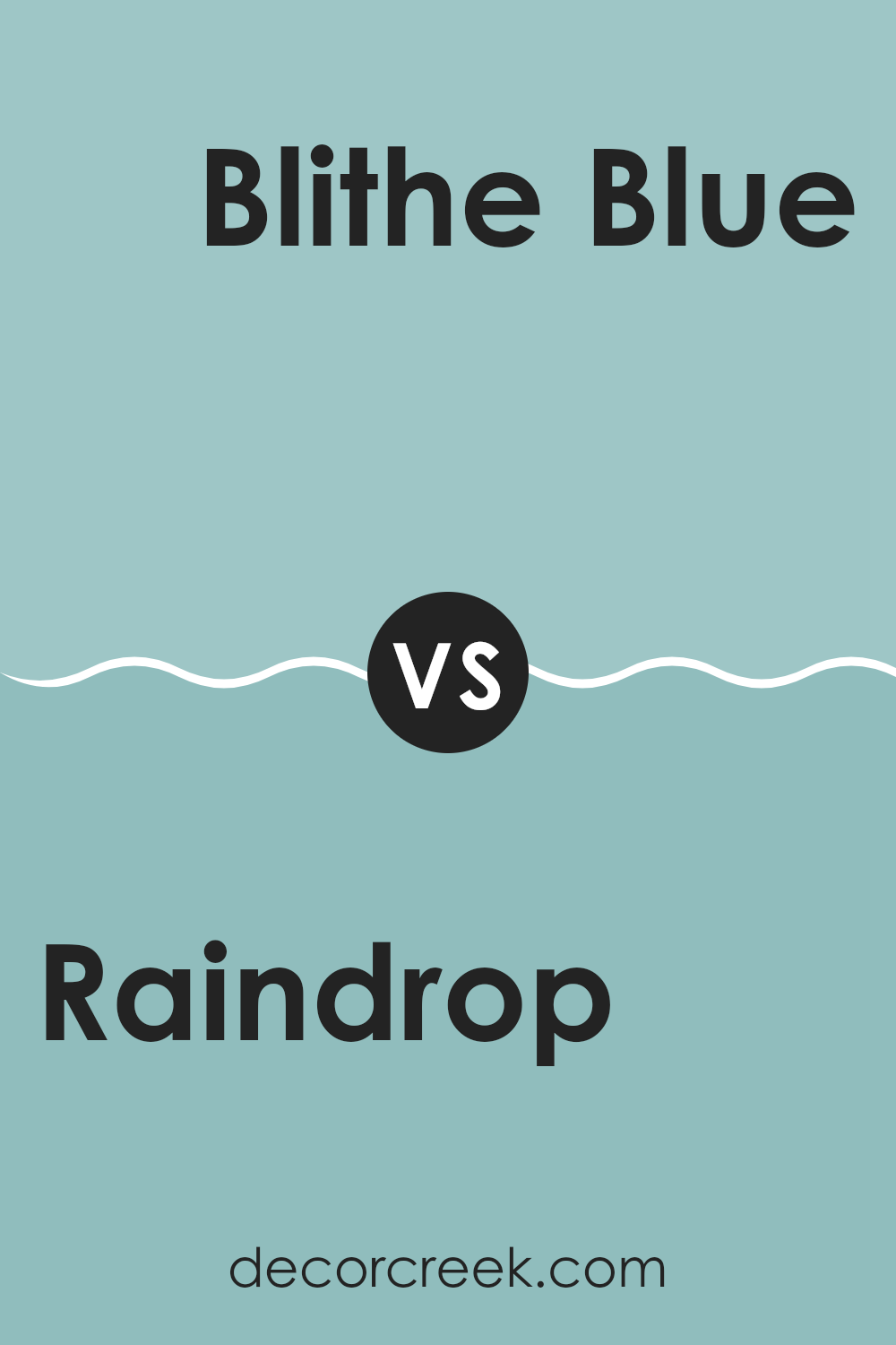
Raindrop SW 6485 by Sherwin Williams vs Blithe Blue SW 9052 by Sherwin Williams
Raindrop SW 6485 and Blithe Blue SW 9052, both by Sherwin Williams, offer distinct but complementary blue tones for your decorating needs. Raindrop is a vibrant and more intense blue that can add a lively pop of color to any space. It’s the type of color that stands out and can make a strong statement in a room, be it on an accent wall or for contrast in accessories.
On the other hand, Blithe Blue is much softer and lighter, providing a subtle and soothing feeling that’s perfect for creating a calm and relaxed environment. This color works well in bedrooms or bathrooms where you want to encourage a peaceful atmosphere.
Overall, Raindrop is bold and dynamic, while Blithe Blue is gentle and calming. They could even work well together in a single space, where Raindrop can be used for emphasis and Blithe Blue for balancing the ambiance with a gentle touch.
You can see recommended paint color below:
- SW 9052 Blithe Blue
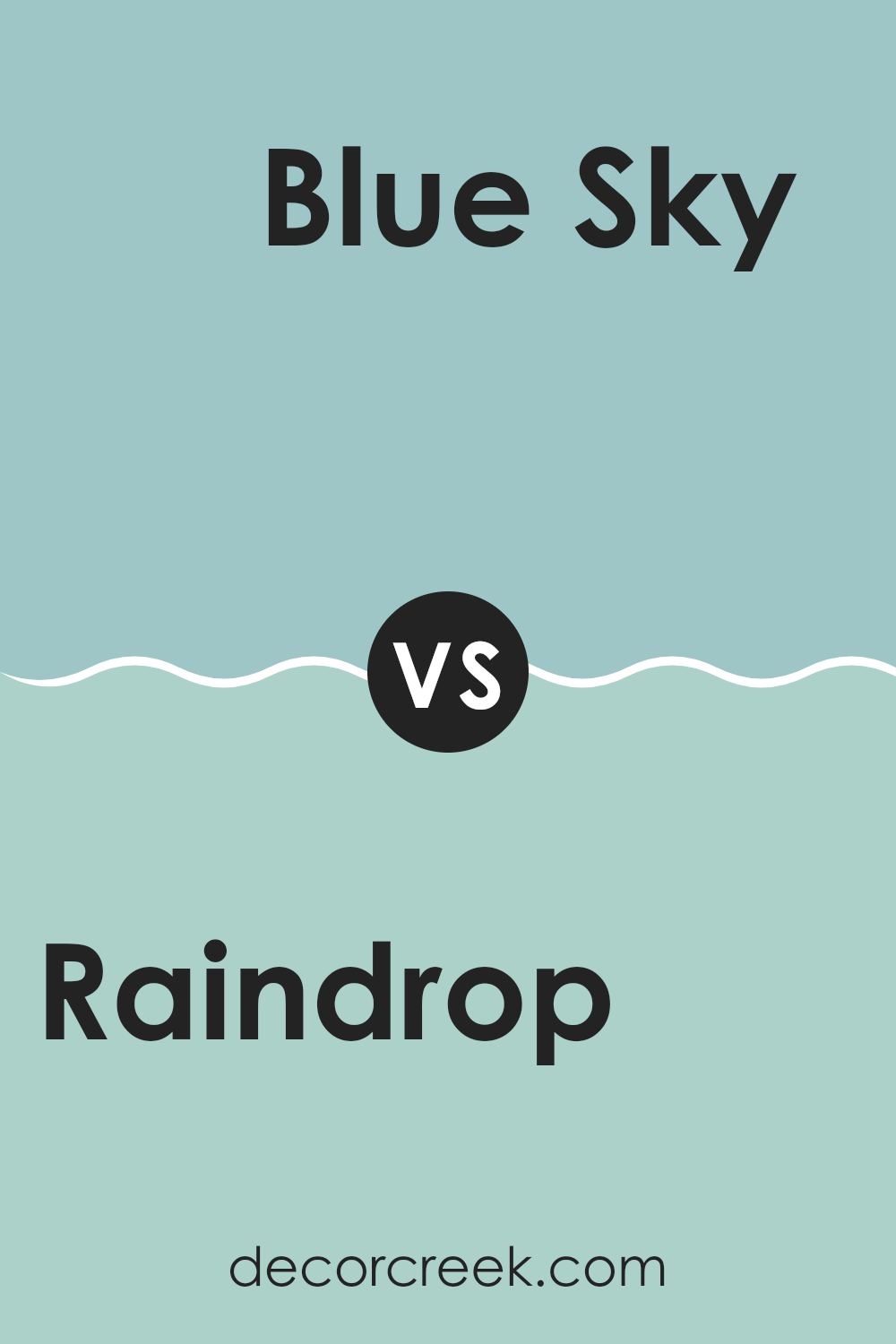
Raindrop SW 6485 by Sherwin Williams vs Blue Sky SW 0063 by Sherwin Williams
Raindrop SW 6485 and Blue Sky SW 0063 are two colors by Sherwin Williams that offer unique shades of blue. Raindrop is a vibrant and bright blue with a lively feel to it. It’s the kind of color that can make a room feel cheerful and energetic.
On the other hand, Blue Sky is a much lighter and softer blue. It resembles the clear, calming blue of a sunny day’s sky and tends to give spaces a fresh and airy vibe.
When comparing the two, Raindrop has a more playful and bold appearance, making it a great choice for areas where you want to add a splash of color or create a focal point. Blue Sky, in contrast, is more subdued and works well in creating a relaxing atmosphere, perfect for bedrooms or bathrooms. Both colors can refresh a space but serve different moods and themes depending on what you’re looking for in a room.
You can see recommended paint color below:
Raindrop SW 6485 by Sherwin Williams vs Festoon Aqua SW 0019 by Sherwin Williams
Raindrop and Festoon Aqua are two colors by Sherwin Williams that each have their unique charm. Raindrop is a soft, calming blue that resembles the shade of a clear sky just after a gentle rainfall. It has a light and airy feel, making it perfect for creating a relaxed vibe in any room.
On the other hand, Festoon Aqua leans toward a more vibrant and lively tone. This color is similar to a bright turquoise, reminiscent of festive decorative accents. It’s a bit bolder compared to Raindrop, bringing energy and a touch of fun to spaces.
Both colors are great choices for adding a refreshing splash of color to your home. Raindrop works well in bedrooms and bathrooms for a soothing effect, while Festoon Aqua is suitable for areas where you want to inject more personality and cheer, like kitchens or living rooms. Each ensures the space feels welcoming yet lively, catering to different moods and styles.
You can see recommended paint color below:
- SW 0019 Festoon Aqua
Raindrop SW 6485 by Sherwin Williams vs Jetstream SW 6492 by Sherwin Williams
Raindrop and Jetstream are two paint colors by Sherwin Williams that both belong to a cool, soothing palette, yet they have distinct differences. Raindrop is a vibrant, lively blue with a noticeable brightness that can energize a room while still keeping a refreshing vibe. It’s a great choice for spaces where you want a cheerful atmosphere without overwhelming the senses.
On the other hand, Jetstream is a lighter and airier shade of blue. It has a subtle, soft quality that makes it great for creating a relaxed feeling in a space, making it ideal for bedrooms or bathrooms where a calming effect is desired. This color could also work well in small areas as it helps to open up the space with its lightness.
Pairing them together provides a dynamic contrast—Raindrop offers a punch of color while Jetstream serves as a soothing background, balancing the vibrancy of Raindrop with its understated charm. This combination can work beautifully in a variety of living spaces.
You can see recommended paint color below:
- SW 6492 Jetstream
Raindrop SW 6485 by Sherwin Williams vs Agua Fria SW 9053 by Sherwin Williams
Raindrop and Agua Fria are both refreshing colors by Sherwin Williams that bring a cool and calm feeling to any space. Raindrop is a vibrant blue that has a playful and bright tone. It’s a color that can instantly cheer up a room, making it feel lively and joyful.
On the other hand, Agua Fria is a deeper shade of teal that leans more towards a sophisticated green-blue mix. It gives off a calm and grounding vibe, perfect for creating a cozy and peaceful atmosphere.
If you’re choosing between these colors, consider the mood you want to set. Raindrop is great for spaces like a child’s room or a family area where you want an upbeat and energetic feel. Agua Fria, with its richer and deeper tone, works well in places like bedrooms or offices, where a calming and focusing environment is preferred. Both colors offer unique attributes, making them suitable for different spaces depending on the desired effect.
You can see recommended paint color below:
- SW 9053 Agua Fria
Raindrop SW 6485 by Sherwin Williams vs Cay SW 6772 by Sherwin Williams
Raindrop SW 6485 and Cay SW 6772, both by Sherwin Williams, are distinct shades with their unique characteristics. Raindrop is a light shade of blue with a fresh and calming feel. It has a subtle vibrancy that reminds one of a light, refreshing drizzle or a gentle sky on a clear day. This color works well in bathrooms or bedrooms, offering a clean and airy atmosphere.
On the other hand, Cay is a striking teal, much deeper and more noticeable than Raindrop. It combines the coolness of blue with a hint of green, giving it a lively, tropical feel. This color can make a bold statement when used on accent walls or for entire rooms in settings where a vibrant, energetic mood is desired.
Although both colors are from the blue family, Raindrop offers a softer, lighter approach, while Cay stands out with its richer, more dynamic tone. They could work well together in a complementary scheme, with Raindrop providing a soothing background and Cay adding pops of excitement.
You can see recommended paint color below:
- SW 6772 Cay
Raindrop SW 6485 by Sherwin Williams vs Watery SW 6478 by Sherwin Williams
Raindrop SW 6485 and Watery SW 6478, both from Sherwin Williams, are unique shades of blue that offer distinct vibes for any space. Raindrop is a deeper, more saturated hue resembling a vibrant sky just after a storm.
This color can add a touch of boldness to a room, making it an excellent choice for accent walls or furniture pieces. On the other hand, Watery is a lighter, more subdued shade, similar to the clear, pale blue of a calm sea.
It’s perfect for creating a relaxed, airy feel in spaces like bathrooms or bedrooms. While Raindrop provides a more striking visual impact, Watery tends to soften a space, making it feel more open and light. Both colors can refresh a room, but the choice between them depends on the atmosphere you want to create.
You can see recommended paint color below:
- SW 6478 Watery
Raindrop SW 6485 by Sherwin Williams vs Bora Bora Shore SW 9045 by Sherwin Williams
Raindrop and Bora Bora Shore are both colors by Sherwin Williams but they have different vibes. Raindrop is a vibrant, bright blue that has a fresh and lively feel. It’s the kind of color that might remind you of a clear sky on a sunny day. It’s bold and can really make a statement in a space, especially when used on a wall or as an accent color.
On the other hand, Bora Bora Shore is a much softer blue with hints of green. It’s closer to a teal shade, which makes it feel more relaxed and laid-back compared to Raindrop. This color could be perfect for creating a calming atmosphere in places like bedrooms or bathrooms, where you go to chill out and get away from the hustle and bustle.
Both colors can bring a lot of personality to a room, but they do it in different ways. Raindrop is more about energy and cheer, while Bora Bora Shore is about creating a soothing retreat.
You can see recommended paint color below:
- SW 9045 Bora Bora Shore
Raindrop SW 6485 by Sherwin Williams vs Aquaverde SW 9051 by Sherwin Williams
Raindrop SW 6485 and Aquaverde SW 9051 are two distinct colors by Sherwin Williams. Raindrop is a refreshing light blue that mimics the clear sky on a sunny day. It’s a soft, calm shade that brings a breezy and airy feel to any space. On the other hand, Aquaverde leans towards a subtle green hue, reminiscent of a calm, shallow sea, giving a room a more natural and earthy vibe.
While both shades promote a peaceful atmosphere, Raindrop offers a cooler tone, making it ideal for creating a light, open feel. Aquaverde, with its hint of green, suggests a connection with nature and can help in making a space feel grounded and cozy.
These colors are versatile but serve slightly different moods and themes due to their underlying tones. Raindrop is best for achieving a crisp, clean look, whereas Aquaverde works well where a touch of organic, soothing presence is desired.
You can see recommended paint color below:
This color is perfect for bedrooms, bathrooms, and can really liven up a living room. It’s calm enough to help you relax, but also has just the right amount of brightness to make your room feel lively. When paired with white or light gray, Raindrop looks especially fresh and clean.
Using SW 6485 Raindrop can be a good choice if you’re looking to give your room a fresh, new look without being too bold or loud. It’s a lovely shade that adds just the right pop of color. Parents might consider it for kids’ rooms because it’s fun and friendly, or it could be a nice way to freshen up the bathroom or kitchen.
All in all, SW 6485 Raindrop by Sherwin Williams is a wonderful choice for anyone who wants to create a happy and peaceful feeling in their home. It has charmed me with its soft, cheerful presence, and I would highly recommend it to anyone looking to spruce up their home!
Ever wished paint sampling was as easy as sticking a sticker? Guess what? Now it is! Discover Samplize's unique Peel & Stick samples.
Get paint samples

