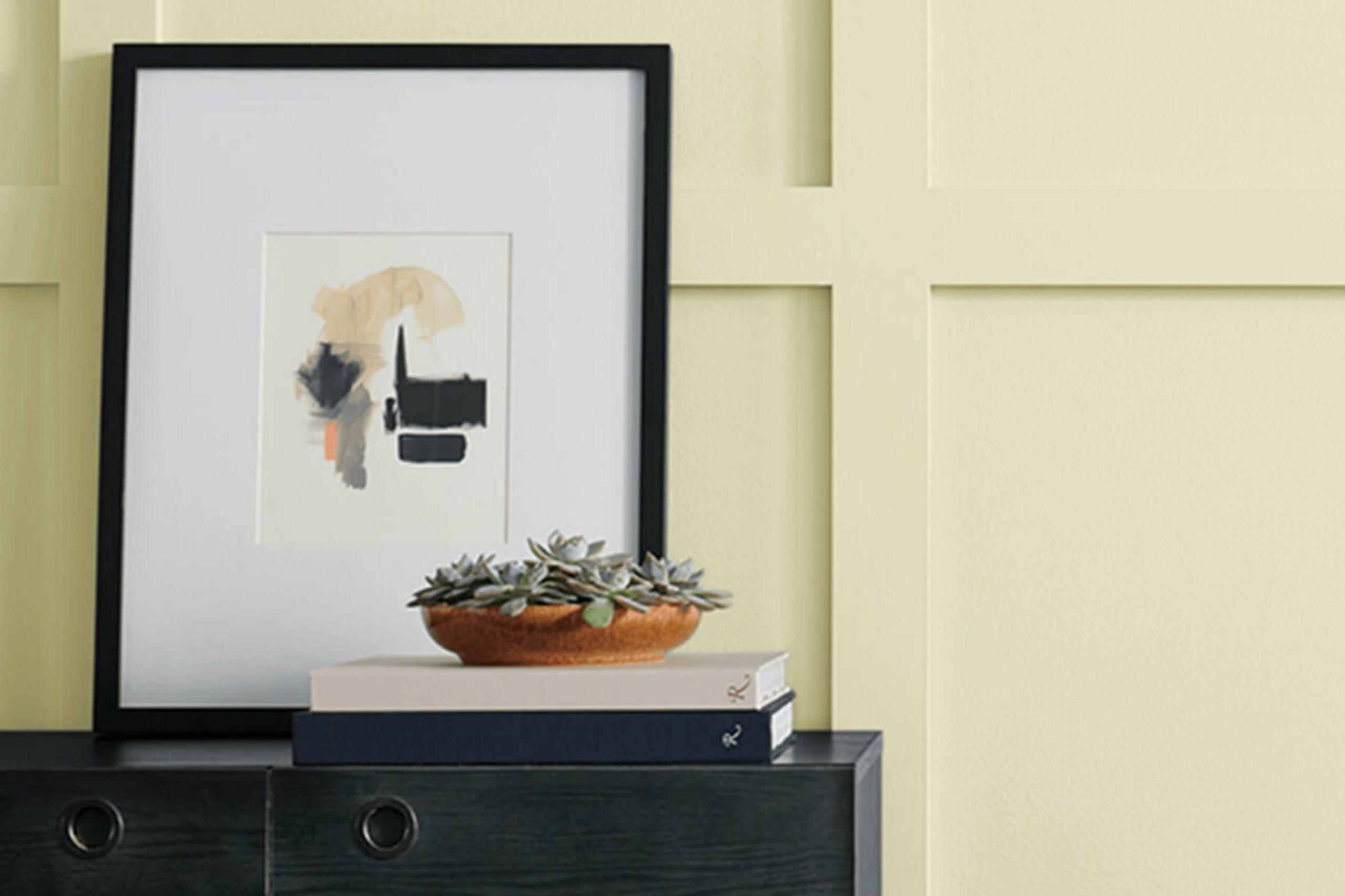
Stepping into a room painted with Sherwin Williams’ SW 6421 Celery feels refreshing and alive. This color strikes a delicate balance between a soft, earthy green and a hint of vibrant zest. It’s like the perfect blend of nature with a modern twist.
When you stand in a room with Celery on the walls, there’s this subtle calmness that washes over you, a gentle reminder of a lush garden on a bright morning. The hue is not overpowering and adds just the right amount of energy without being too bold.
Celery complements various styles and decor pieces. It pairs beautifully with neutral tones, making it a flexible choice for any room in your house. Whether you’re updating a kitchen, living room, or even a nursery, this color is easy to work with. It can bring life to minimalist rooms or add a touch of nature to more detailed designs.
Imagine the possibilities: pairing it with natural wood finishes or clean white trims can create a peaceful and inviting atmosphere.
With Sherwin Williams’ Celery, your room feels warm and welcoming, fostering an environment that’s both refreshing and invigorating.
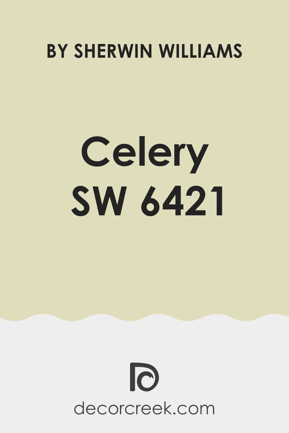
What Color Is Celery SW 6421 by Sherwin Williams?
Celery SW 6421 by Sherwin Williams is a soft, light green with a hint of warmth. It resembles the light, fresh color of celery stalks. This gentle shade is subtle, making it suitable for various interior styles.
Celery works wonderfully in rooms with a natural or earthy aesthetic, such as cottage, farmhouse, or bohemian interiors. Its calming quality makes it an excellent choice for bedrooms, living rooms, or kitchens where a soothing atmosphere is desired.
Pairing Celery with natural materials like wood and stone enhances its organic feel. It complements light woods such as oak or pine and looks great with natural stone accents or tiles. Adding textures like woven baskets, jute rugs, and linen fabrics can emphasize a cozy and inviting environment.
Celery also pairs nicely with whites and creams, which can help to maintain a bright, open room. For a touch of contrast, consider incorporating darker greens or muted blues. Metallic accents in brass or soft gold can add a touch of warmth and elegance to the room. Overall, Celery SW 6421 brings a gentle touch of nature to interiors, working well with a range of colors, materials, and textures.
Is Celery SW 6421 by Sherwin Williams Warm or Cool color?
Celery SW 6421 by Sherwin Williams is a fresh, light green paint color that can bring a lively and welcoming feel to any home. This shade resembles the soft green hue of celery, making it both warm and calming.
It is a flexible color that works well in many settings, like living rooms, kitchens, or bedrooms. When used in a room, Celery can help create an open and airy atmosphere, reminiscent of nature. It pairs beautifully with neutral colors like whites and beiges, allowing it to blend seamlessly into different styles.
For a touch of contrast, it can be matched with darker greens or even wood tones, enhancing its natural appeal. In addition, Celery SW 6421 has a way of brightening up rooms without feeling too bold. Overall, it’s an excellent choice for anyone wanting to refresh their home with a hint of nature-inspired color.
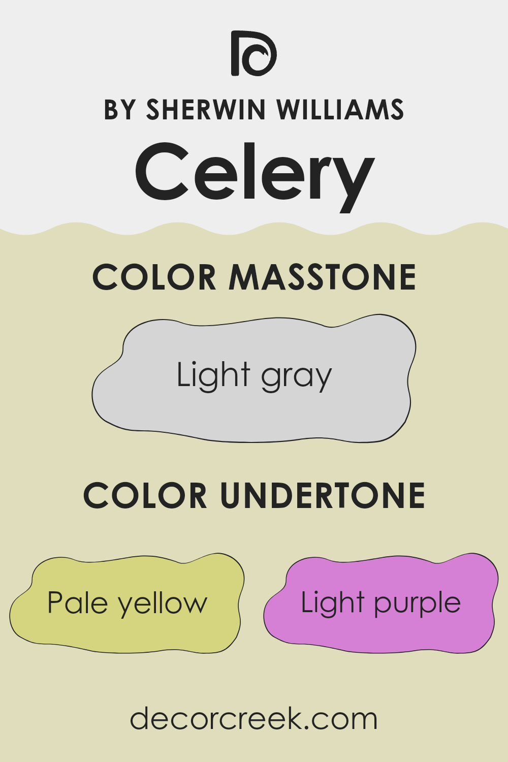
Undertones of Celery SW 6421 by Sherwin Williams
Celery SW 6421 by Sherwin Williams is a unique paint color with a variety of undertones that can subtly change the way it appears in different lighting and rooms. Understanding these undertones is key to choosing the right color for your interior walls.
The color is primarily a soft, muted green, but the undertones play a significant role in the overall appearance. Pale yellow, for example, can add a touch of warmth to the color, making it feel welcoming and sunny.
Light purple and lilac introduce a hint of coolness, adding a delicate and soothing effect. Light blue and mint contribute to this coolness as well, offering a relaxed and refreshing vibe. Meanwhile, pale pink adds softness and a gentle warmth. The presence of grey as an undertone provides balance, giving the paint a muted, neutral quality. When applied to interior walls, these undertones can affect the mood of a room.
In a room with a lot of natural light, the pale yellow and mint might stand out more, giving the room a light and airy feel. In dimmer lighting, the grey, lilac, or light purple tones might be more noticeable, offering a cozy and calming atmosphere. These undertones can help shape a room that feels just right, depending on the light and other colors used around it.
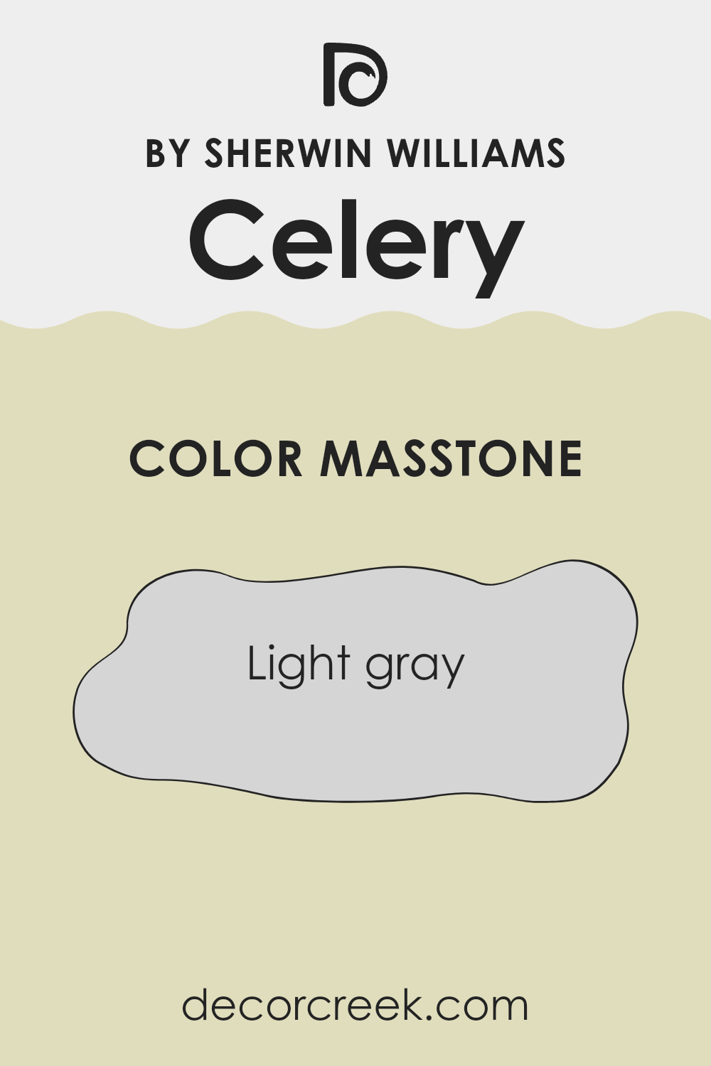
What is the Masstone of the Celery SW 6421 by Sherwin Williams?
Sherwin Williams Celery SW 6421 has a masstone of light gray (hex code: #D5D5D5). This soft, neutral shade provides a clean and modern look, making it a flexible choice for home interiors. Light gray is a calming color that blends well with many other shades, so it can complement various decor styles.
It reflects light well, which helps make rooms feel more open and bright. This quality is especially useful in smaller rooms or rooms that do not receive much natural light. In living rooms, light gray creates a relaxing backdrop that can balance bolder accent colors.
In bedrooms, it offers a peaceful vibe, promoting restfulness. Kitchens and bathrooms can benefit from its simplicity and freshness. Because it is a neutral color, light gray is very forgiving and easy to pair with furniture and decor. Whether you use it on walls, trim, or furniture, it provides a classic and understated elegance to any room.
How Does Lighting Affect Celery SW 6421 by Sherwin Williams?
Lighting can dramatically change how we perceive colors. Natural light and artificial light can make a color look different, and the direction a room faces also plays a big role in this. Let’s look at how the color “Celery” (SW 6421 by Sherwin Williams) appears in different lighting conditions.
In natural light, “Celery” can look quite refreshing. This light green shade can appear brighter and more vivid in direct sunlight. However, in artificial lighting, especially under warm incandescent or LED lights, it might take on a slightly warmer or yellowish hue. In contrast, under cooler, fluorescent lighting, it might look a bit lighter and less warm.
Now, let’s talk about how “Celery” appears in rooms facing different directions:
- 1. North-facing rooms: These rooms often get cooler and softer light. Here, “Celery” might seem a bit muted and could take on a slight grayish tone. The color might not appear as bright as it could in a room with more direct sunlight.
- 2. South-facing rooms: These rooms typically have warm light throughout the day. “Celery” in a south-facing room will likely appear vibrant and lively. The consistent light can bring out the warmer tones of the color, making it feel cozy and inviting.
- 3. East-facing rooms: Morning light in east-facing rooms is usually warm and yellowish, making “Celery” look bright and cheerful in the mornings. However, as the sun moves away, the color might appear cooler and a bit subdued in the afternoon and evening.
- 4. West-facing rooms: In west-facing rooms, the afternoon and evening light is warm and rich. This will enhance the warmer aspects of “Celery,” making the color look particularly vibrant and inviting as the day progresses.
Overall, the appearance of “Celery” will change based on lighting, affecting how bright or muted the color appears.

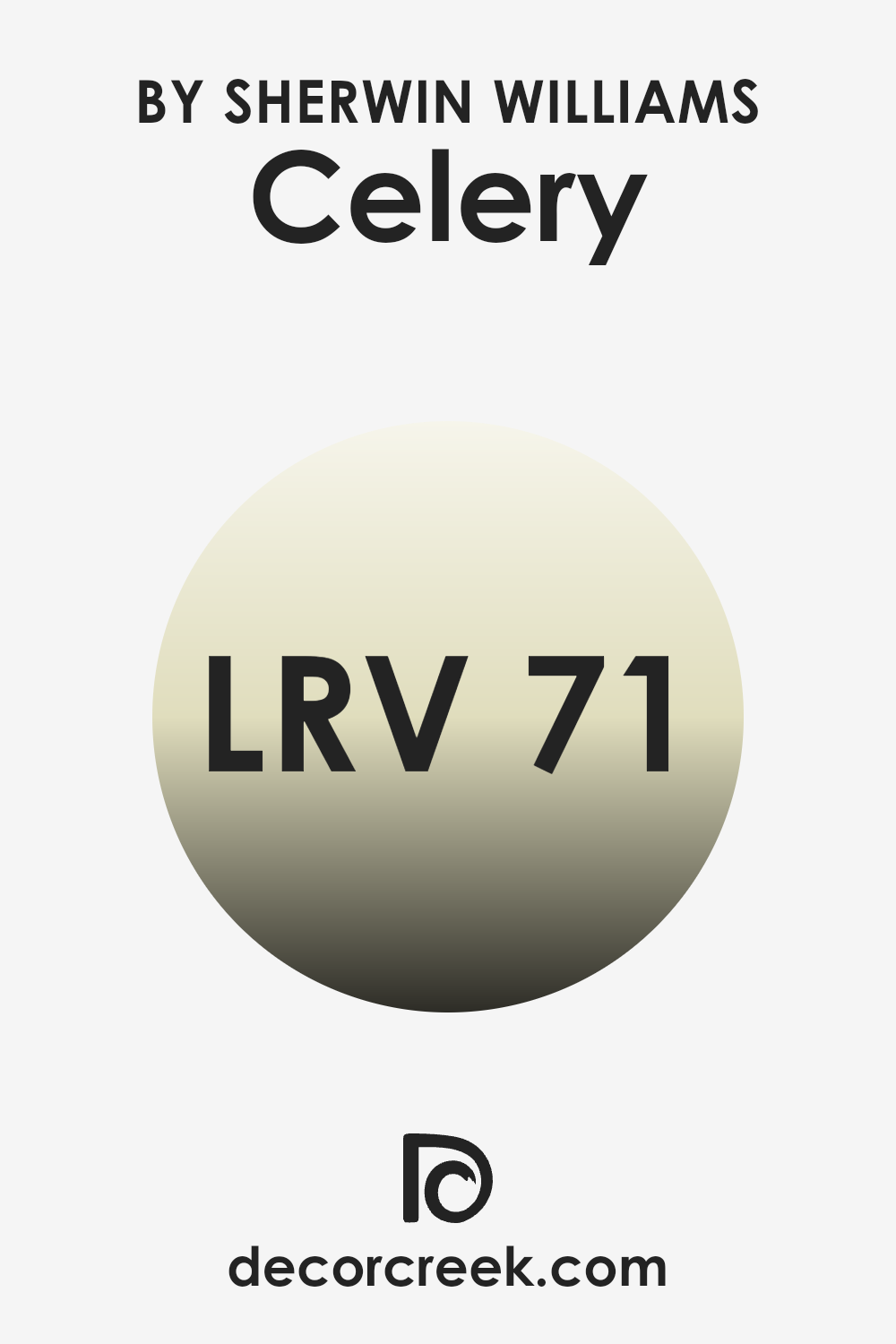
What is the LRV of Celery SW 6421 by Sherwin Williams?
Light Reflectance Value, or LRV, is a measure that tells us how much light a color reflects. The scale runs from 0 to 100, where 0 means no light is reflected (pure black) and 100 means all light is reflected (pure white). Colors with higher LRV values reflect more light, making them appear brighter and more radiant in a room.
When choosing paint colors, it’s important to consider LRV because it influences how light or dark a color will look when painted on walls, which ultimately affects the feel and ambiance of a room. For example, colors with high LRV can make a room feel more open and airy, while colors with low LRV can create a cozy, intimate atmosphere.
The LRV of 71.303 for Celery SW 6421 means this particular color reflects a good amount of light, above the mid-point of the scale. This high LRV indicates that Celery is a light, fresh color that can help brighten up a room, making it feel larger and more inviting.
Because it reflects so much light, it can be a good choice for rooms that don’t get a lot of natural sunlight, as it can help maximize the light that is available. This makes Celery a flexible choice for many different rooms, providing a refreshing and cheerful backdrop without taking over the room.
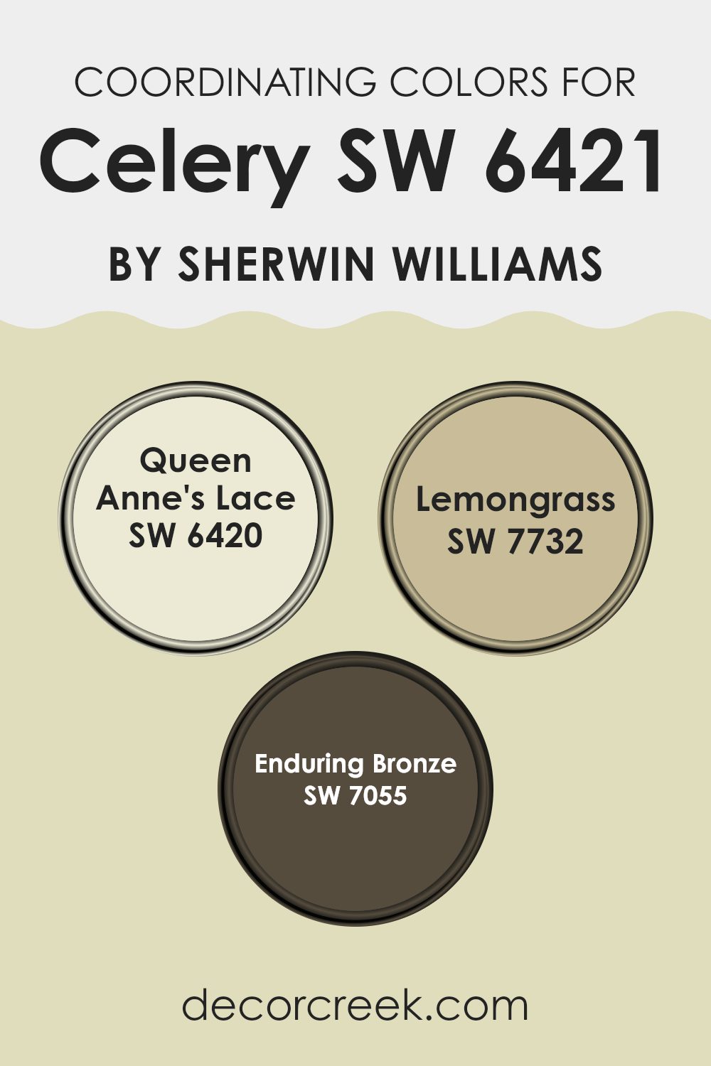
Coordinating Colors of Celery SW 6421 by Sherwin Williams
Coordinating colors are those that work well together to create a harmonious look in a room. When selecting coordinating colors for a particular shade, such as Celery SW 6421 by Sherwin Williams, it’s important to consider hues that complement it without competing for attention. Celery is a soft, fresh green with a hint of yellow, bringing a touch of nature indoors.
To pair with it, you can choose colors like Queen Anne’s Lace SW 6420, which is a light, creamy white shade. This color gracefully balances Celery with its subtlety and plays a perfect supporting role, keeping the room bright and airy.
Another coordinating choice is Lemongrass SW 7732, a lively green that has a slightly deeper tone than Celery. Lemongrass adds depth to the palette and brings a touch of vibrancy while maintaining a nature-inspired theme. For something richer, consider Enduring Bronze SW 7055. This color is a warm, dark brown that grounds the lighter greens and whites, making the overall palette feel more polished and stable. Together, these colors create a room that feels balanced, fresh, and inviting, where each color complements the others without feeling too strong.
You can see recommended paint colors below:
- SW 6420 Queen Anne’s Lace
- SW 7732 Lemongrass
- SW 7055 Enduring Bronze
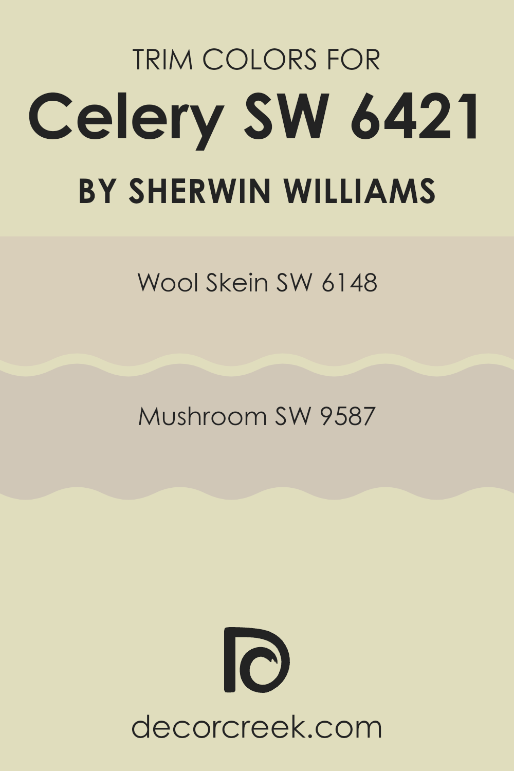
What are the Trim colors of Celery SW 6421 by Sherwin Williams?
Trim colors play a crucial role in enhancing the appearance of any room, as they provide a subtle yet effective way to highlight architectural details and create visual interest. When paired with Celery SW 6421 by Sherwin-Williams, a light green hue that brings a fresh and lively atmosphere to a room, selecting the right trim colors is key. Wool Skein SW 6148, a soft, warm beige, offers a gentle contrast to the vibrant Celery, lending an inviting touch that doesn’t take away from the main color.
On the other hand, Mushroom SW 9587 brings a taupe undertone that complements Celery perfectly, providing depth while maintaining a cozy feel. By choosing these trim colors, you highlight the unique qualities of Celery SW 6421 and add dimension to your room without making it feel too strong.
Wool Skein is a warm and adaptable beige that brings a sense of comfort and neutrality, which makes it an excellent choice for trim when you want to keep the atmosphere relaxed yet refined. It subtly balances the freshness of Celery by grounding the room with its quiet style.
Meanwhile, Mushroom is a soft taupe that adds a bit more intensity and richness without being too bold, ideal for those who want their room to have a slightly more dramatic touch. The combination of these trim colors with Celery allows for a pleasant visual variety, ensuring the main shade stands out beautifully while the trims anchor and frame the overall design.
You can see recommended paint colors below:
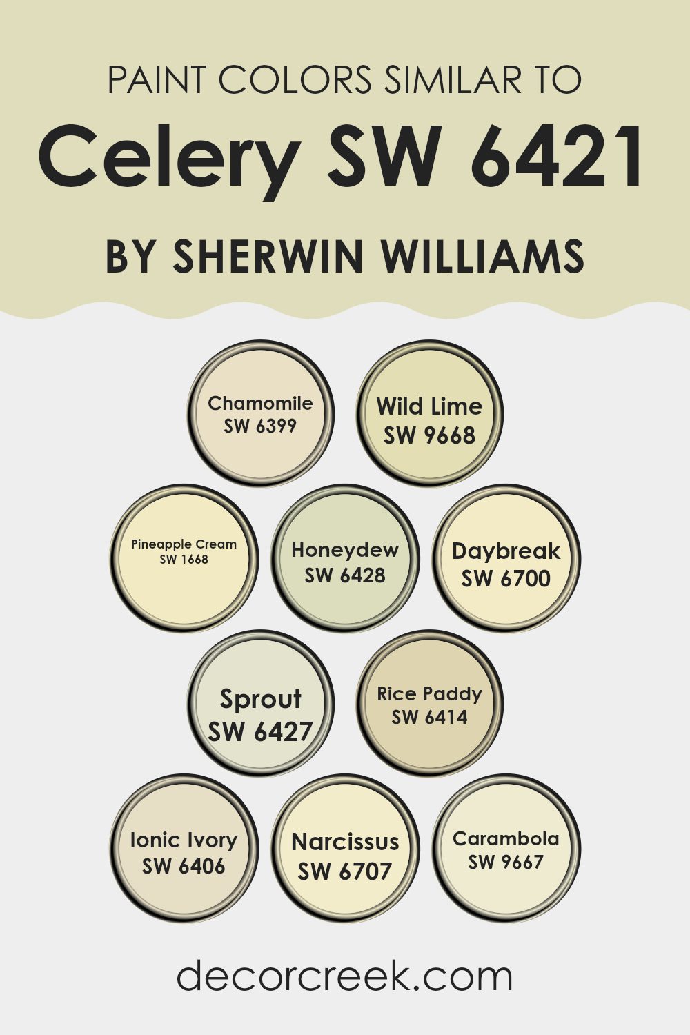
Colors Similar to Celery SW 6421 by Sherwin Williams
Similar colors are important in design because they help create a harmonious and cohesive look. When you’re decorating a room or working on a project, choosing colors that are close to each other on the color wheel can make everything look like it belongs together. For example, Celery by Sherwin Williams is a fresh green that pairs nicely with hues that have a hint of yellow, green, or even soft white.
Colors like Chamomile have a gentle, muted tone that feels calming, while Wild Lime adds a touch of vibrant energy with its zesty green-yellow mix. Pineapple Cream introduces a subtle, creamy yellow that gives a room warmth without being overpowering.
Other similar colors also complement Celery beautifully. Honeydew offers a soft green that’s soothing to the eye, and Daybreak is a fresh, light yellow that can brighten up any room. Sprout mirrors nature’s freshness with its light, leafy green.
Rice Paddy has an earthy, muted tone, perfect for creating a natural setting. Ionic Ivory presents a soft, off-white shade, and Narcissus adds a cheerful, sunny vibe with its bright yellow. Finally, Carambola has a lively, citrus-like hue that can bring a little zest to a room. All these colors work together to create a balanced and inviting atmosphere.
You can see recommended paint colors below:
- SW 6399 Chamomile
- SW 9668 Wild Lime
- SW 1668 Pineapple Cream
- SW 6428 Honeydew
- SW 6700 Daybreak
- SW 6427 Sprout
- SW 6414 Rice Paddy
- SW 6406 Ionic Ivory
- SW 6707 Narcissus
- SW 9667 Carambola
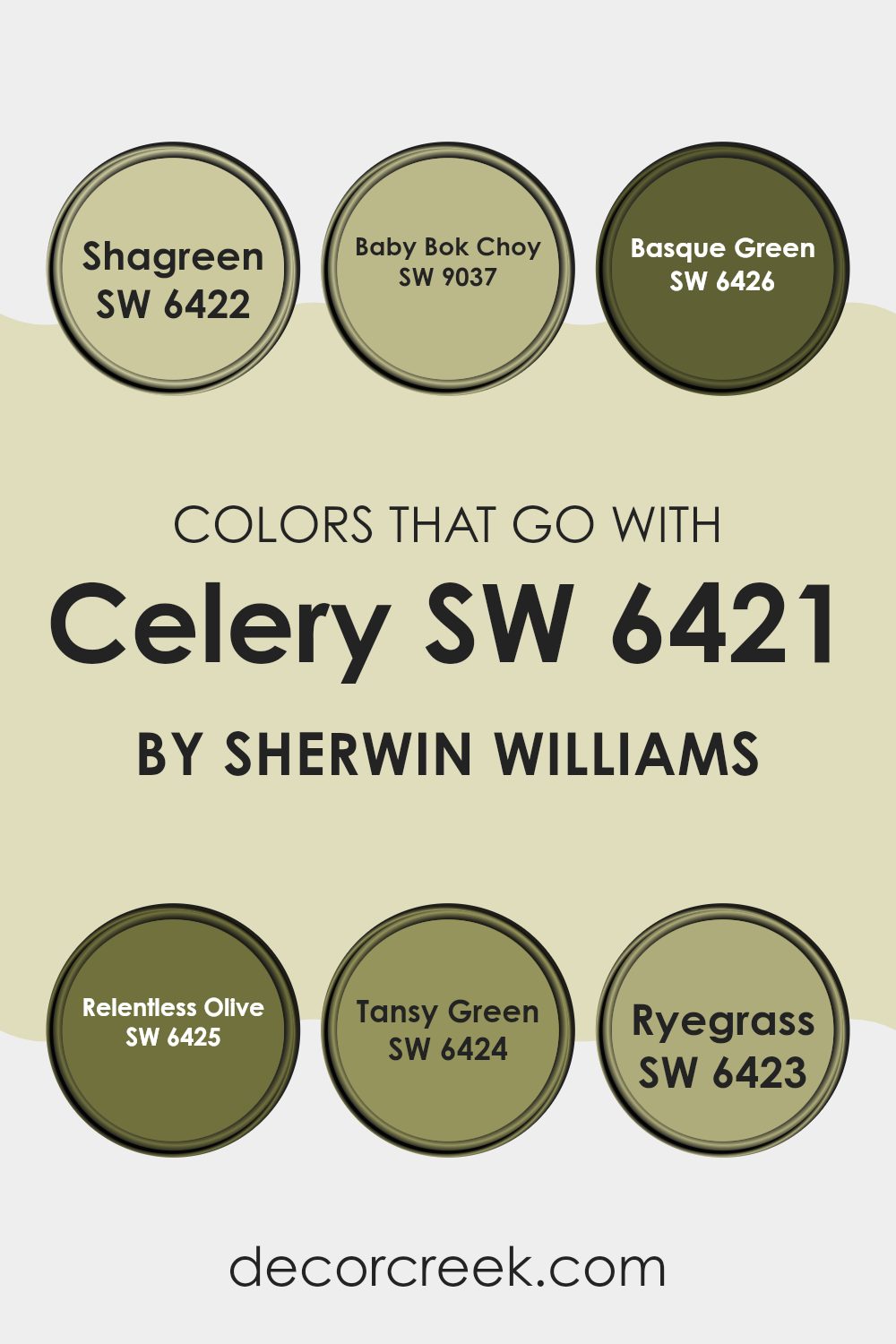
Colors that Go With Celery SW 6421 by Sherwin Williams
Choosing colors that complement Celery SW 6421 by Sherwin Williams can create a calming and natural atmosphere in any room. Celery is a soft, muted green, and pairing it with the right colors can enhance its vibrant yet gentle appeal. For example, SW 6422 – Shagreen is a slightly darker green that provides a pleasing contrast to the lighter Celery.
It adds depth while still maintaining a harmonious look. SW 9037 – Baby Bok Choy is a fresh, lively green with a hint of yellow, which brings a bit of brightness and playfulness, making the setting feel more lively and inviting.
SW 6426 – Basque Green is a rich, deep green that grounds the room and adds a touch of style. Its darker tone allows lighter colors like Celery to stand out. SW 6425 – Relentless Olive has a warm, earthy feel with its olive tones, ideal for adding warmth and richness. This creates a cozy, welcoming environment.
SW 6424 – Tansy Green leans towards a more neutral green and complements Celery by providing a soft, understated backdrop. SW 6423 – Ryegrass is a mid-tone green that balances the palette, neither too light nor too dark. Together, these colors work seamlessly to create a room that feels cohesive and connected to nature.
You can see recommended paint colors below:
- SW 6422 Shagreen
- SW 9037 Baby Bok Choy
- SW 6426 Basque Green
- SW 6425 Relentless Olive
- SW 6424 Tansy Green
- SW 6423 Ryegrass
How to Use Celery SW 6421 by Sherwin Williams In Your Home?
Celery SW 6421 by Sherwin Williams is a soft, muted green that brings a fresh and calming vibe to any room. With its light and airy feel, it’s a great choice for rooms where you want a natural touch. Imagine using this color in a kitchen or dining area to create a lively yet peaceful atmosphere.
It pairs well with natural wood tones and white accents, making the room feel open and inviting. In a bedroom, Celery can create a restful environment. It works nicely with whites or soft beige as complementary colors for trims and ceilings.
This shade also fits well in living rooms or entryways, offering a welcoming and pleasant look. For those who enjoy a bit of green but want something subtle, Celery provides just the right touch without feeling too bold. It’s perfect for adding a bit of color while keeping things light and bright in any part of your home.
Celery SW 6421 by Sherwin Williams vs Narcissus SW 6707 by Sherwin Williams
Celery SW 6421 by Sherwin Williams is a soft and muted green. It gives off a natural vibe, reminiscent of fresh leaves or light green vegetables. It’s calming and can fit well in rooms where you want a subtle, earthy feel. In contrast, Narcissus SW 6707 is a bright, sunny yellow.
This color is energetic and cheerful, like a burst of sunshine in a room. It can make rooms feel warm and lively. While Celery offers a gentle and soothing backdrop, Narcissus brings a pop of vibrant energy.
Together, they create a nice balance between ease and brightness. Celery is more subdued, perfect for a relaxed atmosphere, while Narcissus adds excitement and positivity. Depending on the mood you want, you can choose Celery for a more laid-back area or Narcissus to uplift the environment with its lively glow.
You can see recommended paint color below:
- SW 6707 Narcissus
Celery SW 6421 by Sherwin Williams vs Honeydew SW 6428 by Sherwin Williams
Celery (SW 6421) and Honeydew (SW 6428) by Sherwin Williams are two green hues with distinct feels. Celery is a soft, muted shade of green with a hint of yellow, giving it a warm, earthy vibe. It’s subtle and can easily complement various styles, making it suitable for different rooms in your home.
On the other hand, Honeydew is a lighter, brighter green with a fresher, more vibrant appearance. This color has a bit more energy, making it suitable for rooms where you want to add a touch of liveliness without being too bold.
When you compare them, Celery feels more calm and understated, while Honeydew is cheerful and fresh. Both can add a natural feel, but their moods are different. Celery works well in cozy, warm settings, whereas Honeydew adds a burst of youthful energy. Choosing between them depends on the atmosphere you want to create.
You can see recommended paint color below:
- SW 6428 Honeydew
Celery SW 6421 by Sherwin Williams vs Wild Lime SW 9668 by Sherwin Williams
Celery SW 6421 and Wild Lime SW 9668 by Sherwin Williams are two vibrant shades of green that bring different vibes to a room. Celery is a soft, muted green with a hint of yellow, creating a calm and fresh atmosphere. It’s a flexible color that works well in kitchens, living rooms, or bedrooms, offering a gentle and natural feel.
Wild Lime, on the other hand, is a bold and lively green with a brighter, more energetic tone. It’s perfect for making a statement in a room, ideal for accent walls or fun, creative areas like kids’ rooms or playrooms.
While Celery brings subtlety and a soothing backdrop, Wild Lime provides a shot of energy and exuberance. When choosing between these two, consider the mood you want to create. For a restful, balanced look, Celery is a great choice. For a lively, spirited touch, Wild Lime stands out.
You can see recommended paint color below:
- SW 9668 Wild Lime
Celery SW 6421 by Sherwin Williams vs Rice Paddy SW 6414 by Sherwin Williams
Celery SW 6421 and Rice Paddy SW 6414 by Sherwin Williams are both greens, but they have distinct personalities. Celery is a soft, muted green with a hint of yellow, making it feel fresh and calming. It’s a flexible color that can brighten up a room without being too intense. It works well in kitchens or living rooms, providing a clean and airy feel.
Rice Paddy, on the other hand, is a slightly darker green with earthier undertones. It has a more natural, grounded vibe, bringing a touch of the outdoors inside. This color can create a cozy and comfortable atmosphere, making it suitable for bedrooms or reading nooks.
While both colors are restful and soothing, Celery is lighter and more energized, whereas Rice Paddy provides a bit more depth and warmth. Using them in different rooms can help set the right mood and complement various styles and accents.
You can see recommended paint color below:
- SW 6414 Rice Paddy

Celery SW 6421 by Sherwin Williams vs Ionic Ivory SW 6406 by Sherwin Williams
Celery SW 6421 by Sherwin Williams is a fresh, soft green that evokes a natural and lively feeling. It’s perfect for rooms where you want to bring a hint of the outdoors inside. This shade works well in kitchens or living areas where you want a touch of color without feeling too bold.
Ionic Ivory SW 6406, on the other hand, is a warm, muted ivory with subtle undertones of yellow and beige. It provides a neutral backdrop that is flexible and easy to match with other colors. This color is great for creating cozy and inviting rooms like bedrooms or dining rooms.
When comparing the two, Celery is ideal if you’re aiming for a gentle pop of green, while Ionic Ivory offers a classic and understated look. Both colors have their unique applications: Celery adds energy and a touch of nature, whereas Ionic Ivory brings warmth and comfort.
You can see recommended paint color below:
- SW 6406 Ionic Ivory
Celery SW 6421 by Sherwin Williams vs Daybreak SW 6700 by Sherwin Williams
Celery SW 6421 by Sherwin Williams is a soothing, muted green that brings a natural and calming feel to any room. It’s a soft color, reminiscent of fresh celery stalks, which gives rooms a clean and refreshing look. It’s a flexible hue, often used in living rooms, kitchens, and bedrooms for a peaceful ambiance.
On the other hand, Daybreak SW 6700 is a cheerful, light yellow with a sunny disposition. This color can brighten up a room and is ideal for rooms where you want to create a warm and inviting atmosphere. Its light and airy quality make it a great choice for kitchens and dining areas where natural light is abundant.
While both colors are light and easy on the eyes, Celery provides a more subdued and earthy tone, whereas Daybreak offers a lively and uplifting aura. Together, they can complement each other well, with Celery acting as a grounding influence and Daybreak adding a splash of energy.
You can see recommended paint color below:
Celery SW 6421 by Sherwin Williams vs Pineapple Cream SW 1668 by Sherwin Williams
Celery SW 6421 by Sherwin Williams is a light green color that brings a fresh and vibrant feel to any room. It has a natural, earthy tone, reminiscent of leafy vegetables, making it perfect for creating a lively and calming atmosphere indoors. This color can be a great choice for kitchens, living rooms, or any area where you want a bit of nature.
On the other hand, Pineapple Cream SW 1668 is a warm, soft yellow. This shade is cheerful and bright, adding a sunny touch to a room. It’s ideal for places where you want to evoke feelings of warmth and happiness, like a breakfast nook or a children’s playroom.
While Celery is more subdued and calming, Pineapple Cream bursts with warmth and energy. Together, they can work harmoniously, with Celery providing a grounding effect to balance Pineapple Cream’s lively nature. Both colors can enhance the mood of a room in their own unique ways.
You can see recommended paint color below:
- SW 1668 Pineapple Cream
Celery SW 6421 by Sherwin Williams vs Sprout SW 6427 by Sherwin Williams
Celery SW 6421 and Sprout SW 6427 by Sherwin Williams are both green shades, but they differ in tone and brightness. Celery is a soft, muted green that has a calming and fresh feel. It resembles the color of green vegetable leaves, making it blend well in nature-inspired rooms.
On the other hand, Sprout is a brighter and more vibrant green, with a touch of yellow that gives it more energy and warmth. It’s reminiscent of young plant growth and adds a lively touch to rooms.
While Celery can create a soothing backdrop in rooms where you want relaxation, Sprout can liven up a room with its cheerful vibe. Both can be used in harmonious settings, but Celery leans more towards a gentle and quiet look, while Sprout brings a lively and spirited atmosphere to rooms. They each bring their own unique style to a home.
You can see recommended paint color below:
- SW 6427 Sprout
Celery SW 6421 by Sherwin Williams vs Carambola SW 9667 by Sherwin Williams
Celery SW 6421 by Sherwin Williams and Carambola SW 9667 by Sherwin Williams are both flexible colors, but they offer different feels. Celery is a soft, muted green with a hint of yellow. It’s a gentle and fresh shade that brings a light, airy vibe to any room. It has an earthy tone that can be soothing and natural, making it a good fit for rooms where you want to create a relaxing ambiance.
On the other hand, Carambola is a brighter, more vibrant yellow-green. It’s lively and energetic, bringing more intensity and zest into a room compared to Celery. Carambola is great for adding a pop of color and can make rooms feel more lively and cheerful.
While Celery is subtle and calming, Carambola is bold and invigorating. Choosing between them depends on whether you want a gentle, balanced look or a bright, lively atmosphere. Both colors have their unique charm, serving different moods and settings.
You can see recommended paint color below:
- SW 9667 Carambola
Celery SW 6421 by Sherwin Williams vs Chamomile SW 6399 by Sherwin Williams
Celery SW 6421 and Chamomile SW 6399 are two distinct yet gentle shades by Sherwin Williams. Celery is a soft, light green with a fresh and natural vibe, perfect for creating a calm and inviting room. It’s reminiscent of the crispness of a celery stalk, bringing a hint of nature indoors.
Chamomile, on the other hand, leans towards a muted yellow with earthy undertones. It’s warmer compared to Celery and evokes the comforting feel of chamomile tea. Both colors are light and adaptable, matching well with a range of neutrals and earth tones.
Celery is ideal for adding a hint of greenery to a room, while Chamomile introduces a subtle warmth. Used together or separately, they can add a natural and comforting atmosphere to a home, though Chamomile has a slightly cozier and sunnier feel compared to the refreshing vibe of Celery.
You can see recommended paint color below:
After going through the article on SW 6421 Celery by Sherwin Williams, I’ve gained a good sense of this color’s charm. SW 6421 Celery is a soft, gentle green that reminds me of fresh, new plants in springtime. It’s like bringing a piece of the garden indoors.
The color is bright enough to make a room feel cheerful but not so strong that it becomes too much for the eyes. It feels friendly and relaxing, perfect for places where you hang out with family or watch TV on a lazy afternoon.
I learned that this shade of green can work nicely in different spots around a house. It could be a great choice for kitchens since its light and fresh tone can make cooking areas feel clean and pleasant. It would also add a comfortable vibe to a bedroom, making it a cozy place to sleep. SW 6421 Celery matches well with other colors like creamy whites or gentle yellows, which makes it fun to pair with furniture and decorations.
Overall, I find SW 6421 Celery to be a nice and pleasing color that can make a home feel happy and easygoing. It’s a delightful color choice for anyone looking to bring a bit of nature’s bright green hue inside.

Ever wished paint sampling was as easy as sticking a sticker? Guess what? Now it is! Discover Samplize's unique Peel & Stick samples.
Get paint samples

