If you’re considering a fresh look for your home or anticipating a decorating project, let me introduce you to a color you may find intriguing: SW 7055 Enduring Bronze by Sherwin Williams. This shade is a robust blend of earthy tones that can bring a sense of warmth and sophistication to any space.
Whether you’re looking to add depth to your living room, bedroom, or even an office, Enduring Bronze has a remarkable versatility. Its unique ability to pair well with both rustic and modern decor makes it a reliable choice for transforming your environment.
As I guide you through its various applications and combinations with other colors, you’ll see how it can fit seamlessly into your decorating plans. So, if you’re ready to refresh your walls with a color that offers both beauty and functionality, consider the enduring appeal of Enduring Bronze.
What Color Is Enduring Bronze SW 7055 by Sherwin Williams?
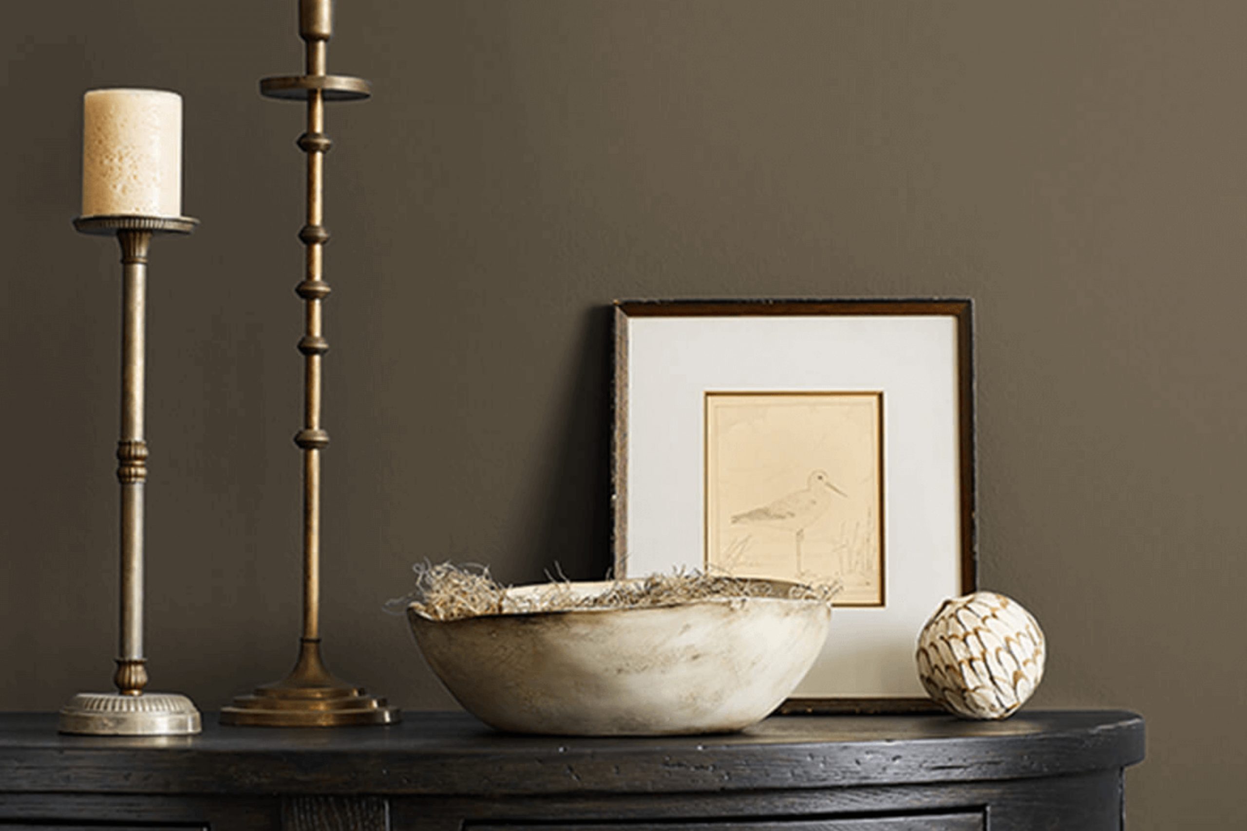
Enduring Bronze is a rich, warm color that perfectly balances between a deep taupe and a soft brown. This inviting shade creates a cozy and comfortable atmosphere, making it an ideal choice for living rooms, bedrooms, and entryways where a welcoming feel is desired. Its timeless quality ensures that it fits well with a variety of interior styles, particularly rustic, traditional, and modern farmhouse designs.
Enduring Bronze pairs beautifully with natural materials such as wood, leather, and wool, enhancing the earthy tones of these textures. When used on walls, it provides a stunning backdrop to furniture and decor in both light and dark finishes, allowing for versatile design options. Metallic accents in gold or bronze can add a touch of glamour to the rich depth of this color, while creamy whites or soft grays help to create a balanced look.
For those looking to create a homely yet stylish space, this color works wonders in areas that receive a lot of foot traffic or where you want to promote a sense of warmth and enclosure.
Its ability to act as a neutral, yet impactful backdrop makes it a smart choice for anyone looking to refresh their home with a hue that’s both cozy and stylish.
Is Enduring Bronze SW 7055 by Sherwin Williams Warm or Cool color?
Enduring Bronze is a beautiful paint color from Sherwin Williams. It has a deep, warm tone that brings a cozy feel to any room. When used in a home, this color makes spaces feel welcoming and comfortable. It’s perfect for living rooms and bedrooms where you want to create a relaxing atmosphere. The richness of Enduring Bronze also works well in a dining room, adding a touch of elegance without being too bold.
This color pairs nicely with lighter, neutral colors like creams or soft whites, which help to balance its depth. Adding wood furniture or decor pieces can enhance the warm qualities of the color, making the room feel even more inviting.
Because of its warm undertones, it is also versatile enough to look good with both natural light and artificial lighting, ensuring the room looks its best at all times. Enduring Bronze is a great choice for anyone wanting to add a cozy, warm feel to their home.
Undertones of Enduring Bronze SW 7055 by Sherwin Williams
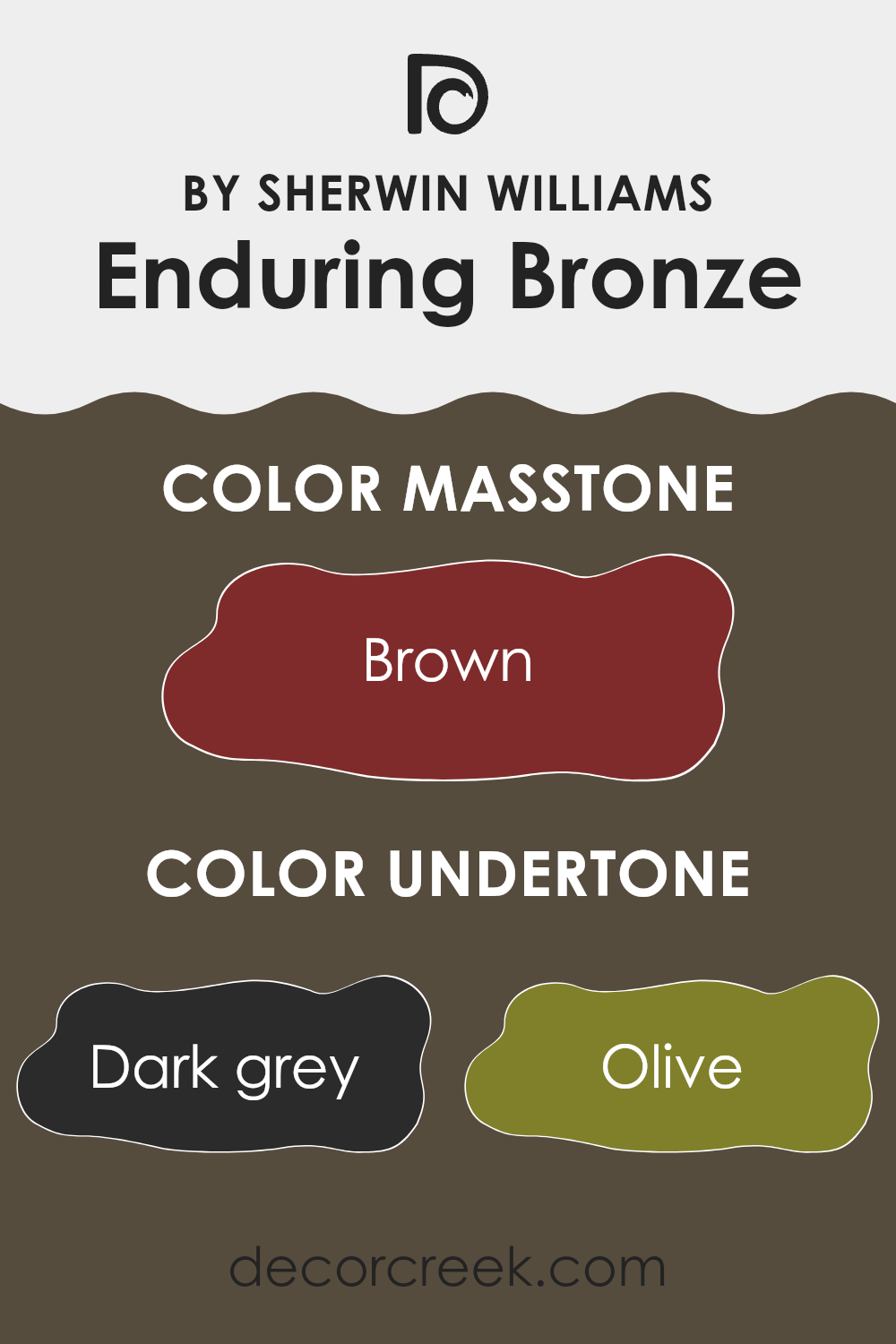
Enduring Bronze is a unique paint color that has a complex mixture of undertones which contribute to its overall appearance. An undertone is a subtle color that lies beneath the primary surface color, influencing how the color looks under different lighting conditions. For Enduring Bronze, these undertones include dark grey, olive, dark green, purple, navy, dark turquoise, grey, red, orange, pink, and pale pink.
These undertones play a significant role in how we perceive the color. For example, in a room with natural sunlight, the orange or pink undertones might make the color appear warmer, whereas in a room with less natural light, the dark grey or navy might make it appear more muted and cooler.
When used on interior walls, the complex undertones of Enduring Bronze can make the space feel rich and inviting. The darker undertones like dark green and navy can give a sense of depth, making the room feel more cozy and grounded. On the other hand, the hints of red and orange can add a subtle vibrancy, bringing a sense of warmth to the space.
Overall, the variety of undertones in Enduring Bronze makes it a versatile color that can adapt to various settings and lighting conditions, affecting the mood and character of any room. It’s a great choice for anyone looking to add a touch of richness and depth to their living space.
What is the Masstone of the Enduring Bronze SW 7055 by Sherwin Williams?
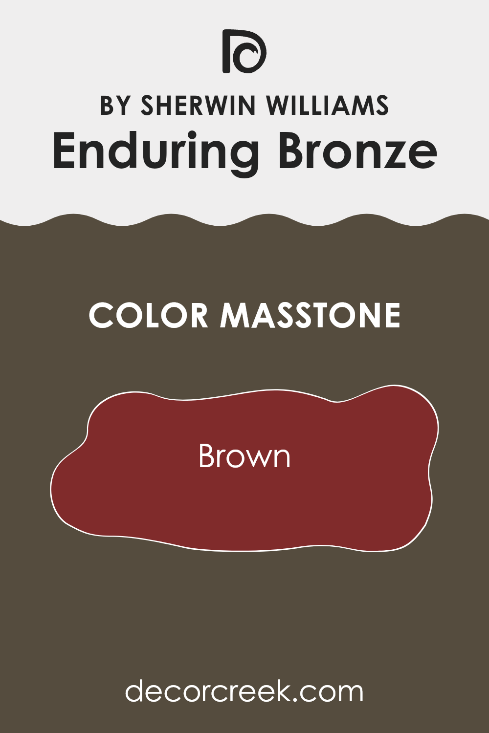
Enduring Bronze is a distinct shade of brown, carrying a deep, rich vibe that adds a warm and welcoming feel to any room. When applied to walls, it can make large spaces more inviting and smaller areas appear cozier.
The deep brown integrates well with natural elements like wooden furniture and leather, enhancing the room’s overall aesthetic with a rustic charm. Furthermore, the warm undertones in this color balance well with brighter shades and metallic accents, creating a pleasant contrast that brings life to the decor.
In homes, using this color can also hide marks or smudges, making it a practical choice for high-traffic areas or places prone to wear, like hallways and family rooms. Enduring Bronze provides a multiple function as both a base shade and as an accent, adaptable enough to fit various styles and preferences.
How Does Lighting Affect Enduring Bronze SW 7055 by Sherwin Williams?
Lighting plays a crucial role in how we perceive colors. The same color can look different under various lighting conditions due to the light’s temperature and brightness. Understanding this phenomenon can help you choose the right paint color for your rooms, ensuring they look as intended throughout the day. Take the color Enduring Bronze, for example. This shade is a deep, warm gray with earth undertones.
Under artificial light, which is typically warmer, Enduring Bronze will likely appear richer and more vibrant.
Its warm undertones are enhanced, making it feel cozy and inviting, especially in spaces lit with soft, warm bulbs.
In natural light, however, the appearance of Enduring Bronze can shift depending on the direction of the room and the time of day.
In north-faced rooms, which receive less direct sunlight and tend to have cooler light, this color might look more subdued and slightly cooler, highlighting its gray aspects more than its warm undertones. This can give a more formal look to the space.
In south-faced rooms, where sunlight is abundant and warmer, Enduring Bronze can look exceptionally warm and dynamic. The sunlight enhances its warmer undertones, making spaces feel lively and welcoming.
East-faced rooms get the morning light, which is bright and slightly warm. Here, Enduring Bronze will have a bright, cheerful appearance in the morning, fading to a more balanced look as the day progresses. It’s ideal for rooms used mainly in the morning, like breakfast nooks.
In west-faced rooms, the evening light, which tends to be very warm and golden, will enrich the color’s warm tones, making the walls glow with warmth in the afternoon. This makes it perfect for living rooms or dining rooms that are used mostly in the late day.
So, the effects of lighting on colors like Enduring Bronze are significant and vary widely with the room’s orientation and the type of light present, influencing the atmosphere in each space.
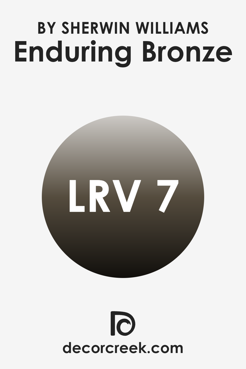
What is the LRV of Enduring Bronze SW 7055 by Sherwin Williams?
LRV stands for Light Reflectance Value, and it measures the amount of light a paint color can reflect back into a room. It’s expressed as a percentage, with higher numbers meaning that the color reflects more light.
This value is critical because it helps homeowners and designers understand how light or dark a color will appear once it’s on the walls. A higher LRV can make a room feel more open and airy since it reflects more light around the space, while a lower LRV can create a cozier, more enveloping feel because it absorbs more light.
In the case of the color with an LRV of 7.454, it is quite low, meaning it will not reflect a lot of light. This makes it a darker color that could be used effectively for creating a more intimate and warm atmosphere in a space.
If you’re painting a smaller room or one with limited natural light, this low LRV might make the room feel even smaller or darker. Therefore, it’s ideal for spaces where you want to enhance a sense of closeness and warmth, potentially making it great for dens, libraries, or bedrooms looking for a moody ambiance.
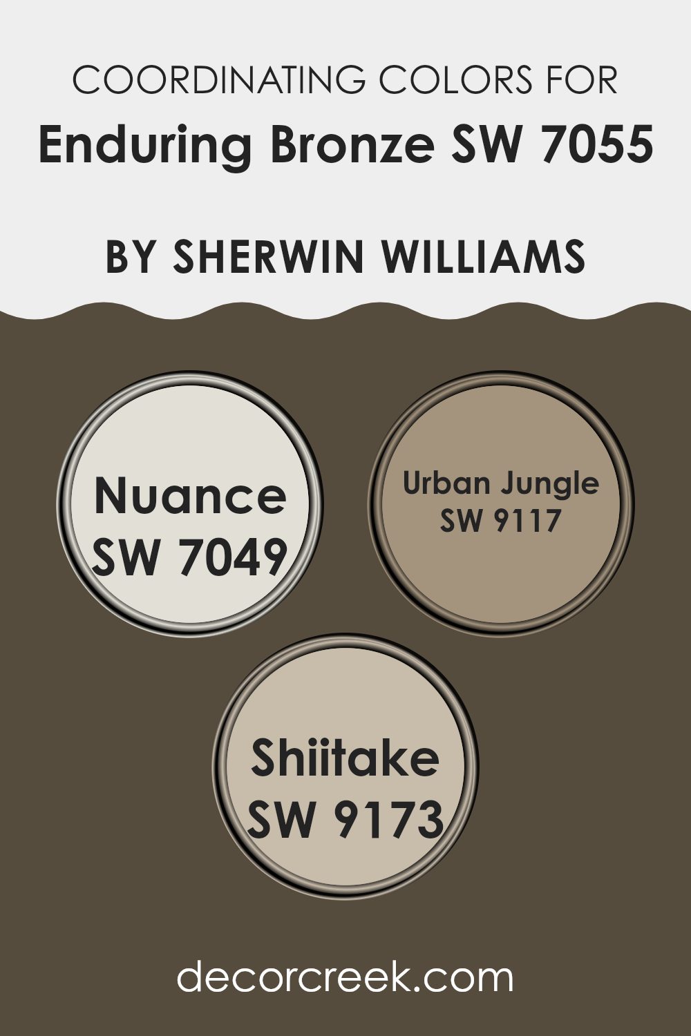
Coordinating Colors of Enduring Bronze SW 7055 by Sherwin Williams
Coordinating colors are selected to harmonize with a main color, accentuating its appeal without overshadowing it. In the case of the earthy hue of Enduring Bronze by Sherwin-Williams, colors like Nuance, Urban Jungle, and Shiitake work exceptionally well together, creating a cohesive and balanced color scheme. These coordinating colors complement Enduring Bronze by either contrasting subtly or enhancing its understated elegance, making it easy to create a visually appealing space.
Nuance is a soft gray that provides a subtle contrast to the bolder Enduring Bronze, making it an excellent choice for larger areas such as walls, which allows the darker tones to stand out as accents. Urban Jungle brings in a nature-inspired green that adds a fresh and lively touch to the palette, perfect for introducing a natural element into the environment.
Shiitake, a warm mushroom color, works particularly well with Enduring Bronze, offering a gentle and harmonious look that is ideal for creating a calming and inviting atmosphere. Together, these shades form a versatile and appealing palette that enhances the warmth and natural beauty of any space.
You can see recommended paint colors below:
- SW 7049 Nuance
- SW 9117 Urban Jungle
- SW 9173 Shiitake
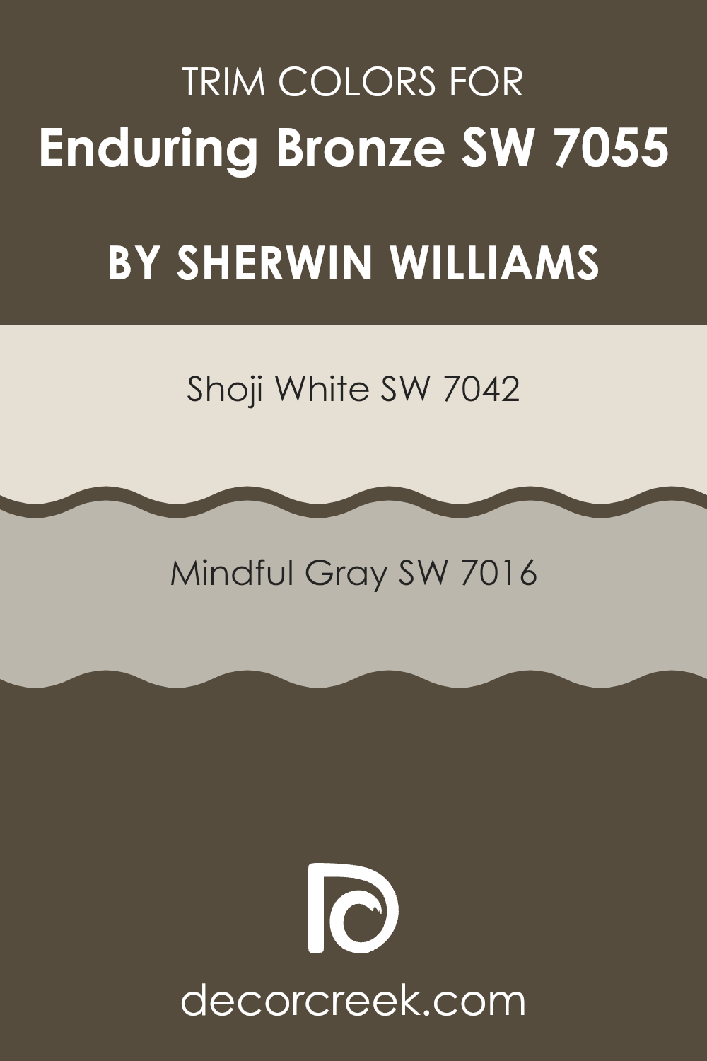
What are the Trim colors of Enduring Bronze SW 7055 by Sherwin Williams?
Trim colors are specific shades used to highlight or accentuate the architectural details of a room, such as baseboards, moldings, and door frames, creating a visual contrast that draws the eye and enhances the overall aesthetics of a space. Selecting the right trim color can significantly impact the feel and perception of an area, complementing the main wall color to complete the look of a room.
When paired with a deeper hue like Enduring Bronze by Sherwin Williams, lighter trim colors can add a crisp, clean edge that helps to define and balance the visual weight of the darker walls, ensuring that the room maintains a harmonious yet dynamic appearance.
Shoji White, indicated by SW 7042, is a muted, off-white color with a warm undertone that softly contrasts with richer, darker colors like Enduring Bronze, providing a subtle delineation without overwhelming the senses.
Mindful Gray, represented by SW 7016, is a gentle gray that offers a slightly bolder contrast than Shoji White, giving more definition to the edges in a room; this color works well to bridge the gap between modern and traditional styles, harmonizing with darker wall colors to create a cohesive yet distinct look. Both Shoji White and Mindful Gray perform excellently as trim colors, bringing out the depth and richness of Enduring Bronze, and adding to the room’s overall aesthetic harmony.
You can see recommended paint colors below:
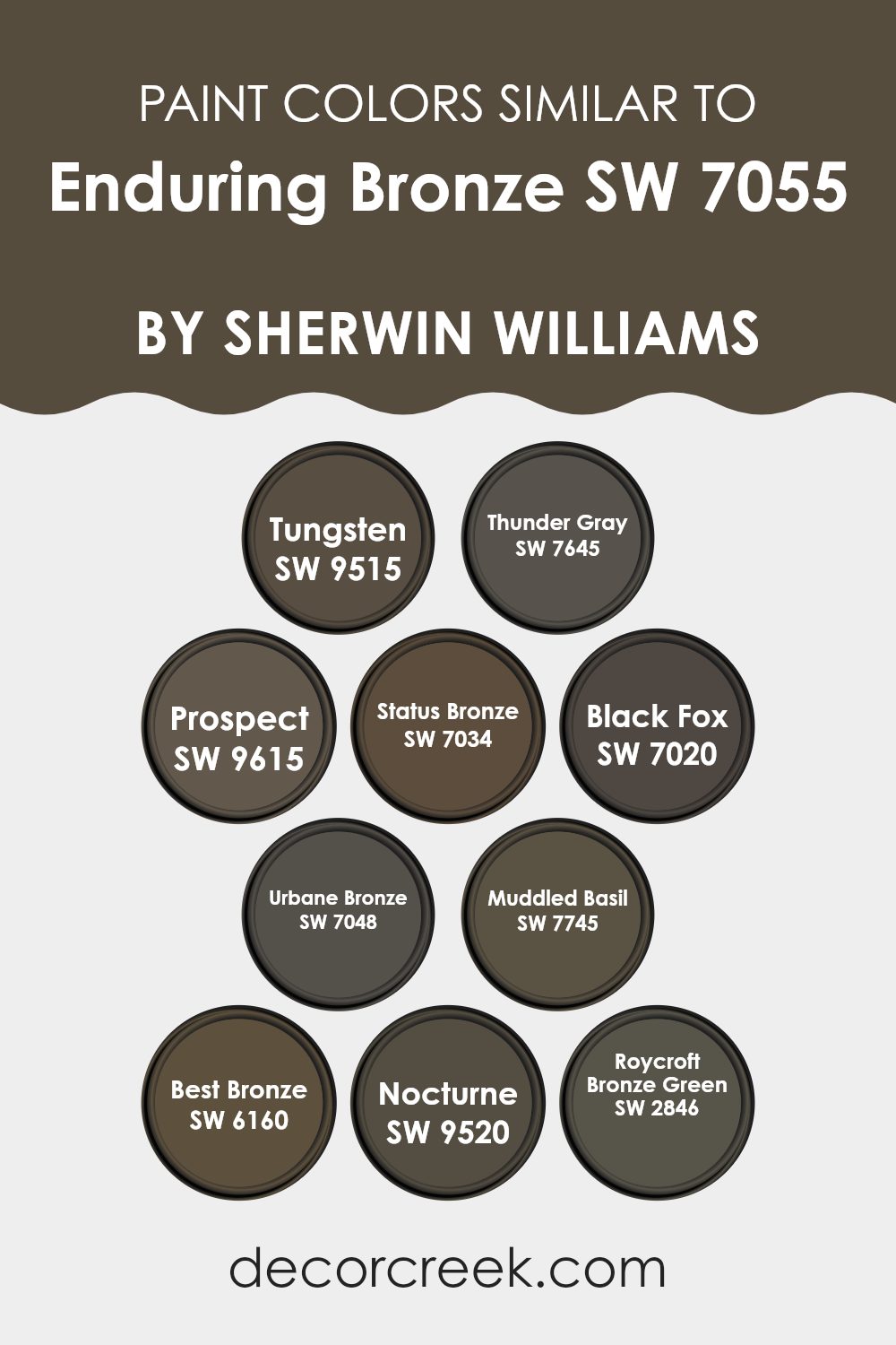
Colors Similar to Enduring Bronze SW 7055 by Sherwin Williams
Exploring the world of colors, particularly those similar to Enduring Bronze by Sherwin Williams, reveals how slight variations in tone and saturation can greatly influence the mood and style of a space. Similar colors like Tungsten and Thunder Gray offer subtle shifts; Tungsten presents a deep, metallic grey, hinting at a cool sophistication, while Thunder Gray offers a slightly lighter, more subdued hue that softly complements darker themes.
Colors such as Prospect and Status Bronze lean towards the earthier spectrum, with Prospect having a gentle clay tone which creates a warm feel, and Status Bronze enhancing environments with its richer, more intense brown.
Extending this palette, Black Fox and Urbane Bronze deepen the aesthetic, both providing elements of profound and muted strength – Black Fox with its dark, almost charcoal hue adds a strong statement, whereas Urbane Bronze softens the strong impact with its smoky brown.
If looking for greenish undertones, Muddled Basil and Roycroft Bronze Green are perfect; Muddled Basil infuses spaces with a dusky green that is quite grounding, while Roycroft Bronze Green offers a historic touch with its muted, earthy green.
For those interested in the darker end of the spectrum, Best Bronze, Nocturne, and their nuances round off this collection beautifully; Best Bronze shines with a deep ornamental bronze ideal for accent pieces, and Nocturne envelops spaces in its nearly black allure, perfect for creating striking contrasts. Through these variations, one can achieve a cohesive yet diverse ambiance that retains a unified visual flow.
You can see recommended paint colors below:
- SW 9515 Tungsten
- SW 7645 Thunder Gray
- SW 9615 Prospect
- SW 7034 Status Bronze
- SW 7020 Black Fox
- SW 7048 Urbane Bronze
- SW 7745 Muddled Basil
- SW 6160 Best Bronze
- SW 9520 Nocturne
- SW 2846 Roycroft Bronze Green
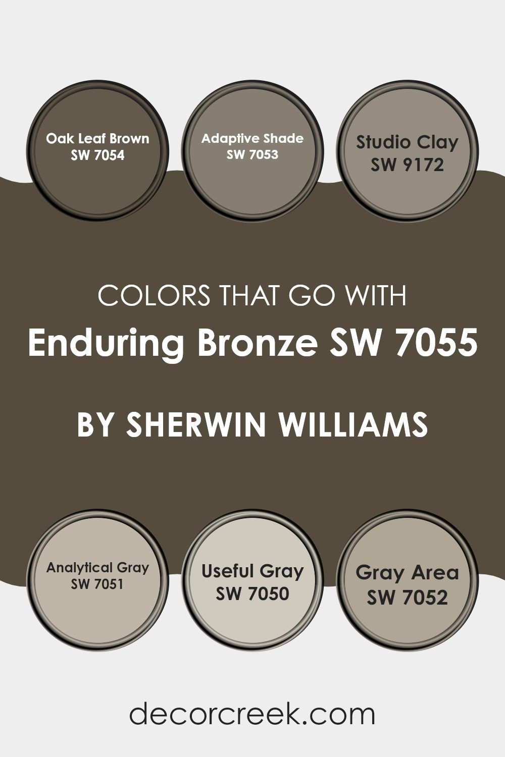
Colors that Go With Enduring Bronze SW 7055 by Sherwin Williams
Choosing the right colors that complement Enduring Bronze SW 7055 by Sherwin Williams is crucial for creating balanced and harmonious spaces. These coordinating colors blend seamlessly with Enduring Bronze, a warm, earthy hue, ensuring that the overall aesthetic is coherent and pleasing. For example, Oak Leaf Brown SW 7054 enhances Enduring Bronze by adding a darker, richer tone that’s perfect for grounding a room or adding depth. On the other hand, Adaptive Shade SW 7053 is slightly lighter and brings a subtle contrast that can help to brighten a space.
Similarly, Studio Clay SW 9172 works well as it draws from the same earthy palette, providing a sturdy, muted backdrop that complements furniture and decor without overpowering them. Analytical Gray SW 7051 and Useful Gray SW 7050 offer lighter options that introduce a soft, gentle contrast against the robust tone of Enduring Bronze.
These grays can make the room feel more spacious and airy. Lastly, Gray Area SW 7052 serves as a middle ground, not too dark and not too light, which makes it versatile for either accentuating key areas or blending the elements of a room together. These coordinating colors help in achieving a visually cohesive environment and enhance the overall appeal of the space.
You can see recommended paint colors below:
- SW 7054 Oak Leaf Brown
- SW 7053 Adaptive Shade
- SW 9172 Studio Clay
- SW 7051 Analytical Gray
- SW 7050 Useful Gray
- SW 7052 Gray Area
How to Use Enduring Bronze SW 7055 by Sherwin Williams In Your Home?
Enduring Bronze SW 7055 by Sherwin Williams is a warm, rich paint color that brings a cozy and inviting feel to any room. This earthy shade is perfect for creating a welcoming atmosphere in your home. You can use it in your living room to make the space feel more comfortable and homey. It’s also great for bedrooms, where it adds a sense of calm and coziness, helping you relax and unwind.
In addition, Enduring Bronze works well as an accent wall color. Pair it with lighter shades like creams or soft whites to create a balanced look. This color can also be used in your kitchen or dining area to give a touch of warmth, making meals more enjoyable.
Moreover, for those who love a bit of style, combining Enduring Bronze with wooden furniture and rustic décor can enhance the natural feel of the space, making it perfect for a cabin-style or country home look.
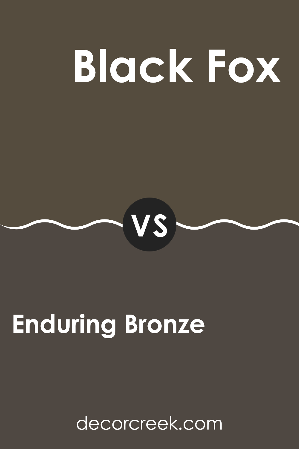
Enduring Bronze SW 7055 by Sherwin Williams vs Black Fox SW 7020 by Sherwin Williams
Enduring Bronze and Black Fox are both Sherwin Williams colors with deep, warm undertones. Enduring Bronze has a unique mix of brown and gray, giving it a soft yet substantial presence. This color works well in spaces where you want a cozy feel without darkening the room too much.
It pairs nicely with natural materials like wood and stone. On the other hand, Black Fox is much darker, leaning closer to a charcoal black. This hue is perfect for adding drama and depth to a space. It’s great for accent walls or trim if you’re looking to create a bold contrast.
Both colors offer warmth, but Black Fox provides a stronger statement due to its closer proximity to black, while Enduring Bronze offers a lighter, more muted option that still brings plenty of warmth.
You can see recommended paint color below:
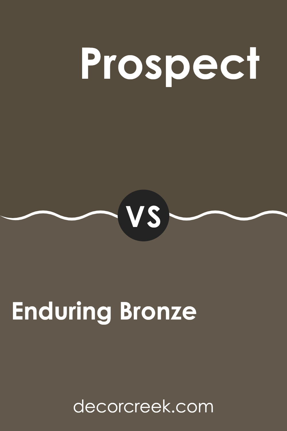
Enduring Bronze SW 7055 by Sherwin Williams vs Prospect SW 9615 by Sherwin Williams
Enduring Bronze is a robust, deep taupe that leans towards a warm, dark gray with subtle brown undertones, giving it a solid, grounding effect. It’s a color that creates a cozy, inviting atmosphere in a room, ideal for spaces where you want to feel relaxed and comfortable. It pairs well with natural materials and rich textures, enhancing a feeling of stability and comfort.
On the other hand, Prospect is a lighter, cool gray color that has a more neutral and versatile tone. It’s lighter and more understated than Enduring Bronze, making it suitable for smaller spaces or areas where you want to maintain an open, airy feel. This shade works well as a base, allowing other colors in the decor to stand out without overwhelming them.
In summary, while Enduring Bronze offers a warm, enveloping feel, perfect for creating a cozy refuge, Prospect provides a calm, subdued backdrop, ideal for brightening spaces and making them appear more spacious.
You can see recommended paint color below:
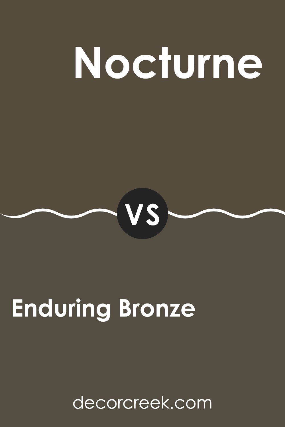
Enduring Bronze SW 7055 by Sherwin Williams vs Nocturne SW 9520 by Sherwin Williams
Enduring Bronze and Nocturne, both by Sherwin Williams, are distinct yet harmonious colors. Enduring Bronze is a warm, deep hue reminiscent of a rich, earthy clay. It provides a welcoming feel, perfect for creating a cozy ambiance in spaces like living rooms or bedrooms. Its bronze undertones offer a touch of elegance without being overly bold.
On the other hand, Nocturne is a much darker shade, closely aligned with charcoal. This color is ideal for making dramatic statements, suitable for accent walls or for rooms where a more striking, moody atmosphere is desired. While both colors are deep, Nocturne’s cooler base contrasts with the warmth of Enduring Bronze, making each stand out in unique ways when used in interior design.
Together, these colors can complement each other beautifully, with Enduring Bronze lighting up space and Nocturne adding depth and interest.
You can see recommended paint color below:
- SW 9520 Nocturne
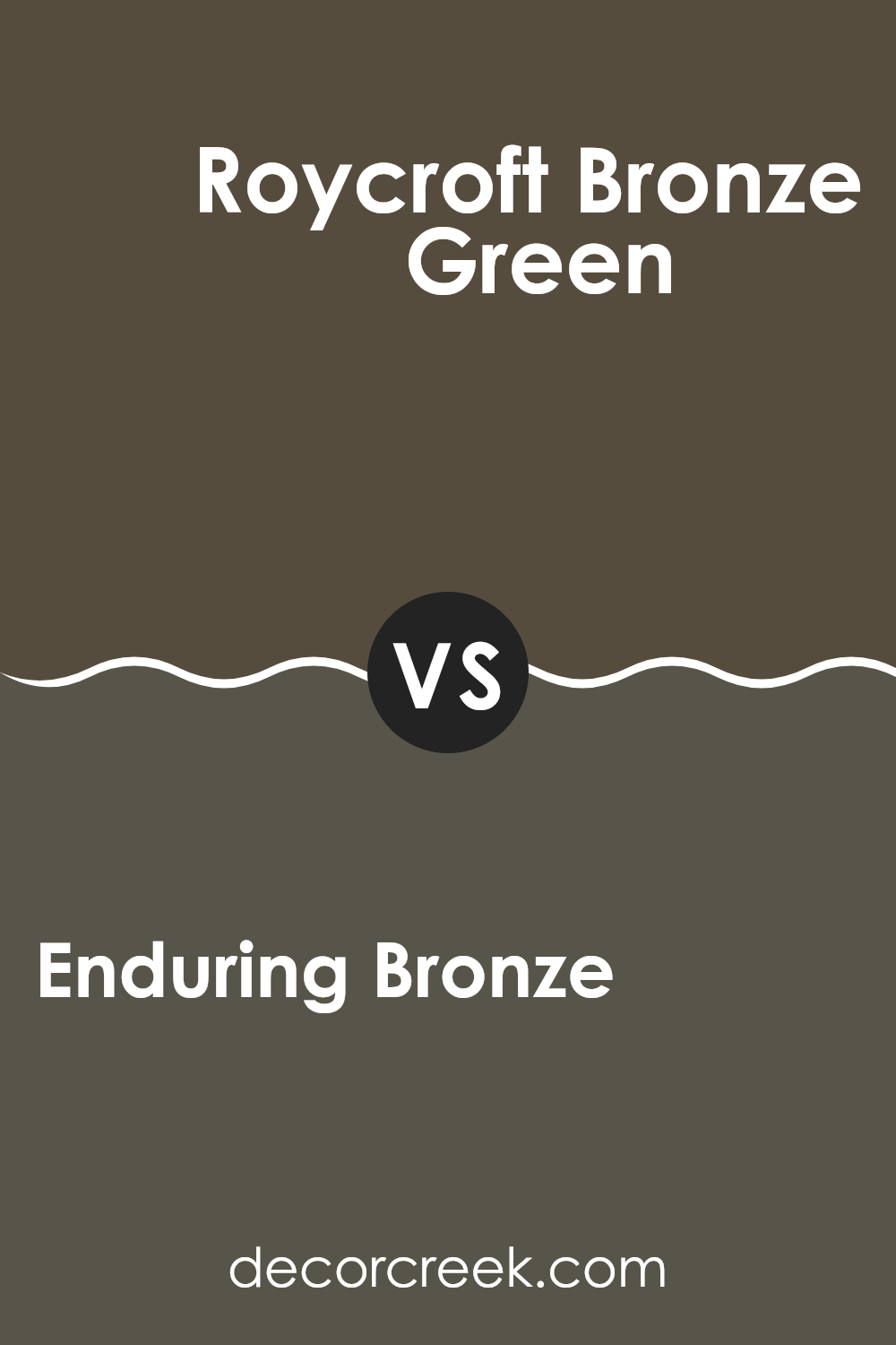
Enduring Bronze SW 7055 by Sherwin Williams vs Roycroft Bronze Green SW 2846 by Sherwin Williams
Enduring Bronze and Roycroft Bronze Green, both from Sherwin Williams, showcase distinct tones that can greatly enhance the atmosphere of any room. Enduring Bronze is a warm, deep gray with brown undertones, providing a neutral backdrop that’s very versatile.
It pairs well with a variety of decor styles and adds a sense of stability to spaces. On the other hand, Roycroft Bronze Green leans towards a darker, earthier hue that blends green and bronze, giving it a richer, more natural feel. This color is excellent for adding depth and a touch of nature to interiors.
When comparing the two, Enduring Bronze offers a more subtle, understated look, while Roycroft Bronze Green stands out with its vibrant depth, making it a strong choice for those wanting to make a statement with their color scheme. Both colors are practical yet appealing, fitting well into many home color palettes.
You can see recommended paint color below:
- SW 2846 Roycroft Bronze Green
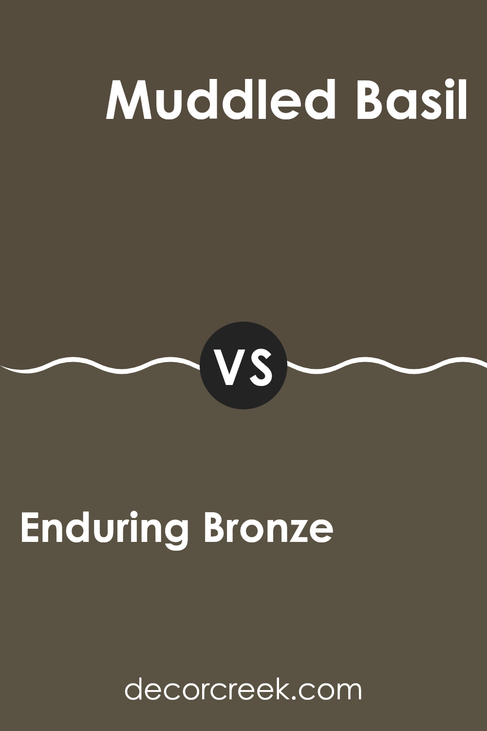
Enduring Bronze SW 7055 by Sherwin Williams vs Muddled Basil SW 7745 by Sherwin Williams
Enduring Bronze and Muddled Basil are two unique colors offered by Sherwin Williams, each bringing a distinct feel to space. Enduring Bronze is a warm, deep gray-brown that offers a cozy and inviting vibe, perfect for living rooms or bedrooms. It pairs well with soft lighting and rich textures, providing a grounded and homey atmosphere.
On the other hand, Muddled Basil is a dark, muted green that suggests the natural world and has a calming effect. Ideal for spaces where you want a touch of nature, such as kitchens or studies, it complements wooden accents and natural fibers, enhancing a sense of relaxation.
Both colors are versatile and can create a stylish and comfortable environment, whether used as main hues or accent walls. Each color stands out distinctly, with Enduring Bronze leaning towards a warm, earthy palette and Muddled Basil promoting a cooler, garden-inspired look. Mixing these colors in a home can add depth and interest to the decor.
You can see recommended paint color below:
- SW 7745 Muddled Basil
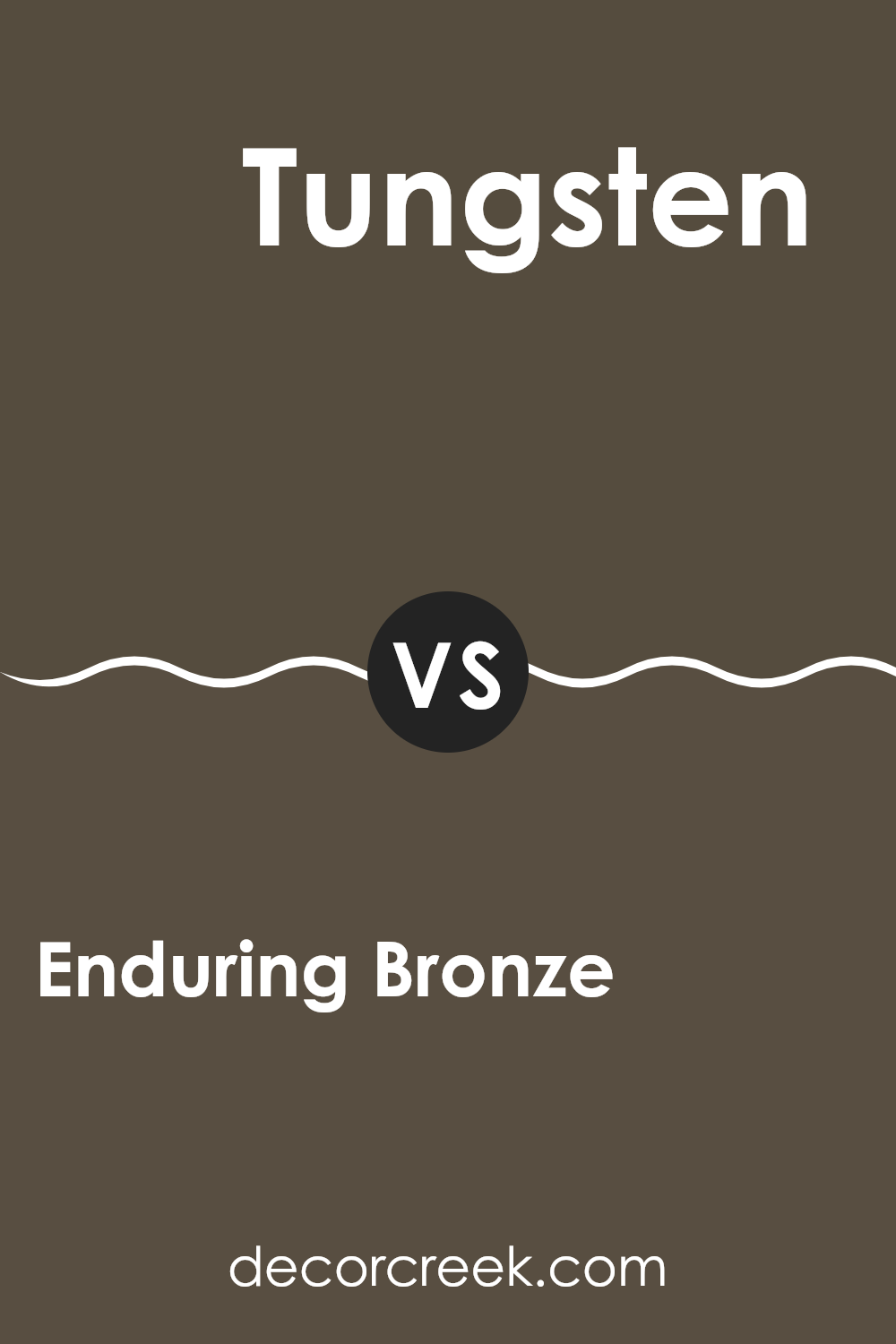
Enduring Bronze SW 7055 by Sherwin Williams vs Tungsten SW 9515 by Sherwin Williams
Enduring Bronze and Tungsten, both by Sherwin Williams, offer unique options for those looking to update their space. Enduring Bronze has a deep, warm tone that exudes a sense of coziness and comfort. It’s a rich color that draws you in, making it ideal for a living room or study. This shade pairs well with natural materials like wood or leather, enhancing the welcoming feel of any room.
On the other hand, Tungsten is a cooler, more neutral gray that has a modern vibe. It’s lighter than Enduring Bronze, providing a fresh and clean look that works well in kitchens, bathrooms, or modern living spaces. This color goes well with both bright accents and subdued tones, making it incredibly versatile for different decor styles.
Both colors offer beautiful base tones for any decorating project, each creating a different mood and style in your home. Whether you prefer the warmth of Enduring Bronze or the crisp neutrality of Tungsten, both colors offer wonderful options for personalizing your space.
You can see recommended paint color below:
Enduring Bronze SW 7055 by Sherwin Williams vs Urbane Bronze SW 7048 by Sherwin Williams
Enduring Bronze and Urbane Bronze by Sherwin Williams are two distinct shades, both offering a unique aesthetic. Enduring Bronze has a lighter, warmer tone which makes it quite versatile for use in various spaces. Its subtle warmth helps in creating a welcoming atmosphere, ideal for living rooms or bedrooms. This color pairs well with soft textiles and natural wood, enhancing the cozy feel of any area.
Urbane Bronze, on the other hand, is darker and tends to make more of a statement. It carries a rich depth that works well in modern and minimalistic designs, perfect for accent walls or cabinetry. This shade has a certain robustness, making it suitable for spaces where you want to add some drama or ground the room’s decor with a strong, defining color.
Both colors offer beautiful options for interior design, each setting a different mood and possibly complementing different themes and accessories. Whether you prefer the light warmth of Enduring Bronze or the bold depth of Urbane Bronze, each brings its unique charm to your space.
You can see recommended paint color below:
Enduring Bronze SW 7055 by Sherwin Williams vs Best Bronze SW 6160 by Sherwin Williams
Enduring Bronze and Best Bronze, both from Sherwin Williams, present unique shades of bronze that could significantly affect the atmosphere of a space. Enduring Bronze offers a deeper, almost earthier hue that works well in areas where you desire a warm, inviting feel. It has a rich depth that pairs nicely with natural textures and warm lighting, making it ideal for living rooms or dens.
On the other hand, Best Bronze leans towards a slightly lighter and warmer tone. This color is more reflective, which can help to brighten a space while still retaining warmth. It’s a great option for spaces like bedrooms or entryways where a welcoming, yet not overpowering color is needed.
Both colors provide warmth and sophistication but cater to different aesthetic needs and lighting situations. Enduring Bronze is robust and grounding, while Best Bronze offers a lighter touch, perfect for creating a soft, cozy ambiance.
You can see recommended paint color below:
- SW 6160 Best Bronze

Enduring Bronze SW 7055 by Sherwin Williams vs Thunder Gray SW 7645 by Sherwin Williams
Enduring Bronze and Thunder Gray by Sherwin Williams are two paint colors with distinct characteristics. Enduring Bronze is a warm, medium-toned color that brings a cozy vibe to any space. It can remind one of autumn with its rich, bronze-like shade, making it ideal for creating a welcoming atmosphere in living rooms or bedrooms.
Thunder Gray, on the other hand, is a cooler, darker gray that offers a more subtle and neutral look. This color suits modern spaces well and can act as a strong backdrop for brighter colors or work beautifully to create a calm and understated elegance. It tends to fit well in areas like home offices or kitchens where a more reserved aesthetic is preferred.
These two colors, while both are earthy, contrast in their temperature and depth, providing different moods and styles depending on the room they are used in. Their individual qualities allow them to stand out in unique ways, enhancing the character of home interiors.
You can see recommended paint color below:
- SW 7645 Thunder Gray
Enduring Bronze SW 7055 by Sherwin Williams vs Status Bronze SW 7034 by Sherwin Williams
Enduring Bronze and Status Bronze, both by Sherwin Williams, are each unique in their own way. Enduring Bronze has a deep, rich tone that feels warm and welcoming. It’s perfect for creating a cozy atmosphere in any room. This color has a slightly reddish undertone, giving it a bit of warmth that makes it very inviting.
On the other hand, Status Bronze leans towards a cooler, more muted bronze tone. It’s less intense than Enduring Bronze and works well in spaces that need a subtle, understated look. This color has a slight greenish undertone, making it ideal for those looking for a more neutral option in their color scheme.
Both colors are versatile and can work well in various settings, whether you want to add depth to a space with Enduring Bronze or keep things more laid-back with Status Bronze. Depending on what feel you want to achieve, either color could be the perfect choice for your project.
You can see recommended paint color below:
Conclusion
Having spent a good amount of time talking about SW 7055 Enduring Bronze by Sherwin Williams, I can confidently say this paint color is a fantastic choice for anyone looking to give their room a warm and welcoming feel. It’s a deep, rich shade that looks a bit like the color of dark chocolate mixed with a hint of bronze. This color works really well in places where you want to feel cozy, like living rooms or bedrooms.
What’s especially great about Enduring Bronze is how well it plays with other colors. You can pair it with light colors like creams or beiges to create a soft contrast, or you can go bold and use it with brighter colors for a fun and lively look. It’s really flexible, making it easy to fit into most home decorating styles, whether your house looks modern, traditional, or something in between.
Finally, using SW 7055 Enduring Bronze in your home can make the place feel warm and inviting. It’s perfect for making big, open rooms feel more snug, or for turning a plain room into something with a lot more character and warmth. If you’re thinking about a new color for your walls, Enduring Bronze is definitely worth considering. It’s not just a color; it’s a mood booster and a way to make your home feel more put together.
Ever wished paint sampling was as easy as sticking a sticker? Guess what? Now it is! Discover Samplize's unique Peel & Stick samples.
Get paint samples

