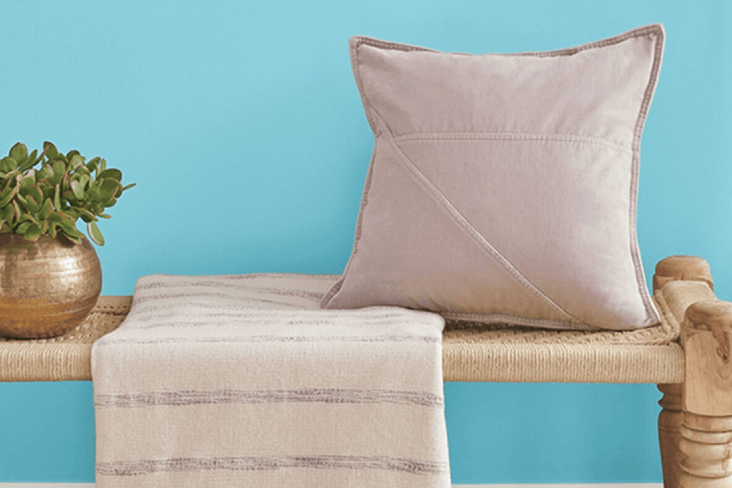
I recently came across a paint that truly stands out in Sherwin Williams’ extensive palette. Known as “Cloudless” and numbered SW 6786, this shade offers a refreshing burst of clear blue that perfectly captures the essence of a calm, cloud-free sky.
As someone who delights in adding vibrant yet soothing colors to rooms, I found Cloudless to be an excellent choice for creating an uplifting and bright atmosphere in any room. The color is so beautifully vivid that it consistently fills a room with a sense of openness and airiness.
Whether you’re looking to revamp your bathroom, bedroom, or even a kitchen, this color maintains a cheerful vibe throughout the day, from the bright mornings to the dimming light of dusk. If you’re considering a makeover or just a subtle uplift to your living area, Cloudless by Sherwin Williams could be the refreshing touch you need.
It promises not only to brighten the walls but also to lift the spirits of everyone who walks into the room.
What Color Is Cloudless SW 6786 by Sherwin Williams?
The color Cloudless by Sherwin Williams is a vibrant, refreshing shade of blue that radiates a cheerful and light-infused ambiance in any room it graces. Reminiscent of a clear, sunny sky, this hue injects a breezy freshness perfect for creating an inviting environment. Cloudless is quite adaptable and can seamlessly fit into various interior styles, especially coastal, contemporary, and modern farmhouse designs.
In coastal styled rooms, Cloudless mirrors the openness of the sea and the sky, complementing white or sandy tones and organic textures like linen or unfinished wood. This results in a room that feels like a light, airy beachside cottage. For a contemporary setting, pairing this bright blue with sleek materials such as polished metal, glass, and lacquered finishes helps to achieve a clean and crisp look.
When it comes to a modern farmhouse aesthetic, Cloudless works wonderfully with natural elements and rustic touches. It pairs beautifully with exposed wooden beams, barn-style doors, and handcrafted ceramics, striking a balance between the old and new. To enhance the effect, adding soft, plush textiles like chunky knit throws or cotton rugs can make rooms more inviting while preserving a fresh and lively vibe. Cloudless is truly a flexible color that brings rooms to life with its sunny and pleasant undertones.
decorcreek.com
Is Cloudless SW 6786 by Sherwin Williams Warm or Cool color?
Cloudless SW 6786 by Sherwin Williams is a light and fresh blue paint, ideal for creating a bright and airy feel in any home. This shade can significantly lighten up darker rooms or areas with limited natural light. When used on walls, it gives off a clean and refreshing vibe, helping smaller rooms appear more spacious.
Cloudless is adaptable and matches well with a variety of decor styles and color palettes, making it a great choice for anyone looking to refresh their living area. Whether applied in a bedroom, kitchen, or living room, this color brings a cheerful ambiance that feels welcoming.
Additionally, this paint can help soften harsh lines and features within a room, providing a gentle backdrop that complements both modern and traditional designs. Overall, this cheerful blue is a reliable choice for those looking to brighten their home interior with a touch of gentle color.
Undertones of Cloudless SW 6786 by Sherwin Williams
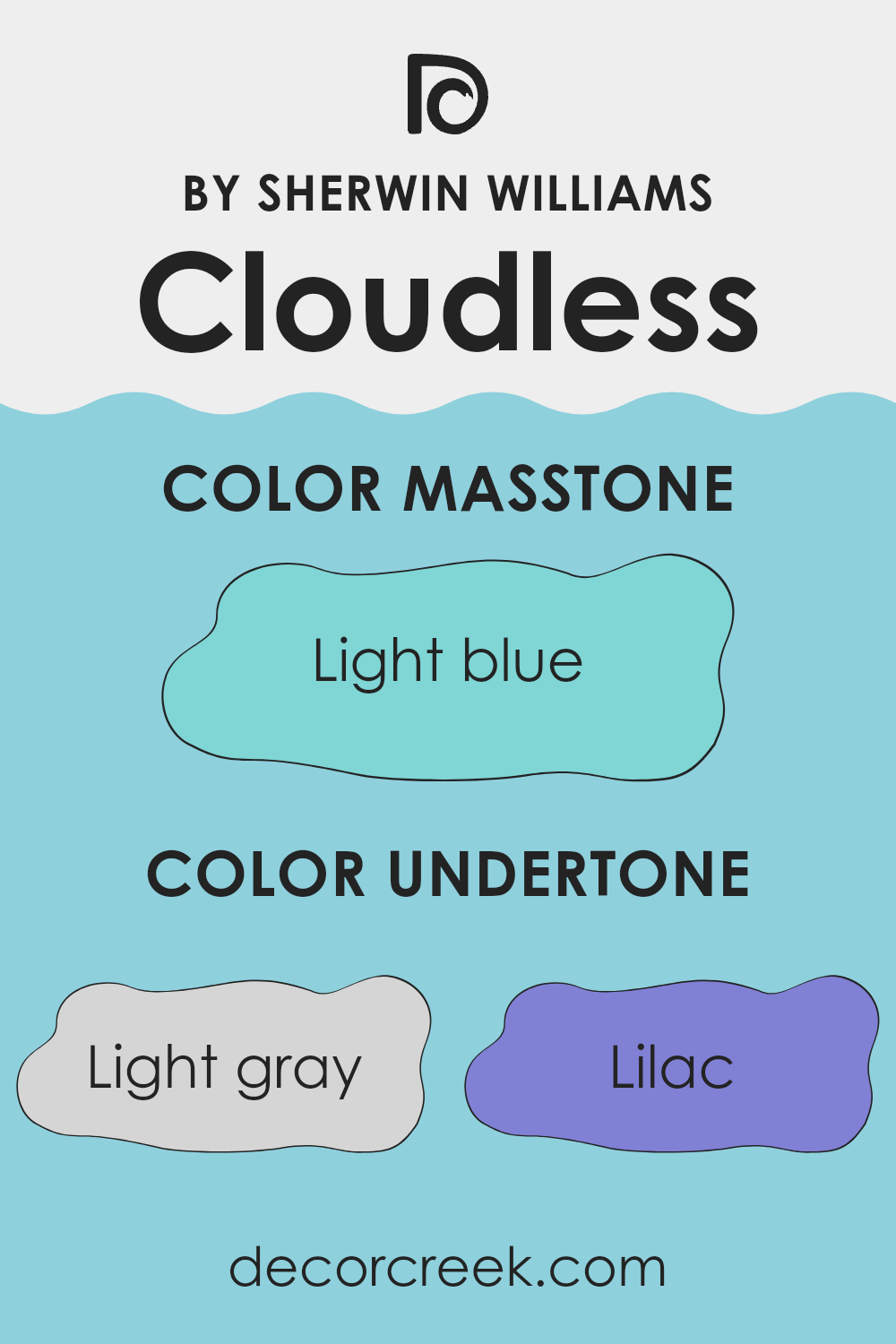
Cloudless SW 6786 by Sherwin Williams is a vibrant color that captures a sense of clear skies and openness. The various undertones in this paint play a significant role in how it appears in different lights and surroundings. Undertones are essentially subtle colors that sit beneath the main color, influencing its overall hue and how it’s perceived in various environments.
This specific color includes undertones such as light gray, lilac, mint, turquoise, light purple, pale yellow, grey, blue, light turquoise, pale pink, and dark turquoise. These undertones contribute to the dynamic and adaptable nature of the color.
For instance, light gray and grey add a neutral balance, softening the intensity of the color, making it more suitable for different rooms and lighting conditions. The lilac and light purple introduce a slight, soft floral feel, which can make a room feel more inviting and warm.
Mint and turquoise, along with their variations, impart a fresh, lively vibe that can energize a room, perfect for areas needing a touch of vibrancy. On the other hand, pale yellow can brighten the color, infusing it with a sunny, cheerful quality that enhances the welcoming atmosphere of any room.
On interior walls, these undertones can cause the color to appear differently based on the lighting and other colors in the room. For example, in a room with ample natural light, the mint and pale yellow undertones might become more pronounced, making the walls look more vibrant and lively. Conversely, in a room with less light or during the evening, the gray undertones might become more dominant, giving the walls a more subdued and mellow appearance.
When choosing colors for home decor, considering the undertones can help in selecting complementary colors for furniture and decorations, ensuring that everything in the room works together harmoniously.
decorcreek.com
What is the Masstone of the Cloudless SW 6786 by Sherwin Williams?
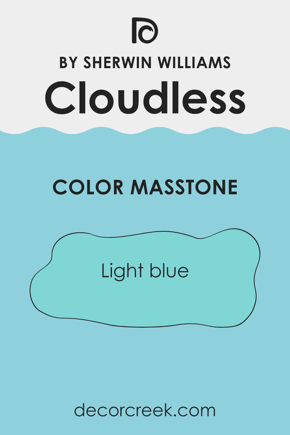
Cloudless SW 6786 by Sherwin Williams has a masstone of light blue, specifically resembling the hue #80D5D5. This shade gives off a refreshing and gentle feel, making it a great option for anyone looking to create a calm and welcoming environment in their home.
The subtlety of this light blue can make small rooms appear larger and more open, while its cool tone can help balance rooms that get a lot of sunlight, keeping them from feeling overly warm.
It’s a flexible color that works well in various rooms, from bedrooms where you want a calm atmosphere to relax, to bathrooms where you might want a clean and airy feel. In living areas or kitchens, pairing it with bright whites or contrasting colors can keep the room feeling light and lively. Overall, this light blue adds a fresh and pleasant vibe that can easily fit with different styles and decor.
decorcreek.com
How Does Lighting Affect Cloudless SW 6786 by Sherwin Williams?
Lighting plays a crucial role in how we perceive colors. The light source, whether artificial or natural, can significantly influence the appearance of a color. Different types of light have different color temperatures, affecting how a color looks on walls or objects.
Cloudless, a vibrant shade of blue, responds uniquely to various lighting conditions. Under artificial light, such as LED or fluorescent bulbs, Cloudless tends to appear slightly brighter and more vivid. This is because artificial lighting often has a cooler temperature, which enhances blue tones, making them stand out.
In natural light, the appearance of Cloudless can change throughout the day. Morning light, which is softer, will show it as gentle and subdued. As the day progresses and the light becomes brighter and whiter, the blue will appear clearer and more dynamic. As evening arrives and the light softens again, the color may take on a softer, more muted tone.
Room orientation also affects how Cloudless is perceived:
- North-facing rooms – These rooms get less direct sunlight, which can make colors appear cooler and somewhat shadowy. Cloudless might look more subdued and less vibrant in a north-facing room, especially during the day.
- South-facing rooms – These rooms benefit from plentiful sunlight most of the day, which can make Cloudless look brighter and more vibrant. The blue will likely be at its truest in a south-facing room, really standing out vividly.
- East-facing rooms – In these rooms, Cloudless will be illuminated by the warm, yellow light of the morning sun, making the blue appear slightly softened in the mornings, but it will grow cooler as the day progresses.
- West-facing rooms – Evening light, which tends to be warmer, will warm up Cloudless in the afternoons and evenings, making the blue appear softer and less intense than during midday.
In summary, the way Cloudless is perceived varies significantly depending on the light source and room orientation, shifting from vibrant and dynamic under direct light to softer and more nuanced in dimmer, indirect light.
decorcreek.com
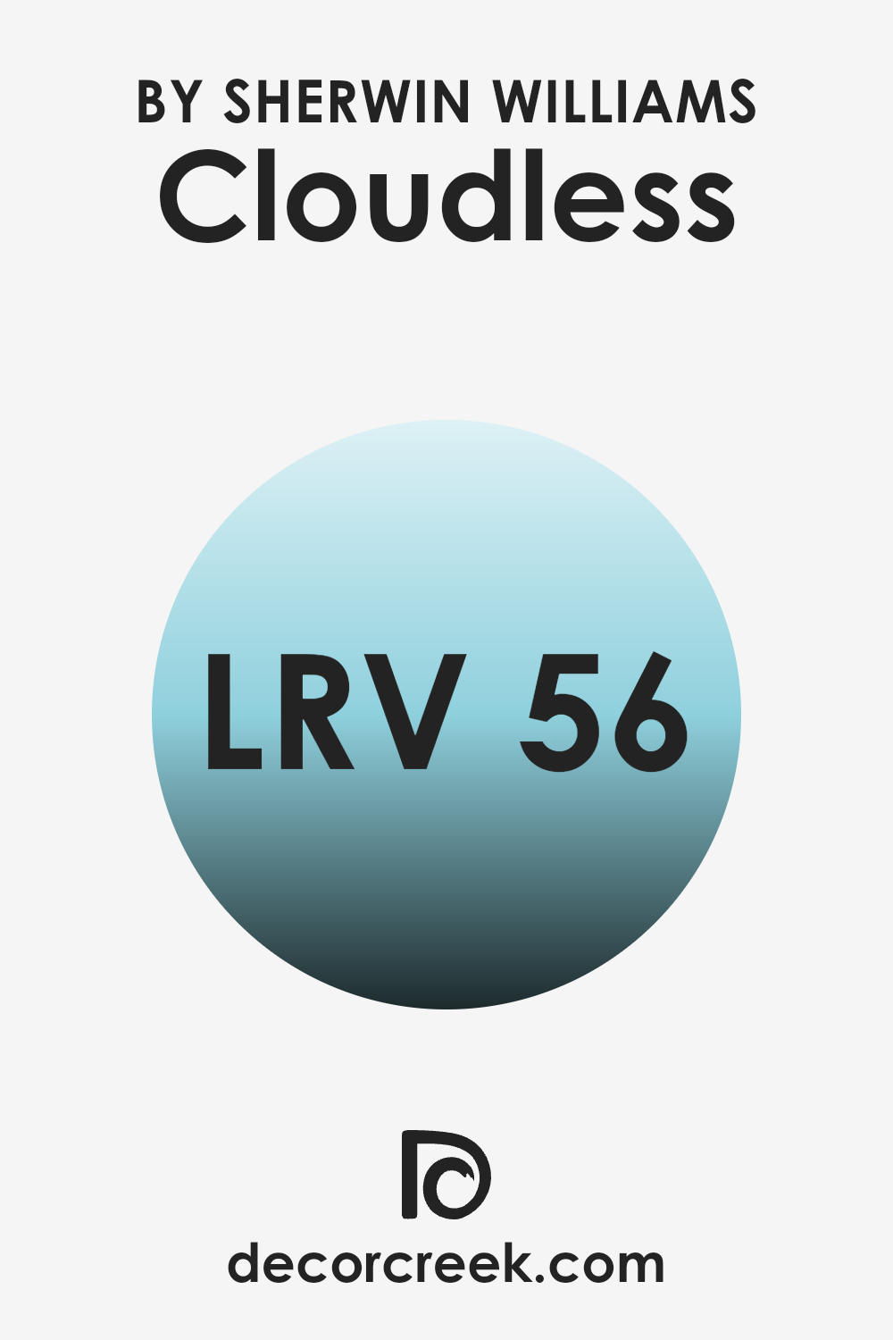
What is the LRV of Cloudless SW 6786 by Sherwin Williams?
Light Reflectance Value (LRV) measures the amount of light a paint color reflects back into a room as opposed to absorbing it. A higher LRV means the color reflects more light, making a room feel brighter, while a lower LRV means the color absorbs more light, which can make a room feel cozier.
This value is crucial when choosing paint colors because it helps determine how a color will look under various lighting conditions. For example, a room with less natural light might benefit from a paint color with a higher LRV to make the room appear lighter and more open.
In the case of the color with an LRV of 56.152, such as Cloudless SW 6786, it sits in the middle range of the scale. This means it neither reflects light excessively nor does it absorb too much. This mid-range LRV makes the color adaptable, suitable for rooms with both good and limited natural light. In a well-lit room, the color will appear more vibrant and lively, while in a room with less natural light, it will still manage to reflect a moderate amount of light, helping to keep the room from feeling too dark. This balance makes it a practical choice for many rooms.
decorcreek.com
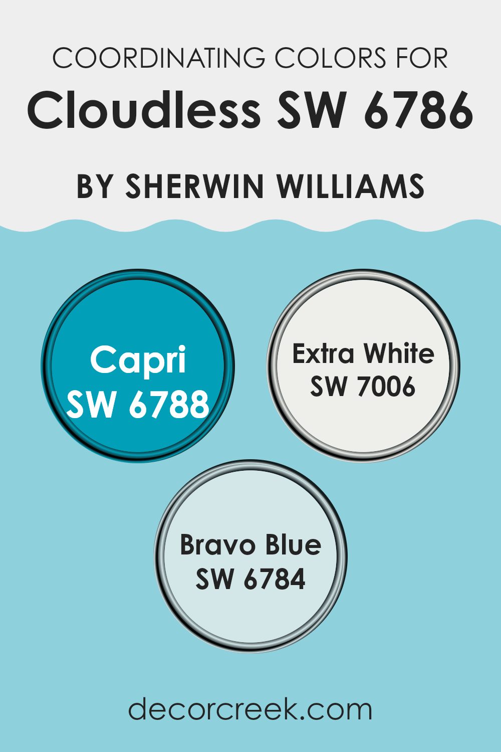
Coordinating Colors of Cloudless SW 6786 by Sherwin Williams
Coordinating colors are those that complement each other well, enhancing the overall aesthetic of a room without being too intense. These colors often share certain tones that allow them to create a harmonious look when used together. For instance, if we consider the vibrant shade of Cloudless by Sherwin Williams, there are specific colors that coordinate effectively with it to bring out its true essence while maintaining a balanced visual appeal.
One of the coordinating colors is Capri, a lively turquoise that echoes the bright and cheerful vibe of a clear sky. It pairs wonderfully with Cloudless, offering a playful yet calming effect, ideal for rooms meant to inspire energy and freshness. Another great match is Extra White, a pure and clean hue that provides a crisp contrast to the lively tones of Cloudless, making it perfect for trim or ceiling color to create a fresh and airy feel.
Lastly, Bravo Blue, a deeper shade of blue, complements Cloudless by adding depth and a sense of grounding to the palette, making it suitable for accents or larger areas in a room to anchor lighter colors. Together, these colors work seamlessly to enhance the beauty of each other, providing multiple design possibilities.
You can see recommended paint colors below:
- SW 6788 Capri
- SW 7006 Extra White
- SW 6784 Bravo Blue
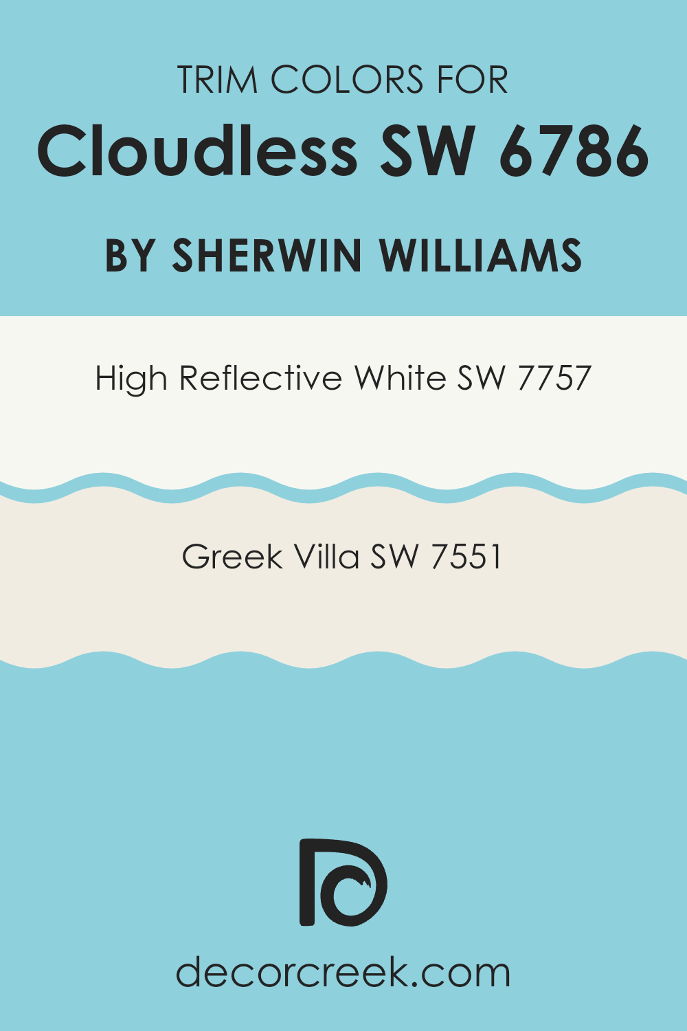
What are the Trim colors of Cloudless SW 6786 by Sherwin Williams?
Trim colors, such as SW 7757 – High Reflective White and SW 7551 – Greek Villa, are used to accentuate the finer details of a home’s exterior or interior, such as door frames, moldings, and skirting boards. These colors are particularly important when paired with a primary color like Cloudless by Sherwin Williams.
They can provide a crisp, clean contrast that highlights the vibrant blue of Cloudless, helping to define the edges and transitions between different areas or materials in a room. Moreover, using the right trim color can help to enhance the overall aesthetic of a room or building, making architectural features stand out and giving the room a more polished look.
High Reflective White is an ultra-bright white that can bring a fresh and light feel to any edge it adorns. It reflects a lot of light, making rooms appear larger and more open. Greek Villa, on the other hand, offers a slightly softer, creamy white that exudes warmth and offers a more subtle contrast with strong colors like Cloudless.
This shade can help soften the bold impact of Cloudless, creating a more relaxed yet still stylish visual effect. Choosing between these two will depend on the desired result, either leaning toward a striking contrast with High Reflective White or a softer, harmonious feel with Greek Villa.
You can see recommended paint colors below:
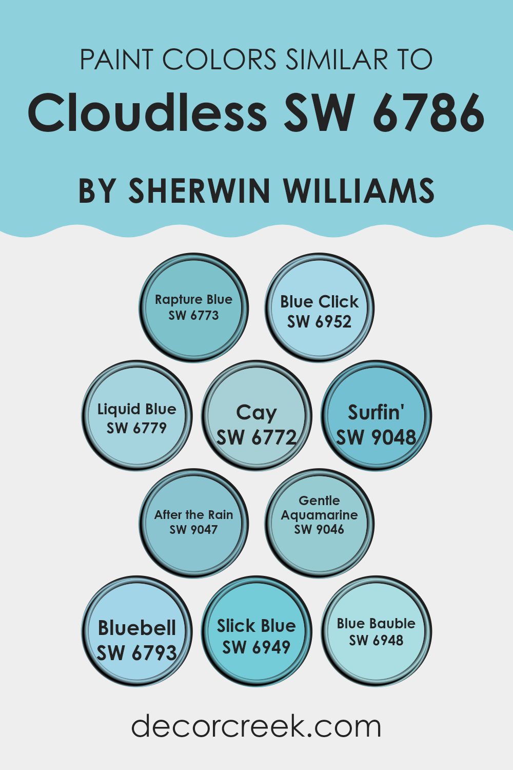
Colors Similar to Cloudless SW 6786 by Sherwin Williams
Choosing colors that are similar to each other can create a harmonious and visually pleasing environment, enhancing a room’s aesthetic without being too intense with high contrast. Similar colors, like those close to Cloudless by Sherwin Williams, work well together because they share the same base hue and vary mostly in terms of brightness and saturation. This cohesive look is soothing and can make a room feel more organized and intentional.
For instance, Rapture Blue has a lively vibe distantly reminiscent of a clear sky, making it great for energetic rooms. Blue Click steps up with a bit more punch, vibrant yet calming, ideal for creating a focused atmosphere. Liquid Blue offers a soft, gentle presence, similar to a light wash of the summer sky, perfect for peaceful areas. Cay brings in a bit of the ocean’s essence with its slightly aqua lean, suitable for a breezy, relaxed room.
Surfin’ is reminiscent of wave crests, energetic yet familiar. Its counterpart, After the Rain, mimics the reflective quality of the sky after a storm, light yet profound. Gentle Aquamarine whispers more of the sea, subtle and light, great for calm settings. Bluebell softly speaks of early spring flowers, lending a fresh and youthful touch.
Slick Blue, slightly deeper, adds a dash of drama without being too intense. Lastly, Blue Bauble rounds out our palette with a depth that anchors lighter tones, balancing the overall scheme with its richer, yet still gentle, presence. Together, these colors provide a flexible palette that works seamlessly for creating inviting yet cohesive rooms.
You can see recommended paint colors below:
- SW 6773 Rapture Blue
- SW 6952 Blue Click
- SW 6779 Liquid Blue
- SW 6772 Cay
- SW 9048 Surfin’
- SW 9047 After the Rain
- SW 9046 Gentle Aquamarine
- SW 6793 Bluebell
- SW 6949 Slick Blue
- SW 6948 Blue Bauble
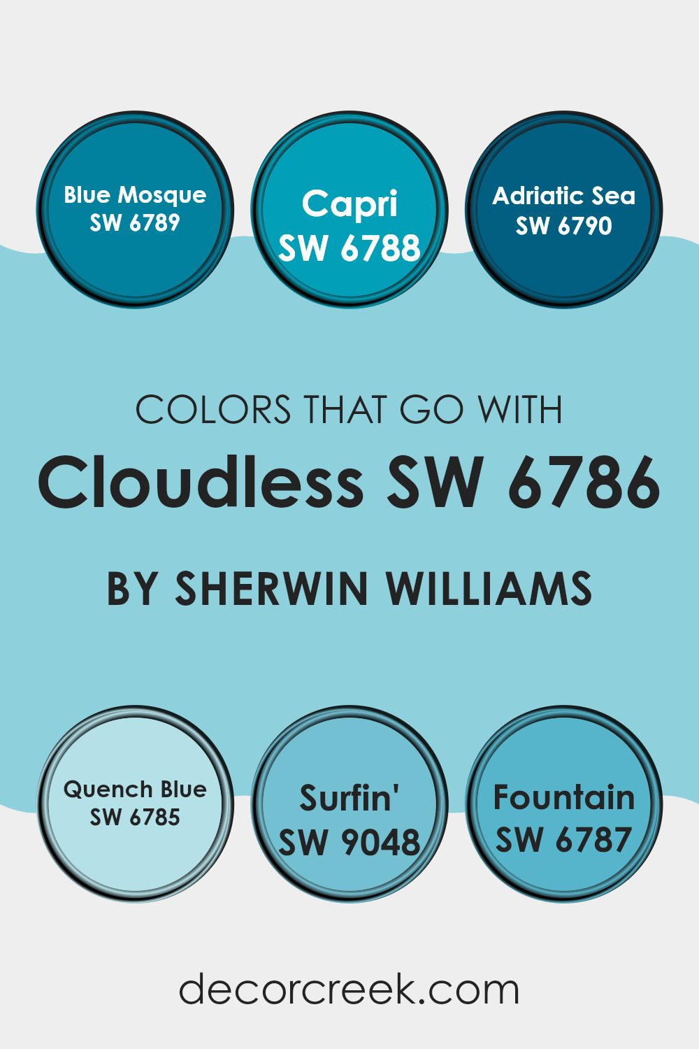
Colors that Go With Cloudless SW 6786 by Sherwin Williams
Choosing complementary colors for Cloudless SW 6786 by Sherwin Williams is crucial because it helps create a harmonious and visually appealing room. These colors can enhance the atmosphere of a room by balancing or accentuating the vibrant blue of Cloudless.
For instance, SW 6789 Blue Mosque shares a similar depth but with a slightly duskier tone, making it perfect for adding some contrast while keeping the room within the blue spectrum. On the other hand, SW 6788 Capri is a lighter, more playful blue, excellent for creating a fresh and airy feel when paired with Cloudless.
SW 6790 Adriatic Sea offers a deeper, more oceanic blue that provides a strong statement and depth, ideal for an accent wall or furniture pieces. SW 6785 Quench Blue is another fantastic match that leans toward a softer, more subtle blue, perfect for creating a calming effect in rooms like bedrooms or bathrooms.
SW 9048 Surfin’ brings a vibrant, energetic twist with its bright and cheerful hue, great for injecting life into a dull area. Lastly, SW 6787 Fountain introduces a unique blend with its slightly greenish-blue tint, offering a different perspective on the traditional blue, which can add an interesting dimension to the overall decor. Integrating these colors with Cloudless helps achieve a fluid and appealing visual effect, enhancing both the aesthetics and the mood of any interior.
You can see recommended paint colors below:
- SW 6789 Blue Mosque
- SW 6788 Capri
- SW 6790 Adriatic Sea
- SW 6785 Quench Blue
- SW 9048 Surfin’
- SW 6787 Fountain
How to Use Cloudless SW 6786 by Sherwin Williams In Your Home?
Cloudless SW 6786 by Sherwin Williams is a vibrant and cheerful blue paint color that can brighten up any room in your home. This shade of blue is lively and has a clean, fresh look that can make rooms feel more open and airy.
Perfect for bedrooms or bathrooms, it brings in a sense of calm and freshness. You can also use it in your kitchen or living room paired with crisp white trim to create a refreshing contrast.
For those who enjoy a bit of creativity, Cloudless works well as an accent wall to add a pop of color. Additionally, painting furniture, like a bookshelf or a cabinet, can give your room a fun and unique touch. Combine it with softer tones or natural elements such as wood and plants for a balanced look. This color not only looks great but also has a positive impact on the mood, making your home a more pleasant place to be.
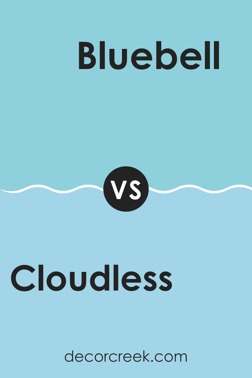
Cloudless SW 6786 by Sherwin Williams vs Bluebell SW 6793 by Sherwin Williams
Cloudless and Bluebell, both by Sherwin Williams, offer unique takes on the color blue. Cloudless is a soft, clear blue that closely resembles a bright, sunny sky. It feels light and airy, making any room feel more open and inviting.
On the other hand, Bluebell is a deeper, more vivid shade of blue. It has a noticeable vibrancy that stands out and can add a cheerful burst of color to a room. It tends to draw more attention than Cloudless because of its richer hue.
While Cloudless adds a subtle touch of freshness, Bluebell makes a bolder statement. Depending on the mood you want to set in your room, you might choose the soothing simplicity of Cloudless or the lively, dynamic tone of Bluebell. Both colors bring their own unique characteristics to interiors but cater to different aesthetics and preferences.
You can see recommended paint color below:
- SW 6793 Bluebell
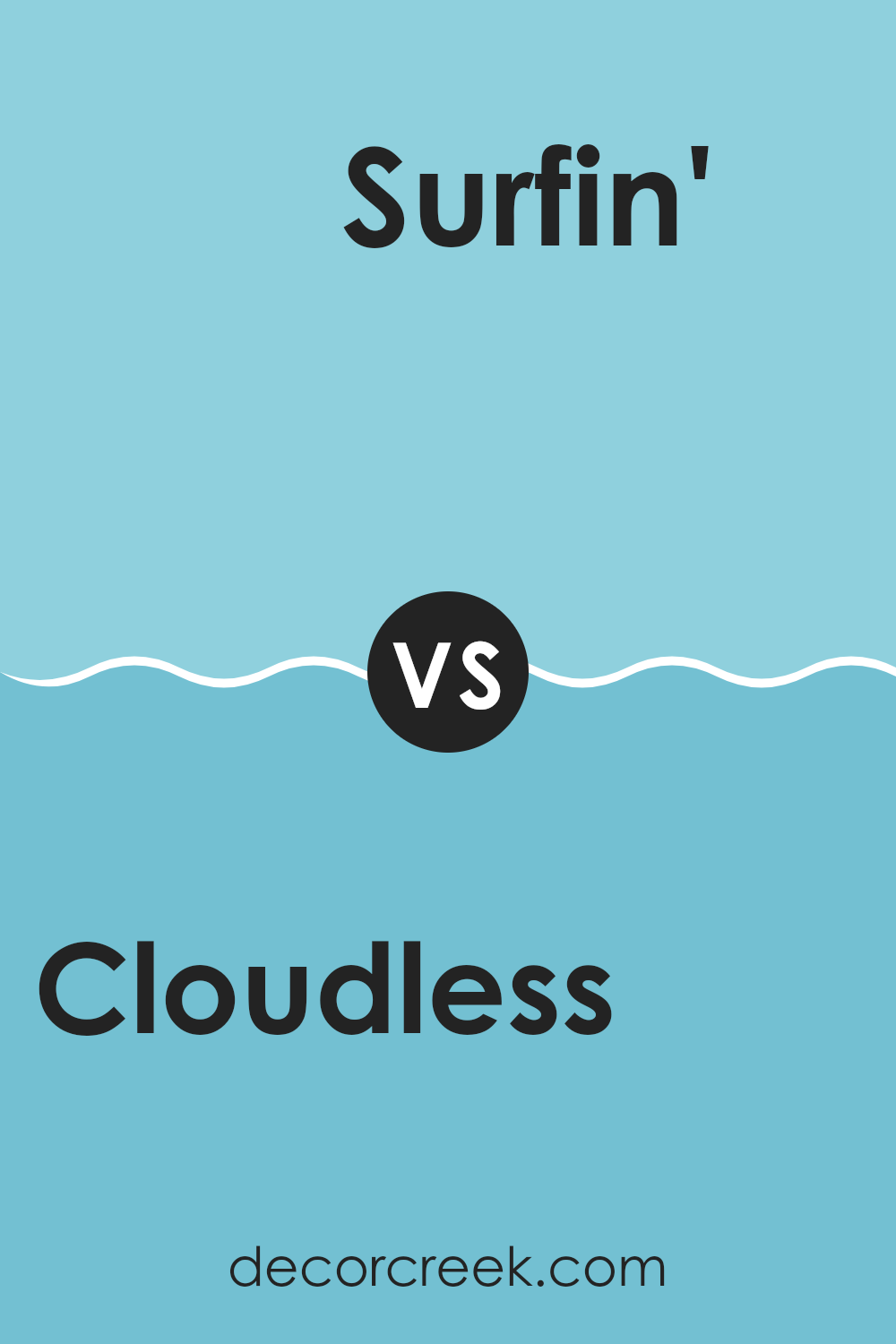
Cloudless SW 6786 by Sherwin Williams vs Surfin’ SW 9048 by Sherwin Williams
Cloudless SW 6786 is a vibrant, pure blue, which resembles the clear daytime sky. It has a lively and refreshing feel that can brighten up any room significantly. This shade is perfect if you want to add a pop of bold color without being too intense.
On the other hand, Surfin’ SW 9048 tends a tad darker with subtle gray undertones. This color brings a cooler, more muted feel, making it excellent for creating a calm and collected atmosphere in a room.
While both these blues share similarities, Cloudless leans toward a more energetic and stimulating vibe, whereas Surfin’ provides a more relaxed and understated backdrop. These distinctions make each suitable for different moods and settings, depending on the desired effect and the area where it’s applied.
You can see recommended paint color below:
- SW 9048 Surfin’
Cloudless SW 6786 by Sherwin Williams vs Gentle Aquamarine SW 9046 by Sherwin Williams
Cloudless and Gentle Aquamarine are two shades from Sherwin Williams that offer distinct vibes for any room. Cloudless is a vibrant, pure blue that is reminiscent of a clear sky on a sunny day. It has an energetic and bright feel, making it perfect for rooms where you want to add a lively pop of color.
On the other hand, Gentle Aquamarine is a softer, more muted blue with a hint of green. This color is more relaxed and subdued, ideal for creating a calm and peaceful atmosphere in a room.
While Cloudless can bring a sense of cheer and openness, Gentle Aquamarine is better for rooms where you want a gentle, soothing presence. Both colors can refresh a room but cater to different moods and styles, depending on what you are aiming to achieve with your decor.
You can see recommended paint color below:
- SW 9046 Gentle Aquamarine
Cloudless SW 6786 by Sherwin Williams vs Blue Click SW 6952 by Sherwin Williams
Cloudless and Gentle Aquamarine are two shades from Sherwin Williams that offer distinct vibes for any room. Cloudless is a vibrant, pure blue that is reminiscent of a clear sky on a sunny day. It has an energetic and bright feel, making it perfect for rooms where you want to add a lively pop of color.
On the other hand, Gentle Aquamarine is a softer, more muted blue with a hint of green. This color is more relaxed and subdued, ideal for creating a calm and peaceful atmosphere in a room.
While Cloudless can bring a sense of cheer and openness, Gentle Aquamarine is better for rooms where you want a gentle, soothing presence. Both colors can refresh a room but cater to different moods and styles, depending on what you are aiming to achieve with your decor.
You can see recommended paint color below:
- SW 6952 Blue Click
Cloudless SW 6786 by Sherwin Williams vs Slick Blue SW 6949 by Sherwin Williams
Cloudless and Slick Blue, both by Sherwin Williams, are vibrant colors that offer unique vibes for any room. Cloudless is a bright and airy light blue that reflects a clear sky, giving a room an open and refreshing feel. It’s perfect for creating a light, breezy atmosphere in rooms like kitchens and bathrooms or as a calming backdrop in a bedroom.
On the other hand, Slick Blue is a much deeper and richer blue with a hint of teal. It has a bold presence that makes it ideal for accent walls or decorative touches in areas that benefit from a splash of color, such as living rooms or dining rooms. This color can add a dramatic flair and is great for pairing with neutral tones to make it stand out.
In summary, while Cloudless fills a room with a sense of airiness and calm, Slick Blue offers a striking and confident boost of color. Choosing between them depends on whether you want a subtle, soothing effect or a more dynamic, eye-catching impact.
You can see recommended paint color below:
- SW 6949 Slick Blue
Cloudless SW 6786 by Sherwin Williams vs Cay SW 6772 by Sherwin Williams
Cloudless SW 6786 and Cay SW 6772 are two distinct paint colors from Sherwin Williams that each create a unique ambiance in a room. Cloudless is a vivid, bright blue reminiscent of a clear sky on a sunny day. It has a cheerful and refreshing vibe, making it ideal for rooms where you want to add vibrancy and a sense of airiness.
On the other hand, Cay is a deeper, turquoise blue that carries a bit more energy and boldness. This color brings a lively and dynamic feel to a room, suitable for areas that benefit from a pop of color, like a bathroom or an accent wall in a living room.
Both colors are from the blue family, yet they serve different purposes based on their intensity and depth. While Cloudless opens up a room with its lighter tone, Cay adds a dash of drama with its richer hue. Choosing between them depends on the desired mood and function of the room.
You can see recommended paint color below:
Cloudless SW 6786 by Sherwin Williams vs Rapture Blue SW 6773 by Sherwin Williams
Cloudless SW 6786 is a bright, fresh blue that feels like a clear sky on a sunny day. It’s vivid and could really brighten up a room. On the other hand, Rapture Blue SW 6773 is a deeper shade that leans slightly toward turquoise. This color offers a bit more depth and is a tad cooler in tone compared to the light and airy feel of Cloudless.
If you want to make a room feel more open and cheerful, Cloudless is a great choice as it mimics the openness of a cloud-free sky. However, if you’re aiming for a slightly more relaxed and grounded atmosphere, Rapture Blue is the way to go. It’s not as intense as Cloudless, and its turquoise undertones give it a calm but vibrant character.
In terms of matching with other colors, Cloudless is adaptable enough to be paired with soft neutrals or even bold colors for a dynamic look. Rapture Blue, while also adaptable, looks particularly stunning with whites and grays, providing a cool contrast.
You can see recommended paint color below:
- SW 6773 Rapture Blue
Cloudless SW 6786 by Sherwin Williams vs Blue Bauble SW 6948 by Sherwin Williams
Cloudless and Blue Bauble, both by Sherwin Williams, are unique shades of blue that offer different vibes for rooms. Cloudless is a light and airy blue, very reminiscent of a clear sky on a sunny day.
This shade is perfect for creating a fresh and open feel in any room. On the other hand, Blue Bauble is a deeper, more vibrant blue. It has a cheerful and bold quality that can add a dynamic pop of color to your room.
When comparing these two, Cloudless tends to bring a calm and light atmosphere, making it suitable for a relaxing bedroom or bathroom. Blue Bauble, with its richer tone, is more striking and would be ideal for an accent wall or a room where a touch of vibrancy is needed. Both colors complement various decor styles, but the choice between them would depend on the mood and function you want to achieve in your room.
You can see recommended paint color below:
- SW 6948 Blue Bauble
Cloudless SW 6786 by Sherwin Williams vs After the Rain SW 9047 by Sherwin Williams
Cloudless and After the Rain are two colors by Sherwin Williams that complement each other well but have their unique characteristics. Cloudless is a bright, clear blue that gives a feeling of a sunny, open sky. It’s vivid and can make any room feel more lively and energetic. This makes it ideal for rooms where you want to add a pop of color or create an inviting, cheerful atmosphere.
On the other hand, After the Rain is a softer, muted gray with hints of blue. It is much more understated compared to Cloudless and helps create a calm and relaxing vibe. This color is perfect for areas where you want a soothing effect, such as bedrooms or bathrooms.
When comparing the two, Cloudless stands out more because of its brighter hue, while After the Rain serves as a subtle backdrop, allowing other colors or decor elements to shine. They both work beautifully in different ways depending on the mood you want to set in your room.
You can see recommended paint color below:
Cloudless SW 6786 by Sherwin Williams vs Liquid Blue SW 6779 by Sherwin Williams
Cloudless SW 6786 and Liquid Blue SW 6779 by Sherwin Williams are both refreshing shades of blue. However, Cloudless is a lighter, airy shade that closely mimics a clear sky on a sunny day. It’s ideal for creating a bright and open feel in a room. On the other hand, Liquid Blue is a bit deeper and has a more pronounced presence. It resembles the vibrant hue of tropical waters, adding a lively splash of color to any room.
When choosing between the two for decorating, consider the mood and size of the room. Cloudless works well in a smaller room or a room with less natural light, as its lighter tone helps to make the area seem larger and more inviting. Liquid Blue, with its richer intensity, suits rooms where a bold color statement is desired. It can really make elements like trim or accent walls stand out.
Both colors are adaptable, pairing well with various decor styles and additional colors. Cloudless tends to lend a fresh, calm feel, while Liquid Blue offers a more energetic vibe.
You can see recommended paint color below:
In conclusion, SW 6786 Cloudless by Sherwin Williams is a lovely, bright blue paint that really makes any room feel happy and full of light. It looks like a clear sky on a sunny day, which can make you feel more cheerful just by being in a room painted that color. This shade of blue is perfect for anyone who wants to add a friendly touch to their home – it’s especially nice for places like kitchens or playrooms, where you spend a lot of happy times.
When I tried this paint in my own home, I noticed how it made the rooms look cleaner and bigger. It has a way of making old walls feel brand new again, which is great if you’re looking to freshen up your house without doing too much work. It works well with white trims, giving everything a neat and tidy look.
If you’re thinking about giving your walls a new coat of paint, Cloudless by Sherwin Williams is definitely a color worth considering. It’s cheerful, makes rooms look fresh and inviting, and most importantly, it’s a color that almost everyone will like. It can add life and excitement to your home without being too intense or out there.
decorcreek.com
Ever wished paint sampling was as easy as sticking a sticker? Guess what? Now it is! Discover Samplize's unique Peel & Stick samples.
Get paint samples

