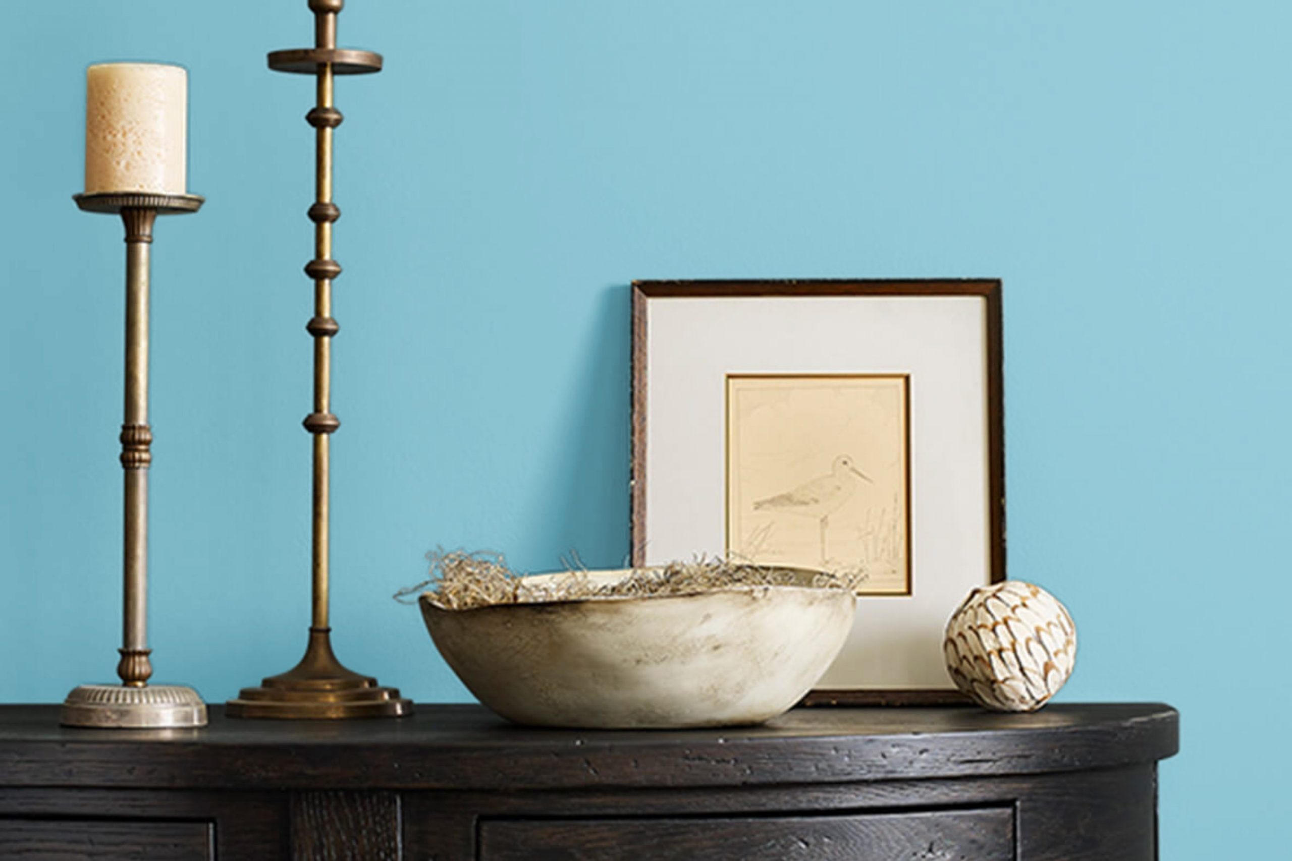
Are you thinking about refreshing your room with a new coat of paint? I was in the same boat recently and came across SW 9047 After the Rain by Sherwin Williams. It’s a color that gently nudges any room from simply existing to gently bringing life and clarity. This shade of blue is soft yet noticeable—an ideal choice for someone looking to introduce a fresh, peaceful vibe into their home without being too intense.
What I particularly enjoy about SW 9047 After the Rain is its adaptability. Whether in a sun-soaked living room or a dimly lit bathroom, this color adjusts beautifully, reflecting varying moods depending on the lighting. It pairs well with both modern and traditional decor, making it a handy palette choice for different rooms and styles.
If you are on the lookout for a color that enhances calmness and brings a gentle pop of character, consider giving SW 9047 After the Rain a chance. Its subtle tones might be just what you need to create a peaceful room that feels both inviting and invigorating.
What Color Is After the Rain SW 9047 by Sherwin Williams?
“After the Rain” by Sherwin Williams is a soft, subtle hue that effectively brightens rooms with its gentle blend of colors. This color, with its hint of lavender undertone, is light and airy, making it perfect for creating a fresh, calming atmosphere in any room. It works exceptionally well in interior styles that emphasize simplicity and light, such as Scandinavian, minimalist, or modern contemporary designs.
This shade pairs beautifully with natural materials like light wooden floors, wicker, or linen textiles, enhancing its airy quality. Incorporating elements like glass or metallic finishes like silver or brushed nickel can also complement the softness of the color, adding a touch of crispness to the overall aesthetic. Textures play a crucial role when working with “After the Rain.” Soft, plush fabrics or fluffy rugs can add depth and warmth to rooms painted in this color, making them feel more inviting.
Overall, “After the Rain” is adaptable for various applications, from bedrooms and bathrooms to living areas. Its ability to reflect light helps make smaller rooms appear larger, offering flexibility in use across different home environments. Whether looking to create a soothing bedroom retreat or a bright, welcoming living area, this color is an excellent choice for a fresh, updated look.

decorcreek.com
Is After the Rain SW 9047 by Sherwin Williams Warm or Cool color?
After the Rain by Sherwin Williams is a soothing shade of blue that brings a sense of calm to any room. It’s a flexible color that works well in many areas of a home, from the living room and bedroom to the bathroom.
When used in a living room, it creates a welcoming atmosphere that encourages relaxation, making it a perfect backdrop for socializing or winding down after a busy day. In bedrooms, this color helps to create a restful environment, which is ideal for sleeping. In bathrooms, After the Rain offers a clean and fresh look, contributing to a spa-like ambiance.
This color also pairs nicely with various decor styles, including modern, traditional, and coastal. It can be combined with white trims or furniture for a crisp look or with warm wood tones for a more grounded feel. Overall, After the Rain is an adaptable choice that can make home rooms more comfortable and visually appealing.
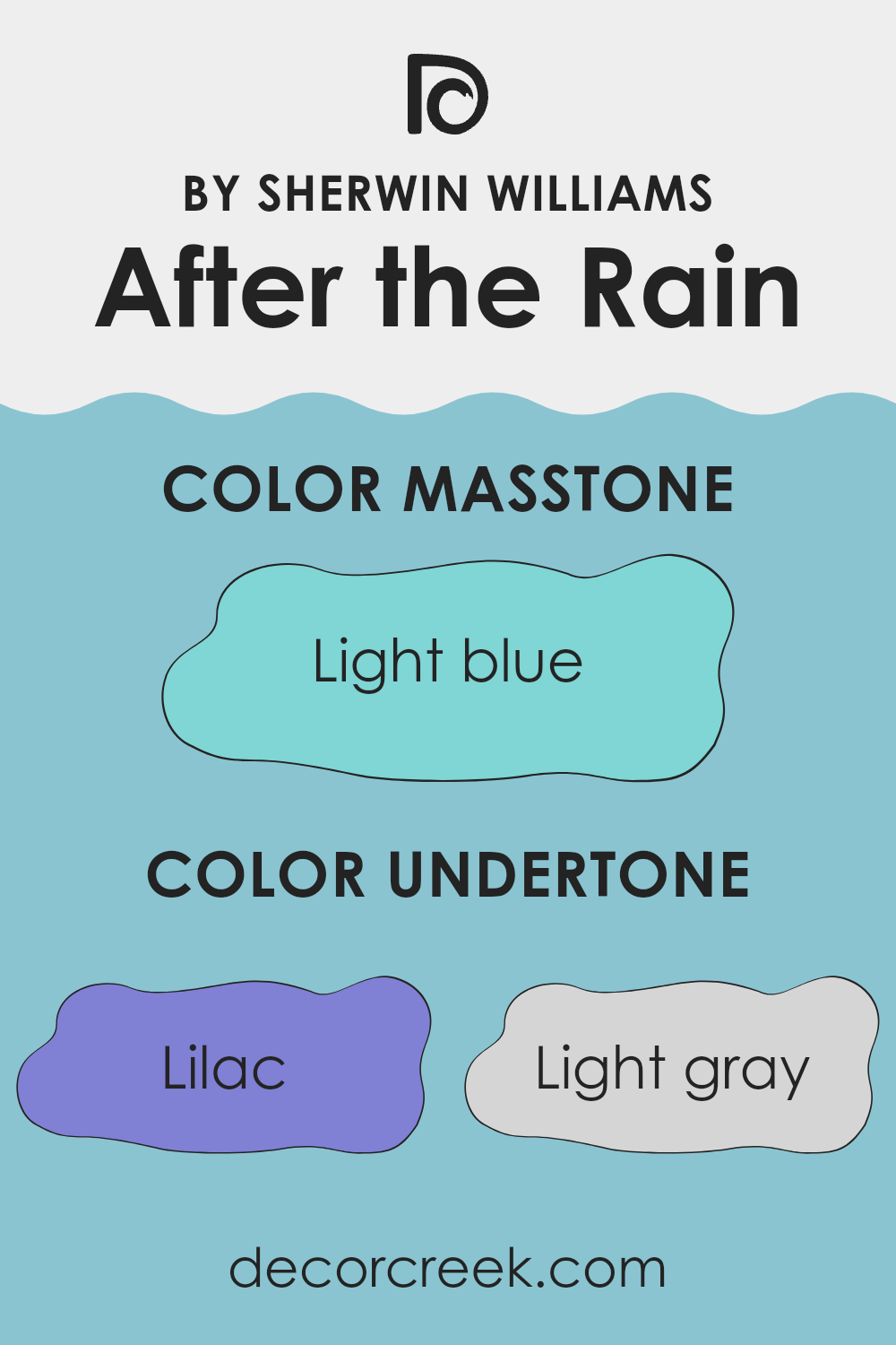
Undertones of After the Rain SW 9047 by Sherwin Williams
“After the Rain” by Sherwin Williams is a complex color that brings together a variety of undertones to create a unique visual effect. The undertones in a paint color are subtle hues mixed into the primary color, impacting how it appears under different lighting conditions and when placed next to other colors.
This particular color includes undertones of lilac, light gray, mint, turquoise, light purple, grey, pale yellow, blue, light turquoise, pale pink, and dark turquoise. Each of these undertones contributes to the overall perception of the color.
For example, lilac and light purple add a gentle, warm touch, making the color feel softer and more welcoming. On the other hand, shades like light gray and grey provide a neutral backdrop, which can help the color blend well with a variety of decor styles and colors.
In an interior setting, “After the Rain” can have a dynamic impact. The blend of cool tones like mint and turquoise with warmer tones like pale yellow and pale pink can make the walls feel alive yet balanced. This color can effectively reflect natural light during the day, giving a room a bright and airy feel, while its deeper tones like dark turquoise can add a hint of depth and interest in artificial lighting.
When used on interior walls, the variety of undertones in “After the Rain” ensures it can complement many different themes and accessories, making it an adaptable choice for many rooms. Whether you’re looking to create a calm backdrop for a bedroom or a stimulating environment in a living room, the array of undertones within this color can help achieve the desired ambiance.
decorcreek.com
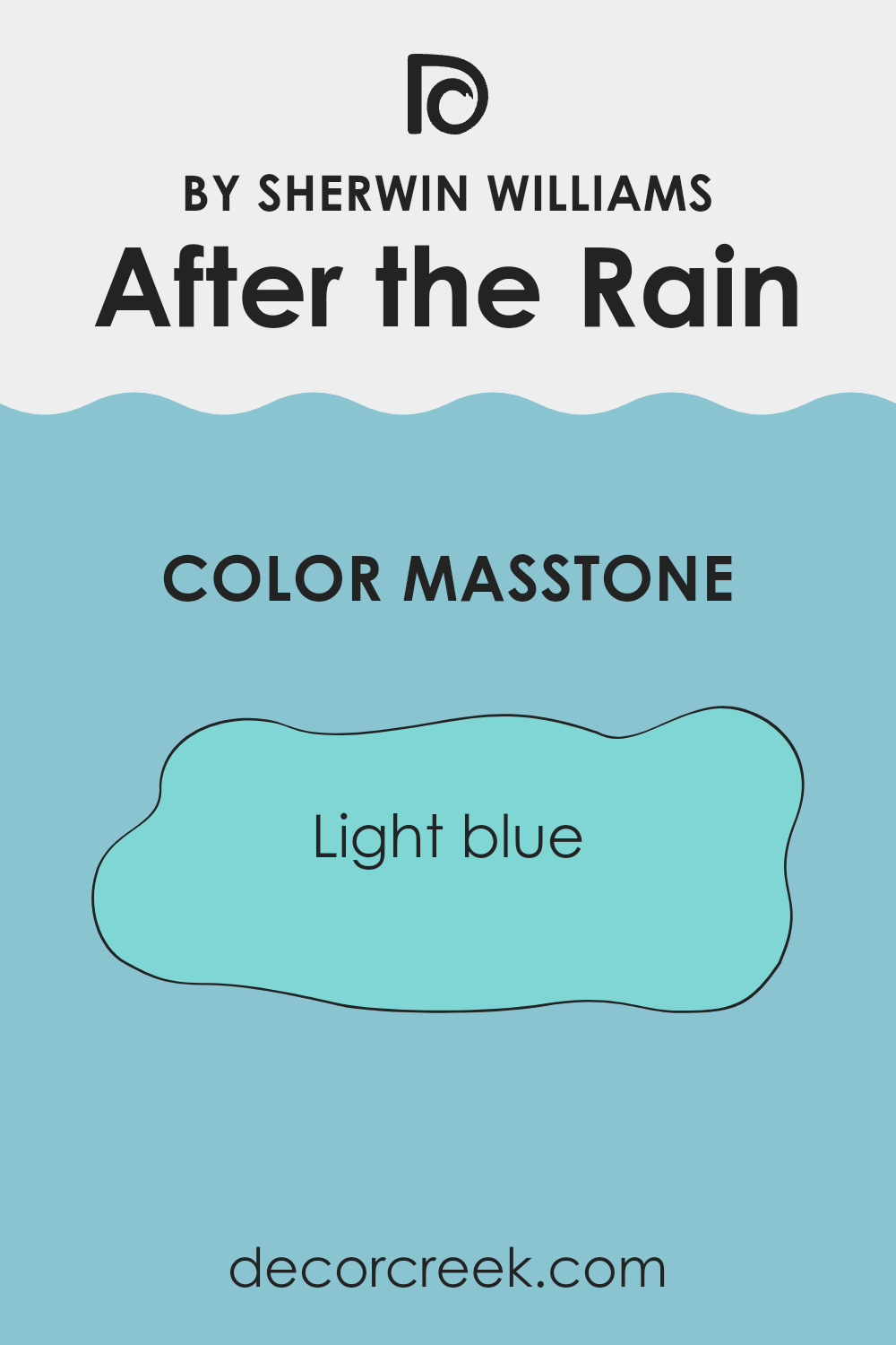
What is the Masstone of the After the Rain SW 9047 by Sherwin Williams?
After the Rain SW 9047 by Sherwin Williams is a soothing light blue color with a subtle touch of freshness, making it an ideal choice for homes. Its masstone, resembling a light blue (#80D5D5), is light and airy, creating a clean and welcoming atmosphere.
This color works well in various rooms in the home because it doesn’t overpower a room but instead adds a gentle hint of color. In bedrooms and bathrooms, it promotes a restful, calm environment, which can help in unwinding after a long day.
In living areas like the living room or kitchen, After the Rain adds a cheerful splash of brightness, especially in well-lit areas where natural light can enhance its soft tones. Its flexibility also allows it to mix well with other colors and décor styles, from modern minimalist to cozy cottage, making it a practical choice for those looking to refresh their home’s look without making a room feel too busy or cramped.
decorcreek.com
How Does Lighting Affect After the Rain SW 9047 by Sherwin Williams?
Lighting has a significant impact on how colors appear in different environments. The shade “After the Rain” by Sherwin Williams, a soothing and adaptable hue, can shift in appearance based on the type of light it’s exposed to. It’s essential to understand this, especially when selecting paint colors for your home.
In artificial light, “After the Rain” tends to lean toward a cozy and warm appearance. This is because most artificial lighting in homes emits a yellowish tone, enhancing the warmer undertones of this color. The result is a snug, inviting vibe, which makes it ideal for living rooms or bedrooms where you seek comfort and softness.
With natural light, the same color can look quite different. Sunlight is generally cooler, so it can bring out the blue and green undertones in “After the Rain,” giving it a more vibrant, fresh look. This means that the color can appear brighter and more dynamic during the day, especially in well-lit rooms.
The orientation of the room also affects how “After the Rain” is perceived. North-faced rooms usually receive less direct sunlight and can make colors look slightly muted and cooler. Here, “After the Rain” might seem a bit more subdued, almost like a soft, gentle mist.
In contrast, south-faced rooms bathed in ample sunlight can make “After the Rain” appear lively and radiant, enhancing its refreshing qualities. It’s a great choice for these rooms, where the color can truly come to life under the influence of brighter, clearer light.
East-facing rooms receive light in the morning when the sun is rising. Here, the paint will look brighter and more cheerful in the morning, then softer as the day progresses.
West-faced rooms, conversely, get the most intense light in the afternoon and evening. “After the Rain” will look more subtle and neutral in the morning, but warmer and richer later in the day when sunlight floods in. Overall, lighting conditions can make a big difference in the appearance of paint colors, and the adaptable nature of “After the Rain” allows it to adjust uniquely across different settings and times of day.

decorcreek.com
What is the LRV of After the Rain SW 9047 by Sherwin Williams?
LRV stands for Light Reflectance Value, which is a measure of the amount of visible and usable light that a paint color reflects when it’s on the walls, versus the light it absorbs.
This value is expressed on a scale traditionally running from zero, which represents a true black that absorbs all light, to the higher end near the top of the scale which would be a pure white reflecting most of the light. The LRV helps in determining how light or dark a color will look once applied to the walls and how it will affect the mood and visual dimensions of a room.
With an LRV of 49.421, the color “After the Rain” by Sherwin Williams sits almost at the midpoint of the scale, which means it neither reflects nor absorbs light excessively. This makes it an adaptable color option, as it is likely to maintain some stability in appearance under different lighting conditions. In a room with ample natural light, “After the Rain” might appear slightly lighter, creating a fresh and airy feel. Conversely, in a dimly lit room, it could provide a cozy, subdued ambiance without darkening the room too much. This balanced LRV makes it a practical choice for various rooms and lighting situations.

decorcreek.com
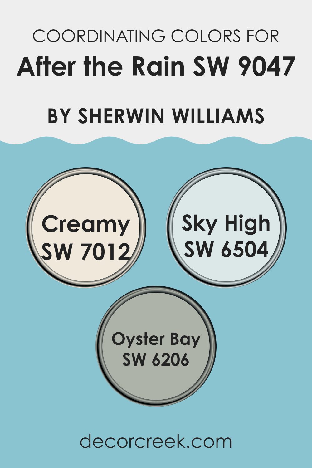
Coordinating Colors of After the Rain SW 9047 by Sherwin Williams
Coordinating colors work together to create a harmonious and aesthetically pleasing color scheme in any room. They are chosen because they complement the main color, helping to achieve a balanced look throughout the room.
When dealing with a color like After the Rain by Sherwin Williams, it’s useful to select coordinating colors that enhance both its tone and mood without overpowering it. Colors such as Creamy, Sky High, and Oyster Bay are excellent choices for this purpose.
Creamy is a warm, soft white that brings a subtle brightness to the room, making it feel cozy and inviting. It’s ideal for trim or as an accent wall where it can lighten the room without creating stark contrasts. Sky High, on the other hand, is a light, ethereal blue that echoes the freshness of a clear sky, adding a calm and airy feel that pairs beautifully with more grounded shades.
Lastly, Oyster Bay is a unique green with gray undertones, offering a touch of refinement and a natural, earthy vibe that complements well with both light and dark hues, completing the look of a room with a touch of nature-inspired freshness. Together, these colors support and enhance the primary color, creating a cohesive and inviting room.
You can see recommended paint colors below:
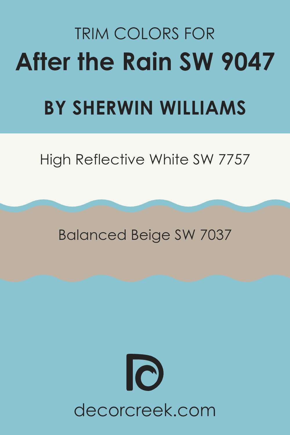
What are the Trim colors of After the Rain SW 9047 by Sherwin Williams?
Trim colors are specifically chosen paint colors that are applied to the molding, door frames, window frames, and other architectural features that stand out from the main wall colors. They are crucial in interior design because they accentuate the architectural details of a room, distinguish different sections of a building, and create a finished, cohesive look.
For instance, when using a subtle and pale hue like After the Rain by Sherwin Williams, selecting the right trim colors can significantly influence the overall ambiance and appearance of the room. High Reflective White and Balanced Beige are two trim colors that complement it very well, drawing attention to the trim details without being too intense compared to the gentle nature of the main color.
High Reflective White, SW 7757, is a bright and very clean white that reflects light beautifully. This makes it an excellent choice for trim, as it provides a crisp contrast that can make the walls appear more defined and the colors more distinct. On the other hand, Balanced Beige, SW 7037, is a warmer, mid-tone beige that offers a soft but distinct boundary to the softer hues like After the Rain. It adds a touch of warmth to the room and provides a subtle contrast that harmonizes with warmer furnishings and decor, maintaining a seamless but defined aesthetic.
You can see recommended paint colors below:
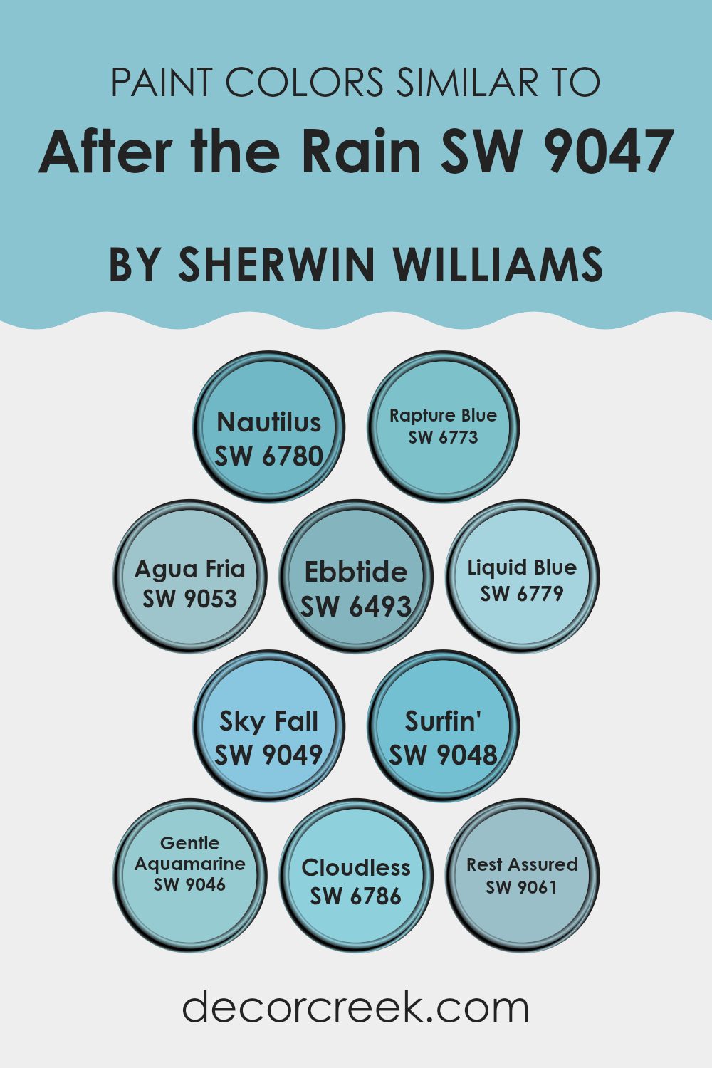
Colors Similar to After the Rain SW 9047 by Sherwin Williams
Similar colors play a crucial role in design and aesthetics because they create a harmonious and cohesive look. Choosing colors that are similar to After the Rain, like Nautilus and Rapture Blue, allows for a smooth visual transition, enhancing the overall ambiance without a striking contrast.
Colors such as Agua Fria and Ebbtide bolster this effect by adding subtle variations that enrich the environment while maintaining a unified theme. This approach is beneficial in painting projects or interior decorating, where the goal is often to establish a fluid and coherent room.
Nautilus is a rich, deep blue that evokes the mystery of the deep sea, while Rapture Blue offers a lighter, airier feel, similar to a clear sky. Agua Fria features a muted turquoise that pairs beautifully with natural elements, and Ebbtide introduces a soothing sea blue, perfect for relaxed rooms.
Liquid Blue and Sky Fall both offer vibrant, sky-inspired hues, with the former leaning towards a more dynamic, bright look and the latter providing a dusky blue that’s reminiscent of a twilight sky. Surfin’ brings a playful, energetic aqua tone to rooms, while Gentle Aquamarine offers a more subdued, gentle touch of blue-green.
Cloudless is as the name implies, a clear, vibrant azure that mimics a perfect, cloud-free day. Finally, Rest Assured is a comforting, soft blue that envelops rooms in a calm, cozy vibe, making it ideal for bedrooms or relaxation areas. These similar colors work together seamlessly, creating inviting and peaceful environments.
You can see recommended paint colors below:
- SW 6780 Nautilus
- SW 6773 Rapture Blue
- SW 9053 Agua Fria
- SW 6493 Ebbtide
- SW 6779 Liquid Blue
- SW 9049 Sky Fall
- SW 9048 Surfin’
- SW 9046 Gentle Aquamarine
- SW 6786 Cloudless
- SW 9061 Rest Assured
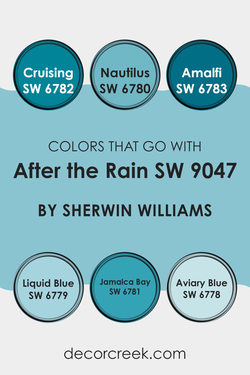
Colors that Go With After the Rain SW 9047 by Sherwin Williams
Choosing colors that complement Sherwin Williams’ After the Rain (SW 9047) is essential for creating a harmonious and appealing room. Each coordinating color brings its own unique vibe to the paint scheme, enhancing the environment and setting the desired mood. For instance, Cruising (SW 6782) is a vibrant sky blue that injects a lively, cheerful energy into the room, while Nautilus (SW 6780) offers a deeper blue tone that adds a calm, grounding effect.
Amalfi (SW 6783) is a bright, refreshing turquoise that seems to bring a bit of the ocean’s breeze indoors, making rooms feel fresh and inviting. Liquid Blue (SW 6779), a softer, lighter version of blue, provides a gentle touch that’s perfect for creating a relaxed atmosphere in rooms meant for unwinding.
Moving on, Jamaica Bay (SW 6781) stands out with its rich, aqua blue, giving a room an energetic splash of color and a fresh vibe. Lastly, Aviary Blue (SW 6778) is like a breath of fresh air with its pale, airy qualities, perfect for enhancing rooms with a subtle touch of peacefulness. Together, these colors complement After the Rain by offering a palette that ranges from stimulating to soothing, allowing for flexibility in achieving different styles and atmospheres in any home.
You can see recommended paint colors below:
- SW 6782 Cruising
- SW 6780 Nautilus
- SW 6783 Amalfi
- SW 6779 Liquid Blue
- SW 6781 Jamaica Bay
- SW 6778 Aviary Blue
How to Use After the Rain SW 9047 by Sherwin Williams In Your Home?
After the Rain SW 9047 by Sherwin Williams is a gentle blue-gray paint color that brings a soothing, fresh feel to any room.
This hue is perfect for creating a relaxed atmosphere in rooms where you want to unwind, like bedrooms or bathrooms. Its light and airy quality can also make small rooms seem bigger and brighter, which is a helpful trick for apartments or rooms with limited natural light.
You can use After the Rain in a variety of decorating styles. It pairs beautifully with white trim for a clean, classic look, or you can match it with darker furniture and accents for a more striking contrast. If you like a coastal or nautical theme, this color works well with sandy tones and blues to mimic the beachy environment. Whether you paint all the walls in a room or just one as an accent, After the Rain offers a fresh and calming backdrop to your home decor.
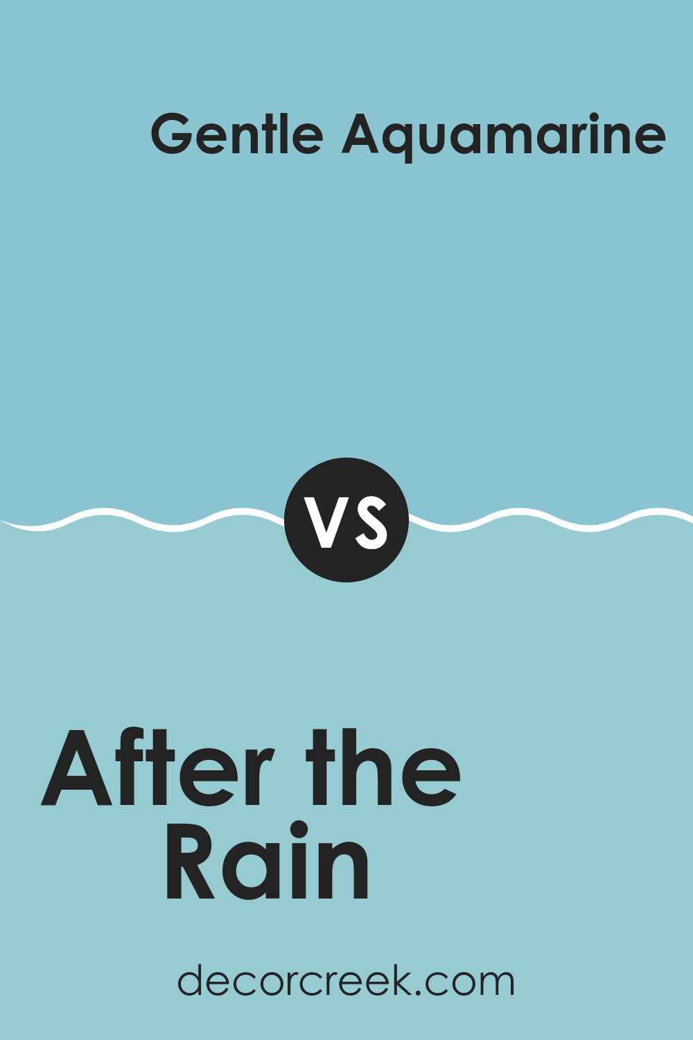
After the Rain SW 9047 by Sherwin Williams vs Gentle Aquamarine SW 9046 by Sherwin Williams
“After the Rain” and “Gentle Aquamarine” are two soothing paint colors by Sherwin Williams. “After the Rain” is a soft, muted gray with a hint of blue. This color brings a calm, gentle vibe to a room, making it a great choice for creating a relaxing room. It pairs well with modern and traditional decor, providing a neutral backdrop that lets furnishings stand out.
On the other hand, “Gentle Aquamarine” is a light, refreshing aquamarine shade that adds a splash of subtle color to a room. It’s reminiscent of the ocean and the sky on a clear sunny day. This color is perfect for those looking to add a light, airy feel to their interiors. It works wonderfully in bathrooms or bedrooms, offering a sense of freshness and calm.
Although both colors promote a peaceful atmosphere, “After the Rain” leans towards a more neutral palette, while “Gentle Aquamarine” brings a touch of soft, cheerful color.
You can see recommended paint color below:
- SW 9046 Gentle Aquamarine
After the Rain SW 9047 by Sherwin Williams vs Rest Assured SW 9061 by Sherwin Williams
“After the Rain” by Sherwin Williams is a soft, subtle gray that carries a hint of blue, which gives it a calm, refreshing feel. This color works well in rooms that aim for a light, airy atmosphere, and it pairs beautifully with brighter accents or soft neutrals.
On the other hand, “Rest Assured” is a darker, moodier gray that leans more towards a true neutral gray. This shade is ideal for areas that require a bit of gravity without becoming too heavy or too intense. It’s perfect for creating a cozy, inviting environment, and it complements a wide range of decor styles.
Overall, “After the Rain” is better suited for a breezy, light-filled room, while “Rest Assured” is excellent for adding depth and warmth to a room. Both colors offer unique vibes and can effectively enhance different room settings depending on the desired mood and function.
You can see recommended paint color below:
- SW 9061 Rest Assured

After the Rain SW 9047 by Sherwin Williams vs Agua Fria SW 9053 by Sherwin Williams
After the Rain by Sherwin Williams is a light grey with cool blue undertones, giving it a fresh and clean look. It’s perfect for rooms where you want a subtle yet modern feel, providing a gentle backdrop that complements more vibrant colors.
Agua Fria, on the other hand, is a deeper teal that leans towards a more pronounced and energetic presence. This color is ideal for adding character and a touch of drama to any room, making it a great choice for accent walls or areas where you want to make a statement.
Both colors offer unique vibes: After the Rain is more understated and calm, while Agua Fria is bolder and more striking, offering a lively contrast in any interior palette.
You can see recommended paint color below:

After the Rain SW 9047 by Sherwin Williams vs Sky Fall SW 9049 by Sherwin Williams
“After the Rain” and “Sky Fall” by Sherwin Williams are two colors that evoke different moods inspired by weather and sky themes. “After the Rain” is a soft, gentle gray with a hint of blue, reflecting the calm and freshness you often feel in the atmosphere following a rainstorm. It’s a subtle color, well-suited for creating a soothing environment in interior rooms like living rooms or bedrooms.
On the other hand, “Sky Fall” is a deeper, more pronounced shade of blue that mirrors the rich tones of the sky during a dramatic, late afternoon sunset. This color has a bolder presence and can add a striking touch to a room, making it ideal for an accent wall or for rooms where a strong, visual impact is desired.
Both colors offer unique aesthetic appeals: “After the Rain” brings a light, airy feel, while “Sky Fall” provides depth and intensity. Choosing between them depends on the desired mood and tone for the room.
You can see recommended paint color below:

After the Rain SW 9047 by Sherwin Williams vs Rapture Blue SW 6773 by Sherwin Williams
“After the Rain” by Sherwin Williams is a soft, gentle gray with subtle blue undertones. This color feels light and airy, making it perfect for creating a calm, soothing atmosphere in any room. It complements a wide range of decor styles and works well in rooms that need a touch of neutrality without feeling too cold.
On the other hand, “Rapture Blue” is a vibrant, striking blue that adds a splash of cheer and brightness to rooms. This shade is more intense and lively, providing a bold statement when used on walls or accents. It particularly stands out in modern or coastal themes, where its brightness can be balanced with neutral tones and natural materials.
Both colors offer unique vibes: “After the Rain” providing a subdued backdrop for various interiors, and “Rapture Blue” bringing energy and focus to a room. Whether you prefer the muted subtlety of the first or the dynamic brightness of the second, both paints can enhance your home beautifully.
You can see recommended paint color below:
- SW 6773 Rapture Blue

After the Rain SW 9047 by Sherwin Williams vs Liquid Blue SW 6779 by Sherwin Williams
After the Rain and Liquid Blue are two distinct paint colors by Sherwin Williams that offer unique vibes for any room. After the Rain is a soft, subtle shade, akin to the sky clearing after a storm. It has a muted quality, making it easy to pair with brighter or darker colors in home decor. It’s perfect for creating a calm, cozy atmosphere in rooms such as living rooms or bedrooms.
On the other hand, Liquid Blue is a vibrant and lively color. It has a freshness that resembles clear, sunny skies. This color is brighter and tends to energize a room, making it suitable for areas where you want to add a splash of cheerfulness, like bathrooms or kitchens.
Both colors provide different moods and can work well depending on what feelings you want to inspire in a room. After the Rain is more reserved and understated, while Liquid Blue is bolder and more dynamic.
You can see recommended paint color below:

After the Rain SW 9047 by Sherwin Williams vs Ebbtide SW 6493 by Sherwin Williams
“After the Rain” by Sherwin Williams is a soothing, light gray shade that carries a sense of calm and subtlety. It’s a neutral color that works well as a backdrop in any room, providing a clean and understated look.
On the other hand, “Ebbtide” is a vibrant teal that offers a lively burst of color, ideal for adding a fresh and cheerful touch to rooms. This shade is more intense and energetic compared to the gentle neutrality of “After the Rain.”
While “After the Rain” serves as a perfect canvas for any decor, allowing other elements to stand out, “Ebbtide” is a statement color that can become the focal point of a room, creating a dynamic and refreshing ambiance. Overall, “After the Rain” is best for those who prefer subtle refinement, whereas “Ebbtide” suits those looking to inject vibrancy and energy into their environment.
You can see recommended paint color below:

After the Rain SW 9047 by Sherwin Williams vs Surfin’ SW 9048 by Sherwin Williams
“After the Rain” and “Surfin” by Sherwin Williams are two distinct shades that bring different vibes to a room. “After the Rain” is a muted gray with a hint of blue, giving it a cool and calm feel which is ideal for creating a peaceful environment, perfect for places like bedrooms or studies.
On the other hand, “Surfin” is a vibrant teal that seems more lively and energetic. This color could be great for areas where you want to add some cheerful energy, such as a kitchen or a playroom.
While “After the Rain” sets a more subdued and neutral backdrop, “Surfin” adds a punch of color that’s bold and fun. Each color has its own unique appeal, depending on the mood you want to set in your room.
You can see recommended paint color below:
- SW 9048 Surfin’
After the Rain SW 9047 by Sherwin Williams vs Cloudless SW 6786 by Sherwin Williams
“After the Rain” and “Cloudless” by Sherwin Williams are two distinct colors, each bringing its own unique vibe. “After the Rain” is a gentle gray with a subtle hint of blue. It evokes a feeling of calmness and is perfect for creating a soothing environment. This color is adaptable enough to be used in any room, adding a touch of quiet refinement without overpowering other design elements.
On the other hand, “Cloudless” is a vibrant, pure blue that mimics a clear sky on a sunny day. It is a lively color that can brighten up any room, making it feel more open and airy. It’s especially great for rooms where you want to inject energy and a sense of cheerfulness.
In comparison, while “After the Rain” tends to keep things low-key and subtle, “Cloudless” stands out with its brighter and more energetic feel. Each color serves different purposes depending on the mood you want to set in a room.
You can see recommended paint color below:
- SW 6786 Cloudless

After the Rain SW 9047 by Sherwin Williams vs Nautilus SW 6780 by Sherwin Williams
“After the Rain” and “Nautilus” by Sherwin Williams are two distinct colors that offer unique vibes for any room. “After the Rain” is a soft, light gray shade that has a clean and subtle feel.
It’s a flexible color that can blend easily with various decor styles, giving rooms a fresh and airy look. In contrast, “Nautilus” is a bold, bright turquoise. This color adds a vibrant splash and can create a lively, energetic environment.
It’s perfect for accent walls or areas where you want to inject some cheerfulness. While “After the Rain” provides a calm, neutral background, “Nautilus” stands out and makes a statement. Together, these colors could complement each other, with “Nautilus” adding pops of color to the neutral palette of “After the Rain.”
You can see recommended paint color below:
- SW 6780 Nautilus

Writing about SW 9047 After the Rain by Sherwin Williams has been a fun experience! This color is really special because it looks like the sky when a rainstorm has just finished. It has this cool, calm, blue-gray shade that makes any room feel fresh, like a new day.
Using this color in our house helped me see how it can change the way a room feels. In our living room, this paint made it so relaxing, like sitting under a cozy blanket on a quiet morning. We also tried it in the bathroom, and it felt like being in a calm, peaceful pond.
I learned that colors like After the Rain are perfect if you want your home to feel calm and refreshing. It’s a color that is easy to look at all day, whether you’re reading, playing games, or just hanging out. If someone asks me about a color that would make their home feel like a peaceful spot after a rainstorm, I’d definitely say to try SW 9047 After the Rain by Sherwin Williams. It’s like bringing a little piece of the peaceful outside world into your home!

decorcreek.com
Ever wished paint sampling was as easy as sticking a sticker? Guess what? Now it is! Discover Samplize's unique Peel & Stick samples.
Get paint samples

