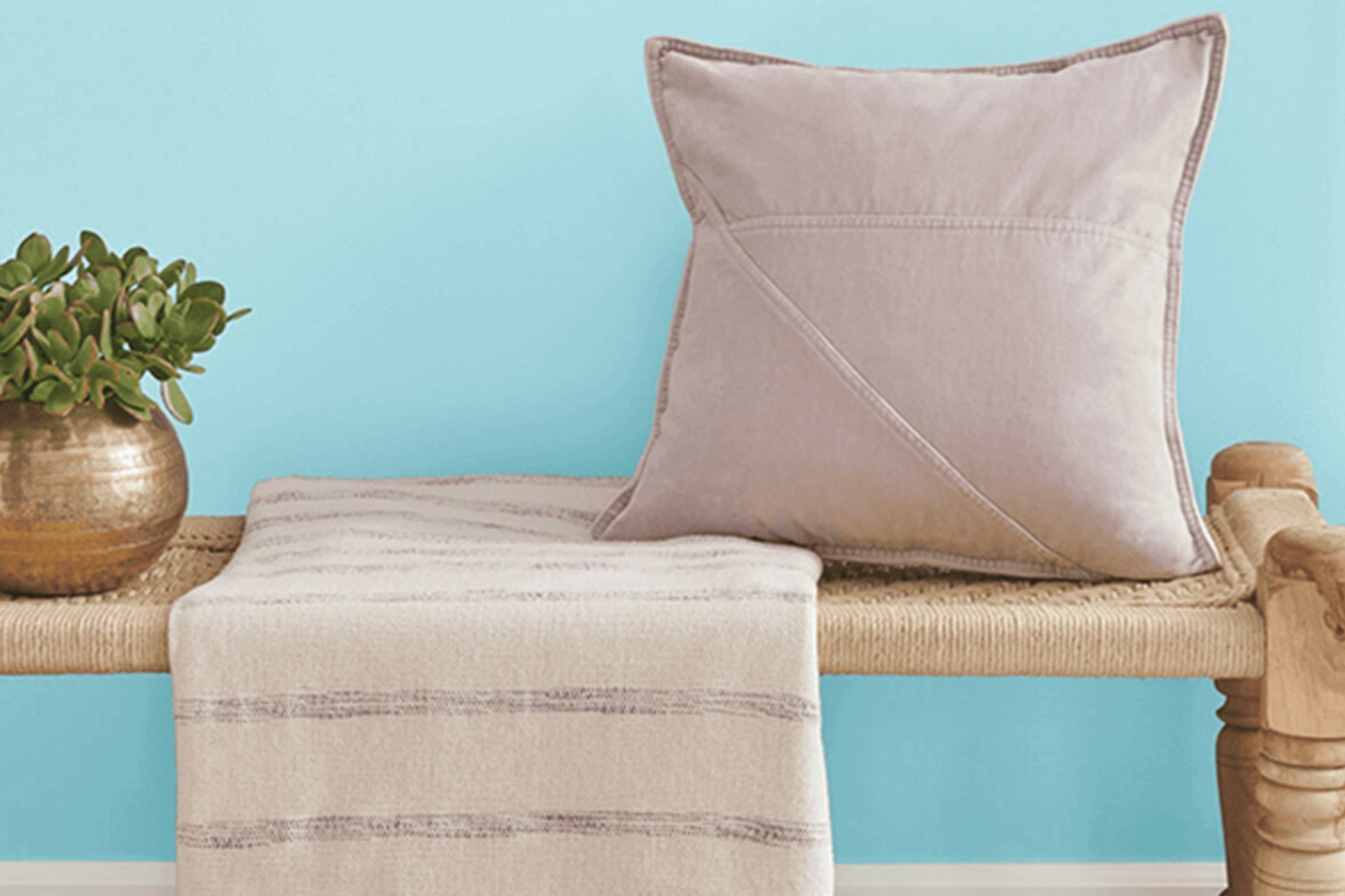
When looking for a color that brings a sense of calm and freshness to a room, SW 6785 Quench Blue from Sherwin Williams might catch your attention. It strikes a perfect balance between a vibrant pop and a soothing hue, great for creating a lively yet relaxed atmosphere. This color can immediately brighten a room, making it a popular choice for both interiors and exteriors.
I enjoy how Quench Blue can add a refreshing twist to a wide range of rooms. Whether you want to revitalize a living room, kitchen, or even a bathroom, this color can bring life without overpowering other design elements. Pairing it with neutral tones or natural materials can create a pleasing contrast and enhance the overall effect.
What I’ve noticed about Quench Blue is its versatility. It works well in modern settings but can also complement more traditional environments.
By using it thoughtfully, you can create a cohesive look that feels both inviting and invigorating. Quench Blue, with its lively yet calm essence, offers a great opportunity to experiment with different styles and moods in any room.
What Color Is Quench Blue SW 6785 by Sherwin Williams?
Quench Blue by Sherwin Williams is a lively and refreshing shade of blue. It brings to mind clear summer skies and sparkling oceans. This vibrant color can add a burst of energy and cheerfulness to any room, making it an excellent choice for living areas, kitchens, or even playful children’s rooms.
In terms of interior styles, Quench Blue works beautifully in coastal and nautical themes, enhancing the breezy and light feel typical of these styles. It is also a great fit for modern and contemporary rooms, where it can add a striking contrast to neutral or monochromatic palettes.
For those who enjoy a more eclectic or bohemian look, Quench Blue can serve as a dramatic backdrop that highlights various colorful accents.
When it comes to pairing materials and textures, Quench Blue complements natural elements like light woods, rattan, and seagrass, which accentuate its beachy vibe.
It also pairs well with crisp white for a clean and fresh combination. Metallics, such as silver or chrome, can give the room a sleek and modern edge when paired with this vibrant blue.
Textures like linen or cotton in neutral tones will work effortlessly, offering balance and a sense of harmony that prevents the room from feeling too strong.
Is Quench Blue SW 6785 by Sherwin Williams Warm or Cool color?
Quench Blue SW 6785 by Sherwin Williams is a color that brings a refreshing and vibrant feel to any home. It’s a medium blue shade that isn’t too dark or too light, making it quite flexible. When used in a room, Quench Blue can create a lively and cheerful atmosphere.
It’s a great choice for rooms where you want to feel energized and awake, like kitchens or bathrooms. The color pairs well with neutral tones like white, gray, or beige, which help balance its brightness.
In living rooms or bedrooms, using Quench Blue as an accent wall can add a touch of interest without making the room feel too strong. It looks great when combined with natural elements such as wood furniture or plants. Additionally, this color can make small rooms feel larger by adding a sense of depth. Overall, Quench Blue SW 6785 is an excellent option for those looking to add a splash of color to their home in a fun and inviting way.
Undertones of Quench Blue SW 6785 by Sherwin Williams
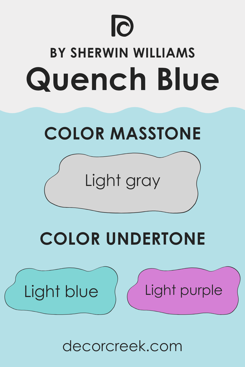
Quench Blue by Sherwin Williams is a flexible paint color with unique undertones that influence how we perceive it on walls. Its primary appearance is a rich blue, but it includes subtle hints of other hues like light blue, light purple, pale yellow, lilac, mint, pale pink, and grey. These undertones play a major role in changing how the color looks under different lighting conditions and in various rooms.
For instance, the light blue and mint undertones can make Quench Blue feel refreshing and airy, perfect for creating a calming atmosphere in a bedroom or bathroom. The light purple and lilac hints add a touch of warmth, making the color feel cozier and more inviting for living rooms.
Pale yellow and pale pink undertones add subtle warmth and brightness, preventing the blue from feeling too cold. Meanwhile, grey undertones bring a sense of balance and neutrality, ensuring the color remains flexible and easy to use.
Under different lighting conditions, these undertones can become more or less apparent, altering the room’s overall feel. In natural light, the color might seem brighter and fresher, while artificial lighting could highlight its warmer undertones. This adaptability makes Quench Blue a great choice for anyone looking to create a dynamic and welcoming room.
What is the Masstone of the Quench Blue SW 6785 by Sherwin Williams?
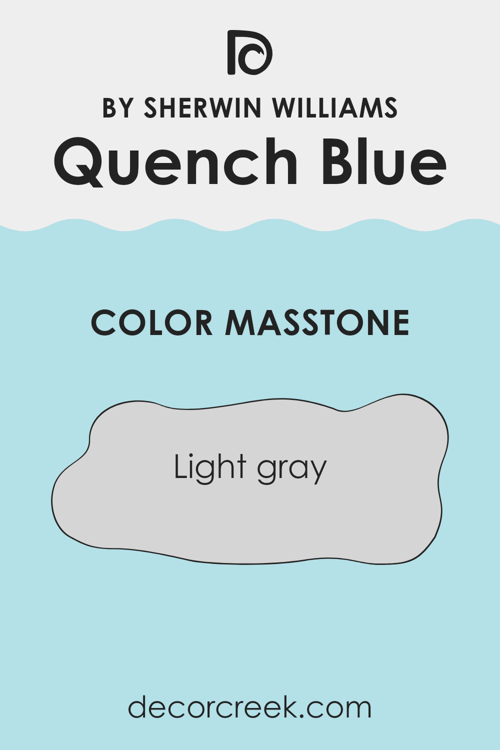
Quench Blue (SW 6785) by Sherwin Williams is a light and breezy color that brings a sense of calmness to any room. Its masstone, a subtle light gray (#D5D5D5), makes it flexible and soft. This gentle gray undertone allows the blue to blend seamlessly into various rooms, making it a great choice for home interiors.
In living rooms, this color creates an inviting and peaceful atmosphere, perfect for relaxation and family time. In bedrooms, it encourages restfulness and helps people feel at ease. The light gray tone of Quench Blue gives it a neutral quality, so it pairs well with a wide range of colors and materials.
It works beautifully with whites, creams, and other neutrals, or it can be enhanced with darker accents like navy or charcoal for added contrast. Overall, this color is ideal for those looking to bring a touch of calm and understated elegance to their homes.
How Does Lighting Affect Quench Blue SW 6785 by Sherwin Williams?
Lighting plays a crucial role in how colors are perceived. Quench Blue by Sherwin Williams is a vibrant color that can look different depending on the lighting conditions.
In natural light, colors can appear more vivid and accurate to how they were intended. However, this can vary based on the direction of the light. In artificial light, whether it’s incandescent, fluorescent, or LED, this color may change appearance because each type of bulb emits a different color temperature.
Incandescent lights cast a warmer glow, which might make Quench Blue appear slightly warmer or more muted. Fluorescent lights often give off a cooler tone, which could enhance the blue aspects of the color.
In a north-facing room, natural light tends to be cooler and dimmer, which can make Quench Blue appear grayer or more subdued. North light tends not to change much throughout the day, providing a constant, but sometimes dull, illumination. In these rooms, adding warm artificial lighting can help balance the cooler tones.
South-facing rooms receive the most consistent sunlight throughout the day, often bright and warm. This light can enrich the brightness of Quench Blue, making it appear more vibrant and lively. The constant exposure to warm, natural light can showcase the true nature of this color.
In east-facing rooms, the morning light is bright and warm, which can make Quench Blue look fresh and crisp at the beginning of the day. As the sun moves, the light becomes cooler and softer, thus changing the way the color is perceived, potentially making it feel calmer or more muted in the afternoon.
West-facing rooms benefit from warm, golden light in the late afternoon and evening. Quench Blue will look richer during these times as the warm light deepens the color. In the morning, the light is softer, which might make the blue appear gentler and cooler.
Overall, Quench Blue’s look is highly dependent on the type and direction of light, shifting its appearance from bright and vivid to calm and subdued.
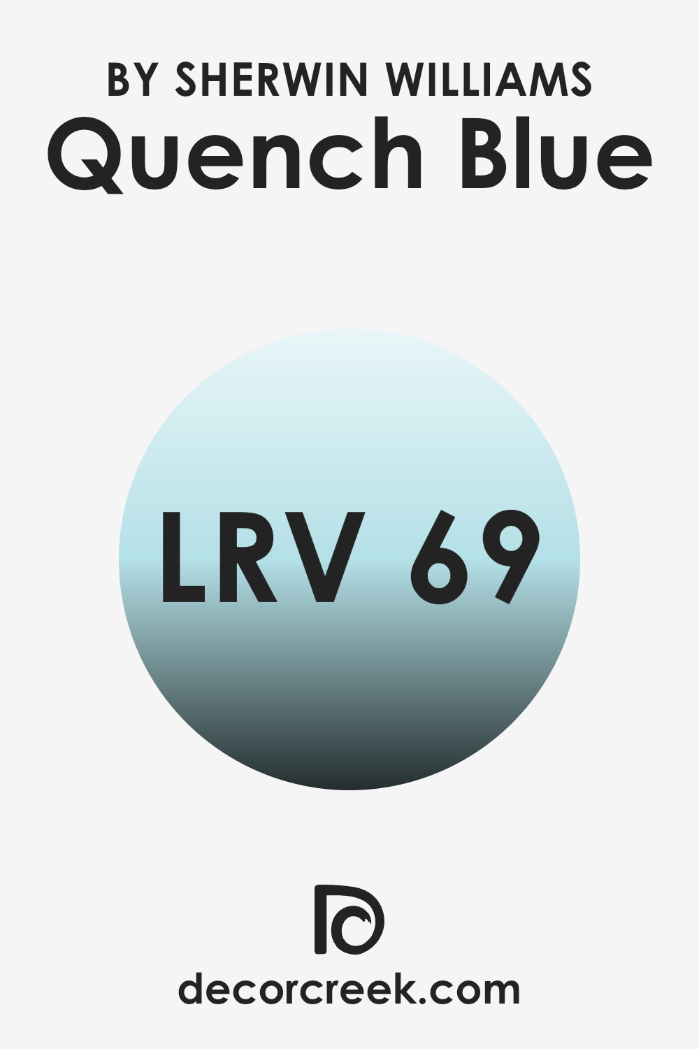
What is the LRV of Quench Blue SW 6785 by Sherwin Williams?
Light Reflectance Value, or LRV, measures how much light a color reflects. It is a scale from 0 to 100, where 0 is absolute black (absorbing all light) and 100 is pure white (reflecting all light). Colors with a high LRV will reflect more light, making a room feel brighter and more spacious.
This can be important when choosing paint, as it affects both how the color looks on the walls and how it influences the overall feel of the room. The color you mentioned has an LRV of 68.606, which is relatively high.
This means it reflects a good amount of light, making it a bright and airy choice for a room. This color will make an area feel more open and can enhance natural light. Its higher LRV also helps it maintain its color vibrancy even in dimmer conditions, ensuring the room doesn’t feel too dark. Thus, it will keep rooms feeling light and welcoming.
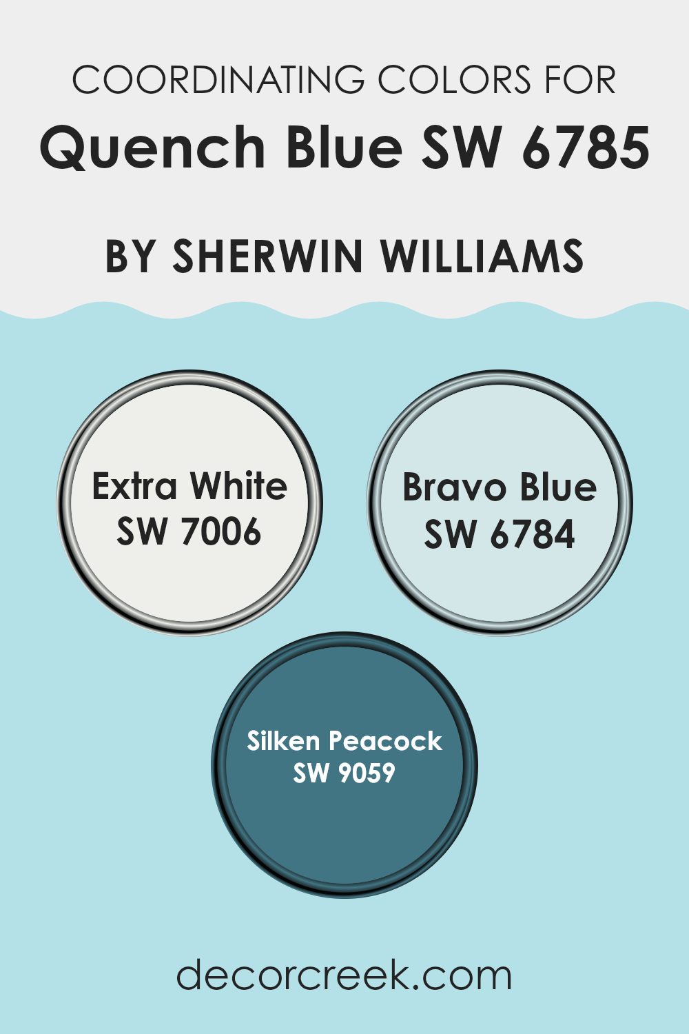
Coordinating Colors of Quench Blue SW 6785 by Sherwin Williams
Coordinating colors are hues that work well together, creating a pleasing and balanced look in a room. When choosing colors to match with Quench Blue, a vibrant and refreshing shade, it’s important to select tones that complement its lively character. The key is to find hues that enhance each other, resulting in a unified appearance.
SW 7006, known as Extra White, is a pure, clean white that serves as a perfect backdrop to Quench Blue. It adds a crisp contrast, making the blue pop while creating a bright and airy feel. SW 6784, Bravo Blue, is another suitable option.
This shade is a bit lighter and has a playful, cheerful quality that complements Quench Blue nicely. It keeps the palette vibrant and dynamic. SW 9059, Silken Peacock, rounds out the selection. This color offers a deeper, richer tone, with a hint of elegance and depth. It balances the other hues, adding refinement without being too strong. Together, these colors create a well-coordinated palette that is both refreshing and inviting, perfect for any room that needs a touch of color and harmony.
You can see recommended paint colors below:
- SW 7006 Extra White
- SW 6784 Bravo Blue
- SW 9059 Silken Peacock
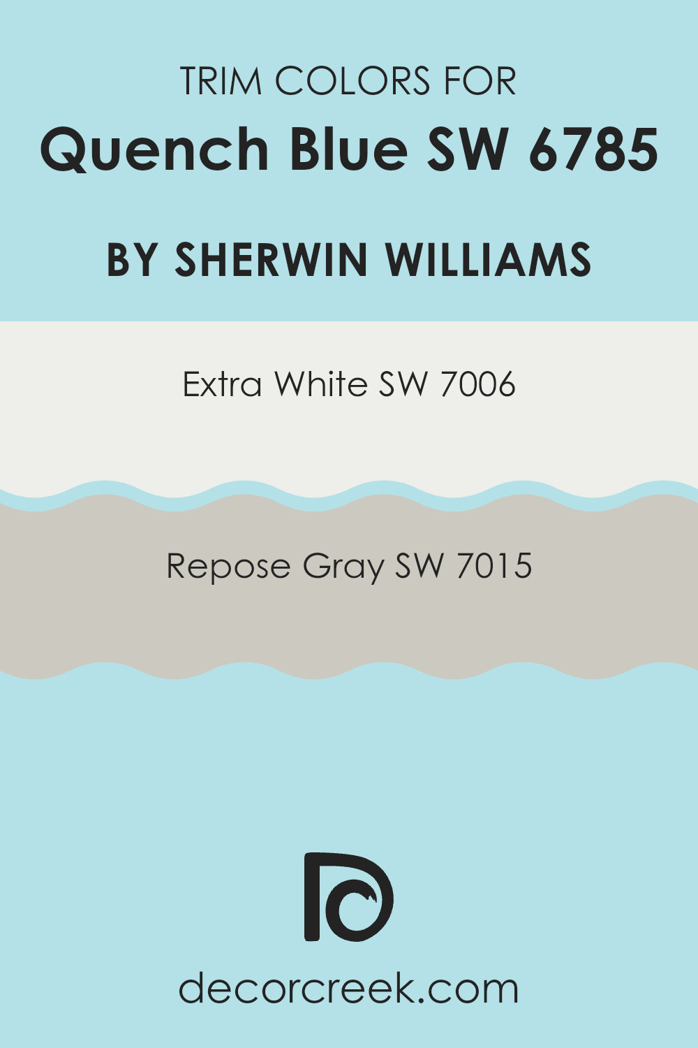
What are the Trim colors of Quench Blue SW 6785 by Sherwin Williams?
Trim colors are the shades used for the finishing touches on doors, windows, and other architectural features, often creating a contrast with the primary wall color of a room. When paired with Quench Blue SW 6785 by Sherwin Williams, trim colors are key in balancing the vibrant energy of the main hue.
Quench Blue is a bold shade that evokes a sense of freshness and life. Using trim colors like SW 7006 – Extra White and SW 7015 – Repose Gray can enhance this effect by offering a crisp and clean look that frames this blue beautifully, balancing its intensity while providing visual interest and depth.
SW 7006 – Extra White is a bright, clean white that acts as a perfect neutral pairing, making the blue seem even more vibrant. This color offers a fresh, airy feel that brings a sense of purity to the surroundings. On the other hand, SW 7015 – Repose Gray offers a soft and warm gray that provides a gentle contrast to Quench Blue.
It adds depth and sophistication, making rooms feel welcoming and grounded without taking attention away from the prominent blue tone. By carefully choosing trim colors, you can create a harmonious environment where the main color stands out while still looking cohesive and visually appealing.
You can see recommended paint colors below:
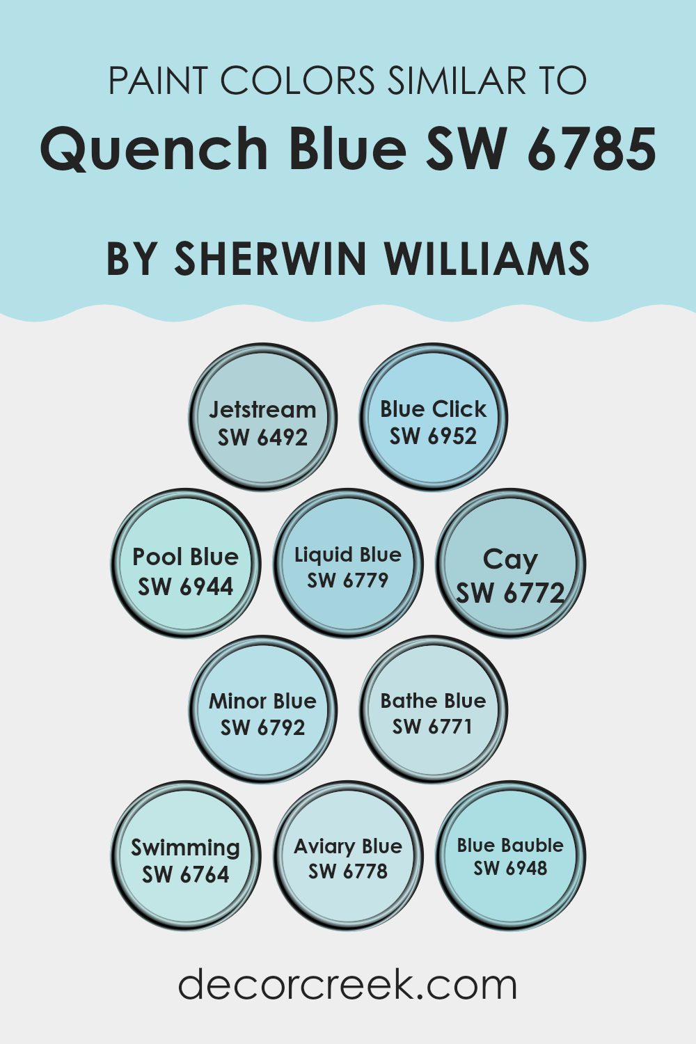
Colors Similar to Quench Blue SW 6785 by Sherwin Williams
Similar colors to Quench Blue, such as Jetstream, Blue Click, Pool Blue, Liquid Blue, and Cay, can create a harmonious and soothing atmosphere in any room. Jetstream is a soft, breezy color that feels like a gentle sky, while Blue Click offers a more intense shade that adds a striking visual element. Pool Blue is reminiscent of refreshing waters, bringing a sense of relaxation. Liquid Blue embodies a vibrant, lively touch that’s full of energy. Cay provides a cool, calm hue that’s perfect for balancing brighter tones.
Minor Blue, Bathe Blue, Swimming, Aviary Blue, and Blue Bauble all beautifully complement Quench Blue, offering subtle variations in tone. Minor Blue is a muted yet striking shade that works well for calm interiors. Bathe Blue feels like a peaceful day at the spa, offering a refreshing touch.
Swimming is an inviting shade that feels like the edge of a tranquil pool, while Aviary Blue creates a gentle hint of color that’s easy on the eyes. Blue Bauble is a playful, vibrant tone that adds a pop of excitement without overpowering. By using these similar colors, you can effortlessly create a cohesive and appealing look that infuses any room with calmness and understated beauty.
You can see recommended paint colors below:
- SW 6492 Jetstream
- SW 6952 Blue Click
- SW 6944 Pool Blue
- SW 6779 Liquid Blue
- SW 6772 Cay
- SW 6792 Minor Blue
- SW 6771 Bathe Blue
- SW 6764 Swimming
- SW 6778 Aviary Blue
- SW 6948 Blue Bauble
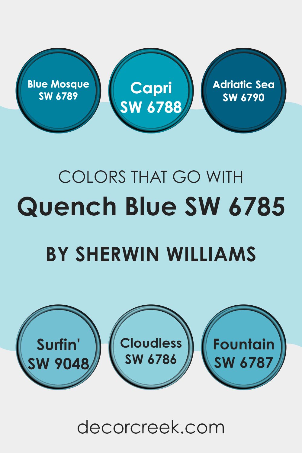
Colors that Go With Quench Blue SW 6785 by Sherwin Williams
When it comes to decorating with Quench Blue SW 6785 by Sherwin Williams, choosing complementary colors can make the overall design more cohesive and visually appealing. Quench Blue is a bold and vibrant shade, so pairing it with other colors like SW 6789 – Blue Mosque and SW 6788 – Capri can create a lively and energetic atmosphere.
Blue Mosque is a rich, deep blue that adds depth and intensity, while Capri is a lighter, more playful blue with a hint of green, providing a refreshing contrast. These shades work together to create a harmonious blue palette, each contributing its own vibe, yet maintaining a clear connection to Quench Blue.
On the other hand, SW 6790 – Adriatic Sea and SW 9048 – Surfin’ bring a coastal feel into the mix. Adriatic Sea is a slightly muted blue-green, reminiscent of ocean waters, perfect for adding a touch of relaxation and balance. Surfin’ is a brighter, cheerful blue that injects a sense of fun and positivity into the room. For a softer look, SW 6786 – Cloudless and SW 6787 – Fountain are perfect. Cloudless is a light, airy blue with a peaceful presence, while Fountain offers a gentle teal touch with a soft and quiet feel. Together, these colors can enhance the presence of Quench Blue, promoting a balanced and welcoming atmosphere.
You can see recommended paint colors below:
- SW 6789 Blue Mosque
- SW 6788 Capri
- SW 6790 Adriatic Sea
- SW 9048 Surfin’
- SW 6786 Cloudless
- SW 6787 Fountain
How to Use Quench Blue SW 6785 by Sherwin Williams In Your Home?
Quench Blue SW 6785 by Sherwin Williams is a cool and refreshing color that can bring a sense of calmness to any room. This gentle shade of blue works well in different parts of the home, offering a flexible option for a variety of design styles.
In a bedroom, Quench Blue can create a relaxing and peaceful atmosphere, perfect for winding down after a long day. Pair it with soft white or light gray bedding to keep the room feeling airy and open. In living rooms, it can add a pop of color without feeling too bold, making the room inviting for family and friends. Use it on an accent wall to complement neutral furniture.
In the kitchen, Quench Blue can refresh cabinets or a backsplash, bringing a lively touch that pairs well with stainless steel appliances or natural wood finishes. This color can also make smaller rooms like bathrooms feel larger and more open. Overall, Quench Blue is a flexible choice for home decor.
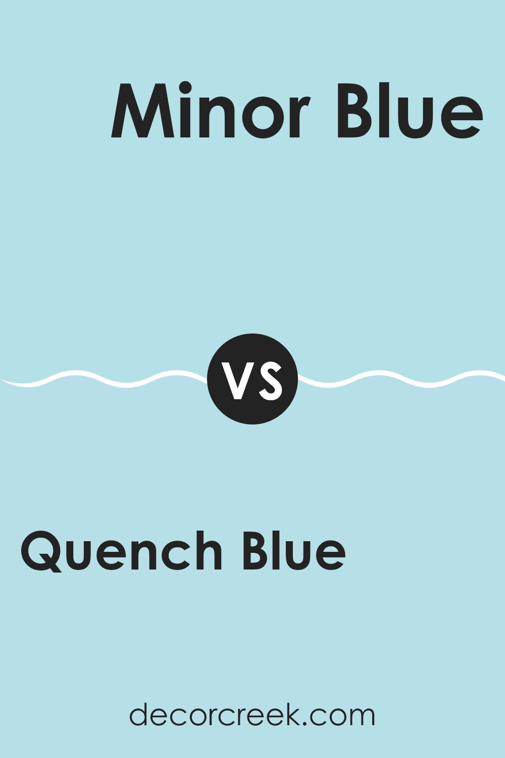
Quench Blue SW 6785 by Sherwin Williams vs Minor Blue SW 6792 by Sherwin Williams
Quench Blue SW 6785 and Minor Blue SW 6792 are both beautiful shades of blue from Sherwin Williams, but they have distinct characteristics. Quench Blue is a bold and vibrant color that provides a strong, energetic feel to any room.
It’s a bright blue that can add a sense of freshness and energy to a room. On the other hand, Minor Blue is softer and more subdued. It has a calming, gentle appearance, making it ideal for creating a relaxing atmosphere.
While Quench Blue stands out due to its intensity, Minor Blue blends more easily with neutral tones, offering a subtle touch of color. Both colors can be used effectively depending on the mood and style you want to achieve. Quench Blue is great for making a strong statement, while Minor Blue is excellent for a more peaceful and quiet setting.
You can see recommended paint color below:
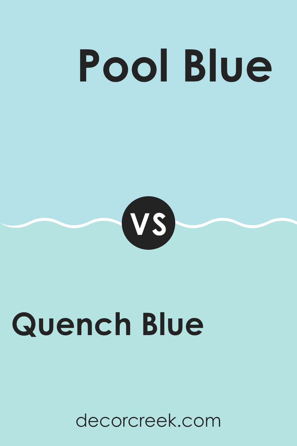
Quench Blue SW 6785 by Sherwin Williams vs Pool Blue SW 6944 by Sherwin Williams
Quench Blue and Pool Blue are two vibrant shades from Sherwin Williams that offer distinct vibes for any room or area. Quench Blue is a deeper, richer shade with a touch of green, giving it a more muted and peaceful feel.
It’s ideal for creating a peaceful atmosphere, making it suitable for bedrooms or living rooms where relaxation is key. On the other hand, Pool Blue is lighter and more playful, with a brighter tone that resembles the refreshing color of a clear swimming pool.
This color works well in rooms where energy and liveliness are desired, like kitchens or bathrooms. While Quench Blue has a more mature and calming look, Pool Blue brings a fresh and cheerful touch to any area. Both colors can complement various decor styles, but their effect can vary widely based on the mood you wish to achieve in your room.
You can see recommended paint color below:
Quench Blue SW 6785 by Sherwin Williams vs Liquid Blue SW 6779 by Sherwin Williams
Quench Blue is a lively and vibrant shade, reminiscent of clear skies and tropical seas. It has a boldness that makes it perfect for adding energy and brightness to any room. This color works well in areas where you want a cheerful and refreshing atmosphere.
Liquid Blue, on the other hand, is a softer and more muted blue. It’s a calm and soothing color, ideal for creating a relaxing and peaceful environment. Compared to Quench Blue, Liquid Blue feels a little more understated and gentle, making it suitable for bedrooms or living areas where a tranquil vibe is desired.
Both colors share a blue base, but they offer different moods. Quench Blue is more about excitement and energy, while Liquid Blue leans towards ease and comfort. The choice between them depends on whether you’re looking to energize or relax a room.
You can see recommended paint color below:
- SW 6779 Liquid Blue
Quench Blue SW 6785 by Sherwin Williams vs Aviary Blue SW 6778 by Sherwin Williams
Quench Blue and Aviary Blue by Sherwin Williams are both shades of blue but differ in tone and intensity. Quench Blue is a bolder, more vibrant shade with a deeper and more vivid look. It can add a lively and energetic feel to a room, making it a great choice for areas where you want to make a strong impression.
On the other hand, Aviary Blue is softer and lighter, with a touch of coolness that feels airy and refreshing. This color can create a calming and open atmosphere, perfect for rooms where you want a gentle and peaceful vibe.
While Quench Blue works well as an accent color or in modern rooms due to its intensity, Aviary Blue lends itself to larger areas where a softer touch is desired. Both colors are flexible, but choosing between them depends on the mood you want to create in your room.
You can see recommended paint color below:
Quench Blue SW 6785 by Sherwin Williams vs Blue Click SW 6952 by Sherwin Williams
Quench Blue and Blue Click by Sherwin Williams are two vibrant shades of blue that bring different vibes to a room. Quench Blue is a rich, deep hue that adds a strong, bold presence to any area. It feels slightly more muted than Blue Click, which gives it a more substantial and anchored look.
On the other hand, Blue Click is brighter and more vivid. It adds a splash of energy and freshness, making it perfect for rooms where you want to inject a little enthusiasm and fun. Quench Blue pairs well with neutral colors like whites and grays, offering a striking contrast without being too bold.
It’s a great choice for feature walls or accent pieces. Blue Click, with its lively tone, pairs well with light colors and even some softer shades of yellow or green, creating a bright and cheerful atmosphere. Both colors are flexible, but the choice between them depends on whether you prefer a darker, more dramatic feel or a lighter, more energetic vibe.
You can see recommended paint color below:
- SW 6952 Blue Click
Quench Blue SW 6785 by Sherwin Williams vs Jetstream SW 6492 by Sherwin Williams
Quench Blue and Jetstream are two different shades from Sherwin Williams that bring unique qualities to any room. Quench Blue is a vibrant, bold blue that tends to catch attention and energize a room. It’s perfect for creating a lively atmosphere, with its rich tone making a strong statement.
On the other hand, Jetstream is a softer, lighter blue. It feels more airy and calm, giving off a peaceful vibe, unlike the more intense Quench Blue. Jetstream is excellent for rooms where you want a more relaxed and open feel, like a bedroom or a bathroom.
While Quench Blue can dominate a room with its striking presence, Jetstream quietly sets a soothing tone. Both colors can be paired beautifully with neutrals or whites to balance their unique effects. Choosing between them depends on whether you want a room to feel lively or restful.
You can see recommended paint color below:
- SW 6492 Jetstream
Quench Blue SW 6785 by Sherwin Williams vs Bathe Blue SW 6771 by Sherwin Williams
Quench Blue (SW 6785) and Bathe Blue (SW 6771) are both delightful shades of blue by Sherwin Williams, but they possess distinct characteristics. Quench Blue is a deeper, more vibrant hue, which makes it a strong choice for creating bold and energetic rooms. It delivers a lively feel that can energize any area it’s used in. This color can stand out as an accent or main feature due to its strength.
On the other hand, Bathe Blue is softer and lighter. It conveys a calm and peaceful atmosphere, making it suitable for rooms where you want to relax and feel at ease. Its lighter tone can make a room feel more open and airy.
When choosing between these colors, consider the mood you want to set. Quench Blue offers intensity, while Bathe Blue brings a gentle, calming presence. Both colors have their unique appeal and can suit different preferences and environments.
You can see recommended paint color below:
- SW 6771 Bathe Blue
Quench Blue SW 6785 by Sherwin Williams vs Cay SW 6772 by Sherwin Williams
Quench Blue (SW 6785) and Cay (SW 6772) are two beautiful blues by Sherwin Williams, each offering its own unique feel. Quench Blue is a bold, bright, and vibrant shade. It is energetic and lively, bringing a sense of freshness and vitality to any room. This color works well in rooms where you want to create a lively and welcoming atmosphere.
On the other hand, Cay is a softer and more subdued blue. It has a calming effect, making it ideal for rooms where relaxation is the goal. Think of it as a gentle ocean breeze, offering a peaceful and soothing vibe.
Both colors can be used to create a stunning look, but they serve different purposes. Quench Blue might suit an accent wall or a playful, creative room, while Cay can be perfect for bedrooms or quiet reading nooks. Choose based on the mood you wish to create.
You can see recommended paint color below:
Quench Blue SW 6785 by Sherwin Williams vs Blue Bauble SW 6948 by Sherwin Williams
Quench Blue (SW 6785) and Blue Bauble (SW 6948) are two vibrant colors by Sherwin Williams, each bringing a unique personality to any room. Quench Blue is a rich, deep shade that resembles the color of a clear ocean on a sunny day. It has a calming, yet energizing presence, perfect for rooms where you want a mix of relaxation and liveliness.
Blue Bauble, on the other hand, is brighter and more playful. It has a lively and cheerful vibe, akin to a sparkling gemstone. This color can add a fun and youthful touch to rooms, making them feel more open and dynamic.
While Quench Blue might suit a more peaceful environment like a bedroom or living room, Blue Bauble is great for areas that benefit from a lively atmosphere, such as a kid’s room or a creative work room. Both colors can make a bold statement but cater to different moods and settings.
You can see recommended paint color below:
- SW 6948 Blue Bauble
Quench Blue SW 6785 by Sherwin Williams vs Swimming SW 6764 by Sherwin Williams
Quench Blue and Swimming by Sherwin Williams are both shades of blue, but they bring different feelings to a room. Quench Blue is a deeper, more intense blue, which can create a bold and striking atmosphere. It’s great for making a statement or adding a pop of strong color. On the other hand, Swimming is a lighter, softer shade that brings a breezy, refreshing feel, perfect for creating a calm and open environment.
This color feels more airy and relaxed, making it suitable for rooms where you want a calm and soothing vibe. While both belong to the blue family, they serve different purposes. Quench Blue can dominate a room and is ideal for accent walls or areas where you want to draw attention.
Meanwhile, Swimming can cover larger areas without feeling too bold, providing a gentle backdrop. Choosing between them depends on whether you want a room to feel energetic and strong or light and breezy. Both colors have their own charm and can enhance different styles and moods.
You can see recommended paint color below:
- SW 6764 Swimming
After learning about SW 6785 Quench Blue by Sherwin Williams, I’ve realized how special and fun this paint color really is. It’s like adding a splash of the calm ocean to your room. This blue isn’t too strong or too light—it’s just right. It helps make a room feel cozy and cool at the same time.
I think it’s perfect for places where you want to relax, like a bedroom or a study corner. But it can also make a playroom super fun and bright! One of the coolest things about Quench Blue is how it can change depending on what you put it next to. If you have white furniture or decorations, the blue seems even brighter and pops out more! If your things are more colorful, this blue helps them stand out without clashing.
I also like that Quench Blue can fit in with grown-up styles or fun kids’ rooms. It’s like a color chameleon!
So, if you want a color that can make your room feel like a little seaside getaway and match with lots of other things, Quench Blue is a great pick. I hope you think it’s as cool as I do!
Ever wished paint sampling was as easy as sticking a sticker? Guess what? Now it is! Discover Samplize's unique Peel & Stick samples.
Get paint samples

