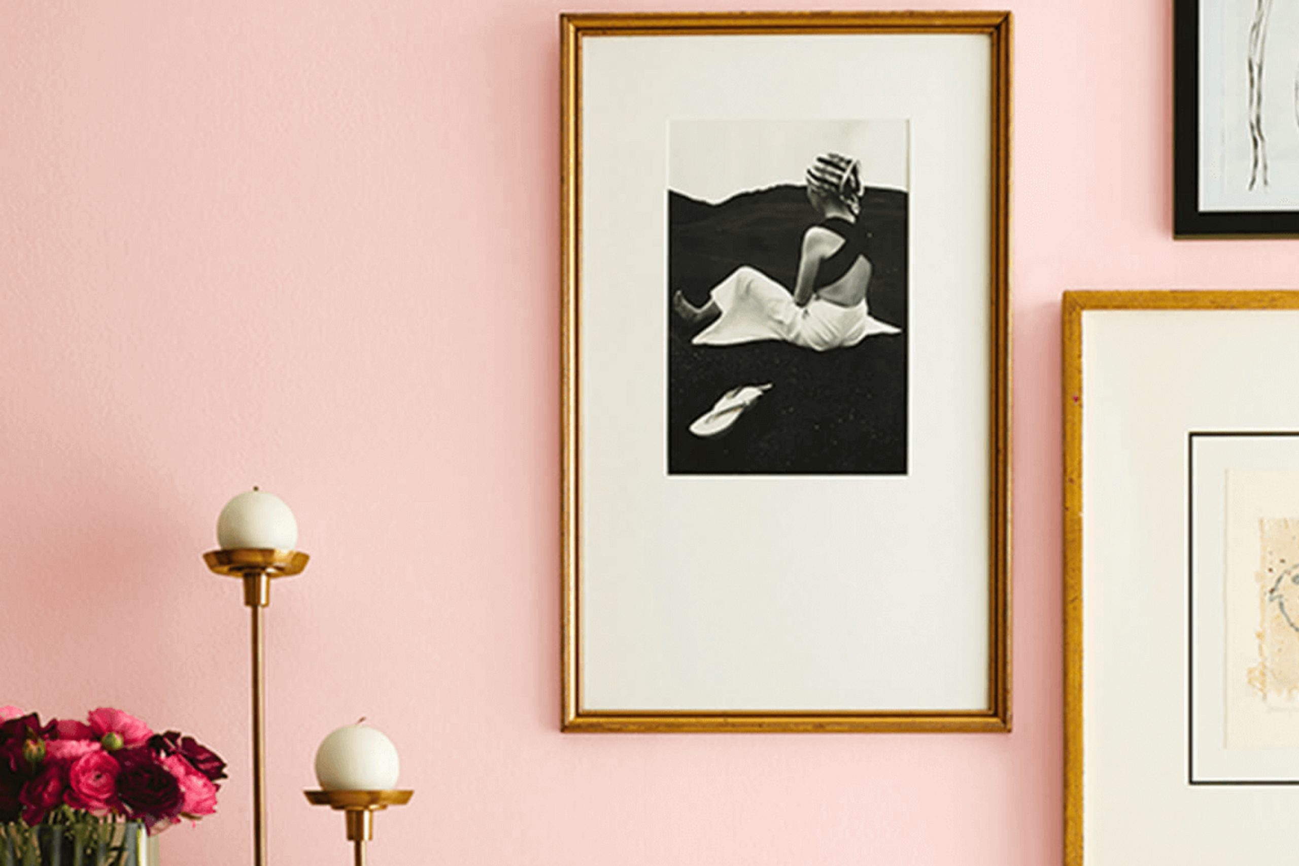
If you’ve been searching for a color that brightens up a room while also lending a touch of whimsy, look no further than SW 6876 Comical Coral by Sherwin Williams. I came across this lively shade when I was on the hunt for something unique yet inviting for my reading nook. The color is vibrant without being too loud—think of it as a playful blend of pink with an orange zest, perfectly suited for spaces that need a cheerful lift.
The touch of coral fosters a sense of warmth and friendliness, making it ideal for areas where you and your guests spend a lot of time. It has the versatility to invigorate a variety of decor styles, from contemporary to traditional, adapting smoothly to different lighting conditions and complementing a wide range of interior accents.
Whether you’re thinking of repainting a single accent wall or planning a complete makeover for several rooms, Comical Coral delivers a fresh, upbeat vibe that’s hard to overlook. Understanding how to apply this color effectively can transform ordinary spaces into charming, energetic areas.
Let me guide you through a few styling tips and potential pairings with Comical Coral, aiming to make your decorating process as smooth and enjoyable as possible.
What Color Is Comical Coral SW 6876 by Sherwin Williams?
Comical Coral by Sherwin Williams is a vibrant, playful color that falls somewhere between pink and orange. It’s a warm hue that can instantly give a space a cheerful, welcoming feel. This shade is particularly effective in adding a pop of color without overwhelming a room. It works well when paired with soft neutrals like sandy beige, warm whites, or light grays, which help to balance its brightness.
In terms of interior design, Comical Coral fits beautifully in modern and contemporary styles due to its lively yet warm character. It can also be great in a coastal-inspired interior, where its sunny disposition complements blues and greens that echo the sea and sand. Bohemian settings, which often employ rich, vibrant colors and diverse textures, can also benefit from this color’s dynamic charm.
Materials that work well with Comical Coral include natural wood, which can provide an earthy backdrop that contrasts appealingly with the color’s zest. Textures like wicker or rattan add a rustic touch that aligns well with the warmth of the color, while metallic finishes in gold or brass can introduce a hint of luxury and modernity.
Soft fabrics like cotton or linen in neutral tones also complement the vivacity of Comical Coral, creating a balanced and visually harmonious environment.

Is Comical Coral SW 6876 by Sherwin Williams Warm or Cool color?
Comical Coral by Sherwin Williams is a vibrant and cheerful shade of pink-orange that adds a burst of energy and fun to any room. This particular color is perfect for creating a playful and inviting atmosphere in spaces like living rooms or children’s bedrooms.
Its warm tones can make a room feel cozy and welcoming, which is great for areas where families gather or for an accent wall to add a pop of personality. Using this color can also brighten up a small or dark space, making it appear more open and airy.
When paired with neutral colors like white, gray, or beige, Comical Coral stands out and becomes the focal point of the decor, bringing a lively vibe to the home environment. Additionally, this color can be complemented with green or blue accents for a more balanced and energetic palette, ideal for a refreshing and vibrant home setting.
Undertones of Comical Coral SW 6876 by Sherwin Williams
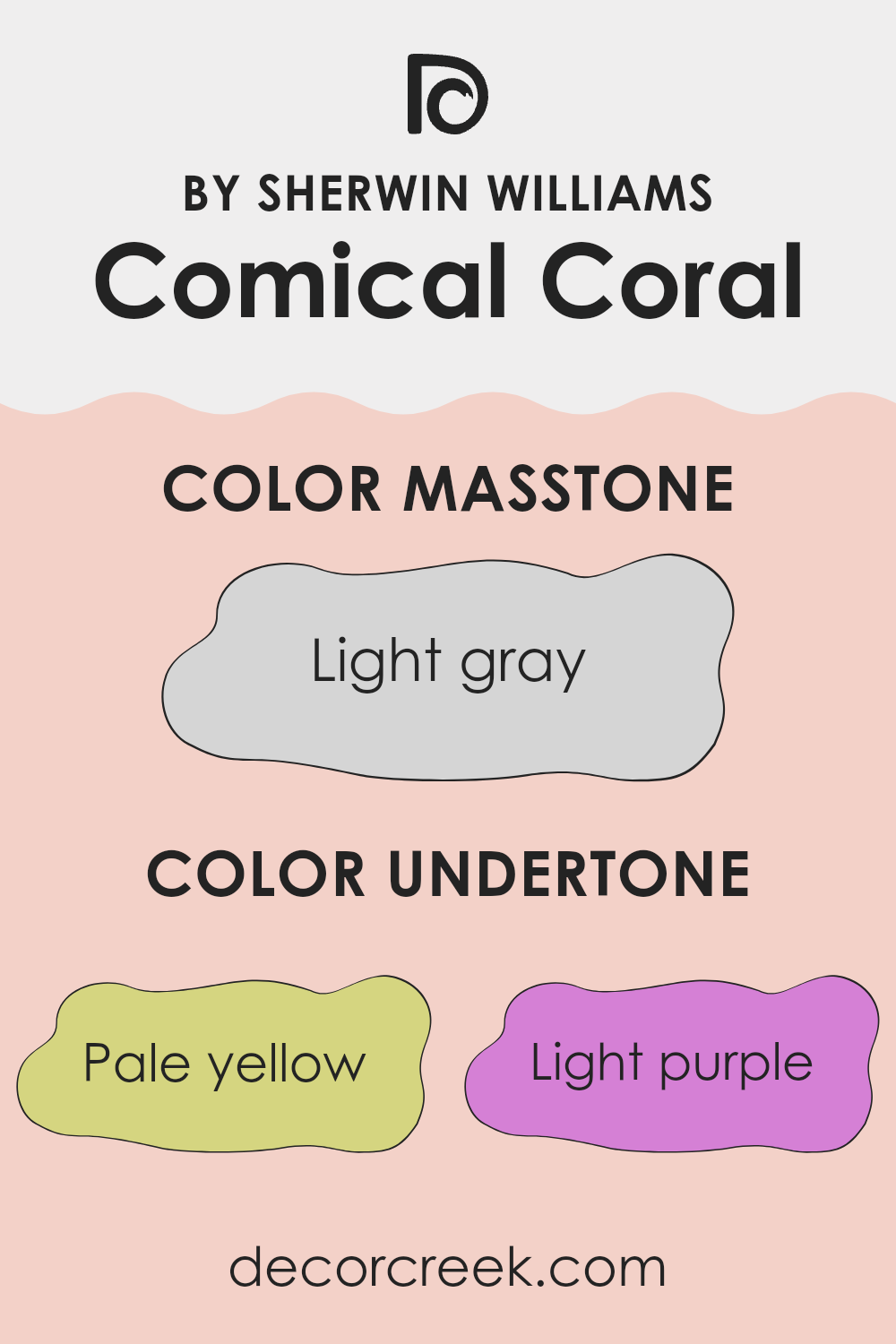
Comical Coral is a lively shade from Sherwin Williams, but its true charm lies in its complex undertones. Undertones are subtle hues that influence the main color visually, especially under different lighting conditions. They give a color depth and can affect how the color looks in various parts of a room.
In the case of Comical Coral, the undertones are quite diverse, ranging from pale yellow and light purple to pale pink, light blue, mint, lilac, and grey. These undertones play a crucial role in how Comical Coral interacts with light and other elements in a space.
Pale yellow adds a subtle brightness, making the space feel more light and airy. Light purple and lilac bring a slight coolness, which can balance the warmth of the coral shade. Pale pink enhances the softness of the color, making it perfect for spaces needing a gentle ambiance.
Light blue and mint each inject a hint of freshness, which can make a room feel more open and clean. Lastly, the grey undertone helps ground the color, preventing it from becoming too overwhelming and ensuring it complements other decor elements.
On interior walls, these undertones mean that Comical Coral can adapt remarkably well to different styles and lighting. In natural light, the color can appear vibrant and playful, while in artificial lighting, it might show more of its calm, grounding grey or blue sides. This makes Comical Coral a versatile choice for various interior spaces, adaptable to both mood and function.
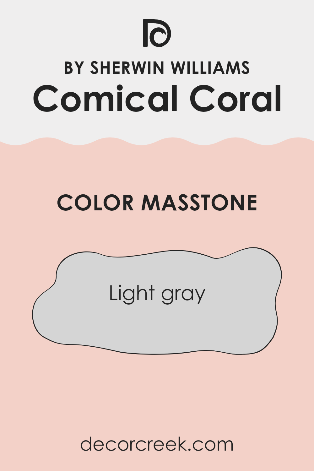
What is the Masstone of the Comical Coral SW 6876 by Sherwin Williams?
Comical Coral in its masstone, a light gray with the code #D5D5D5, offers a versatile option for home interiors. This shade of gray acts as a neutral backdrop, making it easy to pair with various colors, whether bright or subtle.
In living spaces, it provides a clean, unobtrusive look that helps maintain a calm atmosphere. The simplicity of this color allows homeowners to experiment with bold furniture or vibrant accents without the fear of clashing.
It’s particularly useful in smaller rooms, where its lightness helps to make the space feel bigger and more open. Additionally, this light gray is practical as it tends to hide minor imperfections better than darker colors and requires less maintenance in busy family homes. Overall, its flexibility and understated charm make it a popular choice for creating a fresh and inviting home environment.
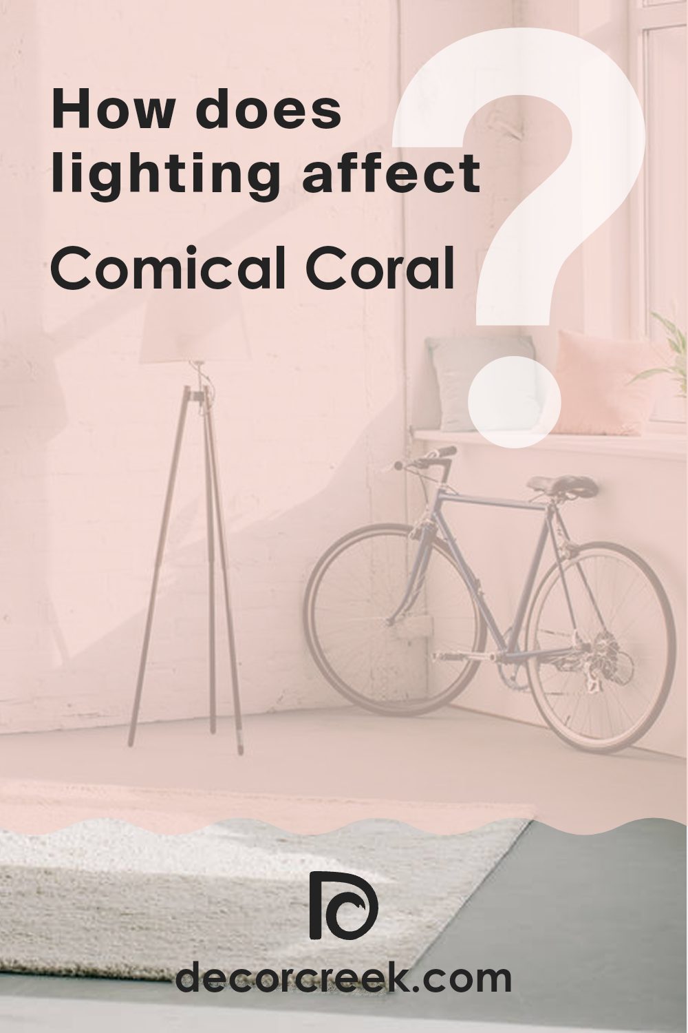
How Does Lighting Affect Comical Coral SW 6876 by Sherwin Williams?
Lighting plays a crucial role in how we perceive color in our surroundings. Whether it’s natural light from the sun or artificial light from bulbs, the type and quality of light can change the way a color looks. For instance, Comical Coral, a vibrant, warm shade, can appear differently depending on the light it’s under.
Artificial Light: Under artificial lighting, such as LED or fluorescent lights, Comical Coral tends to look warmer and more intense.
This is because most artificial lights have a fixed spectrum which can enhance certain tones. In a room lit with warm bulbs, Comical Coral might look more vivid and cozy, making it a great choice for living areas or gathering spaces.
Natural Light: Natural light, which changes throughout the day, affects colors dynamically. In the morning and evening, when the light is softer and more golden, Comical Coral can look especially warm and inviting.
During midday, when sunlight is brightest, this color might appear lighter and more vibrant.
Room Orientation:
– North-faced rooms: These rooms get less direct sunlight, which can make colors appear cooler. Comical Coral in a north-facing room might look slightly muted and less intense, possibly requiring additional lighting to bring out its warmth.
– South-faced rooms: These rooms receive plenty of sunlight, which enhances the warmth and vibrancy of Comical Coral, making it look lively and bright.
– East-faced rooms: In the morning, east-facing rooms get strong sunlight, making Comical Coral look bright and cheerful. As the day progresses, the color could lose some of its vibrancy as natural light fades.
– West-faced rooms: These rooms have the opposite effect of east-facing rooms. Comical Coral might appear duller in the morning but will become warmer and more vibrant during the afternoon and evening as sunlight intensifies.
Understanding how lighting affects colors like Comical Coral can help you decide where to use them most effectively in your home, ensuring they look their best under various lighting conditions.
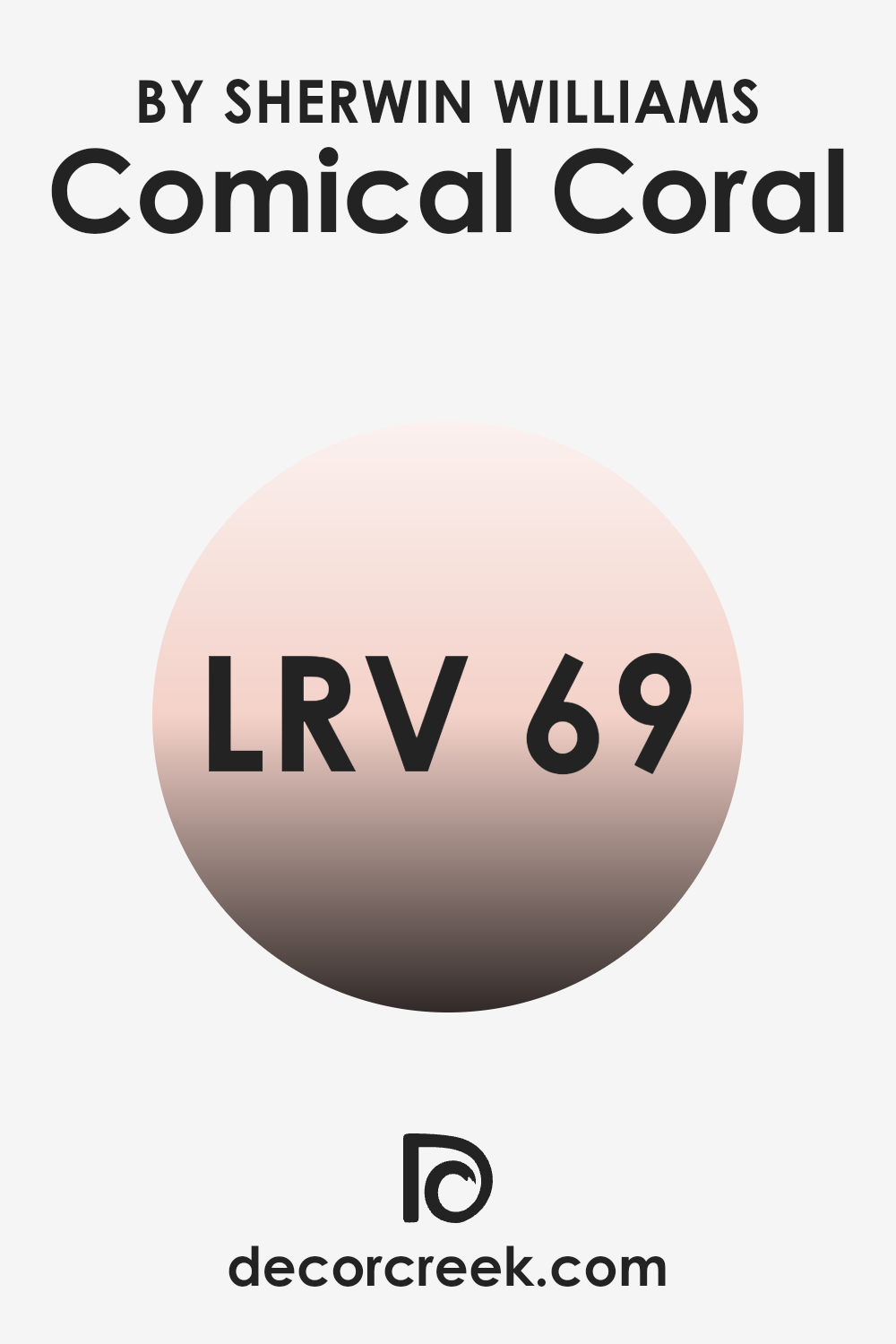
What is the LRV of Comical Coral SW 6876 by Sherwin Williams?
LRV stands for Light Reflectance Value, which is a measure of the amount of visible and usable light that a color reflects from or absorbs into a painted surface. Expressed as a percentage, LRV helps determine how light or dark a color will appear when applied to walls.
A higher LRV means the color reflects more light, making it appear brighter, while a lower LRV indicates that the color absorbs more light, appearing darker. This measurement is crucial for both aesthetic and practical considerations in design, such as creating the illusion of space or determining the need for additional lighting in a room.
For the color in question, with an LRV of 68.933, it falls into the category of colors that reflect a substantial amount of light. This inherently makes the color appear lighter on the walls, contributing to a sense of openness and brightness in the space. Such a high LRV suggests that the color is an excellent choice for spaces that seek to maximize natural light or enhance the visibility in dimly lit rooms.
It’s ideal for smaller or more confined spaces where you want to visually expand the area or in spaces that you wish to give a cheerful, lively vibe without overwhelming with brightness.
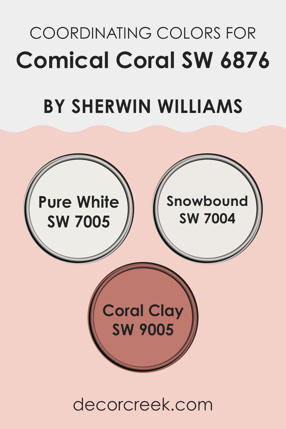
Coordinating Colors of Comical Coral SW 6876 by Sherwin Williams
Coordinating colors are selected to complement each other and work harmoniously within a color scheme, enhancing the overall aesthetic of a space. When paired with a vibrant hue like Comical Coral, coordinating colors such as Pure White, Snowbound, and Coral Clay play essential roles in balancing and softening the look, creating a pleasing and aesthetically coherent palette. These coordinating colors help in softening intense shades or reinforcing a more muted look, depending on the combination used.
Pure White, with its clean and crisp aura, offers a neutral backdrop that allows a vibrant tone like Comical Coral to truly stand out, making the space feel fresh and lively. Snowbound presents a slightly warmer white with subtle undertones that can bring a cozy and inviting feel, working well in various lighting conditions and complementing richer colors.
Coral Clay has a subdued terracotta touch that pairs beautifully with Comical Coral, adding depth and warmth to the combination, ideal for creating a welcoming and cohesive environment. Together, these colors provide versatile options for crafting an engaging and harmonious space.
You can see recommended paint colors below:
- SW 7005 Pure White
- SW 7004 Snowbound
- SW 9005 Coral Clay
What are the Trim colors of Comical Coral SW 6876 by Sherwin Williams?
Trim colors are essential accents that highlight and complement the main color of a room, like Comical Coral by Sherwin Williams, by framing features such as doors, windows, and crown moldings.
Choosing the right trim color can enhance the visual aesthetics of a space, making the wall color pop and providing a polished, finished look. SW 6385 Dover White and SW 7013 Ivory Lace are two options that work beautifully with Comical Coral.
Dover White is a soft, creamy white that brings a gentle warmth to Comical Coral, ensuring that the space feels inviting without overpowering the senses. On the other hand, Ivory Lace offers a slightly more subdued tone that still maintains a light and airy feel when paired with Comical Coral, which can help in creating a seamless color transition from the trim to the wall. These trim colors aid in subtly defining the architectural details of a room, adding depth and character to the overall design.
You can see recommended paint colors below:

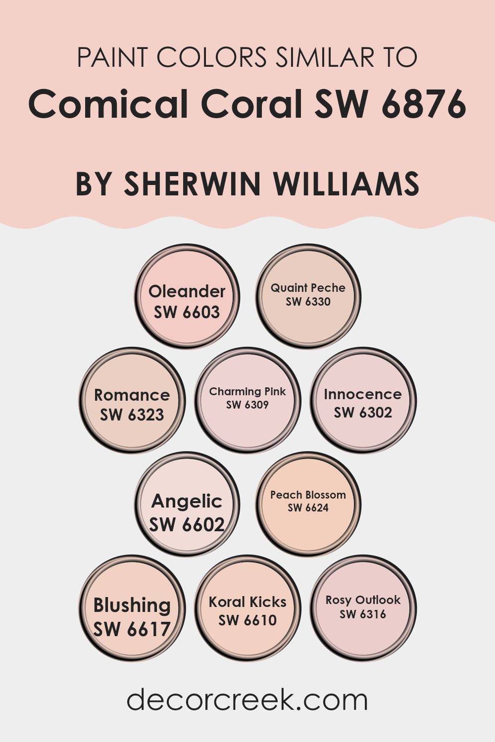
Colors Similar to Comical Coral SW 6876 by Sherwin Williams
Similar colors play a crucial role in design by creating a harmonious and cohesive look. When colors like SW 6603 – Oleander, a muted floral pink, and SW 6330 – Quaint Peche, a soft peach, are used together, they produce a subtle variation that enriches the environment without overwhelming the senses. SW 6323 – Romance offers a soft pink blush, blending effortlessly with the more subdued SW 6309 – Charming Pink which brings a calm, gentle pink to the palette.
These colors work together by sharing a common hue, intensity, or saturation level, enabling them to unify a space subtly. Continuing with similar shades, SW 6302 – Innocence gives a delicate pastel pink that echoes the softness of SW 6602 – Angelic, enhancing the airy and light feeling in a room.
SW 6624 – Peach Blossom introduces a slightly more intense peach tone, bridging the gap between stronger and more understated colors like SW 6617 – Blushing, a slightly muted coral. Meanwhile, SW 6610 – Koral Kicks adds a vibrant punch, contrasting nicely with SW 6316 – Rosy Outlook which offers a hopeful, gentle rose hue. These shades allow for flexibility in design, making it easier to achieve a balanced and inviting visual experience.
You can see recommended paint colors below:
- SW 6603 Oleander
- SW 6330 Quaint Peche
- SW 6323 Romance
- SW 6309 Charming Pink
- SW 6302 Innocence
- SW 6602 Angelic
- SW 6624 Peach Blossom
- SW 6617 Blushing
- SW 6610 Koral Kicks
- SW 6316 Rosy Outlook
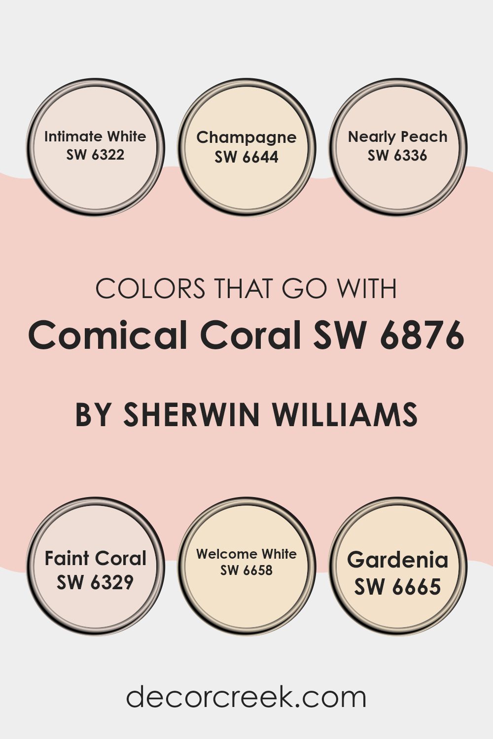
Colors that Go With Comical Coral SW 6876 by Sherwin Williams
Choosing colors that complement Comical Coral SW 6876 by Sherwin Williams is crucial in creating a harmonious and appealing space. Comical Coral is a vibrant and energetic shade that can brighten any room, but its impact is greatly enhanced when paired with the right coordinating colors. For example, pairing it with Intimate White, a soft white with a slight creaminess, underlines the warmth in Comical Coral, creating a cozy and inviting atmosphere.
Champagne is another great companion; its subtle, muted beige tone offsets the boldness of Comical Coral, providing a balanced background that allows the coral to stand out without overwhelming the space.
Nearly Peach shares a similar undertone to Comical Coral but is softer, making it perfect for blending smoothly on adjacent walls or in decor accents. Faint Coral is just a few shades lighter than Comical Coral, which means it can create a monochromatic effect that’s both modern and pleasing, offering a gentle contrast.
Welcome White has a crispness that freshens up the palette, offering a clear distinction that adds a vibrant edge to spaces using Comical Coral. Lastly, Gardenia offers a rich, creamy touch that complements the vibrancy of Comical Coral, ensuring the space feels warm and welcoming. These colors collectively create a cohesive look that enhances the aesthetic and mood of any room.
You can see recommended paint colors below:
- SW 6322 Intimate White
- SW 6644 Champagne
- SW 6336 Nearly Peach
- SW 6329 Faint Coral
- SW 6658 Welcome White
- SW 6665 Gardenia
How to Use Comical Coral SW 6876 by Sherwin Williams In Your Home?
Comical Coral by Sherwin Williams is a vibrant and cheerful shade of orange that can add a fun pop of color to any room in your home. It’s perfect for creating a lively atmosphere and is especially great in spaces where you entertain guests or where you want to inject some energy, like living rooms or kitchens. The warmth of this coral hue makes it inviting and comfortable, not too bold but still full of personality.
To use it in your home, you could paint one accent wall with Comical Coral to liven up a neutral-toned room. This method keeps things balanced yet adds a striking contrast. It pairs well with soft grays, whites, and even teal for a more playful palette. In addition, consider using it for furniture pieces like a dresser or a bookshelf to provide a unique touch without overwhelming the space.
Additionally, Comical Coral works beautifully in smaller doses, such as in throw pillows, curtains, or decorative items, blending well with different colors and adding just the right amount of warmth and cheeriness to your home.
Comical Coral SW 6876 by Sherwin Williams vs Blushing SW 6617 by Sherwin Williams
Comical Coral and Blushing are two unique colors by Sherwin Williams that bring their own distinct flair to any space. Comical Coral is a vivid, playful orange with a warm undertone, creating a bright and energetic vibe. It works great in areas where you want to add a lively splash of color, such as playrooms or creative spaces.
On the other hand, Blushing is a softer, more understated pink. It has a gentle warmth to it, making it perfect for creating a cozy and inviting atmosphere in spaces like bedrooms or living rooms. While it’s still cheerful, Blushing offers a quieter kind of charm compared to the boldness of Comical Coral.
When comparing the two, Comical Coral stands out more and tends to draw the eye, whereas Blushing blends into surroundings for a subtler effect. Depending on what mood you’re aiming to achieve in a room, each color has its advantages.
You can see recommended paint color below:
- SW 6617 Blushing
Comical Coral SW 6876 by Sherwin Williams vs Innocence SW 6302 by Sherwin Williams
The main color Comical Coral is a vibrant, playful shade of orange with a hint of pink, making it lively and energetic. It stands out and brings a cheerful and friendly vibe to any space. On the other hand, Innocence is a soft, gentle pink with a calm and soothing presence.
This color is more subtle and tends to blend into settings, providing a backdrop that’s easy on the eyes and comforting. When compared, Comical Coral is definitely the bolder choice, ideal for areas where you want to add a burst of energy and fun.
Innocence invites a more relaxed, peaceful atmosphere, making it perfect for spaces where you want to relax and wind down. These two colors offer distinct moods: Comical Coral adds excitement, while Innocence offers a peaceful retreat.
You can see recommended paint color below:

Comical Coral SW 6876 by Sherwin Williams vs Romance SW 6323 by Sherwin Williams
Comical Coral and Romance, both from Sherwin Williams, offer distinct vibes for any room. Comical Coral is a vibrant, outgoing coral hue that adds a lively splash of color. It’s a great choice if you’re looking to brighten up a space and add some cheerfulness.
On the other hand, Romance is a softer, subtler pink that creates a calm and gentle atmosphere. It’s perfect for spaces where you want to relax, like a bedroom or a reading nook. While Comical Coral stands out and grabs attention, Romance works quietly in the background, offering a soothing touch.
Depending on your decorating goals, you might choose the boldness of Comical Coral for a more energetic room or the softness of Romance for a relaxing retreat. Both colors offer beautiful ways to personalize your space.
You can see recommended paint color below:
Comical Coral SW 6876 by Sherwin Williams vs Koral Kicks SW 6610 by Sherwin Williams
Comical Coral and Koral Kicks are two vibrant shades by Sherwin Williams that both bring a lively splash of color to any space, but they have distinct tones. Comical Coral is a bright and cheerful orange-pink that adds a punchy, playful vibe. It’s a bold choice, perfect for energizing a room or creating a fun accent wall.
On the other hand, Koral Kicks leans more towards a pinkish coral with a subtler, softer appearance. It’s a great option if you prefer a color that’s not too loud yet still warm and inviting. Both colors can warm up spaces but Comical Coral, with its more vivid and saturated hue, makes a stronger statement.
Koral Kicks offers a gentler approach, suitable for spaces where you want a touch of color without overwhelming the senses. Each has its charm, depending on the mood and atmosphere you want to create.
You can see recommended paint color below:
- SW 6610 Koral Kicks
Comical Coral SW 6876 by Sherwin Williams vs Angelic SW 6602 by Sherwin Williams
Comical Coral is a vibrant, cheerful pink with a lively vibe, perfect for spaces that want to feel energetic and fun. It has a bold presence that can really liven up a room, making it great for areas like playrooms or creative spaces.
Angelic, on the other hand, is a soft, gentle white with a subtle pink undertone. This color is much more subdued compared to Comical Coral, offering a calm and soothing atmosphere, ideal for bedrooms or living areas where you want to relax.
While Comical Coral stands out and grabs attention, Angelic is more about creating a peaceful backdrop, blending seamlessly into a variety of decor styles. Together, these colors could work well if you’re looking to have areas of both high energy and relaxation within the same space.
You can see recommended paint color below:
- SW 6602 Angelic
Comical Coral SW 6876 by Sherwin Williams vs Charming Pink SW 6309 by Sherwin Williams
Comical Coral and Charming Pink, both by Sherwin Williams, present unique hues that bring warmth and softness to any space. Comical Coral is a vibrant, playful color. It’s a bolder shade that leans towards orange and adds a cheerful pop to rooms.
It suits spaces like a lively living room or a fun playroom very well. On the other hand, Charming Pink is more subdued and gentle. This color skews closer to a traditional pink, maintaining a calm and lovely atmosphere.
It’s perfect for creating a cozy feeling in bedrooms or nurturing environments like nurseries. While both shades are warm, Comical Coral offers a dynamic burst of energy, and Charming Pink provides a soothing touch to interior décor. Each contributes a distinct mood and can therefore align differently with personal tastes and design objectives.
You can see recommended paint color below:
Comical Coral SW 6876 by Sherwin Williams vs Rosy Outlook SW 6316 by Sherwin Williams
Comical Coral and Rosy Outlook, both by Sherwin Williams, offer unique takes on the pink spectrum. Comical Coral is a vivid, playful shade that leans towards orange, bringing a cheerful and lively vibe to a space. It’s bright enough to add energy, but still soft enough to be inviting and warm. This makes it great for spaces where you want to add a pop of color without overwhelming the room.
On the other hand, Rosy Outlook is a subtler, more muted pink. It has a gentle, calming quality, making it perfect for areas where you want to relax, such as bedrooms or bathrooms. It provides a soft backdrop that complements various decor styles, from modern to traditional.
When comparing the two, Comical Coral stands out with its boldness, ideal for making a statement. Rosy Outlook, in contrast, offers a softer touch, excellent for creating a soothing environment. Both colors are versatile and can refresh any space, depending on the mood you wish to set.
You can see recommended paint color below:
- SW 6316 Rosy Outlook
Comical Coral SW 6876 by Sherwin Williams vs Peach Blossom SW 6624 by Sherwin Williams
Comical Coral and Peach Blossom by Sherwin Williams are both warm, inviting shades, but they have distinct vibes. Comical Coral is a vibrant, bold coral hue that really stands out. It’s the kind of color that adds a lively pop to any space, making it feel fun and energetic.
On the other hand, Peach Blossom is a softer, subtler peach shade. It offers a more gentle appeal, perfect for creating a soothing atmosphere in a room. While Comical Coral is more attention-grabbing.
Peach Blossom is calm and understated, making it an excellent choice for someone looking to add just a hint of color without overwhelming a space. Both colors can warm up a room, but the choice between them depends on how much you want the color to stand out.
You can see recommended paint color below:
Comical Coral SW 6876 by Sherwin Williams vs Quaint Peche SW 6330 by Sherwin Williams
Comical Coral and Quaint Peche are both warm, inviting colors by Sherwin Williams, but they have distinct tones that set them apart. Comical Coral is a vivid, punchy shade with a bright, playful feel. It’s a color that stands out and adds a burst of energy to any space.
In contrast, Quaint Peche has a softer, more subdued appearance. This peachy tone is gentler and exudes a cozy, soothing vibe, making it ideal for creating a relaxing atmosphere in rooms like living areas or bedrooms.
While Comical Coral is perfect for spaces where you want to make a strong visual impact or add a sense of fun, Quaint Peche works well where you wish for a milder, more understated look. Depending on your room’s purpose, lighting, and decor, either color can add its unique charm to your home. Both colors offer warmth, yet their differing intensities can influence the mood and style of your interiors significantly.
You can see recommended paint color below:
- SW 6330 Quaint Peche
Comical Coral SW 6876 by Sherwin Williams vs Oleander SW 6603 by Sherwin Williams
Comical Coral is a vibrant, punchy shade of orange with a strong pink undertone, making it stand out and energize any space. This color is perfect for areas where you want to inject some fun and liveliness, such as a playroom or a creative workspace. Its vivacious tone helps to create an atmosphere that’s cheerful and inviting.
On the other hand, Oleander has a softer, more subdued quality. This color is a gentle pink that leans towards a calming peach. It’s an ideal choice for spaces where you want to promote a light and airy feel, like in a nursery or a cozy reading nook. Oleander helps to add a touch of warmth without being too bold, offering a soothing backdrop that’s easy on the eyes.
In comparison, while both colors bring warmth and personality, Comical Coral offers more energy and vibrancy, whereas Oleander gives a space a softer, more relaxed vibe. Each has its unique appeal depending on the mood and function you want for your room.
You can see recommended paint color below:
Conclusion
One of the best things I picked up is that while Comical Coral is bold, it’s also pretty friendly to match with other colors. It can work nicely with soft white, gentle gray, or even some bolder colors like deep blue if someone wants to add a bit more excitement.
Comical Coral isn’t just pretty and friendly but also kind of like a ray of light in any room. If you’re thinking of bringing some new life and fun into your space, this color might just be the perfect choice. It’s amazing how a simple coat of paint can make things feel new and energetic.
So, using Comical Coral might just be the splash of fun your home needs!

Ever wished paint sampling was as easy as sticking a sticker? Guess what? Now it is! Discover Samplize's unique Peel & Stick samples.
Get paint samples

