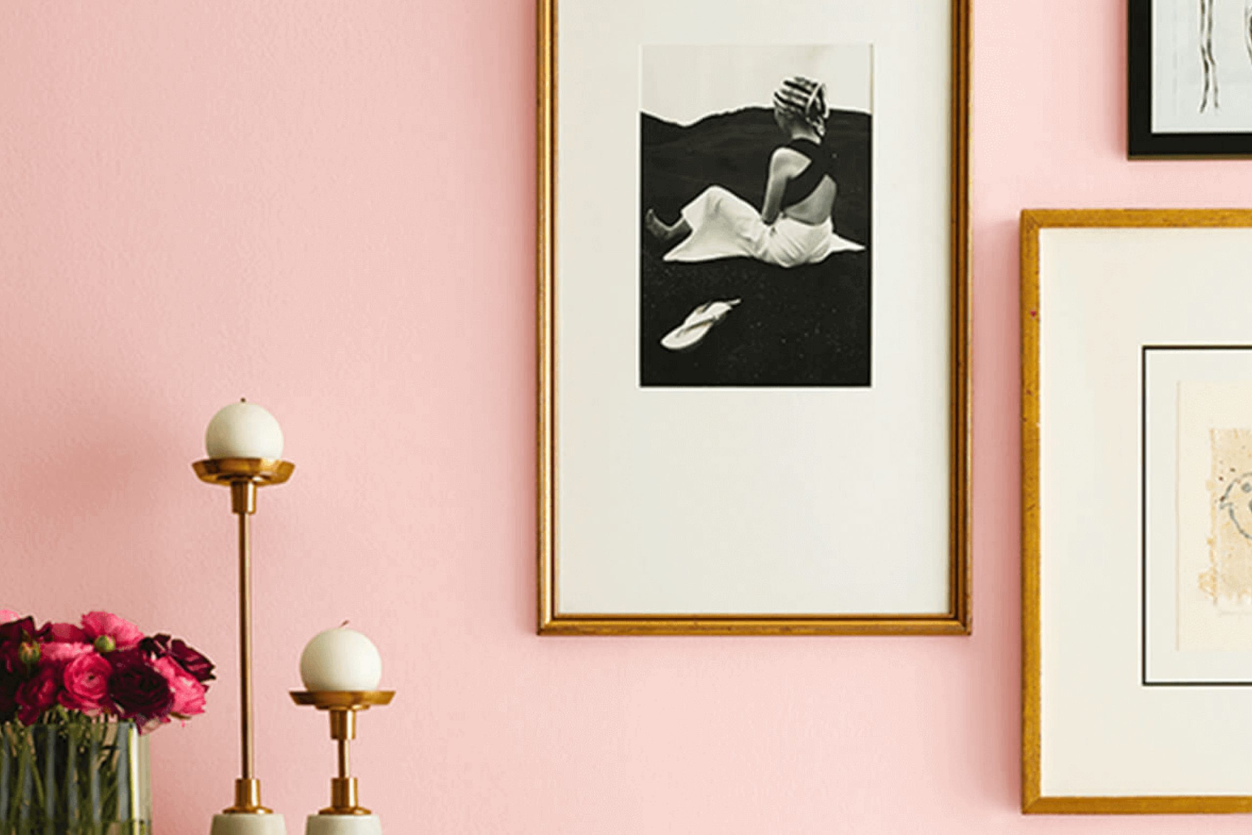
When you think of a soft, sophisticated touch that adds warmth and comfort to a space, SW 6603 Oleander by Sherwin Williams might just be the shade for you. This distinctive color is a gentle blend of rosy tones that doesn’t overpower your senses but rather creates an inviting atmosphere.
Imagine walking into a room where the walls seem to softly glow with a delicate hue that reminds you of a serene sunset. The subtle pink undertones of Oleander create a welcoming backdrop, perfect for both modern and traditional settings.
Whether you’re updating a living room, bedroom, or even a cozy reading nook, this color brings a sense of calm elegance to every corner. It pairs beautifully with neutral colors, allowing easy coordination with various design elements and decor pieces.
As you apply this shade, you’ll notice how it reflects light, adding depth and dimension to your space.
This color isn’t just about aesthetics; it’s about setting a mood that makes you feel instantly at ease.
So, if you’re looking for a color that effortlessly combines warmth with charm, Oleander could be your perfect choice.
What Color Is Oleander SW 6603 by Sherwin Williams?
Oleander SW 6603 by Sherwin Williams is a soft, muted pink that brings a gentle warmth to any space. Its subtle blush tone creates a welcoming and cozy feel without being overwhelming. This color is versatile and can add a touch of sweetness to a variety of interior styles.
In a modern setting, Oleander works well when paired with clean lines and sleek materials like glass and metal. It adds a touch of softness to the otherwise crisp and minimal aesthetic.
For a more traditional or vintage look, Oleander can complement wood tones, especially those with rich, dark finishes, enhancing the cozy, homey vibe.
In bohemian or eclectic interiors, Oleander pairs beautifully with bold patterns and textured fabrics. Think woven baskets, plush throws, and an array of colorful cushions, which the pink hue can accentuate. It also works well with natural materials like rattan, linen, and cotton, emphasizing a relaxed, earthy feel.
Oleander is a great choice for bedrooms, living rooms, or even nurseries, where its gentle hue can create a soothing atmosphere.
Paired with whites and creams, it brings out a sense of openness and airiness, while darker accents like charcoal or navy can add depth and contrast.
Is Oleander SW 6603 by Sherwin Williams Warm or Cool color?
Oleander SW 6603 by Sherwin Williams is a warm and inviting color often described as a soft, muted pink. Its subtle hue makes it a versatile choice for various rooms in a home. This color can add a touch of warmth and coziness to living spaces, making them feel more welcoming.
In a bedroom, Oleander can create a soothing environment that is perfect for relaxation. When used in combination with neutral colors or other soft shades, it can bring a gentle charm to the space.
In kitchens or dining areas, Oleander can provide a sense of comfort, while in hallways or entryways, it sets a pleasant tone as you move through the home. Its gentle nature allows it to work well with both modern and traditional decor styles. The color’s understated presence ensures that it complements rather than overpowers, making it an excellent choice for enhancing the overall feel of a home.
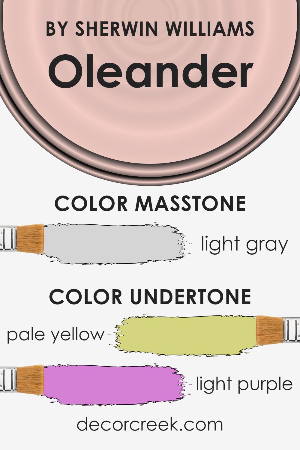
Undertones of Oleander SW 6603 by Sherwin Williams
Oleander SW 6603 by Sherwin Williams is a warm, inviting color often associated with a sense of comfort and good cheer. The undertones of a paint color play a crucial role in how the color is perceived once it’s on your walls. These subtle hints can make a color appear warmer or cooler, more vibrant or subdued.
Oleander has several undertones that influence its overall look. The pale yellow gives it warmth and a hint of brightness, which can make a room feel sunny and welcoming. The light purple adds a touch of softness and can introduce a calming feel to the space.
Pale pink contributes to a warm, cozy atmosphere, while light blue brings a refreshing and airy quality. The mint undertone adds a hint of freshness, and the lilac offers a gentle, soothing vibe. Grey undertones help balance the color, preventing it from feeling too overpowering.
When applied to interior walls, these undertones interact with different lighting conditions. In natural light, the yellow and pink undertones can brighten and cozy up a room, while in artificial light, the cooler blues and purples might become more noticeable, providing a balanced, pleasant environment.
Overall, the combination of these undertones in Oleander SW 6603 makes it versatile and adaptable to various interior styles.
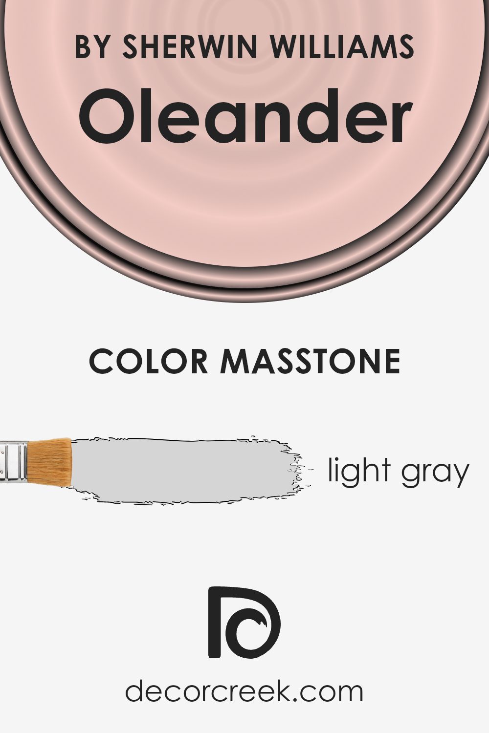
What is the Masstone of the Oleander SW 6603 by Sherwin Williams?
Oleander SW 6603 by Sherwin Williams has a masstone of light gray (#D5D5D5), which brings a cozy and neutral feel to any space. This light gray is versatile and pairs well with various colors, allowing homeowners to change accent pieces and furnishings without worrying about clashes.
The neutral quality of the light gray makes it a great backdrop, especially in living rooms and bedrooms, where people spend much of their time.
It provides a sense of calm without feeling too stark or cold. Because it’s not too dark, Oleander SW 6603 helps reflect natural light, making rooms feel brighter and more open.
This makes it particularly suitable for smaller spaces, where light colors can help create the illusion of more space.
Overall, its subtle, warm tone can make any room feel inviting and comfortable, making it a popular choice for those looking for a timeless and flexible wall color.
How Does Lighting Affect Oleander SW 6603 by Sherwin Williams?
Lighting plays a crucial role in how we perceive colors. The appearance of a color can change dramatically under different lighting conditions, affecting its tone, warmth, and depth. For Oleander SW 6603 by Sherwin Williams, a warm, soft red, these changes can be quite pronounced depending on the type of light it’s exposed to.
In natural light, Oleander SW 6603 can appear very different throughout the day. In a north-facing room, which receives cooler and more consistent indirect light, this color may look more subdued and slightly cooler, as if toned down by a blue undertone.
The color retains its richness but may seem less vibrant than in other lighting.
In contrast, a south-facing room gets warm, direct sunlight for most of the day. This enhances the warmth and vibrancy of Oleander, giving it a more vivid and cheerful appearance. The sunlight brings out the full dimension and richness of the color, making it appear lively and warm.
In east-facing rooms, which receive bright, soft light in the morning, Oleander will look fresh and warm, as the morning light complements and enhances the red tones nicely. However, as the day progresses and the light fades, the color might look a bit more muted.
On the other hand, west-facing rooms get the most light in the late afternoon and early evening. During these times, Oleander can appear at its most intense and vibrant, thanks to the warmer tones of the setting sun which exaggerate its warm qualities.
Under artificial lighting, Oleander can change based on the type of bulb used. Incandescent bulbs can enhance its warmth, while LED lights that emit cooler tones might dull its vibrancy slightly.
Overall, lighting has a significant impact on how this particular color is perceived in any space.

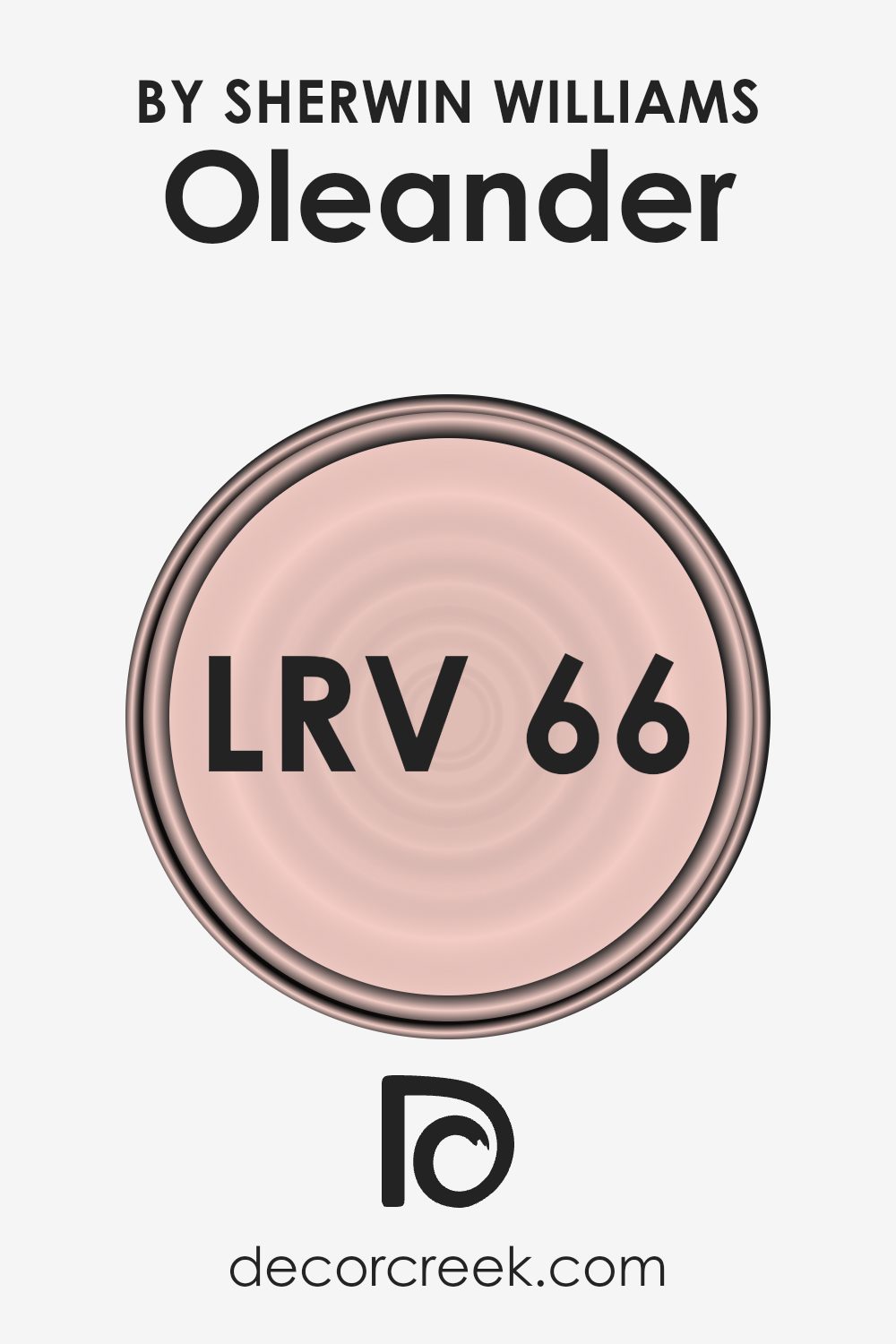
What is the LRV of Oleander SW 6603 by Sherwin Williams?
Light Reflectance Value, or LRV, tells us how much light a color will reflect when it’s on a surface. It’s measured on a scale from 0 to 100. A value of 0 means the color absorbs all light and reflects none, making it very dark, while a value of 100 means it reflects all light, making it very bright.
LRV can greatly influence how a color appears in a room. If a color has a high LRV, it will reflect more light and can make a room feel brighter and more open. In contrast, a color with a low LRV will absorb more light, making a space feel cozy or even smaller.
For Oleander, which has an LRV of 65.883, it falls into the category of lighter colors. This means it reflects a good amount of light, which can make spaces seem larger and more airy. Oleander is a soft, warm pink, and its relatively high LRV means that it won’t overpower a room with too much color intensity but will still give a subtle warmth and brightness to the space.
Rooms painted with this color will benefit from feeling open and inviting, especially in areas that receive a lot of natural light, as it will further enhance the color’s brightening effect.
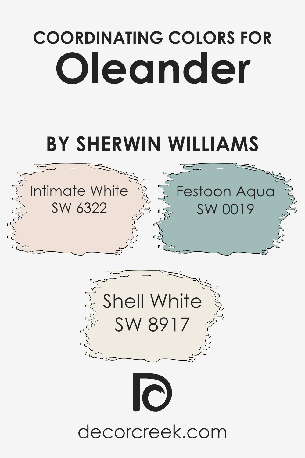
Coordinating Colors of Oleander SW 6603 by Sherwin Williams
Coordinating colors are hues that complement each other and work well together in a design scheme. They create harmony and balance in a space, ensuring that no single color overpowers the others. Oleander, a vibrant shade of pink from Sherwin Williams, can be beautifully paired with softer tones to create a balanced look.
By choosing coordinating colors like Intimate White, Shell White, and Festoon Aqua, you can enhance the visual appeal and make a room feel more cohesive.
Intimate White, a gentle and soft shade, adds a touch of warmth and coziness. It pairs beautifully with Oleander by providing a neutral background that allows the pink to stand out without being too bold. Shell White, with its subtle hints of peach, adds a hint of warmth and elegance.
It complements Oleander by bringing out its cheerful tone. Festoon Aqua introduces a splash of freshness and a hint of ocean-inspired calmness.
Its light blue-green hue contrasts with Oleander, offering a fresh pop of color that can make any space feel lively. Together, these coordinating colors create a pleasant and inviting atmosphere.
You can see recommended paint colors below:
- SW 6322 Intimate White
- SW 8917 Shell White
- SW 0019 Festoon Aqua
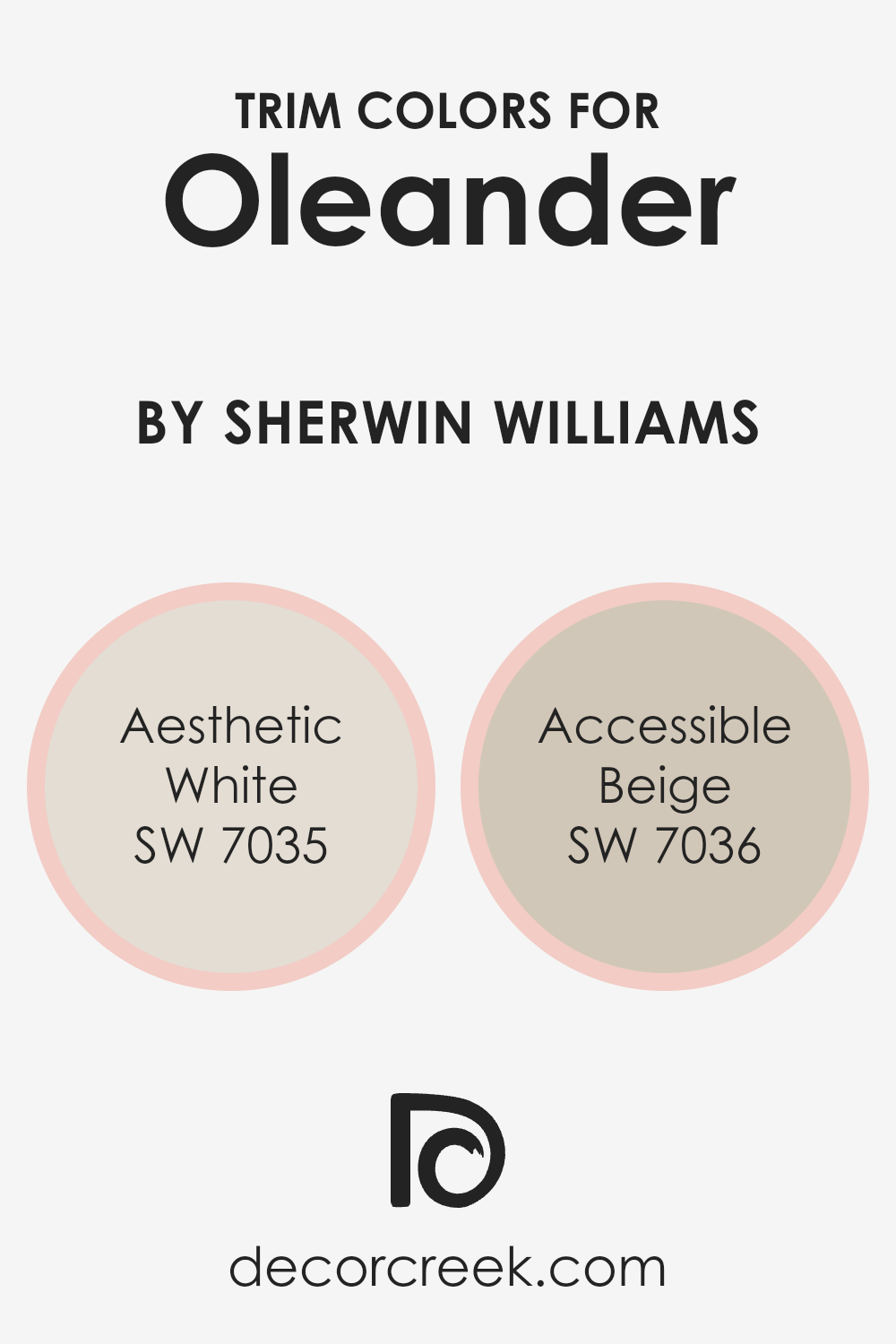
What are the Trim colors of Oleander SW 6603 by Sherwin Williams?
Trim colors are shades used to highlight and define the edges and boundaries of walls and other surfaces, adding depth and dimension to a room. Choosing the right trim can make a significant difference in how a main wall color like Oleander, a warm and inviting pink by Sherwin Williams, is perceived.
For Oleander, using SW 7035 Aesthetic White or SW 7036 Accessible Beige can create a harmonious and balanced look.
These colors can enhance the beauty of Oleander by offering subtle contrast and highlighting architectural features like molding, doors, and window frames, ensuring the overall design feels cohesive and complete.
Trim colors are crucial in creating a polished look, as they frame the main color and can either make it stand out more or seamlessly blend it into the space.
SW 7035 Aesthetic White is a soft, creamy white with subtle beige undertones that offers a clean and fresh appearance, making a space feel open and airy. SW 7036 Accessible Beige, on the other hand, is a warm grey-beige that provides a neutral backdrop, complementing the warmth of Oleander without overpowering it.
Both colors serve as an excellent choice for trim around Oleander, depending on whether you want a gentle transition or a more distinct contrast.
Using these trim colors helps in creating a composed and inviting space, ensuring that Oleander remains the focal point while still achieving a graceful balance in the room’s design.
You can see recommended paint colors below:
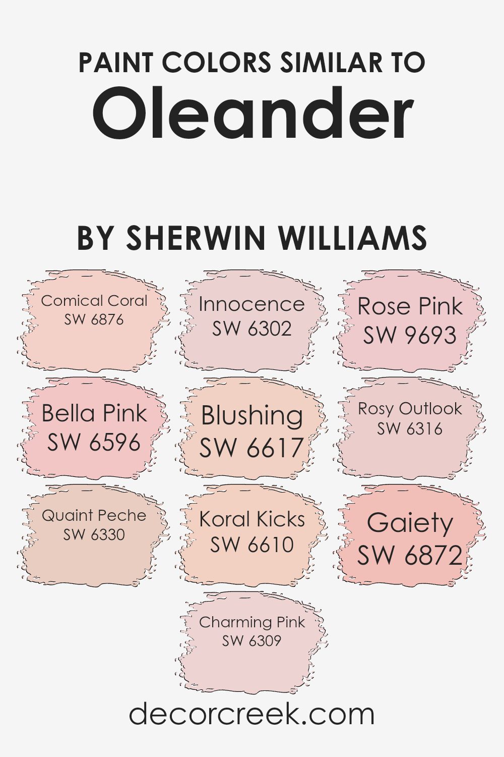
Colors Similar to Oleander SW 6603 by Sherwin Williams
Similar colors play a crucial role in design because they create harmony and cohesion. They allow for smooth transitions between different areas of a space, making it feel more unified and pleasing to the eye. Similar colors to Oleander, such as Comical Coral and Bella Pink, add warmth and vibrancy, while Quaint Peche offers a touch of refined sweetness.
Charming Pink captures a gentle and soft essence, perfect for creating welcoming interiors. Innocence provides a subtle, delicate hue that enhances spaces without overwhelming them.
Blushing introduces a playful and lively touch, making it ideal for spaces that seek to energize and uplift. Koral Kicks adds a more vivid and dynamic pink, great for bold accents or focal points. Rose Pink and Rosy Outlook bring a sense of youthful freshness and can brighten up any room with their lively yet gentle tones.
Finally, Gaiety offers a cheerful and lively hue, reminiscent of summer blooms. Together, these colors can work wonders in achieving a balanced and attractive environment, enhancing the overall aesthetic without overwhelming the senses.
You can see recommended paint colors below:
- SW 6876 Comical Coral
- SW 6596 Bella Pink
- SW 6330 Quaint Peche
- SW 6309 Charming Pink
- SW 6302 Innocence
- SW 6617 Blushing
- SW 6610 Koral Kicks
- SW 9693 Rose Pink
- SW 6316 Rosy Outlook
- SW 6872 Gaiety
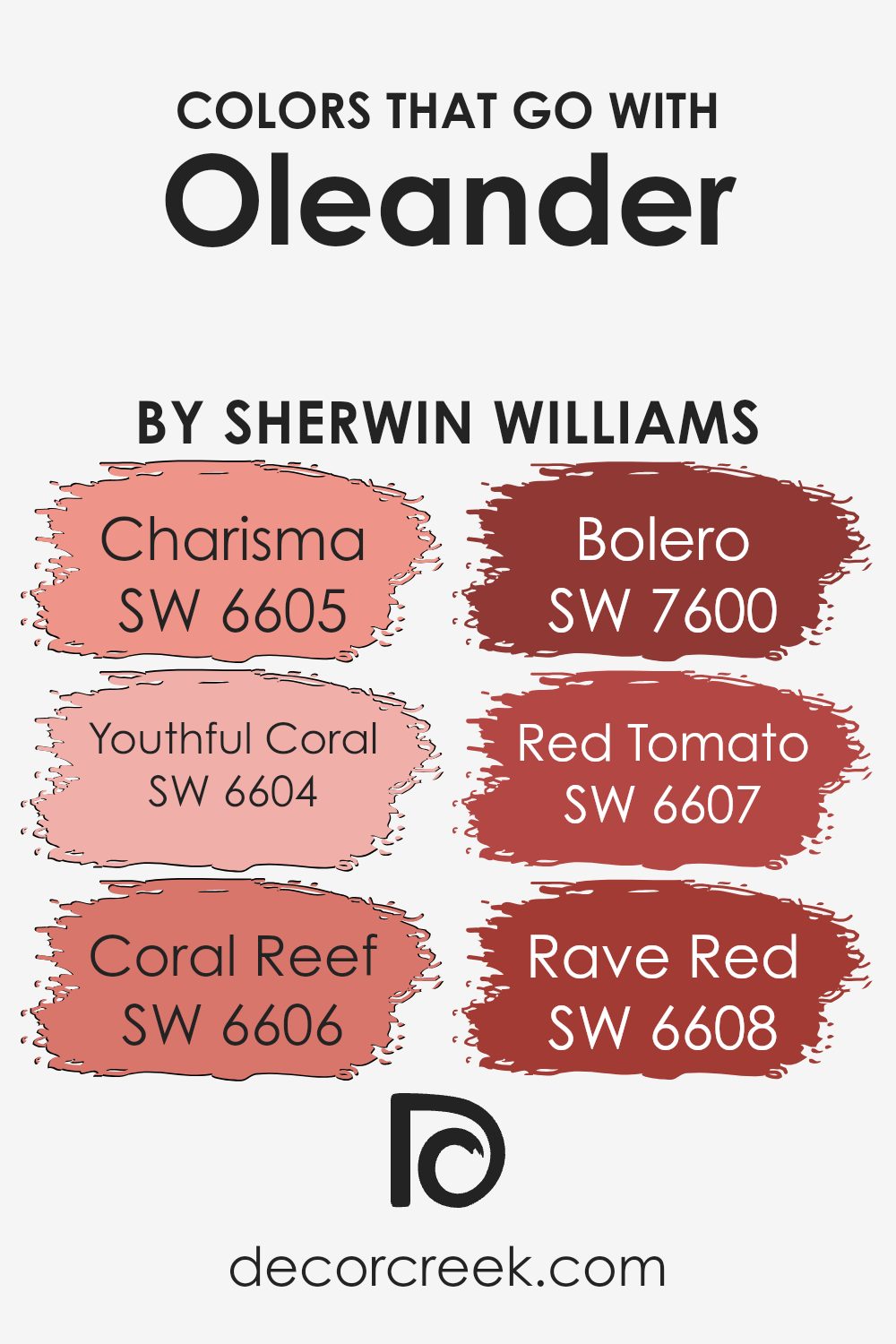
Colors that Go With Oleander SW 6603 by Sherwin Williams
Colors that complement Oleander SW 6603 by Sherwin Williams create a harmonious and balanced look in any space. Using these colors helps highlight the beauty of Oleander while adding depth and interest to a room’s design. SW 6605 – Charisma is a soft, warm coral that brings a cheerful and lively feel to any setting.
It’s perfect for adding a touch of energy without overwhelming the senses. SW 6604 – Youthful Coral is lively and fresh, infusing spaces with a sense of vitality that pairs beautifully with Oleander.
Complementing these are SW 6606 – Coral Reef, which offers a vibrant and bold splash of color, immediately brightening up any area it graces.
For those who prefer deeper tones, SW 7600 – Bolero provides a rich and dramatic red that adds a striking contrast to Oleander’s softer hue.
On the other hand, SW 6607 – Red Tomato brings in a spirited and dynamic pop of color, ideal for making a bold statement. Finally, SW 6608 – Rave Red, with its intense and passionate shade, adds a daring and adventurous vibe, ensuring that any room featuring Oleander remains lively and full of character. Together, these colors enhance Oleander, providing endless possibilities for creating spaces that are both warm and inviting.
You can see recommended paint colors below:
- SW 6605 Charisma
- SW 6604 Youthful Coral
- SW 6606 Coral Reef
- SW 7600 Bolero
- SW 6607 Red Tomato
- SW 6608 Rave Red
How to Use Oleander SW 6603 by Sherwin Williams In Your Home?
Oleander SW 6603 by Sherwin Williams is a warm, soft pink that brings a cozy and inviting feeling to any room. It’s gentle and versatile, making it a great choice for various spaces in your home. In the living room, Oleander can create a welcoming atmosphere that encourages relaxation and conversation. It pairs well with neutral colors like white or beige, providing a subtle pop of color without being overwhelming.
In the bedroom, Oleander’s soothing hue promotes a restful environment, perfect for winding down after a long day. When used in a child’s room, it adds a playful touch while remaining stylish and modern.
In the kitchen, this pink shade can add a unique twist, complementing both modern and vintage styles. Oleander is also a great option for accent walls or smaller areas like bathrooms or nooks, bringing a touch of warmth and elegance without overpowering the space.
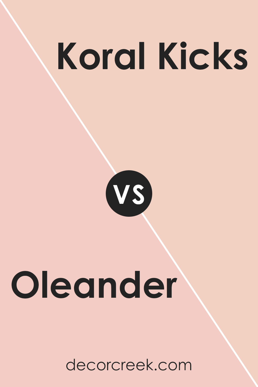
Oleander SW 6603 by Sherwin Williams vs Koral Kicks SW 6610 by Sherwin Williams
Oleander SW 6603 and Koral Kicks SW 6610 by Sherwin Williams are both vibrant shades, but each has its unique feel. Oleander is a lively and warm pink. It brings a sense of energy and cheerfulness, making it a great choice for spaces meant to feel welcoming and lively.
In contrast, Koral Kicks is a richer, slightly darker coral tone. It has a touch more orange, giving it a bold and adventurous vibe. Koral Kicks can add a bit of drama to a room while keeping it inviting.
When paired together, Oleander can serve as a lighter, refreshing touch, while Koral Kicks acts as a strong accent, adding depth. They complement each other well, offering both brightness and intensity. Whether used alone or together, these colors bring a splash of personality to any space.
You can see recommended paint color below:
- SW 6610 Koral Kicks
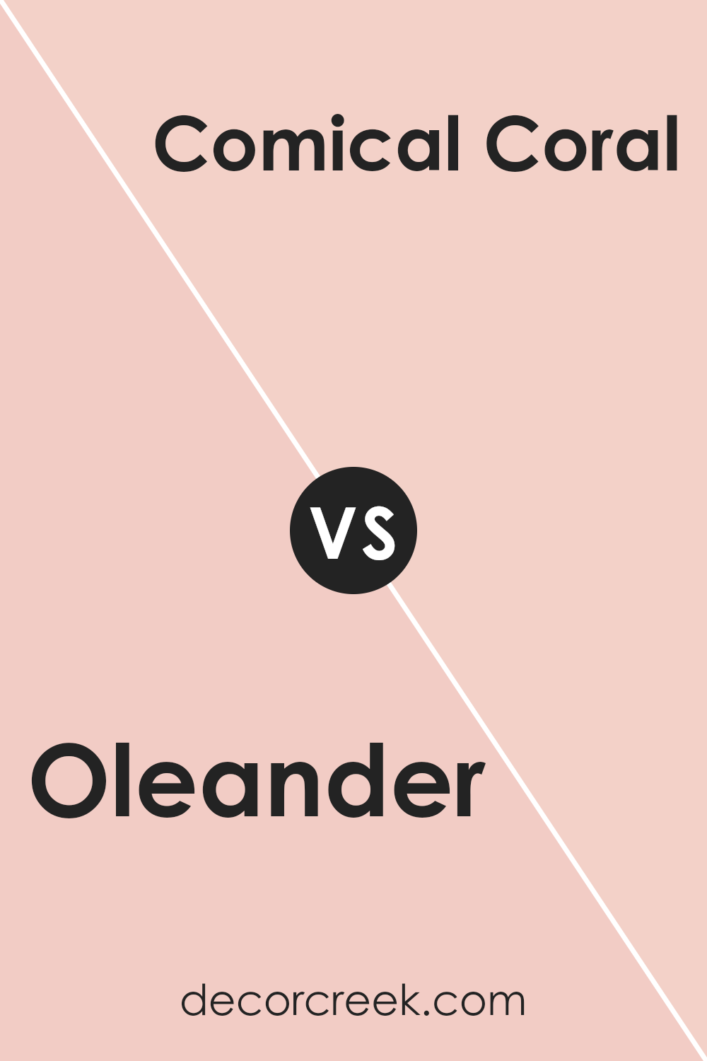
Oleander SW 6603 by Sherwin Williams vs Comical Coral SW 6876 by Sherwin Williams
Oleander (SW 6603) and Comical Coral (SW 6876) are both sunny, vibrant colors from Sherwin Williams. Oleander is a warm pink with a hint of peach, giving it an inviting and cheerful look. This color works well for spaces where you want to create a warm, cozy atmosphere.
Comical Coral, on the other hand, is a brighter, more vivid coral that leans more towards an orange tone. It adds energy and liveliness to a room, making it ideal for spaces that need a bold and energetic vibe.
While Oleander is more subtle and soothing, Comical Coral is all about making a statement.
Both colors can energize a space, but Oleander offers a softer, peachy-pink feel, while Comical Coral delivers a punchy, bright coral appearance.
They can each brighten up a room in their own unique way.
You can see recommended paint color below:
- SW 6876 Comical Coral
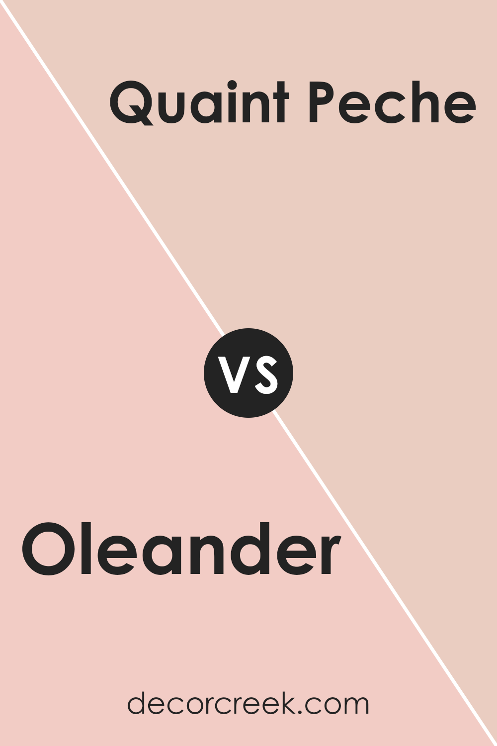
Oleander SW 6603 by Sherwin Williams vs Quaint Peche SW 6330 by Sherwin Williams
Oleander SW 6603 by Sherwin Williams is a bold and vibrant pinkish-red color. It’s bright and full of energy, making it an excellent choice if you want to add a lively vibe to a space. This color is great for creating a statement wall or adding a pop of color to a room.
On the other hand, Quaint Peche SW 6330 is a lighter, peachy hue. It feels softer and more subtle compared to Oleander. Quaint Peche offers a warm and inviting atmosphere without being overpowering. It works well in spaces where you want a gentle, soothing environment.
While Oleander tends to dominate and draw immediate attention, Quaint Peche brings a calming and cozy feel. Both colors have their strengths, but they serve different purposes. Oleander is perfect for making a dramatic impact, while Quaint Peche is better suited for creating a relaxed, homey ambiance.
You can see recommended paint color below:
- SW 6330 Quaint Peche
Oleander SW 6603 by Sherwin Williams vs Bella Pink SW 6596 by Sherwin Williams
Oleander SW 6603 and Bella Pink SW 6596 are two shades of pink by Sherwin Williams, each bringing its own charm. Oleander is a warm, vibrant pink that can energize a room with its bold, lively tone. It has a touch of coral, making it feel rich and full of life.
Bella Pink, on the other hand, is a lighter, softer pink. It’s more subtle and gentle, offering a sweet and delicate feel. While Oleander is ideal for spaces that want a pop of color and a statement, Bella Pink suits areas where a more subdued, calming presence is desired.
Both colors can add warmth to a room, but Oleander is more for making bold impressions, whereas Bella Pink offers a whisper of color.
Depending on the mood and atmosphere you want, either color can be a beautiful choice.
You can see recommended paint color below:
- SW 6596 Bella Pink
Oleander SW 6603 by Sherwin Williams vs Gaiety SW 6872 by Sherwin Williams
Oleander (SW 6603) and Gaiety (SW 6872) by Sherwin Williams are both vibrant colors, but they offer distinct vibes. Oleander is a warm, lively pink with a hint of peach, making it cheerful and inviting. It adds a soft, playful touch to any space and pairs well with neutral tones or light gray for a balanced look.
On the other hand, Gaiety is a bright, energetic fuchsia. It’s bold and eye-catching, perfect for making a statement.
This color works well with whites and metallics, giving rooms a modern edge. While Oleander can create a softer, cozy atmosphere, Gaiety is more about making a dramatic impact. Both colors can bring life to a room, but Oleander does so with a gentle touch, whereas Gaiety commands attention with its intensity. Whether you want a subtle warmth or a vibrant pop, these colors offer something unique.
You can see recommended paint color below:
- SW 6872 Gaiety
Oleander SW 6603 by Sherwin Williams vs Blushing SW 6617 by Sherwin Williams
Oleander SW 6603 and Blushing SW 6617 by Sherwin Williams are two charming shades of pink. Oleander is a bold, bright pink with a touch of coral, making it lively and energetic. It brings a vibrant feel to any space, perfect for adding a pop of color to a room.
Blushing, on the other hand, is a softer, lighter pink. It has a gentler, more delicate appearance, creating a sense of warmth and friendliness. This shade works well in spaces where a softer touch is desired, such as bedrooms or nurseries.
While Oleander is attention-grabbing and dynamic, Blushing offers a subtle and calming presence. The choice between the two depends on the mood and effect you want to achieve in your space; whether you’re aiming for vibrant energy with Oleander or gentle warmth with Blushing. Both colors offer their own unique charm and can be used to create distinct atmospheres.
You can see recommended paint color below:
- SW 6617 Blushing
Oleander SW 6603 by Sherwin Williams vs Charming Pink SW 6309 by Sherwin Williams
Oleander (SW 6603) by Sherwin Williams is a vibrant and bold pink that grabs attention. It has warm undertones, making it lively and cheerful, ideal for spaces where you want to add energy. In contrast, Charming Pink (SW 6309) is a softer, more subtle pink. It has cooler undertones, creating a gentle and calming atmosphere.
Oleander is perfect for accent walls or spaces where you want to make a statement. It’s great for playful environments. On the other hand, Charming Pink works well in bedrooms or nurseries, offering a cozy and soothing feel.
While Oleander is more about making an impact, Charming Pink brings a sense of gentleness and comfort. Both colors bring different vibes to a room, with Oleander being more bold and daring, while Charming Pink leans toward a more delicate and peaceful ambiance.
You can see recommended paint color below:
Oleander SW 6603 by Sherwin Williams vs Innocence SW 6302 by Sherwin Williams
Oleander (SW 6603) by Sherwin Williams is a warm, vibrant pink. It’s lively, energetic, and can add a bold touch to any room. This color can make a space feel cheerful and inviting, perfect for areas where you spend time with friends and family. On the other hand, Innocence (SW 6302) is a softer, more muted pink. It has a gentle, calming quality that can bring a sense of peace and relaxation to a space, making it ideal for bedrooms or areas meant for relaxation.
When comparing these two colors, Oleander is the more intense, eye-catching option, while Innocence offers a more subtle, understated look. Oleander could be a great choice if you want to make a statement or energize a space.
In contrast, Innocence would work well if you’re looking to create a soothing atmosphere. Both colors have their unique appeal and can be used to create different moods in a room.
You can see recommended paint color below:

Oleander SW 6603 by Sherwin Williams vs Rose Pink SW 9693 by Sherwin Williams
Oleander and Rose Pink are two lovely colors from Sherwin Williams that bring out different feelings and styles. Oleander is a warm, medium pink with coral undertones. It can make a room feel cozy and cheerful, perfect for spaces where you want a lively yet comfortable atmosphere.
On the other hand, Rose Pink is a softer, lighter pink with sweet and gentle undertones. It gives a room a light and airy feeling, making it suitable for areas where you want a touch of elegance and calm.
While Oleander is bolder and stands out more due to its warmth and vibrancy, Rose Pink is more subtle and soothing. Choosing between these shades depends on the mood you want to create.
Oleander is great for accent walls or lively rooms, while Rose Pink works well in bedrooms or spaces where you want a peaceful touch. Both colors add charm, each in their unique way
You can see recommended paint color below:
- SW 9693 Rose Pink
Oleander SW 6603 by Sherwin Williams vs Rosy Outlook SW 6316 by Sherwin Williams
Oleander (SW 6603) and Rosy Outlook (SW 6316) are both warm, inviting shades from Sherwin Williams, but they have distinct personalities. Oleander is a vibrant, deep pink with a touch of red that adds boldness and energy to any space. It’s a striking color that makes a statement, perfect for accent walls or focal points.
In contrast, Rosy Outlook is a softer, more subdued pink. It has a hint of warmth without being overpowering, making it an excellent choice for creating a cheerful and friendly atmosphere. This softness allows it to blend well in various settings, whether in a nursery, a bedroom, or a living room.
While Oleander exudes confidence and vibrancy, Rosy Outlook offers a gentle and welcoming feel. Depending on the mood you want to create, Oleander can be the life of the party, while Rosy Outlook can provide a calming, positive backdrop.
You can see recommended paint color below:
- SW 6316 Rosy Outlook
Conclusion
After looking closely at SW 6603 Oleander by Sherwin Williams, I’ve learned a lot about this special color. This color is a bright and happy shade of pink, and it reminds me of pretty flowers blooming in a garden. When I think of Oleander, it makes me feel cheerful and excited, like a sunny day or fun times with friends.
This color is great for adding a lively touch to any room. You can paint a wall with it to make the room look more fun or use it for small things like furniture to give your place a pop of color.
Imagine walking into a room, and your eyes catch this lovely pink—it’s like a friendly smile welcoming you inside.
If you don’t want too much pink, Oleander goes well with other colors. Pair it with gentle whites or soft grays, and it will look both cool and inviting. It’s quite flexible, so it won’t mind sharing the stage with other colors too.
In my view, SW 6603 Oleander by Sherwin Williams is more than just paint. It’s like adding a little piece of happiness to your environment. If you want to make things feel brighter and full of joy, this is a great choice. It’s perfect for making your surroundings feel warm and welcoming.

Ever wished paint sampling was as easy as sticking a sticker? Guess what? Now it is! Discover Samplize's unique Peel & Stick samples.
Get paint samples

