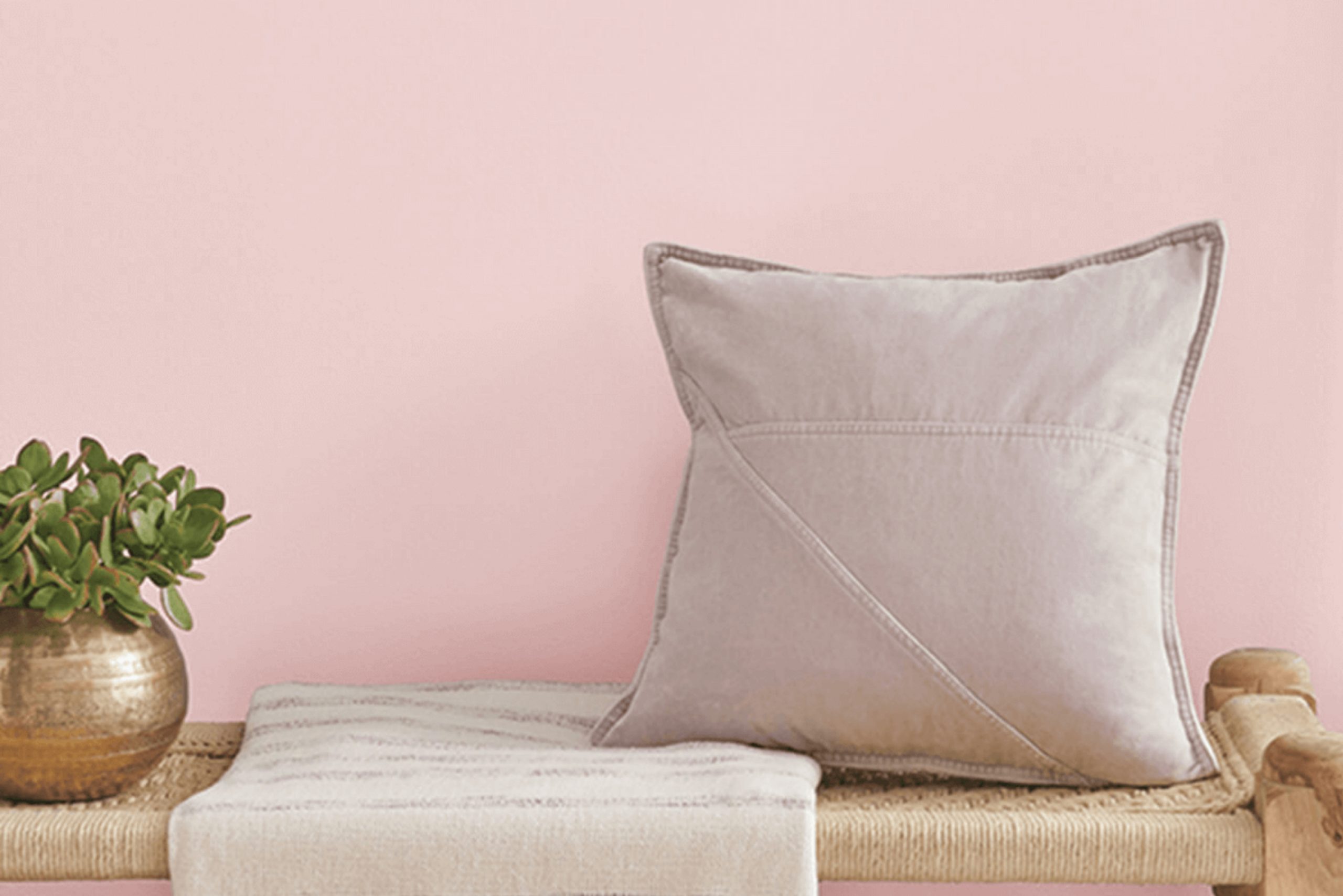
When I first stumbled upon Sherwin-Williams’ SW 6302 Innocence, I felt drawn to its soft and inviting charm. This color has a gentle warmth that seems to invite conversation and reflection, making any room feel more welcoming and comfortable. Its subtle pink undertone adds a touch of playfulness without overpowering the senses, perfect for creating an atmosphere of calm and openness.
Innocence doesn’t demand attention; instead, it gracefully supports the other colors around it. Whether used in a bedroom, kitchen, or living space, it acts as a quiet canvas that enhances whatever style or decor you have.
I found that it pairs beautifully with soft neutrals and bold accents alike, offering flexibility in design choices. It’s perfect for refreshing a space without committing to a bolder hue.
In my experience, choosing the right color can transform the feel of a room, and Innocence does that with ease. Its soft and serene presence makes it a go-to choice for those looking to create a peaceful yet stylish environment.
If you’re considering a change that brings subtle sophistication, SW 6302 Innocence might just be the hue you’re looking for.
What Color Is Innocence SW 6302 by Sherwin Williams?
Innocence SW 6302 by Sherwin Williams is a soft and gentle pink hue that brings a warm and inviting feel to any space. This color exudes a sense of lightness and comfort, making it ideal for creating cozy and welcoming environments.
In a nursery, Innocence can be the perfect backdrop, providing a soothing and calming atmosphere. It’s also a great choice for bedrooms or living rooms where you want to foster relaxation and a sense of warmth.
The subtlety of this pink allows it to work well in various interior styles, but it shines in shabby chic, traditional, and cottage-style interiors. These styles often emphasize comfort, charm, and a touch of feminine grace, which Innocence complements beautifully.
When it comes to materials, Innocence pairs wonderfully with soft fabrics like cotton, linen, and velvet.
Wood accents, particularly in lighter shades or painted finishes, blend harmoniously with this color. Textures such as woven baskets, soft rugs, and delicate lace also enhance the gentle feel of Innocence.
Innocence SW 6302 is a versatile paint color that creates an inviting space. With the right materials and textures, it enhances interiors by adding a warm glow and a touch of understated elegance.
Is Innocence SW 6302 by Sherwin Williams Warm or Cool color?
Innocence SW 6302 by Sherwin Williams is a soft and subtle pink that lends a gentle and warm atmosphere to any room. This color is not overpowering, making it a great choice for creating a cozy and welcoming space. It works well in bedrooms and nurseries, where a soothing feel is often desired. The gentle tone of this pink can make a room feel brighter and more open, as it reflects light softly around the space.
When using Innocence in living rooms or dining areas, it pairs nicely with neutral tones like white, beige, or light gray, highlighting furnishings and décor. It can be used as an accent wall to bring a hint of color that isn’t too bold but still adds character.
Whether used in large or small spaces, Innocence creates a calm and comfortable environment, inviting family and guests to relax and enjoy.
Undertones of Innocence SW 6302 by Sherwin Williams
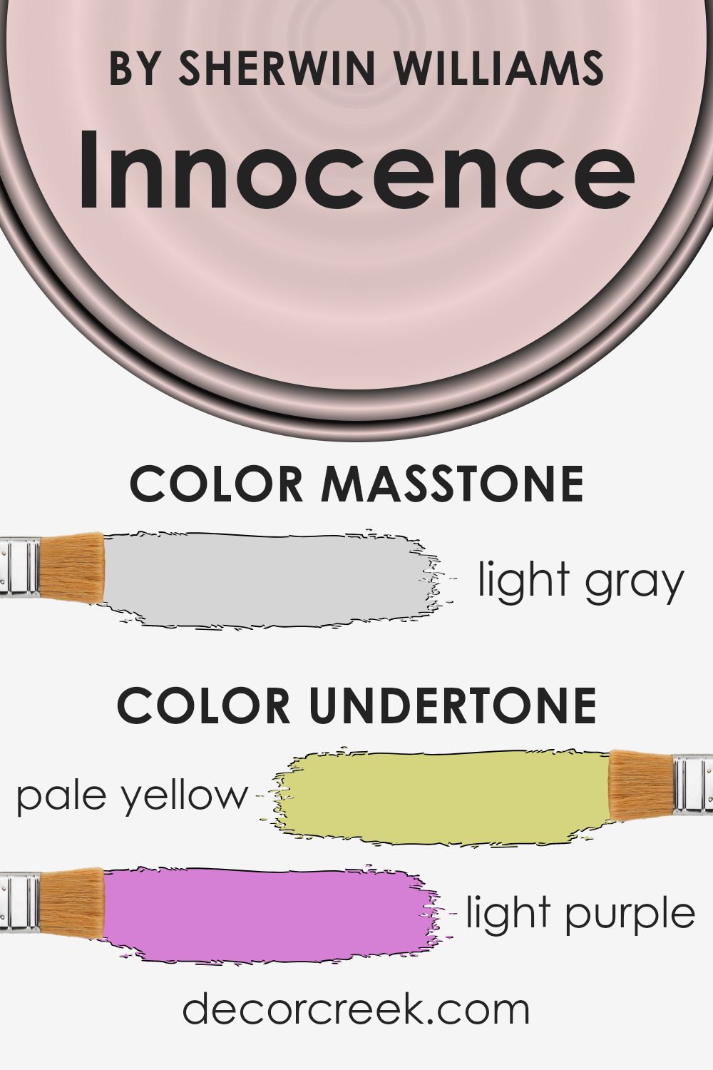
Innocence by Sherwin Williams is a paint color that carries a mix of subtle undertones. These undertones can greatly influence how we perceive the color. For instance, the pale yellow (#D5D580) and pale pink (#D58080) can add warmth, while the light purple (#D580D5) and lilac (#8080D5) bring a gentle softness. The light blue (#80D5D5) and mint (#80D580) introduce a touch of coolness, creating a refreshing feel. The grey (#808080) undertone adds neutrality, giving it a balanced feel.
When applied to interior walls, these undertones make Innocence a versatile choice. The yellow and pink hints can make a room feel cozy and inviting, while the blue and mint add a sense of calmness. The purple and lilac undertones bring a subtle hint of elegance.
Meanwhile, the grey component keeps it grounded, making it suitable for a wide range of decor styles.
Overall, the undertones affect how Innocence is experienced in different lighting conditions. In natural light, warmer undertones might dominate, making the space feel more welcoming. In cooler artificial light, the bluish and grey tones can become more prominent, adding a calming vibe.
The combination of these undertones creates a harmonious and adaptable wall color.
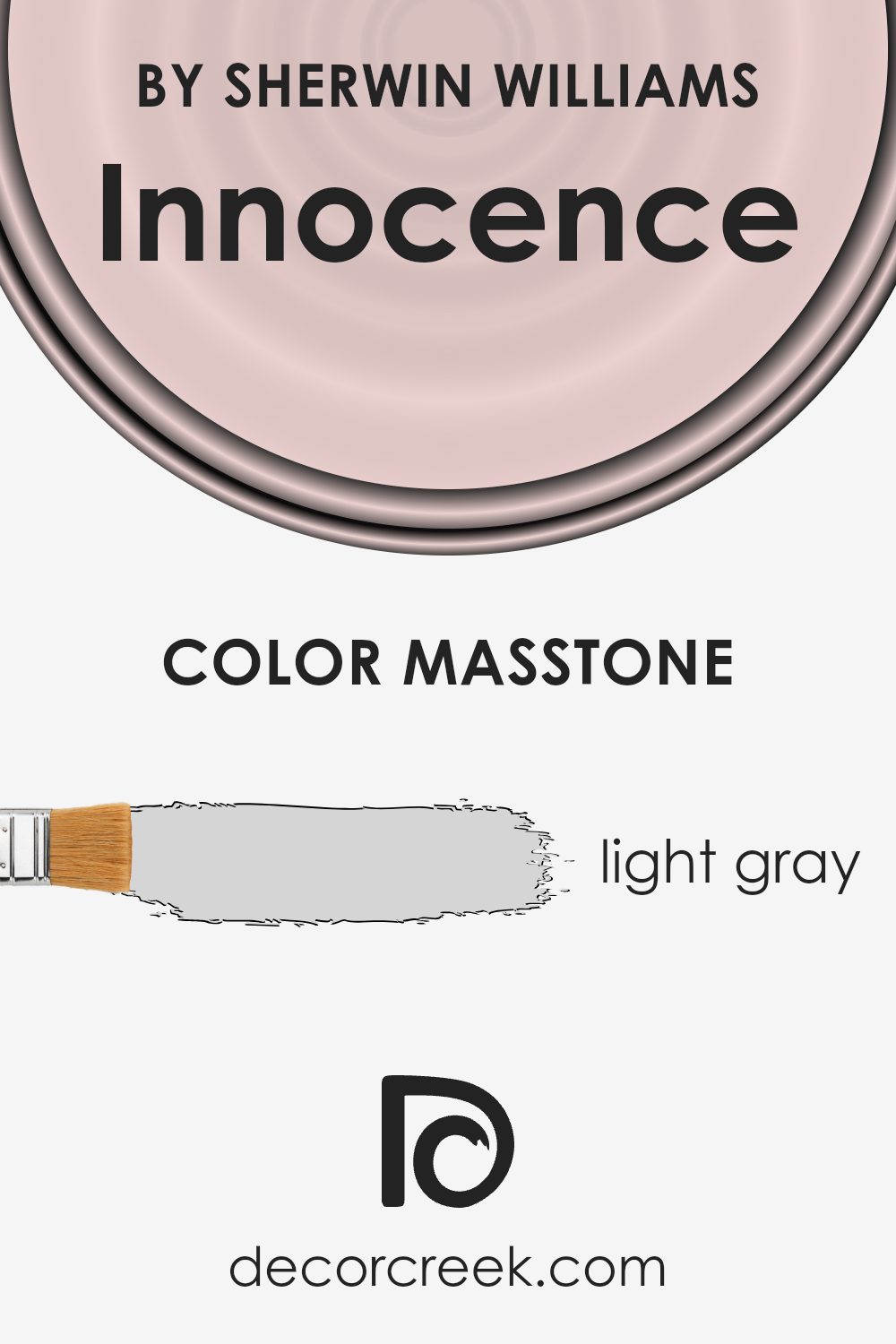
What is the Masstone of the Innocence SW 6302 by Sherwin Williams?
Innocence SW 6302 by Sherwin Williams is a light gray color (#D5D5D5) that brings a soft, neutral touch to homes. Its gentle hue makes it perfect for creating a calm and welcoming atmosphere. Light gray is a versatile color that works well with various design styles, from modern to traditional. It doesn’t overpower a room, allowing other elements like furniture, artwork, or colorful accents to stand out.
In living areas, Innocence can help make spaces feel open and airy, which is especially beneficial in smaller rooms. In bedrooms, it can create a relaxing environment, promoting restful sleep.
Because it’s a neutral tone, Innocence serves as an excellent backdrop for different materials and textures, like wood, metal, or fabric.
This shade’s subtlety makes it easy to pair with both warm and cool colors, adding depth to the room without taking center stage. This light gray can help achieve a balanced and harmonious look throughout the home.
How Does Lighting Affect Innocence SW 6302 by Sherwin Williams?
Lighting plays a crucial role in how we perceive colors in a space. Different lighting can make the same color look slightly different. Understanding the effect of light on color can help us make better choices in home decor and design.
Innocence SW 6302 by Sherwin Williams is a soft, warm hue that can look different depending on the type of light it is under. In natural light, this color tends to look brighter and more vibrant.
The amount and direction of natural light in a room significantly influence how Innocence appears.
In a north-facing room, the light is cooler and softer. This means colors often look more muted and cooler. Innocence SW 6302 could look a bit more subdued and less warm in this setting. Rooms with north-facing windows often get steady, indirect light, which can highlight the soft, calming aspects of Innocence but might not show its warmth as much.
In a south-facing room, the situation changes. South-facing windows get lots of direct sunlight throughout the day, making colors appear richer and warmer. Innocence will look lively and warm in a south-facing room, enhancing its inviting and cozy quality.
East-facing rooms get bright, direct sunlight in the morning and then softer, indirect light as the day goes on. In the morning light, Innocence can appear warm and fresh. As the light becomes less direct in the afternoon, the color might look softer and less intense.
West-facing rooms have the opposite pattern. They receive soft light in the morning and intense, warm light later in the day.
In the afternoon and evening, Innocence will show off its warmer tones and can look more intense when bathed in the golden glow of the setting sun.
Artificial light can also affect how we see this color. Warm artificial lighting enhances the warmth and coziness of Innocence, while cooler LED lights may make it feel softer and less intense. Adjusting the type of artificial light in a room lets you control the appearance of the color to suit your preferences.

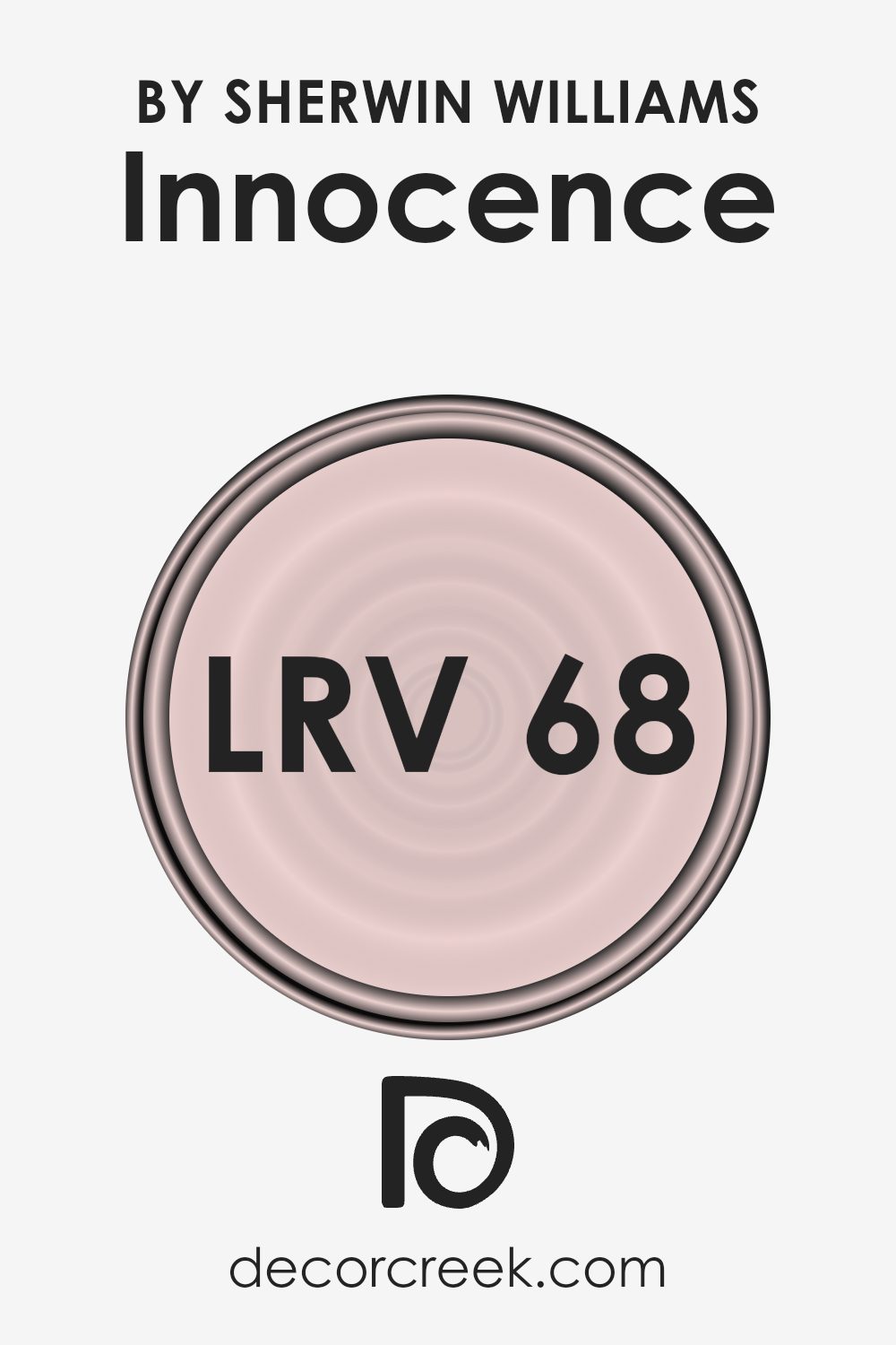
What is the LRV of Innocence SW 6302 by Sherwin Williams?
LRV, or Light Reflectance Value, tells us how much light a color will reflect. It’s a scale where black is 0 and white is 100. A higher LRV means the color reflects more light, making spaces feel brighter and often more open. In homes, colors with high LRV values can make a room feel larger and airier, while those with lower LRVs may absorb more light and make a space feel cozier. Understanding LRV helps in choosing colors that fit the mood and function of your space.
The LRV of Innocence, which is 68, means it reflects a good amount of light. This makes the color appear bright and fresh on walls. It’s a useful choice if you want to make a room feel light and cheerful without using pure white.
This color can work well in rooms that don’t get a lot of natural light, as it will help bounce whatever light is present around the room, making it feel more inviting.
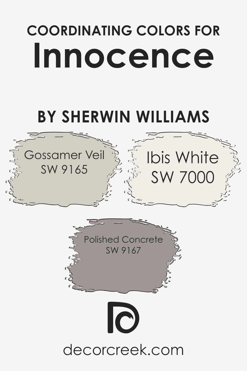
Coordinating Colors of Innocence SW 6302 by Sherwin Williams
Coordinating colors are hues that complement one another, creating a pleasing and harmonious palette in a space. When you choose a color like Innocence by Sherwin Williams, you can pair it with coordinating colors to enhance its effect and achieve a balanced look.
Take, for example, Gossamer Veil, Polished Concrete, and Ibis White. These colors are chosen to work well together, creating an inviting and cohesive atmosphere in any room.
Gossamer Veil is a soft, warm gray that provides a gentle backdrop, adding sophistication without overwhelming the senses. Polished Concrete offers a slightly deeper, cool gray tone that contrasts subtly with Innocence, adding depth and interest to the palette.
Ibis White is a crisp white that brightens and highlights the other colors, providing a clean and fresh complement.
Together, these colors can enhance the gentle blush of Innocence and create a comfortable and welcoming environment that feels effortlessly put together. Whether you’re painting a living room, bedroom, or any other space in your home, using coordinated colors helps ensure each space feels connected and thoughtfully designed.
You can see recommended paint colors below:
- SW 9165 Gossamer Veil
- SW 9167 Polished Concrete
- SW 7000 Ibis White
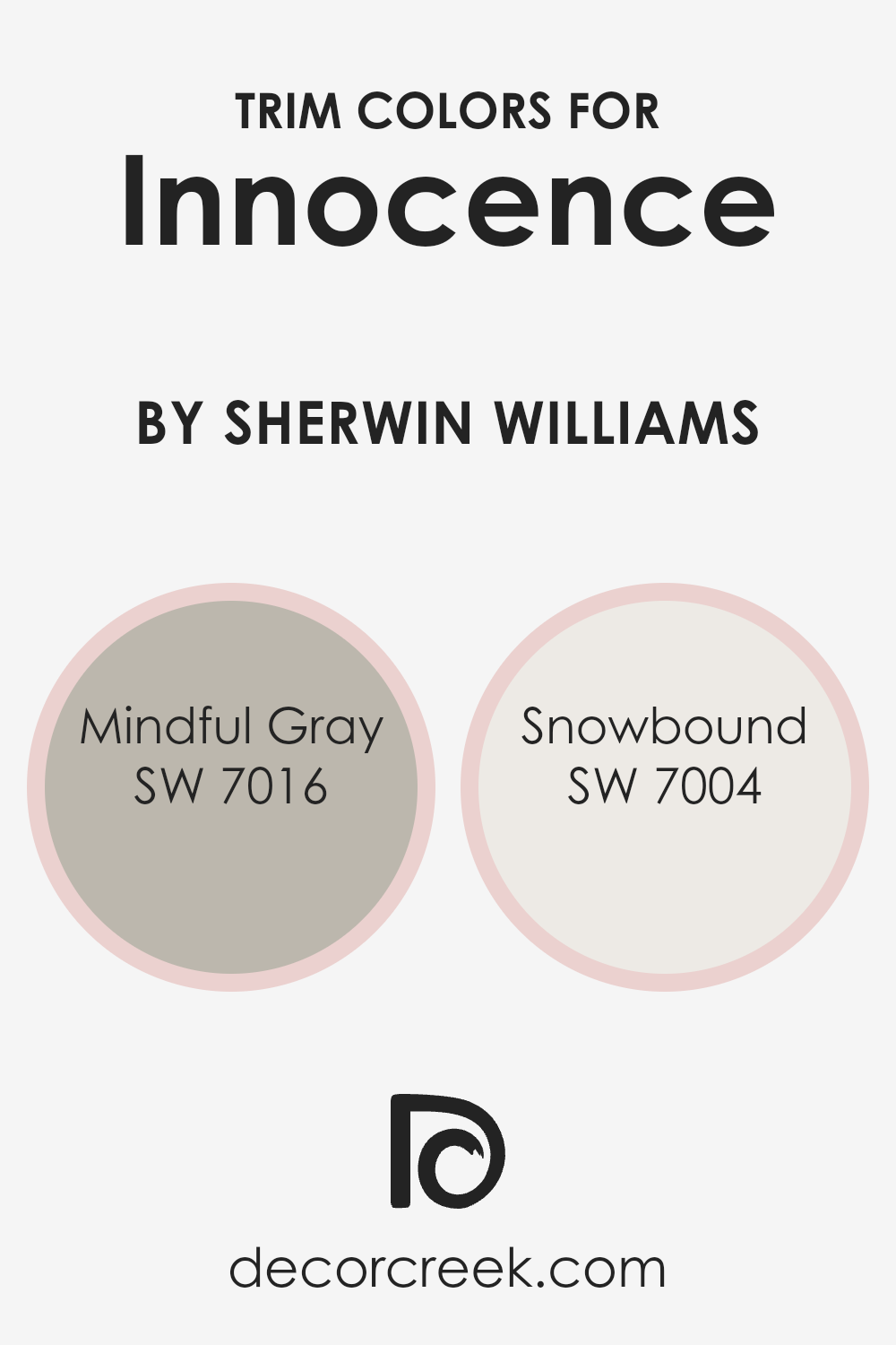
What are the Trim colors of Innocence SW 6302 by Sherwin Williams?
Trim colors are the shades used to accent and frame walls, windows, or doors, giving a room a finished look. When you use certain colors for the trim, it can make other colors stand out or blend well, depending on the effect you want.
For example, using SW 7016 Mindful Gray and SW 7004 Snowbound as trim colors for SW 6302 Innocence from Sherwin Williams can change how the main color looks and feels in a space.
Mindful Gray offers a soft, neutral touch that balances well with the gentle pink of Innocence. On the other hand, Snowbound provides a crisp, clean look that highlights the delicacy of Innocence, adding a sense of brightness and clarity to the overall palette.
Selecting the right trim color is crucial because it helps define the design and feel of a space.
Mindful Gray, a soft, neutral gray, provides a calm and balanced complement to other colors without dominating. Meanwhile, Snowbound, a fresh and bright white, gives rooms a clean and contemporary edge. These colors not only enhance the beauty of the main wall color but also ensure that each room feels cohesive and well put-together.
Using Mindful Gray and Snowbound as trims with Innocence integrates a subtle complexity to a room’s decor, while maintaining a welcoming and harmonious environment.
You can see recommended paint colors below:
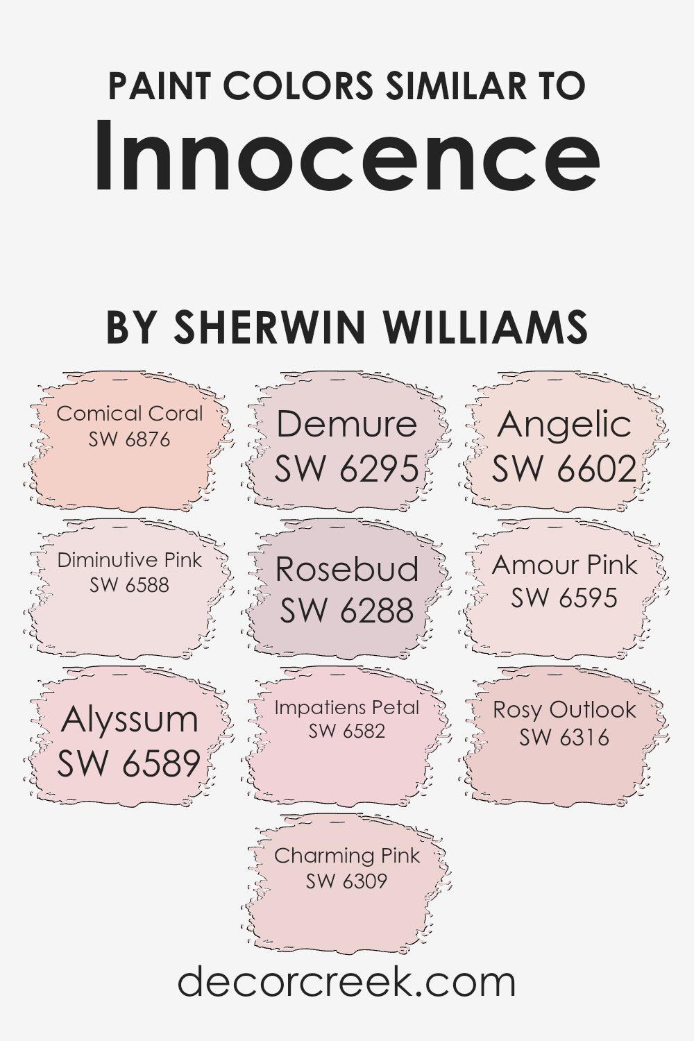
Colors Similar to Innocence SW 6302 by Sherwin Williams
Similar colors play a crucial role in design by creating harmony and balance in a space. When you use shades that are close to each other like those inspired by Innocence, they bring a gentle and cohesive feel to a room. Each color blends smoothly into the next, allowing eyes to move without interruption across a space.
For example, Comical Coral is a lively yet soft coral shade that adds a playful touch. Next to it, Diminutive Pink offers a sweet, delicate pink that complements the lively tones without overpowering them. Alyssum brings a sense of lightness, being a fresh and youthful pink that brightens up the palette.
Charming Pink adds a layer of warmth with its mild blush hue, while Demure balances the energy with its understated soft pink. Rosebud provides a gentle, romantic touch by presenting a more blush-tinted shade. Impatiens Petal introduces a muted pink that feels welcoming and intimate.
Meanwhile, Angelic is a lighter pink, spreading an airy and gentle feel across the room.
Amour Pink suggests a loving atmosphere with its warm, comforting tone, and Rosy Outlook crowns the collection with its optimistic and inviting shade. Together, these colors work to create a peaceful and inviting environment that feels both sophisticated and approachable, wrapping the space in tenderness.
You can see recommended paint colors below:
- SW 6876 Comical Coral
- SW 6588 Diminutive Pink
- SW 6589 Alyssum
- SW 6309 Charming Pink
- SW 6295 Demure
- SW 6288 Rosebud
- SW 6582 Impatiens Petal
- SW 6602 Angelic
- SW 6595 Amour Pink
- SW 6316 Rosy Outlook
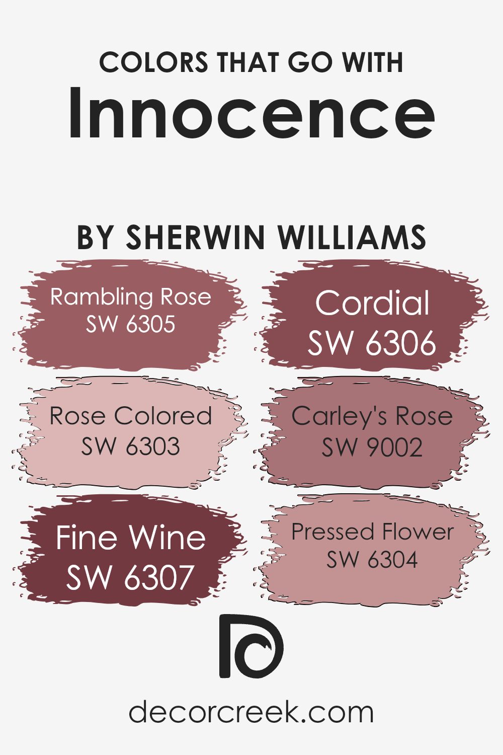
Colors that Go With Innocence SW 6302 by Sherwin Williams
Choosing colors that pair well with Innocence SW 6302 by Sherwin-Williams is crucial because they bring out the beauty of this light, peachy-pink hue. These complementary colors enhance the feeling of warmth and coziness that Innocence naturally provides.
For instance, SW 6305 – Rambling Rose is a deeper, dusty rose that offers a lovely contrast with Innocence, adding depth and richness to any room. Similarly, SW 6303 – Rose Colored is a vibrant and lively shade that energizes the soft, muted quality of Innocence.
On the other hand, SW 6307 – Fine Wine is a rich burgundy that creates an elegant yet inviting atmosphere when paired with the gentle tone of Innocence.
SW 6306 – Cordial brings a muted, warm wine shade that harmonizes beautifully with Innocence, offering a sophisticated contrast without overwhelming the space.
SW 9002 – Carley’s Rose is a deeper version of pink, which adds warmth and character, complementing the lightness of Innocence with its comforting depth.
Lastly, SW 6304 – Pressed Flower, with its muted rose tone, brings a subtle, grounded feeling that makes the lightness of Innocence pop while maintaining a balanced, inviting space.
Together, these colors create a harmonious palette that brings out the best in each shade, making spaces feel thoughtfully designed and soothing.
You can see recommended paint colors below:
- SW 6305 Rambling Rose
- SW 6303 Rose Colored
- SW 6307 Fine Wine
- SW 6306 Cordial
- SW 9002 Carley’s Rose
- SW 6304 Pressed Flower
How to Use Innocence SW 6302 by Sherwin Williams In Your Home?
Innocence SW 6302 by Sherwin Williams is a soft, gentle pink that brings a sense of calm and warmth to any room. This shade works beautifully in bedrooms, as it creates a relaxing and cozy atmosphere perfect for winding down. It’s also a lovely choice for nurseries or children’s rooms, adding a sweet and cheerful touch without being overwhelming.
In living rooms, Innocence can serve as a subtle backdrop that pairs well with both neutral and bold accents. It complements other colors beautifully, allowing you to mix and match decor pieces easily. In a kitchen, this shade can add a touch of warmth and brightness, making the space feel inviting.
For those looking to add a bit of color to their home without going overboard, Innocence is an excellent option. It provides a gentle wash of color that enhances the overall feel of the space, making it more welcoming and comfortable.
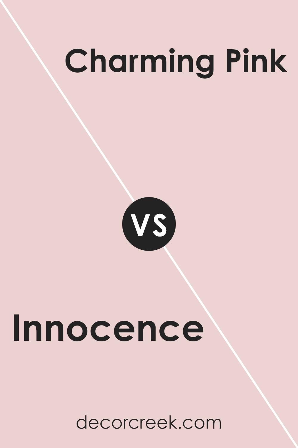
Innocence SW 6302 by Sherwin Williams vs Charming Pink SW 6309 by Sherwin Williams
Innocence SW 6302 by Sherwin Williams is a soft, gentle shade of pink that brings about a sense of calmness and comfort. It’s understated, making spaces feel airy and open, perfect for those who prefer a subtle touch to their walls. Its lightness can easily complement other colors in a room without overpowering them.
On the other hand, Charming Pink SW 6309 by Sherwin Williams is a bit bolder and more vibrant. It carries a warm, lively character, adding more energy to a space. This shade is great for making a statement and works well in areas where you want to create a cozy, inviting atmosphere.
Both colors are appealing, but they serve different purposes. Innocence offers a calming backdrop, while Charming Pink brings in warmth and energy. Your choice between them should depend on whether you want a soothing or lively ambiance.
You can see recommended paint color below:
- SW 6309 Charming Pink
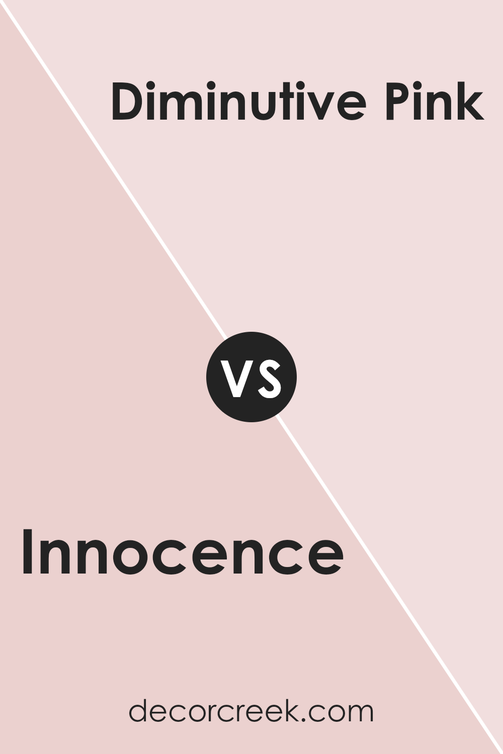
Innocence SW 6302 by Sherwin Williams vs Diminutive Pink SW 6588 by Sherwin Williams
Innocence SW 6302 by Sherwin Williams is a soft, warm pink that feels gentle and comforting. It’s a versatile color that can brighten up a room without being too overwhelming. This shade works well in spaces where you want to create a cozy and inviting atmosphere.
On the other hand, Diminutive Pink SW 6588 by Sherwin Williams is a more playful and vibrant pink. It’s brighter and a bit more energetic than Innocence.
Diminutive Pink can add a lively touch to a space, making it ideal for areas where you want to encourage creativity and fun, like a child’s room or a playful office. When compared, Innocence gives a subtle elegance, while Diminutive Pink stands out more with its cheerful and bold nature. Both colors bring their own unique charm, but they cater to slightly different moods and settings.
You can see recommended paint color below:
- SW 6588 Diminutive Pink
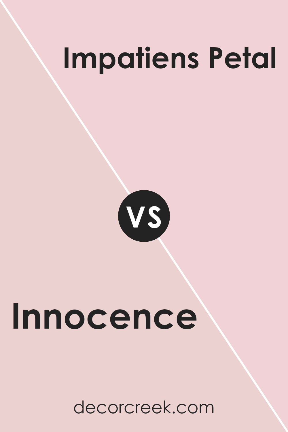
Innocence SW 6302 by Sherwin Williams vs Impatiens Petal SW 6582 by Sherwin Williams
Innocence SW 6302 by Sherwin Williams is a soft, gentle pink that feels light and calming. It’s a pastel shade that might remind you of a delicate flower, making a room feel open and airy. Innocence has a subtle warmth, which can add a touch of gentle elegance to a space.
On the other hand, Impatiens Petal SW 6582 by Sherwin Williams is a brighter, more vibrant pink. It stands out more, adding energy and life to a room. This color is bolder than Innocence, which means it can create a focal point in a space or highlight an accent wall with its lively personality.
While Innocence is more subdued and brings a sense of calm, Impatiens Petal is expressive and energizing. Together, these colors can balance each other out, with Innocence providing softness and Impatiens Petal delivering enthusiasm, creating a dynamic yet harmonious atmosphere.
You can see recommended paint color below:
- SW 6582 Impatiens Petal
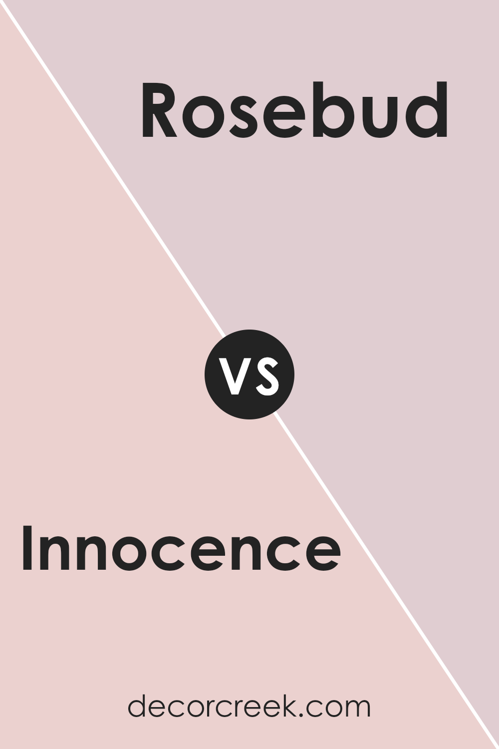
Innocence SW 6302 by Sherwin Williams vs Rosebud SW 6288 by Sherwin Williams
Innocence by Sherwin Williams is a soft, delicate pink with a subtle warmth that makes it feel gentle and inviting. It’s a color that can add a touch of sweetness to any room without being overwhelming. Innocence is perfect for spaces where you want to create a light, airy feeling, such as nurseries or bedrooms. It has a calm and pleasant vibe that works well with neutral accents like white or beige.
On the other hand, Rosebud by Sherwin Williams is a richer, more vibrant pink that has a slightly bolder presence. It carries a hint of energy and enthusiasm, making it ideal for spaces where you want to add a lively touch.
Rosebud pairs beautifully with other warm tones and can make a striking accent wall.
While both colors share a pink base, Innocence leans towards a soft, understated look, whereas Rosebud offers a more pronounced and vivid appearance.
You can see recommended paint color below:
- SW 6288 Rosebud
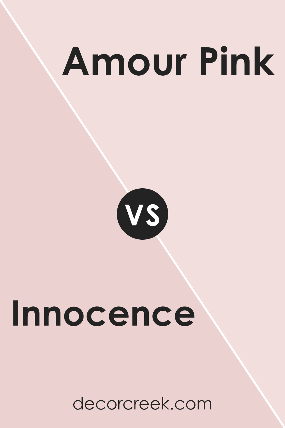
Innocence SW 6302 by Sherwin Williams vs Amour Pink SW 6595 by Sherwin Williams
“Innocence” by Sherwin Williams is a gentle, soft pink with a hint of peach, which gives it a warm, inviting feel. It is light and airy, making it suitable for spaces where you want a subtle touch of color that doesn’t overwhelm. This color creates a cozy atmosphere and works well in bedrooms or nurseries where a calming and welcoming tone is desired.
On the other hand, “Amour Pink” is a bolder, more vibrant pink with a stronger red undertone. It is lively and fun, making it a great choice for spaces that need a touch of energy and excitement, like playrooms or accent walls.
“Amour Pink” is more assertive than “Innocence” and can add a pop of color to a room, making it lively and engaging. While both colors belong to the pink family, their intensity and mood create different ambiances in a space.
You can see recommended paint color below:
- SW 6595 Amour Pink
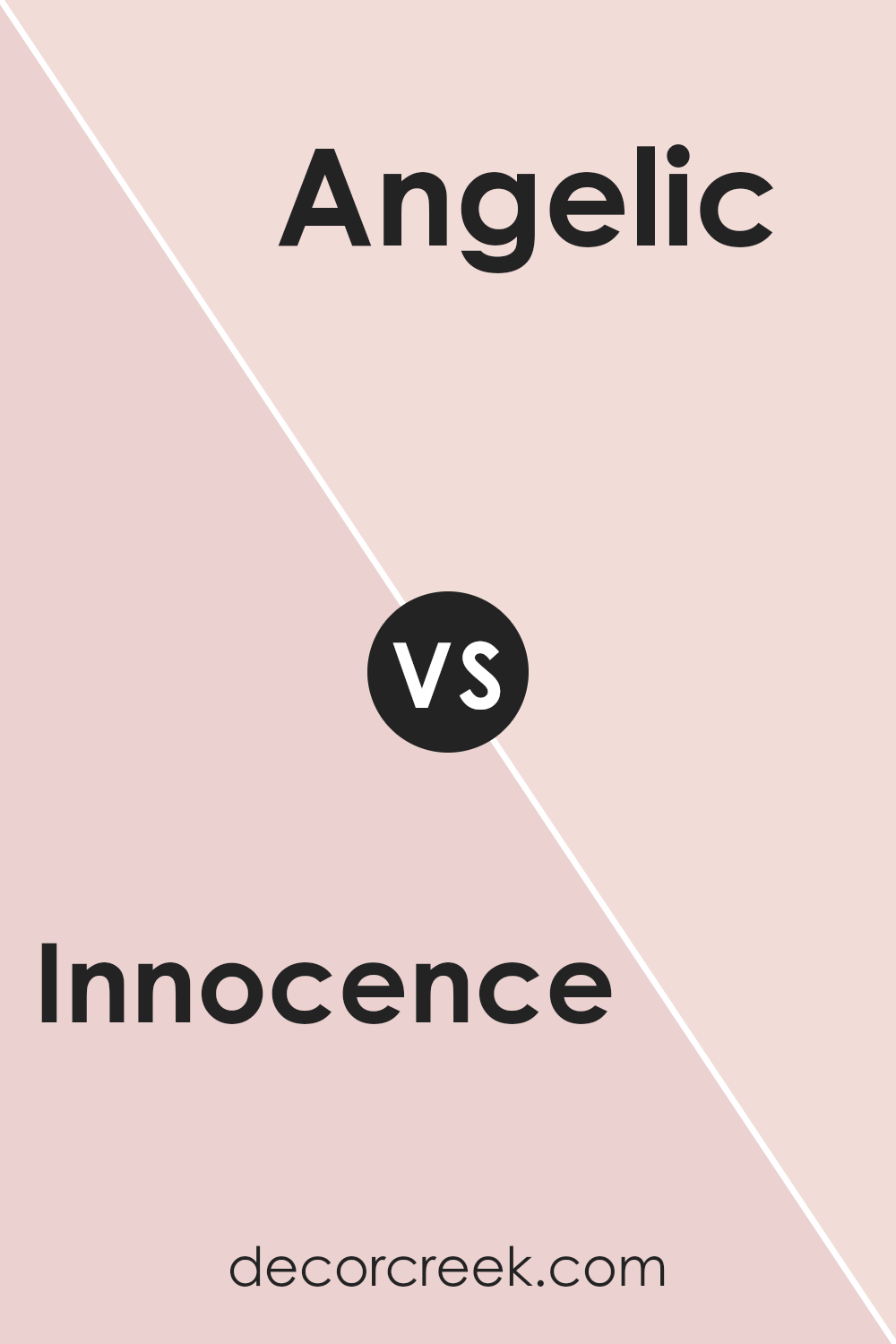
Innocence SW 6302 by Sherwin Williams vs Angelic SW 6602 by Sherwin Williams
Innocence SW 6302 by Sherwin Williams is a soft, warm pink with a gentle, soothing feel. It’s perfect for creating a calm and nurturing environment, often used in spaces like bedrooms or nurseries. This color brings a sense of warmth and subtle charm to any room due to its understated hue.
On the other hand, Angelic SW 6602 is a more vibrant and energetic shade of pink. It has a lively and uplifting quality that can add a pop of color to any space. This color is well-suited for areas where you want to inspire creativity and energy, such as playrooms or accent walls.
While both colors belong to the pink family, Innocence offers a quieter, more restrained presence, whereas Angelic provides a burst of vividness and excitement. Choosing between them depends on the mood you wish to create in your space.
You can see recommended paint color below:
- SW 6602 Angelic
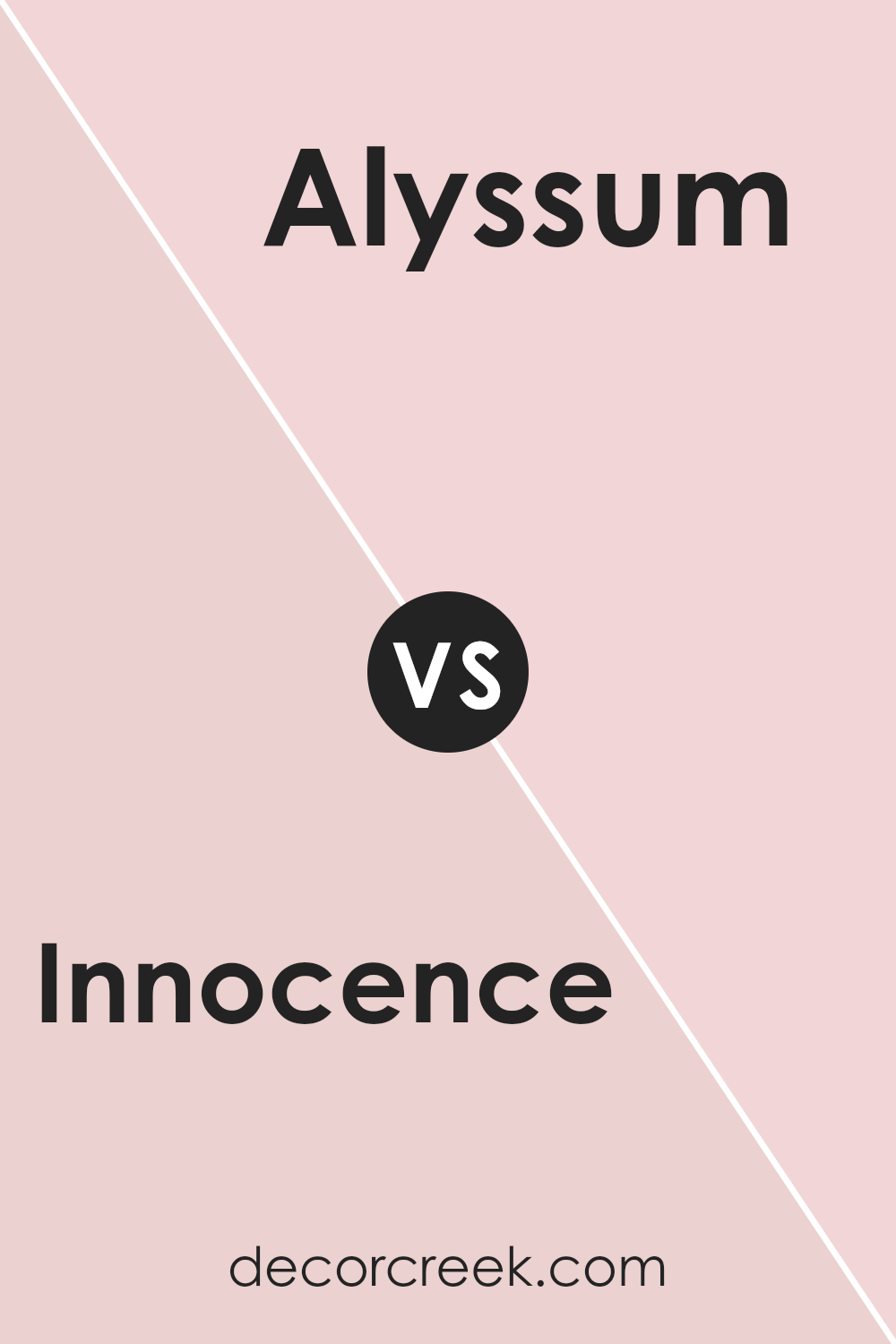
Innocence SW 6302 by Sherwin Williams vs Alyssum SW 6589 by Sherwin Williams
Innocence SW 6302 and Alyssum SW 6589 by Sherwin Williams are two soft, warm colors that bring a gentle feel to any space. Innocence is a very light pink that leans towards white. It creates a subtle, calming backdrop that is ideal for rooms where you want a light and airy atmosphere. It’s perfect for bedrooms or nurseries because of its soothing presence.
Alyssum, on the other hand, is a more distinct and vibrant pink with a hint of coral. It stands out more than Innocence and adds a cheerful and lively energy to a room.
Both colors work well in spaces where you want to promote a cozy and welcoming feeling but in different ways. Innocence offers a softer touch, while Alyssum provides a playful and energetic vibe. When coordinating these colors, you might use Innocence as a main wall color and Alyssum for accents or focal points.
You can see recommended paint color below:
Innocence SW 6302 by Sherwin Williams vs Rosy Outlook SW 6316 by Sherwin Williams
Innocence SW 6302 by Sherwin Williams is a soft, muted pink with gentle warmth. It has a quiet, calming quality, making it suitable for spaces where you want a relaxed atmosphere, like bedrooms or nurseries. It’s understated and subtle, providing a nice backdrop without being overwhelming.
Rosy Outlook SW 6316, on the other hand, is a brighter, more vibrant pink. It’s lively and cheerful, adding energy and a sense of optimism to a room. This color works well in areas where you want to create a welcoming and energetic feel, like living rooms or creative spaces.
While Innocence leans towards a quiet, understated vibe, Rosy Outlook is more eye-catching and dynamic. Both colors have their unique appeal, with Innocence being ideal for calm and soothing environments, and Rosy Outlook bringing a burst of joy and vibrancy where needed. Each color can set a distinct mood in a space.
You can see recommended paint color below:
- SW 6316 Rosy Outlook

Innocence SW 6302 by Sherwin Williams vs Comical Coral SW 6876 by Sherwin Williams
Innocence SW 6302 by Sherwin Williams is a soft, charming pinkish hue that provides a gentle and inviting atmosphere. It has a subtle warmth that makes spaces feel cozy and lighthearted, perfect for bedrooms or nurseries. Its delicate nature can bring a touch of elegance to any room without being overpowering.
On the other hand, Comical Coral SW 6876 is a more vibrant and energetic color. It is a bold, lively coral that brings a sense of fun and cheeriness to a room.
This color is ideal for spaces where you want to encourage creativity and social interaction, such as playrooms or creative studios.
While Innocence is quiet and soothing, Comical Coral stands out with its bright and playful nature.
Together, these colors can create a balance, with Innocence providing calmness and Comical Coral adding a splash of energy. They each have their unique charm and can be used to complement various design styles.
You can see recommended paint color below:
- SW 6876 Comical Coral
Innocence SW 6302 by Sherwin Williams vs Demure SW 6295 by Sherwin Williams
Innocence SW 6302 and Demure SW 6295 by Sherwin Williams are two gentle colors that offer different vibes for a space. Innocence is a soft, light pink that feels fresh and clean. It’s a color that can brighten up a room, making it feel airy and open. It works well in spaces where you want a sense of lightness and cheer.
On the other hand, Demure is a slightly darker pink with a more subdued feel. It has a touch of warmth and depth, providing a cozy and welcoming atmosphere. This color works nicely in areas where you want to invite a sense of comfort and relaxation.
Both colors are soothing, but Innocence brings a purer, lighter mood, while Demure adds a touch of warmth and coziness. Choosing between them depends on whether you prefer a bright and open feel or a warm and snug ambiance for your space.
You can see recommended paint color below:
- SW 6295 Demure
Conclusion
After learning about SW 6302 Innocence by Sherwin Williams, I feel like I understand why this color is so special. It’s a soft and gentle pink that reminds me of a calm and happy day. This color makes rooms feel warm and inviting, almost like a hug.
It’s really nice because it works well in so many places, whether it’s in a bedroom where you want to feel cozy or in a living room where people gather and have fun together.
This pink is not too bright and not too dull; it’s just right. It feels like it can make any place feel cozy and cheerful at the same time. I imagine painting a room with this color would make it look fresh and bright, helping to make anyone who visits feel happy and welcome.
What I really like about SW 6302 Innocence is that it can be used with many other colors to make rooms look fun or peaceful depending on what you like.
It really has a special way of making everything look better without being too much. Seeing how it can make a room look great reminds me of the little things that can turn an ordinary place into one where everyone feels good. SW 6302 Innocence feels like a color that brings joy just by being there.
Ever wished paint sampling was as easy as sticking a sticker? Guess what? Now it is! Discover Samplize's unique Peel & Stick samples.
Get paint samples

