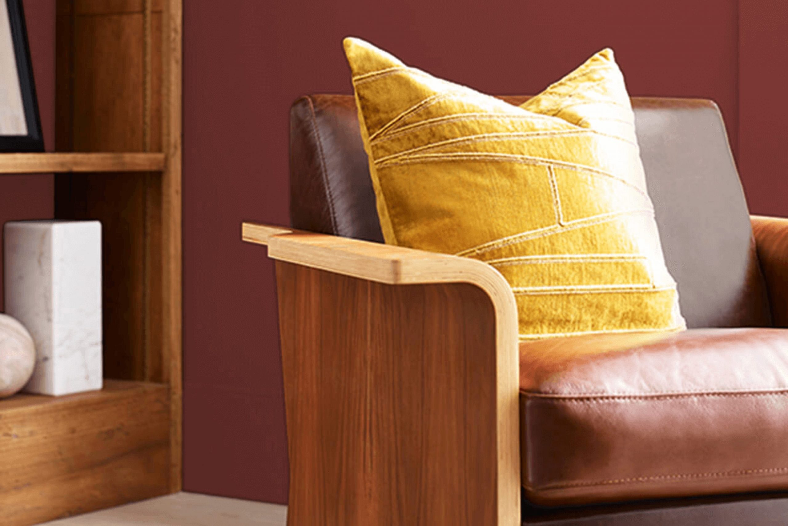
Imagine walking into a room bathed in the warm, inviting glow of SW 7592 Crabby Apple by Sherwin Williams. From the moment this rich, deep crimson hue meets your eyes, it sets a mood that is both cozy and vibrant. I often find that selecting the right paint color can significantly change the atmosphere of a room, but it’s rare to come across a shade that strikes the perfect balance between being bold and naturally harmonious.
As someone who has used and experienced this color in various settings, I can share that Crabby Apple goes beyond just being a paint choice; it’s a statement. Its ability to add depth and character to a room is truly impressive. Whether you’re considering this shade for a dining room that needs a touch of elegance or a living area that could use a splash of energy, Crabby Apple stands out as a top contender.
Moreover, while deep reds can seem daunting to work with, SW 7592 comes across as an accessible color that pairs beautifully with a wide range of decor styles and complements various textures and materials.
The warmth of Crabby Apple can turn any room into an inviting and stylish area, making it an ideal choice for someone looking to improve their home’s aesthetic appeal.
What Color Is Crabby Apple SW 7592 by Sherwin Williams?
Crabby Apple by Sherwin Williams is a deep, muted red shade that brings warmth and richness to any room. This color is defined by its slightly rustic vibe, making it a perfect choice for cozy, inviting rooms. It works exceptionally well in traditional designs, such as in a classic living room, a welcoming dining area, or even a relaxed home office. The color also fits beautifully in farmhouse-style interiors, adding a touch of earthy nostalgia and comfort.
With its robust red tone, Crabby Apple pairs well with natural materials, such as warm wood finishes, which enhance its cozy feel. Think of using it with oak or walnut furniture that shows off their natural grain, creating a harmonious balance between color and texture. Additionally, it matches well with exposed brick for a more industrial or rustic look. In terms of fabrics, this color blends seamlessly with soft textures like cotton, linen, or wool, especially in neutral tones or simple patterns.
Using Crabby Apple in an interior room can establish a welcoming, warm environment. It’s particularly effective in areas where you want to promote conversation and relaxation, making it a great choice for rooms like the living room or dining area. By balancing this strong color with softer tones and varied textures, you can create a cozy, aesthetically pleasing environment.
Is Crabby Apple SW 7592 by Sherwin Williams Warm or Cool color?
Crabby Apple by Sherwin Williams is a bold and vibrant red paint color that brings a cozy and warm atmosphere to any room. This shade is perfect for creating a welcoming feel in rooms like the living room or dining area. The rich depth of this color can make large rooms feel more intimate, while giving smaller rooms a touch of drama and personality.
When used on an accent wall, Crabby Apple can help highlight specific areas of a home, such as a fireplace or a piece of art. This color pairs well with neutral shades like whites and grays, which help balance its intensity. Additionally, wooden furniture and natural textures look great against this deep red, promoting a rustic yet modern vibe.
Crabby Apple is also adaptable enough to be used in various lighting conditions. In natural light, it appears more vibrant, whereas in artificial lighting, it can provide a more subdued and cozy effect. This makes it a great choice for homes looking to add a dash of warmth and character.
Undertones of Crabby Apple SW 7592 by Sherwin Williams
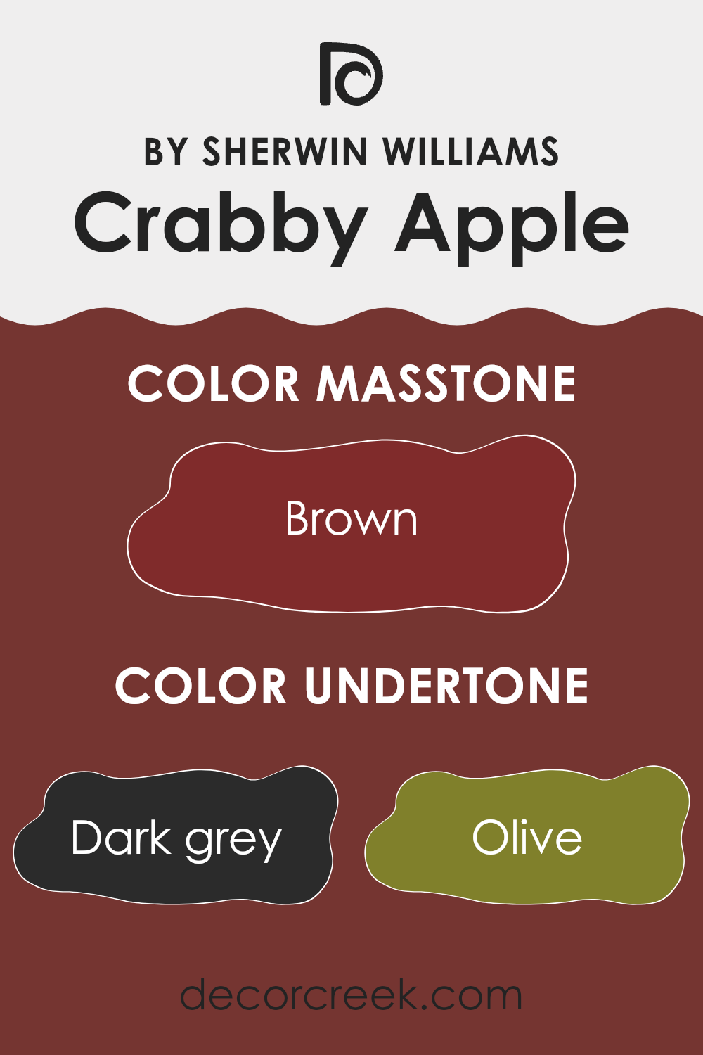
Crabby Apple is a unique and complex color with multiple undertones that subtly influence its appearance in different lighting conditions. The undertones in Crabby Apple include dark grey, olive, purple, red, dark green, navy, grey, orange, pink, dark turquoise, and pale pink. These undertones contribute to the depth and adaptability of the color, making it an interesting choice for interior walls.
When a color like Crabby Apple is used on walls, the variety of undertones plays a crucial role in how the color is perceived. Dark grey and navy add a sense of depth, making the room feel more enclosed and cozy. Olive and dark green can give a touch of naturalness, suggesting an earthy vibe that feels calming and grounding. Red and orange undertones bring warmth to the room, making it feel more welcoming.
The presence of purple and pink undertones adds a subtle hint of creativity and freshness, ideal for areas meant to inspire or soothe. Meanwhile, grey and dark turquoise provide a balanced backdrop, allowing for flexibility in decorating with different colors and materials.
Overall, because of its complex undertones, Crabby Apple can look slightly different depending on the time of day and other colors used in the room. This makes it a dynamic choice for those looking to add depth and interest to their interior rooms.
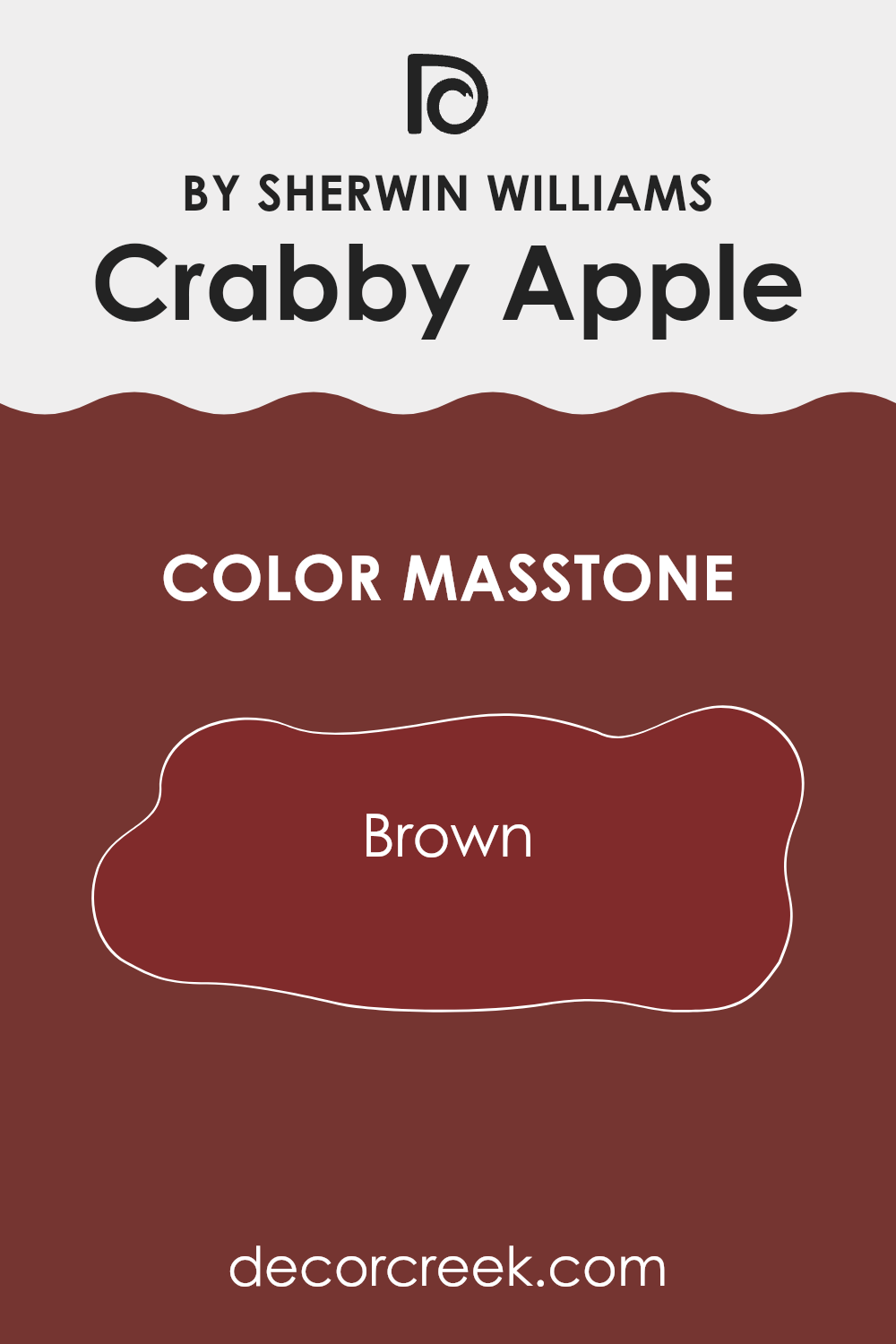
What is the Masstone of the Crabby Apple SW 7592 by Sherwin Williams?
Crabby Apple SW 7592 by Sherwin Williams is a rich, deep color with Brown (#802B2B) as its base tone. This shade holds a warm, cozy feel, which makes it perfect for adding a touch of comfort to any room.
In homes, this color works well in areas where a sense of warmth is desired, such as living rooms, dining areas, or reading nooks. Its deep brown masstone can also make large rooms feel more inviting and smaller rooms feel more intimate.
This color pairs well with lighter shades, bringing out a pleasing contrast that can enhance the overall look of a room. It’s also adaptable in style, fitting well in traditional, rustic, or even more modern settings due to its classic shade. Plus, the warmth of the brown can help soften sharper modern decor, making it easier to create a balanced interior. Overall, Crabby Apple SW 7592 is great for anyone looking to create a cozy, welcoming room in their home.
How Does Lighting Affect Crabby Apple SW 7592 by Sherwin Williams?
Lighting plays a pivotal role in how colors appear in different environments. Colors can shift noticeably under various light sources. For instance, the color perception of a vibrant hue like Crabby Apple by Sherwin Williams can change depending on whether it is viewed under artificial or natural light.
In artificial light, Crabby Apple tends to look richer and more intense. This is because many types of artificial lighting, such as LED or incandescent bulbs, can enhance warm tones, making this color appear more vivid and lively.
In natural light, the appearance of this color can vary throughout the day. During midday, when sunlight is brightest and slightly blue, Crabby Apple might look slightly muted but will still retain its warmth. Towards the evening, as the sunlight softens, this color can appear deeper and more luxurious.
The orientation of a room also affects how Crabby Apple looks. In north-facing rooms, which get less direct sunlight and more cool, indirect light, this color may seem a bit subdued and less vibrant. The lack of strong, direct light tends to cool down the color’s warm undertones. Conversely, in south-facing rooms, which receive ample sunlight throughout the day, this color will look warm and lively, fully displaying its rich, red undertones.
East-facing rooms get the morning light, which is warm and bright. Here, Crabby Apple will appear fresh and vivid in the morning, changing slightly as the light fades throughout the day. In west-facing rooms, the late afternoon and evening light, which is warm and golden, will enhance the cozy and inviting qualities of Crabby Apple, making the room feel welcoming.
Understanding the interplay between light and color helps in making better decorating decisions, ensuring that colors like Crabby Apple work beautifully in your intended room under various lighting conditions.
What is the LRV of Crabby Apple SW 7592 by Sherwin Williams?
Light Reflectance Value (LRV) measures the percentage of light a paint color reflects. It is a scale that helps determine how light or dark a color will appear on a wall. A higher LRV means the color reflects more light, making a room look brighter.
This can be particularly useful in choosing paint colors for rooms that need to feel more open or brighter. Conversely, a lower LRV indicates that the color absorbs more light, which can make a room appear smaller or cozier. This value is essential for architects and designers to consider when selecting hues to achieve the desired ambiance in a room.
With an LRV of 6.554, the color in question is quite dark since it’s close to one end of the scale where little light is reflected. This can make a room feel smaller or more enclosed when used on the walls. The dark nature of the color means it can create dramatic and intimate rooms, ideal for areas such as home theaters or dining rooms where a sense of closeness is desired. However, if used in a small room, it might make the area feel even tighter, so it’s important to balance it with adequate lighting and lighter accents to prevent it from feeling too strong.

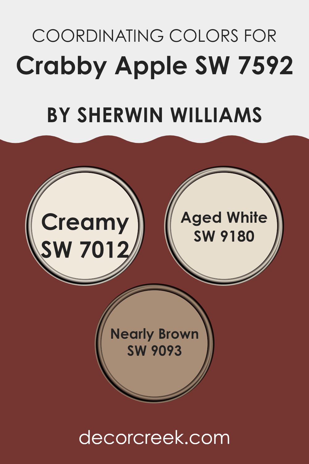
Coordinating Colors of Crabby Apple SW 7592 by Sherwin Williams
Coordinating colors are chosen to complement a main color, in this case, Crabby Apple by Sherwin Williams, creating a harmonious look in your room. When using coordinating colors like Creamy, Aged White, and Nearly Brown along with the main shade, they work together to improve the overall look of a room. These shades can add depth, contrast, or harmony depending on how they are used in relation to the primary color.
Creamy is a soft, gentle white with a touch of warmth that makes it an adaptable choice for creating a soothing backdrop or accenting brighter colors. It pairs beautifully with the deep richness of Crabby Apple, softening its impact in a room and adding a light, airy feel.
Aged White, on the other hand, offers a hint more depth than traditional whites, providing a vintage feel that complements the elegance of darker colors like Crabby Apple. It’s particularly effective in rooms that aim for a rustic or antique look. Lastly, Nearly Brown is a rich, deep tone that borders on the warmth of dark wood, making it ideal for adding a grounding, earthy element to interiors. Together, these colors work harmoniously with Crabby Apple to create a cohesive and inviting palette.
You can see recommended paint colors below:
- SW 7012 Creamy
- SW 9180 Aged White
- SW 9093 Nearly Brown
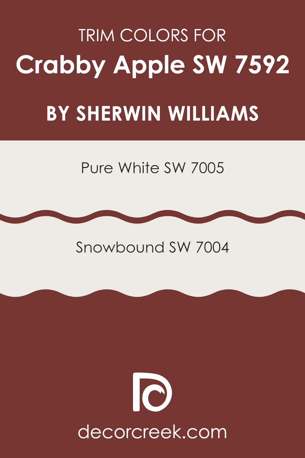
What are the Trim colors of Crabby Apple SW 7592 by Sherwin Williams?
Trim colors are essential in interior or exterior design as they help define and accentuate the architectural features of a room. When paired with a distinctive shade like Crabby Apple SW 7592 by Sherwin Williams, trim colors like Pure White SW 7005 and Snowbound SW 7004 can provide a striking contrast that highlights the unique elements of the building. Using lighter or contrasting trim colors ensures that features such as moldings, doors, and window frames catch the eye, enhancing the overall visual appeal of the property.
Pure White SW 7005 is a clean and bright shade that brings a fresh and crisp look to any room. It pairs beautifully with richer and darker colors like Crabby Apple, highlighting details with a clear contrast that is visually pleasing.
Snowbound SW 7004, on the other hand, offers a slightly warmer tone than Pure White. While still bright, it has a subtle gray undertone that softens the overall effect and works well in creating a gentle yet appealing contrast with deeper, more robust colors. Together, these trim colors can significantly complement and add to the visual depth when used alongside the bolder Crabby Apple.
You can see recommended paint colors below:
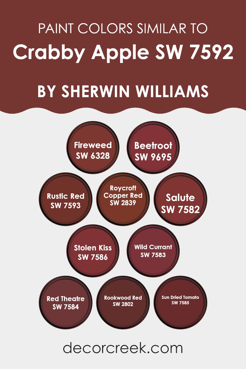
Colors Similar to Crabby Apple SW 7592 by Sherwin Williams
Similar colors are vital in design because they create a harmonious and cohesive look. By using shades that are close to each other, such as the different reds related to Crabby Apple by Sherwin Williams, the overall effect can be very pleasing to the eye, producing an atmosphere that feels balanced and integrated. For example, Fireweed is a bold, lively red that introduces a sense of energy into any room. A shade like Beetroot adds depth with its darker, earthy tone, which works well in areas that require a touch of elegance without using overly bright colors.
Rustic Red and Roycroft Copper Red offer warm, welcoming hues that are perfect for creating cozy environments. While Rustic Red has a traditional feel that’s great for classic decor, Roycroft Copper Red provides a unique blend of red and brown, giving a room a more grounded feeling.
Neighboring shades like Salute and Stolen Kiss present lighter and darker variations of mature red, allowing for subtle transitions in themed rooms. Wild Currant, Red Theatre, and Rookwood Red provide robust options that can act as focal points or supporting accents depending on the room and lighting conditions. Lastly, Sun Dried Tomato rounds out this palette with its rich, burnt red hue, offering an option that mirrors the appearance of natural elements aged gracefully. Together, these similar colors work to create environments that are visually cohesive and strikingly beautiful.
You can see recommended paint colors below:
- SW 6328 Fireweed
- SW 9695 Beetroot
- SW 7593 Rustic Red
- SW 2839 Roycroft Copper Red
- SW 7582 Salute
- SW 7586 Stolen Kiss
- SW 7583 Wild Currant
- SW 7584 Red Theatre
- SW 2802 Rookwood Red
- SW 7585 Sun Dried Tomato
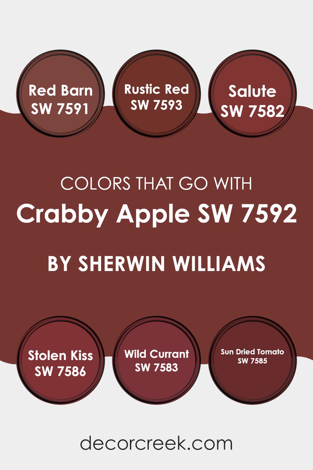
Colors that Go With Crabby Apple SW 7592 by Sherwin Williams
Choosing coordinating colors for Crabby Apple SW 7592 by Sherwin-Williams is essential because it ensures that the paint scheme in your room flows harmoniously without clashing elements. These complementary colors help create a cohesive look, making your room feel unified and thoughtfully designed. Whether it’s for a feature wall, accent accessories, or furniture, having the right colors together can set the mood and style of a room.
Red Barn SW 7591 is a rich, deep red that offers a traditional warmth. This shade is perfect for creating a cozy atmosphere and pairs beautifully with Crabby Apple for a robust and welcoming environment. Rustic Red SW 7593, slightly lighter than Red Barn, lends a touch of earthy red that is ideal for someone looking to add a subtle rustic charm to their room.
It works well with Crabby Apple to give a soft yet vibrant look. Salute SW 7582 offers a more muted and neutral option with its gray undertones, making it great for balancing out the boldness of Crabby Apple without feeling too heavy. Stolen Kiss SW 7586, with its soft, muted coral red, provides a touch of romance and softness, perfect for bedrooms or relaxing rooms. Wild Currant SW 7583 brings a hint of dark, berry red, adding depth and polish, while Sun Dried Tomato SW 7585 bridges the gap with a spicy red that has brown undertones, excellent for adding warmth and character. These colors, when used alongside Crabby Apple, ensure that the atmosphere remains warm and inviting.
You can see recommended paint colors below:
- SW 7591 Red Barn
- SW 7593 Rustic Red
- SW 7582 Salute
- SW 7586 Stolen Kiss
- SW 7583 Wild Currant
- SW 7585 Sun Dried Tomato
How to Use Crabby Apple SW 7592 by Sherwin Williams In Your Home?
Crabby Apple SW 7592 by Sherwin Williams is a rich, deep red paint that adds a bold touch to any room. This color is perfect for creating a warm and inviting atmosphere in your home. You can use it in various ways to enhance your living area.
For instance, painting one accent wall with Crabby Apple can make your room feel more cozy and welcoming without feeling too strong. This shade works especially well in dining rooms or living rooms where you entertain guests, as it sparks a lively and comfortable vibe.
Alternatively, you could paint kitchen cabinets or a bathroom vanity for a chic pop of color. This shade pairs beautifully with neutral tones, such as whites, creams, and soft browns, which help balance the boldness of the red. Adding Crabby Apple to furniture, like a bookshelf or a chair, can also introduce a fun splash of color that enlivens your decor. Whether you choose to use it on a large scale or in small doses, this color can make your home look more appealing and fresh.
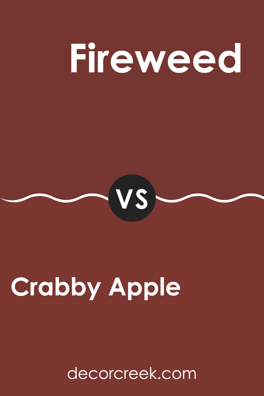
Crabby Apple SW 7592 by Sherwin Williams vs Fireweed SW 6328 by Sherwin Williams
Crabby Apple and Fireweed are both hues from Sherwin Williams but offer distinct vibes for any room. Crabby Apple is like a rich, deep red with a hint of brown, making it a warm and cozy choice for rooms. It’s perfect if you want a traditional feel with a touch of elegance.
On the other hand, Fireweed is a vibrant, bright red that’s bolder and more striking. This color has a lively energy that makes it great for rooms where you want to make a statement and add some excitement.
While Crabby Apple can make a room feel more inviting and comfortable, Fireweed tends to draw more attention and can really liven up a room. Depending on what atmosphere you want to create, each of these colors has its unique appeal.
You can see recommended paint color below:
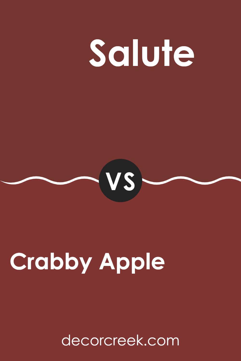
Crabby Apple SW 7592 by Sherwin Williams vs Salute SW 7582 by Sherwin Williams
The main color, Crabby Apple, is a deep, rich red with a slightly brownish tint, giving it an inviting warmth. This color is perfect for creating a cozy atmosphere in any room, like a living room or dining area. Due to its deep tone, it pairs well with neutral colors like whites and greys, which can help balance its intensity.
On the other hand, Salute is a much darker and moodier hue, leaning toward a deep charcoal gray. This color has a strong presence and is ideal for accent walls or areas where you want to make a bold statement. It can serve well in modern settings, particularly if used in contrast with lighter shades to prevent it from feeling too heavy.
Both colors are robust and deep, offering unique possibilities depending on what you want to achieve in your decorating project. While Crabby Apple brings warmth, Salute offers a dramatic flair, making them flexible choices for different preferences and styles.
You can see recommended paint color below:
- SW 7582 Salute
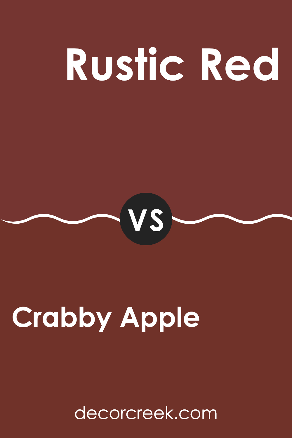
Crabby Apple SW 7592 by Sherwin Williams vs Rustic Red SW 7593 by Sherwin Williams
Crabby Apple and Rustic Red are both vivid, warm hues from Sherwin Williams, but they have distinct differences that can affect the mood and style of a room. Crabby Apple has a darker, more muted tone, making it ideal for creating a cozy and somewhat reserved ambiance. It’s a great choice if you want to add depth and warmth to an area without being too bold.
On the other hand, Rustic Red is a brighter, more vibrant shade. This color has a more energetic feel, perfect for rooms where you want to make a statement or stir up excitement. Rustic Red can really liven up a kitchen or dining area, drawing attention and gathering people together.
Both colors are red, but the deeper, subtler Crabby Apple is best for those looking for a traditional feel, while the lively Rustic Red suits a more dynamic, attention-grabbing environment. They can also complement each other well when used in the same color scheme for those wanting a layered red palette.
You can see recommended paint color below:
- SW 7593 Rustic Red
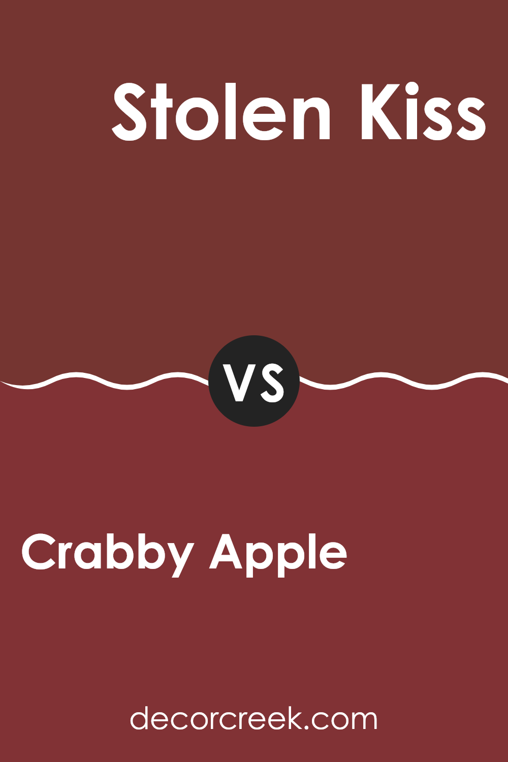
Crabby Apple SW 7592 by Sherwin Williams vs Stolen Kiss SW 7586 by Sherwin Williams
Crabby Apple and Stolen Kiss, both by Sherwin Williams, present unique shades of red. Crabby Apple has a deep, rich red color, often resembling the dark red you see on certain apples. It has a strong presence and can make walls look prominent and eye-catching in a room.
On the other hand, Stolen Kiss offers a brighter and slightly pinkish red hue that adds a touch of warmth to any room. This shade can make a room feel cozy and welcoming without feeling too intense.
Crabby Apple suits areas where a bold statement is desired, while Stolen Kiss works well in rooms needing a softer yet still warm atmosphere. These colors can complement each other nicely if used together in the right setting, potentially creating a layered red color scheme that varies in depth and warmth.
You can see recommended paint color below:
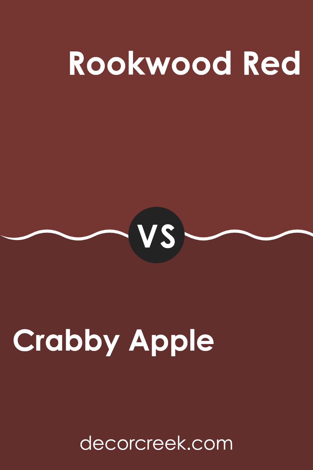
Crabby Apple SW 7592 by Sherwin Williams vs Rookwood Red SW 2802 by Sherwin Williams
The two colors, Crabby Apple and Rookwood Red by Sherwin Williams, both offer rich, deep red tones, but they have distinct differences. Crabby Apple has a darker, muted burgundy shade that gives it a cozy and warm feel, making it great for rooms where you want a subtle, welcoming atmosphere. This color works well in living rooms or dining areas and pairs nicely with soft lighting and dark wood furniture.
On the other hand, Rookwood Red features a brighter, more vivid red. This color feels more attention-grabbing and lively, suitable for areas where you want to make a statement or add some energy. It’s an excellent choice for an accent wall or to highlight architectural details. It tends to reflect light a bit more, which can make an interior feel more dynamic and vibrant.
In conclusion, while both Crabby Apple and Rookwood Red bring warmth and richness to an interior, Crabby Apple leans toward a subtler, more understated feel, and Rookwood Red offers a bolder, more striking presence.
You can see recommended paint color below:
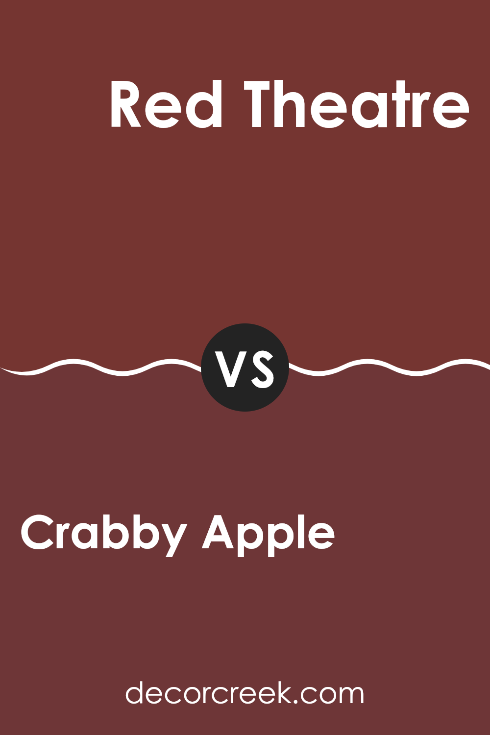
Crabby Apple SW 7592 by Sherwin Williams vs Red Theatre SW 7584 by Sherwin Williams
Crabby Apple and Red Theatre are both vibrant colors, but they have distinct tones that set them apart. Crabby Apple offers a deeper, muted red that resembles the rich skin of dark red apples, providing a cozy and welcoming feel.
It’s a color that works well in rooms that aim for a warm and somewhat traditional look. On the other hand, Red Theatre is a brighter, more vivid red. This color is similar to the curtains you might see in old cinemas or theaters, hence its name.
It’s more striking and immediately draws the eye, making it a great choice for areas where you want to make a bold statement. While both are shades of red, Crabby Apple leans toward a subdued, earthy tone, whereas Red Theatre is more aligned with an energetic, lively vibe.
You can see recommended paint color below:
- SW 7584 Red Theatre
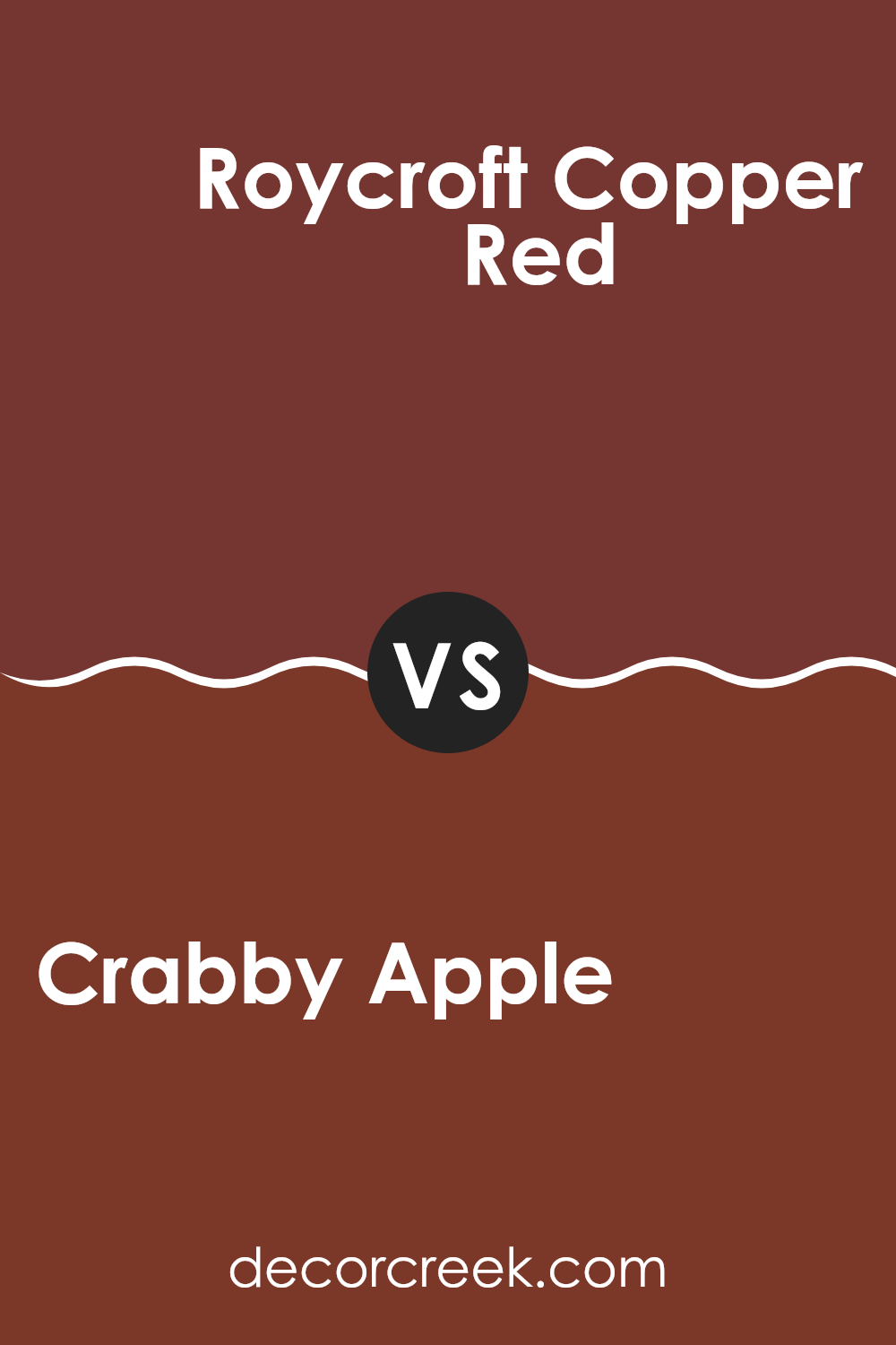
Crabby Apple SW 7592 by Sherwin Williams vs Roycroft Copper Red SW 2839 by Sherwin Williams
Crabby Apple and Roycroft Copper Red are two warm, inviting shades by Sherwin Williams, each offering a distinct vibe for any room. Crabby Apple is a deep, rich red with a slightly muted tone, making it perfect for creating a cozy and comfortable atmosphere in a room. It pairs well with soft lighting and can make large rooms feel more intimate.
On the other hand, Roycroft Copper Red has a more traditional, earthy quality with hints of brown. This color is great for adding a touch of rustic elegance to any area. It works especially well in rooms that aim for a classic look with a modern twist.
Both colors are quite adaptable but serve different aesthetic goals. Crabby Apple tends to draw more attention and can act as a striking focal point, while Roycroft Copper Red blends smoothly into settings that favor subtle, natural elements. Depending on the mood you want to create, each color offers unique possibilities for decorating.
You can see recommended paint color below:
- SW 2839 Roycroft Copper Red
Crabby Apple SW 7592 by Sherwin Williams vs Beetroot SW 9695 by Sherwin Williams
Crabby Apple and Beetroot are two distinct shades offered by Sherwin Williams. Crabby Apple is a deep, rich red with a hint of warmth, resembling the outer skin of its namesake fruit. This color is vibrant but also has a cozy, inviting feel, making it a great choice for rooms where you want to add a touch of energy without feeling too strong.
Beetroot, on the other hand, is a darker, more intense shade. It leans toward a purplish-red, reminiscent of the vegetable it’s named after. This color has a bold, dramatic flair and can create a strong statement in a room. It’s perfect for an accent wall or in an area where you want to draw attention.
Both colors are great for adding depth and interest to your interiors, but their different undertones and intensities can change the mood of a room. Crabby Apple brightens a room with its warmer hue, while Beetroot sets a moodier, more dramatic tone.
You can see recommended paint color below:
Crabby Apple SW 7592 by Sherwin Williams vs Sun Dried Tomato SW 7585 by Sherwin Williams
Crabby Apple and Sun Dried Tomato are two rich shades by Sherwin Williams that both offer a warm, inviting tone yet differ noticeably in their hues and depth. Crabby Apple is a deeper, muted red with a hint of brown, making it a perfect choice for creating a cozy, somewhat traditional atmosphere in a room. It balances the line between being assertive and understated.
On the other hand, Sun Dried Tomato has a brighter, more vibrant presence. This color includes more red than brown, giving it a bolder and more energizing feel. It’s an excellent option for areas where you want to make a statement or add a pop of color without feeling too intense.
When deciding between the two, consider the mood you want to set in your room. Crabby Apple works well in areas where a subtle, refined look is desired, while Sun Dried Tomato is ideal for livening up a room with its cheerful and lively red.
You can see recommended paint color below:
- SW 7585 Sun Dried Tomato
Crabby Apple SW 7592 by Sherwin Williams vs Wild Currant SW 7583 by Sherwin Williams
The main color, Crabby Apple, and Wild Currant, both from Sherwin Williams, each offer a unique character to rooms. Crabby Apple is a deeper red with a hint of brown, creating a warm and cozy feel. It’s perfect for rooms where you want a rich, welcoming atmosphere, like living rooms or dining areas.
Wild Currant, on the other hand, is a bolder, more vibrant red. This color has less brown and stands out more vividly. It’s great for accents or areas where you want to make a statement, such as on a feature wall or in a creative room.
Both colors share a red base but differ in intensity and mood. Crabby Apple’s brownish tone makes it more subdued and easier to blend with earthy colors, while Wild Currant’s pure red is more striking and pairs well with sharp contrasts. Whether you’re looking for warmth or a pop of color, these shades have distinct qualities worth considering for your next project.
You can see recommended paint color below:
- SW 7583 Wild Currant
In wrapping up my thoughts on SW 7592 Crabby Apple by Sherwin Williams, I’ve found that this paint color is pretty neat! It’s a deep, rich red that really makes any room feel warm and inviting. Whether you’re painting a cozy nook or the whole living room, Crabby Apple has this unique way of making places feel just right. It’s bold, but not too flashy; it’s perfect if you want to add some fun color without making everything too loud.
I tested it in different lights to see how it changes throughout the day, and it was cool to see the shifts from a bright red to a deeper, slightly darker tone by evening. This shows how a single color can act differently, which keeps things interesting. And, it pairs super well with softer colors like creams and light browns, giving a comfy, welcoming vibe.
Overall, from what I’ve learned and tested, SW 7592 Crabby Apple is a great choice if you love colors that feel warm and make your rooms look happy and lively. It’s perfect for anyone looking to liven up their home in a simple yet impactful way.
So, if you’re thinking about a new color for your room, Crabby Apple might just be the way to go!

Ever wished paint sampling was as easy as sticking a sticker? Guess what? Now it is! Discover Samplize's unique Peel & Stick samples.
Get paint samples

