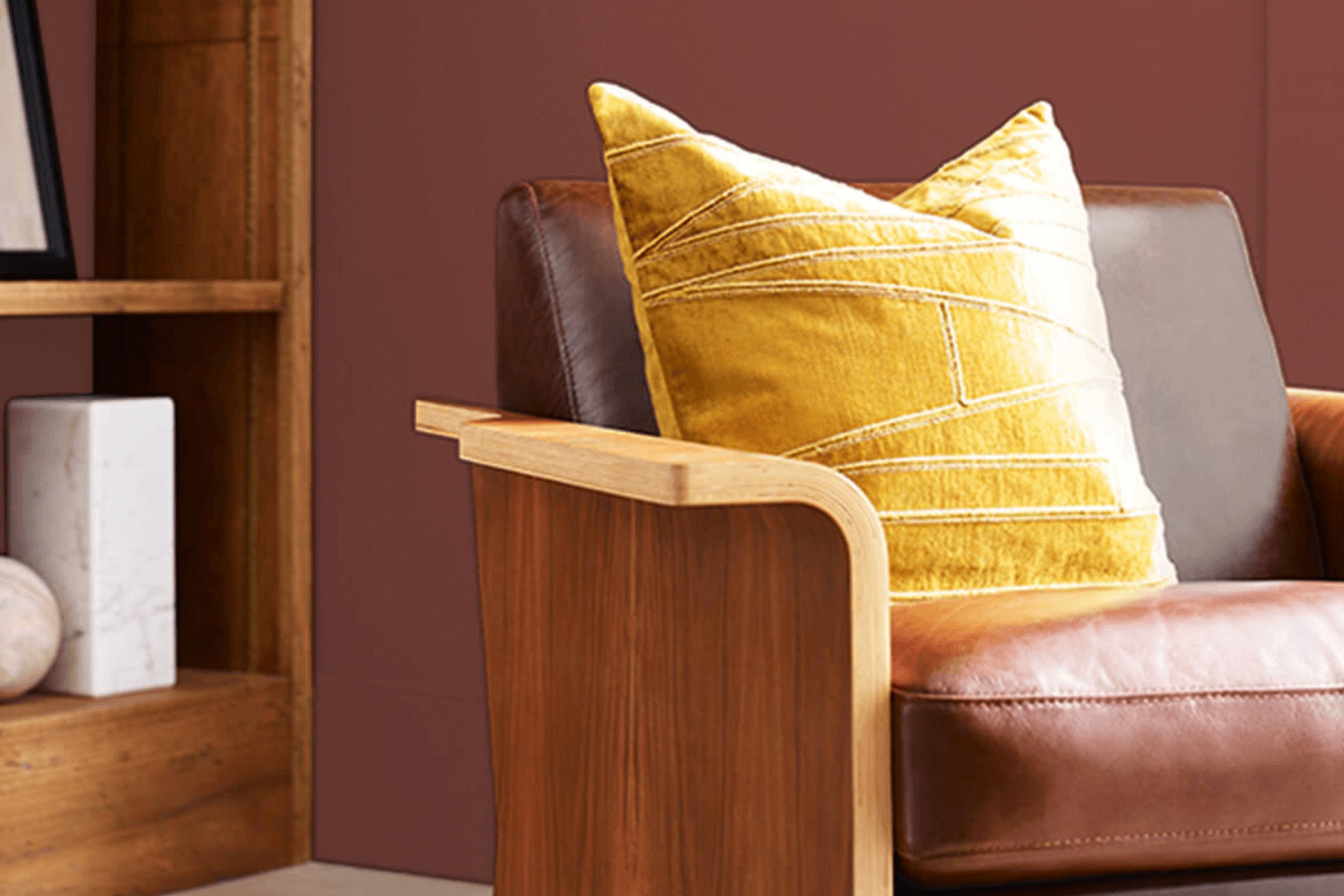
When I stumbled upon SW 7591 Red Barn by Sherwin-Williams, it instantly caught my attention. This color feels like a warm hug, reminiscent of cozy evenings in rustic settings. It’s not just a shade of red; it’s a heartfelt invitation to nostalgia and comfort. There’s a classic quality to Red Barn that evokes images of classic American barns bathed in golden sunsets.
Using it in a room brings a sense of warmth and coziness. The hue has a subtle depth that makes any room feel intimate and welcoming. I imagine it in a living room paired with soft furnishings and natural wood accents, creating a harmonious balance between tradition and modernity.
Red Barn is flexible. It complements both bold and neutral palettes, making it easy to incorporate into different styles. Whether applied on accent walls or exteriors, it provides a vibrant yet grounded feel. There’s something intrinsically satisfying about its rich, earthy essence that feels both rooted and uplifting.
Choosing SW 7591 Red Barn is like adding a piece of history to your surroundings. It connects areas to memories and emotions, making it more than just a color—it’s an experience that enriches a home.
What Color Is Red Barn SW 7591 by Sherwin Williams?
Red Barn SW 7591 by Sherwin Williams is a warm, bold shade of red reminiscent of classic farm structures. It brings a sense of comfort and tradition to a room, making it an excellent choice for those looking to add a touch of rustic charm to their interiors. This color is particularly effective in country-style homes or farmhouse-inspired designs, where its depth and warmth enhance the cozy, inviting atmosphere.
This red shade pairs beautifully with natural materials such as wood and stone. Think wooden beams, oak flooring, or stone fireplaces, which complement its richness and create a harmonious look. In a kitchen, Red Barn can pair well with butcher block countertops or a brick backsplash, adding a touch of vintage charm.
For textures, consider using Red Barn on wainscoting or accent walls to bring texture and dimension. Pairing the color with lighter neutrals like cream or soft gray can create balance, while adding pops of this red in accessories or smaller furniture pieces can create cohesion in a room without overpowering it.
In essence, Red Barn is a flexible color choice that can bring warmth and character to both traditional and contemporary areas when used thoughtfully with other design elements.
Is Red Barn SW 7591 by Sherwin Williams Warm or Cool color?
Red Barn SW 7591 by Sherwin-Williams is a warm and inviting shade of red. It’s a color that brings a sense of coziness and comfort to homes. When used in living areas or kitchens, this red adds a lively and cheerful touch, making areas feel welcoming and full of energy. It’s a great choice for accent walls or for use on furniture pieces to create a focal point in a room.
The warmth of Red Barn helps create a homely atmosphere, ideal for gathering rooms where family and friends come together. Its rich tone pairs well with natural wood finishes, enhancing that rustic feel many people love. When matched with creams or soft whites, it balances out nicely, preventing the room from feeling too intense.
Overall, Red Barn SW 7591 works well in home settings where an energetic yet warm vibe is desired, bringing a classic and friendly touch to any environment.
Undertones of Red Barn SW 7591 by Sherwin Williams
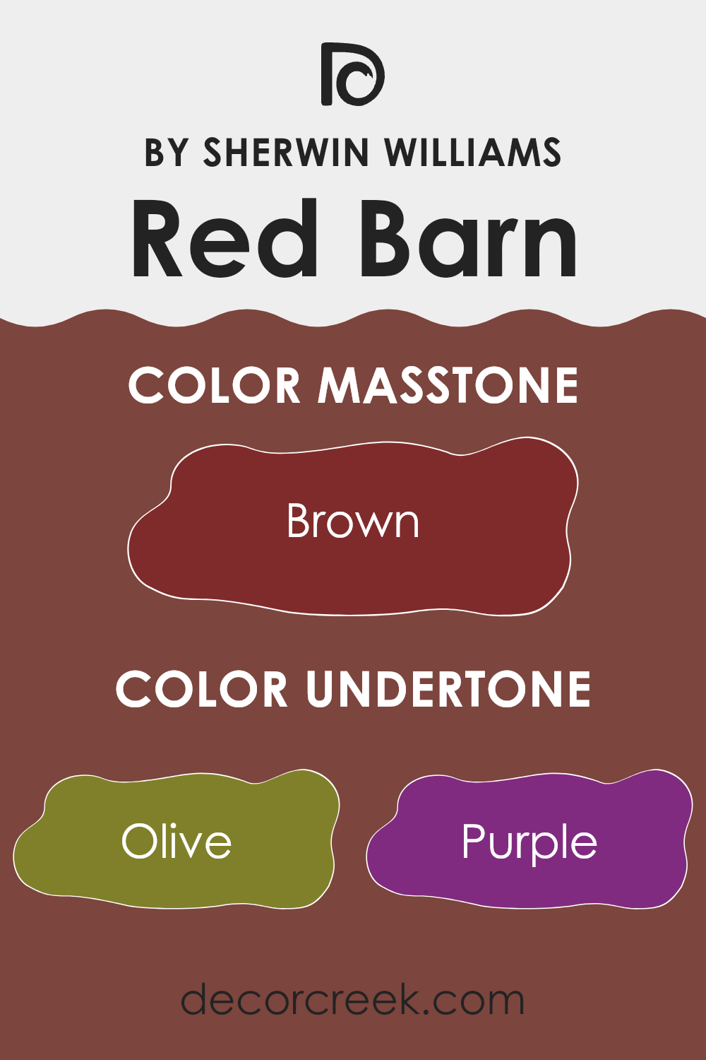
Red Barn by Sherwin Williams is a rich and warm color with various undertones that influence how it appears in different settings. These undertones include olive, purple, dark grey, regular grey, red, dark green, orange, navy, pink, dark turquoise, and pale pink. These underlying hues can subtly change the main appearance of the color depending on the lighting and surrounding colors.
When Red Barn is used on interior walls, these undertones work together to create a cozy and inviting atmosphere. The red and orange undertones add warmth, making a room feel welcoming. The dark grey and navy tones lend a bit of sophistication and depth to the color, which can help a room feel more grounded and stable.
Olive and dark green undertones provide an earthy, natural touch, adding an element of freshness and calm. Purple and pink hints in the undertone give a soft, muted effect, adding a touch of romance and gentleness. The versatility of Red Barn’s undertones allows it to pair well with various decor styles. Depending on the room’s natural light and other interior colors, these undertones can make Red Barn appear either more vibrant or subdued, impacting the overall mood and aesthetic of your room.
What is the Masstone of the Red Barn SW 7591 by Sherwin Williams?
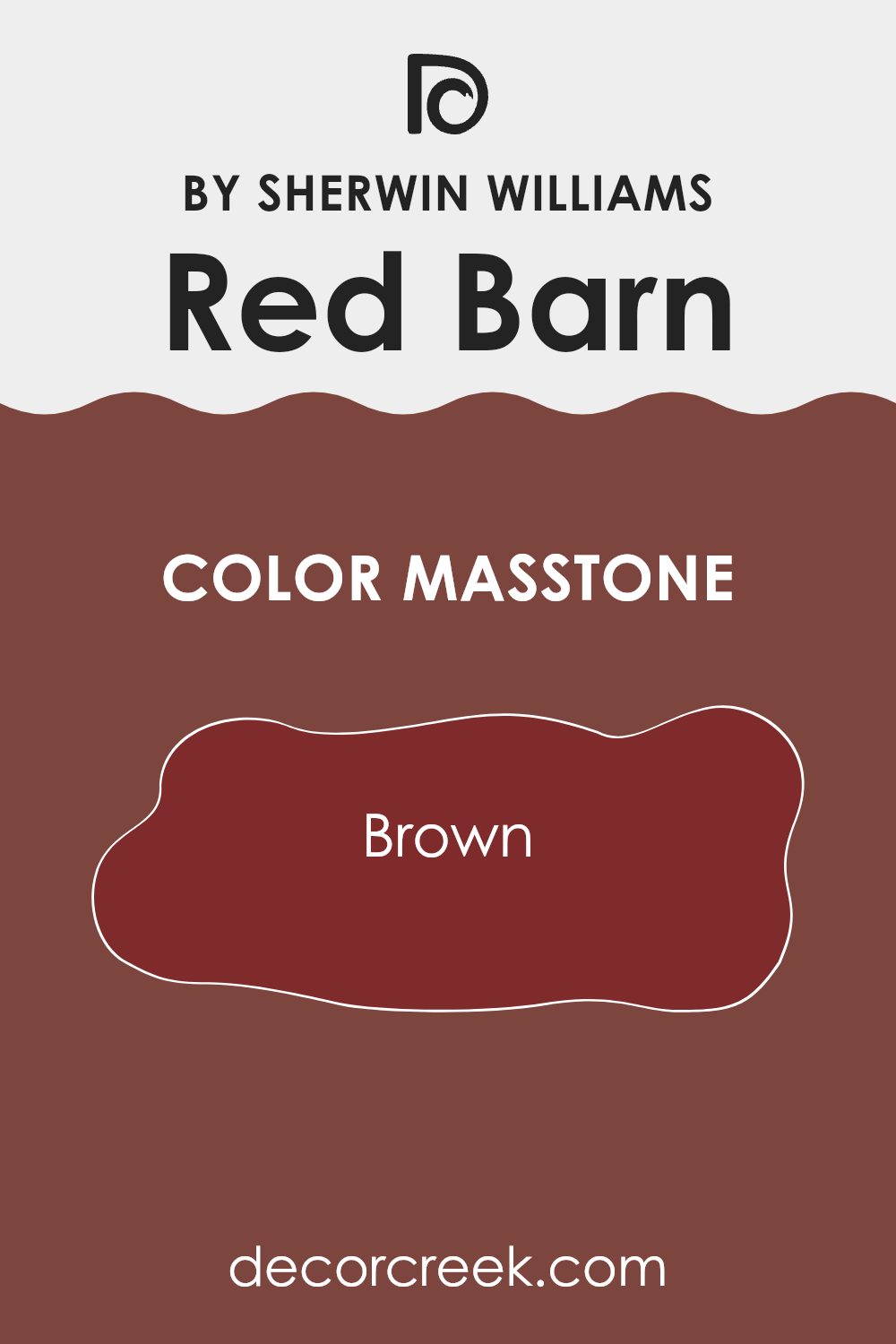
Red Barn SW 7591 by Sherwin Williams features a rich brown masstone, which gives the color its deep and earthy quality. This brown undertone makes Red Barn a warm and inviting choice for homes. The color can create a cozy atmosphere, perfect for living rooms or entryways where you want to feel welcomed and comfortable.
The warmth of the brown can also add a sense of stability and earthiness, making it a solid choice for areas intended for relaxation or gatherings. In homes with rustic or traditional settings, Red Barn can enhance the overall aesthetic by adding a touch of richness and depth.
When used in combination with neutral colors or natural materials like wood and stone, it complements the environment, offering a harmonious blend. It’s a flexible shade that can add character and warmth to any room without feeling overpowering, bringing a sense of comfort and homeliness to various interior designs.
How Does Lighting Affect Red Barn SW 7591 by Sherwin Williams?
Lighting plays a big role in how we perceive colors. The type of light in a room can change the appearance of paint colors significantly. “Red Barn” by Sherwin Williams, a deep, rich red, is no exception.
In natural light, the color can appear brighter and more vibrant. Natural light, particularly in the middle of the day, tends to be cool and balanced, which can emphasize the true tones of the paint. However, as the day progresses and the sun moves, the light changes, which can alter how we see the color.
In a north-facing room, where the light is often cooler and less direct, Red Barn might appear slightly more subdued. The cool light can emphasize any blue undertones in red, making it feel a bit darker and more muted than it appears on the paint chip.
In a south-facing room, which benefits from warm and direct sunlight for most of the day, the color will likely appear warmer and more vibrant. The warm light can bring out the warmth in red, making Red Barn appear vivid and lively.
In an east-facing room, morning light is abundant and slightly warm, which can both highlight the warmth of the color in the morning and make it appear a bit flatter in the afternoon, when the light is less direct.
On the other hand, a west-facing room will have the opposite effect. The light is cooler in the morning, which may make the color seem softer or even a bit muted. However, in the afternoon, as the sun sets, the light turns warmer, and the color can really glow.
In artificial light, the color’s appearance can vary greatly. Incandescent bulbs will bring out the warmer tones, making Red Barn look cozy and inviting. On the flip side, fluorescent lights, which are often cooler, could make the color feel slightly more subdued. Therefore, before committing to a paint color, it’s a good idea to test a sample under your specific lighting conditions to see how it behaves throughout the day and night.
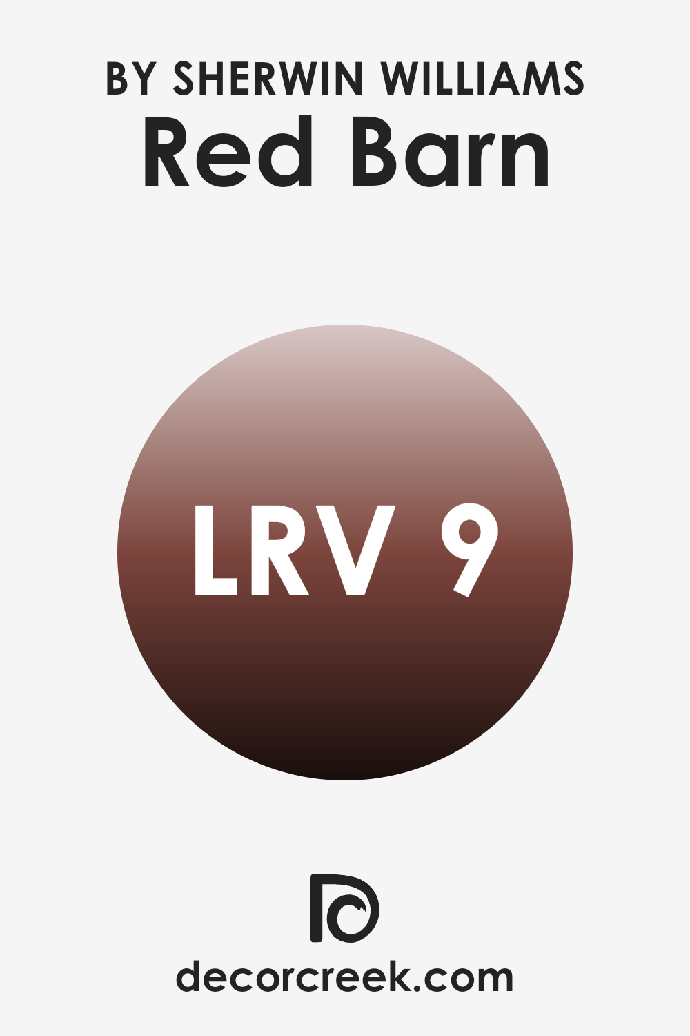
What is the LRV of Red Barn SW 7591 by Sherwin Williams?
LRV stands for Light Reflectance Value, which measures how much light a color reflects. The scale ranges from 0, which reflects no light and is completely black, to 100, which reflects all light and is completely white. LRV helps people understand how light or dark a color will appear when painted on walls.
Colors with low LRV values absorb more light, making rooms feel cozier and more intimate. Conversely, colors with high LRV values reflect more light, making rooms feel brighter and larger. With an LRV of 8.856, the color Red Barn is quite dark.
This means it absorbs most of the light that hits it. When used on walls, Red Barn will make the room feel warm and enveloping. It’s ideal for areas where you want a touch of coziness, such as a dining room or a den. However, in a room with little natural light, it can make the room seem smaller and more enclosed. To balance this, consider using it in rooms with ample sunlight or pair it with lighter colors to add contrast and balance.
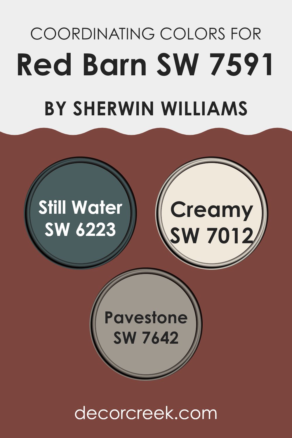
Coordinating Colors of Red Barn SW 7591 by Sherwin Williams
Coordinating colors are hues that work well together in a design, creating a harmonious and visually appealing room. When selecting colors that coordinate with Red Barn by Sherwin Williams, you should consider hues that complement its rich, earthy tone.
The chosen shades should enhance and balance Red Barn’s intensity, adding depth and interest to a room. These coordinating colors, such as Still Water, Creamy, and Pavestone, either contrast or blend smoothly, offering a cohesive look while allowing the primary color to stand out.
Still Water (SW 6223) is a deep, muted blue-green that adds a soothing contrast to the warmth of Red Barn, bringing in a hint of nature’s peace. Creamy (SW 7012) is a soft, warm off-white that pairs beautifully with the boldness of Red Barn, offering a gentle neutral that lightens and brightens the overall palette.
Pavestone (SW 7642) is a grounded, mid-tone gray that provides a stable backdrop, helping to balance the bold red with its calming undertone. Together, these colors create a pleasing environment where Red Barn can shine while still harmonizing with the other shades.
You can see recommended paint colors below:
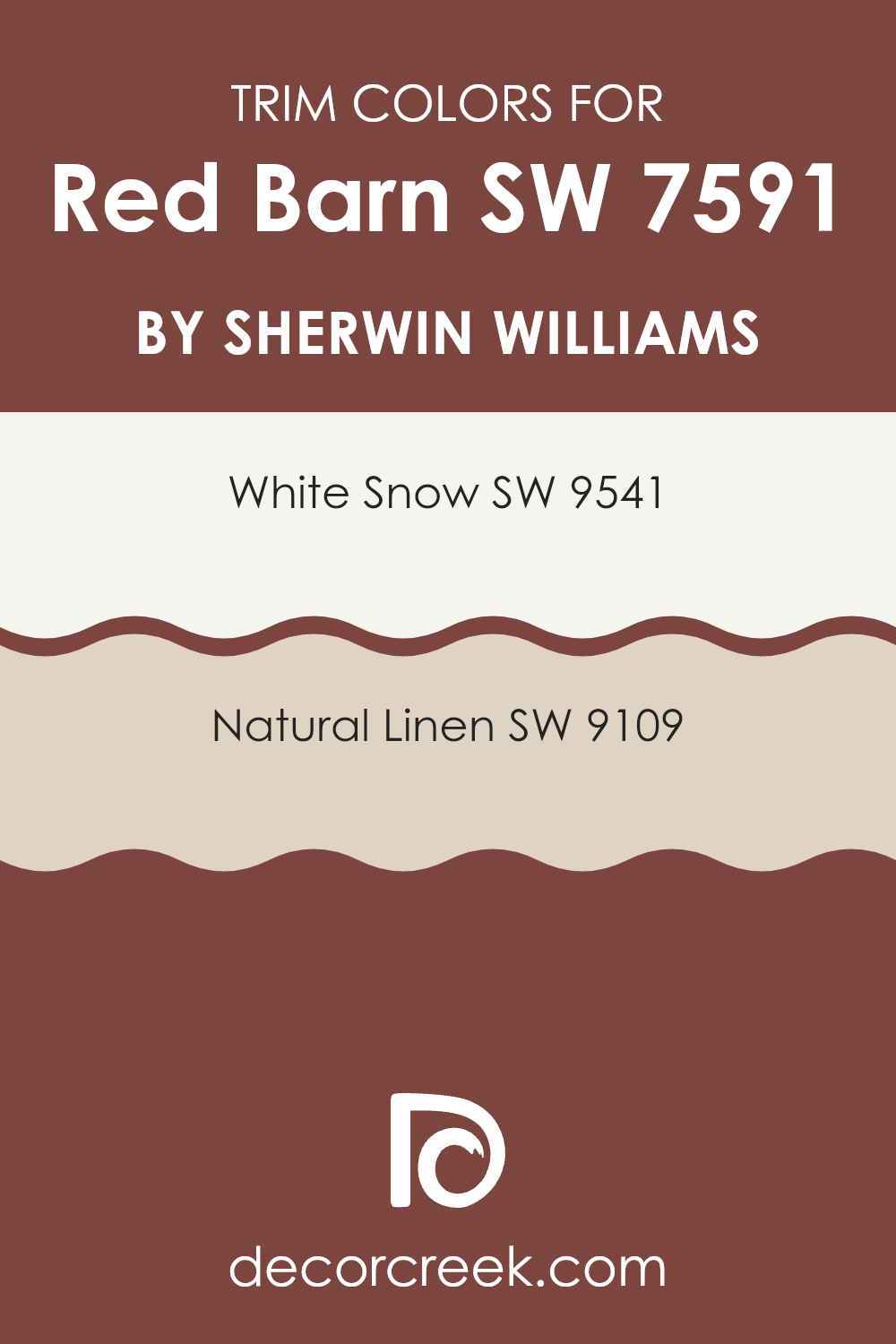
What are the Trim colors of Red Barn SW 7591 by Sherwin Williams?
Trim colors are essential elements in home design that help define and highlight architectural features. They frame doors, windows, and other elements, adding depth and contrast to the main color of a building. When it comes to “Red Barn” by Sherwin Williams, trim colors like White Snow and Natural Linen are important because they complement and enhance the lively red hue.
They can make the boldness of the red appear more vibrant and inviting. The trim acts as a subtle visual guide, leading the eyes across the structure and balancing the overall design. By providing contrast, these colors ensure that the red doesn’t overwhelm, creating a harmonious appearance.
White Snow is a clean, crisp white that offers a classic look and brightens up the exterior. It serves as a fresh, neutral backdrop to Red Barn, making the red pop without clashing. In contrast, Natural Linen is a warm, soft beige that adds a touch of warmth and richness.
Its understated nature provides a gentle transition between the vibrant red and any surrounding natural elements, such as landscaping. Both of these trim colors ensure that the Red Barn color stands out in a balanced and visually pleasing manner, highlighting the architectural beauty of the home.
You can see recommended paint colors below:
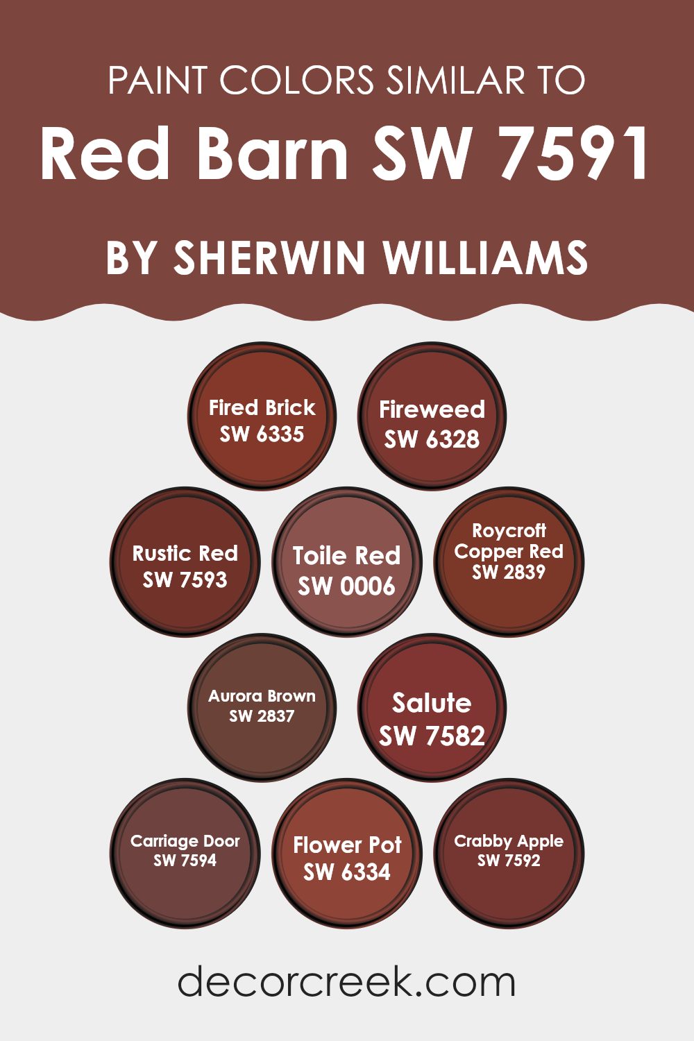
Colors Similar to Red Barn SW 7591 by Sherwin Williams
Similar colors to Red Barn by Sherwin Williams play a crucial role in creating harmonious and inviting areas. These colors share warm, earthy undertones that create a cohesive look when used together, making a room feel balanced. Fired Brick is a deep, earthy red that offers a grounding effect. Fireweed introduces a mixture of brown and red, lending an organic and warm touch.
Rustic Red is a muted shade that provides an old-world charm, while Toile Red is a bold, rich hue that adds a strong visual impact. Roycroft Copper Red has a rusty orange tint, providing a unique twist on traditional red tones.
Aurora Brown introduces a deeper, more profound hue that complements these reds with its earthy base. Salute is a dark, moody red that can make a dramatic statement in any setting. Carriage Door leans toward a darker brown-red, reminiscent of vintage wood finishes.
Flower Pot is a bright and lively shade that brings a pop of warm, inviting energy, making it great for accent walls. Lastly, Crabby Apple is a vibrant and deep red that offers a punch of color while still maintaining a cozy feel. These colors work beautifully together, each one enhancing the others, creating a warm, comforting environment that feels naturally inviting.
You can see recommended paint colors below:
- SW 6335 Fired Brick
- SW 6328 Fireweed
- SW 7593 Rustic Red
- SW 0006 Toile Red
- SW 2839 Roycroft Copper Red
- SW 2837 Aurora Brown
- SW 7582 Salute
- SW 7594 Carriage Door
- SW 6334 Flower Pot
- SW 7592 Crabby Apple
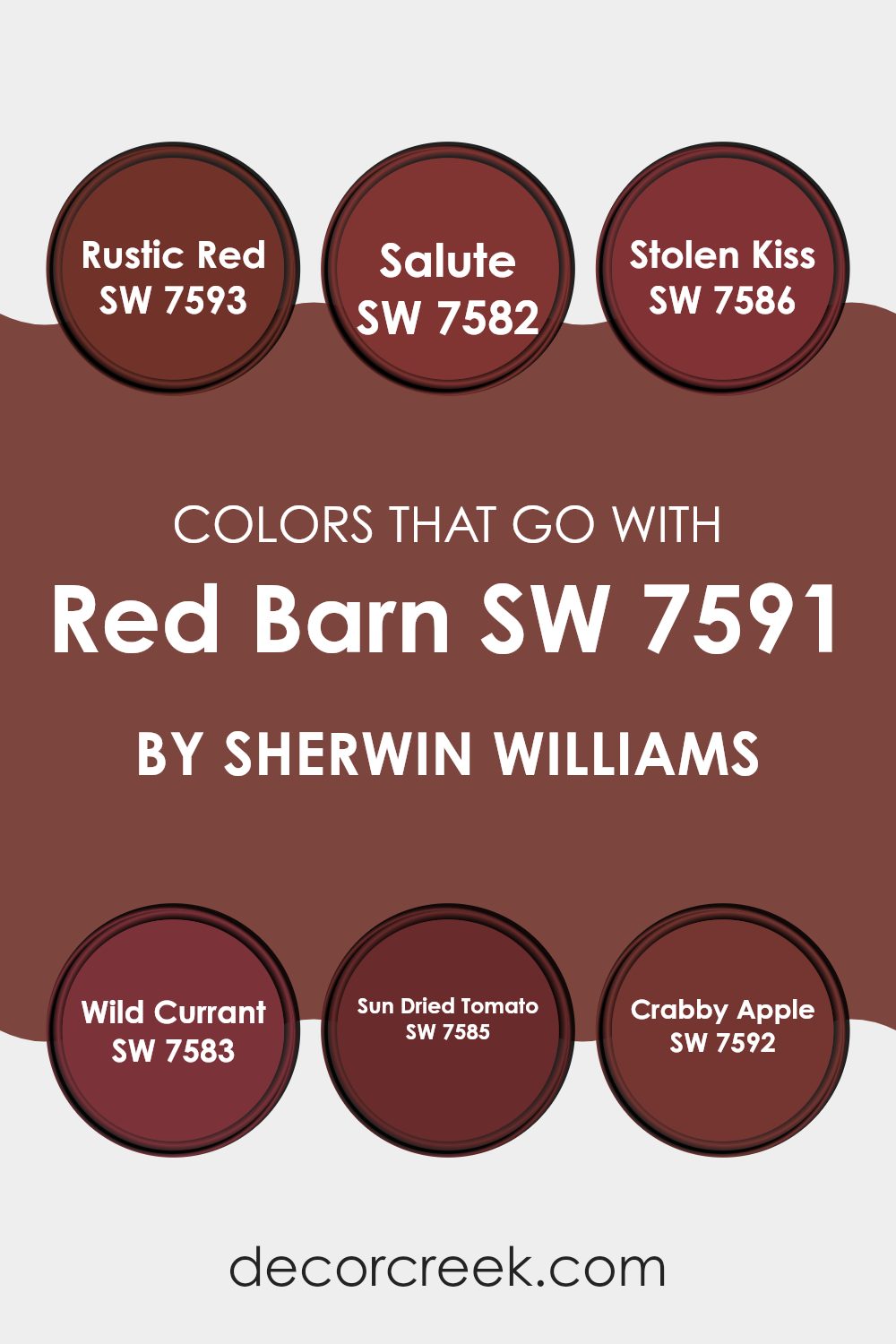
Colors that Go With Red Barn SW 7591 by Sherwin Williams
Colors that complement Red Barn SW 7591 by Sherwin Williams play an important role in creating a harmonious and visually appealing room. When using Red Barn, you’re setting a warm and inviting tone, and the colors you choose to pair with it can enhance this feeling or add new dimensions.
SW 7593 – Rustic Red is a warm, earthy color that pairs well, adding depth without overpowering. SW 7582 – Salute is a rich, deep shade that brings a touch of elegance and a sense of calm. SW 7586 – Stolen Kiss offers a bright, vibrant contrast, adding energy and interest to the palette.
For a more subdued and rich look, SW 7583 – Wild Currant introduces a bold and slightly purplish hue that blends seamlessly, offering an elegant edge. SW 7585 – Sun Dried Tomato provides a slightly muted, sun-kissed look, which adds a cozy, lived-in feeling to the color scheme.
SW 7592 – Crabby Apple brings a playful and lively touch, offering a slight hint of whimsy that can lighten the mood of any room. Together with Red Barn, these colors create a balanced, warm, and inviting atmosphere that can enhance both traditional and contemporary areas.
You can see recommended paint colors below:
- SW 7593 Rustic Red
- SW 7582 Salute
- SW 7586 Stolen Kiss
- SW 7583 Wild Currant
- SW 7585 Sun Dried Tomato
- SW 7592 Crabby Apple
How to Use Red Barn SW 7591 by Sherwin Williams In Your Home?
Red Barn SW 7591 by Sherwin Williams is a rich, warm hue that brings a cozy and inviting feel to any room. This color is perfect for adding a touch of rustic charm to your home. It’s a deep red shade that can make a bold statement, yet it’s flexible enough to blend well with various decor styles.
In the living room, you can use Red Barn on an accent wall to create a warm focal point, complementing neutral furniture and natural materials like wood and leather. In the kitchen, it can add a cozy feel to cabinets or a dining nook, especially when paired with cream or white tones and bronze fixtures.
This color also works beautifully for exterior doors or shutters, providing a welcoming and striking entrance to your home. Whether used indoors or outdoors, Red Barn SW 7591 adds warmth and character, making areas feel more inviting and comfortable.
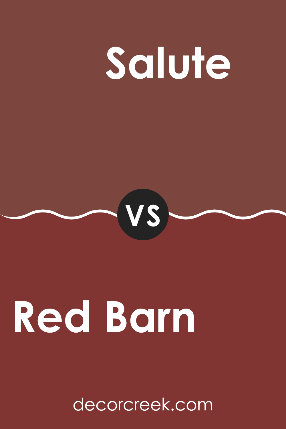
Red Barn SW 7591 by Sherwin Williams vs Salute SW 7582 by Sherwin Williams
Red Barn SW 7591 and Salute SW 7582 are two distinctive shades from Sherwin Williams that bring different vibes to a room. Red Barn is a warm, earthy red reminiscent of classic barns or rustic country settings. It has a cozy and comforting feel, making it ideal for areas where you want to create a welcoming atmosphere.
On the other hand, Salute is a darker, more intense red. It carries a rich and bold character, adding a dramatic touch to any room. Salute can be a striking accent color that offers depth and sophistication.
While Red Barn evokes a feeling of warmth and tradition, Salute brings a sense of strength and boldness. Both colors can be used effectively in various settings, but they serve different purposes based on the mood you want to create.
You can see recommended paint color below:
- SW 7582 Salute
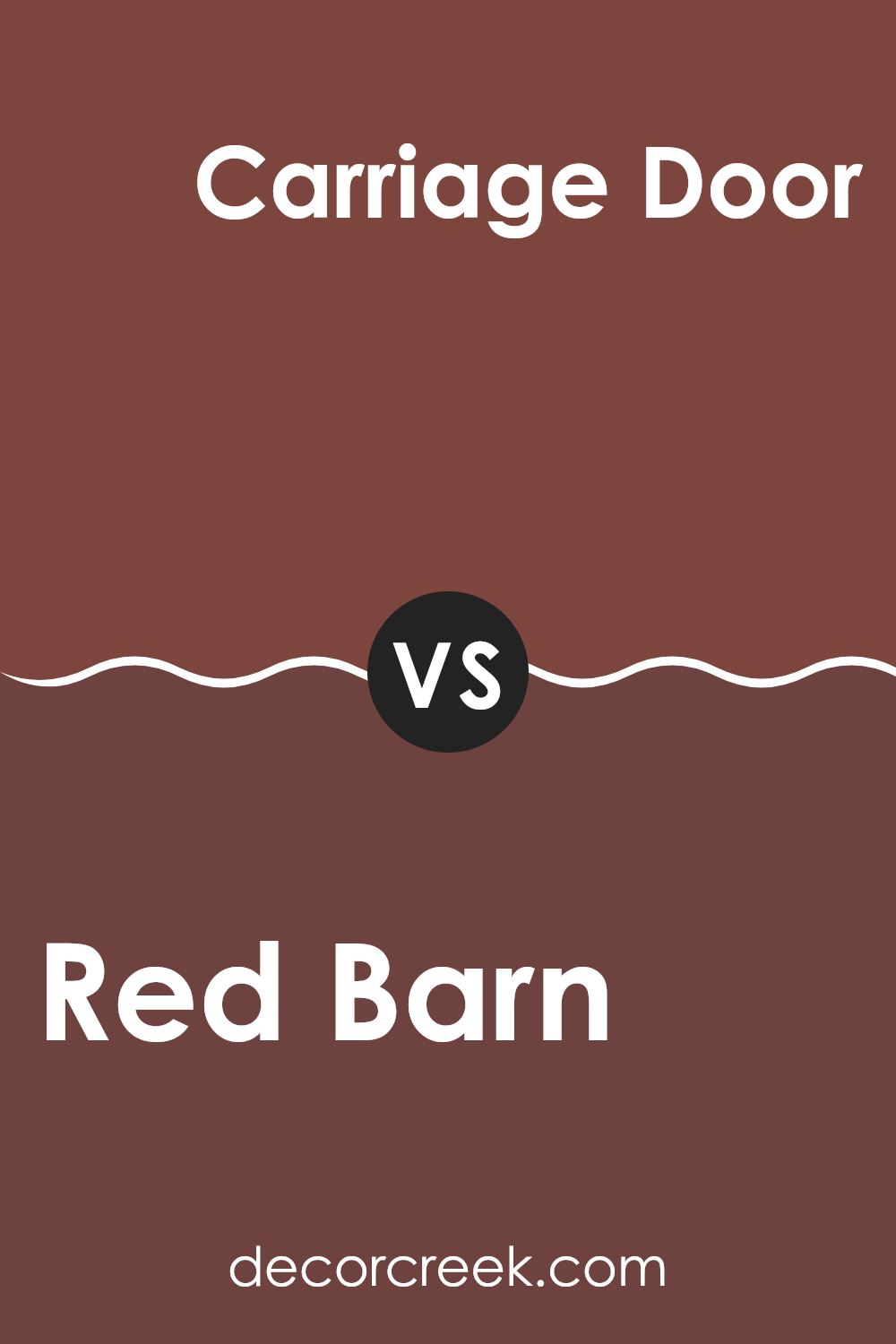
Red Barn SW 7591 by Sherwin Williams vs Carriage Door SW 7594 by Sherwin Williams
Red Barn SW 7591 and Carriage Door SW 7594, both by Sherwin Williams, offer distinct choices for those considering a red hue. Red Barn is a warm, earthy red with a hint of brown, giving it a rustic and cozy feel.
It’s reminiscent of classic barns and adds a welcoming, homely vibe to any room. In contrast, Carriage Door is a deeper, more muted red with subtle gray undertones. This color provides a more subdued and refined appearance. While Red Barn evokes a sense of warmth and nostalgia, Carriage Door brings a quiet elegance.
Both colors can work well in various settings, but Red Barn might be best suited for areas where warmth and energy are desired, while Carriage Door could fit in areas that call for a more understated and classic look. Depending on the desired mood, either color could effectively enhance your home or project.
You can see recommended paint color below:
- SW 7594 Carriage Door
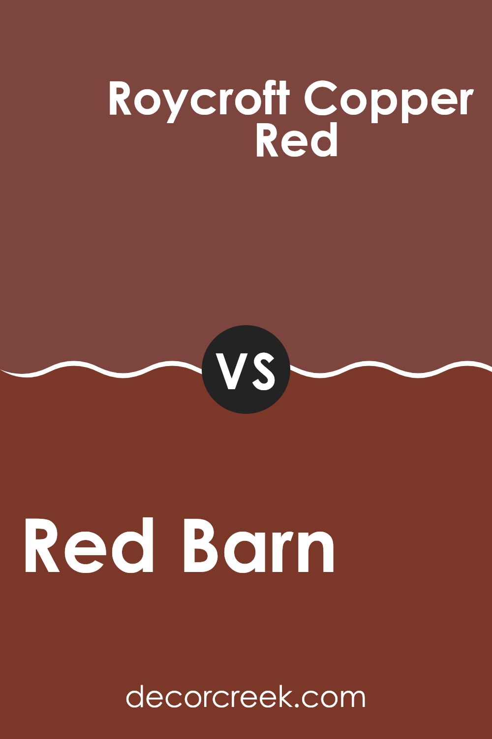
Red Barn SW 7591 by Sherwin Williams vs Roycroft Copper Red SW 2839 by Sherwin Williams
Red Barn SW 7591 and Roycroft Copper Red SW 2839 are both warm red shades by Sherwin Williams, but they have unique characteristics that set them apart. Red Barn is a deep, earthy red that brings to mind the classic hues of a traditional barn.
It’s a robust and rich color with a hint of brown, giving it a grounded and rustic feel. This makes it ideal for creating a cozy and inviting atmosphere in a room. On the other hand, Roycroft Copper Red is slightly brighter with a touch of orange.
This gives it a more vibrant and energetic appearance compared to Red Barn. Roycroft Copper Red can add a lively touch to a room, making it feel more dynamic and animated. While both colors are warm and inviting, Red Barn leans towards a more muted and classic look, whereas Roycroft Copper Red adds a bit more brightness and energy.
You can see recommended paint color below:
- SW 2839 Roycroft Copper Red
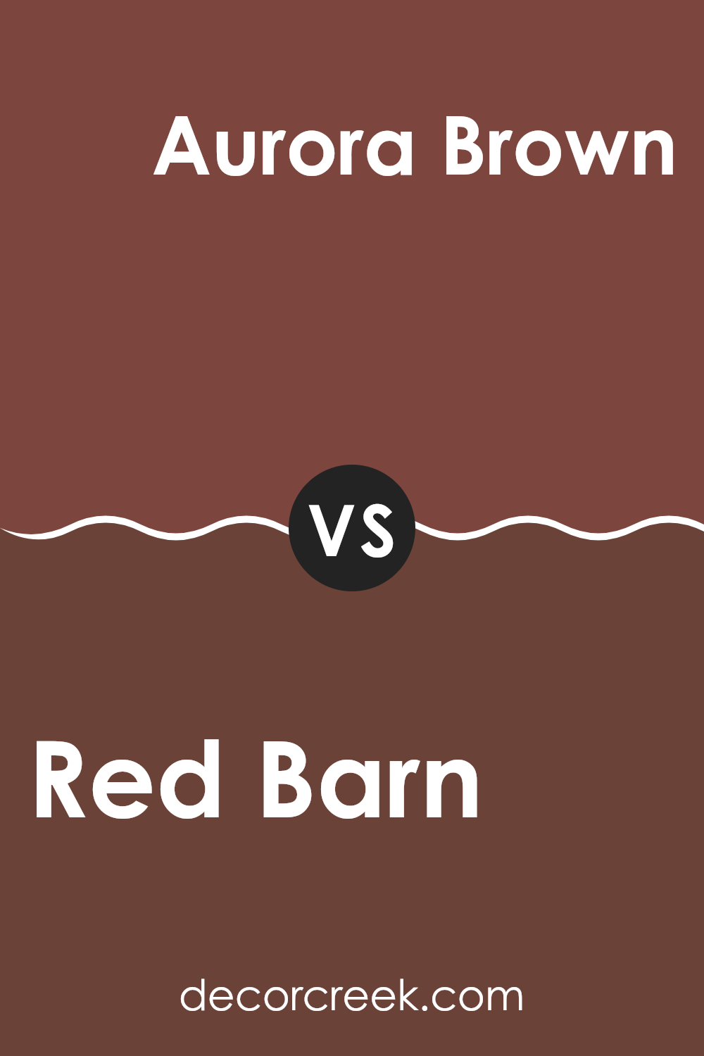
Red Barn SW 7591 by Sherwin Williams vs Aurora Brown SW 2837 by Sherwin Williams
Red Barn SW 7591 and Aurora Brown SW 2837, both by Sherwin Williams, are warm, earthy colors that offer distinct feels. Red Barn is a rich, warm red that draws inspiration from classic rural structures, giving a cozy, welcoming vibe.
It’s bold and vibrant, making a room feel lively and energetic. In contrast, Aurora Brown is a deep, earthy tone with a hint of chocolate. It provides a sense of comfort and grounding, making it perfect for creating a warm, inviting room.
While Red Barn stands out and catches attention, Aurora Brown blends more seamlessly into its surroundings, offering a more subtle charm. Both colors work well in different areas depending on the mood you want to create: choose Red Barn for a striking effect or Aurora Brown for a more subdued and cozy feel.
You can see recommended paint color below:
- SW 2837 Aurora Brown
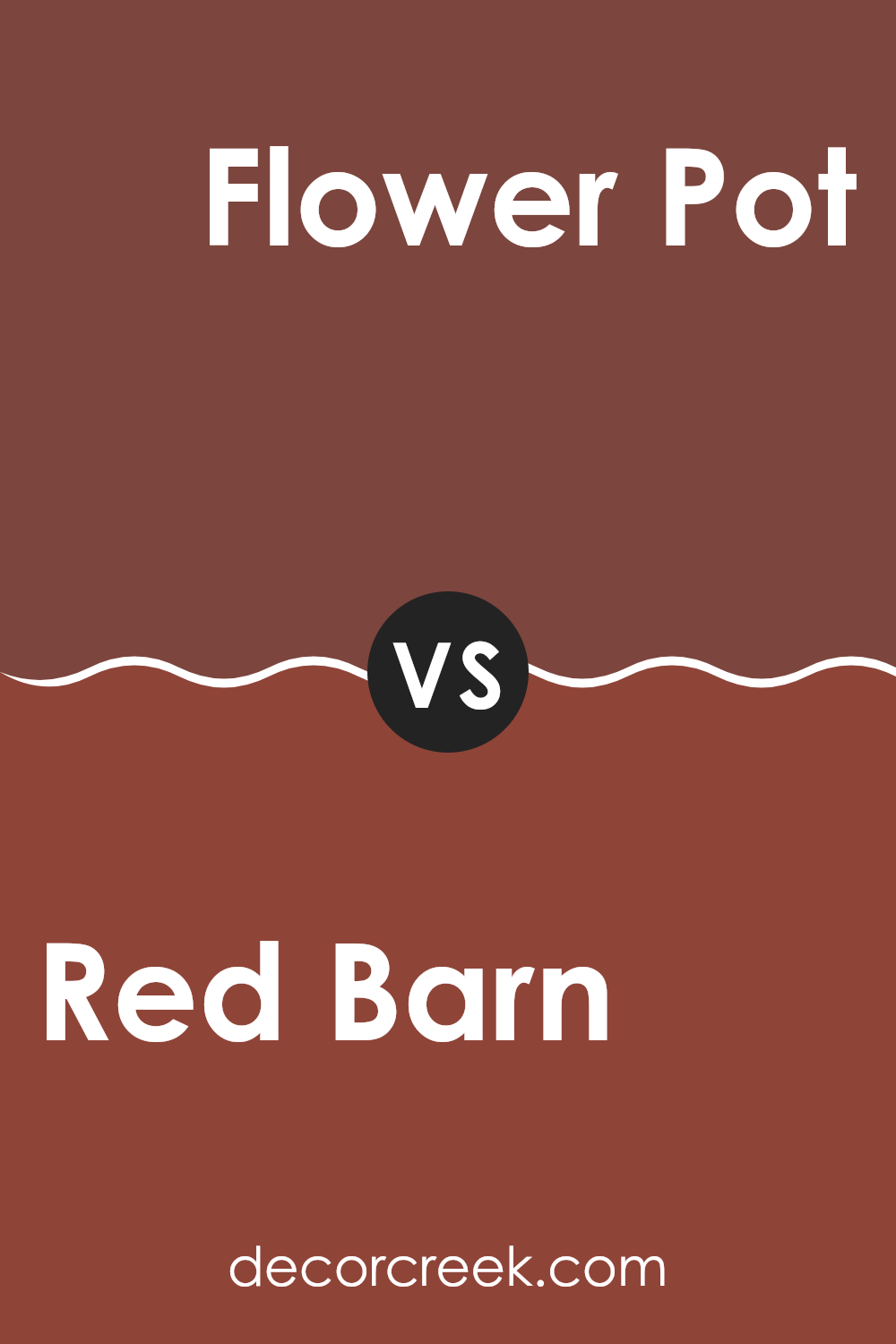
Red Barn SW 7591 by Sherwin Williams vs Flower Pot SW 6334 by Sherwin Williams
Red Barn SW 7591 and Flower Pot SW 6334 are two rich and warm colors from Sherwin Williams. Red Barn is a deep, earthy red with a slightly muted tone, suggesting a classic and cozy feel. It resembles the traditional red used on barns, providing a rustic charm that can make a room feel inviting and warm.
On the other hand, Flower Pot is a brighter, more vibrant shade of red-orange. It offers a lively and energetic vibe, adding a pop of color and warmth to any room. This hue feels more playful and can inject a sense of fun and creativity into a room.
While both colors share some red tones, Red Barn leans more towards a traditional and subdued red, whereas Flower Pot exudes a bolder, cheerful presence with its orange undertones. Each color has its unique personality, with Red Barn being cozier and Flower Pot appearing more spirited.
You can see recommended paint color below:
- SW 6334 Flower Pot
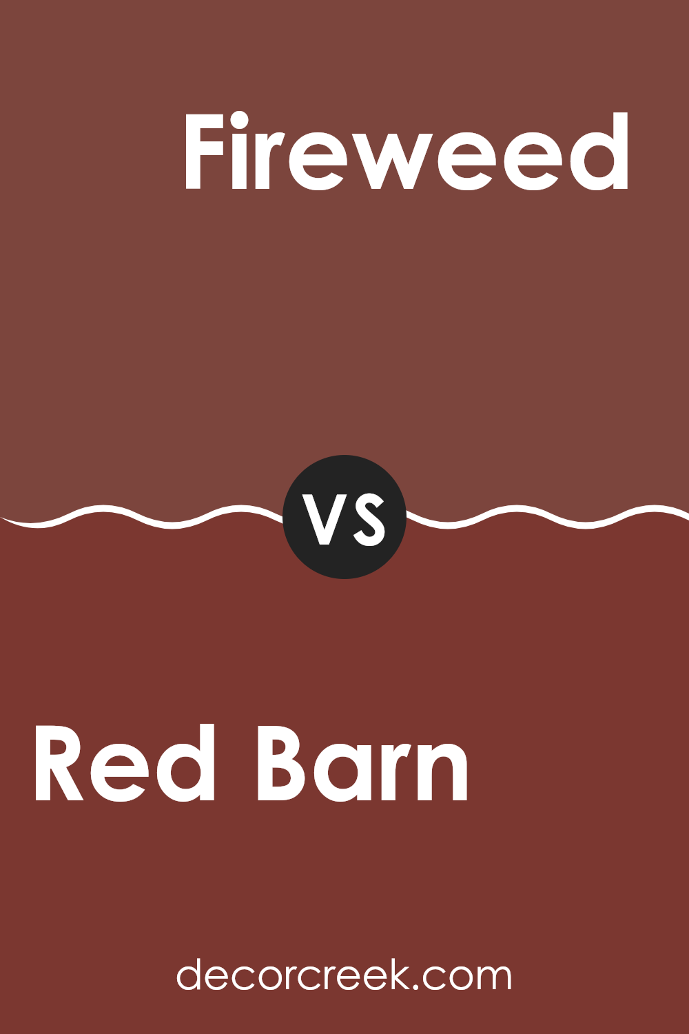
Red Barn SW 7591 by Sherwin Williams vs Fireweed SW 6328 by Sherwin Williams
Red Barn SW 7591 and Fireweed SW 6328 are two rich paint colors by Sherwin Williams, each offering a distinct feel. Red Barn is a warm, earthy red that resembles the color of traditional barn structures. It has a slight brown undertone, giving it a grounded and rustic appearance suitable for a cozy room or exterior use.
Fireweed, on the other hand, is a deeper, more intense red with stronger pink and magenta undertones. It brings out a more vibrant and bold look compared to Red Barn. This color can add drama and make a statement in a room, providing a modern and lively touch.
While both colors are part of the red family, Red Barn leans towards a classic, subdued look, whereas Fireweed offers a more energetic and dynamic vibe. Choosing between them depends on whether you prefer a traditional or more contemporary feel in your area.
You can see recommended paint color below:
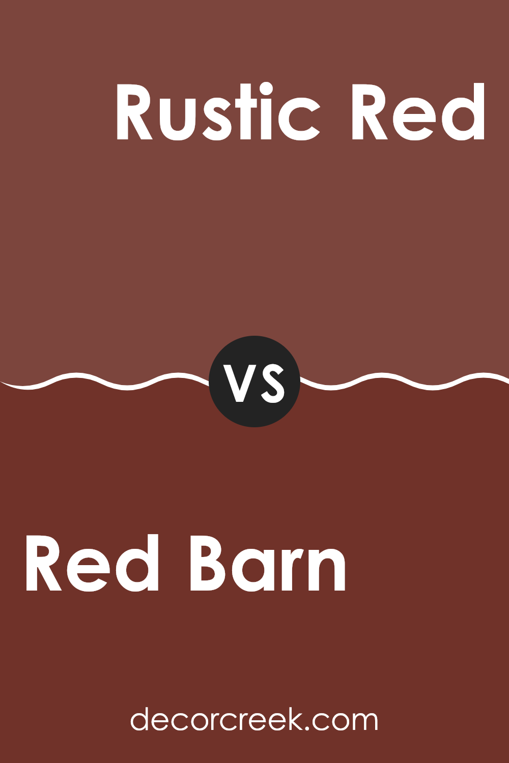
Red Barn SW 7591 by Sherwin Williams vs Rustic Red SW 7593 by Sherwin Williams
Red Barn (SW 7591) and Rustic Red (SW 7593) are both warm, earthy reds by Sherwin Williams, but they have distinct characteristics. Red Barn is a softer, muted red with brown undertones, giving it a warm and cozy feel. It resembles the traditional color of old barnwood, making it perfect for creating a rustic or vintage look in a room.
Rustic Red, on the other hand, is a bit deeper and richer, with more pronounced red tones. It has an intense and bold character, making it stand out more than Red Barn. This makes Rustic Red suitable for making a strong statement or adding a dramatic touch to a room.
Both colors can be used to add warmth and a touch of nature to any room, but Red Barn is more understated, while Rustic Red is more vibrant and assertive. When choosing between them, consider the mood and impact you want to achieve.
You can see recommended paint color below:
- SW 7593 Rustic Red
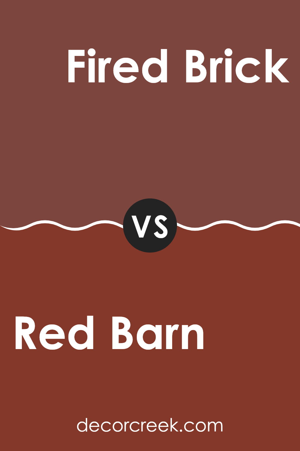
Red Barn SW 7591 by Sherwin Williams vs Fired Brick SW 6335 by Sherwin Williams
Red Barn SW 7591 and Fired Brick SW 6335 are two rich and warm colors by Sherwin Williams. Red Barn is a deeper shade of red with earthy undertones, resembling the hue of a classic American barn. It’s bold but not overpowering, making it flexible for various rooms.
On the other hand, Fired Brick is a slightly darker and more muted red with hints of brown, bringing to mind the color of aged bricks. This shade adds warmth and a rustic feel to a room. Both colors are warm, but Red Barn is more vivid, while Fired Brick leans towards a more subdued and mature vibe.
Choosing between them depends on the atmosphere you wish to create. Red Barn is ideal if you want a lively and inviting feel, whereas Fired Brick offers a cozier and grounded ambiance. Both colors work well in living rooms or dining areas where comfort is key.
You can see recommended paint color below:
- SW 6335 Fired Brick
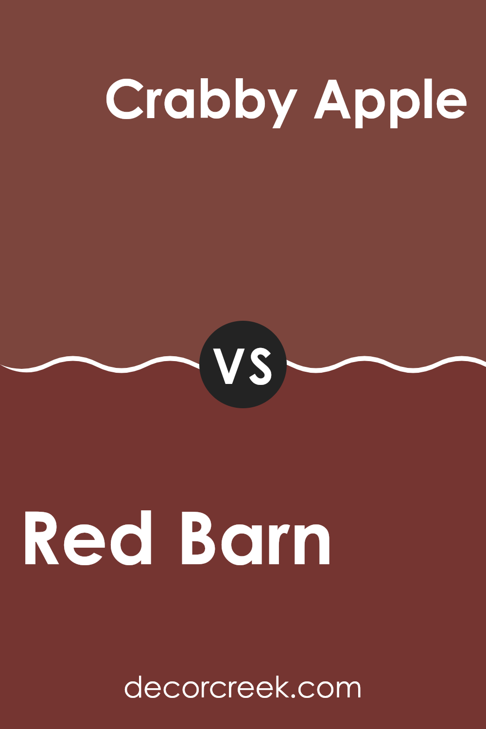
Red Barn SW 7591 by Sherwin Williams vs Crabby Apple SW 7592 by Sherwin Williams
Red Barn (SW 7591) is a rich, earthy red from Sherwin Williams that feels warm and grounded. This color can make a room feel cozy and inviting. It’s a classic hue that works well in a variety of settings, from traditional homes to more rustic environments.
On the other hand, Crabby Apple (SW 7592) is a slightly more intense red with deeper undertones. It’s bolder and more vibrant compared to Red Barn, offering a bit more drama and energy. This shade can add a lively touch to any room, making it feel more energetic.
While both colors belong to the same red family and are next to each other in the palette, Red Barn offers a more subdued, tranquil feel, while Crabby Apple adds a punch of strong color. Depending on the mood one wants to create, Red Barn is slightly earthier, whereas Crabby Apple leans towards being livelier and more spirited.
You can see recommended paint color below:
- SW 7592 Crabby Apple
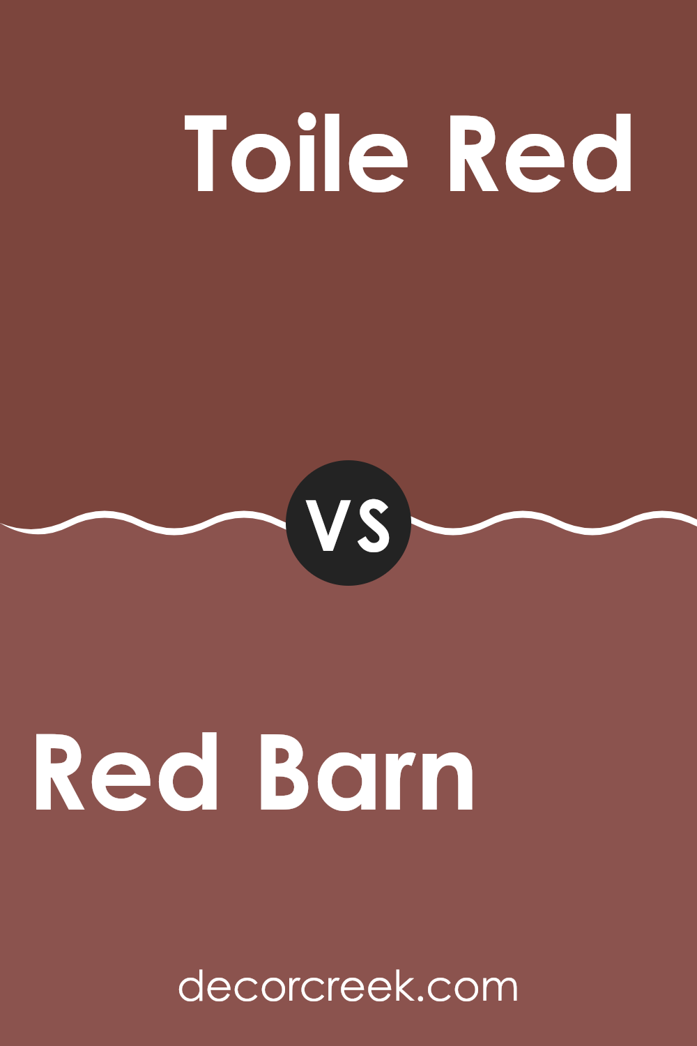
Red Barn SW 7591 by Sherwin Williams vs Toile Red SW 0006 by Sherwin Williams
Red Barn and Toile Red are both appealing shades of red offered by Sherwin Williams. Red Barn is a darker and more muted red, often reminiscent of rustic barns found in the countryside. It has an earthy tone that feels grounded and warm, making it ideal for creating a cozy atmosphere in a room.
This color works well in traditional settings or as an accent in a modern room to add warmth. On the other hand, Toile Red is bright and vivid. It’s a more lively and eye-catching red with a dash of elegance.
Toile Red can bring energy and drama to a room and is often used for accents or statement walls. It’s a classic shade that can suit a variety of styles, from vintage to contemporary. Choosing between them depends on the mood you want to create: cozy and warm with Red Barn, or bold and vibrant with Toile Red.
You can see recommended paint color below:
After going over everything about SW 7591 Red Barn by Sherwin Williams, I feel really excited about this paint color. It reminds me of the bright reds found on traditional barns, making it feel warm and cozy. This color is perfect for adding a lively touch to any room or even the outside of a house.
If I were to use Red Barn, I’d put it in a room where I want people to feel energized and happy, like the kitchen or a family room. It is a strong and vibrant color that makes other colors look great next to it. For example, if you add white or gray, it can make Red Barn pop and look even more special. Even brown or wood tones would look nice, because they match so well with the red.
The best part about Red Barn is how it can make a place feel welcoming and cheerful. Whether you use it for a whole wall or just small parts, like a door or an accent piece, it brings a nice touch of color.
So, if you want to make things feel lively and friendly, SW 7591 Red Barn is a wonderful choice.
Ever wished paint sampling was as easy as sticking a sticker? Guess what? Now it is! Discover Samplize's unique Peel & Stick samples.
Get paint samples

