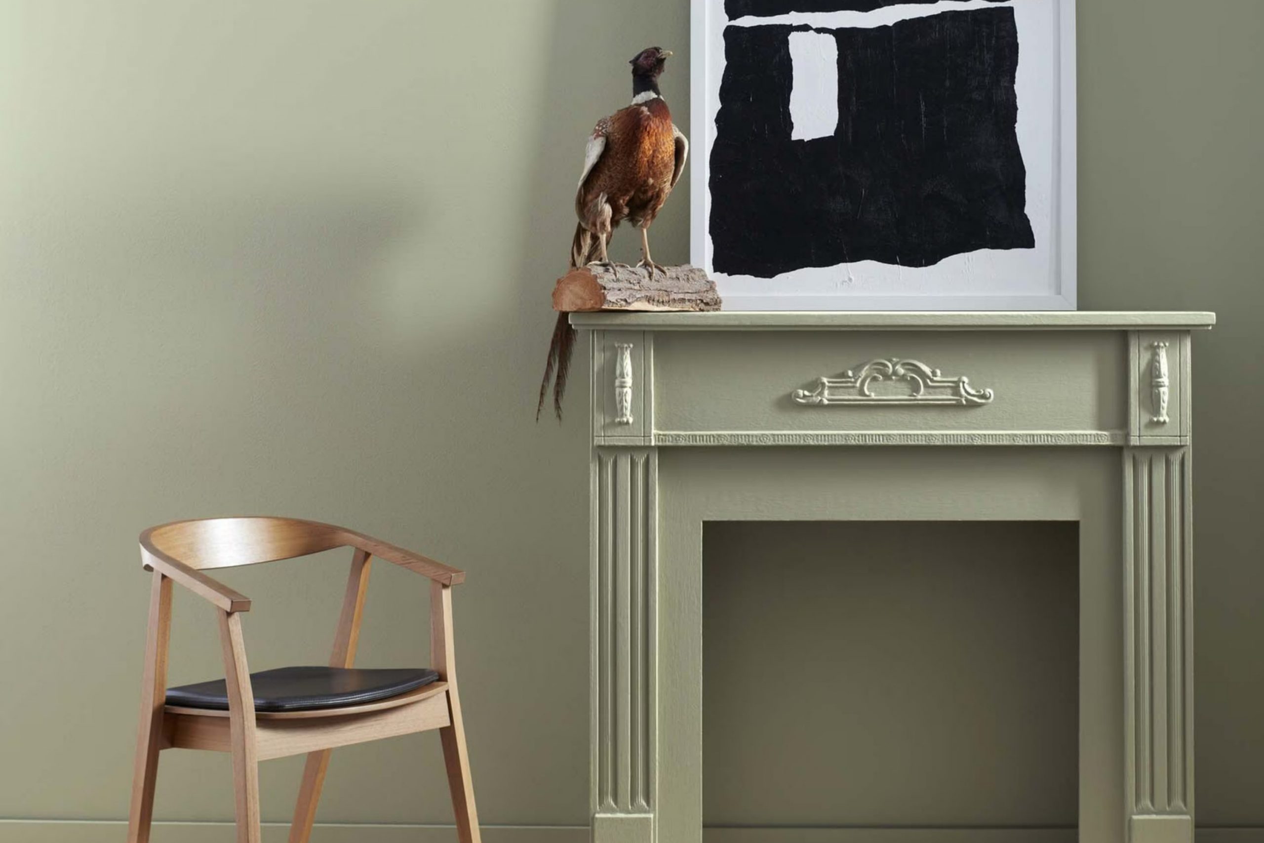
When you decide to refresh a room, choosing the right paint color is key to setting the mood. AF-455 Croquet by Benjamin Moore is a shade that deserves your attention if you’re aiming for a peaceful and inviting atmosphere. This particular color has a uniquely subtle green tone, making it flexible enough to use in various rooms, whether it’s a bustling kitchen or a quiet study.
In my experience, what sets AF-455 Croquet apart is how it complements both modern and traditional decor. Its understated elegance supports a wide range of furniture styles and accessories, allowing you to blend old and new pieces effortlessly. If you’re looking for a color that provides a calm backdrop and boosts other elements in your room, AF-455 Croquet could be the ideal choice.
Moreover, its adaptability extends beyond style. The color interacts harmoniously with natural light, subtly shifting throughout the day from a fresh, lively green to a more muted, cozy hue as the evening sets in. This chameleon-like quality keeps your room feeling dynamic yet always welcoming.
If you’re planning your next home update, consider how AF-455 Croquet could enhance your living environment.
It’s not just a paint color; it’s a step towards a more pleasing and balanced home aesthetic.
What Color Is Croquet AF-455 by Benjamin Moore?
The color Croquet by Benjamin Moore is a subtle, muted green with a hint of grey, giving it a soft and adaptable appearance. This calming shade is ideal for creating a relaxed and welcoming atmosphere in any room. It’s particularly effective in rooms where you want to promote a sense of calm and restfulness, such as bedrooms and living areas.
Because of its understated elegance, this color pairs exceptionally well with natural materials like wood, stone, and linen, adding a touch of warmth and texture to the environment. It also goes well with materials like soft leather and cotton, which help to enhance its gentle nature without overpowering the senses.
Croquet fits seamlessly into several interior design styles. It’s perfect for Scandinavian decor, where a minimalist approach emphasizes clean lines and light, muted colors. It also works well in contemporary rooms, where its subtlety can act as a neutral backdrop, allowing other design elements to stand out. For a more traditional look, Croquet can be used to offer a fresh touch to classic style settings without diverting from their enduring appeal.
In summary, Croquet is a flexible color that harmonizes well with a variety of textures and materials, making it a smart choice for anyone looking to create a soft, welcoming interior room.
Is Croquet AF-455 by Benjamin Moore Warm or Cool color?
Croquet AF-455 by Benjamin Moore is a paint color that stands out for adding a subtle and modern look to any home. This color has a warm, earthy tone that offers a cozy feel, making it perfect for rooms where you want to relax, like living rooms and bedrooms. Its flexibility means it can equally enhance more active areas such as kitchens or dining rooms, providing a backdrop that complements both modern and traditional décor.
The hue works well in homes because it acts as a neutral. It pairs easily with a wide range of other colors, from bold shades to softer tones, giving homeowners the freedom to mix and match their furniture and accessories.
Additionally, because of its calming nature, it makes smaller rooms appear larger and more open, which is a clever way to make the most of limited square footage. Overall, using Croquet AF-455 can help create a warm, inviting atmosphere in any home, making it a solid choice for those looking to freshen up their room.
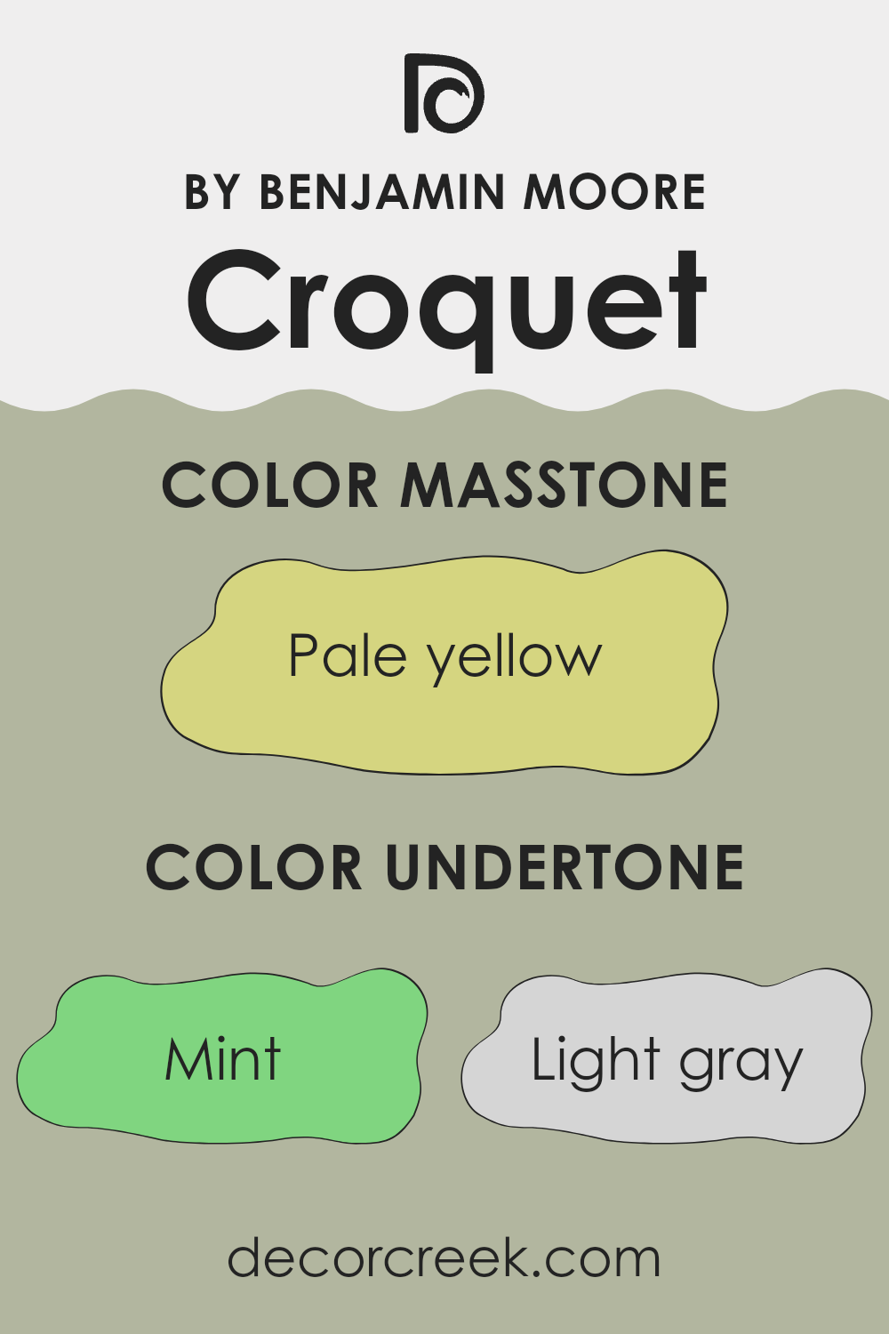
Undertones of Croquet AF-455 by Benjamin Moore
Croquet AF-455 is a unique paint color that brings out a rich tapestry of undertones, each adding its own flavor to the primary hue. Undertones are subtle colors that influence the overall appearance of paint once it’s applied to walls. These secondary colors can make a significant difference in how a main color appears under various lighting conditions.
This particular shade has undertones ranging from cool mints and light blues to warm oranges and pale pinks. Each undertone contributes to the complexity of Croquet AF-455, making it adaptable and appealing in different settings. For example, in a room with a lot of natural light, the mint and light blue undertones might make the walls appear fresher and airier. In contrast, in a room with warmer lighting, the pale pink and orange undertones could make the room feel cozier.
Understanding these undertones is crucial when choosing paint for your home because they can subtly change the mood and feel of a room. For instance, a bedroom painted in Croquet AF-455 might feel soothing and calm due to its lilac and light purple undertones, providing a gentle backdrop for relaxation.
Overall, the range of undertones in Croquet AF-455 offers a flexible palette that can enhance the interior aesthetics of any room, depending on the existing decor and lighting conditions. Whether creating a soothing atmosphere or a lively room, these undertones play a key role in achieving the desired ambiance.
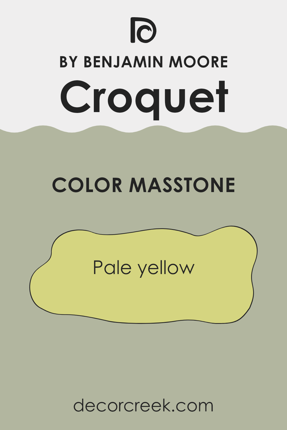
What is the Masstone of the Croquet AF-455 by Benjamin Moore?
Croquet AF-455 by Benjamin Moore is a popular choice for interior rooms due to its pale yellow masstone. The light and airy feel of this yellow brings a bright and welcoming vibe to any room. It reflects natural light well, making small rooms look larger and more open.
This color works especially well in living areas and kitchens where you want a cheerful atmosphere. It pairs beautifully with white trim for a crisp, clean look, or it can be matched with darker woods for a cozy, warm feel.
Because it doesn’t overpower, it’s easy to match with various decor styles and colors, making it a flexible option for many homes. Pale yellow tends to hide small scuffs and marks, which is practical for high-traffic areas. Overall, its warm tone creates a pleasant environment that’s perfect for relaxing at home.
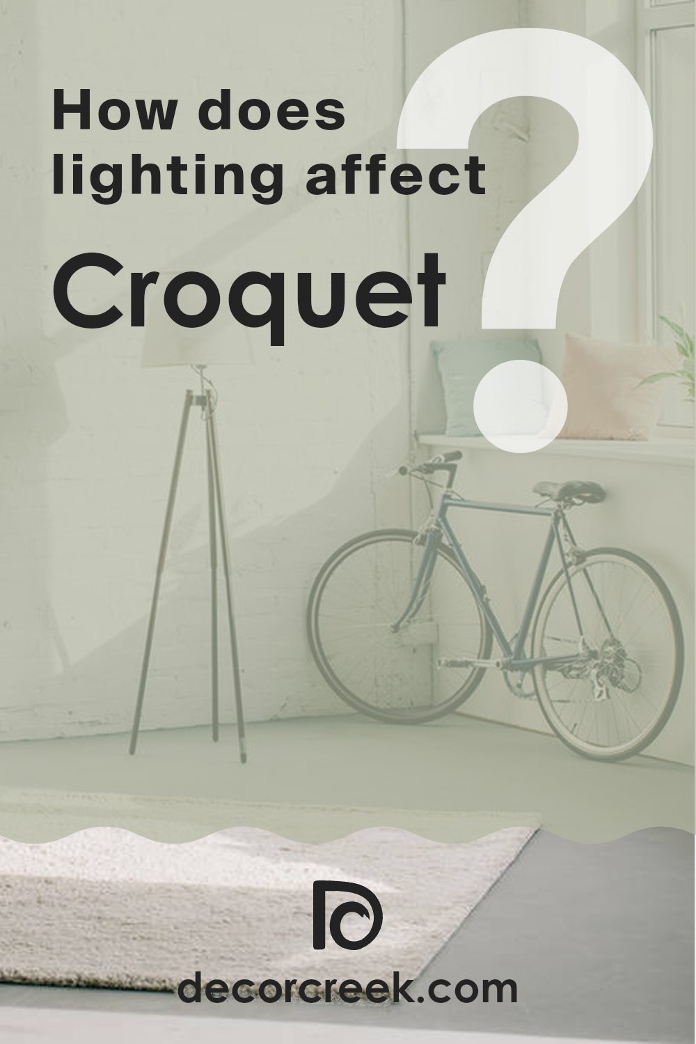
How Does Lighting Affect Croquet AF-455 by Benjamin Moore?
Lighting plays a crucial role in how we perceive colors. The quality and type of light can change the appearance of a color significantly. Generally, natural light from the sun provides the truest view of colors, while artificial lighting can alter these perceptions depending on its type.
When considering a specific paint color such as Croquet by Benjamin Moore, lighting becomes even more important. In natural light, Croquet appears true to its original hue, showing its unique blend of tones. On a sunny day, the color can seem warmer and more vibrant due to the bright natural light enhancing its warmer undertones.
In rooms with artificial light, the type of bulbs used makes a difference. LED or fluorescent lighting can either bring out the subtleties of Croquet or cast different shadows, affecting how the color is viewed. Warmer bulbs tend to enhance the cozy elements of the color, while cooler bulbs might make it look a bit more subdued.
Room orientation affects how Croquet will look throughout the day:
- North-facing rooms: These rooms get less direct sunlight, leading Croquet to appear a bit more muted and cooler. It maintains a steady appearance without too many shifts during the day.
- South-facing rooms: With more exposure to direct sunlight, Croquet will appear brighter and more vibrant in these rooms, especially during the middle of the day when sunlight is abundant.
- East-facing rooms: Morning light in these rooms brings a bright and warm appearance to Croquet, making it look quite cheerful. As the light fades, the color will begin to look softer and more subtle.
- West-facing rooms: In the evening, as the sun sets, Croquet can look exceptionally warm and inviting in west-facing rooms. Morning light will cause the color to appear cooler, gradually warming up throughout the day.
Understanding these nuances can help in deciding where to apply this paint color to make the most of its beautiful hue under various lighting conditions.
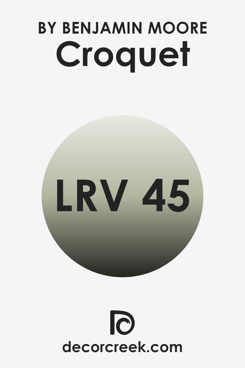
What is the LRV of Croquet AF-455 by Benjamin Moore?
LRV, or Light Reflectance Value, is a measure used to describe the percentage of light a paint color reflects when it’s on your walls. Each color has a different LRV, ranging from zero, which absorbs all light and looks completely black, to the highest end of the scale, which reflects all light and appears pure white.
The LRV helps determine how light or dark a paint color will look in your room and can influence how small or large a room feels. The higher the LRV, the lighter the color will appear, making a room feel more open and airy.
The LRV for the shade Croquet (AF-455) is 45.02, which means it reflects almost half of the light that hits it. This value places it in the medium range of reflectiveness. In practical terms, this means that Croquet isn’t too dark nor too light, making it quite adaptable for various lighting situations.
In a brightly lit room, it will look lighter and more reflective, while in a poorly lit room, it will appear slightly darker. This particular shade can help balance out a room that gets varied light throughout the day, providing a consistent look that changes subtly with the natural light.
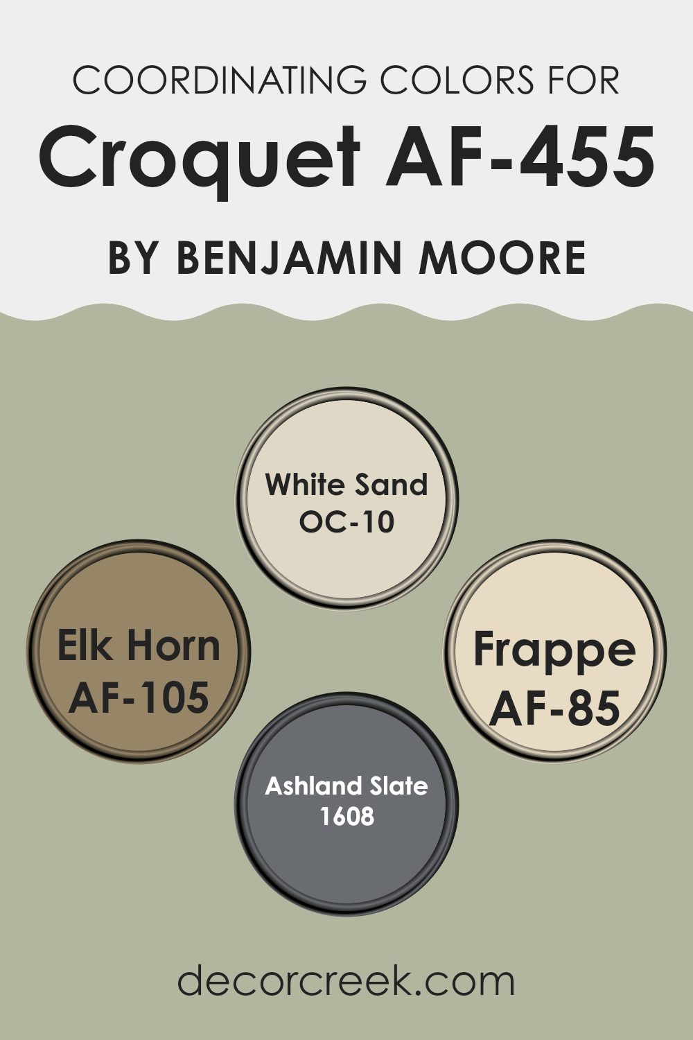
Coordinating Colors of Croquet AF-455 by Benjamin Moore
Coordinating colors are chosen to complement a main color, enhancing the overall aesthetic of a room. They work by balancing the visual impact, making a room feel more harmonious and pleasing to the eye. By selecting colors that work well together, you can create a cohesive look that feels intentional and put together.
Take, for example, a palette designed to coordinate with a specific paint such as OC-10 – White Sand. This is a soft, warm shade that provides a subtle backdrop, perfect for layering with richer colors. AF-105 – Elk Horn is another coordinating color which offers a deeper, earthy beige, adding a touch of warmth to any room without overpowering it.
AF-85 – Frappe is a neutral, mid-tone beige that bridges the gap between lighter and darker hues, making it an ideal choice for creating a smooth transition in rooms that need balance. Lastly, 1608 – Ashland Slate brings a dark, charcoal gray to the mix, providing depth and contrast, which can help in highlighting specific areas or features within a room. Together, these coordinating colors support and enhance each other, making any room more inviting and visually interesting.
You can see recommended paint colors below:
- OC-10 White Sand
- AF-105 Elk Horn
- AF-85 Frappe
- 1608 Ashland Slate
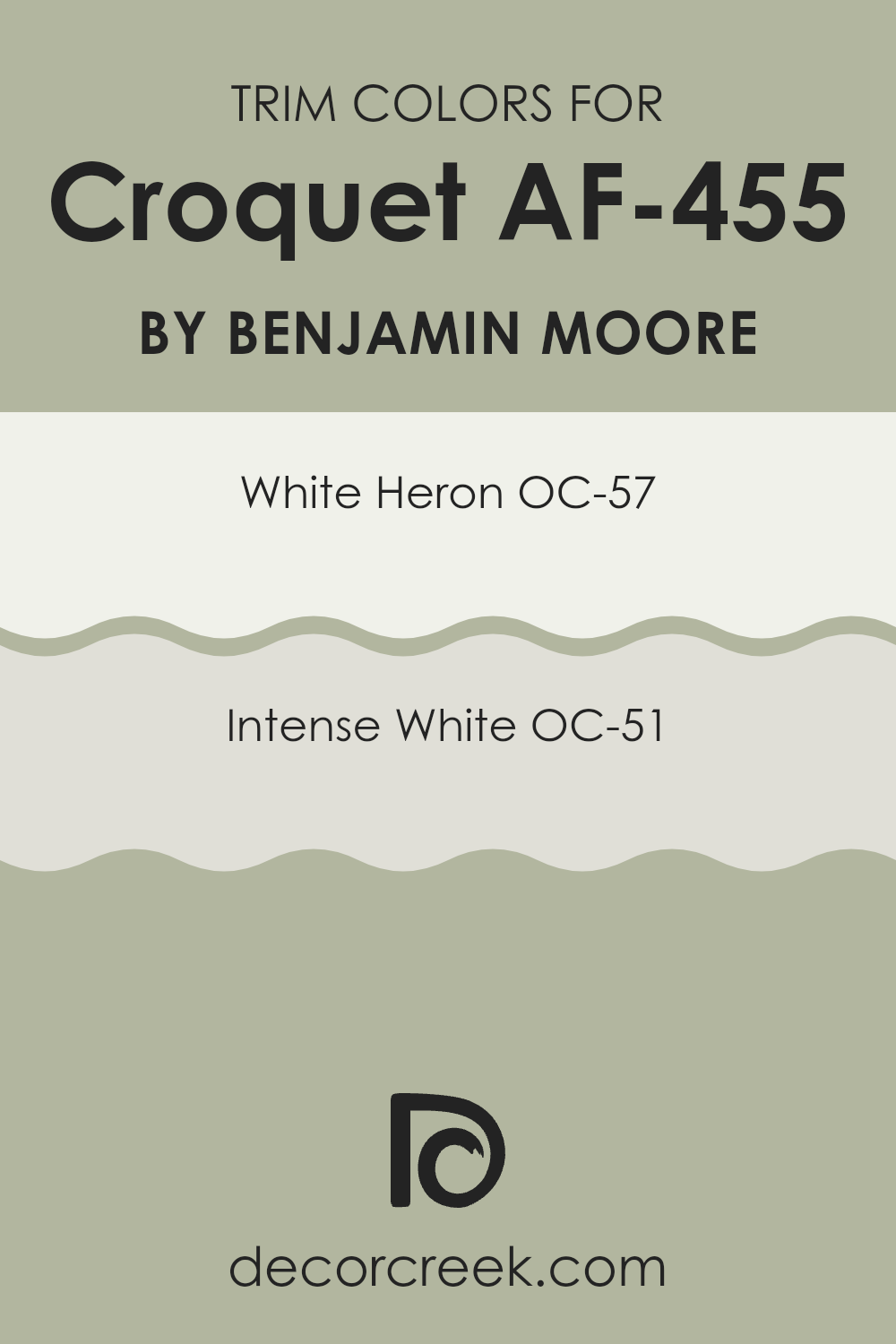
What are the Trim colors of Croquet AF-455 by Benjamin Moore?
Trim colors are used on the architectural elements of a room—like door frames, window sills, and baseboards—to accent and define the room, adding depth and contrast to the walls and creating a more polished overall look. Selecting the right trim color can enhance the aesthetics of your environment, making it feel more inviting and coherent.
With the right trim color like OC-57 White Heron or OC-51 Intense White, paired with walls painted in Croquet AF-455 by Benjamin Moore, the trim effectively highlights and complements the wall color while contributing to a neat and tidy appearance throughout the room.
OC-57 White Heron is a crisp white color that brings a fresh and airy feel to any living room. It works especially well in ensuring that other colors, such as the subtle green hue of Croquet AF-455, stand out and catch the eye without overpowering the senses.
On the other hand, OC-51 Intense White offers a slightly warmer tone that provides a soft, yet distinct, boundary that gently enhances adjoining colors. Both of these trim colors work harmoniously to draw attention to the distinct features of a room, boosting both the appearance and the feel of the room.
You can see recommended paint colors below:
- OC-57 White Heron
- OC-51 Intense White
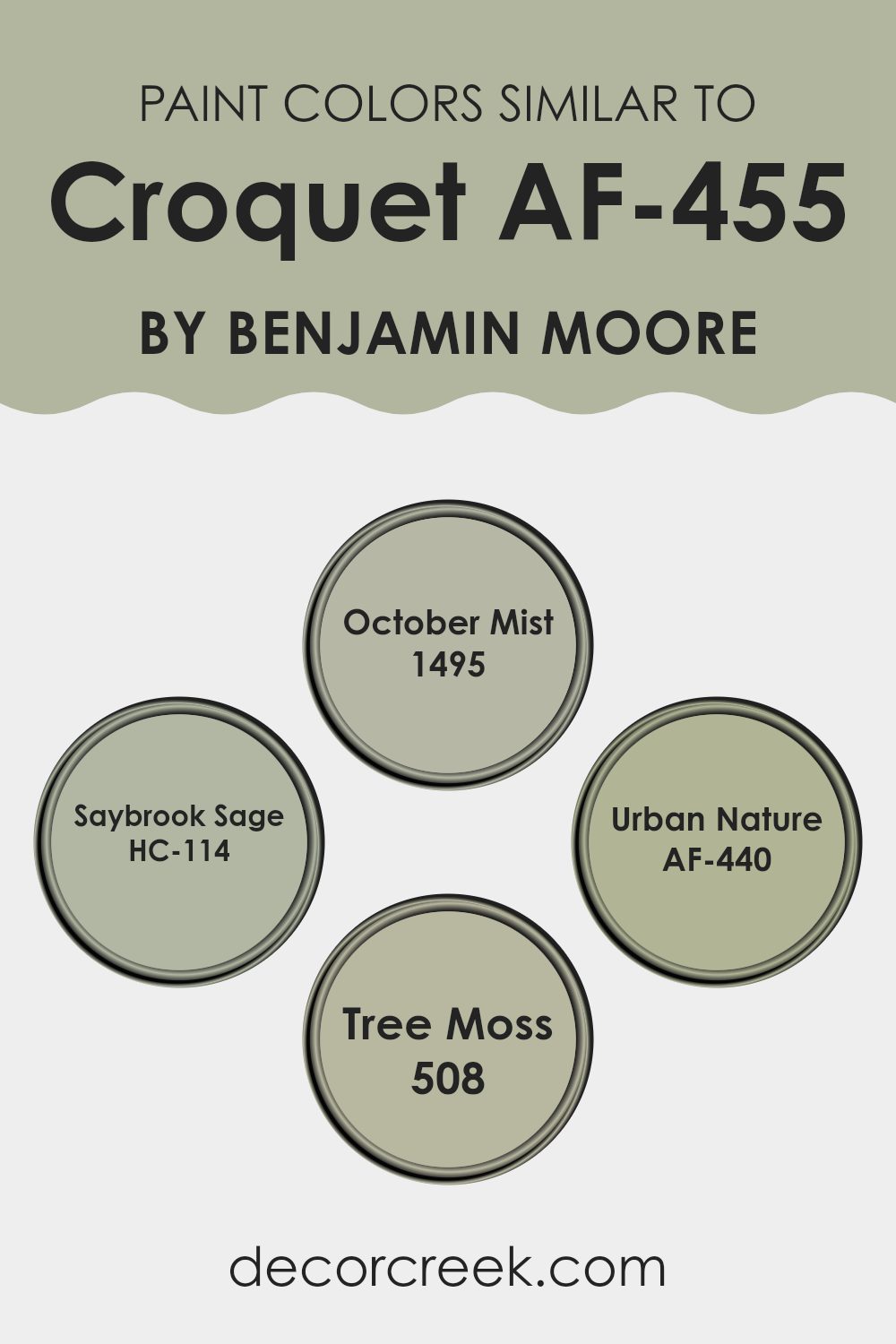
Colors Similar to Croquet AF-455 by Benjamin Moore
When decorating a room, using similar colors can create a harmonious and appealing look that subtly ties different design elements together. Similar colors, like those close to Croquet AF-455 by Benjamin Moore, offer a cohesive palette that makes a room feel balanced and coordinated.
These shades can also help in avoiding stark contrasts that may make a room feel jarring or disjointed. Working with shades like October Mist, Saybrook Sage, Urban Nature, and Tree Moss can lend a soft, gentle uniformity throughout your interiors, helping to enhance the overall aesthetic appeal without overpowering it with too many competing colors.
October Mist is a gentle gray with a hint of green, providing a muted backdrop that is easy on the eyes and complements a variety of decor styles. Saybrook Sage has a touch more green, enriching rooms with a natural feel that pairs well with both light and dark accents. Urban Nature is a slightly deeper green that suggests an earthy, grounded atmosphere, perfect for adding depth to a room.
Lastly, Tree Moss, with its deeper, moodier tone of green, offers a rich contrast that still aligns beautifully with the other colors, perfect for an accent wall or for bringing in some drama to a neutrally themed palette. Utilizing these shades together can create a layered and cohesive room that feels intentionally designed and pleasant to inhabit.
You can see recommended paint colors below:
- 1495 October Mist
- HC-114 Saybrook Sage
- AF-440 Urban Nature
- 508 Tree Moss
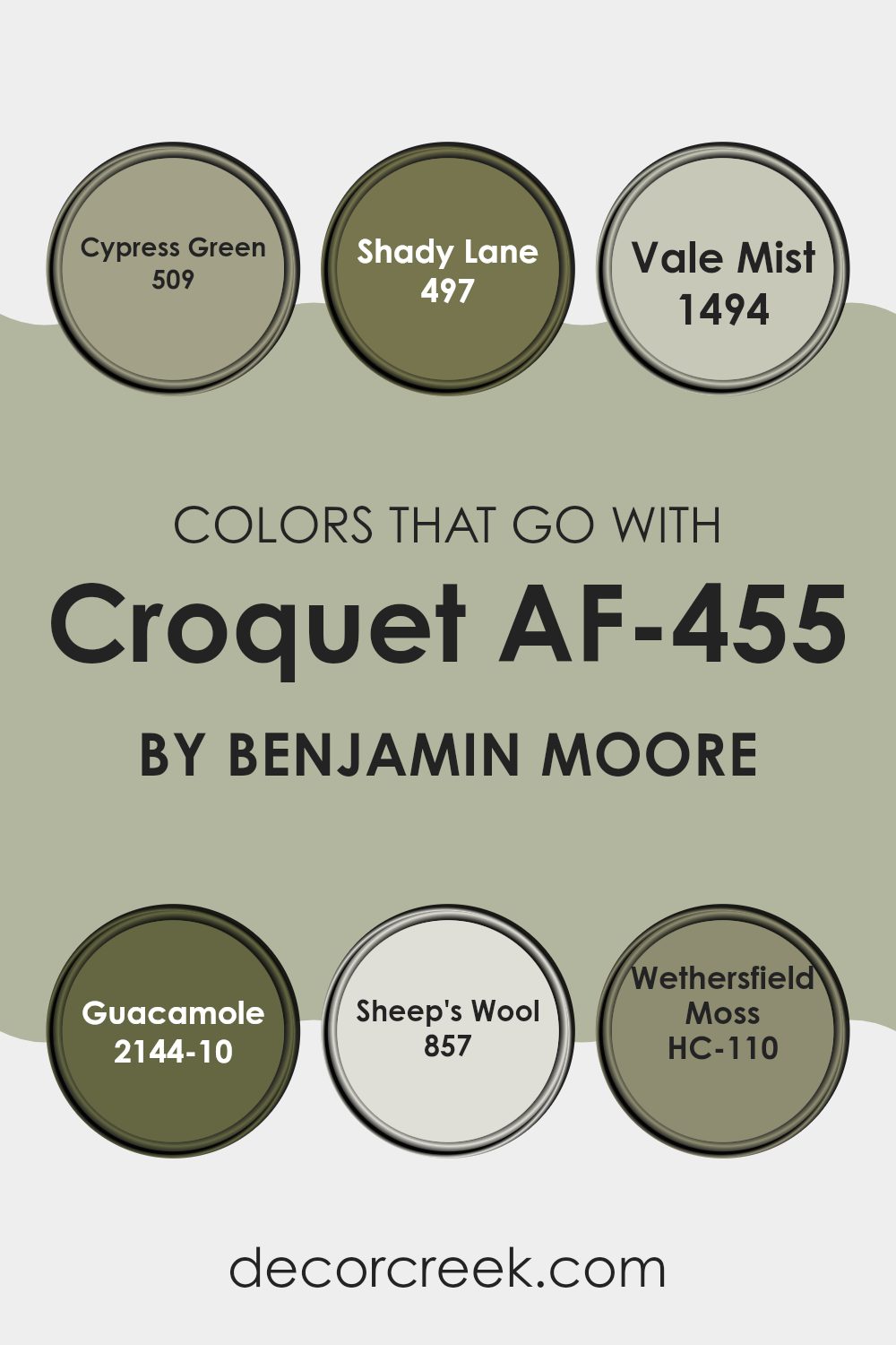
Colors that Go With Croquet AF-455 by Benjamin Moore
When decorating with Croquet AF-455 by Benjamin Moore, choosing the right complementary colors is crucial since it helps create a harmonious atmosphere. This green hue pairs well with colors like 509 – Cypress Green, which is a deeper, richer shade of green, giving a sense of continuity and depth to the room. Similarly, 497 – Shady Lane offers a slightly muted green that works well in providing a subtle contrast, perfect for areas that benefit from a calm and cohesive look.
Adding to the palette, 1494 – Vale Mist introduces a soft, almost misty quality with its lighter green tone, excellent for brightening rooms or adding a soft backdrop. Pairing it with 2144-10 – Guacamole, a vibrant, lively green brings in a splash of energy and freshness, making it ideal for accent walls or decor pieces.
For a gentler contrast, 857 – Sheep’s Wool offers a creamy, off-white that complements the green tones beautifully, creating a warm and inviting environment. Lastly, HC-110 – Wethersfield Moss anchors the scheme with its earthy, deep hue, perfect for grounding the room or adding an element of nature. These colors together support a cohesive, inviting look that enhances the main color, making any room feel well-coordinated and thoughtfully designed.
You can see recommended paint colors below:
- 509 Cypress Green
- 497 Shady Lane
- 1494 Vale Mist
- 2144-10 Guacamole
- 857 Sheep’s Wool
- HC-110 Wethersfield Moss
How to Use Croquet AF-455 by Benjamin Moore In Your Home?
Croquet AF-455 by Benjamin Moore is a soft, muted green paint color that brings a fresh and calm feel to any room. This shade is perfect for those looking to add a touch of nature-inspired beauty to their home without overpowering the room.
It works exceptionally well in living rooms and bedrooms, where its soothing qualities can create a relaxing atmosphere. For a modern look, you can pair it with light woods and neutral colors like whites and beiges. In kitchens and bathrooms, Croquet can complement white cabinetry or tiles, giving the room a clean and inviting look.
Additionally, this color is adaptable enough to be used on accent walls or for painting furniture. It adds a subtle pop of color while keeping the overall aesthetic light and airy. Croquet AF-455 provides a simple and effective way to refresh your home, making rooms more enjoyable and stylish.
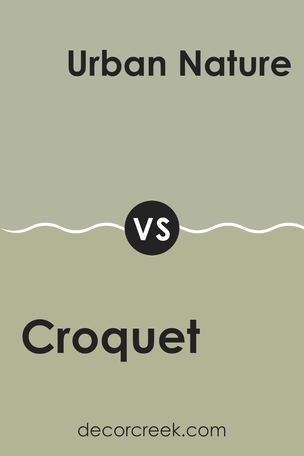
Croquet AF-455 by Benjamin Moore vs Urban Nature AF-440 by Benjamin Moore
The main color, Croquet, is a gentle, soothing green that brings a touch of softness to any room. It’s a light hue that keeps rooms feeling open and airy, perfect for creating a relaxed environment.
On the other hand, Urban Nature is a deeper, robust olive green that provides a feeling of groundedness and stability. This darker shade can make large rooms feel more intimate and cozy, lending a natural, earthy vibe.
Both colors come from the same green family but serve different purposes based on their tones. While Croquet can brighten up a room and give it a fresh, clean look, Urban Nature works well in areas where you want to induce a sense of comfort and closeness to nature. Using them together could create a layered effect, from vibrant to calm, that could enhance a home’s decor beautifully.
You can see recommended paint color below:
- AF-440 Urban Nature
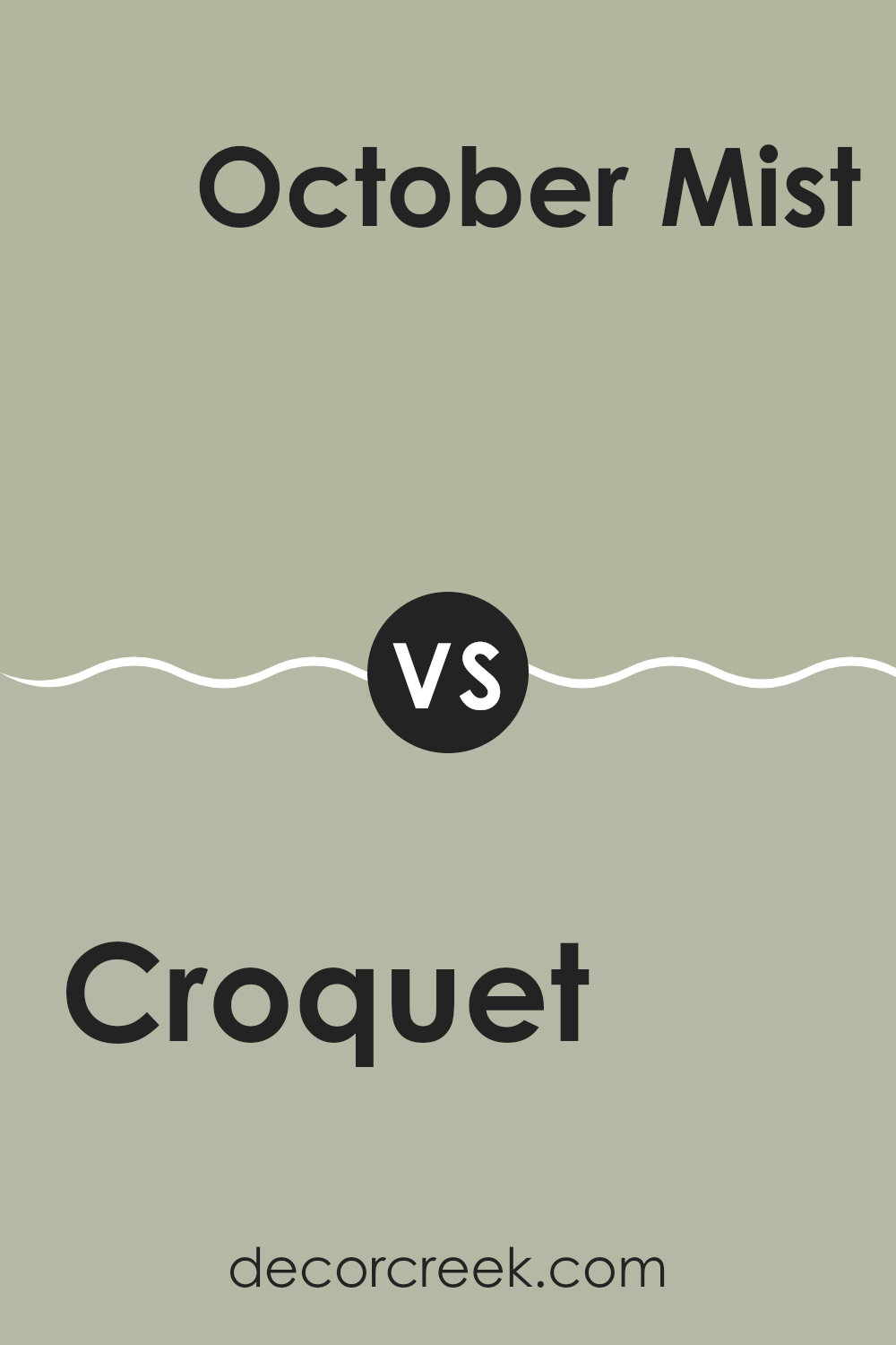
Croquet AF-455 by Benjamin Moore vs October Mist 1495 by Benjamin Moore
The color Croquet by Benjamin Moore is a soft, subtle green with a hint of gray. It has an understated look that feels fresh and calming. It’s an adaptable color that works well in rooms meant for relaxation, like bedrooms or living rooms.
On the other hand, October Mist by Benjamin Moore leans more towards a gentle sage green, providing a touch of nature-inspired freshness to any room. October Mist is slightly cooler compared to Croquet and gives off a crisp vibe, making it great for modern rooms.
Both colors promote a soothing atmosphere, but Croquet has more warmth due to its gray undertones, while October Mist feels more airy and light with its whispery sage notes. Together, they can create a peaceful and harmonious color palette.
You can see recommended paint color below:
Croquet AF-455 by Benjamin Moore vs Tree Moss 508 by Benjamin Moore
Croquet by Benjamin Moore is a subtle, soft green that gives a fresh and natural feel to any room. It’s a light color that works well in rooms that need a gentle touch of nature without overpowering the surroundings. This hue reflects light beautifully, making the room feel airy and more open. It pairs nicely with neutral tones and natural materials, such as wood or stone, enhancing the overall calm atmosphere of a room.
Tree Moss is a deeper, richer shade of green compared to Croquet. This color resembles the deep tones found in a dense forest and is perfect for adding a touch of nature’s depth to an interior. Tree Moss offers a stronger character and can make a bold statement when used on accent walls or for entire rooms.
It’s ideal for rooms that can handle a dark color, providing a grounding and cozy feel. These two Benjamin Moore colors differ mainly in their depth and impact, with Croquet being lighter and airier, and Tree Moss offering a more intense and enriched presence.
You can see recommended paint color below:
Croquet AF-455 by Benjamin Moore vs Saybrook Sage HC-114 by Benjamin Moore
Croquet AF-455 and Saybrook Sage HC-114 are both colors by Benjamin Moore that share a natural, soothing vibe but have distinct tones. Croquet is a deeper, greener shade that brings a fresh and lively feel to a room. It’s like the color of dense foliage or a lush forest, making it great for creating a cozy and inviting atmosphere.
On the other hand, Saybrook Sage is a lighter, more subdued green with gray undertones. This color is great for bringing a calm and gentle touch to any room, making it feel open and airy. Saybrook Sage is perfect if you want a background color that blends smoothly without overpowering the room.
In contrast, Croquet makes more of a statement with its richer hue, adding depth and interest to a room. Both colors work well in various settings, but your choice between them might depend on how bold or subtle you want the room’s vibe to be.
You can see recommended paint color below:
Writing about AF-455 Croquet by Benjamin Moore has opened my eyes to the understated beauty of this color. What I really enjoy about Croquet is its soft, subtle tone. It’s a kind of green that doesn’t shout for attention yet adds a gentle hint of nature to any room. Whether I painted a whole room or just a wall for accent, this color made the room feel warm and inviting.
This color proves that you don’t need bright or bold colors to make a room look beautiful. It works really well in rooms where you want a calm atmosphere, like bedrooms or reading nooks. It blends perfectly with lots of other colors and decorations without clashing. If I had to redo some rooms in my house, I’d surely pick Croquet again because it’s so easy to work with.
In summary, AF-455 Croquet by Benjamin Moore is an excellent pick if you’re looking for a color that’s soft, natural, and makes any room feel cozy without trying too hard. It’s a color that goes well with everything and shifts the feel of a room in a gentle but positive way.
I’m really glad I got to learn and write about it!
Ever wished paint sampling was as easy as sticking a sticker? Guess what? Now it is! Discover Samplize's unique Peel & Stick samples.
Get paint samples

