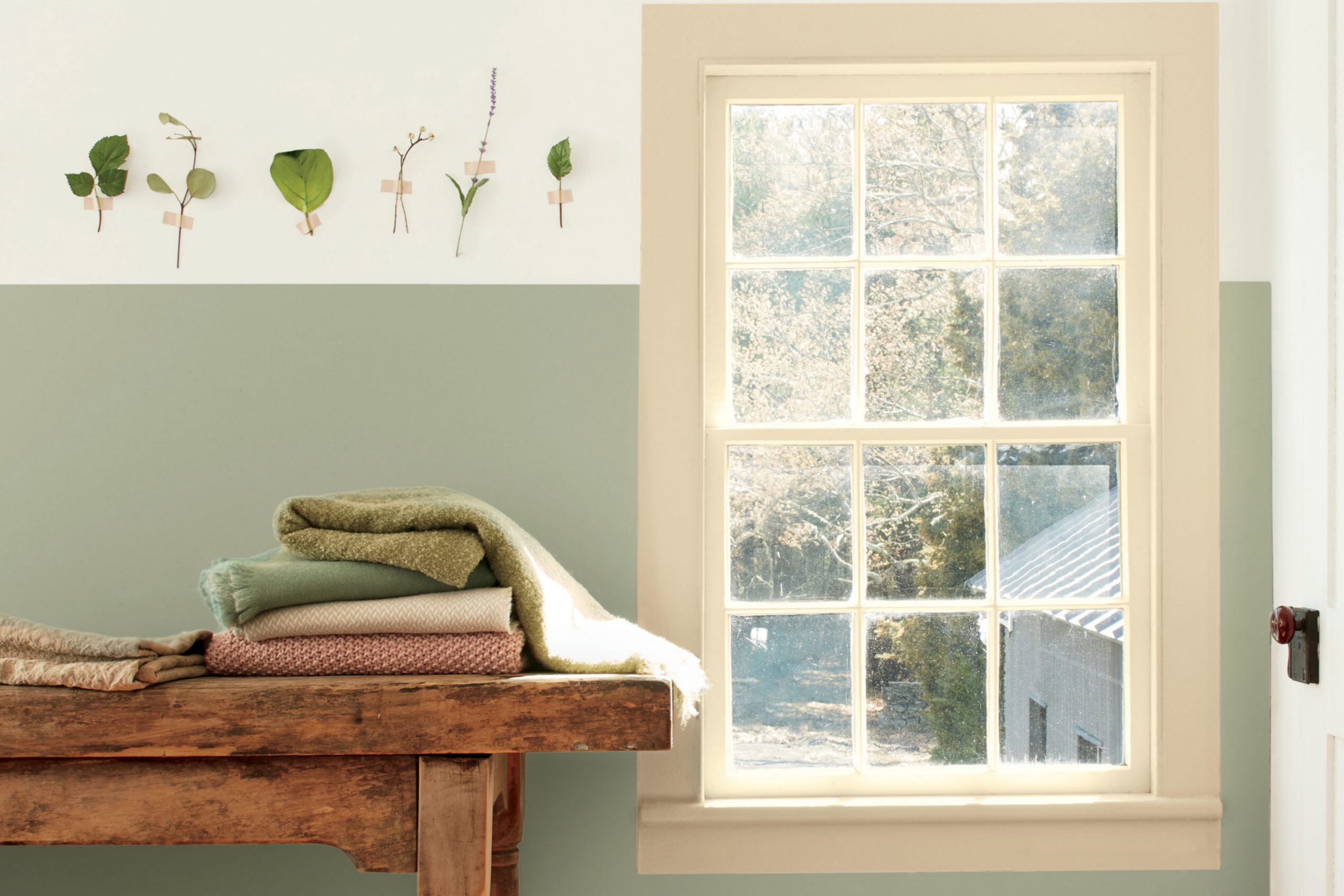
The 1495 October Mist by Benjamin Moore is all about capturing the essence of autumn in a paint color. When you think of refreshing your space, choosing the right shade can make all the difference. October Mist, this unique color, brings the calming feel of a misty morning walk into your room. It’s not just a paint; it’s an invitation to bring the serene and calming presence of nature inside.
October Mist straddles the line between green and gray, offering a subtle nod to the changing seasons. It’s versatile, working wonderfully in various settings, whether you’re aiming for a modern look or a more traditional atmosphere. This shade has a magical way of complementing both cool and warm palettes, making it a fantastic choice for anyone looking to refresh their home.
If you’ve ever witnessed the first light of dawn brushing through a mist-covered landscape, you’ll understand the quiet beauty October Mist aims to encapsulate. Ideal for bedrooms, living rooms, or even home offices, it creates a backdrop that both inspires and soothes.
Whether you’re updating a single room or planning a larger renovation, considering this unique shade could be the perfect start to your journey.
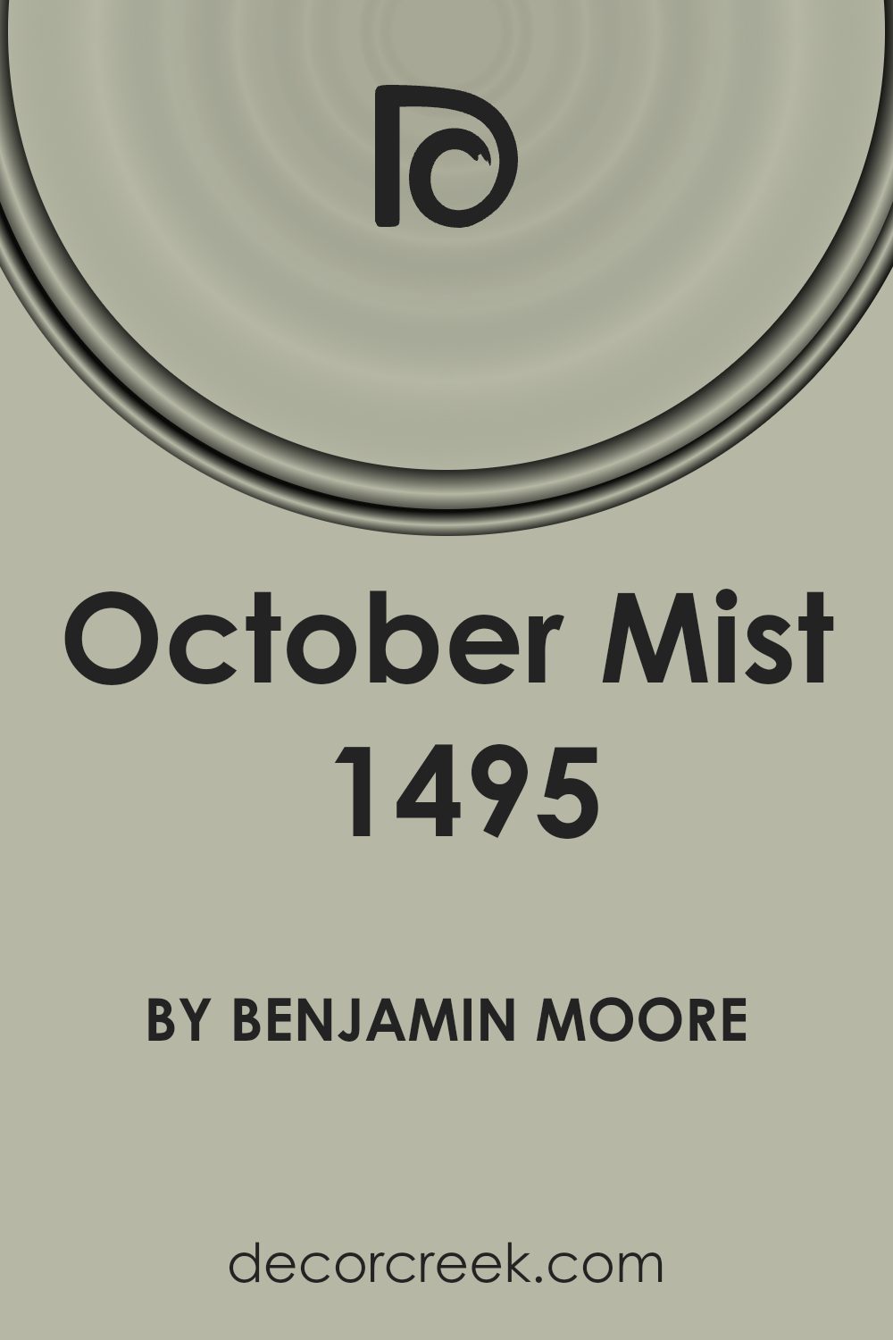
What Color Is October Mist 1495 by Benjamin Moore?
October Mist by Benjamin Moore is a unique hue that effortlessly brings a sense of calm and relaxation to any space. This color is a soft, muted green with a hint of gray, making it highly versatile and able to blend seamlessly with a variety of decor styles and color palettes. It’s a neutral yet fresh option for those looking to introduce a subtle pop of color into their homes.
This shade works beautifully in a range of interior styles, including modern farmhouse, Scandinavian, and transitional. Its understated elegance makes it perfect for living rooms, bedrooms, and even kitchens, providing a serene backdrop that complements natural light and spacious layouts.
When it comes to pairing materials and textures, October Mist shows its true versatility. It pairs well with natural wood tones, from light oaks to rich walnuts, enhancing the warmth and organic feel of the space. Textiles in linen and cotton, with their natural, breathable qualities, also work well with this color, adding layers of texture and comfort. For a more polished look, incorporating metals like brushed brass or matte black can add contrast and visual interest.
Stone textures, whether in accessories or architectural elements like a fireplace or backsplash, also harmonize beautifully with this muted green, creating a balanced and inviting atmosphere.
Is October Mist 1495 by Benjamin Moore Warm or Cool color?
October Mist 1495 by Benjamin Moore is a soothing and versatile color that brings a soft, gentle touch to any room in the home. Its muted green hue has a hint of gray, making it incredibly easy to work with. Whether you’re painting a sunlit living room or a cozy bedroom, this color creates a peaceful backdrop that complements a wide range of decor styles, from modern to traditional. It’s especially good at making small spaces feel bigger and brighter without overwhelming the senses.
In homes, October Mist 1495 acts like a chameleon; it adapts to different lighting conditions, appearing more green or gray depending on the time of day. This characteristic helps it pair beautifully with both warm wood tones and cool metallics, giving homeowners the flexibility to mix and match their furniture and accessories.
It’s a perfect choice for those looking to create a serene and inviting atmosphere in their spaces.
Undertones of October Mist 1495 by Benjamin Moore
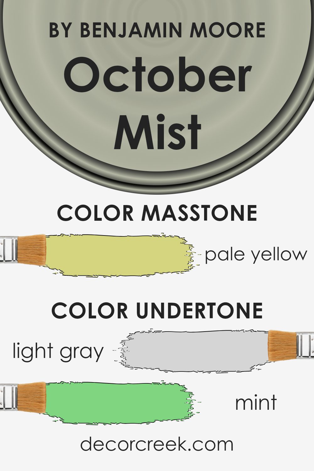
October Mist by Benjamin Moore is a unique paint color that seems simple at first glance but carries a complex blend of undertones. These undertones include light gray, mint, pale pink, light blue, light purple, grey, lilac, yellow, light green, orange, and olive. These various shades play a significant role in how we perceive the color.
Understand, the term “undertone” refers to the subtle hue that can be seen underneath the surface color when viewed in different lighting conditions or when placed against other colors. These underlying hues can shift the perceived main color in surprising ways.
For example, in bright sunlight, October Mist might lean towards its mint or light blue undertones, giving a fresher, cooler vibe. In the soft light of the early evening, the pale pink or light purple might become more prominent, offering a gentle, warm appearance.
On interior walls, these undertones can deeply influence the ambiance of a room. The light gray and grey offer a neutral base, making the color versatile and easy to pair with a wide range of decor. The mint, light green, and lilac undertones can add a touch of nature-inspired tranquility, making a room feel more open and airy.
The warmer undertones like pale pink, orange, and yellow can make a space feel more cozy and inviting. The success of using October Mist in an interior setting depends on utilizing these undertones effectively by considering room size, lighting, and accompanying colors.
Understanding and considering the undertones of October Mist can help create the desired mood in a space, whether aiming for a calming retreat or a warm, welcoming atmosphere.
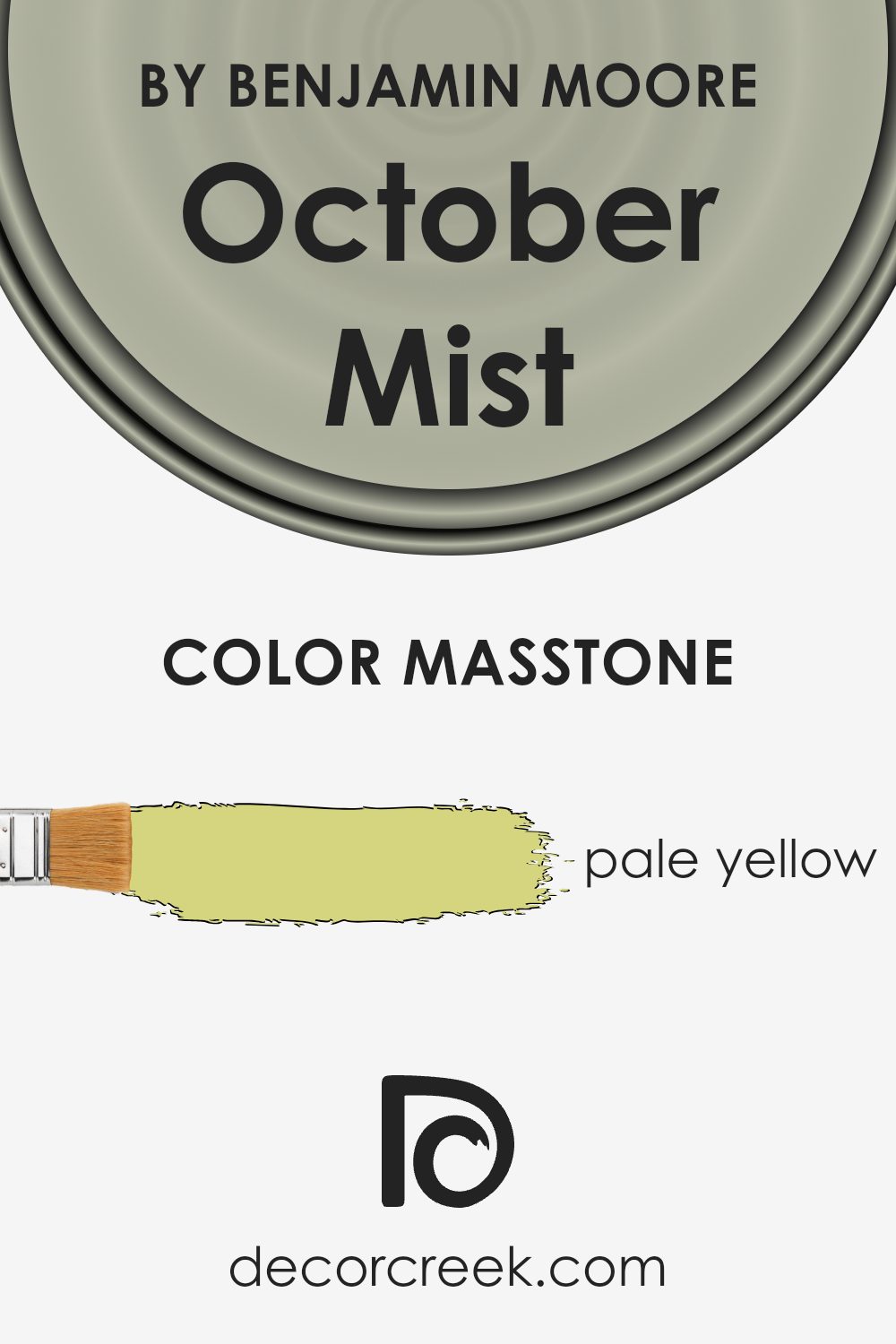
What is the Masstone of the October Mist 1495 by Benjamin Moore?
October Mist 1495 by Benjamin Moore, with its masstone of pale yellow, offers a unique and fresh perspective on home decoration. This particular shade, a subtle hint of sunshine, brings a warm and inviting atmosphere to any room. It’s almost like the gentle morning light, soft and soothing, perfect for creating a calm and welcoming space.
When used in homes, this color can make spaces appear larger and more open, thanks to its light-reflecting qualities. It’s especially effective in smaller or darker rooms, where it adds a hint of brightness without overwhelming the space. This versatility makes it a great choice for living areas, bedrooms, and even kitchens, where a touch of coziness is always welcome.
Its friendly and easy-going nature means it pairs well with a wide range of decor styles and colors, from traditional to modern, allowing for creative freedom in designing your home.
How Does Lighting Affect October Mist 1495 by Benjamin Moore?
Lighting plays a crucial role in how we perceive colors in our environments. The same color can look different under various types of light due to how light interacts with surfaces and reflects color back to our eyes. October Mist by Benjamin Moore is a perfect example to explore the effects of lighting on color perception.
When it comes to artificial light, the tone of October Mist can vary. Under warm lights, like those with a yellowish hue, October Mist may appear softer and slightly more green, creating a cozy atmosphere in the room. On the other hand, in cooler or white artificial light, the color might lean towards a fresher, slightly bluer shade, contributing to a more vibrant space.
Natural light brings its dynamic character into play. The quality and angle of sunlight changes throughout the day and affects how October Mist looks. In the morning and evening, when the sun is low, the color can look warmer and more inviting. Around noon, when the sunlight is brighter and more direct, the color may appear crisper and more neutral.
The orientation of rooms also influences how October Mist is perceived. North-faced rooms receive less direct sunlight, so the color might look cooler and slightly more shadowed, maintaining a consistent subtle and soothing appearance throughout the day. South-faced rooms bask in plenty of sunlight, making October Mist warm up and reveal its underlying cozy undertones, especially during the sunny parts of the day.
East-faced rooms see the warm sunlight in the morning, making October Mist appear soft and warm early in the day, but as the light shifts, the color can become cooler and more tranquil. West-facing rooms experience the opposite effect, with the color starting cooler in the morning and warming up in the afternoon and evening as the sun sets, highlighting the gentle warmth of the color.
In summary, lighting significantly influences how we see and feel about the color October Mist. Its versatile nature can adapt to different lighting conditions, showcasing a range of subtle shifts that makes it a dynamic choice for interior spaces.

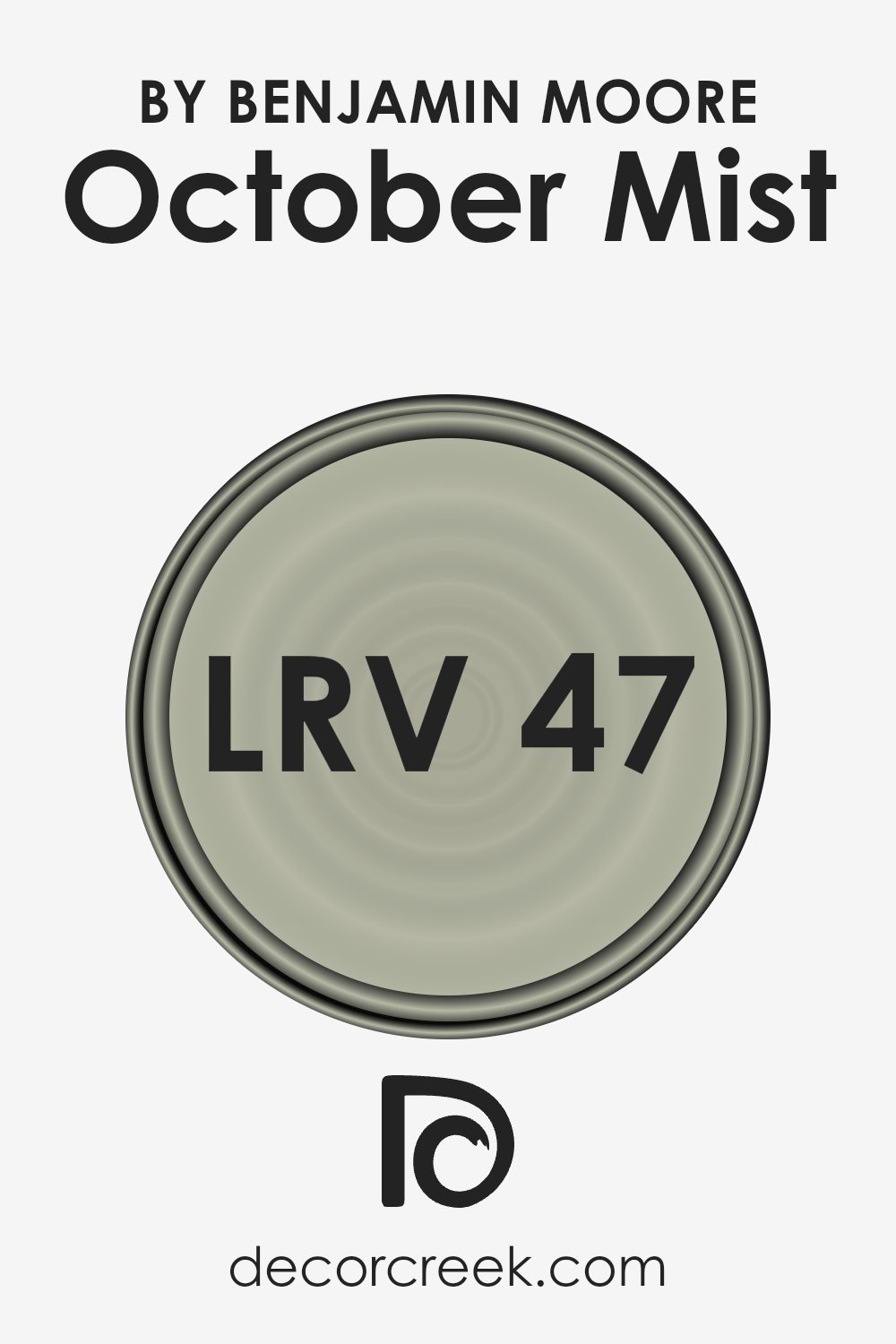
What is the LRV of October Mist 1495 by Benjamin Moore?
LRV stands for Light Reflectance Value. It’s a measure that tells us how much light a color reflects back into a room, compared to how much it absorbs. The scale goes from 0, which is pure black (because it absorbs all the light) and doesn’t reflect any, up to 100, which is pure white (reflecting all the light back).
What this means is, when you’re choosing a paint color for your room, the LRV helps you understand how light or dark that color will look once it’s on your walls. Higher numbers mean the color will look lighter, making spaces feel more open and airy, while lower numbers make a color look darker, which can add coziness but might make a small room feel tighter.
The LRV of October Mist, which is 46.54, puts it in the middle range. This means it’s not too light or too dark but has a balanced quality that can work well in a variety of spaces and lighting conditions. For this specific color, it will reflect a moderate amount of light, making it versatile for use in many areas of a home.
It could brighten up a space without being overpowering, and it offers a softer alternative to stark whites. Its mid-range LRV makes it adaptable, as it can complement both vibrant accents and subdued textures, providing a calm and inviting atmosphere without the risk of making the room feel closed in or overly spacious.
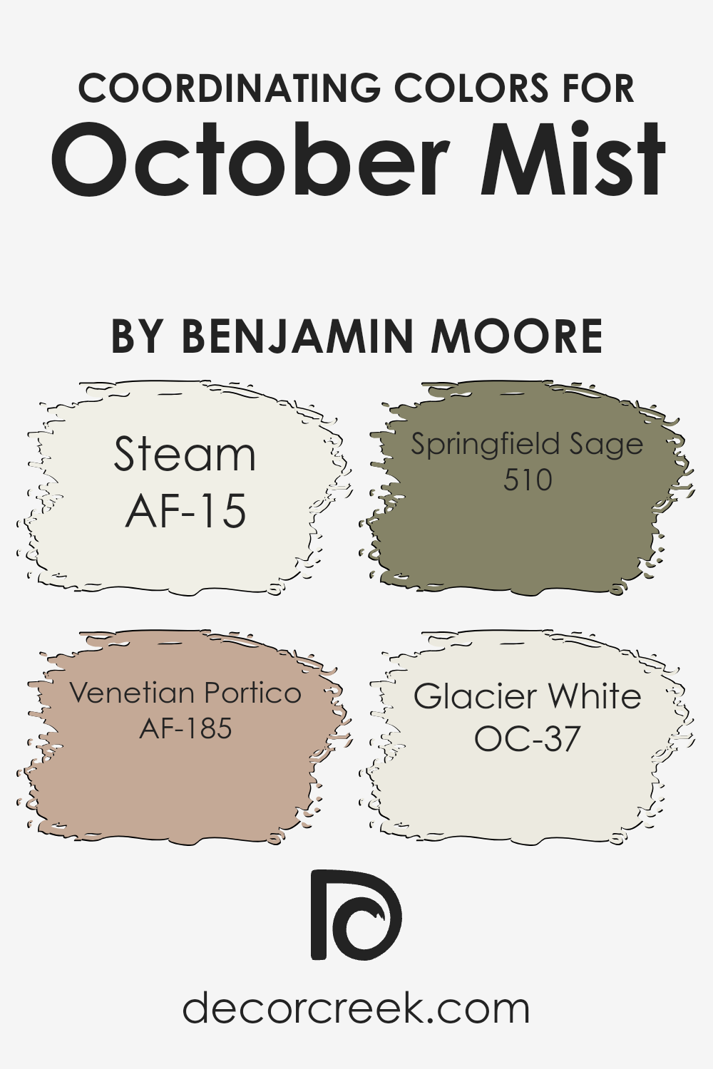
Coordinating Colors of October Mist 1495 by Benjamin Moore
Coordinating colors are shades that complement each other, creating a harmonious and balanced look when used together in a room. They’re selected to enhance the beauty and mood of the main color, ensuring that the overall design feels cohesive.
When choosing coordinating colors for a specific hue, like the subtle and sophisticated October Mist by Benjamin Moore, it’s crucial to find colors that not only work well together but also bring out the unique qualities of the main shade. This approach ensures a visually appealing space that feels put together with purpose and style.
For instance, AF-15, known as Steam, offers a soft, nearly ethereal presence that can lighten up any space without overwhelming it, making it a perfect companion to the grounded October Mist. Then there’s AF-185, Venetian Portico, a warm and inviting shade that adds a hint of earthiness, seamlessly complementing the natural vibe of October Mist.
Another coordinating color, 510, Springfield Sage, introduces a deeper, botanical feel, enriching the palette with its robust tones. Lastly, OC-37, Glacier White, serves as the quintessential neutral, providing a crisp and clean background that allows the other colors, especially October Mist, to stand out beautifully. Together, these colors offer a well-rounded palette that enhances the charm and aesthetic appeal of any space they inhabit.
You can see recommended paint colors below:
- AF-15 Steam
- AF-185 Venetian Portico
- 510 Springfield Sage
- OC-37 Glacier White
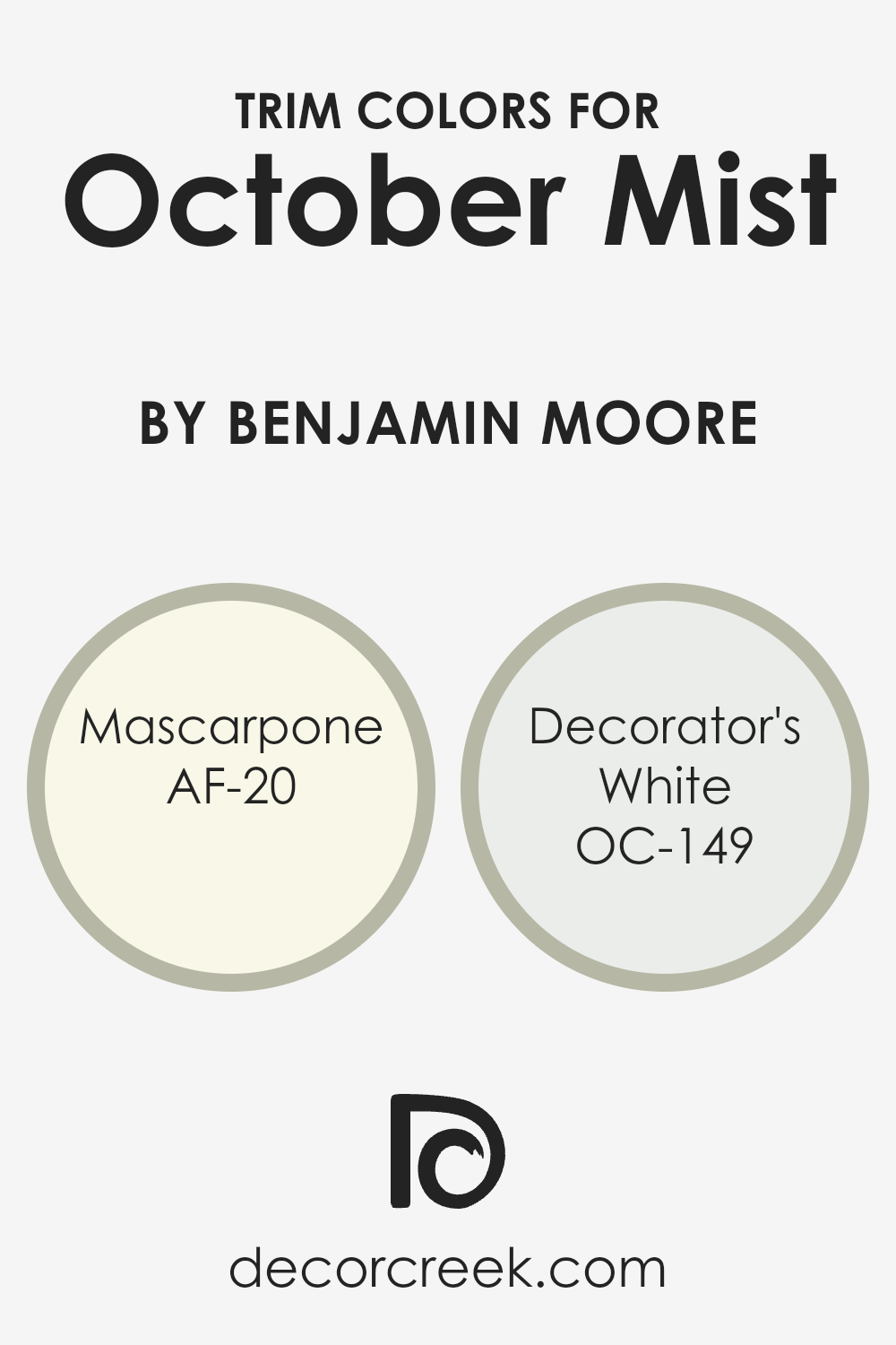
What are the Trim colors of October Mist 1495 by Benjamin Moore?
Trim colors play a crucial role in defining the character and feel of a space, especially when it comes to painting with a specific shade like October Mist by Benjamin Moore. They are essentially the colors used for the architectural details of a room—such as door frames, window frames, skirting boards, and moldings.
The right trim color can complement or contrast with the wall color, adding depth, highlighting architectural features, and creating a cohesive or dynamic aesthetic. For October Mist, a versatile and serene shade, choosing harmonious trim colors is key to achieving a balanced and inviting atmosphere.
AF-20 Mascarpone and OC-149 Decorator’s White are two trim colors recommended for use with October Mist. Mascarpone is a creamy, warm white that offers a subtle richness to the trim, bringing a soft yet vibrant edge that beautifully frames the muted green of October Mist.
This color adds a touch of elegance and warmth, ensuring the space feels welcoming and sophisticated. On the other hand, Decorator’s White is a crisp, clean white with a slight hint of cool undertones. It provides a sharp contrast that makes the architectural details pop against October Mist, creating a fresh and refined look.
By carefully selecting one of these trim colors, you can enhance the overall appearance and mood of your space, making it more visually appealing and harmonious.
You can see recommended paint colors below:
- AF-20 Mascarpone
- OC-149 Decorator’s White
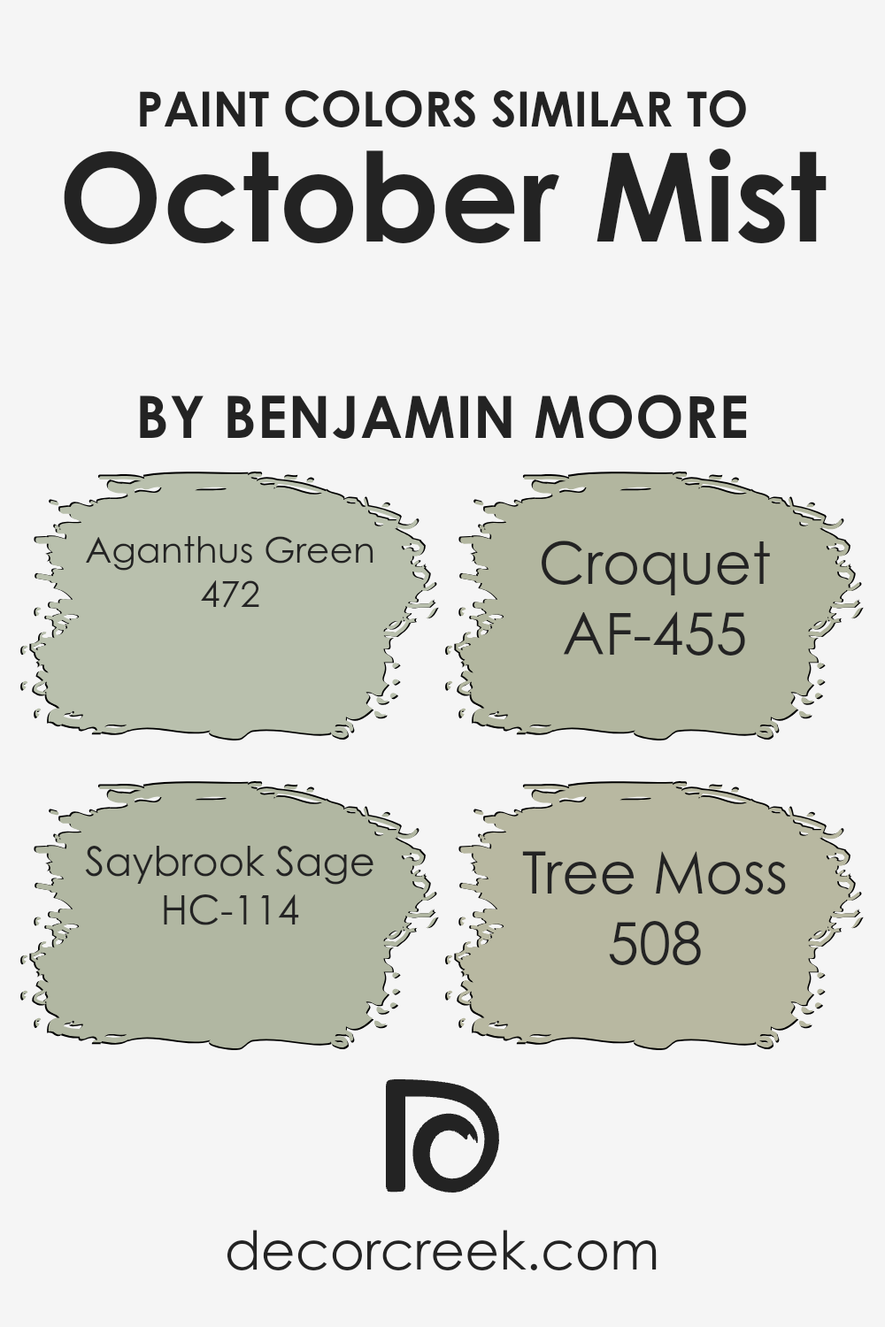
Colors Similar to October Mist 1495 by Benjamin Moore
Similar colors are essential in design and decor, offering a cohesive and harmonious look that is pleasing to the eye. When colors are closely related, such as the shades inspired by October Mist by Benjamin Moore, they create a seamless blend, making a space feel united and thoughtfully curated.
These shades, ranging from Aganthus Green to Tree Moss, share a common foundation yet provide subtle differences that add depth and dimension to interiors. Using similar hues allows for layering and texture in design without overwhelming the senses, offering a gentle transition from one area to another or from one element to the next, making the overall aesthetic soothing and inviting.
Aganthus Green presents as a soft, muted green with a hint of earthiness, bringing a natural and calming influence to spaces. Saybrook Sage, on the other hand, is a light, airy green that can brighten rooms with its understated elegance. Croquet stands out with a slightly grayish tone, offering a more sophisticated and versatile option for neutral lovers.
Finally, Tree Moss delves into deeper, richer territory, providing a grounding anchor to the surrounding lighter shades. Together, these colors support a versatile palette that can adapt to various styles and preferences, ensuring a space that’s both stylish and timeless.
You can see recommended paint colors below:
- 472 Aganthus Green
- HC-114 Saybrook Sage
- AF-455 Croquet
- 508 Tree Moss
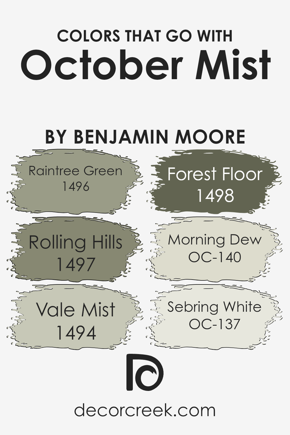
Colors that Go With October Mist 1495 by Benjamin Moore
Choosing the right colors to complement October Mist 1495 by Benjamin Moore can significantly enhance the aesthetic appeal and mood of any space. These colors are specially selected to harmonize with October Mist, a versatile and soothing green-gray shade that brings a sense of tranquility and natural elegance to interiors. By carefully selecting colors that blend well with October Mist, homeowners and designers can create spaces that feel cohesive, balanced, and inviting.
Raintree Green 1496 adds a touch of depth and richness, similar to the lushness of a forest canopy, making it ideal for creating focal points or accentuating architectural features. Rolling Hills 1497, with its slightly lighter and earthier tone, evokes the serene feeling of sprawling landscapes, perfectly complementing the calmness of October Mist.
Vale Mist 1494, a whisper of green, seamlessly bridges the gap between the indoor environment and the natural world outside, enhancing the overall sense of space. Forest Floor 1498, as the name suggests, introduces a grounded, dark hue that echoes the forest’s undergrowth, providing a striking contrast that highlights the beauty of October Mist.
Morning Dew OC-140 offers a refreshing hint of coolness, reminiscent of early morning freshness, which can brighten and uplift any room. Finally, Sebring White OC-137 brings a clean and crisp edge, acting as a perfect backdrop to allow the more nuanced tones of October Mist and its companions to stand out. Together, these colors work in harmony to create spaces that are both soothing and visually interesting, making them an essential tool in the palette of anyone looking to design a beautiful and cohesive home environment.
You can see recommended paint colors below:
- 1496 Raintree Green
- 1497 Rolling Hills
- 1494 Vale Mist
- 1498 Forest Floor
- OC-140 Morning Dew
- OC-137 Sebring White
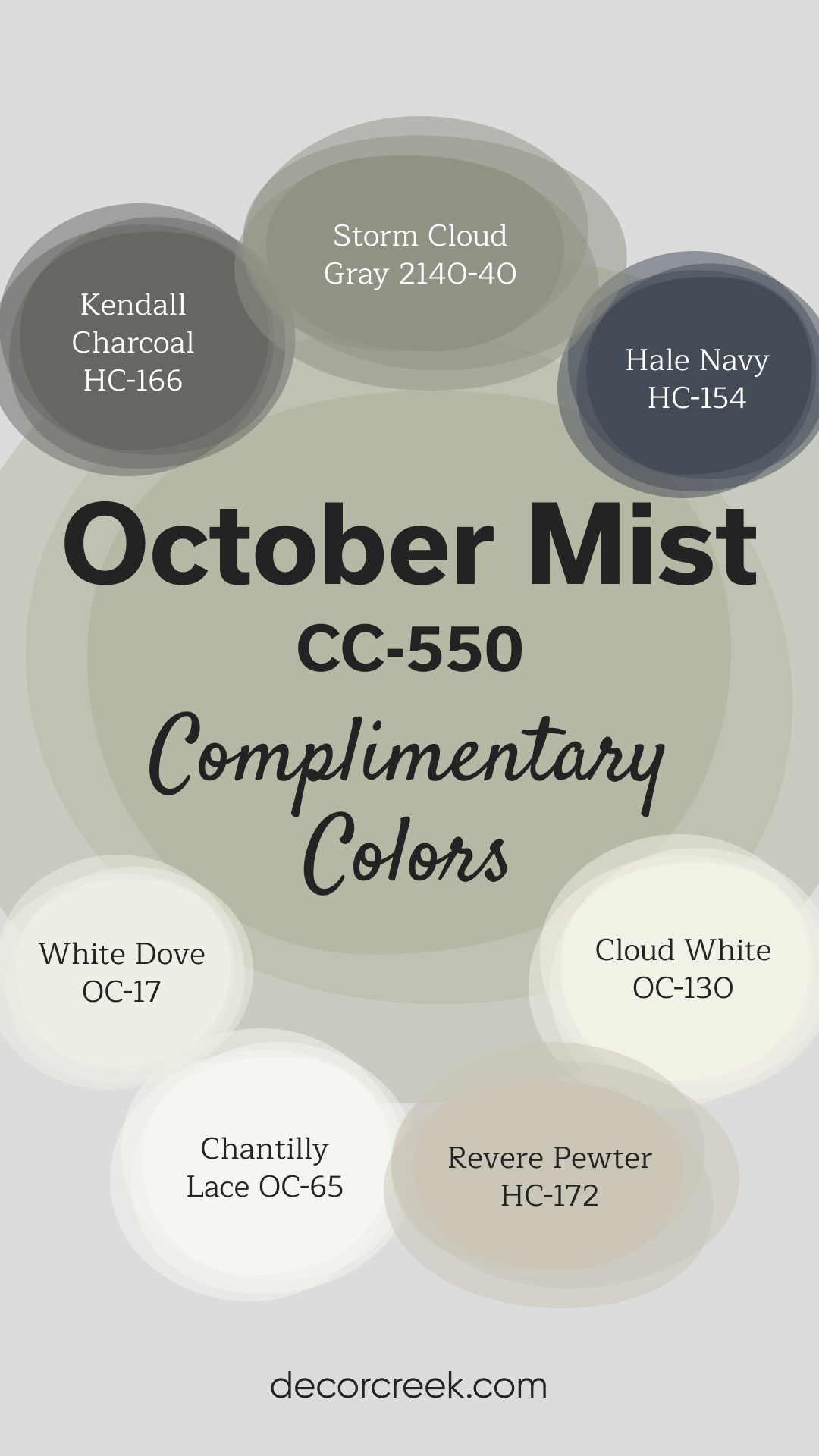
Complimentary Colors for October Mist 1495 Paint Color by Benjamin Moore
October Mist by Benjamin Moore is a calming, soft sage green that works beautifully in any room. It pairs effortlessly with crisp whites like White Dove and Chantilly Lace, adding brightness and freshness to a space. These shades are perfect for trim or accents, creating a clean, polished look.
For a more balanced, neutral palette, Revere Pewter and Storm Cloud Gray offer soft, understated tones.
If you’re looking for a bolder contrast, Hale Navy and Kendall Charcoal provide deep, rich hues that complement October Mist’s gentle green. Cloud White brings warmth, tying the entire palette together for a serene and stylish finish.
How to Use October Mist 1495 by Benjamin Moore In Your Home?
October Mist 1495 by Benjamin Moore is a soft, versatile shade of green that brings a touch of calm and serenity to any space in your home. It’s like the peaceful feeling of a misty morning in October, hence the name. This color is neutral enough to fit in with many different decor styles and color schemes, making it an excellent choice for walls in living rooms, bedrooms, or even kitchens and bathrooms. You can pair it with white trim for a crisp, fresh look, or match it with darker woods for a more cozy, warm atmosphere.
October Mist 1495 also works well as a background color for art and photographs, helping them to stand out without overwhelming them. For those looking to add a subtle splash of color that feels both modern and timeless, this paint can achieve that balance. Whether you want to create a soothing retreat or a welcoming space to gather with family and friends, October Mist can help you achieve the look and feel you’re aiming for.
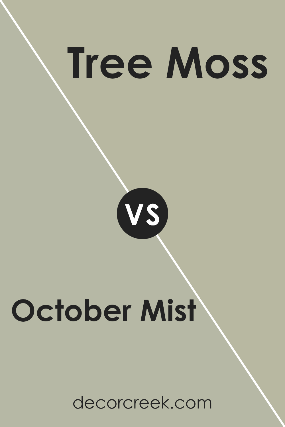
October Mist 1495 by Benjamin Moore vs Tree Moss 508 by Benjamin Moore
Sure! Let’s talk about October Mist and Tree Moss, two lovely colors by Benjamin Moore. October Mist is a gentle, soft green that feels like the subtle shades of green you see in early fall. It’s like looking at a peaceful, foggy morning in October, where the mist lightly covers the fields. It’s a versatile color that brings a calm and soothing vibe to any room, making it perfect for creating a serene space.
On the other hand, Tree Moss is a deeper, richer green. This color reminds you of the dense, lush leaves found in a forest. It’s a bit more intense than October Mist, with a grounding feeling that can add a touch of nature’s freshness to your home. While October Mist gives a subtle, airy lift, Tree Moss provides a strong connection to nature, bringing the outdoors inside in a more pronounced way.
Both colors are great for adding a natural touch to your home, but October Mist offers a lighter, mist-like feel, and Tree Moss gives a richer, earthier vibe.
You can see recommended paint color below:
- 508 Tree Moss
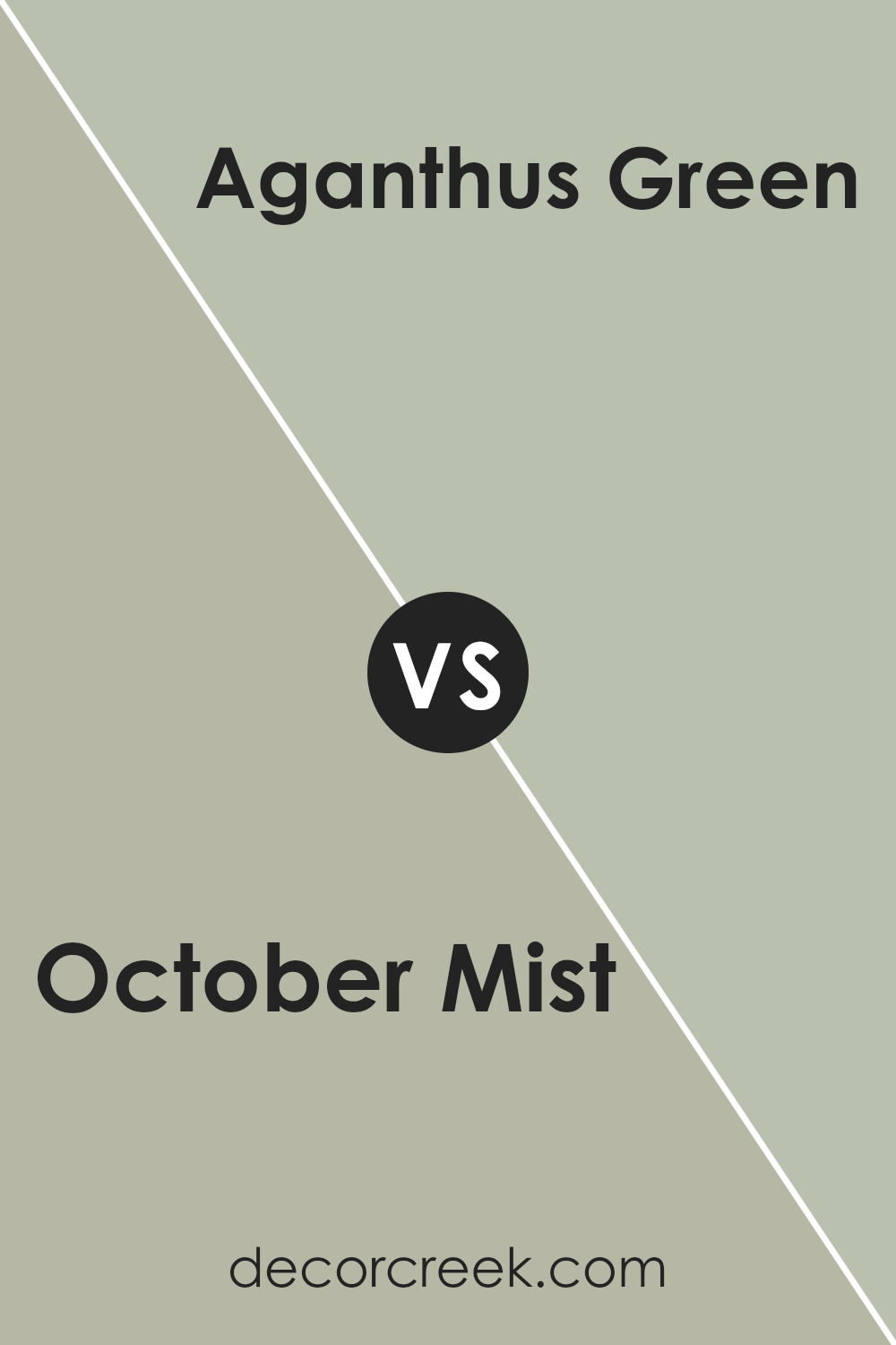
October Mist 1495 by Benjamin Moore vs Aganthus Green 472 by Benjamin Moore
October Mist 1495 and Aganthus Green 472, both from Benjamin Moore, offer unique shades of green that add subtle yet distinct character to any space. October Mist sits on the softer side, resembling the gentle hue of early fall mornings when mist lightly covers the ground. It’s a versatile tone that works well in spaces aiming for a calm and serene atmosphere.
Aganthus Green 472, on the other hand, is a bit more vibrant. It draws inspiration from the natural elegance of green foliage, bringing an organic and fresh feeling to any room. This color tends to inject more energy into a space compared to the more laid-back vibe of October Mist.
When comparing them, October Mist leans towards a more muted, neutral palette, making it a great background color that easily pairs with a wide range of decor styles. Aganthus Green, with its slightly bolder and more pronounced green tint, is perfect for creating a focal point or adding a dash of nature-inspired liveliness. Both colors offer unique possibilities for transforming spaces, but the choice between the two ultimately depends on the desired mood and style.
You can see recommended paint color below:
- 472 Aganthus Green
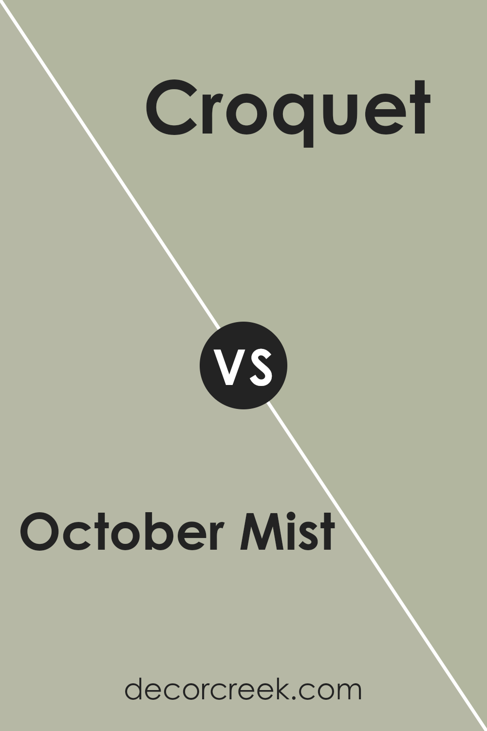
October Mist 1495 by Benjamin Moore vs Croquet AF-455 by Benjamin Moore
October Mist 1495 and Croquet AF-455 are both lovely hues from Benjamin Moore that bring a touch of calm and nature into any space. October Mist 1495 is a gentle sage green that brings to mind the soft, muted greens of early autumn. It’s a versatile color that pairs beautifully with both light and dark accents, making it perfect for creating a soothing and welcoming atmosphere in any room.
On the other hand, Croquet AF-455 leans more towards a subtle, sophisticated olive tone. It’s deeper and richer than October Mist, offering a grounding effect that can make spaces feel more cozy and intimate. Croquet AF-455 works well in spaces where you want to add a bit of depth without overwhelming the room with too dark a color.
Both colors reflect nature’s palette, but while October Mist evokes a light, airy feel, Croquet brings an earthier, warmer vibe. Whether you prefer the lighter, fresher touch of October Mist or the cozy depth of Croquet will depend on the ambiance you’re aiming to create in your home.
You can see recommended paint color below:
- AF-455 Croquet
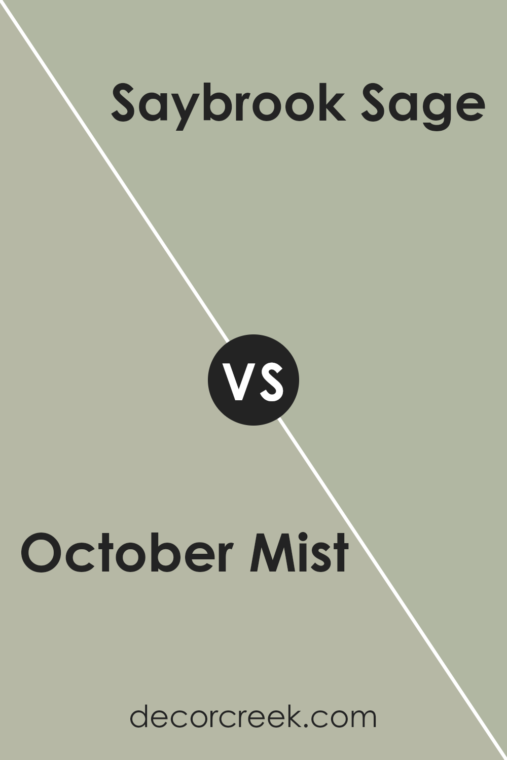
October Mist 1495 by Benjamin Moore vs Saybrook Sage HC-114 by Benjamin Moore
October Mist and Saybrook Sage are two beautiful shades by Benjamin Moore that share some similarities but also have distinct differences. October Mist can be best described as a gentle, muted green with a hint of gray, creating a serene and peaceful vibe in any space. It’s like the color of a soft, foggy morning in early fall, providing a subtle, sophisticated backdrop that’s versatile enough for any room.
On the other hand, Saybrook Sage takes the essence of sage and enriches it with deeper, earthier tones. It’s a slightly warmer hue compared to October Mist, drawing inspiration from natural elements. This color tends to bring a cozy, inviting feel to spaces, making it perfect for areas where you want to relax and unwind.
While both colors bring a touch of nature indoors, October Mist leans more towards a neutral, airy feel, suitable for those who prefer a lighter touch. Saybrook Sage, with its richer, more grounded appearance, offers a sense of warmth and comfort. Choosing between them comes down to the atmosphere you wish to create: calm and understated with October Mist or warm and welcoming with Saybrook Sage.
You can see recommended paint color below:
Conclusion
The color October Mist, chosen by Benjamin Moore, reflects a natural and rejuvenating essence that easily complements a wide range of design preferences. It has a versatile quality that allows it to blend seamlessly with other colors, providing a soothing backdrop for creativity and personal expression in any space. This color possesses an understated elegance, offering a fresh and modern feel that can lighten up rooms without overwhelming them.
In conclusion, October Mist is an ideal choice for those looking to refresh their living or working spaces with a color that speaks to tranquility and flexibility. Its ability to pair well with various hues and textures makes it a practical option for anyone aiming to update their interiors with a sense of calm and a touch of sophistication. Whether applying it to walls, furniture, or accents, October Mist adds a timeless and inviting quality to every environment it adorns.

Ever wished paint sampling was as easy as sticking a sticker? Guess what? Now it is! Discover Samplize's unique Peel & Stick samples.
Get paint samples

