When I look at SW 6901 Daffodil by Sherwin Williams, I see more than just a color. It’s like an instant burst of sunshine that brings warmth and cheer into any room. The bright, vibrant yellow hue radiates positivity and energy, reminiscent of blooming flowers on a perfect spring day. It can make even the dullest corners feel alive.
Using Daffodil in a room seems to naturally lift moods and inspire creativity. It’s not too intense or harsh; instead, it feels welcoming and friendly. Whether you’re considering a fresh coat of paint for a common area or a unique accent wall in a personal room, this color fits right in. It’s perfect for those who appreciate a lively and inviting environment.
As I imagine rooms with Daffodil, I think of lively kitchens, happy nurseries, or energetic workspaces. It pairs beautifully with neutral tones, adding just the right amount of flair without being too loud. You might consider it for a room that needs a little extra zest or to highlight your favorite pieces of furniture.
SW 6901 Daffodil is more than just paint; it’s a mood-booster that brightens life one wall at a time.
What Color Is Daffodil SW 6901 by Sherwin Williams?
Daffodil by Sherwin Williams is a bright, cheerful yellow. It’s lively and fresh, like the first days of spring. This color is perfect for bringing warmth and light into any room. It can make small areas feel larger and more open, thanks to its ability to reflect light. Daffodil works particularly well in modern, eclectic, or bohemian interior styles. Its vibrant nature can add a splash of color to otherwise neutral palettes.
In terms of materials, Daffodil pairs beautifully with natural woods, from light oak to rich walnut. These combinations create a welcoming and organic feel. For a modern twist, try pairing it with clean white surfaces or matte black accents. Textured elements like woven baskets, soft cottons, or even velvet can complement Daffodil’s brightness, adding depth to the room.
Additionally, metallics such as brass or gold can enhance its warm tone, offering a touch of elegance. When using Daffodil, consider balancing its vibrancy with neutral shades like gray or beige to prevent overpowering the room.
This sunny hue is ideal for areas where you want to encourage energy and positivity, such as kitchens, bathrooms, and entryways.

Is Daffodil SW 6901 by Sherwin Williams Warm or Cool color?
Daffodil by Sherwin Williams, identified as SW 6901, is a vibrant and lively shade of yellow. It can bring a warm and cheerful feeling to any room where it’s used. This color works well in rooms where you want to create an inviting and energetic atmosphere, like kitchens, living rooms, or playrooms.
Its bright yellow tone can make a room feel more open and filled with light. When used on accent walls or paired with neutral tones like gray or beige, it can add just the right touch of color without being too intense.
Daffodil also works beautifully with natural elements. If you have wooden furniture or green plants, this color can complement these features nicely. It’s a great choice if you’re looking to add a splash of warmth and joy to your home. Using Daffodil can enhance mood and bring a sense of optimism into daily living areas.
Undertones of Daffodil SW 6901 by Sherwin Williams
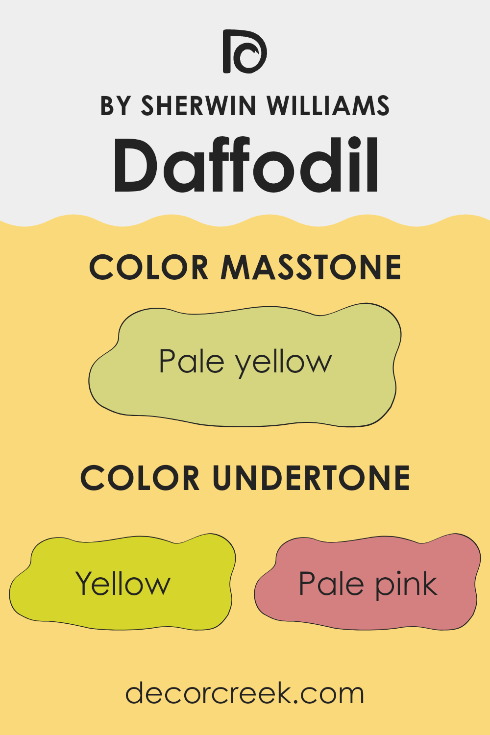
Daffodil SW 6901 by Sherwin Williams is a warm, cheerful yellow with various undertones that affect how we perceive it. Undertones are subtle hints of other colors mixed into the main color, and they can influence the overall appearance in different lighting conditions or when paired with other colors.
For Daffodil, the yellow base is enhanced with touches of pale pink, orange, and light green, which can add warmth and make the yellow feel a little softer and more inviting. The mint and light blue undertones can introduce a fresh feel, while light purple and lilac bring in a hint of playfulness.
Light gray and gray undertones balance the brightness and add a touch of neutrality, preventing the color from becoming too intense. When used on interior walls, these undertones can influence the ambiance of a room. In natural sunlight, the yellow will appear warm and vibrant, with the pale pink and orange making the room feel cozy.
Under artificial lighting, the mint and light blue undertones may become more noticeable, adding a touch of coolness. The light gray undertones ensure the color doesn’t become too bold, making it suitable for various room styles and designs. The blend of these undertones helps Daffodil maintain its cheerful yet balanced look.
What is the Masstone of the Daffodil SW 6901 by Sherwin Williams?
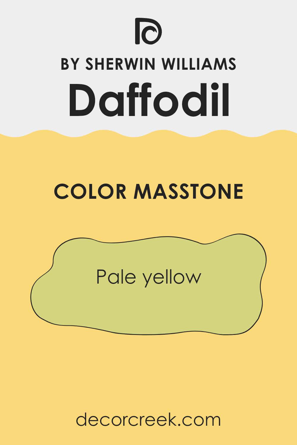
Daffodil SW 6901 by Sherwin-Williams has a gentle, pale yellow masstone (#D5D580), which gives it a fresh and cheerful appearance. This color can make rooms feel brighter and more welcoming. In home interiors, Daffodil is adaptable and can work well in various areas.
In kitchens and dining areas, it can bring a sunny atmosphere that feels inviting and cozy. When used in living rooms or bedrooms, it creates a sense of warmth without being too much. Daffodil can also pair well with neutrals like whites and grays, allowing for a balanced look.
Additionally, it can complement bolder colors for a lively contrast. In smaller rooms or areas with limited natural light, this pale yellow can help brighten up the room, making it appear more open and airy. Its soft tone adds a touch of happiness and energy to any home setting.
How Does Lighting Affect Daffodil SW 6901 by Sherwin Williams?
Lighting can dramatically change how we perceive a color. Colors can look different based on whether they’re viewed under natural light or artificial light, and also depending on the direction a room faces. Let’s look at how the color Daffodil SW 6901 by Sherwin Williams, a warm and lively yellow, behaves in different lighting conditions.
In natural light, colors are typically seen in their most true form. However, natural light itself changes throughout the day. In a room with natural light, Daffodil SW 6901 can look vibrant and inviting. The brightness from the sun enhances its warm tones, making it perfect for rooms where you want to feel uplifted.
In artificial light, the appearance of this color will depend on the type of bulb used. Incandescent and warm LED lights enhance the yellow, making it look even warmer and cozier. Meanwhile, cool fluorescent or daylight bulbs might soften the glow, giving the room a slightly cooler feel.
In north-facing rooms, which generally receive less direct sunlight and have cooler, softer light, Daffodil SW 6901 may appear more subdued. The cool light can tone down the natural warmth of the color, making it look slightly muted or pastel-like.
In south-facing rooms, which tend to have a lot of strong natural light throughout the day, this color shows off its full vibrancy. The warm, consistent light brings out the sunny and cheerful qualities of Daffodil, creating a lively and energetic atmosphere.
In east-facing rooms, where the morning light is bright and warm, Daffodil SW 6901 will also look warm and cheerful in the earlier hours. However, as the day progresses and the light becomes cooler, it might take on a softer appearance.
In west-facing rooms, the color can look a bit muted in the morning but will shine brightly with the golden glow of the late afternoon and evening light. This makes Daffodil a dynamic choice, capable of fostering different moods throughout the day.

What is the LRV of Daffodil SW 6901 by Sherwin Williams?
Light Reflectance Value (LRV) is a measure that tells you how much light a color reflects or absorbs. It ranges from 0, which is absolute black and absorbs all light, to 100, which is pure white and reflects all light. Essentially, the higher the LRV number, the lighter and more reflective the color is.
This is important when considering paint choices because it affects how light or dark a room will feel once painted. A color with a high LRV will reflect more light and help make a room feel brighter and more open, while a color with a lower LRV will absorb more light, making the room feel cozier and more intimate.
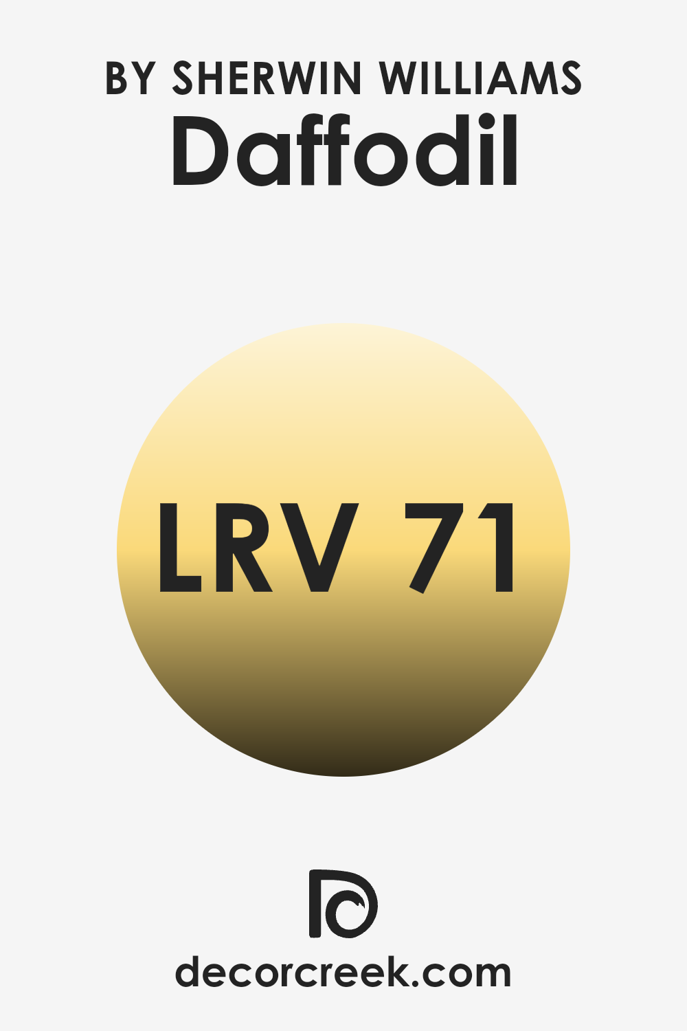
Daffodil, with its LRV of 71.315, is a color that reflects a significant amount of light, creating a bright and cheerful atmosphere. Because it reflects so much light, it can make a room feel larger and more open. This makes it a great choice for rooms that don’t get much natural light, as it helps brighten them up. However, in very well-lit rooms, the high reflectivity can cause the color to appear even lighter and more vibrant than expected, so it’s important to consider the lighting in your specific area.
Overall, Daffodil’s high LRV makes it a vibrant and lively option that can refresh a room with energy.
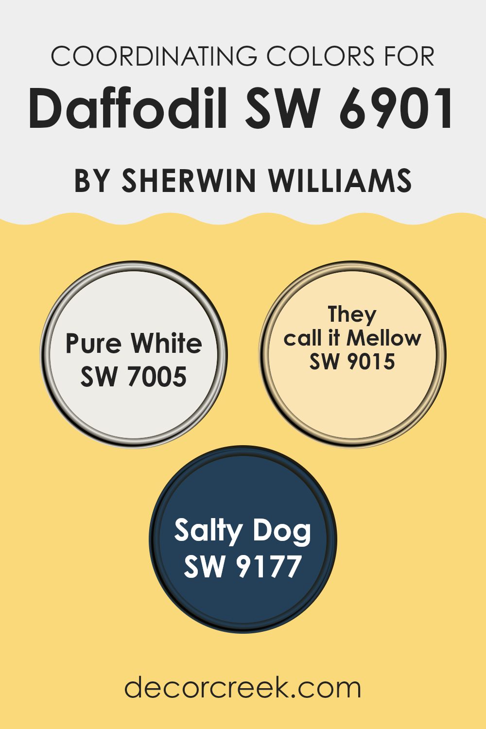
Coordinating Colors of Daffodil SW 6901 by Sherwin Williams
Coordinating colors are hues that harmonize well when placed together, creating a pleasing and balanced look. They are often used in interior design to enhance the overall aesthetic of a room. For example, Daffodil SW 6901 by Sherwin Williams is a bright and cheerful yellow that pairs beautifully with certain shades to create a well-balanced palette.
SW 7005 – Pure White is a crisp, clean white that serves as a perfect backdrop, allowing brighter colors like Daffodil to stand out without being too much. SW 9015 – They Call It Mellow is a warm, soft yellow that complements the brightness of Daffodil, adding a more laid-back, cozy feel to the room.
Finally, SW 9177 – Salty Dog is a deep navy blue that offers a striking contrast to the vibrant Daffodil, adding depth and a touch of boldness to the overall palette. Using these coordinating colors together can create a harmonious and inviting atmosphere in any room.
You can see recommended paint colors below:
- SW 7005 Pure White
- SW 9015 They call it Mellow
- SW 9177 Salty Dog
What are the Trim colors of Daffodil SW 6901 by Sherwin Williams?
Trim colors are important because they help define and accentuate the main wall color, creating a visual frame and enhancing the overall aesthetic of a room. For the cheerful and sunny Daffodil SW 6901 by Sherwin Williams, choosing the right trim color can help balance its vibrant hue. Using a neutral trim color like Snowbound SW 7004 or Ivory Lace SW 7013 creates a subtle contrast that can make the Daffodil stand out without being too intense.
Snowbound is a soft white with a hint of gray, which pairs wonderfully to bring a clean, crisp edge to the bright yellow of Daffodil. It adds a modern freshness to your room, giving a balanced and refined look.
Ivory Lace SW 7013, on the other hand, is a warm, creamy white with a subtle hint of yellow, which makes it a lovely complement to Daffodil’s brightness. It provides a gentle contrast, maintaining warmth and comfort in the room. Using these trim colors highlights architectural details and creates a polished finish.
With Snowbound or Ivory Lace, trim work can stand out subtly, completing the look of your room without clashing with the boldness of Daffodil. This combination can create an inviting and harmonious atmosphere in a home, bringing out the best in your chosen color palette.
You can see recommended paint colors below:

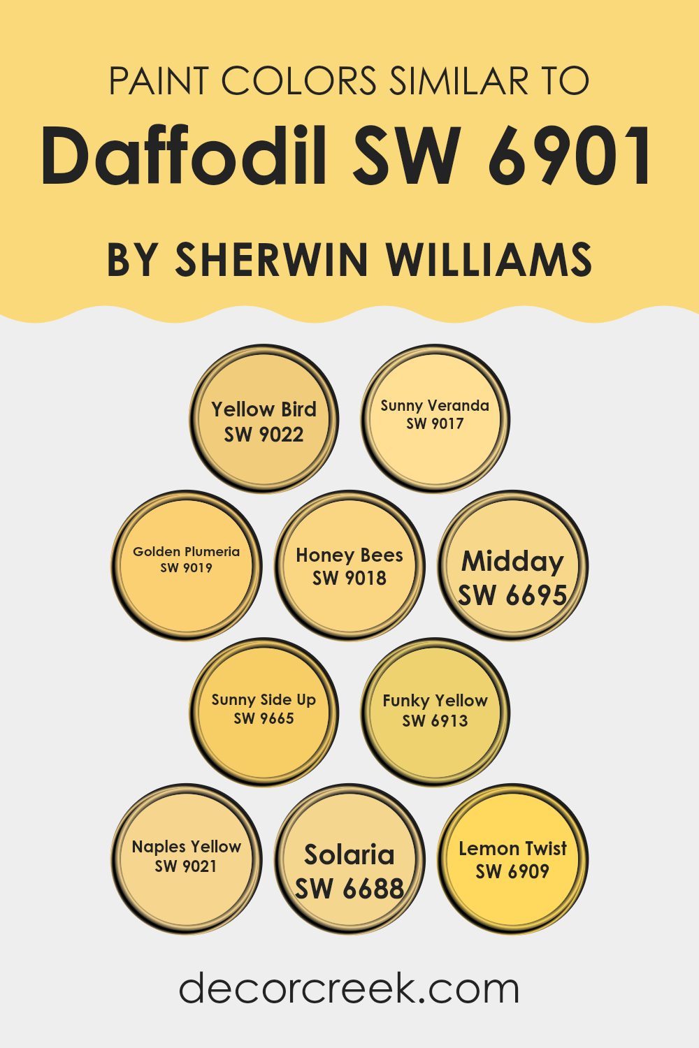
Colors Similar to Daffodil SW 6901 by Sherwin Williams
Similar colors to Daffodil by Sherwin Williams play an important role in creating a harmonious and inviting room. They help in achieving a cohesive look and make it easier to find coordinating shades without clashing.
These similar colors work together beautifully because they share common hues that complement each other, adding warmth and brightness to any room. For example, SW 9022 – Yellow Bird has a cheerful, vibrant tone perfect for energizing a room. SW 9017 – Sunny Veranda exudes a warm, golden glow, adding coziness to interiors.
SW 9019 – Golden Plumeria brings a rich, buttery softness that creates a welcoming atmosphere, while SW 9018 – Honey Bees offers a subtle, yet sunny vibe that’s both comforting and uplifting. With SW 6695 – Midday, you find a balance that provides the feel of sunshine at its peak. Sunny Side Up (SW 9665) has a friendly and fresh appeal that brightens any room.
SW 6913 – Funky Yellow is bold and playful, ideal for adding a fun touch to your decor. Naples Yellow (SW 9021) offers a soft, natural warmth, while SW 6688 – Solaria radiates an inviting, sunny brightness. Finally, SW 6909 – Lemon Twist adds a zesty, lively spark that makes rooms more cheerful. Together, these colors create a harmonious and vibrant palette that enriches any environment.
You can see recommended paint colors below:
- SW 9022 Yellow Bird
- SW 9017 Sunny Veranda
- SW 9019 Golden Plumeria
- SW 9018 Honey Bees
- SW 6695 Midday
- SW 9665 Sunny Side Up
- SW 6913 Funky Yellow
- SW 9021 Naples Yellow
- SW 6688 Solaria
- SW 6909 Lemon Twist
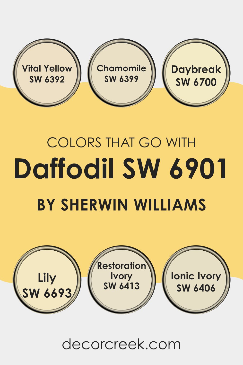
Colors that Go With Daffodil SW 6901 by Sherwin Williams
Daffodil SW 6901 by Sherwin Williams is a cheerful, bright yellow that brings warmth and energy to a room. Choosing colors that complement this hue is important as they create balance and harmony in a room. SW 6392 Vital Yellow is a lively, vibrant shade that pairs beautifully with Daffodil, enhancing its energetic feel. SW 6399 Chamomile is a softer, soothing yellow that adds a gentle touch, perfect for creating a welcoming atmosphere. SW 6700 Daybreak offers a light, sunny hue that brightens up any room, making it feel fresh and airy.
Adding to the palette, SW 6693 Lily is a calm, muted color that works well to tone down the brightness of Daffodil, providing a pleasing contrast. SW 6413 Restoration Ivory is a creamy ivory shade that brings in an element of warmth without overpowering, helping create a cozy environment.
Lastly, SW 6406 Ionic Ivory is a light, neutral tone that balances the vividness of Daffodil, providing a soft background that allows the yellow tones to shine without being too intense. Together, these colors work to create an inviting, harmonious room filled with warmth and positivity.
You can see recommended paint colors below:
- SW 6392 Vital Yellow
- SW 6399 Chamomile
- SW 6700 Daybreak
- SW 6693 Lily
- SW 6413 Restoration Ivory
- SW 6406 Ionic Ivory
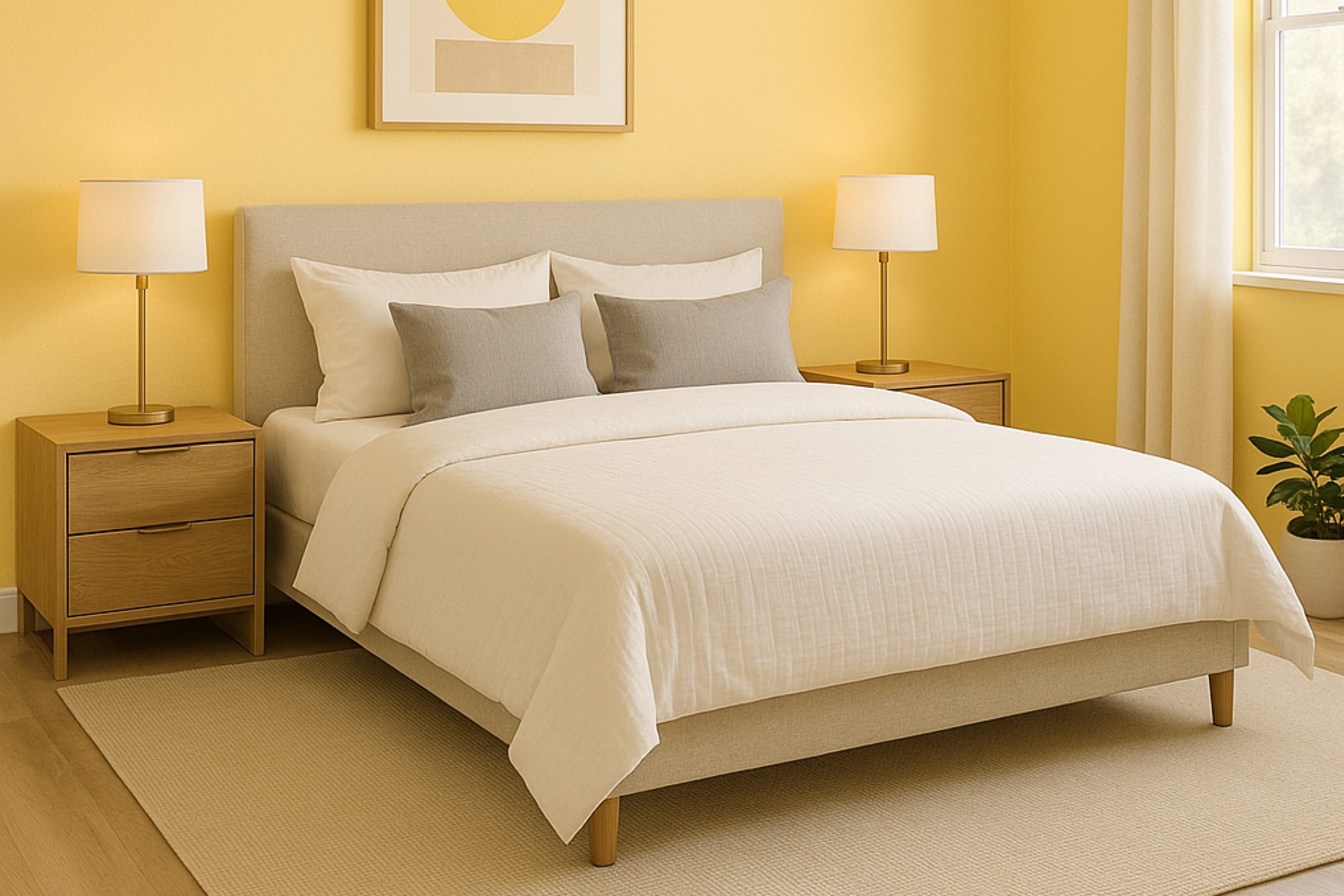
How to Use Daffodil SW 6901 by Sherwin Williams In Your Home?
Daffodil SW 6901 by Sherwin Williams is a warm, sunny yellow that can brighten up any room in your home. This cheerful color works particularly well in kitchens or dining areas, where it can create an inviting atmosphere.
You can use Daffodil on an accent wall to draw attention or pair it with neutral colors for a balanced look. In a child’s room, this shade can add a playful touch without feeling too intense. To bring a bit of sunshine indoors, consider painting a small piece of furniture like a side table or a set of chairs in Daffodil.
The color also complements natural wood tones, making it a good choice for rooms with lots of wooden furniture. If you enjoy a bold look, consider pairing Daffodil with cool grays or blues. With its vibrant hue, Daffodil can make your home feel livelier and more welcoming.
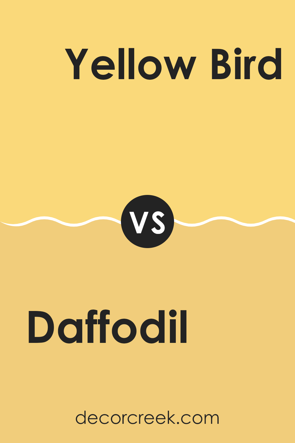
Daffodil SW 6901 by Sherwin Williams vs Yellow Bird SW 9022 by Sherwin Williams
Daffodil SW 6901 and Yellow Bird SW 9022 by Sherwin Williams are both bright, cheerful yellows, but they have distinct personalities. Daffodil SW 6901 is a vibrant, sunny yellow that evokes the warmth and energy of spring flowers.
It’s bold and attention-grabbing, making it great for rooms where you want to create a welcoming, lively atmosphere. On the other hand, Yellow Bird SW 9022 has a slightly softer, more muted tone. It mixes yellow with a hint of warmth that feels inviting but not too intense.
This makes it suitable for areas where you want a touch of brightness without it being too overpowering. While both colors can bring life and happiness to a room, Daffodil is for those who want a strong pop of color, and Yellow Bird offers a gentler, more subtle approach to adding sunshine to rooms.
You can see recommended paint color below:
- SW 9022 Yellow Bird
Daffodil SW 6901 by Sherwin Williams vs Midday SW 6695 by Sherwin Williams
Daffodil (SW 6901) and Midday (SW 6695) are two bright yellow paints from Sherwin Williams, each with its own distinct feel. Daffodil is a lively and energetic shade of yellow, reminiscent of fresh flowers and sunny mornings.
It’s vibrant and eye-catching, perfect for adding cheeriness to any room. Midday, on the other hand, is also a warm yellow but has a slightly softer look. It’s more muted compared to Daffodil, which makes it feel a bit cozier and less intense.
When placed side by side, Daffodil stands out as the bolder option, while Midday feels a little more understated and calming. Both colors can bring happiness and warmth, but Daffodil might be better suited for areas where you want a burst of energy, whereas Midday might work well in rooms intended for comfort and relaxation. In essence, both are sunny shades, but with different levels of brightness and glow.
You can see recommended paint color below:
- SW 6695 Midday

Daffodil SW 6901 by Sherwin Williams vs Golden Plumeria SW 9019 by Sherwin Williams
Daffodil and Golden Plumeria, both by Sherwin Williams, are warm and inviting shades of yellow, each with its distinct character. Daffodil is a bright, cheerful yellow that tends to energize a room, making it feel lively and sunny. It’s a bold choice, perfect for rooms where you want to add a burst of positivity and light.
In contrast, Golden Plumeria is a slightly deeper yellow with a hint of warmth, bringing a cozy and welcoming feel to a room. It has a touch of sophistication, creating a more refined and relaxed atmosphere while still maintaining the uplifting qualities of yellow.
When placed side by side, Daffodil stands out with its vibrant and attention-grabbing presence, while Golden Plumeria offers a more subdued, comforting glow. Both colors work well in different settings, with Daffodil suitable for playrooms or kitchens, and Golden Plumeria ideal for living rooms or bedrooms.
You can see recommended paint color below:
- SW 9019 Golden Plumeria
Daffodil SW 6901 by Sherwin Williams vs Naples Yellow SW 9021 by Sherwin Williams
Daffodil (SW 6901) by Sherwin Williams is a bright, cheerful yellow. It resembles the vibrant hue of a spring daffodil flower, bringing a lively and energetic feel to any room. This color is great for adding warmth and positivity to a room, making it perfect for lively areas like kitchens or playrooms.
On the other hand, Naples Yellow (SW 9021) by Sherwin Williams has a more subdued and earthy tone. It is a softer, more muted yellow that provides a calming and relaxed atmosphere. Naples Yellow is well-suited for rooms where you want a touch of coziness and subtlety, like bedrooms or living rooms.
Both colors are warm and inviting, but Daffodil is bolder, making it ideal for rooms where you want to feel energized. Naples Yellow, being softer, is better for creating a peaceful and relaxed atmosphere.
You can see recommended paint color below:
- SW 9021 Naples Yellow
Daffodil SW 6901 by Sherwin Williams vs Sunny Veranda SW 9017 by Sherwin Williams
Daffodil (SW 6901) by Sherwin Williams is a vibrant, cheerful yellow that brings a sense of warmth and sunshine to a room. It is bold and bright, making it perfect for adding a pop of color to any room. This color can liven up a room and is ideal for those who love a lively and energetic atmosphere.
On the other hand, Sunny Veranda (SW 9017) is a softer, more subdued yellow. It has a gentle, mellow tone that feels welcoming and cozy. While it still brings warmth, it is less intense than Daffodil, which makes it a great choice for creating a more relaxed and comfortable environment.
Comparing the two, Daffodil is more striking and attention-grabbing, while Sunny Veranda offers a calmer and more understated vibe. Depending on the mood you want to create, you can choose between the energetic brightness of Daffodil or the soothing comfort of Sunny Veranda.
You can see recommended paint color below:
- SW 9017 Sunny Veranda

Daffodil SW 6901 by Sherwin Williams vs Solaria SW 6688 by Sherwin Williams
Daffodil SW 6901 and Solaria SW 6688 by Sherwin Williams are both warm, cheerful yellows, but they have distinct characters. Daffodil is a bright, energetic yellow that brings a burst of sunshine into any room. It’s a lively and bold color, perfect for adding a sense of fun and brightness to a room.
On the other hand, Solaria is a softer, more muted yellow. It has a gentle, creamy undertone that makes it feel a bit more relaxed and cozy. While still cheerful, Solaria is slightly more subdued than Daffodil, making it a good choice for those who want warmth but with a softer touch.
Both colors can enhance a room, but the choice depends on the atmosphere you want to create. Daffodil is more vibrant and eye-catching, while Solaria offers a calm yet sunny ambiance.
You can see recommended paint color below:
- SW 6688 Solaria
Daffodil SW 6901 by Sherwin Williams vs Honey Bees SW 9018 by Sherwin Williams
Daffodil SW 6901 and Honey Bees SW 9018 by Sherwin Williams are both warm, sunny yellows, but they have distinctive characteristics. Daffodil is a bright, vivid yellow with a cheerful, energetic vibe. It is like a splash of sunshine, instantly brightening up a room with its bold presence. This color works well in areas where you want to create a lively, invigorating atmosphere.
Honey Bees, on the other hand, is a softer, more muted yellow. It has a gentle warmth and mellow tone, reminiscent of honey or golden beeswax. This color is inviting and cozy, offering a comforting feeling without being too intense. It suits rooms where a calm, welcoming ambiance is desired.
Both colors bring warmth and positivity, but Daffodil is more vibrant and striking, while Honey Bees offers a softer, more soothing presence. Depending on the mood you want to set, you can choose between these two shades to best suit your environment.
You can see recommended paint color below:
- SW 9018 Honey Bees

Daffodil SW 6901 by Sherwin Williams vs Funky Yellow SW 6913 by Sherwin Williams
Daffodil is a bright, sunny yellow that brings warmth and cheer to any room. It’s a lively color that can instantly make a room feel more vibrant and inviting. This shade of yellow works well as a standout feature on walls, furniture, or decorative accents.
Funky Yellow, on the other hand, is even more bold and daring. It has a brighter, more intense hue, making it perfect for those who want a more energetic and eye-catching look. This color is great for creating a fun and playful atmosphere, perfect for rooms like a kid’s room or a creative studio.
When comparing the two, Daffodil offers a slightly softer, welcoming feel, whereas Funky Yellow is all about making a strong statement. Both are excellent choices for adding a splash of happiness to a room, but the right choice depends on how bold you want to go.
You can see recommended paint color below:
- SW 6913 Funky Yellow
Daffodil SW 6901 by Sherwin Williams vs Lemon Twist SW 6909 by Sherwin Williams
Daffodil and Lemon Twist are two cheerful yellow shades offered by Sherwin Williams. Daffodil SW 6901 is a bright and warm yellow that brings energy and vibrancy to a room. It’s great for creating a happy and welcoming atmosphere, making it ideal for areas like kitchens or playrooms where liveliness is desired.
On the other hand, Lemon Twist SW 6909 is a slightly softer and paler yellow. While still bright and sunny, it has a gentler feel compared to Daffodil. This makes Lemon Twist better suited for rooms where a subtle and calming touch of yellow is needed without making the atmosphere too intense.
Both colors are uplifting and can brighten up any room, but the key difference lies in their intensity. Daffodil leans towards boldness, whereas Lemon Twist offers a more gentle approach, providing flexibility based on the desired mood and lighting of the room.
You can see recommended paint color below:

Daffodil SW 6901 by Sherwin Williams vs Sunny Side Up SW 9665 by Sherwin Williams
Daffodil (SW 6901) and Sunny Side Up (SW 9665) are both cheerful, bright yellows from Sherwin Williams, but they have distinct characteristics. Daffodil is a vibrant, lively yellow reminiscent of the flower it’s named after.
It is bright and energetic, a great choice for adding a pop of color to a room. On the other hand, Sunny Side Up is a softer, more muted yellow. It still retains a happy vibe but offers a slightly more subdued look.
While Daffodil might be perfect for rooms where you want bold energy, like a playroom or accent wall, Sunny Side Up is more flexible and calming, suitable for a kitchen or living room where a touch of warmth is needed. Both colors can lift the mood of a room, but the choice between them depends on whether you prefer a strong and bold or a gentle and warm yellow.
You can see recommended paint color below:
- SW 9665 Sunny Side Up

When I think about SW 6901 Daffodil by Sherwin Williams, I see it as a bright and cheerful color. Daffodil reminds me of sunny days and fields of flowers. It’s a happy shade that can make a room feel warm and inviting. If you’re looking for a color that can make you smile every day, this one is a great choice.
Daffodil is like a friendly hug for your walls. It’s not too bright to hurt your eyes, but it’s lively enough to catch your attention. Whether it’s in a kitchen, living room, or even a bathroom, Daffodil feels welcoming. When I imagine it in a room, I think of it adding a sunny glow that can lift everyone’s mood who walks in.
I also find that Daffodil pairs nicely with other colors, like soft grays or whites. It can be the star of the room or a cheerful background. It’s like when you combine different colors in an art project and they all come together beautifully.
So, if you want your home to feel as happy as a sunny day, SW 6901 Daffodil might be the perfect paint color to try. It’s like bringing a bit of sunshine indoors, and who wouldn’t love that?

Ever wished paint sampling was as easy as sticking a sticker? Guess what? Now it is! Discover Samplize's unique Peel & Stick samples.
Get paint samples

