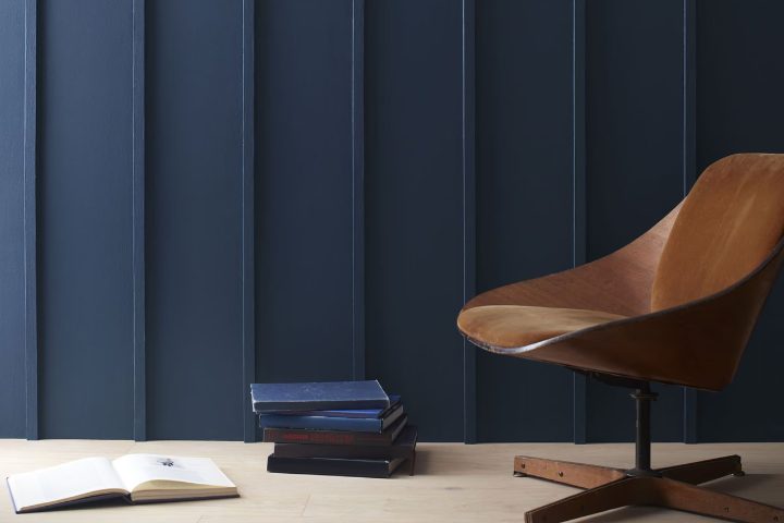
If you’re looking for a color that adds depth and refinement to any room, Benjamin Moore’s 2061-10 Deep Royal is a fantastic choice. When I first used this shade in a client’s dining room, I was amazed by how it enhanced the area with its rich, deep blue tones.
It has a way of creating a feeling of elegance without being too intense, providing just the right amount of character to make the walls stand out beautifully. The adaptability of Deep Royal also impresses me. Whether you’re aiming for a contemporary look or something more traditional, this color seamlessly fits into various styles and settings.
It pairs wonderfully with bright whites and soft grays, bringing a balanced, yet powerful presence to the environment. Moreover, it works equally well in rooms with a lot of natural light or in areas that rely more on artificial lighting, maintaining its beauty in different conditions.
So, if you’re thinking of giving your home a fresh, new look, consider this distinctive blue from Benjamin Moore. It might just be the touch of refinement you’ve been searching for.
What Color Is Deep Royal 2061-10 by Benjamin Moore?
Deep Royal 2061-10 by Benjamin Moore is a rich, vibrant blue that brings a strong presence to any room. This bold hue is perfect for creating a statement wall or adding a pop of color to an accent piece. Its deep blue shade can give an area a sense of depth and focus, making it a fantastic choice for rooms that could use a touch of drama. This color works exceptionally well in modern and contemporary interiors, where its boldness complements minimalist, clean lines and sleek furniture.
It’s also a great fit for eclectic styles, where a mix of colors and textures can be anchored by this strong blue. Deep Royal pairs beautifully with natural materials like wood and leather, which help soften its intensity while maintaining an air of luxury. Metals such as gold or brass also complement this color well, adding a touch of glamour to the room.
For textures, Deep Royal goes well with smooth, glossy finishes that reflect light and create a dynamic contrast with its matte appearance. Velvety fabrics or soft furnishings can also complement this paint color by adding a tactile dimension that invites touch, enhancing the overall sensory experience of the room. Whether on a feature wall or through decorative accents, this color is adaptable in meeting various design needs and preferences.
Is Deep Royal 2061-10 by Benjamin Moore Warm or Cool color?
Deep Royal, color code 2061-10 by Benjamin Moore, is a vivid and bold blue that can make a strong statement in any home. This shade has the power to add a sense of energy and depth to your room. When used on a feature wall, it can create a dramatic backdrop that highlights your decor and furniture. It’s also a great color for doors or cabinets if you want to add a pop of color without making the entire room feel too heavy.
If you have a small room, you might want to use Deep Royal sparingly, as dark colors can make areas appear smaller. Pairing it with lighter colors such as whites or light grays can help keep the room feeling open and airy.
In larger rooms, like a spacious living area, this color can help define different zones and bring a cozy, grounded feeling. Overall, Deep Royal is a great option if you’re looking to add some energy and depth to your home without going too bold. It pairs well with many shades and can be used in various ways to enhance the overall look of your interior.
Undertones of Deep Royal 2061-10 by Benjamin Moore
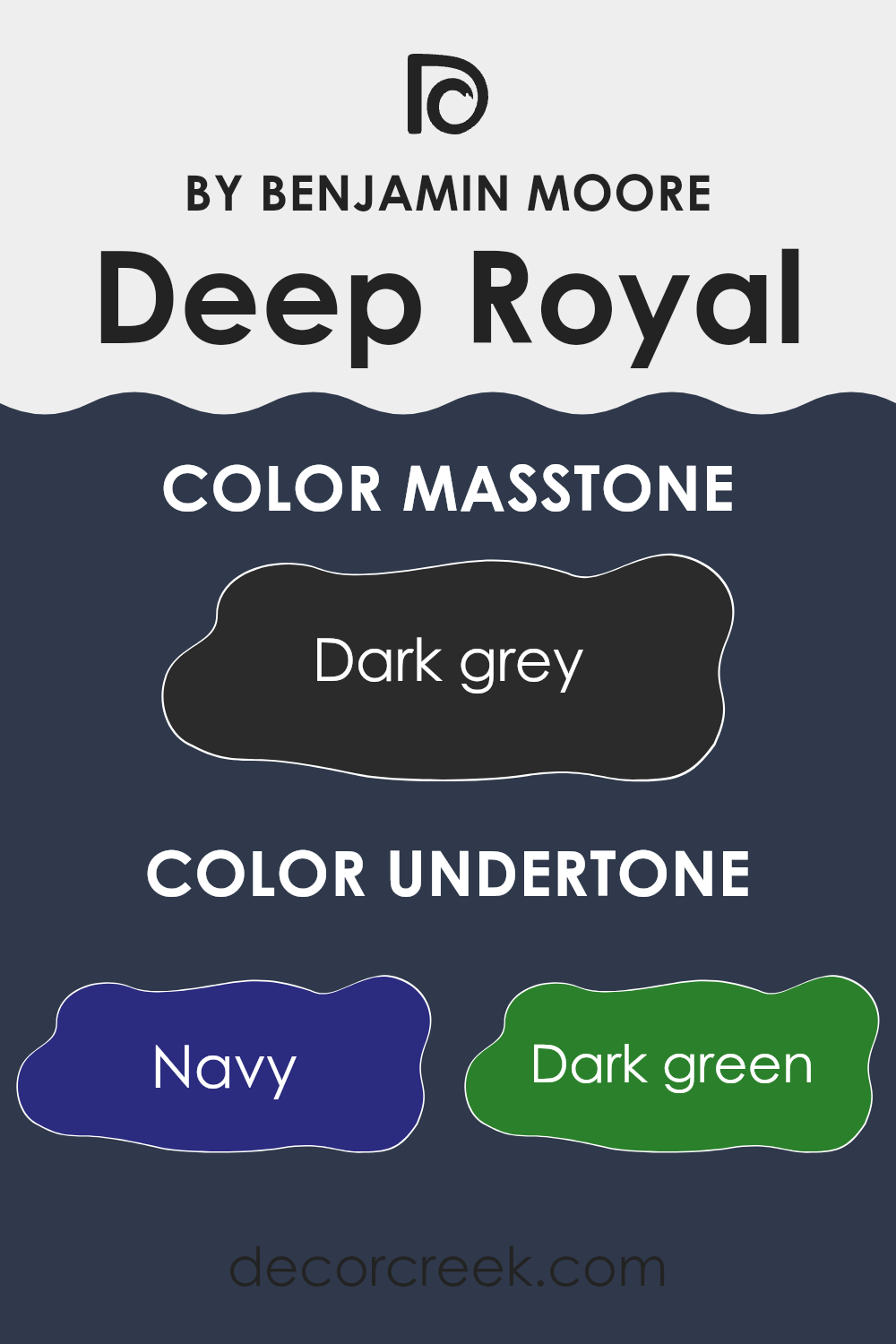
Deep Royal, a rich color, is more than just a single shade; it’s made up of a complex blend of undertones that significantly influence how it appears in different settings. Undertones are the subtle colors that lie beneath the surface of what we consider the main color. They can include shades like navy, dark green, brown, dark turquoise, purple, olive, and grey.
Understanding undertones is crucial because they can alter the perceived color depending on the lighting and surrounding tones. For example, in a room with natural lighting, navy and dark turquoise undertones might make Deep Royal appear more vibrant, bringing a cool, deep blue feel to the area.
On the other hand, in artificial light, brown and olive undertones might stand out, giving the walls a warmer, more muted appearance. When applied to interior walls, the undertones of Deep Royal create a dynamic effect. Rooms with ample sunlight might highlight its cooler navy or purple undertones, making the room feel fresher. In contrast, areas with less light can bring out the warmer brown or olive undertones, making the room feel cozier.
In summary, the various undertones in Deep Royal affect its overall appearance in a room. They can make the color look diverse under different conditions, making it an adaptable choice for interior design. This understanding helps in predicting how the color will react in different environments and choosing complementary shades for decor and furniture.
What is the Masstone of the Deep Royal 2061-10 by Benjamin Moore?
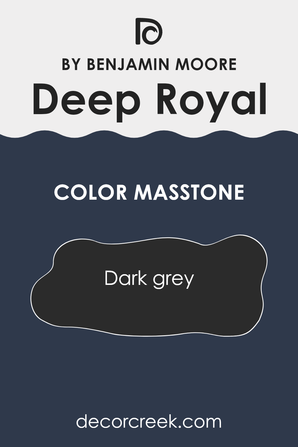
Deep Royal 2061-10 by Benjamin Moore has a masstone that is dark grey (color code #2B2B2B). This deep, vivid shade brings a strong and bold feel to any room it’s used in. When applied to walls, this color can make large, bright areas feel cozier and more intimate, balancing out the excess light. In smaller rooms, using this color might make the area seem a bit smaller but adds a lot of character and mood.
This dark grey shade is adaptable, making it an excellent choice for various home styles. It can look very stylish in modern or minimalistic settings, creating a striking contrast with light-colored furniture and decor. In traditional rooms, it adds depth and grounds the decor with its rich hue.
The dark tone also shows less dirt, which is practical for high-traffic areas or homes with kids and pets. Overall, Deep Royal 2061-10 can add a bold statement to your home while keeping it warm and inviting.
How Does Lighting Affect Deep Royal 2061-10 by Benjamin Moore?
Lighting plays a crucial role in how we perceive colors. The same shade can appear differently under various light sources because different lighting conditions can enhance or mute certain tones. Let’s look at the color Deep Royal, a dark, saturated blue. This color’s appearance can shift noticeably depending on whether it’s illuminated by artificial light or natural sunlight.
In artificial light, Deep Royal tends to look richer and more intense. Many artificial lights have a warm tone, which can add a slight cozy glow to this deep blue, making it appear less stark and more welcoming. This makes it a great choice for settings where artificial lighting is predominant, such as living rooms or dining areas where you want to create a warm, inviting atmosphere.
In natural light, the true depth of Deep Royal comes alive, especially in bright conditions. The vibrant blue can look exceptionally vivid under ample sunlight, making areas feel more energetic and dynamic.
When considering room orientation:
- In north-facing rooms, which typically receive cooler, indirect light throughout the day, Deep Royal can appear somewhat shadowed and muted. This can give a calming, subdued look to the area but might require extra lighting to reveal the richness of the color.
- In south-facing rooms, with consistent, warm light, this color will look bright and lively. It catches the light beautifully, allowing the area to feel airy during the day despite its depth.
- For east-facing rooms, morning light can make Deep Royal look very vivid and dramatic. As the day progresses and light fades, the color appears more subdued, offering a shifting tone throughout the day.
In west-facing rooms, the afternoon and evening light can illuminate this color with a warm glow, enhancing its richness and depth, making it an excellent option for areas used mainly in the evening.In summary, Deep Royal is an adaptable color that can express different moods depending on the lighting it’s paired with. When choosing this shade for a room, consider the direction of light to ensure it aligns with the atmosphere you want to create.
decorcreek.com
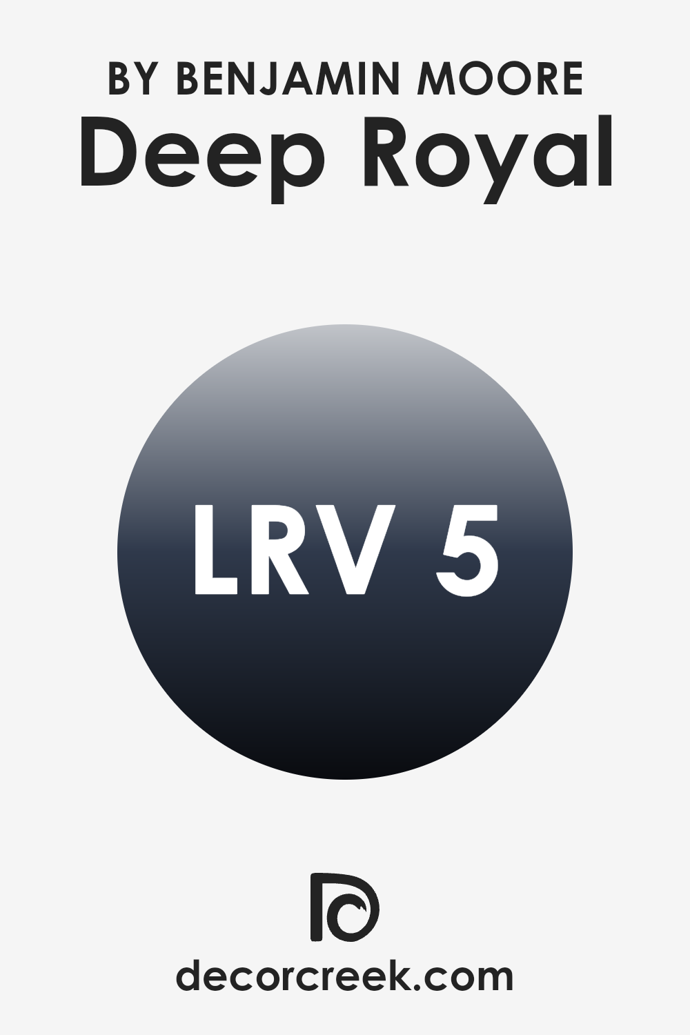
What is the LRV of Deep Royal 2061-10 by Benjamin Moore?
LRV stands for Light Reflectance Value, which measures how much light a color reflects back into a room. This scale ranges from zero, representing pure black that absorbs all light, to the highest LRV, representing pure white that reflects all light back into the area.
The LRV helps people anticipate how a paint color will appear under different lighting conditions before applying it to the walls. It’s especially useful when choosing colors based on how bright or dim a room naturally is since LRV can influence whether a room feels lighter or darker than it actually is.
With an LRV of 5.36, Deep Royal is a dark color that absorbs far more light than it reflects. This means it can make a room feel cozier but also visually smaller, as darker shades tend to draw the walls inward. In small or dimly lit rooms, it might make the area appear even more enclosed and darker.
However, in bright or open areas, this color adds a rich and dramatic effect without overpowering the room, especially when paired with lighter tones in the decor and furnishings. When thinking about how this color might influence the mood of a room, lighting plays an important role—both natural and artificial sources can greatly change how this deep shade looks on the walls.
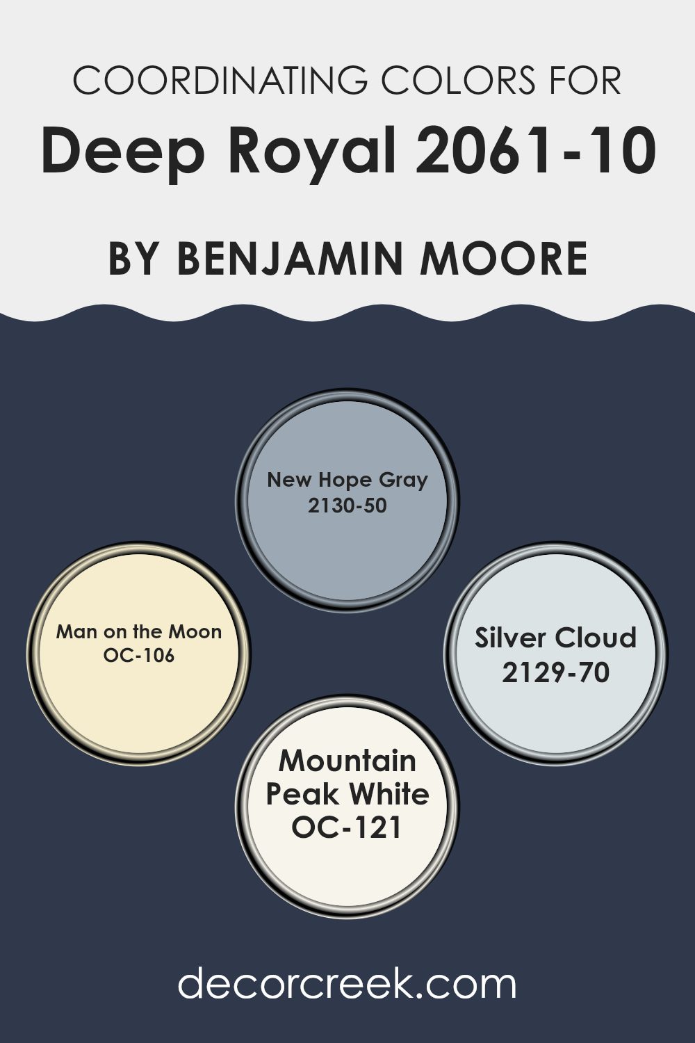
Coordinating Colors of Deep Royal 2061-10 by Benjamin Moore
Coordinating colors are shades that harmoniously complement the main color in a palette, enhancing the overall aesthetic without overshadowing it. For instance, when paired with a bold color like a deep royal blue, coordinating shades can balance its intensity while maintaining a cohesive appearance. Selecting the right combinations involves considering hue strength and undertones to create a visually appealing and balanced design.
New Hope Gray is a moderate gray that provides a smooth blend, contrasting nicely with deeper blues without creating an overly harsh effect. Man on the Moon, on the other hand, is a lighter, subtle beige that serves as a neutral base, allowing richer shades to stand out gracefully.
Silver Cloud is another gentle gray, but with a lighter, almost airy quality that adds a fresh, calming touch to an area dominated by stronger tones. Lastly, Mountain Peak White is a crisp, clean white that delivers a sharp contrast, accentuating vibrant hues and giving the area a bright, open feeling. These colors work beautifully together, offering a balanced and refined palette that enhances the overall character of any interior.
You can see recommended paint colors below:
- 2130-50 New Hope Gray
- OC-106 Man on the Moon
- 2129-70 Silver Cloud
- OC-121 Mountain Peak White
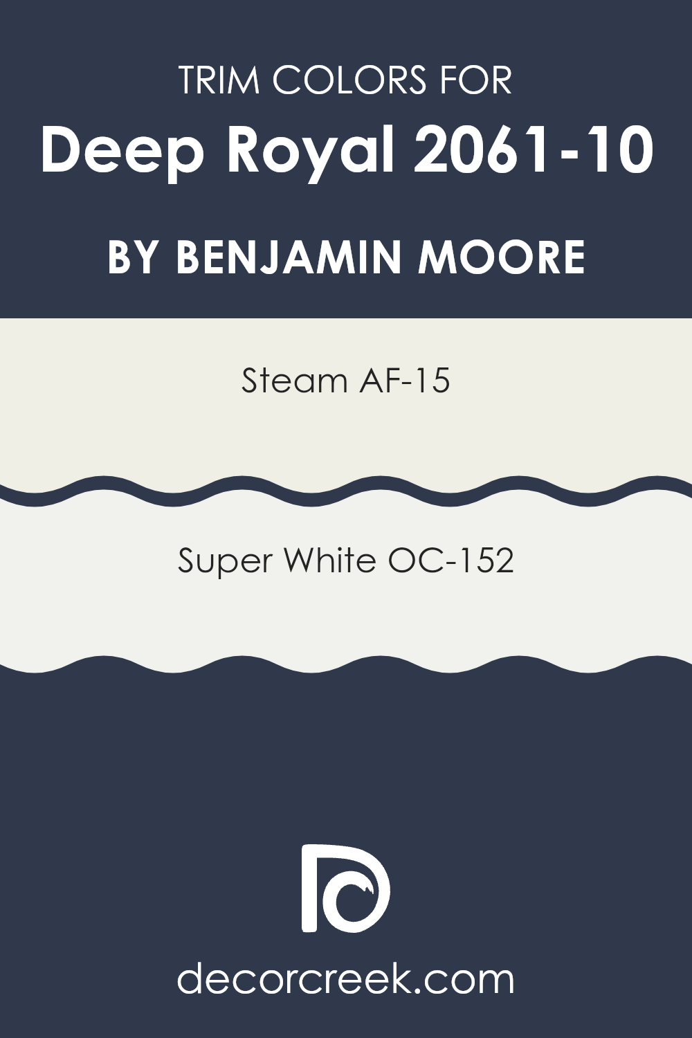
What are the Trim colors of Deep Royal 2061-10 by Benjamin Moore?
Trim colors are shades chosen to emphasize or accentuate the architectural details of a room, such as door frames, window sills, baseboards, and crown moldings. Selecting the right trim color can greatly enhance the visual appeal of your walls, making the main color stand out more clearly and giving the area a polished, cohesive appearance. When working with a strong and vivid color like Deep Royal by Benjamin Moore, choosing the right trim colors is essential to achieve a balanced design without making the look feel too intense.
Two excellent trim colors for Deep Royal are AF-15 Steam and OC-152 Super White by Benjamin Moore. AF-15 Steam is a soft, muted white with gentle warmth, offering a smooth contrast when paired with deep, rich hues like Deep Royal.
This combination helps the area maintain a light and open feeling without the sharp brightness that a pure white might introduce. OC-152 Super White, in contrast, is a crisp white that delivers a stronger contrast against darker shades. Using Super White as a trim color alongside Deep Royal creates a bold, clean outline that beautifully highlights the architectural elements of the room.
You can see recommended paint colors below:
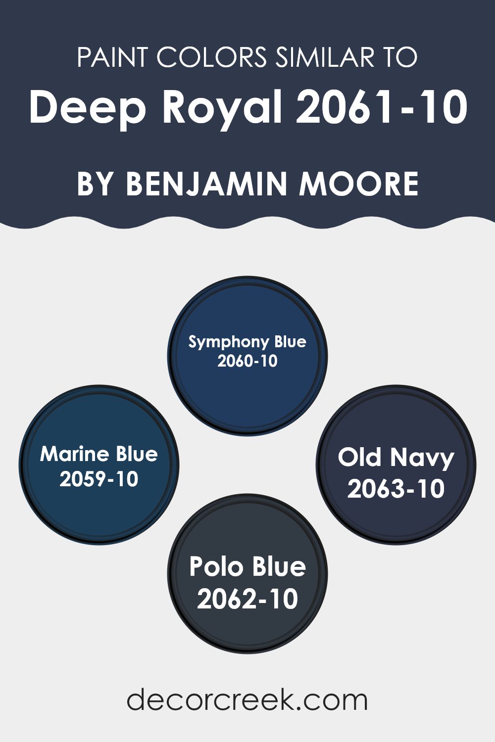
Colors Similar to Deep Royal 2061-10 by Benjamin Moore
Choosing similar colors for a design project helps create a unified and balanced feeling in a room. When shades are closely related, like those similar to Deep Royal by Benjamin Moore, they blend naturally to form a cohesive and visually smooth look. Using such colors can also subtly define different areas within an open layout without introducing harsh contrasts that might interrupt the flow of the room.
Symphony Blue has a rich, vibrant tone that carries a sense of energy while remaining close enough to deep blue to maintain a calm consistency. Marine Blue is a slightly bolder, crisper hue that adds a refreshing touch while staying true to the moody blue palette.
Old Navy, a deeper and more shadowed tone, introduces grounding depth to the mix. Polo Blue completes the palette with a touch of refinement that feels balanced and not overly bright, ensuring a smooth transition between all related hues. Each of these colors adds a unique nuance in tone and atmosphere, allowing design flexibility while preserving a cohesive aesthetic.
You can see recommended paint colors below:
- 2060-10 Symphony Blue
- 2059-10 Marine Blue
- 2063-10 Old Navy
- 2062-10 Polo Blue
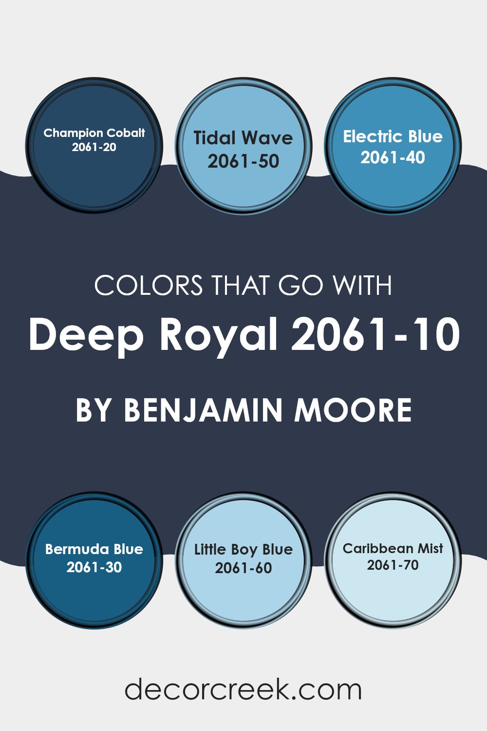
Colors that Go With Deep Royal 2061-10 by Benjamin Moore
Choosing the right colors to pair with Deep Royal 2061-10 by Benjamin Moore is essential for creating a balanced and visually pleasing room. Colors that complement Deep Royal include a range of blues that highlight its bold and vibrant nature without competing against it.
For example, Champion Cobalt is a strong, saturated blue that enhances the depth of Deep Royal, making it perfect for achieving a dynamic and striking look. Similarly, Tidal Wave has a calming yet cheerful tone that adds freshness and liveliness, offering a gentle balance to Deep Royal’s intensity.
Electric Blue introduces an energetic and vivid presence, bringing a playful spark when paired with the darker shade. Bermuda Blue, with its aqua-inspired tone, contributes a lighter and breezier feeling—an excellent option for creating a cool and refreshing ambiance.
Little Boy Blue offers a softer, more subdued touch, ideal for a subtle contrast against Deep Royal’s bold depth. Finally, Caribbean Mist provides a light, muted balance that complements the deeper hue gracefully, fostering a relaxed and harmonious mood. Together, these colors create a refined, well-coordinated palette that enhances the beauty and character of any interior centered around Deep Royal.
You can see recommended paint colors below:
- 2061-20 Champion Cobalt
- 2061-50 Tidal Wave
- 2061-40 Electric Blue
- 2061-30 Bermuda Blue
- 2061-60 Little Boy Blue
- 2061-70 Caribbean Mist
How to Use Deep Royal 2061-10 by Benjamin Moore In Your Home?
Deep Royal 2061-10 by Benjamin Moore is a rich, deep blue paint that brings a bold and elegant touch to any home. This shade is ideal for creating a strong visual impact in a room. For instance, using Deep Royal on a feature wall can draw attention and establish a clear focal point in your living room or bedroom. It also works beautifully in a home office, helping define the area and giving it a distinctive, polished character.
For those who appreciate contrast, Deep Royal pairs wonderfully with lighter shades like white or gray, which help balance its intensity while keeping its captivating charm. Painting baseboards, window frames, or doors in a crisp white can provide a clean, refined edge that highlights the depth of the blue.
This color also adapts well through accessories—items like cushions, rugs, or wall art in complementary tones can unify the overall look. Beyond its visual appeal, Deep Royal is practical too; its depth helps conceal minor wall flaws, making it both a stylish and functional choice for modern interiors.
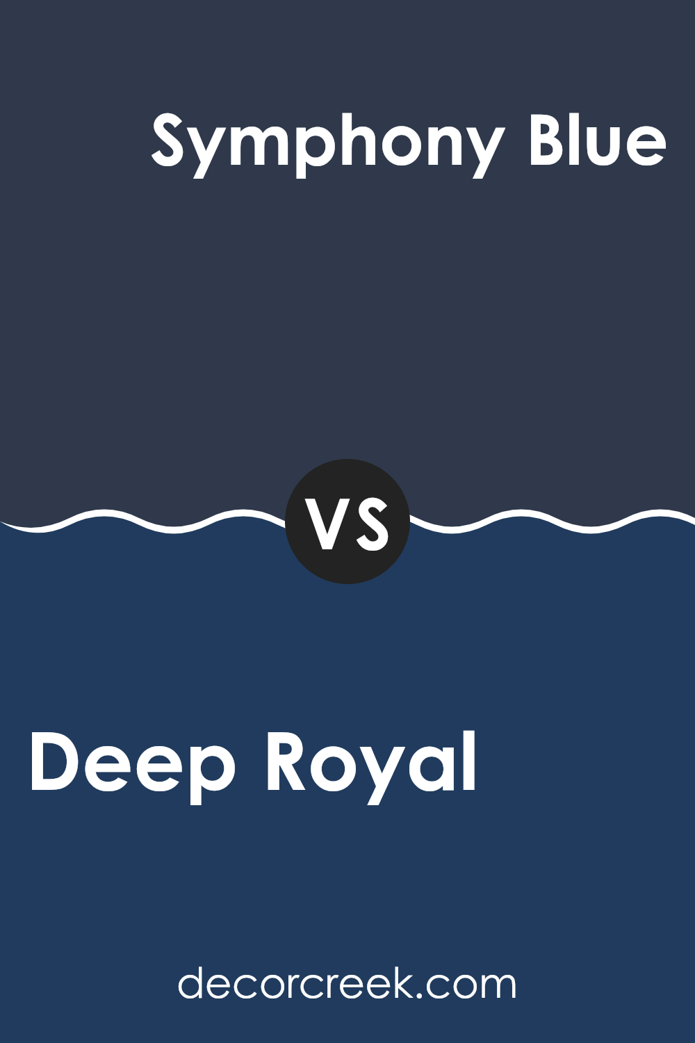
Deep Royal 2061-10 by Benjamin Moore vs Symphony Blue 2060-10 by Benjamin Moore
Deep Royal and Symphony Blue by Benjamin Moore are two dark shades of blue, each with its unique vibe. Deep Royal is a rich, dark blue with a hint of purple, giving it a warm and cozy feel. This color works well in areas where you want to create a snug and inviting atmosphere, like living rooms or bedrooms.
On the other hand, Symphony Blue is also a dark blue, but it leans slightly towards the teal side. This brings a cooler tone, which makes it perfect for creating a fresh, modern look in a room. It’s an excellent choice for bathrooms or study areas where you want a more crisp and updated feel.
Both colors are deep and intense, ideal for making bold statements on your walls. The choice between them depends on the mood you’re aiming for—warm and cozy with Deep Royal or cool and fresh with Symphony Blue.
You can see recommended paint color below:
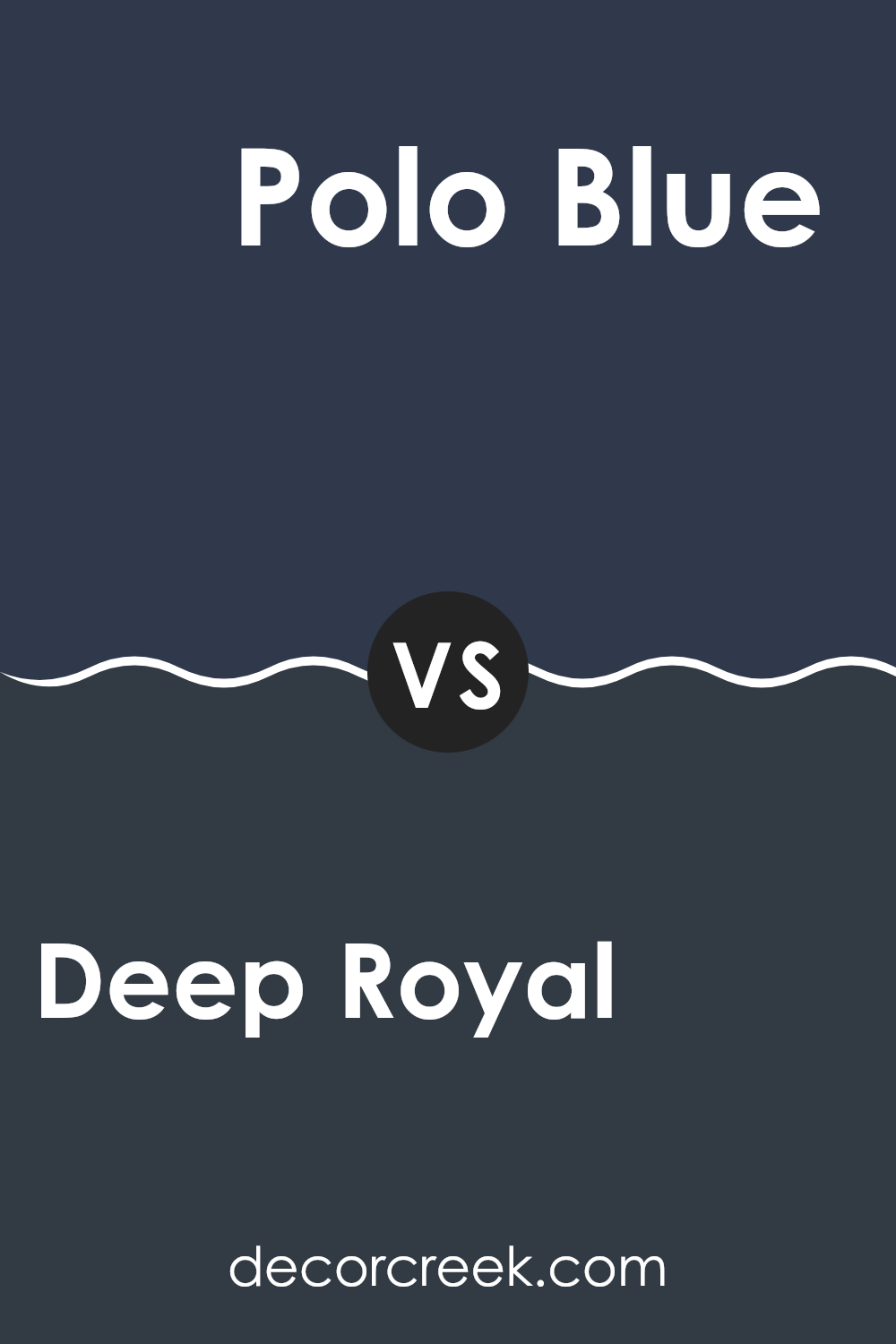
Deep Royal 2061-10 by Benjamin Moore vs Polo Blue 2062-10 by Benjamin Moore
Deep Royal and Polo Blue are both rich, dark colors by Benjamin Moore, but they have some subtle differences in their tones. Deep Royal, as the name suggests, is a deep blue that leans slightly toward a royal blue shade.
It has a vibrant yet dark base that can make any room feel cozy and defined. On the other hand, Polo Blue is also a dark blue but carries a stronger hint of navy, giving it a more classic look. Polo Blue might remind you of a traditional navy blazer – enduring and slightly more refined than Deep Royal.
Both shades are great for creating a striking accent in a room, especially when used for walls or furniture pieces. They work beautifully in rooms that aim for a bold yet welcoming atmosphere. Whether it’s Deep Royal with its vibrant tone or Polo Blue with its classic charm, each adds its own distinctive character to interiors.
You can see recommended paint color below:
- 2062-10 Polo Blue
Deep Royal 2061-10 by Benjamin Moore vs Marine Blue 2059-10 by Benjamin Moore
Deep Royal and Marine Blue are both striking colors by Benjamin Moore, but they bring their distinct vibes to rooms. Deep Royal is a rich, bold blue that’s closer to a navy, offering a strong presence that can make walls stand out or add depth as an accent. It’s great in a study or dining room where you want a touch of formality.
On the other hand, Marine Blue is also a deep shade but leans more toward a true blue. This makes it slightly brighter and more vibrant than Deep Royal. It’s an excellent choice for areas where you want to add energy and a lively feel, like in a kids’ room or a creative area like a home studio.
Both colors work well in rooms that aim for a dramatic flair, but your choice depends on the mood you want to create. Deep Royal offers a more grounded, classic look, while Marine Blue brings a fresher, more dynamic vibe.
You can see recommended paint color below:
- 2059-10 Marine Blue
Deep Royal 2061-10 by Benjamin Moore vs Old Navy 2063-10 by Benjamin Moore
Deep Royal and Old Navy are two dark shades from Benjamin Moore. Deep Royal is a vibrant, rich blue that brings to mind the tone of ripe blueberries. It stands out in any room and adds a bold touch of color. On the other hand, Old Navy is a classic navy blue that resembles the night sky.
It’s slightly darker than Deep Royal and carries a more traditional feel. Both colors have their unique charm—Deep Royal is more striking and lively, while Old Navy feels more grounded and enduring.
If you want to make a bold statement, Deep Royal is the perfect choice, while Old Navy works beautifully for creating a warm, grounded atmosphere in a room. Each offers its own distinct mood depending on the effect you want to achieve.
You can see recommended paint color below:
After learning about the paint color 2061-10 Deep Royal by Benjamin Moore, I can say it’s a truly special blue shade that can make any room look beautiful and lively. It’s not just any blue; it has a depth that reminds you of the deep ocean or the sky at dusk. This color can bring a noticeable change to your room, whether you choose to paint an entire wall or just a smaller area.
Benjamin Moore created this shade for those who want their homes to feel cozy and full of character. If you’re thinking about adding a new touch to your room, 2061-10 Deep Royal is a wonderful option because it pairs nicely with many other colors. Whether you combine it with soft whites or other bold tones, it always creates a balanced and appealing look.
So, if you’re planning to refresh your room, 2061-10 Deep Royal could be the ideal choice.
It’s a shade that will surely make your room stand out and give it a bright, renewed appearance.
Ever wished paint sampling was as easy as sticking a sticker? Guess what? Now it is! Discover Samplize's unique Peel & Stick samples.
Get paint samples

