Have you ever walked into a room and felt instantly calmed by the color of the walls? That’s the magic of Symphony Blue (2060-10) by Benjamin Moore – a paint that transforms any space into a serene sanctuary.
This article will introduce you to the unique charm of Symphony Blue, a color that combines the tranquility of the ocean with the clear sky’s vastness, making it perfect for anyone looking to refresh their home environment.Symphony Blue is not just any blue.
It’s a vibrant yet soothing shade that offers a modern twist on classic navy.
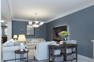
Whether you’re thinking about updating a single room or considering a complete home makeover, Symphony Blue adds a touch of sophistication and depth to any decorating project.
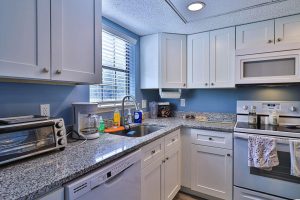
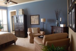
Its versatility means it can work beautifully in living rooms, bedrooms, and even kitchens, adding personality without being overwhelming.
In this article, we’ll explore how Symphony Blue can harmonize with various decor styles, from minimalist to eclectic, and provide tips on choosing complementary colors and accessories.
Designed to inspire and inform, we’re here to help you see the potential in your space through the lens of this stunning shade.
Join us on this journey as we explore the possibilities of Symphony Blue by Benjamin Moore, and discover how it can help transform your home into a peaceful and stylish retreat.
What Color Is Symphony Blue 2060-10 by Benjamin Moore?
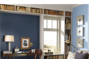
Symphony Blue, a rich and vibrant hue from Benjamin Moore, stands out as a bold choice for interior design. This particular shade is a deep blue with a hint of brightness, making it versatile for various styles and settings.
Its intensity adds depth and character to any space, offering a canvas for creating striking contrasts or a serene ambiance.
This color works exceptionally well in modern and contemporary interiors, where its boldness can be balanced with minimalist designs and clean lines.
It also fits nicely into nautical or coastal themes, bringing the essence of the deep ocean indoors.
For a more traditional or eclectic approach, Symphony Blue can serve as an accent wall or be incorporated through décor elements, adding a touch of elegance and sophistication.
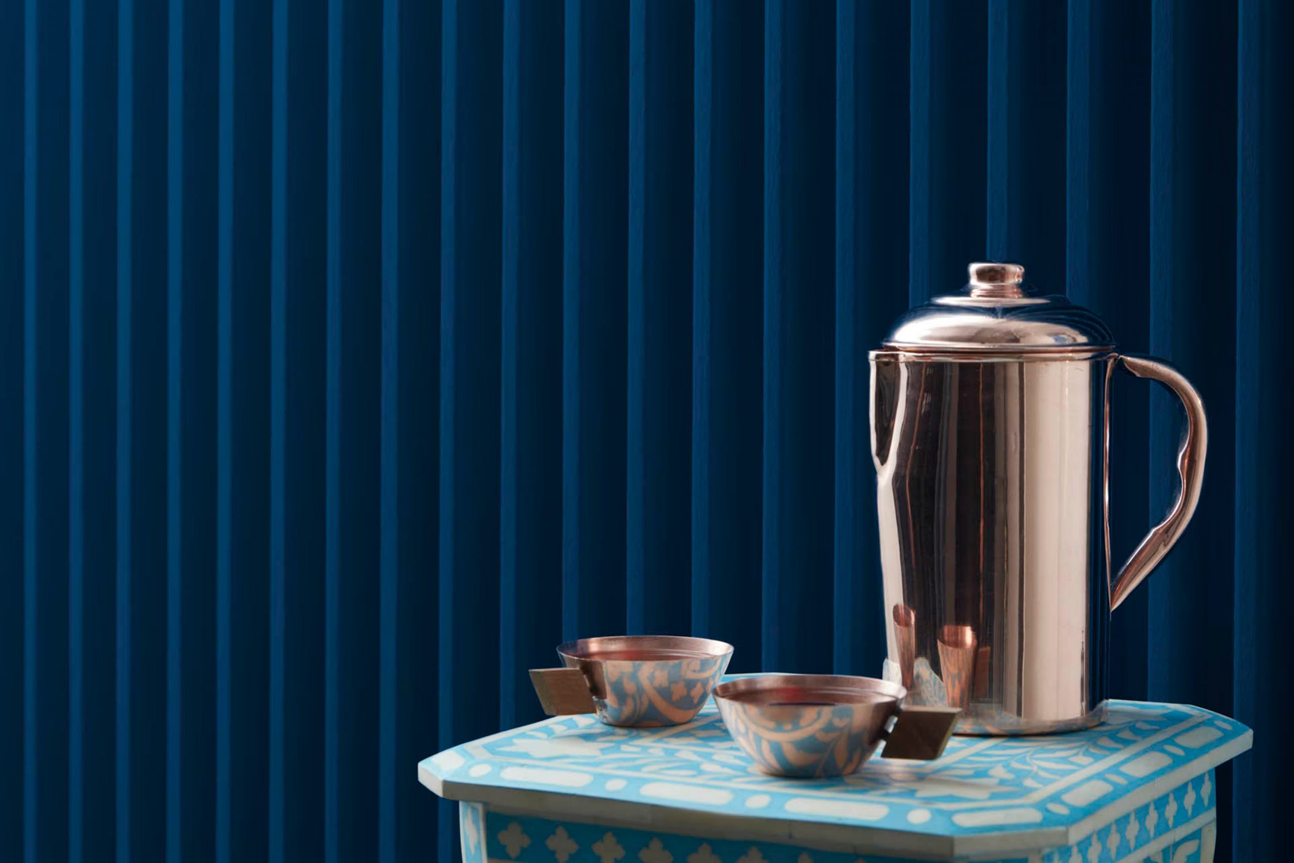
When it comes to pairing materials and textures, Symphony Blue is quite flexible. It pairs beautifully with natural wood finishes, from light oak to dark walnut, adding warmth to the cool undertones of the blue.
Metals like brass and copper can introduce a luxurious feel, while chrome or stainless steel maintains a modern edge.
In terms of textures, this color is complemented by both soft and cozy fabrics like wool and velvet, and smoother textures like silk or satin, offering a dynamic but harmonious interior palette.
Leather in dark or tan shades also looks exquisite against this vibrant blue, creating a refined and inviting space.
Ever wished paint sampling was as easy as sticking a sticker? Guess what? Now it is! Discover Samplize's unique Peel & Stick samples.
Get paint samples

Is Symphony Blue 2060-10 by Benjamin Moore Warm or Cool color?
Symphony Blue2060-10 by Benjamin Moore is a stunning paint color that adds a vibrant touch to any space. This shade of blue is deep and rich, providing a sense of calm and elegance to rooms.
It’s a versatile color that works well in various areas of the home, from bedrooms to living rooms, and even in kitchens and bathrooms.
The beauty of Symphony Blue lies in its ability to blend with different decor styles, whether you’re aiming for a classic look, a modern vibe, or something in between.
Applying this color to walls can transform a dull space into a lively and inviting area. It pairs beautifully with white trim, adding a crisp and clean contrast that really makes the blue pop.
For those worried about dark colors making a room feel smaller, Symphony Blue has a unique quality. It adds depth and dimension without overwhelming the space, especially when used on an accent wall or paired with ample natural light.
In essence, Symphony Blue2060-10 introduces a touch of sophistication and tranquility, making it a popular choice for homeowners looking to refresh their living spaces with a lasting and appealing color.
Undertones of Symphony Blue 2060-10 by Benjamin Moore
Symphony Blue 2060-10 by Benjamin Moore features subtle undertones that give it a unique and dynamic appearance. Specifically, this color has undertones of dark grey and dark turquoise.
Undertones are crucial in paint colors because they can significantly impact how the color looks in different lighting conditions. They can subtly influence the color’s character and how it feels in a room.
The dark grey undertone in Symphony Blue brings a muted, sophisticated edge to the color. This characteristic can make the color appear more grounded and less vibrant, adding a level of seriousness and elegance to interior walls.
It’s excellent for creating a space that feels calm and collected.
On the other hand, the dark turquoise undertone adds a layer of complexity, infusing a touch of vibrancy and depth into the color. This can make the blue seem more lively and engaging, especially in natural light.
The inclusion of this undertone can make Symphony Blue feel more welcoming and dynamic, adding a slight, unexpected freshness to the room.
When Symphony Blue is applied to interior walls, the combined effect of these undertones can create a fascinating visual experience. The color may appear more vibrant and playful in spaces with plenty of natural light, showcasing its turquoise undertones.
In contrast, in areas with less light, the grey undertones might become more prominent, giving the space a more refined and understated look.
This versatility makes Symphony Blue an interesting choice for anyone looking to add both sophistication and a hint of energy to their interiors.
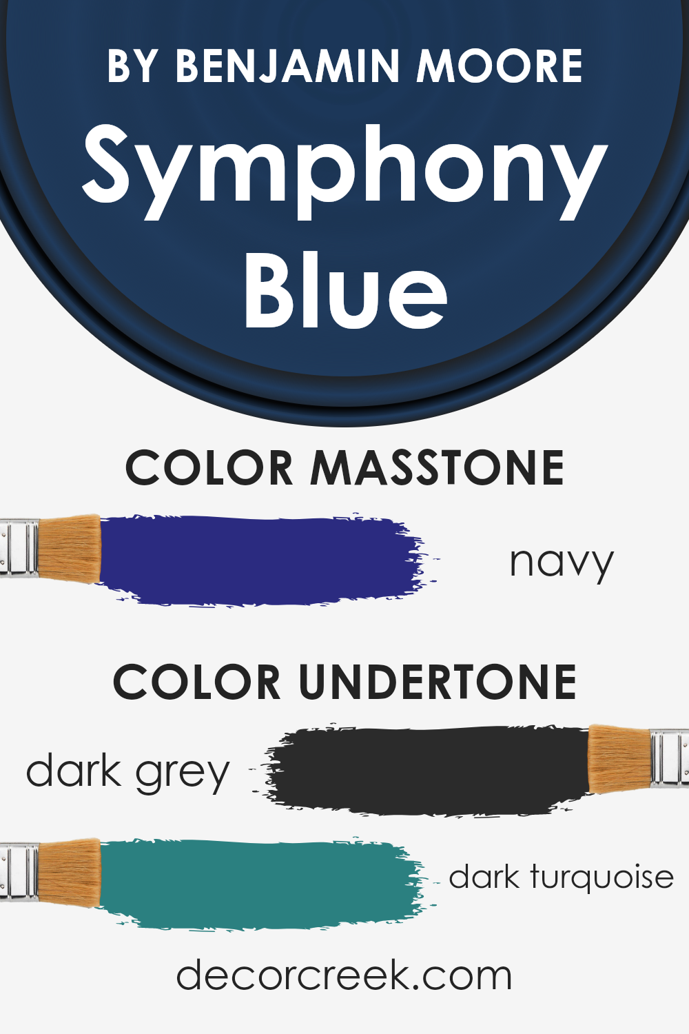
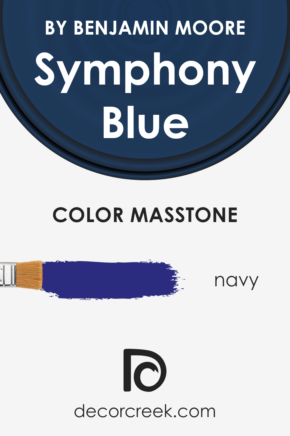
What is the Masstone of the Symphony Blue 2060-10 by Benjamin Moore?
Symphony Blue2060-10 by Benjamin Moore has a masstone of Navy, identified by the color code #2B2B80. This rich, deep blue offers a sense of sophistication and calm to any space it graces.
When used in homes, this stunning shade creates a backdrop that’s both stylish and comforting. Imagine walking into a room and feeling the depth and tranquility the color brings.
It’s perfect for creating a focal point in a room without overwhelming the senses. In spaces where relaxation or focus is key, like bedrooms or home offices, Symphony Blue sets the right tone.
It can also make smaller spaces feel more intimate and cozy. This color works well with a variety of decor styles and complements a wide range of accent colors, from warm golds to crisp whites, allowing for flexibility in design choices.
Overall, Symphony Blue2060-10 adds a touch of elegance and a tranquil vibe to any home.
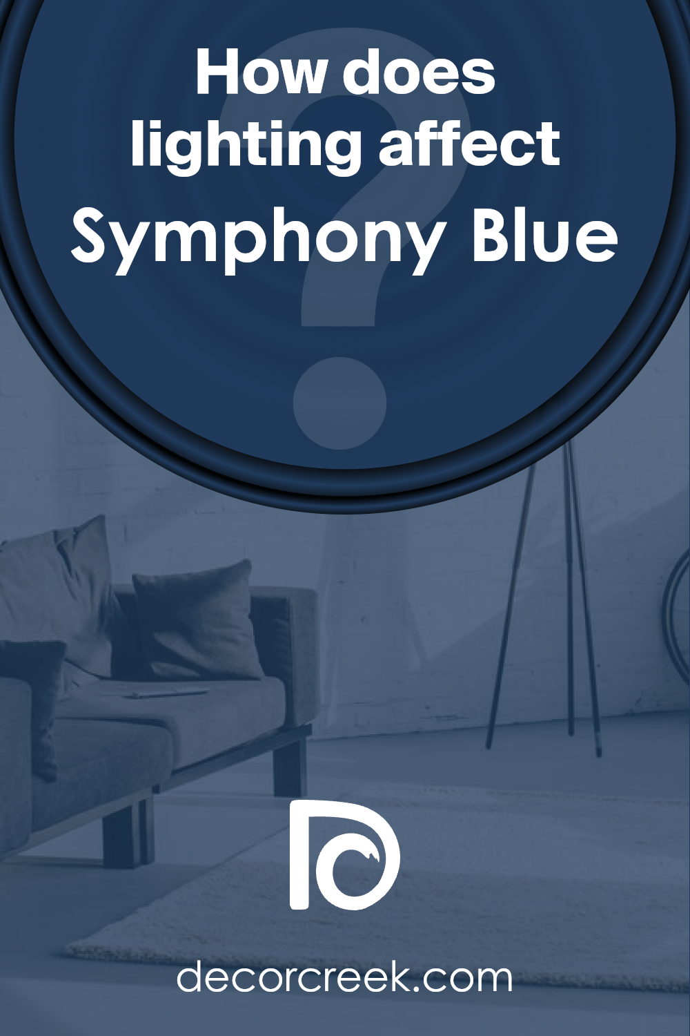
How Does Lighting Affect Symphony Blue 2060-10 by Benjamin Moore?
Lighting plays a crucial role in how we perceive colors in our environment. Different types of light can dramatically alter the appearance of a color.
When considering a specific color, like Symphony Blue by Benjamin Moore, it’s important to consider how it will look in various lighting conditions.
In artificial light, Symphony Blue might appear more vivid or slightly altered, depending on the type of bulb used. Warm lights can make the color seem richer and more vibrant, adding coziness to the space.
On the other hand, cool lights may enhance the blue, making it appear brighter and more energetic. Therefore, the choice of lighting can greatly influence how this color feels in a room.
Natural light brings out the truest version of Symphony Blue, but the direction of the room plays a big part in its final appearance.
North-faced rooms receive less direct sunlight, which can make this blue appear more muted and subtle, perfect for creating a calm and serene atmosphere. Such rooms might not show the full depth of the color under the softer, cooler light.
South-faced rooms are flooded with warm sunlight for most of the day, which can make Symphony Blue glow with vibrancy. The warmth of the light can bring out the color’s depth, making it feel inviting and lively.
East-faced rooms receive the morning sunlight, which is cooler and brings a crisp and fresh feel to the color. Here, Symphony Blue can look exceptionally vibrant in the morning, offering a refreshing start to the day.
As the day progresses, and the natural light diminishes, the color may take on a more subdued tone.
West-faced rooms catch the evening light, which is warmer. This warm glow can enrich Symphony Blue, making it more pronounced and dynamic towards the end of the day.
It’s an excellent option for spaces used more during the afternoon and evening.
Understanding how lighting affects Symphony Blue can help in deciding where to apply this color to achieve the desired mood and effect in each room.
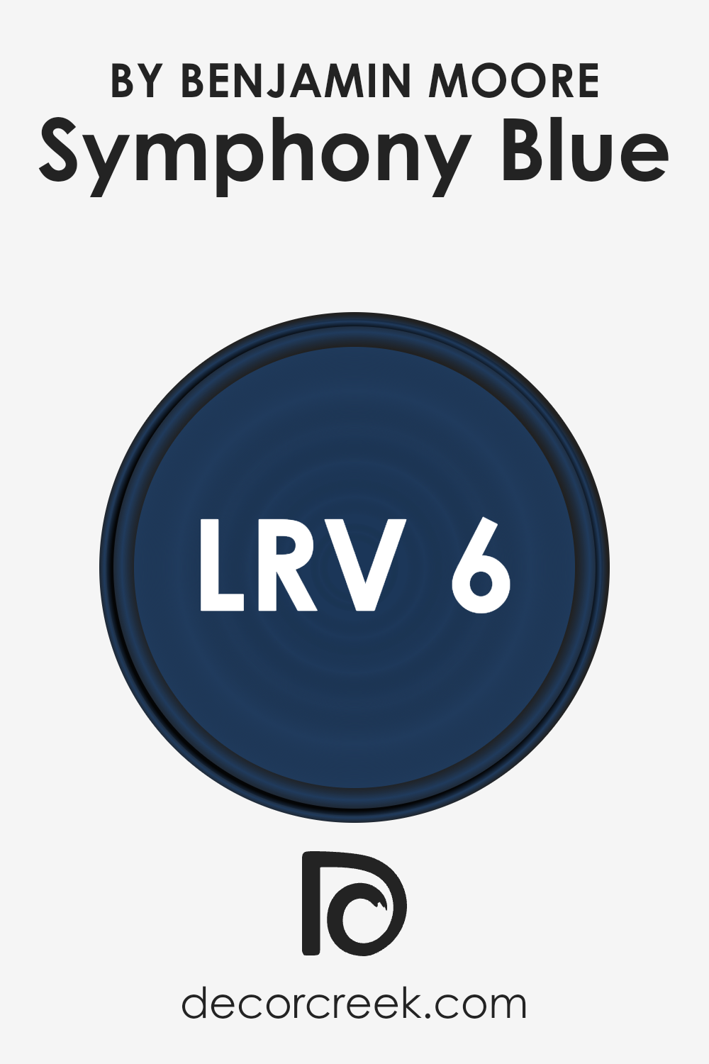
What is the LRV of Symphony Blue 2060-10 by Benjamin Moore?
LRV, or Light Reflectance Value, is a measurement scale that tells us how much light a color reflects back into a room.
It ranges from 0, which is complete absorption of light (making it look black), to 100, reflecting all light (which looks white). This value helps when picking paint colors, as it influences how light or dark a color appears on your walls.
The higher the LRV, the lighter the color looks, making small rooms feel more spacious. Conversely, lower LRV values make colors appear deeper and can add a sense of coziness or drama to a space but might make a small room feel tighter.
With an LRV of 6.16, the color in question reflects very little light, sitting at the darker end of the scale.
This means it will look quite rich and deep when applied to walls, potentially absorbing more light than it reflects. In rooms with plenty of natural or artificial light, this can add a sophisticated, moody ambiance.
However, in a darker room or a space with limited light sources, it might make the room feel even darker.
Therefore, when using a color with a low LRV like this, consider your space’s lighting to ensure it complements the room without making it feel too confined or overwhelming.
LRV – what does it mean? Read This Before Finding Your Perfect Paint Color
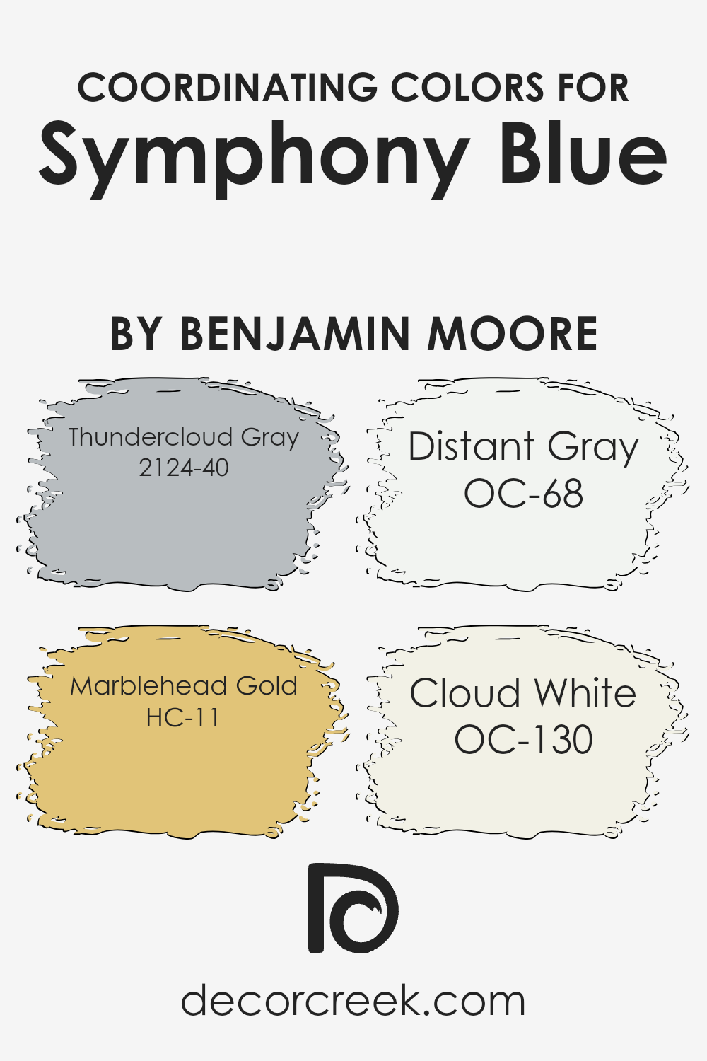
Coordinating Colors of Symphony Blue 2060-10 by Benjamin Moore
Coordinating colors are the hues that work in harmony with a primary color, enhancing the overall look and feel of a space. These colors complement or contrast with the main color in a way that creates balance and visual interest.
For Symphony Blue by Benjamin Moore, a vibrant shade of blue, there are several coordinating colors that can help to bring out its beauty and create a cohesive design.
Thundercloud Gray is a moody gray with a touch of blue undertone, making it a perfect companion for Symphony Blue, adding depth and sophistication to the palette.
Marblehead Gold is a warm, muted gold that provides a striking contrast to Symphony Blue, bringing a touch of warmth and brightness to spaces that feature these colors.
Distant Gray is an almost ethereal shade of gray, so light and subtle that it acts as a neutral backdrop, allowing Symphony Blue to truly stand out.
Lastly, Cloud White is a crisp, clean white with a hint of warmth, offering a refreshing counterbalance to the rich tones of Symphony Blue.
These colors, when used together, can create a dynamic and harmonious space, reflecting a range of moods and styles.
You can see recommended paint colors below:
- 2124-40 Thundercloud Gray
- HC-11 Marblehead Gold
- OC-68 Distant Gray
- OC-130 Cloud White
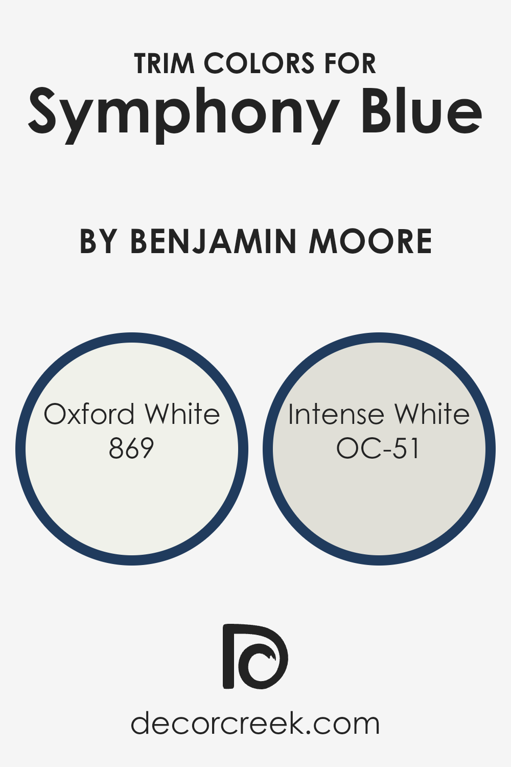
What are the Trim colors of Symphony Blue 2060-10 by Benjamin Moore?
Trim colors are the shades used on the architectural elements of a room or an exterior, such as door frames, window trims, skirtings, and moldings, which highlight these features against the main wall colors.
When it comes to selecting a trim color for Symphony Blue 2060-10 by Benjamin Moore, a well-chosen hue can significantly impact the overall appearance of the space, drawing attention to the architectural details, creating depth, and enhancing the cohesive look of the room.
Opting for the right trim color ensures that the vibrant Symphony Blue stands out, offering a crisp, finished look that elevates the color’s depth and vibrancy.
For Symphony Blue 2060-10 by Benjamin Moore, two excellent trim choices are 869 – Oxford White and OC-51 – Intense White.
Oxford White is a bright, clean white that provides a stark contrast to Symphony Blue, highlighting the boldness of the blue with its pure and unadulterated brightness, making the space feel more open and airy.
Intense White, on the other hand, is a soft white with a slight undertone that adds a subtle warmth to the room. It complements Symphony Blue by softening the transition between the wall color and the trim, offering a more nuanced approach to defining the space.
Together, these trim colors provide options to either sharpen the contrast with Symphony Blue or gently blend the room’s elements for a serene ambiance.
You can see recommended paint colors below:
- 869 Oxford White
- OC-51 Intense White
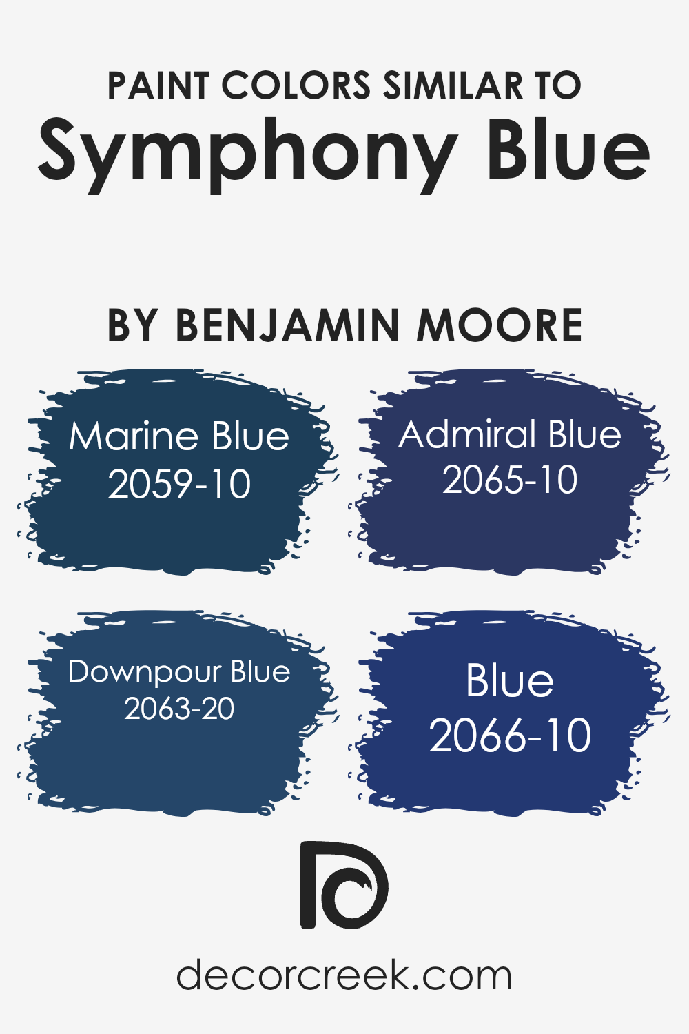
Colors Similar to Symphony Blue 2060-10 by Benjamin Moore
Similar colors play a significant role in design and aesthetics because they create harmony and balance.
When colors closely resemble each other, like the variations of blue inspired by Symphony Blue by Benjamin Moore, they provide a seamless transition from one shade to another, enabling a cohesive look.
This subtle progression of hues can define spaces without the stark contrast that comes from combining opposite colors.
For instance, when dealing with a palette that includes Marine Blue, Downpour Blue, Admiral Blue, and Blue, you’re essentially working within a spectrum that offers both unity and variety.
This allows for a sophisticated approach to design, where the mood and atmosphere of a room can be adjusted with nuanced changes in shade.
Marine Blue is a vibrant hue that brings to mind the deep, open sea, offering a sense of depth and serenity to any space. On the other hand, Downpour Blue has a more dynamic quality, reminiscent of a stormy sky, which can add a touch of drama.
Admiral Blue sits firmly in the spectrum as a strong and steady presence, carrying an air of authority and calmness.
Lastly, simply named Blue, this shade acts as the quintessential example of the color at its most fundamental, offering a pure and uncluttered aesthetic.
Together, these colors provide a versatile palette that works harmoniously, allowing for creative flexibility while maintaining a cohesive visual flow.
You can see recommended paint colors below:
- 2059-10 Marine Blue
- 2063-20 Downpour Blue
- 2065-10 Admiral Blue
- 2066-10 Blue
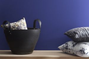
How to Use Symphony Blue 2060-10 by Benjamin Moore In Your Home?
Symphony Blue 2060-10 by Benjamin Moore is a striking paint color that can bring a fresh and vibrant feel to any room in your home.
This shade of blue is both bold and beautiful, perfect for adding a splash of color to your living space. Whether you want to paint an accent wall in your living room, bedroom, or even your kitchen, Symphony Blue can make a big impact.
Using this color, you can easily liven up a dull room by painting all the walls for a cozy, enveloping effect or just one wall to create a focal point.
It pairs wonderfully with neutral colors like white, gray, or beige, allowing furniture and decor to stand out. For those looking to add a bit of drama to their space without being overwhelming, Symphony Blue is an excellent choice.
In addition to walls, consider using Symphony Blue on cabinets, doors, or even ceilings for an unexpected pop of color.
It’s also great for exterior projects, like front doors, to welcome guests with style. With Symphony Blue, the possibilities are endless, allowing personal creativity to shine through.
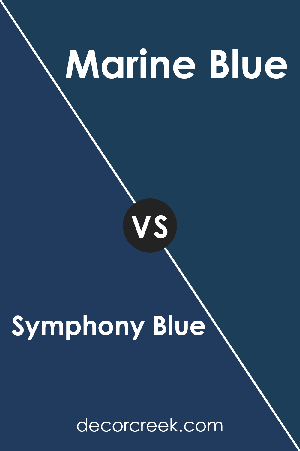
Symphony Blue 2060-10 by Benjamin Moore vs Marine Blue 2059-10 by Benjamin Moore
Symphony Blue and Marine Blue by Benjamin Moore are two striking colors, each with its unique charm. Symphony Blue is a rich, vibrant shade that brings a sense of sophistication and depth to any space.
It has a subtle elegance, making it perfect for creating a statement wall or adding a touch of luxury to a room. On the other hand, Marine Blue is slightly brighter and more energetic.
It’s a color that feels fresh and lively, ideal for spaces that aim to be invigorating and inspiring.
While Symphony Blue leans towards a more refined and classic vibe, Marine Blue offers a burst of freshness, almost like the lively waves of the sea.
Both colors are stunning in their own right, offering different moods and atmospheres to spaces. Whether looking for something more grounded and dignified or something full of vitality and zest, these colors present lovely options.
You can see recommended paint color below:
- 2059-10 Marine Blue
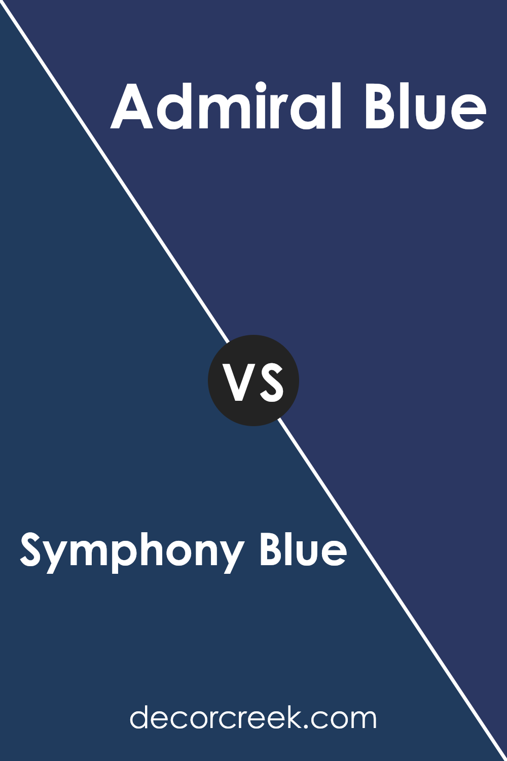
Symphony Blue 2060-10 by Benjamin Moore vs Admiral Blue 2065-10 by Benjamin Moore
Symphony Blue and Admiral Blue by Benjamin Moore are both deep, rich colors, but they have their unique characteristics. Symphony Blue has a vibrant, lively vibe.
It’s like looking into a deep ocean during a sunny day – bright yet profound. It gives spaces a fresh, energetic feel, perfect for adding a splash of color without overwhelming a room.
On the other hand, Admiral Blue is more reserved and serious. It’s the kind of blue you might see as the sky transitions into night – deep, with a hint of mystery.
It’s a strong color, often chosen for spaces that aim for a more formal or sophisticated look.
Both colors bring their special touch to interiors, but the choice between them depends on the mood you want to create.
Symphony Blue brings vibrancy and life, making it great for lively, social spaces. Admiral Blue offers depth and sophistication, ideal for creating a calm, thoughtful atmosphere.
You can see recommended paint color below:
- 2065-10 Admiral Blue
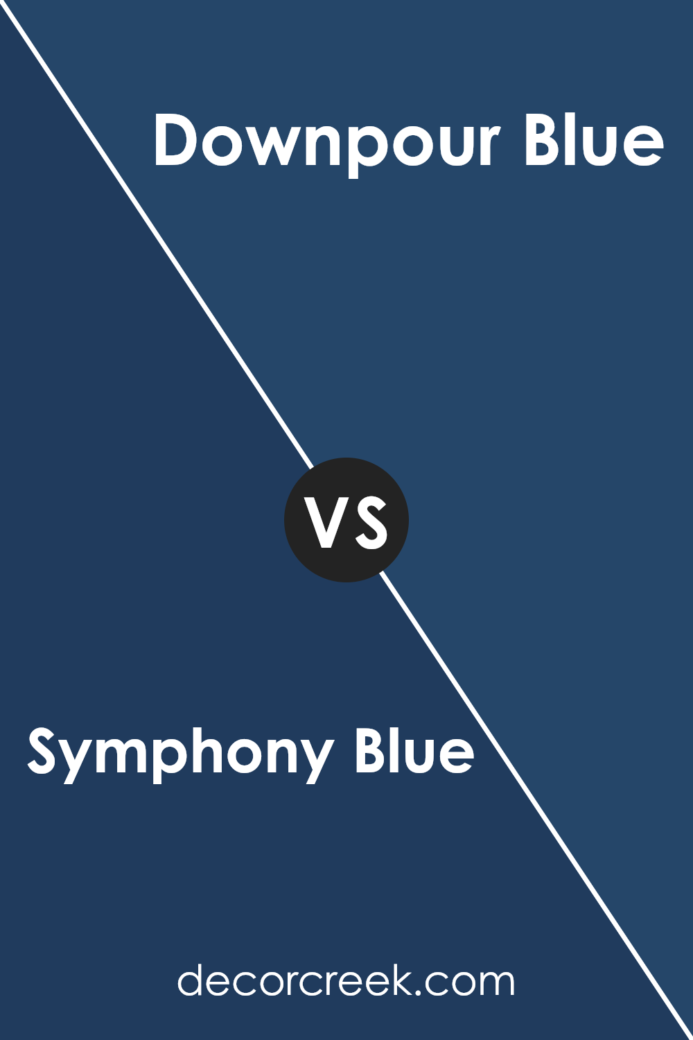
Symphony Blue 2060-10 by Benjamin Moore vs Downpour Blue 2063-20 by Benjamin Moore
Symphony Blue and Downpour Blue, both created by Benjamin Moore, share a natural kinship as they are deep, rich blues, but they distinctly stand out in their own unique shades.
Symphony Blue presents itself as a vibrant, lively blue that seems to carry a bit of brightness, making it pop in any space it adorns.
It’s the kind of color that brings a fresh and energetic vibe to a room, perfect for creating a focal point or adding a punch of color.
On the other hand, Downpour Blue is deeper and more intense. It’s a shade that leans towards the darker end of the spectrum, offering a sense of depth and sophistication.
his color can make a room feel more grounded and enveloped, providing a strong statement with its bold character. Downpour Blue works well in spaces meant to have a calming, yet dramatic effect, adding seriousness and elegance.
In essence, while both Symphony Blue and Downpour Blue are beautiful choices for those looking to incorporate blue into their design scheme, they serve different moods and atmospheres.
Symphony Blue brightens and energizes, whereas Downpour Blue deepens and defines, making them versatile for various styles and preferences.
You can see recommended paint color below:
- 2063-20 Downpour Blue
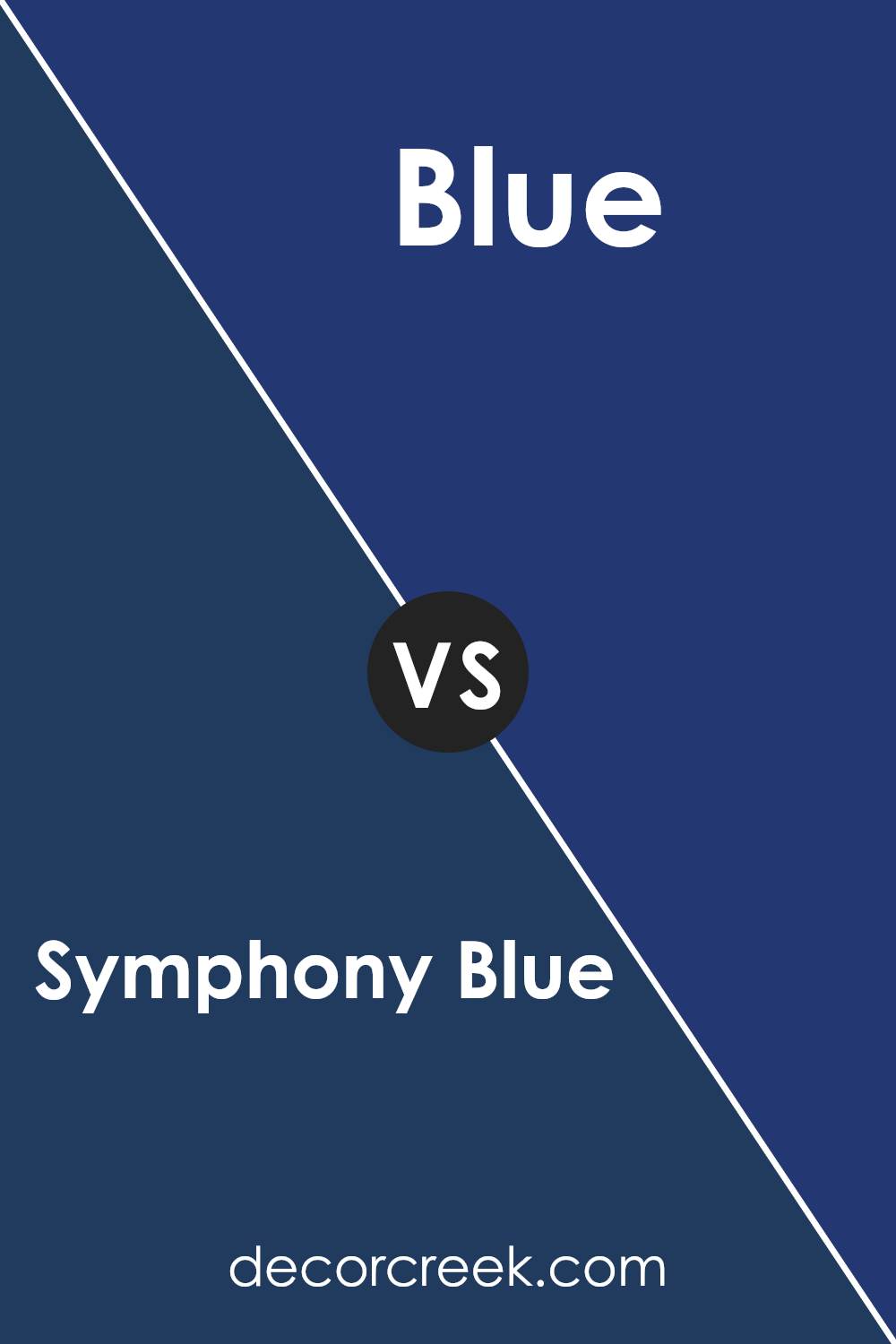
Symphony Blue 2060-10 by Benjamin Moore vs Blue 2066-10 by Benjamin Moore
Symphony Blue 2060-10 and Blue 2066-10 by Benjamin Moore are two striking colors, but they bring their own unique vibes. Symphony Blue has a rich, deep tone that looks luxurious and sophisticated.
It’s the kind of blue that makes a statement, whether on a feature wall or as part of a room’s overall color scheme. It has a balanced mix of depth and brightness, making it versatile for various settings.
On the other hand, Blue 2066-10 is a bold choice. It’s brighter and can really pop in a space, adding a lively and dynamic feel. It’s perfect for bringing a fresh and energetic atmosphere to any room.
While it shares a similarity with Symphony Blue in its base color, the intensity is ramped up, giving it a more eye-catching appeal.
Both colors are fantastic in their own right, with Symphony Blue being more refined and Blue 2066-10 being more vibrant. Depending on what mood or style you’re aiming for, either one could be the perfect fit.
You can see recommended paint color below:
- 2066-10 Blue
Conclusion
Symphony Blue 2060-10 by Benjamin Moore is a beautiful shade that stands out for its versatility and unique appeal. This color finds its strength in its ability to add depth and character to any space, making it a favorite among homeowners and designers alike.
Its rich hue balances perfectly between boldness and tranquility, lending a sophisticated yet approachable feel to interiors.
Whether used as an accent wall or to envelop a room in color, Symphony Blue brings a refreshing energy that can rejuvenate any space.
Applying Symphony Blue in home decor offers a brilliant way to incorporate a sense of elegance and calm. This particular shade works wonderfully with a variety of decor styles, from modern minimalist to cozy traditional, proving its adaptability and timeless charm.
Its ability to pair well with both warm and cool tones means it can easily be integrated into existing color schemes or serve as an inspiration for a new design project.
Symphony Blue, by Benjamin Moore, truly stands out as a versatile color that encourages personal expression and transforms spaces into serene retreats.
Ever wished paint sampling was as easy as sticking a sticker? Guess what? Now it is! Discover Samplize's unique Peel & Stick samples.
Get paint samples