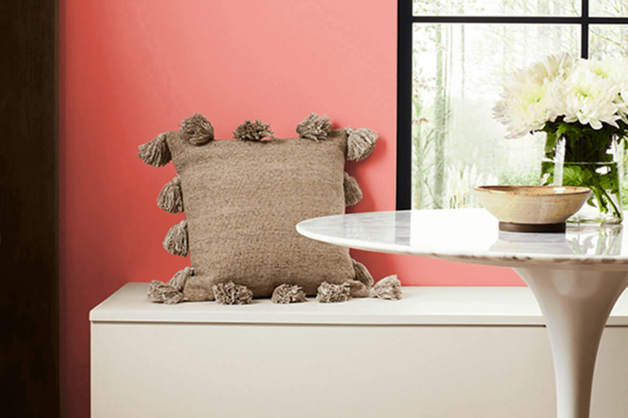
SW 6605 Charisma by Sherwin-Williams is a color that immediately catches attention. When laying eyes on this shade, a warm and welcoming vibe comes through. It has a vibrant coral tone that seems to brighten up any room, bringing a lively energy into the room. The color feels like a friendly invitation to relax and enjoy the surroundings. It can change the mood of a place, making it feel more upbeat and cheerful.
The warmth exuded by Charisma creates an atmosphere that feels cozy and inviting. It’s not overpowering but has enough presence to stand out and make an impression. It’s suitable for areas where you want to feel energized, such as living rooms or creative areas. The hue works beautifully with neutral shades for a balanced look, or it can be paired with other bold colors for a more daring style.
Charisma seems to have the flexibility to work well with various design styles, whether you’re going for a modern, traditional, or eclectic look. It brings a touch of personality without being overpowering.
If you’re considering a new color for your home or office, Charisma might just be the perfect choice to add a splash of warmth and brilliance to your surroundings.
What Color Is Charisma SW 6605 by Sherwin Williams?
Charisma SW 6605 by Sherwin Williams is a soft, warm coral color. It exudes a sense of comfort and warmth, making any room feel inviting. This shade carries a hint of peach, which softens the color and keeps it from feeling too bold or overpowering.
Charisma works well in various interior styles. In a coastal-themed room, it pairs beautifully with soft blues and sandy tones, creating a relaxed and airy atmosphere reminiscent of a beachside retreat. It’s also a great choice for retro or mid-century modern interiors, where it can highlight the playful and vibrant elements typical of those styles.
When it comes to materials and textures, Charisma shines when paired with natural materials like light oak wood or rattan, adding to a breezy, casual feel. It also works nicely with soft furnishings, such as linen or cotton fabrics, which enhance its approachable quality. In a more contemporary setting, metals like brushed brass or matte black can complement its warmth and add contrast.
Overall, Charisma is a flexible color that can bring joy and warmth to any room. Its cozy vibe and adaptable nature make it an excellent choice for anyone wanting to add a touch of color without overpowering the room.
Is Charisma SW 6605 by Sherwin Williams Warm or Cool color?
Charisma (SW 6605) by Sherwin Williams is a warm, pleasant coral shade that can brighten up any room in a home. Its cheerful tone is perfect for creating inviting and lively rooms. When used in living rooms, it brings a cozy and friendly atmosphere, ideal for family gatherings or social occasions. In the kitchen, it can add a sense of warmth and energy, encouraging creativity and conversation.
This color works well with both modern and traditional styles. It pairs beautifully with neutral colors like grays and whites, allowing it to stand out without overpowering the room. Charisma can also complement wood finishes and natural materials, enhancing the overall visual appeal.
In bedrooms, this coral shade can create a comfortable and cheerful environment, making it easier to wake up refreshed. Its versatility means it can be used as an accent wall or throughout the entire room, adding personality and charm to any home.
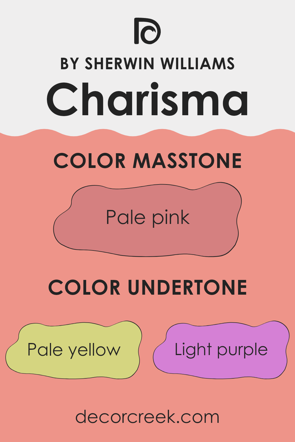
Undertones of Charisma SW 6605 by Sherwin Williams
Charisma SW 6605 by Sherwin-Williams is a paint color with several undertones, including pale yellow, light purple, orange, light gray, pink, and others. These undertones subtly influence how we perceive the color. Undertones can change how a color looks depending on the surrounding light and decor. For example, a paint with yellow undertones might feel warmer and sunnier, while gray undertones might lend a cooler, more subdued vibe.
In the case of Charisma SW 6605, the pale yellow and light purple tones can give the paint a soft, welcoming look. The pink and orange undertones add some warmth and vibrancy, making rooms feel lively without being too intense. Meanwhile, the light gray and mint undertones can provide a touch of calm and balance to the color, allowing it to adapt well to various settings and lighting throughout the day.
When applied to interior walls, these undertones help Charisma SW 6605 create a flexible backdrop. Rooms painted with it can feel cozy yet bright, making areas feel comfortable. The combination of undertones adds depth and interest to the walls, allowing the color to stand out or subtly complement other decor elements. It’s a well-rounded option for living areas, bedrooms, or any room where you want a mix of warmth and subtlety.
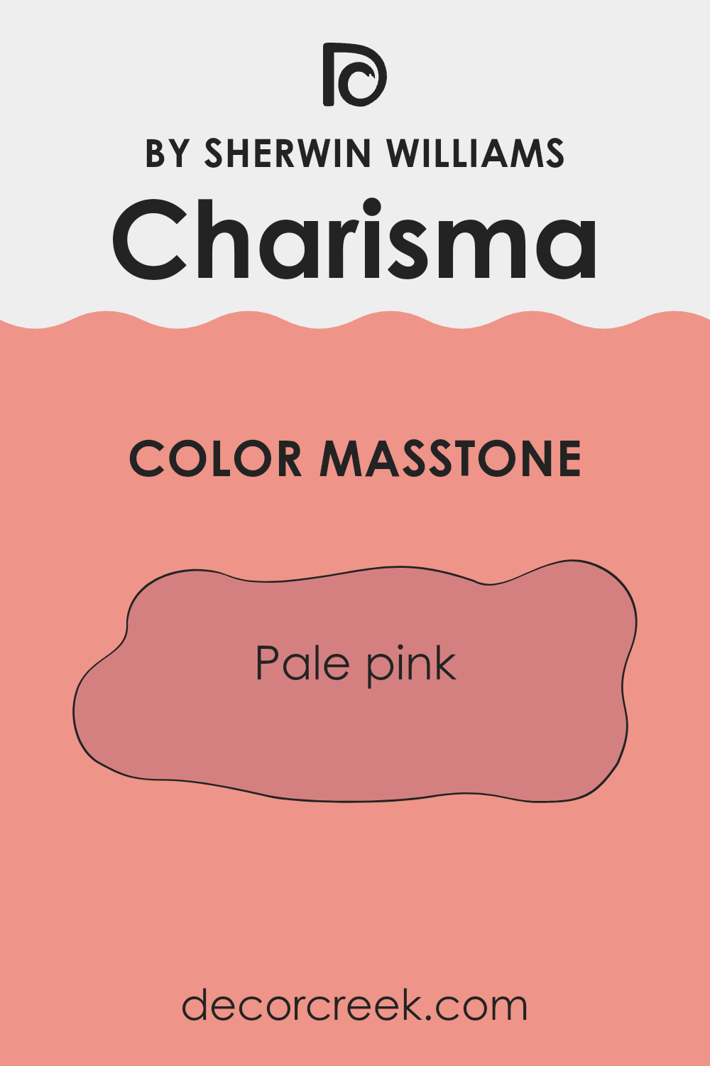
What is the Masstone of the Charisma SW 6605 by Sherwin Williams?
Charisma 6605 by Sherwin Williams is a gentle and inviting pale pink with the masstone of #D58080. This color adds a warm, soft touch to any room. Its subtle hue makes it perfect for creating a cozy and inviting atmosphere in areas like living rooms, bedrooms, or nurseries.
The warmth of this shade can make a room feel more welcoming, helping to brighten up areas that might otherwise seem dull or cold. Pale pinks like Charisma are flexible and can easily be paired with neutral colors such as whites, grays, or beiges, adding a touch of warmth without overpowering the room.
It also works well with other pastels for a harmonious look, or with deeper tones for a bit of contrast. This color is especially useful in smaller rooms where you want to create an open and airy feel. Overall, Charisma brings comfort and elegance into home areas.
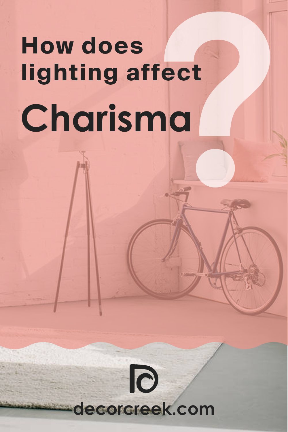
How Does Lighting Affect Charisma SW 6605 by Sherwin Williams?
Lighting plays a big role in how we see colors. Different lighting conditions can make a color look bright and vivid or dull and muted. Sherwin Williams’ color Charisma SW 6605 is no exception. This color is a warm, soft pink that can look different depending on the light.
In natural light, Charisma appears fresh and lively. It has a warm undertone that might feel more pronounced in the sunlight. However, it won’t look the same throughout the day. In the morning, as the sun rises, you may notice more pink tones, while in the late afternoon, the color might seem softer and slightly muted.
When it comes to artificial light, the effect depends on the type of bulb you use. In rooms with incandescent bulbs, which tend to cast a warm glow, Charisma will look warmer and more inviting. Under fluorescent lighting, which is cooler, the pink could seem a bit less vibrant, potentially even taking on a slight grayish tint.
The direction a room faces also affects how Charisma looks. In north-facing rooms, which get less direct sunlight, colors can appear cooler and dimmer. Charisma might look a little more muted in these areas. South-facing rooms, getting consistent, bright light throughout the day, help this color feel warm and welcoming, with the pink tones really coming to life.
East-facing rooms have the best light in the morning, which will make Charisma appear brighter and more cheerful in the early hours. As the day progresses, the color might feel a bit softer. In west-facing rooms, afternoon light is warmest, making Charisma appear rich and vibrant as the day ends.
In summary, Charisma SW 6605 can change a lot with different lighting, but it’s generally a warm and charming color that adjusts beautifully to its surroundings.
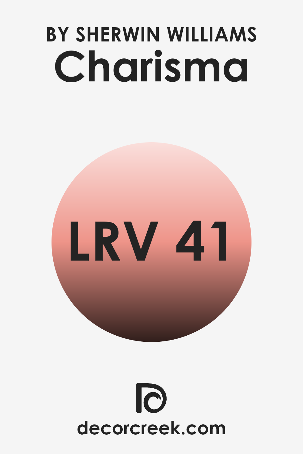
What is the LRV of Charisma SW 6605 by Sherwin Williams?
LRV, which stands for Light Reflectance Value, is a measurement used in the paint and color industry that indicates how much light a color reflects. It’s a scale from 0 to 100, with 0 being absolute black (absorbing all light) and 100 being pure white (reflecting all light). Essentially, LRV helps us understand how bright or dark a color will appear when it is applied to walls.
A higher LRV means the color will reflect more light and make a room feel brighter and more spacious. Conversely, a lower LRV means the color absorbs more light, leading to a cozier and sometimes darker feel in a room.
The color Charisma by Sherwin Williams has an LRV of 41.158, which places it in the medium range. This means it reflects a moderate amount of light. In a room painted with Charisma, you can expect the color to add warmth and depth without making the room feel too dark. It’s not too light or too dark, which makes it flexible for various lighting conditions. In brightly lit rooms, it will hold its own and maintain a rich look, while in dim rooms, it will bring some warmth without appearing too heavy or overpowering.
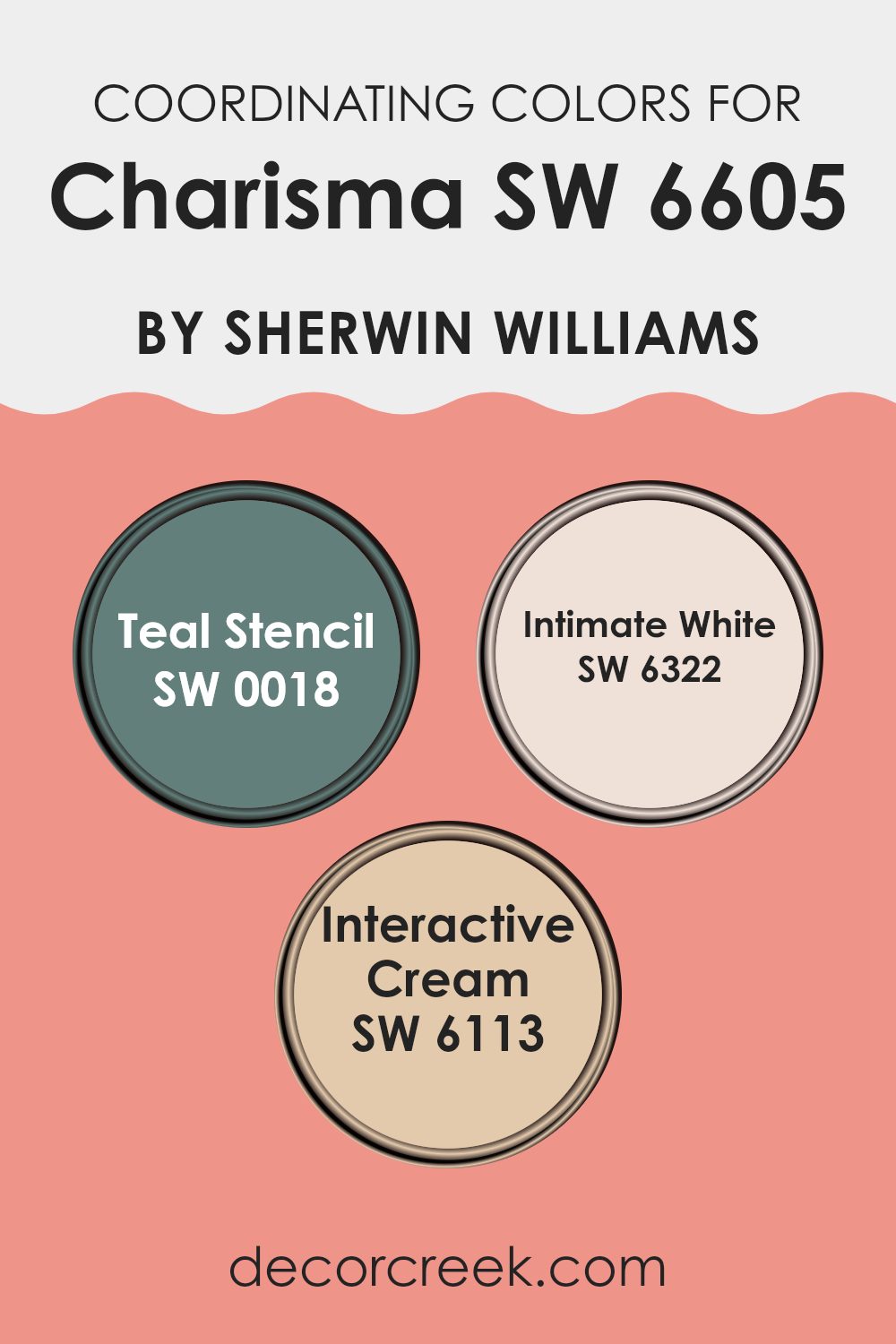
Coordinating Colors of Charisma SW 6605 by Sherwin Williams
Coordinating colors are those that complement or harmonize with a given shade, creating a balanced and visually appealing palette. When you pick a main color, coordinating colors are chosen to enhance and support it, bringing out its best qualities. For the main color, Charisma by Sherwin Williams, there are three great coordinating colors that work well. These supporting colors add interest, depth, and cohesion to any room or design.
Teal Stencil is a rich teal, offering a bold choice with a calm undertone. It complements Charisma by adding a touch of coolness. Intimate White is a gentle, soft pink-toned white that provides a light and airy balance to the vibrant main shade. Its subtle hint of color can brighten up areas without being overpowering.
Interactive Cream is a warm, inviting cream that pairs beautifully with Charisma. It grounds the palette and adds a sense of warmth. Together, these colors create a harmonious mix, where each shade plays its role in ensuring the overall look is pleasing to the eye. Whether used in a living room or a bedroom, these colors can work beautifully together to create a delightful room.
You can see recommended paint colors below:
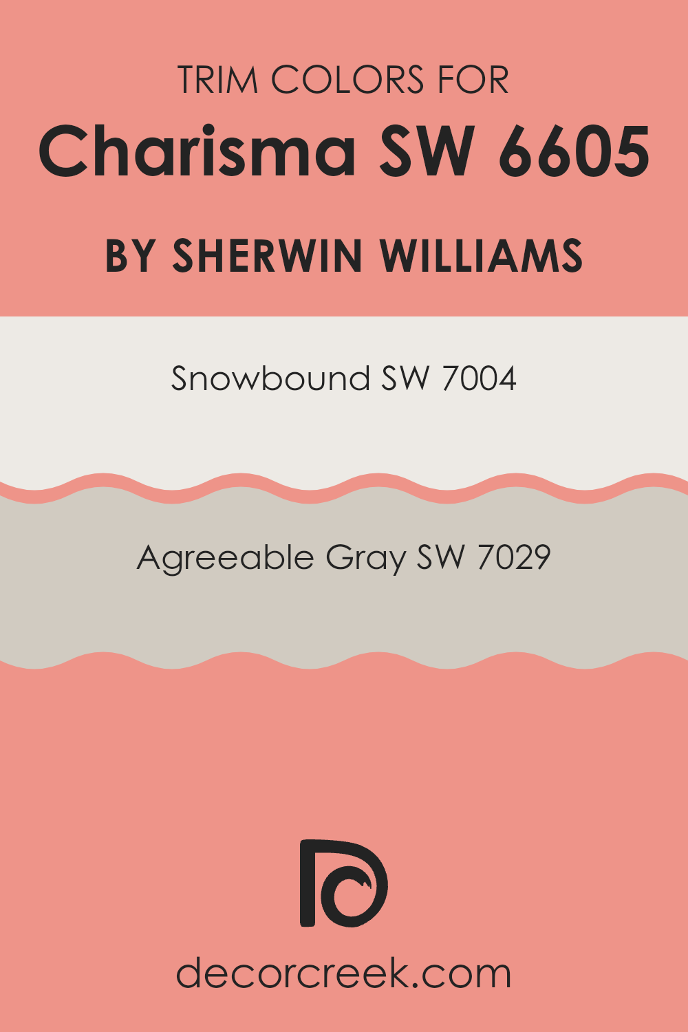
What are the Trim colors of Charisma SW 6605 by Sherwin Williams?
Trim colors are selected to complement or highlight main wall colors in a room, adding contrast and definition to a room. In the case of using Charisma SW 6605 by Sherwin Williams on the walls, choosing the right trim color is crucial in enhancing the overall appearance and ensuring a well-balanced look.
Charisma is a warm, soft shade of pink that exudes a friendly and inviting aura. Pairing it with carefully chosen light trim colors can highlight architectural features and offer a subtle yet effective balance to the main color. Trim colors should not only coordinate with the primary wall color but also with other elements in the room, such as furniture and decor, to create a cohesive aesthetic.
Two excellent trim options for Charisma are SW 7004 Snowbound and SW 7029 Agreeable Gray. Snowbound is a crisp, clean white that offers a fresh and bright appearance, which can highlight and frame Charisma beautifully without overshadowing it. Its neutral quality helps maintain a clean and classic look. Agreeable Gray, on the other hand, is a warm, flexible beige-gray that provides a softer contrast.
It adds a gentle warmth to the trim, complementing Charisma’s pink tones while bringing a grounded, balanced feel to the room. Both colors are flexible choices that enhance Charisma by either highlighting the color contrasts or subtly blending in, supporting the overall design of the room.
You can see recommended paint colors below:
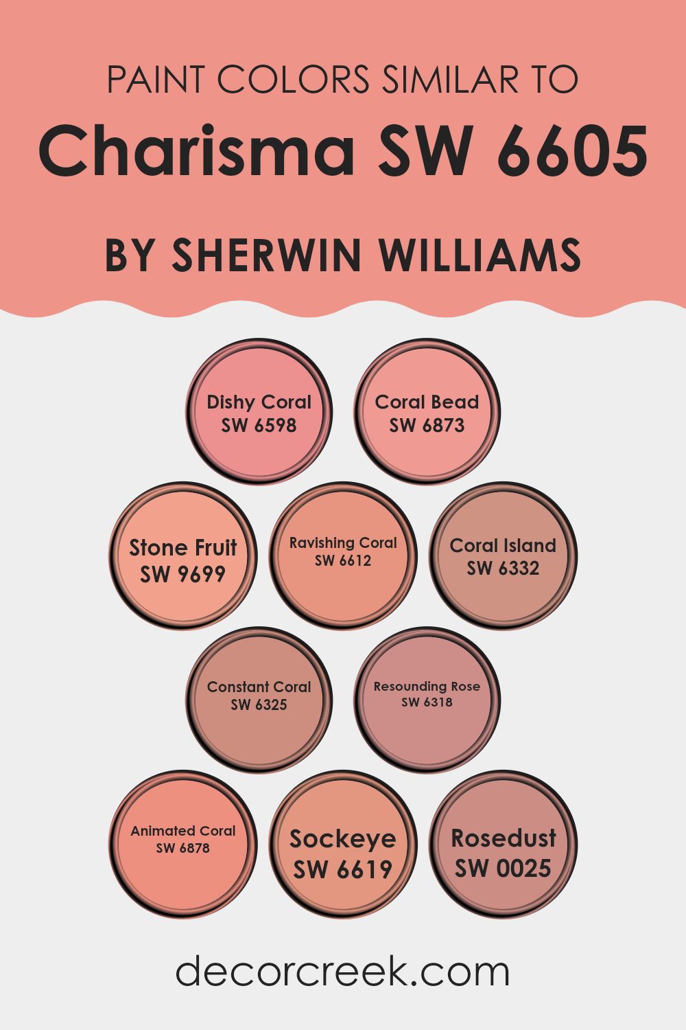
Colors Similar to Charisma SW 6605 by Sherwin Williams
When choosing colors for a room, similar colors create harmony and unity, providing a sense of balance and flow. Similar colors to Sherwin Williams’ Charisma include Dishy Coral, which offers a lively and cheerful vibe, making any room feel welcoming and bright.
Coral Bead is a warmer tone that adds depth and personality, while Stone Fruit combines a subtle pinkish tone with a hint of orange, providing a soft, natural touch. Ravishing Coral stands out with its bold and energetic essence, energizing any room. Each color carries its unique character, but they all work together to create a cohesive and inviting atmosphere.
Coral Island presents a slightly muted shade compared to others, lending a soothing and relaxed feel. Constant Coral blends a robust pink with a tinge of red, giving off a more vibrant energy. Resounding Rose is a deep, rich hue that provides a touch of elegance and warmth.
Animated Coral is a fun and fresh tone that lifts the mood effortlessly. Sockeye gives off a dynamic, lively feel, reminiscent of vibrant sunsets, and Rosedust, with its soft, airy touch, enhances areas with a gentle, comforting warmth. All these colors together offer a range of emotions and moods through variations of coral and pink, perfect for creating a cohesive design.
You can see recommended paint colors below:
- SW 6598 Dishy Coral
- SW 6873 Coral Bead
- SW 9699 Stone Fruit
- SW 6612 Ravishing Coral
- SW 6332 Coral Island
- SW 6325 Constant Coral
- SW 6318 Resounding Rose
- SW 6878 Animated Coral
- SW 6619 Sockeye
- SW 0025 Rosedust
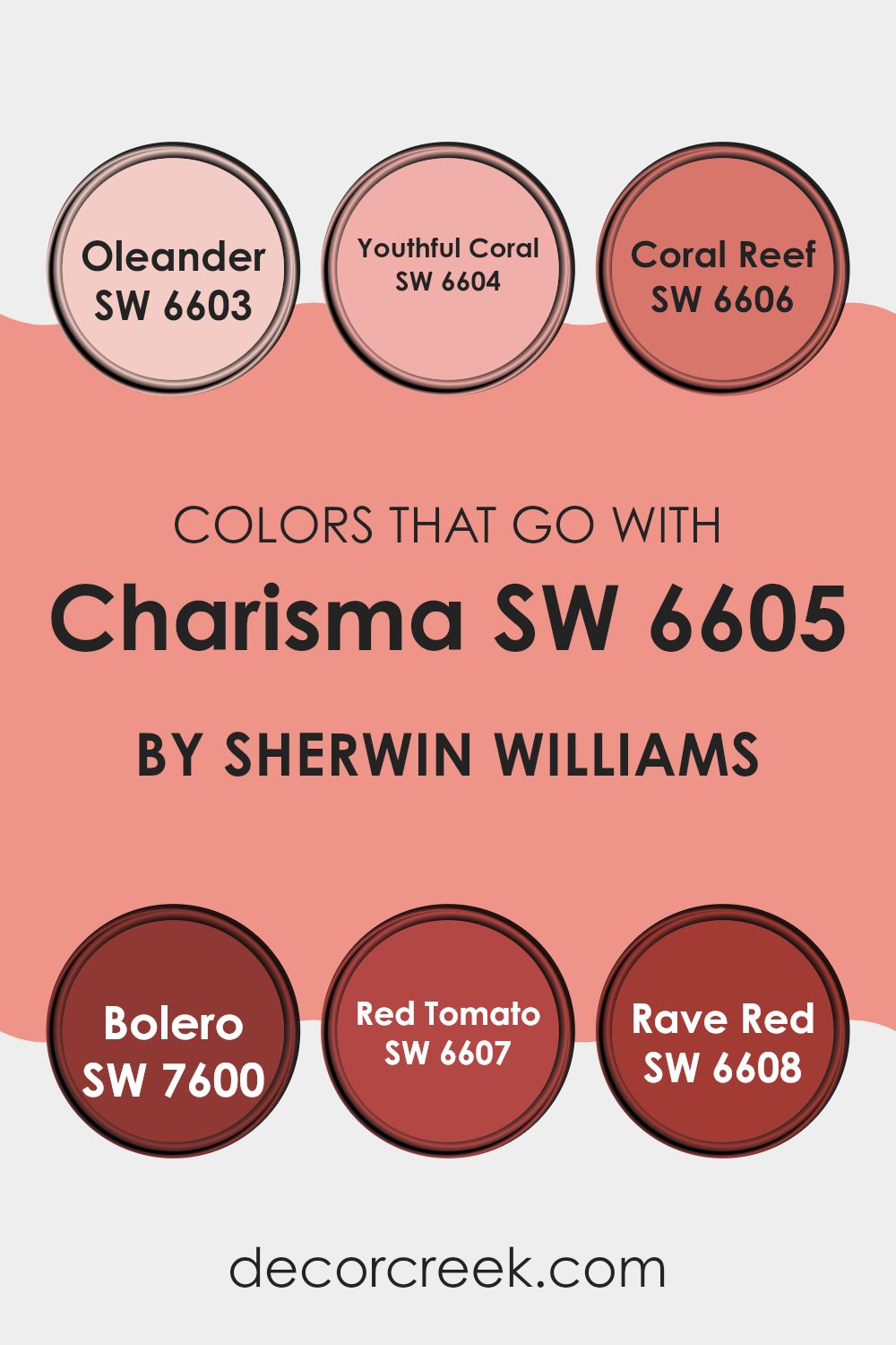
Colors that Go With Charisma SW 6605 by Sherwin Williams
Colors that complement Charisma SW 6605 by Sherwin Williams are important because they add depth and harmony to any room. When paired with Charisma, which is a warm and inviting hue, they create a balanced look that feels both fresh and vibrant. These colors are not only visually appealing but also enhance the mood of a room by providing interesting contrasts or harmonious blends. Finding the right combination is crucial to creating an atmosphere that feels cohesive and inviting, whether you’re designing a cozy family room or a lively dining area.
SW 6603 – Oleander is a soft pink shade that offers a gentle touch, perfect for creating a calming backdrop. SW 6604 – Youthful Coral is brighter and brings energy to a room, adding a touch of cheerfulness. SW 6606 – Coral Reef is rich and bold, making a room lively without being too intense.
SW 7600 – Bolero is a deep, warm red that gives a room a sense of warmth and comfort. SW 6607 – Red Tomato delivers a bright and spirited feel, ideal for making a statement in any room. Finally, SW 6608 – Rave Red is vibrant and exciting, perfect for adding a burst of intensity. Together, these colors work in harmony with Charisma SW 6605 to create a dynamic and welcoming environment.
You can see recommended paint colors below:
- SW 6603 Oleander
- SW 6604 Youthful Coral
- SW 6606 Coral Reef
- SW 7600 Bolero
- SW 6607 Red Tomato
- SW 6608 Rave Red
How to Use Charisma SW 6605 by Sherwin Williams In Your Home?
Charisma SW 6605 by Sherwin Williams is a warm and inviting pinkish-peach hue that can bring a cheerful and cozy feeling to any home. This color works beautifully in living rooms and bedrooms, as it adds a soft, welcoming touch that encourages relaxation and comfort. It pairs well with neutral tones like whites and grays, creating a balanced and harmonious look.
If you’re looking to add a splash of color without overpowering a room, consider painting an accent wall with Charisma. This approach allows the color to stand out and adds depth to the room. For those who enjoy a bit more color, painting an entire small room, like a powder room or a cozy reading nook, can make the room feel inviting and charming.
Mixing Charisma with warm wood tones can also enhance your home’s warmth. Using this color in accessories, such as cushions or curtains, is another great way to bring joy to your area.
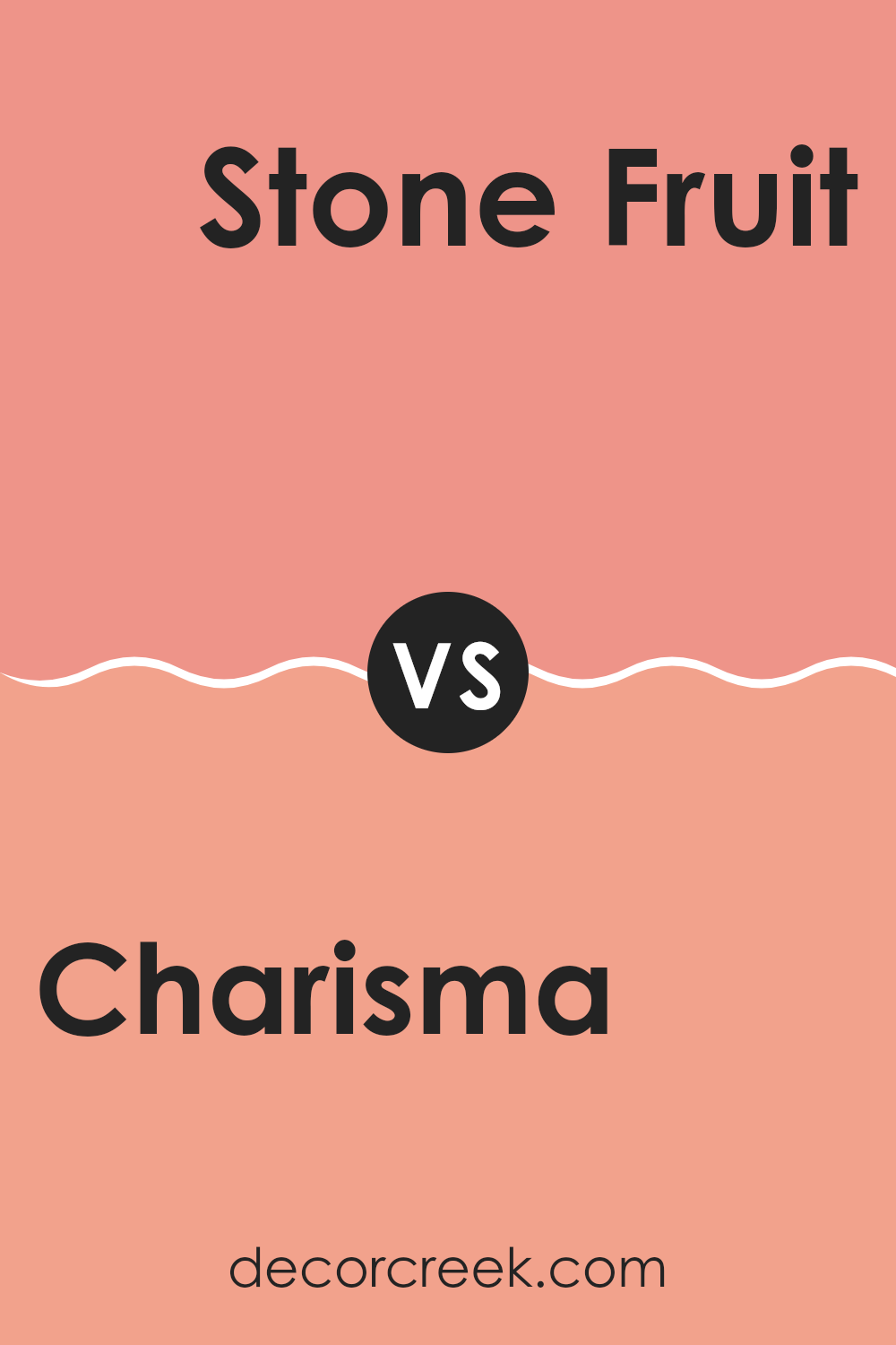
Charisma SW 6605 by Sherwin Williams vs Stone Fruit SW 9699 by Sherwin Williams
Charisma SW 6605 by Sherwin Williams is a vibrant and warm coral hue that often creates an energetic and lively atmosphere. It’s an eye-catching mix of red and pink that can add a bold pop of color to any room. This color works well in areas where you want to stimulate conversation and energy, such as living rooms or dining areas.
On the other hand, Stone Fruit SW 9699 by Sherwin Williams is a deeper, more muted color with earthy undertones. This shade is reminiscent of ripe stone fruits like plums or peaches and offers a warm, comfortable vibe. It’s a flexible color that can work in both modern and traditional settings.
While both colors offer warmth, Charisma is more vibrant and striking, while Stone Fruit has a richer and more grounded feel. Together, they can create a balanced and interesting color palette in a room.
You can see recommended paint color below:
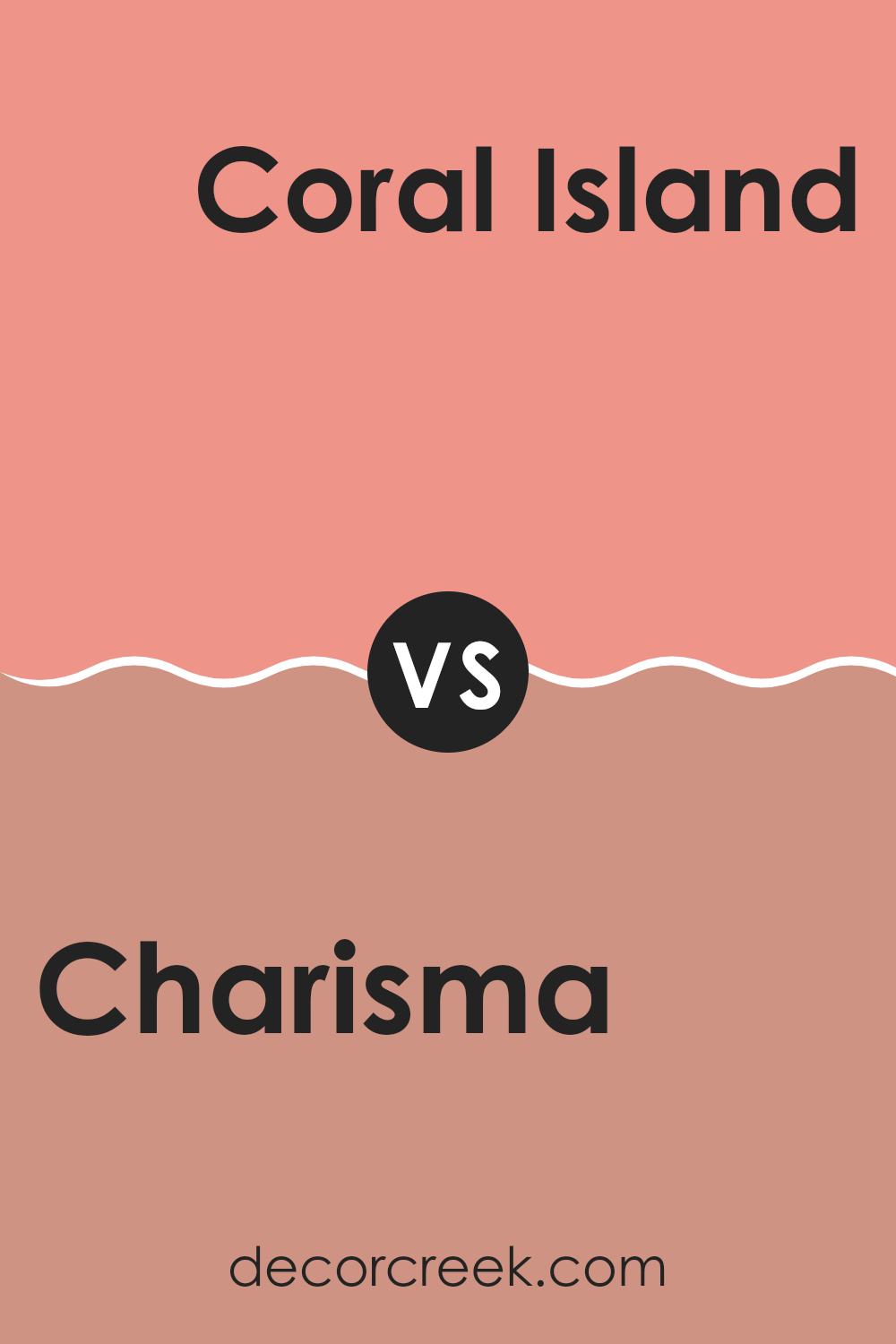
Charisma SW 6605 by Sherwin Williams vs Coral Island SW 6332 by Sherwin Williams
Charisma SW 6605 is a vibrant, warm coral hue with a cheerful and lively character, making it perfect for areas where you want to create an upbeat and energizing atmosphere. It carries a pinkish undertone, giving it a pronounced presence in any room.
On the other hand, Coral Island SW 6332 is a softer, pink-toned coral. It is slightly more muted and calming compared to Charisma. Coral Island is ideal if you’re looking for a cozy and inviting ambiance without overpowering the room.
Both colors bring warmth and a sense of playfulness. However, Charisma stands out more with its bright and bold energy, while Coral Island offers a subtler approach. When choosing between the two, consider the room’s natural light and the mood you want to achieve. Charisma is great for accent walls or lively areas, whereas Coral Island suits bedrooms or areas where a softer touch is desired.
You can see recommended paint color below:
- SW 6332 Coral Island
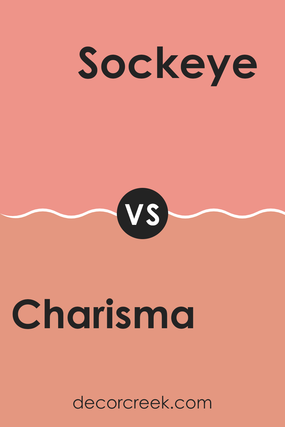
Charisma SW 6605 by Sherwin Williams vs Sockeye SW 6619 by Sherwin Williams
Charisma SW 6605 and Sockeye SW 6619 by Sherwin Williams are both warm and vibrant colors, but they have distinct personalities. Charisma is a lively and energetic coral that infuses areas with a cheerful and welcoming vibe. It’s a flexible color that works well in social areas like living rooms or kitchens, where you want to encourage conversation and activity.
In contrast, Sockeye is a deeper, more fiery red with strong orange undertones. It’s bolder and can create a more intense and dramatic atmosphere, perfect for accent walls or areas where you want to make a statement.
Both colors bring a sense of warmth and vitality, but Charisma offers a softer, more playful feel, while Sockeye delivers a richer, more intense energy. Choosing between them depends on whether you prefer a light-hearted ambiance or a bolder, more impactful look.
You can see recommended paint color below:
- SW 6619 Sockeye
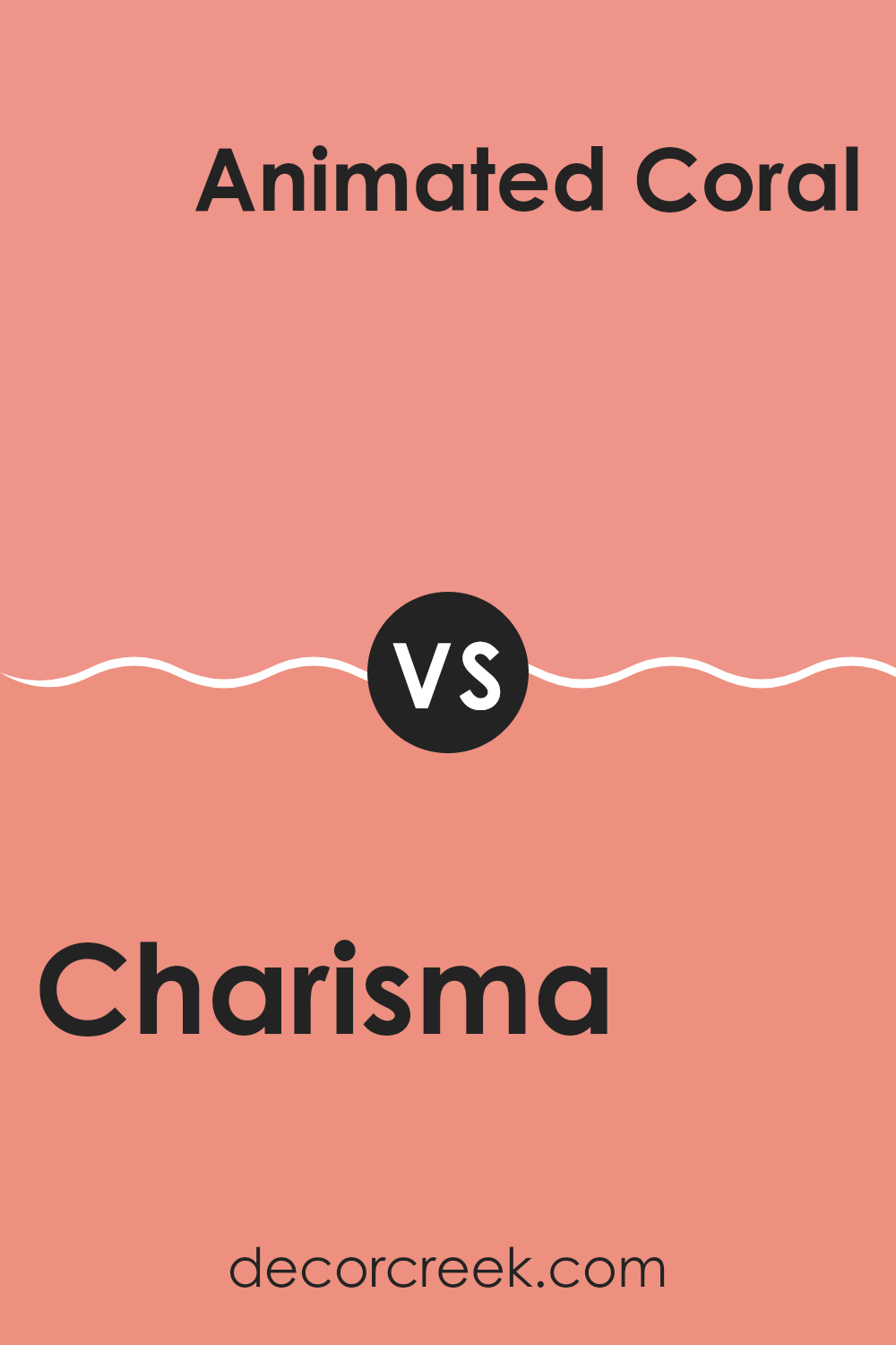
Charisma SW 6605 by Sherwin Williams vs Animated Coral SW 6878 by Sherwin Williams
Charisma SW 6605 and Animated Coral SW 6878 are two vibrant colors by Sherwin Williams. Charisma is a warm, peachy pink that brings a cheerful and inviting feel to any room. It’s a flexible color that can work well in living rooms or bedrooms, giving a cozy and comfortable atmosphere.
On the other hand, Animated Coral is a bolder and more lively hue. It’s a vivid coral pink that can add energy and excitement to a room. This color is perfect for areas where you want to make a statement, like an accent wall or a playful kitchen.
While both colors are pinky and warm, Charisma offers a softer look, whereas Animated Coral is more intense and striking. Choosing between them will depend on the desired mood and energy level you want to achieve in your room.
You can see recommended paint color below:
- SW 6878 Animated Coral
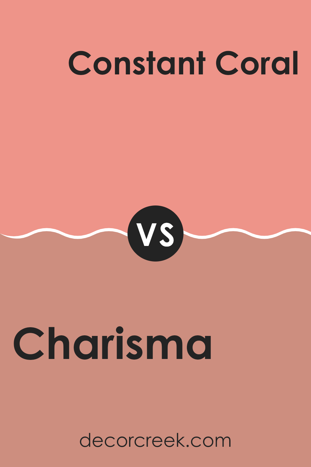
Charisma SW 6605 by Sherwin Williams vs Constant Coral SW 6325 by Sherwin Williams
Charisma SW 6605 and Constant Coral SW 6325, both by Sherwin Williams, are warm, inviting colors that share some similarities but have distinct differences. Charisma is a vibrant and energetic hue, offering a lively blend of coral and pink tones. It’s perfect for creating rooms that feel cheerful and lively.
On the other hand, Constant Coral is slightly softer and more muted, with a calming blend of coral and peach tones. This makes it a flexible choice for areas where a more subtle touch of color is desired.
While both colors exude warmth and positivity, Charisma stands out as the bolder of the two, perfect for feature walls or areas where you want to make a strong statement. Constant Coral is better suited for a more understated yet still colorful backdrop. Together, these colors can complement each other beautifully, providing depth and interest to a room.
You can see recommended paint color below:
- SW 6325 Constant Coral
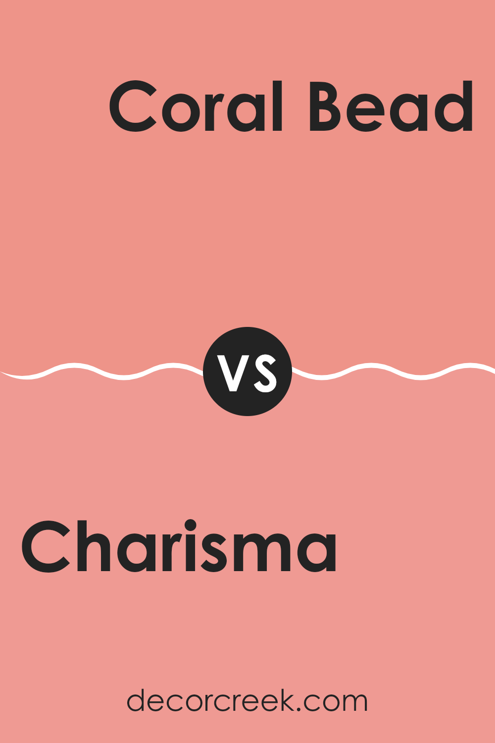
Charisma SW 6605 by Sherwin Williams vs Coral Bead SW 6873 by Sherwin Williams
Charisma SW 6605 and Coral Bead SW 6873 are two lively colors by Sherwin Williams that each bring a unique vibe to a room. Charisma is a warm, peachy hue with subtle undertones that can make a room feel inviting and friendly. It’s perfect for creating rooms with a cozy, cheerful atmosphere without overpowering the senses.
On the other hand, Coral Bead is a more vibrant and vivid shade of coral, with strong pink and red undertones. This color is energetic and bold, making it a great choice for an accent wall or a room where you want to draw attention. It can also bring a feeling of warmth and passion into a room, which makes it ideal for lively areas.
Both colors can work well in different settings, but Charisma is softer and better suited for calming, gentle environments, while Coral Bead delivers a punch of energy and excitement.
You can see recommended paint color below:
- SW 6873 Coral Bead
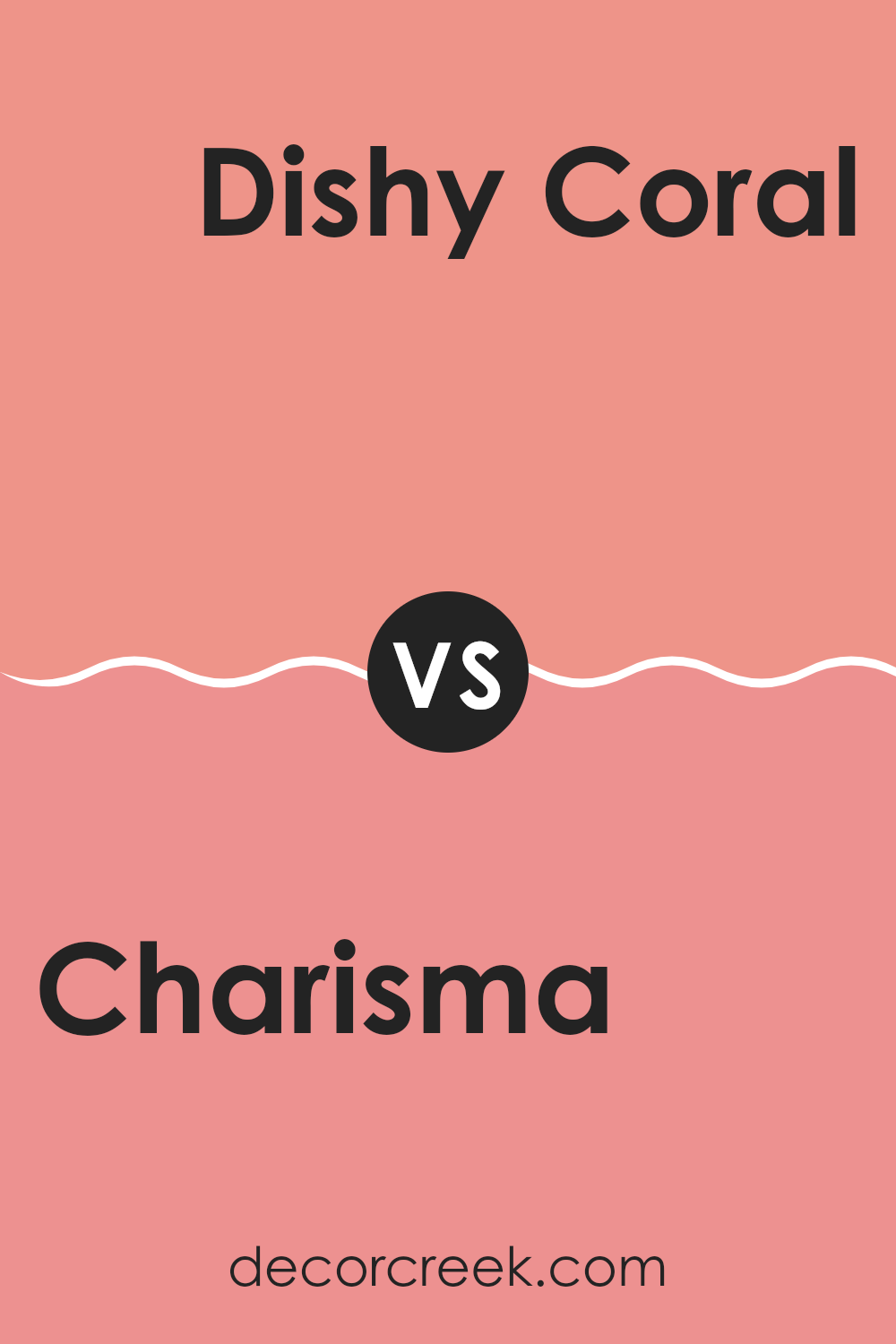
Charisma SW 6605 by Sherwin Williams vs Dishy Coral SW 6598 by Sherwin Williams
Charisma SW 6605 and Dishy Coral SW 6598 by Sherwin Williams are two inviting and warm shades of pinkish-orange. Charisma SW 6605 has a soft, peachy tone with an orange undertone, making it feel cheerful and friendly. It’s a flexible color that can bring warmth to a room without being too intense.
On the other hand, Dishy Coral SW 6598 is more vivid and lively. It includes a stronger pink hue compared to Charisma, which gives it a bolder, more energetic feel. This color can add a burst of personality and is great for creating an accent wall or highlighting a particular area in a room.
While both colors belong to the same family, Charisma SW 6605 is more subdued and can work well for larger areas or those aiming for a cozy atmosphere. Dishy Coral SW 6598, with its stronger pink notes, is perfect for making a statement.
You can see recommended paint color below:
- SW 6598 Dishy Coral
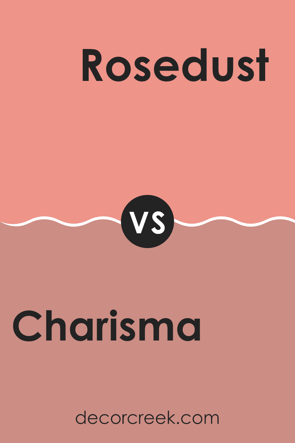
Charisma SW 6605 by Sherwin Williams vs Rosedust SW 0025 by Sherwin Williams
Charisma (SW 6605) and Rosedust (SW 0025) by Sherwin Williams are both warm, inviting colors, but they offer different moods. Charisma is a vibrant coral hue with a lively and energetic feel. It’s bright and makes a bold statement, perfect for adding a cheerful touch to any room. This color can lighten up rooms, making them feel warm and welcoming.
Rosedust, on the other hand, is a more subdued and earthy shade. It’s a dusty rose that feels more muted and soft. This color gives off a cozy and relaxing vibe, ideal for creating a peaceful atmosphere in bedrooms or living areas.
When comparing the two, Charisma is more dynamic and eye-catching, while Rosedust provides a gentle and calming presence. Both colors can beautifully complement natural materials like wood, but Charisma will stand out more, while Rosedust will blend in, creating a harmonious look.
You can see recommended paint color below:
- SW 0025 Rosedust
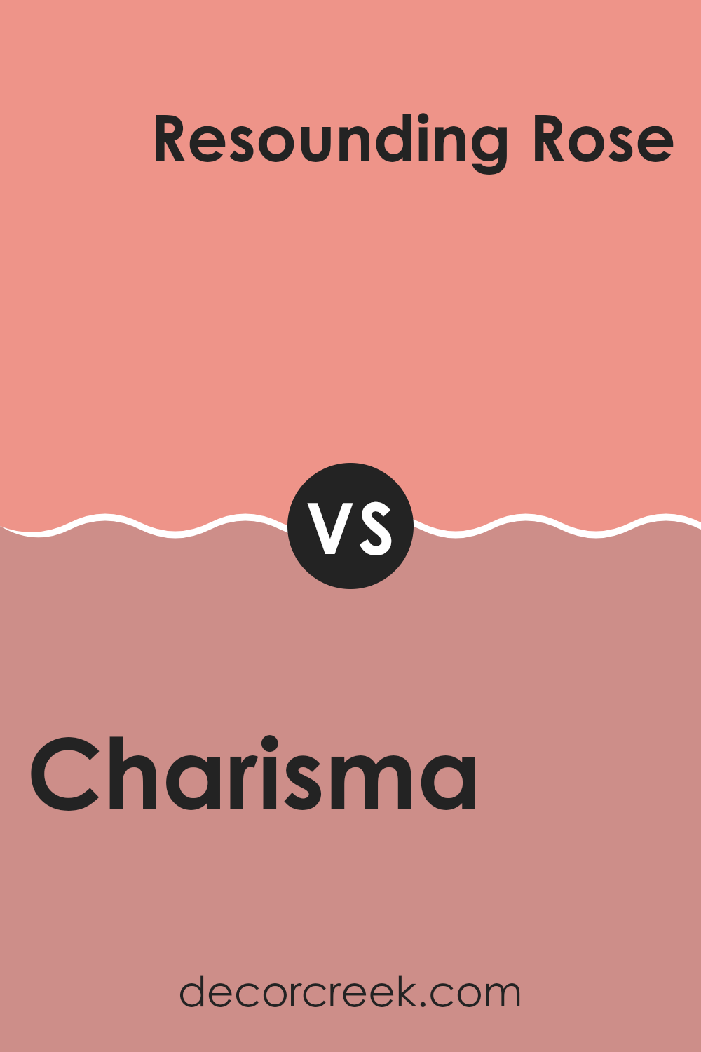
Charisma SW 6605 by Sherwin Williams vs Resounding Rose SW 6318 by Sherwin Williams
Charisma SW 6605 and Resounding Rose SW 6318 by Sherwin Williams are both lively colors, but they have distinct personalities. Charisma is a vibrant coral with a mix of pink and orange tones. It feels cheerful and energetic. This is a great choice for adding warmth and positivity to a room, like a living room or a kitchen, where you want a lively atmosphere.
On the other hand, Resounding Rose is a deeper, more intense pinkish-red. It feels bold and dramatic, making it ideal for areas where you want to make a strong statement. This color can bring a rich and cozy feel to a bedroom or any area where you want to create a sense of intimacy.
Both colors can brighten up a room, but Charisma does so with a lighter, more playful touch, while Resounding Rose offers a deeper, more passionate feeling. Each can add a unique charm depending on the mood you want to create in a room.
You can see recommended paint color below:
- SW 6318 Resounding Rose
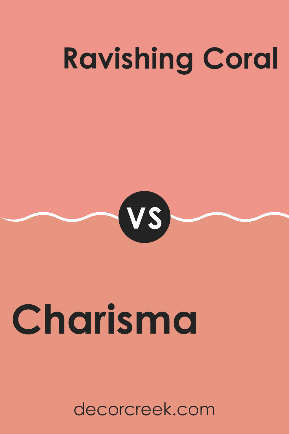
Charisma SW 6605 by Sherwin Williams vs Ravishing Coral SW 6612 by Sherwin Williams
Charisma (SW 6605) and Ravishing Coral (SW 6612) are two vibrant colors by Sherwin Williams. Charisma is a warm, peachy pink color with an inviting and cheerful vibe. It can make areas feel lively and energetic. This color works well in living rooms or bedrooms, creating a playful atmosphere.
Ravishing Coral, on the other hand, is a deeper, more intense shade of coral. It has a richer and more dramatic feel compared to Charisma. This color can add a touch of boldness and warmth to any room. It’s perfect for accent walls or areas where you want to make a strong statement.
Both colors have a warm undertone, but Ravishing Coral is more pronounced and striking. Charisma is softer and more understated. Choosing between them depends on whether you prefer the subtlety of Charisma or the intensity of Ravishing Coral.
You can see recommended paint color below:
- SW 6612 Ravishing Coral
After trying SW 6605 Charisma by Sherwin Williams, I feel excited to share my thoughts with you. This beautiful color, Charisma, is a lively shade of coral that brings warmth and energy wherever it is used. Imagine the joy and vitality you feel when you see a sunrise or the cheerful petals of flowers; that’s the feeling Charisma can add to a room.
Charisma is great because it makes any place feel inviting and full of life. It’s like a happy, warm hug in color form! You can use it in different rooms at home, like the living room, kitchen, or even your bedroom. It lifts the mood and can make you feel more positive.
What I really like about Charisma is how it can work well with other colors. You can pair it with soft grays or creamy whites to make it stand out. Or mix it with other bright colors for a fun, energetic feel. The possibilities are endless, and you can’t go wrong with it.
In the end, SW 6605 Charisma by Sherwin Williams is a wonderful choice for making any room feel exciting and comfortable. It’s a color that makes you smile every time you see it. Whether you paint an entire room or just an accent wall, Charisma adds that special touch of happiness.
Ever wished paint sampling was as easy as sticking a sticker? Guess what? Now it is! Discover Samplize's unique Peel & Stick samples.
Get paint samples

