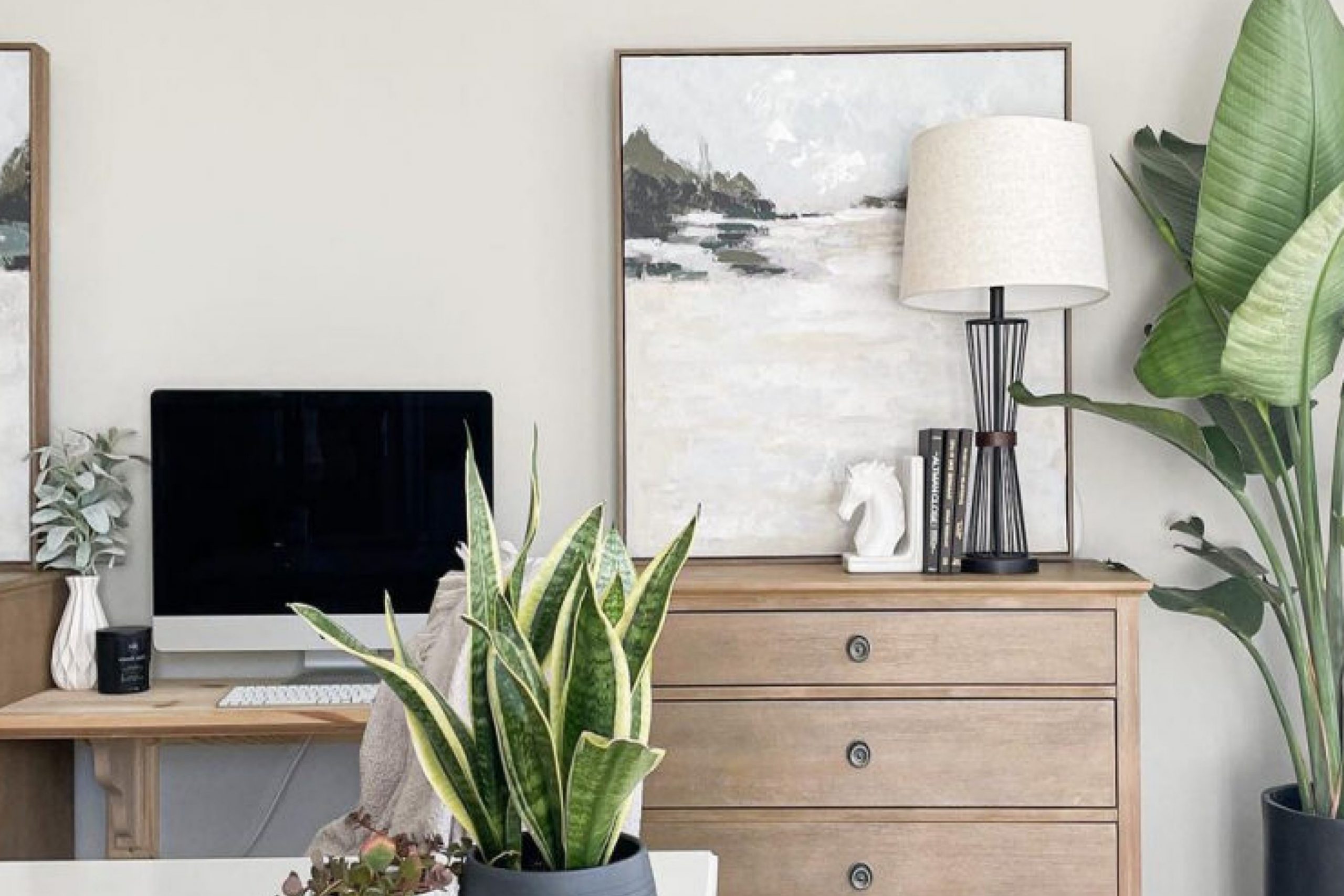
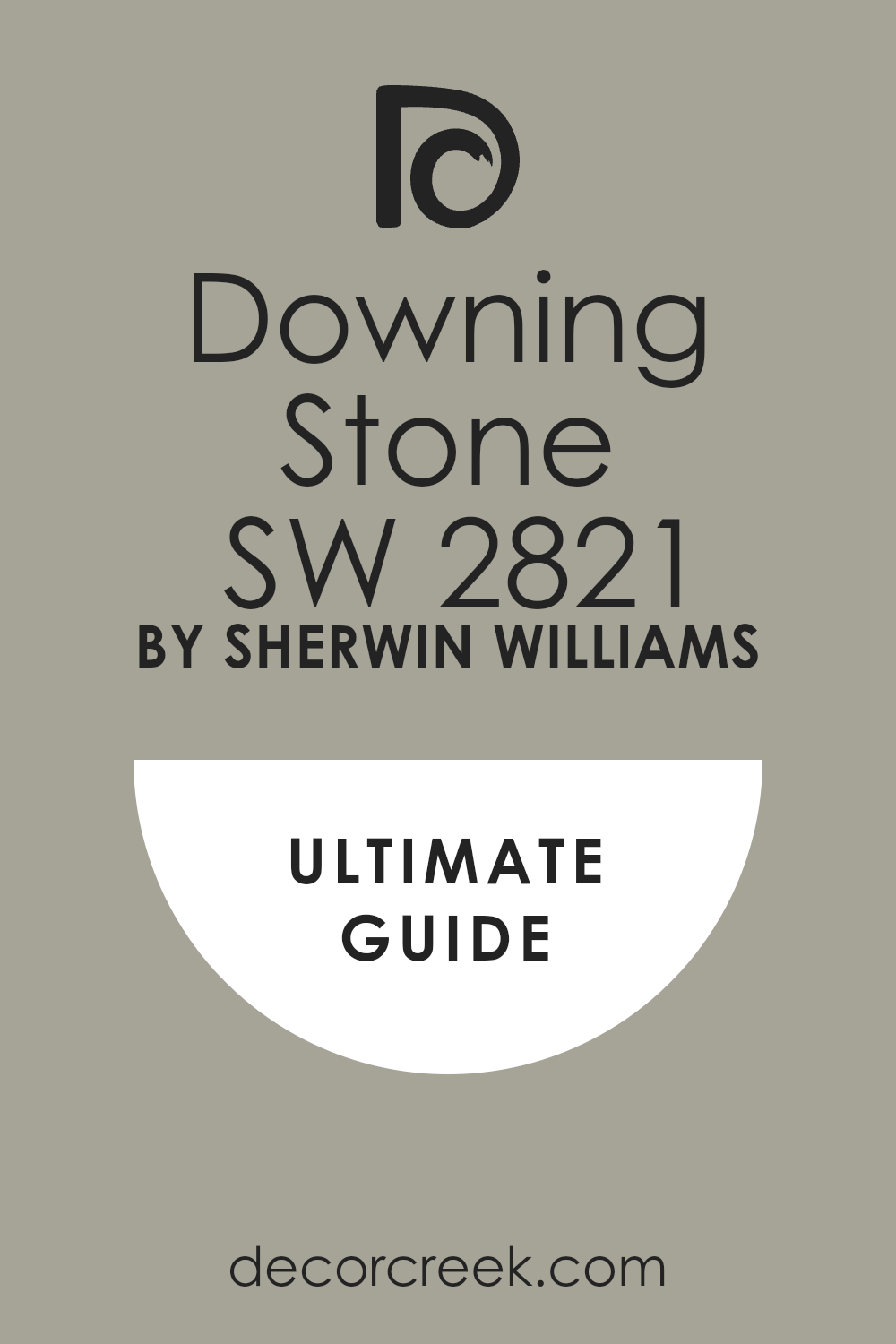
When you’re thinking about refreshing a room or choosing a palette for a new space, SW 2821 Downing Stone by Sherwin Williams is a color you might really like. This shade is part of the broader Sherwin Williams collection, and it stands out for its versatility and understated elegance. Downing Stone is a warm, welcoming hue that can make any room feel cozy and well-coordinated.
I find that this particular color works beautifully in spaces where you spend a lot of time relaxing. It has a soothing presence that’s not too bold, yet it brings a certain richness to walls that can complement both modern and traditional decor.
Whether you’re painting a living room, bedroom, or even a kitchen, Downing Stone can easily tie together different elements and textures in your space.
Personally, I appreciate how this color behaves under different lighting conditions. It can appear slightly more amber in natural light while presenting a more grounded, earthy quality under artificial lighting.
This adaptability makes it a go-to choice for many of my projects where I want long-lasting appeal without resorting to a typical neutral like beige or gray.
If you’re looking for a color that provides warmth and depth without overwhelming a space, SW 2821 Downing Stone could be the perfect pick for your next project.
What Color Is Downing Stone SW 2821 by Sherwin Williams?
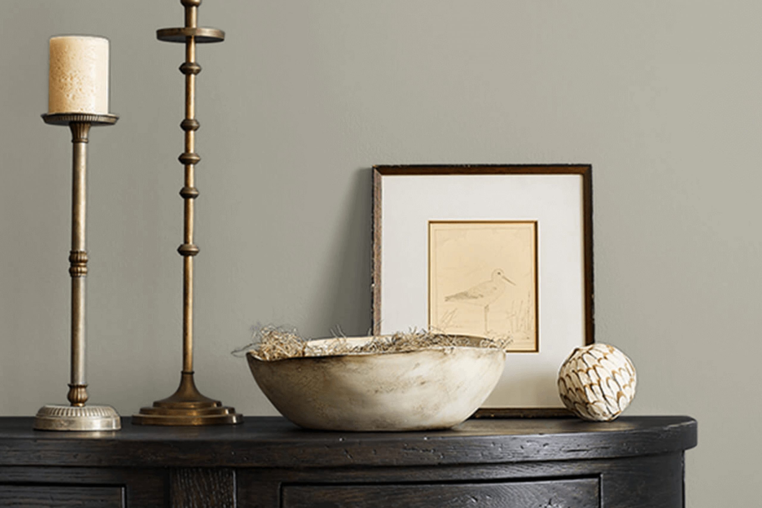
Downing Stone by Sherwin Williams is a warm, earthy neutral that brings a cozy and welcoming feel to any room. This color has a versatile hue that combines hints of brown and gray, making it a perfect backdrop for various interior design styles. It works exceptionally well in modern farmhouse, rustic, and even traditional settings, providing a grounding effect that complements natural materials.
When it comes to pairing materials and textures with Downing Stone, you’ll find it goes well with raw wood, leather, and linen. These materials enhance its earthy qualities and add to the warm atmosphere it creates. Textured walls, such as brick or stone, also align beautifully with this color, offering a charming contrast that stands out in a subtle way.
In spaces like the living room or bedroom, Downing Stone can set a cozy and inviting tone. It pairs well with soft, plush fabrics such as wool or cotton throws and cushions, adding layers of texture that make the space feel more comfortable. When used in a kitchen or dining area, it can be matched with ceramic or terracotta accessories to enhance its warm, inviting qualities.
Overall, Downing Stone is a flexible color that adapts well to various interiors, enriching spaces with its warm and grounding presence. Whether you’re looking for a color that can hold its own or seamlessly blend with other elements, Downing Stone is a reliable choice.
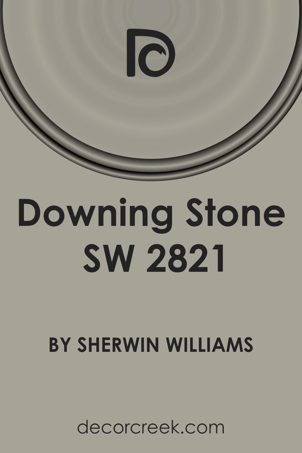
Is Downing Stone SW 2821 by Sherwin Williams Warm or Cool color?
Downing Stone by Sherwin Williams is a warm, earthy paint color that brings a cozy and welcoming vibe to any home. It has a subtle hint of beige and gray, making it an ideal choice for those looking to add a touch of warmth without overpowering the space. This color works well in living rooms, bedrooms, and even kitchens, as it pairs nicely with a variety of textures and materials from wood to metal and fabrics.
Since Downing Stone is quite neutral, it easily matches with other colors. You can pair it with soft pastels for a gentle contrast or with bold shades for a more dynamic look. This flexibility makes it quite easy to work with when decorating.
The color is also great for spaces that don’t get a lot of natural light. Its warm undertones help brighten up rooms that might otherwise feel a bit dull. Applying this color can make small rooms feel larger and more inviting, which is a big plus for anyone looking to improve their home’s interior without making major changes.
Undertones of Downing Stone SW 2821 by Sherwin Williams
Downing Stone by Sherwin Williams is a versatile paint color that can subtly shift its appearance based on its surroundings and lighting. The undertones in a paint color are the subtle hues that can be seen when the color is exposed to different types of light or when it’s placed next to other colors. These undertones can greatly influence how a color looks once it’s on your walls.
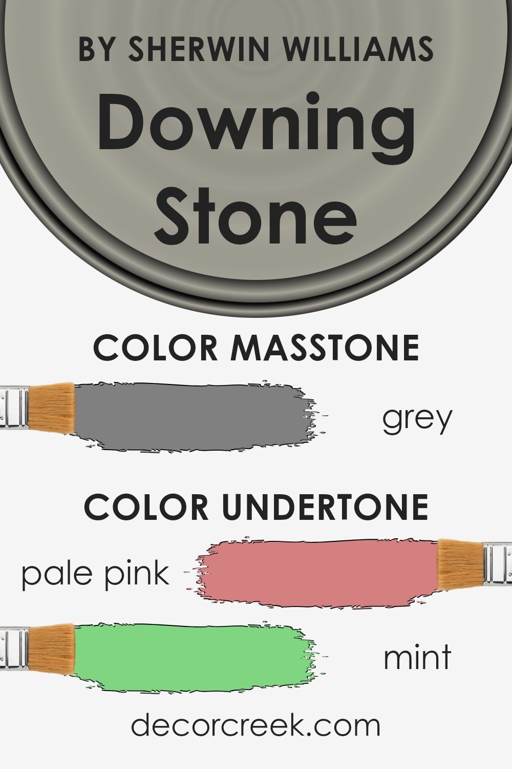
For Downing Stone, the undertones present include a wide spectrum from pale pink to dark blue. This means in certain lighting or next to particular colors, Downing Stone might lean slightly towards these undertones. For instance, under bright, natural light, the pale yellow or light gray undertones might become more prominent, giving the walls a softer, warmer appearance.
Conversely, in dimmer lighting, the darker undertones like olive or navy might be more visible, providing a cooler, more subdued look.
When using Downing Stone on interior walls, the room’s lighting and furnishings play a big role in which undertones stand out. If the room has lots of natural light, the paint might appear lighter and more neutral. In contrast, with less natural light, the deeper, darker undertones might become evident, affecting the overall mood and feel of the room. This ability to adapt makes Downing Stone a practical choice for many spaces, enabling it to fit with various decor styles and preferences.
It’s important to consider these undertones if aiming for a specific atmosphere in a room.
What is the Masstone of the Downing Stone SW 2821 by Sherwin Williams?
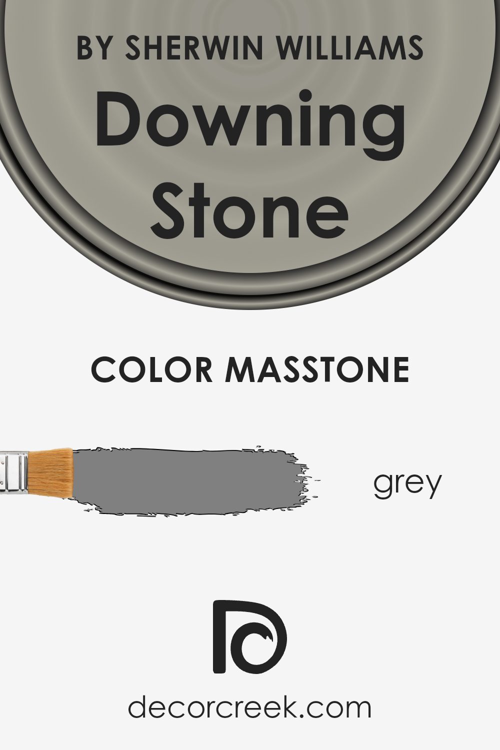
Downing Stone SW 2821 by Sherwin Williams has a masstone that is a true grey, color code #808080. This medium shade of grey provides a neutral base, making it incredibly versatile for use in home interiors. Since it does not lean too cool or too warm, it pairs well with a wide range of other colors, from bold hues to softer pastels, allowing for various decorating styles.
The neutrality of this grey means it can work effectively in any room, whether it’s creating a calm backdrop in a bustling kitchen or offering a balanced tone in a bedroom. Furthermore, its consistency in shade can help in making small spaces appear larger and more open, while also giving larger areas a cohesive look.
This color can also hide imperfections well and is useful in high-traffic areas, maintaining a clean appearance longer.
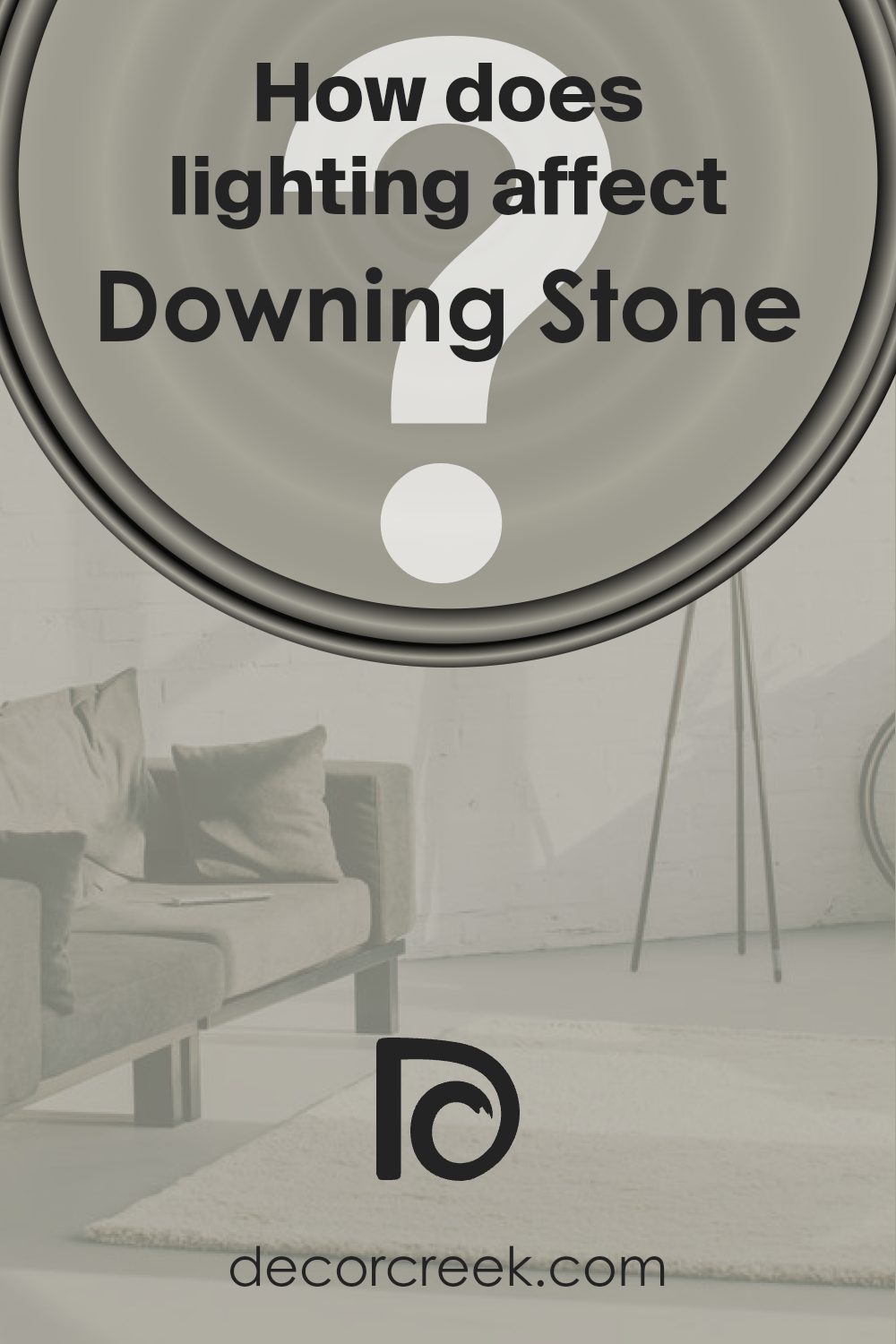
How Does Lighting Affect Downing Stone SW 2821 by Sherwin Williams?
Lighting plays a crucial role in how we perceive colors in different environments. Colors can appear dramatically different under various light sources due to something called color temperature. For instance, natural sunlight has a different impact on colors compared to artificial lights like LEDs or fluorescents.
Take the example of a color like Downing Stone (SW 2821) by Sherwin Williams. This color is a warm, earthy hue that can create various effects in a room depending on the type of light it’s exposed to.
Effects Under Various Lighting Conditions:
Natural Light: Under the bright, clear light of the sun, Downing Stone appears true to its form. It maintains a warm, inviting effect and gives the room an airy feel. In a room with ample sunlight, such as one facing south, the color appears lighter and more vivid, enhancing the room’s overall warmth.
Artificial Light: Under artificial lighting, the influence on Downing Stone depends on the type of bulbs used. Warm lights, like incandescent bulbs, enhance its earthy tones, making it feel cozier and richer. Cool lights, like some LEDs, might make it look slightly muted, pulling out more grey undertones in the color.
Room Orientation and Color Impact:
North-Faced Rooms: These rooms receive less direct sunlight, emphasizing the cooler tones in the paint. Here, Downing Stone might look slightly more subdued and will benefit from warm artificial lights to counteract the lack of natural warmth.
South-Faced Rooms: With more exposure to direct sunlight, Downing Stone shines brightly, amplifying its warmer, richer tones, which creates a welcoming and warm environment.
East-Faced Rooms: In these rooms, the color will change throughout the day. Morning light can make Downing Stone look very vibrant and warm, and as the light fades, the color will become more neutral and subdued towards the evening.
West-Faced Rooms: Similar to east-facing rooms but reversed, the color will start off neutral or muted in the morning and become warmer and more vibrant toward the late afternoon and evening as the sun sets.
In summary, the perception of colors like Downing Stone can shift substantially based on the lighting. Adjusting your lighting can help you control and enhance how these colors present themselves in your space.
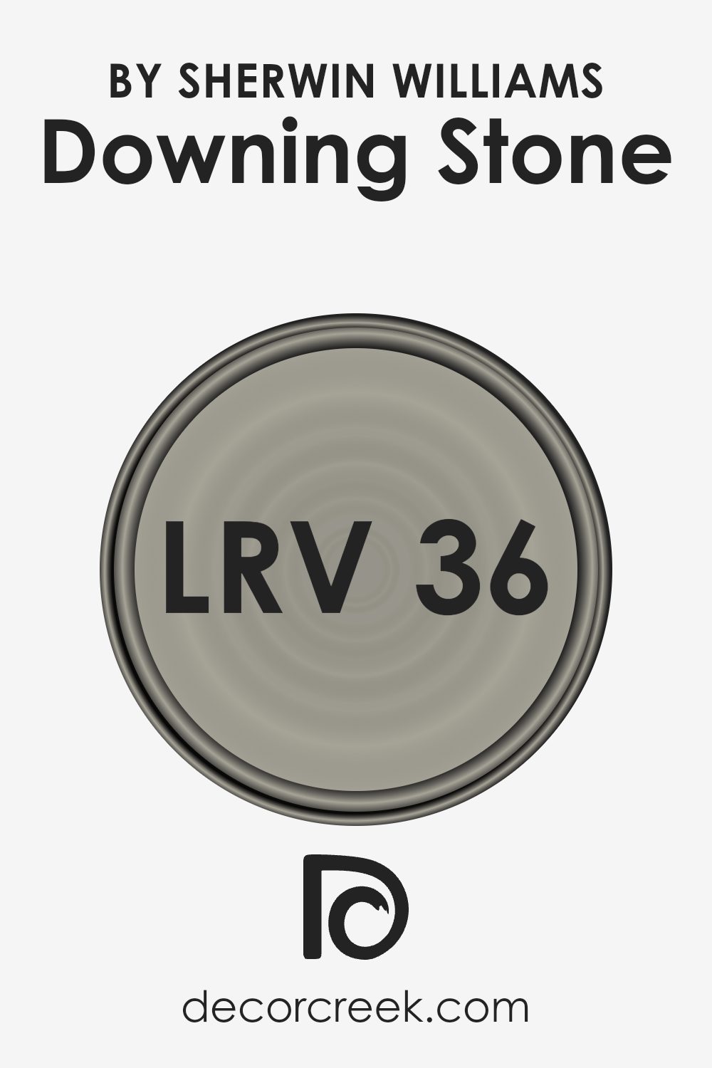
What is the LRV of Downing Stone SW 2821 by Sherwin Williams?
LRV stands for Light Reflectance Value, which is a measure used to express how much light a paint color reflects back into a room as opposed to absorbing it. This value is expressed on a scale where higher numbers mean the paint reflects more light, making the space appear brighter.
Conversely, lower numbers mean less light is reflected, which can make a room feel darker. The LRV helps in selecting the right paint shade depending on how light or dark you want your space to appear. It is particularly useful for small rooms or areas with little natural light.
With an LRV of 36.354, Downing Stone has a medium light reflectance, meaning it doesn’t reflect a lot of light but also isn’t among the darkest. This makes it a versatile option for various spaces, both small and large. In a room with ample natural light, this color can add warmth without making the space feel enclosed, while in a dimly lit room, it could create a cozier and more intimate ambiance.
The specific shade, while not too dark, is enough to add depth and character to any room, making spaces feel more defined and stylish.
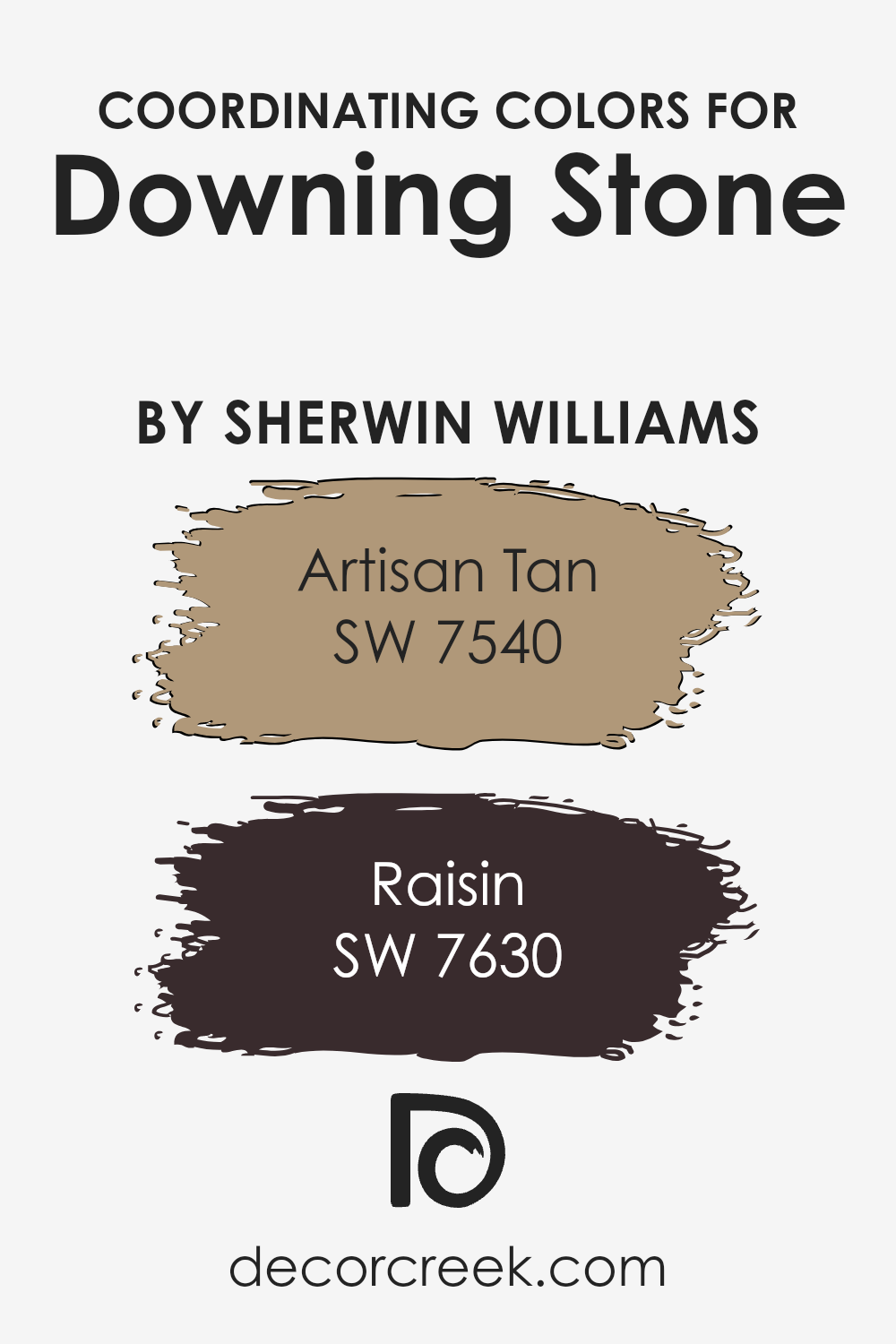
Coordinating Colors of Downing Stone SW 2821 by Sherwin Williams
Coordinating colors are color shades that complement or pair well with each other to create a harmonious look in any space. When choosing coordinating colors, it’s important to consider how these colors interact and balance one another, amplifying the overall aesthetic appeal without overwhelming the senses.
For example, when paired with a versatile neutral like beige or a light brown, which can serve as a base, the accent colors should bring depth and warmth to the palette.
Take SW 7540 – Artisan Tan, for instance; this is a warm shade that evokes a sense of coziness and comfort, adding a subtle, natural depth when used in decor. It works well to provide a warm backdrop to spaces, allowing for an inviting atmosphere. Another coordinating color, SW 7630 – Raisin, is significantly darker and richer, giving off a deep, earthy vibe. This color can brilliantly draw in attention when used for accent walls or furniture, adding a distinguished look without overwhelming the lighter tones in the room.
These types of coordinating colors are great choices for balancing out neutral bases while adding personal touches to your spaces.
You can see recommended paint colors below:
- SW 7540 Artisan Tan (CHECK A SAMPLE)
- SW 7630 Raisin (CHECK A SAMPLE)
What are the Trim colors of Downing Stone SW 2821 by Sherwin Williams?
Trim colors are an essential aspect of painting, used to enhance the aesthetic appeal and highlight architectural features of a room. When it comes to Downing Stone by Sherwin Williams, selecting the right trim colors can greatly complement this rich and earthy shade.
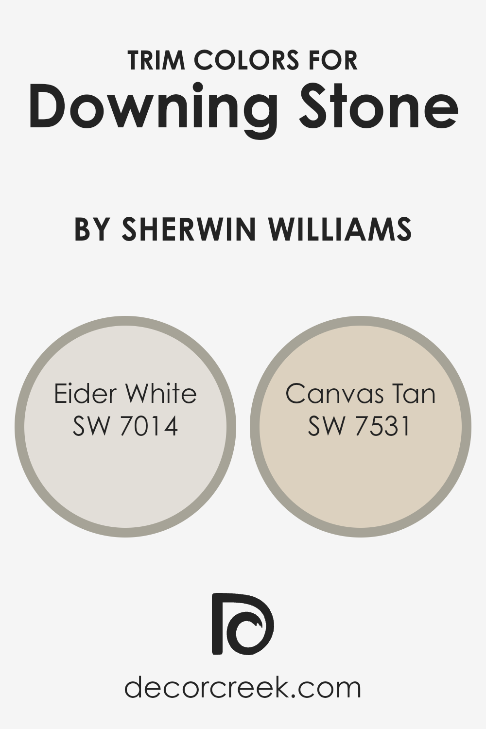
Using contrasting trim colors, such as SW 7014 – Eider White and SW 7531 – Canvas Tan, adds visual interest and helps define the lines between walls and other elements like doorways, ceilings, and baseboards, making them more noticeable and appealing.
Eider White by Sherwin Williams is a soft, muted gray with a hint of warmth which acts as a subtle contrast against darker hues, giving a clean and fresh look while still keeping the atmosphere relaxed and inviting. On the other hand, Canvas Tan is a light, warm beige that provides a gentle, understated contrast to richer wall colors, offering a timeless and cozy feel that works well in many spaces without overpowering the primary color theme. Both colors work beautifully with Downing Stone, ensuring that the space feels cohesive yet distinct, enhancing both the functionality and charm of the room.
You can see recommended paint colors below:
Colors Similar to Downing Stone SW 2821 by Sherwin Williams
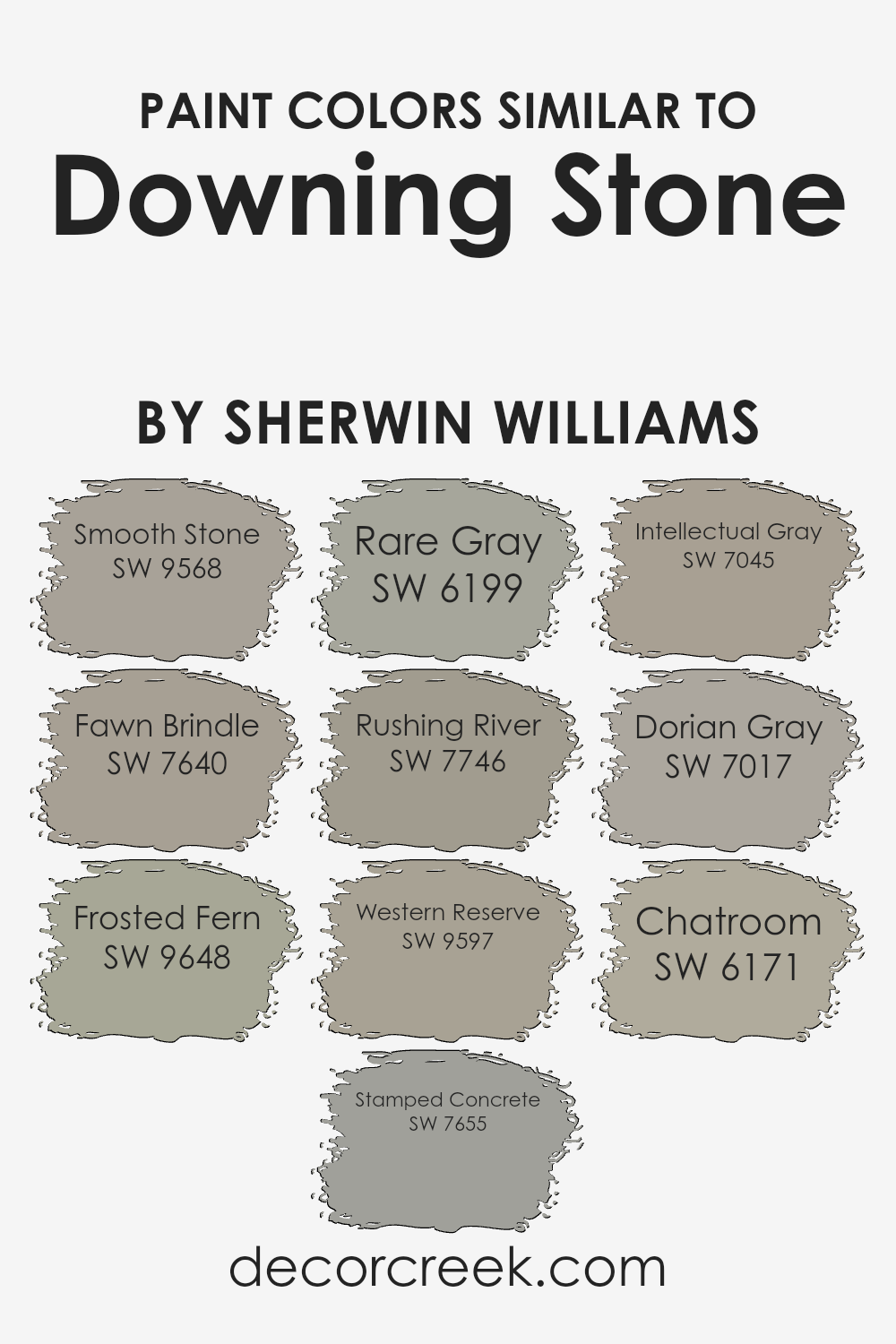
Similar colors are crucial in design because they create a cohesive and harmonious aesthetic, gently transitioning from one shade to another to provide depth and continuity in spaces. By using shades like Downing Stone and its related colors, you can ensure that the environment feels unified and visually pleasing.
These similar colors have subtle differences that allow for layering and accentuating different features of a room without overwhelming it with contrast.
Smooth Stone is a light gray that offers a subtly fresh canvas, allowing other elements in a space to stand out. It’s like starting with a blank slate, but warmer. Fawn Brindle steps up with a deeper hue, bringing a gentle warmth to its surroundings, reminiscent of soft earth.
Frosted Fern adds a whisper of green, reminiscent of a dusting of lichen on a rock, providing a natural touch to the palette. Stamped Concrete has a mid-tone gray that echoes the textures often seen in urban environments, versatile and understated.
Rare Gray tilts towards a fuller, richer feel, giving depth where needed. Rushing River, as the name suggests, flows with a cooler undertone, like water in shade, perfect for a calm, collected feel. Western Reserve offers a bolder, more pronounced presence, holding a hint of robustness for a striking but grounded effect.
Intellectual Gray supports spaces with its intellectual, almost academic gray that works well in study areas or offices. Dorian Gray is a deeper, moodier gray, excellent for creating focus and drama without darkness.
Lastly, Chatroom is a unique blend, pulling in whispers of taupe for a complex, contemporary look that works beautifully in modern settings. Each of these colors complements Downing Stone by picking up on its tones and textures, allowing for a fluid and adaptive design scheme.
You can see recommended paint colors below:
- SW 9568 Smooth Stone (CHECK A SAMPLE)
- SW 7640 Fawn Brindle (CHECK A SAMPLE)
- SW 9648 Frosted Fern (CHECK A SAMPLE)
- SW 7655 Stamped Concrete (CHECK A SAMPLE)
- SW 6199 Rare Gray (CHECK A SAMPLE)
- SW 7746 Rushing River (CHECK A SAMPLE)
- SW 9597 Western Reserve (CHECK A SAMPLE)
- SW 7045 Intellectual Gray (CHECK A SAMPLE)
- SW 7017 Dorian Gray (CHECK A SAMPLE)
- SW 6171 Chatroom (CHECK A SAMPLE)
How to Use Downing Stone SW 2821 by Sherwin Williams In Your Home?
Downing Stone SW 2821 by Sherwin Williams is a versatile paint color that can be a great addition to any home. This shade is a warm, neutral gray-brown that offers a soothing feel without being too bold. It’s perfect for those looking to add a subtle touch of color to their rooms.
You can use it in various spaces within your house. For example, it works well in living rooms on walls as it creates a cozy, inviting atmosphere. In bedrooms, Downing Stone can provide a calm backdrop, making the space feel comfortable and grounded.
This color pairs nicely with both modern and traditional decor, so it can fit many styles. It also complements a wide range of furniture colors, from whites and creams to darker shades like navy or black. For those looking to give their bathroom or kitchen a fresh look, this color can also be used on cabinets or as an accent wall to add depth without overwhelming the space.
Downing Stone SW 2821 by Sherwin Williams vs Frosted Fern SW 9648 by Sherwin Williams
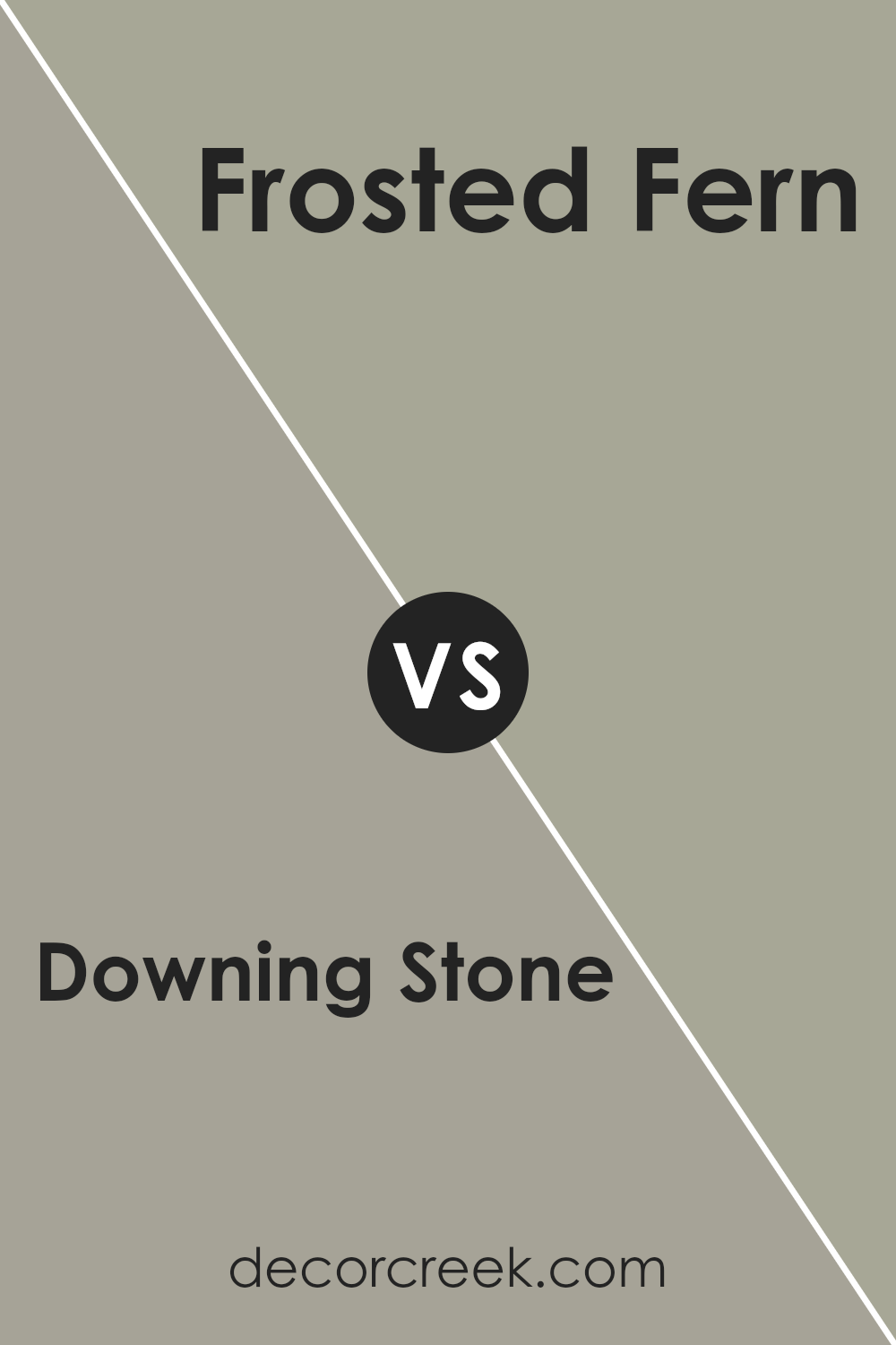
Downing Stone and Frosted Fern are two distinct colors by Sherwin Williams that can create different moods in a space. Downing Stone is a deep, warm greige (a mix of gray and beige) that offers a cozy and welcoming feel. It’s perfect for areas where you want a neutral color with some depth to anchor the space.
In contrast, Frosted Fern is a light and fresh green, giving off a calm and refreshing vibe that can brighten up any room. This color is ideal for creating a light, airy feel and works well in smaller spaces or places that need a touch of nature-inspired freshness.
While Downing Stone provides a strong and grounded look, Frosted Fern offers a breezy and revitalizing touch, making them suitable for different purposes in home décor.
You can see recommended paint color below:
- SW 9648 Frosted Fern (CHECK A SAMPLE)
Downing Stone SW 2821 by Sherwin Williams vs Dorian Gray SW 7017 by Sherwin Williams
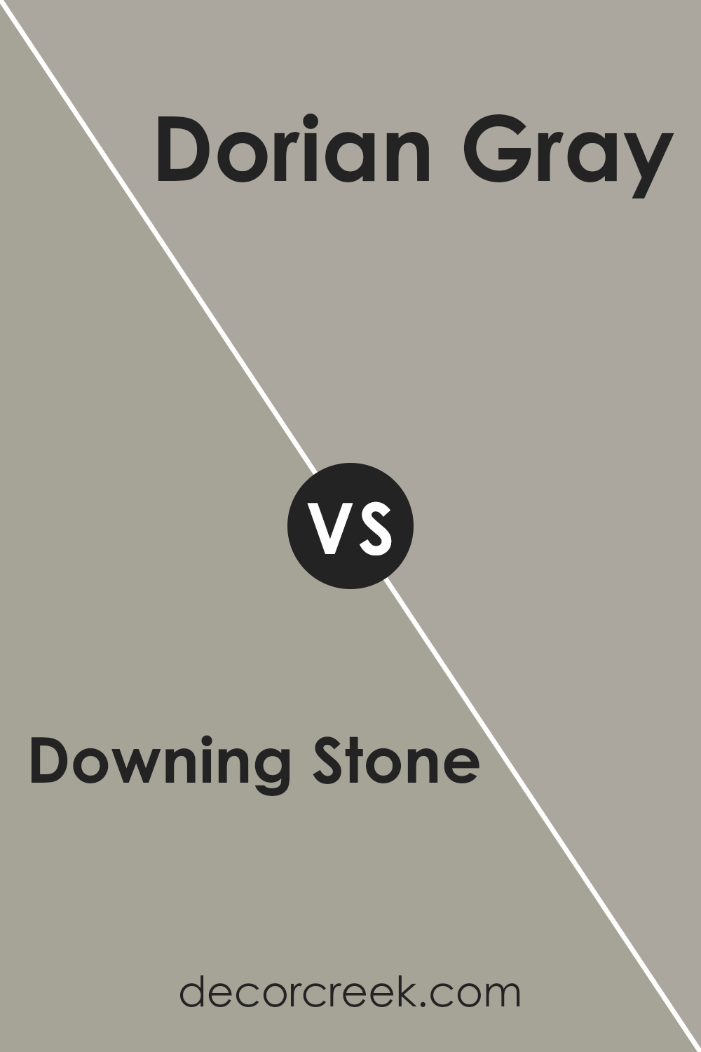
Downing Stone and Dorian Gray by Sherwin Williams are both popular choices for adding a touch of neutrality to any space. Downing Stone is a warm beige with a subtle earthy undertone, making it a cozy and inviting color. This shade is versatile and can help make a room feel more grounded and comfortable.
It pairs well with both bright accents and deeper, darker shades, making it a flexible option for various decorating styles.
On the other hand, Dorian Gray is a mid-tone gray that leans slightly towards the cooler side. This color is perfect for those wanting a more modern and clean look. Its neutral yet distinct gray tone works well in spaces that aim for a more contemporary feel, acting as a sleek backdrop for both colorful and minimalistic themes.
Both colors are great for creating a neutral scheme in your home, but the choice between Downing Stone’s warmth and Dorian Gray’s cool sophistication depends on the atmosphere you want to achieve.
You can see recommended paint color below:
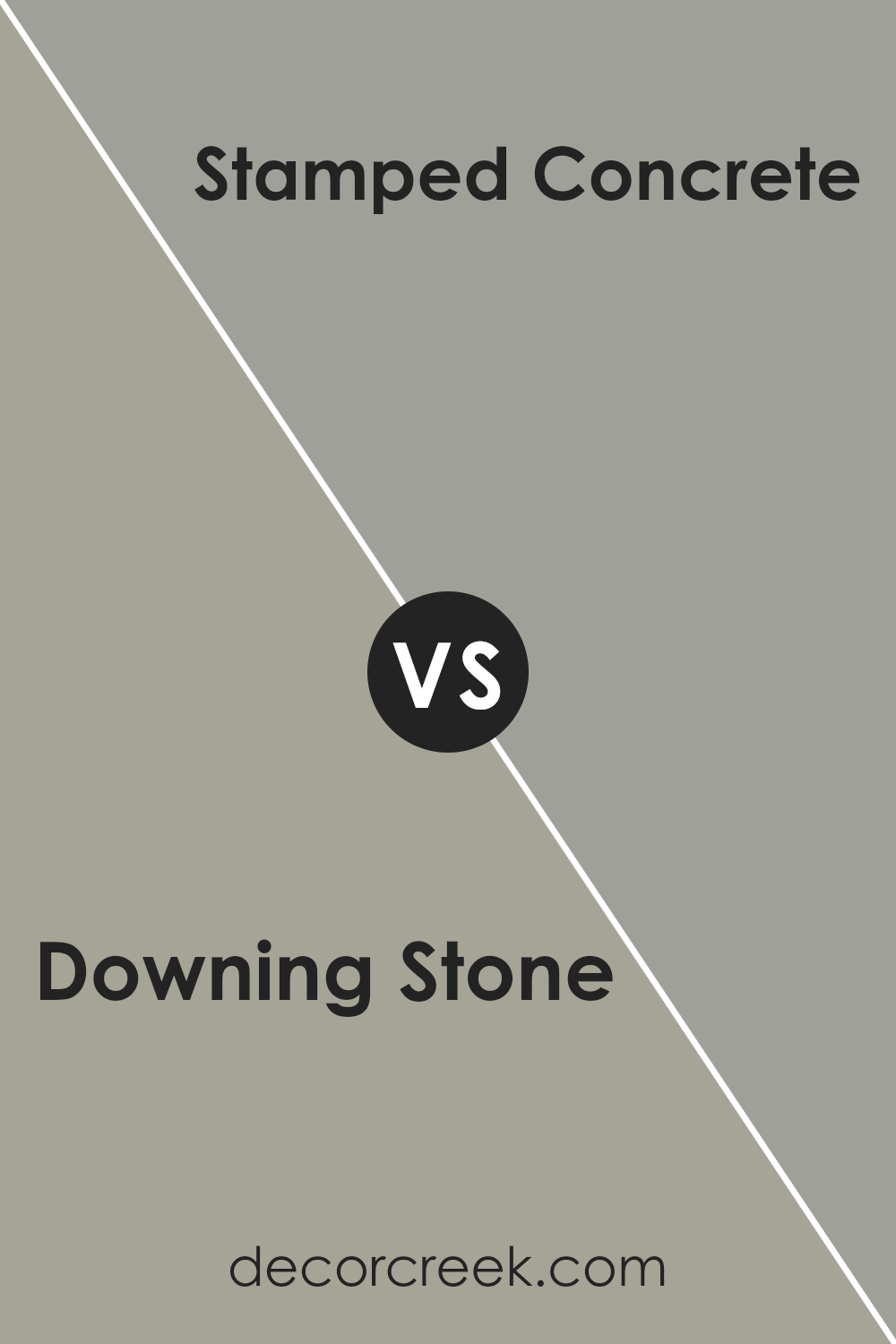
Downing Stone SW 2821 by Sherwin Williams vs Stamped Concrete SW 7655 by Sherwin Williams
Downing Stone and Stamped Concrete are both paint colors from Sherwin Williams, but they have different vibes. Downing Stone is a warm beige with a slight peachy undertone that makes it feel cozy and welcoming. It’s the kind of color that could work well in a living room or bedroom to create a soft, comforting atmosphere.
On the other hand, Stamped Concrete is a deeper gray with a hint of blue. It’s cooler in tone than Downing Stone and offers a more modern, clean look. This makes it suitable for spaces that you want to give a sleek or contemporary feel, like a kitchen or bathroom.
Between the two, Downing Stone gives a warmer, earthier sense, while Stamped Concrete leans towards a more neutral, crisp appearance. Each color has its charm, depending on the mood and style you want to set in your space.
You can see recommended paint color below:
- SW 7655 Stamped Concrete (CHECK A SAMPLE)
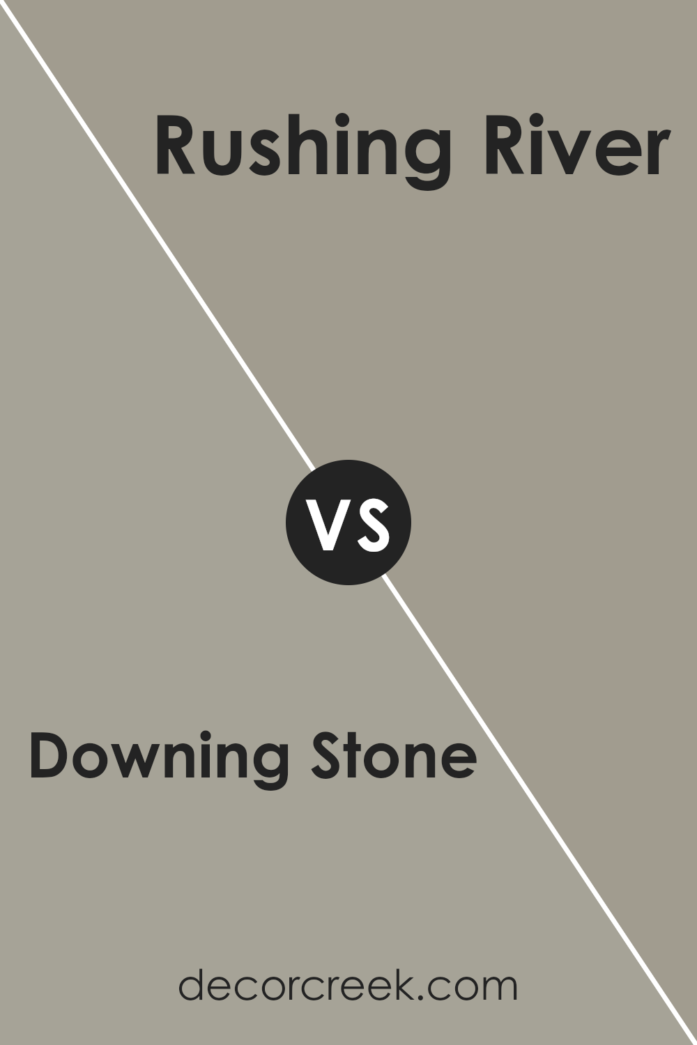
Downing Stone SW 2821 by Sherwin Williams vs Rushing River SW 7746 by Sherwin Williams
Downing Stone and Rushing River are two different paint colors from Sherwin Williams that offer unique vibes for any room. Downing Stone has a warm, beige tone that provides a cozy and inviting feel. It’s a versatile color that pairs well with many decor styles, making it great for living rooms and bedrooms.
On the other hand, Rushing River is a cooler, gray-green shade that brings a fresh and calm atmosphere to spaces. It works especially well in bathrooms or kitchens, where it complements natural light and materials like wood and stone.
While Downing Stone adds warmth to a room, Rushing River offers a cooler palette that can make small rooms feel more spacious. Both colors can refresh your home, but the choice between them depends on whether you prefer a warmer or a cooler hue.
You can see recommended paint color below:
- SW 7746 Rushing River (CHECK A SAMPLE)
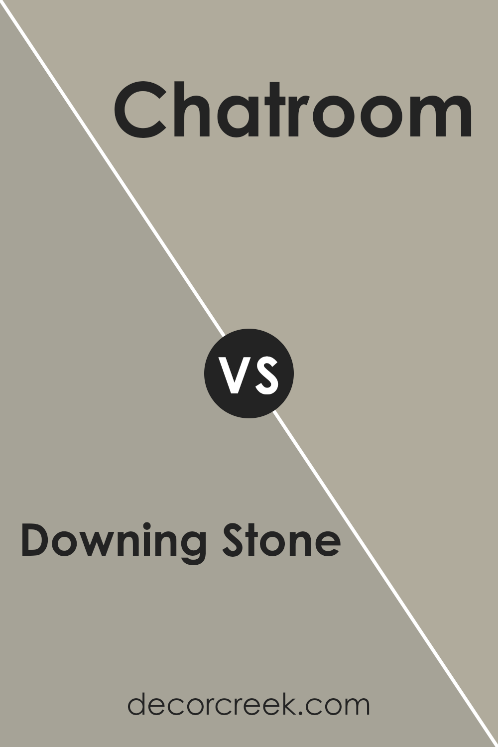
Downing Stone SW 2821 by Sherwin Williams vs Chatroom SW 6171 by Sherwin Williams
Downing Stone and Chatroom, both by Sherwin Williams, are neutral colors but with distinct tones and moods. Downing Stone is a warm greige, blending gray with beige which gives it a cozy, inviting feel. It’s versatile and works well in many spaces, from living rooms to bedrooms, creating a soft backdrop that pairs nicely with a wide range of decor styles.
On the other hand, Chatroom is a darker shade that leans more towards a muted sage green with gray undertones. This color is ideal for those looking to add a bit of depth and interest to their rooms without overwhelming the space with too bold a hue. It’s particularly effective in creating a focused, calm environment, making it suitable for offices or study areas.
Both colors offer a subtle, neutral palette but deliver different vibes—Downing Stone pulling in warmth, and Chatroom providing a cooler, more collected atmosphere. They can also complement each other well when used in the same home, maintaining harmony while defining different spaces.
You can see recommended paint color below:
- SW 6171 Chatroom (CHECK A SAMPLE)
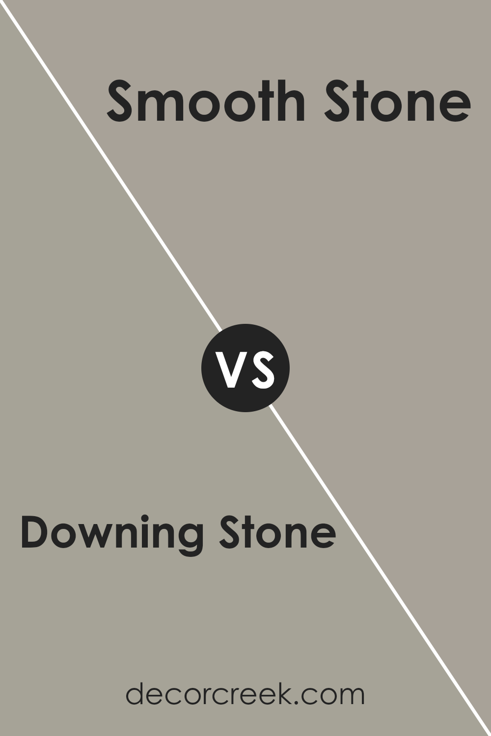
Downing Stone SW 2821 by Sherwin Williams vs Smooth Stone SW 9568 by Sherwin Williams
Downing Stone and Smooth Stone are both popular paint colors by Sherwin Williams, but they have distinct differences. Downing Stone is a deep, warm beige with subtle brown undertones, giving it an earthy and welcoming feel. This color is versatile and works well in spaces that need a cozy and inviting atmosphere, like living rooms or bedrooms.
On the other hand, Smooth Stone is a lighter gray, offering a more neutral backdrop. It carries a soft, subtle vibe that makes it a great choice for modern and minimalistic spaces. Due to its lighter tone, Smooth Stone can help make small rooms appear larger and brighter.
Overall, while Downing Stone adds warmth to a room, Smooth Stone provides a clean and calm background, making each suitable for different aesthetic goals and room functions.
You can see recommended paint color below:
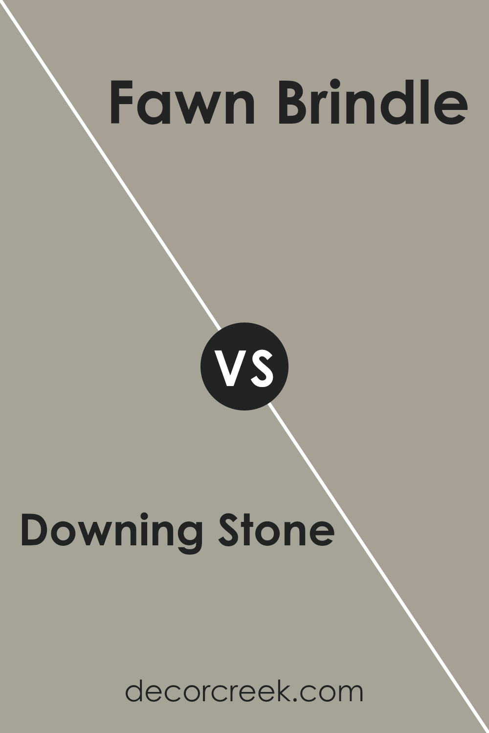
Downing Stone SW 2821 by Sherwin Williams vs Fawn Brindle SW 7640 by Sherwin Williams
Downing Stone and Fawn Brindle, both by Sherwin Williams, offer distinct hues that set a warm, welcoming tone in any room. Downing Stone is a deeper, earthy beige with hints of gray, making it a robust choice for those who prefer a stronger color presence. Its grounding effect works well in high-traffic areas or spaces where you want to add depth.
On the other hand, Fawn Brindle lends a lighter, softer gray-brown tone. This color is slightly cooler compared to Downing Stone, providing a subtle, understated elegance. It’s an excellent choice for creating a calm, cozy backdrop in bedrooms or living areas.
When used together, these colors complement each other beautifully, allowing the lighter Fawn Brindle to brighten spaces while Downing Stone adds richness and warmth. Whether used for accent walls, main living spaces, or details, both colors offer versatility and style to suit various decors.
You can see recommended paint color below:
- SW 7640 Fawn Brindle (CHECK A SAMPLE)
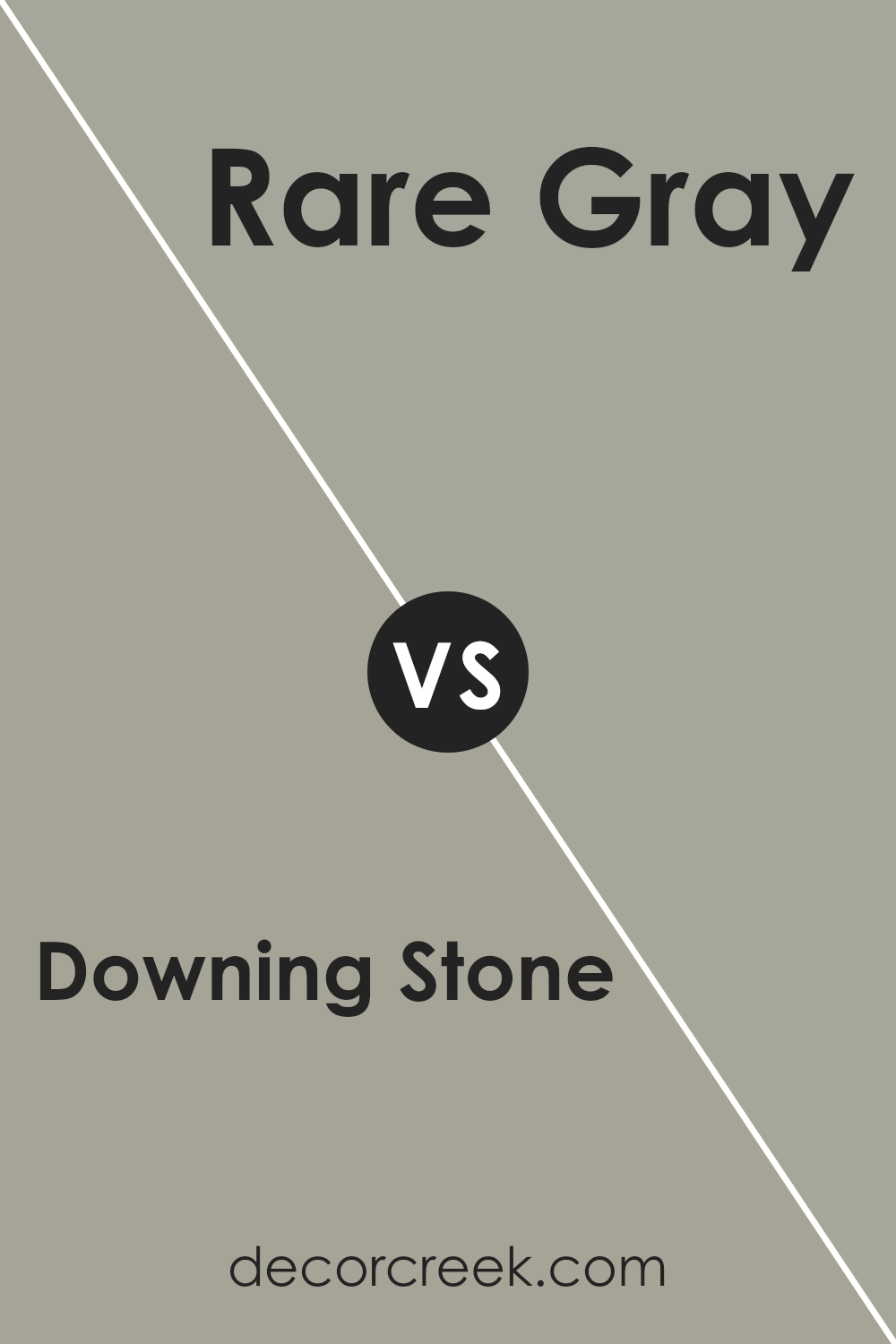
Downing Stone SW 2821 by Sherwin Williams vs Rare Gray SW 6199 by Sherwin Williams
Downing Stone and Rare Gray are both unique colors from Sherwin Williams, each bringing its own distinct vibe to a space. Downing Stone presents a warm, cozy feel with its earthy brown tones, making it perfect for creating a welcoming atmosphere in places like living rooms or bedrooms. Its rich hue offers a soothing background that pairs well with a variety of decor styles, from rustic to modern.
On the other hand, Rare Gray is a versatile shade that leans more towards a neutral gray with subtle green undertones. It’s a great choice for those looking to achieve a fresh, modern look in their home. This color works beautifully in spaces that benefit from a calm and collected ambiance, such as bathrooms or offices.
Both colors are quite adaptable and can blend seamlessly with different aesthetics, furniture, and accent colors. Whether you choose Downing Stone for its warm depth or Rare Gray for its cool subtlety, each color has the potential to make any room feel more welcoming and stylish.
You can see recommended paint color below:
- SW 6199 Rare Gray (CHECK A SAMPLE)
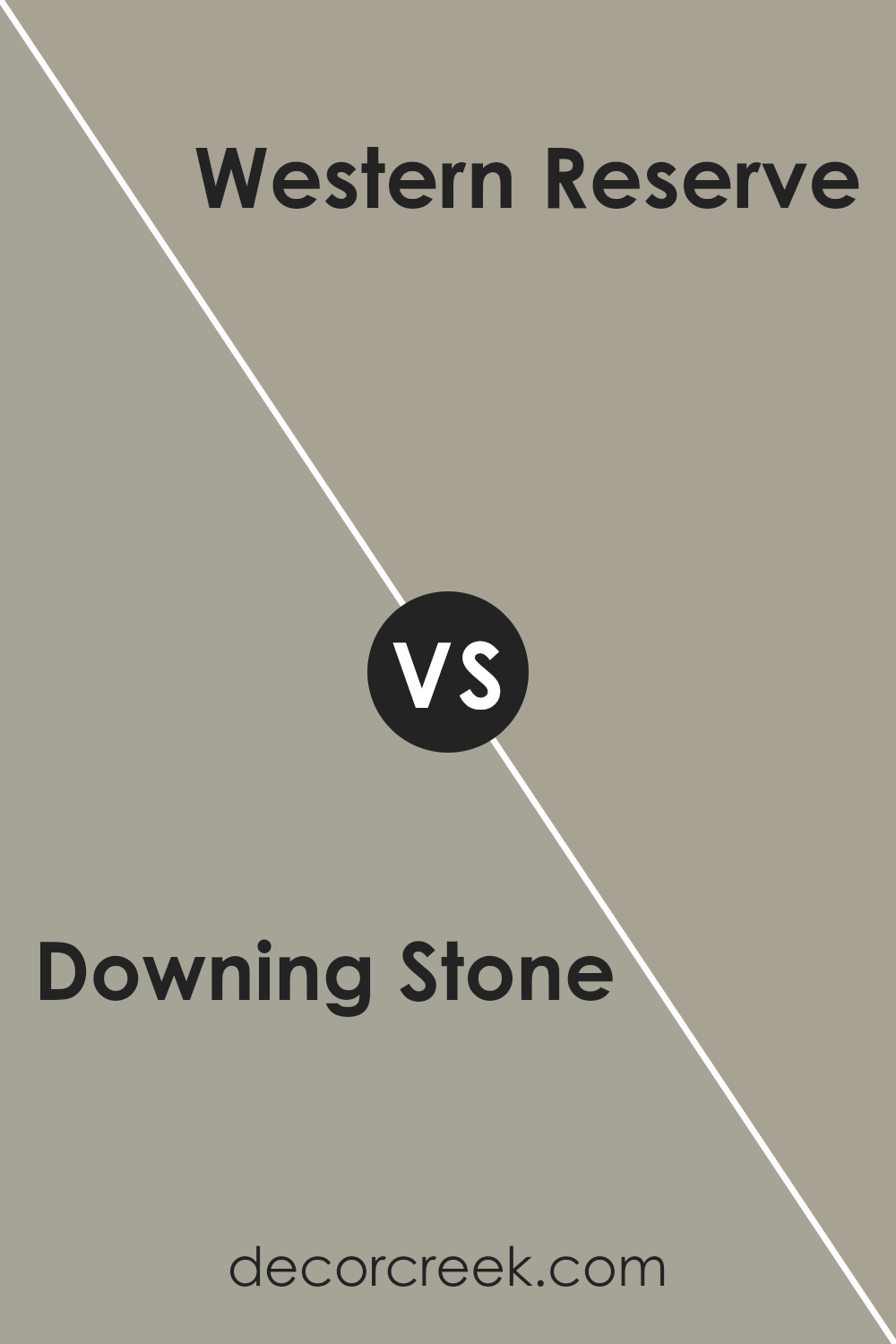
Downing Stone SW 2821 by Sherwin Williams vs Western Reserve SW 9597 by Sherwin Williams
Downing Stone is a warm, neutral beige that creates a comfortable and inviting atmosphere in any space. It has an earthy tone that pairs well with both bright colors and darker hues, making it quite versatile for decorating. This color is ideal for living areas or bedrooms where a cozy vibe is desired.
On the other hand, Western Reserve offers a darker, richer gray shade. This color provides a strong presence in a room, perfect for making a bold statement or anchoring a space with its deep tone. It works well in modern settings or as a contrast to lighter colors.
Both colors are practical choices for interior walls, and they can be used together effectively. Downing Stone can lighten a room, while Western Reserve can add depth and focus, creating a balanced look in your home.
You can see recommended paint color below:
- SW 9597 Western Reserve (CHECK A SAMPLE)
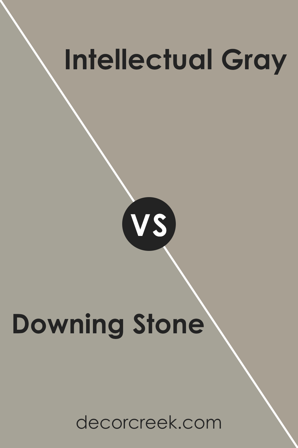
Downing Stone SW 2821 by Sherwin Williams vs Intellectual Gray SW 7045 by Sherwin Williams
Downing Stone and Intellectual Gray are two distinct paint shades offered by Sherwin Williams. Downing Stone has a rich, deep beige hue with warm undertones, creating a cozy and inviting atmosphere in any space. It’s a versatile color that pairs well with various decor elements, making it ideal for living rooms or bedrooms.
On the other hand, Intellectual Gray is a softer, more neutral gray that gives off a clean and subtle look. Its light gray tone works great in spaces that aim for a modern, understated aesthetic, and it complements both bright colors and other neutrals nicely. This color is particularly suited for offices or kitchens due to its calm and neutral appearance.
When comparing the two, Downing Stone brings warmth to a room, while Intellectual Gray offers a cooler, more minimalistic vibe. Choosing between them would depend on the mood and functionality desired in the space.
You can see recommended paint color below:
Conclusion
After looking closely at the paint SW 2821 Downing Stone by Sherwin Williams, I’ve learned quite a bit about what makes it special. This color is warm and cozy, kind of like the feeling you get when you’re wrapped up in a soft blanket. It has a way of making a room feel inviting and comfortable, which is really nice for places like the living room or bedroom where you want to relax.
What stands out about Downing Stone is its ability to fit in with lots of different styles and furniture. Whether your room has modern touches or more traditional pieces, this paint color can really tie everything together. It’s like a friendly color that gets along with everyone and everything!
I also noticed that it does a great job of hiding little marks and smudges on the walls. This is great for rooms that get a lot of use, like the kitchen or a kid’s playroom. You won’t have to worry about touching up paint all the time.
So, if you’re thinking about giving a room a new look, Downing Stone by Sherwin Williams could be a perfect choice. It’s warm, friendly, and works well in lots of different rooms. It’s like picking the perfect background for all your favorite moments at home.
Ever wished paint sampling was as easy as sticking a sticker? Guess what? Now it is! Discover Samplize's unique Peel & Stick samples.
Get paint samples
