Choosing the right paint color for your space can be a bit of a challenge, but Sherwin Williams makes it a whole lot easier with their wide range of colors.
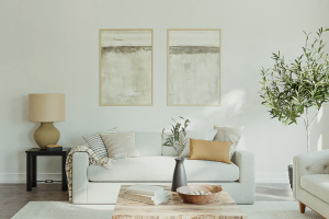
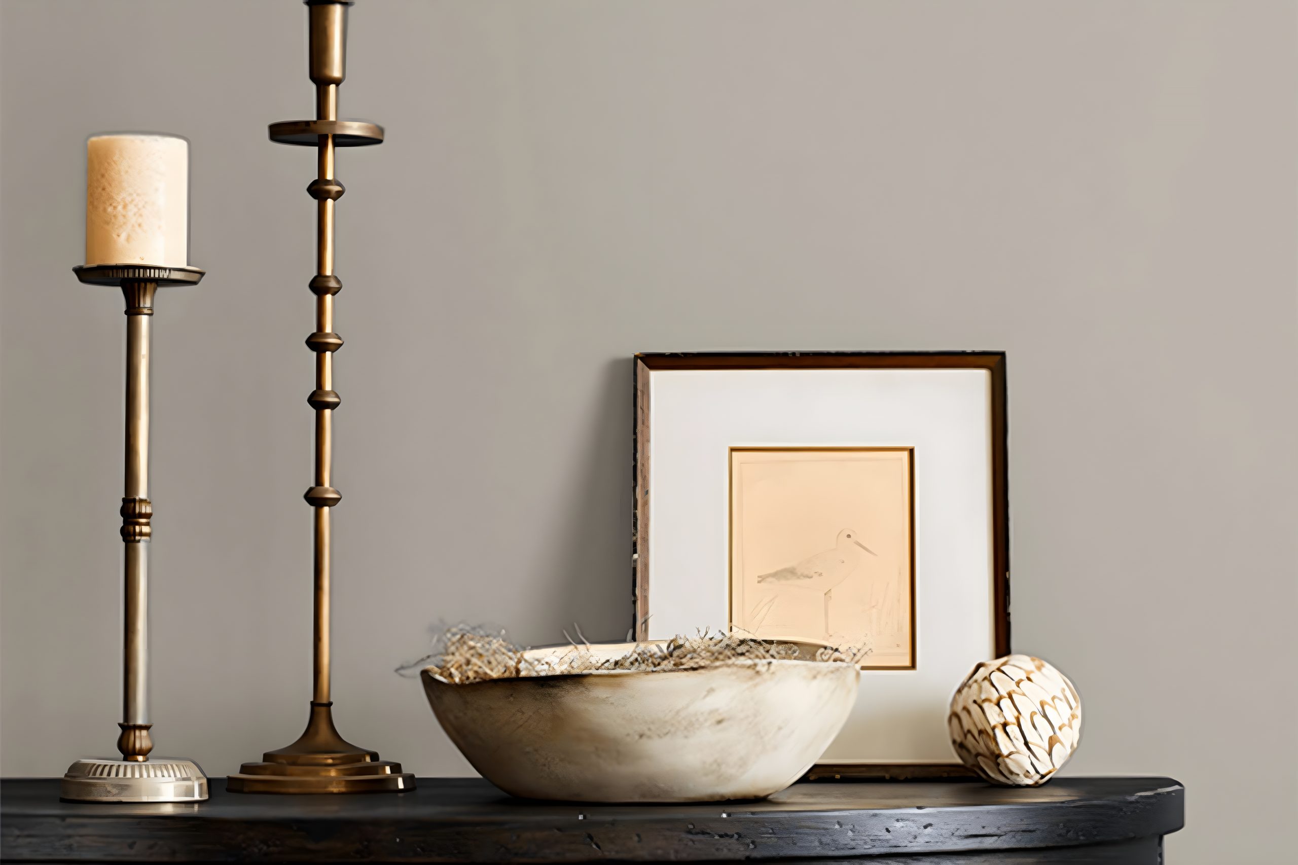
If you’re looking for a color that’s both modern and versatile, then you might want to consider SW 9568, also known as Smooth Stone.
This particular shade is a favorite among homeowners and interior designers alike for its ability to create a warm and welcoming ambiance in any room.
Smooth Stone is a neutral color that falls somewhere between a soft gray and a warm beige. This makes it an excellent choice for those who are looking for something that’s not too bold but still adds a bit of character to their space.
Whether you’re painting a cozy living room, a serene bedroom, or even a home office, Smooth Stone offers a subtle backdrop that complements a wide range of decor styles and furniture colors.
One of the highlights of choosing a color like Smooth Stone is its versatility. It pairs beautifully with a variety of accents and finishes, from natural wood to metallics, making it easy to integrate into your existing home decor.
Additionally, it’s a great choice if you’re planning to sell your home, as its neutral appeal can easily match the tastes of potential buyers.
If you’re considering giving your space a fresh new look, Smooth Stone by Sherwin Williams is a color worth looking into. It’s not only stylish but also has a timeless quality that ensures your walls will look great for years to come.
What Color Is Smooth Stone SW 9568 by Sherwin Williams?
Smooth Stone by Sherwin Williams is a versatile neutral color that offers a harmonious balance of warmth and subtlety, making it perfect for creating a serene and inviting atmosphere in any room.
This color has a unique ability to blend with various interior styles, from modern minimalism to rustic farmhouse, due to its understated elegance and soft, welcoming tone.
In terms of interior styles, Smooth Stone works exceptionally well in spaces aiming for a relaxed, yet sophisticated vibe. Its gentle gray hue provides a solid foundation for Scandinavian designs, where the focus is on simplicity and functionality.
The color can also enhance the cozy feel of a traditional setup, adding a touch of modernity without overwhelming the classic elements.
When it comes to pairing with materials and textures, Smooth Stone’s adaptability shines through. It complements natural wood finishes superbly, from lighter oaks to deeper walnuts, highlighting the beauty of the grain and adding depth to the space.
In rooms with ample sunlight, the color can appear slightly warmer, making it an excellent match for soft linens and woven textures that contribute to a relaxed environment.
For a more refined look, pairing it with smooth marble countertops or polished metals such as brass or copper can add a luxurious touch.
Its neutral base also means it’s great alongside vibrant colors in art or accent pieces, allowing for a dynamic yet cohesive interior design.
Ever wished paint sampling was as easy as sticking a sticker? Guess what? Now it is! Discover Samplize's unique Peel & Stick samples.
Get paint samples

Is Smooth Stone SW 9568 by Sherwin Williams Warm or Cool color?
Smooth Stone by Sherwin Williams is a gentle and versatile paint color that fits perfectly into any home. It has a soft, warm undertone that makes spaces feel inviting and cozy.
This particular shade is great at balancing out natural and artificial light, ensuring rooms look beautiful at any time of the day. It works especially well in living rooms and bedrooms, where a calm and peaceful atmosphere is desired.
Because of its neutral nature, Smooth Stone is excellent for pairing with a wide range of colors.
Whether you’re looking to create a subtle backdrop for bright and bold furniture or aiming for a more understated, minimalist style, this color can adapt effortlessly.
It’s also fantastic for small spaces, as it helps to make them appear larger and more open.
The versatility of this color means it doesn’t just fit with any style, from modern to rustic, but it also helps in enhancing the natural beauty of a home’s features. It’s a smart choice for those wanting to refresh their home without making drastic changes.
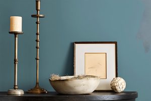
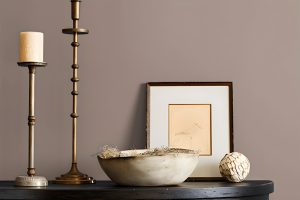
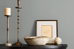
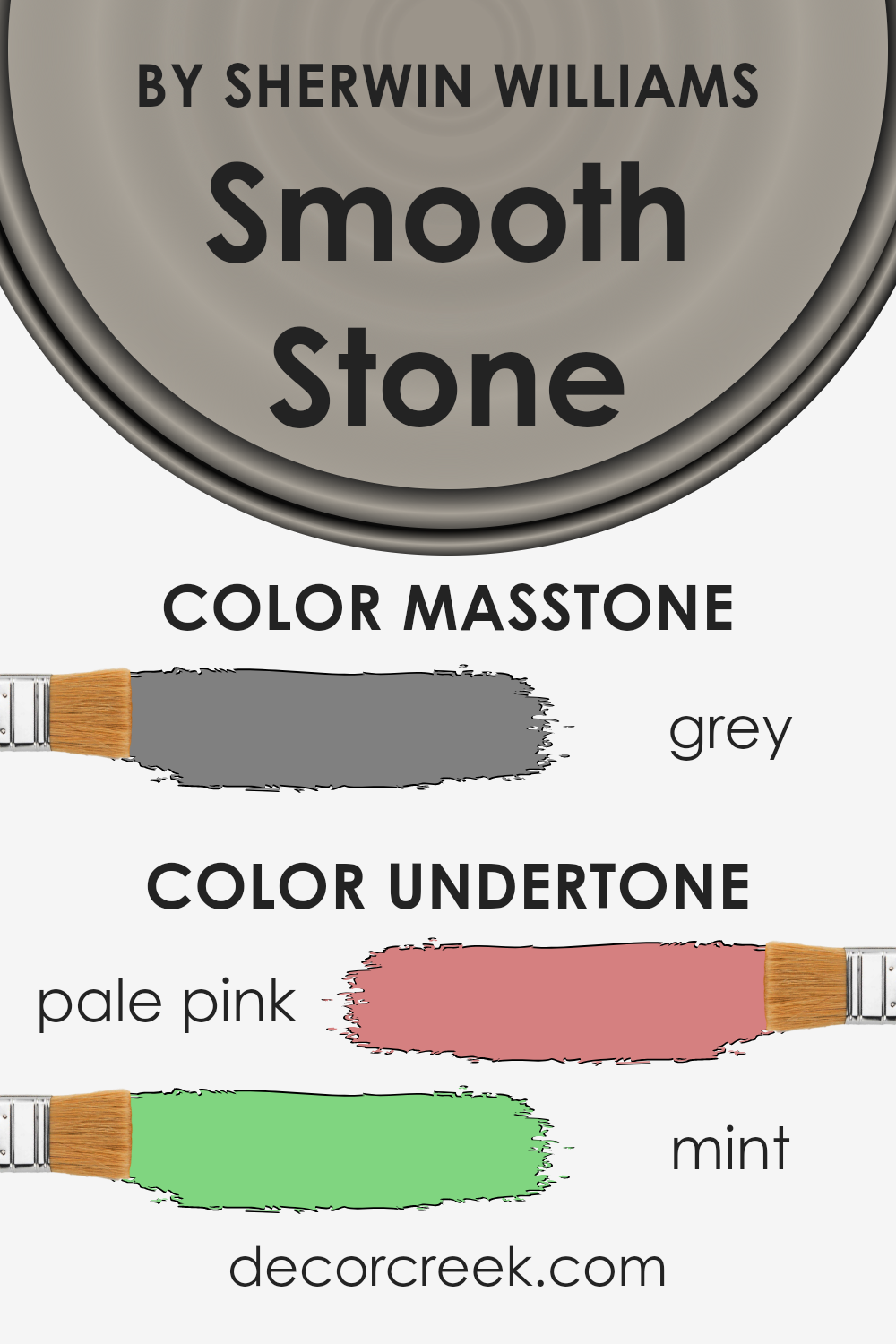
Undertones of Smooth Stone SW 9568 by Sherwin Williams
Smooth Stone by Sherwin Williams is a unique color because it has undertones that might surprise you – pale pink and mint.
The word “undertone” refers to the subtle colors that are mixed into the main color, influencing how it looks in different settings. Imagine undertones as the background music in a movie scene—they set the mood without you even noticing.
These undertones play a big role in how we perceive color. They can make a color feel warmer or cooler and affect how it pairs with other colors in your space.
The pale pink undertone adds a soft warmth to the color, making it feel inviting and cozy. On the other hand, the mint undertone introduces a hint of freshness, keeping the color from feeling too heavy or dull.
When Smooth Stone is used on interior walls, these undertones come into play with the light and surrounding colors. In natural light, the pale pink might become more noticeable, giving the room a gentle glow.
Meanwhile, artificial lighting might highlight the mint, adding a crisp feel to the space. This dynamic nature makes the color versatile, allowing it to fit various styles and preferences.
Instead of seeing just a single color, these undertones enrich the overall look, adding depth and character to your walls.
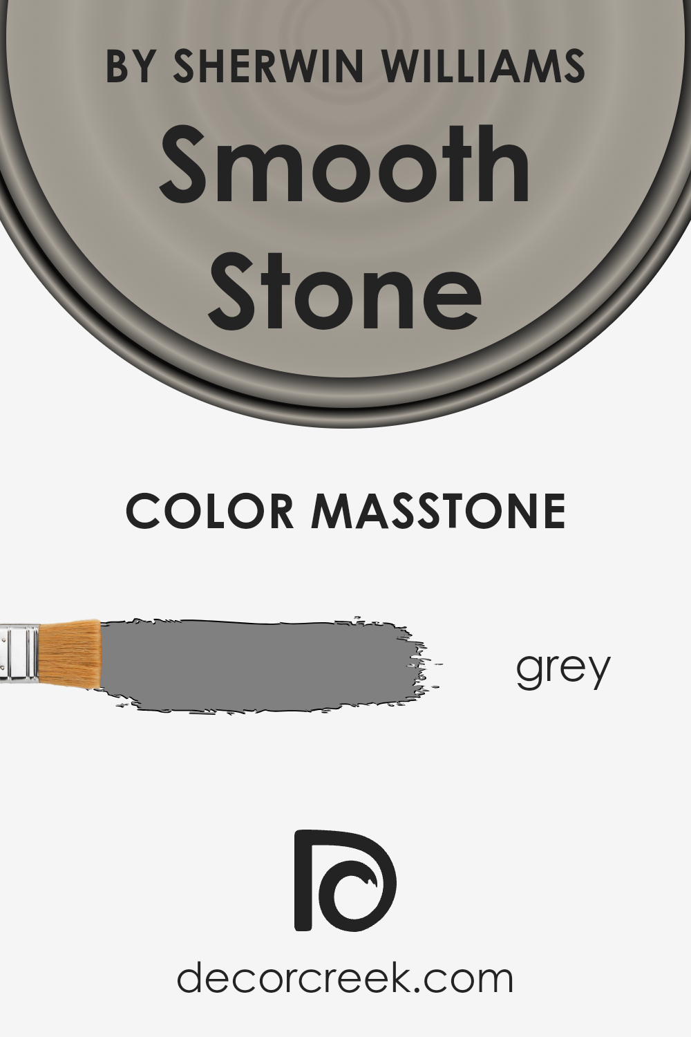
What is the Masstone of the Smooth Stone SW 9568 by Sherwin Williams?
Smooth Stone, tagged as SW 9568 by Sherwin Williams, is a unique shade that brings a comfortable and serene vibe to any space. Its masstone, being grey (#808080), offers a versatile backdrop that can easily fit into various home styles and decorations.
This particular shade of grey stands out because it has a neutral tone that works wonders in both bright and low-light areas. In well-lit rooms, it helps create an airy feel, making the space seem more open and inviting.
In contrast, in areas with less natural light, it adds depth and warmth, avoiding the cave-like feel that darker colors might induce.
The beauty of this grey is in its ability to blend with other colors, providing a balanced look whether you’re going for a modern minimalist design or a more cozy, traditional feel.
It’s a forgiving color that can hide small imperfections on walls, making it a practical choice as well.
Overall, its impact on home aesthetics is largely positive, offering flexibility, elegance, and a tranquil atmosphere that’s hard to achieve with more saturated or dramatic colors.
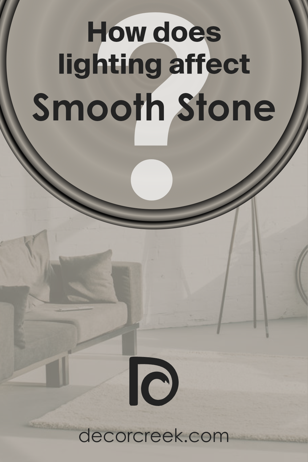
How Does Lighting Affect Smooth Stone SW 9568 by Sherwin Williams?
Lighting plays a crucial role in how we perceive colors. Different types of light can make the same color look different. This is because lights have varying color temperatures, affecting how we see colors in a room.
When discussing a specific color like Smooth Stone by Sherwin Williams, its appearance can change under different lighting conditions. In natural light, this color can look vastly different throughout the day.
In the morning and late afternoon, when the sun’s rays are warmer, this color will likely appear warmer and more inviting.
However, under the midday sun, which is brighter and more neutral, it might look closer to its true shade, a soft, versatile grey.
In artificial light, the type of bulbs used impacts how this color appears. LED or fluorescent lights, which often have a cooler tone, can make it appear sharper and slightly bluer.
In contrast, incandescent lighting, which tends to be warmer, will bring out the warmer undertones in the color, making it feel cozier.
Now, considering different room orientations:
- North-facing rooms receive less direct sunlight, so they tend to have cooler, softer light. In these rooms, Smooth Stone might appear more muted and slightly cooler, emphasizing its grey attributes.
- South-facing rooms bask in ample sunlight throughout the day, meaning the color can look lighter and slightly warmer, enhancing its underlying warm tones.
- East-facing rooms get bright light in the morning, turning cooler as the day progresses. Here, Smooth Stone might look brighter and warmer in the morning but become more true to its neutral grey by the afternoon.
- West-facing rooms are the opposite, with more subdued light in the morning that becomes warmer and more intense towards the evening. This color can seem cooler and more neutral in the morning light, but by sunset, it could take on a warmer, more welcoming quality.
Understanding how lighting affects colors like Smooth Stone helps in choosing the right paint for your space, ensuring the color behaves as you expect throughout the day in various lighting conditions.
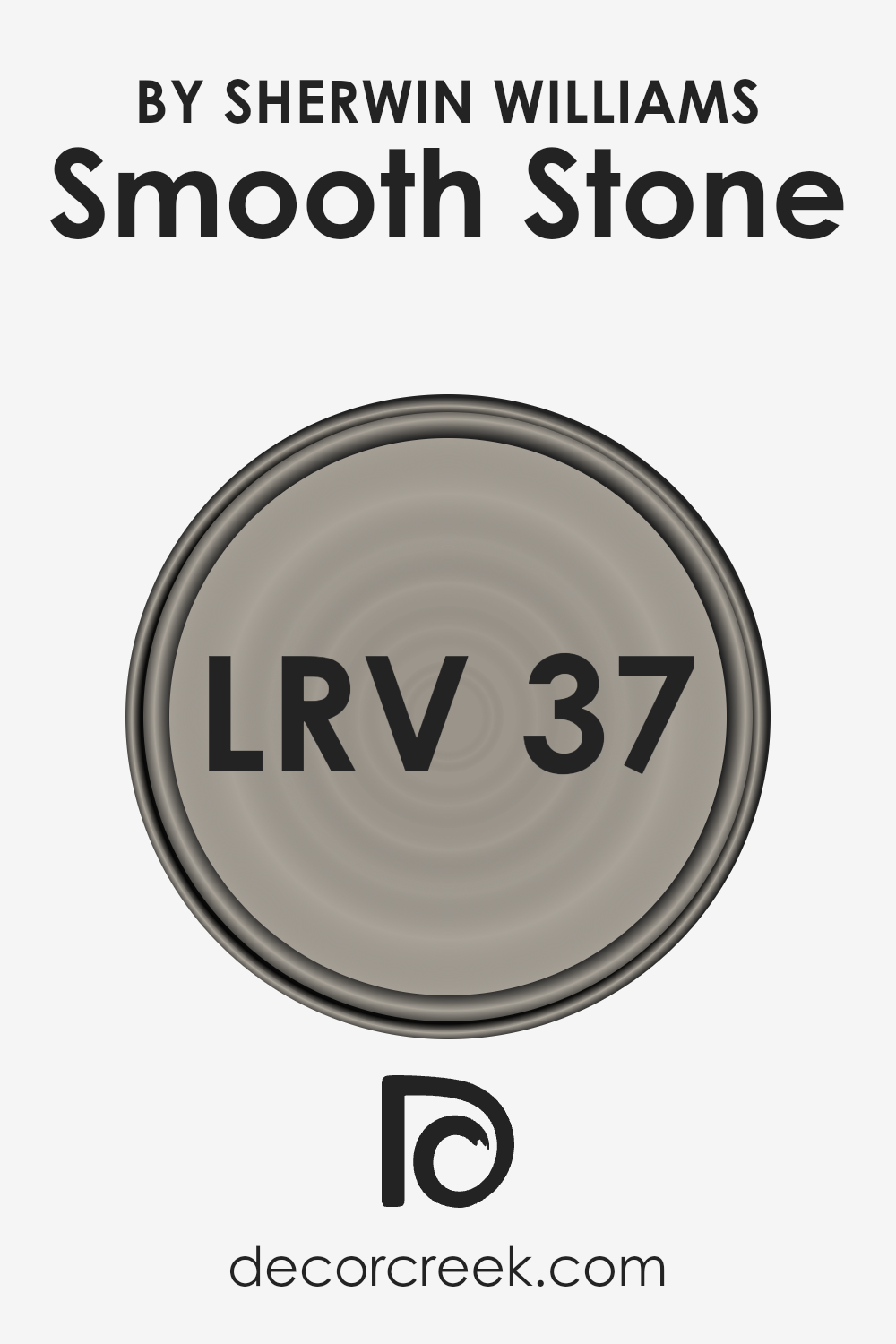
What is the LRV of Smooth Stone SW 9568 by Sherwin Williams?
LRV stands for Light Reflectance Value, which is a measure of how much light a paint color reflects or absorbs.
Think of it like this: on a scale from 0 to 100, 0 is pure black, absorbing all light, and 100 is pure white, reflecting all light.
Colors with a higher LRV make a room feel brighter because they reflect more light back into the room. This is especially useful in spaces that don’t get a lot of natural sunlight, making them feel more open and airy.
On the other hand, colors with a low LRV can make a space feel cozier or smaller since they absorb more light.
In the case of the color with an LRV of 36.601, it’s in the mid-range, which means it doesn’t reflect a lot of light but also doesn’t absorb it all.
This kind of LRV is versatile, making the color adaptable to different spaces and lighting conditions.
In well-lit rooms, it might appear lighter and more vibrant, while in darker rooms, it could look more subdued. This particular shade won’t dramatically brighten a space but will add a comfortable, moderate level of light reflection.
It’s a good choice for those wanting a balanced look without going too bright or too dark.
LRV – what does it mean? Read This Before Finding Your Perfect Paint Color
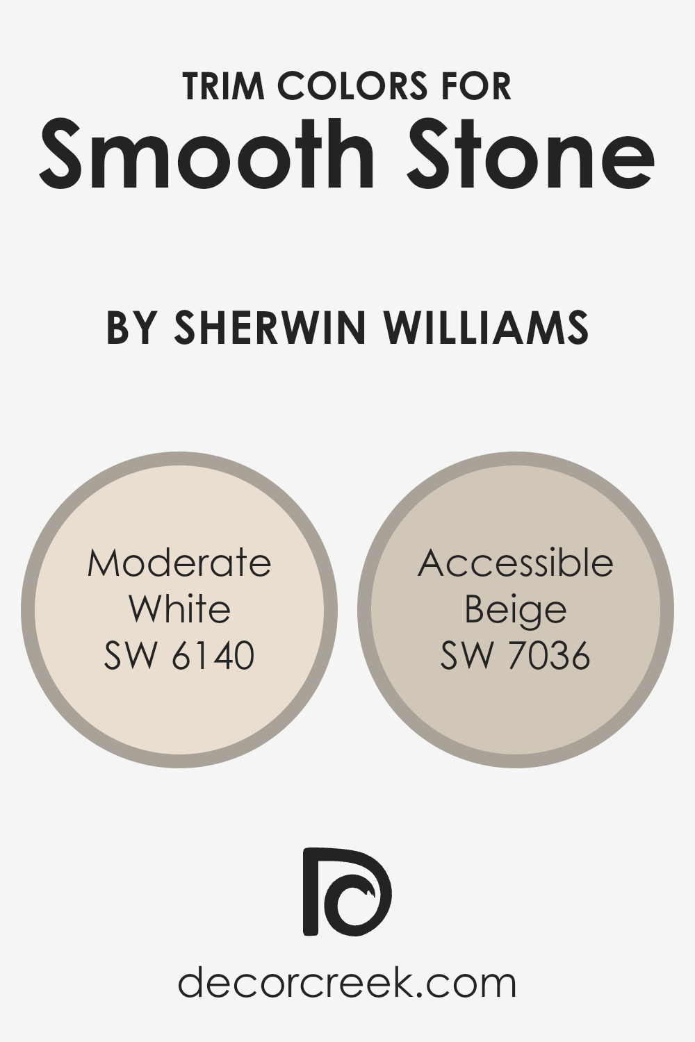
What are the Trim colors of Smooth Stone SW 9568 by Sherwin Williams?
Trim colors are specially selected shades that are used to accent and outline features such as doorframes, window sills, and skirting boards, providing a visual contrast and highlighting the craftsmanship of a home.
When it comes to a versatile and elegant color like Smooth Stone by Sherwin Williams, choosing the right trim colors can significantly enhance its appearance by adding depth and character to the space.
The trim acts as a frame for the walls, drawing the eye and making the wall color pop, which is why picking complementary trim colors is crucial for achieving a cohesive and appealing look.
Moderate White SW 6140 offers a soft, warm tone that harmonizes beautifully as a trim color with Smooth Stone, imbuing spaces with a subtle brightness without overwhelming the senses.
Its understated elegance makes it an ideal choice for a sophisticated yet inviting atmosphere.
On the other hand, Accessible Beige SW 7036 brings a richer, earthy contrast to the cooler hues of Smooth Stone, providing a grounding effect that enhances the room’s warmth.
This color is perfect for creating a seamless transition between the tranquility of Smooth Stone and the comforting embrace of a well-curated space, ensuring a balanced and harmonious design.
You can see recommended paint colors below:
- SW 6140 Moderate White
- SW 7036 Accessible Beige
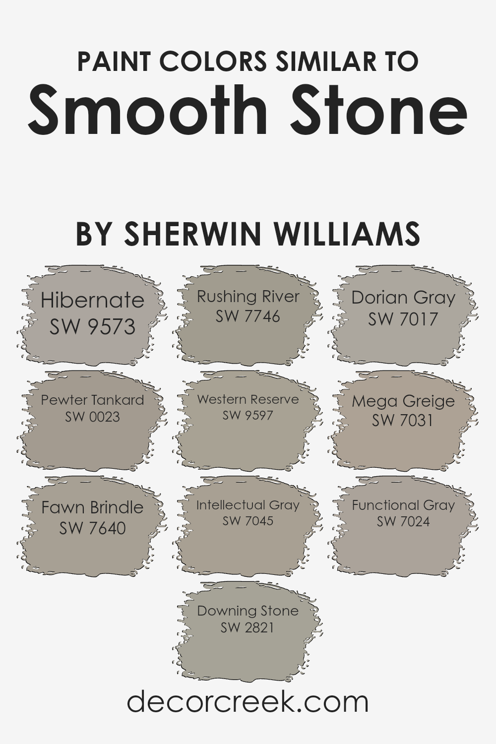
Colors Similar to Smooth Stone SW 9568 by Sherwin Williams
Choosing similar colors is vital in design because it creates a harmonious and cohesive look.
Similar colors to Smooth Stone by Sherwin Williams, such as Hibernate and Pewter Tankard, offer subtle variations that can add depth and interest to a space without overwhelming it.
These shades are close enough to work together seamlessly, yet different enough to define spaces or create gentle contrast.
For example, Hibernate provides a warm, cozy backdrop, ideal for creating a snug atmosphere, while Pewter Tankard, a deeper gray, offers a bold statement without straying far from the primary palette.
Other shades like Fawn Brindle and Downing Stone bring earthy elements into the mix, introducing a natural, grounded feel.
Fawn Brindle has a soft, muted quality perfect for serene settings, whereas Downing Stone offers a slightly more pronounced hue that complements wood and natural textures beautifully.
Colors such as Rushing River and Western Reserve continue this trend by adding cooler tones, which can be perfect for calming bedroom colors or modern living areas.
Intellectual Gray, Dorian Gray, Mega Greige, and Functional Gray expand the palette by offering a range of grays that can either warm up a space or keep it cool, depending on the lighting and surrounding décor.
These colors, while individual in their undertones and depth, work together to create a sophisticated and versatile palette that can suit a variety of tastes and styles.
You can see recommended paint colors below:
- SW 9573 Hibernate
- SW 0023 Pewter Tankard
- SW 7640 Fawn Brindle
- SW 2821 Downing Stone
- SW 7746 Rushing River
- SW 9597 Western Reserve
- SW 7045 Intellectual Gray
- SW 7017 Dorian Gray
- SW 7031 Mega Greige
- SW 7024 Functional Gray
How to Use Smooth Stone SW 9568 by Sherwin Williams In Your Home?
Smooth Stone by Sherwin Williams is a versatile paint shade perfect for any room in your home. Its subtle, warm undertone can give your living space a cozy feel while keeping the look clean and modern.
Think of using this color in areas where you want to add a touch of sophistication without overwhelming the space.
For instance, it works great in bedrooms, creating a calm and relaxing atmosphere that makes it easy to unwind after a long day.
In your living room or kitchen, Smooth Stone can complement various decor styles, from rustic to contemporary, making your furniture and accent pieces stand out beautifully.
Additionally, it’s an excellent choice for bathrooms, providing a light and airy feel that can make small spaces appear larger and more inviting.
So, if you’re considering giving your home a fresh new look, Smooth Stone can effortlessly bring together comfort and style.
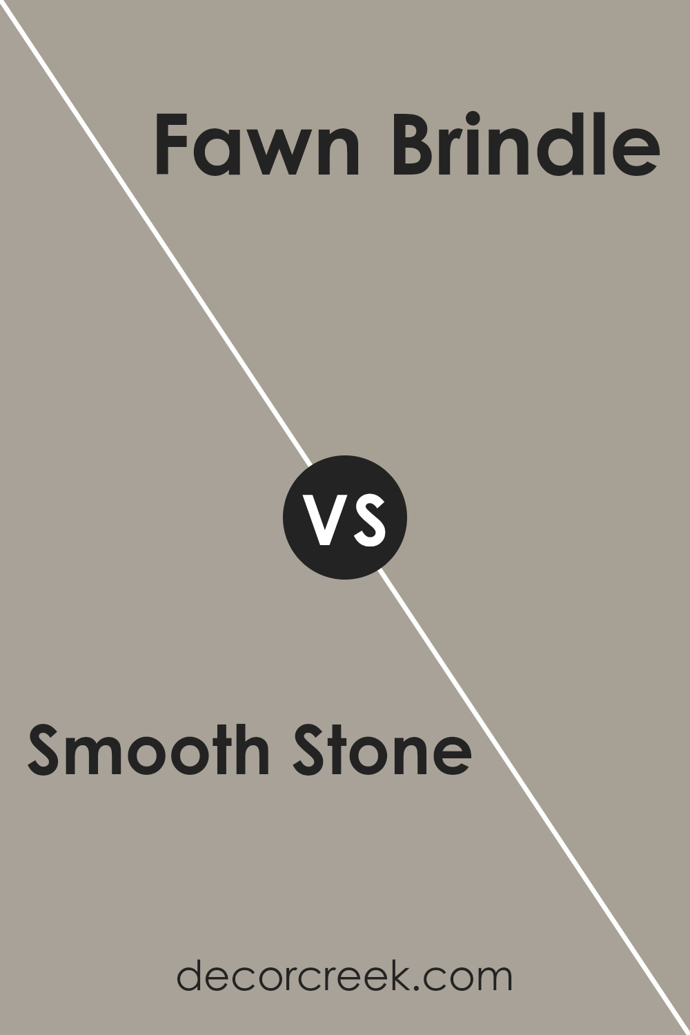
Smooth Stone SW 9568 by Sherwin Williams vs Fawn Brindle SW 7640 by Sherwin Williams
Smooth Stone and Fawn Brindle, both from Sherwin Williams, bring unique vibes to any space. Smooth Stone sits on the lighter side, offering a gentle, airy feel that can make rooms look more open and welcoming.
It’s the kind of color that doesn’t demand attention but rather complements the space it’s in, making it versatile for various design styles. On the other hand, Fawn Brindle packs a bit more punch.
Although still considered neutral, it leans towards a richer, deeper gray that adds a sense of sophistication and depth. This color can bring about a cozy atmosphere, perfect for creating a warm, inviting space.
Together, these colors can work harmoniously, with Smooth Stone lightening up a room and Fawn Brindle adding grounded, deeper accents.
Whether used together or separately, they cater to different tastes and design needs, offering flexibility and beauty in home decor.
You can see recommended paint color below:
- SW 7640 Fawn Brindle
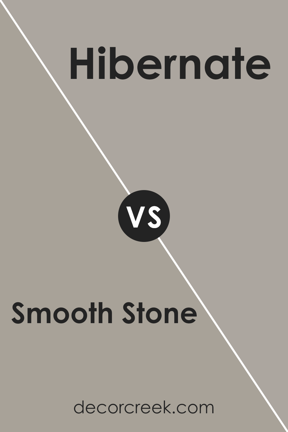
Smooth Stone SW 9568 by Sherwin Williams vs Hibernate SW 9573 by Sherwin Williams
The main color, Smooth Stone, and the second color, Hibernate, both from Sherwin Williams, offer unique tones for interior spaces. Smooth Stone presents itself as a light, airy gray that can make any room feel more spacious and open.
Its subtle warmth ensures it pairs well with a wide range of decor, making it incredibly versatile. On the other hand, Hibernate is a deeper, cozier shade that suggests a sense of comfort and calm.
It leans more towards a richer tone, perfect for creating an inviting atmosphere in areas meant for relaxation. While Smooth Stone reflects more light and can enhance the perception of space, Hibernate offers a more intimate and snug ambiance.
These differences make each color suited to different design intentions — Smooth Stone for brightening and enlarging spaces, and Hibernate for adding depth and warmth.
Choosing between them depends on the desired mood and functionality of the room.
You can see recommended paint color below:
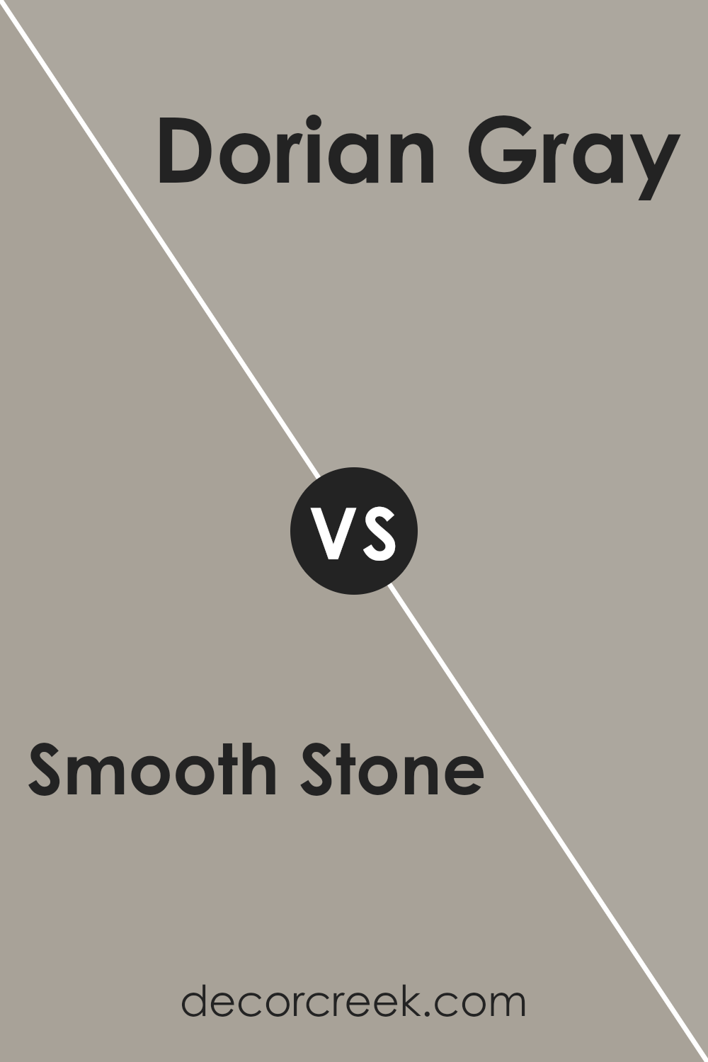
Smooth Stone SW 9568 by Sherwin Williams vs Dorian Gray SW 7017 by Sherwin Williams
Smooth Stone and Dorian Gray are two popular colors by Sherwin Williams, each offering a unique vibe for walls or decor.
Smooth Stone is a lighter, airy gray that brings a sense of calm and simplicity to a room.
It’s perfect for spaces where you want a subtle backdrop that won’t overpower your decor but still adds a touch of elegance. On the other hand, Dorian Gray is a deeper, mid-tone gray.
It has a stronger presence, making it ideal for creating a statement or adding depth to a space.
While Smooth Stone provides a gentle, soothing atmosphere, Dorian Gray stands out more, offering a sophisticated and bolder look.
Whether you’re looking for a soft, minimalistic feel with Smooth Stone or a more dramatic, impactful vibe with Dorian Gray, both colors are versatile choices that can enhance the style of any room.
You can see recommended paint color below:
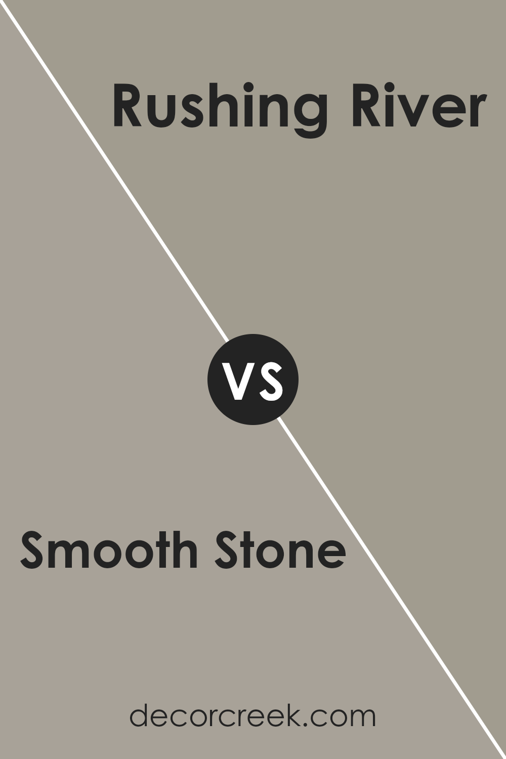
Smooth Stone SW 9568 by Sherwin Williams vs Rushing River SW 7746 by Sherwin Williams
Smooth Stone and Rushing River, both from Sherwin Williams, offer unique vibes for any space. Smooth Stone is like a gentle gray hug for your walls.
It’s light, airy, and offers a soft, calming atmosphere, making it perfect for creating a relaxed, serene setting in any room. Think of it as a backdrop that allows other colors to shine without overpowering them.
On the other hand, Rushing River is more like the mysterious shaded areas by a river. It’s a deeper gray that leans towards green, bringing a touch of nature indoors.
This color is great for adding depth and a bit of sophistication. It works well in spaces where you want a bit more character without going too dark or bold.
While Smooth Stone whispers tranquility and lightness, Rushing River speaks in tones of depth and natural elegance.
Choosing between them depends on whether you want your room to feel more open and airy or cozy and rooted in outdoor beauty.
You can see recommended paint color below:
- SW 7746 Rushing River
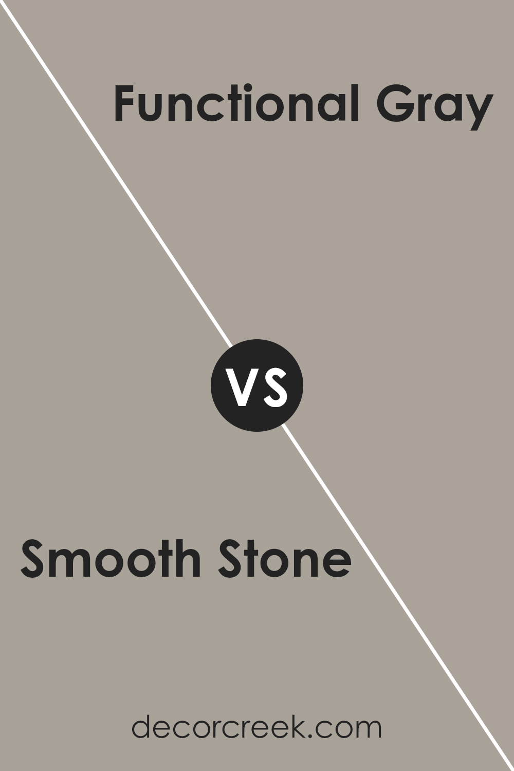
Smooth Stone SW 9568 by Sherwin Williams vs Functional Gray SW 7024 by Sherwin Williams
The main color, Smooth Stone, and the second color, Functional Gray, both from Sherwin Williams, offer subtle yet distinct vibes to a space. Smooth Stone leans toward a lighter, more gentle hue.
It has an airy feel that can open up a room, making it feel more expansive and welcoming. Its soft undertone offers versatility, fitting well in various decor styles, from modern minimalism to cozy traditional.
On the other hand, Functional Gray is a tad deeper and bolder. This color brings a stronger character to walls, grounding the space with its more pronounced presence.
It works beautifully in areas where you want to add a bit of sophistication and depth without overpowering the room’s overall aesthetic.
While both colors share a neutral palette, making them easy to pair with a range of color schemes, their differences lie in their ability to set the room’s tone.
Smooth Stone is brighter and uplifting, whereas Functional Gray adds a touch of elegance and warmth, making each unique in setting the mood for a space.
You can see recommended paint color below:
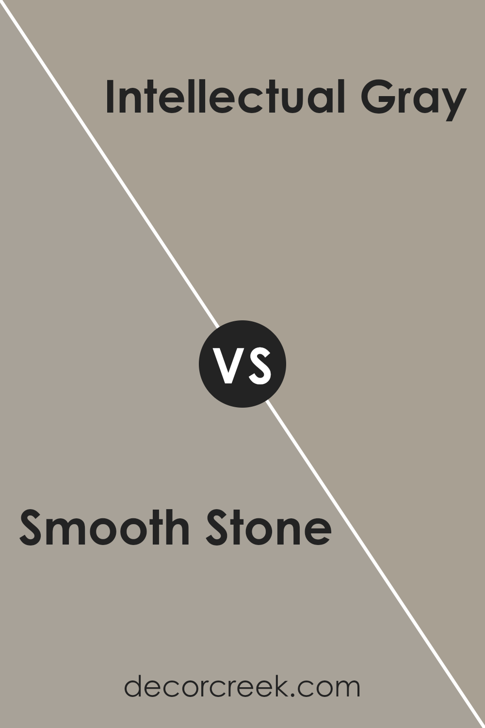
Smooth Stone SW 9568 by Sherwin Williams vs Intellectual Gray SW 7045 by Sherwin Williams
Smooth Stone and Intellectual Gray are two colors offered by Sherwin Williams that both bring their unique charm to any space. At a glance, Smooth Stone gives off a lighter, more subtle vibe.
It’s like the first light of dawn, soft and gentle, creating a calm atmosphere. It’s perfect for those looking to add a touch of serenity to their rooms without overpowering them with color.
On the other hand, Intellectual Gray steps in with a bit more depth. Think of it as the shadow under a tree on a sunny day; it’s noticeable, yet incredibly soothing.
This color has a bit more weight to it, making it ideal for someone wanting to add a hint of sophistication and strength to their environment.
Both colors provide a neutral palette, but Smooth Stone leans towards a fresher, airier feel, while Intellectual Gray offers a grounded, earthy essence.
No matter your preference, each color has its way of making a space feel tailored and complete.
You can see recommended paint color below:
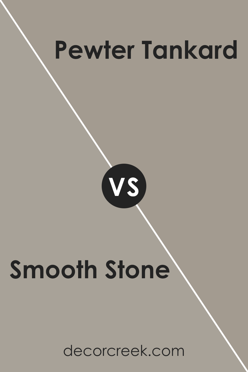
Smooth Stone SW 9568 by Sherwin Williams vs Pewter Tankard SW 0023 by Sherwin Williams
Smooth Stone by Sherwin Williams is a subtle, soft shade with a warm undertone that gives off a serene and calming vibe, perfect for creating a cozy atmosphere in any room.
It’s light enough to make small spaces appear larger and airy, yet has enough depth to add character and a soothing aesthetic to the area. On the other hand, Pewter Tankard, also by Sherwin Williams, is a darker, richer gray with a cooler undertone.
This color brings a sense of sophistication and elegance to spaces, making it ideal for accent walls or rooms where you want more drama and a strong presence.
Comparing the two, Smooth Stone is more about creating a light, airy feel with a warm, inviting ambiance, while Pewter Tankard focuses on adding depth and a bold statement to interiors.
Depending on the mood you wish to create and the natural light your space receives, each color offers its unique charm and can transform your space into anything from a peaceful retreat to a chic, elegant room.
You can see recommended paint color below:
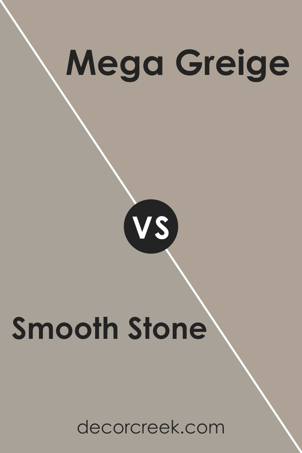
Smooth Stone SW 9568 by Sherwin Williams vs Mega Greige SW 7031 by Sherwin Williams
Smooth Stone and Mega Greige are two nuanced paint colors from Sherwin Williams that bring their own unique flair to spaces.
Smooth Stone is a gentle, soft gray with a warm undertone that makes it versatile for any room, offering a serene and light atmosphere that’s easy on the eyes. It pairs well with a variety of decors, enhancing spaces without overpowering them.
On the other hand, Mega Greige steps in with a deeper, richer tone. As the name suggests, it’s a blend of gray and beige, but with a more pronounced presence that brings a cozy warmth to spaces.
This color works great in areas where you want to add depth and sophistication without going too dark. It’s particularly effective in creating an inviting ambiance in living areas or bedrooms.
Both colors have their charm: Smooth Stone leans towards a fresher, airy feel, while Mega Greige offers a stronger statement with its earthy, robust vibe.
Depending on the mood you wish to set or the size of the room, either color can transform your space beautifully.
You can see recommended paint color below:
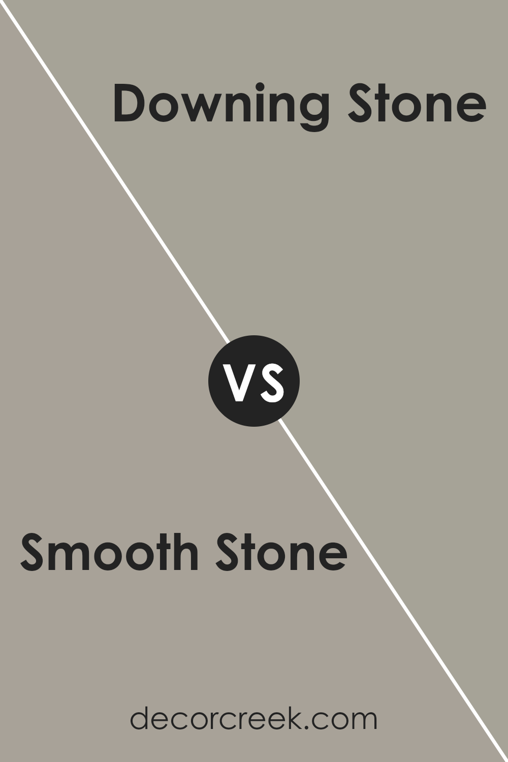
Smooth Stone SW 9568 by Sherwin Williams vs Downing Stone SW 2821 by Sherwin Williams
Smooth Stone and Downing Stone by Sherwin Williams are both unique, yet they offer different vibes for a space. Smooth Stone is a light, airy gray that brings a soft, almost ethereal quality to a room.
It’s great for creating a serene, calming atmosphere. It’s subtle enough not to overwhelm, making it perfect for spaces where you want peace and quiet.
On the other hand, Downing Stone is a deeper, more pronounced color. This shade leans towards a richer, warmer gray, adding a cozy, welcoming feel.
It’s ideal for areas where you want more character and depth without going too dark. This color can add a sense of sophistication and warmth, making it great for living areas or bedrooms.
In short, if you’re looking for a gentle, soothing backdrop, Smooth Stone is your go-to. For a touch more warmth and personality, Downing Stone will do the trick.
Both colors are versatile, but the choice between a lighter, breezier feel and a cozier, richer ambiance depends on your personal preference and the mood you aim to create.
You can see recommended paint color below:
- SW 2821 Downing Stone
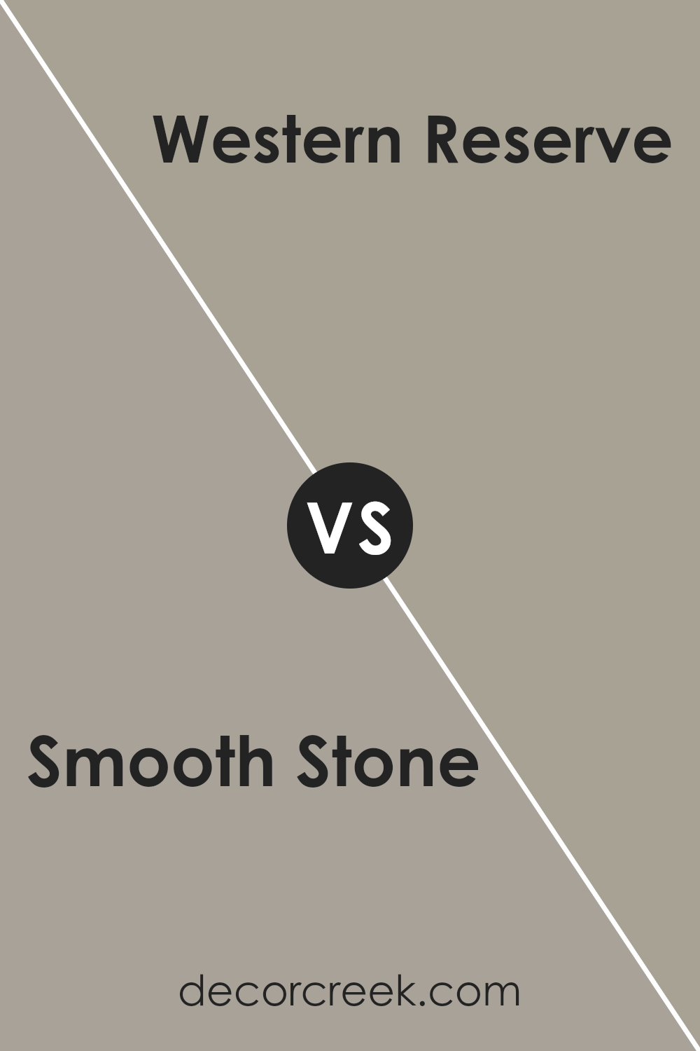
Smooth Stone SW 9568 by Sherwin Williams vs Western Reserve SW 9597 by Sherwin Williams
Smooth Stone and Western Reserve, both from Sherwin Williams, present unique shades for different tastes and spaces. Smooth Stone is a light, airy gray that brings a soft, neutral backdrop to any room, offering a calm and peaceful vibe.
It’s perfect for creating a serene space, making small rooms appear larger, and enhancing natural light.
On the other hand, Western Reserve steps into the room with a bolder statement. This color is a deeper, more pronounced hue that draws in a sense of richness and warmth.
It leans towards a cozy, enveloping atmosphere, ideal for adding character and depth to spaces. It can serve beautifully in accent walls or to give a room a grounded feel.
Comparing the two, Smooth Stone provides a subtle, clean look, while Western Reserve is all about making a warm, inviting statement.
Whether you’re aiming for a gentle nudge of neutrality or a strong embrace of color, choosing between these two comes down to the mood you want to create.
You can see recommended paint color below:
- SW 9597 Western Reserve
Conclusion
In conclusion, Smooth Stone by Sherwin Williams is recognized for its versatility and the serene ambiance it brings to interiors.
This color has gained popularity for its ability to blend seamlessly into a variety of decor styles, from contemporary to traditional, adding a subtle touch of elegance and a sense of calm to any room.
Its neutral tone makes it a perfect choice for those looking to create a space that feels both inviting and stylish without overwhelming the senses.
Furthermore, the adaptability of Smooth Stone allows it to be easily paired with different textures and color palettes, making it an ideal backdrop for interior designers and homeowners alike who wish to experiment with their space.
Whether it’s used on walls, as an accent, or to highlight architectural features, Smooth Stone offers a timeless appeal that enhances the overall aesthetics of a home, proving why it continues to be a favored choice among Sherwin Williams’ vast selection of colors.
Ever wished paint sampling was as easy as sticking a sticker? Guess what? Now it is! Discover Samplize's unique Peel & Stick samples.
Get paint samples