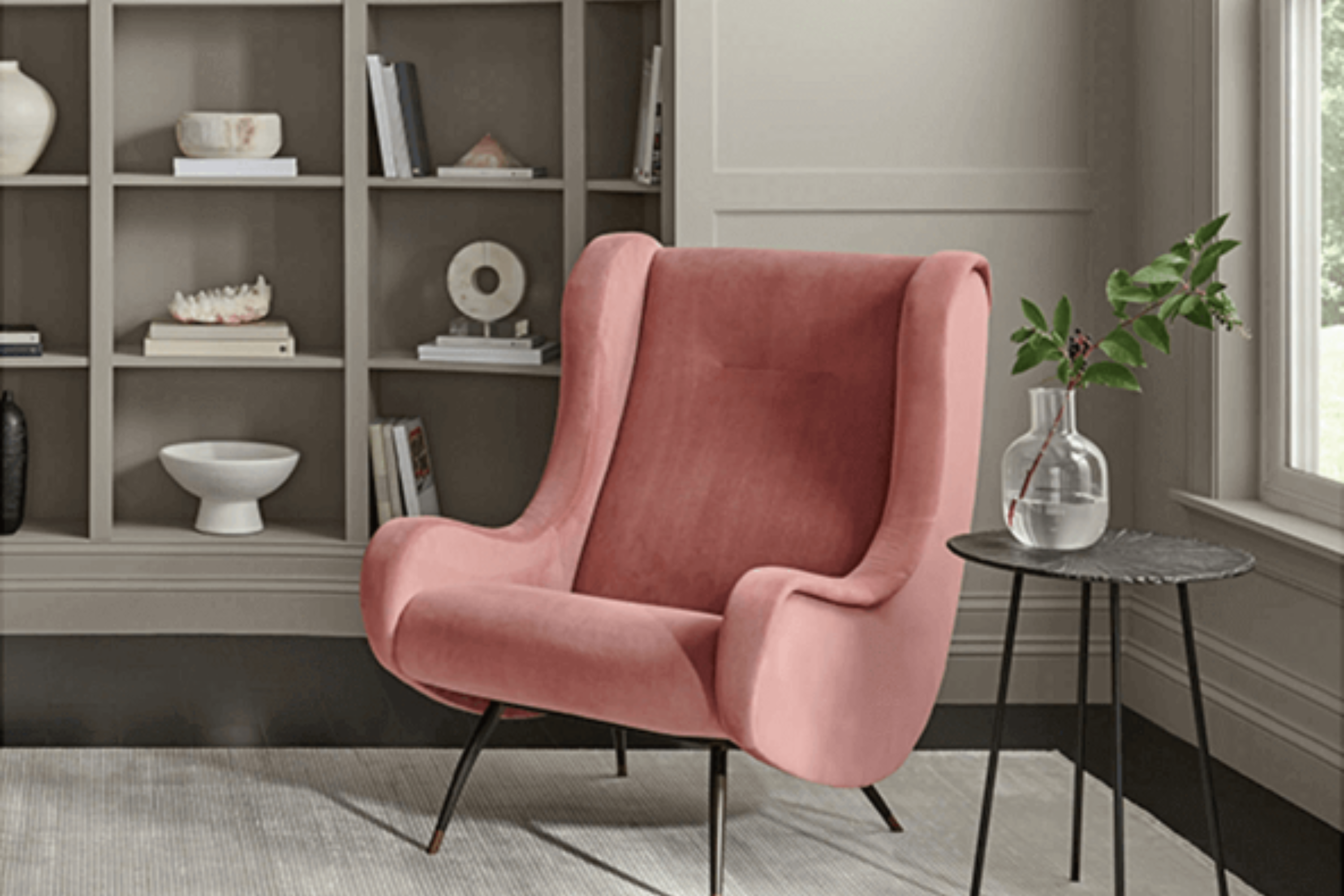
Introducing SW 7017 Dorian Gray by Sherwin Williams, your go-to shade for a touch of elegance and versatility in any space. When it comes to finding the perfect backdrop for your rooms, Dorian Gray strikes an ideal balance. It is not just another gray—it’s a unique blend that adds a sophisticated layer to interiors, proving itself as a favorite among homeowners and designers alike.
What makes Dorian Gray stand out is its ability to adapt to various settings and lighting conditions, offering a warm, inviting ambiance that feels both modern and timeless.
This color has a remarkable trait of looking slightly different yet stunning in every room, whether it’s casting a soft, cozy glow in a dimly lit bedroom or adding depth and contrast in a well-lit living area.
Painting your walls with SW 7017 Dorian Gray is more than just a decorating decision; it’s a choice to create a space that feels welcoming and lived-in. Its neutrality means it pairs beautifully with a wide range of colors, from bold and bright to soft and understated, allowing you to craft interiors that truly reflect your personal style.
As you consider the options for your next home improvement project, think of SW 7017 Dorian Gray as more than just paint. It’s a step towards creating a home environment that feels both stylish and warmly familiar.
What Color Is Dorian Gray SW 7017 by Sherwin Williams?
Dorian Gray by Sherwin Williams is a versatile, sophisticated gray that brings a depth of calm and refinement to any space. This color has a warm undertone, making it perfect for creating inviting interiors. It’s a timeless shade that works exceptionally well in a variety of interior styles, from modern and contemporary to traditional and rustic.
This gray is especially adept at complementing a wide range of materials and textures. In rooms with natural wood elements, such as hardwood floors or wooden furniture, Dorian Gray adds a layer of modern elegance. When paired with metal accents, like stainless steel or brass, it brings out a chic industrial vibe. For those who prefer a softer look, combining this color with fabrics like velvet or silk in complementary tones can create a cozy yet sophisticated atmosphere.
In terms of interior styles, Dorian Gray shines in minimalist spaces where its subtle warmth enhances a clean, uncluttered look. It’s also ideal for farmhouse-style interiors, where its earthy quality can complement natural textures and muted color palettes.
Urban loft and Scandi-inspired environments benefit from its cool-yet-warm balance, providing a serene backdrop that’s both stylish and welcoming.
Overall, Dorian Gray is a highly adaptable color that can elevate the look and feel of a wide range of interior design styles, making spaces more appealing and cohesive.
Ever wished paint sampling was as easy as sticking a sticker? Guess what? Now it is! Discover Samplize's unique Peel & Stick samples.
Get paint samples

Is Dorian Gray SW 7017 by Sherwin Williams Warm or Cool color?
Dorian Gray SW 7017 by Sherwin Williams is a beautiful, versatile paint color that brings a unique blend of warmth and sophistication to any home. This particular shade of gray has subtle brown undertones, which make it incredibly inviting and cozy. Unlike cooler grays, Dorian Gray adds a touch of warmth, making it perfect for living rooms, bedrooms, and even kitchens, where creating a welcoming atmosphere is key.
One of the best things about Dorian Gray is its ability to adapt to various lighting conditions, looking slightly different yet stunning at all times of the day. It pairs wonderfully with a wide range of decor styles, from modern to rustic, and complements both bright colors and more muted tones.
This makes it a fantastic choice for those wanting to refresh their space without overwhelming it.
By incorporating Dorian Gray into your home, you’ll find it easy to create a balanced, stylish look that feels both grounded and airy. Whether you choose it as a main color or as an accent, it’s sure to enhance the beauty and comfort of your space.
Undertones of Dorian Gray SW 7017 by Sherwin Williams
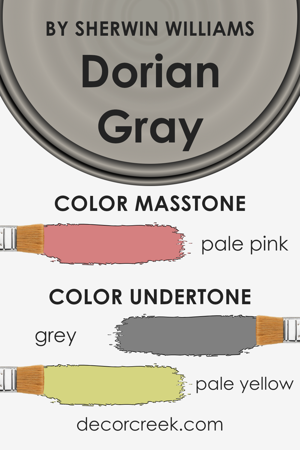
Dorian Gray by Sherwin Williams is a popular paint color for its versatile and neutral shade, but what makes it really stand out are its undertones. Every color has undertones, subtle hues that can change how a color looks under different lighting conditions and when paired with other colors. For Dorian Gray, the undertones are grey and pale yellow.
Grey undertones give this color a cool, soothing vibe, making it a great choice for creating a calm and relaxing atmosphere in any room. It’s the kind of color that pairs well with a wide range of decor, making it a go-to choice for many homeowners.
On the other hand, the pale yellow undertones add a hint of warmth, ensuring the color doesn’t feel too cold or sterile. This subtle warmth makes the paint more inviting and can help brighten up a space without being overwhelming. It’s this balance between cool and warm that makes Dorian Gray so versatile and appealing.
When it comes to interior walls, these undertones play a significant role in how the color appears. Depending on the lighting in a room, Dorian Gray can appear more as its grey undertones in natural light, giving a serene and classic look, while artificial lighting can bring out its pale yellow undertones, adding a cozy vibe. This interplay between undertones and lighting means the color can adapt and change throughout the day, giving your walls depth and complexity.
What is the Masstone of the Dorian Gray SW 7017 by Sherwin Williams?
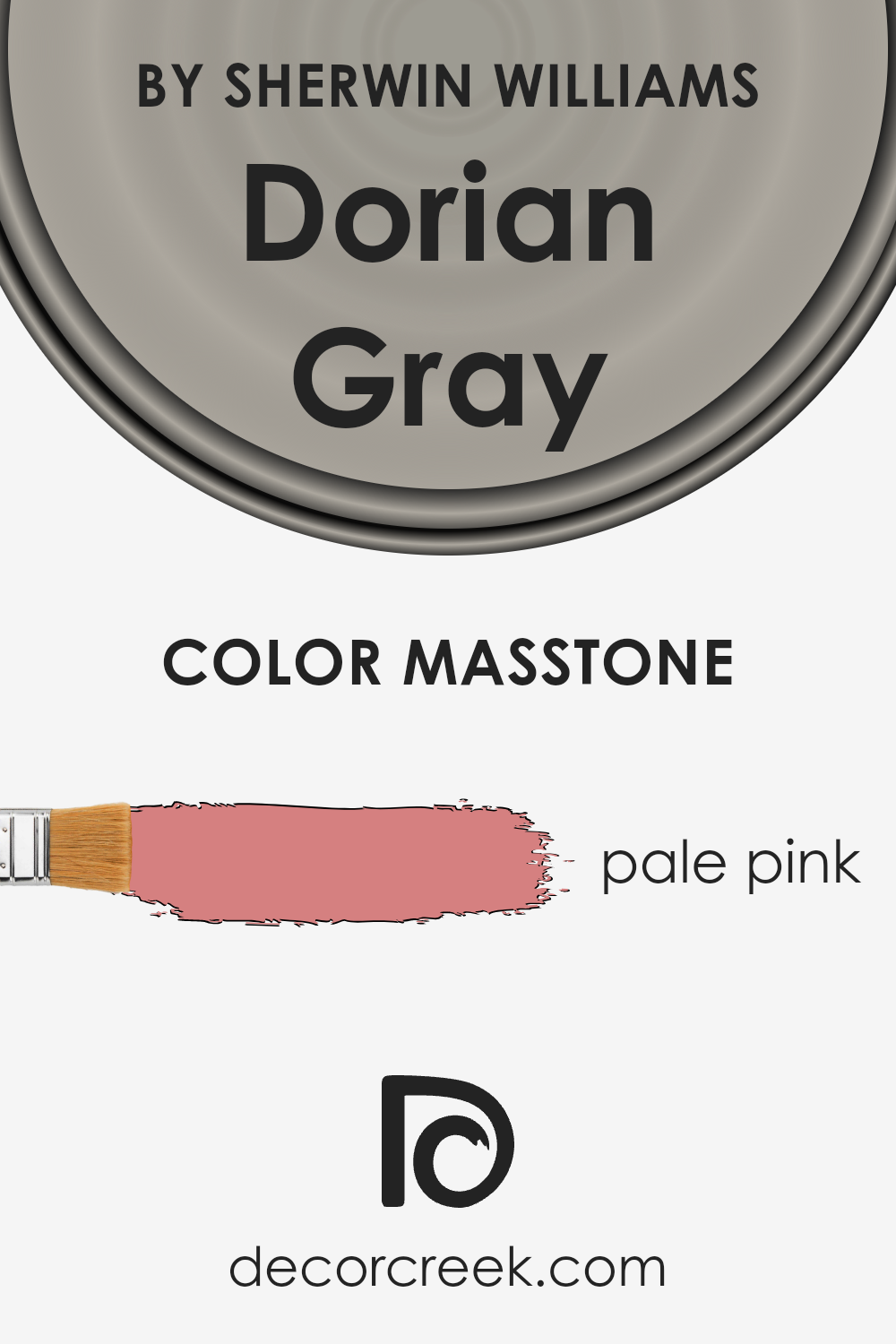
Dorian GraySW 7017 by Sherwin Williams has a masstone that may surprise you – it’s a pale pink, much like the color you see with #D58080. This detail is important because it helps us understand how this color behaves in home environments. When you apply this paint to your walls, the overall effect leans more into a subtle tone rather than the bold or stark feel you might expect from a gray.
This pale pink undertone gives rooms a warm, welcoming vibe. It’s ideal for spaces where you want a hint of coziness without overpowering the room with color. Whether it’s a bedroom that needs a soft touch or a living area that could use a little warmth, this shade does the trick. It blends well with other colors, too, making it versatile for decorating.
In natural light, the pink masstone can become more apparent, adding a gentle layer of interest and depth to your walls. It’s this quality that makes it so effective in adding character to your home in a subtle, understated way.
How Does Lighting Affect Dorian Gray SW 7017 by Sherwin Williams?
Lighting plays a crucial role in how we perceive the color of objects, significantly altering their appearance in different conditions. When it comes to painting walls, choosing the right color can transform the mood and feel of a room. For instance, a color like Dorian Gray by Sherwin Williams is versatile and behaves differently under various lighting conditions.
- Under artificial light, the subtleties of Dorian Gray might shift depending on the type of bulb used. Incandescent bulbs, which emit a warm, yellowish glow, can make this color appear warmer and more inviting, bringing out beige undertones. LED or fluorescent lights, which have a cooler effect, might highlight its cooler, more neutral base, keeping the color true to its appearance in daylight but slightly muted.
- In natural light, Dorian Gray’s true complexity is revealed. This color can look soothing and soft in rooms with ample sunlight but may appear more profound and richer in spaces with limited natural light. Its perception significantly varies with the room orientation:
- North-faced rooms: Light in north-facing rooms tends to be cooler and more consistent throughout the day. Here, Dorian Gray might appear slightly darker and lean towards its cooler, more shadowy undertones, making the room feel cozy yet sophisticated.
- South-faced rooms: These rooms receive a warmer, brighter light, especially during the day. In such rooms, Dorian Gray can warm up significantly, revealing any lighter undertones and offering a softer, more airy feel.
- East-faced rooms: Morning light is warm and bright, making Dorian Gray look lighter and more welcoming in the morning. As the day progresses and natural light diminishes, it may take on a cooler, more neutral appearance.
- West-faced rooms: Evening light brings warmth and a golden glow, which can make the color appear warmer and richer than at any other time of the day. During the morning, when the light is less intense, the color may present its more muted, natural state.
In conclusion, the multifaceted nature of Dorian Gray under different lighting conditions makes it a flexible color choice for various settings, enhancing the ambiance of a room by shifting in shade and warmth with the day’s rhythm and the type of lighting used.
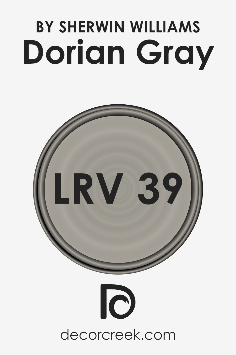
What is the LRV of Dorian Gray SW 7017 by Sherwin Williams?
LRV stands for Light Reflectance Value, a measure showing how much light a paint color reflects compared to how much it absorbs. On a scale from 0 to 100, 0 means it’s a true black, absorbing all light, and 100 means it’s a pure white, reflecting all the light that hits it. This measurement helps in understanding how light or dark a paint color will look once applied to your walls.
The amount of natural or artificial light a room gets can also affect the perception of the color. In rooms with plenty of sunlight, a higher LRV can make the space feel brighter and more open, while lower LRV colors can create a cozier, more intimate atmosphere.
For the specific color with an LRV of 38.723, it’s in the lower-middle part of the scale, meaning it doesn’t reflect a lot of light but isn’t the darkest option either. In spaces with less natural light, this color could appear darker and more profound on the walls, possibly making the room feel smaller or more enclosed.
Conversely, in well-lit areas, this paint might look slightly lighter and more vibrant, giving off a different ambiance. The LRV indicates that this shade can add a warm, welcoming depth to a room without overpowering it with darkness, making it a versatile choice for various lighting situations.
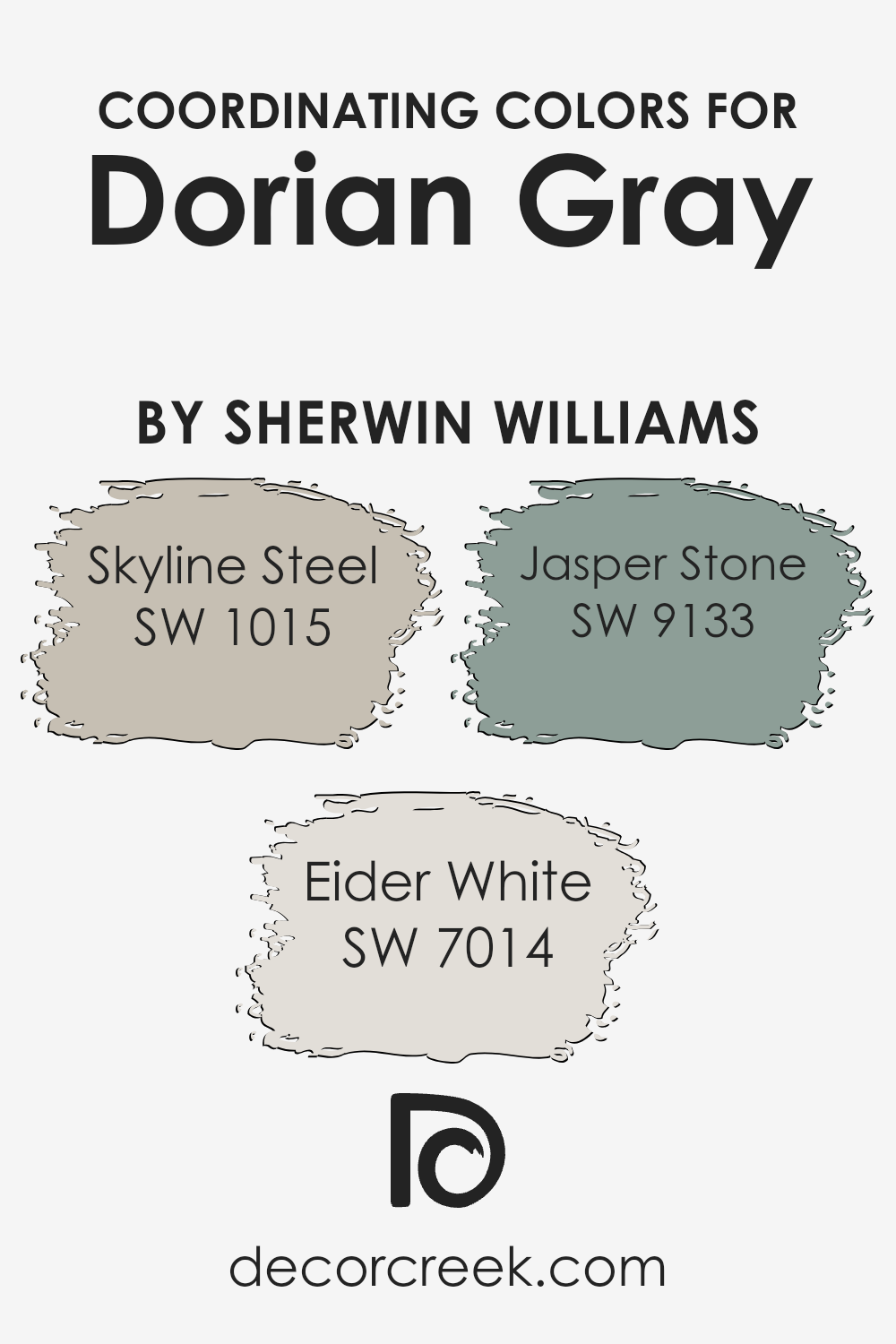
Coordinating Colors of Dorian Gray SW 7017 by Sherwin Williams
Coordinating colors are shades that complement each other, creating a harmonious and balanced look when used together. These colors can add depth and interest to a space, making it more vibrant or soothing, depending on the combination. When considering the soothing, versatile hue of Dorian Gray by Sherwin Williams, finding the right coordinating colors is essential to achieve a cohesive look.
The chosen shades should enhance the room’s atmosphere without overwhelming it, allowing each color to enhance the elegance of the others seamlessly.
Skyline Steel, Eider White, and Jasper Stone are excellent coordinating colors for Dorian Gray due to their complementary tones. Skyline Steel is a soft, muted gray with a subtle warmth that pairs beautifully with the deeper tones of Dorian Gray, providing a sophisticated backdrop that’s both inviting and modern.
Eider White offers a lighter, almost ethereal touch, brightening spaces with its crisp, clean presence, making it an ideal choice for trim or ceilings to add a sense of loftiness and light. Finally, Jasper Stone introduces a serene, nature-inspired vibe, a muted green with earthy undertones that adds a tranquil, organic element to the palette, perfect for accent walls or decorative elements.
Together, these colors work in harmony to create spaces that are visually appealing and thoughtfully designed, enhancing the beauty of Dorian Gray as a foundation shade.
You can see recommended paint colors below:
- SW 1015 Skyline Steel
- SW 7014 Eider White
- SW 9133 Jasper Stone
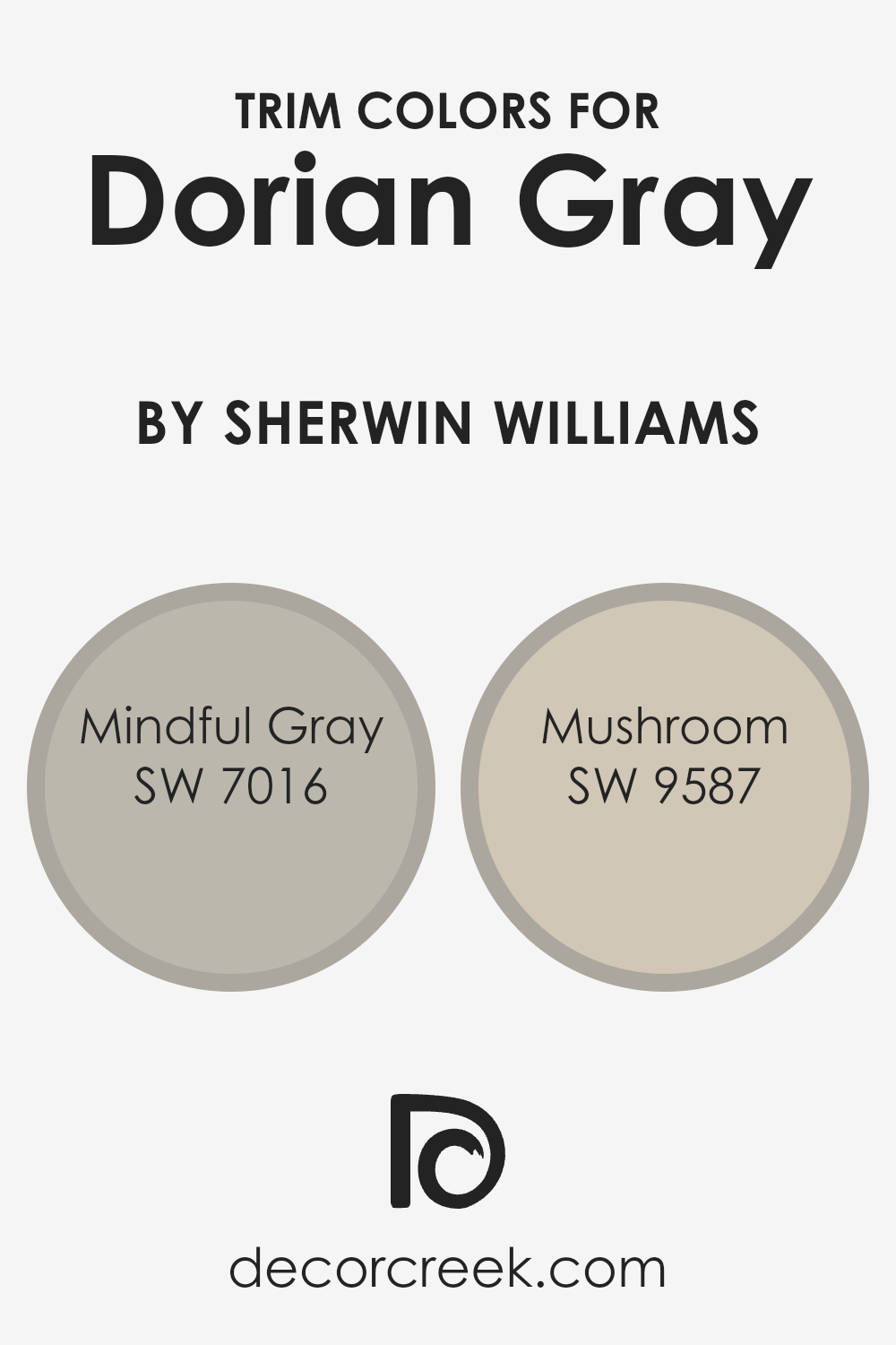
What are the Trim colors of Dorian Gray SW 7017 by Sherwin Williams?
Trim colors are the hues selected for the architectural details of a room or exterior, such as moldings, window frames, doors, and skirting boards. These colors play a crucial role in interior and exterior design because they frame the spaces, adding depth, contrast, and cohesive accents to the overall color scheme.
When used wisely, trim colors can highlight the main color palette of a space, bring harmony between different design elements, and enhance the architectural features of a building.
For a sophisticated and balanced look with Dorian Gray by Sherwin Williams, one can consider using Mindful Gray SW 7016 and Mushroom SW 9587 as trim colors. Mindful Gray is a warm, light gray shade that offers a soft, understated elegance, making it perfect for creating a seamless transition between the wall color and trim, ensuring that the focus remains on the richness of Dorian Gray.
On the other hand, Mushroom is a deeper, earthy hue that provides a beautiful contrast against the cooler tones of Dorian Gray, giving the space a grounded and inviting feel. Together, these trim colors can bring out the best in Dorian Gray, enhancing the surroundings with a sense of harmony and refined beauty.
You can see recommended paint colors below:
- SW 7016 Mindful Gray
- SW 9587 Mushroom
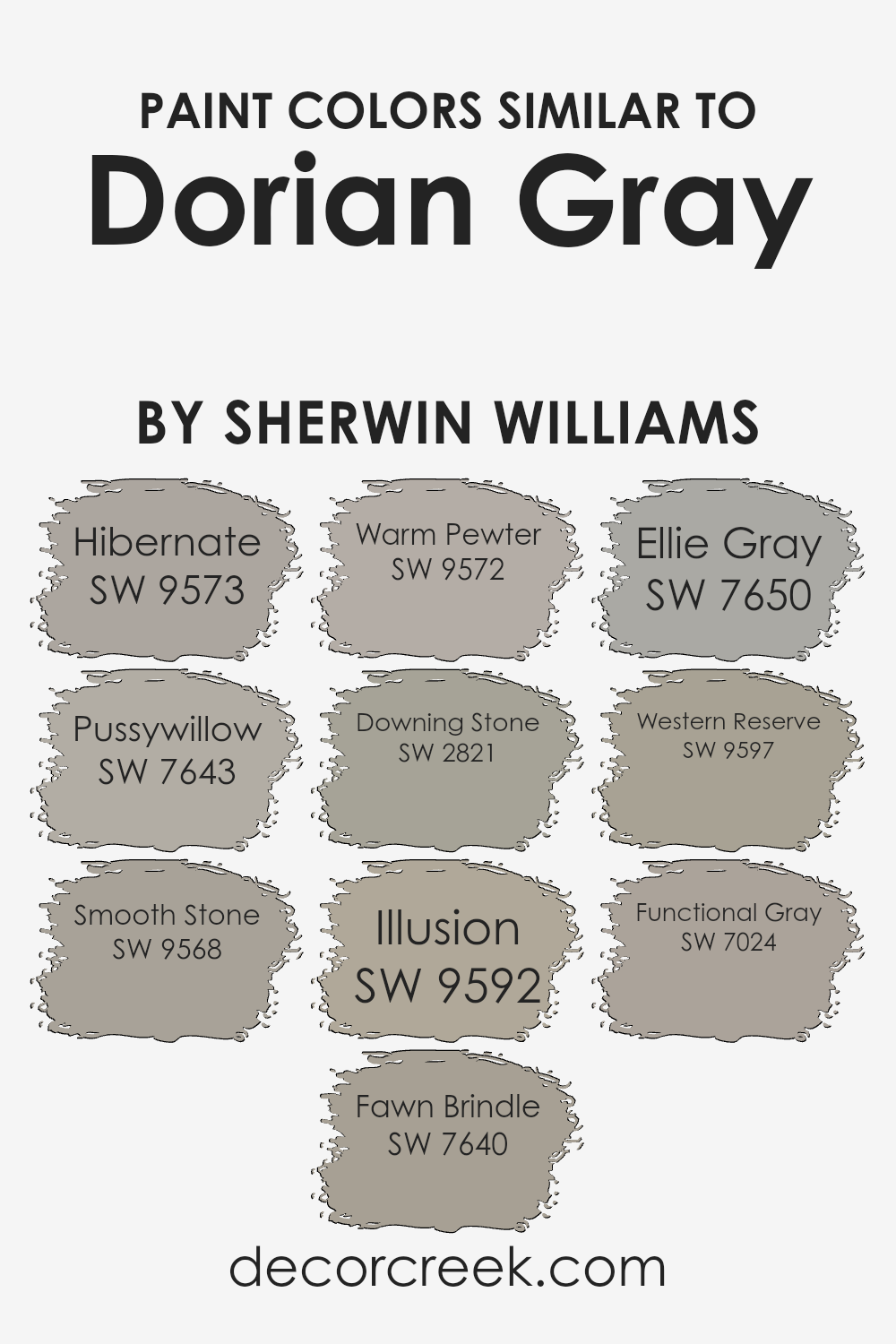
Colors Similar to Dorian Gray SW 7017 by Sherwin Williams
Choosing similar colors is crucial because it allows for a harmonious and balanced look in any space. These colors can blend seamlessly or offer subtle contrasts, providing depth and complexity without overwhelming the senses.
For instance, colors like Hibernate, a cozy, warm hue, softly complement the neutral base of grays and browns, creating a snug atmosphere. Pussywillow, a soft, muted gray, adds a calm, peaceful touch to interiors, echoing the quietude of early morning skies.
Smooth Stone, with its gentle gray tone, offers a sleek, modern look, while Fawn Brindle introduces a deeper, earthy element for grounding spaces with its rich, welcoming presence.
On the other hand, Warm Pewter, a medium gray with warm undertones, brings in a touch of sophistication and versatility, making it easy to pair with various decor styles. Downing Stone lends a stately elegance with its robust, deeper hue, perfect for adding character. Illusion, a lighter shade, illuminates spaces with its breezy, airy feel. Ellie Gray, a balanced, mid-tone gray, provides a steady backdrop for vibrant accents to pop.
Western Reserve, a unique blend with a hint of green, offers an organic, refreshing twist to the palette. Functional Gray, with its no-nonsense approach, anchors spaces with its solid, dependable tone. Each of these colors supports the others, creating a comprehensive palette that accommodates an array of design preferences while maintaining visual coherence and appeal.
You can see recommended paint colors below:
- SW 9573 Hibernate
- SW 7643 Pussywillow
- SW 9568 Smooth Stone
- SW 7640 Fawn Brindle
- SW 9572 Warm Pewter
- SW 2821 Downing Stone
- SW 9592 Illusion
- SW 7650 Ellie Gray
- SW 9597 Western Reserve
- SW 7024 Functional Gray
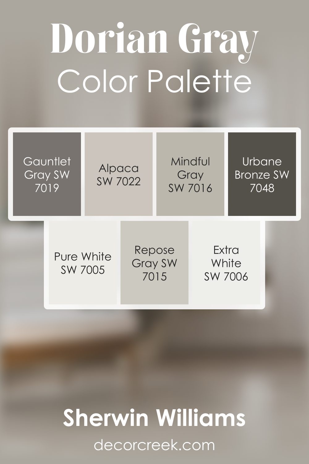
Dorian Gray SW 7017 by Sherwin Williams Color Palette
Dorian Gray sits at the center of this palette with its gentle mid-tone color that feels steady and soothing. Mindful Gray and Repose Gray create soft transitions that help rooms feel connected and harmonious. Pure White and Extra White brighten the palette, adding freshness that pairs beautifully with the warmer tones.
Gauntlet Gray brings meaningful depth, giving the palette strong accents that still feel natural.
Alpaca adds warmth that softens the overall look, while Urbane Bronze introduces bold contrast for areas that need definition. This palette feels balanced, warm, and easy to enjoy, making it an ideal choice for relaxed homes that love comfort and quiet style.
How to Use Dorian Gray SW 7017 by Sherwin Williams In Your Home?
Dorian Gray by Sherwin Williams is a versatile paint color that brings a modern touch to any home. This shade is a beautiful balance of gray with warm undertones, making it a perfect pick if you’re looking to refresh your space with a cozy yet sophisticated vibe. Whether you’re aiming to revamp your living room, bedroom, or even your kitchen, Dorian Gray can create a stunning backdrop that complements a wide range of decor styles and color schemes.
One of the best things about this color is its ability to blend with both light and dark accents, furniture, and accessories. For instance, you can use it on your walls to provide a calm and inviting atmosphere that enhances natural light during the day and feels cozy at night.
If you’re not ready to commit to painting an entire room, consider using Dorian Gray for an accent wall. This can highlight a particular area of your room without overwhelming the space.
Moreover, Dorian Gray works well not just on walls but also on cabinets or shelves, giving your room a chic, cohesive look. Its flexibility and timeless appeal make it an excellent choice for anyone looking to update their home with a touch of elegance.
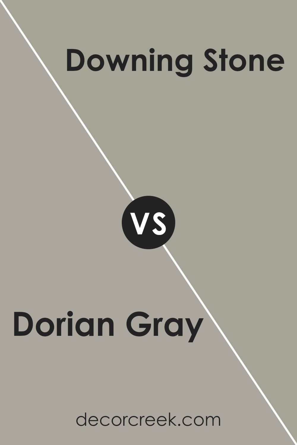
Dorian Gray SW 7017 by Sherwin Williams vs Downing Stone SW 2821 by Sherwin Williams
Dorian Gray and Downing Stone, both from Sherwin Williams, offer unique takes on neutral hues. Dorian Gray is a warm, mid-tone gray. It provides a cozy backdrop for any room, making spaces feel inviting.
Its versatility allows it to match a wide range of decor, from modern to traditional. On the other hand, Downing Stone is darker, leaning towards a brown-gray. This color brings a refined, sophisticated vibe to spaces.
It works well in areas where you want to add depth and is particularly stunning in well-lit rooms or as an accent wall. While Dorian Gray can lighten up a room with its softer appearance, Downing Stone adds drama and character.
Choosing between them depends on the atmosphere you’re aiming for: Dorian Gray for a friendly, open space, and Downing Stone for a more dramatic, elegant look.
You can see recommended paint color below:
- SW 2821 Downing Stone
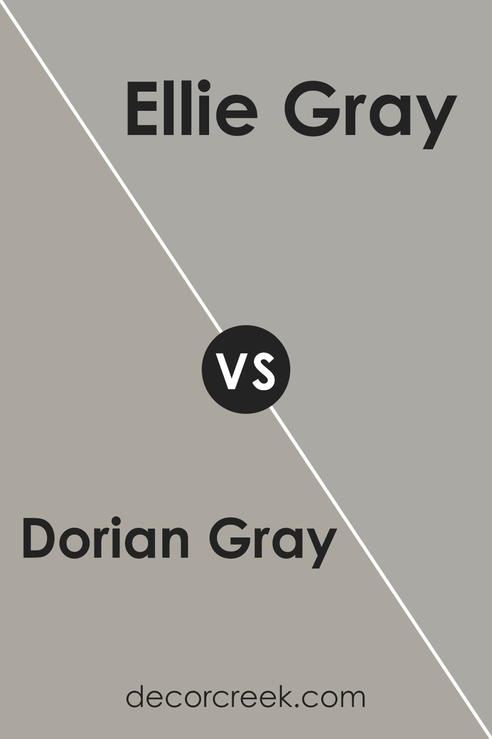
Dorian Gray SW 7017 by Sherwin Williams vs Ellie Gray SW 7650 by Sherwin Williams
Dorian Gray and Ellie Gray are both gray shades by Sherwin Williams but have unique touches that set them apart. Dorian Gray sits on the warmer side of the gray spectrum. It has a cozy, welcoming vibe that’s versatile for many spaces. Think of it as a soft, gentle gray that can make rooms feel inviting.
On the other hand, Ellie Gray leans towards the cooler, more neutral side. It’s like a breath of fresh air in a room, giving off a modern and sleek feel. This color brings a sense of calm and is excellent for a contemporary look.
While both colors share the tranquility of gray, Dorian Gray offers warmth and coziness, making spaces feel homey. Ellie Gray, meanwhile, provides a crisp, clean backdrop for a more updated and chic aesthetic. Depending on what atmosphere you’re looking to create – warm and snug with Dorian Gray or cool and sophisticated with Ellie Gray – each color brings its unique charm to a space.
You can see recommended paint color below:
- SW 7650 Ellie Gray
Dorian Gray SW 7017 by Sherwin Williams vs Smooth Stone SW 9568 by Sherwin Williams
Dorian Gray and Smooth Stone are both elegant shades offered by Sherwin Williams, but they bring different vibes to a room. Dorian Gray leans towards a mid-tone gray that has a warm, welcoming feel. It’s the kind of color that can make a space feel cozy and sophisticated at the same time. On the other hand, Smooth Stone is lighter and has a more subtle, serene quality.
It’s great for creating a bright and airy feeling in a space, making it appear more open and spacious. While Dorian Gray might be better suited for making a statement or anchoring a room with its slightly bolder presence, Smooth Stone works beautifully as a neutral backdrop that can complement a wide range of colors.
Both colors are versatile, but your choice between them would depend on the atmosphere you’re aiming to achieve in your space.
You can see recommended paint color below:
Dorian Gray SW 7017 by Sherwin Williams vs Illusion SW 9592 by Sherwin Williams
Dorian Gray and Illusion, both by Sherwin Williams, are two distinct shades that bring their unique vibes to any space. Dorian Gray is a warm, medium-dark gray that feels cozy and inviting.
It’s perfect for creating a sophisticated yet welcoming atmosphere. This color is versatile, easily fitting into a modern living room or a cozy bedroom. It pairs beautifully with white trim or soft pastels. On the other hand, Illusion is a lighter shade, leaning towards a soft, powdery blue with hints of gray.
This color gives off a serene and calming effect, making it ideal for bathrooms or bedrooms where you want to unwind.
It’s great for achieving a fresh, airy look, complementing white accents or natural wood tones. While Dorian Gray provides a rich, grounded feel, Illusion offers a breezy and tranquil touch. Each brings its mood to interiors, from Dorian Gray’s comforting embrace to Illusion’s refreshing calm.
You can see recommended paint color below:
Dorian Gray SW 7017 by Sherwin Williams vs Fawn Brindle SW 7640 by Sherwin Williams
The two colors, Dorian Gray and Fawn Brindle, both from Sherwin Williams, have their own uniqueness, yet share a subtle, sophisticated vibe. Dorian Gray stands out as a warm medium gray that leans toward a soft, welcoming feel. It’s versatile, making it a great choice for any room looking for a touch of elegance without being too bold.
On the other hand, Fawn Brindle is a tad darker, mixing gray and brown tones to create a cozy, earthy color. This shade gives off a more traditional look, perfect for creating a snug and inviting space.
While both colors are ideal for those seeking a neutral palette, Fawn Brindle adds a bit more warmth due to its brown undertones, making it ideal for spaces where you want to add depth and comfort.
In summary, if you’re going for a classic gray with a modern twist, Dorian Gray is your color. But, if it’s warmth and a hint of tradition you’re after, Fawn Brindle is the way to go. Both are beautiful, it really comes down to the mood you’re trying to set.
You can see recommended paint color below:
- SW 7640 Fawn Brindle
Dorian Gray SW 7017 by Sherwin Williams vs Western Reserve SW 9597 by Sherwin Williams
Dorian Gray and Western Reserve by Sherwin Williams are two unique colors that bring their own charm to any space. Dorian Gray is a medium-light shade of gray that has a warm undertone, making it welcoming and versatile for various decorating styles. It’s the kind of color that can make a room feel cozy yet spacious, perfect for living rooms or bedrooms.
On the other hand, Western Reserve is significantly darker and leans towards a more sophisticated, almost navy blue-gray hue. This color adds depth and a sense of luxury to spaces, making it great for creating accent walls or for use in areas where you want to make a strong visual statement.
While Dorian Gray offers a softer, more neutral background that can easily match different decors and colors, Western Reserve brings a bold and dramatic flair. Both colors can transform a room in different ways, with Dorian Gray providing a light, airy feel and Western Reserve giving an anchored, profound look.
You can see recommended paint color below:
- SW 9597 Western Reserve
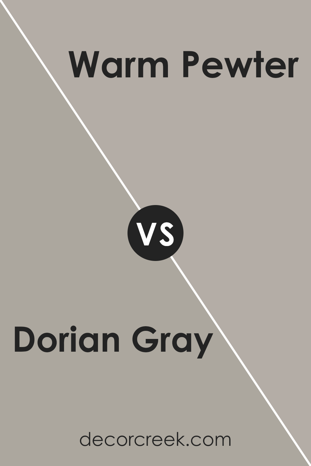
Dorian Gray SW 7017 by Sherwin Williams vs Warm Pewter SW 9572 by Sherwin Williams
Dorian Gray and Warm Pewter, both by Sherwin Williams, are two neutral colors with subtle differences. Dorian Gray is a cozy, medium shade that balances between gray and beige. This versatility allows it to blend seamlessly into various decor styles, offering a soothing backdrop that’s neither too cold nor too warm. It’s a color that gives spaces a sophisticated and timeless feel, perfect for living rooms or bedrooms looking for a touch of elegance.
On the other hand, Warm Pewter is a lighter gray that leans more towards a soft, silvery tone. This color is ideal for those wanting to brighten up their space while maintaining a neutral palette. It reflects light beautifully, making it an excellent choice for smaller rooms or areas with limited natural light.
Its ability to act as a fresh canvas makes it highly adaptable and easy to pair with different accents and furnishings.
In summary, Dorian Gray offers a deeper, warmer tone that’s great for creating cozy, inviting spaces, while Warm Pewter is lighter and lends a more airy, spacious feeling to rooms. Both colors provide a neutral base, but their unique shades can dramatically change the ambiance of a space.
You can see recommended paint color below:
- SW 9572 Warm Pewter
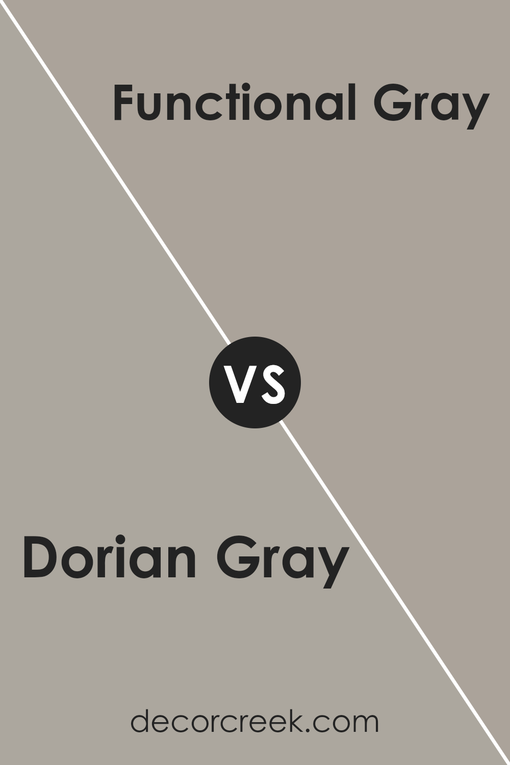
Dorian Gray SW 7017 by Sherwin Williams vs Functional Gray SW 7024 by Sherwin Williams
Dorian Gray and Functional Gray, both by Sherwin Williams, are two intriguing shades of gray. Dorian Gray is a mid-tone gray with warm undertones, offering a cozy feel to any space.
It’s versatile, fitting well in various rooms, such as living areas or bedrooms, adding a subtle hint of sophistication without overpowering the space. On the other hand, Functional Gray is a bit darker and leans more towards cool undertones, providing a more defined and contemporary look.
This color is excellent for creating a statement, possibly in areas like a home office or dining room, where its depth can add a layer of modern elegance.
While both colors share the gray family, Dorian Gray wraps a room in a welcoming warmth, whereas Functional Gray offers a sharper, more urban vibe. Choosing between them depends on the mood you want to set; warm and inviting or cool and stylish.
You can see recommended paint color below:
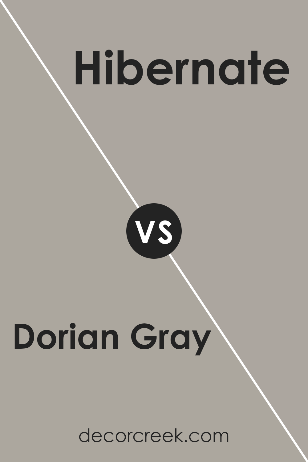
Dorian Gray SW 7017 by Sherwin Williams vs Hibernate SW 9573 by Sherwin Williams
Dorian Gray and Hibernate by Sherwin Williams are two distinct paints with unique appeal. Looking closely, Dorian Gray serves as a cool, mid-tone gray with soothing vibes. Imagine it as a versatile backdrop in any room, offering a sleek and modern feel without being too overwhelming. It’s like a steady friend that fits in everywhere, enhancing other colors around it.
On the other side, Hibernate introduces itself with a warmer, cozier touch. It’s a deeper, earthy taupe that brings to mind a comforting blanket on a chilly evening. It carries an inviting warmth, perfect for creating a snug and welcoming atmosphere in spaces meant for relaxation.
When comparing these two, think of Dorian Gray as the light, airy cloud cover of an early morning, while Hibernate is the rich, fertile soil of the earth. Both bring beauty and personality to a space but in very different ways – Dorian Gray with its cool, subtle elegance, and Hibernate with its warm, nurturing embrace. They answer different calls of style, one with a whisper of contemporary chic and the other with a hearty nod to natural comfort.
You can see recommended paint color below:
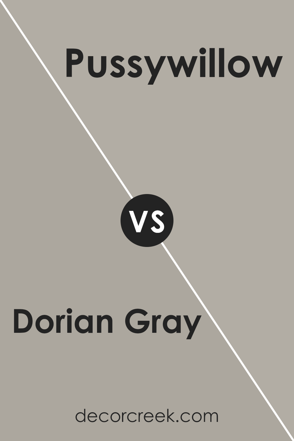
Dorian Gray SW 7017 by Sherwin Williams vs Pussywillow SW 7643 by Sherwin Williams
Dorian Gray and Pussywillow, both by Sherwin Williams, share a neutral charm, but they stand apart in their unique shades and vibes. Dorian Gray is a warmer, medium gray that gives off a cozy yet sophisticated feel. It’s like the perfect gray sweater: comforting and stylish. The warmth in Dorian Gray can make a room inviting, making it ideal for living spaces where you want to relax.
On the other hand, Pussywillow leans slightly cooler and lighter. It has a versatile, understated elegance, making it a great choice for creating a serene and airy feel. While both colors are great for a modern aesthetic, Pussywillow’s lighter tone can make small spaces appear larger and more open.
In essence, Dorian Gray brings warmth and depth, presenting a snug retreat, whereas Pussywillow offers a crisp, clean look, perfect for a fresh, minimalist style. Both colors are incredibly adaptable, but your choice might depend on the atmosphere you’re aiming to achieve.
You can see recommended paint color below:
Conclusion
Dorian Gray by Sherwin Williams is a versatile and sophisticated color that has gained popularity for its ability to blend well with a variety of decor styles and settings. Characterized by its unique balance between warm and cool tones, this shade offers a muted elegance that makes it perfect for creating a serene and inviting atmosphere in homes.
Its adaptability means it works beautifully in spaces like living rooms, bedrooms, and kitchens, providing a neutral backdrop that complements both modern and traditional designs.
One of the key advantages of Dorian Gray is its ability to pair effortlessly with a wide range of colors, from soft pastels to bold hues, allowing for creative and personal interior styling.
Its timeless quality ensures that spaces painted in this color remain stylish and appealing over time, avoiding the pitfalls of trend-driven design choices. For homeowners looking to update their space with a color that marries warmth and sophistication, Dorian Gray stands out as a smart, enduring choice.

Ever wished paint sampling was as easy as sticking a sticker? Guess what? Now it is! Discover Samplize's unique Peel & Stick samples.
Get paint samples
