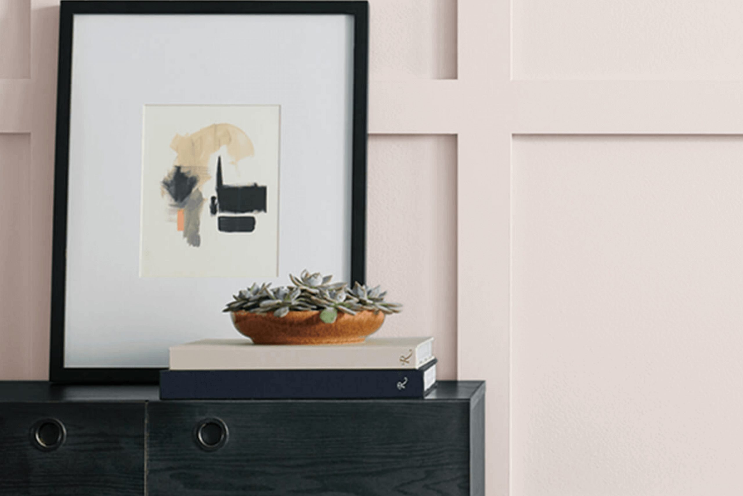
This paint color quickly became a staple in my home, thanks to its soft and inviting aura. Over time, I noticed how it effortlessly brightened up any room, making spaces feel open and airy without being overpowering. Dreamy White offers a perfect backdrop, allowing my furniture and decorations to truly stand out.
What drew me most to this color was its versatility. Whether I was updating the living room, refreshing the bedroom, or even giving the kitchen a new look, Dreamy White proved to be a reliable choice. It beautifully complements both modern and traditional styles, offering a timeless feel that doesn’t go out of fashion.
Plus, its neutral tone makes it easy to match with other colors, making the decorating process straightforward and stress-free.
Choosing Dreamy White by Sherwin Williams has changed how I experience my home. Its gentle and soothing hue creates a peaceful environment where I can unwind after a long day.
Whether you’re sprucing up a single room or redoing your entire home, Dreamy White offers a simple yet effective way to bring warmth and elegance to your space.
What Color Is Dreamy White SW 6021 by Sherwin Williams?
Dreamy White SW 6021 by Sherwin Williams is a soft, gentle off-white with subtle undertones that lend warmth to a room without overpowering it. Its delicate hue offers a cozy and inviting feeling, making any space feel welcoming. This versatile color works beautifully across various interior styles like modern, farmhouse, coastal, or traditional.
In a modern setting, Dreamy White provides a clean backdrop that enhances minimalist furniture and bold accessories. Pair it with sleek materials like glass, polished metals, and smooth, lacquered finishes for a contemporary look. In a farmhouse style, it blends seamlessly with natural wood, burlap, and vintage touches, creating a comforting, homey atmosphere.
Coastal interiors benefit from its light, airy feel, complementing soft blues, sandy beiges, and nautical elements like rattan or seagrass. Textures such as linen, cotton, and wicker harmonize well here, giving spaces a relaxed and beachy vibe.
Traditional rooms can also use this shade effectively, as it pairs well with classic wood tones and decorative moldings. Incorporate rich textiles, like velvet and brocade, for added depth and luxury.
Overall, Dreamy White is adaptable and works with various textures and materials, making it a perfect choice for creating warm, inviting interiors.

Is Dreamy White SW 6021 by Sherwin Williams Warm or Cool color?
Dreamy White SW 6021 by Sherwin Williams is a soft, gentle color that can have a calming effect in homes. This shade of white has a subtle warmth to it, making it feel inviting and cozy. It doesn’t come across as stark or cold, which can sometimes be an issue with pure whites. Instead, it offers a sense of comfort and ease.
In living rooms, this color can create a bright, open feeling without being too overwhelming. It pairs well with natural light, enhancing the airy, spacious vibe of a room. In bedrooms, Dreamy White provides a restful backdrop that can help create a peaceful environment for sleep.
When used in kitchens, it can provide a clean look while still feeling homely. This color works well with both modern and traditional decor, making it versatile for various design styles. Overall, Dreamy White SW 6021 is a great choice for those looking to add warmth and softness to their spaces.
Undertones of Dreamy White SW 6021 by Sherwin Williams
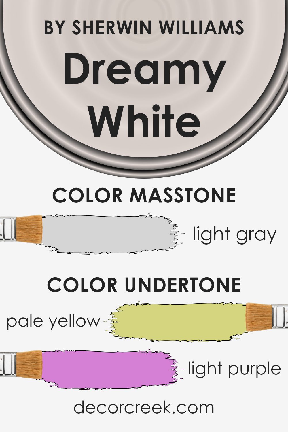
Dreamy White by Sherwin Williams has a unique blend of undertones that can subtly change how it looks in different settings. These undertones include pale yellow, light purple, light blue, pale pink, mint, lilac, and grey. Undertones are the hidden colors that can give the main color a different feel depending on the lighting and surrounding colors.
When you apply Dreamy White to interior walls, its undertones can have a big effect. In rooms with warm lighting, the pale yellow and pale pink undertones might come forward, making the color appear softer and a bit warmer. This can make a space feel cozy and inviting.
In contrast, in areas with cooler light, like natural daylight, the light blue and mint undertones might stand out, giving the walls a cooler, fresher feel.
The presence of the grey undertone helps keep the color balanced, preventing it from becoming too bright or too dull. With its subtle lilac and light purple notes, Dreamy White can take on a slightly romantic and gentle vibe, ideal for spaces meant to feel restful and welcoming.
Overall, the mix of these undertones allows this white to adapt beautifully to various environments, giving it a versatile and pleasing appearance.
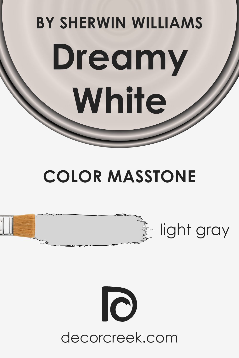
What is the Masstone of the Dreamy White SW 6021 by Sherwin Williams?
Dreamy White, by Sherwin Williams, is a soft light gray that carries an elegant simplicity. With its masstone being a calm light gray (#D5D5D5), this color brings a gentle brightness to any space. It works well in homes, creating a clean and airy atmosphere that feels open and welcoming. Its subtle undertone ensures it complements a wide range of other colors, blending seamlessly with both cool and warm tones.
In living rooms, Dreamy White makes spaces feel more open and enhances natural light. In bedrooms, it provides a restful backdrop, perfect for relaxation. Kitchens painted in this color feel fresh and inviting, allowing other design elements such as countertops and cabinets to stand out.
Dreamy White’s neutrality also makes it a perfect choice for selling homes as it appeals to a broad audience. It’s versatile enough to support various styles, whether modern, traditional, or somewhere in between.
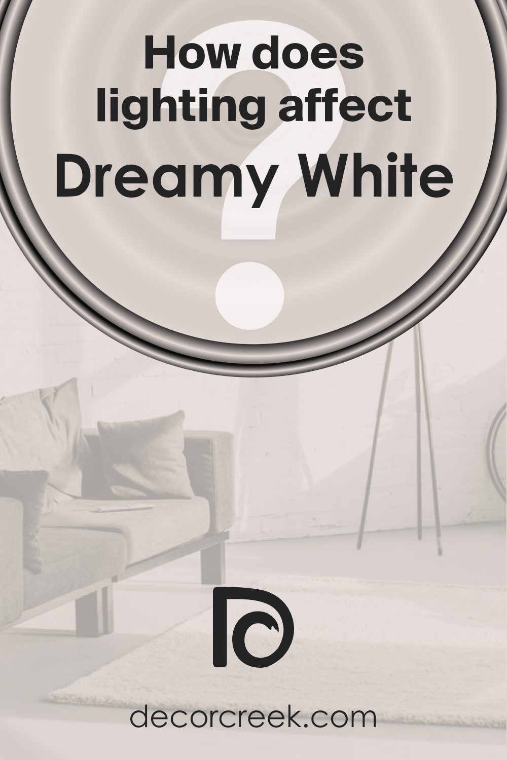
How Does Lighting Affect Dreamy White SW 6021 by Sherwin Williams?
Lighting plays a crucial role in how we perceive colors. It can change the appearance of colors dramatically, affecting their brightness, warmth, and overall feel. Dreamy White SW 6021 by Sherwin-Williams is a soft, warm white that behaves differently under various lighting conditions.
In natural light, Dreamy White can appear soft and inviting. In a north-facing room, the light tends to be cooler, so Dreamy White might pick up hints of gray or blue, which can make the room feel a bit more subdued. This can work well if you want a calm and neutral backdrop. However, if you were expecting a warm white, the color might feel cooler than anticipated.
In a south-facing room, where the light is typically warm and bright, Dreamy White will show off its warmer undertones. The color can appear creamy and welcoming, adding a cozy atmosphere to the room. This type of lighting enhances the warmth of Dreamy White, making spaces feel comfortable and sunny.
East-facing rooms receive warm, direct sunlight in the morning and cooler light in the afternoon. During the morning, Dreamy White will look warm and soft, adding a gentle glow to the room. As the day progresses and the light cools, the color might appear slightly less warm but still soft and neutral.
In west-facing rooms, the lighting is cooler in the morning and warmer in the afternoon and evening. Dreamy White may initially seem more neutral or even slightly cool. However, as the day goes on and the light warms up, the color will become richer and warmer, adding depth to the space during the late afternoon and evening hours.
In artificial light, the color can vary depending on the light bulbs used. Incandescent bulbs will enhance its warm undertones, while LED or fluorescent lights might make it look more neutral or cool. It’s important to test Dreamy White in your specific space to see how it interacts with your room’s lighting.
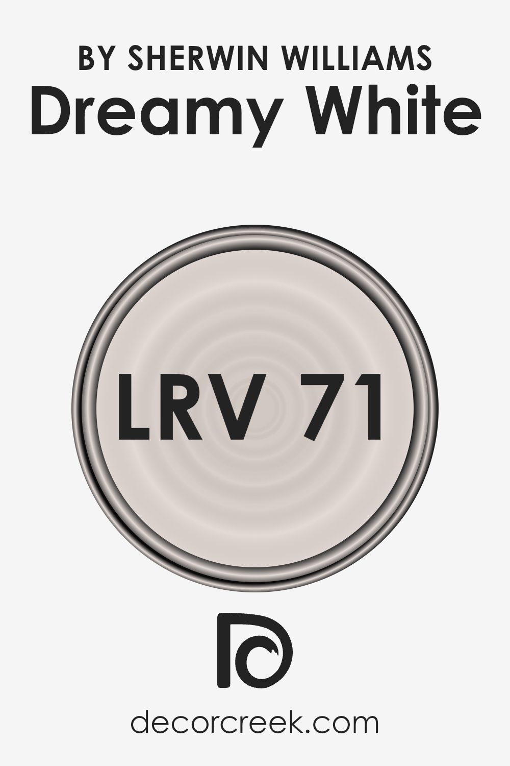
What is the LRV of Dreamy White SW 6021 by Sherwin Williams?
The Light Reflectance Value, or LRV, measures how much light a paint color reflects. It’s a scale that runs from 0, meaning the color absorbs all light, to 100, meaning it reflects all light. Lighter colors have higher LRVs and reflect more light, making a room feel brighter and possibly even larger.
On the other hand, colors with lower LRV values absorb more light, making spaces feel cozier or more intimate.
With a LRV of 70.89, Dreamy White reflects a significant amount of light. This makes it a bright choice for rooms where you want to maximize natural light or create an airy feel. The color won’t overwhelm the space, and it can help smaller or darker rooms feel more open and inviting.
Since it reflects so much light, it is versatile and works with various lighting conditions throughout the day, appearing slightly different as the light changes but always maintaining its light and bright character.
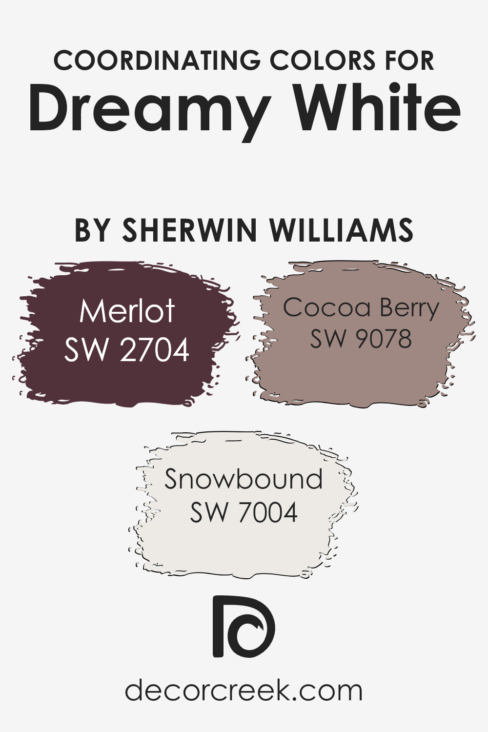
Coordinating Colors of Dreamy White SW 6021 by Sherwin Williams
Coordinating colors are shades chosen to complement and enhance a particular color, creating a harmonious look in a space. For a shade like Dreamy White (SW 6021) from Sherwin Williams, selecting the right coordinating colors can highlight its creamy warmth and versatility.
By pairing it with complementary hues such as Merlot (SW 2704), Snowbound (SW 7004), and Cocoa Berry (SW 9078), you can create a balanced and cohesive design that brings out the best in each shade.
Merlot is a rich, deep red that adds warmth and depth to any space, offering a striking contrast against lighter hues like Dreamy White. On the other hand, Snowbound is a crisp, clean white that provides a fresh and airy feel, which can brighten up a room and make Dreamy White appear even more inviting.
Meanwhile, Cocoa Berry offers a soft, muted brownish-pink tone that brings a touch of subtle color, bridging the gap between bold and neutral shades. Together, these coordinating colors enrich the overall visual appeal, ensuring that any space feels well put-together and aesthetically pleasing.
By carefully choosing such complementary shades, you can enhance the unique charm and character of Dreamy White.
You can see recommended paint colors below:
- SW 2704 Merlot
- SW 7004 Snowbound
- SW 9078 Cocoa Berry
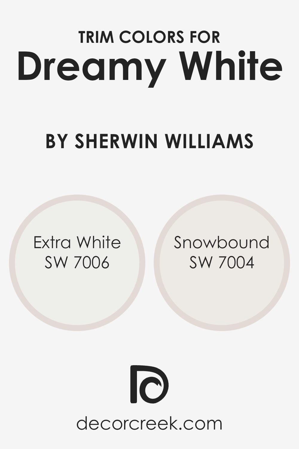
What are the Trim colors of Dreamy White SW 6021 by Sherwin Williams?
Trim colors refer to the paint colors used on the trims, moldings, doors, or windows against a wall color. When painting a room with Dreamy White by Sherwin Williams, choosing the right trim color can make a significant difference in how the space feels and looks.
Trim colors like SW 7006 Extra White and SW 7004 Snowbound are excellent choices to pair with Dreamy White because they provide a slight contrast that enhances the room’s details.
This helps highlight the architecture of the room and makes the space feel more complete and polished, drawing attention to the trims without overwhelming the primary wall color.
SW 7006 Extra White is a bright, clean white that offers a crisp look. It’s great for creating a sharp, modern contrast against the warmer tones of Dreamy White.
On the other hand, SW 7004 Snowbound is a softer, warmer white with subtle hints of gray, which pairs well with Dreamy White for a more muted, cohesive look. Using either of these trim colors adds depth and definition to the space, making the walls painted in Dreamy White stand out without disrupting the overall harmony of the room’s color scheme.
You can see recommended paint colors below:
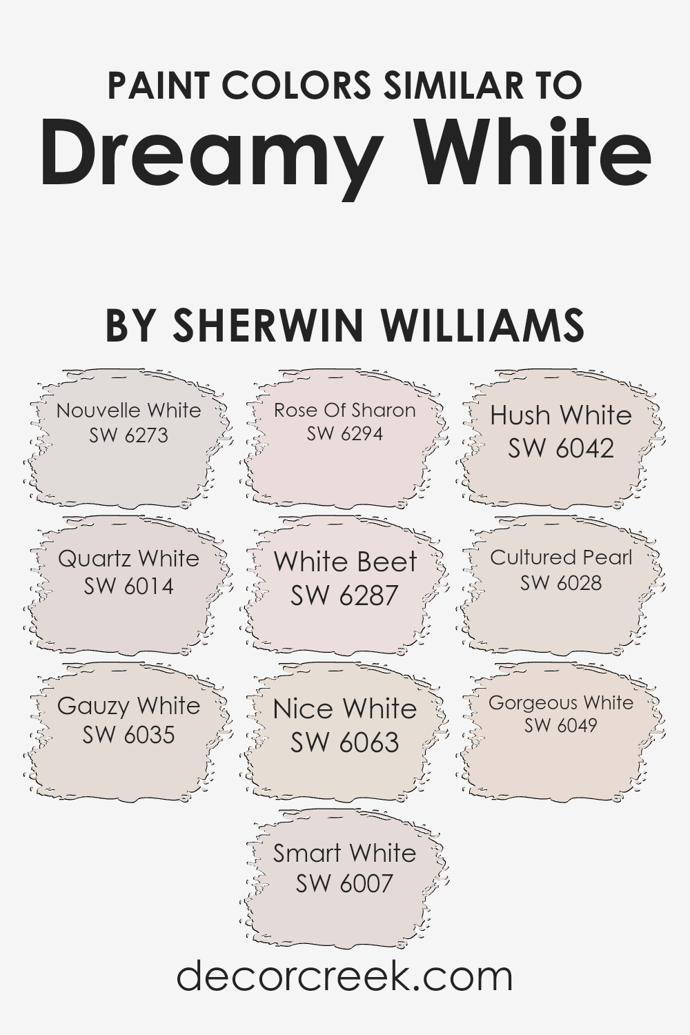
Colors Similar to Dreamy White SW 6021 by Sherwin Williams
Similar colors can create a cohesive and harmonious environment. When decorating a space, selecting colors that are close in tone helps to maintain a consistent look and feel. Each similar color can bring out different undertones and nuances in the main color, such as Sherwin-Williams’ Dreamy White.
Nouvelle White has a soft, creamy backdrop that brings warmth and subtlety. Quartz White offers a light and airy feel with a hint of sophistication that feels slightly more concentrated. Gauzy White is reminiscent of lightweight fabric, making it a perfect choice for a gentle atmosphere.
Smart White has an intuitive touch, with a crisp and balanced presence that brings clarity to a room. Rose Of Sharon introduces a soft, understated pink that gently brightens the space. Meanwhile, White Beet has a very faint tint of blush that adds a layer of depth to neutral foundations. Nice White is pleasantly simple and versatile, fitting into most color schemes effortlessly.
Hush White carries a whisper of softness, injecting a pleasing quietness into interiors. Cultured Pearl brings an elegant touch with its muted sheen, ideal for refined spaces.
Finally, Gorgeous White is uncomplicated and pure, perfect for creating a pristine and clean look. Together, these colors complement and enhance each other beautifully, ensuring a unified and pleasing aesthetic.
You can see recommended paint colors below:
- SW 6273 Nouvelle White
- SW 6014 Quartz White
- SW 6035 Gauzy White
- SW 6007 Smart White
- SW 6294 Rose Of Sharon
- SW 6287 White Beet
- SW 6063 Nice White
- SW 6042 Hush White
- SW 6028 Cultured Pearl
- SW 6049 Gorgeous White
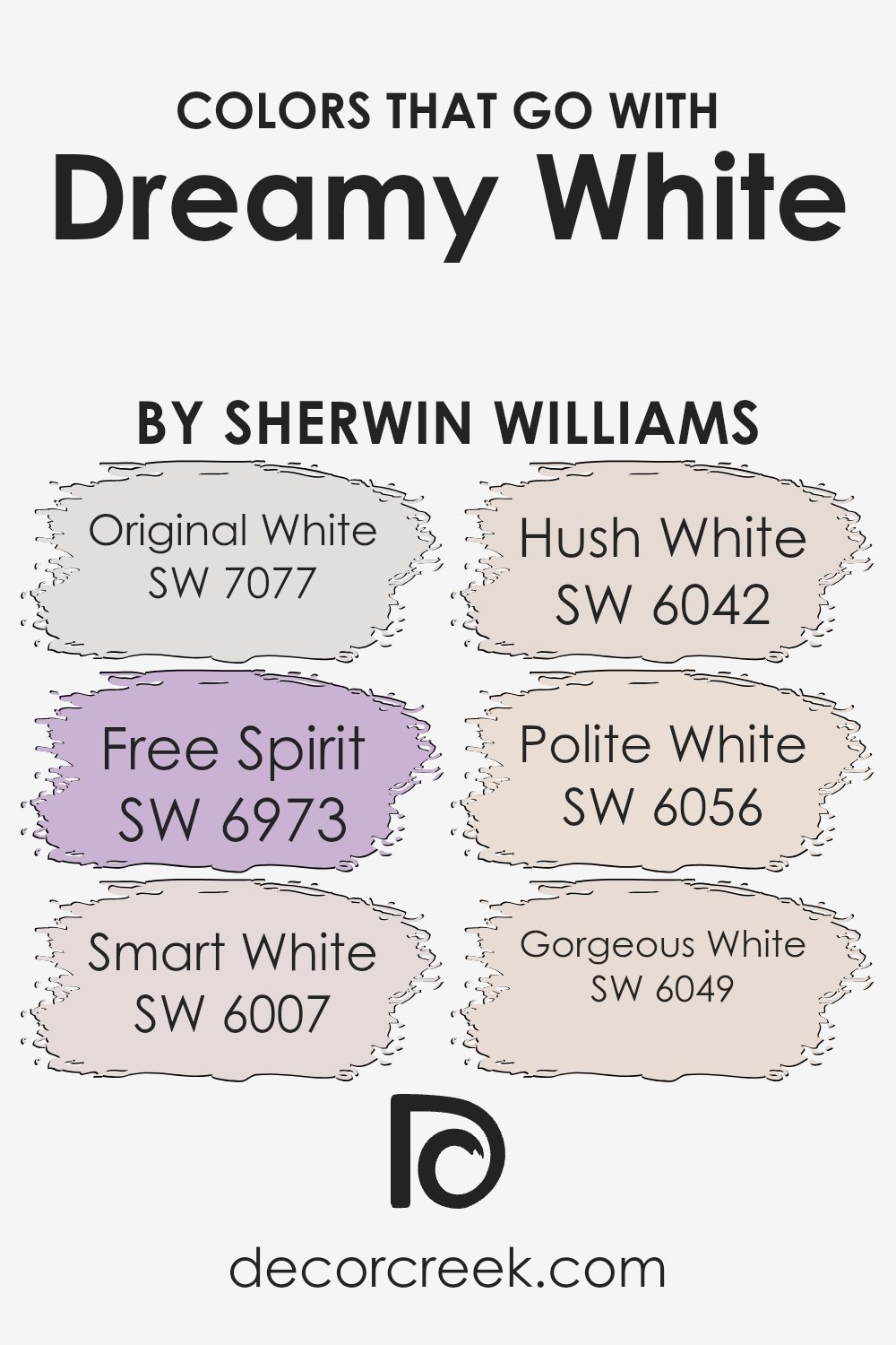
Colors that Go With Dreamy White SW 6021 by Sherwin Williams
Choosing the right colors to go with Dreamy White SW 6021 by Sherwin Williams is essential to create a balanced and pleasing environment. Dreamy White is a soft, warm hue that provides a gentle backdrop, inviting other colors to shine without overpowering. Original White SW 7077 pairs well by offering a clean, bright contrast that can highlight the subtle undertones of Dreamy White.
In contrast, Free Spirit SW 6973 brings a vibrant, lively touch, adding energy and excitement to the space. Meanwhile, Smart White SW 6007 provides a subtle warmth that complements Dreamy White, enhancing the cozy and inviting atmosphere of any room.
Hush White SW 6042 brings depth and interest with its slightly muted tone, making spaces feel more grounded and calm. Polite White SW 6056, with its soft pink undertones, can add a charming and gentle contrast, perfect for creating an elegant, cozy setting.
Lastly, Gorgeous White SW 6049 retains a hint of creaminess that works beautifully with Dreamy White, maintaining its soft aura while adding a touch of sophistication.
Together, these colors create a harmonious palette that allows each individual hue to shine while ensuring that none overwhelm the soothing nature of Dreamy White.
You can see recommended paint colors below:
- SW 7077 Original White
- SW 6973 Free Spirit
- SW 6007 Smart White
- SW 6042 Hush White
- SW 6056 Polite White
- SW 6049 Gorgeous White
How to Use Dreamy White SW 6021 by Sherwin Williams In Your Home?
Dreamy White SW 6021 by Sherwin Williams is a soft, subtle white with warm undertones, ideal for creating a calm and airy atmosphere in any room. This versatile color works well in various spaces, from living rooms to bedrooms. In a living room, it can serve as the perfect backdrop, allowing furniture and artwork to stand out while maintaining a light and open feel. In the bedroom, it can contribute to a peaceful and cozy retreat when paired with soft textiles and warm lighting.
For those who love a minimalist look, Dreamy White is an excellent choice. It pairs beautifully with natural wood accents and green plants, adding a touch of nature indoors. When used in a kitchen, it can help create a bright and clean environment, making the space feel fresh and inviting.
Overall, this gentle white is perfect for those looking to create a welcoming and comforting home.
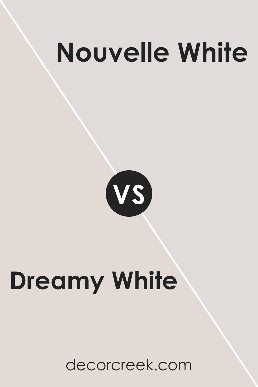
Dreamy White SW 6021 by Sherwin Williams vs Nouvelle White SW 6273 by Sherwin Williams
Dreamy White SW 6021 and Nouvelle White SW 6273 by Sherwin Williams are both soft, light colors, but they have some differences. Dreamy White is a warm white with a hint of beige. It brings a cozy and inviting feel to a room, making it great for spaces where you want to relax or entertain.
On the other hand, Nouvelle White is a cooler white with subtle gray undertones. This gives it a cleaner and more modern look, suitable for contemporary or minimalist spaces.
While Dreamy White adds warmth, Nouvelle White offers a crisp, fresh appearance. Both colors work well as neutral bases, allowing other colors in the room to pop.
Choosing between them depends on the atmosphere you want to create: Dreamy White for warmth and comfort, or Nouvelle White for a sleek and airy vibe.
You can see recommended paint color below:
- SW 6273 Nouvelle White
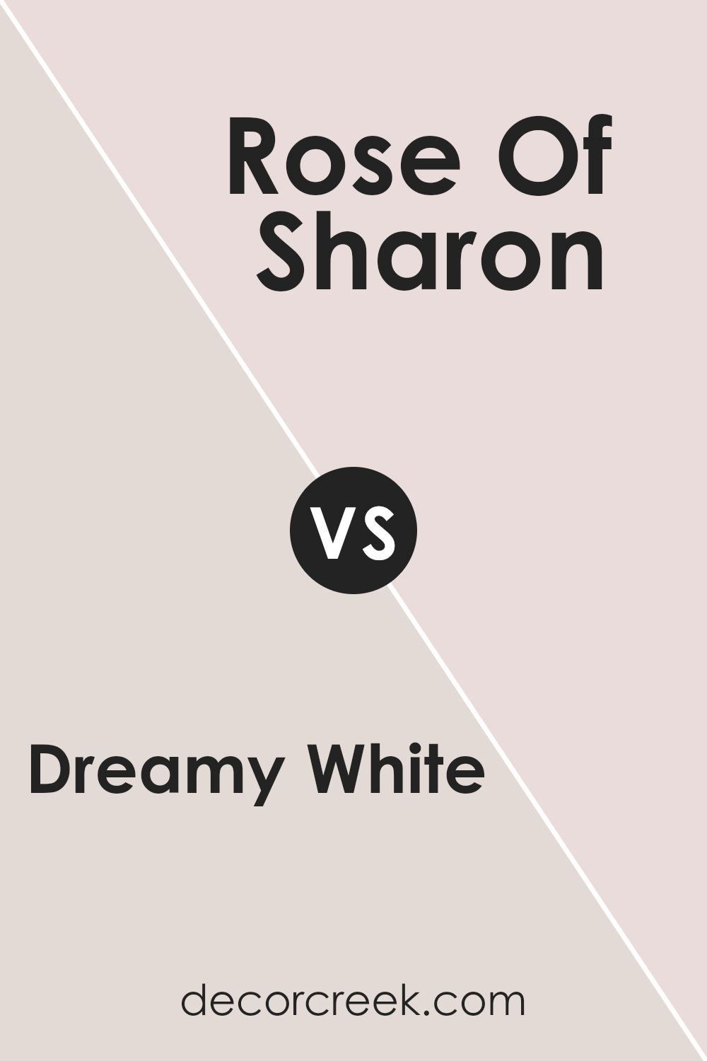
Dreamy White SW 6021 by Sherwin Williams vs Rose Of Sharon SW 6294 by Sherwin Williams
Dreamy White SW 6021 is a gentle and soft off-white with a touch of warmth. It creates a light and airy atmosphere, making it perfect for spaces where you want to feel calm and relaxed. It works well in rooms with lots of natural light and pairs easily with other colors due to its neutrality.
On the other hand, Rose Of Sharon SW 6294 is a warm, rosy hue that brings energy and life to a room. It is vibrant without being overpowering and adds a sense of coziness. This color can make a statement on its own and is great for accent walls or spaces where you want to feel cheerful and lively.
While Dreamy White serves as a versatile and calm backdrop, Rose Of Sharon is more about adding personality and warmth. Together, they can balance a space, with Dreamy White providing a soft foundation and Rose Of Sharon adding a pop of color.
You can see recommended paint color below:
- SW 6294 Rose Of Sharon
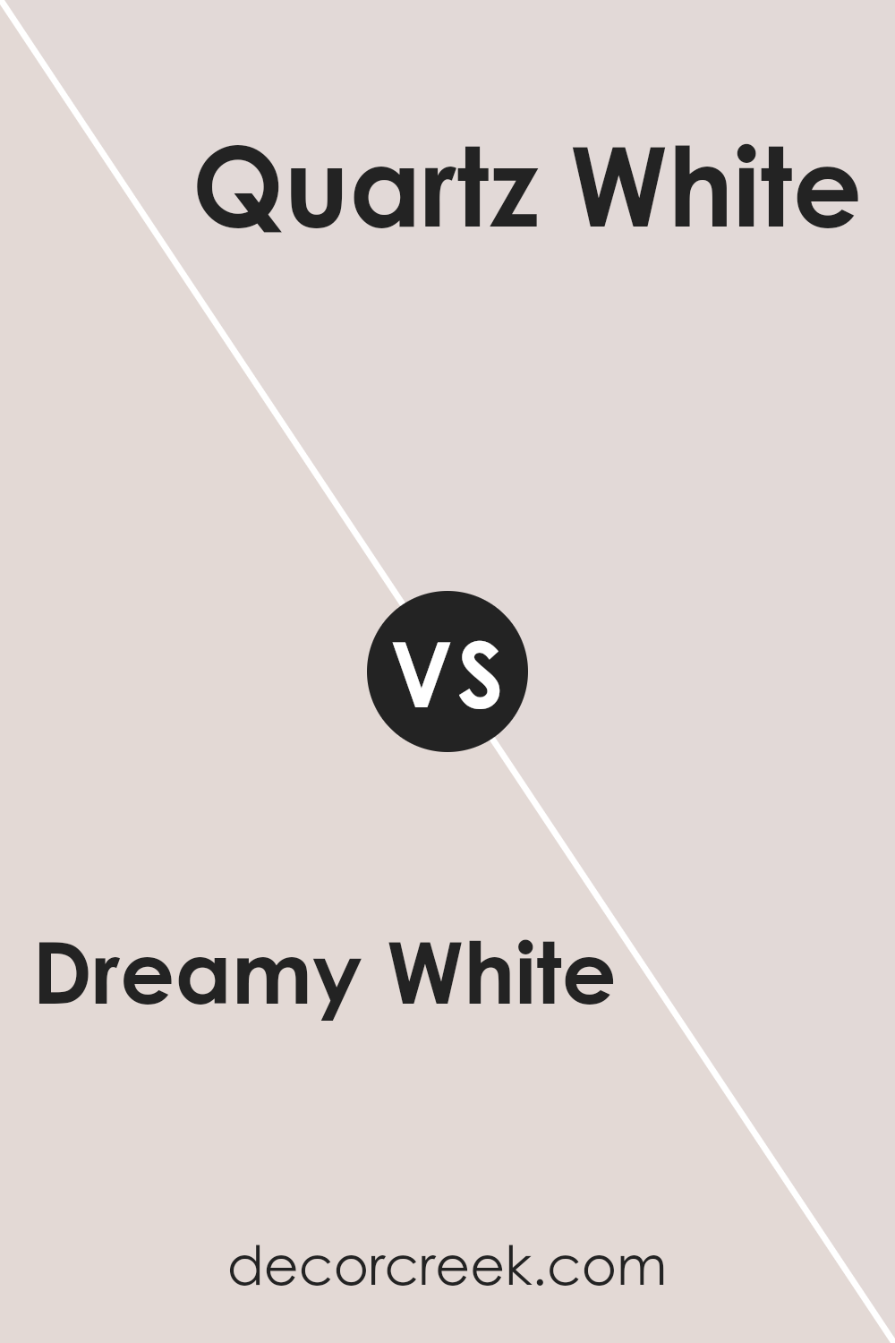
Dreamy White SW 6021 by Sherwin Williams vs Quartz White SW 6014 by Sherwin Williams
Dreamy White (SW 6021) and Quartz White (SW 6014) are both soft, neutral colors from Sherwin Williams, but they offer different moods and tones. Dreamy White has a slight warm undertone, giving it a cozy, inviting feel, making it suitable for living spaces where comfort is a priority. It’s versatile enough to complement different design styles while maintaining a subtle presence.
Quartz White, on the other hand, has cooler undertones, which can lend a more crisp and modern atmosphere to a room. This makes it an excellent choice for areas where a fresh and clean look is desired, such as kitchens or bathrooms.
While both colors serve as excellent backdrops, Dreamy White creates a warmer, more intimate vibe, whereas Quartz White leans toward a cooler and more contemporary feel. Choosing between them depends on whether you want warmth or a cooler, more airy feel.
You can see recommended paint color below:
- SW 6014 Quartz White
Dreamy White SW 6021 by Sherwin Williams vs Nice White SW 6063 by Sherwin Williams
Dreamy White SW 6021 and Nice White SW 6063 by Sherwin Williams are both soft, neutral colors, but they bring different vibes to a space. Dreamy White is a warm, slightly creamy white with pink undertones, giving it a cozy and inviting feeling. It works well in spaces where you want a gentle atmosphere, making it perfect for living rooms or bedrooms.
On the other hand, Nice White is a bit warmer with beige undertones. It has a touch more depth than Dreamy White and can create a soothing and relaxed environment. This makes it a great choice for areas like hallways or kitchens where you want a welcoming yet calm feel.
Both colors serve as excellent backdrops, but Dreamy White may impart a more subtle elegance, while Nice White offers slightly more warmth and comfort. Their understated nature allows for easy pairing with a wide range of accent colors and decor styles.
You can see recommended paint color below:
Dreamy White SW 6021 by Sherwin Williams vs White Beet SW 6287 by Sherwin Williams
Dreamy White SW 6021 and White Beet SW 6287 by Sherwin Williams are both soft, light colors, but they have distinct characteristics. Dreamy White is a warm, creamy white with a hint of peach or blush undertone. It creates a cozy and inviting atmosphere, making it ideal for living spaces or bedrooms where a touch of warmth is desired.
In contrast, White Beet is a cooler, more neutral white with slight lavender or violet undertones. This gives it a more modern and crisp appearance, perfect for bathrooms, kitchens, or spaces where a fresh, clean look is preferred. While Dreamy White adds warmth and softness, White Beet offers a cooler and more contemporary feel.
Both colors can complement a variety of design styles, but they evoke different moods based on their undertones. Dreamy White is cozy and inviting, while White Beet is modern and refreshing.
You can see recommended paint color below:
- SW 6287 White Beet
Dreamy White SW 6021 by Sherwin Williams vs Gorgeous White SW 6049 by Sherwin Williams
Dreamy White SW 6021 and Gorgeous White SW 6049 by Sherwin Williams are both shades of white, but they each offer a unique vibe. Dreamy White is soft and warm, with a touch of cream, giving it a cozy feel. It works well in spaces where you want a gentle, inviting atmosphere. In contrast, Gorgeous White has a hint of gray, providing a cooler undertone.
This makes it a versatile choice for modern spaces, adding a clean and fresh look. Both colors complement various styles of decor, but their undertones set them apart. Dreamy White’s warmth can make a room feel homey and comfortable, while Gorgeous White’s coolness lends a more contemporary, sleek appearance.
When choosing between them, consider the natural light in your space and the mood you want to create. Both whites are beautiful, but their subtle differences can influence the overall feel of a room.
You can see recommended paint color below:
- SW 6049 Gorgeous White
Dreamy White SW 6021 by Sherwin Williams vs Gauzy White SW 6035 by Sherwin Williams
Dreamy White SW 6021 and Gauzy White SW 6035 are both Sherwin Williams paint colors, but they have distinct characteristics. Dreamy White is a soft, warm white with subtle undertones that can create a cozy and inviting atmosphere. It pairs well with both traditional and modern decor, offering a touch of warmth and comfort to any room.
On the other hand, Gauzy White is slightly cooler and has more of a clean, crisp feel. It is a fresh and airy shade of white that can make spaces feel light and spacious. This color works well in contemporary settings or in rooms where you want a brighter appearance.
Choosing between these colors depends on the desired feel of the space. Dreamy White is perfect for creating a warm, welcoming setting, while Gauzy White is ideal for a clean and bright atmosphere.
Both can be versatile but offer different moods to a room.
You can see recommended paint color below:
- SW 6035 Gauzy White
Dreamy White SW 6021 by Sherwin Williams vs Smart White SW 6007 by Sherwin Williams
Dreamy White SW 6021 and Smart White SW 6007, both from Sherwin Williams, are subtle shades with distinct personalities. Dreamy White is a delicate, soft white with a warm undertone that adds a cozy feel to any room. It’s perfect for spaces where you want a gentle, inviting ambiance.
On the other hand, Smart White is a clean, pure white that exudes brightness and clarity. It works well in modern and minimalist spaces, providing a fresh and airy atmosphere.
While Dreamy White wraps a room in warmth with its gentle touch, Smart White offers a crisp backdrop that highlights architectural features or colorful accents. Dreamy White’s warm undertones make it suitable for traditional or rustic homes, blending well with earthy tones.
In contrast, Smart White, with its neutrality, fits seamlessly into contemporary settings, complementing bold and vibrant decor. Both whites have their unique charm, suited for different tastes and design needs.
You can see recommended paint color below:
- SW 6007 Smart White
Dreamy White SW 6021 by Sherwin Williams vs Cultured Pearl SW 6028 by Sherwin Williams
Dreamy White SW 6021 and Cultured Pearl SW 6028, both by Sherwin Williams, offer distinct shades while maintaining a gentle feel. Dreamy White is a soft, warm white with subtle pink undertones. It is versatile and can create a cozy atmosphere, suited for spaces where a touch of warmth is desired.
On the other hand, Cultured Pearl is a cooler, light gray with very faint blue undertones. It delivers a more modern and crisp look, ideal for those wanting a calm and refreshing space.
Both colors work well as neutrals and can be used in various rooms, from living spaces to bedrooms. While Dreamy White provides warmth and comfort, making it great for adding coziness, Cultured Pearl lends itself to creating a sleek and airy environment.
The choice between them will depend on whether you prefer a warmer or cooler backdrop for your decor.
You can see recommended paint color below:
- SW 6028 Cultured Pearl
Dreamy White SW 6021 by Sherwin Williams vs Hush White SW 6042 by Sherwin Williams
Dreamy White SW 6021 by Sherwin Williams and Hush White SW 6042 are both soft, neutral colors, but they have distinct differences. Dreamy White is a light beige with warm undertones, providing a cozy and welcoming feel to a room. It’s versatile enough to work in various lighting conditions, making spaces feel airy yet grounded.
In contrast, Hush White is slightly darker with grayish undertones, giving it a calm and muted appearance. It can add a touch of sophistication to a space without being overpowering. This color is ideal for rooms where a bit more depth is desired, while still maintaining a neutral balance.
Both colors are excellent choices for creating a soothing environment, but Dreamy White leans more into warmth, making it ideal for areas seeking comfort and coziness. Meanwhile, Hush White offers a cooler, more understated elegance. Both colors pair well with a variety of furnishings and other colors, ensuring flexibility in decor.
You can see recommended paint color below:
Conclusion
Wrapping up my thoughts on SW 6021 Dreamy White by Sherwin Williams, I’d like to share why I think this paint color is so special. Picture a fluffy cloud or the softest marshmallow—Dreamy White is a color that brings that kind of lightness and comfort into a room.
Using Dreamy White in your home can make everything feel brighter and more open. It’s like having extra sunshine in the room. This paint also works well with every other color you might want to use. So, if you like changing things up with pillows, rugs, or art on the walls, Dreamy White will look great no matter what.
What I love most is how peaceful and cozy it makes me feel. Imagine curling up with a good book or playing quietly with toys—it’s a color that makes those moments feel just right. It’s also great for any room, whether it’s your living room or bedroom.
When I think about Dreamy White, I think about how it can make a house truly feel like home. It’s a color that welcomes you and makes you want to stay and enjoy the little things.

Ever wished paint sampling was as easy as sticking a sticker? Guess what? Now it is! Discover Samplize's unique Peel & Stick samples.
Get paint samples

