Black
Black Blue
Blue Brown
Brown Gray
Gray Green
Green Neutral
 Orange
 White
White Yellow
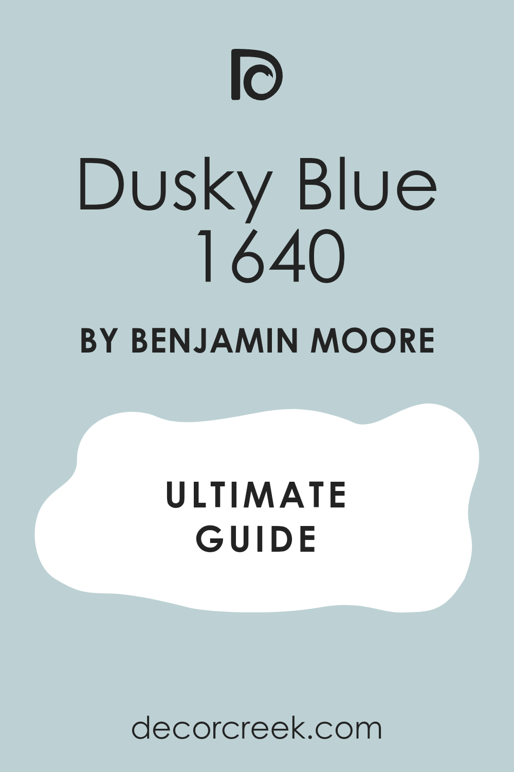
If you’re looking to freshen up a room with a peaceful yet expressive color, let me introduce you to Benjamin Moore’s 1640 Dusky Blue. I recently decided to repaint my study and wanted a shade that felt both soothing and elegant. After sifting through countless options, Dusky Blue stood out as the perfect fit. It has a unique balance, being not too bold yet far from bland, which infuses a quiet charm into any room.
What’s special about Dusky Blue is the way it changes with the light. During the day, it carries a soft, airy vibe that makes the room feel more open and welcoming. By night, it shifts slightly to reveal deeper, cozier undertones, perfect for winding down.
Whether you’re looking to create a peaceful retreat or a stylish workspace, this color has the flexibility to adapt and impress. It pairs wonderfully with white trim and natural wood elements, adding just the right amount of warmth and depth to your decor.
So if you’re considering a new look for your walls, Dusky Blue is a delightful choice that you might just fall in love with!
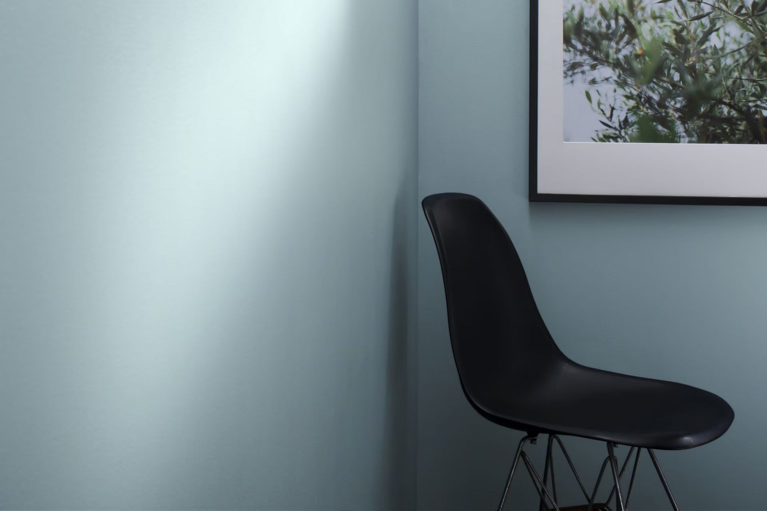
What Color Is Dusky Blue 1640 by Benjamin Moore?
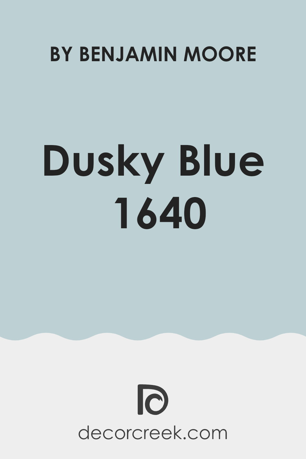
Dusky Blue by Benjamin Moore is a gentle, calming shade that brings to mind the quiet moments just before dusk. This muted blue has subtle gray undertones, making it a flexible choice for interior rooms. The color pairs beautifully with a wide range of materials and textures.
It looks especially stunning when combined with warm wood tones, which highlight its coolness and add a natural, welcoming feel to the room. Moreover, adding elements like soft, plush fabrics in neutral colors such as creams or light grays can help create a cozy, relaxed atmosphere.
This color is well-suited for various interior styles, particularly those favoring a more understated, classic aesthetic. It works wonderfully in Scandinavian and coastal-themed interiors due to its airy and light presence, which complements the minimalistic, nature-inspired elements typical of these styles. Additionally, Dusky Blue is a great choice for contemporary rooms where its clean, soothing hue can provide a backdrop that allows modern furniture and bold decor pieces to stand out.
Implementing this color in a room with plenty of natural light will accentuate its depth and variability throughout the day, shifting subtly with the changing light to provide a dynamic visual experience.
decorcreek.com
Is Dusky Blue 1640 by Benjamin Moore Warm or Cool color?
Dusky Blue 1640 by Benjamin Moore is a flexible and cozy shade of blue that brings a calm and inviting vibe to any room in a home. This color has a slightly gray undertone, which makes it easy to pair with various decor styles and furnishings.
It works well in rooms that aim for a relaxed and comforting atmosphere, like living rooms and bedrooms. When used on walls, Dusky Blue creates a soft backdrop that makes light-colored furniture and decor pieces stand out.
It’s also an excellent choice for bathrooms as it pairs nicely with white fixtures and cabinetry, providing a clean and fresh look. Additionally, in smaller rooms, this color can help make the room feel larger and more open. Overall, Dusky Blue is a smart pick for anyone looking to give their home a gentle, refreshing update without making it feel too bold or overpowering.
Undertones of Dusky Blue 1640 by Benjamin Moore
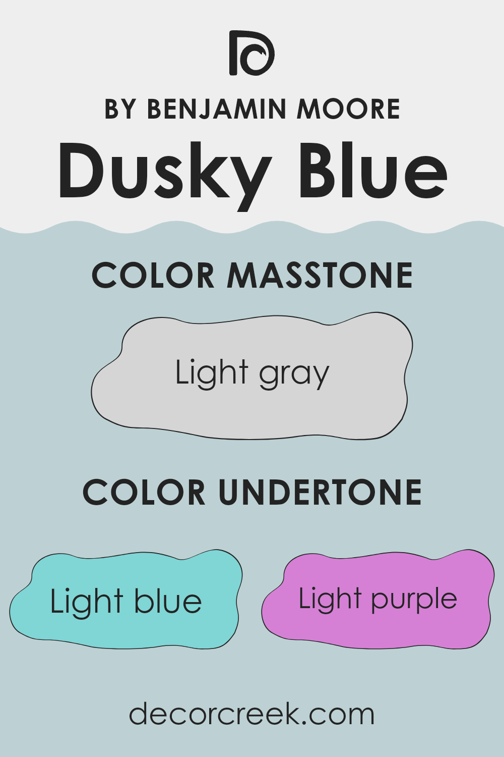
Dusky Blue is a unique paint color that carries a blend of subtle undertones, making it flexible for decorating various rooms. The undertones of light blue, light purple, pale yellow, lilac, mint, pale pink, and grey influence how this color appears under different lighting conditions and can change the mood of a room.
Undertones are like hidden colors within the main hue that emerge under specific lighting conditions or when paired with certain decor items. They play a significant role in color perception, often adding depth and complexity. For instance, in broad daylight, Dusky Blue might show more of its light blue or lilac undertones, giving a cooler, more calming effect.
In the softer, artificial light, however, the grey or pale pink undertones could become more noticeable, providing a warmer, cozier feel.
When used on interior walls, the rich variety of undertones in Dusky Blue allows it to adapt seamlessly to different styles and settings. The presence of light blue and mint undertones can create a fresh and airy vibe, making it ideal for a living room or bathroom. On the other hand, the hint of pale yellow and lilac can make a bedroom feel peaceful yet cheerful.
The variation in undertones also means that Dusky Blue looks natural alongside various decor colors, from soft neutrals to bold shades, allowing for flexible design choices.
decorcreek.com
What is the Masstone of the Dusky Blue 1640 by Benjamin Moore?
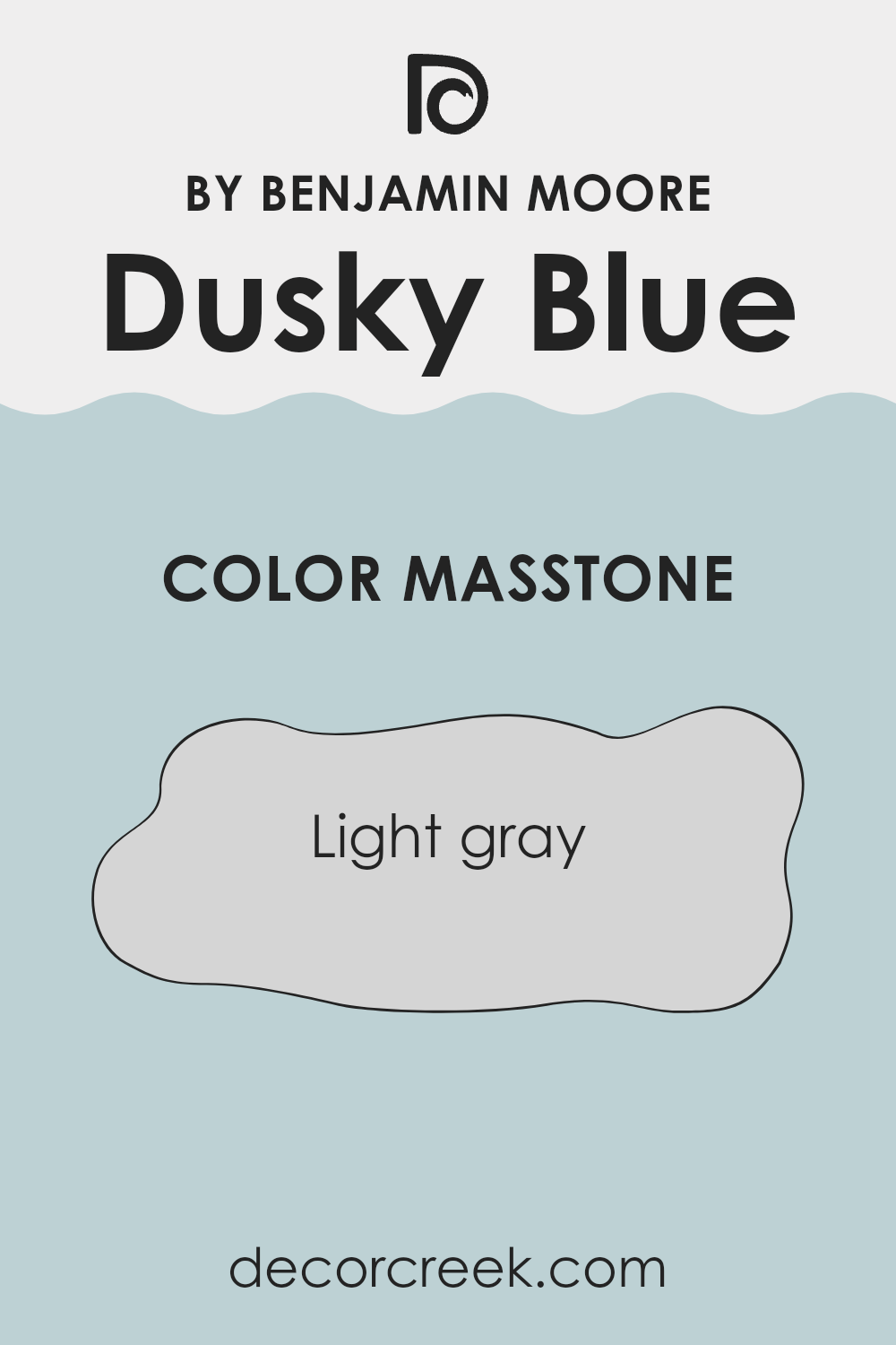
Dusky Blue 1640 by Benjamin Moore has a masstone of light gray. This masstone gives it a subtle, neutral base that can easily blend with different designs and furnishings in a home. Because the underlying gray is not overpowering, it works well in rooms that need a touch of color without being too bold.
The light gray masstone helps create a calming atmosphere, making it a great choice for bedrooms or living areas where a relaxing vibe is desired. Additionally, the neutrality of the masstone means that Dusky Blue can be paired with various decor styles, from modern to classic, without clashing.
It’s also beneficial in smaller rooms or areas with limited natural light, as the lightness of the gray can help make the area appear more open and airy. Overall, the light gray masstone of Dusky Blue offers a flexible and pleasant background that enhances the adaptability and usability of this color in homes.
decorcreek.com
How Does Lighting Affect Dusky Blue 1640 by Benjamin Moore?
The way colors appear can greatly change based on lighting. This is because light sources differ in the types and amounts of light they emit, which then affects how we see color. Lighting can be from natural sources like sunlight or from artificial sources like lamps and LEDs.
The color Dusky Blue (Benjamin Moore 1640) is a rich, subtle shade that can look quite different depending on the lighting. In artificial light, which often has yellow tones, Dusky Blue might look deeper and warmer. It could seem more like a cozy, soft blue rather than bright or stark, making it great for relaxing areas like living rooms or bedrooms where softer light is often used.
In natural light, Dusky Blue might appear lighter or more vibrant, especially in rooms with plenty of sunlight. The type of natural light varies depending on the direction the room faces:
- North-faced rooms: These rooms get less direct sunlight, which can make colors look slightly darker and cooler. Dusky Blue in a north-facing room might therefore seem more subdued, giving a calm, understated look.
- South-faced rooms: These rooms benefit from abundant sunlight for most of the day, which can brighten and enhance colors. Dusky Blue in a south-facing room may appear brighter and more cheerful, making the room feel airy and lively.
- East-faced rooms: These rooms get morning sun that is bright and warm. Dusky Blue will look fresh and inviting in the morning but might lose some vibrancy as the day progresses and the light dims.
- West-faced rooms: Light in these rooms is strongest in the late afternoon and evening. Dusky Blue will appear softer in the morning and become more dynamic and richer towards evening.
Understanding these effects can help in choosing the right room and purpose for each color, ensuring that the hues always enhance the room as intended.
decorcreek.com
What is the LRV of Dusky Blue 1640 by Benjamin Moore?
LRV stands for Light Reflectance Value and is a measure of the amount of light a color reflects back into the room, versus how much it absorbs. When it comes to painting walls, LRV is an important factor because it can significantly influence how light or dark a room feels.
A higher LRV means the color reflects more light, which can make a room feel more open and airy. Conversely, a lower LRV means the color absorbs more light, which can make a room feel cozier but smaller.
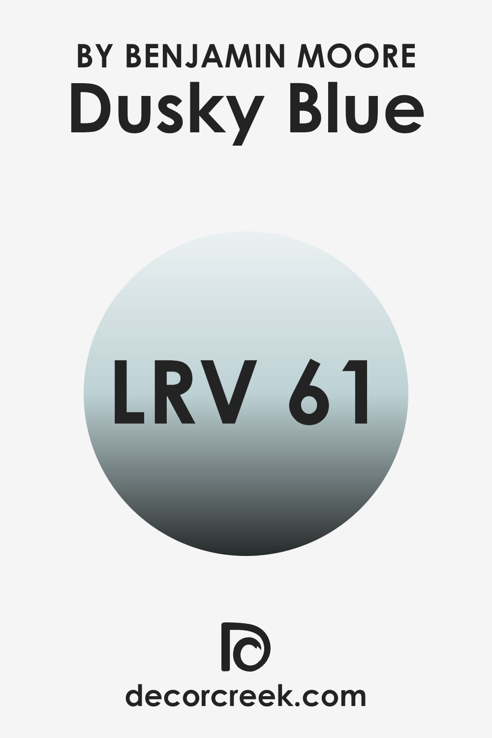
The LRV of Dusky Blue is 60.83. This means it is on the lighter side and has a good capacity to reflect light, making it a great option for rooms that might be smaller or have limited natural light. In certain light conditions, this particular shade of blue will appear vibrant and can make the room feel lively and bright. Its ability to reflect a substantial amount of light can also help in reducing the need for artificial lighting during the day, potentially saving energy and enhancing the natural qualities of a room.
decorcreek.com
Coordinating Colors of Dusky Blue 1640 by Benjamin Moore
Coordinating colors are those that complement each other well and create an aesthetically pleasing palette when used together in a design. For example, colors that coordinate with Dusky Blue by Benjamin Moore can work effectively to enhance the primary hue while maintaining harmony within the room. These combinations can balance or accentuate the room’s overall feel, depending on how they are utilized in the decor.
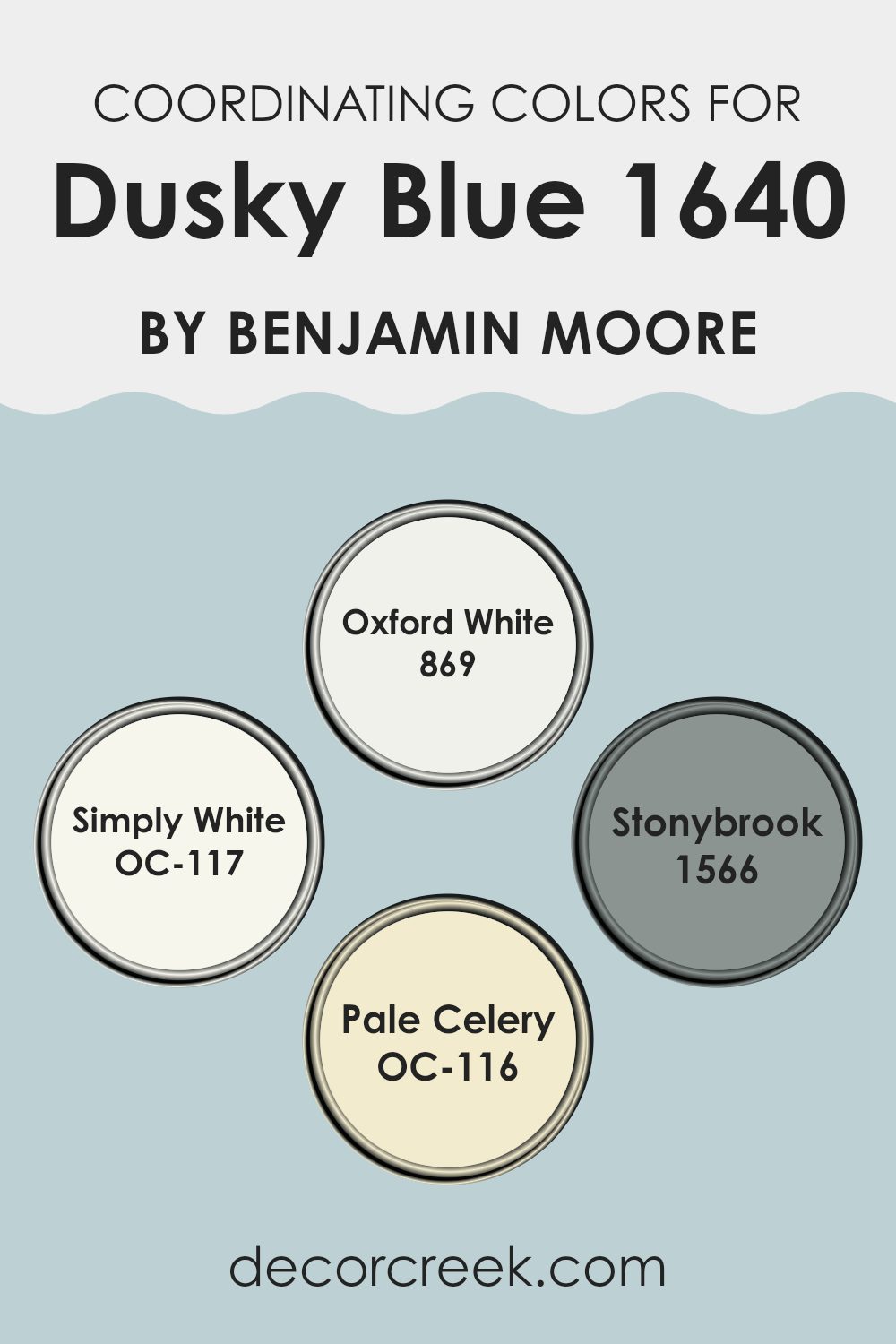
Oxford White 869 is a crisp and clean shade, ideal for creating a fresh, airy look that contrasts beautifully against deeper tones like Dusky Blue. Simply White OC-117 is another light option, offering a slightly warm undertone which can make a room feel inviting and cozy.
On the other hand, Stonybrook 1566 has a unique bluish-green tint that pairs well with Dusky Blue, expanding the room’s color depth without feeling too strong. Lastly, Pale Celery OC-116 provides a subtle hint of green, giving a room a touch of nature-infused lightness, which can help in softening the overall appearance while maintaining a connection with the featured blue shade. These colors, by working in harmony, can effectively support and enhance the beauty of Dusky Blue in an interior room.
You can see recommended paint colors below:
- 869 Oxford White
- OC-117 Simply White
- 1566 Stonybrook
- OC-116 Pale Celery
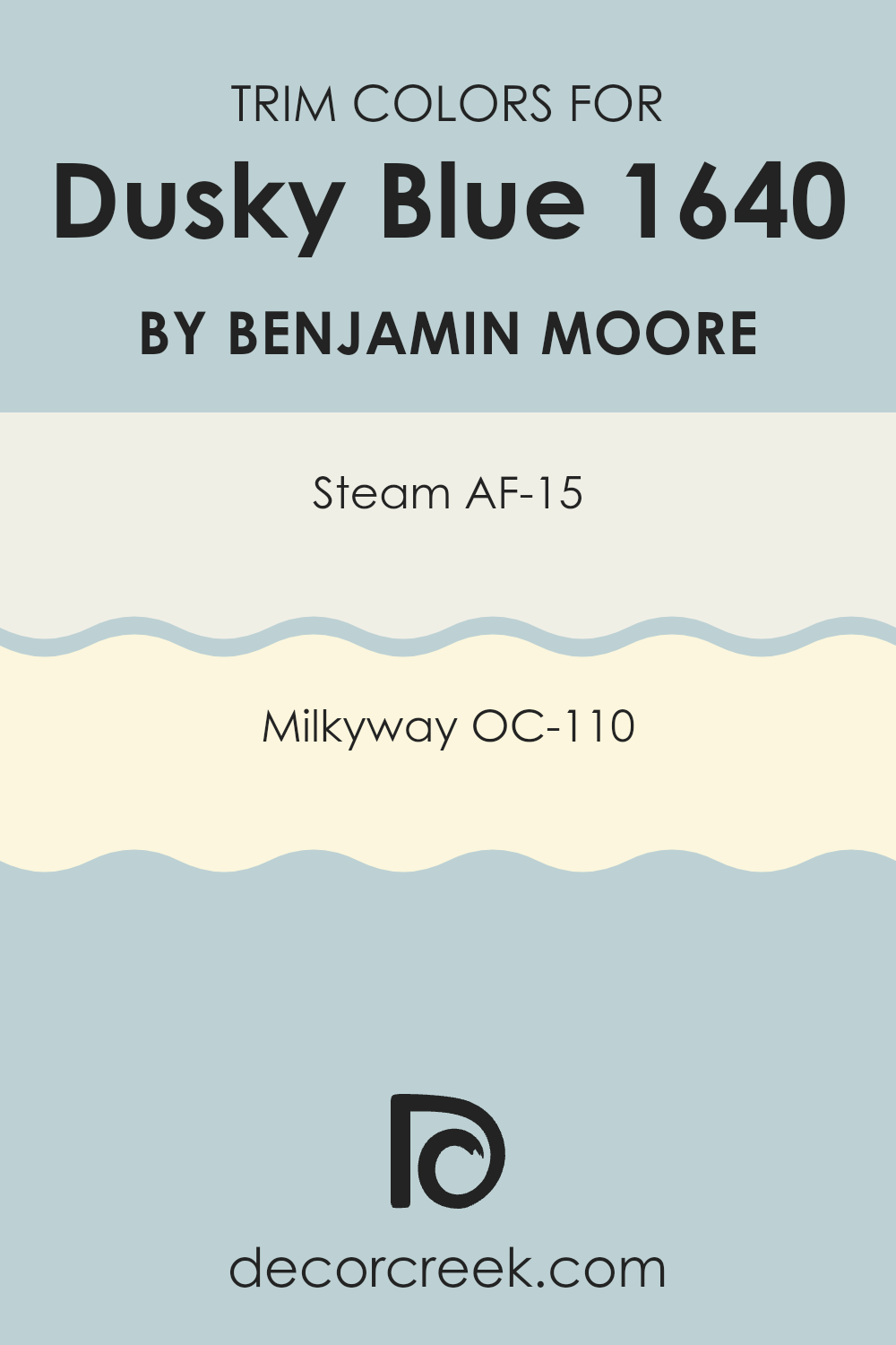
What are the Trim colors of Dusky Blue 1640 by Benjamin Moore?
Trim colors are used as an accent to complement or contrast the main color on a wall, highlighting architectural features such as door frames, crown molding, and baseboards. Choosing the right trim color can enhance the overall appearance of a room, providing a finished look that defines rooms and brings attention to details.
For the color Dusky Blue by Benjamin Moore, appropriate trim colors could significantly affect how this shade interacts with the room’s lighting and other design elements.
AF-15, known as Steam, is a pale, neutral color that provides a subtle contrast to the bigger, bolder Dusky Blue, ideal for creating a gentle yet defined boundary within the room. OC-110, or Milkyway, offers a slightly warmer tone, adding a soft, creamy finish that can help to soften the impact of the more pronounced blue, ensuring the room feels well-coordinated and polished. Both colors support a harmonious balance with Dusky Blue, enabling the walls to stand out in a pleasing yet unobtrusive manner.
You can see recommended paint colors below:
Colors Similar to Dusky Blue 1640 by Benjamin Moore
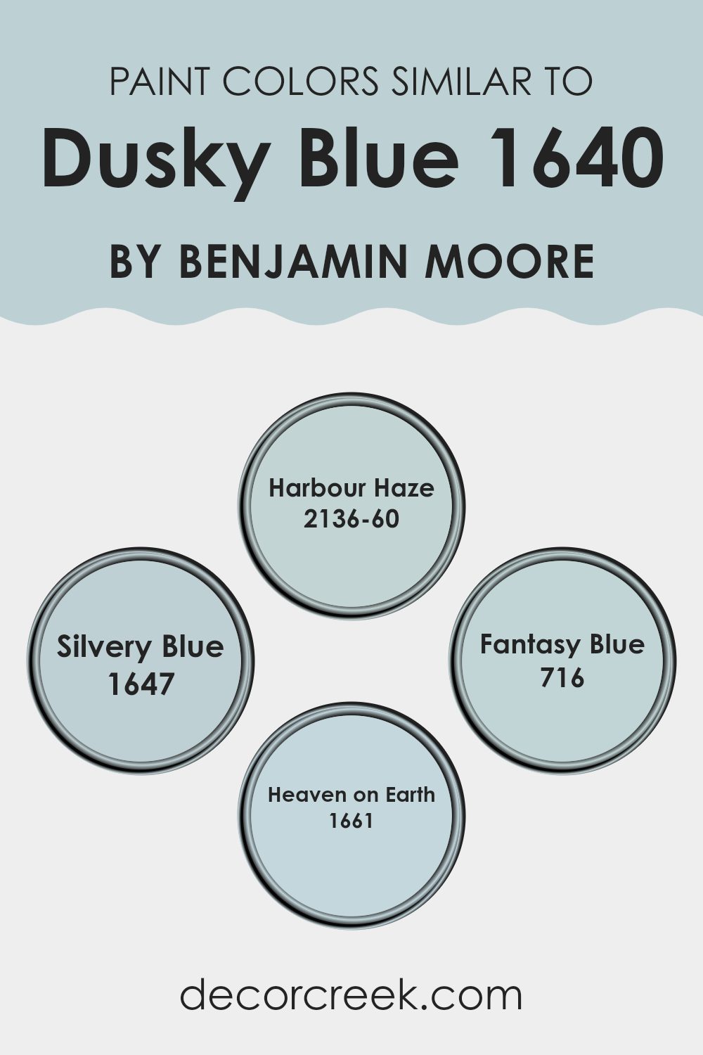
Similar colors help in creating a harmonious and soothing ambiance in any room. When colors are closely related in hue, they blend seamlessly on walls, providing a subtle contrast that enhances the overall aesthetic without feeling too strong.
For example, colors like 2136-60 – Harbour Haze, 1647 – Silvery Blue, 716 – Fantasy Blue, and 1661 – Heaven on Earth, work beautifully with Dusky Blue as they share underlying blue tones. Utilizing similar shades allows for more flexibility in decor, granting a unified yet distinctive look to each room.
The color 2136-60 – Harbour Haze offers a gentle reminder of a foggy morning sky, light and airy, making it perfect for rooms aiming for a fresh, clean look. On the other hand, 1647 – Silvery Blue, has a hint of metallic flair, giving it a unique but still calm presence in a room.
The shade 716 – Fantasy Blue, with its brighter and more playful tone, brings a gentle splash of vibrancy, making it ideal for invigorating a room subtly. Finally, 1661 – Heaven on Earth provides a soft, muted backdrop, reminiscent of a peaceful cloudy day, ideal for crafting a soothing retreat in homes. Together, these colors work in concert to enhance the visual impact of interiors gently and effectively.
You can see recommended paint colors below:
- 2136-60 Harbour Haze
- 1647 Silvery Blue
- 716 Fantasy Blue
- 1661 Heaven on Earth
Colors that Go With Dusky Blue 1640 by Benjamin Moore
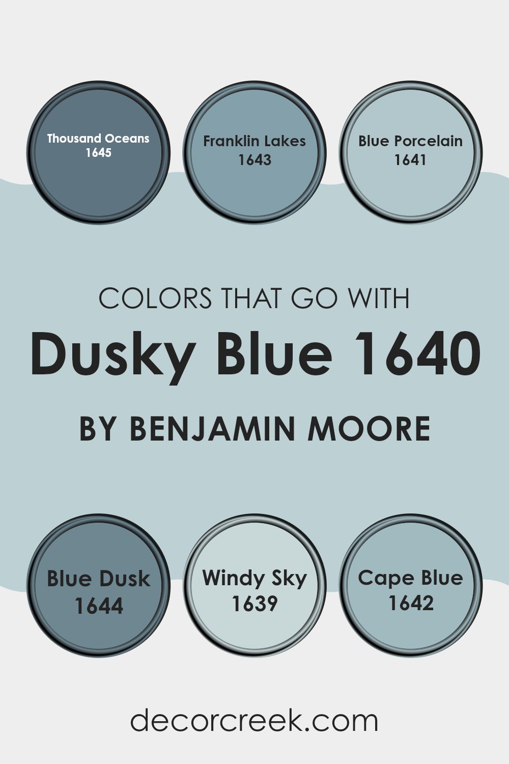
Choosing the right colors to complement Dusky Blue 1640 by Benjamin Moore is crucial because it helps create a cohesive and pleasing look. When colors harmonize well, they can enhance the mood of a room and bring out the best features of the surrounding decor.
For instance, Thousand Oceans 1645, with its soft, beach-inspired tones, offers a gentle contrast that accentuates the depth of Dusky Blue without feeling too strong. Meanwhile, Franklin Lakes 1643, a slightly darker and more muted shade, brings a subtle richness that works to set a calm and inviting atmosphere.
Additionally, Blue Porcelain 1641 adds a touch of lightness that can brighten areas and give a refreshing airy feel to a room using Dusky Blue as a base. Blue Dusk 1644, similar yet distinct, shares a cool undertone that pairs effortlessly with Dusky Blue, ensuring the room feels well-rounded.
On the other hand, Windy Sky 1639 has a dynamic yet understated charm that can help in making smaller rooms appear more expansive. Lastly, Cape Blue 1642 stands out with a slightly vibrant hue that offers a hint of energy, which is excellent for adding a splash of color that attracts the eye without taking over the room’s theme. Together, these colors support Dusky Blue in creating an inviting, cohesive environment.
You can see recommended paint colors below:
- 1645 Thousand Oceans
- 1643 Franklin Lakes
- 1641 Blue Porcelain
- 1644 Blue Dusk
- 1639 Windy Sky
- 1642 Cape Blue
How to Use Dusky Blue 1640 by Benjamin Moore In Your Home?
Dusky Blue by Benjamin Moore is a soft, muted shade that adds a calm and gentle touch to any room. This color is perfect if you want to create a cozy, welcoming room in your home. Due to its flexible nature, Dusky Blue works well in various settings such as bedrooms, living rooms, and bathrooms.
To use Dusky Blue in your bedroom, consider painting the walls with this color to foster a restful atmosphere. It pairs well with white trim and soft beige accents for a clean and balanced look. In the living room, Dusky Blue can be used on a feature wall. Combine it with shades of gray and creams for furniture and decor to keep the room feeling light and airy.
For those who enjoy a bit of creativity, you could also use Dusky Blue for kitchen cabinets or a bathroom vanity for an unexpected pop of color that is still gentle and unobtrusive. This color matches well with natural elements like wooden countertops or stone tiles, creating a charming and stylish room.
Dusky Blue 1640 by Benjamin Moore vs Fantasy Blue 716 by Benjamin Moore
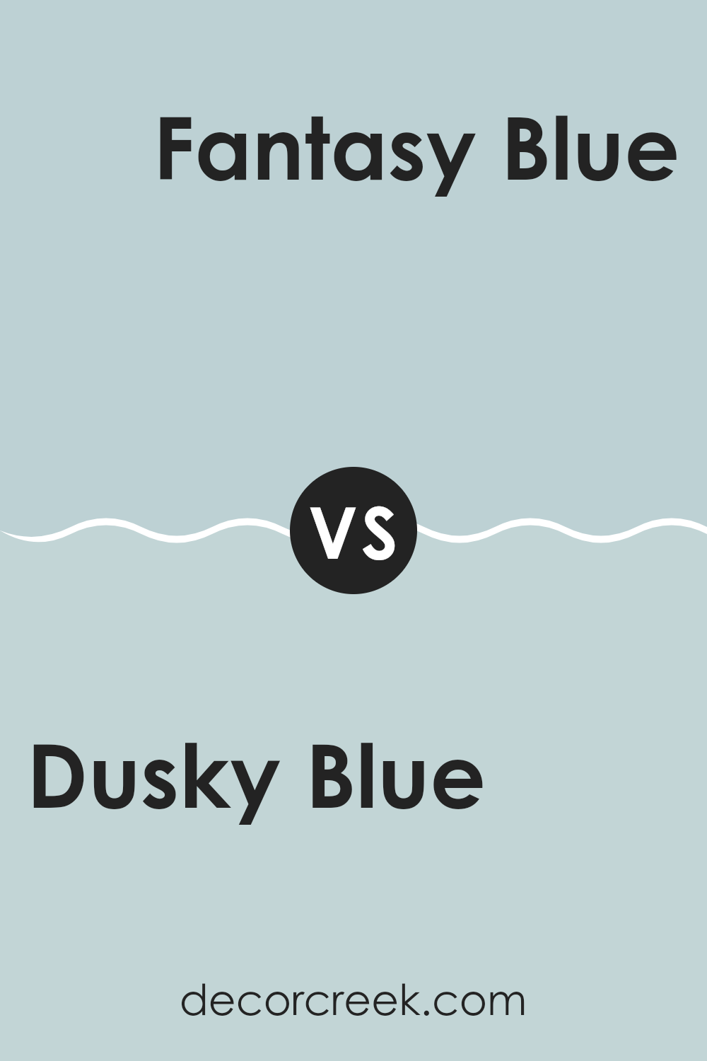
Dusky Blue and Fantasy Blue are two calming shades from Benjamin Moore. Dusky Blue is a bit darker and can make a room feel warm and cozy, perfect for creating a subtle, inviting atmosphere. It has gray undertones that make it flexible for various rooms, adding depth without feeling too strong.
On the other hand, Fantasy Blue is lighter and brighter. This color brings a fresh and airy feel to any room, making it feel more open and spacious. It has a hint of liveliness that’s great for rooms meant to feel energizing and refreshing.
Both colors are suited for anyone looking to add a peaceful and gentle touch to their home, but the choice between them depends on the specific mood and feel you want to achieve in a room. Dusky Blue works well in a more relaxed, intimate setting, while Fantasy Blue is ideal for vibrant, light-filled rooms.
You can see recommended paint color below:
- 716 Fantasy Blue
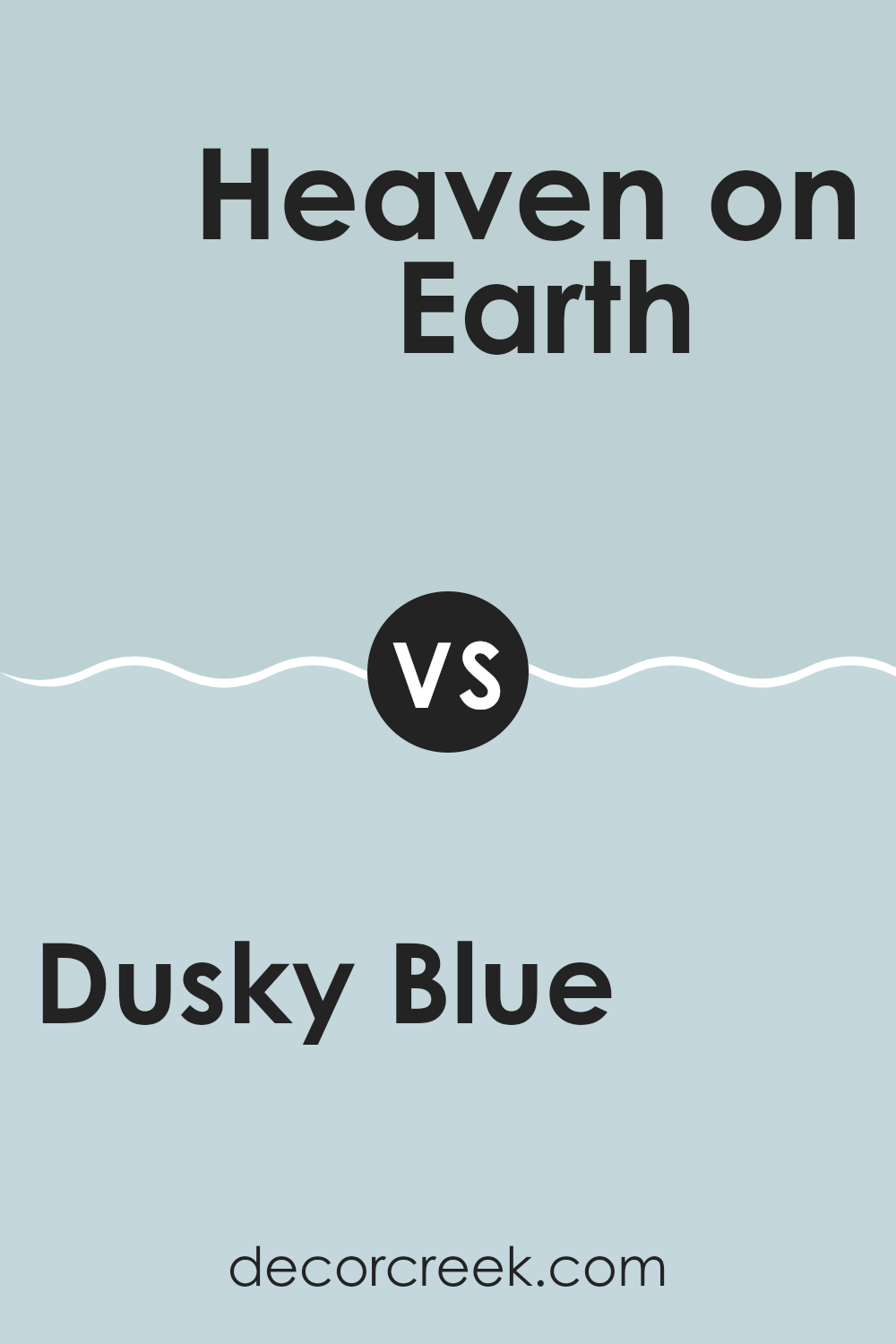
Dusky Blue 1640 by Benjamin Moore vs Heaven on Earth 1661 by Benjamin Moore
Dusky Blue and Heaven on Earth, both from Benjamin Moore, offer distinct yet subtly varied tones. Dusky Blue presents a deeper shade that could remind one of the evening sky. This color is flexible and could be perfect for creating a more grounded, cozy feeling in a room.
On the other hand, Heaven on Earth is lighter and softer. It leans towards a pastel palette, suggesting the calmness of an early morning sky. This lighter blue can help make a room feel more open and airy.
Both colors could work well together, with Dusky Blue offering depth and grounding, and Heaven on Earth bringing in a lightness, possibly ideal for accents or larger, bright areas. Each brings its unique mood to interiors, depending on what you’re trying to achieve—whether grounding or lightening a room.
You can see recommended paint color below:
- 1661 Heaven on Earth
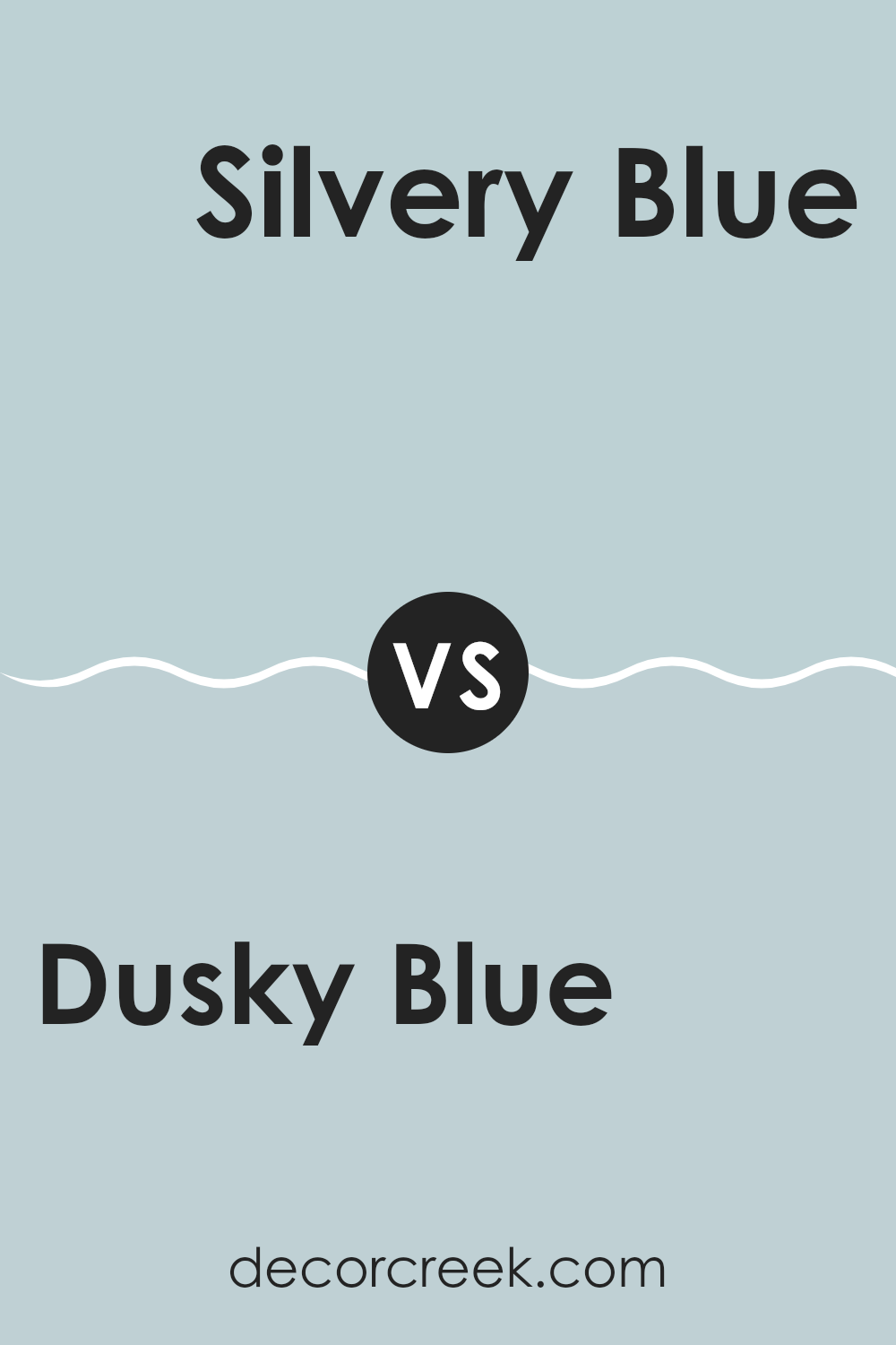
Dusky Blue 1640 by Benjamin Moore vs Silvery Blue 1647 by Benjamin Moore
The main color Dusky Blue has a deep, muted tone that can make a room feel cozy and inviting. It’s a darker shade that could be perfect for creating a calming effect in rooms like bedrooms or studies.
On the other hand, Silvery Blue has a lighter, brighter feel. This color is closer to a soft sky blue and can make a room appear more spacious and airy. It’s great for bathrooms or kitchens where you want a clean, fresh vibe.
Both colors carry a hint of gray, which helps them blend well with modern home decor and fittings. But while Dusky Blue offers a more enveloping warmth, Silvery Blue reflects more light, lending a subtle cheerful glow to room aesthetics. Each is unique but flexible enough to work in various settings depending on your desire for mood and room enhancement.
You can see recommended paint color below:
- 1647 Silvery Blue
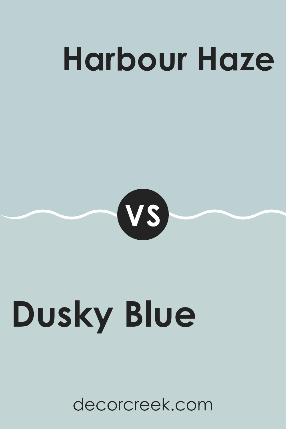
Dusky Blue 1640 by Benjamin Moore vs Harbour Haze 2136-60 by Benjamin Moore
Dusky Blue and Harbour Haze, both by Benjamin Moore, are distinct yet harmonious colors. Dusky Blue is a deeper shade, reminiscent of a twilight sky, offering a sense of calm and a touch of mystery to any room. In contrast, Harbour Haze is much lighter, akin to a soft, misty morning by the sea. It provides a fresh and airy feel, making it ideal for creating a relaxed atmosphere.
When used in interior rooms, Dusky Blue serves as a strong anchor, perfect for feature walls or furniture, bringing depth and focus. Harbour Haze, with its lighter, almost pastel tone, works wonderfully for opening up a room, making it appear larger and more inviting.
Combining these two colors can create a layered, visually intriguing environment. While Dusky Blue adds richness, Harbour Haze introduces brightness, resulting in a balanced and appealing aesthetic. Whether you want a striking contrast or a gentle complement, pairing these two can achieve both effects seamlessly.
You can see recommended paint color below:
After reading all about 1640 Dusky Blue by Benjamin Moore, I’ve learned it’s a really special paint color that can make any room feel calm and cozy. It’s like the sky on a clear, early evening when the stars are just about to come out. This shade isn’t too bright or too dark, so it fits just right in places like your bedroom or living room where you want to feel relaxed.
This color goes well with lots of different decorating styles, whether you like things a bit more modern or if you prefer a classic look. It can match with many colors, like soft whites or even darker grays, so it’s easy to use when you want to change up your room without making everything look new.
Also, it’s not just for walls! You can use this color for things like bookshelves or cabinets, and it will still look very nice. So, whether you’re painting a whole room, or just a little bit of your home, 1640 Dusky Blue can be a great choice to make your place more welcoming and nice.
If you’re thinking of picking a new color for any of your rooms, Dusky Blue might be just the right pick to make your home look pretty and feel comfy.
decorcreek.com
Ever wished paint sampling was as easy as sticking a sticker? Guess what? Now it is! Discover Samplize's unique Peel & Stick samples.
Get paint samples