Black
Black Blue
Blue Brown
Brown Gray
Gray Green
Green Neutral
 Orange
 White
White Yellow
Have you ever had a moment when a color completely changed the feeling of a room for you? That’s exactly what happened to me with Benjamin Moore’s 1566 Stonybrook. It’s a unique shade that strikes a perfect balance between blue and green, creating a calm and soothing atmosphere that feels both fresh and familiar.
As someone always looking for adaptable paint colors that work well in different rooms, I found 1566 Stonybrook especially appealing for its flexibility. It pairs beautifully with natural elements like wood and stone, as well as with more industrial materials such as metal and glass.
The color also has this subtle way of shifting under different lighting conditions, sometimes appearing more blue, other times more green, making it an interesting choice for any room.
Whether you’re aiming to refresh your living room, bedroom, or even a bathroom, this color might be exactly what you’re looking for to create a calm and welcoming room.
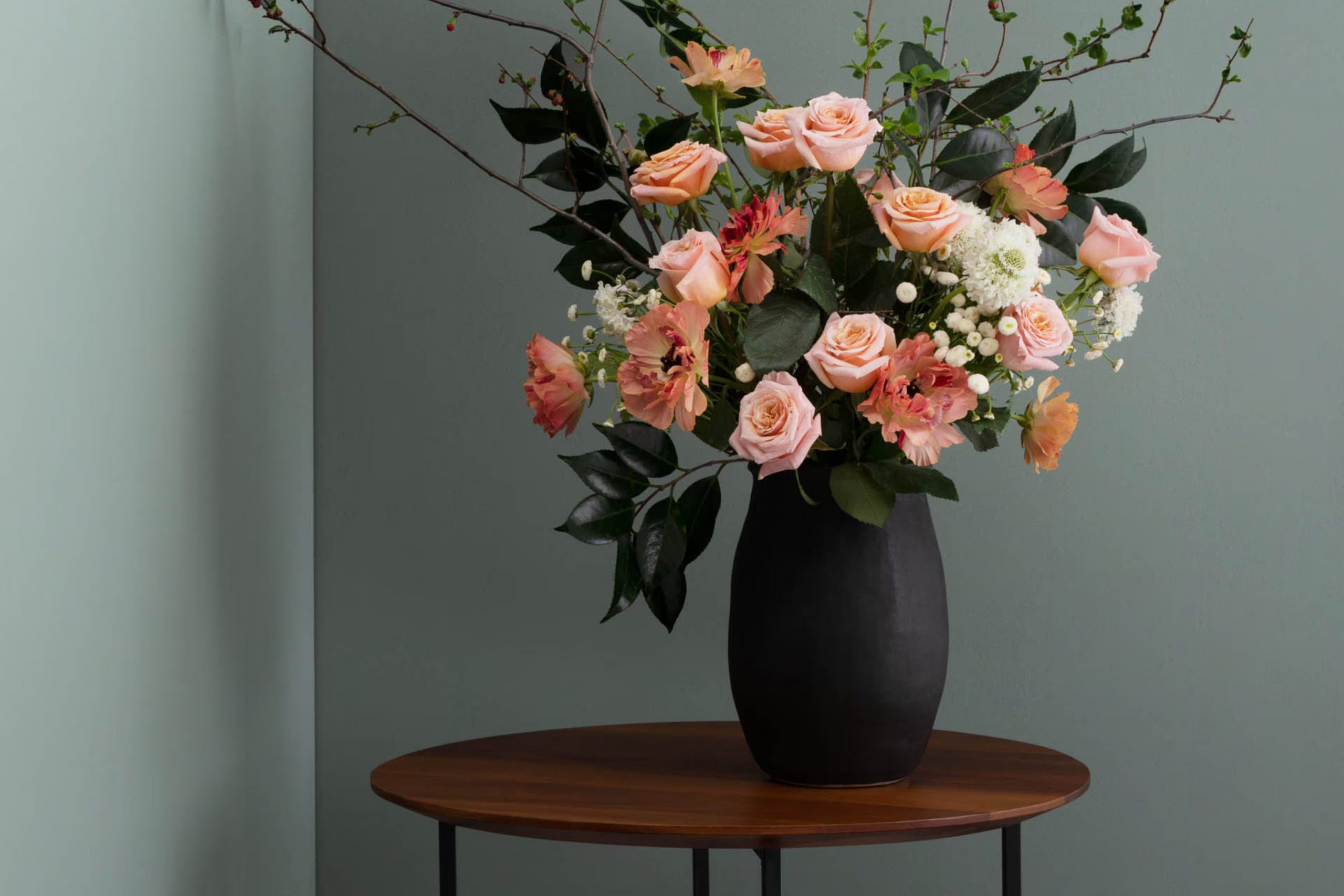
What Color Is Stonybrook 1566 by Benjamin Moore?
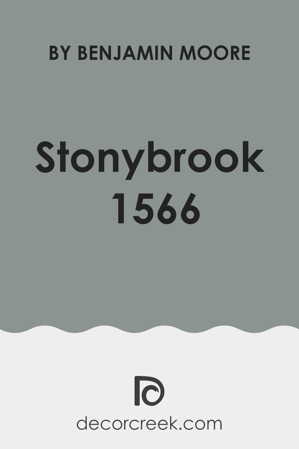
Stonybrook 1566 by Benjamin Moore is a calming shade of blue with a touch of gray. This color provides an adaptable backdrop that can work beautifully with a variety of decorating styles and is soft enough to avoid overpowering a room. It is especially effective in creating a calm and welcoming atmosphere, making it an excellent choice for living rooms, bedrooms, and even bathrooms.
In terms of interior styles, Stonybrook 1566 fits wonderfully with modern farmhouse designs, coastal themes, or traditional decor. The muted blue-gray tone pairs beautifully with natural materials such as wood and stone, improving the organic feeling of a room. It also works well with metallic accents like copper or silver, which add a touch of brightness and contrast to the softness of the color.
For textures, Stonybrook 1566 pairs nicely with soft textiles such as linen or cotton, making it a wonderful option for drapery or upholstered furniture. It complements textured wallpaper and works well alongside other subtle patterns or solid colors, offering flexibility in design choices.
Whether you’re aiming for a relaxed, cozy feeling or a more polished look, this color can help you create your desired atmosphere without feeling too intense.
decorcreek.com
Is Stonybrook 1566 by Benjamin Moore Warm or Cool color?
Stonybrook 1566 by Benjamin Moore is a unique shade of blue with a touch of gray, making it an adaptable choice for home interiors. This color has a calming effect, creating a peaceful and welcoming atmosphere in any room. Its understated tone works well in different settings, from modern to traditional styles, and can be used in living rooms, bedrooms, and even bathrooms.
One of the biggest advantages of Stonybrook 1566 is its ability to blend with different decor elements. It pairs beautifully with white trim, highlighting wood features and brightening rooms.
This color also works well with both natural light and artificial lighting, maintaining its true appearance without looking too dark or too intense. It’s an ideal backdrop for artwork or can serve as a striking accent wall. Whether you want a peaceful retreat or a stylish room for entertaining, Stonybrook 1566 provides a pleasing color base that’s easy to work with.
Undertones of Stonybrook 1566 by Benjamin Moore
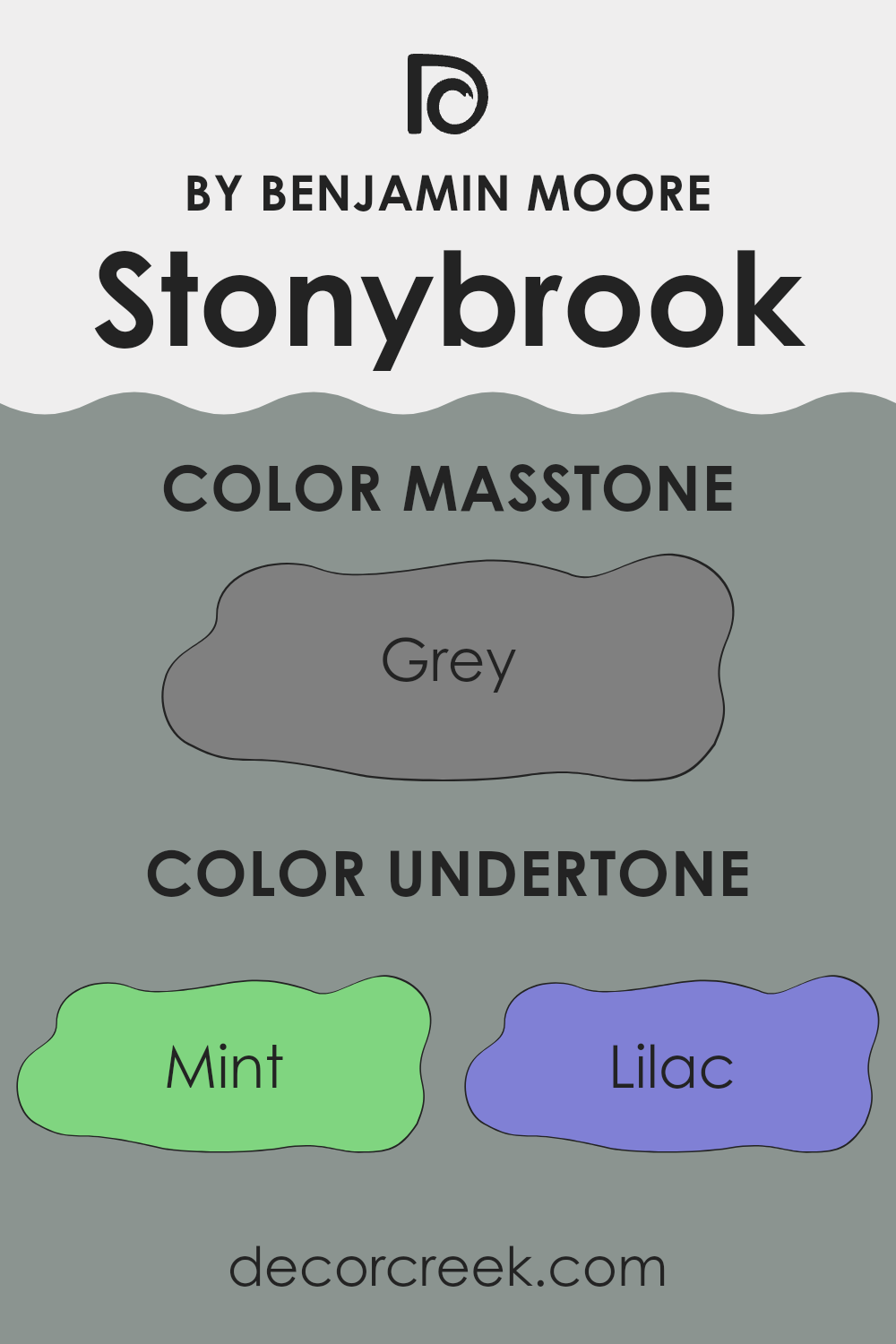
Stonybrook by Benjamin Moore is a unique paint color that carries a complex blend of undertones, each affecting the overall appearance of the shade in subtle yet important ways. Undertones play a major role in how we perceive color, as they can change its warmth, coolness, and depth, shaping the mood and atmosphere of any room.
Stonybrook includes a range of undertones from refreshing mint, warm pale yellow, calming light blue to deeper shades like dark turquoise and navy. These undertones can influence how the color appears depending on the lighting.
For example, in a room with plenty of natural light, the mint and light blue undertones of Stonybrook might make the walls appear cooler and more welcoming. In contrast, in a dimly lit room, the darker undertones like navy and dark turquoise could make the room feel more enclosed yet cozy.
When applied to interior walls, Stonybrook’s multiple undertones can either improve the room’s features or interact with your décor in interesting ways. Light furniture and decor can make the walls appear brighter and more lively, whereas darker elements might bring out the deeper undertones in the paint.
Furthermore, the complexity of Stonybrook offers adaptability, allowing it to work beautifully with different decorative styles and preferences. It can easily blend with various textures and materials, making it a practical choice for many homes. This flexibility makes Stonybrook an excellent option for those looking to refresh their rooms without choosing a completely different color palette.
decorcreek.com
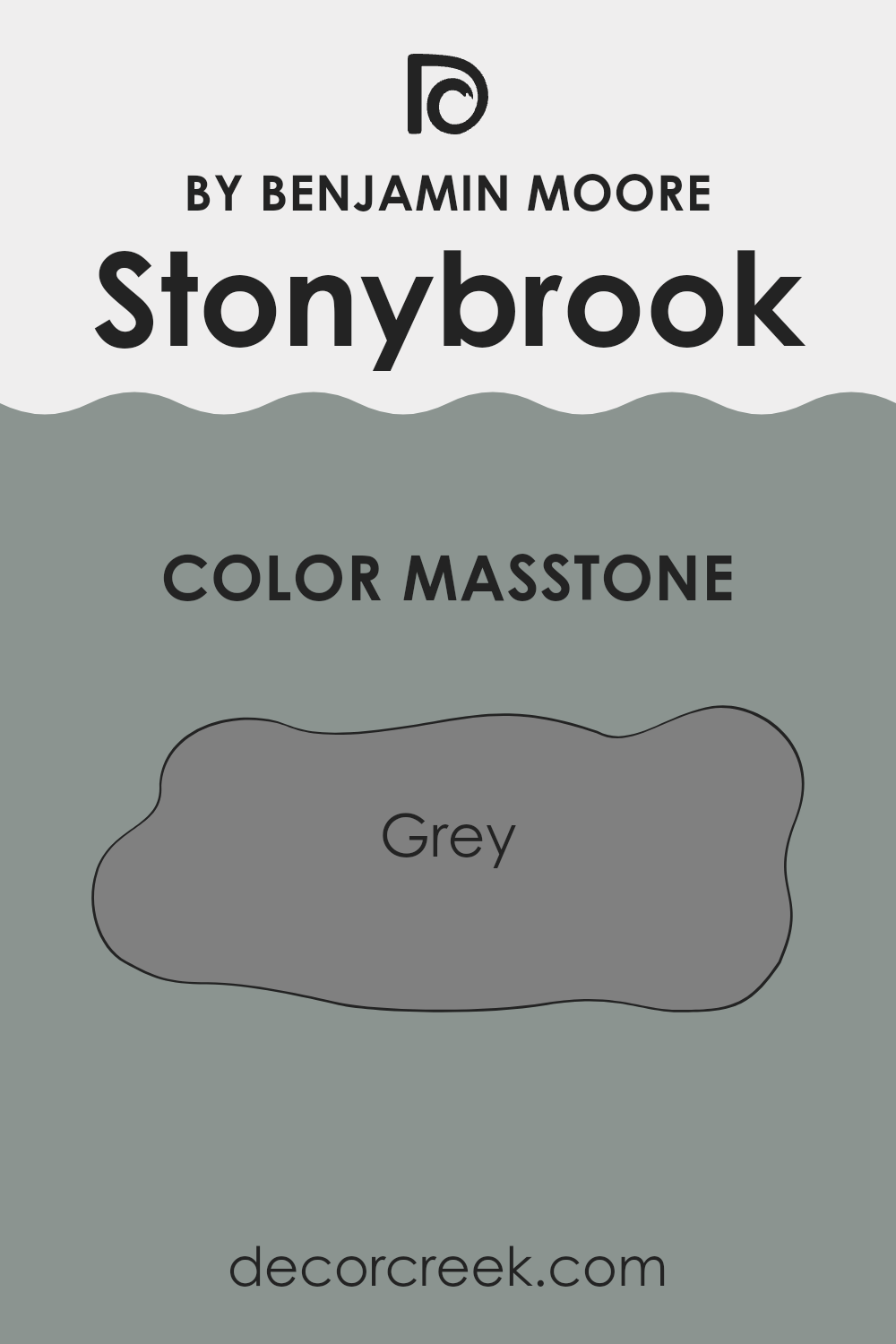
What is the Masstone of the Stonybrook 1566 by Benjamin Moore?
Stonybrook 1566 by Benjamin Moore has a masstone of grey, specifically Grey (#808080), which gives it an adaptable and balanced appearance. This shade of grey is quite neutral, making it an excellent base for different home decor styles.
Since it doesn’t lean too cool or too warm, it pairs well with both vibrant and muted colors, allowing for flexibility in decorating choices. This neutrality means it can be used in any room, from kitchens to bedrooms, without overpowering other design elements.
Grey, being a mid-tone, is practical for hiding everyday wear and tear on walls, which is especially useful for busy households or rooms that see a lot of activity. It’s easier to maintain and doesn’t show small marks or dirt as easily as lighter colors might. In homes, Stonybrook 1566 can help create a calm, steady backdrop that complements furnishings and artwork, allowing personal style to stand out without clashing with the wall color.
decorcreek.com
How Does Lighting Affect Stonybrook 1566 by Benjamin Moore?
Lighting can strongly affect how we perceive colors. When it comes to painting a room, such as one painted in Stonybrook1566 by Benjamin Moore, the way the color appears can vary greatly depending on the type of light—whether natural or artificial.
Under artificial lighting, Stonybrook1566 might appear slightly different than it does under natural sunlight. Artificial lights, depending on whether they are warm (more yellow) or cool (more blue), can change the color’s appearance. In warmer light, Stonybrook1566 may look more cozy and welcoming, highlighting its green undertones. In cooler light, the same color could seem cleaner and fresher, as the light brings out its soft blue tones.
Natural light also changes the appearance of Stonybrook1566 throughout the day and depending on the direction of the windows. Rooms facing north often receive less direct sunlight, which could make Stonybrook1566 appear softer and cooler, possibly bringing out more of its gray undertones. This can make the room feel calm and slightly dim if there is not enough artificial lighting.
In south-facing rooms, however, Stonybrook1566 can look very different. South-facing rooms receive stronger, direct light for most of the day, which could make Stonybrook1566 appear brighter and more lively. Its green and blue tones may become more noticeable, giving the room a fresh and energetic feeling.
Rooms facing east will have Stonybrook1566 looking bright and cheerful in the morning light, which usually has a cooler tone, making the color appear fresh and soft. As the sun moves, the intensity and warmth of the light will shift, potentially changing the mood of the room by afternoon.
In west-facing rooms, the evening light, which tends to be warmer, will affect Stonybrook1566 by making it appear richer and warmer. This can create a cozy atmosphere in the afternoon and evening, perfect for relaxing.
Considering these lighting differences is important when choosing paint colors, as the same shade can show different tones and moods depending on the setting and lighting conditions.
decorcreek.com
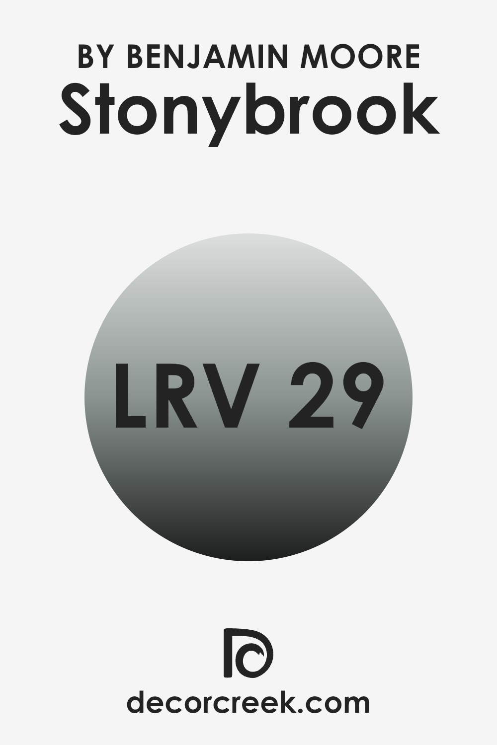
What is the LRV of Stonybrook 1566 by Benjamin Moore?
LRV stands for Light Reflectance Value, which measures how much light a paint color reflects or absorbs once it’s applied to a wall. This value is expressed on a scale that theoretically ranges from 0 (absolute black, absorbing all light) to the brightest white (reflecting all light).
LRV is important when choosing a paint color because it can strongly influence the brightness of a room. Higher LRV values mean the color reflects more light, making rooms appear larger and more open. On the other hand, lower LRV values create a cozier, more enclosed feeling because they absorb more light.
Considering the LRV of Stonybrook (29.27), it’s a darker shade that absorbs more light than it reflects. This quality makes it suitable for a room where a more intimate and grounded atmosphere is desired. The color will likely make the room feel smaller and warmer, as it won’t reflect a large amount of light around the room. This could be ideal for a study or a bedroom where a sense of calm and focus is important. When using a lower LRV color like this, it’s helpful to balance it with good lighting or lighter accents to prevent the room from feeling too dark.
decorcreek.com
Coordinating Colors of Stonybrook 1566 by Benjamin Moore
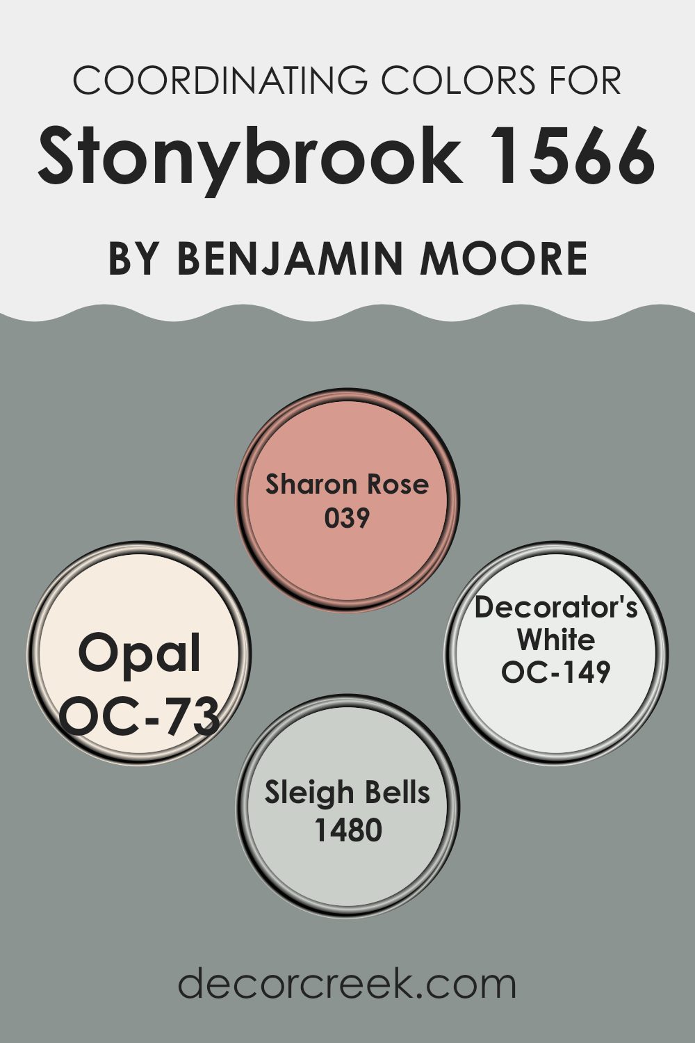
Coordinating colors are shades that pair well together to create balanced and appealing looks in interior design. When a primary color, like Stonybrook, is chosen for a room, selecting coordinating colors can help improve the overall look and bring harmony to the room. These colors are usually selected because they share complementary tones or contrasts that work beautifully with the main color, supporting the overall design without feeling too intense.
For example, Sharon Rose is a soft, gentle pink that adds a warm and welcoming feeling, making it an excellent match for Stonybrook’s richer tone. Opal, another coordinating shade, is a muted off-white with a touch of warmth, providing a subtle contrast that helps the main color stand out.
Decorator’s White is a crisp, clean white that offers a sharp, fresh contrast, ideal for trim or ceilings, improving the depth of Stonybrook. Lastly, Sleigh Bells is a gray with a soft blue undertone, creating a calming effect that pairs beautifully with Stonybrook for a softer and more relaxing color scheme. These coordinating colors work together to create a connected look that highlights the character of the primary color.
You can see recommended paint colors below:
- 039 Sharon Rose
- OC-73 Opal
- OC-149 Decorator’s White
- 1480 Sleigh Bells
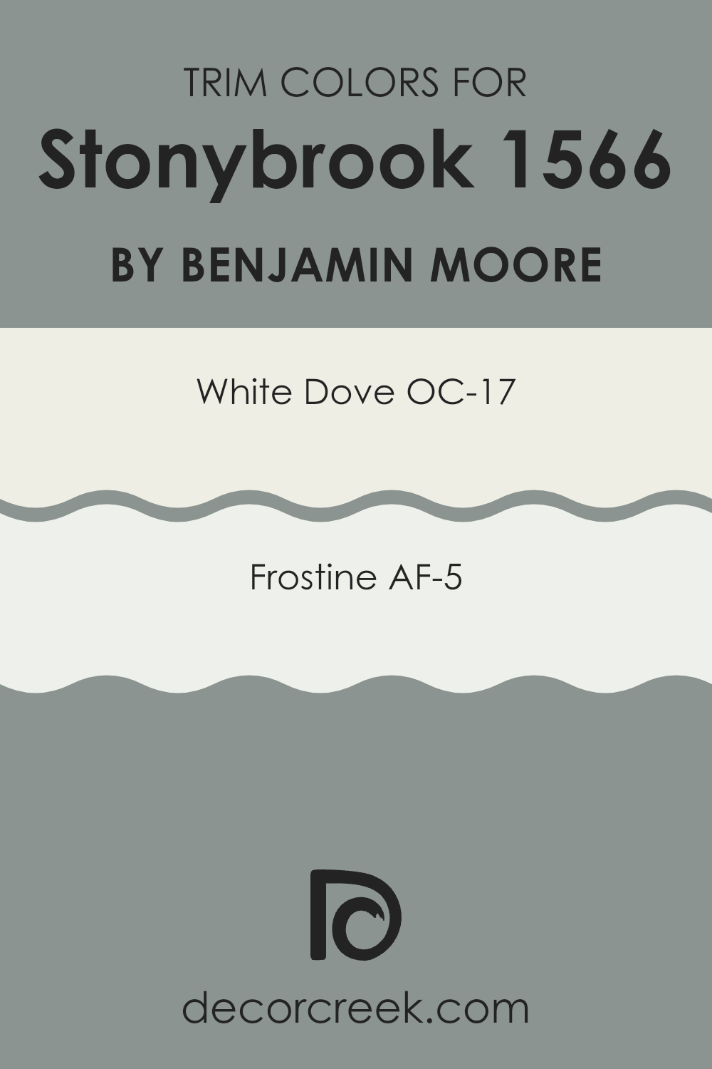
What are the Trim colors of Stonybrook 1566 by Benjamin Moore?
Trim colors refer to the paint used on architectural elements like door frames, moldings, and baseboards that outline or “trim” different parts of a home’s decor. These colors play an important role in highlighting and emphasizing the structural details of a room, providing visual borders that can gently improve the overall appearance. For a color like Stonybrook by Benjamin Moore, which offers a calm and gentle feeling, choosing the right trim colors is important to complement its tone without making it feel too strong.
White Dove OC-17 is an adaptable and classic trim color that offers a pure, slightly warm white that works beautifully with softer wall colors like Stonybrook. It helps gently define edges without creating a sharp contrast, making it an excellent choice for a balanced and welcoming look.
Frostine AF-5, another wonderful trim option, presents a cooler white that brings a fresh and airy feeling to the interior. This color is especially useful in rooms that aim for a light, open atmosphere, pairing well with the understated beauty of Stonybrook to improve the room without drawing too much attention.
You can see recommended paint colors below:
- OC-17 White Dove
- AF-5 Frostine
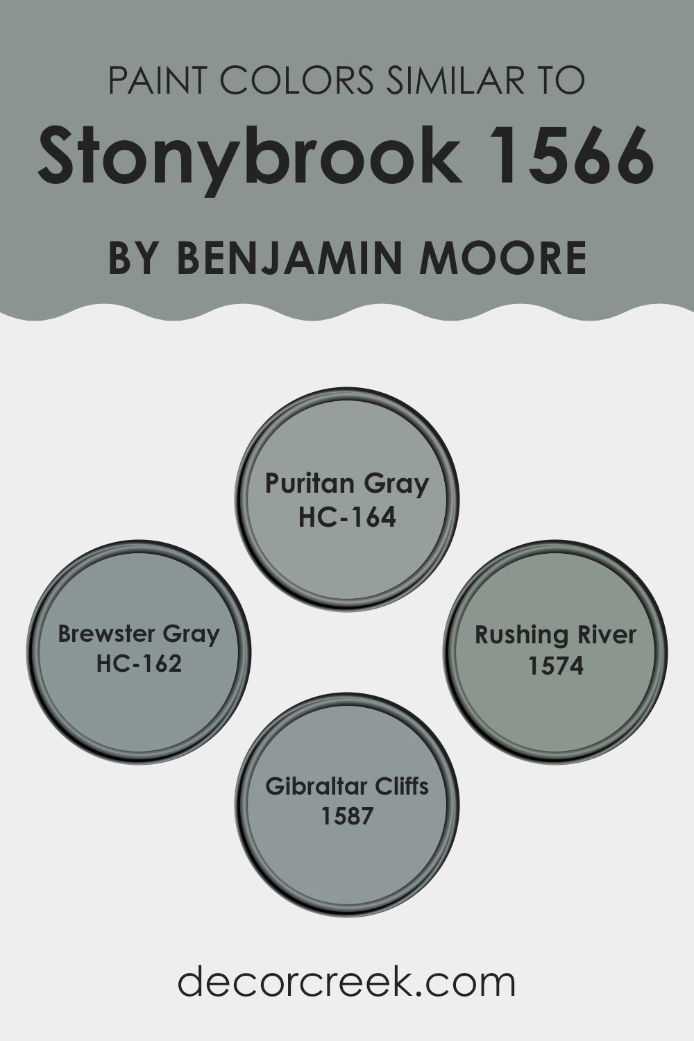
Colors Similar to Stonybrook 1566 by Benjamin Moore
When decorating a room, choosing similar colors can create a balanced and connected look. Colors like HC-164 – Puritan Gray, HC-162 – Brewster Gray, 1574 – Rushing River, and 1587 – Gibraltar Cliffs are all shades that share a common base yet have unique details that make them wonderful for blending together.
Choosing shades within the same color family simplifies the design process because these colors naturally complement one another, reducing the chance of a harsh or mismatched result. This consistency in tone helps create a smooth visual flow from room to room, making every area feel connected and carefully designed.
Each of these colors has its own charm. HC-164 – Puritan Gray is a gentle gray with a hint of blue that brings a calm and understated beauty to any room. HC-162 – Brewster Gray, slightly deeper than Puritan Gray, adds a touch of richness and formality without feeling too intense.
On the other hand, 1574 – Rushing River carries a more energetic feeling with its bluer undertone, offering a fresh touch to rooms that need extra brightness. Lastly, 1587 – Gibraltar Cliffs has a deeper appearance, making it ideal for accent walls or furniture pieces meant to attract attention and ground the room. When used thoughtfully, these colors can bring life into a home while maintaining a peaceful and unified look.
You can see recommended paint colors below:
- HC-164 Puritan Gray
- HC-162 Brewster Gray
- 1574 Rushing River
- 1587 Gibraltar Cliffs
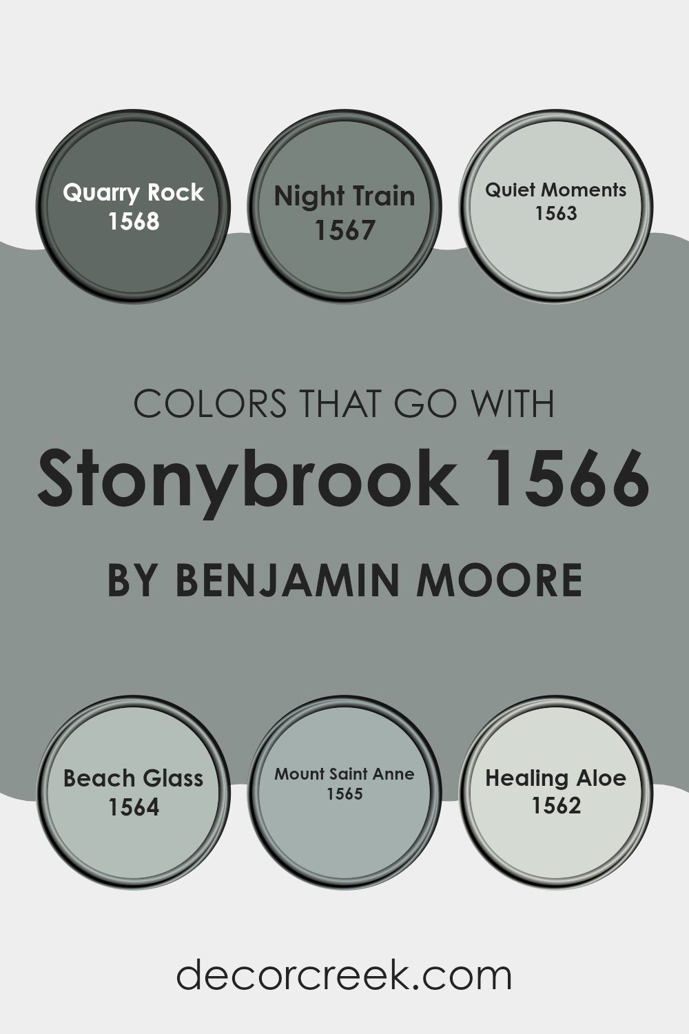
Colors that Go With Stonybrook 1566 by Benjamin Moore
Colors that complement Stonybrook 1566 by Benjamin Moore are important because they help create a balanced and harmonious atmosphere in any room. When selecting colors such as Quarry Rock, Night Train, Quiet Moments, Beach Glass, Mount Saint Anne, and Healing Aloe, the goal is to improve the environment without making it feel too intense. These colors work together by balancing one another, making them perfect for designing rooms that feel both welcoming and relaxing.
Quarry Rock 1568 is a deep gray that adds depth and definition, perfect for accent walls or furniture. Night Train 1567 offers a slightly lighter gray tone, providing a subtle contrast that works beautifully with natural materials like wood or stone. Quiet Moments 1563 presents a soft, muted blue-green, ideal for creating a calm and cozy backdrop in bedrooms or living rooms.
Its gentle tone complements bolder colors nicely. Beach Glass 1564 continues in the blue-green range but with a lighter, airy feeling that brings to mind the freshness of the seaside, suitable for bathrooms or smaller rooms. Mount Saint Anne 1565 shifts toward a deeper blue-green, adding a touch of drama and beauty to rooms that need a bit more richness.
Finally, Healing Aloe 1562 is a pale green with a calming presence, excellent for rooms designed for relaxation or rest, like spas or reading nooks. Together, these colors create a balanced palette that improves mood and visual appeal, making any room feel more welcoming and comfortable.
You can see recommended paint colors below:
- 1568 Quarry Rock
- 1567 Night Train
- 1563 Quiet Moments
- 1564 Beach Glass
- 1565 Mount Saint Anne
- 1562 Healing Aloe
How to Use Stonybrook 1566 by Benjamin Moore In Your Home?
Stonybrook 1566 by Benjamin Moore is a rich and adaptable paint color that brings a unique charm to any room in your home. With its deep blue-green shade, Stonybrook can act as a bold backdrop in your living room, adding depth and warmth to the room. It’s also wonderful for bedrooms, creating a calming feeling that’s perfect for relaxation. In the kitchen, using this color can create a welcoming, cozy atmosphere, encouraging family gatherings and long conversations.
What’s especially nice about Stonybrook is its ability to pair beautifully with many decor styles and colors. It looks stunning when combined with bright whites, which can make the room feel fresh and lively. Additionally, using natural wood elements alongside Stonybrook brings an earthy, grounded feeling to your home.
Whether you’re painting an accent wall, updating your cabinets, or giving your exterior a fresh look, this color is adaptable and easy to use in many different ways. It’s a dependable choice that holds up beautifully over time, making it not only stylish but practical as well.
Stonybrook 1566 by Benjamin Moore vs Rushing River 1574 by Benjamin Moore
Stonybrook by Benjamin Moore is a muted green that brings a natural and gentle feeling to rooms. It has a softness that makes it easy to pair with both light and dark furniture.
Rushing River, also by Benjamin Moore, leans more toward a deeper slate blue with gray undertones, giving off a cooler and slightly stronger presence than Stonybrook.
While Stonybrook offers a warmer and more welcoming feeling thanks to its green base, Rushing River provides a bit more character and contrast, perfect for making a statement or highlighting smaller decor details. Both colors work beautifully in different home styles, but their different tones can either warm up a room or give it a cooler, cleaner appearance, depending on the atmosphere you want to create.
You can see recommended paint color below:
- 1574 Rushing River

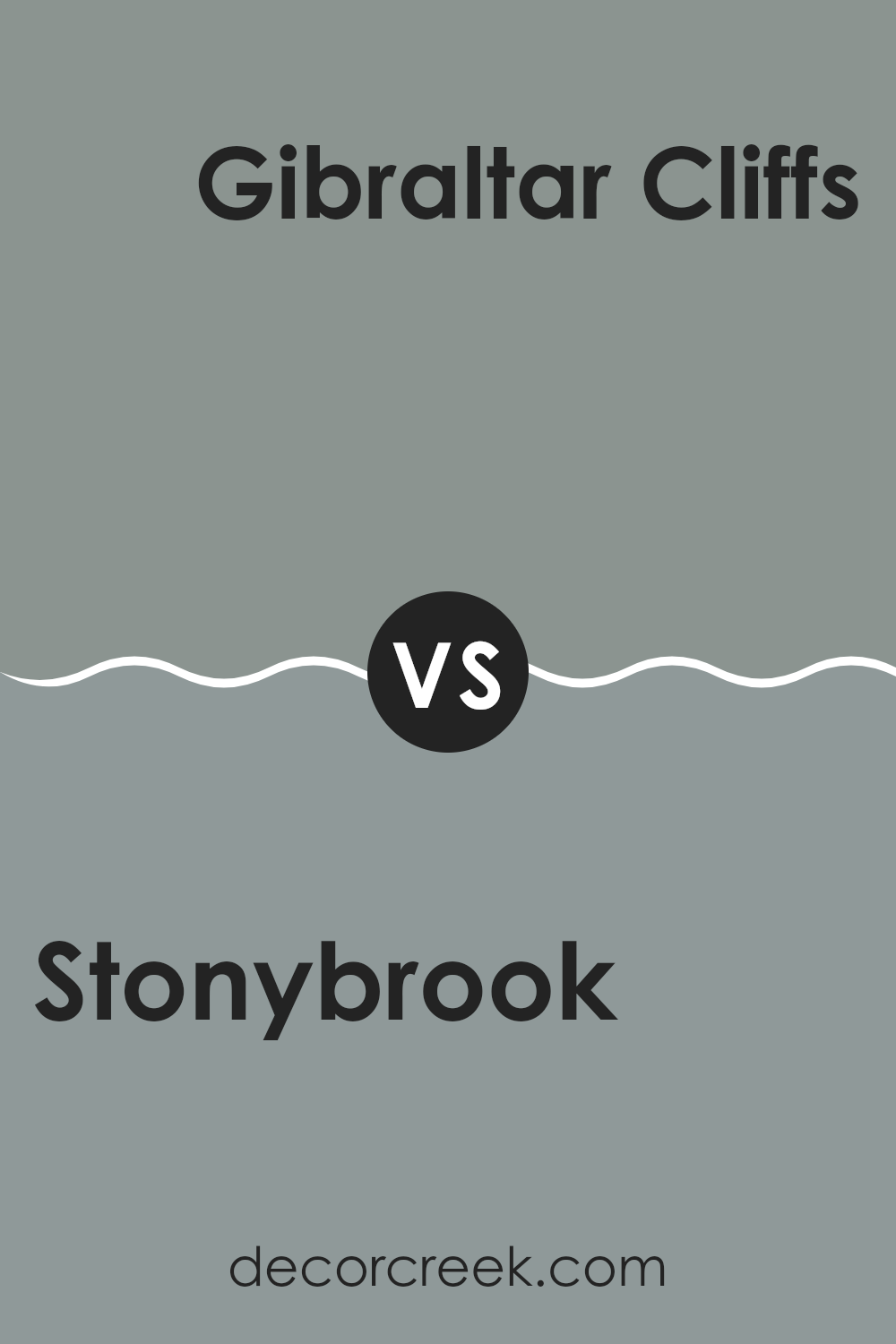
Stonybrook 1566 by Benjamin Moore vs Gibraltar Cliffs 1587 by Benjamin Moore
Stonybrook by Benjamin Moore is a muted blue with gray undertones, giving off a calm and gentle feeling. It’s fairly light and neutral, suited for rooms that aim for a calming atmosphere without feeling too cold or distant.
Gibraltar Cliffs, also by Benjamin Moore, is a deeper tone that leans toward a richer gray-blue shade. This color feels more grounded and can provide a strong backdrop in a room, adding depth and focus. While both shades share a blue base, Stonybrook is lighter and softer, making it wonderful for more relaxed rooms like a bedroom.
On the other hand, Gibraltar Cliffs, with its deeper appearance, works well in areas of the home meant for focus and gathering, like dining rooms or studies. Each color offers its own benefits depending on the atmosphere you want to create in your decorating project.
You can see recommended paint color below:
- 1587 Gibraltar Cliffs
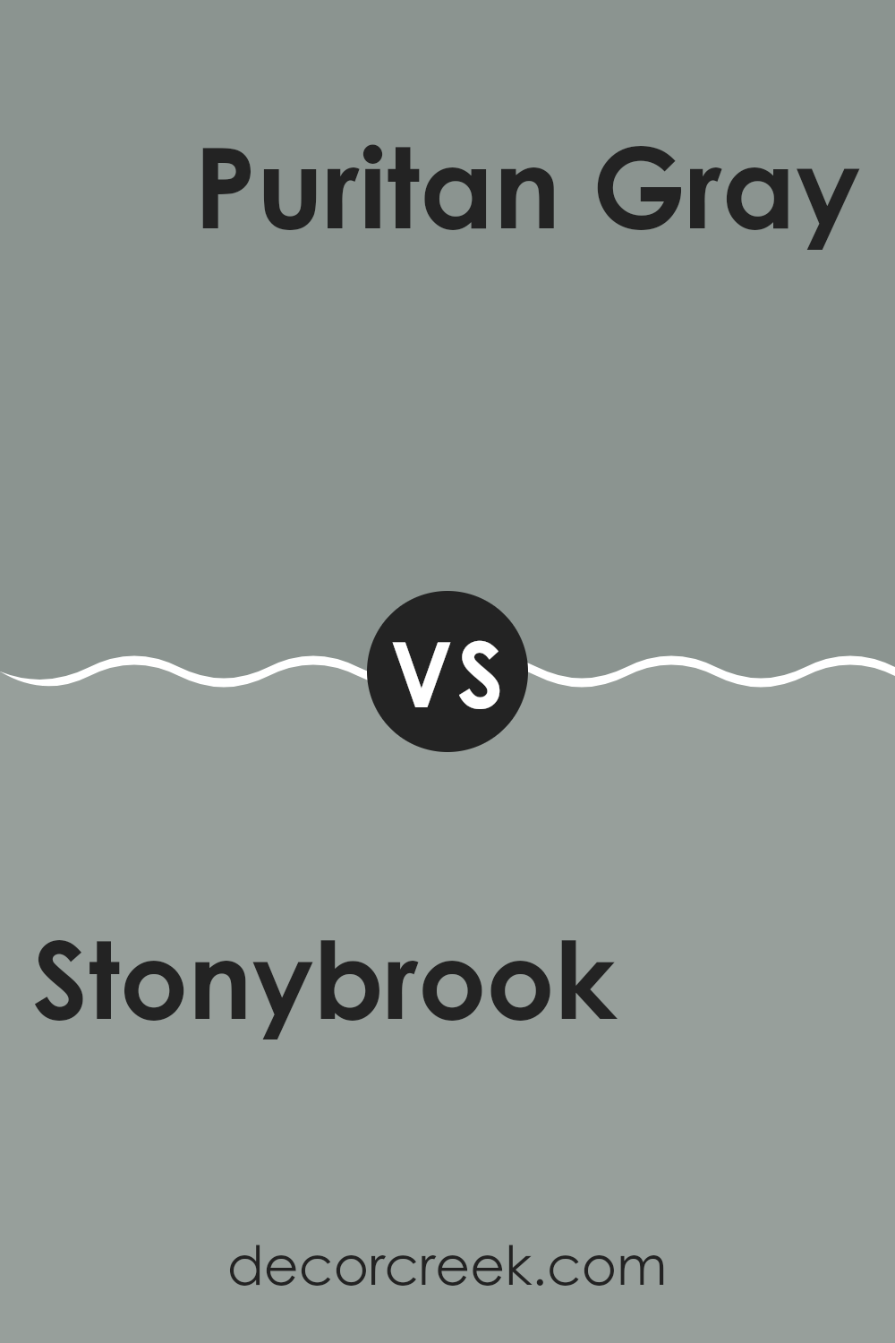
Stonybrook 1566 by Benjamin Moore vs Puritan Gray HC-164 by Benjamin Moore
Stonybrook by Benjamin Moore is a unique shade of blue with subtle green undertones, creating a calm yet fresh atmosphere. It’s an adaptable color that works beautifully in many rooms, adding a soft, natural feeling that is both comforting and welcoming.
On the other hand, Puritan Gray by Benjamin Moore is a classic gray with a hint of blue, which gives it a cool and crisp appearance. This color is excellent for creating a clean and modern look in any room. It pairs beautifully with many decor styles, making it a highly adaptable choice for contemporary interiors.
When comparing these two, Stonybrook tends to bring a more lively and slightly warmer atmosphere because of its green undertone, while Puritan Gray offers a more understated and cooler presence that can feel more formal or polished. Both colors are excellent for creating a peaceful atmosphere, but your choice depends on the specific mood or style you want to create.
You can see recommended paint color below:
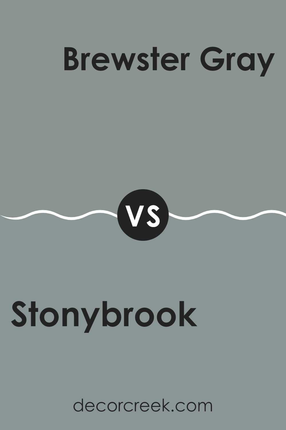
Stonybrook 1566 by Benjamin Moore vs Brewster Gray HC-162 by Benjamin Moore
Stonybrook is a unique blue-green shade that adds a subtle yet distinct character to any room. Its natural tones can make a room feel fresh and lively, creating a comfortable backdrop that feels easy on the eyes. This color works beautifully in rooms designed for relaxation, like bedrooms or bathrooms, but it is also adaptable enough for living areas.
On the other hand, Brewster Gray is a more subdued and classic blue-gray color. It carries a formal yet welcoming feeling, making it perfect for areas where you entertain guests, such as dining rooms or formal living rooms. Brewster Gray has a classic charm, ensuring it pairs well with both modern and traditional decor.
Comparing the two, Stonybrook offers a touch of brighter color, bringing energy and a natural feeling indoors. Brewster Gray, while more reserved, provides a polished and grounded appearance that can anchor a room’s decor. Depending on the mood you want to create, each color offers its own strengths in shaping a particular atmosphere.
You can see recommended paint color below:
In closing, Benjamin Moore’s 1566 Stonybrook is a lovely paint color that can truly make a room feel calmer and more welcoming. After learning about its qualities and the different ways it can be used in decorating, I think it’s a wonderful choice for anyone wanting to refresh their home. The shade of blue has a gentle quality that can make a busy room feel more relaxing or give a quiet room a touch of color without feeling too bright or bold.
This paint color works beautifully in many areas, like living rooms, bedrooms, bathrooms, and kitchens. Because it’s neither too dark nor too light, it pairs wonderfully with both light and dark furniture, which means you don’t need to purchase new pieces to make your room look beautiful. It’s like having a blue that feels easygoing while still standing out in a lovely way.
So, if someone is thinking about adding a new color to their walls, Stonybrook could be a wonderful option. It has a gentle ability to improve any room while keeping things simple and clean. I think it’s a color that could bring happiness to many homes. It’s amazing how a can of paint can completely refresh a room!
decorcreek.com
Ever wished paint sampling was as easy as sticking a sticker? Guess what? Now it is! Discover Samplize's unique Peel & Stick samples.
Get paint samples