When you’re looking for a fresh new color for your walls, SW 9643 Eventide by Sherwin Williams is a choice you might want to consider. This shade offers a serene and soothing atmosphere, which can be perfect for spaces where you want a touch of calmness.
Whether it’s your bedroom, bathroom, or a quiet reading nook, Eventide brings a gentle blue tint that pairs beautifully with a variety of decor styles and color palettes.
I find that this color has a unique ability to create a peaceful space, making it easier for me to relax and unwind after a busy day. It also works well in well-lit areas, reflecting light to make the space look brighter and more open. If you’re thinking of giving your room a makeover, Eventide could be the perfect backdrop to inspire a light and airy feeling in your home.
It’s a soft, versatile color that adds a nice touch without overpowering the room. This makes it a great base for experimenting with different textures and accent colors in your furniture and accessories.
What Color Is Eventide SW 9643 by Sherwin Williams?
Eventide by Sherwin Williams is a soft, muted blue with a hint of gray, presenting a soothing and fresh look that can lighten up any space. This particular shade is versatile and works beautifully in a variety of interior design styles, particularly lending itself well to modern, coastal, and Scandinavian-inspired decors.
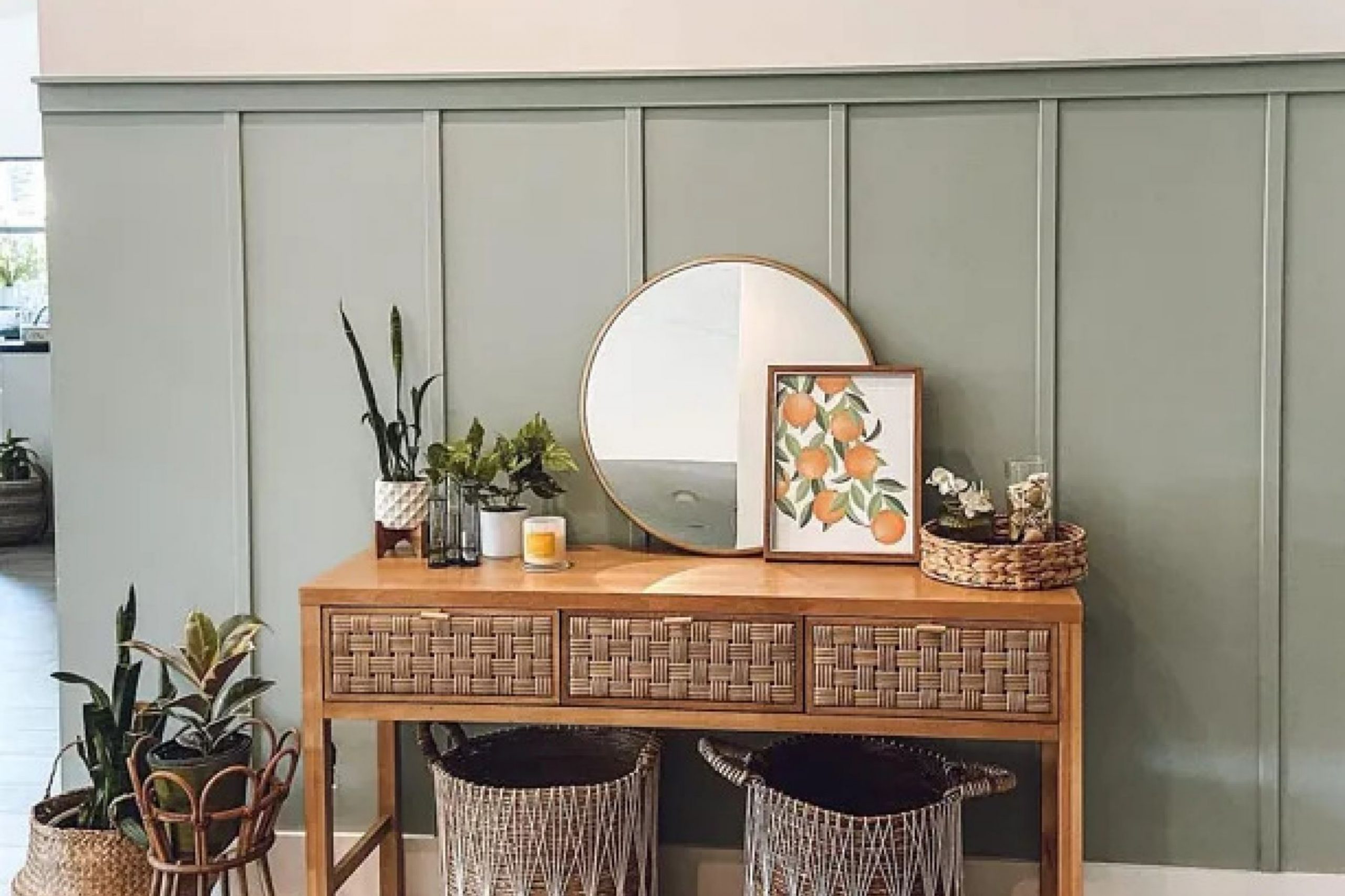
The subtle undertones of Eventide make it a superb choice for pairing with natural materials and textures. For instance, light wooden elements such as oak or birch can complement this color, bringing warmth to the cool tones of the paint.
Linen fabrics and jute rugs also work well with Eventide, adding a textural contrast to its smooth finish.
Additionally, this color pairs nicely with white trimmings or furniture, enhancing its airy feel. For a modern look, incorporating metals like brushed nickel or stainless steel can give a room a clean, streamlined appearance. In coastal-themed settings, accents in sandy tans or soft whites help create a relaxed, beachy vibe that echoes the calmness of the ocean.
Easy to integrate into various rooms, whether it’s a bedroom, bathroom, or living area, Eventide provides a refreshed and light atmosphere, making it a smart choice for those looking for a gentle yet effective way to update their interiors.
Is Eventide SW 9643 by Sherwin Williams Warm or Cool color?
Eventide by Sherwin Williams is a unique color that can greatly impact the feel of a home. It has a gentle, soft quality that makes any space feel cozy and welcoming. When used in a living room or bedroom, it provides a calming atmosphere, helping to relax the mind after a long day.
This color is versatile enough to work well with both modern and traditional decor, making it a convenient choice for many households.
In smaller spaces, such as a bathroom or a study, Eventide can help the area appear larger and more open. It pairs beautifully with white trim or furniture, creating a fresh and clean look. For those who love adding personal touches, this color also goes well with various accent colors, like navy or mustard, which can add a bit of energy and contrast to the room.
Overall, Eventide is a flexible and appealing color choice that can enhance the aesthetics of any home interior.
Undertones of Eventide SW 9643 by Sherwin Williams
Eventide is a versatile paint color that contains various undertones, which significantly influence how it appears on your walls under different lighting conditions. Undertones are the subtle colors that lie beneath the surface of the main color, affecting its overall hue.
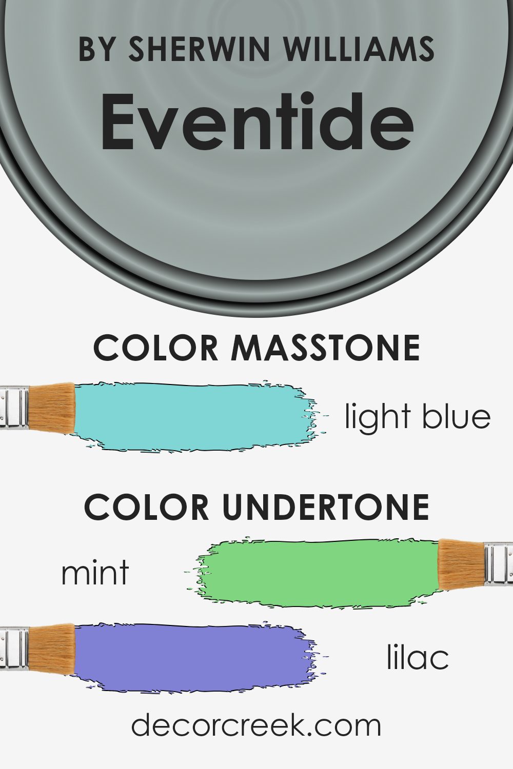
For Eventide, these undertones include shades like mint, lilac, light gray, gray, pale yellow, light purple, pale pink, turquoise, light turquoise, blue, and dark turquoise.
Understanding these undertones can help you predict how the color will interact with your room’s natural and artificial light, as well as your decor. For instance, in a room with a lot of sunlight, the pale yellow undertone might become more pronounced, giving the walls a warmer feel. Artificial light, depending on whether it’s warm or cool, can highlight the lilac or blue undertones, altering the mood of the room.
Using Eventide on interior walls offers a dynamic backdrop that can shift subtly with changes in light or surrounding colors. The mint and turquoise undertones could give a refreshing and lively feel, enhancing areas like living rooms or kitchens.
Conversely, the lilac and light purple undertones might add a soft, cozy touch to bedrooms.
In sum, the variety of undertones in this paint means it can easily adapt to different styles and spaces, making it an excellent choice for those looking to refresh their interiors. Always consider the primary use of the room and its lighting to maximize the potential of this unique color.
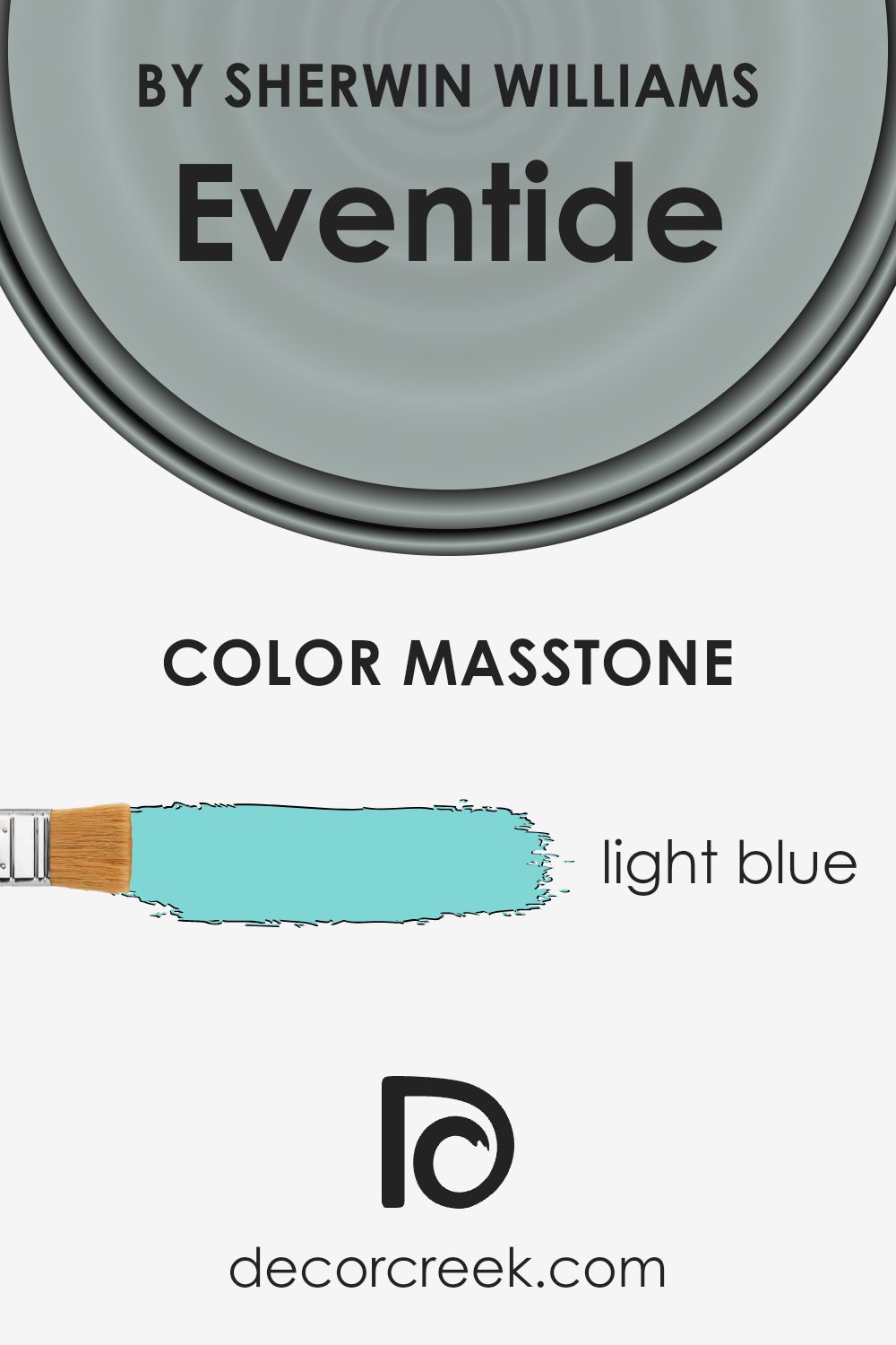
What is the Masstone of the Eventide SW 9643 by Sherwin Williams?
EventideSW 9643 by Sherwin Williams presents a light blue masstone, which resonates with a fresh and clean vibe, making it an excellent choice for homes. This shade carries the lightness of the sky and the freshness of a mild sea breeze, which can help make spaces feel more airy and open.
When applied to walls in rooms like the living room or bedroom, it adds a cooling effect, especially beneficial in spaces that receive a lot of sunlight. The calming nature of this color is also ideal for bathrooms, where it contributes to a clean and refreshing environment.
In home offices, the light blue hue can help maintain a lively atmosphere, aiding concentration and creativity. Compatible with a variety of decor styles and other colors, it works well with whites, grays, and even some warmer tones like soft yellows, making it a versatile choice for many different home settings.
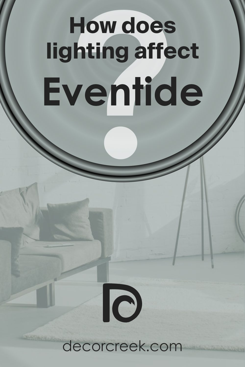
How Does Lighting Affect Eventide SW 9643 by Sherwin Williams?
Lighting plays a crucial role in how we perceive colors, significantly influencing their appearance in different environments. Whether a space uses natural or artificial light can change how a color looks on walls or decor.
Take, for example, the color Eventide by Sherwin Williams. This shade can appear quite differently under various lighting conditions. Under artificial lighting, such as LED or incandescent bulbs, Eventide might look slightly darker than it does in natural light. The type of bulb can affect the color too; warmer bulbs might bring out more yellow undertones, while cooler bulbs could highlight blue undertones.
In natural light, the perception of Eventide also varies depending on the direction the room faces. In north-facing rooms, which receive less direct sunlight and tend to have cooler, more consistent light throughout the day, Eventide might look a bit muted and shadowy. This cooler light can enhance the cooler undertones of the paint, giving it a calm and subtle appearance.
In south-facing rooms, however, which are flooded with warm, direct sunlight for most of the day, Eventide may appear brighter and more vibrant. The natural brightness can make the color feel more lively and dynamic, which could add a sense of energy to the space.
East-facing rooms get most of their light in the morning when the sun rises. Here, Eventide will start the day with a soft, warm glow but may become more neutral and subdued as the day progresses and the natural light diminishes.
West-facing rooms experience the opposite lighting pattern, with the most intense light in the late afternoon. Eventide in these rooms may look softer during the morning and become more pronounced and rich in color by evening.
Understanding these nuances of lighting and direction can help in deciding where and how to use certain colors like Eventide to enhance the mood and function of a room efficiently.
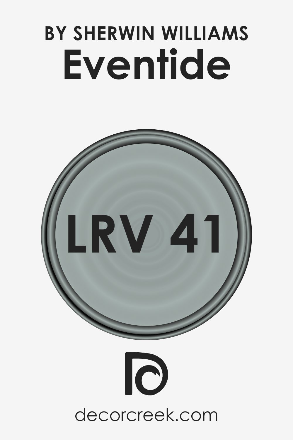
What is the LRV of Eventide SW 9643 by Sherwin Williams?
LRV stands for Light Reflectance Value, which is a measure of how much light a color reflects. Ranging from 0 to 100, with higher numbers indicating that the color reflects more light, LRV is a tool that helps predict how light or dark a color will look once it’s on your walls.
Generally, colors with higher LRVs are used in smaller or dimly lit spaces to make them appear larger and brighter, while lower values are chosen for a denser and cozier feel. This measurement is crucial in making design choices that suit the natural lighting of a room and the visual impact you want to achieve.
Regarding the color Eventide with an LRV of 41.358, it sits in the mid-range of the scale. This moderate LRV means it is versatile enough to work in various spaces but performs best in rooms with a moderate amount of light. It will neither reflect light like lighter shades nor absorb it like darker tones.
As a result, Eventide tends to offer a balanced visual weight, maintaining its true color under most lighting conditions without leaning too heavy or too light.
This characteristic makes it a reliable choice for common areas and bedrooms where a neutral, steady appearance is often desired.
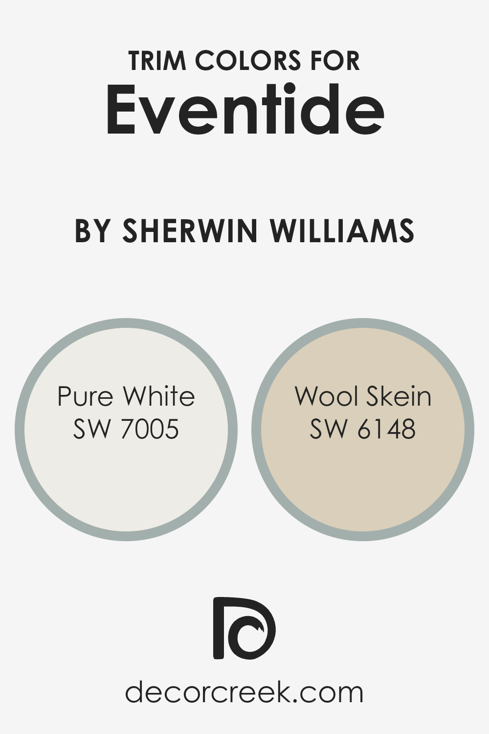
What are the Trim colors of Eventide SW 9643 by Sherwin Williams?
Trim colors are used to accentuate the main color on a building’s exterior or an interior room’s walls, creating a crisp boundary or a subtle transition that highlights architectural details. For Sherwin Williams’ Eventide, a gentle and appealing hue, choosing the right trim color can significantly enhance its appearance.
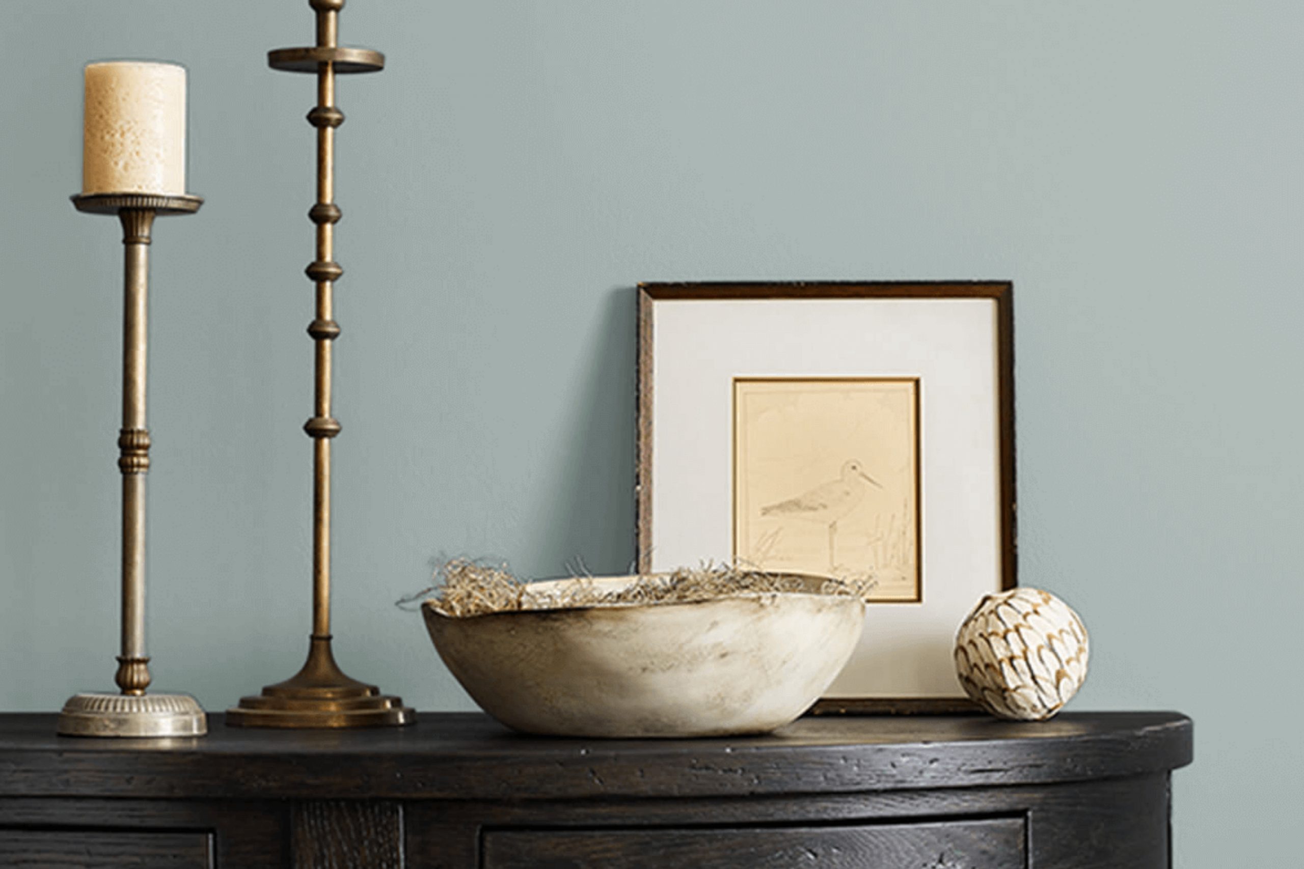
Pure White and Wool Skein are two excellent choices for trim that complement and add a gentle contrast with Eventide, both contributing to a harmonious and polished look.
Pure White (SW 7005) by Sherwin Williams is a clean, crisp white that can bring out the richness of Eventide by providing a stark, refreshing contrast that makes the wall color pop. It’s particularly effective in brightening up spaces and adding a feel of neatness to any home. On the other hand, Wool Skein (SW 6148) offers a subtler option; it’s a soft, warm neutral with hints of yellow and beige, blending seamlessly with Eventide for a more understated elegance.
Wool Skein works well in achieving a cozy and welcoming atmosphere without creating too stark a contrast, making it ideal for a softer aesthetic.
You can see recommended paint colors below:
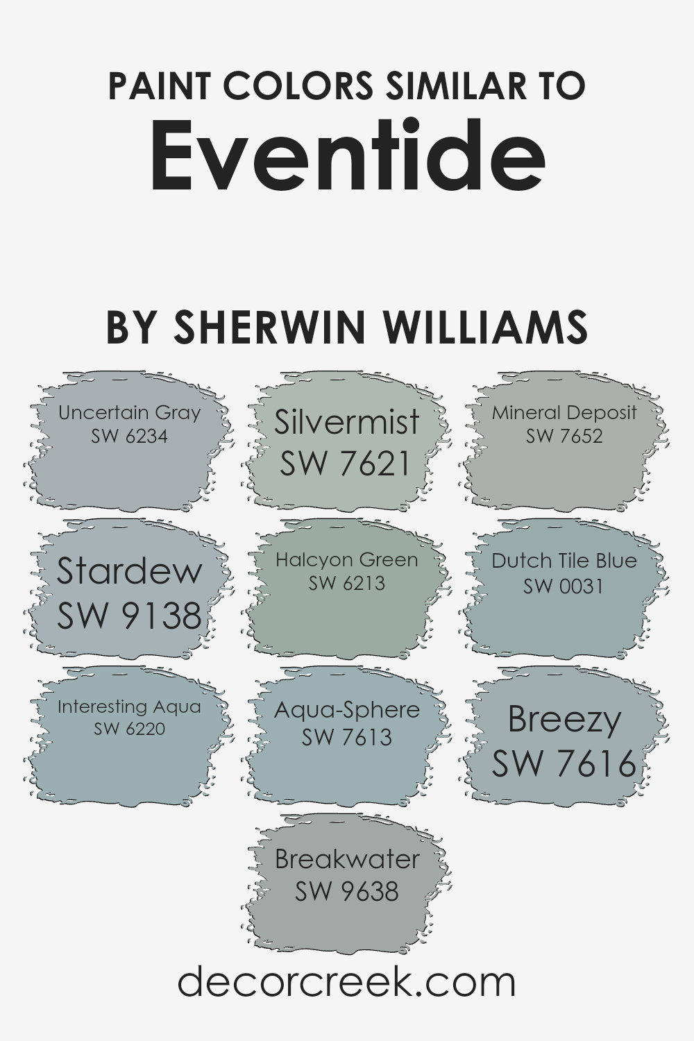
Colors Similar to Eventide SW 9643 by Sherwin Williams
Similar colors are essential in creating a cohesive and visually appealing space. Colors that blend well together can enhance the mood of a room and flow seamlessly from one area to another. For instance, using shades similar to Eventide, like Uncertain Gray and Stardew, allows for a gentle transition in spaces that aim for a calm and harmonious atmosphere.
Uncertain Gray offers a subtle, soft neutral tone that complements cooler hues, while Stardew’s more pronounced blue-gray cast supports a peaceful environment. Both shades serve as versatile backdrops for decor elements, enabling other colors to stand out without overwhelming the senses.
Furthering this gentle alignment of colors, Interesting Aqua and Breakwater add a touch of vibrancy while keeping the overall tone subdued. Interesting Aqua provides a lively yet mild aquatic shade that pairs nicely with softer, neutral furniture, whereas Breakwater offers a deeper, more introspective blue that can anchor lighter tones around it.
Silvermist and Halcyon Green keep within the muted, nature-inspired palette, suggesting an airy, light-filled room. Silvermist, with its hint of green in a gray base, works beautifully in areas that get a lot of natural light. In contrast, Halcyon Green, a soothing green-blue, is perfect for creating a soft, welcoming environment.
Moving towards slightly deeper tones, Aqua-Sphere and Mineral Deposit introduce a more profound element without disrupting the visual flow. Aqua-Sphere’s rich blue-green hue makes it ideal for focal points in a room, while Mineral Deposit’s grayish-blue shade complements wood tones and metallic finishes.
Lastly, Dutch Tile Blue and Breezy are great for adding a splash of color without overpowering.
Dutch Tile Blue exudes a traditional charm with its vibrant yet deep blue, perfect fo
r accent walls or furniture pieces. On the other hand, Breezy offers a light and airy blue that imparts freshness to any space, enhancing the open, light-filled feel of a room.
You can see recommended paint colors below:
- SW 6234 Uncertain Gray
- SW 9138 Stardew
- SW 6220 Interesting Aqua
- SW 9638 Breakwater
- SW 7621 Silvermist
- SW 6213 Halcyon Green
- SW 7613 Aqua-Sphere
- SW 7652 Mineral Deposit
- SW 0031 Dutch Tile Blue
- SW 7616 Breezy
How to Use Eventide SW 9643 by Sherwin Williams In Your Home?
Eventide SW 9643 by Sherwin Williams is a versatile paint color that can add a fresh touch to any home. It’s a soft gray shade that works well in different lighting, making it easy for homeowners to use in various rooms. You can apply it in high-traffic areas like living rooms and kitchens because it provides a neutral backdrop that complements both bright and muted furnishings.
In smaller spaces such as bathrooms, Eventide creates a sense of more space and light, making the room feel larger.
It’s also an excellent choice for bedrooms, where its soothing tone helps create a relaxing atmosphere for rest. To integrate Eventide into your home, consider painting your walls or using it for accent features like a single wall or on kitchen cabinets. Matching this color with whites or darker grays can produce a stylish and harmonious look.
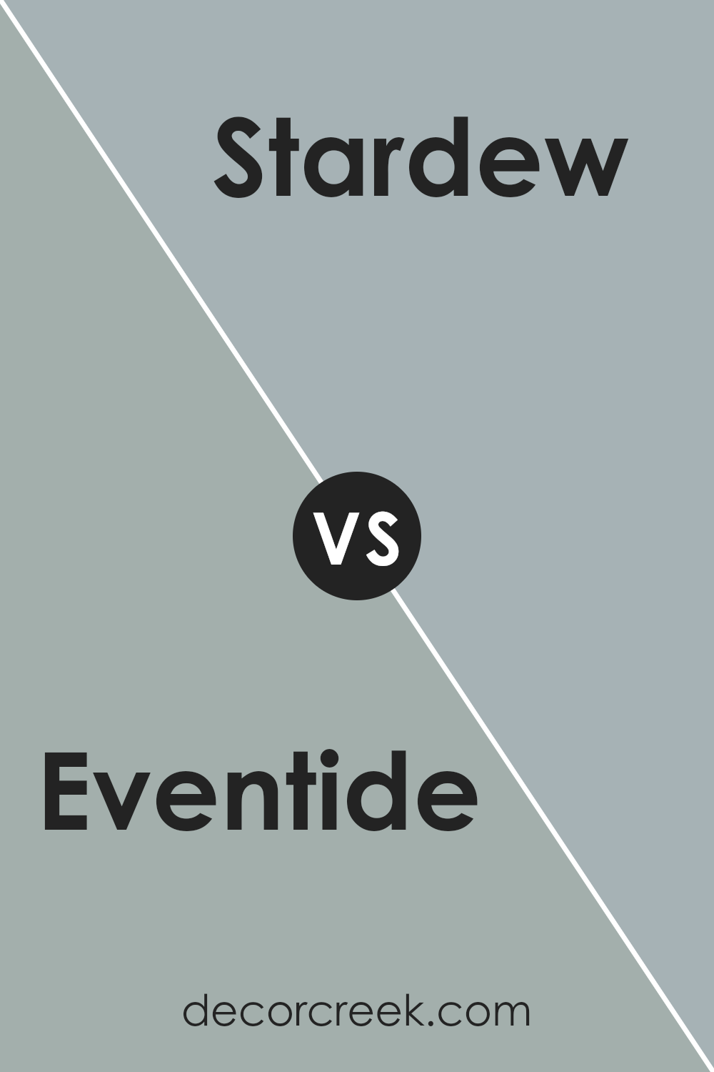
Eventide SW 9643 by Sherwin Williams vs Stardew SW 9138 by Sherwin Williams
Eventide and Stardew, both by Sherwin Williams, are distinctly different in their hues, offering unique atmospheres for any room. Eventide has a deep, rich blue tone that suggests elegance and calmness. It’s perfect for creating a cozy, inviting space due to its darker nature.
In contrast, Stardew is a lighter, muted gray-blue that can give a room a fresh and open feel. This color is subtler, making it ideal for spaces where you want to maintain a quiet, clean look without overpowering the surroundings.
While Eventide adds a bold touch, Stardew offers a softer, more gentle approach. Both colors work well in many areas, depending on your preference for intensity and mood setting.
You can see recommended paint color below:
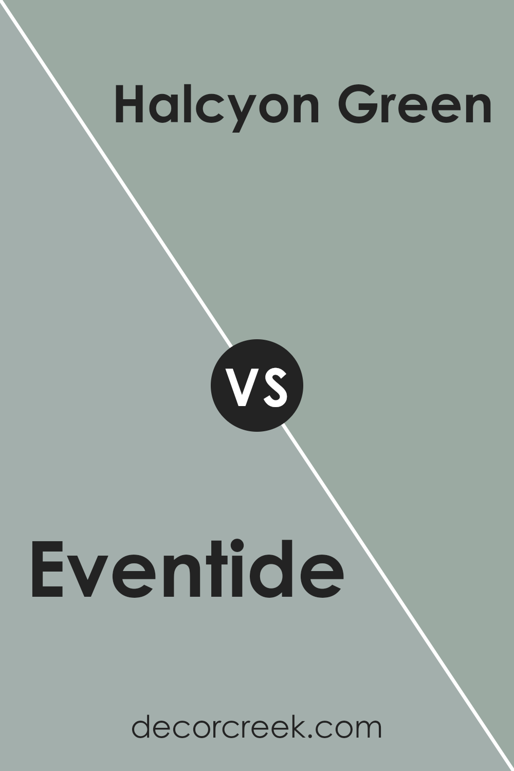
Eventide SW 9643 by Sherwin Williams vs Halcyon Green SW 6213 by Sherwin Williams
Eventide and Halcyon Green by Sherwin Williams are two distinct colors with unique atmospheres. Eventide is a deep, rich blue with a moody undertone that gives it a feeling of evening skies. It’s strong but still has a quiet depth to it, which makes it perfect for spaces where you want both relaxation and a bit of drama.
Halcyon Green, on the other hand, is a softer, more muted green with grey tones. This color is calming and encourages a comfortable, laid-back vibe, resembling a peaceful day in early spring.
While Eventide adds a bold touch to a room, Halcyon Green goes for a gentle, cozy feeling. Both colors work well in spaces meant for rest and calm, but their different tones can alter the mood significantly from vibrant and energetic to soothing and gentle. They stand out uniquely depending on where and how they are used in home decor.
You can see recommended paint color below:
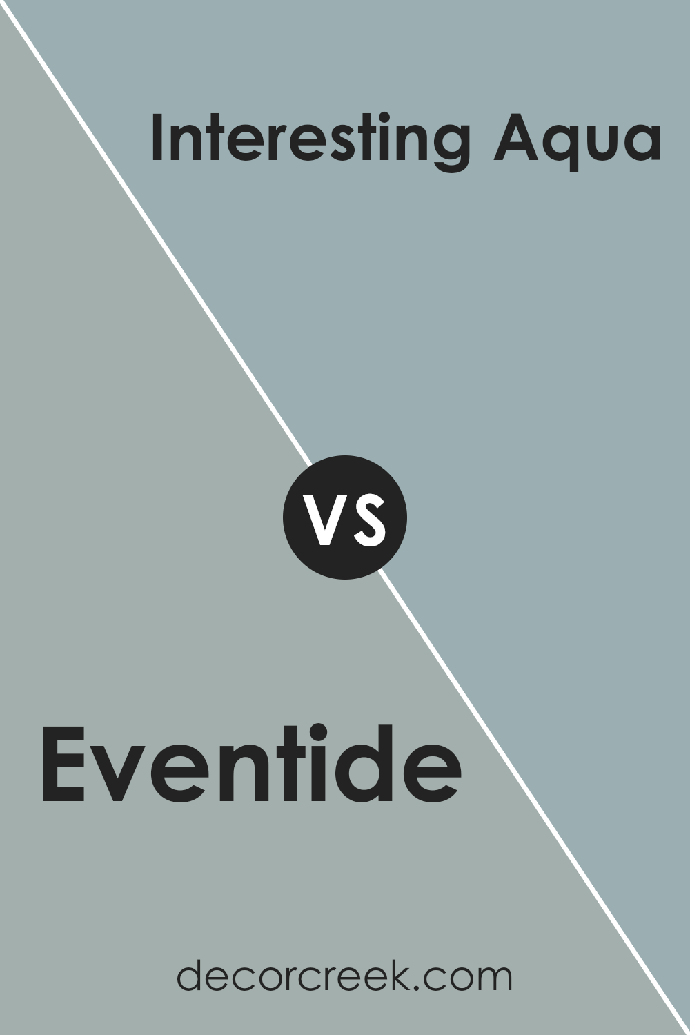
Eventide SW 9643 by Sherwin Williams vs Interesting Aqua SW 6220 by Sherwin Williams
Eventide is a deep, rich blue with a hint of purple, giving it a vivid and eye-catching look. It stands out as a bold choice that can make any space lively and vibrant. On the other hand, Interesting Aqua is a lighter, more subtle shade that blends blue with green, creating a soothing and fresh atmosphere.
It’s more understated compared to Eventide and would work well in areas where you want a calm and inviting vibe. Both colors are versatile, but Eventide tends to draw more attention due to its intensity, while Interesting Aqua is ideal for a more relaxed feel.
Whether you’re looking to make a strong statement or create a gentle environment, these colors offer distinct options to suit different tastes and spaces.
You can see recommended paint color below:
- SW 6220 Interesting Aqua
Eventide SW 9643 by Sherwin Williams vs Aqua-Sphere SW 7613 by Sherwin Williams
Eventide is a deep, rich blue with a gray undertone, creating a bold and calming atmosphere. It’s ideal for accent walls or rooms where a strong, but not overpowering, color is desired. This color adds a cozy and comfortable feel, perfect for spaces intended for relaxation or concentration.
Aqua-Sphere, on the other hand, is a lighter, softer shade of blue with a hint of green. It gives a refreshing and airy feel, suitable for bathrooms, kitchens, or smaller spaces that would benefit from a sense of openness. This color evokes a clean and inviting environment, appealing for anyone wanting to brighten up their room.
Both colors carry distinctive vibes: Eventide tends to ground a room with its depth, while Aqua-Sphere lifts an area with its lighter, breezier touch. Each color works well in different settings depending on the mood and function you’re aiming for in your decorating projects.
You can see recommended paint color below:
Eventide SW 9643 by Sherwin Williams vs Uncertain Gray SW 6234 by Sherwin Williams
The main color, Eventide, is a deep, rich blue with a hint of purple, making it feel vibrant yet cozy. It has an energizing quality but also lends a sense of calm to spaces, making it great for rooms where you want a balance of relaxation and dynamic aesthetics.
On the other hand, Uncertain Gray is a softer, lighter gray that leans slightly to the blue side. This color is very versatile and works well in areas that need a neutral backdrop that still offers a touch of character. It’s an excellent choice for creating a peaceful and inviting atmosphere without leaning too warm or too cool.
When comparing the two, Eventide is noticeably darker and more pronounced, perfect for making a statement or accenting a room. Uncertain Gray is more understated and can be used more liberally across larger areas without overwhelming the space. Both colors offer unique vibes and can be used effectively depending on the mood you want to achieve in your room.
You can see recommended paint color below:
- SW 6234 Uncertain Gray
Eventide SW 9643 by Sherwin Williams vs Silvermist SW 7621 by Sherwin Williams
Eventide is a deep, moody blue with a hint of gray that adds a quiet sense of calm to any room. Its richness works well as a primary wall color, providing a strong backdrop that highlights décor or furniture. In contrast, Silvermist offers a lighter, softer gray with subtle blue undertones.
This color is more versatile for use in various spaces, from kitchens to bedrooms, where a gentler ambiance is desired. Both colors fit well in a contemporary home, but Eventide creates a bolder statement while Silvermist is more understated and blends easily with different styles and textures.
Together, these colors could complement each other well in a space, with Silvermist lightening the overall mood and Eventide adding dramatic flair.
You can see recommended paint color below:

Eventide SW 9643 by Sherwin Williams vs Breezy SW 7616 by Sherwin Williams
Eventide, the main color, is a deep and rich blue tone that carries a hint of dusky purple, giving it a moody and somewhat mysterious look. This color works great in spaces where a strong, noticeable backdrop is needed, as it’s bold but still retains a cozy feel. It is versatile enough to enhance both classic and modern decor styles by adding depth and interest.
On the other hand, Breezy is much lighter, showcasing a soft, airy blue that has a fresh and clean appearance. This color is great for creating a relaxed, open atmosphere in a room, as it resembles the light blue of a clear sky.
It’s particularly effective in smaller or more confined spaces, as the lightness of the hue helps to make areas seem more expansive and inviting.
Both colors, while from the same family, serve distinct purposes in home decor. Eventide provides a profound backdrop or accent, drawing in the eye, while Breezy offers a calm, uplifting vibe that opens up a space.
You can see recommended paint color below:
- SW 7616 Breezy
Eventide SW 9643 by Sherwin Williams vs Breakwater SW 9638 by Sherwin Williams
Eventide and Breakwater, both from Sherwin Williams, present soothing, yet distinctly different shades. Eventide offers a deep, dusky violet that exudes a sense of calmness ideal for setting a relaxed mood in any space. This color has a richness that could enhance more intimate or low-lit areas, making it perfect for bedrooms or cozy reading nooks.
On the other hand, Breakwater is a lighter, airier blue that feels refreshing and clean. It brings to mind the clarity of a bright day along the coast and is excellent for spaces where you want to inject a sense of freshness, like bathrooms or kitchens.
Overall, while both colors lend a peaceful feel to interiors, Eventide provides a deeper, warmer hue, and Breakwater offers a crisper, revitalizing vibe. Choosing between them depends on the atmosphere you’re looking to create—cozy and enveloping with Eventide or bright and breezy with Breakwater.
You can see recommended paint color below:
- SW 9638 Breakwater
Eventide SW 9643 by Sherwin Williams vs Mineral Deposit SW 7652 by Sherwin Williams
Eventide is a deep, soothing blue that has a touch of gray. It can make a space feel cozy and somewhat dramatic at the same time. This color works well in rooms where you want a calm but strong presence. On the other hand, Mineral Deposit is a lighter, softer gray that also has hints of blue.
It’s more understated than Eventide and is great for creating a relaxed, airy feel in a room. Mineral Deposit is versatile, blending well with many styles and furnishings, making it ideal for spaces where you want a clean and open atmosphere.
While both colors share a base of cool tones, Eventide is darker and closer to navy blue, whereas Mineral Deposit is much lighter and leans towards a soft, neutral gray. Together, they could complement each other nicely in a color scheme for someone looking to balance depth with lightness in their decor.
You can see recommended paint color below:
- SW 7652 Mineral Deposit
Eventide SW 9643 by Sherwin Williams vs Dutch Tile Blue SW 0031 by Sherwin Williams
The main color, Eventide, is a deep, dusky blue that brings a sense of calm and quiet elegance to a space. It’s a color that can make a room feel cozy yet spacious, thanks to its depth and intensity. On the other hand, Dutch Tile Blue is lighter and has a touch of gray, giving it a softer and more muted appearance.
This color is great for creating a gentle and airy atmosphere in a room, making it feel open and relaxed. Both colors are versatile and can work well in various settings, but Eventide tends to be a bit more bold and moody, while Dutch Tile Blue offers a lighter and more understated vibe.
Depending on the mood you want to set in your room, either could be a good choice, with Eventide adding drama and Dutch Tile Blue providing a gentle backdrop.
You can see recommended paint color below:
- SW 0031 Dutch Tile Blue
Eventide SW 9643 vs Acacia Haze (SW 9132)
Eventide reads as a moody blue-gray with cool undertones. Acacia Haze is a muted green with gray influence, softer and earthier.
Choose Eventide for a cooler, modern vibe; choose Acacia Haze for a gentle, nature-leaning look.
This color works great everywhere, whether you want your bedroom, living room, or even the bathroom to look pretty and soothing.
I noticed that combining Eventide with lighter colors like white or soft gray makes the room look even more welcoming. It’s perfect for anyone who wants to refresh their home without making it too bright or bold.
Whether you’re fixing up an old chair or painting the entire walls of a room, Eventide is easy to fit in with different styles and furniture.
In the end, I think Eventide by Sherwin Williams is a wonderful choice if you’re thinking of adding a new splash of color in your home. It’s like adding a piece of the calm sky right into your room, which makes coming home even nicer.
Plus, it’s simple to use and works well with so many other colors that you might already have.

Ever wished paint sampling was as easy as sticking a sticker? Guess what? Now it is! Discover Samplize's unique Peel & Stick samples.
Get paint samples

