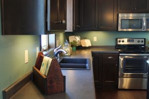
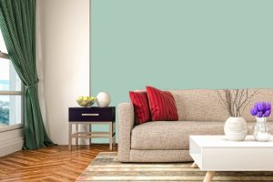
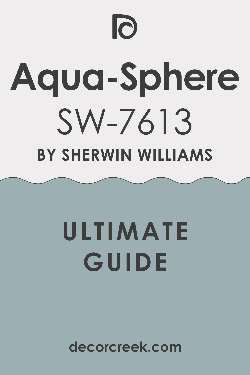
The magic of color lies in its limitless potential to transform our living spaces, creating atmospheres that mirror our emotions, passions, and dreams. Today, we explore the unique charm and versatility of SW 7613 Aqua-Sphere, a delightful color from Sherwin-Williams.
Known for its tranquil and soothing nature, SW Aqua-Sphere has the power to instill a sense of serenity into any room it graces.
What Color Is SW 7613 Aqua-Sphere?
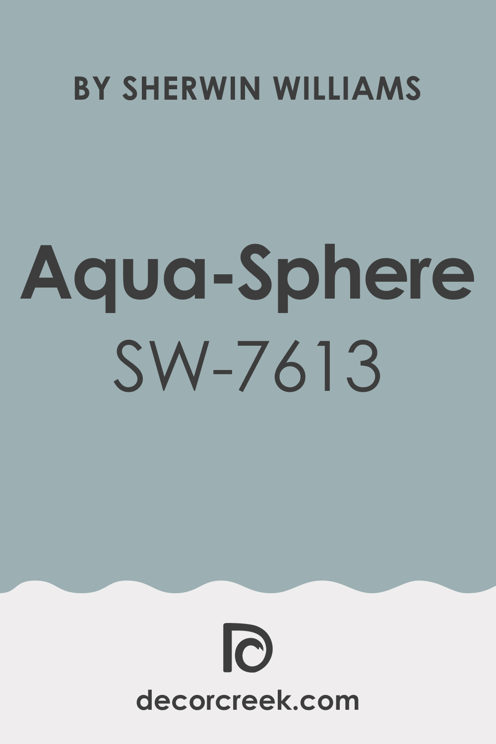
SW Aqua-Sphere is an appealing medium-light shade of cyan blue. Akin to the soft hues reflected in a quiet pond under the midday sky, this color echoes the soothing character of water and the cooling comfort of a gentle breeze. It carries a certain lightness that can open up a room, offering a sense of space and freshness.
Secondly, SW Aqua-Sphere possesses a subdued sophistication that allows it to remain unobtrusive yet engaging. It’s neither overpowering nor too passive. It has a graceful presence, offering a perfect balance that allows it to blend seamlessly with other hues while still holding its own.
The color’s versatility allows it to create both a cool, tranquil retreat and an energetic, vibrant space.
Ever wished paint sampling was as easy as sticking a sticker? Guess what? Now it is! Discover Samplize's unique Peel & Stick samples.
Get paint samples
Is It a Warm Or Cool Color?
SW Aqua-Sphere falls into the cool color category. It carries the calming attributes of blue, which is often associated with tranquility, calmness, and serenity. Its coolness can make a space feel more expansive and airy, creating an ambiance that is relaxing and refreshing.
Undertones of SW 7613 Aqua-Sphere
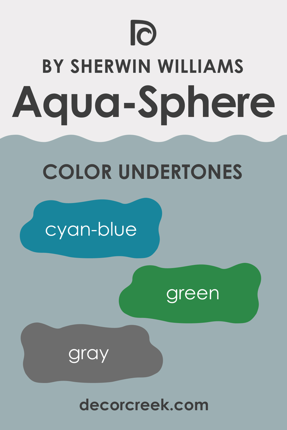
Undertones play a vital role in how we perceive color. They can subtly influence the overall look and feel of color, affecting how it interacts with other colors and elements in a room. Understanding the undertones of color can help you make more informed color choices, ensuring the hues you select harmonize beautifully with your existing decor. SW Aqua-Sphere has the following undertones:
- Cyan-Blue: The prominent undertone of Aqua-Sphere is cyan-blue, contributing to its overall cooling effect. This undertone enhances the color’s calming attributes and is a significant factor in its ability to create a serene environment.
- Green: A slight green undertone adds a touch of warmth to SW Aqua-Sphere, preventing it from feeling too cold or clinical. It adds depth to the color and enables it to harmonize beautifully with a variety of natural elements.
- Gray: A subtle gray undertone contributes to SW Aqua-Sphere’s subdued sophistication. It brings a sense of balance and elegance to the color, allowing it to blend seamlessly in a range of styles and settings.
Coordinating Colors of SW 7613 Aqua-Sphere
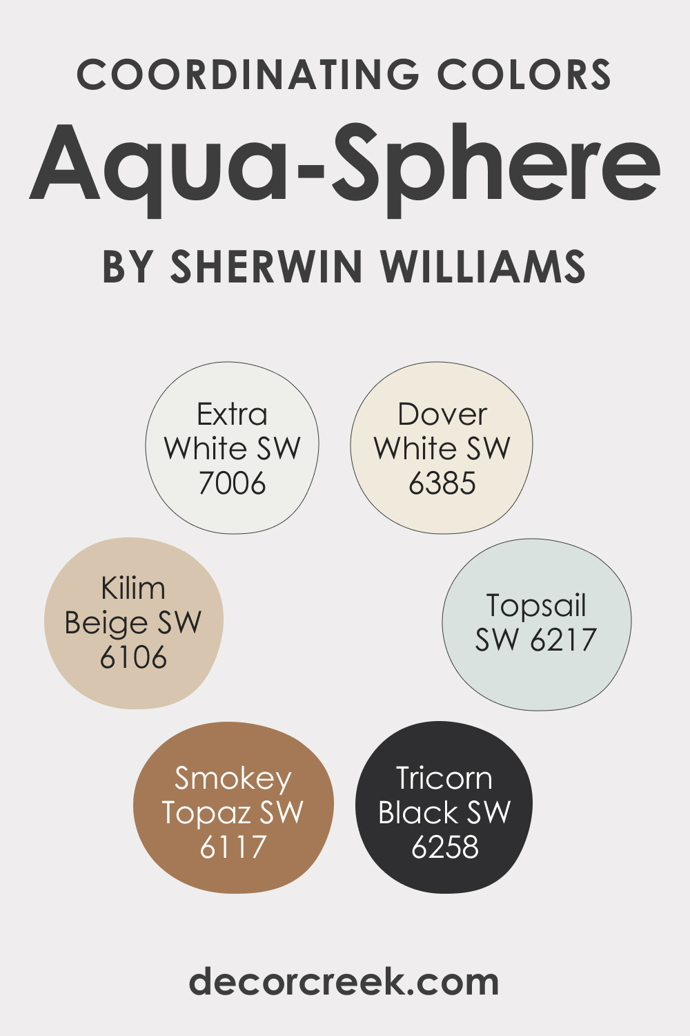
Coordinating colors refer to colors that harmonize well with a given color, creating a balanced and visually appealing color scheme. They can be similar hues, contrasting shades, or complementary colors. Understanding how coordinating colors work can help you create a cohesive and engaging color palette in your home. SW Aqua-Sphere can be coordinated with the following colors:
- SW 7006 Extra White (CHECK A SAMPLE): Extra White is a pure, clean white. It provides a crisp contrast to Aqua-Sphere, making the color pop while offering a refreshing balance.
- SW 6385 Dover White (CHECK A SAMPLE): Dover White is a soft, warm white with subtle yellow undertones. It complements Aqua-Sphere beautifully, adding warmth to the cool hues and creating an inviting atmosphere.
- SW 6117 Smokey Topaz (CHECK A SAMPLE): Smokey Topaz is a medium-dark brown with a touch of red-orange undertone. It provides a striking contrast to Aqua-Sphere, adding depth and interest to the color scheme.
Additional coordinating colors:
- SW 6258 Tricorn Black (CHECK A SAMPLE): Tricorn Black offers a bold, dramatic contrast to Aqua-Sphere, adding a touch of modern sophistication to the color scheme.
- SW 6106 Kilim Beige (CHECK A SAMPLE): Kilim Beige is a light-medium beige with warm, neutral undertones. It complements Aqua-Sphere’s cool tones beautifully, creating a balanced, harmonious palette.
- SW 6217 Topsail (CHECK A SAMPLE): Topsail is a lighter shade of cyan blue. It pairs seamlessly with Aqua-Sphere, enhancing the cooling effect while offering a layered, monochromatic look.
How Does Lighting Affect SW 7613 Aqua-Sphere?
Lighting plays a significant role in how we perceive color. Under natural light, SW Aqua-Sphere tends to appear brighter and more vibrant, with its blue undertones becoming more pronounced. As the day progresses and the natural light shifts, the color may seem softer and more muted.
Under artificial lighting, the Aqua-Sphere color can take on a different character. Warm, incandescent lighting can bring out the green undertones, adding a touch of warmth to the color. In contrast, cool, fluorescent light enhances the blue undertones, making the color appear cooler.
LRV of SW 7613 Aqua-Sphere
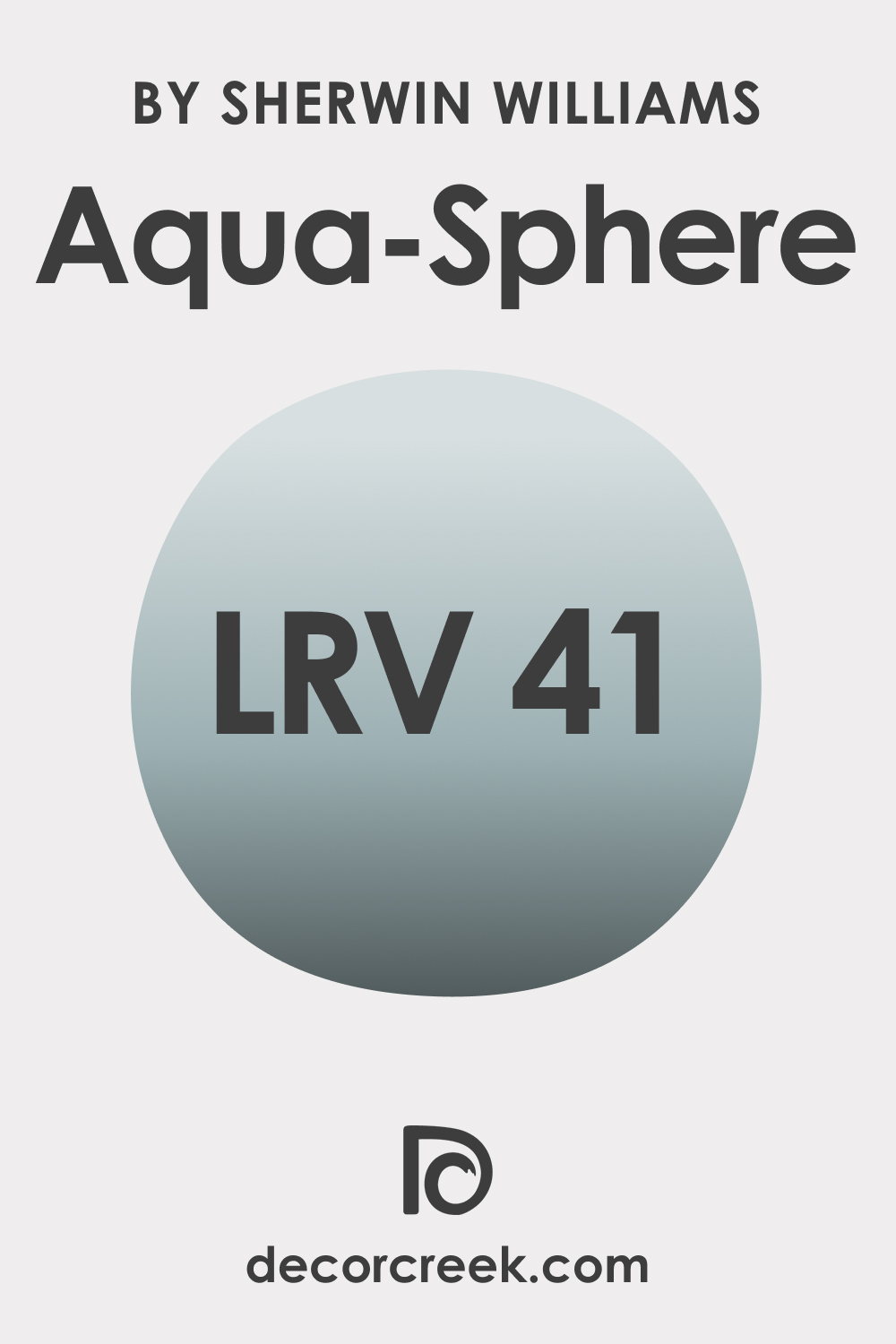
The Light Reflectance Value (LRV) of color measures how much light it reflects. Aqua-Sphere has an LRV of 41, placing it in the medium range on the LRV scale. This means it reflects a decent amount of light, contributing to the color’s overall airy and spacious feel.
The LRV is a crucial factor to consider when selecting paint colors, as it can influence how a color looks in a specific setting and how it affects the mood of the room. Colors with high LRVs can make a space feel larger and brighter, while those with low LRVs can make a room feel smaller and cozier.
Given its LRV of 41, Aqua-Sphere can be considered versatile, working well in rooms of various sizes and light conditions. It offers a balance between brightness and depth, allowing it to create a cozy yet open ambiance.
LRV – what does it mean? Read This Before Finding Your Perfect Paint Color
Trim Colors of SW 7613 Aqua-Sphere
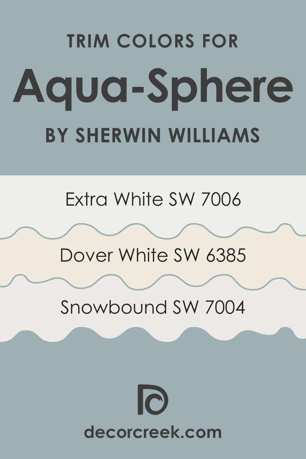
Trim colors are used on molding, doors, and windows to frame and define the spaces. They play a crucial role in a room’s overall color scheme, either complementing or contrasting with the wall color. Choosing the right trim color can enhance the visual appeal of your walls and contribute to a cohesive and harmonious look in your room. Here are some trim colors that work well for SW Aqua-Sphere:
- SW 7006 Extra White (CHECK A SAMPLE): Extra White provides a crisp, clean contrast to Aqua-Sphere, helping to frame and highlight the color.
- SW 6385 Dover White (CHECK A SAMPLE): Dover White complements Aqua-Sphere beautifully, adding a touch of warmth and sophistication to the cool hues.
- SW 7004 Snowbound (CHECK A SAMPLE): Snowbound is a soft white with subtle gray undertones. It blends seamlessly with Aqua-Sphere, enhancing its elegance and tranquil feel.
Colors Similar to SW 7613 Aqua-Sphere
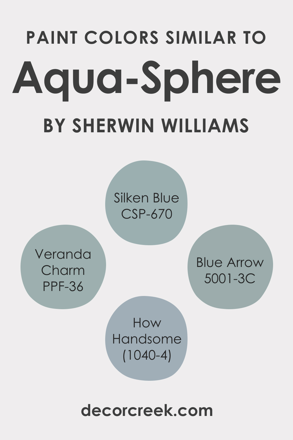
Understanding similar colors to SW Aqua-Sphere can provide alternatives if you like the overall feel of Aqua-Sphere but want a slightly different hue. Similar colors might include:
- Behr Veranda Charm
- BM Silken Blue (CHECK A SAMPLE)
- PPG How Handsome
- Valspar Blue Arrow
Colors That Go With Sherwin-Williams SW 7613 Aqua-Sphere
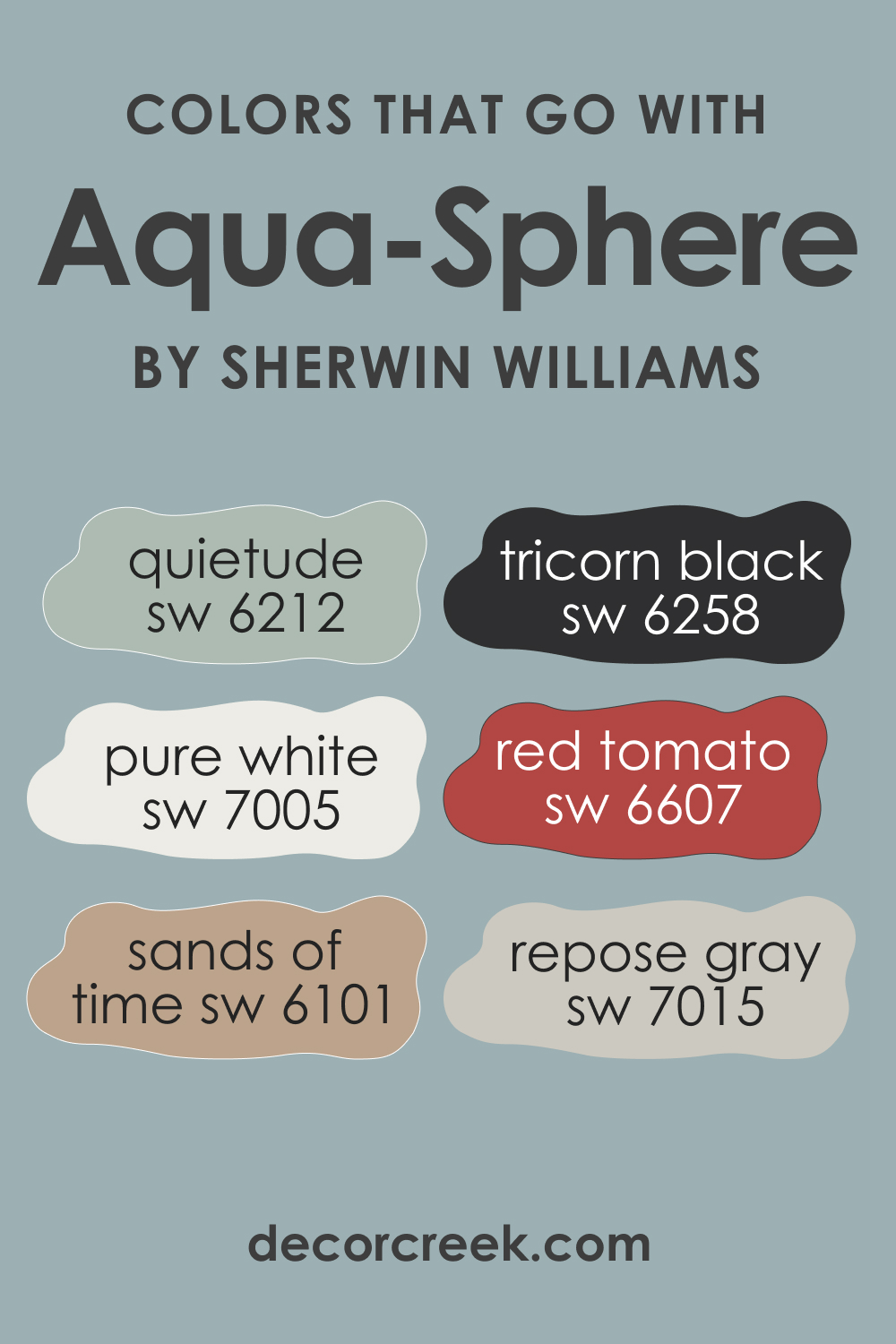
Sherwin-Williams SW 7613 Aqua-Sphere is a beautiful, sophisticated color that exudes a tranquil, cool mood. It’s versatile enough to be used as a main wall color or as an accent color. When choosing a color palette, it’s important to consider colors that harmonize well with Aqua-Sphere, which creates a balanced and cohesive look in the room. The right color combination can significantly influence the atmosphere and mood of the space.
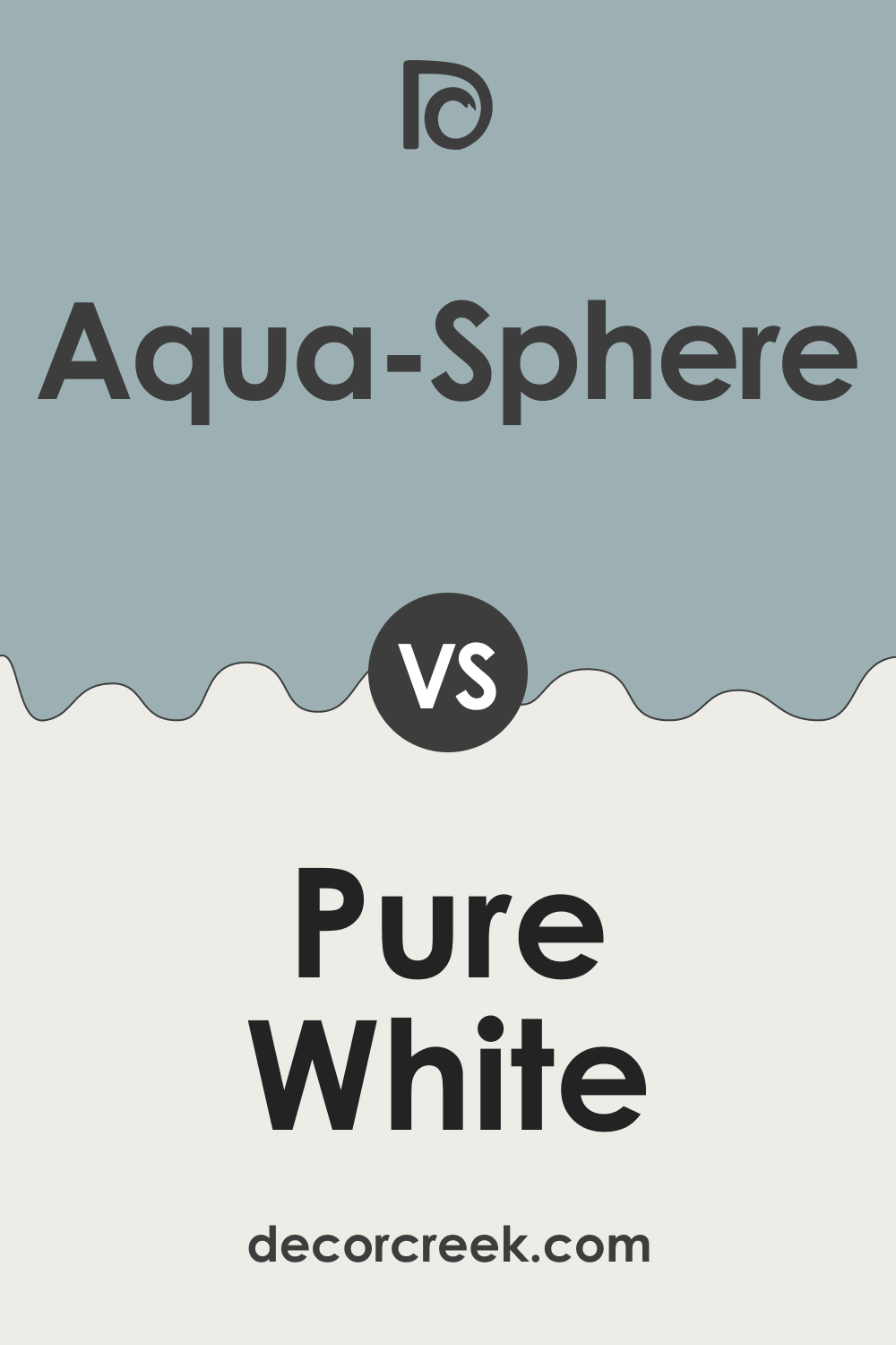
- SW 7005 Pure White (CHECK A SAMPLE): A crisp white like Pure White can provide a beautiful contrast to the Aqua-Sphere. This high-contrast pairing will allow Aqua-Sphere to stand out while still maintaining a sense of balance. White also adds a fresh, clean look that pairs well with almost any color.
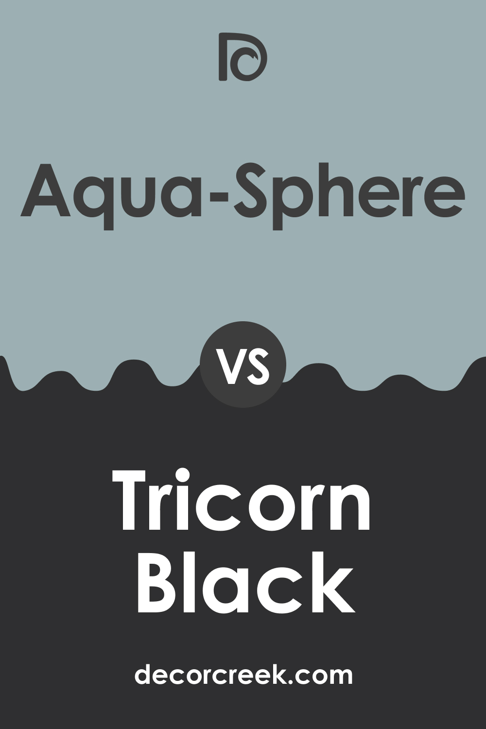
- SW 6258 Tricorn Black (CHECK A SAMPLE): On the other end of the spectrum, Tricorn Black offers a rich, deep contrast to Aqua-Sphere. It can be used in small doses for accents or in larger areas for a dramatic effect. This combination creates a modern, bold, and sophisticated look.
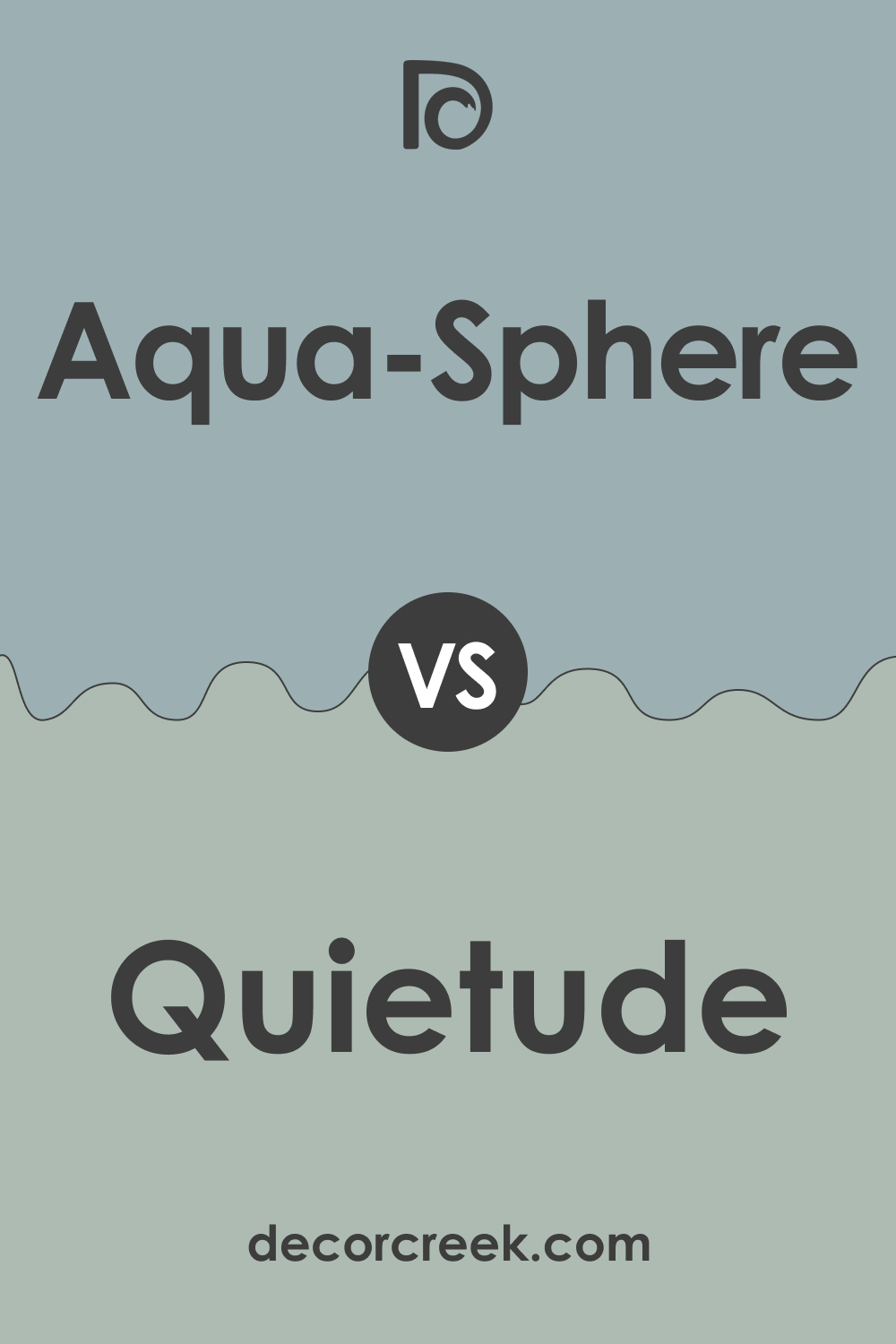
- SW 6212 Quietude (CHECK A SAMPLE): Quietude is a muted green-blue color that pairs beautifully with Aqua-Sphere. This color combination can create a soothing, serene environment, perfect for spaces like bedrooms or bathrooms.
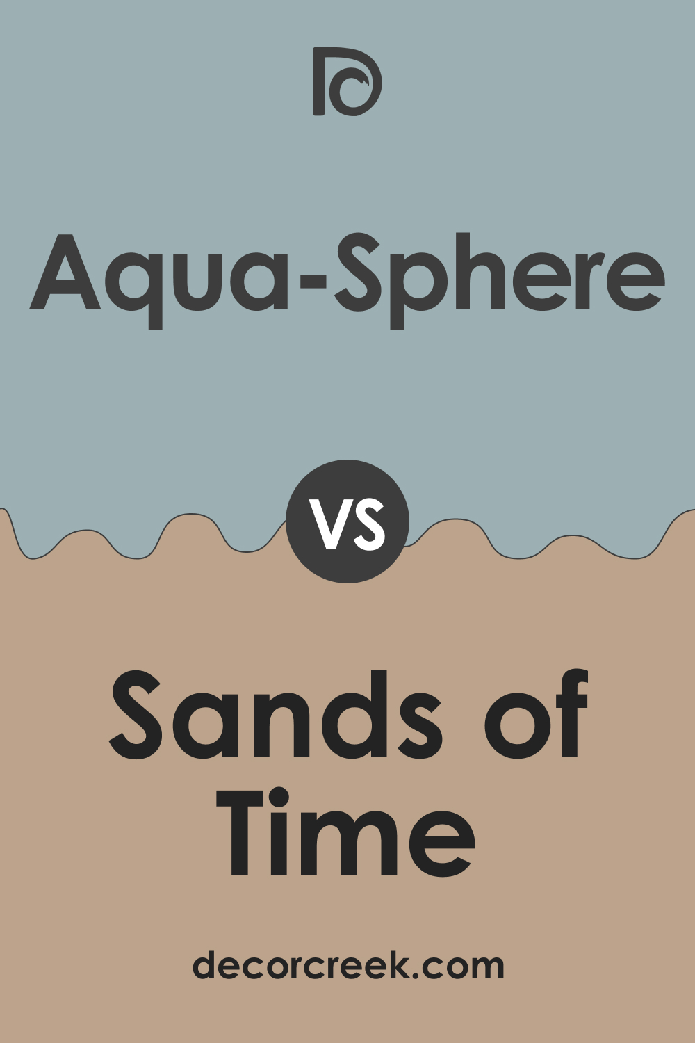
- SW 6101 Sands of Time (CHECK A SAMPLE): This soft neutral tan color provides a warm balance to the cool Aqua-Sphere, resulting in a calming and inviting environment. It’s perfect for common areas like the living room or kitchen.
- SW 6607 Red Tomato (CHECK A SAMPLE): For a pop of color, Red Tomato is a vibrant choice. This warm red provides a striking contrast to the cool Aqua-Sphere. Use it sparingly to add energy and excitement to the room.
- SW 7015 Repose Gray (CHECK A SAMPLE): Repose Gray is a light gray with a touch of blue. It pairs beautifully with Aqua-Sphere, enhancing the cool tones and creating a calm, sophisticated environment.
The right color combinations are essential in interior design because they can greatly affect the overall aesthetic and mood of a room. Colors that work well together create harmony and balance, making the space feel comfortable and cohesive.
Clashing or disjointed colors, on the other hand, can lead to a space that feels chaotic or uncomfortable. Whether you’re going for a relaxing and serene vibe or an energized and dynamic feel, the color palette you choose plays a crucial role in achieving that goal.
How to Use SW 7613 Aqua-Sphere In Your Home?
The soothing tone of Sherwin-Williams SW 7613 Aqua-Sphere lends itself well to many interior design styles, including coastal, Scandinavian, modern, and even farmhouse, when paired with the right decor. The cool, tranquil vibe of this color can make any room feel more serene and inviting.
In a coastal design style, SW Aqua-Sphere can mimic the sea, creating a calm and soothing environment. In a Scandinavian style, it can add a subtle splash of color while maintaining the minimalist, clean lines of the design. In a modern setting, SW Aqua-Sphere can provide a sophisticated touch of color, especially when paired with metallic accents and sleek furniture.
In a farmhouse style, it can serve as a cool counterpoint to the warm, rustic elements typically found in this design style. Below, you can read how this color may work in different rooms.
How to Use SW 7613 Aqua-Sphere in the Bedroom?
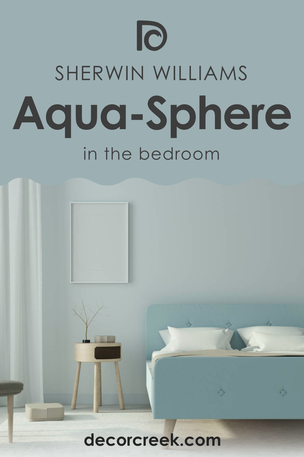
Aqua-Sphere is a wonderful choice for a bedroom. Its calming and tranquil qualities can help to create a peaceful atmosphere, perfect for unwinding at the end of the day. You can use Aqua-Sphere as the main wall color, creating a serene backdrop for your bedroom. Pair it with neutral colors like white or cream for the bedding and curtains to create a balanced look.
Alternatively, you can use Aqua-Sphere as an accent color in a bedroom with predominantly white or gray walls. Use it for a feature wall behind the headboard or for smaller elements like picture frames or a bedside table. It adds a pop of color without overwhelming the room and works especially well in a coastal or Scandinavian design style.
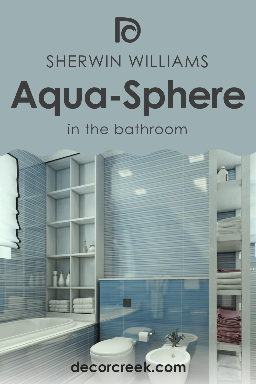
How to Use SW 7613 Aqua-Sphere in the Bathroom?
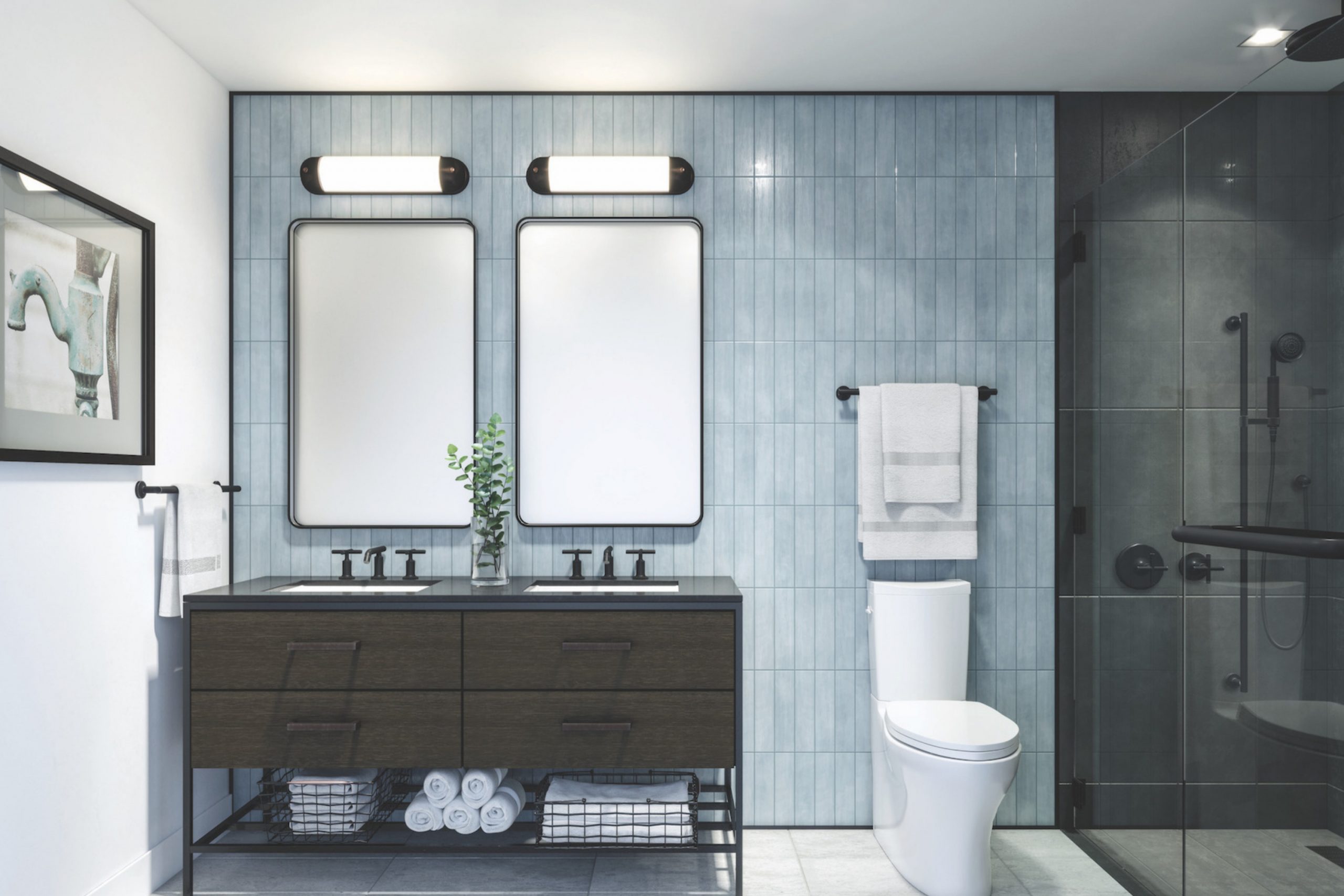
Aqua-Sphere is an excellent choice for a bathroom, adding a touch of sophistication to the often-overlooked space. Its serene qualities can create a spa-like atmosphere, making your daily routine feel more relaxing. Use it for all the walls or just one for a feature wall, depending on the size of your bathroom and your personal preference.
To add some warmth to the cool tones of Aqua-Sphere, consider using wooden elements like vanity or shelves. Pair it with white fixtures for a fresh, clean look, and incorporate metallic accents like chrome or brushed nickel faucet for a touch of modern elegance. This color works well in a variety of bathroom styles, from modern to coastal to farmhouse.
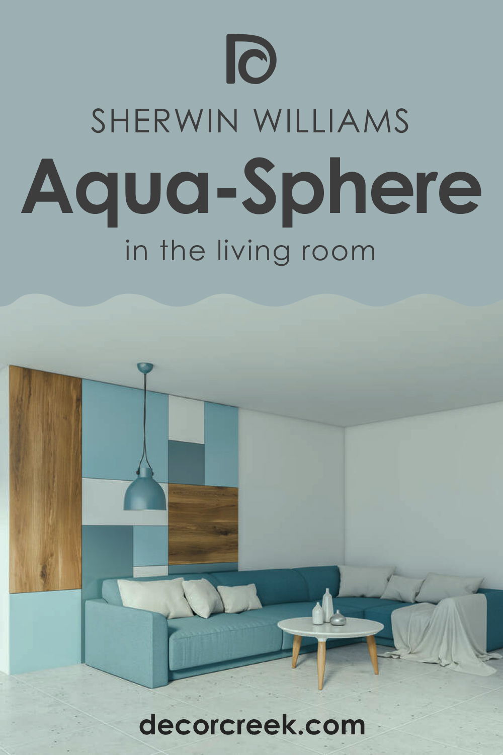
How to Use SW 7613 Aqua-Sphere in the Living Room?
Aqua-Sphere can bring a tranquil and inviting vibe to a living room. Use it for all the walls to create a soothing atmosphere, perfect for relaxing or entertaining. The color pairs beautifully with a variety of neutrals, from whites and grays to tans and browns, which can be incorporated through furniture, rugs, and curtains.
For a more dynamic look, you could use Aqua-Sphere as an accent color in a predominantly white or gray living room. Use it for a feature wall or incorporate it through smaller elements like throw pillows, art pieces, or a statement chair.
In both cases, Aqua-Sphere can help to create a stylish and comfortable living room, whether you’re going for a modern, coastal, Scandinavian, or farmhouse aesthetic.
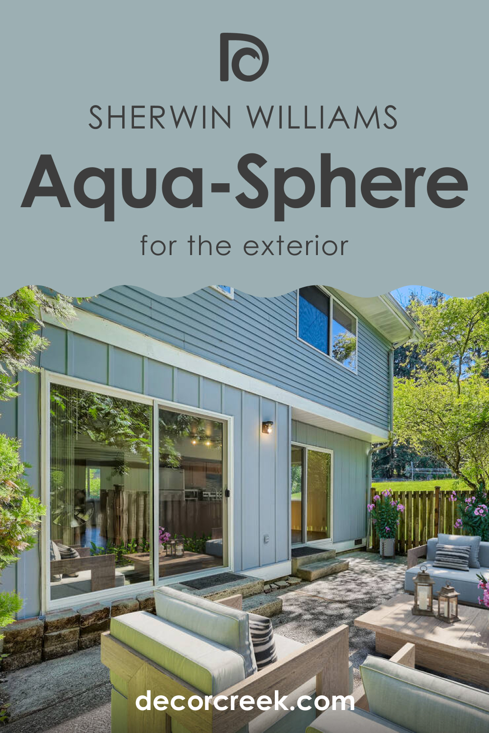
How to Use SW 7613 Aqua-Sphere for an Exterior?
Aqua-Sphere can also be a stunning choice for the exterior of a home. It can create a calm and inviting first impression, especially when paired with white trim and a vibrant front door color like red or yellow for contrast. This color is particularly well-suited to coastal or beach-style homes but can work well with any architectural style that allows for some color creativity.
Using Aqua-Sphere for the exterior can also blend beautifully with natural landscapes. Whether it’s a green lawn or a sandy beach, Aqua-Sphere can harmonize with the surroundings, creating a cohesive and attractive look.
For a more modern aesthetic, consider using darker shades like gray or black for the roof and window frames, which can provide a striking contrast to the cool tones of Aqua-Sphere.
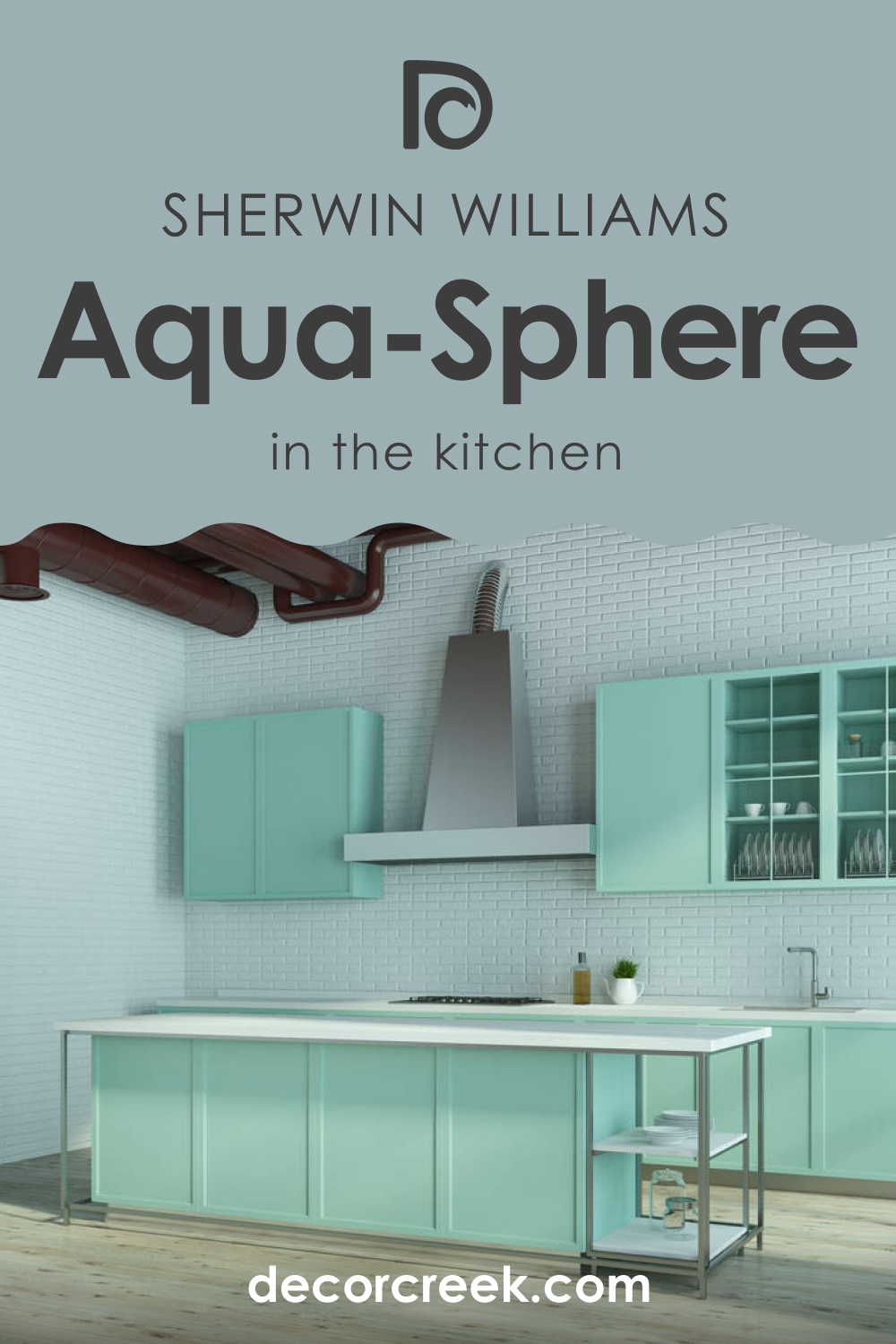
How to Use SW 7613 Aqua-Sphere in the Kitchen?
Kitchens are often the heart of a home, and Aqua-Sphere can bring a refreshing and invigorating vibe to this space. Consider using it for the walls to create a soothing backdrop for cooking and dining. Pair it with white cabinets and countertops for a fresh, clean look, and add warm wooden elements like a kitchen island or open shelves to balance the cool tones of Aqua-Sphere.
If you have an open-concept kitchen, Aqua-Sphere can help to define the kitchen area without making it feel closed off. You could also use it for a feature wall or a kitchen island, adding a pop of color without overwhelming the space. Whether your kitchen is modern, coastal, Scandinavian, or farmhouse, Aqua-Sphere can add a touch of sophistication and tranquility.
How to Use SW 7613 Aqua-Sphere for Kitchen Cabinets?
For a bold and stylish look, consider using Aqua-Sphere for your kitchen cabinets. This can create a striking contrast against white or gray walls, turning the cabinets into a focal point of the kitchen. Pair with brass or gold hardware for a touch of elegance and warmth.
Alternatively, you could use Aqua-Sphere for the lower cabinets or a kitchen island and keep the upper cabinets white for a two-toned look. This can add visual interest to your kitchen without making it feel too busy. It’s a modern and stylish look that can make your kitchen feel unique and personalized.

Comparing SW 7613 Aqua-Sphere With Other Colors
To better understand color, it’s a good idea to compare it with several other colors, either similar or different. For example, below, you can read such a comparison. Here we explain how SW Aqua-Sphere may read in your living space compared to other paint colors. This will allow you to see its unique features clearly.
SW 7613 Aqua-Sphere vs. SW 7005 Pure White
When paired together, Aqua-Sphere and Pure White (CHECK A SAMPLE) create a refreshing and classic look. Pure White offers a crisp contrast to the serene and tranquil Aqua-Sphere, allowing it to stand out without overpowering it. This color combination is ideal for creating a balanced and soothing space with a clean, modern aesthetic.
SW 7613 Aqua-Sphere vs. SW 6258 Tricorn Black
A dramatic contrast can be achieved when pairing Aqua-Sphere with Tricorn Black (CHECK A SAMPLE). The depth and richness of Tricorn Black offer a striking backdrop that makes Aqua-Sphere truly pop. This sophisticated palette is perfect for a modern, contemporary design that seeks to make a bold statement.
SW 7613 Aqua-Sphere vs. SW 6212 Quietude
SW Aqua-Sphere and Quietude (CHECK A SAMPLE) pair beautifully together to create a serene, ocean-inspired palette. Quietude is a muted green-blue color that complements Aqua-Sphere’s tranquility, enhancing its calming effect. This soothing color combination is perfect for creating a peaceful, beachy feel, especially in bathrooms and bedrooms.
SW 7613 Aqua-Sphere vs. SW 6101 Sands of Time
SW Sands of Time (CHECK A SAMPLE) is a soft, neutral tan that provides a warm balance to the cool tones of Aqua-Sphere. When used together, they create a comforting and inviting color palette suitable for living spaces or kitchens. The warmth of Sands of Time complements Aqua-Sphere, grounding its cool tones and creating a harmonious balance.
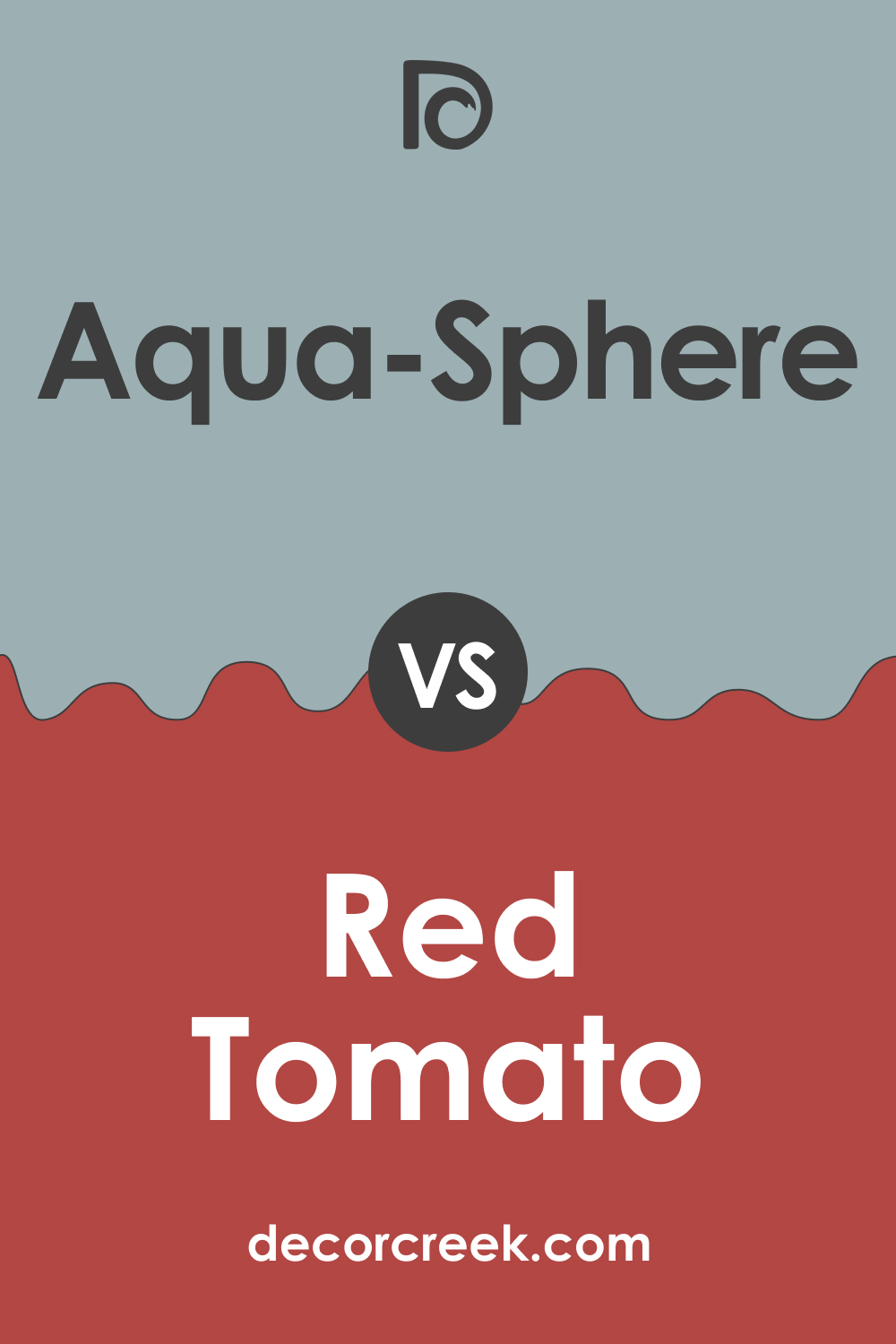
SW 7613 Aqua-Sphere vs. SW 6607 Red Tomato
For a more adventurous and vibrant color pairing, Aqua-Sphere can be teamed with Red Tomato (CHECK A SAMPLE). The warm, energetic red of Red Tomato provides an eye-catching contrast to the cool and calming Aqua-Sphere. This color combination would be perfect for adding an energetic and exciting vibe to a space while still maintaining a sense of balance.
Conclusion
Sherwin-Williams SW 7613 Aqua-Sphere is a versatile and sophisticated color that can enhance a wide variety of spaces in your home. Its tranquil and soothing nature makes it ideal for creating calm and serene environments, whether it’s a peaceful bedroom, a spa-like bathroom, or a welcoming living room.
The color can also work well in a vibrant and energized setting when paired with bold contrasting colors. From modern to coastal, Scandinavian to a farmhouse, Aqua-Sphere can fit seamlessly into various design styles, offering a touch of sophistication and tranquility.
Its ability to harmonize with a broad spectrum of other colors, from neutrals to bold hues, makes it a smart and stylish choice for any interior design project.
Ever wished paint sampling was as easy as sticking a sticker? Guess what? Now it is! Discover Samplize's unique Peel & Stick samples.
Get paint samples
Frequently Asked Questions
⭐What type of rooms is SW 7613 Aqua-Sphere best suited for?
SW 7613 Aqua-Sphere is a versatile color that suits many rooms. Its soothing and tranquil qualities make it great for bedrooms and bathrooms, creating a peaceful atmosphere. However, it can also be used effectively in living rooms, kitchens, and even exteriors for a refreshing and inviting vibe.
⭐What design styles does SW 7613 Aqua-Sphere fit into?
Aqua-Sphere can fit into a variety of design styles including coastal, Scandinavian, modern, and farmhouse. In a coastal design, it can mimic the sea, adding a calming effect. In a Scandinavian style, it can maintain clean lines while adding a subtle splash of color. For a modern design, Aqua-Sphere adds a sophisticated touch, especially when paired with metallic accents. In a farmhouse style, it can offer a cool counterpoint to the warm, rustic elements of the design.
⭐What colors pair well with SW 7613 Aqua-Sphere?
Aqua-Sphere pairs well with a wide range of colors. For a high-contrast look, colors like SW 7005 Pure White or SW 6258 Tricorn Black work well. For a more serene, ocean-inspired palette, consider SW 6212 Quietude. If you're looking for a warm balance, try pairing with SW 6101 Sands of Time. For a vibrant contrast, SW 6607 Red Tomato can provide an exciting vibe.
⭐Can I use SW 7613 Aqua-Sphere for my kitchen cabinets?
Yes, Aqua-Sphere can be a unique and stylish choice for kitchen cabinets. It can provide a striking contrast against lighter wall colors, turning the cabinets into a focal point. It can be paired with brass or gold hardware for an elegant touch, or you can use it for the lower cabinets and keep the upper cabinets lighter for a two-toned look.
⭐How does SW 7613 Aqua-Sphere look for home exteriors?
Aqua-Sphere can be an attractive choice for home exteriors. Its tranquil qualities can create a calm and inviting first impression. It's particularly well-suited for coastal or beach-style homes but can complement any architectural style that allows for color creativity. It can also blend well with natural landscapes, creating a cohesive look.


