Introducing SW 7666 Fleur de Sel by Sherwin Williams, a paint color that brings a clean, refreshing feel to any space. The name ‘Fleur de Sel,’ which translates to ‘flower of salt,’ suggests a natural, gentle backdrop ideal for creating a relaxed environment.
This shade belongs to a cool, soft palette that makes it perfect for those looking to add a subtle touch of elegance without overwhelming a room’s existing decor.
This color works beautifully in various settings, from modern kitchens to cozy bedrooms, acting as a versatile choice for both homeowners and designers. The lightness of Fleur de Sel helps to open up smaller spaces, making them appear brighter and more airy.
Whether aiming to refresh an entire room or simply accent a small area, SW 7666 Fleur de Sel provides a dependable option that pairs well with a wide range of colors and materials.
For anyone considering a fresh coat of paint that’s easy on the eyes and allows other elements of the room to shine, SW 7666 Fleur de Sel is worth considering. It offers a gentle backdrop that supports varied interior themes, from minimalist to rustic, giving you the creative freedom to personalize your living space.
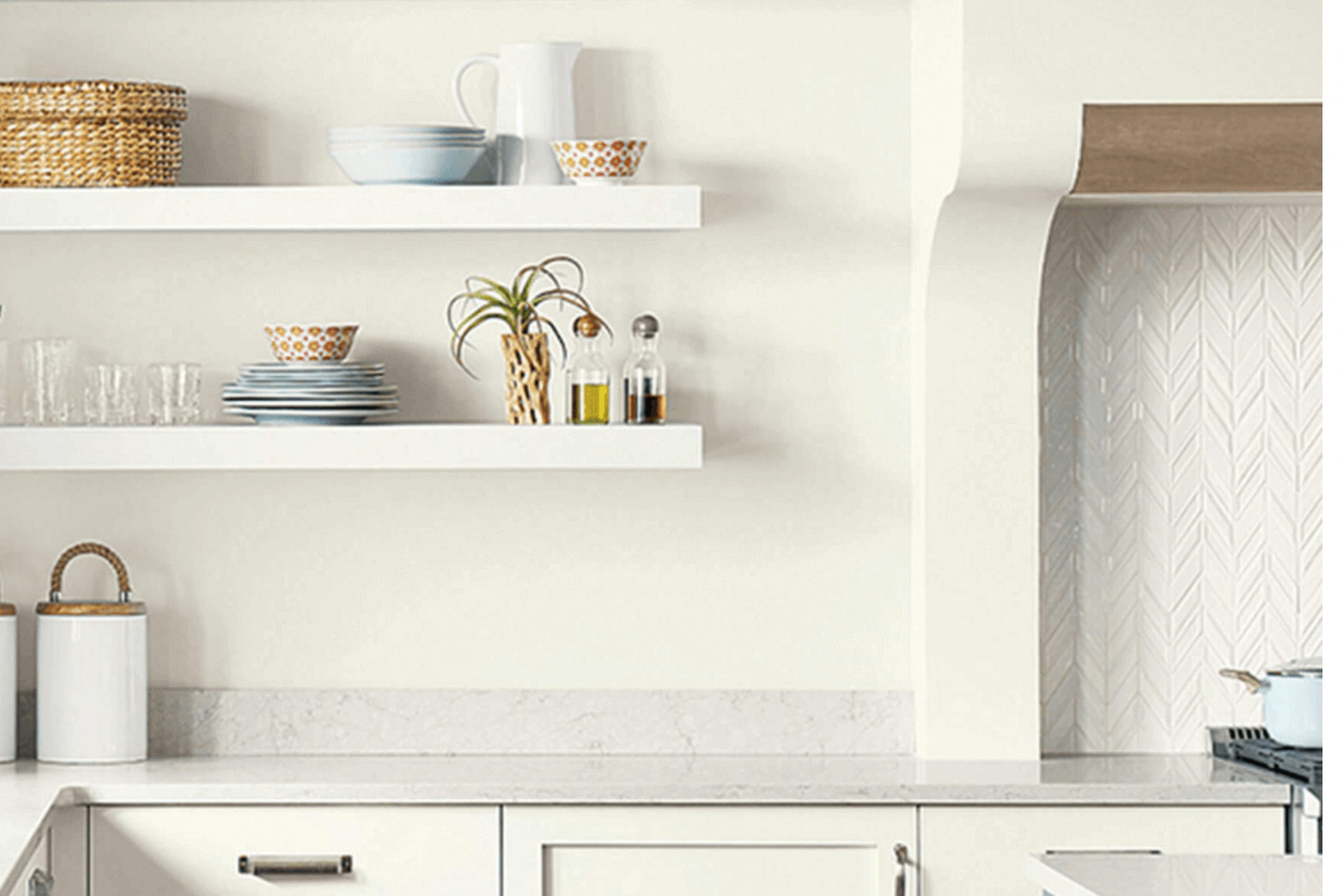
What Color Is Fleur de Sel SW 7666 by Sherwin Williams?
Fleur de Sel is a soft, muted shade of white that has a hint of beige, giving it a warm and inviting quality. This color is remarkably versatile, making it an excellent choice for creating a cozy, welcoming atmosphere in any room. Its subtle warmth helps to soften spaces that might otherwise feel stark or cold, making it perfect for living areas, bedrooms, and kitchens.
This color works particularly well in interior styles that favor softness and simplicity, such as Scandinavian, modern farmhouse, and minimalist designs. It provides a clean but gentle backdrop that complements natural light, enhancing the airy feel of a space without making it feel clinical.
When it comes to pairing with materials and textures, Fleur de Sel matches beautifully with natural wood, adding warmth and organic texture to the environment. It also looks stunning with linen textiles and creamy ceramics, creating a harmonious, textured look. For a bit of contrast, pairing it with metals like brushed gold or copper brings a touch of gentle luxury, making the space feel more inviting.
Overall, Fleur de Sel is a wonderful choice for those looking to create a friendly and comfortable space with a touch of natural elegance. It’s an effortlessly chic hue that provides an ideal foundation for a range of decorative styles and textures.
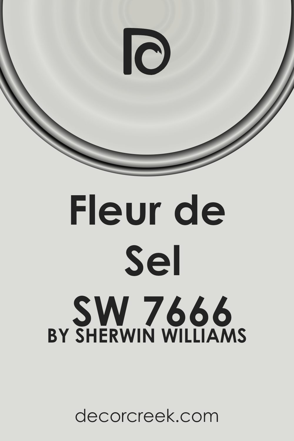
Is Fleur de Sel SW 7666 by Sherwin Williams Warm or Cool color?
Fleur de Sel SW 7666 by Sherwin Williams is a popular paint color that many people choose for their homes. Being a very light shade of gray with a slight touch of warmth, it has a soothing effect which makes it great for spaces where you want to feel relaxed, like bedrooms and living rooms. This color is extremely versatile, blending well with a wide range of decor styles and color schemes.
Its neutrality helps it act as a soft backdrop, allowing furniture and artwork to stand out.
Since it doesn’t overpower, it’s also excellent for smaller rooms, where it can help make the space look bigger and brighter. One of the best things about Fleur de Sel is that it fits well in areas with lots of natural light as well as spaces with less lighting, maintaining its subtle elegance under different lighting conditions.
Thus, its adaptability and calming effect make it a top choice for many.
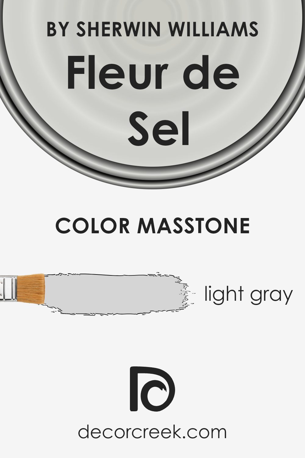
What is the Masstone of the Fleur de Sel SW 7666 by Sherwin Williams?
Fleur de Sel SW 7666 by Sherwin Williams is a light gray color with the hex code #D5D5D5. This shade is calm and subtle, making it suitable for various rooms in a home. Its neutral tone means it can blend in easily and work as a background color that allows furniture and decor to stand out.
Since it is not overpowering, it’s great for smaller spaces where a darker color might make the room feel cramped and less inviting. This light gray can also help brighten up a space by reflecting light, making it appear larger and more open.
Whether used in a living room, bedroom, or bathroom, Fleur de Sel offers a clean and fresh look that pairs well with many other colors, from soft pastels to bold hues. It’s an ideal choice for those who want a versatile color that creates a relaxing and comfortable atmosphere.
How Does Lighting Affect Fleur de Sel SW 7666 by Sherwin Williams?
Lighting has a significant impact on how colors are perceived in a space. Different types of light can enhance or mute the hues in a color, affecting the overall mood and feel of a room.
Fleur de Sel by Sherwin Williams is a subtle, soft shade that can appear differently depending on the lighting conditions. In the presence of artificial light — such as from LED or incandescent bulbs — this color tends to look more muted and can be influenced by the color temperature of the bulbs used.
Warmer lights can make it appear creamier and more inviting, whereas cooler lights can give it a crisper, more neutral appearance.
In natural light, Fleur de Sel also changes in appearance throughout the day. The quality of natural light tends to vary based on the direction a room faces:
- North-facing rooms: Rooms with windows facing north often have the coolest, most consistent light during the day. Here, Fleur de Sel can look a bit sharper and maintain a more true-to-paint-chip appearance without dramatic changes in hue.
- South-facing rooms: These rooms get the most sunlight, which can bring out the brighter elements in Fleur de Sel, making the color appear lighter and more lively. This can provide a warm and cheerful effect throughout most of the day.
- East-facing rooms: In the morning, east-facing rooms are filled with warm, bright sunlight, making Fleur de Sel appear softer and slightly warmer. As the sun shifts, the color can lose some of this warmth and revert to a more neutral, calm state.
- West-facing rooms: Rooms facing west benefit from the evening light, which can enhance Fleur de Sel by providing a soft, warm glow in the afternoon. In the morning, however, the color might appear more neutral and less influenced by the cooler morning light.
Understanding how light affects this particular color can help in making decisions about where to use it effectively within your home to achieve the desired mood and aesthetic.

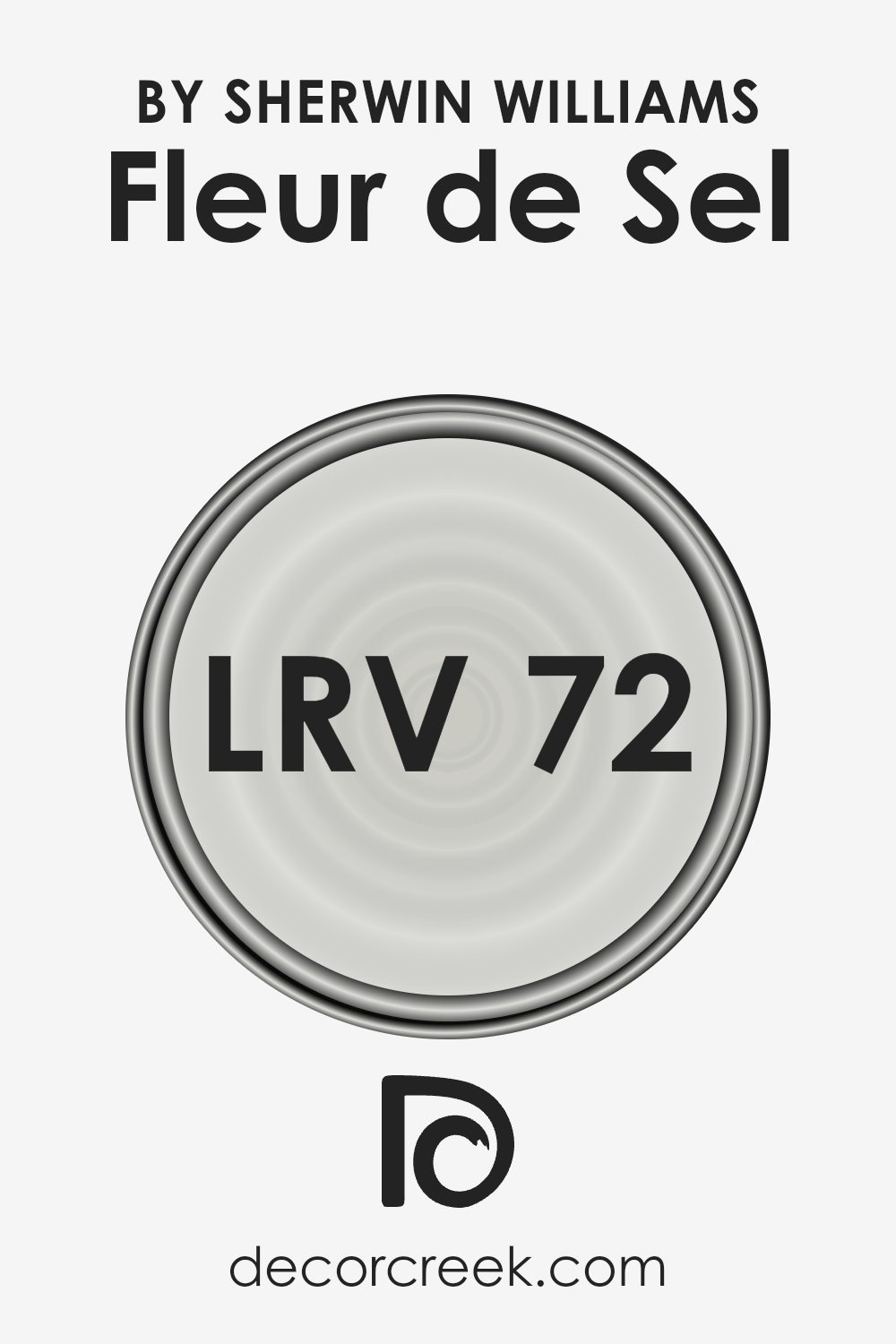
What is the LRV of Fleur de Sel SW 7666 by Sherwin Williams?
LRV stands for Light Reflectance Value, which is a measurement that tells you how much light a color reflects or absorbs. Essentially, a higher LRV means the color reflects more light, making it appear lighter, while a lower LRV means it absorbs more light, making it appear darker.
This value is important when choosing paint colors for a room because it can influence how big or small the space feels. Brighter colors can make a room feel more open and airy, while darker colors can make it feel cozier but smaller.
In the case of the LRV of 72.132 for the color mentioned, it suggests that this color is quite light and will reflect a good amount of light. This makes it a great choice for spaces where you want to enhance natural light or make the space seem larger. Since it’s on the higher end of the LRV scale, it won’t darken a room but instead will help to keep it looking bright and welcoming.
This level of light reflection is particularly useful in rooms that are smaller or have less natural light.
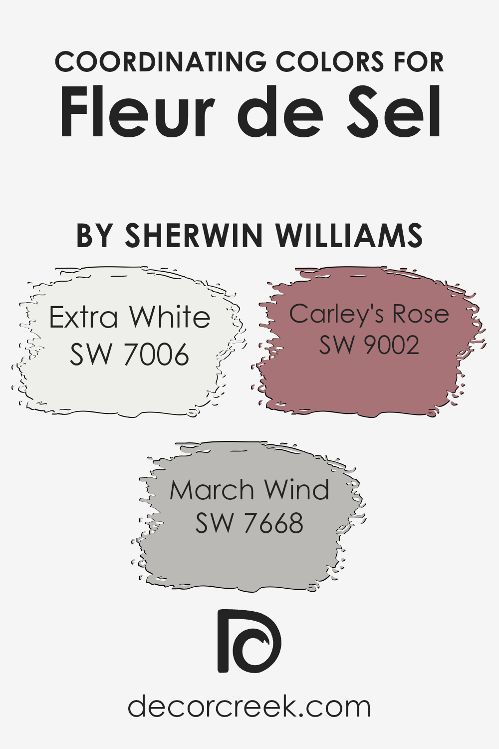
Coordinating Colors of Fleur de Sel SW 7666 by Sherwin Williams
Coordinating colors are those that harmonize well with a main color, enhancing the overall aesthetic of an interior space while allowing individual elements to blend smoothly. For instance, when working with a neutral base like a light gray, adding coordinating colors can add depth and interest without overwhelming the senses. These coordinating colors either complement or contrast in a way that creates a pleasing visual experience.
For example, SW 7006 – Extra White, is a very clean and crisp white that works brilliantly to provide a fresh contrast to more subdued hues, making spaces appear brighter and more open. SW 7668 – March Wind, is a subtle shade of gray that adds a cool undertone to the palette, offering a gentle enhancement without dominating.
Then there’s SW 9002 – Carley’s Rose, a soft and gentle pink that infuses a touch of warmth and a slight vibrancy, perfect for adding a hint of color in a predominantly neutral scheme. These hues work collectively to provide balance and variety, supporting the primary color while ensuring that the space feels cohesive and thoughtfully designed.
Their mutual support creates a harmonious blend of colors that can suit various design preferences and enhance any room’s character.
You can see recommended paint colors below:
- SW 7006 Extra White (CHECK A SAMPLE)
- SW 7668 March Wind (CHECK A SAMPLE)
- SW 9002 Carley’s Rose (CHECK A SAMPLE)
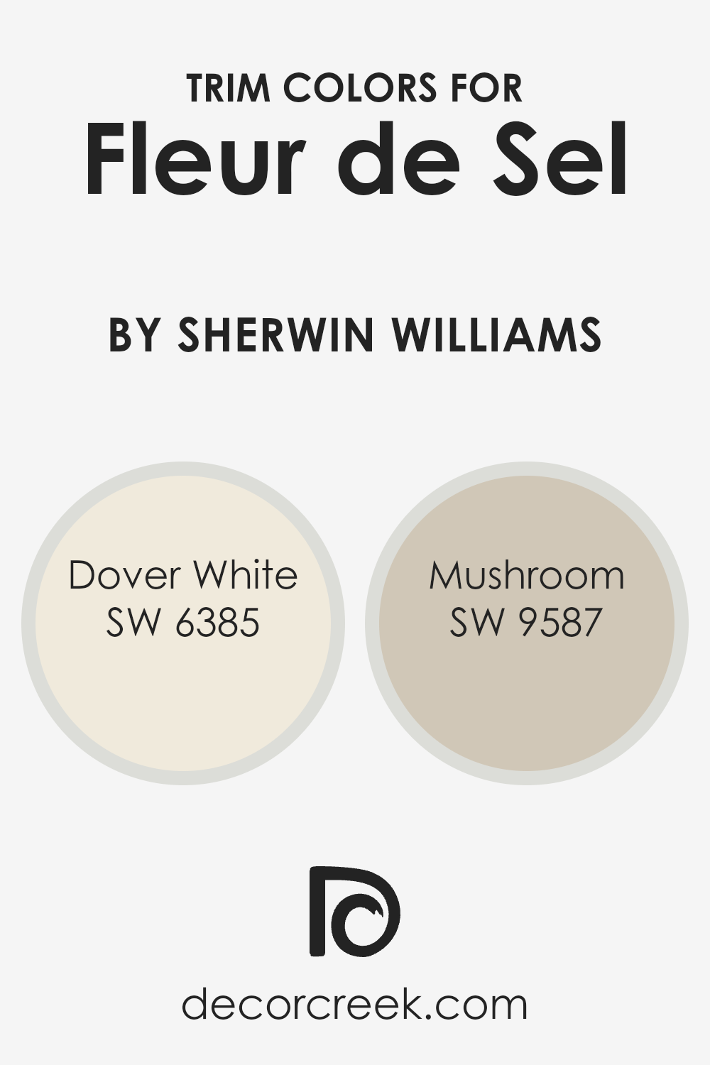
What are the Trim colors of Fleur de Sel SW 7666 by Sherwin Williams?
Trim colors are a key component in home decor that define and accentuate the architectural features of a room. They are typically applied to elements like door frames, crown moldings, baseboards, and window casings.
The trim colors, like SW 6385 – Dover White and SW 9587 – Mushroom, complement the main paint color on the walls, in this case, SW 7666 – Fleur de Sel by Sherwin Williams. The right trim color can enhance the overall aesthetic of a space, creating a clear visual structure and adding character to the room’s design.
Dover White (SW 6385) is a warm, creamy white that offers a subtle contrast while still maintaining a harmonious look alongside the gentle gray of Fleur de Sel. It’s an excellent choice for creating a cozy and inviting atmosphere without overpowering the main color. Mushroom (SW 9587), on the other hand, is a deeper, neutral shade that provides a stronger contrast to Fleur de Sel, giving the room a more defined and grounded appearance. It’s perfect for adding a touch of earthiness and depth to the space. Both colors work well to enhance the beauty of Fleur de Sel, highlighting its quiet elegance without detracting from its primary appeal.
You can see recommended paint colors below:
- SW 6385 Dover White (CHECK A SAMPLE)
- SW 9587 Mushroom (CHECK A SAMPLE)
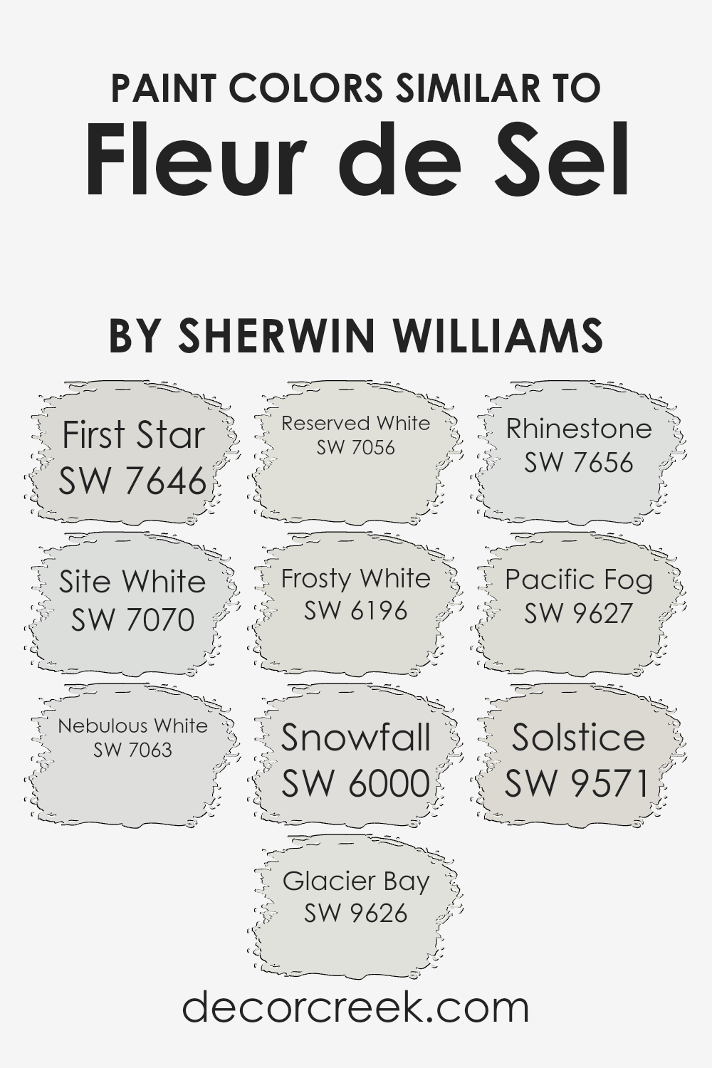
Colors Similar to Fleur de Sel SW 7666 by Sherwin Williams
Choosing similar colors in design can create a harmonious and soft atmosphere, making spaces feel more seamless and aesthetically pleasing. Colors that are close in hue or tone, like those similar to Fleur de Sel by Sherwin Williams, allow for a gentle transition from one space to another and avoid stark contrasts that can disrupt the flow of an area.
These subtle shifts in color can also emphasize textures and play with light in enriching ways, enhancing the overall mood of a room without overwhelming it with strong color differences.
For example, First Star is a pale gray that provides a clean and airy feel, making it perfect for small spaces or ceilings. Site White offers a slightly warmer tone, ideal for creating a soft, inviting environment. Nebulous White, with its hint of blue, reflects an open, crisp ambiance. Glacier Bay, a cool light gray, mimics the tranquil feel of a foggy seascape.
Reserved White leans towards a neutral base, effectively balancing with other accents. Frosty White can illuminate a space due to its bright undertone. Snowfall has a very subtle blue tint that suggests freshness and cleanliness. Rhinestone is another light gray but with a touch of warmth to keep spaces cozy.
Pacific Fog introduces a hint of maritime coolness, perfect for a calm, laid-back setting. Lastly, Solstice rounds out these options by offering a tone that works well in spaces that seek a gentle hint of warmth to counterbalance cooler tones in the decor. Each of these colors supports a seamless aesthetic when paired thoughtfully within interiors.
You can see recommended paint colors below:
- SW 7646 First Star (CHECK A SAMPLE)
- SW 7070 Site White (CHECK A SAMPLE)
- SW 7063 Nebulous White (CHECK A SAMPLE)
- SW 9626 Glacier Bay (CHECK A SAMPLE)
- SW 7056 Reserved White (CHECK A SAMPLE)
- SW 6196 Frosty White (CHECK A SAMPLE)
- SW 6000 Snowfall (CHECK A SAMPLE)
- SW 7656 Rhinestone (CHECK A SAMPLE)
- SW 9627 Pacific Fog (CHECK A SAMPLE)
- SW 9571 Solstice (CHECK A SAMPLE)
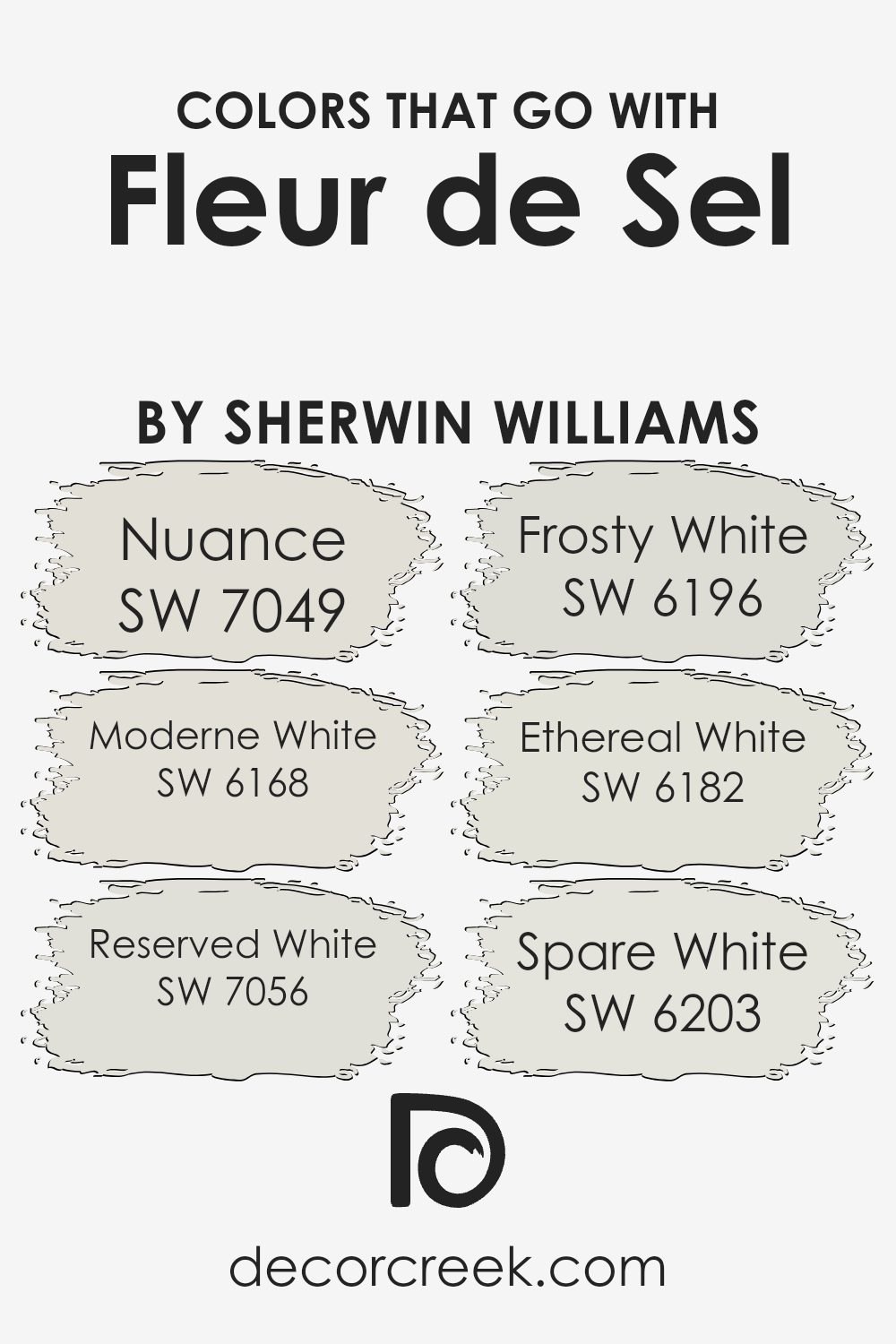
Colors that Go With Fleur de Sel SW 7666 by Sherwin Williams
Choosing the right colors that complement Fleur de Sel SW 7666 by Sherwin-Williams can significantly enhance the overall look and feel of a space. These particular colors are all about creating a harmonious atmosphere that is both appealing and easy on the eyes.
When colors such as SW 7049 – Nuance and SW 6168 – Moderne White are paired with Fleur de Sel, they help to establish a muted and understated aesthetic that is perfect for those who prefer a more subtle decor. On the other hand, including shades like SW 7056 – Reserved White or SW 6196 – Frosty White can add a touch of crisp freshness, making the environment feel clean and refreshed.
For a slightly different vibe, SW 6182 – Ethereal White offers a hint of softness and gentility, perfect for creating a cozy corner or a restful bedroom scene. Meanwhile, SW 6203 – Spare White serves as a great backdrop for spaces that require a minimalistic yet striking appearance, thus adding a contemporary flair while keeping things simple and refined.
Together, these colors work with Fleur de Sel to provide a wide array of options, allowing for flexibility in decor styles ranging from modern minimalist to cozy and inviting, making it easier to design a space that feels both comfortable and stylish.
You can see recommended paint colors below:
- SW 7049 Nuance (CHECK A SAMPLE)
- SW 6168 Moderne White (CHECK A SAMPLE)
- SW 7056 Reserved White (CHECK A SAMPLE)
- SW 6196 Frosty White (CHECK A SAMPLE)
- SW 6182 Ethereal White (CHECK A SAMPLE)
- SW 6203 Spare White (CHECK A SAMPLE)
How to Use Fleur de Sel SW 7666 by Sherwin Williams In Your Home?
Fleur de Sel SW 7666 by Sherwin Williams is a soft, gentle gray paint with a hint of warmth, making it great for creating a cozy, welcoming atmosphere in your home. This color works well in any room, acting as a subtle backdrop that complements bolder colors or stands elegantly on its own.
For example, in the living room, you could paint the walls with Fleur de Sel to help lighter furniture pieces or colorful accents stand out. It’s also ideal for bedrooms, where its calming effect can help you relax and get a good night’s sleep.
In smaller spaces like bathrooms or hallways, this color can make the area feel larger and more open. If you like a clean and orderly look, using Fleur de Sel on kitchen cabinets or walls can help achieve that fresh, tidy appearance. This shade is also easy to match with other colors, making it a practical choice for anyone looking to freshen up their home without making drastic changes.
Fleur de Sel SW 7666 by Sherwin Williams vs Solstice SW 9571 by Sherwin Williams
Fleur de Sel is a very light gray with a subtle warm tone, making it a great neutral choice for those looking to give their space a bright and airy feel. It reflects light well, working to make a room look more open and spacious. Solstice, on the other hand, is a deeper, richer gray with a slightly cooler tone.
This color adds more drama and depth to spaces, making it a good choice for accent walls or for rooms where a more cozy, enclosed feel is desired. Both colors are versatile and can be used in various types of decor, but Fleur de Sel is generally better for creating a light, fresh atmosphere, while Solstice works well where a bolder, more defined impact is needed.
You can see recommended paint color below:
- SW 9571 Solstice (CHECK A SAMPLE)
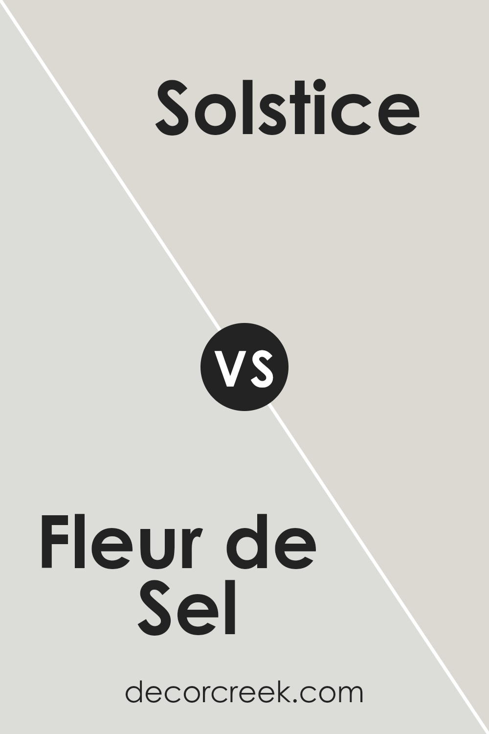
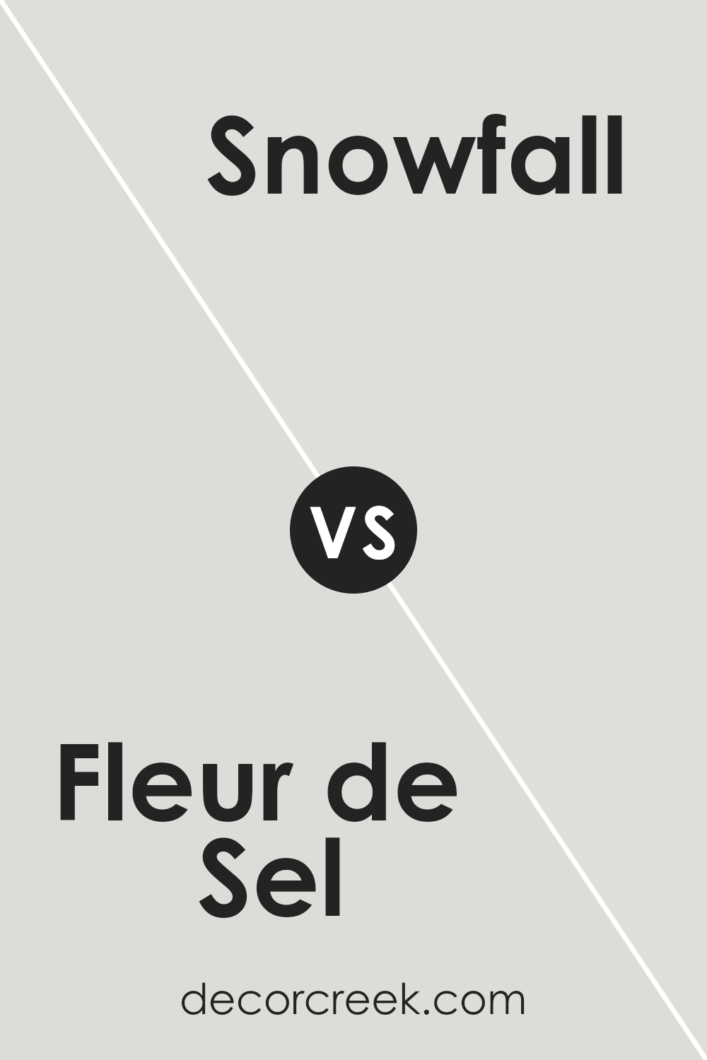
Fleur de Sel SW 7666 by Sherwin Williams vs Snowfall SW 6000 by Sherwin Williams
Fleur de Sel and Snowfall are both paint colors from Sherwin Williams, but they have subtle differences. Fleur de Sel is a light gray with a touch of warmth, making it cozy and welcoming. It works well in rooms that you want to feel soft and comfortable, such as bedrooms or living areas.
On the other hand, Snowfall is a cooler, brighter white. It’s perfect for spaces where you want to create a clean, fresh look. This color is ideal for kitchens, bathrooms, or any area that benefits from a sense of clarity and openness.
Both colors reflect light beautifully, but Snowfall will make a room feel more spacious because of its lighter and brighter qualities, while Fleur de Sel adds a hint of color, providing a warmer atmosphere.
You can see recommended paint color below:
- SW 6000 Snowfall (CHECK A SAMPLE)
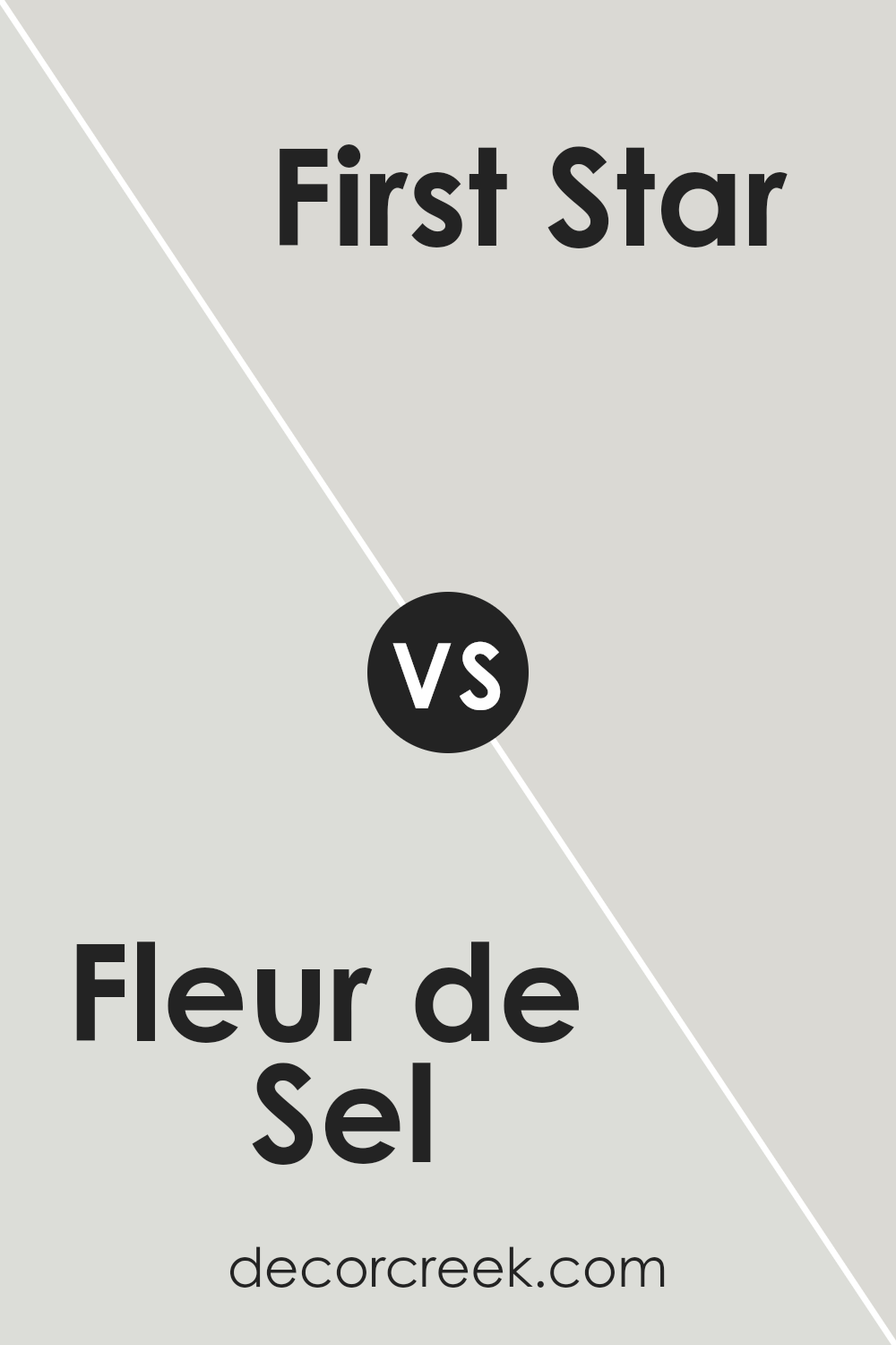
Fleur de Sel SW 7666 by Sherwin Williams vs First Star SW 7646 by Sherwin Williams
Fleur de Sel and First Star by Sherwin Williams are both subtle and soft colors, but they offer distinct tones that can affect the mood of a room differently. Fleur de Sel is a light gray with a slight warm undertone, making it feel cozy and inviting. It’s excellent for creating a gentle, welcoming environment in spaces like living rooms or bedrooms.
In contrast, First Star has cooler undertones, presenting as a cleaner, more neutral gray. This color is ideal for modern spaces that aim for a clean, crisp look, such as in kitchens or bathrooms. Both colors are light enough to make small rooms appear larger and are versatile enough to pair well with many decor styles and colors.
However, the choice between them will depend on the kind of warmth and mood you want to achieve in your space.
You can see recommended paint color below:
- SW 7646 First Star (CHECK A SAMPLE)
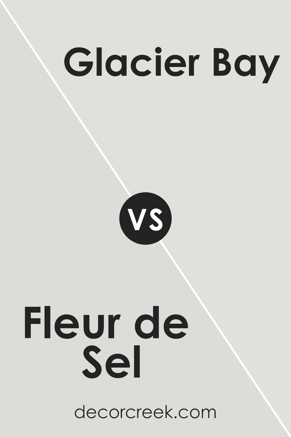
Fleur de Sel SW 7666 by Sherwin Williams vs Glacier Bay SW 9626 by Sherwin Williams
Fleur de Sel and Glacier Bay by Sherwin Williams are both great options for different moods and settings. Fleur de Sel is a soft, light gray that’s versatile enough for any room in your home. It’s gentle and subtle, making it the perfect backdrop for both bold furniture or more muted tones.
On the other hand, Glacier Bay is a light teal with a refreshing and clean feel, adding a hint of color to a space without being overwhelming. This makes it ideal for bathrooms or kitchens, where you might want a more lively atmosphere. Both colors are fairly neutral, but Glacier Bay offers a pop of color, whereas Fleur de Sel leans towards a classic, timeless look.
Depending on the vibe you want, you could choose the quiet elegance of Fleur de Sel or the fresh, energetic feel of Glacier Bay.
You can see recommended paint color below:
- SW 9626 Glacier Bay (CHECK A SAMPLE)
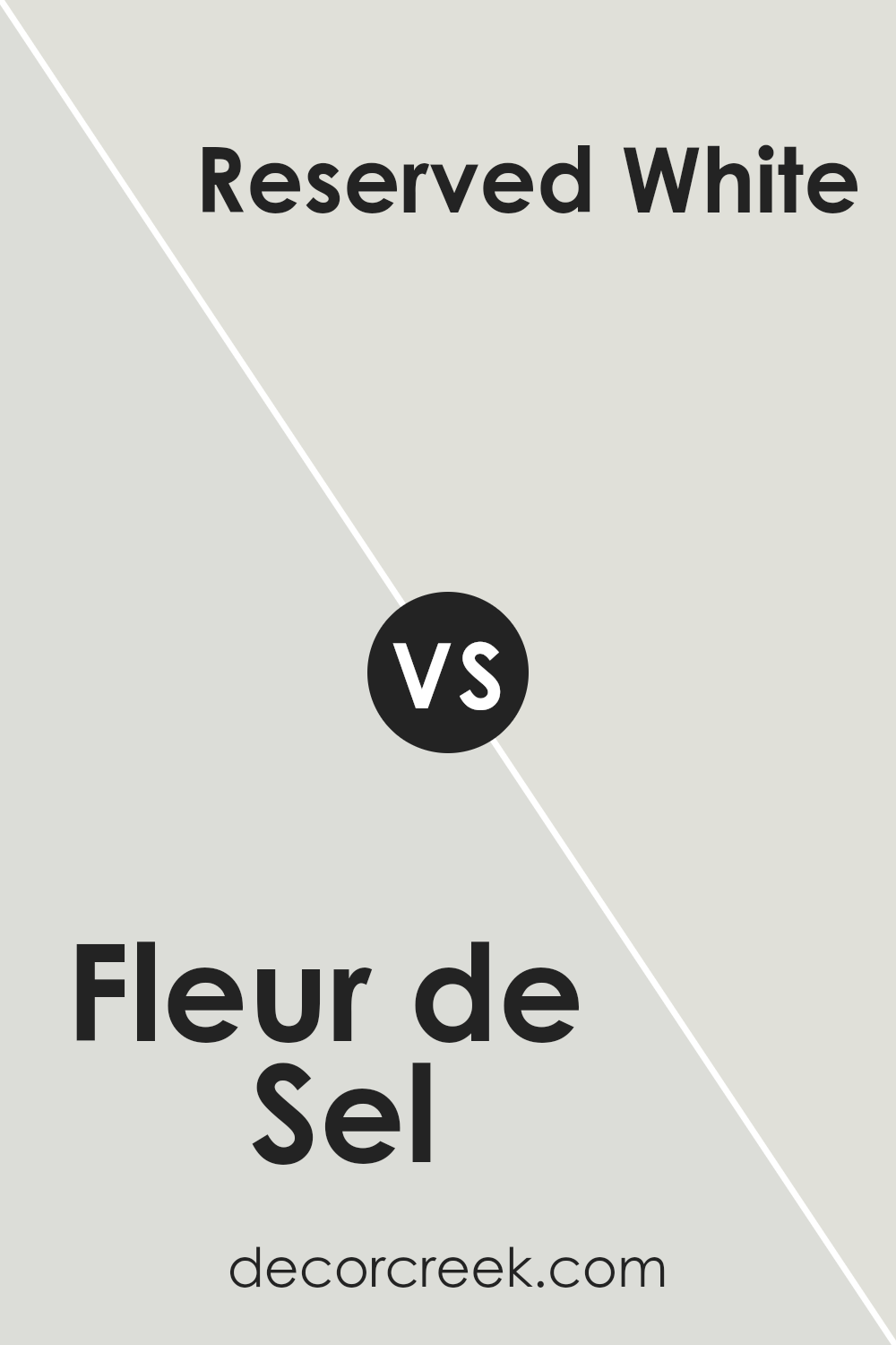
Fleur de Sel SW 7666 by Sherwin Williams vs Reserved White SW 7056 by Sherwin Williams
Fleur de Sel SW 7666 and Reserved White SW 7056 are both soft, neutral white colors from Sherwin Williams with subtle differences in tone. Fleur de Sel is a light gray with a touch of warmth making it a cozy choice for spaces you want to feel inviting, such as living rooms or bedrooms.
Its soft hue provides enough color to add depth to any room without overpowering other design elements. On the other hand, Reserved White is a cooler white, providing a slightly cleaner and crisper look. This color works really well in spaces that benefit from a stark, fresh appearance, like bathrooms, kitchens, or modern living spaces.
It’s also great for enhancing trim or doors, giving a sharp contrast to other wall colors. Side by side, Fleur de Sel feels more like a warm hug while Reserved White offers a brisk, fresh breath of air.
You can see recommended paint color below:
- SW 7056 Reserved White (CHECK A SAMPLE)
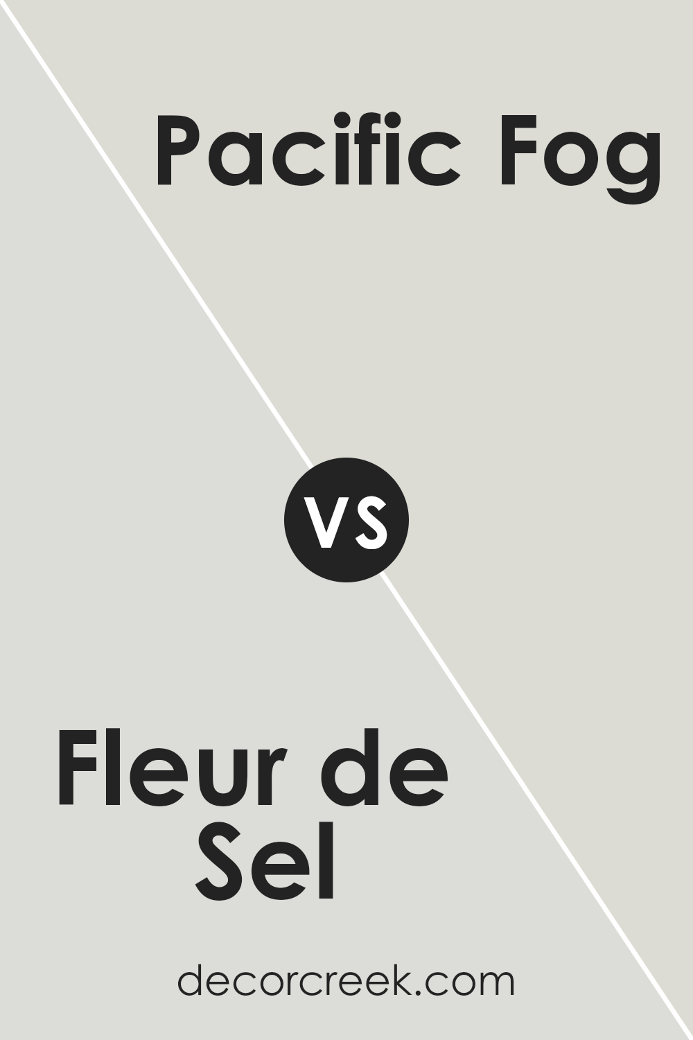
Fleur de Sel SW 7666 by Sherwin Williams vs Pacific Fog SW 9627 by Sherwin Williams
The main color, Fleur de Sel, is a soft, delicate shade that reminds you of just how light and airy a gray can be. It carries a hint of warmth, making it cozy and welcoming in any space. On the other hand, Pacific Fog is also a gray but with a deeper, more pronounced tone. This color stands out more compared to Fleur de Sel because it leans towards a mid-tone gray, providing a stronger presence in a room.
While both colors are versatile and can work well in various decor styles, Fleur de Sel is better for those who prefer a subtle, almost neutral backdrop. It can make small rooms feel larger and more open. Pacific Fog, with its slightly darker shade, is excellent for creating a bit more drama and depth, making it ideal for accent walls or larger rooms.
Both colors maintain a clean and fresh look but offer different levels of warmth and impact.
You can see recommended paint color below:
- SW 9627 Pacific Fog (CHECK A SAMPLE)
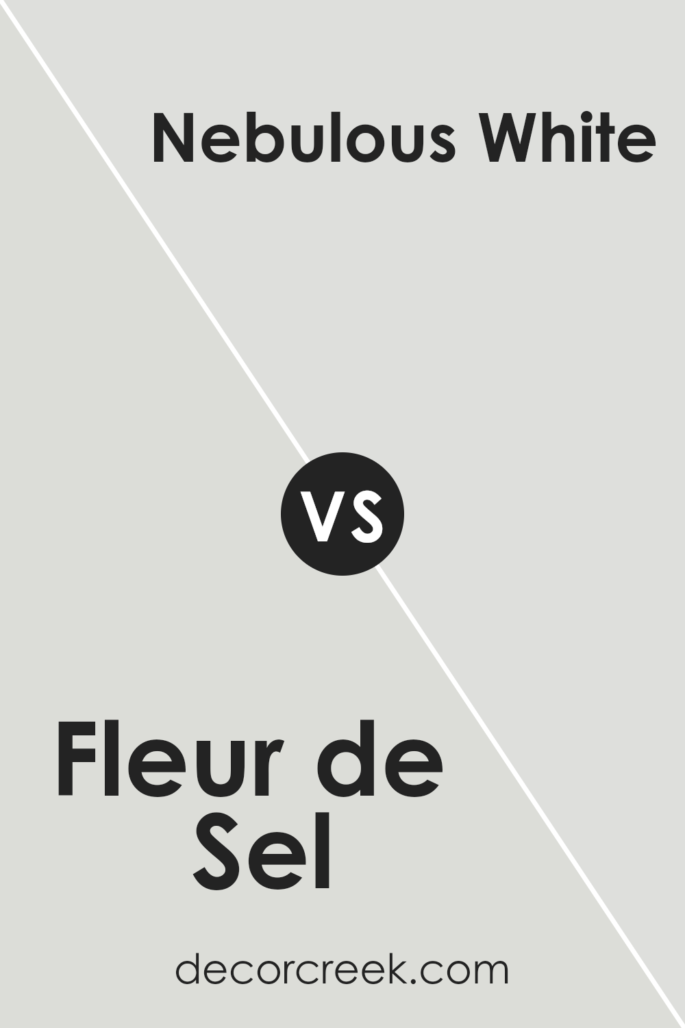
Fleur de Sel SW 7666 by Sherwin Williams vs Nebulous White SW 7063 by Sherwin Williams
Fleur de Sel and Nebulous White, both by Sherwin Williams, are subtle shades ideal for creating a calm and welcoming atmosphere. Fleur de Sel is a soft, light gray with a hint of warmth, making it cozy and adaptable to different spaces and lighting. It has an airy quality that feels clean and fresh.
On the other hand, Nebulous White leans closer to a true neutral gray. It is slightly darker than Fleur de Sel, providing a bit more depth and definition. This color is great for adding a touch of sophistication without feeling too bold or overpowering.
Both colors work well in various settings, from living rooms to bedrooms, and are versatile for pairing with bolder colors or keeping things monochromatic. Fleur de Sel is slightly warmer, which could be more inviting, while Nebulous White offers a crisper, more defined look. Choosing between the two depends on the mood you want to set and the other colors in your space.
You can see recommended paint color below:
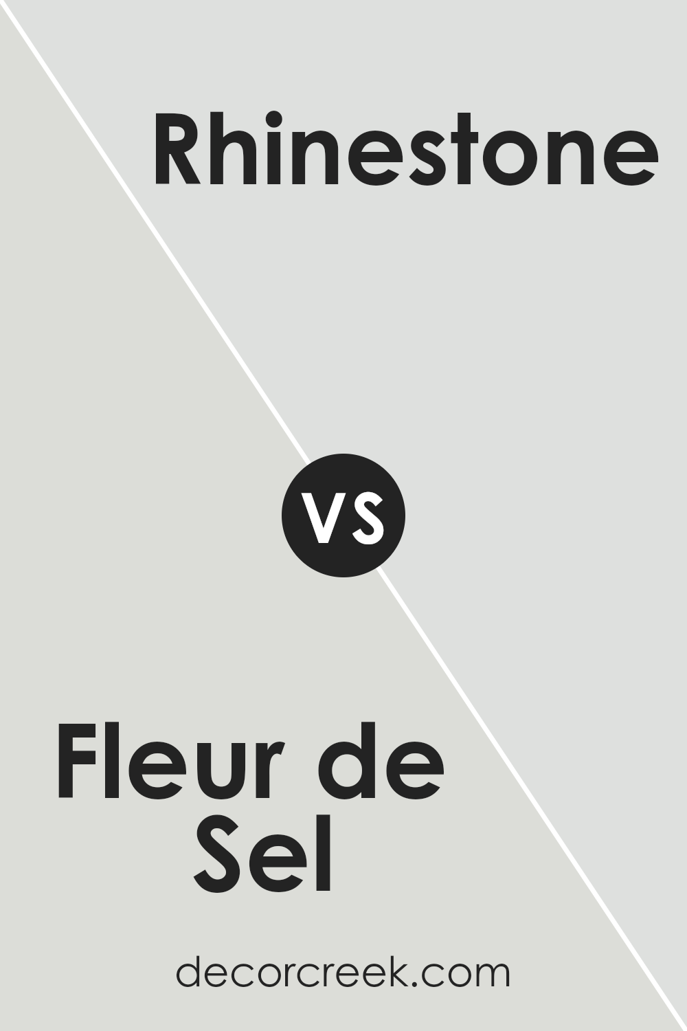
Fleur de Sel SW 7666 by Sherwin Williams vs Rhinestone SW 7656 by Sherwin Williams
Fleur de Sel and Rhinestone by Sherwin Williams are two light shades that although similar, have distinct undertones which set them apart. Fleur de Sel is a soft, light gray with a warm undertone, making it a cozy choice for any room looking to achieve a calm, inviting feel.
It pairs well with a variety of decor styles and brings a gentle, soothing presence. On the other hand, Rhinestone is cooler and slightly brighter, leaning towards a very light blue-gray. This color is great for spaces that get lots of natural light, as it enhances the room’s openness and light feel.
While Fleur de Sel adds warmth to a space, Rhinestone offers a fresher, cleaner look. Both colors are versatile and can be used in various settings, but your choice depends on the atmosphere you want to create – warmer and cozier with Fleur de Sal, or cooler and crisper with Rhinestone.
You can see recommended paint color below:
- SW 7656 Rhinestone (CHECK A SAMPLE)
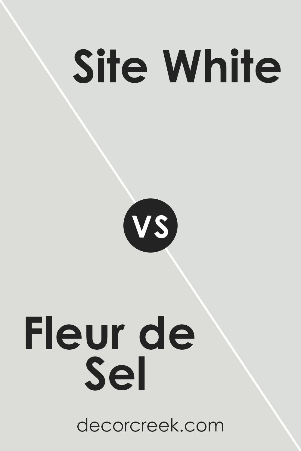
Fleur de Sel SW 7666 by Sherwin Williams vs Site White SW 7070 by Sherwin Williams
Fleur de Sel and Site White are two neutral paint colors by Sherwin Williams, each offering a distinct vibe for room decor. Fleur de Sel is a soft, light gray with a hint of warmth, making it perfect for creating a cozy and inviting atmosphere. It’s an excellent choice for living spaces or bedrooms where a gentle, calming feel is desired.
On the other hand, Site White is a cooler, crisper white with gray undertones. This color provides a clean and fresh look, ideal for modern spaces or smaller rooms that you want to appear more open and airy. It’s especially good for kitchens and bathrooms, where the sharpness can help enhance lighting.
Both colors are versatile, but while Fleur de Sel adds a touch of warmth to a room, Site White offers a more straightforward, brighter foundation, suitable for various styles and accent colors. Choosing between them depends on the mood and functionality you want for your space.
You can see recommended paint color below:
- SW 7070 Site White (CHECK A SAMPLE)
Fleur de Sel SW 7666 by Sherwin Williams vs Frosty White SW 6196 by Sherwin Williams
Fleur de Sel and Frosty White are both Sherwin Williams colors with subtle differences. Fleur de Sel has a soft, light gray tone that gives off a clean and airy feel, making it great for spaces where you want a hint of color without overpowering the room. It pairs well with brighter colors and natural light, enhancing a fresh and inviting atmosphere.
On the other hand, Frosty White leans more towards a pure, crisp white with minimal undertones. It is an excellent choice for creating a bright and clear look in a space. This color is ideal for anyone looking to brighten up a room or give the illusion of more space.
It works well in various settings, especially in areas that receive a lot of natural light or where you aim to display artwork or colorful decor, as it allows other colors to stand out.
Both colors offer their unique vibe, with Fleur de Sel providing a hint of softness and Frosty White creating a sharp, clean backdrop.
You can see recommended paint color below:
- SW 6196 Frosty White (CHECK A SAMPLE)

Conclusion
In discussing Fleur de Sel, an appealing paint color, it is noteworthy for its subtle and versatile quality. This hue possesses a gentle blend of gray and soft white, making it an excellent choice for bringing a light and airy feel to any room. Its adaptability allows it to pair well with a wide array of décor styles and color palettes, making it a practical selection for anyone looking to refresh their living space.
Fleur de Sel offers a clean and fresh backdrop for living areas, bedroom settings, or workspaces. The color’s ability to nicely complement other shades contributes to its popularity among homeowners and designers alike. Its understated elegance can help create a more open and inviting atmosphere, enhancing the aesthetic appeal of homes without overwhelming the senses with bold intensity.
This color not only enhances the visual space but also adds a neat and tidy quality to the environment.
Ever wished paint sampling was as easy as sticking a sticker? Guess what? Now it is! Discover Samplize's unique Peel & Stick samples.
Get paint samples


