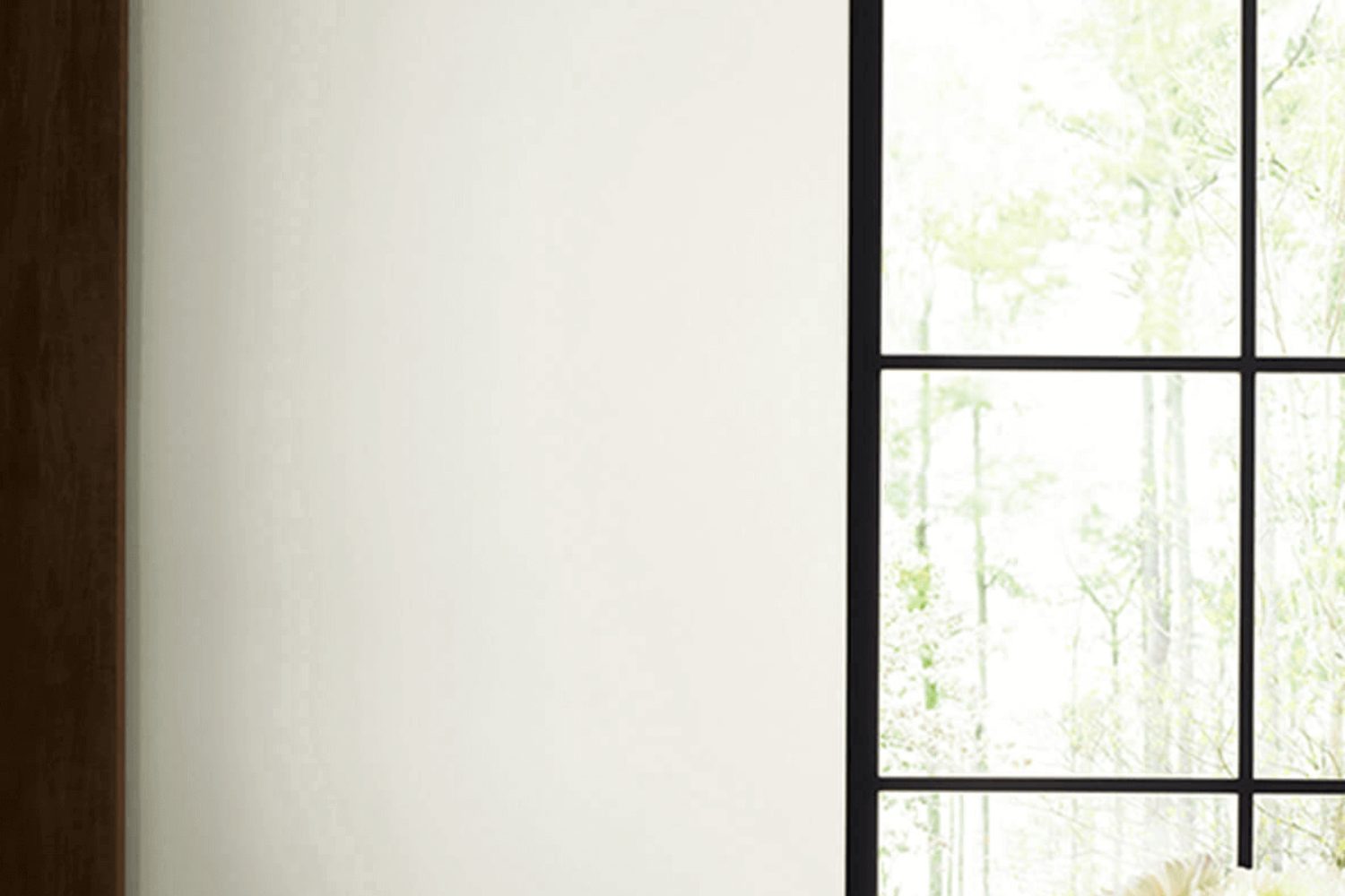
In the bustling world of home decor, choosing the perfect paint color is a fundamental step in transforming any living space. Among the plethora of options, Sherwin Williams’ SW 6182, known as Ethereal White, stands out as a prime choice for those seeking a touch of simplicity and elegance. This particular shade belongs to a family of whites that effortlessly brings a fresh, airy feel to any room. Ideal for those looking to create a serene and inviting atmosphere, Ethereal White offers a subtle backdrop that pairs beautifully with a wide array of decor styles.
As a versatile color, Ethereal White serves as a foundation that can either stand alone, exuding a minimalist charm, or it can act as a harmonious base for layering contrasting colors and textures. It’s particularly favored in spaces aiming for a light and open feel, such as living rooms, bedrooms, and even smaller, less illuminated areas like hallways and bathrooms. This hue’s ability to reflect light magnificently enhances the perceived space, making rooms feel more spacious and breathable.
For homeowners and interior designers alike, SW 6182 Ethereal White by Sherwin Williams is an excellent selection when aiming to achieve a refined and cohesive look throughout a home or project. Its adaptability and timeless nature ensure that this color remains a go-to option for creating environments that are both inviting and stylish.
What Color Is Ethereal White SW 6182 by Sherwin Williams?
Ethereal White by Sherwin Williams is a soft, airy color that breathes tranquility into any space. It’s a gentle hue, resembling the first light of dawn, offering a canvas that can make a room feel larger and more open. This color is perfect for creating a serene and inviting atmosphere without overwhelming the senses.
This particular shade of white works beautifully in a variety of interior styles, especially in minimalist, Scandinavian, and coastal designs. Its subtle warmth brings a cozy, yet sophisticated feel, making spaces feel polished and fresh. Ethereal White pairs exceptionally well with natural materials, such as light woods, adding to the feeling of calmness. It also complements textures like linen and cotton, enhancing a room’s sense of comfort and relaxation.
In addition to natural materials, this color goes hand in hand with elements like glass and metal, creating a balance between warmth and modernity. This versatility allows Ethereal White to be the perfect backdrop for any accent colors, from soft pastels to bold hues, making it easy to adapt as tastes change.
Ultimately, Ethereal White is a timeless choice that can transform any space into a peaceful retreat, making it ideal for anyone looking to create a soothing and welcoming home.
Is Ethereal White SW 6182 by Sherwin Williams Warm or Cool color?
Ethereal White by Sherwin Williams is a soft, airy hue that brings a sense of calm and simplicity into any home. Its subtle warmth radiates a gentle luminosity, making spaces feel more open and inviting. This color excels in creating a serene backdrop for daily life, allowing homeowners to easily complement it with various decor styles and color schemes. Whether in a bright, sunlit kitchen or a cozy, dimly lit bedroom, Ethereal White adapts to the natural light, offering a versatile canvas that enhances the ambiance of a room.
It’s especially effective in small spaces, where its light-reflective qualities can make areas appear larger and more welcoming. Moreover, this color has the unique ability to blend with both modern and traditional interiors, making it a solid choice for those looking to refresh their homes without committing to a bold color change. Ethereal White provides a subtle yet powerful foundation for creating a peaceful and harmonious home environment.
Undertones of Ethereal White SW 6182 by Sherwin Williams
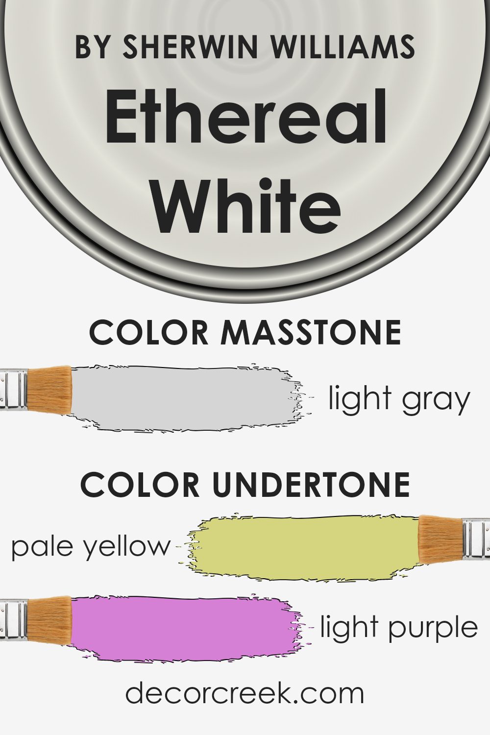
Ethereal White is a unique shade that might look simple at first glance, but it’s packed with a diverse range of undertones. These undertones include pale yellow, light purple, light blue, pale pink, mint, lilac, and grey. Each of these undertones plays a crucial role in how the color appears under different lighting conditions and when combined with various interior elements.
Undertones are like the color’s hidden personality traits that come out under specific circumstances. For instance, in a room with a lot of natural sunlight, the pale yellow undertone might make the color seem warmer and more inviting. On the other hand, in a space with cooler, artificial light, the light blue or grey undertones could give the walls a more serene and calming feel.
When applying this paint on interior walls, the mixture of undertones gives the room a dynamic character without overwhelming it with color. It’s like having a backdrop that subtly changes mood throughout the day, depending on the light and surrounding decor. The presence of light purple and lilac can add a touch of sophistication, while the mint undertone brings freshness to the space.
The beauty of this color lies in its versatility. It can complement a wide range of decor styles and preferences, from modern minimalism to cozy traditional. The gentle shades of pale pink and light blue can soften the look of the room, making it feel more welcoming and relaxed. The grey undertone ensures that the color maintains a neutral base, making it easy to pair with different furniture and accent colors.
Overall, the complex undertones of Ethereal White allow it to adapt and enhance the interior walls in a uniquely subtle way, reflecting various moods and styles while keeping the space light and airy.
What is the Masstone of the Ethereal White SW 6182 by Sherwin Williams?
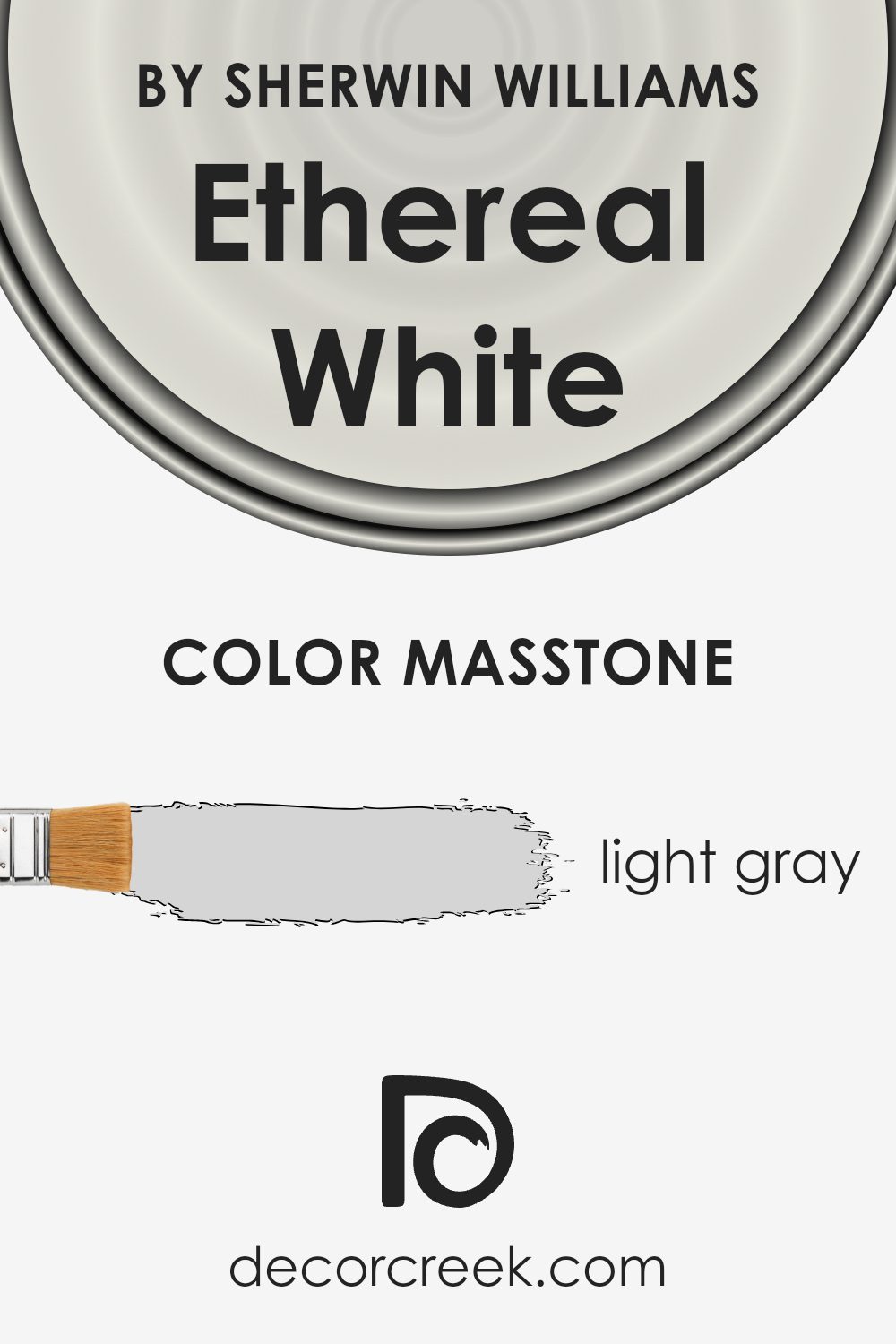
Ethereal WhiteSW 6182 is a subtle shade that brings a fresh and airy feeling to any room. With its masstone being Light gray (#D5D5D5), it offers a neutral base that can work wonders in homes looking for a calming and open atmosphere. This particular shade of gray manages to catch the light in a way that can make spaces feel larger and more inviting. It’s perfect for those wanting to create a serene backdrop that complements a wide range of decor styles and colors.
One of the best things about Ethereal White is how versatile it is. Whether you’re aiming for a modern, minimalist look or something more cozy and traditional, this color fits right in. It doesn’t overwhelm the senses, making it an excellent choice for living rooms, bedrooms, and even kitchens. Plus, it pairs beautifully with bolder colors, allowing you to add splashes of personality through artwork or textiles without clashing.
In homes, the light gray tone of Ethereal White provides a subtle lift to spaces that might otherwise feel closed in or dark. It reflects natural light beautifully, transforming the ambiance through the day with the changing sunlight. This adaptability makes it a go-to choice for anyone hoping to create a peaceful and inviting home environment.
How Does Lighting Affect Ethereal White SW 6182 by Sherwin Williams?
Light profoundly influences the way we see colors. Different types of light can make the same color look completely different. This is essential to understand, especially when choosing paint colors for your rooms, such as Ethereal White by Sherwin Williams.
- In natural light, this color reflects the environment and time of day. The hue’s appearance can change from a bright, pure form of white in the morning to a softer, more mellow shade in the evening. In sunny conditions, Ethereal White appears crisper, while on a cloudy day, it might look more subdued, showing off its subtle undertones.
- Artificial light, on the other hand, varies depending on the kind of bulbs used. Warm, yellow-toned lights can make Ethereal White feel cozier and softer, perfect for living areas or bedrooms where you want a snug atmosphere. Cool, blue-toned lights can make the color appear sharper and more vivid, which might be suitable for places like the kitchen or bathroom, where you need a clear and clean look.
- The direction your room faces also plays a role in how Ethereal White will look. North-faced rooms get less direct sunlight, so the color might seem cooler and slightly gray. This can give a serene and calm feeling to the space. In contrast, south-faced rooms get plenty of sunlight, making the paint look brighter and truer to its original shade, enhancing the feeling of light and space.
- East-faced rooms see the most change, as they are bathed in warm morning light, making Ethereal White look warm and welcoming in the morning and cooler as the day goes on. West-faced rooms get the evening light, which can make the color look very soft and gentle in the afternoon and evening, perfect for relaxing spaces.
Understanding how light affects colors, like Ethereal White, can help you pick the right paint for your space and achieve the atmosphere you’re aiming for.
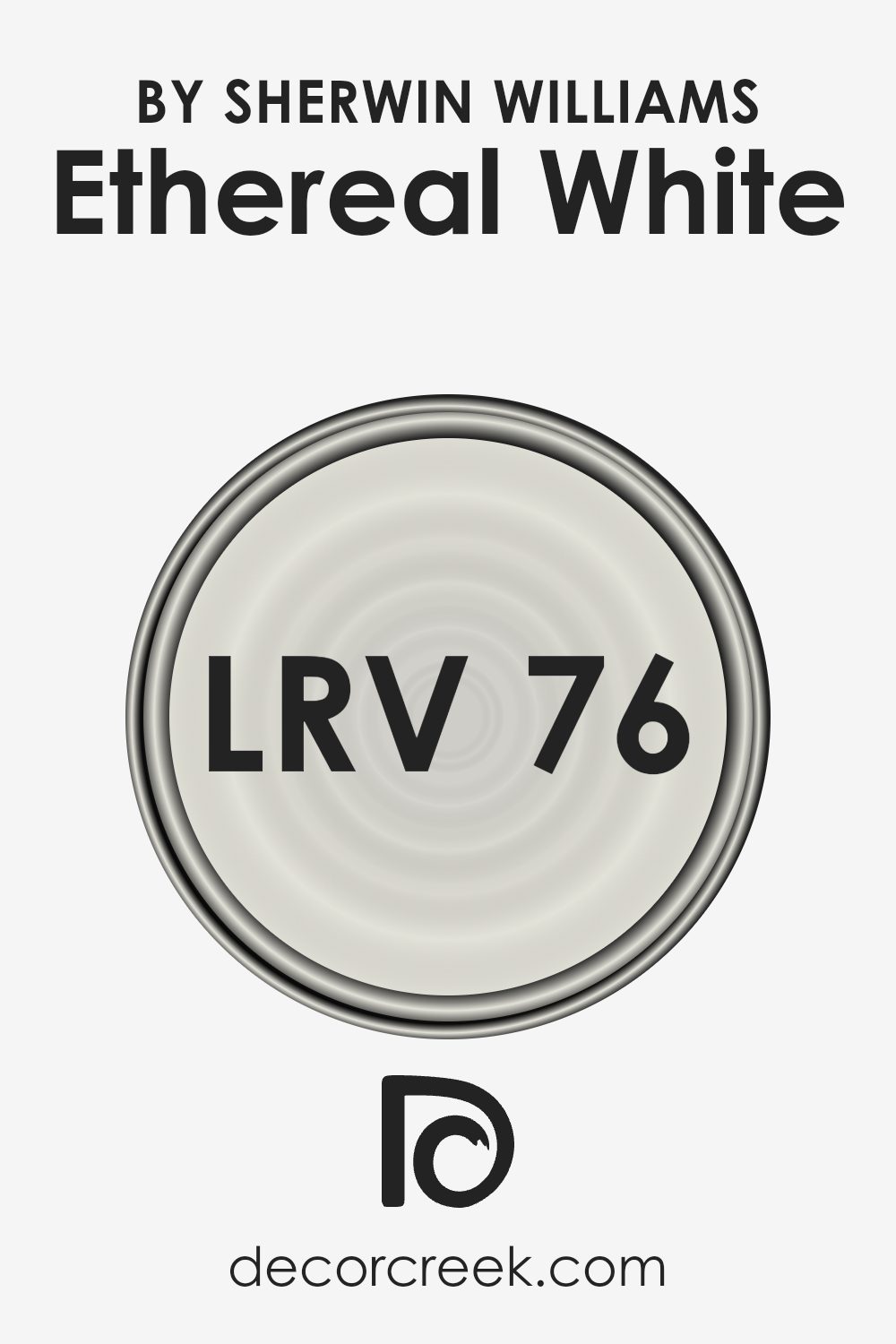
What is the LRV of Ethereal White SW 6182 by Sherwin Williams?
LRV stands for Light Reflectance Value, and it’s a measure used to describe the percentage of visible and usable light that a paint color reflects from or absorbs into a painted surface. Simply put, it’s a way to figure out how light or dark a color will look on your walls. This scale goes from 0 to 100, with 0 being completely black, absorbing all light, and 100 being pure white, reflecting all light. The LRV helps you understand how a paint color might make a room feel – lighter colors can make a space feel more open and airy, while darker colors can make it feel more cozy or smaller.
Ethereal White, with an LRV of 75.903, is on the lighter end of the scale. This means it will reflect a lot of light, making spaces feel more luminous and expansive. Such a high LRV makes this color a great choice for rooms that you want to appear bright and inviting, as it will maximize the natural and artificial light available. In essence, the high LRV of Ethereal White means it can help make a room feel more vibrant, while also being gentle and soothing to the eyes. It’s particularly beneficial in spaces that might not get a lot of sunlight, as it can help in making the space feel naturally brighter.
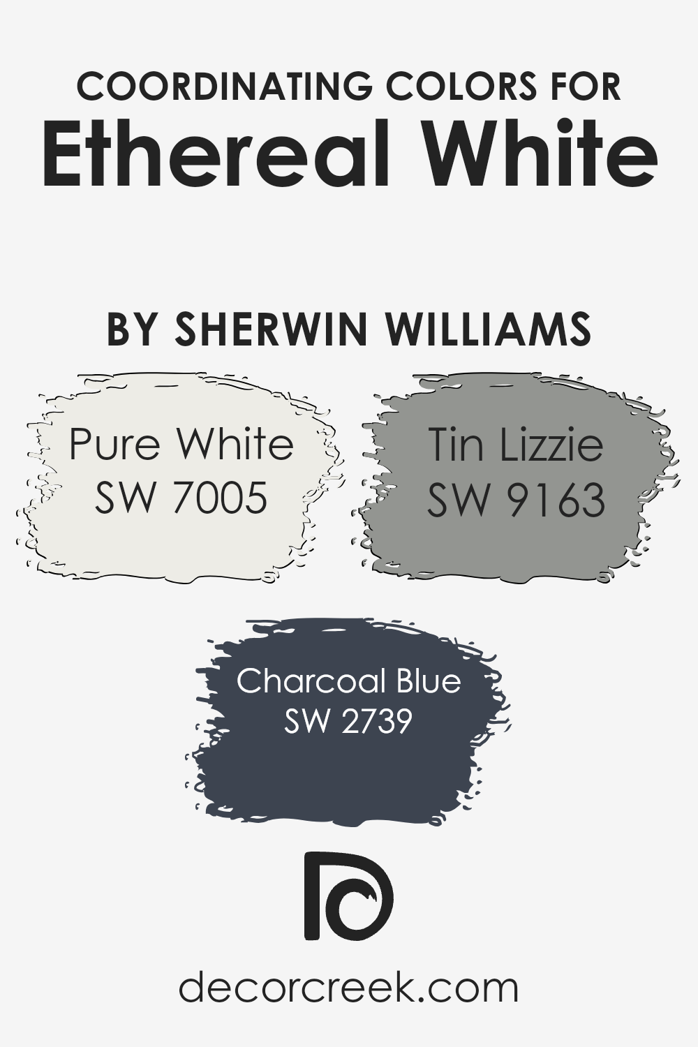
Coordinating Colors of Ethereal White SW 6182 by Sherwin Williams
Coordinating colors are hues that complement each other and work together to create a visually appealing and harmonious look in a space. They are selected based on their positions on the color wheel or their tones and are used to enhance the aesthetic of an area, allowing colors to balance perfectly without overwhelming the senses. For instance, when working with a base color like a soft, serene, subtle shade, you can select coordinating colors that bring contrast, depth, or softness to the overall design. These can range from neutrals to deeper tones, depending on the ambiance you’re aiming to achieve.
A perfect illustration of this is the serene hue, which acts as a fantastic canvas for other colors to shine.
- Pure White is a crisp, clean shade that brings a fresh brightness, making it an excellent companion for creating a light and airy feel.
- Charcoal Blue adds a sophisticated, deep navy tone that offers striking contrast and depth, perfect for adding a touch of elegance and drama.
- Tin Lizzie, on the other hand, is a soft, muted gray with subtle blue undertones, providing a versatile and calming presence that complements without overpowering.
Together, these colors create a balanced and cohesive palette that enhances the beauty and tranquility of the delicate base color.
You can see recommended paint colors below:
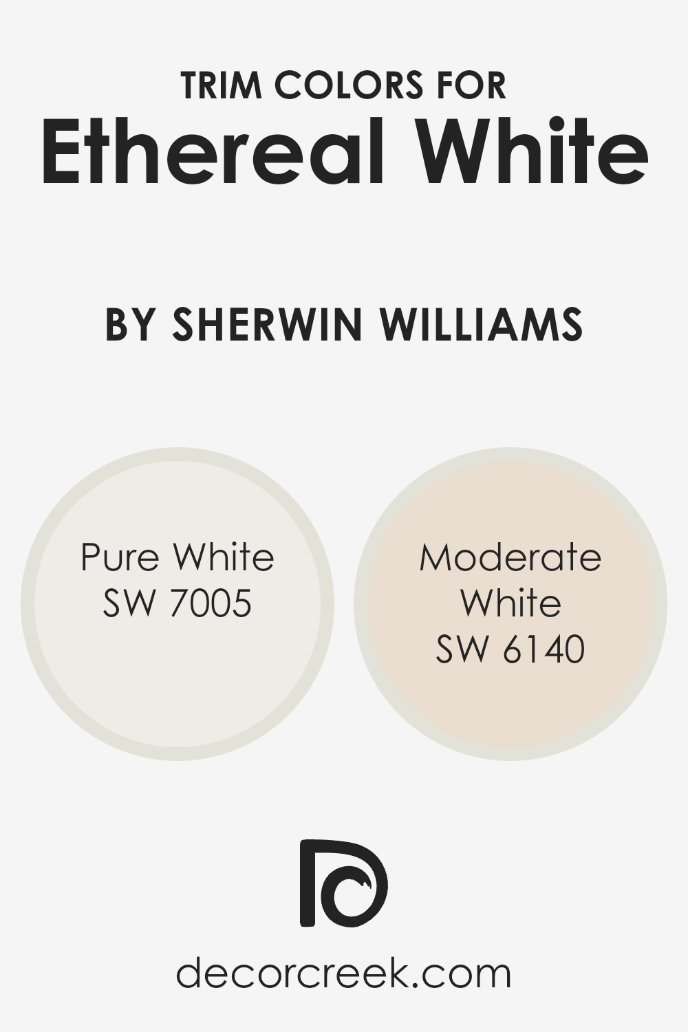
What are the Trim colors of Ethereal White SW 6182 by Sherwin Williams?
Trim colors are essentially the accents you choose to outline or highlight architectural features in your space, such as door frames, window sills, and baseboards. They play a crucial role in defining the character of a room by framing the wall color, in this case, Ethereal White by Sherwin Williams, thereby enhancing its overall appeal and adding a layer of visual interest. The right trim color can either subtly complement the wall, making the space feel cohesive and put together, or provide a bold contrast, adding a dynamic edge to the room’s design.
For Ethereal White, using SW 7005 – Pure White as a trim color offers a crisp, clean boundary that seamlessly blends with this ethereal shade, reinforcing a light and airy atmosphere throughout the room. Pure White is a true, unadulterated white that brings forth a sense of freshness and clarity, perfect for creating a serene and open space. On the other hand, SW 6140 – Moderate White adds a warmer tone to the trim, gently contrasting with Ethereal White by infusing a soft, creamy hue that invites a cozy, inviting vibe. Moderate White is akin to a gentle hug from the room, encapsulating a space in warmth without overwhelming the senses, making it ideal for spaces that aim for comfort with a touch of elegance.
You can see recommended paint colors below:
- SW 7005 Pure White
- SW 6140 Moderate White
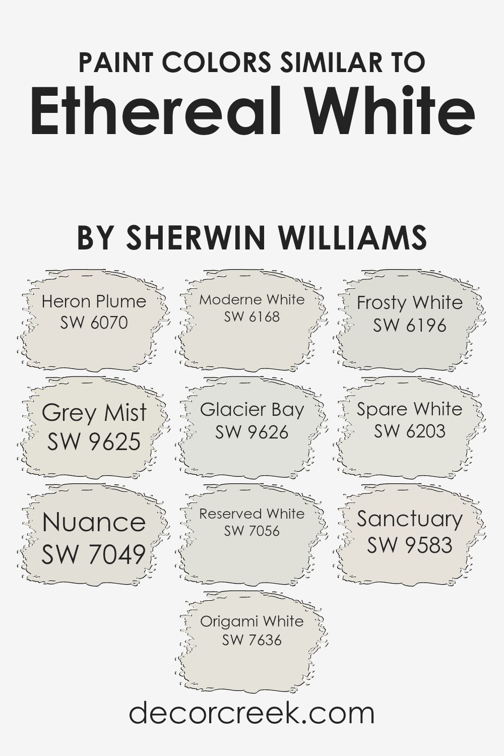
Colors Similar to Ethereal White SW 6182 by Sherwin Williams
Similar colors play a crucial role in interior design by creating a harmonious and balanced aesthetic. For instance, colors close to Ethereal White by Sherwin Williams offer a subtle variation that can enhance the overall look of a space without making drastic changes. These similar tones can enrich the texture and depth of a room, providing a cohesive yet diversified palette. When used wisely, they can contribute to a serene and welcoming atmosphere, emphasizing light and space in beautiful ways, especially in places aiming for a minimalist or modern vibe.
- Starting with Heron Plume, it’s a soft, warm gray that injects a cozy feel into spaces, perfect for creating a snug environment.
- Grey Mist steps in as a cooler, misty gray with a touch of serenity, bringing in a calming effect ideal for restful areas.
- Nuance offers a subtle hint of beige, adding warmth and a natural touch to interiors, mirroring the softness of early morning light.
- Origami White has a crisp and clean vibe that brightens rooms with an airy feel, making spaces appear larger.
- Moderne White leans into elegance, with a sophisticated, creamy undertone that envelops rooms in a soft, inviting glow.
- Glacier Bay introduces a cooler, frosty hue reminiscent of a tranquil, icy escape, offering a refreshing contrast.
- Reserved White is understated yet impactful, providing a neutral backdrop that allows other elements in the room to stand out.
- Frosty White adds a gentle, icy brightness, lifting the ambiance without overwhelming. Spare White brings a minimalist charm with its understated, clean feel, perfect for a modern, sleek look.
- Lastly, Sanctuary rounds out the selection with a peaceful, soft quality that makes any room feel safe and serene, inviting relaxation and tranquility.
These shades, while individually unique, collectively offer a versatile palette that complements Ethereal White, allowing for endless possibilities in interior design.
You can see recommended paint colors below:
- SW 6070 Heron Plume
- SW 9625 Grey Mist
- SW 7049 Nuance
- SW 7636 Origami White
- SW 6168 Moderne White
- SW 9626 Glacier Bay
- SW 7056 Reserved White
- SW 6196 Frosty White
- SW 6203 Spare White
- SW 9583 Sanctuary
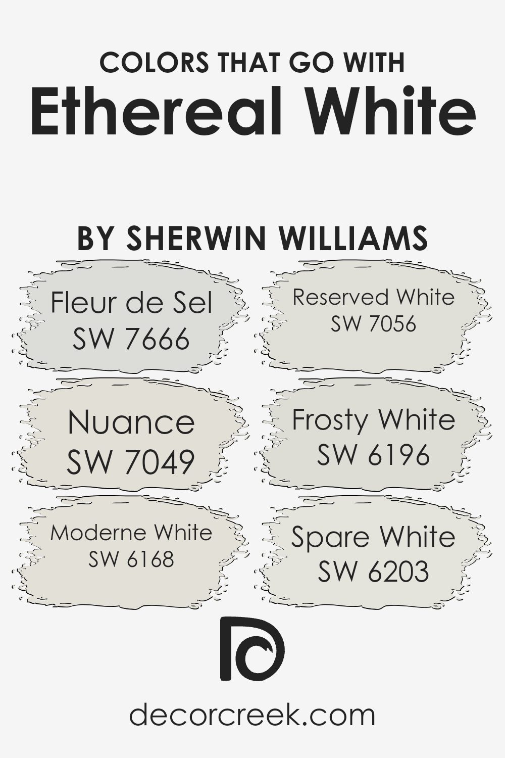
Colors that Go With Ethereal White SW 6182 by Sherwin Williams
Choosing colors that complement Ethereal White SW 6182 by Sherwin Williams is crucial for creating a harmonious and appealing space. These colors, including Fleur de Sel, Nuance, Moderne White, Reserved White, Frosty White, and Spare White, work together to enhance the beauty of Ethereal White by adding depth, contrast, and a sense of cohesion. By carefully selecting these complementary colors, you can design a room that feels balanced and well-thought-out, making the most of Ethereal White’s clean and airy vibe.
- Fleur de Sel SW 7666 brings a subtle elegance to the palette, its soft and serene quality acting as a perfect backdrop for more expressive decor elements.
- Nuance SW 7049, on the other hand, adds a touch of warmth, grounding spaces with its understated, earthy feel.
- Moderne White SW 6168 offers a slightly edgier take on white, infusing spaces with a contemporary coolness that’s both fresh and inviting.
- Reserved White SW 7056 keeps things calm and composed with its neutral undertone, making any room feel more spacious and open.
- Frosty White SW 6196 introduces a crisp, clean look that energizes spaces without overwhelming them.
- Lastly, Spare White SW 6203 serves as a light and breezy counterbalance, promoting a sense of peace and tranquility.
Collectively, these colors create environments that are both aesthetically pleasing and comfortable, showcasing Ethereal White’s versatility and charm.
You can see recommended paint colors below:
- SW 7666 Fleur de Sel
- SW 7049 Nuance
- SW 6168 Moderne White
- SW 7056 Reserved White
- SW 6196 Frosty White
- SW 6203 Spare White
How to Use Ethereal White SW 6182 by Sherwin Williams In Your Home?
Ethereal White, by Sherwin Williams, is a soft and airy paint color that brings a sense of calm and lightness to any space. It’s perfect for creating a relaxed and welcoming atmosphere in your home. One of the best ways to use this gentle color is in living rooms or bedrooms, where you want to invite peace and comfort. It pairs beautifully with natural light, enhancing spaces to feel more open and breathable.
If you’re thinking about refreshing your kitchen or bathroom, Ethereal White can also be a great choice. It can make these often smaller spaces appear bigger and more inviting. This color works well with a variety of decor styles, from minimalist to rustic, making it a versatile option for your home improvement projects.
Additionally, Ethereal White can serve as an excellent backdrop for artwork and bold furniture pieces, allowing them to stand out and capture attention. Whether you’re looking to update a single room or planning a whole-house transformation, this shade can easily become a foundation for your home’s new look, providing a tranquil and clean base to build upon.
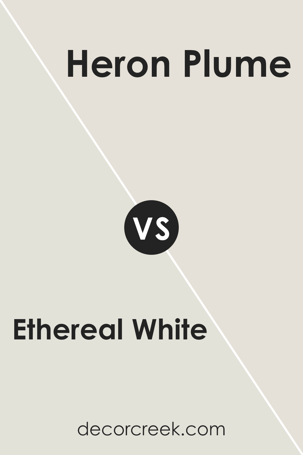
Ethereal White SW 6182 by Sherwin Williams vs Heron Plume SW 6070 by Sherwin Williams
Ethereal White and Heron Plume are two elegant colors by Sherwin Williams that offer subtle yet distinct differences. Ethereal White is as pure and soft as it sounds, bringing a bright and airy feel to any space. It’s the kind of white that acts as a canvas, allowing other elements in the room to shine. On the other hand, Heron Plume carries a bit more depth. While still maintaining a light and neutral tone, it leans slightly towards a warm gray, adding a cozy touch.
This color is perfect for those who want a hint of warmth in their white, making spaces feel inviting. Both colors are versatile, working well in various settings from modern to classic. Whether you choose the crisp simplicity of Ethereal White or the subdued warmth of Heron Plume, each color provides a beautiful backdrop for any room’s design.
You can see recommended paint color below:
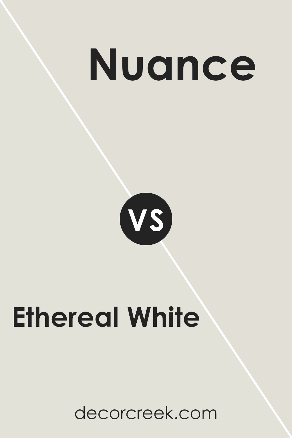
Ethereal White SW 6182 by Sherwin Williams vs Nuance SW 7049 by Sherwin Williams
Ethereal White and Nuance are two unique colors by Sherwin Williams. Ethereal White is a soft and light hue, offering a clean and airy feel to any space. It’s perfect for creating a bright and open atmosphere. This color shines in well-lit rooms, bringing a fresh and uplifting vibe. On the other hand, Nuance is a gray tone with warm undertones. It’s more subdued compared to Ethereal White but provides a soothing and cozy feel to rooms.
Nuance works well in spaces where you want a touch of warmth without darkening the area too much. It’s versatile, fitting nicely in various settings like living rooms or bedrooms. Comparing the two, Ethereal White is better for those seeking a crisp, vibrant look, while Nuance suits someone looking for a neutral, yet inviting backdrop. Both colors offer their unique charm, making spaces feel welcoming in different ways.
You can see recommended paint color below:
- SW 7049 Nuance
Ethereal White SW 6182 by Sherwin Williams vs Glacier Bay SW 9626 by Sherwin Williams
Ethereal White and Glacier Bay are two unique colors from Sherwin Williams. Ethereal White is a soft, airy color, almost like a gentle whisper of white on your walls. It adds a light, clean feel to any room, making spaces seem larger and more open. It’s perfect for those who appreciate a subtle hint of color while wanting to maintain a bright and open look.
On the other hand, Glacier Bay is a cooler, more refreshing shade. It’s a bit like looking at a serene, icy lake. This color brings a calm and soothing vibe, making it great for creating a peaceful and relaxed atmosphere. While still light, it carries a touch of blue, adding a cool freshness that distinguishes it from the warm subtleness of Ethereal White.
When comparing the two, Ethereal White leans towards a neutral, warm tone, providing a canvas for any decor style. Glacier Bay, however, infuses spaces with a tranquil, cool feeling, reminiscent of a crisp, clear day. Both colors offer their unique charms, catering to different moods and aesthetics.
You can see recommended paint color below:
- SW 9626 Glacier Bay
Ethereal White SW 6182 by Sherwin Williams vs Frosty White SW 6196 by Sherwin Williams
Ethereal White and Frosty White are both colors from Sherwin Williams that offer subtle yet distinct vibes for any space. Ethereal White has a soft, airy feel, providing a delicate background that feels open and inviting. It’s like the first light of dawn, gentle and soothing, making it perfect for creating a serene and calm environment. On the other hand, Frosty White leans towards a cooler tone, reminiscent of a crisp, clear winter’s day. It has a more defined character, offering a sharper contrast that can make spaces feel more defined and crisp.
While both shades are white, the key difference lies in their undertones and the ambiance they create. Ethereal White warms up a room, making it cozy and welcoming, whereas Frosty White brings a more refreshing and clean look.
Choosing between them depends on the mood you want to set for your space. Ethereal White works well in bedrooms and living areas where a soft touch is desired, while Frosty White is ideal for kitchens, bathrooms, or any area where a bright, pristine feel is preferred.
You can see recommended paint color below:
- SW 6196 Frosty White
Ethereal White SW 6182 by Sherwin Williams vs Sanctuary SW 9583 by Sherwin Williams
Ethereal White and Sanctuary are two colors by Sherwin Williams that offer a subtle but distinct vibe for any space. Ethereal White is a soft, pure white that brings a bright and airy feel to rooms. It’s perfect for creating a sense of openness and light, making small spaces seem larger and more inviting. On the other hand, Sanctuary is a deeper, soothing taupe that lends a cozy, warm atmosphere to any area.
This color is ideal for those looking to add a touch of calm and comfort to their home, making it feel like a peaceful retreat. While Ethereal White reflects more light, enhancing the sense of space, Sanctuary draws you in with its warmth, perfect for creating a snug, welcoming environment. Together, these colors can complement each other beautifully in a home, blending brightness with warmth to craft spaces that feel both expansive and intimate.
You can see recommended paint color below:
- SW 9583 Sanctuary
Ethereal White SW 6182 by Sherwin Williams vs Origami White SW 7636 by Sherwin Williams
Ethereal White and Origami White by Sherwin Williams are two popular shades with their unique charms. Ethereal White is a soft, warm hue that feels airy and light, making spaces seem more open and inviting. It carries a subtle creaminess, offering a cozy vibe without overwhelming a room with too much yellow or beige undertones. This color works well in spaces where you want to add a touch of warmth while keeping the overall look fresh and serene.
On the other hand, Origami White is a bit cooler compared to Ethereal White. It leans more towards a neutral white with just a hint of gray, giving it a clean, crisp appearance. This shade is excellent for those seeking a modern and minimalist look, as it provides a sleek backdrop that complements contemporary decor and accents.
When deciding between the two, consider the mood and style you want to achieve in your space. Ethereal White brings warmth and a welcoming feel, while Origami White offers a more refined and cool ambiance. Both shades are versatile, but your choice depends on whether you prefer a hint of coziness or a sleek, modern touch.
You can see recommended paint color below:
Ethereal White SW 6182 by Sherwin Williams vs Reserved White SW 7056 by Sherwin Williams
Ethereal White and Reserved White, both by Sherwin Williams, are distinct yet closely related hues. Ethereal White has a soft and airy feel, bringing a sense of lightness to a room. It’s a color that can make small spaces appear larger and brighter, thanks to its subtle warmth, which helps in creating a cozy atmosphere without overwhelming the senses.
On the other hand, Reserved White leans towards a cooler palette, offering a more neutral backdrop. This color is versatile, easily adapting to various decors and styles. It’s perfect for those seeking a clean and understated look, as it doesn’t draw attention to itself but rather complements the elements around it.
Both colors contribute to a serene and inviting environment but in slightly different ways. Ethereal White, with its warmer tone, is ideal for creating a welcoming and comfortable space, whereas Reserved White is better suited for achieving a modern and minimalist aesthetic. The choice between them depends on the desired ambiance and the specific characteristics of the room being decorated.
You can see recommended paint color below:
- SW 7056 Reserved White
Ethereal White SW 6182 by Sherwin Williams vs Spare White SW 6203 by Sherwin Williams
Ethereal White and Spare White, two shades by Sherwin Williams, offer subtle differences in their appeal. Ethereal White has a soft, airy quality that brings a gentle and light feel to any space, making it feel open and inviting. It’s perfect for those looking to add a touch of brightness without overwhelming a room. On the other side, Spare White carries a cooler tone, slightly more reserved, making it ideal for creating a calm and serene environment.
It’s a great choice for spaces meant to be soothing and peaceful. While both colors are variations of white, Ethereal White leans towards a warmer, delicate vibe, enhancing spaces with a cozy glow. Spare White, however, offers a hint of coolness, providing a clean and tranquil backdrop. Choosing between them depends on the mood you wish to set: Ethereal White for a warm, welcoming atmosphere, and Spare White for a cool, serene ambiance.
You can see recommended paint color below:
Ethereal White SW 6182 by Sherwin Williams vs Grey Mist SW 9625 by Sherwin Williams
Ethereal White and Grey Mist are two colors by Sherwin Williams that have their own unique vibes. Ethereal White is like a soft, bright day, making any room feel airy and spacious. It’s not just plain white; it has a hint of warmth that keeps it from feeling cold or stark. Think of it as a gentle hug for your walls, making everything look clean and fresh.
On the other side, Grey Mist is a light grey with a touch of softness. It’s the kind of color that brings a calm, soothing atmosphere to any space. It’s like a misty morning before the world wakes up, peaceful and tranquil. Grey Mist can make a space feel modern without feeling too industrial or cold.
When comparing the two, Ethereal White brings more brightness, making a room feel more open and light-filled. Grey Mist, however, adds a modern, serene touch, offering a backdrop that’s cozy and grounding. Depending on what mood you want to create, each color has its strengths. Ethereal White is perfect for creating a crisp, clean look, while Grey Mist offers a cozy, sophisticated vibe.
You can see recommended paint color below:
- SW 9625 Grey Mist
Ethereal White SW 6182 by Sherwin Williams vs Moderne White SW 6168 by Sherwin Williams
Ethereal White and Moderne White, both by Sherwin Williams, are subtle yet distinct shades that offer unique vibes to any space. Ethereal White leans towards a soft, airy, and luminous feel. It’s like the first light of dawn that gently fills a room with a calming, peaceful ambiance. This color has a hint of warmth to it, making it perfect for creating a cozy yet bright atmosphere. It’s ideal for anyone wanting to add a touch of serenity to their surroundings.
On the other hand, Moderne White is a bit more grounded. It has a richer, deeper tone that brings a sophisticated and contemporary edge to spaces. While still maintaining a sense of brightness, it offers a slightly cooler feel compared to Ethereal White. This makes it excellent for modern, minimalistic settings or spaces where a crisp, clean look is desired.
Both colors are incredibly versatile and can transform a room depending on the lighting and accessories used with them. Whether you’re going for a tranquil retreat or a sleek modern look, choosing between Ethereal White and Moderne White depends on the mood you want to set in your space.
You can see recommended paint color below:
- SW 6168 Moderne White
Conclusion
Ethereal White by Sherwin Williams is a paint color that’s known for its light and almost airy quality, making it a perfect choice for anyone looking to create a subtle and serene atmosphere in a space. It possesses a certain versatility, allowing it to seamlessly blend with various decors and styles. Whether it’s used in a cozy living area or a peaceful bedroom, this shade has the ability to open up a room, making it appear more spacious and inviting. Its understated elegance offers a clean and classic look, making it an ideal backdrop for a wide range of furniture and accent colors.
Choosing Ethereal White for your walls can be a clever move for those aiming to introduce more brightness into their rooms without overwhelming them with a stark white. It works particularly well in spaces that receive a good amount of natural light, enhancing the feeling of freshness and tranquility. Additionally, its adaptability means it can bridge traditional and contemporary designs, providing a neutral foundation that supports an array of personal styles and preferences. For anyone looking to refresh their home with a gentle but pronounced impact, Ethereal White is a considerate choice that brings subtle refinement and a sense of calm to any interior.
Ever wished paint sampling was as easy as sticking a sticker? Guess what? Now it is! Discover Samplize's unique Peel & Stick samples.
Get paint samples

