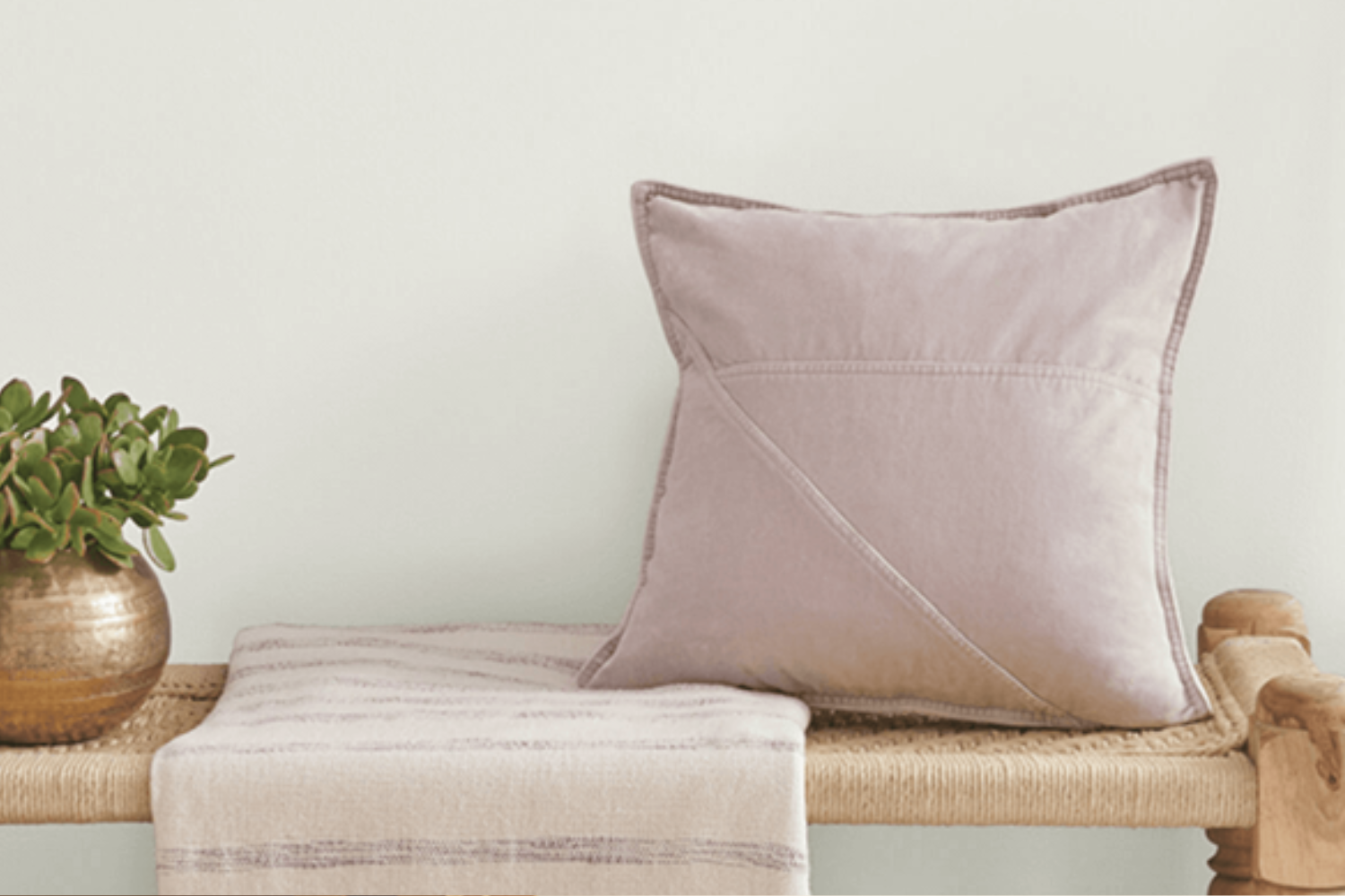
When it comes to choosing paint colors for your home, opting for a shade that brings a fresh and serene vibe is often a top priority. SW 6203, also known as Spare White by Sherwin Williams, is a fantastic choice that fits this bill perfectly. This particular shade of white is unique in its ability to offer a clean and airy feel to any room it graces. Whether you’re looking to paint a cozy bedroom, a welcoming living room, or even brighten up a Kitchen or bathroom, Spare White can effortlessly uplift the space.
One of the key attributes of Spare White is its subtle undertones, which work beautifully to enhance the feeling of space and light in a room. This makes it an ideal backdrop for both minimalist and vibrant decorating styles, as it complements a wide range of decor choices and color schemes.
If you’re planning a home makeover or selecting colors for a new home, considering Spare White is a smart move.
By opting for Spare White, homeowners can achieve a timeless elegance that adds a touch of sophistication without overwhelming the senses. It’s perfect for those looking to achieve a peaceful and inviting atmosphere in their living space.
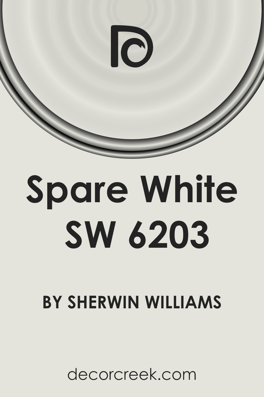
What Color Is Spare White SW 6203 by Sherwin Williams?
The color Spare White from Sherabin Williams is a gentle and welcoming hue, perfect for creating a serene and airy atmosphere in your home. This subtle shade of white carries a hint of warmth, making spaces feel cozy and inviting. It’s not a stark white, but rather has an understated elegance, making it a versatile choice for various interior styles.
Spare White works beautifully in modern and minimalist designs, where its clean simplicity can enhance a sense of openness and light. It’s also well-suited for Scandinavian interiors, where warmth and comfort are key. This color pairs wonderfully with natural materials and textures, such as wood, linen, and wool, adding to its cozy appeal. In a room with plenty of natural light, Spare White can help amplify the brightness, making the space feel more expansive and fresh.
When it comes to materials, this shade complements soft, plush textures as well as sleek, smooth surfaces, offering a balanced backdrop that allows other elements in the room to shine. Whether used on walls, trim, or even cabinets, Spare White brings a harmonious and tranquil vibe to any space.
Overall, Spare White is a timeless and adaptable color, ideal for creating a peaceful and welcoming home environment.
Is Spare White SW 6203 by Sherwin Williams Warm or Cool color?
Spare White SW 6203 by Sherwin Williams is a unique and versatile paint color that brings a fresh, airy feel to any home. This light and subtle shade has a hint of warmth that makes spaces feel inviting without overpowering them. It’s perfect for creating a calm and serene environment, ideal for rooms where you want to relax and unwind. Because of its understated elegance, Spare White can easily complement a wide range of decor styles, from modern to traditional.
When used in small spaces, this color can make rooms appear larger and more open, thanks to its ability to reflect light. In larger rooms, it acts as a perfect backdrop for artwork and furniture, allowing other colors to pop without creating a busy feel.
Furthermore, its neutrality provides homeowners the freedom to switch up their accent colors as trends change over time, without the need to repaint.
Spare White works beautifully in various settings within the home, whether it’s creating a bright and cheerful kitchen, a soothing bedroom, or even a clean and crisp bathroom. It’s a go-to choice for anyone looking to bring a sense of calm and simplicity into their space.
Undertones of Spare White SW 6203 by Sherwin Williams
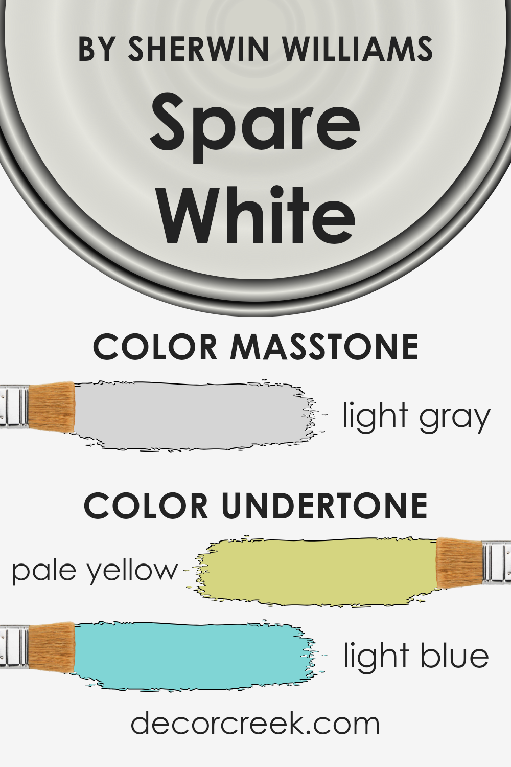
When we talk about Spare White by Sherwin Williams, it’s a unique shade that at first glance seems like a simple, clean white. However, what makes it special and stand out are its subtle undertones of pale yellow and light blue. These undertones aren’t immediately obvious, but they add depth and complexity to the color, influencing how it looks in different lighting and environments.
Undertones play a crucial role in the way we perceive color. They can warm up or cool down a shade, change how it pairs with other colors, and even affect the mood of a room. For Spare White, the pale yellow undertone adds a hint of warmth, making spaces feel more inviting and cozy. On the other hand, the light blue undertone brings in a fresh, calm vibe, making it versatile and adaptive to various styles and settings.
When used on interior walls, the effect of these undertones in Spare White becomes more apparent. Depending on the natural and artificial light the room receives, the walls can appear more delicately warm at times and slightly cool and refreshing at others. This duality makes Spare White an excellent choice for those looking to create a serene and welcoming space without going too stark or too warm. It’s particularly effective in rooms that aim for a balance between relaxation and subtle energy, giving the walls an almost chameleon-like ability to adapt and enhance the surrounding decor and mood.
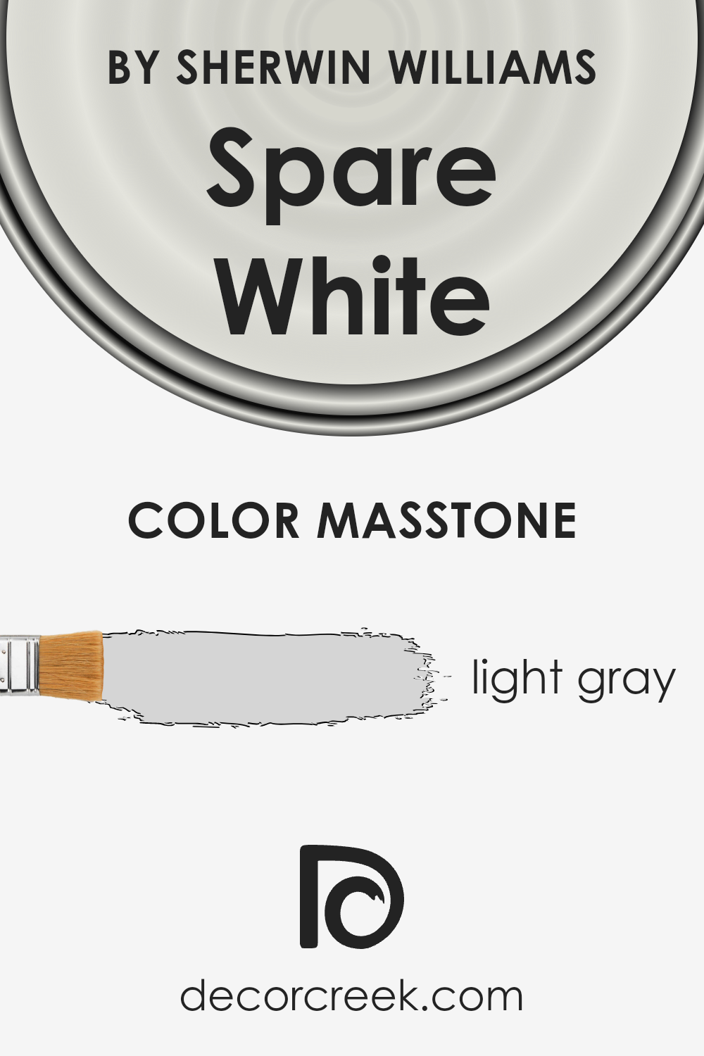
What is the Masstone of the Spare White SW 6203 by Sherwin Williams?
Spare White SW 6203 by Sherwin Williams, with its masstone of light gray (#D5D5D5), offers a versatile backdrop for home interiors. This soft, subtle shade of gray brings a fresh and airy feel to any space, making rooms appear brighter and more spacious. Because of its neutral tone, it effortlessly pairs with a wide range of colors, from bold and vibrant hues to soft pastels, allowing for endless decorating possibilities.
The light gray quality of Spare White helps in softening the overall look of a room, providing a calming and serene atmosphere that’s perfect for bedrooms and living areas.
Its neutral base also means it can adapt to various lighting conditions, subtly shifting in appearance to match the mood and time of day, which enhances the room’s ambiance without overpowering it with color.
In homes, this color is especially effective for creating a modern, minimalist aesthetic, acting as a clean canvas that highlights furniture and art pieces. Moreover, it serves as an excellent choice for small spaces, as its light-reflective properties can make rooms feel more open and less cramped.
How Does Lighting Affect Spare White SW 6203 by Sherwin Williams?
Lighting plays a major role in how we perceive colors, as it can significantly alter their appearance in a space. When it comes to interior design, understanding this dynamic is crucial for creating the desired atmosphere. A specific color, Spare White by Sherwin Williams, provides a great example of how different types of light can influence the perception of color.
- In artificial light, depending on the type of bulb used (warm or cool), the color can appear differently. Warm lights tend to bring out warmer tones in the color, making Spare White lean slightly towards a cozy, creamy hue. In contrast, cool artificial lighting can make it look crisper and cleaner, highlighting its subtle gray undertones.
- Natural light has a similar, yet distinct, impact on this color. Natural light varies throughout the day and depending on the direction your window faces, it can affect how Spare White looks. In north-faced rooms, which receive cooler, indirect light, Spare White may appear more as a true white, maintaining a neutral and steady appearance throughout the day. The limited light these rooms receive brings out the color’s inherent crisp and calm qualities.
- South-faced rooms bask in warm, direct sunlight for most of the day, making colors seem brighter and more vivid. Here, Spare White can adopt a slightly warmer tone, feeling fresh and inviting. The abundant light enhances its brightness, making the room feel open and airy.
- East-faced rooms enjoy bright light in the morning, with the color appearing lively and bright early in the day. As the day progresses and the natural light becomes softer, Spare White may adopt a more muted, serene quality, perfectly adapting from a vibrant morning to a calm afternoon.
- West-faced rooms receive strong evening light, which can cast a warm glow, making Spare White look softer and slightly more golden during sunset hours. During the morning, when the light is cooler, the color would maintain a more neutral stance, demonstrating its versatility.
Ultimately, the way Spare White transforms under different lighting conditions showcases its adaptable nature, making it a versatile choice for any space, playing with undertones and ambient lighting to achieve the perfect balance in your decor.
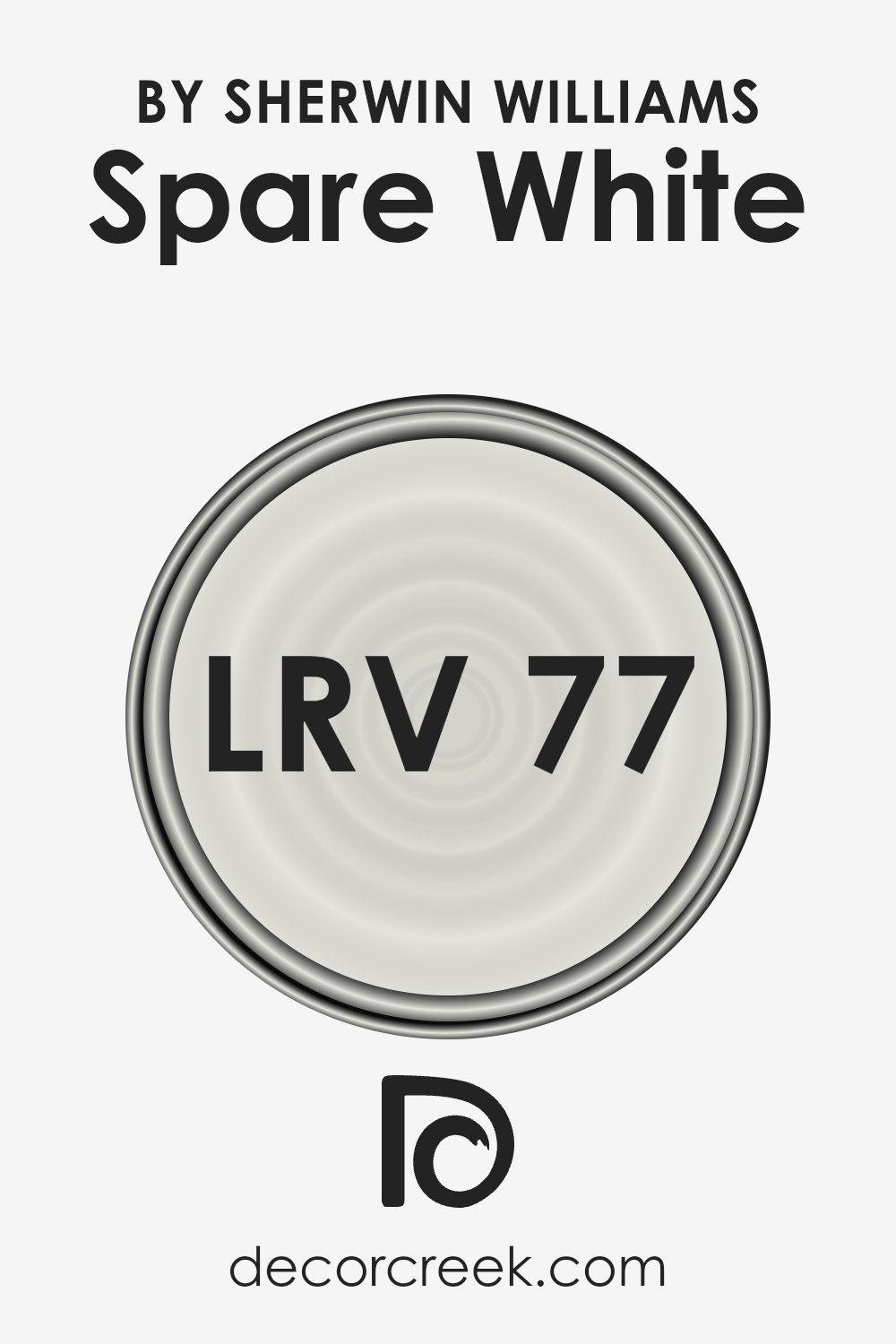
What is the LRV of Spare White SW 6203 by Sherwin Williams?
LRV stands for Light Reflectance Value, which is a measure of the amount of light a paint color reflects or absorbs. Think of it like this: LRV scale goes from 0 to 100, where 0 is pure black (absorbing all light) and 100 is pure white (reflecting all light). The higher the number, the more light that color reflects. This is super important when choosing paint for your rooms because it can really affect the feel of the space. Light colors can make a room feel more open and airy, while dark colors can make it feel more cozy or even smaller.
So, with an LRV of 77.307, Spare White by Sherwin Williams is on the lighter end of the scale, meaning it’s going to reflect a lot of light. In a room with a good amount of natural light, this color can help make the space feel bright and spacious. It’s a cool thing to think about because the amount of light a room gets can change how the color looks. In a very bright room, Spare White could look almost white, but in a room with less light, you might notice more of its subtle undertones. Remembering the LRV can help you predict how a color will look in your space before you commit.
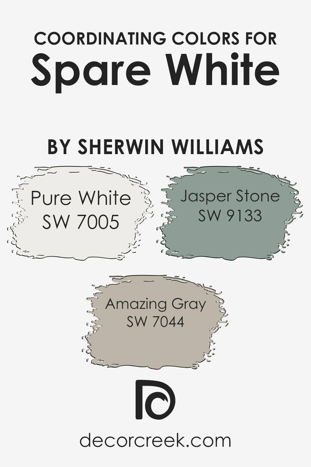
Coordinating Colors of Spare White SW 6203 by Sherwin Williams
Coordinating colors are hues that complement each other when used together in a space, creating a cohesive and visually appealing look. They can either be similar tones that blend harmoniously or contrasting shades that add dynamic interest. When working with a base color like Spare White from Sherwin Williams, choosing the right coordinating colors is key to achieving a balanced and beautiful design. Three such colors that work exceptionally well with Spare White are Pure White, Amazing Gray, and Jasper Stone, each bringing its own unique vibe to the mix.
Pure White is a clean and crisp color that pairs seamlessly with Spare White, adding a fresh brightness to any room without overwhelming it with starkness. Its subtle warmth makes it a versatile choice for trim, ceilings, or even as a main wall color in a minimalist design. Amazing Gray, on the other hand, is a soft, warm gray that offers a sophisticated contrast to Spare White.
Its versatility bridges the gap between light and dark, making it perfect for adding depth and interest to living spaces or bedrooms. Lastly, Jasper Stone is a strikingly rich color with earthy undertones that adds a touch of nature-inspired serenity.
This color works wonderfully as an accent, lending a grounded yet vibrant energy to spaces dominated by the lighter Spare White and its coordinating shades. Together, these colors create a palette that’s both inviting and effortlessly stylish, making it easier for homeowners to achieve a professional-looking design.
You can see recommended paint colors below:
- SW 7005 Pure White
- SW 7044 Amazing Gray
- SW 9133 Jasper Stone
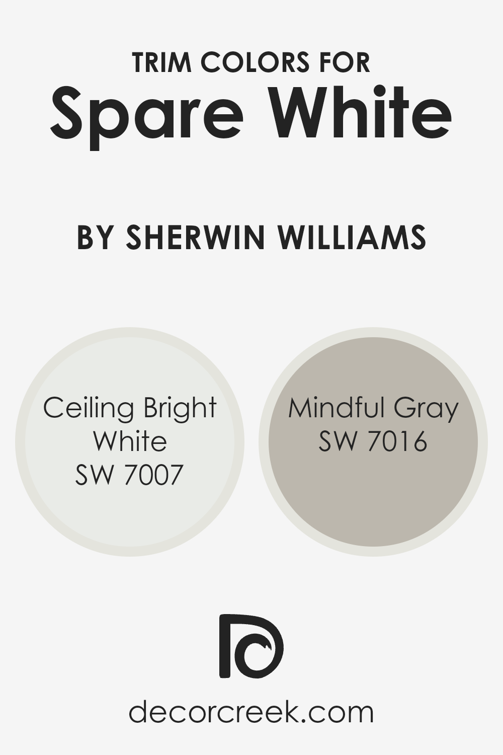
What are the Trim colors of Spare White SW 6203 by Sherwin Williams?
Trim colors serve a special role in painting and interior design by accentuating the architectural features and boundaries of a room, such as door frames, window sills, and baseboards. When paired with a primary wall color like Spare White by Sherwin Williams, the trim color can either make a subtle, harmonious statement or create a strong, contrasting look that highlights the room’s dimensions and design. Choosing the right trim color is crucial because it frames the wall color, influencing the overall ambiance and perceived size of the space. For Spare White, a crisp and clean shade, the choice of trim color can add depth and character to the room without overwhelming its light and airy feel.
Ceiling Bright White SW 7007 is a pristine and luminous shade that brings a sense of openness and light to any space. It’s particularly effective as a trim color alongside Spare White, as it accentuates the clean, fresh look of the walls without introducing a stark contrast, ensuring a seamless visual flow from wall to ceiling. Mindful Gray SW 7016, on the other hand, offers a softer, warmer approach. As a trim color, it provides a subtle contrast to Spare White, enriching the room with a sophisticated and earthy boundary that beautifully frames the walls. This balanced combination of Mindful Gray and Spare White can enhance the room’s dimensionality and warmth, making the space feel inviting and cohesive.
You can see recommended paint colors below:
- SW 7007 Ceiling Bright White
- SW 7016 Mindful Gray
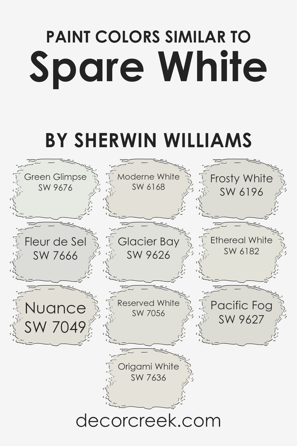
Colors Similar to Spare White SW 6203 by Sherwin Williams
Choosing similar colors to a base hue, such as Spare White by Sherwin Williams, can be an artful strategy in design. These similar shades offer subtle variations that enrich the visual experience, creating depth and harmony within a space. Similar colors work by closely aligning in tone or undertone with the original color, allowing for a cohesive yet varied aesthetic.
This approach can soften transitions between spaces, enhance architectural details, or simply provide a tranquil backdrop that’s dynamic yet understated.
- For instance, Green Glimpse adds a hint of freshness, reminiscent of early morning dew, subtly infusing life into spaces.
- Fleur de Sel, on the other hand, carries the essence of sea salt, offering a crisp, clean feel that’s both soothing and invigorating.
- Nuance bridges the gap between warmth and coolness, providing a balanced, neutral ground that’s inviting and adaptable.
- Origami White captures the soft glow of paper lanterns, providing a gentle brightness that uplifts without overwhelming.
- Moderne White hints at sophistication with its understated elegance, making rooms feel more spacious and refined.
- Glacier Bay brings a breath of cool air, echoing the serene beauty of its namesake, ideal for creating a calm oasis.
- Reserved White is unassuming yet powerful, creating a quiet space for thought and relaxation.
- Frosty White sparkles with a subtle shimmer, reminiscent of a light frost on a sunny morning, adding a crisp clarity.
- Ethereal White offers a soft, dreamlike quality that enhances the sense of openness and light.
- Lastly, Pacific Fog envelops rooms in a muted, misty ambiance, perfect for those seeking solace and a moment of peace in their surroundings.
Together, these colors weave a delicate tapestry, enhancing the beauty and versatility of any design palette.
You can see recommended paint colors below:
- SW 9676 Green Glimpse
- SW 7666 Fleur de Sel
- SW 7049 Nuance
- SW 7636 Origami White
- SW 6168 Moderne White
- SW 9626 Glacier Bay
- SW 7056 Reserved White
- SW 6196 Frosty White
- SW 6182 Ethereal White
- SW 9627 Pacific Fog
How to Use Spare White SW 6203 by Sherwin Williams In Your Home?
Spare White by Sherwin Williams is a fantastic paint choice for those looking to brighten up their home with a fresh, clean look. This shade of white has a slight cool undertone that makes it perfect for creating a serene and airy atmosphere in any room. Whether you’re giving your living room a makeover or freshening up your kitchen, Spare White adds that subtle touch of elegance without overwhelming the space.
One of the best ways to use this color is in rooms that get plenty of natural light, where it can enhance the sense of openness and purity. It’s also an excellent choice for small spaces, making them appear larger and more inviting. Pairing Spare White with colorful decor or vibrant artwork allows the pieces to stand out, making the walls themselves a backdrop that complements everything else in the room.
For those interested in a minimalist aesthetic, Spare White works wonders. It aligns perfectly with a simplistic design, providing a clean canvas that highlights modern furniture and natural wood accents. In bedrooms, it contributes to a peaceful environment, ideal for relaxation and rest.
Overall, Spare White is a versatile and beautiful choice for anyone looking to refresh their home’s look with a touch of simplicity and sophistication.
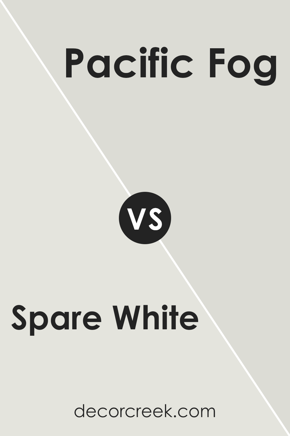
Spare White SW 6203 by Sherwin Williams vs Pacific Fog SW 9627 by Sherwin Williams
Spare White and Pacific Fog are two colors by Sherin Williams that have their own unique vibes. Spare White is a soft, light shade with a subtle hint of warmth, making it perfect for creating a bright and airy space. It’s like a gentle whisper, bringing a clean and unfussy look wherever it’s used. On the other hand, Pacific Fog offers a deeper, more muted tone. It’s a kind of gray that carries a hint of blue – think of it as the color of the sea on a cloudy day. While Spare White opens up a room with its lightness, Pacific Fog brings a sense of calm and sophistication, offering a bit more depth and character. These two colors could work beautifully together, with Spare White brightening up a space and Pacific Fog adding a touch of grounding sophistication.
You can see recommended paint color below:
- SW 9627 Pacific Fog
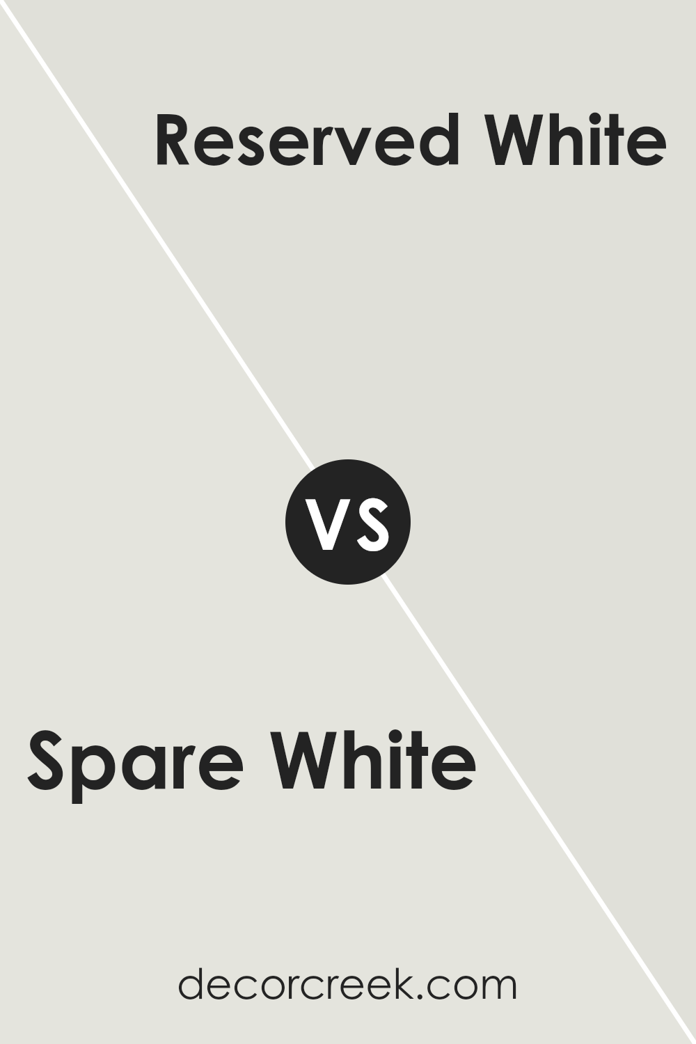
Spare White SW 6203 by Sherwin Williams vs Reserved White SW 7056 by Sherwin Williams
Both Spare White and Reserved White are popular choices from Sherwin Williams, but they offer subtle differences that can affect the overall look of a room. Spare White has a soft, warm undertone that makes it versatile for spaces seeking a cozy yet bright feel. It’s perfect for living areas and bedrooms where comfort is key. On the other hand, Reserved White leans towards a cooler tone, giving it a slightly more modern and crisp appearance.
This color works well in kitchens, bathrooms, or any space that benefits from a clean, fresh vibe. When choosing between these two, consider the lighting in your room and the mood you want to create. Spare White’s warmth adds a gentle, inviting touch, while Reserved White’s cooler hue brings a sleek and refined atmosphere.
You can see recommended paint color below:
- SW 7056 Reserved White
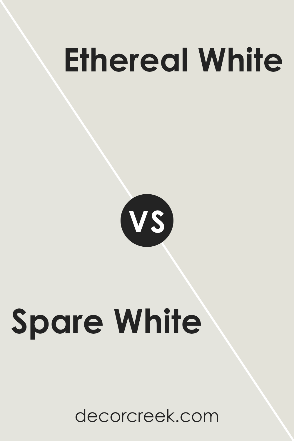
Spare White SW 6203 by Sherwin Williams vs Ethereal White SW 6182 by Sherwin Williams
Looking at Spare White and Ethereal White from Sherwin Williams, you’ll notice some subtle differences. Spare White is a soft, warm white with a hint of gray, making it versatile for various spaces. It’s like a cozy blanket on a chilly day, providing a soft backdrop that’s calming and welcoming. On the other hand, Ethereal White takes a slightly different approach. It leans towards a cooler, almost airy feel, reminding one of a gentle breeze through sheer curtains.
This color gives a fresher, crisper appearance, ideal for creating a serene, peaceful environment. When comparing these two, think of Spare White as a warm, gentle hug, while Ethereal White is like taking a deep breath of fresh, cool air. Both are excellent choices, but your preference might depend on the atmosphere you’re aiming to create—cozy and snug versus fresh and serene.
You can see recommended paint color below:
- SW 6182 Ethereal White
Spare White SW 6203 by Sherwin Williams vs Frosty White SW 6196 by Sherwin Williams
Spare White by Sherwin-Williams is a subtle, warm white that offers a cozy and inviting feel to any space it’s used in. It has a hint of warmth that makes it perfect for creating a serene and harmonious environment. On the other hand, Frosty White is another option from Sherwin-Williams, but this one leans more towards a cooler tone, resembling the crispness of fresh snow. This makes it fantastic for achieving a clean, sharp look in a room.
While both colors come from the same family of whites, their underlying tones set them apart. Spare White brings warmth and a soft, welcoming atmosphere, making it ideal for living areas or bedrooms. Frosty White, with its cooler undertone, is great for areas that benefit from a bright, refreshing vibe, like bathrooms or modern kitchens. In essence, your choice between these two depends on the mood and aesthetic you’re aiming to achieve in your space.
You can see recommended paint color below:
- SW 6196 Frosty White
Spare White SW 6203 by Sherwin Williams vs Moderne White SW 6168 by Sherwin Williams
Spare White and Moderne White by Sherwin Williams are two subtle yet distinct shades. Spare White has a soft, warm undertone that creates a welcoming feel in any space. It’s perfect for those looking to add a touch of coziness without overwhelming the room with color. On the other hand, Moderne White leans slightly more towards a neutral palette, offering a clean and contemporary vibe.
This color is great for achieving a modern look, providing a fresh backdrop that complements various decor styles. While both colors are versatile, Spare White might be better suited for creating a snug, intimate atmosphere, whereas Moderne White is ideal for those who prefer a crisp, minimalist aesthetic.
Choosing between them depends on the mood you want to set in your space; both offer a unique foundation that can enhance your home’s overall appeal.
You can see recommended paint color below:
- SW 6168 Moderne White
Spare White SW 6203 by Sherwin Williams vs Origami White SW 7636 by Sherwin Williams
Spare White and Origami White are two colors by Sherwin Williams that bring their unique touch to spaces. While both colors can be categorized under the banner of white, they have distinct characteristics. Spare White tends to have a soft, soothing feel, making rooms feel airy and relaxed. It’s the type of white that blends seamlessly into the background, providing a subtle canvas without overwhelming the space.
On the other hand, Origami White carries a slightly warmer tone. This warmth adds a gentle, inviting ambiance to interiors, making it perfect for creating cozy environments. It’s especially great in rooms that crave a hint of comfort without deviating too far from a neutral palette.
When comparing these two, the main difference lies in their undertones and the warmth each brings to the table. Spare White offers a cleaner, crisper feel, ideal for modern and minimalist designs. Origami White, with its warm undertones, is better suited for spaces where a welcoming, homely atmosphere is desired. Both are versatile, but the choice between them depends on the mood you want to set in your space.
You can see recommended paint color below:
Spare White SW 6203 by Sherwin Williams vs Green Glimpse SW 9676 by Sherwin Williams
Spare White and Green Glimpse are two distinct colors by Sherwin Williams, offering unique vibes for any space. Spare White, a light and airy hue, brings a sense of calm and simplicity. It’s perfect for creating a clean, minimalistic look, making spaces feel more open and bright. This color works well in almost any room, providing a fresh backdrop that can match with various decor styles.
On the other hand, Green Glimpse offers a touch of nature with its subtle green tone. This color adds a gentle pop of color to your walls without overwhelming the space. It’s ideal for bringing in a bit of the outdoors, creating a soothing and rejuvenating atmosphere. Green Glimpse can pair nicely with natural elements and materials, enhancing a room’s warmth and coziness.
When comparing the two, Spare White offers a neutral canvas, potentially making a room appear larger, while Green Glimpse introduces a soft, earthy element, adding character and a sense of relaxation. Choose Spare White for a timeless look, or opt for Green Glimpse to make a space feel more grounded and connected with nature.
You can see recommended paint color below:
- SW 9676 Green Glimpse
Spare White SW 6203 by Sherwin Williams vs Nuance SW 7049 by Sherwin Williams
Spare White and Nuance, both by Sherwin Williams, are two beautiful, subtle paint colors that might seem similar at first glance but have their own unique characteristics. Spare White is a light, airy color that brings a fresh and clean look to any room. It has a slightly cool undertone, making it perfect for creating a serene and tranquil space. It’s like a breath of fresh air in your home, brightening up spaces without overwhelming them with color.
On the other hand, Nuance is a bit warmer and richer. It’s a soft, neutral gray that adds a touch of sophistication and depth. It’s the kind of color that works well in almost any setting, providing a solid yet unobtrusive backdrop for your decor. It’s great for those who want a bit of warmth in their spaces without going too dark or too light.
Though both colors are neutral, Spare White tends to lean towards a cooler, crisper look while Nuance brings warmth and coziness. Choosing between them depends on the atmosphere you’re aiming to create. Spare White is ideal for a sleek, modern feel, while Nuance is perfect for a cozy, inviting space.
You can see recommended paint color below:
- SW 7049 Nuance
Spare White SW 6203 by Sherwin Williams vs Glacier Bay SW 9626 by Sherwin Williams
Spare White and Glacier Bay, both by Sherwin Williams, are two unique shades with their own character. Spare White is a light, subtle color that can be described as a gentle white with a hint of warmth. It’s the kind of color you might choose for a peaceful and calm space, as it provides a soft backdrop that’s easy on the eyes. Think of it as a quiet base that allows other elements in the room to stand out.
On the other hand, Glacier Bay is much more distinct. It’s a fresh, cool tone that can remind you of the ocean on a clear day. This color brings a vibrant, yet soothing energy into a room. It has the power to transform a space into a serene retreat, perfect for those who love a touch of nature inside their home.
While Spare White offers a whisper of warmth and understated elegance, Glacier Sea introduces a refreshing and lively ambiance. Both colors stand beautifully on their own but cater to different aesthetic preferences and moods within a space.
You can see recommended paint color below:
- SW 9626 Glacier Bay
Spare White SW 6203 by Sherwin Williams vs Fleur de Sel SW 7666 by Sherwin Williams
Comparing Spare White and Fleur de Sel, both from Sherwin-Williams, offers an interesting look at subtle differences in neutral tones. Spare White is a soft, warm white with a slight touch of gray. This color is perfect for creating a cozy and inviting space without feeling too stark or cold. It’s an ideal backdrop for various decor styles, offering a gentle warmth to rooms that need a bit of lightening up.
On the other hand, Fleur de Sel steps into the realm with a cooler vibe. It’s a light gray with a hint of blue undertones, giving it a fresher, crisper look compared to Spare White. This color leans more towards a classic, timeless feel, making it great for modern and minimalistic spaces. It’s especially good in areas where you want to promote calm and tranquility.
Both colors are quite flexible and can beautifully complement different materials and textures. Whether you’re going for a warm, welcoming look with Spare White or a more refined, serene atmosphere with Fleur de Sel, both options offer unique benefits to transform your space.
You can see recommended paint color below:
- SW 7666 Fleur de Sel
Conclusion
In summary, the paint color Spare White, offered by Sherwin Williams, stands out as a versatile and appealing option for homeowners looking to refresh their living spaces. This particular shade of white is known for its ability to brighten rooms while also providing a subtle warmth that ensures spaces don’t feel stark or cold. Its adaptable nature makes it suitable for various settings, from living rooms and kitchens to bedrooms, allowing for a cohesive and inviting aesthetic throughout the home.
Moreover, Spare White’s understated elegance allows it to pair beautifully with a wide range of decor styles and color palettes. Whether used as a primary wall color or as an accent to complement bolder hues, it creates a clean and calming backdrop that enhances the overall ambiance of a space. Its popularity among homeowners and interior designers alike can be attributed to its balance of warmth and brightness, making Spare White a go-to choice for those seeking a fresh and modern update to their interiors.
Ever wished paint sampling was as easy as sticking a sticker? Guess what? Now it is! Discover Samplize's unique Peel & Stick samples.
Get paint samples

