If you’re thinking about giving your space a fresh, sunny upgrade, you might want to check out SW 6680 Friendly Yellow by Sherwin Williams. As a cheerful and vibrant shade, Friendly Yellow has the power to make any room feel more welcoming and lively. It’s perfect for areas where you spend a lot of time with family or entertain guests, as it brings a warm and inviting atmosphere.
Painting your walls with Friendly Yellow can help brighten up a dim space or bring a sense of joy to a room that feels too neutral. It’s not just any yellow; it has a softness that makes it easy to blend with other colors and decor styles.
Whether you’re looking to spruce up your living room, kitchen, or maybe a child’s playroom, this shade could be the perfect pick.
I’ve found that pairing it with whites or soft grays creates a balanced look, while combining it with bold colors like navy or hunter green can make it really pop.
If you’re on the hunt for a color that feels both fresh and comforting, Friendly Yellow is definitely worth considering.
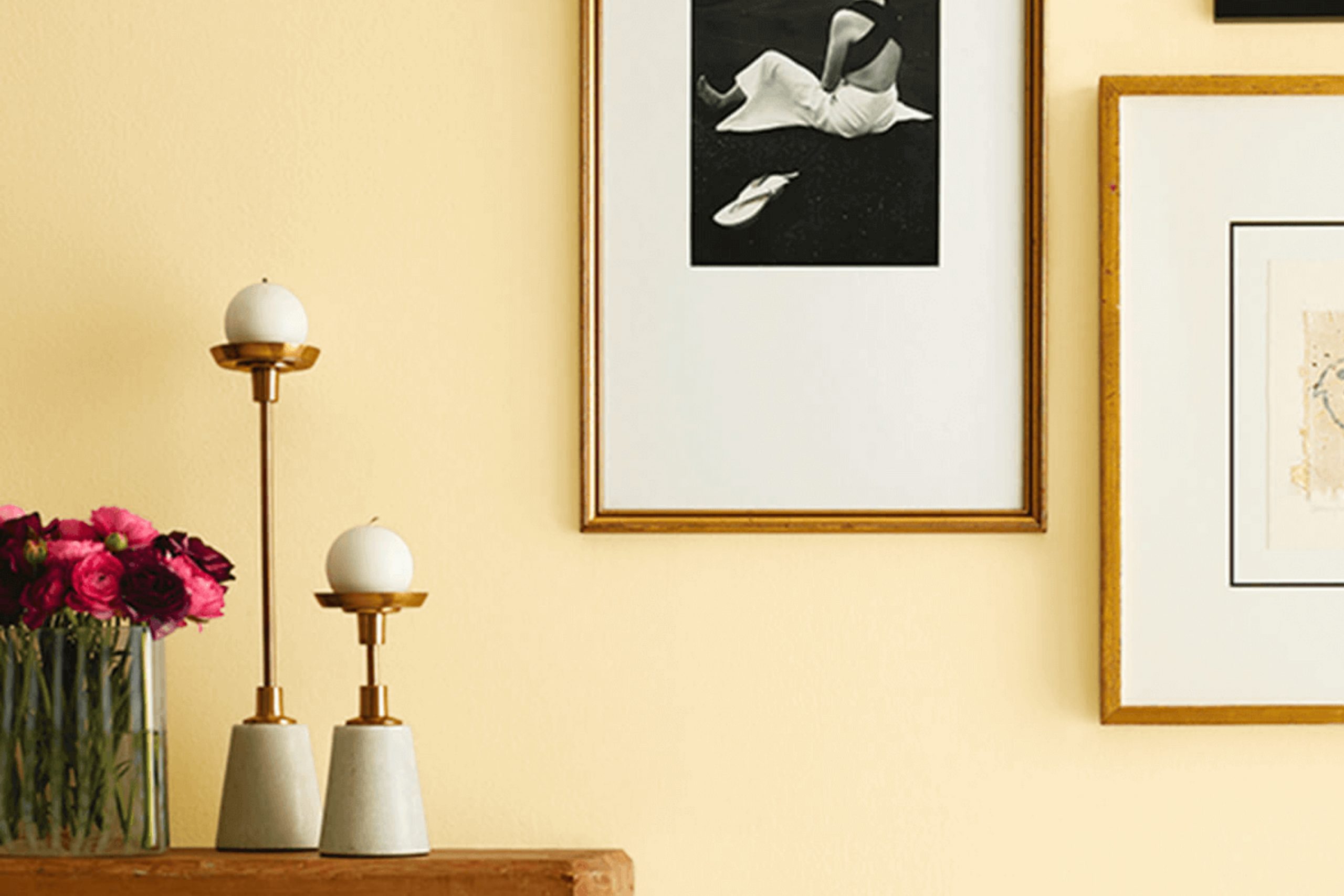
What Color Is Friendly Yellow SW 6680 by Sherwin Williams?
Friendly Yellow by Sherwin Williams is a vibrant and cheerful hue that brings a burst of sunshine into any space. This warm color has a bright, inviting tone that makes it perfect for creating a cozy, welcoming atmosphere. It works especially well in kitchens and living rooms where its energizing quality stimulates conversation and liveliness.
Given its warmth, Friendly Yellow pairs beautifully with natural materials like light woods, which enhance its cozy feel. Think of pine or oak furniture that shares the same warm undertones.
Textiles also play a big role in balancing this vivid color; materials like soft cotton or linen in neutral shades like white, beige, or soft gray can soften the intensity of the yellow, creating a pleasant contrast. Adding elements with subtle, earthy textures like wicker or rattan can also blend harmoniously with this hue, fostering a relaxed, homely vibe.
This color suits various interior styles but shines particularly well in country, rustic, or Scandinavian-inspired decors due to its cheerful and pastoral appeal. In these styles, its ability to act as a backdrop for natural elements and simple, clean lines stands out, making any room feel more lively and inviting.
A backdrop of Friendly Yellow in a more traditional space can also offer a fresh twist, proving that this color is both versatile and timeless.
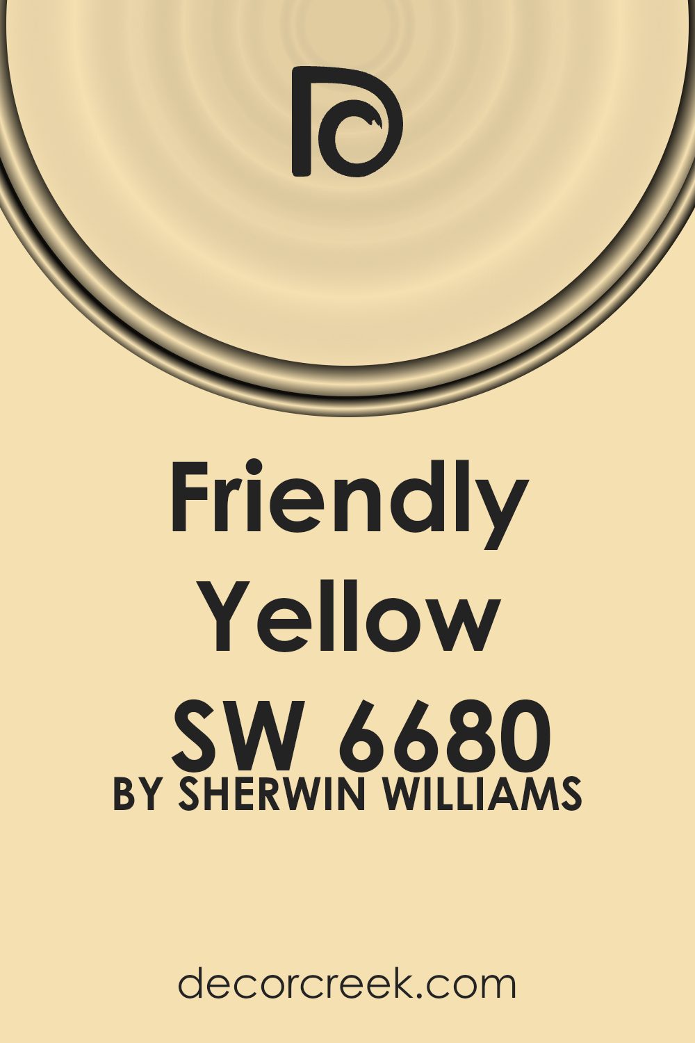
Is Friendly Yellow SW 6680 by Sherwin Williams Warm or Cool color?
Friendly Yellow by Sherwin Williams is a bright and cheerful color that brings a warm, sunny vibe to any room. It’s like having a little bit of sunshine indoors, which can greatly lift moods and brighten up spaces. This shade of yellow works well in kitchens or dining areas where you want to create a welcoming and lively atmosphere. It’s also perfect for playrooms or creative spaces, as the vibrancy can fuel energy and creativity.
When used in small rooms, Friendly Yellow can make the space feel larger and more open. However, it’s important to balance this vivid yellow with softer tones or neutral colors to ensure it doesn’t overpower the room.
Accessories in gray, white, or light wood tones can help achieve a balanced look. Overall, Friendly Yellow offers a refreshing change from more traditional neutrals and can make your home feel more vibrant and energetic.
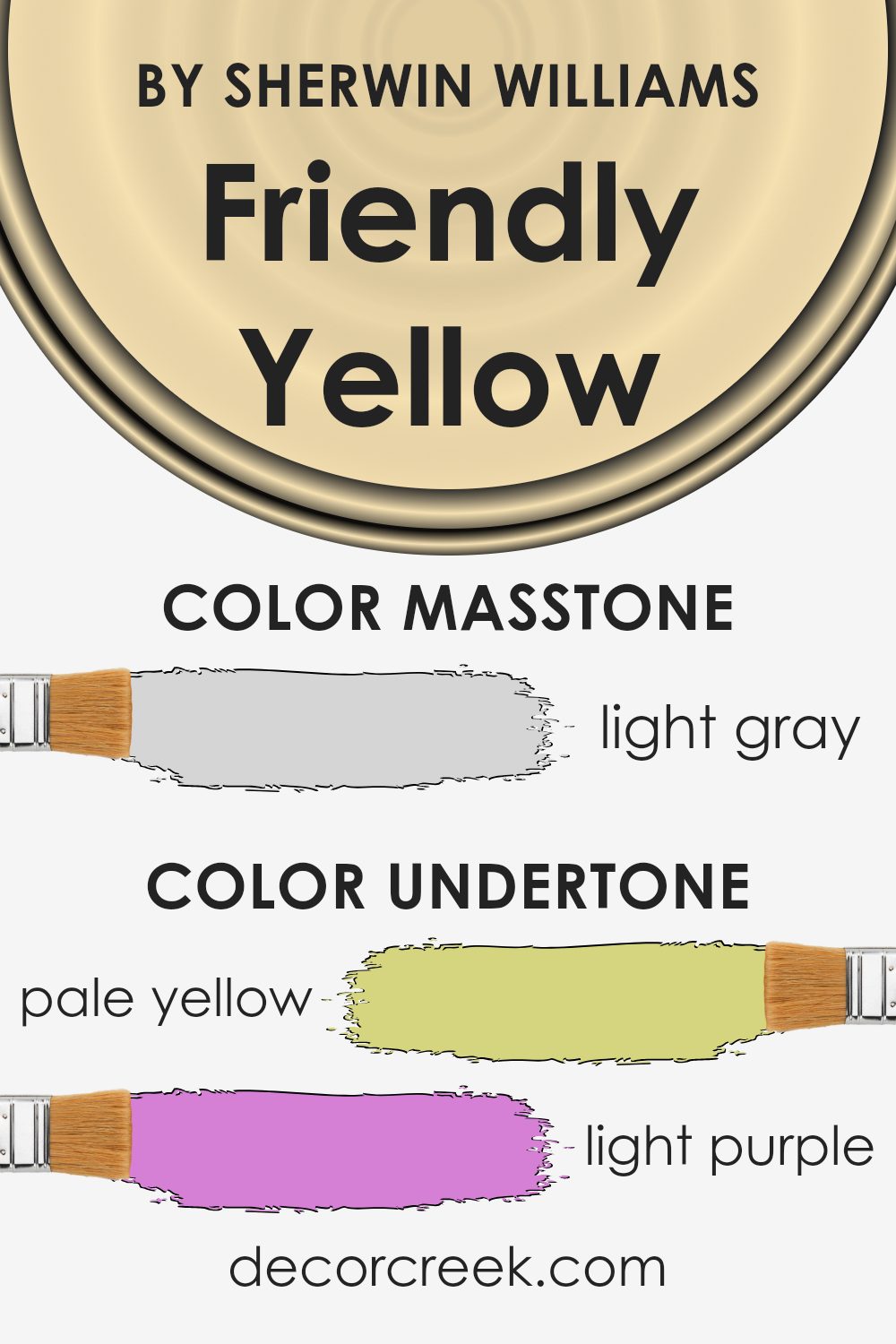
Undertones of Friendly Yellow SW 6680 by Sherwin Williams
Friendly Yellow SW 6680 by Sherwin Williams is a vibrant paint color that brings a cheerful and welcoming vibe to any room. The undertones of a color are subtle hints of other colors that can be noticed when the paint is affected by different lighting conditions or when placed next to contrasting colors.
These undertones can significantly influence the way we perceive the main color.
This specific shade of yellow has various undertones including pale yellow, light purple, pale pink, light blue, mint, lilac, and grey. Each undertone plays a role in how Friendly Yellow is viewed under various lighting situations. For example, in a room with a lot of natural light, the pale yellow undertone might become more prominent, making the walls feel sunnier and more invigorating.
In contrast, in lower light, the grey undertone could appear more dominant, giving the color a more muted and calm appearance.
The variety of undertones makes Friendly Yellow a versatile color for interior walls. It can harmonize with many decor styles and color schemes. For instance, the pale pink and lilac undertones could add a subtle warmth to a room with soft, neutral furnishings, while the mint and light blue undertones might complement a space with cooler tones or metallic accents.
In essence, these undertones allow Friendly Yellow to adapt to the room’s mood, making it a smart choice for creating an inviting atmosphere.
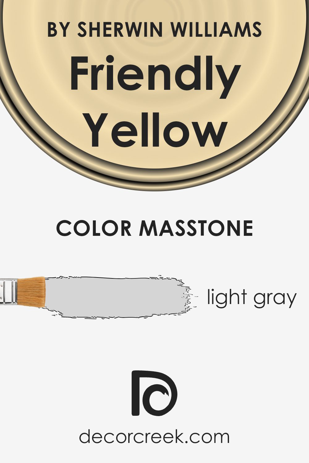
What is the Masstone of the Friendly Yellow SW 6680 by Sherwin Williams?
Friendly Yellow SW 6680 by Sherwin Williams has a masstone of Light Gray (#D5D5D5). This light gray undertone makes the color softer and more adaptable in various home settings.
Even though the name suggests a bold yellow, the gray masstone tones it down, allowing it to work well in spaces without overwhelming them. This subtlety makes it an excellent choice for rooms where you want a hint of cheerfulness but not the intensity that a brighter yellow might bring. Its lightness brings a fresh and airy feel to spaces, making rooms feel more open and larger.
Furthermore, this color pairs nicely with a wide range of decor styles and other colors, adding a touch of warmth without clashing or overpowering other elements in the room.
Whether used on an accent wall or throughout a room, Friendly Yellow with its light gray masstone offers a gentle way to incorporate color into your home.
How Does Lighting Affect Friendly Yellow SW 6680 by Sherwin Williams?
Lighting plays a crucial role in how colors appear in any space. It can change the perception of a color from one moment to the next, purely based on the light source. For instance, Friendly Yellow by Sherwin Williams will have different undertones and brightness levels depending on whether it’s under natural or artificial light.
In natural light, the truest color of paint usually comes out. Friendly Yellow tends to look bright and very cheerful when sunlight hits it, particularly in rooms facing south or west where sunlight is abundant throughout the day.
South-facing rooms benefit from high levels of bright, warm light, which can make this yellow appear more vivid and lively. West-facing rooms, which get the evening sun, will show off a cozy and warm feel of this color towards the evening, keeping the space bright in dimmer lighting.
For north-facing rooms, the light is cooler and more shadow-prone, which can make Friendly Yellow look more subdued and slightly muted. The lack of direct sunlight can draw out the cooler undertones in the yellow, making it appear less vibrant.
Similarly, in east-facing rooms that primarily receive morning light, this yellow will appear bright and sunny in the morning, and become softer as the day progresses and the natural light diminishes.
Artificial lighting, on the other hand, varies greatly with the type of bulbs used. Warm lights, such as yellow or white bulbs, tend to enhance the warmth of Friendly Yellow, making it appear more inviting and cozy.
Cool white lights, like fluorescent bulbs, might make it look sharper and more vibrant, but could also bring out any greenish undertones.
The setting and the type of light can truly affect how Friendly Yellow is perceived, making it a versatile color that can shift dramatically from room to room and from day to night. When choosing colors, always consider how lighting will interact with them to fully achieve the desired effect in your space.
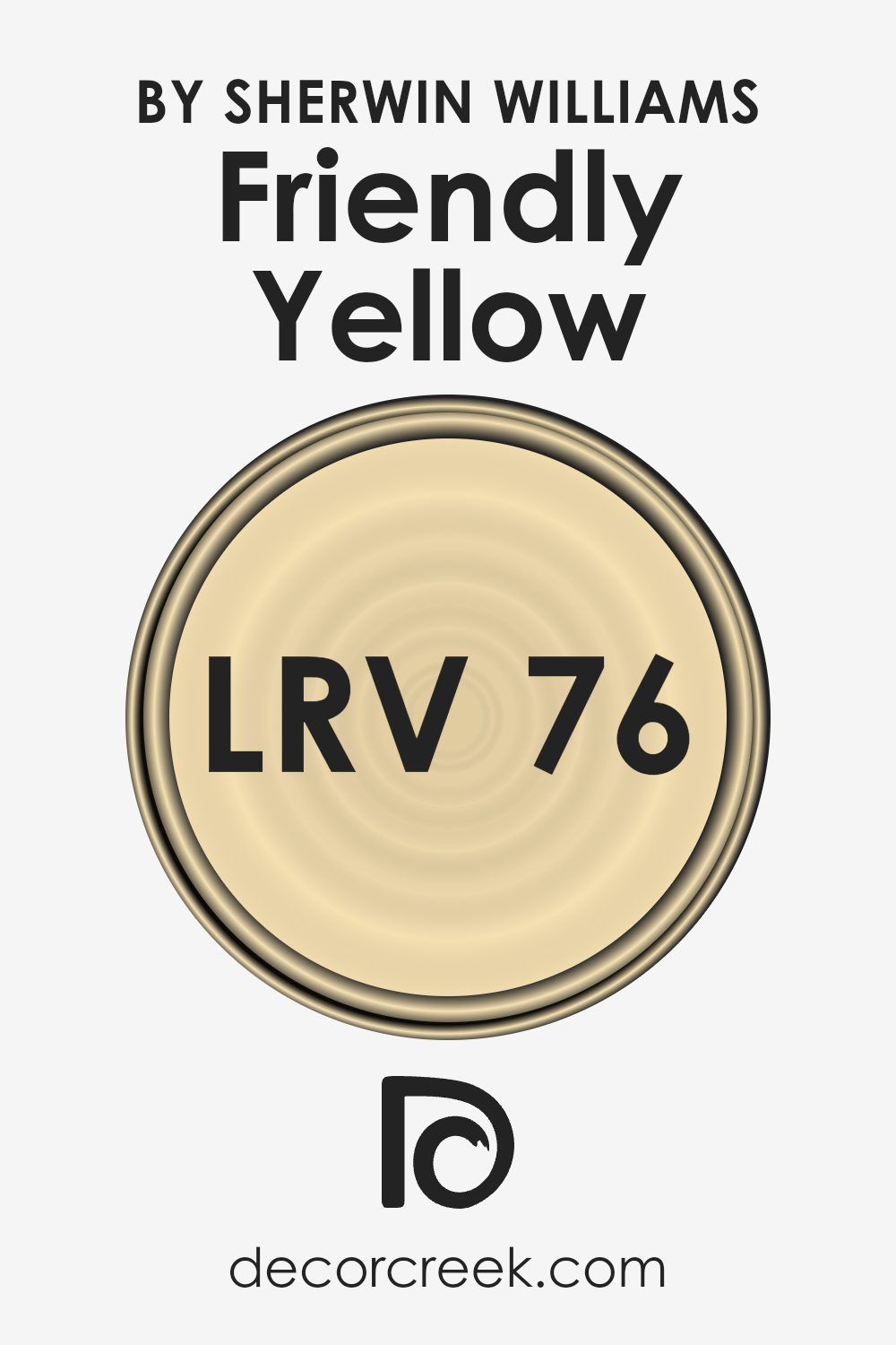
What is the LRV of Friendly Yellow SW 6680 by Sherwin Williams?
LRV stands for Light Reflectance Value, a measure used to indicate the amount of visible and usable light that a paint color reflects or absorbs when it’s applied to walls. Essentially, LRV ranges from 1 (representing colors that absorb most light) to 99 (indicating colors that reflect most of the light they receive). A higher LRV means the color is lighter and reflects more light, making spaces appear brighter.
On the other hand, colors with lower LRV can make a room feel smaller or darker as they absorb more light.
For the color with an LRV of 75.97, like the yellow shade in question, it reflects a significant amount of light, contributing to a bright and airy feel in any room. This particular value is quite high, which means that when used on walls, the color will help to illuminate the space, making it look larger and more open.
The light yellow hue not often only adds a cheerful touch but also maximizes the luminosity of the area, especially beneficial in rooms that receive less natural sunlight.
Coordinating Colors of Friendly Yellow SW 6680 by Sherwin Williams
Coordinating colors are shades that complement each other and help in creating a visually harmonious space. These colors enhance each other when used together, making each one appear more vibrant without clashing.
One main color can really pop when surrounded by coordinating colors that are carefully chosen to support the theme or atmosphere you want to achieve in your room.
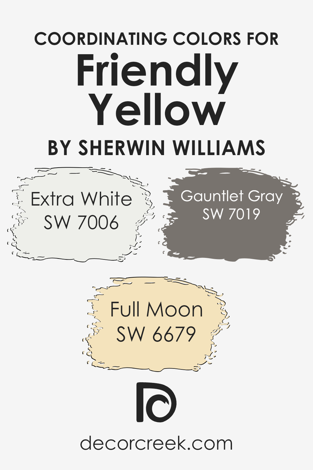
Friendly Yellow by Sherwin Williams, a sunny and vibrant shade, pairs beautifully with Extra White, Full Moon, and Gauntlet Gray. Extra White is a crisp, clean white that provides a fresh contrast, making any space feel more open and airy. This makes it perfect for trims, ceilings, and even as a balance on walls to ensure the yellow stands out just right. Full Moon, a soft, pale yellow, works subtly with our main yellow by amplifying the brightness of the room without overwhelming it with too much color. Lastly, Gauntlet Gray offers a strong anchor as a deeper, neutral shade. This gray is versatile, providing a stylish balance that grounds the brighter yellows, ensuring the overall look is cohesive yet striking.
You can see recommended paint colors below:
- SW 7006 Extra White (CHECK A SAMPLE)
- SW 6679 Full Moon (CHECK A SAMPLE)
- SW 7019 Gauntlet Gray (CHECK A SAMPLE)
What are the Trim colors of Friendly Yellow SW 6680 by Sherwin Williams?
Trim colors play an essential role in defining and accentuating the architectural details of a home, offering a contrast or complement to the main wall color. For instance, when using a vibrant shade like Friendly Yellow by Sherwin Williams, choosing the right trim colors can enhance the overall aesthetic appeal of the space.
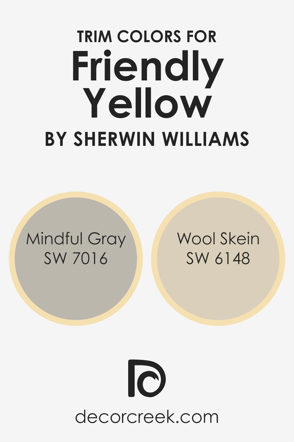
Mindful Gray and Wool Skein are excellent choices for trims as they both offer subtle nuances that can balance the brightness of Friendly Yellow without overwhelming it.
Mindful Gray is a neutral gray that carries a gentle warmth, making it versatile for pairing with brighter hues such as Friendly Yellow. It acts as a grounding element, providing a soft but distinct boundary against the more vivid primary color.
On the other hand, Wool Skein is a softer shade with undertones of beige, contributing a natural, light contrast that enriches the yellow with a discreet and harmonious border.
Both colors offer an opportunity to create a pleasing and welcoming space when used as trim options for Friendly Yellow.
You can see recommended paint colors below:
- SW 7016 Mindful Gray (CHECK A SAMPLE)
- SW 6148 Wool Skein (CHECK A SAMPLE)
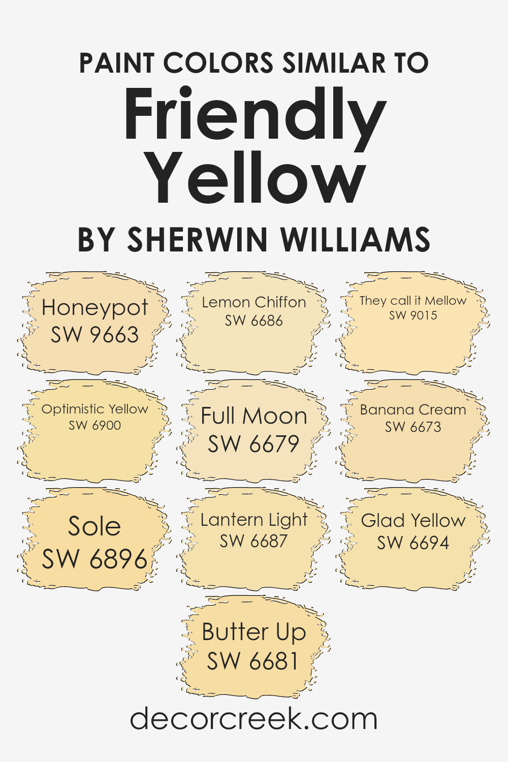
Colors Similar to Friendly Yellow SW 6680 by Sherwin Williams
Using similar colors in decorating your space can create a harmonious and visually appealing environment. These colors often share common hues but differ slightly in intensity and brightness, providing a cohesive yet dynamic look.
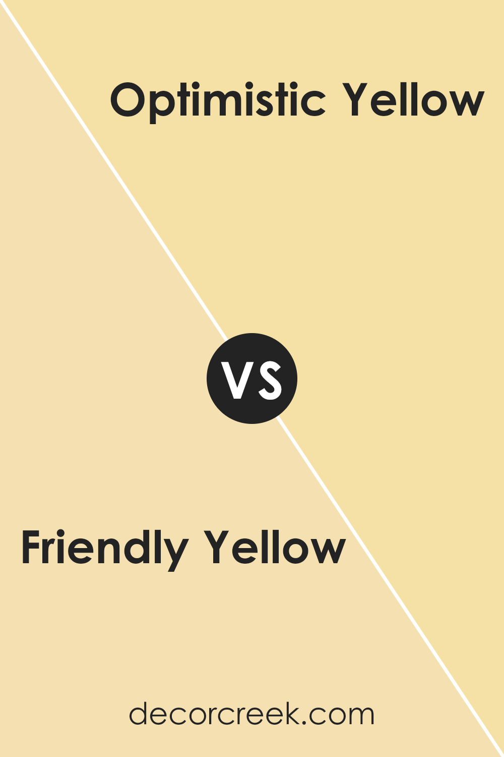
For instance, SW 9663 – Honeypot is a warmer hue that brings a cozy, welcoming vibe to spaces while SW 6900 – Optimistic Yellow is vibrant and energizing, ideal for adding a pop of cheer.
SW 6896 – Sole has a sun-kissed quality that radiates warmth, suitable for areas that benefit from a bright, uplifting atmosphere. Meanwhile, SW 6681 – Butter Up is smoother and creamier, perfect for a soft and soothing presence in a room.
SW 6686 – Lemon Chiffon lends a subtle, refreshing touch with its light and airy feel. SW 6679 – Full Moon offers a muted yellow, soft enough to act as a neutral yet with enough warmth to keep the space lively. SW 6687 – Lantern Light is more intense and can energize a room instantly.
SW 9015 – They call it Mellow provides a relaxed, light-hearted feel, which is great for casual living spaces. SW 6673 – Banana Cream is gentle and unobtrusive, making it an excellent choice for creating a calm setting. Lastly, SW 6694 – Glad Yellow is cheerful and bright, perfect for areas in the home where positivity is welcomed. Each of these shades supports an inviting atmosphere, making them great choices to pair or highlight against a primary yellow like Friendly Yellow.
You can see recommended paint colors below:
- SW 9663 Honeypot (CHECK A SAMPLE)
- SW 6900 Optimistic Yellow (CHECK A SAMPLE)
- SW 6896 Sole (CHECK A SAMPLE)
- SW 6681 Butter Up (CHECK A SAMPLE)
- SW 6686 Lemon Chiffon (CHECK A SAMPLE)
- SW 6679 Full Moon (CHECK A SAMPLE)
- SW 6687 Lantern Light (CHECK A SAMPLE)
- SW 9015 They call it Mellow (CHECK A SAMPLE)
- SW 6673 Banana Cream (CHECK A SAMPLE)
- SW 6694 Glad Yellow (CHECK A SAMPLE)
Colors that Go With Friendly Yellow SW 6680 by Sherwin Williams
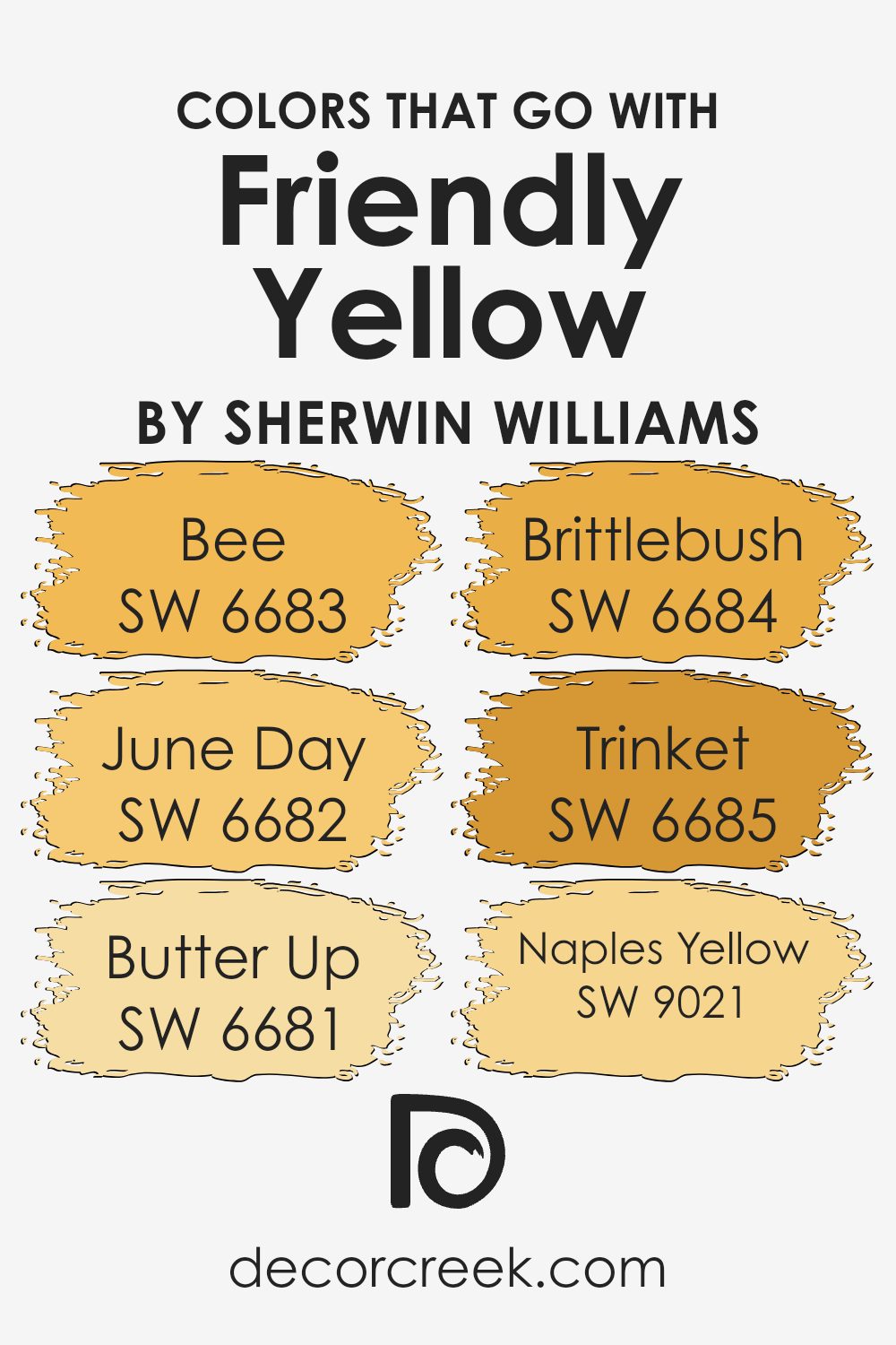
Choosing the right colors to complement Friendly Yellow SW 6680 by Sherwin-Williams is crucial because they can either enhance or soften this vibrant, cheerful shade, depending on the ambiance you’re aiming for in a room.
Friendly Yellow is a bright and inviting color, perfect for creating a warm, welcoming atmosphere. When paired with harmonious colors, it creates spaces that are lively yet balanced, enhancing the aesthetic appeal and mood of any room.
For instance, pairing it with related shades like Bee SW 6683, which is a deeper, slightly muted yellow, adds depth and richness to the décor. June Day SW 6682 offers a soft, creamy yellow that contrasts subtly with Friendly Yellow, providing a gentle blend that is easy on the eyes and perfect for more relaxed spaces.
Butter Up SW 6681 is another great companion, providing a light, almost pastel yellow that brings a sense of softness and lightness to the environment. This can be particularly appealing in smaller spaces or areas with limited natural light. Brittlebush SW 6684 adds a hint of earthy yellow tones that work well with natural materials like wood or linen, enhancing a room with a touch of nature-inspired color.
For something with a bit more shimmer, Trinket SW 6685 is an ideal choice, as it introduces a subtle gold that pairs beautifully with the sunny tones of Friendly Yellow, perfect for adding a slight sparkle.
Lastly, Naples Yellow SW 9021 rounds out the options with its rich, ochre-like hue that can create a more traditional vibe, great for elegant spaces or achieving a more classic look.
By using these coordinating colors, you can achieve a cohesive and visually pleasing environment that feels both comfortable and stylish.
You can see recommended paint colors below:
- SW 6683 Bee (CHECK A SAMPLE)
- SW 6682 June Day (CHECK A SAMPLE)
- SW 6681 Butter Up (CHECK A SAMPLE)
- SW 6684 Brittlebush (CHECK A SAMPLE)
- SW 6685 Trinket (CHECK A SAMPLE)
- SW 9021 Naples Yellow (CHECK A SAMPLE)
How to Use Friendly Yellow SW 6680 by Sherwin Williams In Your Home?
Friendly Yellow by Sherwin Williams is a warm and cheerful color that brings a sunny vibe to any space in the house. This shade of yellow is perfect for creating a welcoming atmosphere in living rooms or kitchens. It pairs well with white trim and cabinets for a fresh and clean look. In a child’s bedroom or a playroom, this vibrant yellow can make the space more lively and stimulating, great for sparking creativity and fun.
If you want to lighten up a dark hallway or a small bathroom, painting the walls with Friendly Yellow can make the area seem more spacious and bright. For those who like subtle decor, using this color as an accent wall, combined with neutral tones, can add just the right amount of cheer without overwhelming the room.
Accessories like cushions, vases, or curtains in Friendly Yellow can also add pops of color to a more understated decor.
Friendly Yellow SW 6680 by Sherwin Williams vs Banana Cream SW 6673 by Sherwin Williams
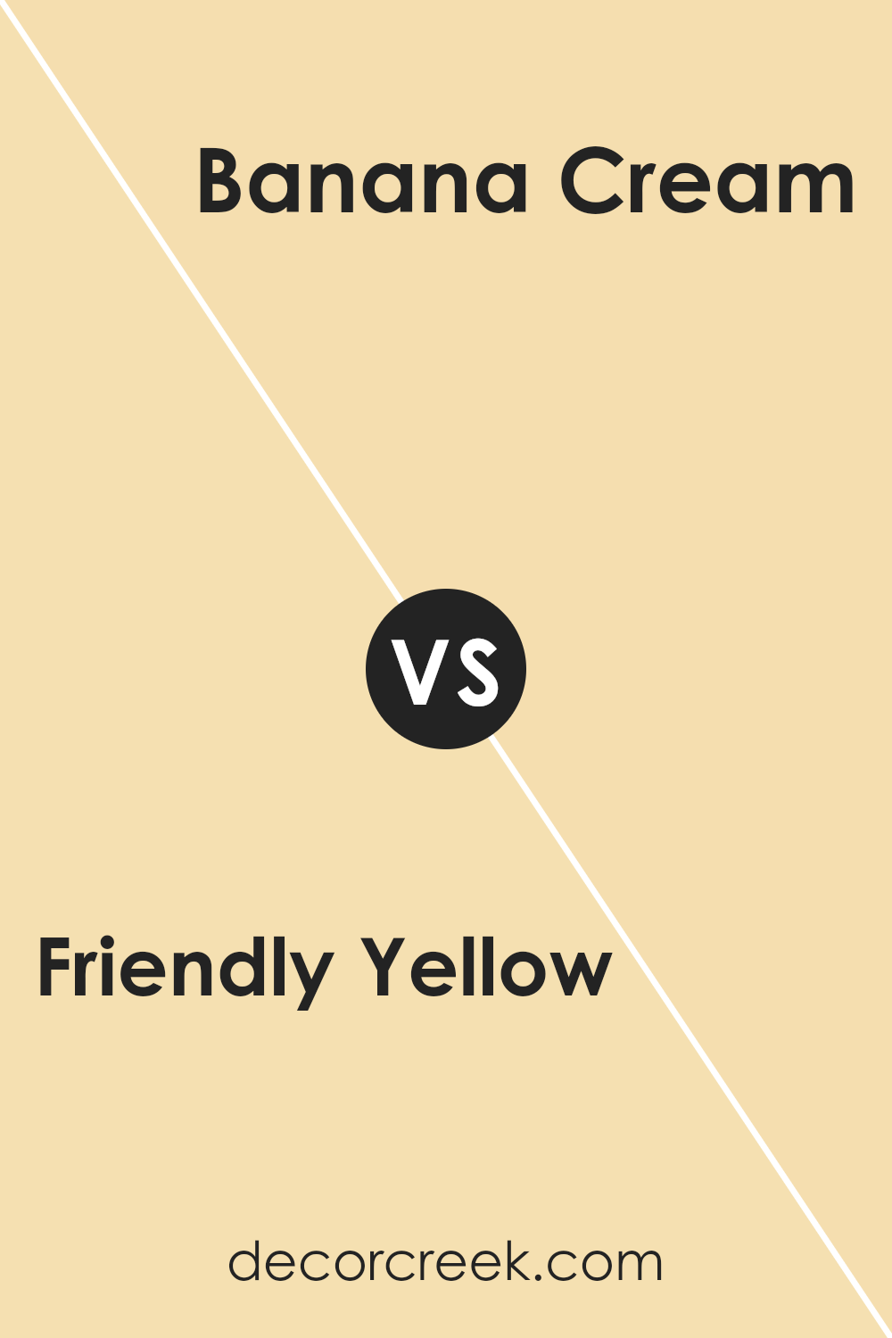
Friendly Yellow and Banana Cream by Sherwin Williams are both cheerful colors, but they have distinct qualities. Friendly Yellow is a bright, vivid shade that really stands out. It’s perfect for spaces where you want to add energy or a feel-good vibe.
On the other hand, Banana Cream is a softer, more muted yellow. It’s less intense and offers a soothing feel, making it ideal for creating a relaxed atmosphere in places like bedrooms or nurseries.
Both colors bring warmth to any room they’re used in, but their impact differs. Friendly Yellow is likely to draw more attention due to its boldness, whereas Banana Cream provides a gentle backdrop that complements other design elements without overpowering them. Depending on what mood or style you’re aiming for, either one could be the perfect choice.
You can see recommended paint color below:
- SW 6673 Banana Cream (CHECK A SAMPLE)
Friendly Yellow SW 6680 by Sherwin Williams vs Full Moon SW 6679 by Sherwin Williams
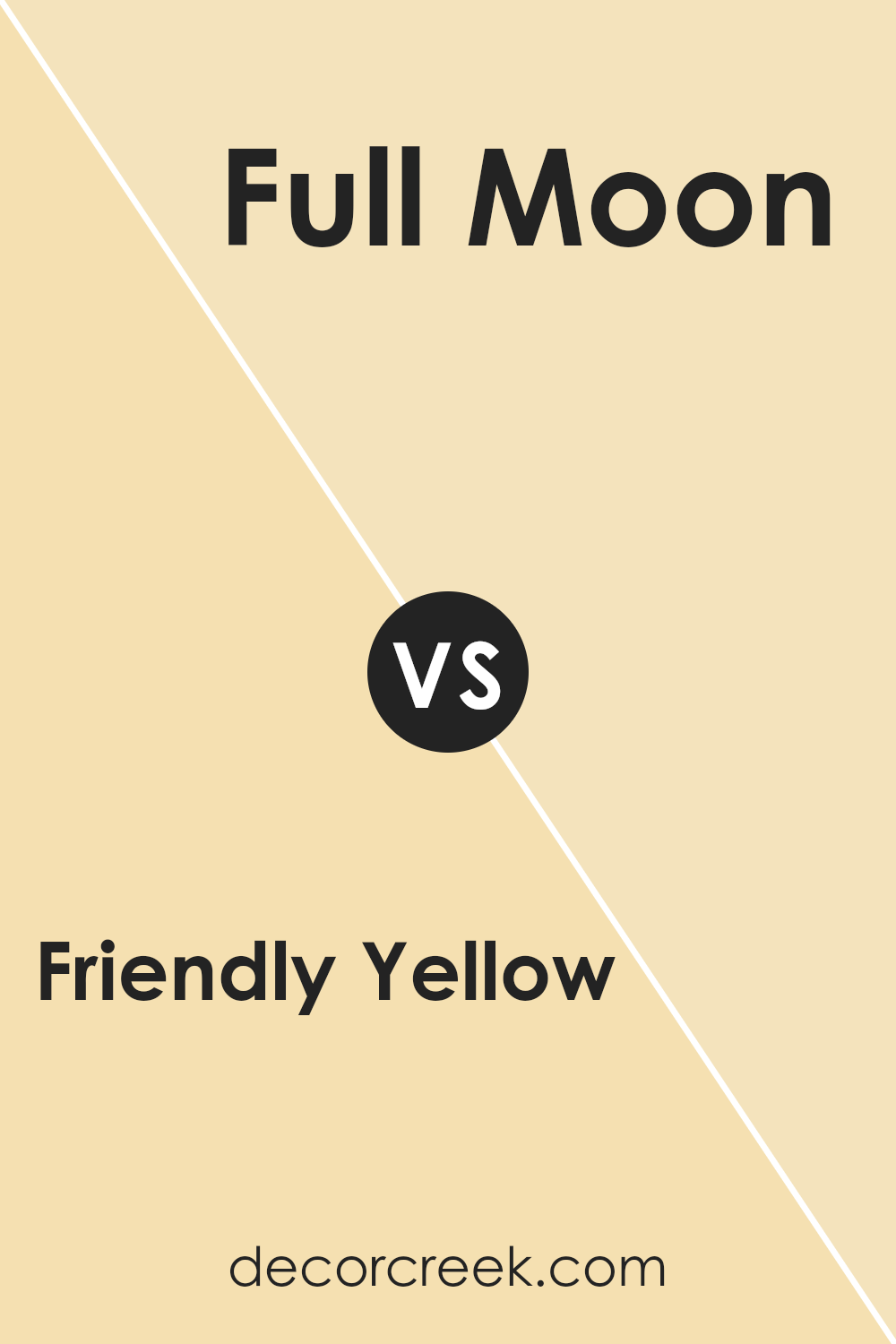
Friendly Yellow and Full Moon, both by Sherwin Williams, have their unique charm. Friendly Yellow is a bright, cheerful color that seems to radiate warmth and happiness. It’s perfect for spaces where you want to create a cozy, welcoming atmosphere.
On the other hand, Full Moon is a softer yellow. It’s more subdued and has a gentle presence, making it ideal for areas where you want a hint of color without overwhelming brightness.
Both shades bring a sunny vibe to any room, but Friendly Yellow is more vivid and bold, while Full Moon offers a lighter, more relaxed touch. Choosing between them depends on how much you want the color to stand out in your space.
You can see recommended paint color below:
- SW 6679 Full Moon (CHECK A SAMPLE)
Friendly Yellow SW 6680 by Sherwin Williams vs Optimistic Yellow SW 6900 by Sherwin Williams
Friendly Yellow and Optimistic Yellow by Sherwin Williams are both vibrant shades, but they have different tones. Friendly Yellow has a soft, warm glow that’s cozy and inviting, making it a great choice for living spaces where you want a soothing vibe.
It pairs well with other warm colors and adds a cheerful touch to rooms. On the other hand, Optimistic Yellow is bright and bold, almost resembling the color of sunshine. It’s perfect for spaces where you want to add a burst of energy and happiness.
This color works well in areas that could use a lively boost, like kitchens or playrooms. In summary, while both yellows bring a sense of happiness, Friendly Yellow offers a gentler warmth, whereas Optimistic Yellow stands out with its lively intensity.
You can see recommended paint color below:
- SW 6900 Optimistic Yellow (CHECK A SAMPLE)
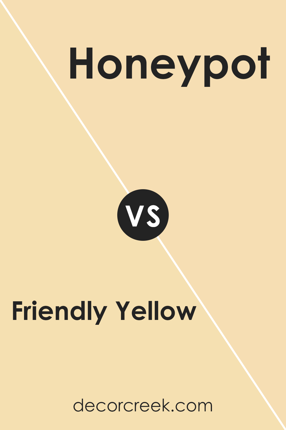
Friendly Yellow SW 6680 by Sherwin Williams vs Honeypot SW 9663 by Sherwin Williams
Friendly Yellow and Honeypot are both warm and welcoming colors from Sherwin Williams, but they offer different vibes. Friendly Yellow is a bright and cheerful color that adds a lively touch to any room. It’s the kind of yellow that can instantly brighten up a space and make it feel more open and inviting.
On the other hand, Honeypot is a deeper, golden-yellow shade that gives a cozy and comforting feel. It’s less vibrant than Friendly Yellow but provides a rich warmth that can make a room feel snug and homey.
Both colors work well in spaces where you want to create a friendly and positive atmosphere, but Friendly Yellow is better for adding a sense of energy and excitement, while Honeypot is ideal for creating a relaxed and warm setting. Depending on the mood you want to set in your room, you can choose either of these appealing Sherwin Williams colors.
You can see recommended paint color below:
- SW 9663 Honeypot (CHECK A SAMPLE)
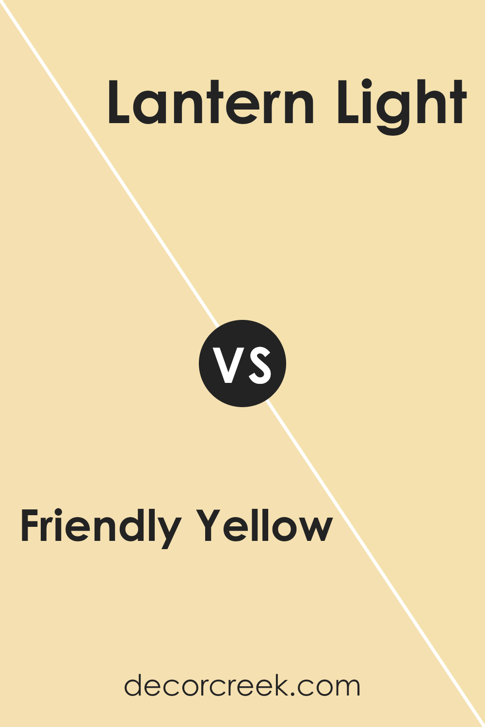
Friendly Yellow SW 6680 by Sherwin Williams vs Lantern Light SW 6687 by Sherwin Williams
Friendly Yellow and Lantern Light are both warm and inviting colors by Sherwin Williams, but they bring different vibes to a space. Friendly Yellow is a bright and cheerful color that really stands out. It has a pure, sunny quality that can make a room feel lively and energetic. It’s perfect for creating a welcoming atmosphere in places like kitchens or family rooms.
On the other hand, Lantern Light is a softer, more muted yellow. Although it’s still warm and cozy, it offers a lighter, almost pastel feel. It can help a space feel relaxed without feeling too vibrant, making it suitable for bedrooms or quiet sitting areas.
Both colors can make a room feel pleasant and sunny, but Friendly Yellow packs a stronger punch with its vividness, while Lantern Light provides a gentle touch of color. Depending on the mood you want to set, both colors offer wonderful options that warm up spaces beautifully.
You can see recommended paint color below:
- SW 6687 Lantern Light (CHECK A SAMPLE)
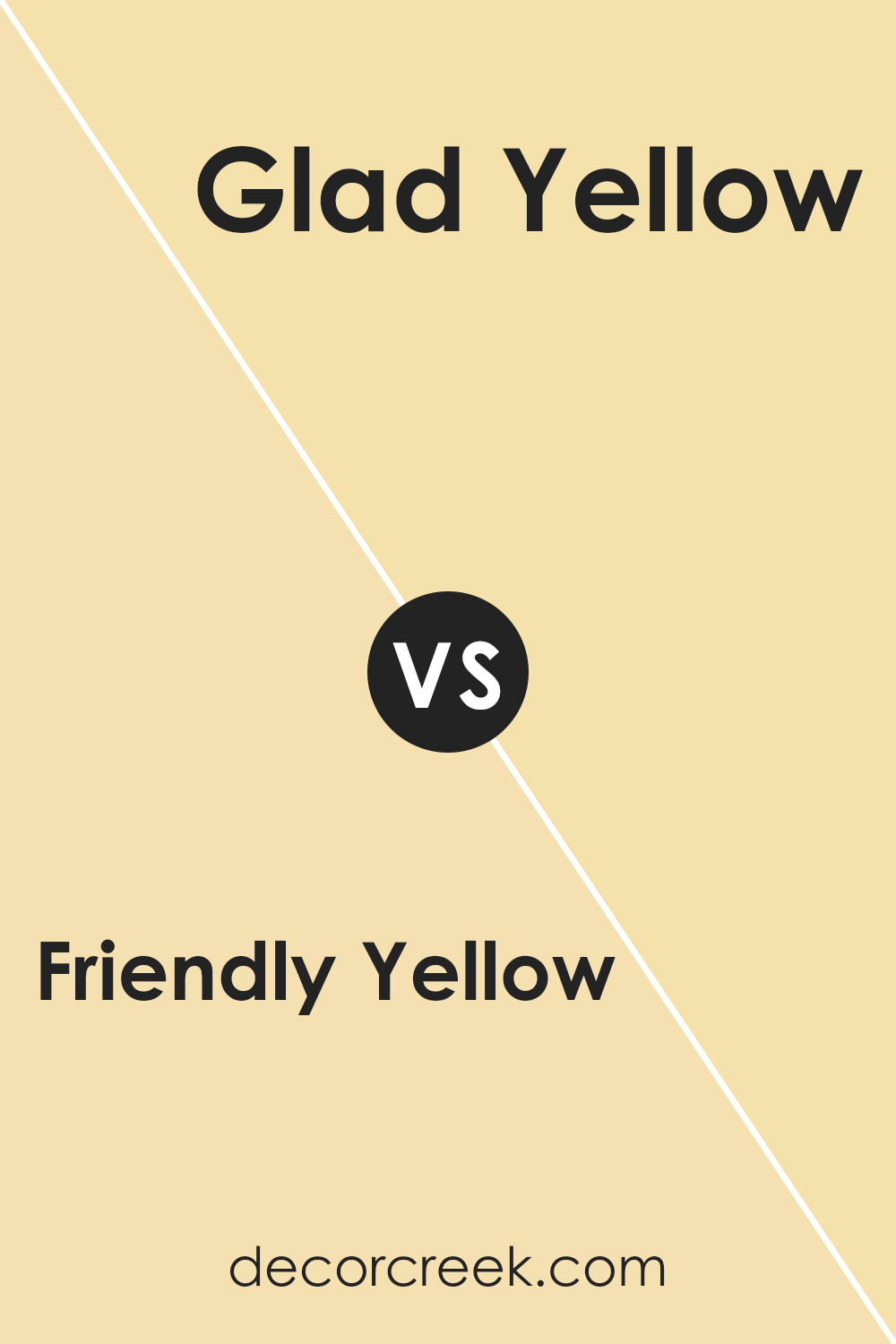
Friendly Yellow SW 6680 by Sherwin Williams vs Glad Yellow SW 6694 by Sherwin Williams
Friendly Yellow by Sherwin Williams is a bright, sunny yellow that instantly makes any room feel welcoming and cheerful. It has a strong, vibrant tone that stands out, bringing life and energy to spaces that need a bit of brightness.
On the other hand, Glad Yellow by Sherwin Williams is another warm yellow but with a slightly softer and more muted tone compared to Friendly Yellow. It offers a gentler approach to brightening up a room, providing a cozy, inviting atmosphere without being too overpowering.
Both colors are great choices if you want to create a happy, positive vibe in your home. Friendly Yellow is perfect if you’re looking for a bold statement, while Glad Yellow works well if you prefer something a bit more subdued. Either way, these yellows can help make your space more lively and bright.
You can see recommended paint color below:
- SW 6694 Glad Yellow (CHECK A SAMPLE)
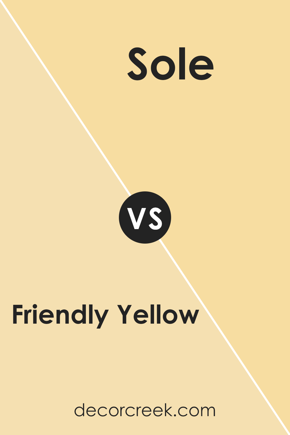
Friendly Yellow SW 6680 by Sherwin Williams vs Sole SW 6896 by Sherwin Williams
Friendly Yellow and Sole are both vibrant colors by Sherwin Williams, each with its unique appeal. Friendly Yellow is a bright, cheerful shade that radiates warmth and energy. It’s perfect for spaces where you want to create a welcoming and lively atmosphere, like kitchens or living rooms. The color resembles a sunny day and can easily make a room feel more inviting and cozy.
On the other hand, Sole is a bold, deep yellow that leans towards orange. It’s an energizing color that can add a touch of excitement and playfulness to a space. This color is great for areas where you want to make a strong impression, such as an accent wall or a creative space.
Both colors are excellent choices if you want to add a splash of brightness to your home, but the selection between them depends on the specific mood and energy you wish to achieve in your space.
You can see recommended paint color below:
- SW 6896 Sole (CHECK A SAMPLE)
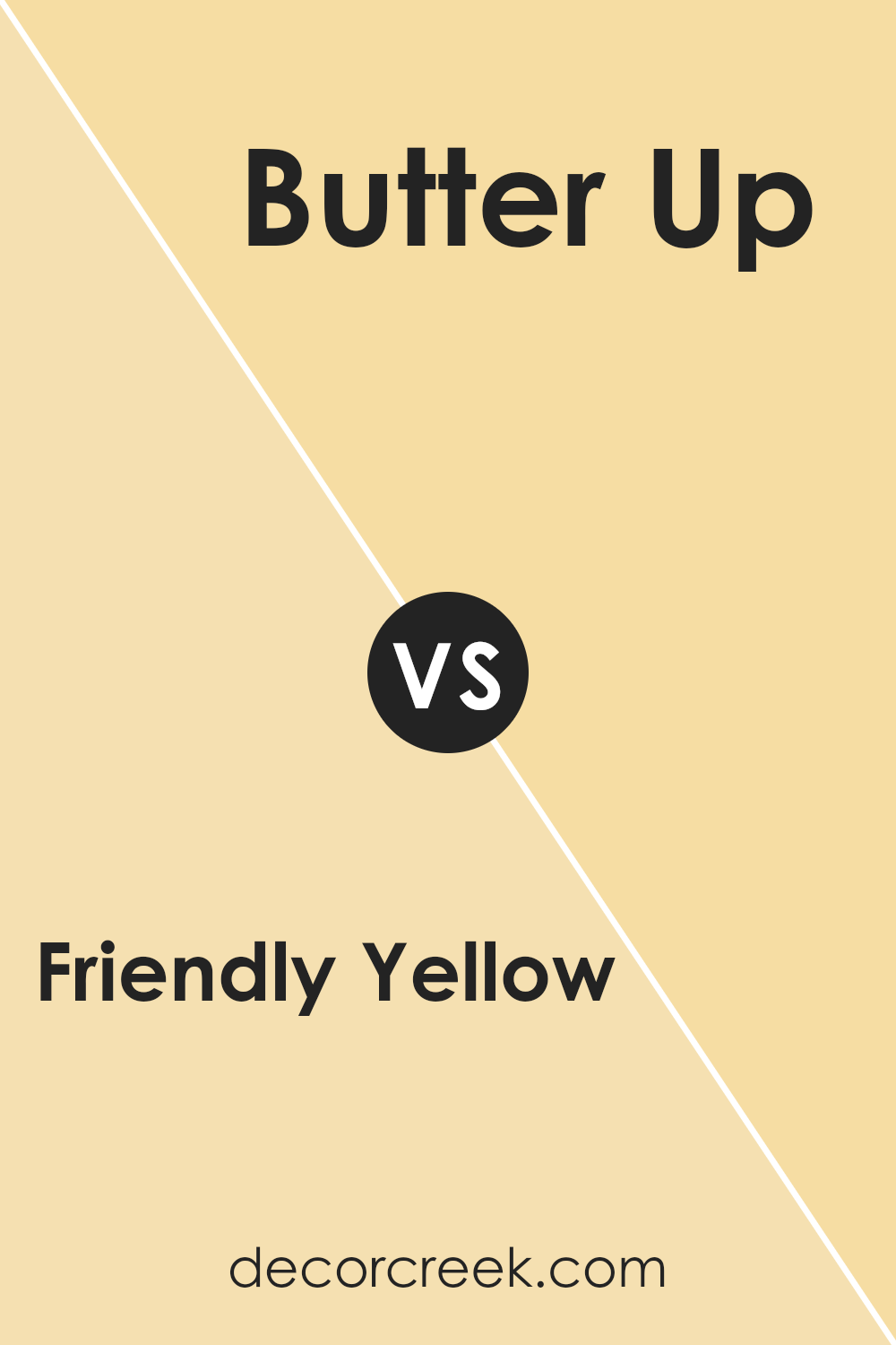
Friendly Yellow SW 6680 by Sherwin Williams vs Butter Up SW 6681 by Sherwin Williams
Friendly Yellow and Butter Up are two similar yet distinct colors from Sherwin Williams. Friendly Yellow is a bright, vibrant shade that exudes a sense of warmth and cheerfulness, making any space feel welcoming and lively.
It’s an excellent choice for kitchens, living rooms, or any area where you want to add a pop of energy.
On the other hand, Butter Up is a softer, more muted yellow. It retains some of the warmth of Friendly Yellow but has a creamier, more subdued look. This makes it perfect for creating a cozy, peaceful setting, such as in bedrooms or nurseries. While both colors are rooted in yellow, Friendly Yellow has a more pronounced intensity compared to the gentler, more laid-back vibe of Butter Up. They can be used separately or together, depending on the mood you want to achieve in your space.
You can see recommended paint color below:
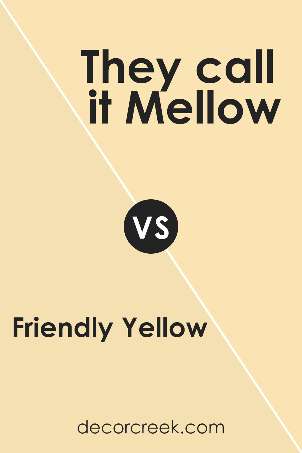
Friendly Yellow SW 6680 by Sherwin Williams vs They call it Mellow SW 9015 by Sherwin Williams
Friendly Yellow and They call it Mellow are both popular shades from Sherwin Williams, but they create different vibes. Friendly Yellow is a bright, sunny color that adds cheer and a welcoming feel to any space. It’s bold and vibrant, making it a great choice for areas like kitchens or playrooms, where you want a lively atmosphere.
On the other hand, They call it Mellow is a softer, more subdued shade. It’s still yellow, but with a gentler touch that provides a warm, cozy feeling. This color is excellent for spaces where you want a calm, inviting ambiance without the intensity of a brighter yellow.
It works well in living rooms or bedrooms where relaxation is the goal.
Overall, if you’re deciding between these two, your choice will depend on the mood you’re trying to create. For a punch of energy and fun, go with Friendly Yellow. If you prefer a softer, soothing environment, They call it Mellow is the way to go.
You can see recommended paint color below:
- SW 9015 They call it Mellow (CHECK A SAMPLE)
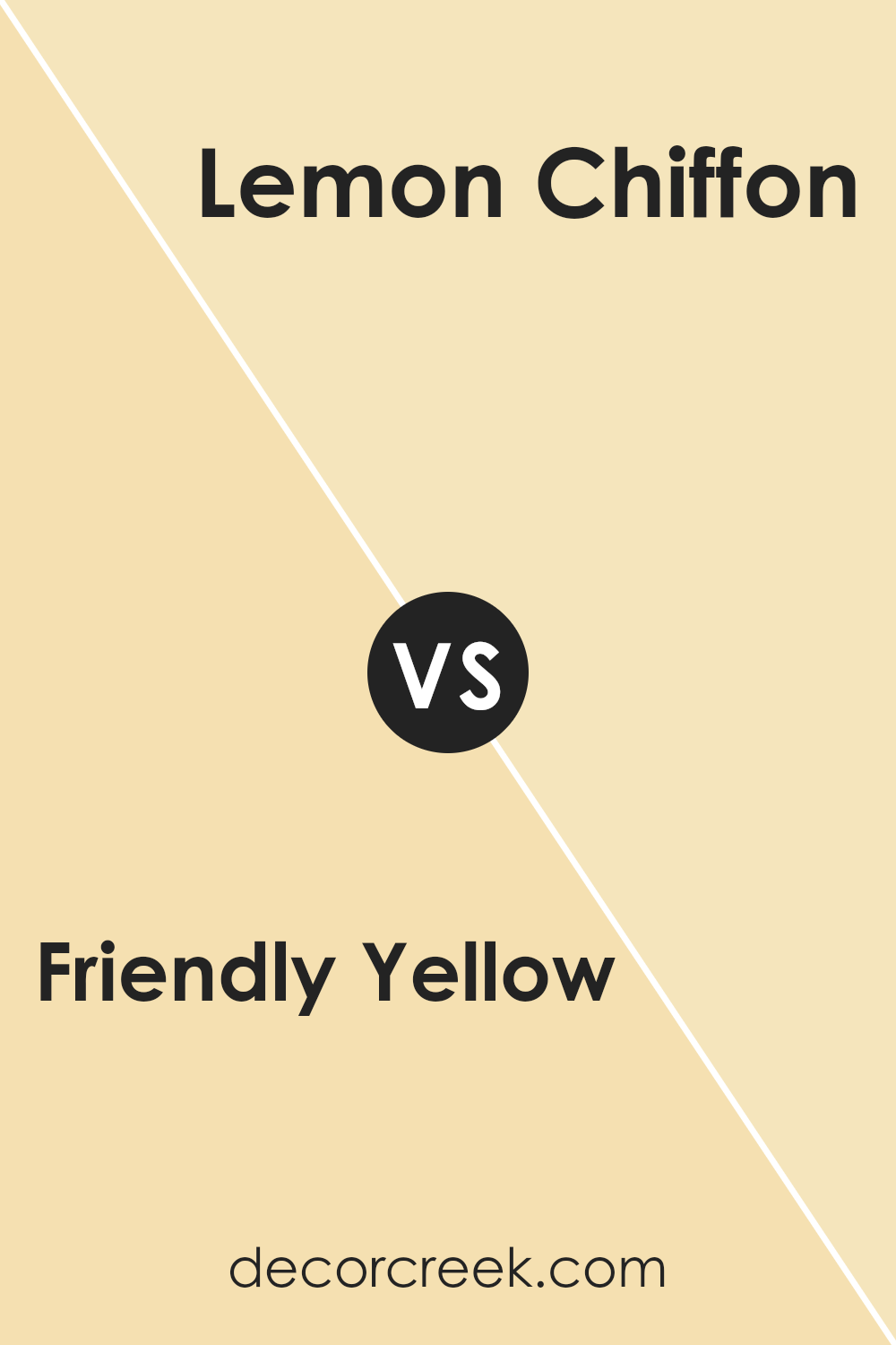
Friendly Yellow SW 6680 by Sherwin Williams vs Lemon Chiffon SW 6686 by Sherwin Williams
Friendly Yellow and Lemon Chiffon, both by Sherwin Williams, offer subtle but distinct moods for any room. Friendly Yellow is a bright and cheerful color, much like the warmth of a sunny day. It’s vibrant without being overpowering, making it a great choice for living areas and kitchens where you want to add a sense of happiness.
In comparison, Lemon Chiffon is lighter and has a softer appearance. This color is closer to pastel, providing a gentle touch of yellow. It works beautifully in spaces where you want to keep things light and airy, such as nurseries or small spaces that need to feel more open.
While both colors share a yellow base, Friendly Yellow packs a stronger punch, standing out more in a room. Lemon Chiffon, on the other hand, blends in for a more subtle lift. Depending on the mood you want to set in your space, either color can brighten the room, with Friendly Yellow bringing energy and Lemon Chiffon offering a soft calmness.
You can see recommended paint color below:
- SW 6686 Lemon Chiffon (CHECK A SAMPLE)
Conclusion
I’ve really enjoyed sharing my thoughts on Sherwin Williams’ SW 6680 Friendly Yellow. This vibrant and cheerful shade brings a lot of warmth and positivity to any space. It has a unique ability to brighten rooms while offering a cozy, inviting atmosphere. In my home, I’ve found that Friendly Yellow works exceptionally well in the kitchen and living areas, areas where my family and friends gather most.
Throughout my analysis, I’ve noticed that Friendly Yellow pairs wonderfully with various colors, enhancing both bold and neutral palettes. It also adapts beautifully to different styles and settings, from modern to rustic, making it a versatile choice for interior decorating.
Using Friendly Yellow has allowed me to refresh my home without overwhelming changes. Its lively yet soft hue promotes a happy and energetic environment, perfect for lively family gatherings or peaceful personal moments.
I highly recommend Friendly Yellow to anyone looking to add a touch of joy and warmth to their living space. It’s more than just a paint; it’s a way to make your home a more delightful place to live.

Ever wished paint sampling was as easy as sticking a sticker? Guess what? Now it is! Discover Samplize's unique Peel & Stick samples.
Get paint samples


