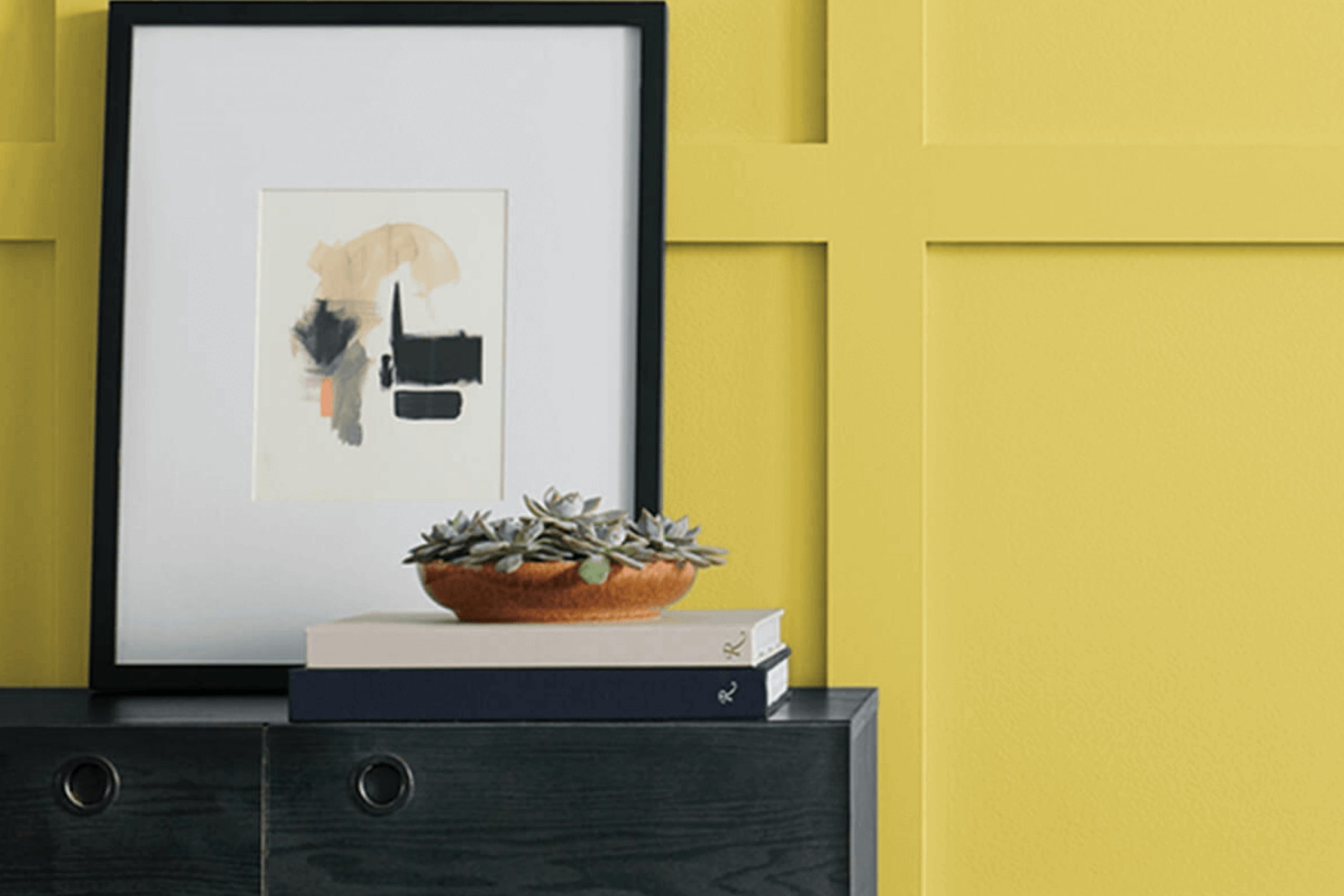
Imagine stepping into a room bathed in the cheerful shades of SW 6703 Frolic by Sherwin Williams. This color breathes a fresh, youthful vigor into any room, making it feel instantly more lively. When you use Frolic in your home, it’s like letting a burst of sunshine in, even on the cloudiest days.
This peppy shade of green has a hint of brightness that’s not overpowering, but just enough to add a playful twist to your decor. Painting your walls with Frolic can refresh an outdated room or give a new life to an old piece of furniture.
It pairs well with a wide range of colors—from crisp whites to soft neutrals or even bold hues—for a flexible and modern look. The vibrant persona of Frolic invites you to rethink your rooms and offers a unique way to express your personality through color.
Whether you’re giving your kitchen a makeover or adding a pop of color to your living room, Frolic provides a backdrop that’s both energizing and enjoyable.
What Color Is Frolic SW 6703 by Sherwin Williams?
Frolic, a vibrant and lively shade by Sherwin Williams, brings a fresh and energizing feel to any room. This color is a vivid green with a hint of yellow, making it bright and cheerful. Its luminous quality adds a dash of sunshine to rooms, ideal for creating a playful and inviting atmosphere.
Frolic works exceptionally well in interior styles that lean towards the modern and contemporary, adding a pop of color that draws the eye without overpowering the room. It also fits beautifully in eclectic decor, where various styles and colors mix, allowing it to stand out as a focal feature or blend harmoniously with other elements.
This color pairs excellently with natural materials like wood and bamboo, which help balance its vibrancy with their earthy tones. Textures like linen or cotton in neutral shades also complement Frolic, creating a comfortable, airy feel.
In rooms like kitchens or children’s playrooms, pairing Frolic with glossy finishes and metallic accents can introduce a sense of fun and creativity. Ultimately, Frolic is perfect for anyone looking to inject some brightness into their home, offering a cheerful backdrop that encourages lively conversation and joyful living.
Is Frolic SW 6703 by Sherwin Williams Warm or Cool color?
Frolic SW 6703 by Sherwin Williams is a vibrant and cheerful shade of green that can add a lively touch to any room in the house. This color works well in areas that could use a burst of energy or a touch of nature’s freshness. In a kitchen or a living room, Frolic can make the environment feel more welcoming and upbeat.
It’s especially good for areas that get a lot of natural light, as the brightness enhances the color’s vividness and makes the room appear more airy and open. For bedrooms, using this color in smaller doses, such as for an accent wall or decor items, can add a playful spark without overpowering the room.
Frolic also pairs nicely with neutral tones like whites, grays, and beiges, which help to balance its boldness while still letting it stand out as a focal point in the decor. Additionally, this color can be a fun choice for children’s rooms or creative areas, bringing a sense of joy and creativity.
Undertones of Frolic SW 6703 by Sherwin Williams
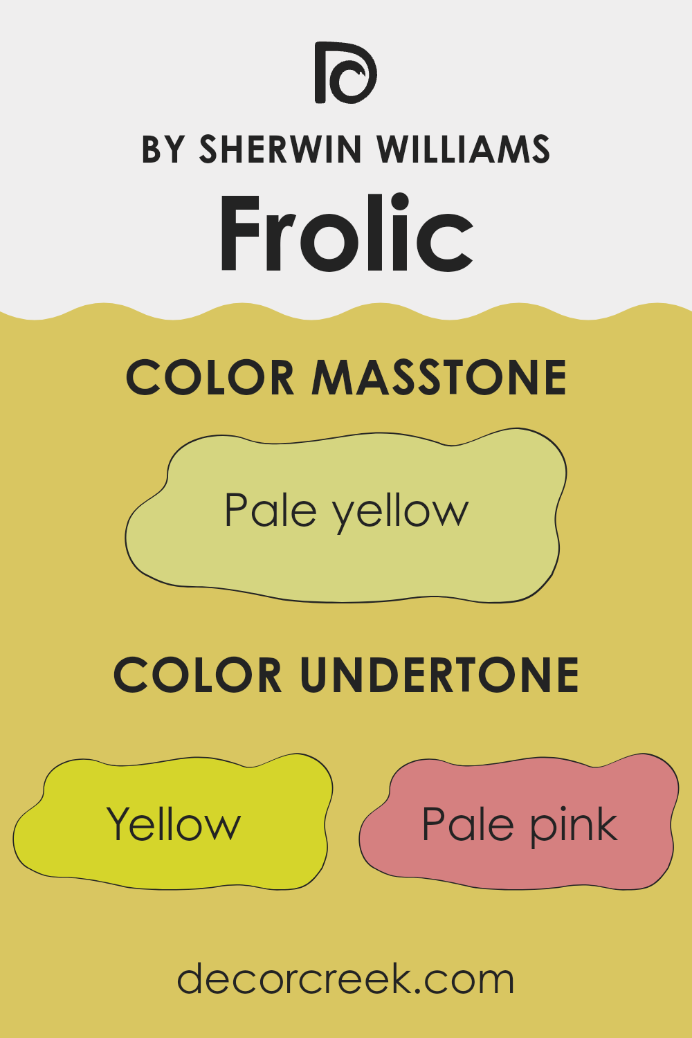
Frolic SW 6703 is a dynamic and flexible color with a fascinating mix of undertones that can alter its appearance under different lighting conditions and when complemented with various decor elements. Undertones are subtle hues that blend into a primary color, influencing how it is perceived and how it interacts within a room. Frolic SW 6703 has a range including yellow, pale pink, orange, mint, light green, light gray, grey, olive, light purple, light blue, and lilac.
These undertones play a crucial role in interior design as they can subtly change a room’s atmosphere. For instance, yellow and orange undertones add warmth making a room feel cozy and welcoming, perfect for living areas. Mint and light green give a fresh, natural vibe, ideal for bathrooms and kitchens. Pale pink and lilac can soften the look, suitable for bedrooms where a calm setting is desirable.
Light gray and grey provide a neutral backdrop, enabling flexibility in decorating with various color schemes. Light blue introduces a cool and calming effect, good for creating a relaxed environment. Lastly, olive adds depth and complements wooden furniture and natural motifs. When painted on interior walls, the mix of these undertones in FrolicSW 6703 means the color will interact differently depending on the day’s lighting and room accessories.
As such, the paint might appear more greenish or grayish under natural light, with hints of pink or blue popping under artificial lighting, making the walls an integral, though subtly shifting, part of the home’s decor. This makes FrolicSW 6703 a smart choice for those looking to bring a lively yet nuanced hue into their living room.
What is the Masstone of the Frolic SW 6703 by Sherwin Williams?
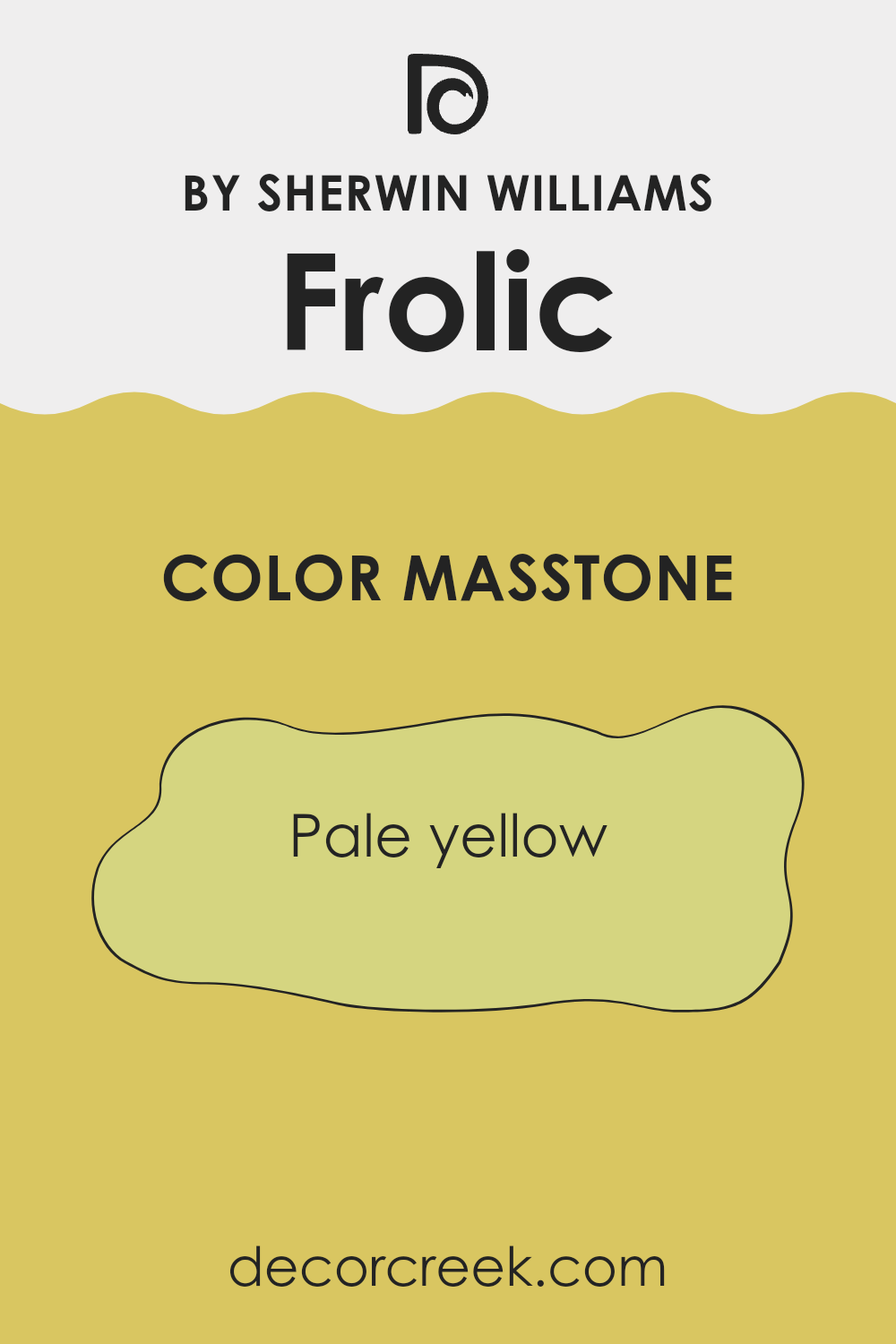
FrolicSW 6703 by Sherwin Williams is a paint color with a masstone of pale yellow, resembling a light, cheerful tone that feels like spring sunshine. This specific shade is gentle and not too bright, making it a great choice for various rooms in homes. It brings a sense of warmth and freshness to any room without being overpowering.
In living areas, this pale yellow can make the room appear more inviting and cozy, giving a friendly, welcoming vibe. It’s ideal for areas where you gather with friends and family, as it promotes a subtle, comforting bright atmosphere. In smaller rooms or rooms with less natural light, using this pale yellow can help make the areas feel larger and brighter.
Additionally, it pairs well with many other colors, from soft whites and grays to bolder greens and blues, offering versatility in decor choices. This adaptability makes it easy to fit into existing design schemes or to inspire new ones, enhancing any home with a light and airy feel.
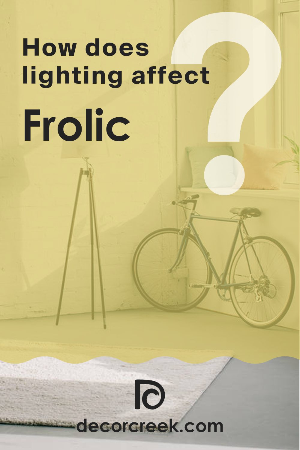
How Does Lighting Affect Frolic SW 6703 by Sherwin Williams?
Lighting plays a crucial role in how colors are perceived. Depending on the type of light—whether artificial or natural—the same color can look different in various environments. Artificial light like LEDs or halogen bulbs can influence the warmth of a color, whereas natural sunlight showcases colors in their truest form.
The color Frolic, when under artificial light, tends to pop more and can appear more vibrant. Artificial lights, especially warm lights, can enhance the yellow and green undertones in the color, making it lively and striking. Conversely, natural light which has a broader spectrum, presents a more balanced hue, allowing the true character of Frolic to shine through. In bright natural light, it might appear lighter and more airy.
The direction a room faces also impacts how Frolic appears throughout the day. In north-facing rooms, which get less direct sunlight, Frolic might look somewhat muted, displaying more of its subtle, soothing qualities. It can create a calm and relaxing atmosphere in these rooms.
In contrast, south-facing rooms enjoy abundant sunlight for most of the day, which can intensify the brightness of Frolic, making it appear more vivid and cheerful. East-facing rooms get plenty of morning light. Here, Frolic will look especially bright and fresh in the morning but might lose some of its vibrancy as the day progresses and the light diminishes.
Meanwhile, in west-facing rooms, the color will undergo an elevation throughout the day; it will start cooler in the morning and become warmly lit in the afternoon and evening as the sunsets, which can make the paint look richer and more dynamic. Understanding these nuances can aid in planning interior decoration, ensuring that colors complement the room’s ambiance and function.
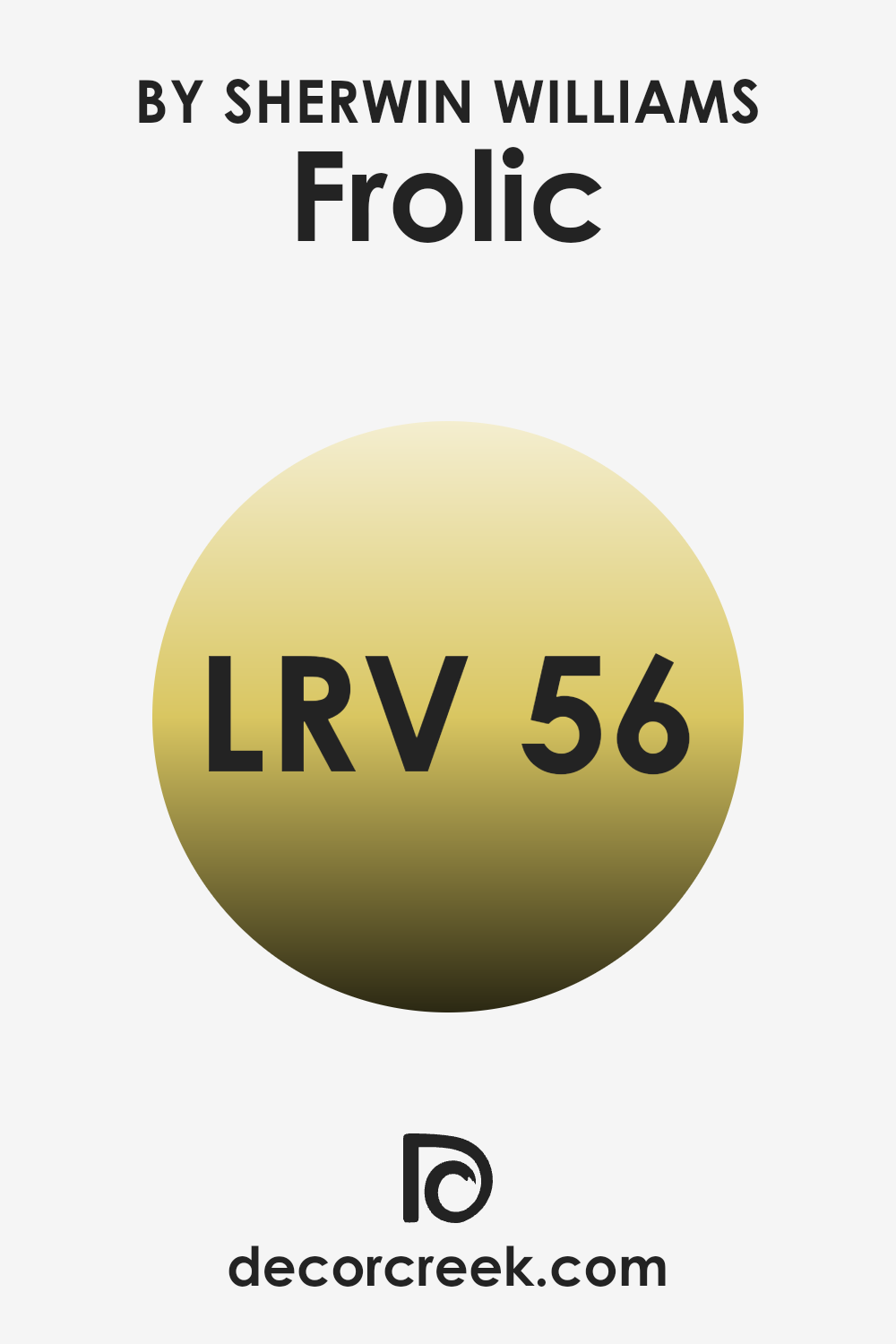
What is the LRV of Frolic SW 6703 by Sherwin Williams?
LRV stands for Light Reflectance Value, a measurement used to determine how much light a paint color reflects or absorbs when applied to a wall. This value ranges from one (meaning no light is reflected and all is absorbed) to ninety-nine (meaning all light is reflected and none is absorbed), and it’s an important factor to consider when choosing paint colors for different areas.
A higher LRV can help to brighten a room by reflecting more light, which makes the room appear larger and more open. Conversely, a lower LRV will absorb more light, which can make a room feel cozier but also smaller and darker. The LRV of fifty-six for the color in question suggests it is moderately reflective.
This means the color won’t feel overly bright or stark but will still reflect a significant amount of light, adding a sense of airiness without being overpowering. In practical terms, this makes it a flexible choice for rooms that don’t receive a lot of natural light, as it won’t turn the room into a dark room. Additionally, it’s light enough to help enhance the feeling of openness, which is ideal for smaller rooms or areas that you’d like to appear more open and inviting.
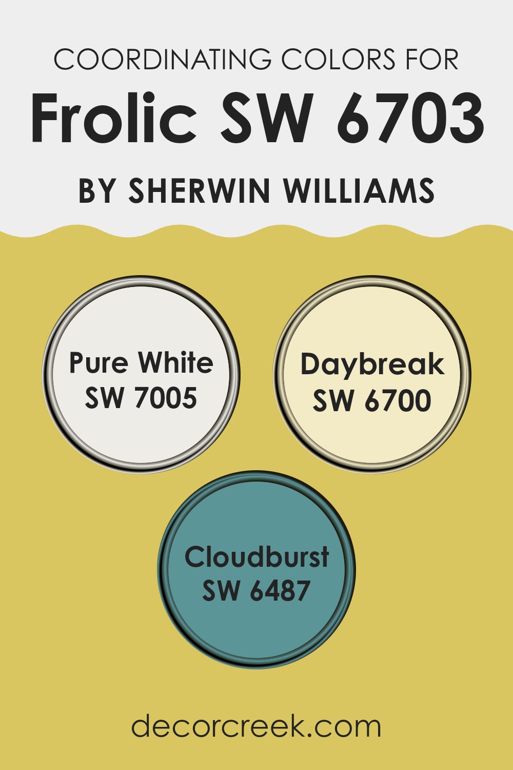
Coordinating Colors of Frolic SW 6703 by Sherwin Williams
Coordinating colors help create a cohesive look in a room by complementing each other, thus enhancing the overall aesthetic appeal without overpowering the central theme. For instance, taking a lively and cheerful shade like a light, bright green and pairing it with other colors that can harmonize effectively, allows each color to either stand out or pull back, depending on the desired effect. Coordinating colors should not clash; they should instead create a balanced visual flow in the decor, making a room feel more put together.
For the color Frolic by Sherwin Williams, hues such as Pure White, Daybreak, and Cloudburst serve as excellent coordinating colors. Pure White is a clean, crisp white that offers a fresh contrast, brightening up darker tones and giving a breathable room around more vibrant colors.
Daybreak is a soft, pale yellow that offers a gentle complement, adding a subtle touch of warmth that enriches the primary hue without overpowering it. Cloudburst, on the other hand, is a deep, moody teal that provides a striking balance, adding depth and intrigue to the room, making it feel grounded and vibrant at the same time. These choices collectively ensure that the room remains lively yet visually appealing.
You can see recommended paint colors below:
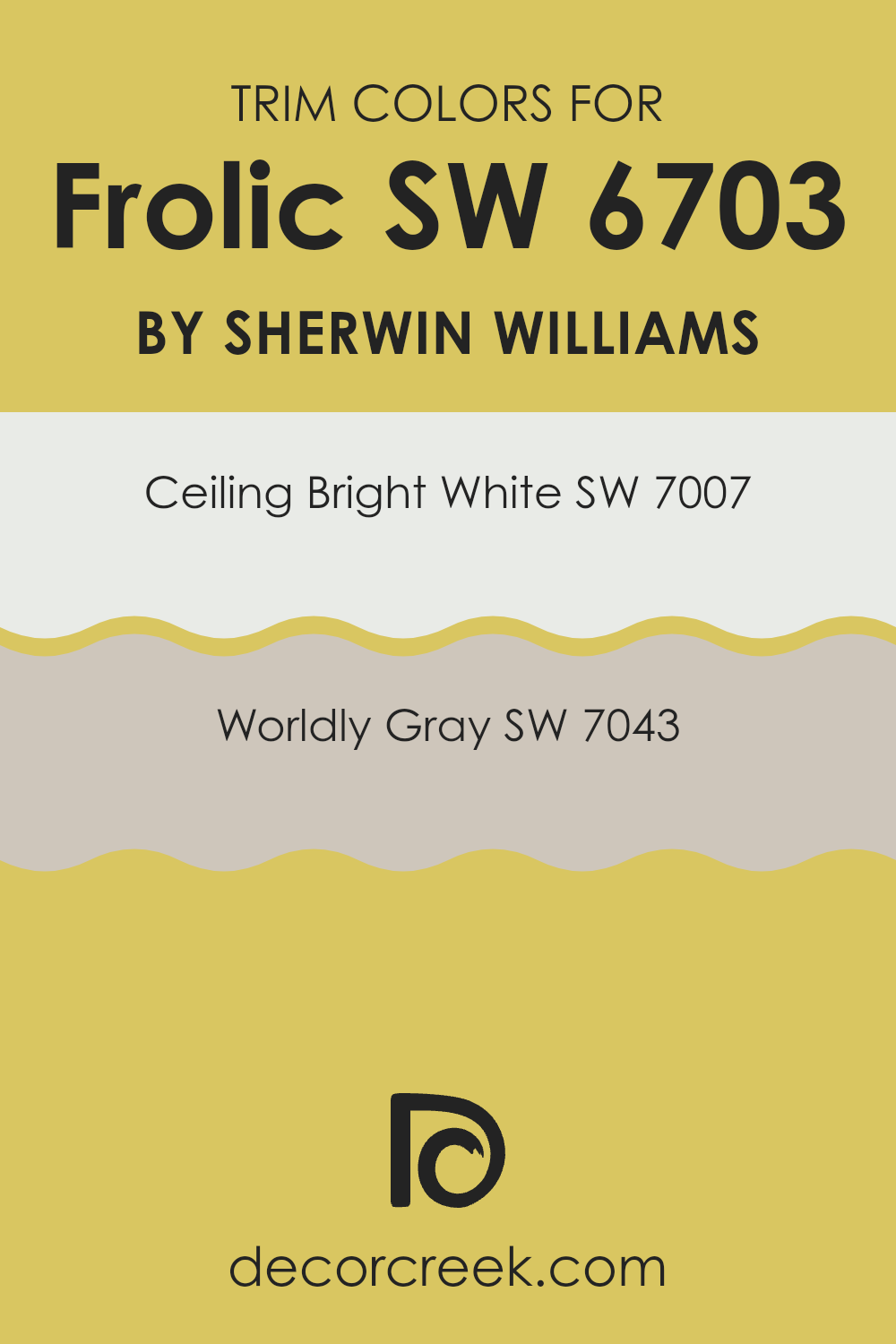
What are the Trim colors of Frolic SW 6703 by Sherwin Williams?
Trim colors are specific hues used to highlight architectural details such as door frames, moldings, and baseboards, setting them apart from the main wall colors. They play a crucial role in defining and accentuating the features of a room, adding depth and contrast to the room. For example, using trim colors like SW 7007 – Ceiling Bright White and SW 7043 – Worldly Gray with a vibrant wall color such as FrolicSW 6703 by Sherwin Williams can create a visually appealing contrast.
These trim colors help frame and define the room, allowing the lively wall color to really stand out, while also providing a polished and cohesive look. The color SW 7007 – Ceiling Bright White is a clean, pure white that brings a fresh and crisp look to any trim work, making it an excellent choice for standing against more saturated hues. It reflects light beautifully, making areas appear brighter and larger.
On the other hand, SW 7043 – Worldly Gray offers a more understated approach with its soft, warm gray tone that introduces a subtle contrast; it works particularly well in softening the impact of more intense colors, ensuring the room feels balanced and not overwhelmed by color. Together, these trim colors provide versatility and can be used to enhance the overall aesthetic of any room painted with vibrant or muted shades alike.
You can see recommended paint colors below:
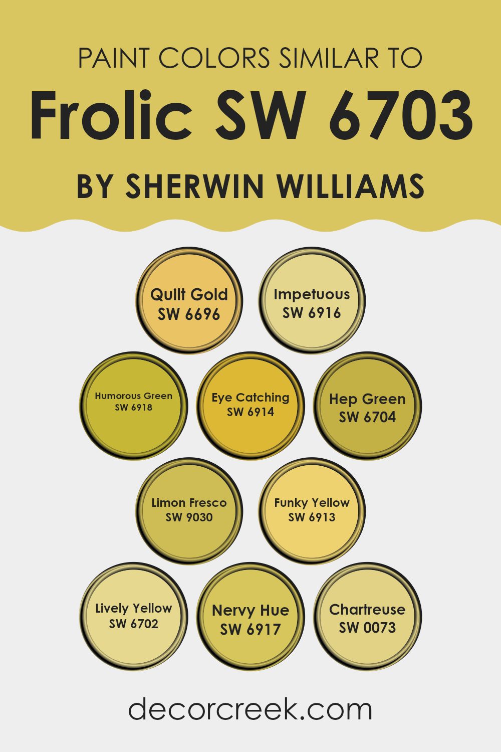
Colors Similar to Frolic SW 6703 by Sherwin Williams
Choosing similar colors, like variations around Frolic SW 6703 by Sherwin Williams, is crucial in design because they create a harmonious and visually cohesive environment. Such colors can flawlessly blend with each other while adding subtle differentiation that enriches a room without overpowering it. These colors, being close siblings on the color wheel, help in achieving a balanced and aesthetically pleasing look, perfect for anyone looking to add liveliness yet a sense of uniformity in their decor.
For instance, Quilt Gold SW 6696, a warm and inviting shade, brings coziness to any room with its sun-kissed glow. Impetuous SW 6916, a vibrant coral, injects a lively spark into designs. The fresh and energetic tone of Humorous Green SW 6918, pairs delightfully with more subdued hues.
Eye Catching SW 6914 offers a bold, almost neon pop of lime that truly stands out. Hep Green SW 6704, which is deeply saturated, provides a rich backdrop that complements lighter and brighter colors. Limon Fresco SW 9030, with its zesty lemon touch, brings a refreshing twist to areas.
Funky Yellow SW 6913, features a mustard-like undertone that works well in eclectic and unique designs. Lively Yellow SW 6702 offers a cheerful radiance that brightens rooms effortlessly. Nervy Hue SW 6917, with its deep and bold green-blue, provides a touch of drama.
Lastly, Chartreuse SW 0073 dabbles between green and yellow, excellent for adding a flash of unexpected color. Each of these carries its own charm and character but collectively, they establish an engaging theme that can tie various elements together seamlessly in interior or exterior rooms.
You can see recommended paint colors below:
- SW 6696 Quilt Gold
- SW 6916 Impetuous
- SW 6918 Humorous Green
- SW 6914 Eye Catching
- SW 6704 Hep Green
- SW 9030 Limon Fresco
- SW 6913 Funky Yellow
- SW 6702 Lively Yellow
- SW 6917 Nervy Hue
- SW 0073 Chartreuse
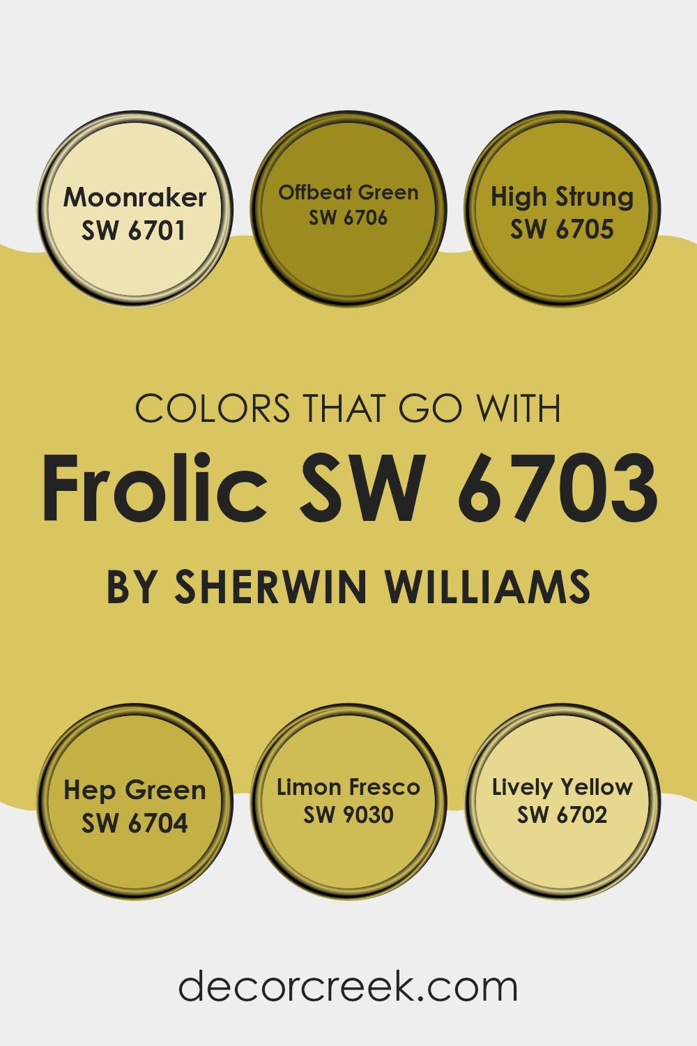
Colors that Go With Frolic SW 6703 by Sherwin Williams
Choosing the right colors that complement Frolic SW 6703 by Sherwin Williams is crucial in creating a harmonious and aesthetically pleasing room. When colors are coordinated well, they can enhance the mood of a room, make areas appear larger or cozier, and tie different design elements together. Colors like Moonraker SW 6701, Offbeat Green SW 6706, and High Strung SW 6705 work beautifully with Frolic as they offer a vibrant yet balanced palette.
Moonraker is a soft, gentle green that brings a touch of lightness and airiness to any room, making it a perfect match for the lively vibrance of Frolic. Offbeat Green presents a more grounded and earthy tone, providing a solid foundation when used alongside the more vivid Frolic.
High Strung is a dynamic and cheerful color, echoing Frolic’s own energy but in a slightly different hue that creates both contrast and continuity. Hep Green and Limon Fresco add unique twists of their own. Hep Green is a deeper, rich green that adds depth and sophistication, while Limon Fresco is a bright, zesty lime that injects a shot of freshness and playfulness into any palette.
Lively Yellow is as sunny and welcoming as its name suggests, offering a burst of brightness that complements Frolic’s lively spirit perfectly. Using these colors together ensures a vibrant, cohesive look that feels both welcoming and thoughtfully designed.
You can see recommended paint colors below:
- SW 6701 Moonraker
- SW 6706 Offbeat Green
- SW 6705 High Strung
- SW 6704 Hep Green
- SW 9030 Limon Fresco
- SW 6702 Lively Yellow
How to Use Frolic SW 6703 by Sherwin Williams In Your Home?
Frolic SW 6703 by Sherwin Williams is a vibrant and cheerful green paint color that can breathe new life into your home. Whether you’re looking to add a splash of color to your living room or brighten up your kitchen, Frolic provides a refreshing change from more traditional hues.
Perfect for creating a lively and welcoming atmosphere, it works well on walls in areas where you entertain guests or enjoy family activities. When using Frolic in smaller rooms, consider balancing its brightness with neutral colors such as whites or soft grays on trim and furniture.
This helps prevent the color from overpowering the room. For a bold approach, pair it with contrasting colors like bright reds or oranges in throw pillows or decorative accents. And don’t forget the exterior; painting your front door with Frolic can create a charming and inviting entryway. Its happy vibe can make your home stand out while showing off your personality.
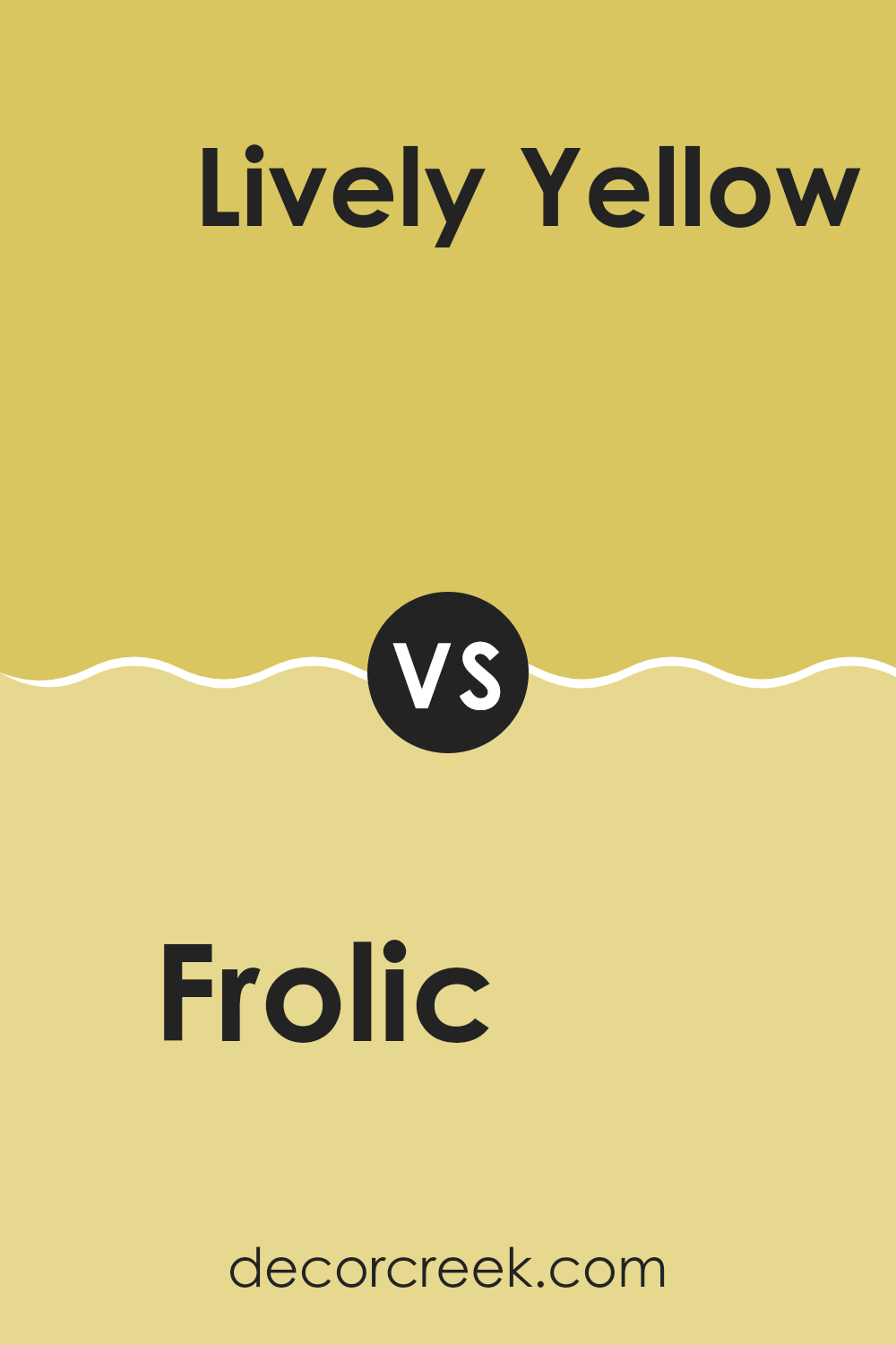
Frolic SW 6703 by Sherwin Williams vs Lively Yellow SW 6702 by Sherwin Williams
Frolic and Lively Yellow, both from Sherwin Williams, are vibrant and cheerful colors, yet they have distinct personalities. Frolic offers a soothing yet bright aqua shade that feels cool and refreshing. It’s ideal for areas needing a calm yet cheerful vibe, like bathrooms or bedrooms. On the other hand, Lively Yellow is a vivid, sunny yellow that’s perfect for energizing a room. It brings a sense of joy and brightness, making it suitable for kitchens, dining areas, or any room that benefits from a sense of openness and light. Both colors are great for creating a positive atmosphere but serve different moods and settings. Frolic cools things down, and Lively Yellow warms them up.
You can see recommended paint color below:
- SW 6702 Lively Yellow
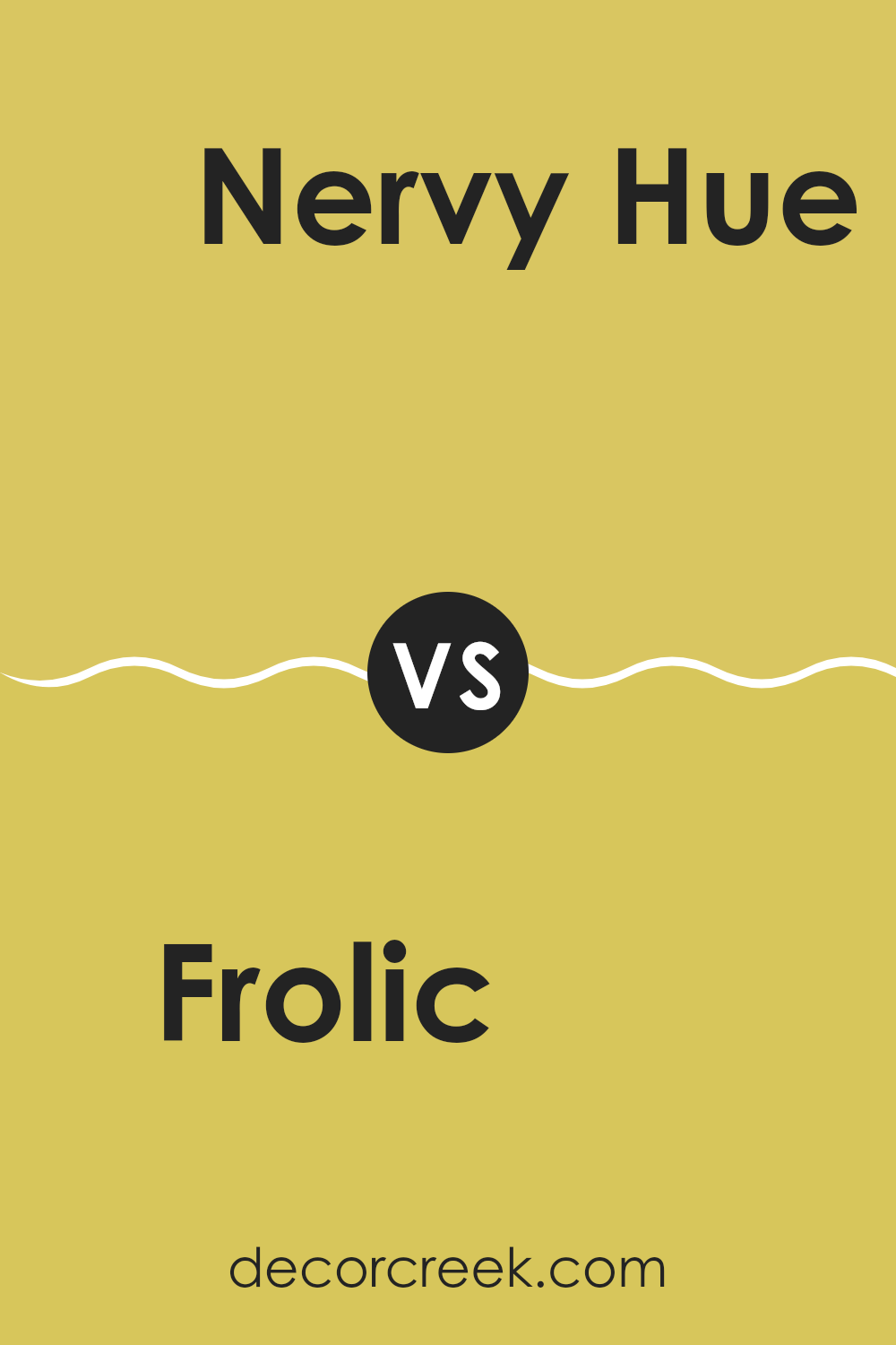
Frolic SW 6703 by Sherwin Williams vs Nervy Hue SW 6917 by Sherwin Williams
The main color, Frolic, is a bright, cheerful shade of green that brings a sense of freshness and energy to any room. Its vibrant hue is reminiscent of spring leaves or a lush garden, making it a great choice for areas where you want to add a lively and inviting atmosphere.
On the other hand, the second color, Nervy Hue, is a bold and intense teal that commands attention. This color has a modern feel and provides a striking contrast, especially when paired with neutral tones or as an accent wall.
While Frolic adds a bright splash of natural vibrancy, Nervy Hue offers a deeper, more dramatic look that can make a statement in a room. Both colors are unique and can significantly influence the mood and style of an interior depending on how they are used.
You can see recommended paint color below:
- SW 6917 Nervy Hue
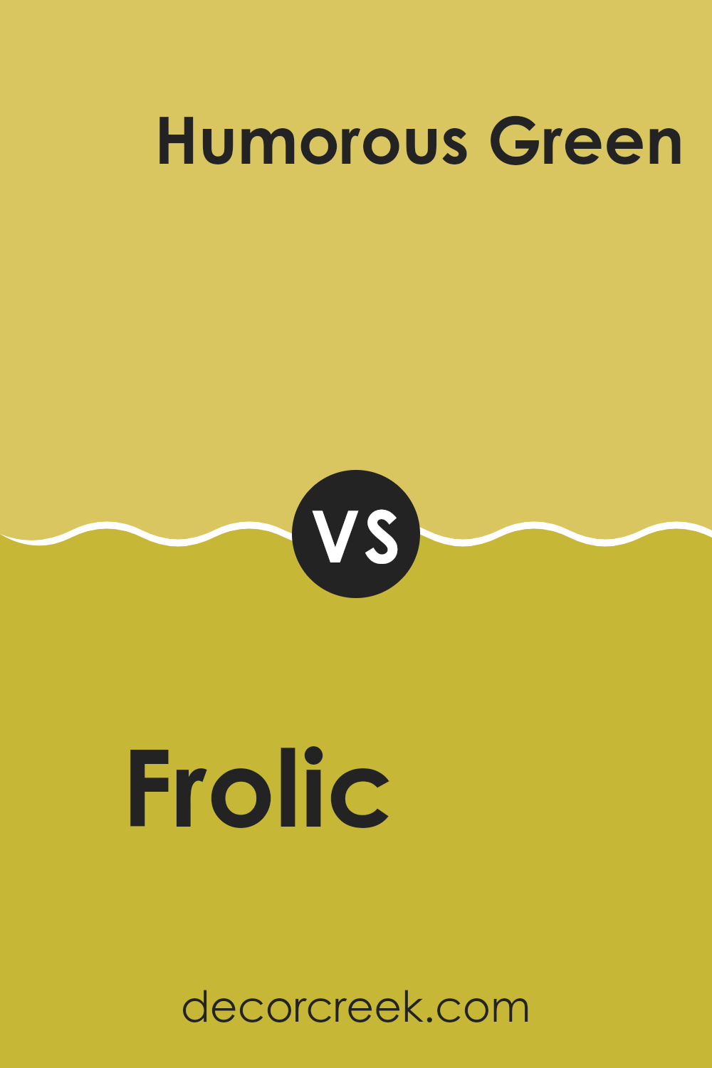
Frolic SW 6703 by Sherwin Williams vs Humorous Green SW 6918 by Sherwin Williams
Frolic and Humorous Green are both vibrant colors by Sherwin Williams, but they bring different vibes to a room. Frolic is a bright, cheerful green that’s reminiscent of springtime freshness. It’s lively and has a lightness that can brighten up any room, making it feel more open and airy.
On the other hand, Humorous Green is a bolder, more saturated shade that leans towards a more energetic and playful atmosphere. This color can add a real punch to areas, ideal for creating a dynamic and fun ambiance.
While Frolic might be better suited for a calming environment like a bedroom or bathroom, Humorous Green works great in areas that benefit from a bit more stimulation, such as playrooms or creative room. Both colors reflect natural green hues, but their impact varies significantly based on their intensity and depth.
You can see recommended paint color below:
- SW 6918 Humorous Green
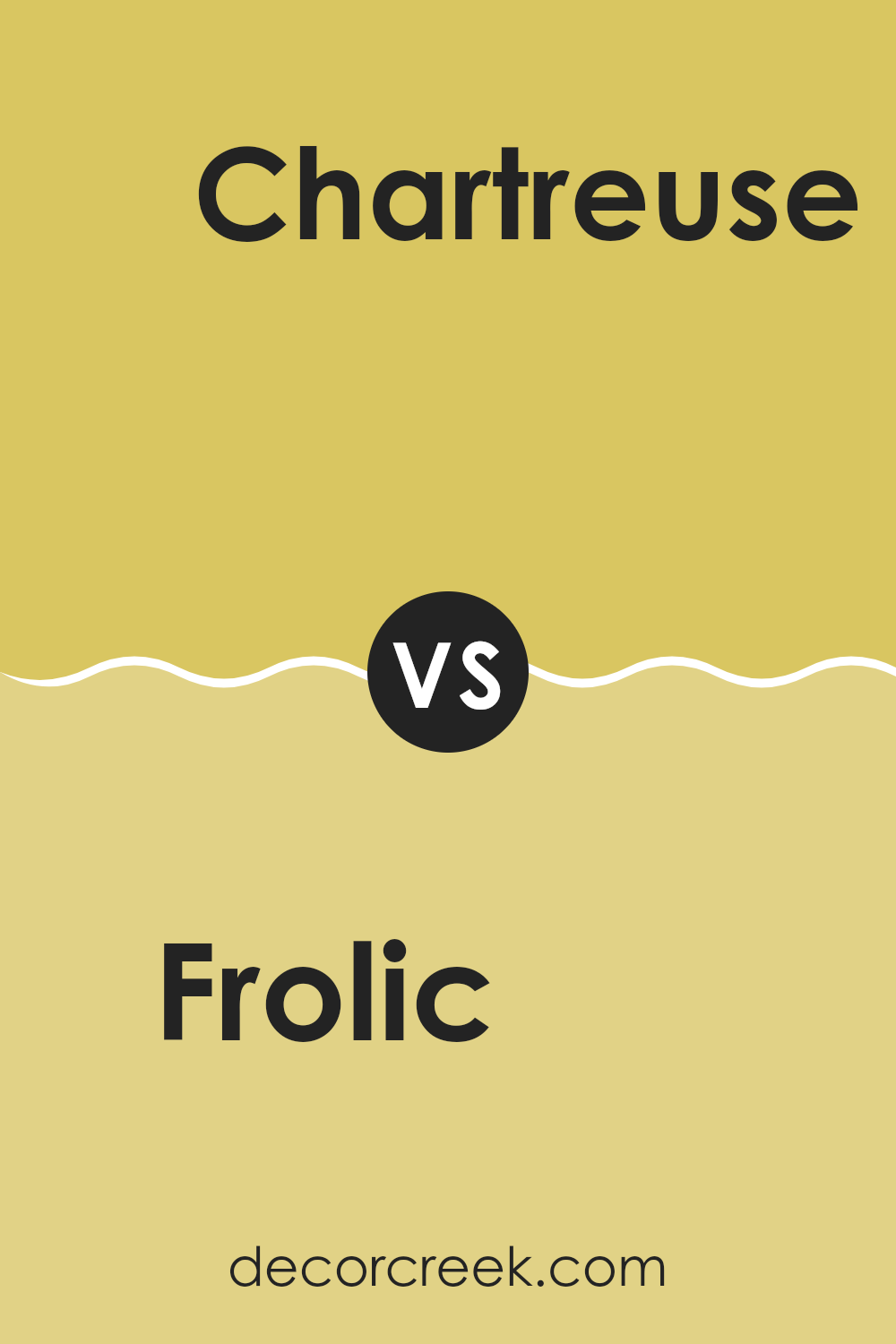
Frolic SW 6703 by Sherwin Williams vs Chartreuse SW 0073 by Sherwin Williams
Frolic and Chartreuse are both vibrant colors by Sherwin Williams that pack a punch, but in different ways. Frolic is a soft, playful green that’s light and airy, giving a gentle, soothing feel without being too bold. It’s perfect for creating a calming yet cheerful room.
In contrast, Chartreuse is a bold, bright yellow-green that’s much more lively and brilliant. This color really stands out and can energize any room it’s used in.
While Frolic might be better suited for a bedroom or living room where you want a relaxed atmosphere, Chartreuse could be the go-to for areas like a kitchen or playroom where you want to inject a lot of energy and fun. Both colors are unique and can make a room more interesting, depending on the effect you’re going for.
You can see recommended paint color below:
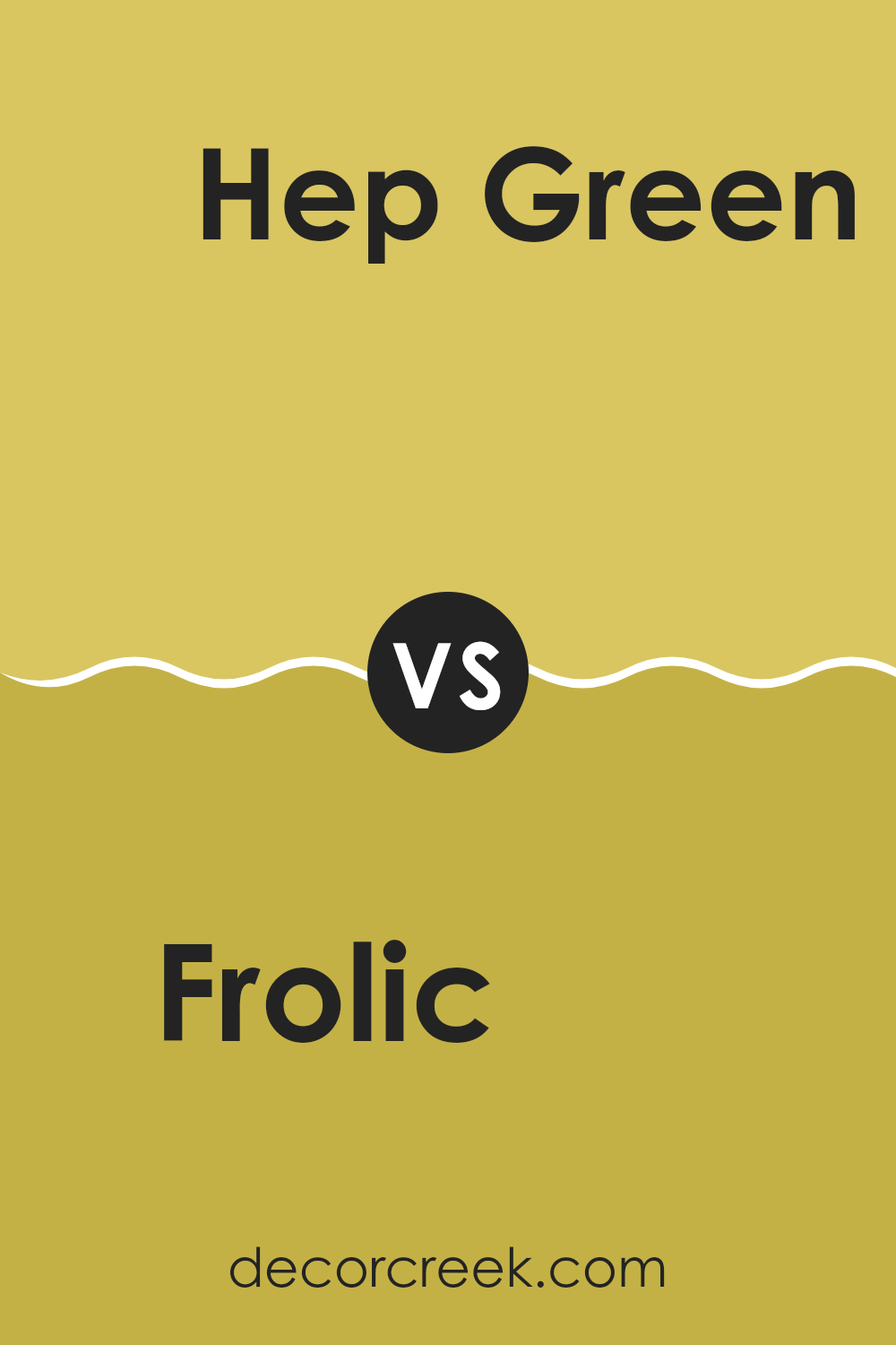
Frolic SW 6703 by Sherwin Williams vs Hep Green SW 6704 by Sherwin Williams
Frolic and Hep Green are two vibrant colors from Sherwin Williams that offer lively and cheerful tones for any room. Frolic is a bright and energetic green, lighter and more playful. It brings a sense of freshness and can perk up a room with a youthful vibe.
On the other hand, Hep Green is a shade darker, adding a touch of depth while maintaining the overall vibrancy. It can make a room feel more grounded without losing the lively feel of green hues.
Both colors work well in rooms that need a pop of color, but Frolic offers a lighter touch while Hep Green provides more intensity and a touch of richness. Overall, both are great for creating lively, welcoming areas, with Frolic being lighter and Hep Green offering a bit more depth.
You can see recommended paint color below:
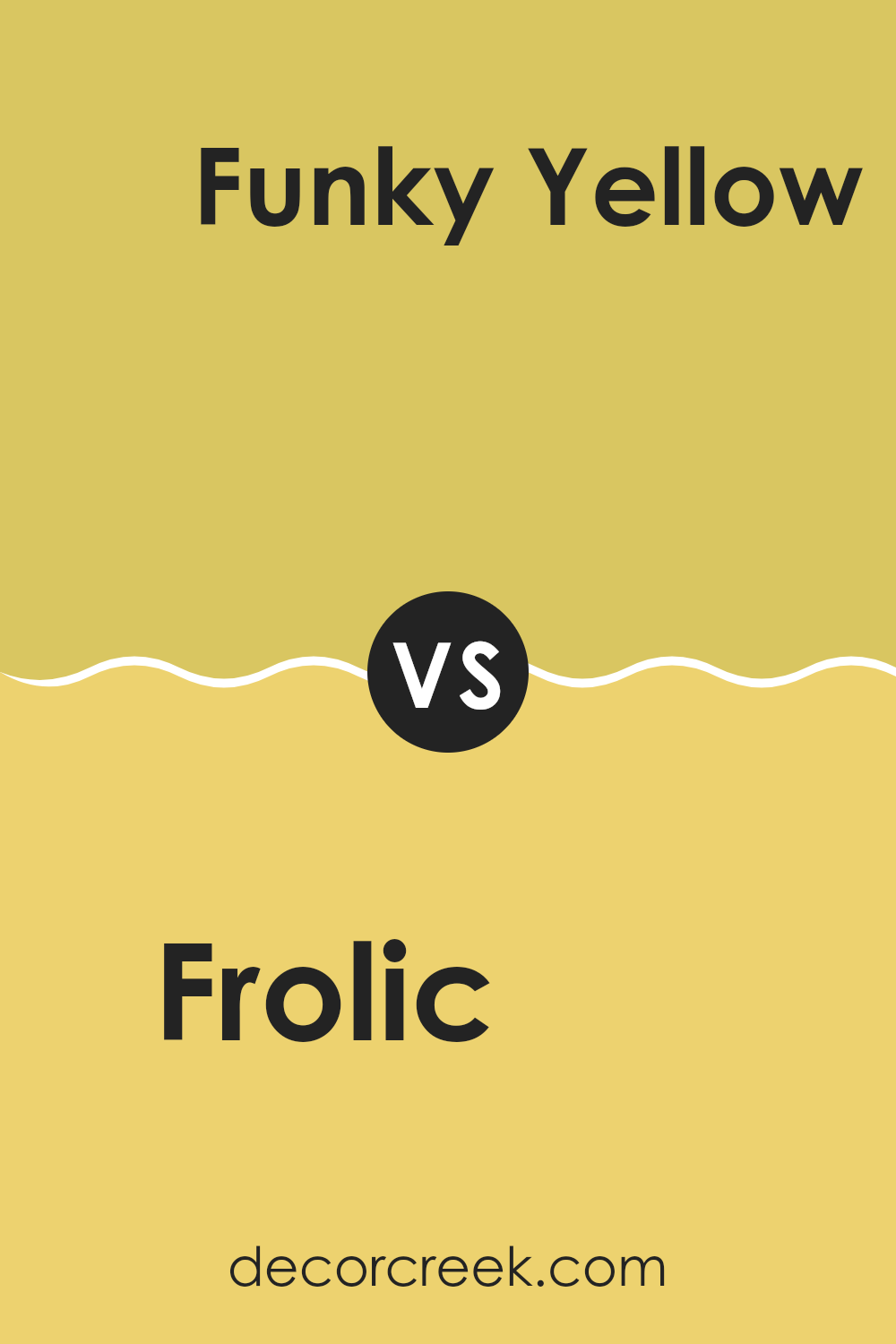
Frolic SW 6703 by Sherwin Williams vs Funky Yellow SW 6913 by Sherwin Williams
Frolic and Funky Yellow are two vibrant colors from Sherwin Williams, each with its own unique appeal. Frolic is a fresh and lively green that brings a sense of energy and renewal to any room. It’s bright without being overpowering, making it a great choice for adding a touch of cheerfulness to rooms.
On the other hand, Funky Yellow is a bold, vivid yellow. It’s a standout color that radiates happiness and brightness, perfect for areas where you want to create a lively, upbeat atmosphere.
Both colors are great for adding personality to a room, but while Frolic provides a cooler, refreshing vibe, Funky Yellow offers a warm, sunny feel. Depending on your room’s theme and the mood you want to set, either color can make a striking statement.
You can see recommended paint color below:
- SW 6913 Funky Yellow
Frolic SW 6703 by Sherwin Williams vs Impetuous SW 6916 by Sherwin Williams
Frolic and Impetuous by Sherwin Williams are two distinct shades that can brighten any room. Frolic is a lively light green with a fresh, spring-like vibe. It’s perfect for adding a splash of energy and vitality to a room.
On the other hand, Impetuous is a bold and vibrant pink that commands attention. It has a playful yet strong presence, making it ideal for creating a standout feature wall or an energetic children’s area. Together, these colors can create a fun and youthful atmosphere, though they cater to different tastes and emotions.
Frolic is more calming and is suitable for areas where you want to feel refreshed, like kitchens and bathrooms. Impetuous, conversely, is great for areas where excitement or creativity is encouraged, such as playrooms or creative studios. Choosing between them comes down to what feeling you want to bring into the room.
You can see recommended paint color below:
- SW 6916 Impetuous
Frolic SW 6703 by Sherwin Williams vs Quilt Gold SW 6696 by Sherwin Williams
Frolic SW 6703 and Quilt Gold SW 6696 by Sherwin Williams are two distinct and vivid colors that can significantly influence the atmosphere of a room. Frolic is a lively, bright green that brings a sense of energy and freshness to any room. It’s the kind of color that can make a room feel invigorated and cheerful, perfect for areas used for creativity and socializing.
On the other hand, Quilt Gold is a warm, deep yellow that offers a cozy and comforting feel. It’s great for creating a welcoming and friendly environment, ideal for living rooms or dining areas where you want to generate a sense of warmth and togetherness.
These two colors, while both vibrant, serve different purposes depending on the mood you want to set. Frolic’s green is more about vibrancy and rejuvenation, while Quilt Gold’s yellow focuses on warmth and comfort. When choosing between them, think about what feelings you want to encourage in your room.
You can see recommended paint color below:
Frolic SW 6703 by Sherwin Williams vs Limon Fresco SW 9030 by Sherwin Williams
Both “Frolic” and “Limon Fresco” by Sherwin Williams are lively, vibrant shades perfect for bringing energy into a room. Frolic is a bright, playful green that leans more towards a spring-like freshness. It resembles the vibrant hues of new leaves and grass, sparking a sense of renewal in any room.
On the other hand, Limon Fresco is a lighter and zestier green, closely mirroring the cheerful vibrance of a lemon’s peel. This color is airier and has a breezy feel, making areas feel open and light. While both colors share a foundation in the green family, Frolic offers a deeper, more grassy tone that can make a room feel grounded yet fresh.
Limon Fresco, with its lemony brightness, seems to lift a room and give it a sunny disposition. Both are perfect for anyone looking to add a punch of cheer and freshness to their decor, with Frolic suited to those preferring a richer hue and Limon Fresco ideal for a lighter, crisper vibe.
You can see recommended paint color below:
- SW 9030 Limon Fresco
Frolic SW 6703 by Sherwin Williams vs Eye Catching SW 6914 by Sherwin Williams
“Frolic” and “Eye Catching” are both lively, vibrant colors by Sherwin Williams, yet they exhibit distinct tones that can set very different moods in a room. “Frolic” is a vivid, light green that brings a fresh and cheerful energy to any room. It’s perfect for creating a bright and inviting atmosphere, reminiscent of spring and new growth. This makes it an excellent choice for kitchens, playrooms, or any area that benefits from a splash of youthful energy.
On the other hand, “Eye Catching” is a bold and deep turquoise. This color is more intense and can lend a dramatic flair to areas. Its richness can add a sense of fun and personality, ideal for an accent wall or a bathroom where you want to make a strong visual impact.
Compared to “Frolic,” “Eye Catching” stands out with a deeper saturation and can influence a room’s aesthetic in a more pronounced way. Both colors are great for those looking to inject vibrancy into their rooms, but the choice between them depends on the specific mood and intensity one wishes to achieve.
You can see recommended paint color below:
- SW 6914 Eye Catching
In conclusion, SW 6703 Frolic by Sherwin Williams is an exciting paint color. It’s like a breath of fresh spring air when you step outside into a sunny, happy garden. This color is light and bright, making any room feel joyful and full of life.
I think it’s perfect for places where you play and laugh, like a playroom or a cheerful kitchen. It has a way of making small rooms seem bigger and more open because it reflects light so well. If you’re thinking of bringing a lively touch to your home, Frolic is a great choice.
It’s fun and feels like a splash of happiness on the walls. All in all, I find Frolic by Sherwin Williams a fantastic color for making a home feel warm and inviting. It turns ordinary rooms into happy little worlds of their own.
Ever wished paint sampling was as easy as sticking a sticker? Guess what? Now it is! Discover Samplize's unique Peel & Stick samples.
Get paint samples

