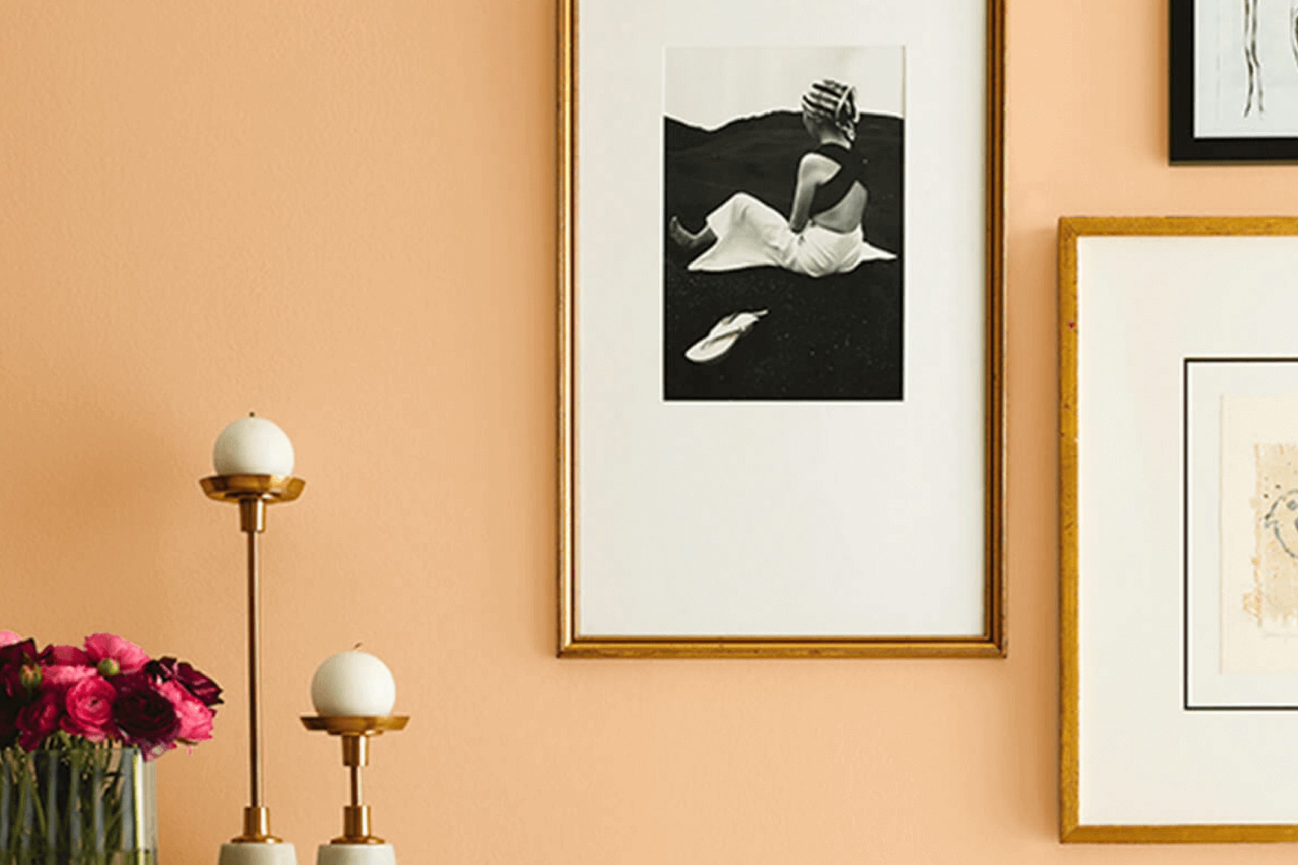
If you’re thinking about giving your room an update with some fresh paint, consider SW 7677 Gold Vessel by Sherwin Williams. When you see this color, you might feel it fills the area with a warm and inviting glow, which can be perfect for making any room feel more welcoming and cozy.
This shade of gold isn’t overly bright or flashy; instead, it strikes a nice balance, providing just enough luster to enhance a room without overpowering it. I’ve noticed that it pairs beautifully with dark woods and rich textures, adding a touch of sophistication to traditional and modern designs alike.
Whether you’re planning to refresh your living room, bedroom or even your kitchen, Gold Vessel could be the touch of warmth your home needs.
What Color Is Gold Vessel SW 7677 by Sherwin Williams?
Gold Vessel SW 7677 by Sherwin Williams is a vibrant, rich golden hue that exudes warmth and elegance. This color brings a lively sparkle to any room, reminiscent of sunlight illuminating gold. It is perfect for creating a welcoming atmosphere that feels both cozy and luxurious.
This particular shade of gold is ideal for traditional interiors, such as classic or Victorian styles, where its opulent tone can be paired with dark woods and intricate textiles to enhance its grandeur. It’s also a great fit for more eclectic decorations where it can be a central piece to contrast with bright, bold colors or to add warmth to a subdued color palette.
Material-wise, Gold Vessel pairs wonderfully with lush fabrics like velvet or silk, adding a soft texture against its shimmering finish. It also looks beautiful with natural materials like leather and wood, which help ground its brightness while maintaining a rich, inviting feel. For a modern twist, pairing it with matte finishes or metals such as brass and copper can create a chic, eye-catching aesthetic.
Whether used as an accent wall, for trim, or within fabric patterns, Gold Vessel is a flexible color that adds a touch of glamour and warmth to any room. Its golden tones can effectively highlight important features or simply enrich the general ambiance of a room.

Is Gold Vessel SW 7677 by Sherwin Williams Warm or Cool color?
Gold Vessel by Sherwin Williams is a warm, vibrant gold paint color that brings a cozy and inviting feel to any room. This shade is perfect for creating a welcoming atmosphere in living areas like the living room or dining area. Due to its lively yet soft appearance, it pairs well with a variety of decor styles, from modern to rustic.
When used in small areas, such as a bathroom or an entryway, Gold Vessel adds a splash of brightness without overpowering the area. Its golden hue can also help to enhance the natural light in a room, making the room appear larger and more open.
For those looking to incorporate a cheerful and warm ambiance in their home, Gold Vessel is an excellent choice. It works well as an accent wall or can be used throughout a room to create a consistent and harmonious look.
Undertones of Gold Vessel SW 7677 by Sherwin Williams
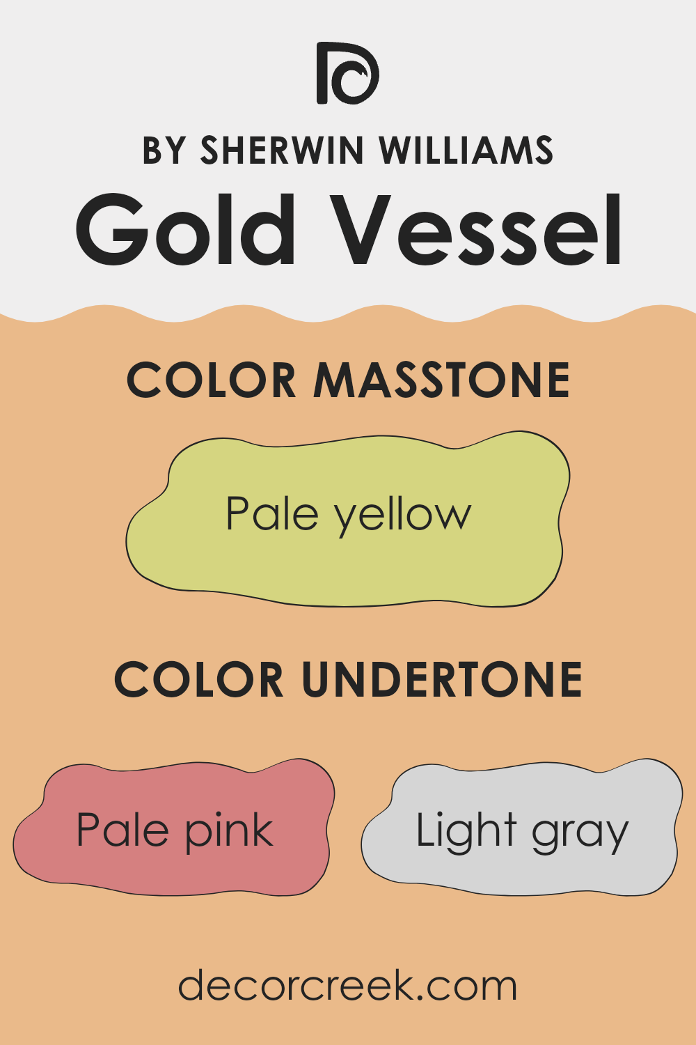
Gold Vessel is a flexible color that can change appearance based on its undertones. Undertones are subtle colors that influence the main shade, affecting how it looks in different lighting or when paired with other colors. For Gold Vessel, the undertones include a range of hues like pale pink, light gray, light purple, yellow, mint, orange, gray, light blue, lilac, light green, and olive.
These undertones play a key role in how the paint looks on interior walls. For instance, pale pink and light purple can give the color a slightly warmer and softer appearance, making the room feel cozy. Light gray or gray can neutralize the color, helping it blend well with modern and minimalist decor. Yellow and orange undertones can add a cheerful brightness, making the room more inviting.
On the other hand, cooler undertones like mint, light blue, and lilac can give the color a fresher look, which might be perfect for bathrooms or kitchens. Olive and light green undertones bring a natural, earthy vibe, ideal for rooms that aim for a connection to nature.
The choice of lighting and decor can either amplify or soften these undertones. Natural light can make Gold Vessel appear brighter and bring out its warmer tones, while artificial lighting can highlight its cooler shades. This makes choosing the right undertone crucial depending on the room’s purpose and the mood you want to set.
What is the Masstone of the Gold Vessel SW 7677 by Sherwin Williams?
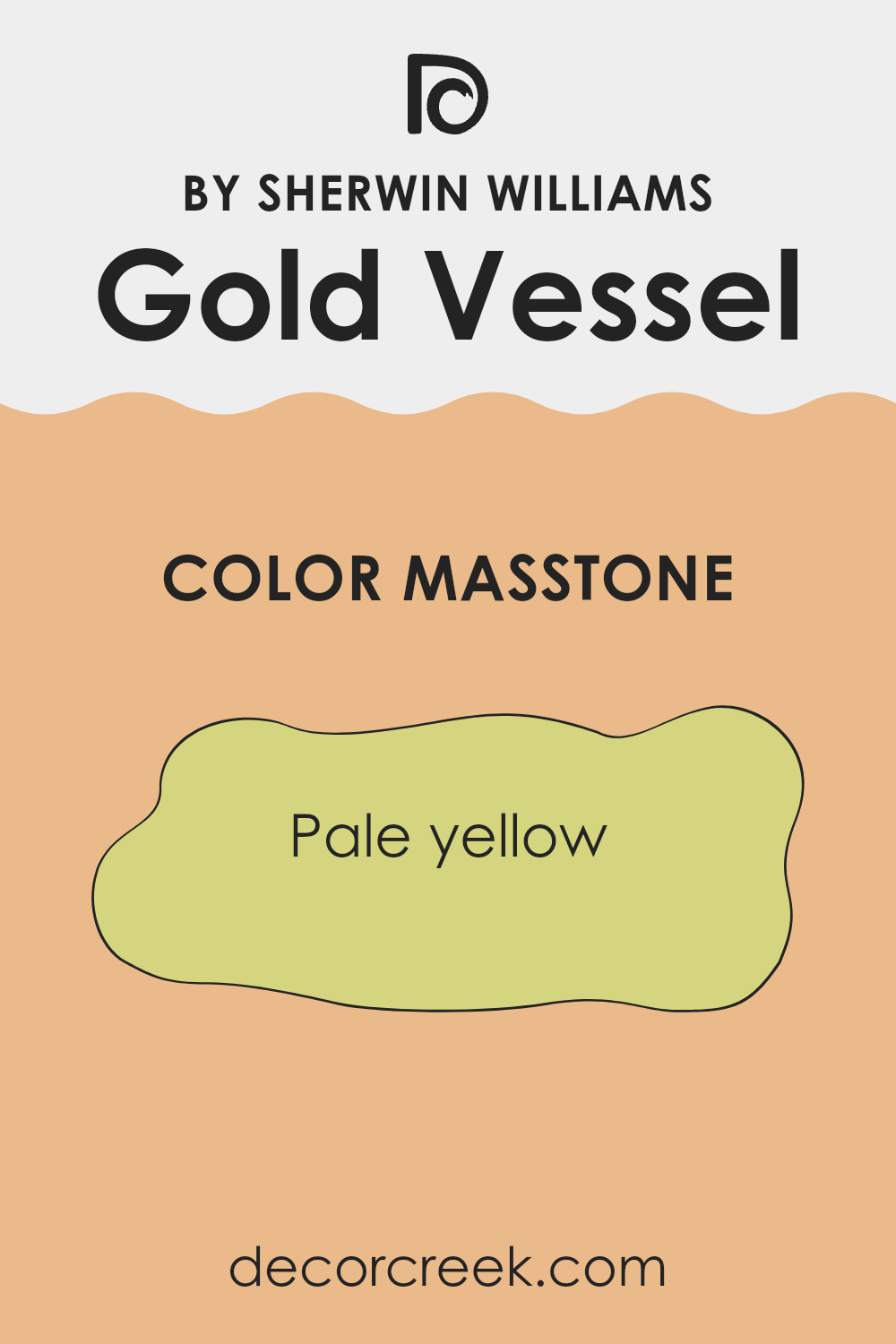
Gold Vessel SW 7677 by Sherwin Williams has a masstone color of pale yellow, specifically a shade similar to #D5D580. This particular color offers a subtle, muted brightness to any room. Since pale yellow is light and airy, it can make smaller areas appear larger and more open.
This tone also provides a warm and welcoming atmosphere, making it ideal for social areas like living rooms and kitchens. Being a neutral yet inviting color, it pairs well with various other colors, from crisp whites to deeper hues like navy or forest green, allowing for flexible design choices.
Additionally, pale yellow has a calming effect, which can help in reducing stress, making it a good choice for bedrooms as well. Overall, this color is practical for creating a cozy, inviting atmosphere in homes without overpowering the senses.
How Does Lighting Affect Gold Vessel SW 7677 by Sherwin Williams?
Lighting dramatically changes the way colors appear in a room. The color Gold Vessel SW 7677 by Sherwin Williams is a prime example of how different types of light can alter the perception of color. This particular shade, a warm and rich hue, can look quite different under various lighting conditions.
Artificial Light vs. Natural Light: Under artificial light, Gold Vessel tends to show its depth, bringing out warm and cozy undertones. This makes it ideal for living areas with soft lighting, where it can create a welcoming atmosphere. In contrast, in natural light, this color can appear brighter and more vibrant, as sunlight tends to enhance its golden qualities, making the area feel lively and cheerful.
Room Orientation:
– North-Faced Rooms: North-facing rooms get less direct sunlight, which can make colors appear slightly cooler. In such rooms, Gold Vessel might appear more subdued and less vibrant, sometimes even taking on a slightly greener tinge. It’s worth considering additional lighting to warm up the color.
– South-Faced Rooms: In contrast, south-facing rooms receive plentiful sunlight that can intensify the warmth of Gold Vessel, making it appear richer and more radiant. This can help the room feel bright and inviting throughout the day.
– East-Faced Rooms: East-facing rooms enjoy morning sunlight, which is warm and bright. In the morning, Gold Vessel will look its most vibrant and welcoming, perfect for rooms used predominantly in the morning, like kitchens or breakfast nooks.
– West-Faced Rooms: West-facing rooms get afternoon light, which can be quite warm. Gold Vessel will look particularly glowing in the late afternoon, creating a cozy and inviting atmosphere that’s perfect for living rooms or dining areas that are used more during the evening.
Choosing the right lighting for Gold Vessel SW 7677 can make a big difference in your room. Whether illuminated by the soft glow of lamps or the bright rays of the sun, this color’s shifting character brings warmth and dynamism to any room.

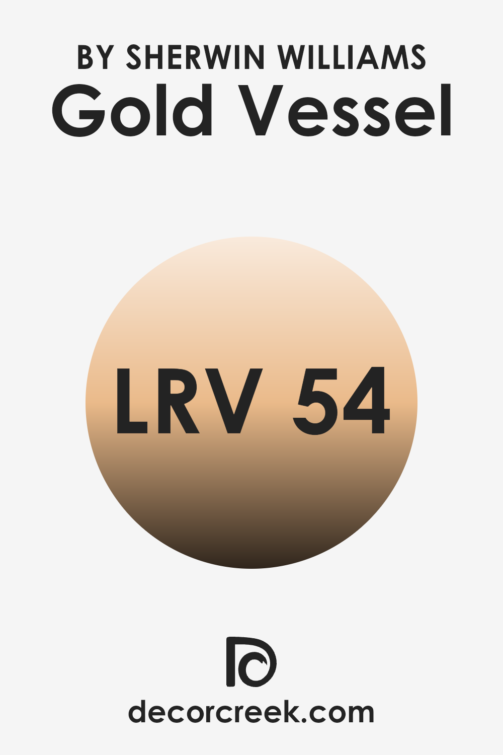
What is the LRV of Gold Vessel SW 7677 by Sherwin Williams?
Light Reflectance Value, or LRV, is a measure used to determine how much light a paint color reflects or absorbs. This number ranges from a minimum value, which indicates that the paint absorbs most light, making it appear darker, to a maximum value that indicates the paint reflects nearly all light, making it look lighter.
Since the value is given as a percentage, higher values mean the color will appear lighter and make rooms feel more open and brighter, while lower values mean the color will appear darker and can make a room feel smaller or more enclosed
The specific LRV for the color Gold Vessel (54.365) indicates that it is a mid-range color, neither too dark nor too light. This balance makes it flexible enough for various lighting situations and room sizes. In brightly lit rooms, the color will appear more vibrant and lively, reflecting a significant amount of light without being overpowering.
In rooms with less natural light, it will comfortably hold its warmth and depth without making the area feel cramped or gloomy. This makes it a practical choice for multiple parts of a home, contributing to a pleasant atmosphere regardless of the room’s lighting conditions.
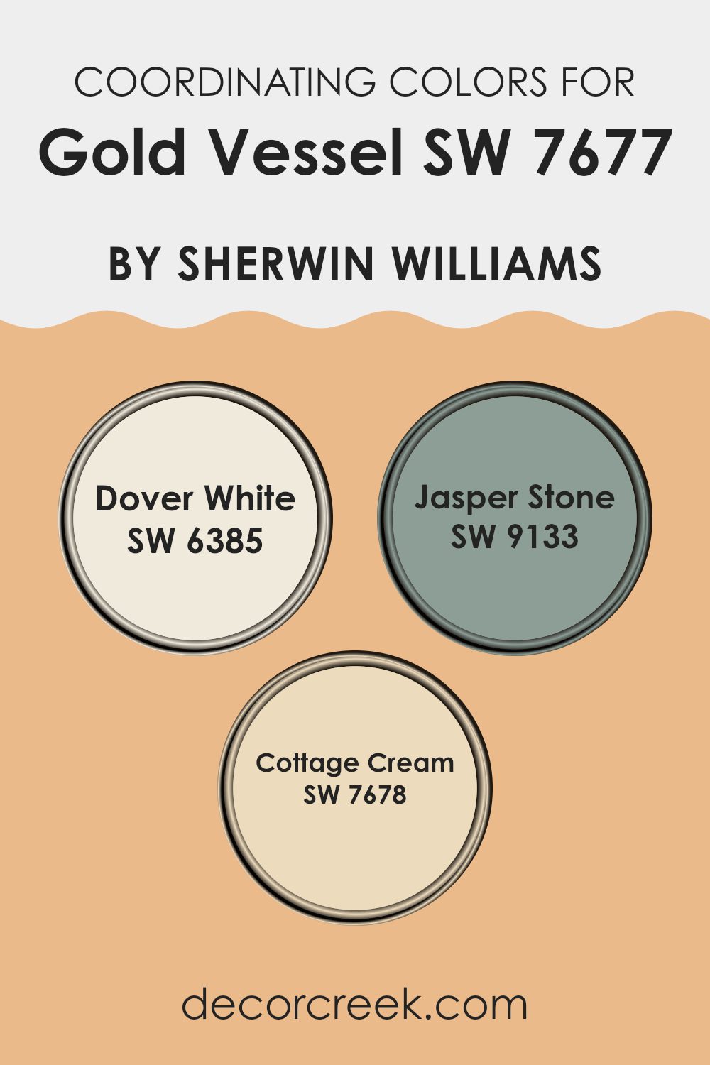
Coordinating Colors of Gold Vessel SW 7677 by Sherwin Williams
Coordinating colors are shades that complement each other and can be used together to create a harmonious color scheme in interior design. When chosen carefully, they can accentuate features, set a mood, or even make a room appear more spacious. For example, the colors Dover White, Jasper Stone, and Cottage Cream are coordinating colors that work well with Gold Vessel, providing a balanced and aesthetically pleasing palette.
Dover White is a soft, creamy white with a hint of warmth, making it ideal as a neutral base or a calming backdrop in any room. It contrasts subtly with richer tones, adding depth while maintaining a light and airy feel.
Jasper Stone is a deep, muted shade of green with gray undertones, offering a grounding effect that is perfect for creating a focal point or accentuating architectural features. It exudes a natural earthiness that pairs well with wood and natural fibers. Finally, Cottage Cream is a gentle yellow with a soothing presence, excellent for adding a touch of brightness to a room without overpowering it.
This color works well in sunlit rooms and can help enhance the cozy, welcoming vibe of a home. These coordinating colors together provide a flexible palette that allows for various design aesthetics, from modern to classic.
You can see recommended paint colors below:
- SW 6385 Dover White
- SW 9133 Jasper Stone
- SW 7678 Cottage Cream
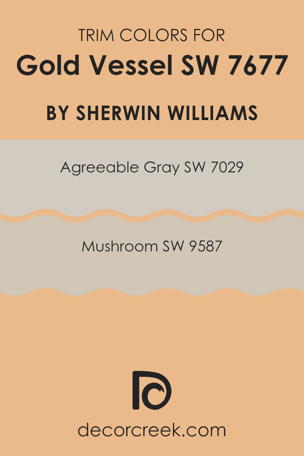
What are the Trim colors of Gold Vessel SW 7677 by Sherwin Williams?
Trim colors are specifically chosen paint shades used to highlight the architectural features of a room such as door frames, window sills, and baseboards. Selecting the right trim color can profoundly impact the overall appearance of a room, enhancing both its aesthetics and features. By carefully choosing trim colors, the visual appeal of the walls gets a subtle yet effective boost, making architectural details pop beautifully.
For Gold Vessel SW 7677 by Sherwin Williams, a bright and warm hue, trim colors like SW 7029 – Agreeable Gray and SW 9587 – Mushroom can complement the brightness with their neutral tones, ensuring that the room feels balanced and pleasantly coordinated.
SW 7029 – Agreeable Gray, as its name implies, is a flexible gray shade that leans towards the warmer spectrum, making it a fantastic choice for a trim that’s designed to pair well with almost any color, including the vivid tones of Gold Vessel. Its inherent warmth ensures that it doesn’t overpower but rather subtly defines the areas between different architectural elements.
On the other hand, SW 9587 – Mushroom is a deeper, earthy color that offers a rich contrast without overpowering the primary wall color. This muted brown with gray undertones brings a grounding effect to the vibrant walls, providing a touch of natural elegance that ties the overall palette together harmoniously.
You can see recommended paint colors below:
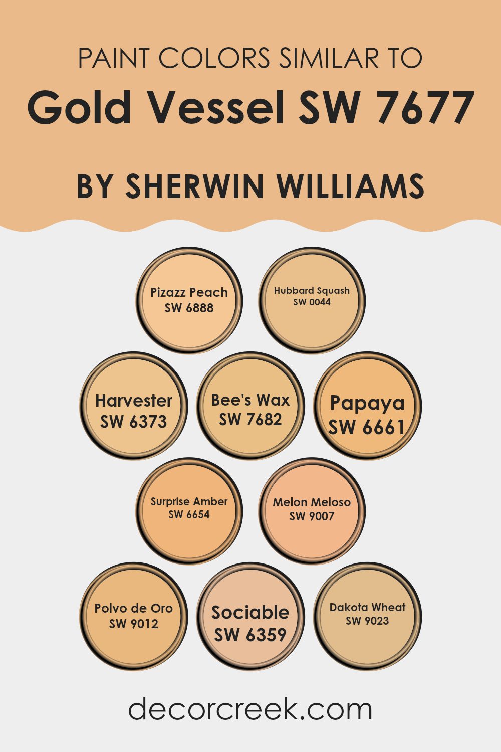
Colors Similar to Gold Vessel SW 7677 by Sherwin Williams
Choosing similar colors can significantly enhance the aesthetic appeal and coherence of a room. When colors such as Pizazz Peach, Hubbard Squash, Harvester, Bee’s Wax, Papaya, Surprise Amber, Melon Meloso, Polvo de Oro, Sociable, and Dakota Wheat are used together, they create a harmonious look that feels connected and balanced. These colors share warm undertones that make them flexible for use in various design styles, providing a welcoming and unified atmosphere.
Pizazz Peach is a lively color that adds a cheerful pop, while Hubbard Squash offers a deeper, rich orange that brings warmth to any setting. Harvester is another warm hue, which falls between yellow and orange, perfect for creating a cozy environment.
Bee’s Wax has a subdued, mellow yellow tone that works well in calming rooms. For a fresh yet soft look, Papaya brilliantly combines soft orange tones. Surprise Amber is a bit more intense, infusing areas with energy and freshness. Melon Meloso is a gentle, peachy tone that radiates a subtle delightfulness.
In contrast, Polvo de Oro is a delicate gold that adds mild elegance without overpowering. Sociable is a vibrant orange that is outgoing and instantly draws the eye, making it great for accent points. Lastly, Dakota Wheat is a strong yet muted gold that lends a sense of groundedness, ideal for rooms aiming for a subtle yet striking impact.
You can see recommended paint colors below:
- SW 6888 Pizazz Peach
- SW 0044 Hubbard Squash
- SW 6373 Harvester
- SW 7682 Bee’s Wax
- SW 6661 Papaya
- SW 6654 Surprise Amber
- SW 9007 Melon Meloso
- SW 9012 Polvo de Oro
- SW 6359 Sociable
- SW 9023 Dakota Wheat
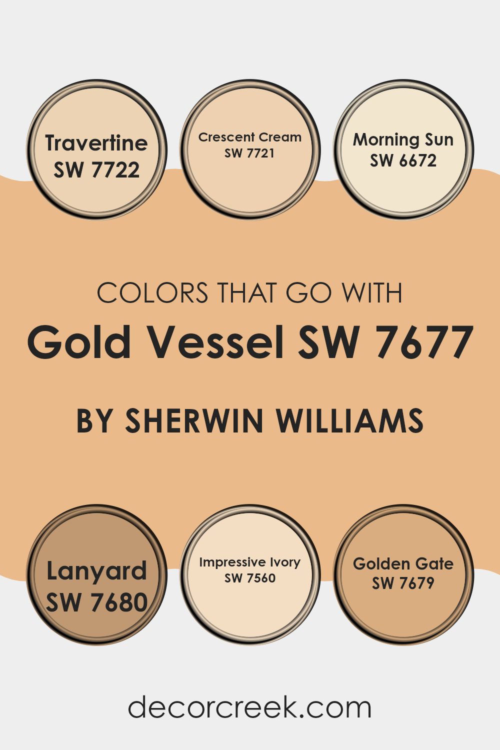
Colors that Go With Gold Vessel SW 7677 by Sherwin Williams
Choosing the right colors to complement Gold Vessel SW 7677 by Sherwin Williams is crucial for creating a harmonious and visually appealing room. These complementary colors can enhance the golden tones of Gold Vessel, making any room feel warm and welcoming.
For example, Travertine SW 7722 adds a soft, sandy texture that works beautifully alongside Gold Vessel’s richness, providing a natural, grounding effect. Similarly, Crescent Cream SW 7721 offers a light, creamy hue that brings out the luminous qualities of Gold Vessel, making the area appear brighter and more airy.
Morning Sun SW 6672 injects a cheerful splash of yellow, echoing the sunlit elements of Gold Vessel and making the room feel vibrant yet cozy. Lanyard SW 7680 introduces a deeper, neutral grey that contrasts nicely with the gold, adding depth and interest to the palette.
Impressive Ivory SW 7560 is a gentle ivory that blends smoothly with Gold Vessel, ensuring the environment remains light and fresh.
Lastly, Golden Gate SW 7679 provides a richer, darker golden tone that reinforces the luxurious feel of Gold Vessel, perfect for creating a more dramatic and inviting atmosphere.
Together, these colors work in harmony to enhance the beauty and effectiveness of the main gold hue, shaping rooms that are both appealing and comfortable.
You can see recommended paint colors below:
- SW 7722 Travertine
- SW 7721 Crescent Cream
- SW 6672 Morning Sun
- SW 7680 Lanyard
- SW 7560 Impressive Ivory
- SW 7679 Golden Gate
How to Use Gold Vessel SW 7677 by Sherwin Williams In Your Home?
Gold Vessel SW 7677 by Sherwin Williams is a warm, rich gold paint that can add a cozy and welcoming touch to your home. This color works beautifully in living rooms or dining areas where you often have guests, as it creates a friendly, inviting atmosphere. You can use it on one wall as an accent to add a pop of color without overpowering the area. It pairs nicely with dark wood furniture or white trim for a classy look.
In bedrooms, Gold Vessel can give a cozy, comforting vibe, perfect for creating a relaxing environment. It’s also great in smaller rooms like bathrooms or hallways, where it can make the area feel more intimate and warm.
Additionally, this color can be used in creative ways, such as on cabinets or shelves, to refresh old furniture and add a touch of brightness to the room. Whether you want a bold statement wall or a subtle hint of warmth, Gold Vessel SW 7677 is a flexible choice that can fit various decorating styles.
Gold Vessel SW 7677 by Sherwin Williams vs Hubbard Squash SW 0044 by Sherwin Williams
Gold Vessel and Hubbard Squash are two distinctive paint colors by Sherwin Williams. Gold Vessel is a rich, deep gold that brings a warm and cozy feel to any room, resembling the glow of a sunset. It has a luxurious touch that can make a room feel welcoming and festive.
In contrast, Hubbard Squash has a softer, more muted appearance. It is a creamy orange color with hints of yellow, reminiscent of autumn pumpkins. This color can help create a cheerful and relaxing environment, perfect for rooms where you want to feel calm and comfortable.
While Gold Vessel adds a bold and warm accent, Hubbard Squash offers a gentler touch that blends seamlessly with a variety of decor styles, making it flexible for many settings.
You can see recommended paint color below:
- SW 0044 Hubbard Squash
Gold Vessel SW 7677 by Sherwin Williams vs Papaya SW 6661 by Sherwin Williams
Gold Vessel and Papaya by Sherwin Williams are two distinct and vivid colors. Gold Vessel is a warm, soft golden shade that brings a feeling of comfort and a bit of charm. It works especially well in places like living rooms or studies, where you want to create a cozy and inviting setting. It pairs well with dark woods and rich textiles, enhancing the sense of warmth.
On the other hand, Papaya is a bright, cheerful orange with a vibrant punch. It’s perfect for adding a splash of energy to any area, such as a kitchen or a children’s playroom, where enthusiasm and happiness are key. This shade coordinates nicely with light woods, whites, and grays, offering a fresh and lively look.
While both colors bring their own unique vibes, Gold Vessel offers a more subdued and traditional aura, whereas Papaya provides a bolder and more dynamic feel. Depending on the mood and function of the room, either color could be a great choice, reflecting a wide range of personal styles and preferences.
You can see recommended paint color below:
- SW 6661 Papaya
Gold Vessel SW 7677 by Sherwin Williams vs Bee’s Wax SW 7682 by Sherwin Williams
Gold Vessel and Bee’s Wax are both warm, inviting colors from Sherwin Williams, each offering unique tones to liven up any room. Gold Vessel has a rich, deep yellow hue that’s reminiscent of a shiny, polished gold. This color brings in a rich, cozy feeling, which makes it a great pick for rooms where you want both comfort and a bold touch—like living rooms or dining areas.
On the other hand, Bee’s Wax is a softer, muted yellow. This color has a more understated vibe compared to Gold Vessel, providing a gentle warmth that’s calming and not too overpowering. Bee’s Wax is ideal for creating a peaceful atmosphere in places like bedrooms or home offices, where a soothing environment is beneficial.
Both colors go well with a range of decorative styles and complement furnishings that feature natural wood tones or darker accents. While Gold Vessel pulls more attention, Bee’s Wax blends seamlessly, making each great for different purposes and tastes.
You can see recommended paint color below:
- SW 7682 Bee’s Wax
Gold Vessel SW 7677 by Sherwin Williams vs Melon Meloso SW 9007 by Sherwin Williams
Gold Vessel from Sherwin Williams is a deep, warm gold that makes any room feel inviting and comfortable. It’s perfect for creating a welcoming atmosphere in living rooms or dining areas, pairing beautifully with darker furniture or accents.
On the other hand, Melon Meloso is a soft, cheerful orange-pink that evokes a light and breezy feel. It’s a great option for rooms where you want to bring in a fun, cheerful vibe—like a kitchen or a kid’s room. This color also works well when combined with lighter shades and natural light to make a room feel more open and airy.
Both colors have their unique appeal, depending on the mood and style you want to achieve. Gold Vessel adds warmth and depth, making it great for traditional or luxurious settings. Meanwhile, Melon Meloso is perfect if you are looking for something more fun and informal.
You can see recommended paint color below:
- SW 9007 Melon Meloso
Gold Vessel SW 7677 by Sherwin Williams vs Polvo de Oro SW 9012 by Sherwin Williams
Gold Vessel and Polvo de Oro, both by Sherwin Williams, are two distinctive shades of gold that can greatly impact the look and feel of a room. Gold Vessel is a deep, rich gold with a muted, almost bronze-like undertone. This color works well to bring a cozy, welcoming feeling to rooms like living or dining areas. It pairs well with dark wood furniture and can give a room a traditional feel.
On the other hand, Polvo de Oro is a lighter, more subtle gold. It has a soft shimmer that reflects light beautifully, making it great for smaller rooms or ones that don’t get much natural light. It works well in modern styles or paired with lighter woods and pastel colors. This shade helps a room feel brighter and more open.
These two gold tones offer different vibes — Gold Vessel is deeper and warmer, while Polvo de Oro is softer and lighter, providing flexibility depending on your design needs.
You can see recommended paint color below:
- SW 9012 Polvo de Oro
Gold Vessel SW 7677 by Sherwin Williams vs Harvester SW 6373 by Sherwin Williams
Gold Vessel is a warm golden shade, much like a classic, cozy sunrise. It’s inviting and pairs beautifully with a variety of decor, giving off a rich and homey vibe. This color is perfect for living rooms and kitchens where a welcoming atmosphere is desired.
On the other hand, Harvester is a soft, muted yellow. This color has a gentler appearance, reminiscent of wheat fields and autumn afternoons. It’s less intense than Gold Vessel, making it ideal for creating a subtle, cheerful environment. Harvester works well in rooms that get plenty of natural light, where its sunny qualities can really shine through.
In comparison, Gold Vessel is deeper and more intense, ideal for making a statement or warming up a room. Harvester, with its lighter, uplifting tone, offers a fresh and airy feel. Both colors can enhance a room but in different ways, depending on the mood you’re aiming to achieve.
You can see recommended paint color below:
- SW 6373 Harvester
Gold Vessel SW 7677 by Sherwin Williams vs Dakota Wheat SW 9023 by Sherwin Williams
Gold Vessel and Dakota Wheat are two distinct colors from Sherwin Williams. Gold Vessel is a bold, rich gold tone that adds a warm and inviting look to any room. This color is especially ideal for creating a cozy, yet vibrant atmosphere in rooms like living rooms or dining areas.
On the other hand, Dakota Wheat is a softer, more subdued beige with subtle golden undertones. It provides a neutral backdrop that works well in a variety of settings, making it great for rooms where you want a calming effect without the brightness of more intense colors.
While Gold Vessel stands out and catches the eye, Dakota Wheat blends smoothly into its surroundings, making it perfect for those who prefer a more understated look. Together, these colors offer options for either making a bold statement or creating a gentle, soothing environment.
You can see recommended paint color below:
Gold Vessel SW 7677 by Sherwin Williams vs Sociable SW 6359 by Sherwin Williams
Gold Vessel and Sociable by Sherwin Williams are quite different in their vibe and appeal. Gold Vessel is a warm, muted gold that gives off a cozy, welcoming feel. It’s perfect for creating a soft, inviting atmosphere in any room, particularly rooms where you want a touch of understated elegance without overpowering brightness.
On the other hand, Sociable is a vibrant, cheerful pink with a distinctly playful energy. It’s great for adding a pop of color and personality to rooms that might otherwise be overlooked. Sociable works well in lively areas like a kitchen or a playroom, where the goal is to create a fun and engaging environment.
Overall, if you’re aiming for a subtle, refined look, Gold Vessel would be the way to go. For making a bold statement with a lively, energizing effect, Sociable is your color. Both colors are quite flexible but serve very different decorative purposes in your home.
You can see recommended paint color below:
Gold Vessel SW 7677 by Sherwin Williams vs Surprise Amber SW 6654 by Sherwin Williams
Gold Vessel and Surprise Amber are both warm, inviting shades from Sherwin Williams, but they have distinct tones and moods. Gold Vessel is a deep, rich gold that offers a sense of luxury and warmth.
It’s perfect for creating a cozy and inviting atmosphere in any room, making it ideal for living rooms or dining areas. On the other hand, Surprise Amber is a lighter, brighter shade with an orangey tint.
It has a playful and cheerful vibe that can energize a room, making it an excellent choice for kitchens, playrooms, or any room that benefits from a burst of sunshine. While both colors bring warmth, Gold Vessel feels more traditional and refined, where Surprise Amber offers a fresher, more vibrant look.
You can see recommended paint color below:
- SW 6654 Surprise Amber
Gold Vessel SW 7677 by Sherwin Williams vs Pizazz Peach SW 6888 by Sherwin Williams
Gold Vessel is a rich, warm gold color with a touch of mustard tones, giving a welcoming and cozy feel. It’s perfect for rooms where a touch of elegance is desired without overpowering the area. This color works well in living rooms, dining areas, or any room where you spend a lot of time and want a warm, inviting atmosphere.
Pizazz Peach, on the other hand, is a vibrant, energetic peach shade that adds a cheerful pop of color. It’s much brighter and has an upbeat, playful vibe, making it ideal for areas meant to energize and uplift, like kitchens, playrooms, or creative zones.
Together, these two colors offer a contrast between warm elegance and cheerful vibrancy, allowing for flexible design options. They can complement each other in rooms that aim for a balance between warmth and energy, making the room feel both welcoming and lively.
You can see recommended paint color below:
- SW 6888 Pizazz Peach
In wrapping up my thoughts about SW 7677 Gold Vessel by Sherwin Williams, I’ve found this color to be a lively and warm choice. This paint can make any room feel more cheerful and bright. Whether you’re painting a bedroom, a living area, or even the kitchen, this shade of gold adds a touch of sunniness that can brighten your day.
After testing it out, I noticed that it pairs really well with lots of other colors. Dark greens, blues, and even grays look amazing with it. This makes it super easy to use because it fits in with colors you might already have in your home. It’s great for anyone looking to refresh their room without completely changing everything around.
Using Gold Vessel also gives a feeling of warmth, almost like the room is giving you a cozy hug. This is perfect for areas where you spend a lot of time with your family or have friends over because it makes everyone feel welcome and happy.
All in all, painting with SW 7677 Gold Vessel is a fantastic choice if you want to make your room bright and sunny. It’s fun to see how much a new color can change the look and feel of a place you think you know so well. So, if you’re thinking about adding some new life to your walls, this cheerful gold could be the perfect way to do it!

Ever wished paint sampling was as easy as sticking a sticker? Guess what? Now it is! Discover Samplize's unique Peel & Stick samples.
Get paint samples

