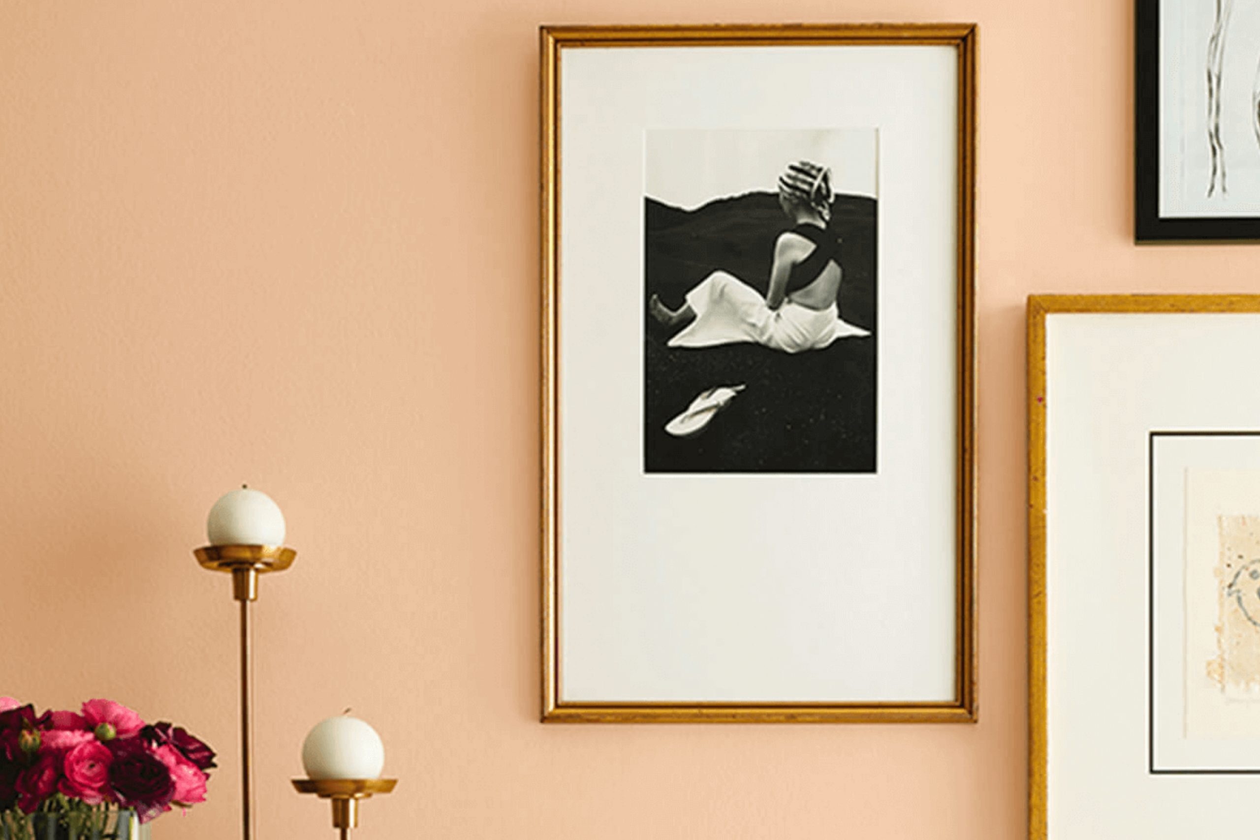
When you think about colors that can effortlessly warm up a space and invite people in, SW 6359 Sociable by Sherwin Williams comes to mind. There’s something special about this shade that makes it perfect for creating cozy environments where people instantly feel comfortable. With its warm, peachy undertones, it has the ability to brighten up a room while still maintaining a soft and welcoming presence.
I found that Sociable is not just a color; it’s an experience. It encourages communication, an open flow of ideas, and a sense of connection among those who spend time in its glow. Its versatile nature allows it to fit seamlessly into various settings, whether in a lively living room or a calm bedroom. You don’t have to worry about it overpowering other design elements, as it complements nearly every style or décor.
Using Sociable feels like adding a touch of warmth to the canvas of your home. Whether you’re hosting a gathering or simply relaxing alone, it provides a soothing backdrop that sets the tone for meaningful moments.
Adding this color to your palette brings an inviting harmony to your space, ensuring that everyone feels at home.
What Color Is Sociable SW 6359 by Sherwin Williams?
Sociable SW 6359 by Sherwin Williams is a warm, earthy coral shade that brings a lively yet comforting atmosphere to any room. This color is perfect for adding a pop of warmth without being too overwhelming. Its inviting hue creates a cozy and cheerful environment, making it a great choice for spaces where you entertain guests, such as living rooms or dining areas.
Sociable works exceptionally well in interiors styled with a mix of bohemian and coastal themes. Its warm tones pair beautifully with natural materials like wood and rattan, enhancing the relaxed and welcoming vibe. This shade also complements woven textures and textiles, making it an excellent option for rooms with lots of throws, cushions, and rugs.
For those who like a bit more contrast, Sociable can be paired with crisp whites to highlight its warmth, or with deep greens and blues for a more dramatic look. Metallic accents in copper or brass, as well as ceramics in natural tones, add a touch of elegance and balance to the overall palette.
Whether on an accent wall or more extensive application, Sociable adds energy and warmth, inviting everyone to enjoy the space.
Is Sociable SW 6359 by Sherwin Williams Warm or Cool color?
Sociable SW 6359 by Sherwin Williams is a warm and inviting color that can create a welcoming atmosphere in any home. This hue is a soft peachy-pink that adds a touch of warmth without being overpowering.
It works well in living rooms and dining areas, where you want to encourage conversation and interaction among family and friends. The warmth of the color can make larger spaces feel cozier, while in smaller rooms, it adds a cheerful and uplifting vibe.
In bedrooms, Sociable SW 6359 provides a comfortable and pleasant environment, perfect for relaxation. It pairs well with neutral tones and soft grays, offering versatility in decorating. Accent pieces like throw pillows, rugs, or curtains in complementary colors can enhance the overall look. This soft shade also works well with wood finishes, bringing out the natural richness of the material. Overall, Sociable SW 6359 can create a harmonious and inviting space.
Undertones of Sociable SW 6359 by Sherwin Williams
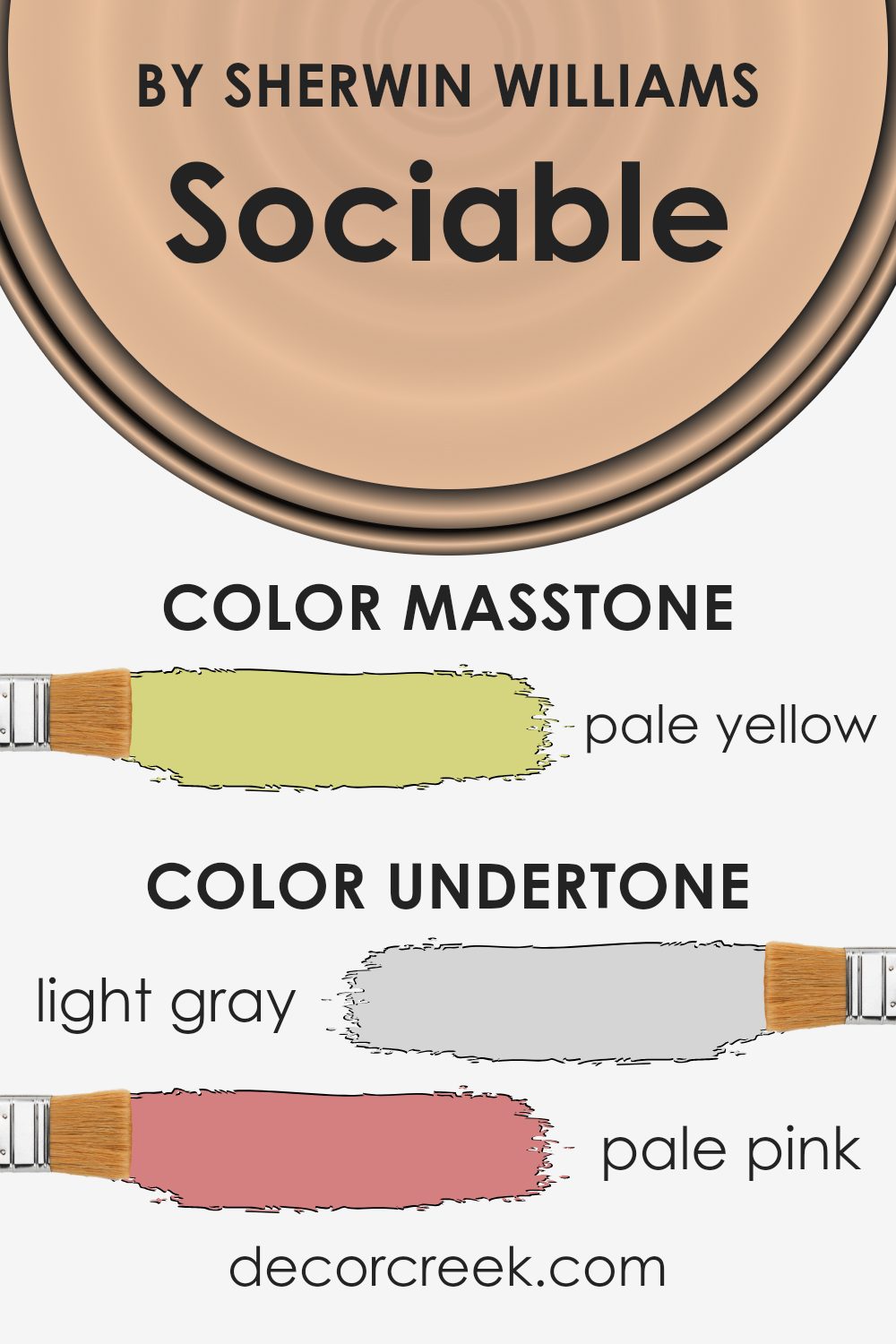
Sociable SW 6359 by Sherwin Williams is a unique color that blends several subtle undertones. These undertones influence how we perceive the color overall. Light gray and grey undertones give it a touch of neutrality and sophistication, allowing it to work well as a background. Pale pink and light purple add warmth and a soft, calming feel, which can make a room feel cozy.
Mint and light green provide a hint of freshness and vibrancy, contributing to a lively atmosphere. The warmth from the yellow and orange undertones gives the color an inviting and cheerful mood, making spaces appear more welcoming. The addition of lilac and light blue undertones injects a sense of peace, making it suitable for areas meant for relaxation.
The olive undertone, along with a hint of grey, adds an earthy and grounded quality, making it versatile enough to match various design elements. When used on interior walls, these undertones can create a balanced environment that is both lively and soothing, without being overpowering. Each undertone plays its part in making the color adaptable and appealing, catering to different tastes while ensuring a pleasant and harmonious appearance in various settings.
What is the Masstone of the Sociable SW 6359 by Sherwin Williams?
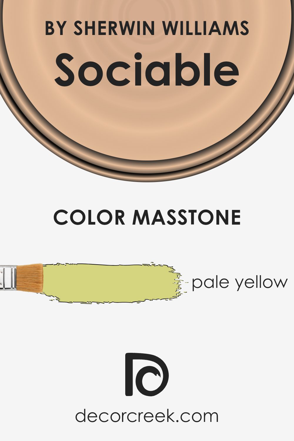
Sociable SW 6359 by Sherwin-Williams is a soft, pale yellow color, identified by the hex code #D5D580. This gentle hue works beautifully in homes, bringing a warm and cheerful feeling to spaces. Its understated brightness makes it a versatile choice for various rooms, from kitchens to living rooms, creating a welcoming atmosphere. The masstone’s light nature helps to make spaces feel larger and more open, as it reflects natural light effectively.
In rooms with plenty of sunlight, Sociable can enhance the light, creating a bright and airy feeling. In spaces with limited natural light, it can add warmth and a sense of comfort without being overpowering.
This color pairs well with soft whites, light grays, and even deeper accent colors like navy or charcoal, offering flexibility in designing a cozy yet stylish interior. Sociable’s subtle cheerfulness makes it an excellent choice for creating inviting living spaces.
How Does Lighting Affect Sociable SW 6359 by Sherwin Williams?
Lighting greatly influences how we perceive color, affecting the mood and appearance of a room. Natural light varies with the time of day and the orientation of a room, while artificial lighting depends on the type and color temperature of the bulbs used.
Sociable SW 6359 by Sherwin Williams is a warm, peachy-pink hue that can change based on lighting conditions. In natural light, especially in south-facing rooms, this color is likely to appear warm and vibrant due to the abundance of direct sunlight. The intense light enhances the warmth, making the room feel inviting and lively.
In north-facing rooms, natural light is cooler and softer, often creating a more muted version of colors. Here, Sociable SW 6359 might look less intense, taking on a softer, deeper pink appearance. The room might feel cozier, but the color won’t be as vivid as in more sunlit spaces.
East-facing rooms have bright, direct sunlight in the morning which gradually becomes more muted throughout the day. In the morning, Sociable SW 6359 will appear bright and fresh, highlighting its warm tones. By afternoon, it adopts a subtler tint as the natural light diminishes.
West-facing rooms receive the warm glow of the evening sun. In these spaces, Sociable SW 6359 will become more intense and warm as the day progresses, mirroring the color of the setting sun. This can add a rich, comforting ambiance to the space during late afternoons and evenings.
Under artificial lighting, the color of Sociable SW 6359 is influenced by the bulb’s color temperature. Warm, yellowish bulbs will enhance its peachy undertones, creating a cozy and inviting atmosphere. Cooler, bluish bulbs may make the color appear more subdued and slightly less warm. Therefore, choosing the right lighting is crucial to achieving the desired effect with this color.

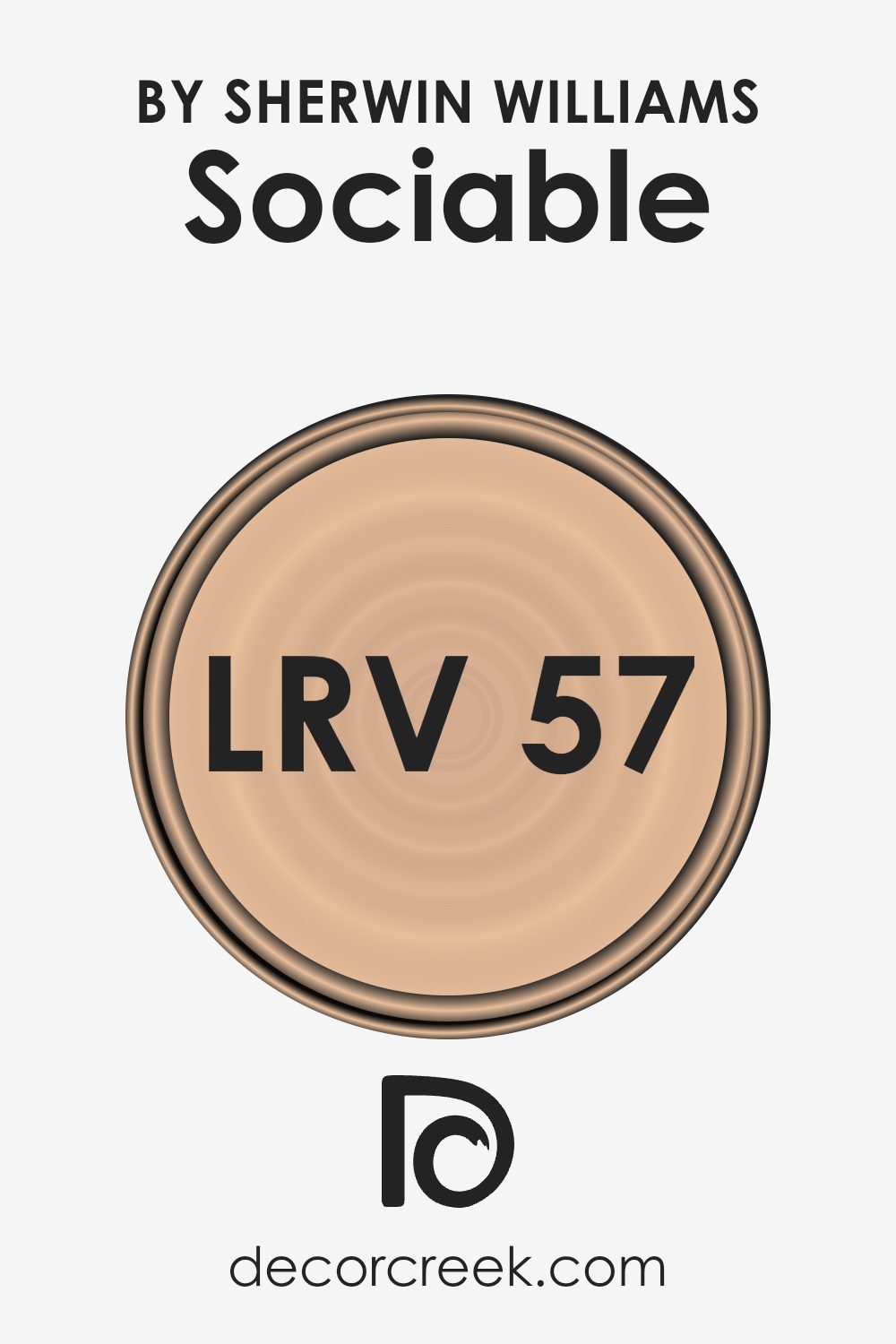
What is the LRV of Sociable SW 6359 by Sherwin Williams?
Light Reflectance Value (LRV) is a measurement that tells us how much light a paint color will reflect or absorb. It is a scale from 0 to 100, but the important part is what these numbers mean in practical terms. A color with an LRV closer to 100 would reflect a lot of light, making a room appear brighter and possibly larger.
On the other hand, colors with lower LRVs absorb more light, making a room appear darker and possibly more intimate. This number is important to know because it helps you understand how a color might look in different lighting conditions and with various sizes and shapes of rooms.
For the color Sociable with an LRV of 56.548, this means it reflects a moderate amount of light. It is somewhere in the middle of the LRV scale, so it will not make a room feel too bright or too dark. This makes it a great choice for creating a balanced feel in a space. It’s not too light that it feels washed out, and not too dark that it absorbs too much light. This color can create a welcoming environment while offering enough warmth to make a room feel cozy.
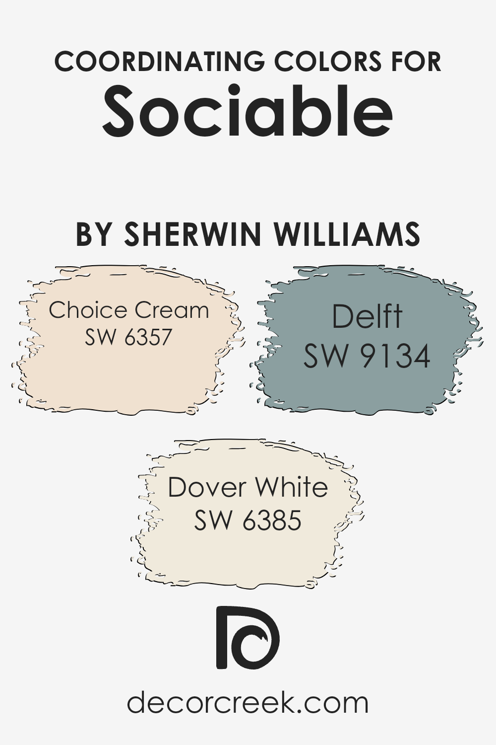
Coordinating Colors of Sociable SW 6359 by Sherwin Williams
Coordinating colors are shades that work well together in a room, creating harmony and balance. They complement the primary color without clashing or overwhelming the space. In the context of the color Sociable by Sherwin Williams, coordinating colors include Choice Cream, Dover White, and Delft. Each of these shades contributes to a cohesive look, making rooms appear well-designed and inviting while highlighting various aspects of your space effectively.
Choice Cream is a warm, soft yellow that adds a touch of sunshine and coziness to any environment. Its subtle hue brightens spaces without being too overpowering, making it an excellent backdrop or accent color. Dover White is a classic, creamy white that goes with almost anything.
It provides a neutral base that is sophisticated yet comfortable, matching a wide range of other colors and materials. Delft, on the other hand, introduces a cool and calming influence with its gentle, medium blue tone. It pairs beautifully with Sociable’s warmth, adding balance and interest. By coordinating these colors with Sociable, the resulting palette enhances the overall mood and ambiance of a room, creating a seamless and inviting atmosphere.
You can see recommended paint colors below:
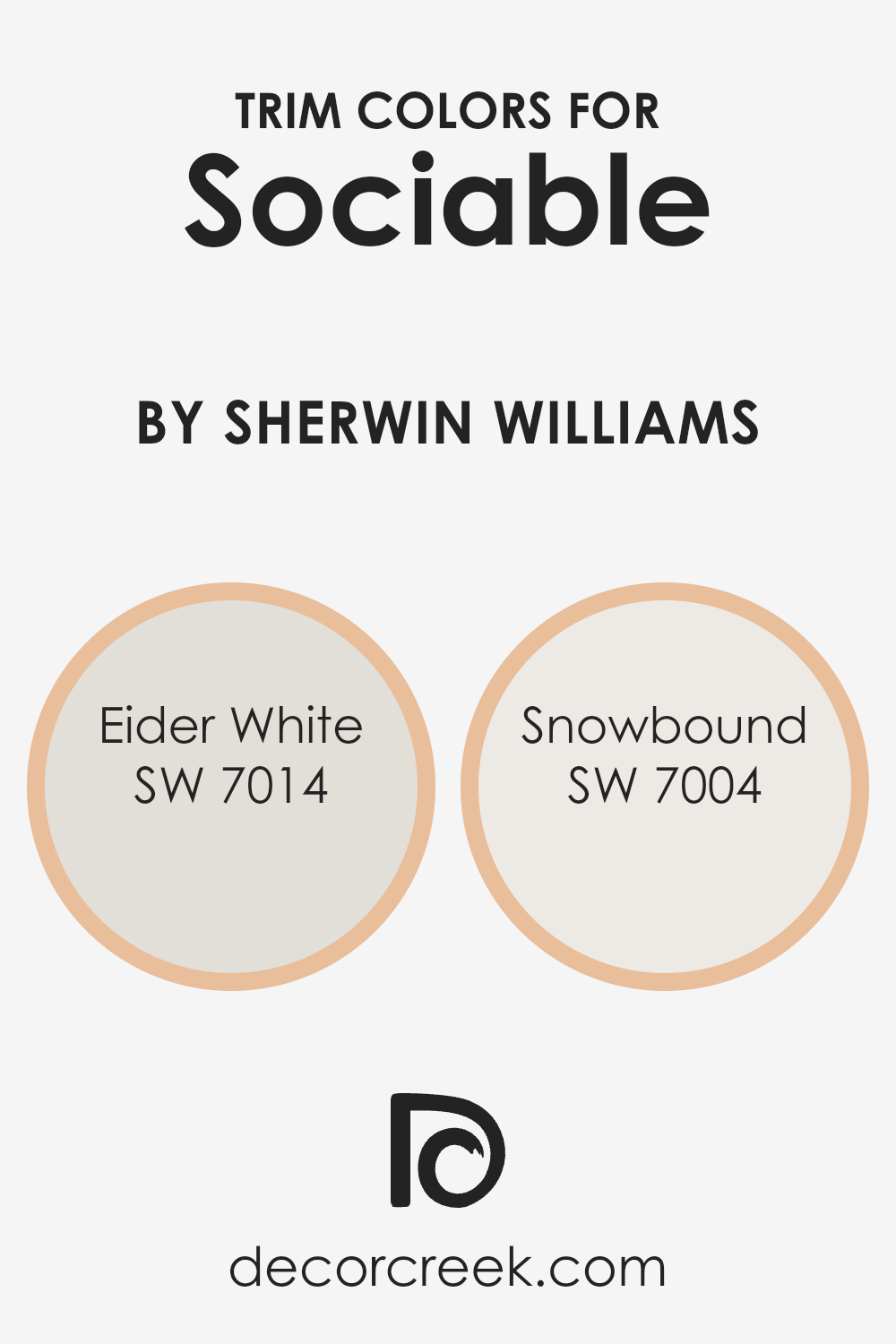
What are the Trim colors of Sociable SW 6359 by Sherwin Williams?
Trim colors are the finishing touches that add depth and character to a room, providing contrast and highlighting architectural features like door frames, windows, and baseboards. For Sociable SW 6359 by Sherwin Williams, selecting the right trim colors is essential to achieve a harmonious look that enhances the warm, inviting vibe of the main wall color. Using Eider White SW 7014 or Snowbound SW 7004 as trim colors can help achieve this balance.
Eider White offers a soft, muted off-white that gives a gentle and consistent look, pairing well with the warm undertones of Sociable. It creates a seamless transition from wall to trim, offering a gentle contrast that makes the space feel cohesive and inviting.
Similarly, Snowbound is another excellent choice for trim, as it brings a crisp and clean white to the room, slightly cooler than Eider White, which can subtly brighten the edges of the room. Choosing a brighter white like Snowbound allows surfaces like molding to stand out more distinctly against the warm undertones of Sociable, contributing to a clean, defined look. Both trims allow the Sociable color to stand out while ensuring the overall feeling of the space remains relaxed and welcoming.
You can see recommended paint colors below:
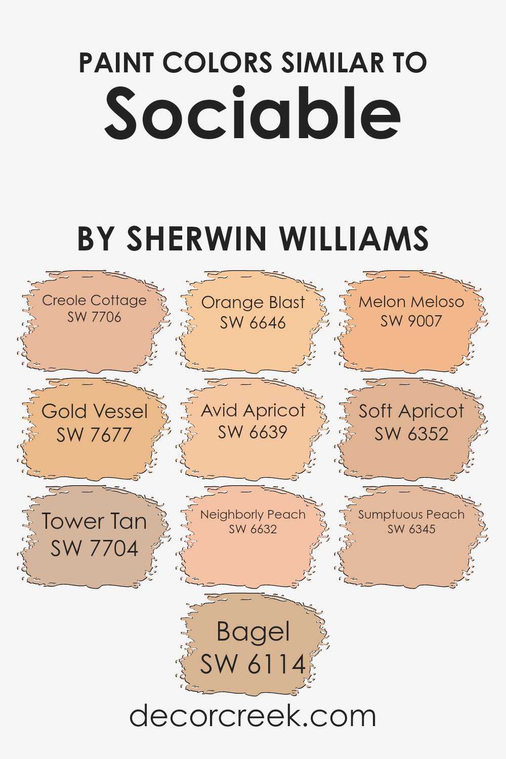
Colors Similar to Sociable SW 6359 by Sherwin Williams
Similar colors are important in design because they create harmony and balance. When used together, these colors create a cohesive look that is easy on the eyes. With a color like Sociable by Sherwin Williams as the main focus, similar shades help highlight its warmth and energy without overwhelming the space.
Colors like SW 7706 Creole Cottage and SW 7677 Gold Vessel are warm and earthy, bringing depth and richness to a palette. SW 7704 Tower Tan and SW 6114 Bagel add neutral tones that provide a subtle backdrop, allowing brighter colors to stand out without clashing.
Additionally, the brighter and more lively colors like SW 6646 Orange Blast and SW 6639 Avid Apricot bring vibrancy and cheerfulness, perfect for infusing a room with positive energy. SW 6632 Neighborly Peach and SW 9007 Melon Meloso offer a softer touch of peachy tones, which create a pleasant and welcoming atmosphere.
SW 6352 Soft Apricot and SW 6345 Sumptuous Peach round out this selection with their approachable shades that can easily be integrated into various design styles. When used together, these colors enhance the main color and create a complimentary setting that is both inviting and aesthetically pleasing.
You can see recommended paint colors below:
- SW 7706 Creole Cottage
- SW 7677 Gold Vessel
- SW 7704 Tower Tan
- SW 6114 Bagel
- SW 6646 Orange Blast
- SW 6639 Avid Apricot
- SW 6632 Neighborly Peach
- SW 9007 Melon Meloso
- SW 6352 Soft Apricot
- SW 6345 Sumptuous Peach
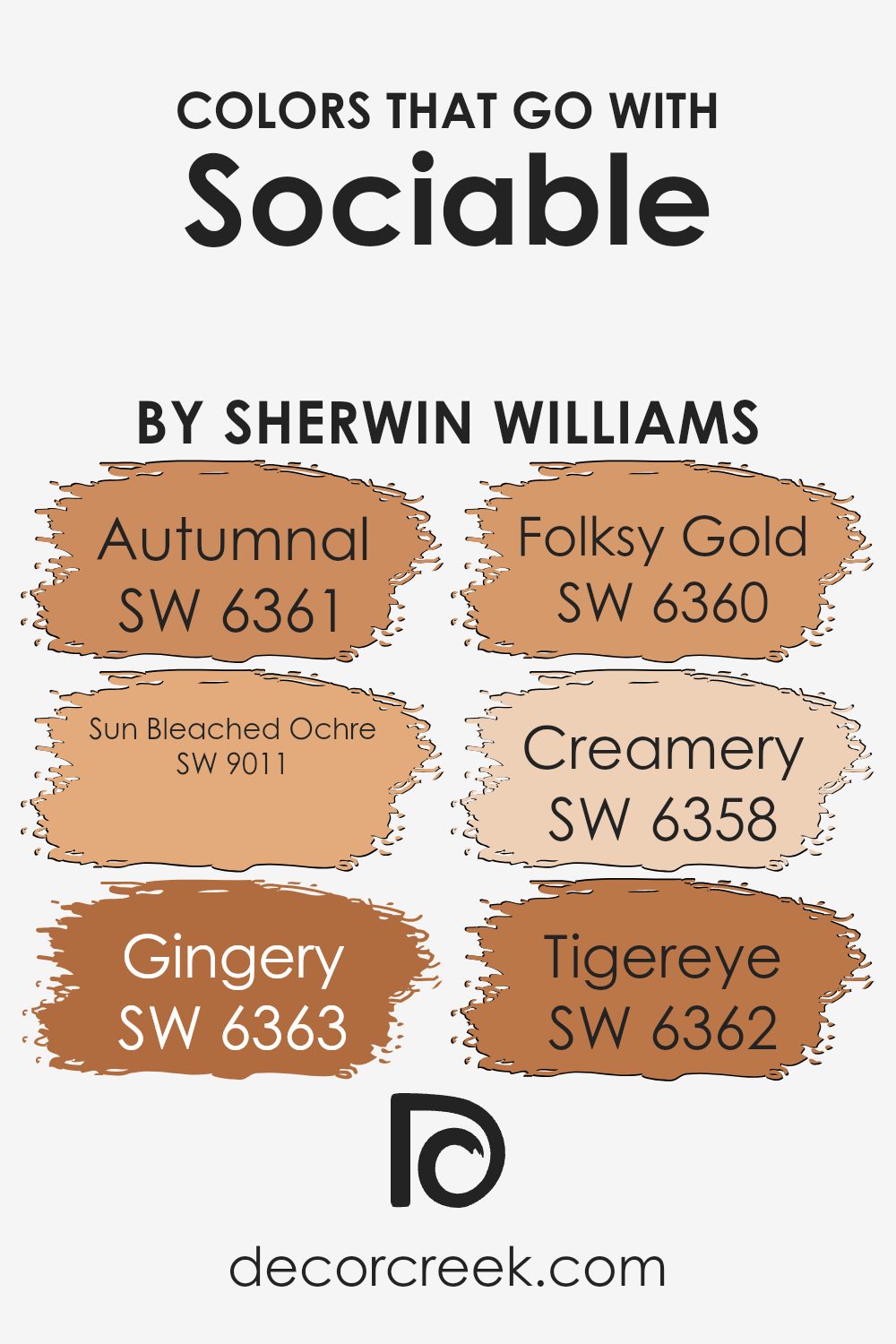
Colors that Go With Sociable SW 6359 by Sherwin Williams
Colors that complement Sociable SW 6359 by Sherwin Williams play a crucial role in creating a harmonious environment. The warm hues of this color palette blend well with spaces, adding a feeling of coziness and warmth. When paired with SW 6361 – Autumnal, which has a rich, earthy tone, it can make rooms feel welcoming and grounded.
SW 9011 – Sun Bleached Ochre is a lighter, more muted shade that brings a sense of light and freshness, preventing spaces from becoming too heavy and balancing the warm undertones of Sociable.
SW 6363 – Gingery adds a touch of spice to your space, offering a lively contrast. SW 6360 – Folksy Gold is a bold, deep shade that can add depth and character. The lighter SW 6358 – Creamery adds a soft, creamy touch, brightening any room and maintaining a sense of openness.
Finally, SW 6362 – Tigereye enhances the palette with its strong, robust color, adding vibrancy while still feeling natural and inviting. Together, these colors create a cohesive look that works seamlessly with Sociable SW 6359, allowing for flexibility in design while maintaining a warm and inviting atmosphere.
You can see recommended paint colors below:
- SW 6361 Autumnal
- SW 9011 Sun Bleached Ochre
- SW 6363 Gingery
- SW 6360 Folksy Gold
- SW 6358 Creamery
- SW 6362 Tigereye
How to Use Sociable SW 6359 by Sherwin Williams In Your Home?
Sociable SW 6359 by Sherwin Williams is a warm, inviting color that brings a cozy feel to any room. This shade is perfect for spaces where you want to encourage conversation and a friendly atmosphere, such as living rooms or dining areas. Its gentle, peachy-orange tone can make a room feel more comfortable and approachable.
You can use Sociable on the walls to create a cheerful backdrop that pairs well with neutral furniture and natural textures like wood and linen. It complements other soft, warm colors, so consider combining it with creams, taupes, or gentle yellows for a harmonious look.
In a family room, this color can make the space feel more relaxed and welcoming, perfect for gatherings. If used in a kitchen, it adds warmth and helps create a pleasant environment. Adding decor pieces in similar warm shades can enhance this effect, making Sociable a versatile choice for various spaces in your home.
Sociable SW 6359 by Sherwin Williams vs Soft Apricot SW 6352 by Sherwin Williams
Both Sociable SW 6359 and Soft Apricot SW 6352 by Sherwin Williams are warm, inviting colors that add a touch of friendliness to any space. Sociable is a vibrant, cheerful peachy tone, making it great for lively, energetic areas like living rooms or kitchens. Its brightness can make a room feel open and welcoming.
On the other hand, Soft Apricot is a lighter, more subdued peach. Its gentle hue is perfect for spaces where you want a calming, cozy atmosphere. This color works well in bedrooms or bathrooms, offering a soft warmth without overwhelming the senses.
While Sociable is bold and attention-grabbing, Soft Apricot offers a more relaxed feel. Both colors complement each other beautifully and can be used together to create a harmonious balance in your home. Whether you want a bold, lively space or a gentle, restful area, these colors have something to offer.
You can see recommended paint color below:

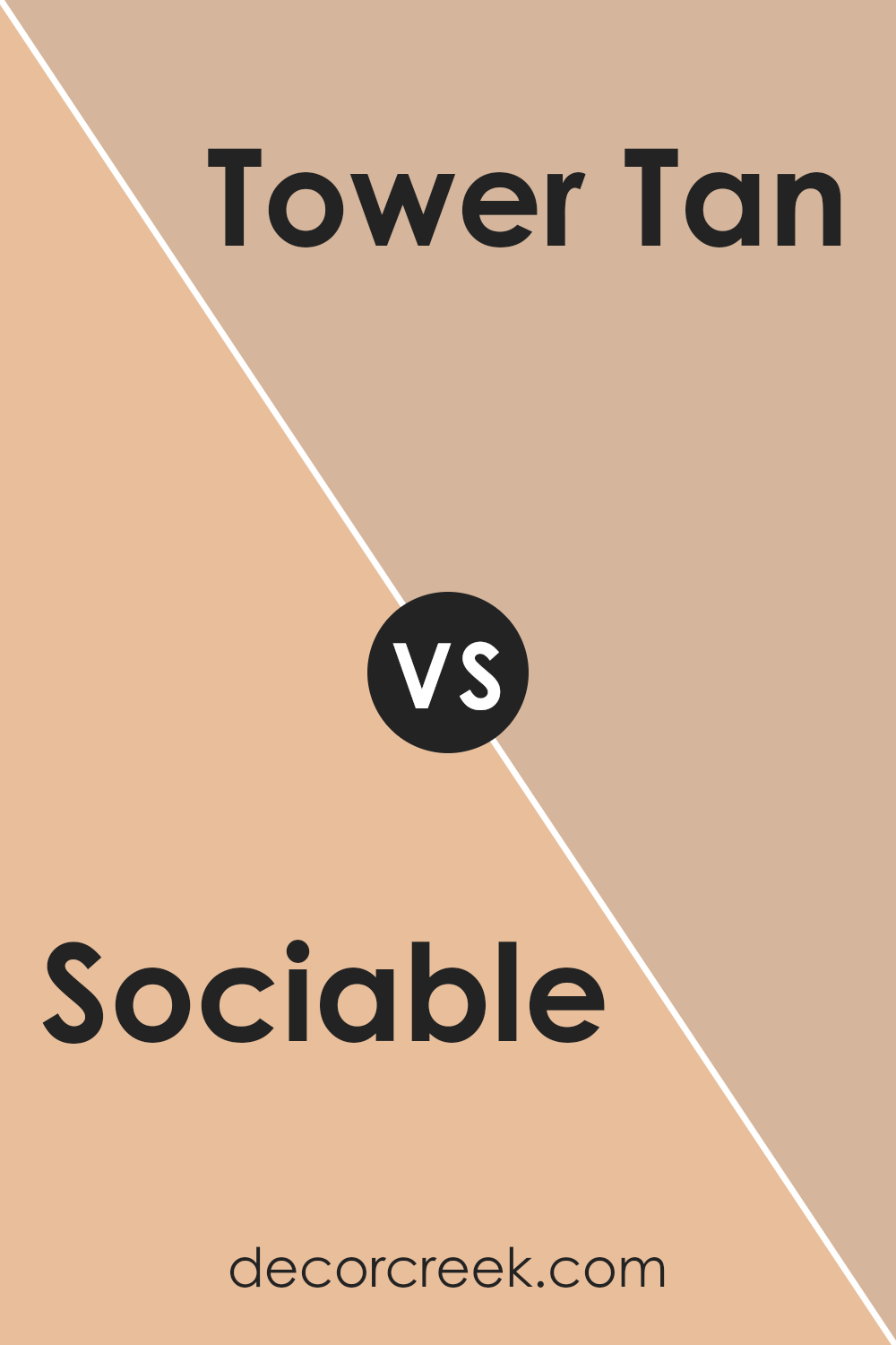
Sociable SW 6359 by Sherwin Williams vs Tower Tan SW 7704 by Sherwin Williams
Sociable SW 6359 and Tower Tan SW 7704, both by Sherwin Williams, offer distinct vibes for spaces. Sociable SW 6359 is a warm, inviting color with a lively peach undertone, ideal for creating friendly and energetic rooms. It’s perfect for living areas where you want to encourage interaction and warmth.
On the other hand, Tower Tan SW 7704 is a more subdued, earthy color that leans towards a sandy beige tone. This shade is relaxing and creates a stable, calming environment, making it great for bedrooms or study spaces. While Sociable brings energy and cheerfulness to a room, Tower Tan offers a grounded and subtle backdrop.
These two colors can complement each other well, with Sociable acting as an accent in a Tower Tan room or vice versa, balancing vibrancy with calm. Overall, the choice between these colors will depend on whether you want energy or relaxation in your space.
You can see recommended paint color below:
- SW 7704 Tower Tan
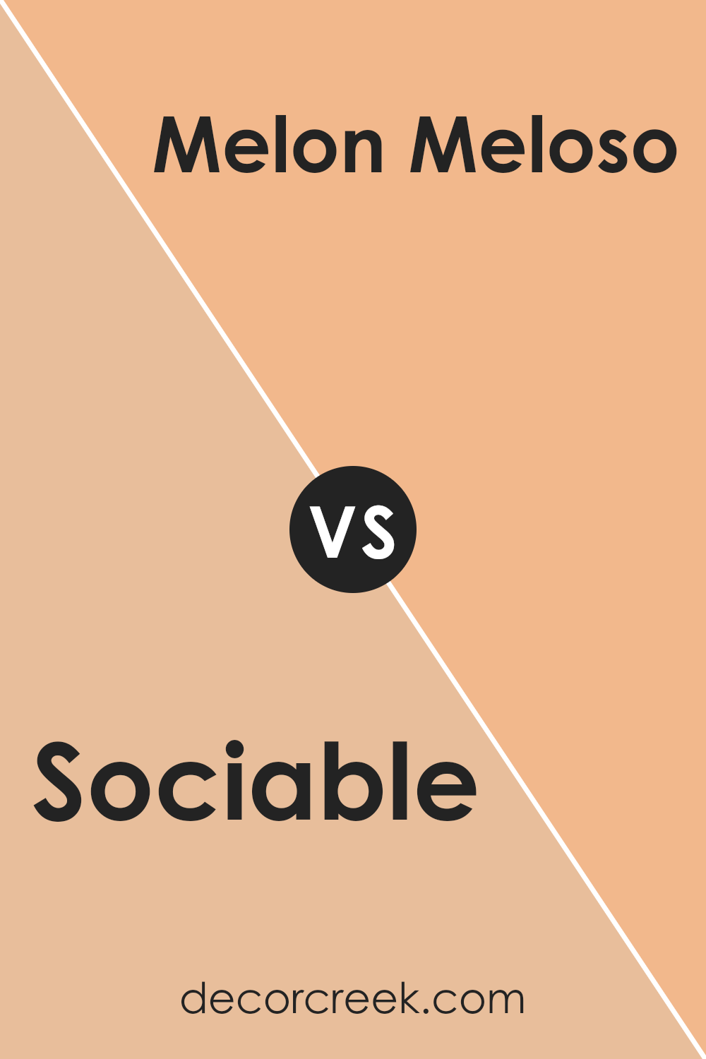
Sociable SW 6359 by Sherwin Williams vs Melon Meloso SW 9007 by Sherwin Williams
Sociable (SW 6359) and Melon Meloso (SW 9007) are two vibrant, warm colors by Sherwin Williams that add energy and brightness to any space. Sociable is a spirited coral hue with hints of orange, making it lively and cheerful. It’s a great choice for areas where you want to encourage conversation and activity, such as living rooms or dining areas.
On the other hand, Melon Meloso is a softer, peachy color. It carries a gentle warmth with a slightly pink undertone, which can bring a cozy and welcoming feel to a space. This color is suitable for bedrooms or kitchens, where a softer touch is desired.
Both colors are eye-catching but in different ways, with Sociable offering a bolder splash while Melon Meloso provides a more subdued, soothing appearance. Pairing these colors together can create a balanced, harmonious look that energizes while also calming the senses.
You can see recommended paint color below:
- SW 9007 Melon Meloso
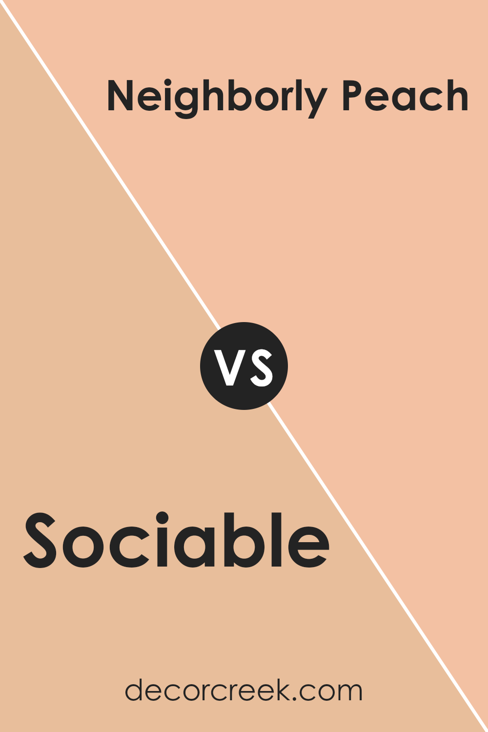
Sociable SW 6359 by Sherwin Williams vs Neighborly Peach SW 6632 by Sherwin Williams
Sociable SW 6359 by Sherwin Williams is a warm, inviting color with strong orange undertones that give it a cheerful, energetic vibe. It’s a lively shade that brings a sense of friendliness and enthusiasm, making it ideal for spaces where conversation and interaction are encouraged, such as living rooms or kitchens.
In contrast, Neighborly Peach SW 6632 is softer and more muted. It has peachy tones that are gentle and comforting, creating a calm and welcoming atmosphere. This color works well in bedrooms or areas designed for relaxation, offering a soothing backdrop that isn’t overpowering.
While both colors share warmth due to their underlying orange hues, Sociable is bolder and more vibrant, while Neighborly Peach leans toward subtlety and softness. Choosing between them depends on whether you want a space to feel more lively and sociable or calm and cozy. Both colors can beautifully brighten up a room but in different ways.
You can see recommended paint color below:
- SW 6632 Neighborly Peach
Sociable SW 6359 by Sherwin Williams vs Sumptuous Peach SW 6345 by Sherwin Williams
Sociable SW 6359 and Sumptuous Peach SW 6345 by Sherwin Williams are both warm, inviting colors, but they have distinct characteristics. Sociable is a cheerful, lively shade with a mix of orange and pink undertones, giving it a vibrant and friendly feel. It’s perfect for creating a welcoming atmosphere in social spaces like living rooms or kitchens.
On the other hand, Sumptuous Peach is a bit softer and lighter, with a more muted tone. It carries a gentle warmth that adds a calm, cozy touch to any room. This color works well in bedrooms or bathrooms, where a soothing environment is desired.
While both colors are in the warm family, Sociable tends to be more energetic, making it great for spaces where lively interaction happens. Sumptuous Peach offers a more restful vibe, ideal for areas meant for relaxation. Together, they could complement each other in different parts of a home for a cohesive but varied look.
You can see recommended paint color below:
- SW 6345 Sumptuous Peach
Sociable SW 6359 by Sherwin Williams vs Avid Apricot SW 6639 by Sherwin Williams
Sociable SW 6359 by Sherwin Williams is a warm and inviting coral hue that creates a welcoming atmosphere. It strikes a balance between vibrant energy and a soft, approachable feel, making it ideal for living spaces where interaction and comfort are key. The color brings life and brightness to a room without overpowering it, creating an environment that feels cozy yet lively.
On the other hand, Avid Apricot SW 6639 is a more intense, bold apricot shade that exudes warmth and enthusiasm. It has a stronger orange undertone compared to Sociable, making it stand out more prominently. Avid Apricot can energize a space, providing a cheerful and upbeat mood. It works well in areas where you want to inspire creativity or add a splash of vibrant color.
Overall, while both colors bring warmth and positivity, Sociable offers a more subtle, calming presence, whereas Avid Apricot leans towards a bolder, more dynamic statement.
You can see recommended paint color below:
- SW 6639 Avid Apricot
Sociable SW 6359 by Sherwin Williams vs Bagel SW 6114 by Sherwin Williams
Sociable SW 6359 and Bagel SW 6114 by Sherwin Williams are warm colors that bring different vibes to a space. Sociable is an upbeat, lively coral hue, perfect for adding energy and cheerfulness to a room. It’s a great choice for social areas like living rooms or dining spaces, where you want to encourage conversation and a friendly atmosphere.
On the other hand, Bagel is a softer, more neutral color. It has a beige tone with a hint of warmth, making it a versatile choice for various settings. Its understated nature makes it excellent for creating a relaxing, cozy feel, ideal for bedrooms or family rooms where you might want a more laid-back setting.
Together, these colors can work well, with Sociable bringing a pop of lively color and Bagel providing a calm backdrop. They complement each other by balancing vibrancy and subtlety in a space.
You can see recommended paint color below:
- SW 6114 Bagel
Sociable SW 6359 by Sherwin Williams vs Gold Vessel SW 7677 by Sherwin Williams
“Sociable” (SW 6359) by Sherwin Williams is a warm and inviting peachy-orange shade. It reflects friendliness and can make a space feel cozy and welcoming. It’s great for areas where people gather, like living rooms or social spaces, as it encourages conversation and interaction.
On the other hand, “Gold Vessel” (SW 7677) is a more muted and sophisticated yellow-gold. It’s less vibrant than “Sociable,” offering a sense of stability and elegance. This color fits well in formal settings like dining rooms or offices, where a touch of class and subtlety is desired.
When you compare the two, “Sociable” brings a lively, energetic vibe, while “Gold Vessel” leans toward a more mature, calm ambiance. Choosing between them depends on whether you want a space to feel more energetic and social, or calm and refined. Both colors have their unique charm and can work well depending on the room’s purpose.
You can see recommended paint color below:
- SW 7677 Gold Vessel
Sociable SW 6359 by Sherwin Williams vs Orange Blast SW 6646 by Sherwin Williams
“Sociable SW 6359” by Sherwin Williams is a warm and inviting color that brings a sense of comfort and friendliness to any space. It’s a soft, muted coral hue that is versatile enough to be used in living rooms or social areas, giving them a welcoming vibe.
On the other hand, “Orange Blast SW 6646” is a much bolder and vibrant color. It’s a vivid orange that makes a strong statement and adds energy to any room. While Sociable is subtle and easygoing, Orange Blast is intense and attention-grabbing.
The former is ideal for spaces where people gather, creating a cozy atmosphere, while the latter is perfect for accent walls or areas where you want to inject life and enthusiasm. Both colors bring warmth, but in considerably different intensities.
You can see recommended paint color below:
- SW 6646 Orange Blast
Sociable SW 6359 by Sherwin Williams vs Creole Cottage SW 7706 by Sherwin Williams
Sociable SW 6359 by Sherwin Williams is a warm and inviting color, with a lively coral hue that brings energy to a room. It’s a vibrant shade that works well in spaces where you want to encourage conversation and activity, like living rooms or dining areas. The color exudes warmth and friendliness, making any room feel more welcoming.
In contrast, Creole Cottage SW 7706 is a much deeper and more subdued color, featuring a rich, earthy brown tone. This shade is reminiscent of natural materials and can give a space a cozy, grounded feel. Creole Cottage is great for creating a more intimate or traditional atmosphere, often used in study rooms or libraries.
While Sociable adds brightness and a sense of fun, Creole Cottage offers a more relaxed and classic ambiance. Together, these colors can complement each other, with Sociable bringing vibrancy and Creole Cottage adding depth and sophistication.
You can see recommended paint color below:
- SW 7706 Creole Cottage
Conclusion
After learning about SW 6359 Sociable by Sherwin Williams, I feel like I truly understand what makes this color special. It’s a warm orange, kind of like the sunset, but not too bright. When you look at it, it feels cheerful and welcoming, like a cozy hug from a friend.
What I like about Sociable is how it can make a room feel happy and energetic without being too loud or flashy. It’s a color that seems to say, “Come on in, let’s have fun!” I learned that it works really well in places where people gather, like living rooms or kitchens, where you want to feel connected and lively.
If you pair Sociable with other colors, it can change the whole vibe of a room. With light colors, it feels fresh and airy, while darker colors make it feel warm and snug. It’s like how wearing a different shirt can change your whole outfit look.
Overall, SW 6359 Sociable is all about making people feel good and bringing them together. It’s a simple reminder of joy and togetherness, perfect for any area where you want that happy, friendly feeling.
Ever wished paint sampling was as easy as sticking a sticker? Guess what? Now it is! Discover Samplize's unique Peel & Stick samples.
Get paint samples

