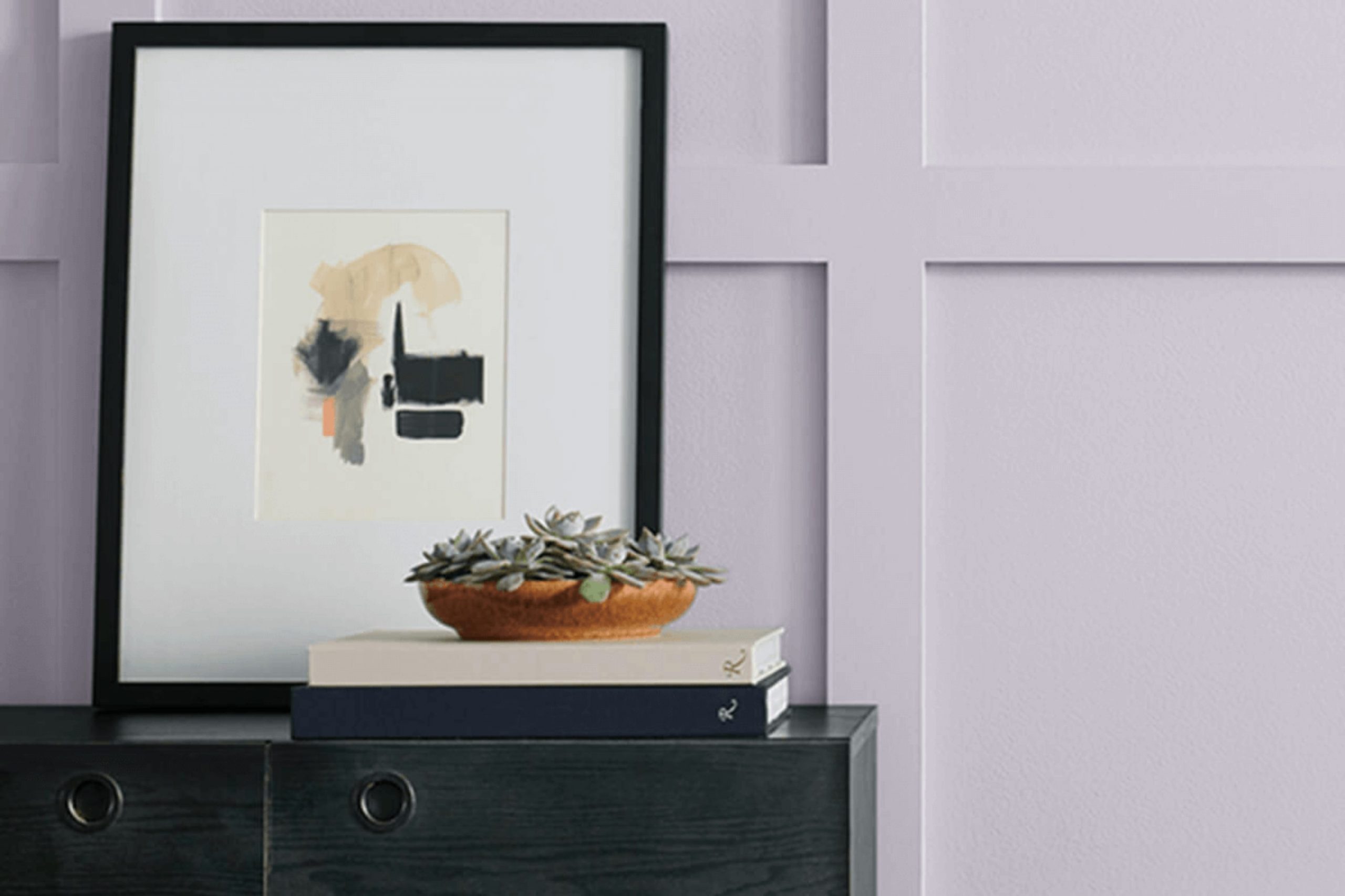
If you’re considering refreshing your room with a fresh coat of paint, let me introduce you to a unique color: SW 6548 Grape Mist by Sherwin Williams.
This soft, soothing shade of lavender brings a light and airy feel to any area, making it a perfect choice if you’re looking to create a calming atmosphere. It’s subtle enough not to overpower your room but has enough character to make a statement.
Painting with Grape Mist can give your room a gently cheerful lift, ideal for areas where relaxation or creativity flourishes. Imagine it in a bedroom, a study, or even your living room; its adaptable nature works wonderfully across various areas of a home.
As someone who enjoys seeing how different colors can change a room, I found Grape Mist both refreshing and delightful, a less common choice that stands out gently yet impressively among other colors.
What Color Is Grape Mist SW 6548 by Sherwin Williams?
Grape Mist is a soft and subtle shade of lavender that has a calming presence in any room. It’s a light hue, not too overpowering, making it quite adaptable for various design aesthetics. The gentle vibrancy of this color brings a fresh and airy feel, perfect for creating a relaxed and welcoming atmosphere.
This color works wonderfully in interior styles that lean towards the modern or minimalist. It adds just the right touch of personality without being too intense. Due to its gentle nature, Grape Mist is also ideal for coastal and Scandinavian designs, where light colors help to enhance the sense of openness and light.
When it comes to pairing with materials and textures, Grape Mist seems to naturally complement softer, lighter woods like maple and birch, which help maintain a room’s airy feel. It also looks beautiful when matched with white trims or furnishings, amplifying its delicate charm.
For textures, consider soft fabrics like linen or cotton which can help to maintain the soothing aesthetic. Adding elements of glass or metallic finishes like silver can introduce a subtle contrast that keeps the room dynamic without being too stark. This color can definitely help create a cozy yet stylish environment.
Is Grape Mist SW 6548 by Sherwin Williams Warm or Cool color?
Grape Mist by Sherwin Williams is a gentle and muted shade of purple that can add a unique touch of color to any room without being too intense. Because of its soft and subtle nature, it can work well in various areas of a home, from bedrooms to living rooms. Its light tone makes it a good choice for smaller rooms as it can help make them appear larger and more open.
One of the major benefits of Grape Mist is its adaptability. It pairs nicely with a wide range of other colors, from neutral shades like whites and grays to more vibrant tones like yellows and blues. This makes it easy to incorporate into existing color schemes or to build a new palette around.
Moreover, Grape Mist has a calming effect, which makes it ideal for areas where you want to relax. It’s particularly popular in bedrooms and bathrooms, where its soothing qualities can enhance the atmosphere. Overall, this color is great for anyone looking to add a bit of subtle color to their home without making too bold a statement.
Undertones of Grape Mist SW 6548 by Sherwin Williams
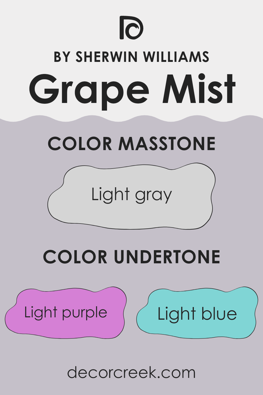
Grape Mist, a unique paint color, carries a blend of subtle undertones that influence its appearance in different lighting conditions. The undertones of a color are the hints of other colors that emerge under certain lights or when placed next to other hues. Grape Mist has a complex mix of light purple, light blue, pale yellow, lilac, pale pink, mint, and grey undertones.
In practical terms, these undertones mean that Grape Mist can look slightly different depending on the room’s lighting and surrounding colors. For example, in a room with plenty of natural sunlight, the pale yellow and light blue undertones might make the color appear cooler. Conversely, in a room with warmer, artificial lighting, the pale pink and lilac undertones could make the paint seem softer and more inviting.
When used on interior walls, the adaptable nature of Grape Mist’s undertones allows it to fit subtly into various decors and themes, making it a flexible choice for many areas. If the room has green or blue elements, the mint and light blue undertones in Grape Mist can enhance these features, creating a cohesive feel. Similarly, if there are elements of yellow or grey, those respective undertones in the paint help tie the room’s look together.
Choosing a color like Grape Mist, with its range of undertones, offers a practical solution for homeowners who want a paint that can adjust to different decorating changes over time, while always providing a fresh, appealing look.
What is the Masstone of the Grape Mist SW 6548 by Sherwin Williams?
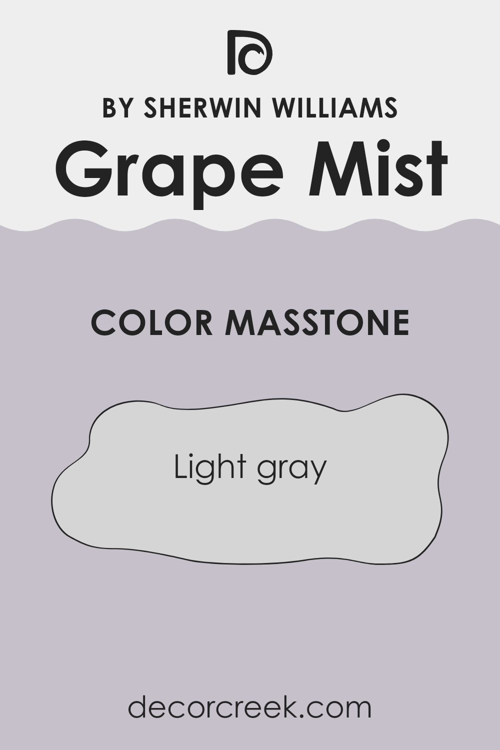
Grape Mist SW 6548 by Sherwin Williams, when viewed in its masstone, shows up as a light gray color. This shade, with its subtle hints of gray, provides a clean and straightforward appeal when used in homes.
It’s an excellent choice for creating a fresh, tidy look in a room, making areas feel more open and well-lit. This color doesn’t overpower with drama but instead offers a gentle backdrop, ideal for complementing a range of decor styles and other colors, from bright and bold to soft and subtle.
The light gray base of Grape Mist works especially well in parts of the home that could benefit from a sense of increased openness, such as small rooms or those with limited natural light. It’s also forgiving when it comes to marks and smudges, which makes it practical for high-traffic areas like living rooms or hallways. This color has the ability to softly reflect light, enhancing the overall airy feel of any room without the starkness often associated with pure white.
How Does Lighting Affect Grape Mist SW 6548 by Sherwin Williams?
Lighting plays a crucial role in how we perceive colors, as it can alter their appearance significantly. Different lighting conditions can make a paint color look quite different from one room to another. Consider the color Grape Mist by Sherwin Williams, a gentle shade of purple with subtle blue undertones.
Artificial Light vs. Natural Light:In artificial light, particularly warm-toned bulbs, Grape Mist might appear slightly muted, with its blue undertones becoming more noticeable, giving it a cozier feel. Cooler artificial lighting, like daylight bulbs, can make the color look more vibrant and closer to how it appears in natural light.
Under natural light, Grape Mist reflects more of its true color saturation, showing off its soothing purple hue vividly during the day.
Lighting in Different Room Orientations:
- North-Faced Rooms:
North-facing rooms often get less direct sunlight, which can cause colors to appear slightly darker and cooler. In such areas, Grape Mist may seem more subdued and its blue undertones might be enhanced, making the room feel calm but slightly cool. - South-Faced Rooms:
South-facing rooms benefit from plentiful sunlight, which can brighten and warm the color. Here, Grape Mist will likely look lighter and more vivid, with its purplish hue shining brightly, creating an inviting and cheerful atmosphere. - East-Faced Rooms:
The light in east-facing rooms is brightest in the morning when the sun rises. Grape Mist will appear most true to color in the morning, giving off a fresh and pleasant vibe. As the day progresses and the natural light fades, the color might appear softer and cooler. - West-Faced Rooms:
In west-facing rooms, the color becomes more vivid in the afternoon to evening as the sunlight intensifies. During this time, Grape Mist will show its warmer tones, often appearing more dynamic and expressive.
Understanding these effects of lighting can help when deciding how to use this color effectively in home design, ensuring that the mood and atmosphere of the room feel just right throughout the day.
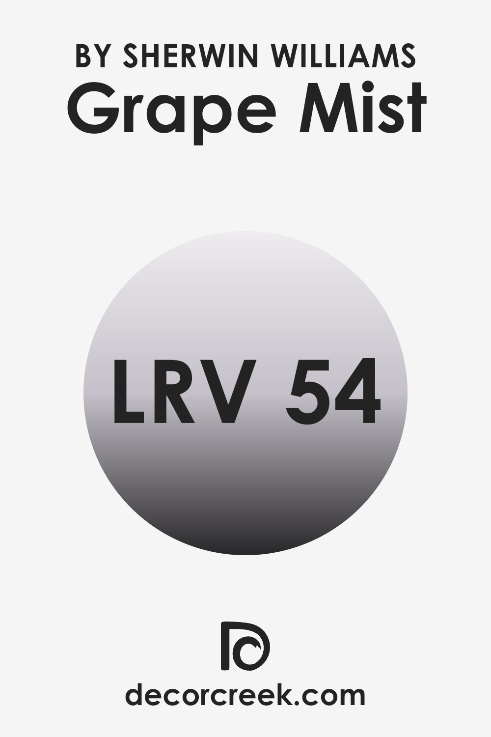
What is the LRV of Grape Mist SW 6548 by Sherwin Williams?
LRV stands for Light Reflectance Value, which is a measurement used to describe how much light a paint color reflects compared to how much it absorbs. It’s given on a scale where a higher number means the paint reflects more light. This measurement is very important when choosing a paint color because it can greatly affect the look and feel of a room.
When a paint has a high LRV, it tends to make an area look brighter and more open because more light is bouncing around. On the other hand, colors with low LRV values can make a room feel cozier and more enclosed because they absorb more light.
In the case of Grape Mist, which has an LRV of 54.023, this color sits in the middle range of the LRV scale. It means this color will reflect a moderate amount of light and won’t make a room feel too bright or too dark. It’s a balanced choice that could be ideal for various settings, whether you’re looking to paint a living room, bedroom, or even a kitchen.
The LRV of Grape Mist allows it to be adaptable in a way that it can enhance the natural light in well-lit rooms or not overpower in those with less sunlight, maintaining a pleasant visual balance under different lighting conditions.
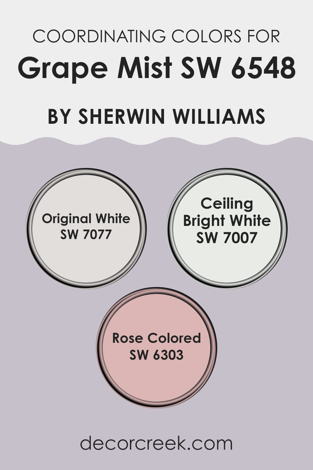
Coordinating Colors of Grape Mist SW 6548 by Sherwin Williams
Coordinating colors are selected shades that complement a primary color, creating a harmonious color scheme in a room. Grape Mist, a subtle hue from Sherwin Williams, pairs well with specific coordinating colors to enhance its beauty and create a balanced visual flow. These coordinating colors have been carefully chosen to support the primary shade without overpowering it, allowing for a cohesive and visually appealing look.
Original White (SW 7077) offers a clean and fresh look, serving as a crisp background that allows colors like Grape Mist to stand out. It’s an adaptable color that works well in any room, providing a neutral base that complements more saturated tones. Ceiling Bright White (SW 7007) is another excellent pairing for Grape Mist, contributing a bright and airy feel to interiors.
This shade is ideal for ceilings and trim, giving a lift to the overall ambiance of a room. Rose Colored (SW 6303) provides a gentle contrast to Grape Mist with its soft, warm undertones. This color adds a hint of warmth and richness, creating a cosy and inviting atmosphere when used alongside cooler shades like Grape Mist.
You can see recommended paint colors below:
- SW 7077 Original White
- SW 7007 Ceiling Bright White
- SW 6303 Rose Colored
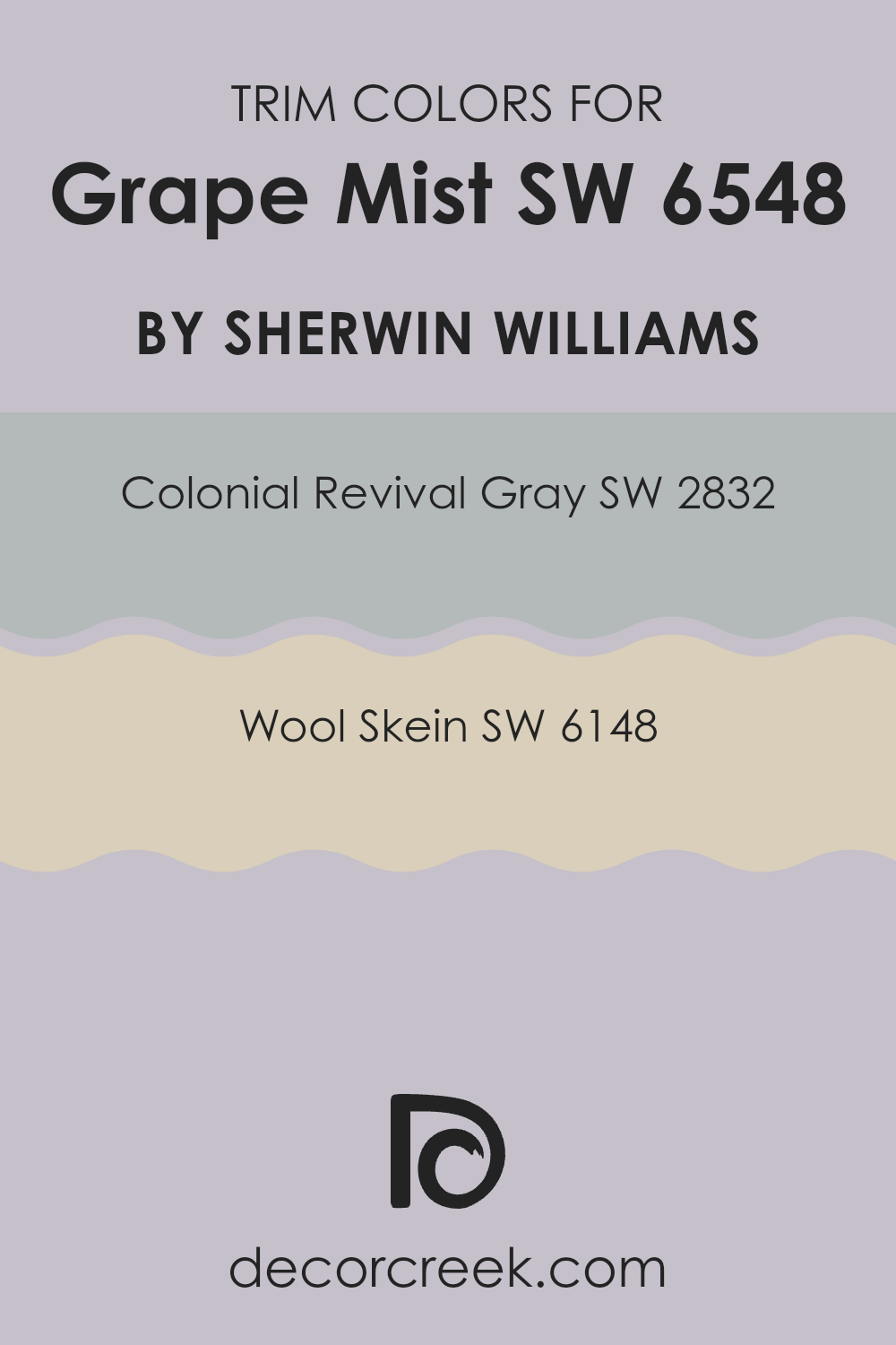
What are the Trim colors of Grape Mist SW 6548 by Sherwin Williams?
Trim colors are used on areas like door frames, window trims, and baseboards to give a room a more polished look and highlight architectural features. Selecting the right trim color can also help bring balance and contrast to your walls.
For the light violet tones of Sherwin Williams Grape Mist, coordinating trim colors such as Colonial Revival Gray and Wool Skein can enhance both the subtle beauty of the wall color and the overall aesthetic of a room. These trim choices can frame the wall color beautifully, making the tones stand out more distinctly.
olonial Revival Gray is a soft, warm gray that can act as a neutral, grounding element when used as a trim color. It complements the cool hue of Grape Mist by adding a gentle contrast that is neither too sharp nor distracting. Meanwhile, Wool Skein offers a lighter, creamy tone that provides a smooth transition between the wall and trim.
This color pairs well with Grape Mist by softening the overall appearance and adding a touch of warmth that can make a room feel inviting and comfortable. Together, these trim colors offer adaptable options that can enhance the overall appeal of Grape Mist without overpowering its gentle charm.
You can see recommended paint colors below:
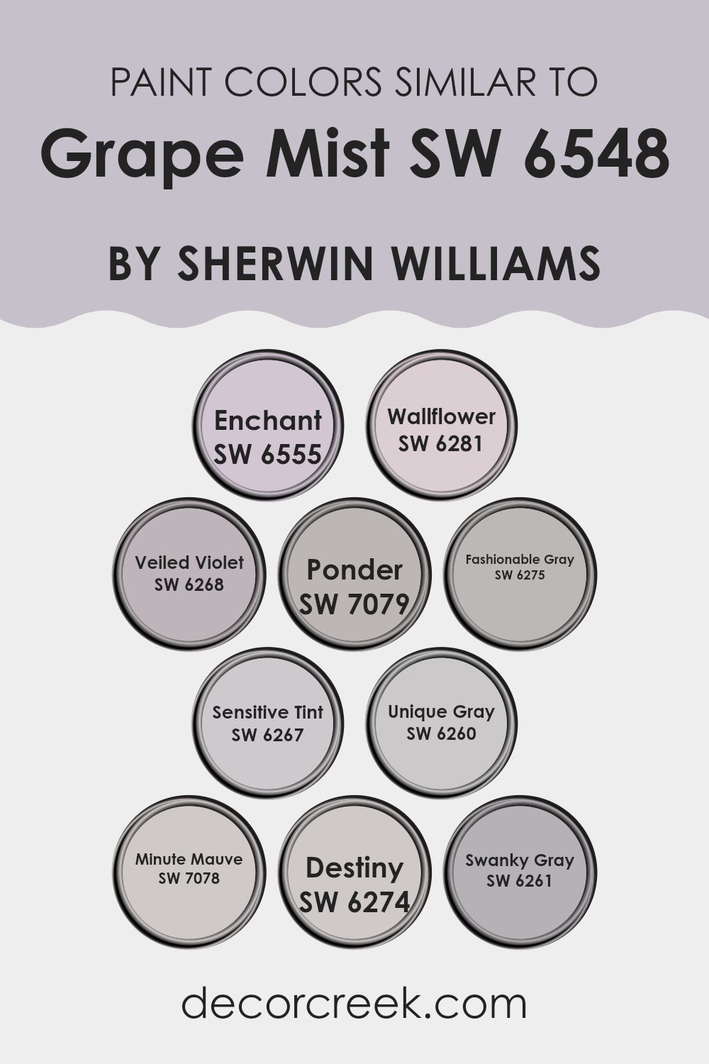
Colors Similar to Grape Mist SW 6548 by Sherwin Williams
Choosing similar colors to Grape Mist can create a harmonious and visually appealing room, greatly enhancing the aesthetic of any interior. These related shades offer subtle variations that can be used to achieve a cohesive atmosphere wherever applied.
For instance, using Veiled Violet introduces a delicate touch of mysterious charm with its slightly deeper tone, while Sensitive Tint offers a lighter, airier feel. The beauty of these similar hues lies in their ability to maintain balance and flow in interiors when used together.
Fashionable Gray adds a modern and stylish neutral base that pairs well with the more expressive tones like Enchant, which has a gentle yet captivating presence. Colors such as Wallflower and Ponder provide a muted backdrop that works beautifully against the richer hues. Unique Gray and Swanky Gray add depth to a design scheme, allowing furniture and décor pieces to stand out.
Minute Mauve gives a soft, welcoming character, while Destiny serves as a subtle coordinating tone alongside Grape Mist. Using these similar colors in decorating plans helps to create a continuous visual story throughout a room, making it feel thoughtfully designed and naturally cohesive.
You can see recommended paint colors below:
- SW 6555 Enchant
- SW 6281 Wallflower
- SW 6268 Veiled Violet
- SW 7079 Ponder
- SW 6275 Fashionable Gray
- SW 6267 Sensitive Tint
- SW 6260 Unique Gray
- SW 7078 Minute Mauve
- SW 6274 Destiny
- SW 6261 Swanky Gray
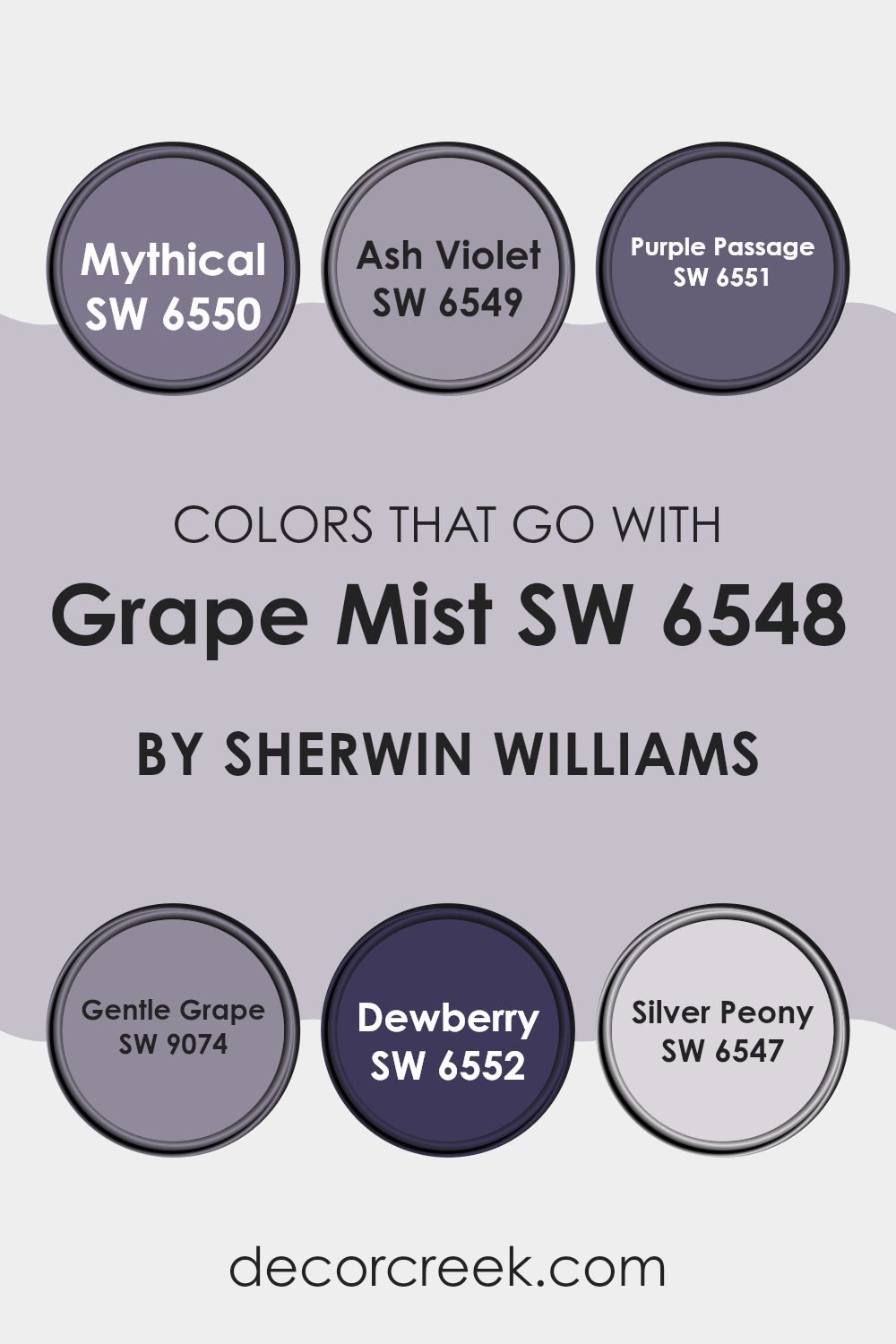
Colors that Go With Grape Mist SW 6548 by Sherwin Williams
Choosing the right colors to complement Grape Mist SW 6548 by Sherwin Williams is essential because the neighboring shades on walls, furniture, or accents can greatly influence the atmosphere and aesthetic of a room. These colors need to harmonize with Grape Mist to create a cohesive and pleasing look. When tones coordinate well, they enhance the overall feel of the interior, making it appear more balanced and inviting.
Grape Mist SW 6548 pairs beautifully with gentle and calm hues like Mythical SW 6550, which offers a muted lavender shade, adding a soothing touch. Another compatible tone is Ash Violet SW 6549, a deeper, dusky purple that provides a rich contrast without being too strong against the softness of Grape Mist.
Purple Passage SW 6551 brings a bolder, more expressive purple that can draw attention while staying in harmony with Grape Mist. Gentle Grape SW 9074 leans toward a tender, lighter purple, perfect for creating a smooth, flowing transition.
Dewberry SW 6552, as its name suggests, adds a vibrant, darker purple that works well for accents or statement areas. Lastly, Silver Peony SW 6547 softens the palette with its light, nearly grayish-lilac tone that helps balance and brighten deeper shades. Each color, when used alongside Grape Mist, enhances its character in a unique way depending on placement and design intent.
You can see recommended paint colors below:
- SW 6550 Mythical
- SW 6549 Ash Violet
- SW 6551 Purple Passage
- SW 9074 Gentle Grape
- SW 6552 Dewberry
- SW 6547 Silver Peony
How to Use Grape Mist SW 6548 by Sherwin Williams In Your Home?
Grape Mist SW 6548 by Sherwin Williams is a soft, gentle purple shade that brings a cozy feel to any room. This color is adaptable and can be used in many areas of the home. In the living room, Grape Mist can add a touch of warmth, creating a welcoming setting for family and guests. It pairs beautifully with neutral tones like whites and grays, allowing you to introduce colorful accents like cushions or artwork without making the room feel crowded.
In the bedroom, using Grape Mist can help establish a calm atmosphere, perfect for unwinding after a long day. It looks stunning on a feature wall behind the bed, combined with lighter shades on other walls to keep the room feeling open and airy.
For those who enjoy DIY projects, Grape Mist can be used to paint furniture pieces such as a bookshelf or nightstand, adding a unique touch to simple items. This color also works wonderfully in bathrooms for a refreshing pop that stands out from the more common blues and greens.
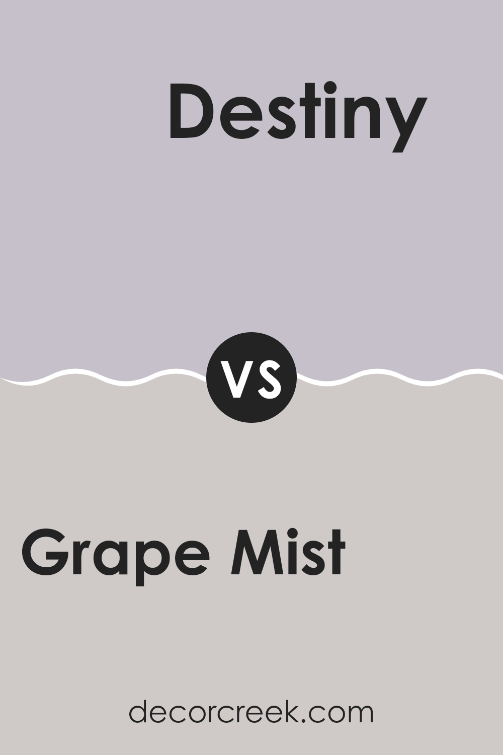
Grape Mist SW 6548 by Sherwin Williams vs Destiny SW 6274 by Sherwin Williams
Grape Mist and Destiny are both colors by Sherwin Williams that offer subtle and soothing vibes but in different tones. Grape Mist is a soft, gentle lavender shade that adds a light, airy feeling wherever it’s used.
It’s especially lovely in rooms that need a hint of softness with a slightly youthful energy. In contrast, Destiny is a muted gray with a touch of purple. This tone feels more grounded and composed, providing a neutral backdrop that works well in many interiors without attracting too much attention.
While Grape Mist brings a brighter, more uplifting character to a room, Destiny delivers a more understated and lasting feel, making it adaptable to a wide range of décor styles. Both shades can refresh a room’s look, but in distinct ways — Grape Mist opens up a room with lightness, while Destiny harmonizes quietly with surrounding elements.
You can see recommended paint color below:
- SW 6274 Destiny
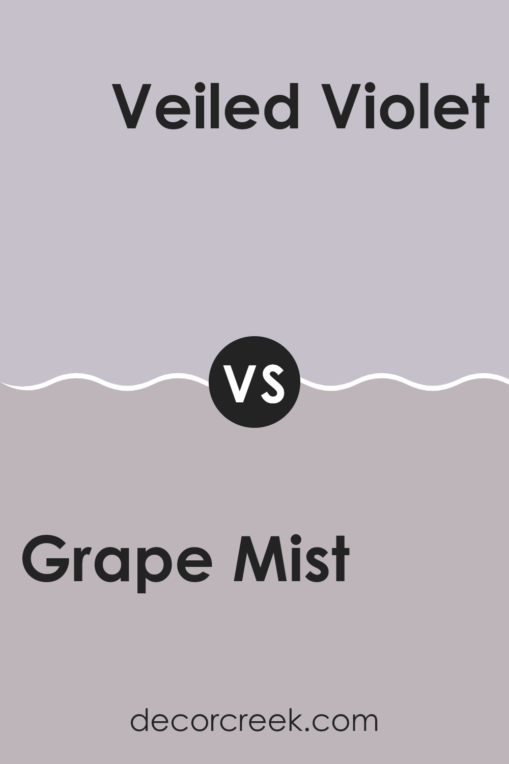
Grape Mist SW 6548 by Sherwin Williams vs Veiled Violet SW 6268 by Sherwin Williams
Grape Mist and Veiled Violet, both from Sherwin Williams, offer subtle yet distinct tones for any room. Grape Mist presents a lighter, airy feel with its soft lavender hue.
It’s perfect for creating a gentle, refreshing atmosphere in a room, nicely suited for areas aimed at relaxation like bedrooms or bathrooms. In contrast, Veiled Violet has a slightly deeper, more muted shade of purple. This color adds a touch of elegance without being too bold, making it ideal for both living areas and work zones that benefit from a calm yet enriching background.
Both colors work well with neutral tones, but while Grape Mist brings a brighter quality, Veiled Violet tends toward a more understated, cozy charm. Pairing either with complementary shades or decor can enhance their beauty further, depending on the vibe you’re going for in your decorating project.
You can see recommended paint color below:
- SW 6268 Veiled Violet
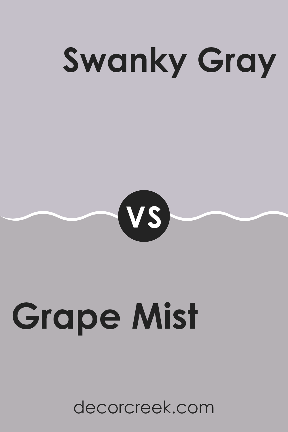
Grape Mist SW 6548 by Sherwin Williams vs Swanky Gray SW 6261 by Sherwin Williams
Grape Mist and Swanky Gray are two distinct hues from Sherwin Williams. Grape Mist presents a light and airy purple that brings a gentle, refreshing feel wherever it’s applied. This color is great for brightening up rooms without making them feel too intense.
On the other hand, Swanky Gray leans into a more neutral palette, offering a medium gray tone that balances well between cool and warm. This color is adaptable, fitting effortlessly into most interior designs to create a balanced look.
While Grape Mist provides a touch of playful charm to a room, Swanky Gray acts as a sturdy base, perfect for any decorating style, making it ideal for those looking for a modern but understated appearance. In essence, Grape Mist adds a pop of subtle color, and Swanky Gray serves as a strong, flexible backdrop.
You can see recommended paint color below:
- SW 6261 Swanky Gray
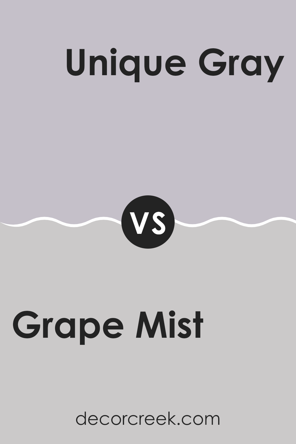
Grape Mist SW 6548 by Sherwin Williams vs Unique Gray SW 6260 by Sherwin Williams
Grape Mist and Unique Gray by Sherwin Williams are two distinct colors with their own unique tones and moods. Grape Mist is a soft, gentle purple that has a light, airy feel. It’s perfect for creating a calming vibe in a room, making it pleasant for areas like bedrooms or bathrooms where relaxation is key.
On the other hand, Unique Gray is a muted gray with a touch of warmth, making it quite adaptable for various decorating styles. It’s an excellent choice for living areas or offices, as it provides a neutral background that pairs well with many different colors and decor elements.
While Grape Mist adds a touch of subtle color to a room without being too intense, Unique Gray offers a solid, understated elegance that can ground a room and give it a polished look. Depending on the atmosphere you want to achieve, either color has great potential to make a room welcoming and stylish.
You can see recommended paint color below:
- SW 6260 Unique Gray
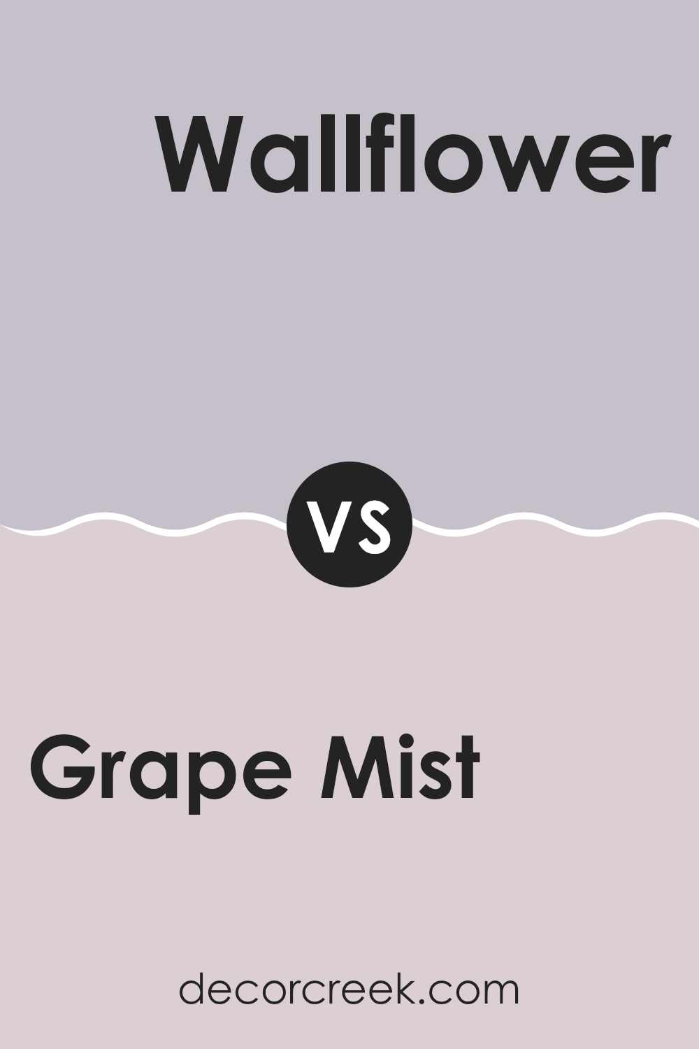
Grape Mist SW 6548 by Sherwin Williams vs Wallflower SW 6281 by Sherwin Williams
Grape Mist by Sherwin Williams is a gentle, muted purple that gives off a calming vibe but with a lively, playful undertone. It’s soft enough to be soothing, yet has enough brightness to add some cheerfulness to a room. This color works well in areas meant for relaxation or creativity.
In contrast, Wallflower by Sherwin Williams is a deeper, more subdued shade. It leans more toward a dusty lavender with hints of gray, making it perfect for creating a cozy and inviting atmosphere. While it’s still in the purple family, it has a more mature feel compared to Grape Mist, providing a subtle backdrop that doesn’t draw too much attention but beautifully complements other colors.
Both colors are quite adaptable but serve different moods and settings. Grape Mist might be better suited for energizing a room, while Wallflower would be ideal for a peaceful retreat.
You can see recommended paint color below:
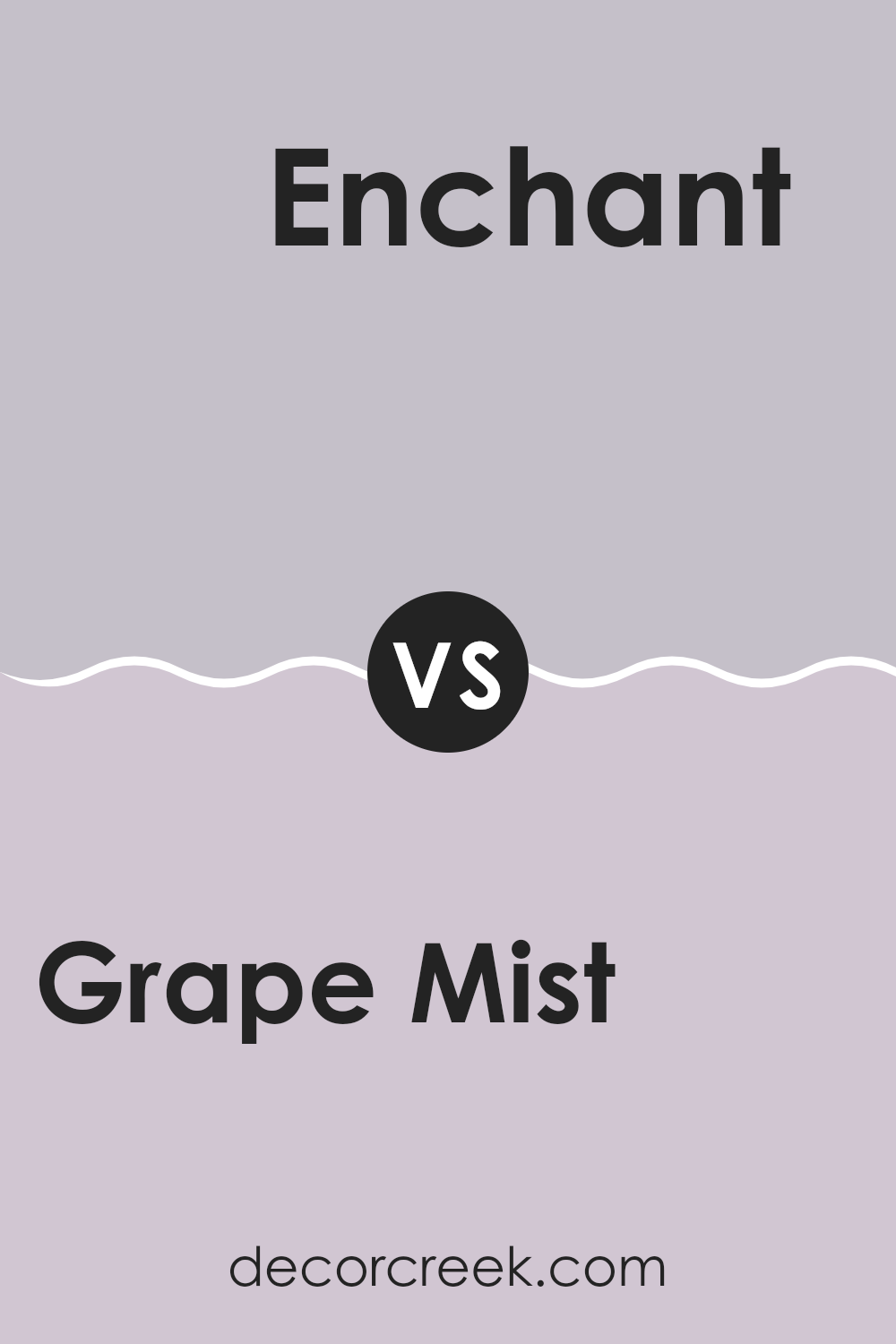
Grape Mist SW 6548 by Sherwin Williams vs Enchant SW 6555 by Sherwin Williams
Grape Mist and Enchant are both appealing colors from Sherwin Williams, but they convey different moods. Grape Mist is a soft, pale purple with a grayish undertone. It’s mild and understated, perfect for creating a gentle, soothing backdrop in a room. It works beautifully in areas aiming for a subtle touch of color without being too intense.
Enchant, on the other hand, is a deeper purple with a more defined richness. It’s bold and brings warmth and depth to a room. This color is ideal for making a statement, whether used on an accent wall or through accessories, adding a touch of drama while maintaining balance and elegance.
Both shades fit different settings, with Grape Mist leaning toward a quieter, more relaxed aesthetic, and Enchant offering a stronger, more expressive character. The choice between them depends on the mood and atmosphere you want to create.
You can see recommended paint color below:
- SW 6555 Enchant
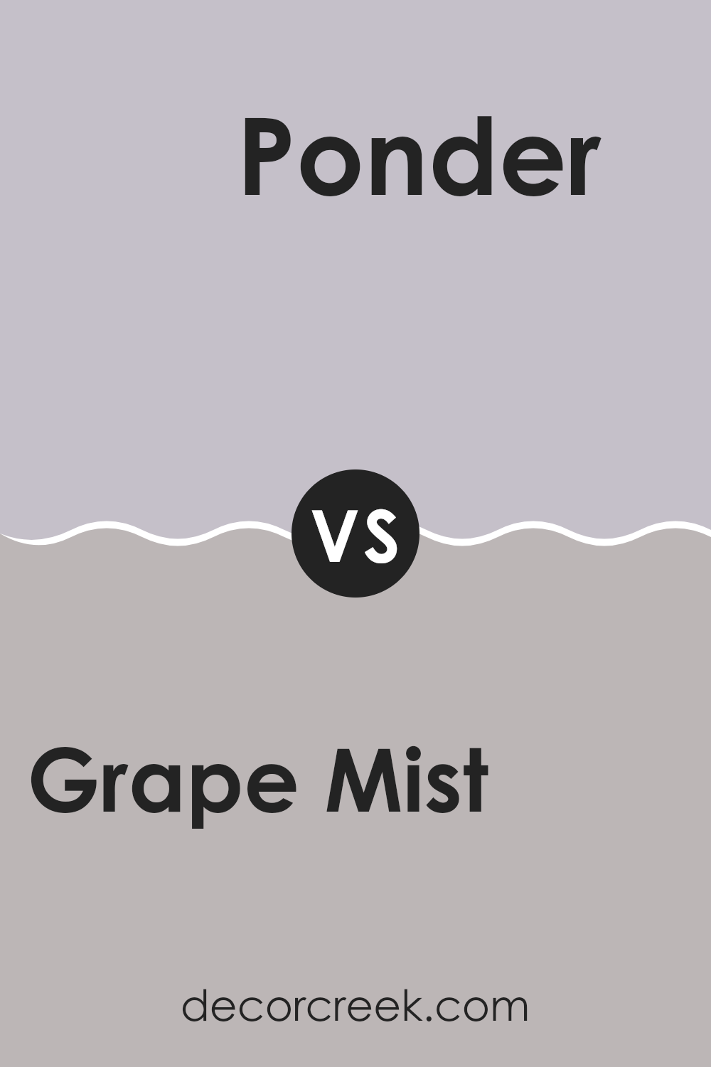
Grape Mist SW 6548 by Sherwin Williams vs Ponder SW 7079 by Sherwin Williams
Grape Mist and Ponder are two contrasting colors by Sherwin Williams. Grape Mist is a soft, light purple that adds a gentle pop of color to any room, making it feel cozy and friendly. It’s an excellent choice if you want to brighten up a room without being too bold.
Ponder, on the other hand, is a deep gray with subtle blue undertones. This color is great for adding a touch of drama and depth to an area. It works well in rooms that aim for a more grounded, stable look.
When you use Grape Mist, it tends to open up smaller rooms and pairs beautifully with whites and creams for a fresh, airy feel. Ponder is more suitable for larger areas or as an accent wall where you want to create a focal point. This color matches well with brighter shades or metallic finishes for a modern look. Both colors have their unique appeal depending on what feeling you want to achieve in your living area.
You can see recommended paint color below:
- SW 7079 Ponder
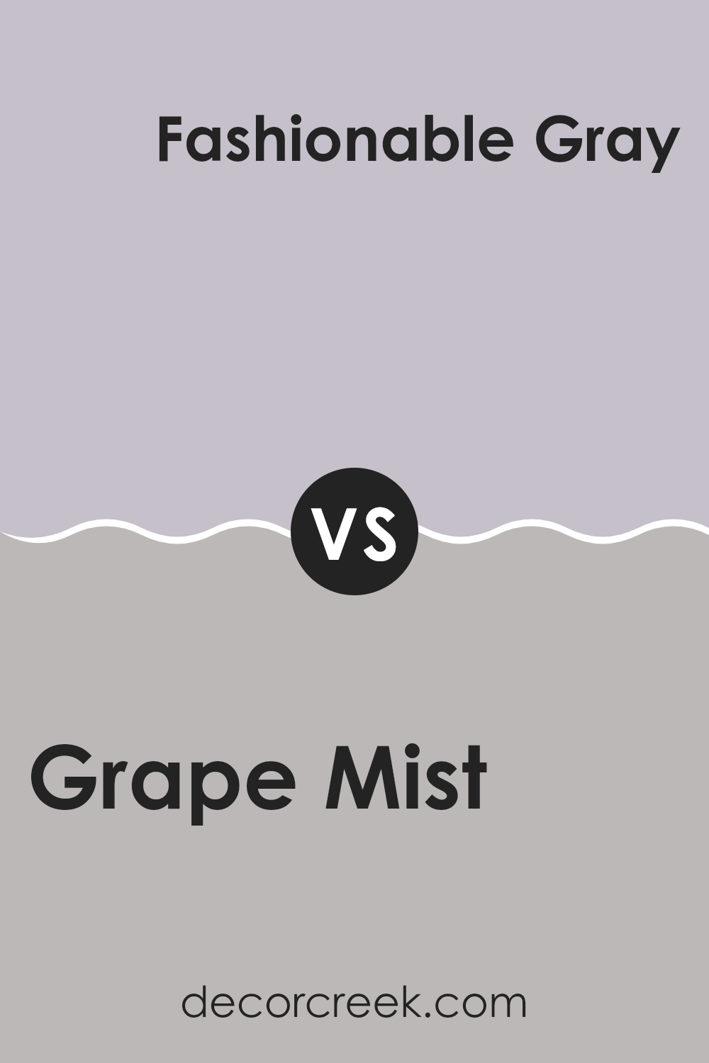
Grape Mist SW 6548 by Sherwin Williams vs Fashionable Gray SW 6275 by Sherwin Williams
Grape Mist by Sherwin Williams is a soft, light purple that has a subtle, airy feel to it. It’s a calm color, perfect for creating a gentle and inviting atmosphere in rooms like bedrooms or living areas. The color is muted, making it adaptable and a good choice for those who like a hint of color without being too intense.
On the other hand, Fashionable Gray by Sherwin Williams is a deeper, neutral gray that carries a hint of elegance. This tone is more understated than Grape Mist and works well in various rooms of a home, providing a steady backdrop that can complement brighter colors or stand alone for a more refined look. Fashionable Gray is ideal for those seeking a color that adds a sense of balance and can ground a room’s decor.
Overall, while Grape Mist adds a touch of softness and lightness, Fashionable Gray offers a more stable and subtle presence, making both shades distinctive in their own ways.
You can see recommended paint color below:
- SW 6275 Fashionable Gray
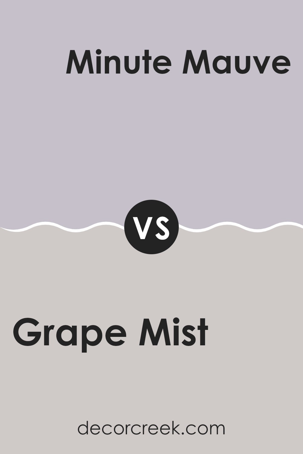
Grape Mist SW 6548 by Sherwin Williams vs Minute Mauve SW 7078 by Sherwin Williams
Grape Mist and Minute Mauve, both by Sherwin Williams, offer subtle variations within the family of muted tones, yet each sets a distinct mood. Grape Mist has a refreshing touch with its light, airy lavender hue, making it ideal for brightening up smaller rooms or adding a gentle hint of color without being too intense. It works beautifully in bedrooms or bathrooms where a calm, relaxing effect is desired.
Minute Mauve, on the other hand, leans more toward a dusky, muted pinkish-purple, offering a warmer and slightly deeper tone. This shade brings a cozy feeling to interiors and can add a touch of understated warmth to araes like living or dining rooms. It pairs nicely with a range of decor styles, from modern to traditional.
Each color has its own appeal — Grape Mist reflects a cooler tone, while Minute Mauve provides a warm, comforting atmosphere. Both can beautifully enhance a room, depending on the mood you want to create.
You can see recommended paint color below:
- SW 7078 Minute Mauve
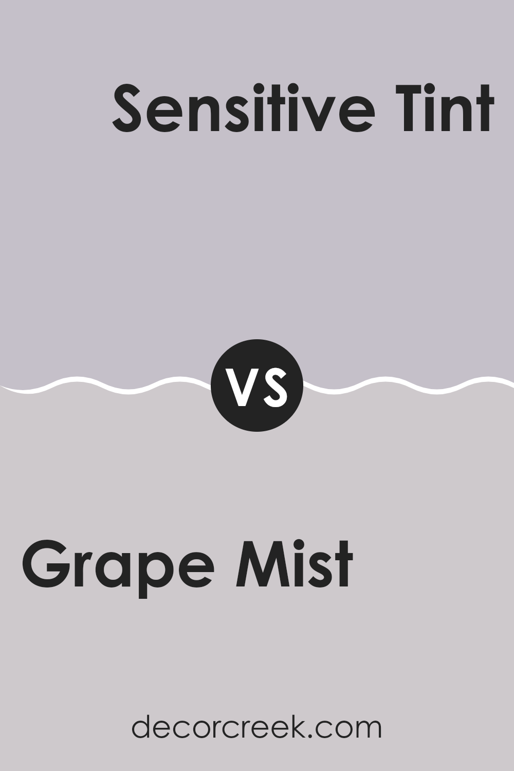
Grape Mist SW 6548 by Sherwin Williams vs Sensitive Tint SW 6267 by Sherwin Williams
Grape Mist and Sensitive Tint are both calm, soft colors by Sherwin Williams, but they have distinct differences in their hues and vibes. Grape Mist is a light purple with a slightly blue undertone, giving it a fresh and gentle feel perfect for creating a peaceful room.
It’s ideal for anyone wanting to add a touch of color without overpowering a room. On the other hand, Sensitive Tint is a gray with a hint of lavender, offering a more muted and subtle option. This color works well in areas where you might want a neutral background that’s a bit warmer than plain gray.
If you’re thinking about room aesthetics, Grape Mist adds a mild, cheerful splash of color, whereas Sensitive Tint keeps things low-key and understated, blending easily with different decor styles. Both are adaptable in their own right, fitting beautifully into various parts of a home from bedrooms to living areas.
You can see recommended paint color below:
- SW 6267 Sensitive Tint
In conclusion, SW 6548 Grape Mist by Sherwin Williams is a really cool paint color! It’s like a light, happy kind of purple that reminds you of small, juicy grapes or soft, dreamy skies early in the morning. This color is great because it feels cheerful and relaxed at the same time, perfect for rooms where you want to chill out or let your imagination run wild. Whether you’re painting a wall in your bedroom or adding a pop of color to your living room, Grape Mist can make the room look fresh and inviting.
You can mix it with lots of other colors too! Pairing it with whites or light grays makes a room feel open and bright, while going with darker tones like blue or green can bring a cozy and comforting feeling. It’s a paint color that makes decorating fun because it works well whether you want something playful or calming.
I really enjoy seeing how Grape Mist can shift the look of a room. It’s not just another purple; it’s got a unique vibe that can make any room more enjoyable. For anyone thinking about trying a new paint color, Grape Mist is definitely worth considering.
It’s simple to use, looks amazing, and can help make your home feel even more inviting.
Ever wished paint sampling was as easy as sticking a sticker? Guess what? Now it is! Discover Samplize's unique Peel & Stick samples.
Get paint samples

