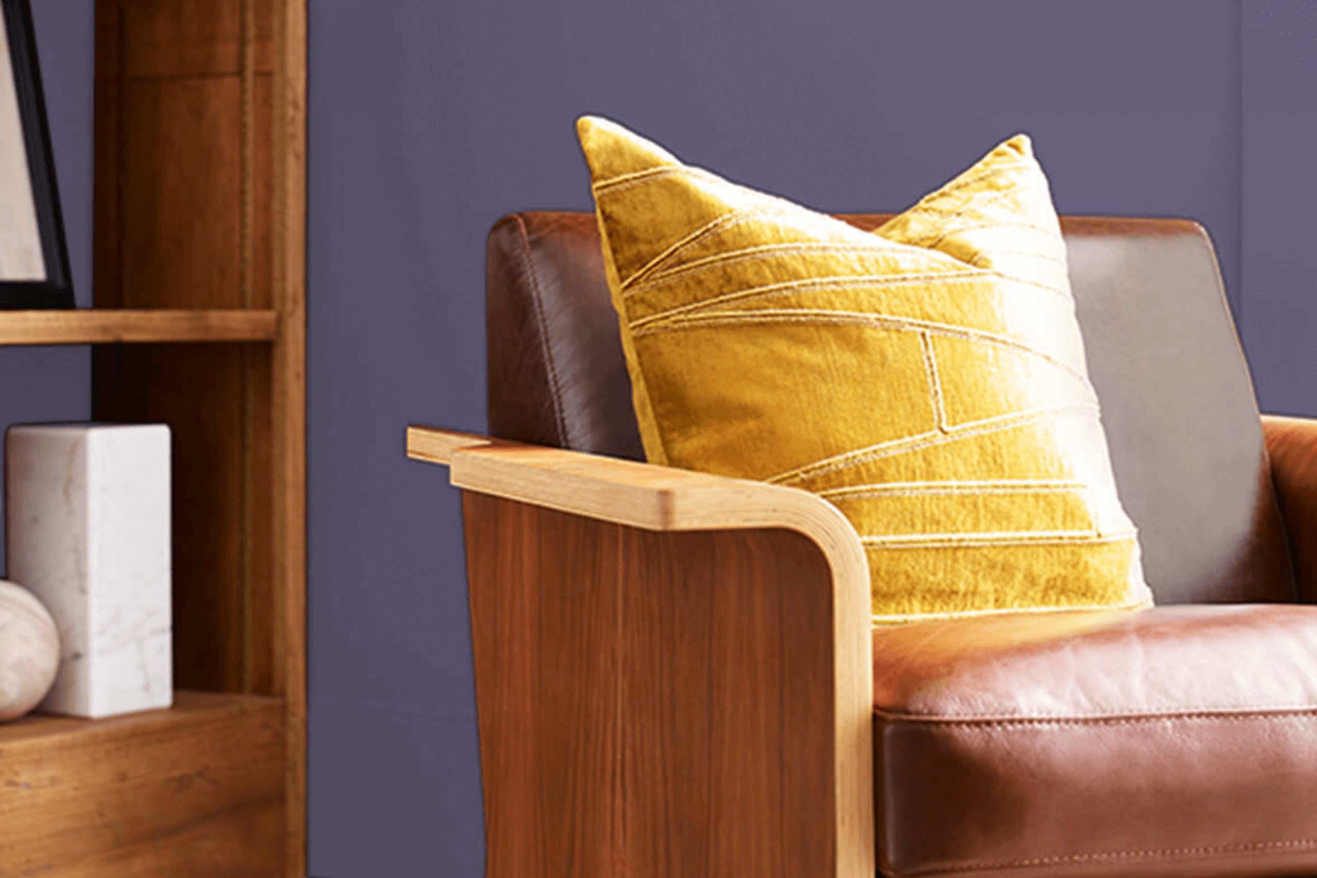
Purple Passage, SW 6551 by Sherwin Williams, has its own unique charm. It’s the kind of color that speaks to you quietly, inviting you into a room that feels both refined and comforting. When I first considered using it, I was drawn to the gentle yet profound personality it brings to a room. Purple Passage carries the elegance of purple without becoming too intense. It strikes a perfect balance—soft enough to create a peaceful environment, yet rich enough to add a touch of grace.
This color works beautifully in various settings, whether you’re looking to refresh a living room, add character to a bedroom, or bring depth to an office room. There’s something about this hue that feels lasting, like it can fit into both modern and traditional designs effortlessly.
If you want your walls to have a subtle presence that still makes its mark, Purple Passage is an excellent choice. It allows other elements in the room to shine while maintaining its unique charm. Experimenting with this color can lead to delightful surprises, as light and shadow play with its tones throughout the day.
Whether paired with neutrals or bolder accents, Purple Passage complements with ease, making it a flexible addition to your room.
What Color Is Purple Passage SW 6551 by Sherwin Williams?
Purple Passage by Sherwin Williams is a lovely shade that strikes a balance between deep and subtle. It is a muted purple with hints of gray, making it flexible and refined. This color works beautifully in various interior styles, from modern to traditional. In a modern setting, it adds a pop of elegance without being too intense. In traditional or vintage interiors, Purple Passage brings a rich, warm feel that complements antique furniture and decor.
This color pairs well with materials that highlight its warmth and depth. Think soft, plush fabrics like velvet or chenille, which emphasize its cozy, inviting nature. Wood tones, especially darker variations like walnut or mahogany, work well, bringing out the color’s richer undertones. Metallics, such as brushed brass or gold, add a touch of luxury and contrast nicely with the muted hue.
For textures, consider natural fibers like wool or linen to maintain a soft, homey vibe. These materials enhance the laid-back elegance of Purple Passage. Incorporating glass or mirrored elements can also add a bit of brightness, creating a balanced look that is both cozy and stylish.
Whether on an accent wall or throughout a room, this purple can enhance and define your room.
Is Purple Passage SW 6551 by Sherwin Williams Warm or Cool color?
Purple Passage SW 6551 by Sherwin-Williams is a unique and flexible color that adds character to any home. This warm and inviting shade of purple creates a cozy atmosphere, making it an excellent choice for living rooms or bedrooms. It adds a touch of elegance and refinement without being too intense.
When used in a room, Purple Passage can make the room feel more intimate and comfortable. Its rich tone pairs well with neutral colors like white, gray, or beige, helping to balance the boldness. You can also combine it with other purples or even soft blues for a harmonious look.
Natural light can enhance Purple Passage, giving it a softer appearance during the day while appearing more dramatic under artificial lighting at night. This color is suitable for both modern and traditional interiors, allowing homeowners to personalize their area effortlessly. Its adaptability makes it a popular choice for those looking to add warmth and interest to their homes.
Undertones of Purple Passage SW 6551 by Sherwin Williams
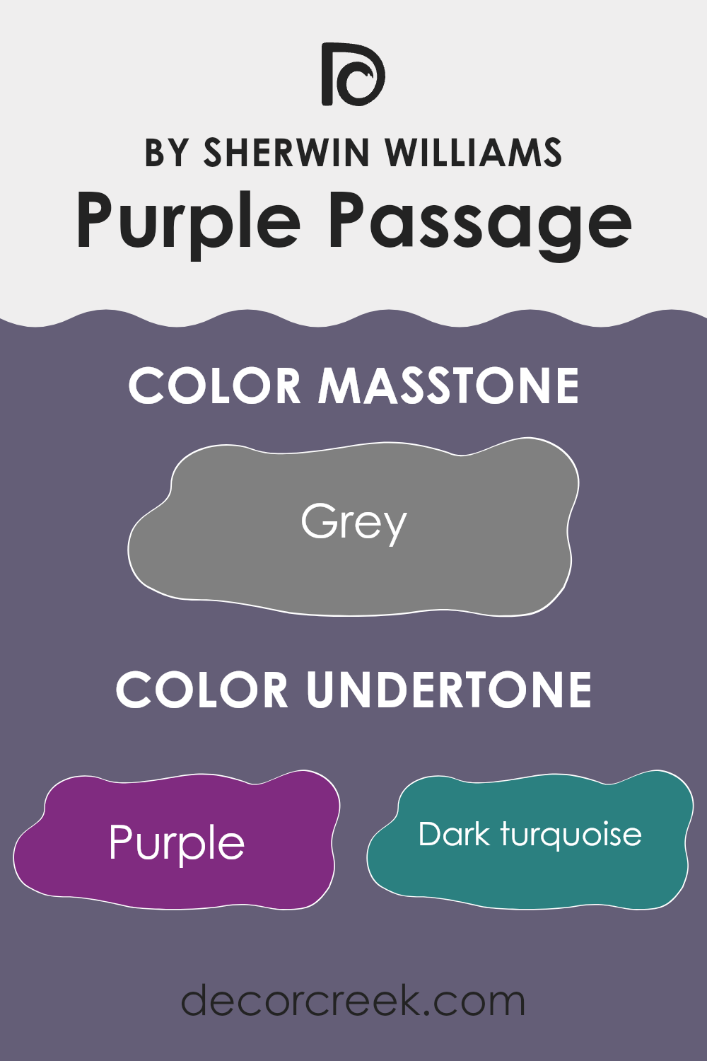
Purple Passage by Sherwin Williams, identified as SW 6551, is a complex color that features a variety of undertones. Undertones are subtle hints of color that lie beneath the main color and can significantly affect how a color looks in different environments.
Purple Passage combines elements of darker purples with hints of navy and violet, creating a deep, rich base. The presence of these undertones means the color might change slightly depending on the lighting and surrounding colors in a room. For instance, in a room with lots of natural light, the paint might lean more towards its cooler lilac or dark blue undertones, potentially creating a deeper and more vibrant look.
On the other hand, in dim lighting or when paired with earthy accents like olive or brown, Purple Passage’s warmer undertones, such as those of red or orange, might come forward, giving the room a cozier and intimate feel. When applied to interior walls, this color’s rich palette can create a sense of depth and complexity. It also pairs well with neutral shades, like light gray, to offer a well-balanced look.
Overall, the undertones in Purple Passage ensure versatility, allowing the color to fit into various design schemes while offering a unique atmosphere in each setting.
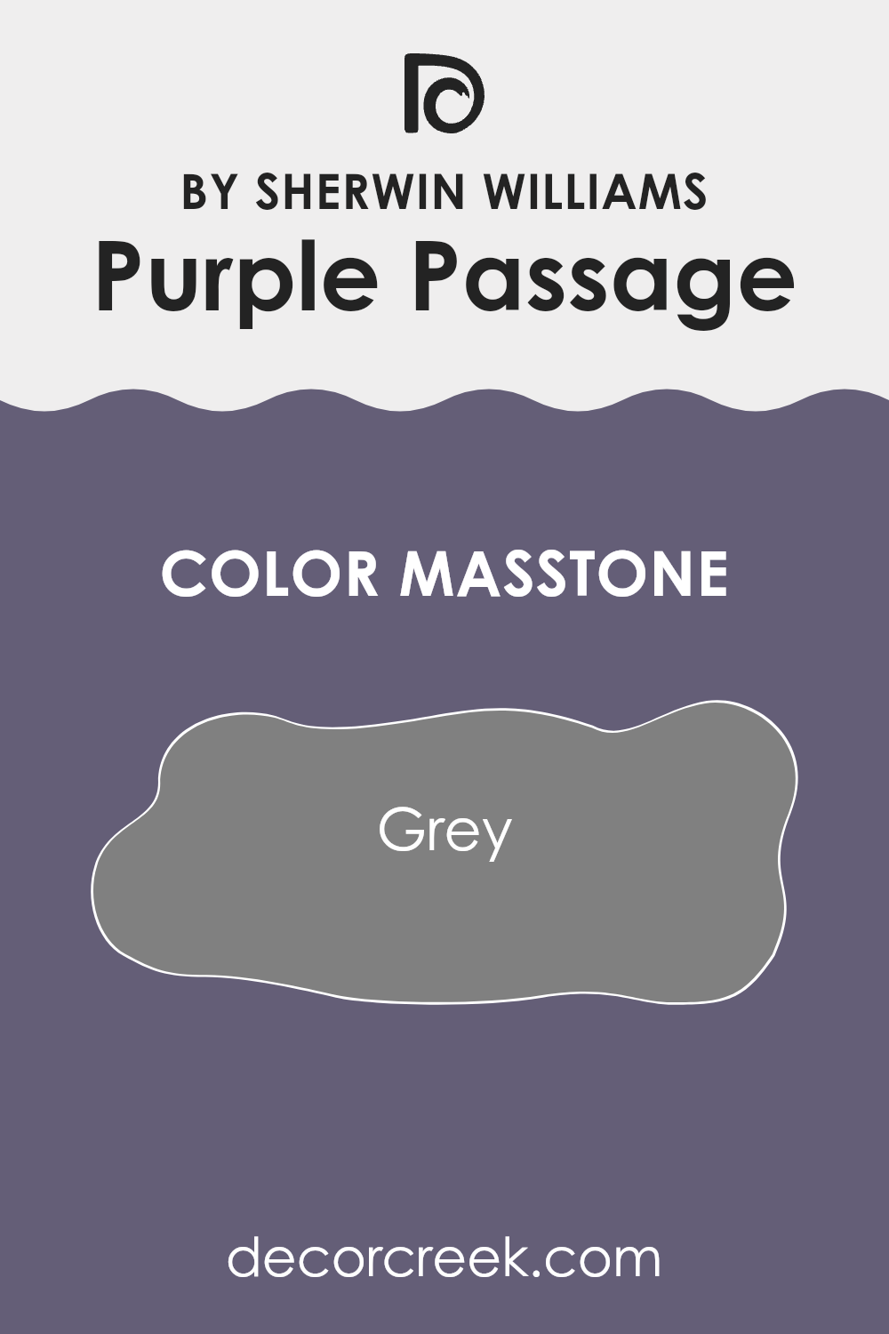
What is the Masstone of the Purple Passage SW 6551 by Sherwin Williams?
Purple Passage SW 6551 by Sherwin-Williams has a unique elegance due to its mixture of soft purple hues with a rich, warm gray tone as its masstone. This gray base, represented by the hex code #808080, ensures a neutral grounding, allowing the purple to be more flexible in different home settings.
The gray undertone softens the boldness of the purple, making it a subtle choice for interior walls. This color works well in living rooms and bedrooms, where a calming atmosphere is desired.
The muted and balanced nature of Purple Passage makes it compatible with various design styles, from modern to traditional. It pairs beautifully with whites, creams, and natural wood tones, adding depth without being too intense. The gray masstone helps the color maintain a sense of warmth and coziness, making it an excellent choice for areas where comfort and relaxation are important.
How Does Lighting Affect Purple Passage SW 6551 by Sherwin Williams?
Lighting plays a crucial role in how we perceive colors. Different light sources can change the appearance of a color, making it look different depending on the time of day and the direction a room faces. The color Purple Passage (SW 6551) by Sherwin Williams, for example, behaves differently under various lighting conditions.
In natural light, Purple Passage appears as a soft, muted purple. In north-facing rooms, which get cooler, indirect light most of the day, this paint color might take on a slightly blue-gray hue. This can make the color feel more subdued or cooler, as northern light tends to enhance cooler undertones.
On the other hand, south-facing rooms get consistent, bright sunlight throughout the day. This kind of light can bring out warmer tones in paint colors. Purple Passage might show its warmer side in such rooms, making it appear lighter and maybe even a bit more pinkish. The consistent sunlight helps maintain the color’s richness without making it feel too cool.
East-facing rooms get their light primarily in the morning. In this setting, Purple Passage may look brighter and more vibrant during the early hours when the sunlight is strong and direct. As the day progresses and the light becomes less direct, the color might shift to a softer appearance.
West-facing rooms, which receive most of their light in the late afternoon and evening, can make Purple Passage appear deeper and richer as the day ends. The warm, golden hues of sunset can bring out the warmer undertones in the paint, intensifying its color.
In artificial light, the type of bulb used can also change how Purple Passage appears. Incandescent lighting, which is warmer, might highlight the warm tones, making the room feel cozy. Meanwhile, cooler LED lighting can emphasize any cooler undertones. Therefore, it’s important to test paint colors like Purple Passage in the specific lighting of your room to understand how they will look in different conditions.
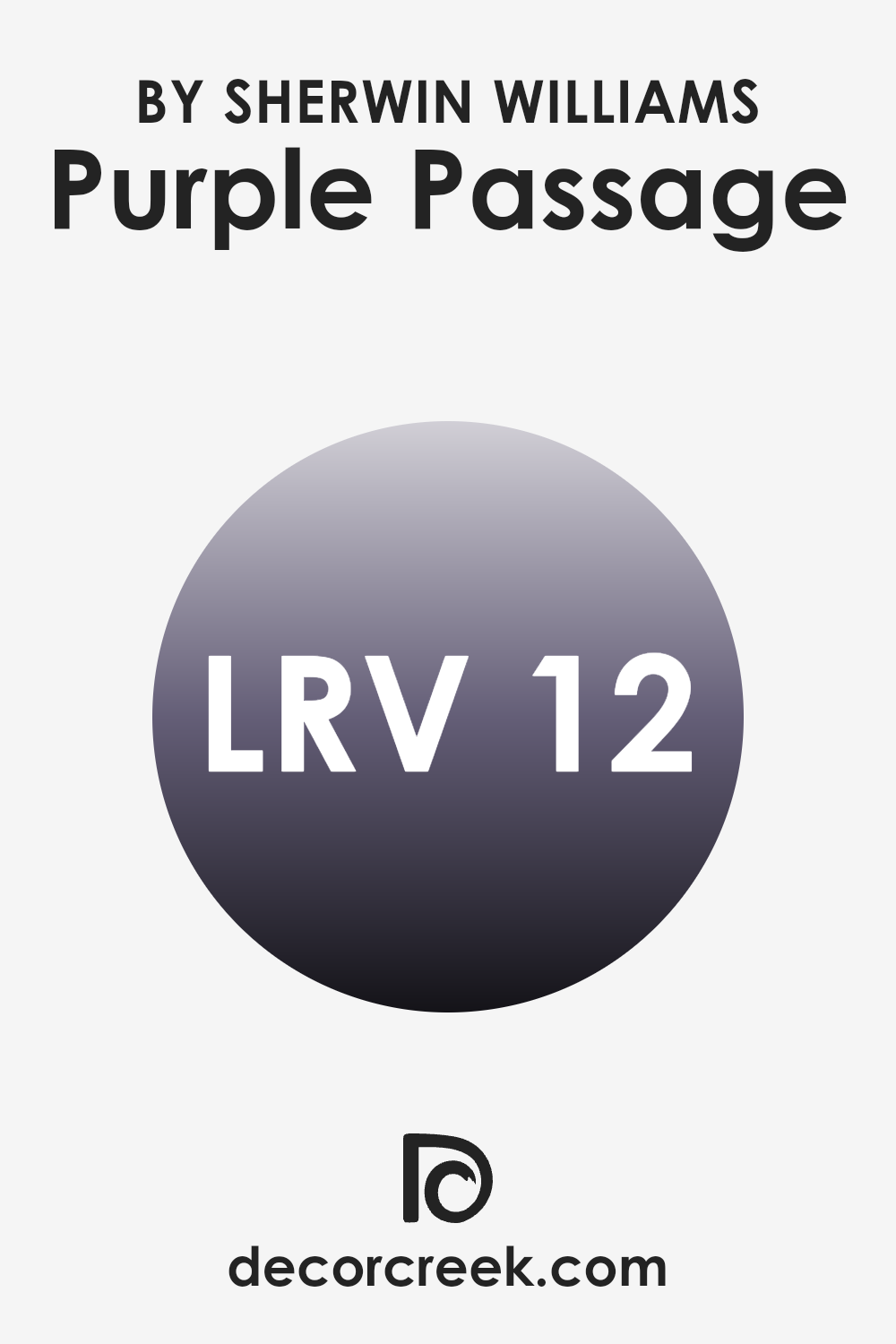
What is the LRV of Purple Passage SW 6551 by Sherwin Williams?
LRV, or Light Reflectance Value, measures how much light a color reflects or absorbs. The scale goes from 0 to 100, where 0 means the color absorbs all light (pure black) and 100 means it reflects all light (pure white). A higher LRV means the color will make a room feel brighter and more open since it reflects more light back into the room.
Lower LRV values, like 12.019, indicate the color will absorb more light, making it appear richer and potentially making the room feel cozier or smaller. The LRV helps you understand how a paint color will look when light hits it, and this is crucial when choosing a color for your walls, as it can significantly impact the room’s atmosphere.
With an LRV of 12.019, the color Purple Passage is quite a deep, saturated choice. This low LRV means it will absorb a lot of light, so it will appear dark on walls, adding depth and intensity to a room. It’s not the kind of color that will brighten up a room or make it feel larger; instead, it might make a large room feel more intimate or a small room feel even cozier.
If you want that rich, enveloping look, this color will work well, especially when paired with good lighting to ensure it doesn’t make the room feel too closed in. It’s a bold option that can add a dramatic flair to any room.
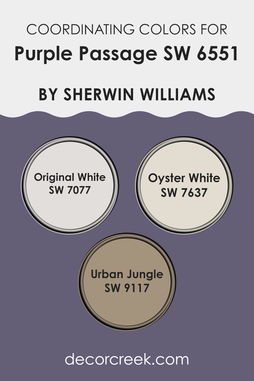
Coordinating Colors of Purple Passage SW 6551 by Sherwin Williams
Coordinating colors are shades that complement each other when used together in interior design, creating a unified and balanced look. When you pair these colors with Purple Passage by Sherwin Williams, they work together to establish a harmonious atmosphere. Coordinating colors do not have to match perfectly, but they should enhance the overall visual appeal of a room. By carefully choosing colors that complement Purple Passage, you can create a cohesive and inviting environment in any room.
Original White (SW 7077) is a soft, clean white that offers a fresh backdrop without overpowering the other colors. Its simplicity helps it adapt well to various designs, making it an excellent choice for walls or trim. Oyster White (SW 7637) carries a subtle warmth, giving it a cozy and inviting feel.
It pairs nicely with Purple Passage to balance out its richness and add a touch of warmth. Urban Jungle (SW 9117) is a muted green that introduces a natural, earthy element. It works beautifully with Purple Passage by adding depth and an organic feel to the room, allowing for a connection to nature. Together, these colors can create a flexible and pleasant setting that feels both comfortable and stylish.
You can see recommended paint colors below:
- SW 7077 Original White
- SW 7637 Oyster White
- SW 9117 Urban Jungle
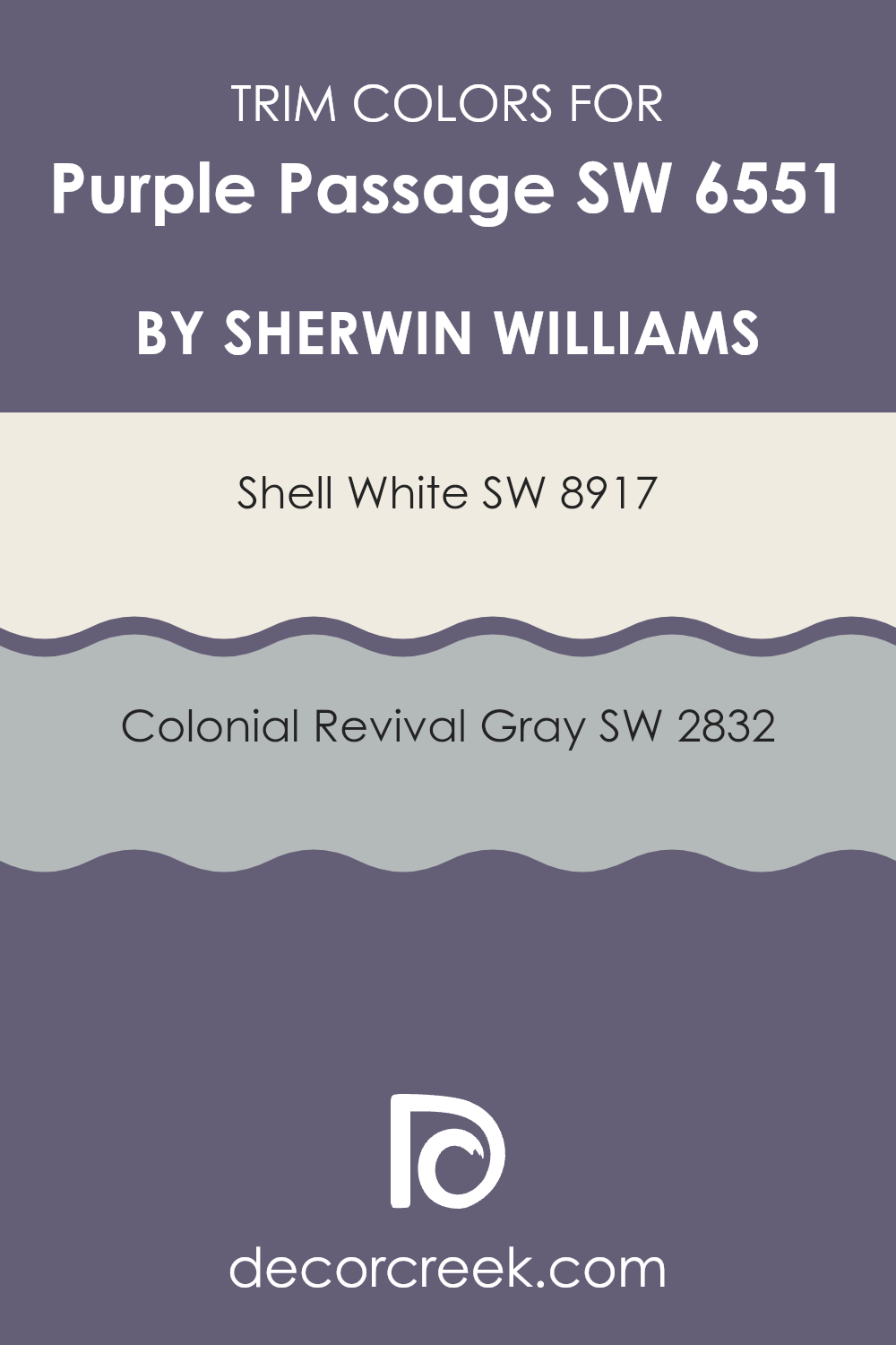
What are the Trim colors of Purple Passage SW 6551 by Sherwin Williams?
Trim colors are the colors used on the edges and details of a room, like the baseboards, door frames, and window frames. These colors play a crucial role in design because they highlight these details and can make a room feel more complete and polished. Trim colors can either contrast with or complement the primary wall color, making the overall appearance more interesting and cohesive.
When using a wall color like Purple Passage, the right trim colors can enhance its beauty and ensure the room feels balanced and inviting. The subtleness or boldness of trim colors can also affect the mood of a room by defining its style and boundaries more clearly.
Shell White, SW 8917, is a soft, off-white color that brings warmth and brightness to a room, making it an excellent choice for trim. This creamy shade can gently contrast with Purple Passage, creating a pleasant and inviting ambiance. On the other hand, Colonial Revival Gray, SW 2832, gives a refined and classic touch with its neutral and balanced tone.
This gray is perfect for adding depth and understated elegance, providing a pleasing contrast to the richer tones of Purple Passage. Both colors work well as trim choices, each offering a different vibe that can influence the look and feel of a room when paired with Purple Passage.
You can see recommended paint colors below:
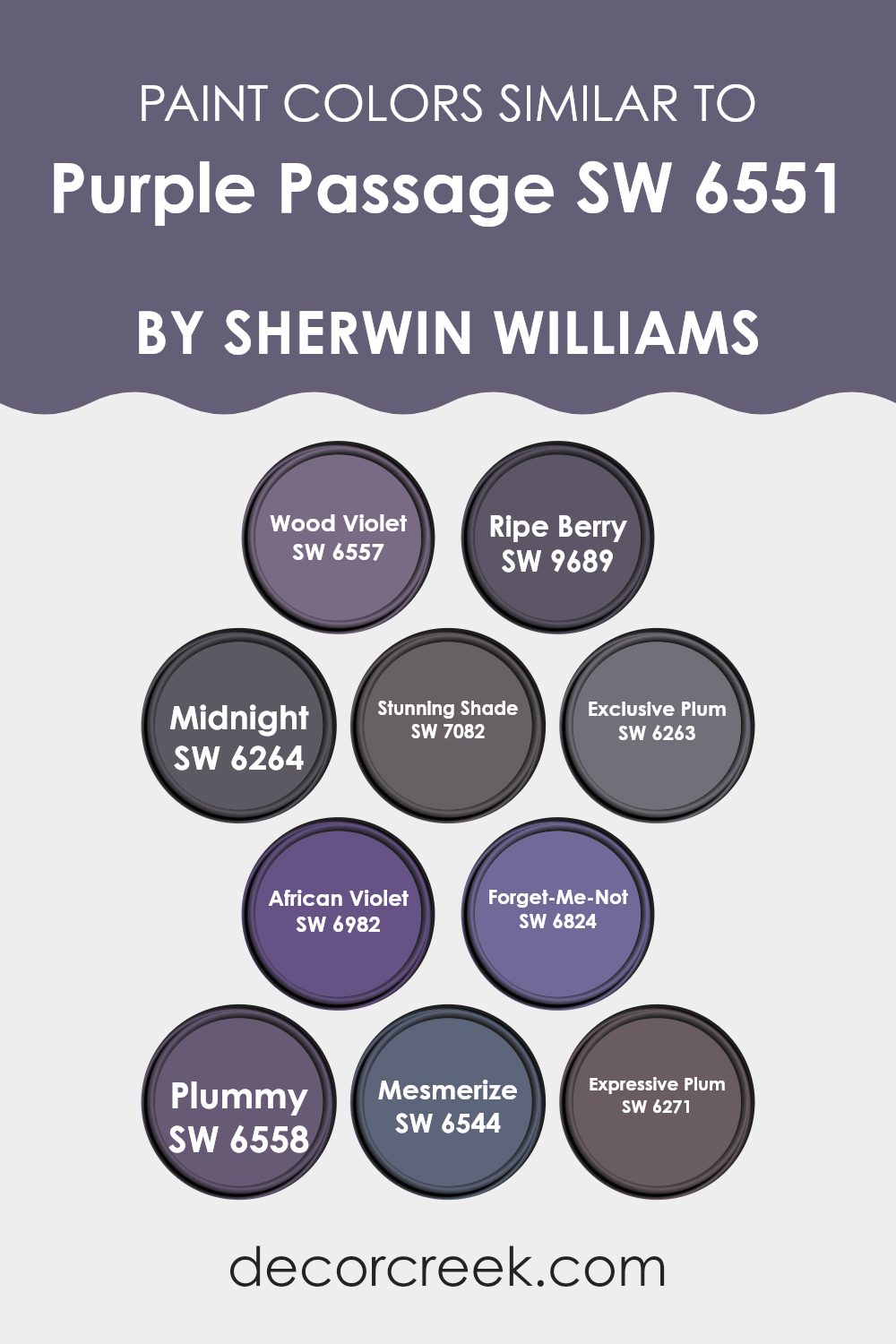
Colors Similar to Purple Passage SW 6551 by Sherwin Williams
Similar colors play a crucial role in design by creating harmony and flow within a room. When working with shades related to Sherwin Williams’ Purple Passage, such as SW 6557 – Wood Violet and SW 9689 – Ripe Berry, the effect is a room imbued with warmth and elegance. Wood Violet carries a rich and natural tone, while Ripe Berry adds a touch of depth with its sweeter, darker hue. SW 6264 – Midnight provides a deep, shadowy contrast that can ground lighter purples, creating a balanced and welcoming atmosphere.
Meanwhile, SW 7082 – Stunning Shade offers a vibrant pop, infusing areas with energy. SW 6263 – Exclusive Plum has a dignified air, lending areas an air of refinement. SW 6982 – African Violet graces rooms with subtle, yet lively energy, while SW 6824 – Forget-Me-Not introduces a touch of nostalgia with its soft lavender undertones.
SW 6558 – Plummy provides a lush feel with deeper, berry-like notes, and SW 6544 – Mesmerize creates intrigue with a mysterious intensity. SW 6271 – Expressive Plum’s lush and bold hue is perfect for making a statement. Together, these shades work in unison, enriching rooms with a sense of cohesion and comfort.
You can see recommended paint colors below:
- SW 6557 Wood Violet
- SW 9689 Ripe Berry
- SW 6264 Midnight
- SW 7082 Stunning Shade
- SW 6263 Exclusive Plum
- SW 6982 African Violet
- SW 6824 Forget-Me-Not
- SW 6558 Plummy
- SW 6544 Mesmerize
- SW 6271 Expressive Plum
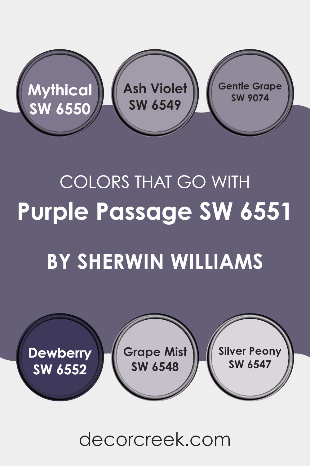
Colors that Go With Purple Passage SW 6551 by Sherwin Williams
Colors that pair well with Purple Passage SW 6551 by Sherwin Williams are key in creating a balanced and pleasing environment. These complementary colors enhance Purple Passage’s rich tone, adding depth and harmony to any room. SW 6550 – Mythical offers a soft, muted purple that gently contrasts with Purple Passage, providing a calming backdrop. SW 6549 – Ash Violet brings a touch of gray into the purple spectrum, adding a subdued and refined feel that balances the vividness of Purple Passage.
SW 9074 – Gentle Grape is a lighter shade of purple, which brings a sense of lightness and airiness, working well for areas that need a touch of brightness. Meanwhile, SW 6552 – Dewberry is a deep, dramatic purple that creates a bold contrast and can be used to add an element of drama or focus within a room.
SW 6548 – Grape Mist is a dusty lavender that softens the area and has a soothing effect. Finally, SW 6547 – Silver Peony mixes lavender with a hint of pink to introduce warmth and coziness. Together, these colors give homeowners lots of choices for creating areas that feel inviting and well-coordinated.
You can see recommended paint colors below:
- SW 6550 Mythical
- SW 6549 Ash Violet
- SW 9074 Gentle Grape
- SW 6552 Dewberry
- SW 6548 Grape Mist
- SW 6547 Silver Peony
How to Use Purple Passage SW 6551 by Sherwin Williams In Your Home?
Purple Passage by Sherwin Williams is a rich and warm shade of purple that adds a cozy touch to any room. This color works well in various areas of the home, such as living rooms, bedrooms, or even dining areas. It provides a sense of comfort and elegance to areas, making them feel inviting and stylish.
When using Purple Passage in a bedroom, pair it with soft grays or whites for a balanced and relaxing atmosphere. In a living room, combining it with gold or brass accents can create a chic and refined look. Adding wooden furniture or neutral-colored upholstery can help tone down the boldness, making the room feel grounded and welcoming.
For those who love color but prefer it in smaller doses, using Purple Passage on an accent wall or as part of a decorative piece can add a pop of personality without being too intense.
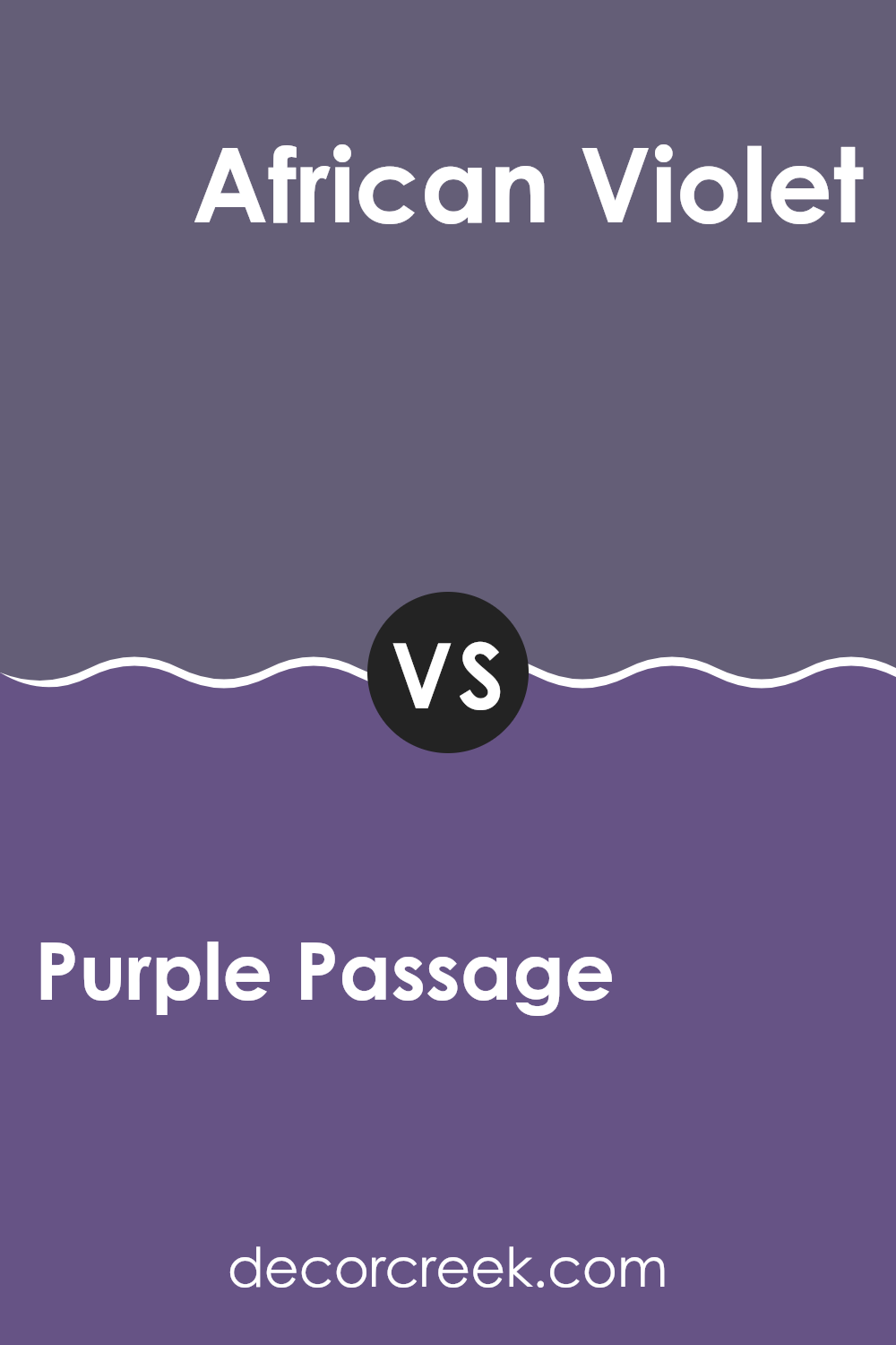
Purple Passage SW 6551 by Sherwin Williams vs African Violet SW 6982 by Sherwin Williams
Purple Passage and African Violet are two rich shades of purple by Sherwin Williams, each with unique characteristics. Purple Passage is a warm and inviting purple with a slightly muted tone. It brings a cozy and comforting feeling to a room.
On the other hand, African Violet is a bolder, deeper shade of purple with hints of blue. It has a more dramatic and intense vibe, making it a standout choice for creating a statement wall or adding character to a room.
While both colors are part of the purple family, Purple Passage leans more towards a red undertone, giving it warmth, perfect for a relaxing bedroom or living area. African Violet’s blue undertone adds depth and a touch of sophistication, suited for areas where you want a striking and bold atmosphere. When choosing between them, consider the mood you want to create: cozy with Purple Passage or bold with African Violet.
You can see recommended paint color below:
- SW 6982 African Violet
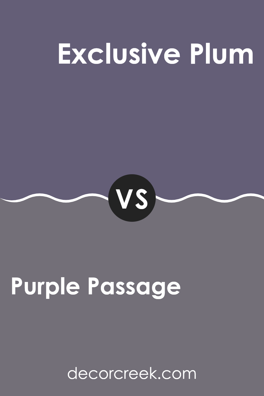
Purple Passage SW 6551 by Sherwin Williams vs Exclusive Plum SW 6263 by Sherwin Williams
Purple Passage (SW 6551) by Sherwin Williams is a warm and flexible shade of purple that adds coziness and vibrancy to a room. It is slightly on the warmer side, with red undertones that make it feel inviting and lively. This color works beautifully in living areas or bedrooms where a touch of energy and warmth is desired.
In contrast, Exclusive Plum (SW 6263) by Sherwin Williams is a deeper, cooler purple with blue undertones. It gives off a more restrained and refined vibe, making it ideal for creating a calming environment. This shade is perfect for areas where you want to instill a sense of drama or elegance, such as a formal dining room or a cozy reading nook.
While both colors bring depth and character to a room, Purple Passage is better suited for bright, welcoming areas, while Exclusive Plum offers a richer, more elegant feel.
You can see recommended paint color below:
- SW 6263 Exclusive Plum
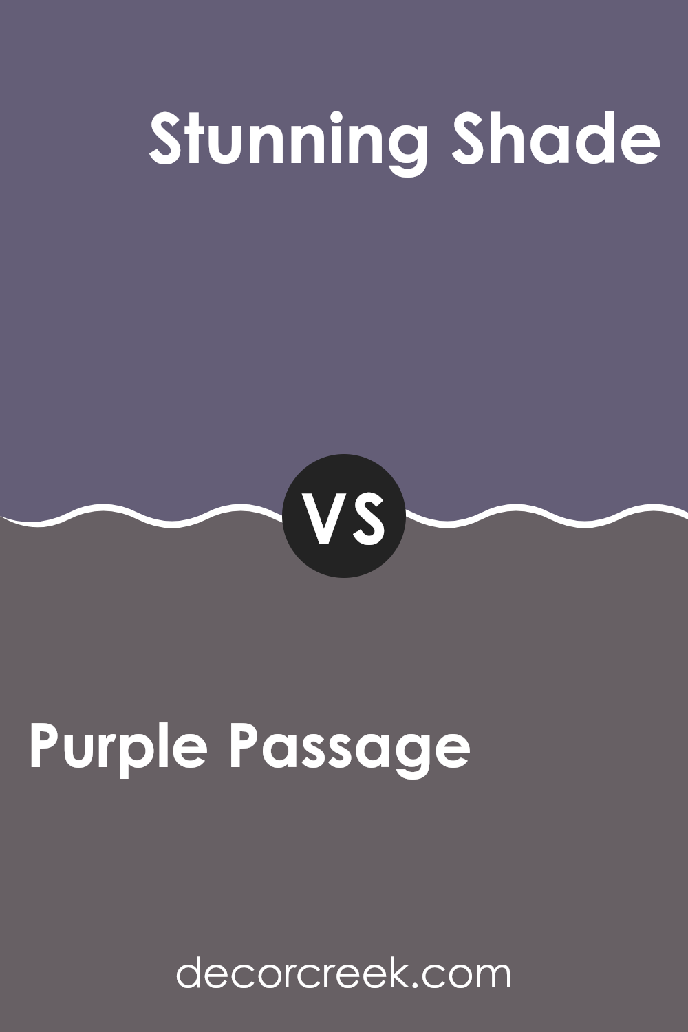
Purple Passage SW 6551 by Sherwin Williams vs Stunning Shade SW 7082 by Sherwin Williams
Purple Passage SW 6551 by Sherwin Williams is a rich and vibrant purple shade. It brings a sense of energy and creativity to any room. The color has a deep hue that can add warmth and depth to a room, making it a good choice for living rooms or bedrooms where you want to create a cozy atmosphere.
On the other hand, Stunning Shade SW 7082 is a soft and subtle color. It’s more muted compared to Purple Passage, offering a calm and understated elegance. This shade is flexible and can work well in both modern and traditional settings.
While Purple Passage demands attention and can serve as a bold focal point, Stunning Shade is more about creating a soothing and relaxed environment. Both have unique qualities and can be used to set different moods in a room, but they are quite distinct in their impact.
You can see recommended paint color below:
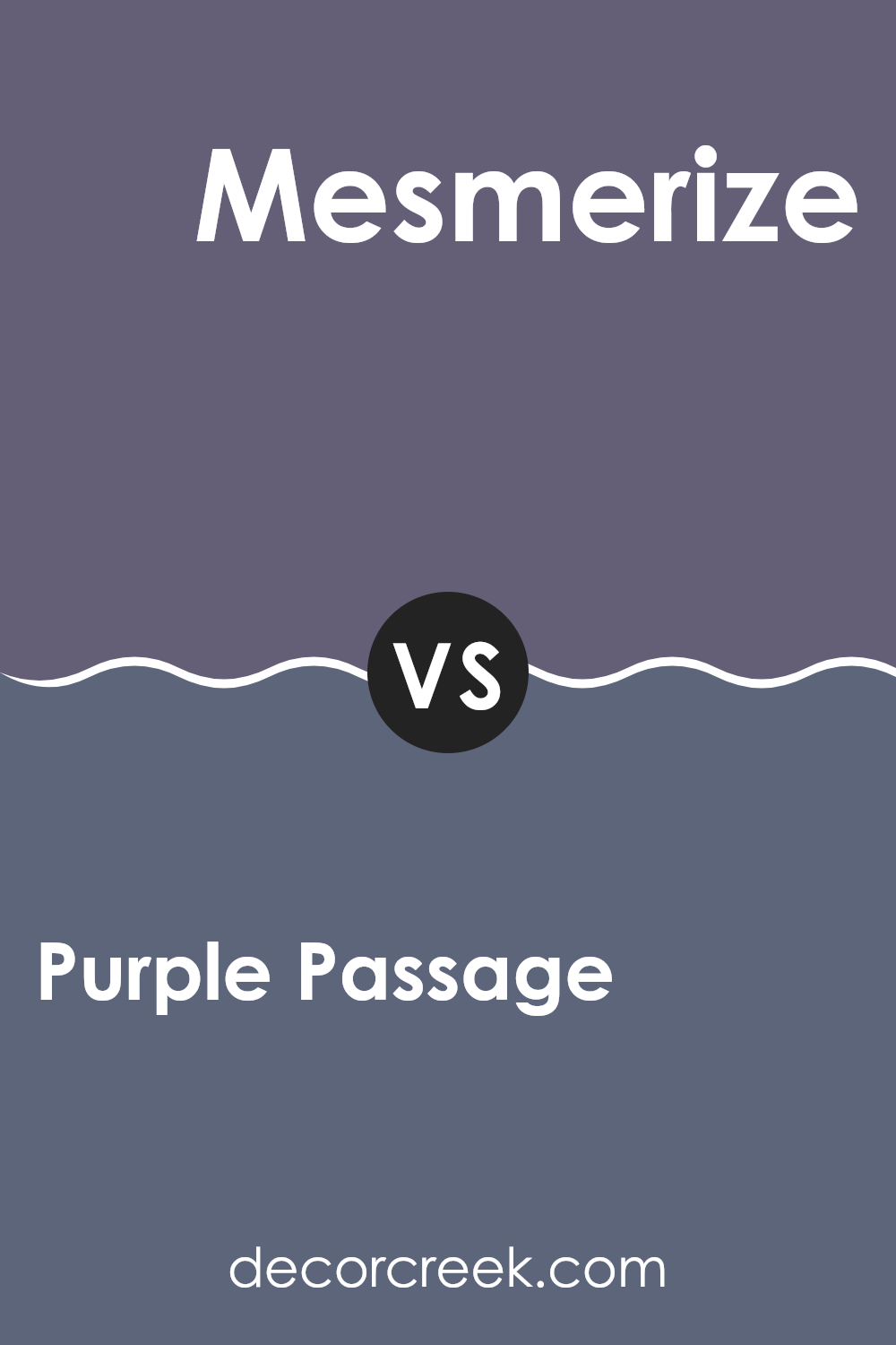
Purple Passage SW 6551 by Sherwin Williams vs Mesmerize SW 6544 by Sherwin Williams
Purple Passage SW 6551 and Mesmerize SW 6544 by Sherwin Williams are two distinct shades of purple that offer different vibes. Purple Passage is a rich, deep purple with a warm undertone, giving it a cozy and inviting feel. It’s ideal for adding a bold touch to any room, creating a sense of warmth and depth.
On the other hand, Mesmerize is a cooler shade of purple, with a blue undertone. This makes it feel more refreshing and vibrant. It’s perfect for areas where you want a pop of color that feels energizing and fresh.
While both colors fall within the purple family, Purple Passage leans towards a reddish base, making it warmer, while Mesmerize has a bit more of a blue presence, giving it a cooler tone. Both can enhance your room in unique ways, depending on whether you prefer warmth with depth or a lively, fresh look.
You can see recommended paint color below:
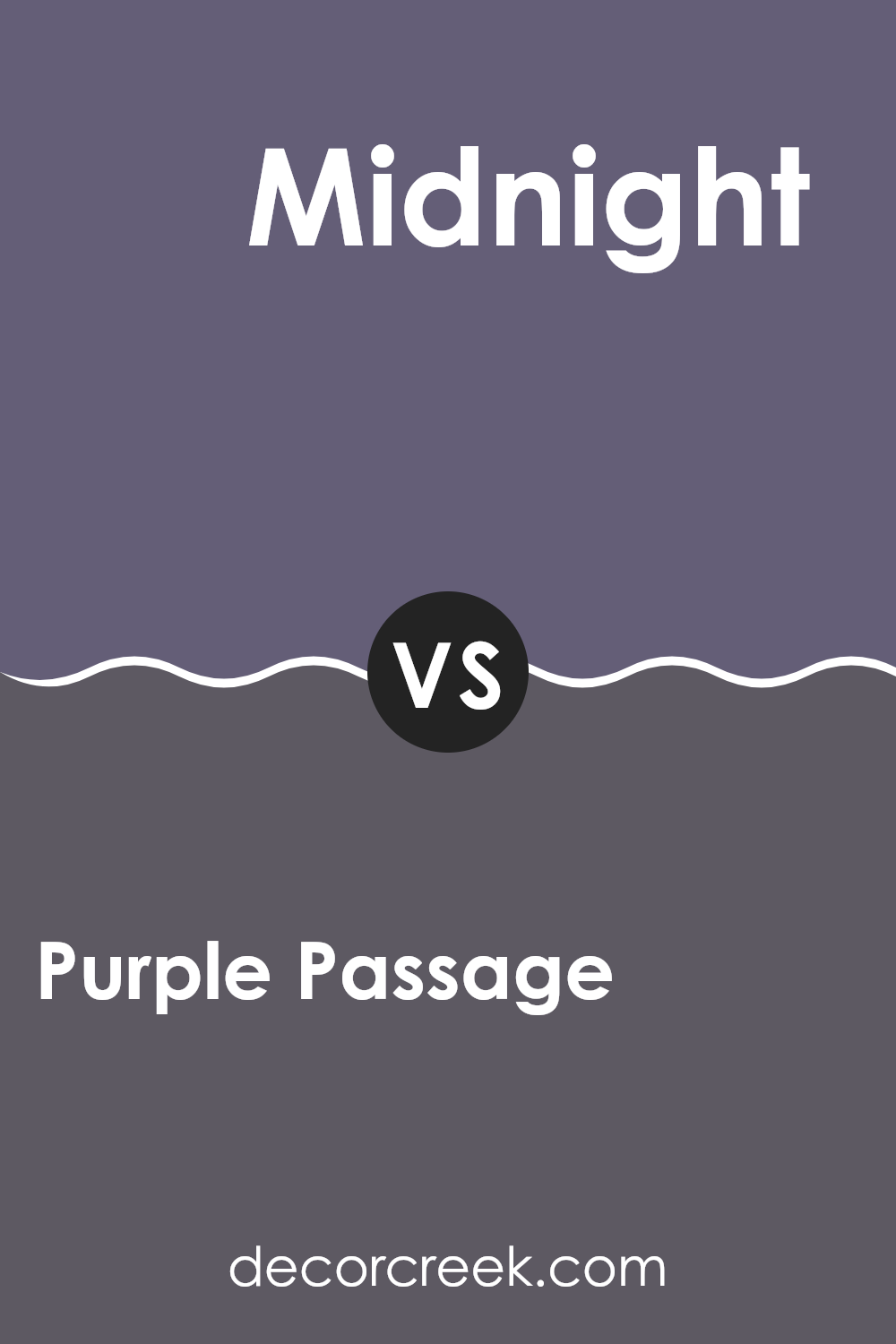
Purple Passage SW 6551 by Sherwin Williams vs Midnight SW 6264 by Sherwin Williams
Purple Passage is a warm and inviting purple with red undertones. It brings a sense of comfort and creativity to a room, making it a good choice for rooms where you want to feel cozy and inspired. This color works well in living rooms or creative areas where you want to add some warmth and color.
On the other hand, Midnight is a deep, dark blue with a cool feel. It creates an atmosphere of calm and quiet, making it perfect for bedrooms or areas where you want to relax. Midnight can add drama and depth to a room, especially when used as an accent wall or in smaller rooms.
While Purple Passage offers warmth and creativity, Midnight brings a cool, calming presence that contrasts with the inviting vibe of the purple. Each color can set a distinct mood, depending on what you are trying to achieve in your room.
You can see recommended paint color below:
- SW 6264 Midnight
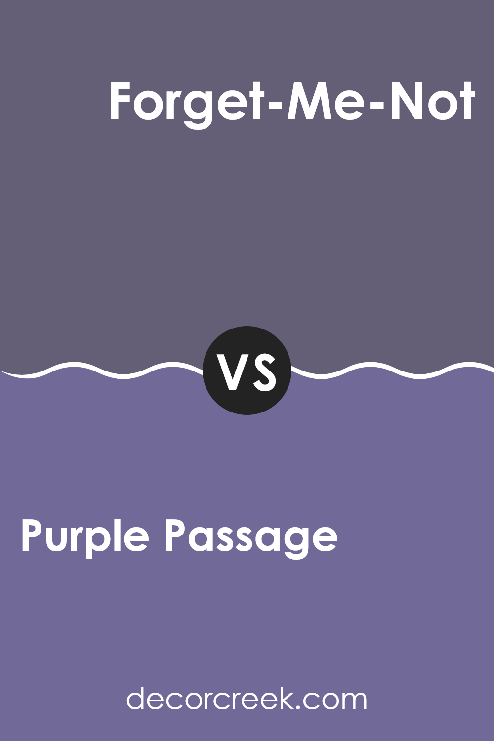
Purple Passage SW 6551 by Sherwin Williams vs Forget-Me-Not SW 6824 by Sherwin Williams
Purple Passage SW 6551 by Sherwin Williams is a rich, deep shade of purple that adds a bold touch to any room. It has an elegant and luxurious feel, making it perfect for creating a cozy, warm atmosphere in a living room or bedroom. Its intensity can make a striking statement or serve as an accent against neutral tones.
In contrast, Forget-Me-Not SW 6824 by Sherwin Williams is a bright, vibrant pink with a fun and playful vibe. This color brings energy and a sense of joy into a room, making it ideal for a child’s room or an area where liveliness is desired. It pairs well with lighter colors and can brighten up a room with its cheerful tone.
While Purple Passage provides drama and sophistication, Forget-Me-Not offers freshness and whimsy. Both colors can define the mood of a room, but they do so in very different, yet equally stunning ways.
You can see recommended paint color below:
- SW 6824 Forget-Me-Not
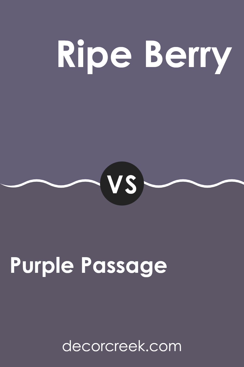
Purple Passage SW 6551 by Sherwin Williams vs Ripe Berry SW 9689 by Sherwin Williams
Purple Passage and Ripe Berry are two distinct shades offered by Sherwin Williams. Purple Passage is a soft, muted purple, evoking a sense of calmness and elegance. It can make a room feel relaxed and slightly whimsical. On the other hand, Ripe Berry is a deeper, more intense shade of purple. It brings a sense of drama and richness to a room, commanding attention and creating a bold statement.
When used in interiors, Purple Passage is ideal for creating a soothing and inviting atmosphere in areas like bedrooms or living rooms. It’s gentle and doesn’t overpower. In contrast, Ripe Berry works well as an accent color, perhaps on a feature wall or in accessories, where its boldness can be fully appreciated without being too intense.
Both colors have their charm, but the choice between them depends on the mood and impact you want to create in your home.
You can see recommended paint color below:
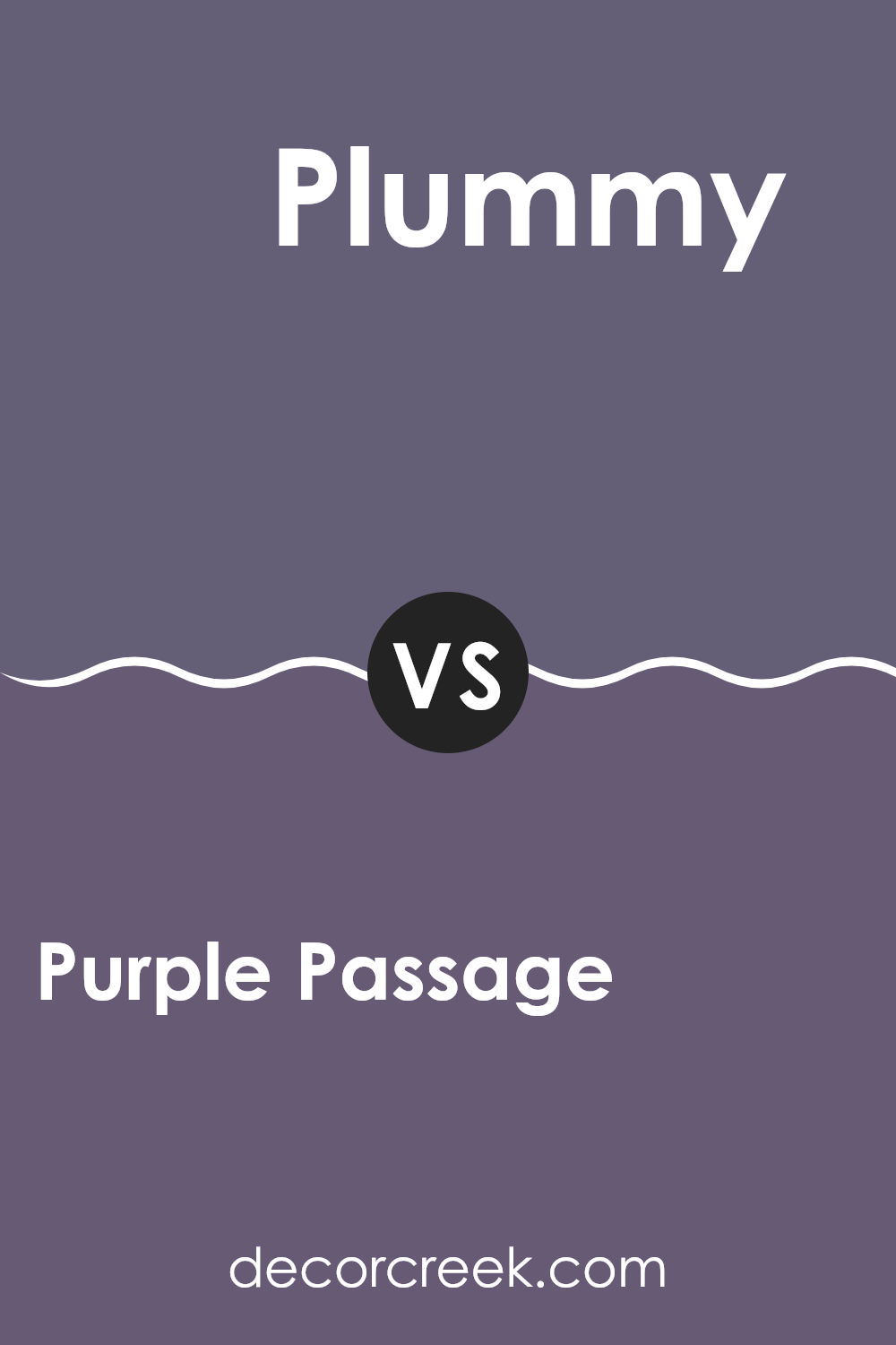
Purple Passage SW 6551 by Sherwin Williams vs Plummy SW 6558 by Sherwin Williams
Purple Passage and Plummy are both beautiful shades of purple, but they have their differences. Purple Passage is a lighter, more muted shade that gives off a calming and gentle vibe. It might remind you of lavender fields or a peaceful sunset.
On the other hand, Plummy is a deeper, richer color that offers a sense of warmth and luxury. It’s more like the color of ripe plums or a cozy room in winter. When you use Purple Passage, the room can feel airy and open, making it great for areas where you want a relaxed atmosphere.
Plummy, being more intense, can make a room feel cozy and intimate. It’s perfect if you want to create a dramatic effect or have a bold feature wall. Both colors are unique and can change the feel of a room, depending on how you use them, but they each offer a distinct personality.
You can see recommended paint color below:
- SW 6558 Plummy
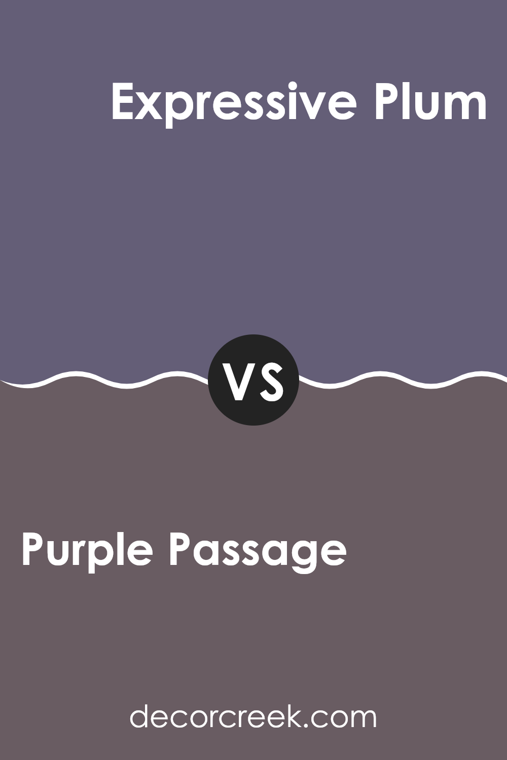
Purple Passage SW 6551 by Sherwin Williams vs Expressive Plum SW 6271 by Sherwin Williams
Purple Passage (SW 6551) by Sherwin Williams is a soft and muted purple that exudes a sense of calm and subtlety. It’s an excellent choice for areas where you want a gentle pop of color without overpowering the room. Its understated nature makes it adaptable, blending well with neutral tones and light accents.
In contrast, Expressive Plum (SW 6271) is a deeper and richer purple with a bold presence. It brings energy and warmth to a room, creating a cozy and inviting atmosphere. This color is perfect for adding a dramatic accent to a room or creating a statement wall that draws attention.
While both are purples, Purple Passage offers a more subdued approach, while Expressive Plum is strikingly vivid. Depending on the mood you wish to create, you can choose between the soothing effect of Purple Passage or the strong and vibrant ambiance of Expressive Plum.
You can see recommended paint color below:
- SW 6271 Expressive Plum
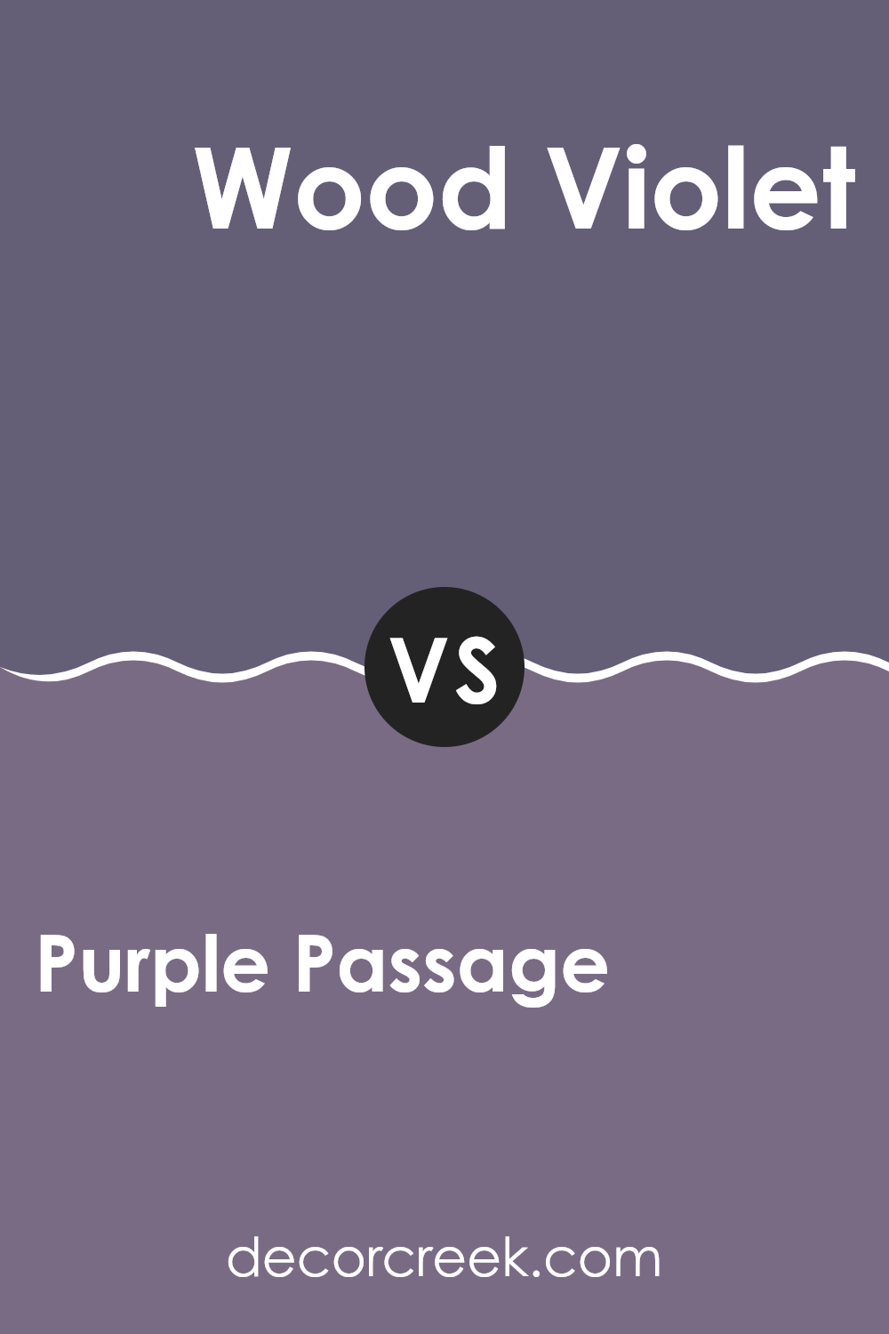
Purple Passage SW 6551 by Sherwin Williams vs Wood Violet SW 6557 by Sherwin Williams
Purple Passage and Wood Violet by Sherwin Williams are two distinct shades of purple that offer different vibes. Purple Passage is a rich, medium purple with a touch of warmth, making it feel cozy and inviting. It’s a bold color that can create a statement wall or add depth to a room. This color works well in living rooms or bedrooms where you want a touch of drama without being too intense.
On the other hand, Wood Violet is a softer, more muted purple. It has a slightly cooler undertone, lending it a more relaxed and calming presence. This color is flexible and can be used in areas where you seek a balance of color without being too intense. It pairs nicely with neutrals and other soft tones.
Both colors bring their unique charm: Purple Passage is vibrant and warm, while Wood Violet is gentle and soothing, perfect for creating different moods in home decor.
You can see recommended paint color below:
After learning about SW 6551 Purple Passage by Sherwin Williams, I feel really excited about this beautiful color. It’s not just any purple; it’s a special shade that can make any room look really nice. Imagine a room where the walls are painted with a soft, gentle purple. It feels kind of magical, like being in a storybook!
This shade of purple can make your bedroom or living room feel cozy and warm. It’s perfect if you want a place to relax after school or a long day. Purple Passage is a friendly color that goes well with other colors too, like soft yellows or calming grays. So, you can mix and match with your favorite things and make your room look just the way you like it.
Painting your room with Purple Passage can be like giving it a big hug. It’s amazing how a simple change of color can make such a big difference! If I wanted a change, this color would be my first choice. It’s perfect for anyone who loves a comfy and inviting place.
Now, I’m really curious to see where else this lovely purple can fit and make things even prettier!
Ever wished paint sampling was as easy as sticking a sticker? Guess what? Now it is! Discover Samplize's unique Peel & Stick samples.
Get paint samples

