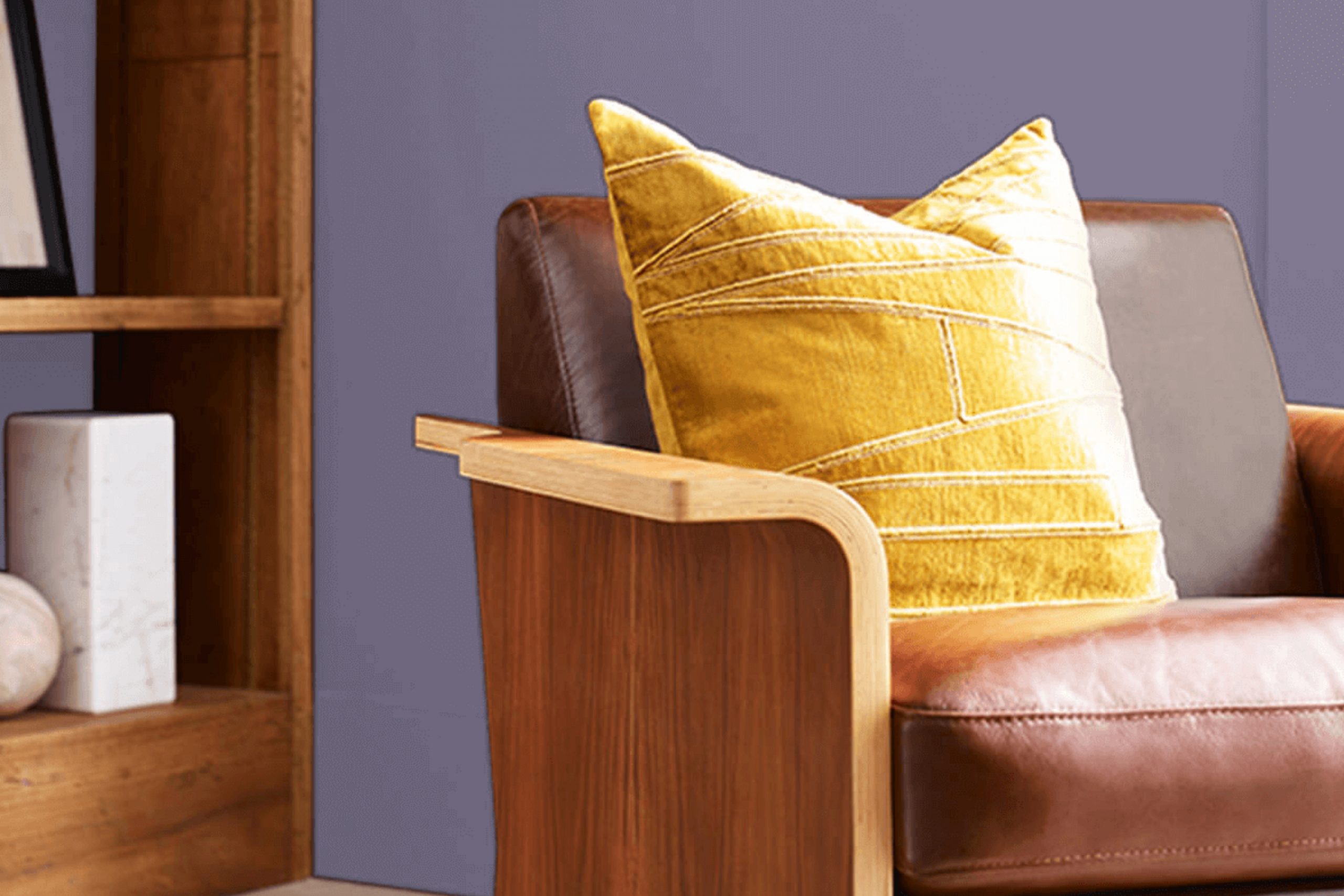
When you step into a room painted with Sherwin Williams’ SW 6550 Mythical, you’re greeted with a hue that immediately catches your attention. It’s a unique blend of lilac with undertones of gray that gives it a mysterious, dreamy quality. The color feels like a gentle whisper, adding depth and character to the room without being overpowering.
Mythical brings a sense of calm and peace, making it perfect for areas where relaxation is key, like bedrooms or reading nooks. It has a soothing effect, yet it also adds a touch of elegance and sophistication. The subtle purple tones create an inviting atmosphere that draws you in, making you want to linger a little longer.
What I love most about Mythical is its flexibility. It pairs beautifully with both modern and classic decor, harmonizing with a wide range of color schemes. Imagine it with soft whites and grays for a calm setup or with deeper purples and blues for a more dramatic look.
Whether you’re aiming for a minimalist vibe or a more opulent room, Mythical can adapt to your style while adding its own unique charm.
What Color Is Mythical SW 6550 by Sherwin Williams?
Mythical SW 6550 by Sherwin Williams is a soft and flexible shade of light blue with subtle undertones that give it a unique depth. This color brings a calm and gentle feel, making it ideal for areas where relaxation is a priority, such as bedrooms and living rooms. Its muted tones can also encourage focus and clarity, making it a good option for home offices.
This hue complements various interior styles, including coastal, cottage, and Scandinavian designs. In coastal settings, Mythical pairs beautifully with natural textures like driftwood and light, sandy tones, enhancing the peaceful seaside feel. In a cottage or farmhouse style, it works well with whitewashed wood and vintage finishes, creating a cozy and inviting atmosphere.
For a Scandinavian aesthetic, combine Mythical with sleek, modern furniture and accents in soft grays and whites to underscore its cool, calming nature. Materials that pair well with this color include natural fabrics like linen and cotton, which enhance its soothing qualities. Light-colored woods, such as birch or maple, offer a harmonious match, while accents of brushed nickel or matte black can add a touch of modern sophistication.
When choosing accessories, consider textures like woven baskets or soft throws to enhance its comforting presence in any room.
Is Mythical SW 6550 by Sherwin Williams Warm or Cool color?
MythicalSW 6550 by Sherwin Williams is a unique color that can change the feel of a room. This shade is a soft blend of gray and green, creating a calming and balanced look. When used in homes, it brings a natural and peaceful atmosphere, which many people find relaxing.
Because it’s a neutral tone, it pairs well with a variety of other colors and styles. This makes it a flexible choice for different rooms, whether it’s the living room, bedroom, or even a bathroom. The subtle hints of green in Mythical NW 6550 add a touch of nature, which can make a room feel more open and soothing.
This color works well with both modern and classic decor, providing a fresh yet understated backdrop. Homeowners often choose this shade because it doesn’t overpower other elements in the room, allowing furniture and artwork to stand out.
Undertones of Mythical SW 6550 by Sherwin Williams
Mythical by Sherwin Williams is a unique paint color that contains a mix of various undertones. These undertones include shades like lilac, purple, dark turquoise, pale pink, and many more. The combination of these undertones influences how we perceive the color.
For instance, the lilac and light purple undertones can give the color a subtle, soft feel, perfect for creating a cozy and inviting atmosphere in a room. On the other hand, undertones like dark turquoise, navy, and dark grey can add depth, making the color appear more grounded and full-bodied.
When used on interior walls, these undertones come together to give Mythical a flexible character. In a room with lots of natural light, the lighter undertones, such as pale pink and mint, become more prominent, making the room feel bright and airy. In dimmer settings, the darker undertones, like dark green and brown, might become more visible, providing a warm and comfortable ambiance.
Additionally, the presence of undertones like olive and pale yellow can introduce a hint of earthiness, making the color suitable for both modern and traditional settings. Overall, the mix of these undertones provides a balanced color that adapts well to different lighting and decor styles.
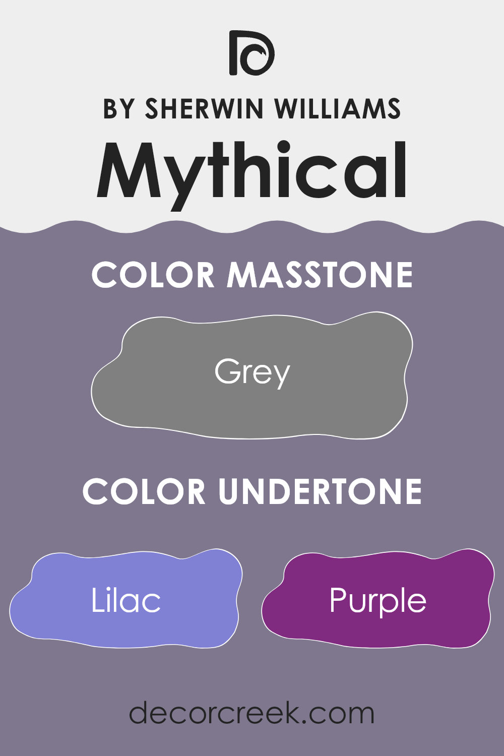
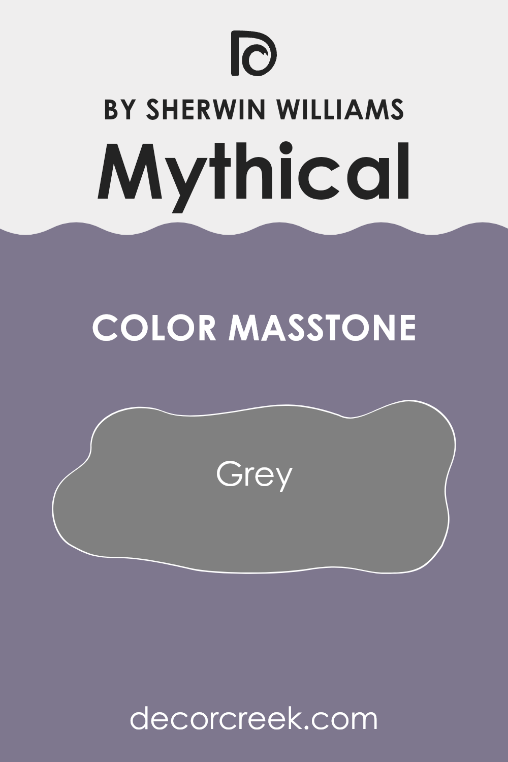
What is the Masstone of the Mythical SW 6550 by Sherwin Williams?
Mythical SW 6550 by Sherwin Williams has a grey masstone (#808080), which is a balanced and neutral color. Its grey base makes it quite flexible for various home settings. In living rooms, this color adds a calm and modern feel because it doesn’t overpower the room with bold vibes.
Instead, it provides a clean and simple backdrop, which allows furniture and decorations to stand out without clashing. This grey works well with both warm and cool tones, meaning it can complement many other colors.
You can pair it with whites and off-whites for a crisp, airy look, or with darker shades for a more grounded and cozy effect. In bedrooms, Mythical can create a peaceful environment, encouraging relaxation. For open areas like kitchens or dining rooms, it offers a neutral yet refined palette that works well with stainless steel appliances and wooden finishes, bringing a balanced and cohesive look to the home.
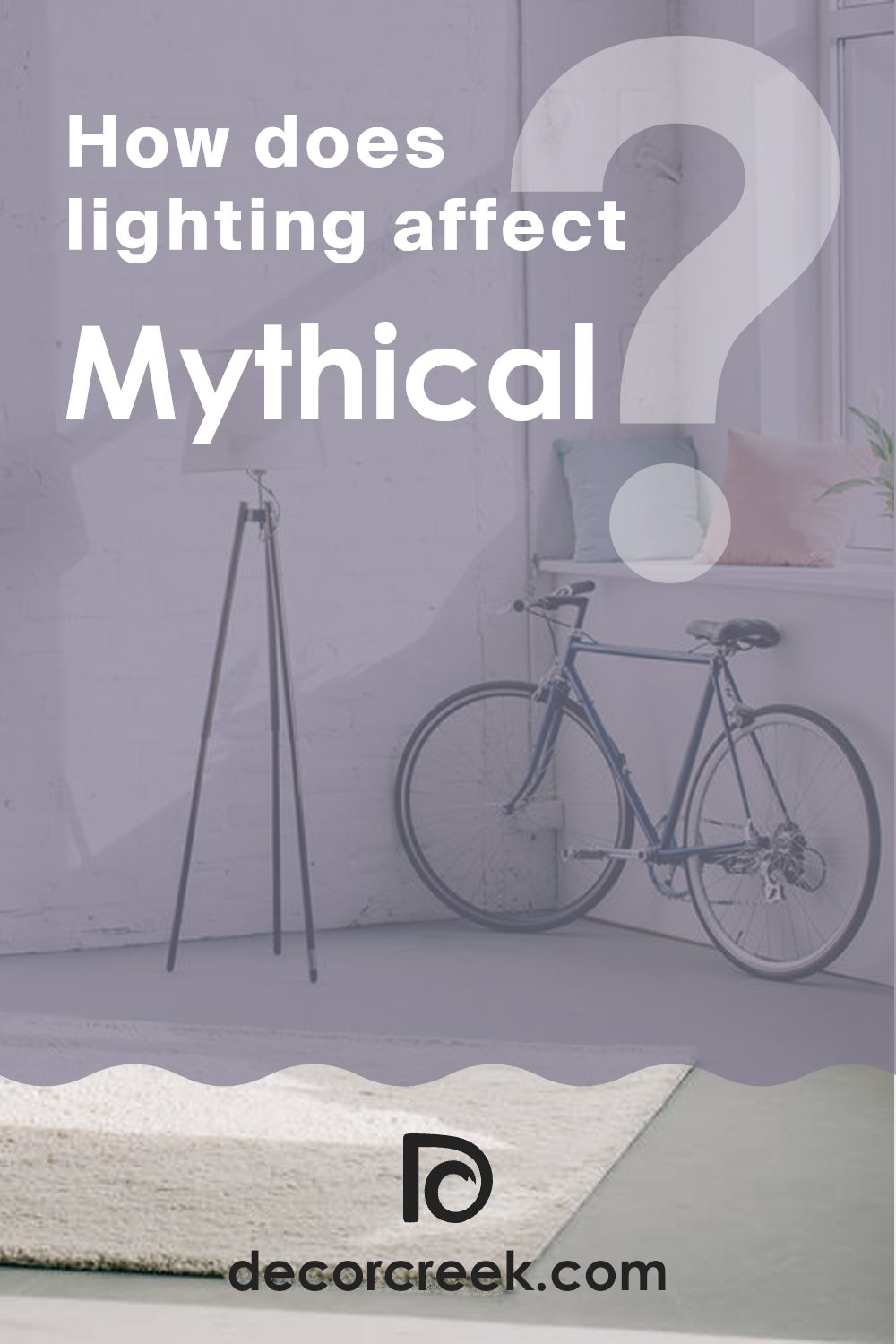
How Does Lighting Affect Mythical SW 6550 by Sherwin Williams?
Lighting plays a crucial role in how we perceive colors in our environment. It can change the way a color looks and feels in a room. Mythical SW 6550 by Sherwin Williams is a unique color that behaves differently under various lighting conditions.
In artificial lighting, this color can appear more muted or take on a warmer tone, depending on the type of bulbs used. Incandescent lights, which have a warm glow, can make Mythical appear more yellowish or creamier, while fluorescent or LED lights with cooler temperatures might bring out a more neutral or even slightly bluish hue.
Under natural light, Mythical SW 6550 tends to show its true color more accurately. However, the orientation of the room greatly affects how much light the color receives and therefore how the paint appears.
In north-facing rooms, natural light is often cooler and less direct, which can make colors look darker and cooler. Mythical might appear more subdued and grayish in these rooms, maintaining a calm, subtle presence as it reflects the limited light.
South-facing rooms enjoy bright, warm light for most of the day. This ample sunlight can enhance the warmth of Mythical, making it appear lighter and more inviting. The color might look more dynamic, with its depth and undertones more pronounced.
East-facing rooms get warm light in the morning and cooler light in the afternoon. In these areas, Mythical SW 6550 can appear warmer and more lively in the morning, with a softer, cooler look later in the day.
West-facing rooms experience the opposite, with cooler light in the morning and warm, rich light in the afternoon and evening. Here, Mythical may look softer and cooler earlier, while appearing warmer and more vibrant as the day progresses. Understanding these lighting effects can help homeowners choose where to use this color for the desired impact in their living rooms.
What is the LRV of Mythical SW 6550 by Sherwin Williams?
LRV, or Light Reflectance Value, is a number that shows how much light a paint color reflects. It ranges from 0 to 100, where 0 means the color absorbs all light (pure black) and 100 means it reflects all light (pure white). A color with a low LRV absorbs more light, making a room feel warmer or more intimate, whereas a color with a high LRV reflects more light, creating a brighter and more open feel.
Understanding LRV is crucial when choosing paint for a room because it influences how colors appear in different lighting conditions. For Mythical SW 6550 by Sherwin Williams, the LRV is 19.663. This low LRV means the color absorbs a lot of light and doesn’t reflect much back into the room. Because of this, it can make a room feel cozier and more inviting.
In a room with limited natural light, this color might appear a bit darker and more muted. However, in a well-lit area, it can bring depth and richness to the walls. If you’re considering this shade, think about the lighting in your room and whether you want a darker or more intimate atmosphere.

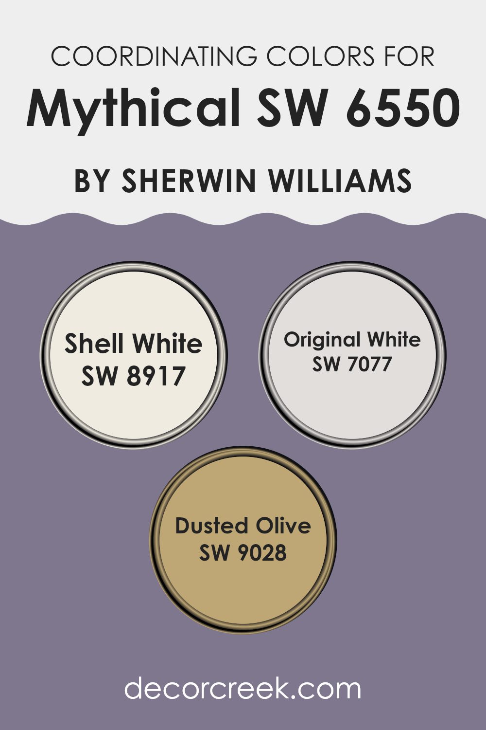
Coordinating Colors of Mythical SW 6550 by Sherwin Williams
Coordinating colors are hues that naturally complement each other, working together to create a cohesive and visually appealing look in a room. When paired with Mythical SW 6550 from Sherwin Williams, coordinating colors can bring out the best in its shade, enhancing the mood and atmosphere of a room. Mythical is a rich, deep shade that provides a grounding effect. To achieve a balanced palette, it’s important to choose coordinating colors that blend seamlessly and highlight the unique qualities of each color involved.
Shell White SW 8917 is a soft, creamy white that provides a warm and inviting backdrop. It has a gentle undertone that pairs beautifully with the depth of Mythical, adding a touch of lightness to the room. Original White SW 7077 offers a crisp, clean white that serves as a neutral anchor in the room.
It enhances the elegance of Mythical by offering contrast without overpowering it. Dusted Olive SW 9028 introduces a muted, earthy green into the mix, adding a layer of natural calmness and depth. This combination creates a well-rounded and welcoming environment, where each color enhances the overall harmony and charm of the room.
You can see recommended paint colors below:
- SW 8917 Shell White
- SW 7077 Original White
- SW 9028 Dusted Olive
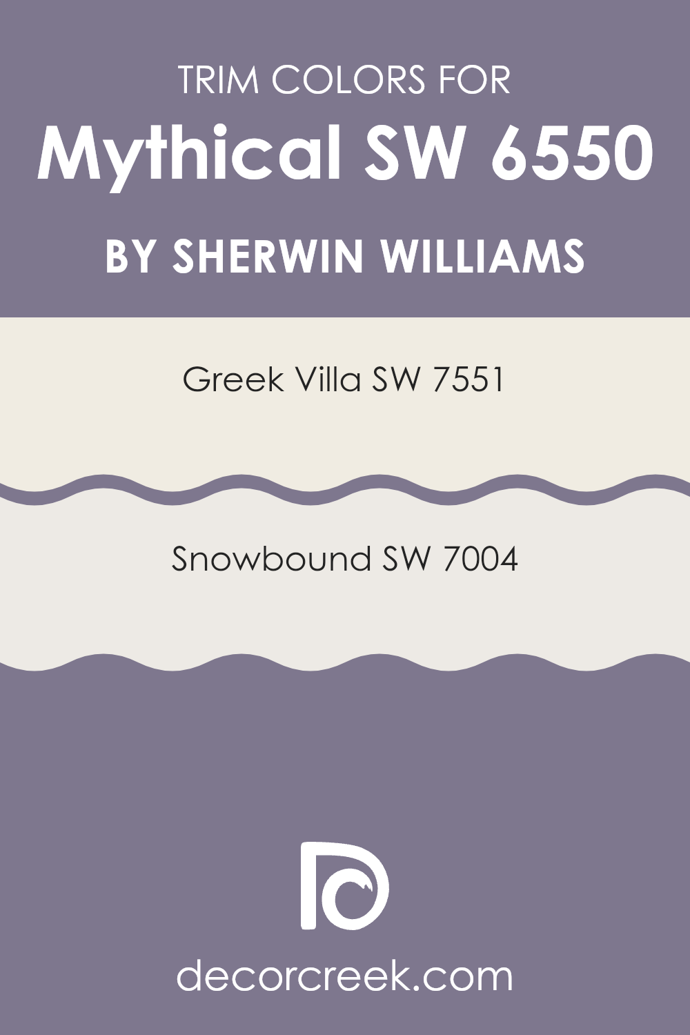
What are the Trim colors of Mythical SW 6550 by Sherwin Williams?
Trim colors play a crucial role in painting as they highlight and define the architectural features of a room. For a color like Mythical SW 6550 from Sherwin Williams, choosing the right trim colors can make all the difference in the overall feel and appearance of a room. Trim colors can help add contrast, complement the main color choice, and add depth to a room.
Using lighter trim colors like Greek Villa or Snowbound can create a clean, fresh look that highlights the main color while giving a subtle, elegant touch to the room. Greek Villa (SW 7551) is a soft white with a warm undertone that creates a welcoming and cozy atmosphere.
It’s perfect for trim work because it can subtly contrast with deeper wall colors without being too stark. On the other hand, Snowbound (SW 7004) offers a cooler, crisper white that still maintains warmth, making it flexible for trim. It provides a slightly more contemporary look that pairs well with Mythical’s muted tones. Both colors enhance the overall aesthetic of a room by ensuring the trim work stands out yet harmonizes with the primary color scheme.
You can see recommended paint colors below:
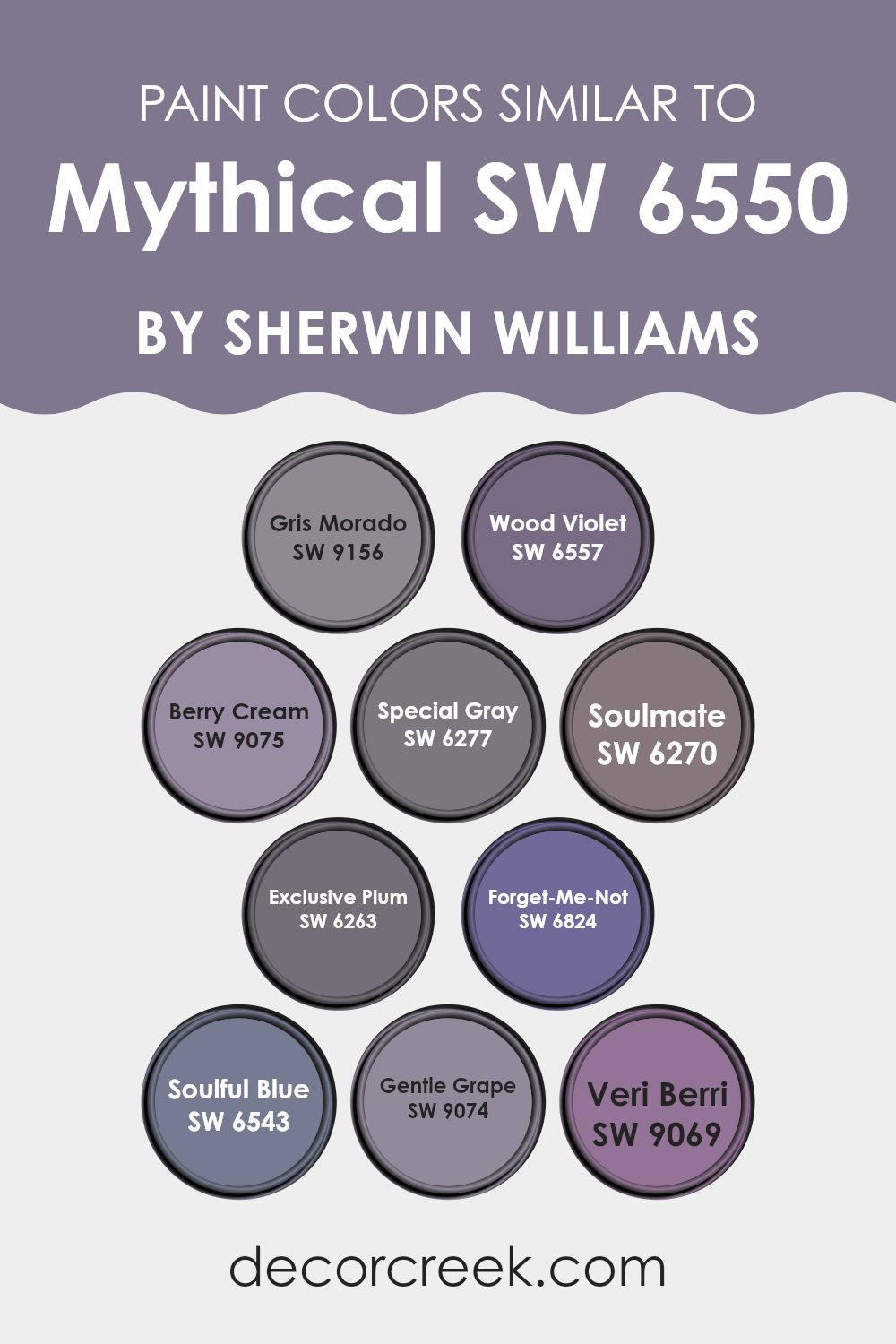
Colors Similar to Mythical SW 6550 by Sherwin Williams
Choosing colors similar to Mythical by Sherwin Williams can create a harmonious and soothing environment in any room. Colors like SW 9156 – Gris Morado, a gentle gray with a hint of purple, offer a calm feeling without overpowering the senses. SW 6557 – Wood Violet gives a warm purple hue that adds coziness to any room.
SW 9075 – Berry Cream blends softness with a delicate touch of pink, perfect for uplifting moods. There’s also SW 6277 – Special Gray, which provides a neutral yet intriguing backdrop with its slight purple undertone. These colors, when combined, create a balanced and peaceful setting.
SW 6270 – Soulmate and SW 6263 – Exclusive Plum are deeper shades, with the former having a dark, rich, purplish tone and Exclusive Plum offering a touch of mystery, adding depth to a room. SW 6824 – Forget-Me-Not brings a lively pop with its vibrant blue reminiscent of clear skies, complementing the purples with freshness.
SW 6543 – Soulful Blue is a cooler shade, creating a sense of calmness, while SW 9074 – Gentle Grape and SW 9069 – Veri Berri round out the palette with their warm, inviting berry hues. Together, these colors encourage a pleasing and inviting atmosphere, perfect for relaxation and comfort in any home.
You can see recommended paint colors below:
- SW 9156 Gris Morado
- SW 6557 Wood Violet
- SW 9075 Berry Cream
- SW 6277 Special Gray
- SW 6270 Soulmate
- SW 6263 Exclusive Plum
- SW 6824 Forget-Me-Not
- SW 6543 Soulful Blue
- SW 9074 Gentle Grape
- SW 9069 Veri Berri
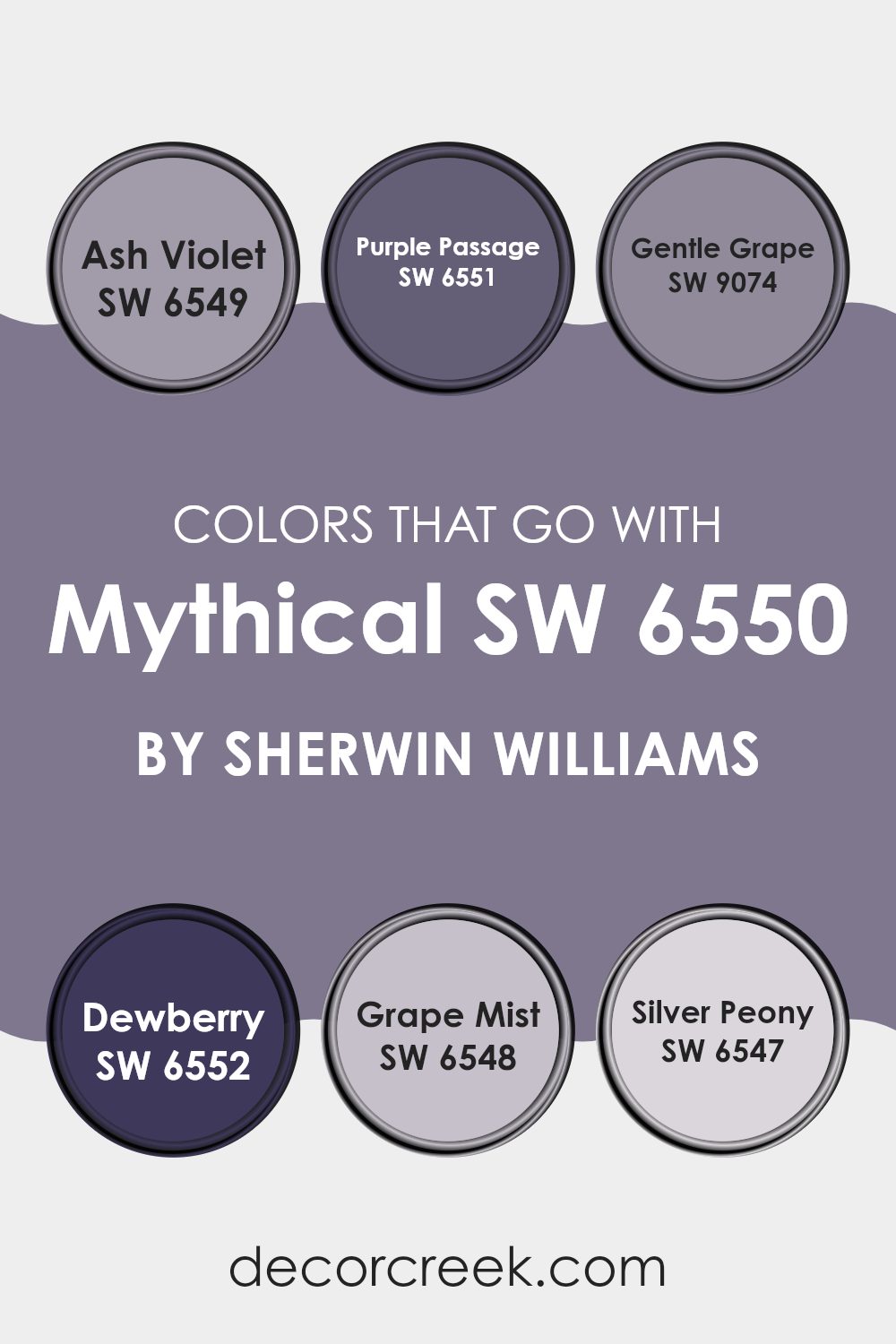
Colors that Go With Mythical SW 6550 by Sherwin Williams
Colors that complement Mythical SW 6550 by Sherwin-Williams add depth and character to areas. They create a stunning backdrop that enhances the primary color through contrast and harmony. For example, SW 6549 – Ash Violet is a soft, muted purple that adds a calm and relaxed vibe, blending beautifully with the undertones of Mythical.
SW 6551 – Purple Passage, with its rich and vibrant hue, introduces a sense of energy and passion, adding a dynamic element to the color scheme. These colors balance each other beautifully, enlivening the room without overpowering it.
Meanwhile, SW 9074 – Gentle Grape and SW 6552 – Dewberry bring different levels of warmth. Gentle Grape is a warm, muted purple that adds an inviting touch, perfect for cozy areas. Dewberry, on the other hand, is a deeper berry tone that brings warmth and richness, adding a touch of elegance to any room.
SW 6548 – Grape Mist offers a refreshing, airy quality with its light and breezy feel, making areas brighter. Finally, SW 6547 – Silver Peony is a soft, delicate pink that adds a touch of elegance and pairs well, allowing all these colors to contrast and complement, enhancing the overall look and feel.
You can see recommended paint colors below:
- SW 6549 Ash Violet
- SW 6551 Purple Passage
- SW 9074 Gentle Grape
- SW 6552 Dewberry
- SW 6548 Grape Mist
- SW 6547 Silver Peony
How to Use Mythical SW 6550 by Sherwin Williams In Your Home?
Mythical SW 6550 by Sherwin-Williams is a soft and calming color. It’s a gentle blend of green and blue, creating a peaceful atmosphere. If you’re looking to paint a room in your home, this color might be a great choice for several areas.
In a bedroom, Mythical can create a restful and soothing environment, perfect for winding down after a long day. For a bathroom, it can evoke a spa-like feel, making your routines more relaxing. In living rooms or dining areas, this color can add a touch of peace and comfort, allowing for enjoyable gatherings and moments of quiet.
Pair it with whites or light grays to maintain an airy feel, or use darker accents for contrast. Mythical SW 6550 can work well with natural materials like wood and stone, enhancing its peaceful vibe. It’s a flexible choice that can fit many styles and areas, bringing a soft touch to your home.
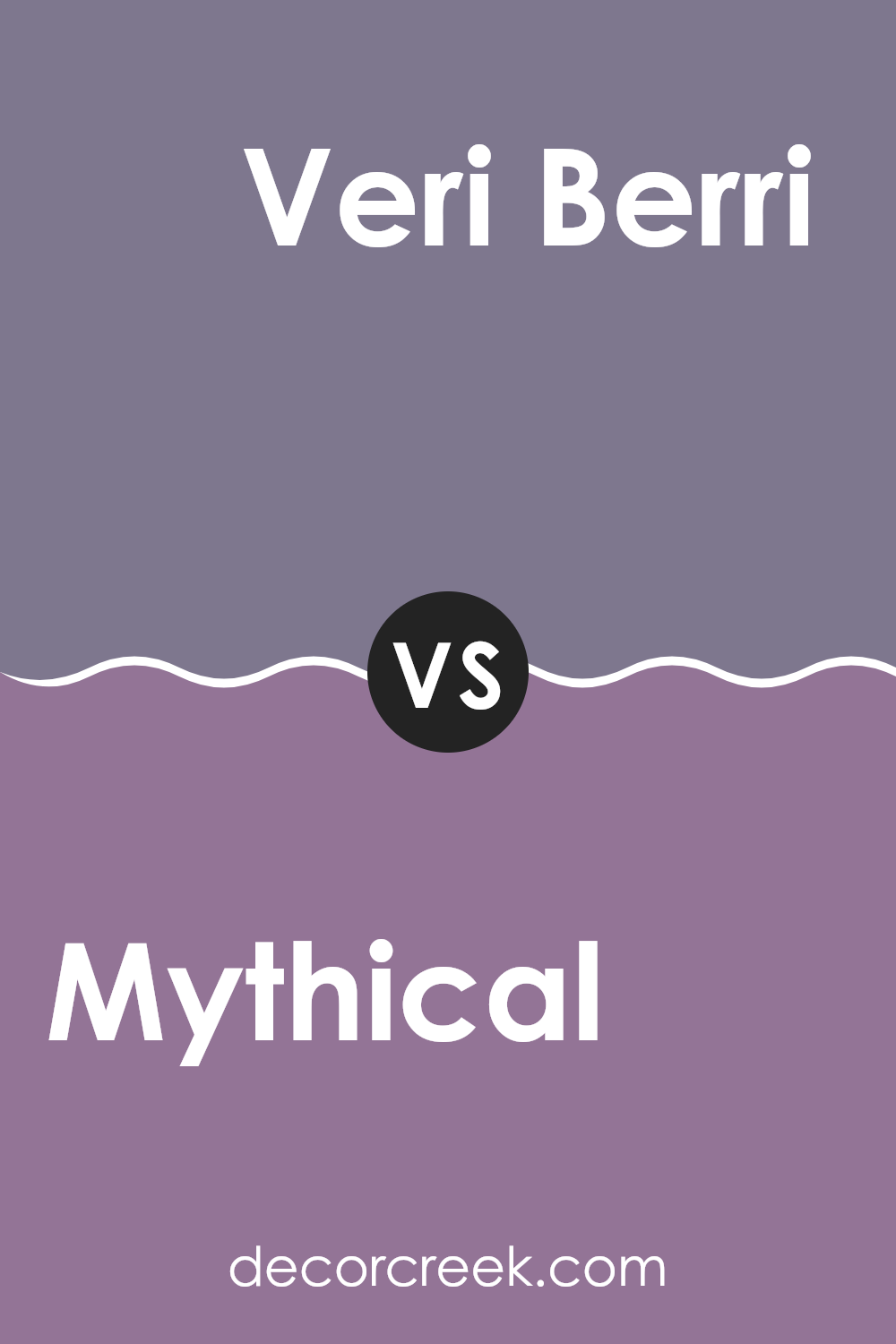
Mythical SW 6550 by Sherwin Williams vs Veri Berri SW 9069 by Sherwin Williams
Mythical SW 6550 and Veri Berri SW 9069 by Sherwin Williams are both unique colors that bring different moods to a room. Mythical is a rich, warm shade with hints of brown and plum, creating a cozy and inviting atmosphere. It is ideal for areas where you want to feel comforted and at ease, such as a living room or bedroom.
On the other hand, Veri Berri is a vibrant and playful berry hue with more pronounced red and pink tones. This color adds energy and liveliness to any room, making it perfect for areas where you want to inspire creativity or add a pop of color, such as an accent wall or a study area.
While both colors have depth, Mythical provides a more subtle and classic feel, whereas Veri Berri offers a bold and spirited vibe. Choosing between them depends on the mood you wish to set in your room.
You can see recommended paint color below:
- SW 9069 Veri Berri
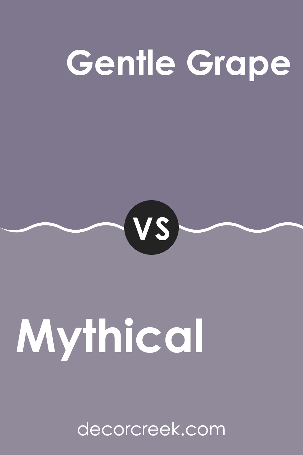
Mythical SW 6550 by Sherwin Williams vs Gentle Grape SW 9074 by Sherwin Williams
Mythical SW 6550 by Sherwin Williams is a deep, bold color that carries a sense of richness and intensity. It combines elements of purple and burgundy, creating a warm, elegant atmosphere. This color can add depth to any room, making it feel cozy and inviting, yet also dramatic and luxurious.
On the other hand, Gentle Grape SW 9074 is a lighter and softer shade of purple. It has a calming and gentle presence, offering a sense of peace and comfort. This soft hue works well in areas where a subtle backdrop is desired, without overpowering a room.
While both colors share a purple base, Mythical is more intense and striking, perfect for creating standout walls or accent pieces. Gentle Grape offers a muted, soothing alternative that can easily blend with other tones. Each color has its own character, providing different moods and energies for home interiors.
You can see recommended paint color below:
- SW 9074 Gentle Grape
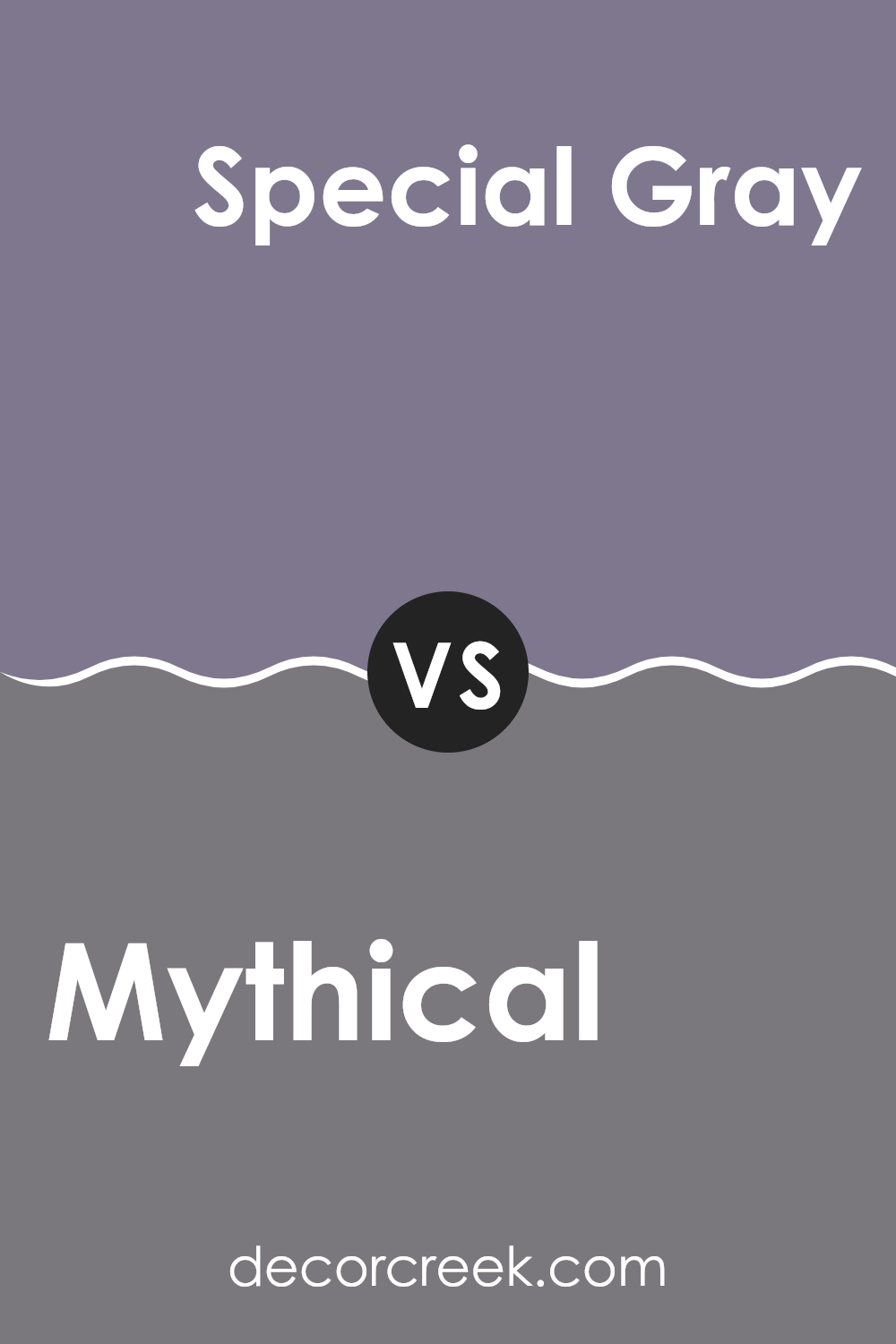
Mythical SW 6550 by Sherwin Williams vs Special Gray SW 6277 by Sherwin Williams
Mythical SW 6550 by Sherwin Williams is a soft, muted hue with a gentle purple undertone, creating a sense of calm and warmth. This color works well in areas where you want to add a touch of subtle color without overpowering the room. It’s flexible and pairs nicely with neutral tones, offering a cozy and inviting atmosphere.
On the other hand, Special Gray SW 6277 is a cool, medium gray with blue undertones. It’s a more modern and sleek color, providing a crisp and clean look to any room. This shade of gray is perfect for those who want a neutral that leans on the cooler side, ideal for minimalist or contemporary designs.
Together, these colors can create a balanced palette. Mythical brings warmth and a hint of color, while Special Gray offers a clean and modern contrast, allowing for creative and harmonious room designs.
You can see recommended paint color below:
- SW 6277 Special Gray
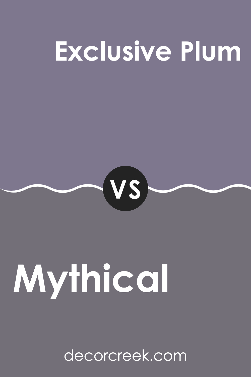
Mythical SW 6550 by Sherwin Williams vs Exclusive Plum SW 6263 by Sherwin Williams
Mythical SW 6550 and Exclusive Plum SW 6263 are two unique paint colors by Sherwin Williams. Mythical is a soft, muted shade often described as a light purple with grayish undertones. It’s a calming, neutral color that can brighten up a room without being too bold.
On the other hand, Exclusive Plum is a rich, deep purple with cool undertones. It’s a more dramatic color, adding a touch of boldness and elegance to a room. When looking at these colors side by side, Mythical offers a light and airy feel, making it suitable for areas where you want to create a gentle and inviting atmosphere.
Exclusive Plum, with its deeper hue, is ideal for creating a cozy and luxurious setting. Both colors can be used to set different moods in a home, whether you’re looking for something subtle or something that stands out.
You can see recommended paint color below:
- SW 6263 Exclusive Plum
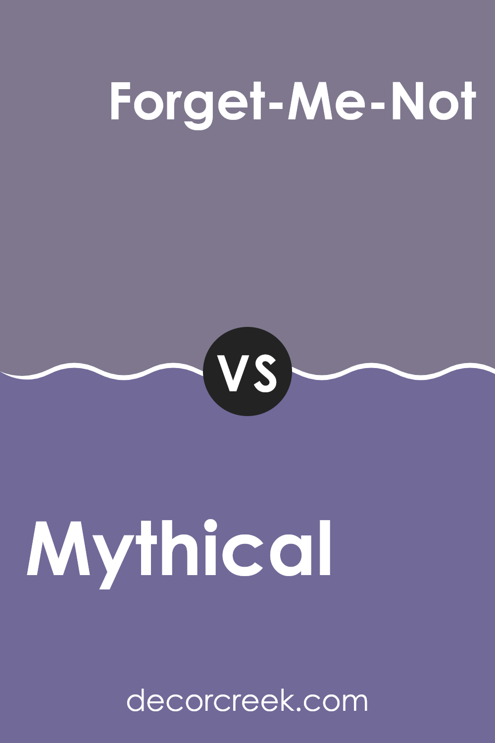
Mythical SW 6550 by Sherwin Williams vs Forget-Me-Not SW 6824 by Sherwin Williams
Mythical (SW 6550) by Sherwin Williams is a deep and mysterious shade of purple. It combines hints of gray and red, giving it a rich and complex feel. This color can create a cozy and intimate atmosphere, especially when used in a bedroom or living room. It attracts attention without being too overpowering, making it suitable for accent walls or focal points in a room.
On the other hand, Forget-Me-Not (SW 6824) by Sherwin Williams is a soft and playful shade of pink. It is lighter and more vibrant than Mythical, lending a cheerful and youthful vibe to any room. This color works well in areas where you want a sense of energy and brightness, such as a child’s room or a creative room.
While Mythical offers depth and warmth, Forget-Me-Not is cheerful and lively, making both colors unique in their own ways.
You can see recommended paint color below:
- SW 6824 Forget-Me-Not
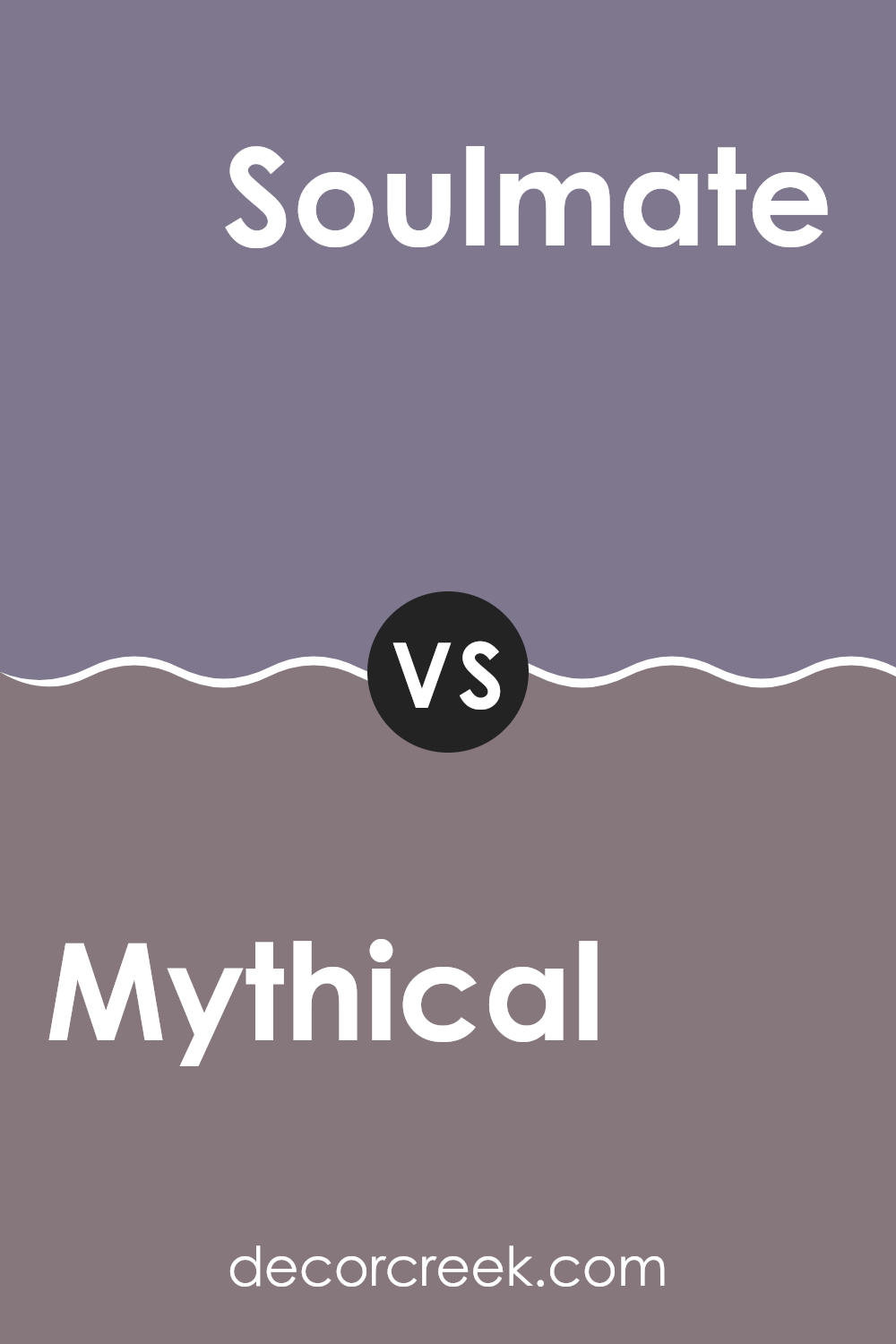
Mythical SW 6550 by Sherwin Williams vs Soulmate SW 6270 by Sherwin Williams
Mythical SW 6550 by Sherwin Williams is a warm, muted pink with hints of beige, giving it an earthy yet elegant look. It’s soft and subtle, adding a touch of warmth and sophistication to any room. This color works well in living areas and bedrooms, creating a cozy and inviting atmosphere.
In contrast, Soulmate SW 6270 is a deep, rich purple with a bit of gray. It’s bold and dramatic, making a statement in any room. This color is perfect for creating a luxurious and intimate feel, especially in dining rooms or dens. Soulmate has a more vibrant and regal air compared to the understated softness of Mythical.
While Mythical is subtle and light, providing a gentle backdrop, Soulmate stands out with its richness and depth. Both colors, though different in mood and intensity, can complement various styles and add character to your home.
You can see recommended paint color below:
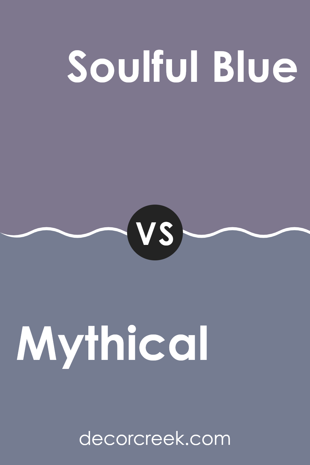
Mythical SW 6550 by Sherwin Williams vs Soulful Blue SW 6543 by Sherwin Williams
Mythical SW 6550 and Soulful Blue SW 6543 by Sherwin Williams are both beautiful colors, each with a unique feel. Mythical is a warm, soft pink with a hint of lavender, offering a cozy and inviting atmosphere.
It works well in bedrooms or living rooms where a gentle, calming tone is desired. With its muted character, it can blend seamlessly with neutral palettes or add a subtle pop of color. On the other hand, Soulful Blue is a medium blue that exudes calmness and depth. Unlike the softer Mythical, Soulful Blue provides a cooler and more vibrant feel.
It’s an excellent choice for areas where you want to create a cool and refreshing effect, like bathrooms or feature walls. Both colors can bring character to a room, but while Mythical tends to be more soothing and understated, Soulful Blue brings energy and liveliness, offering a flexible option for different settings.
You can see recommended paint color below:
- SW 6543 Soulful Blue
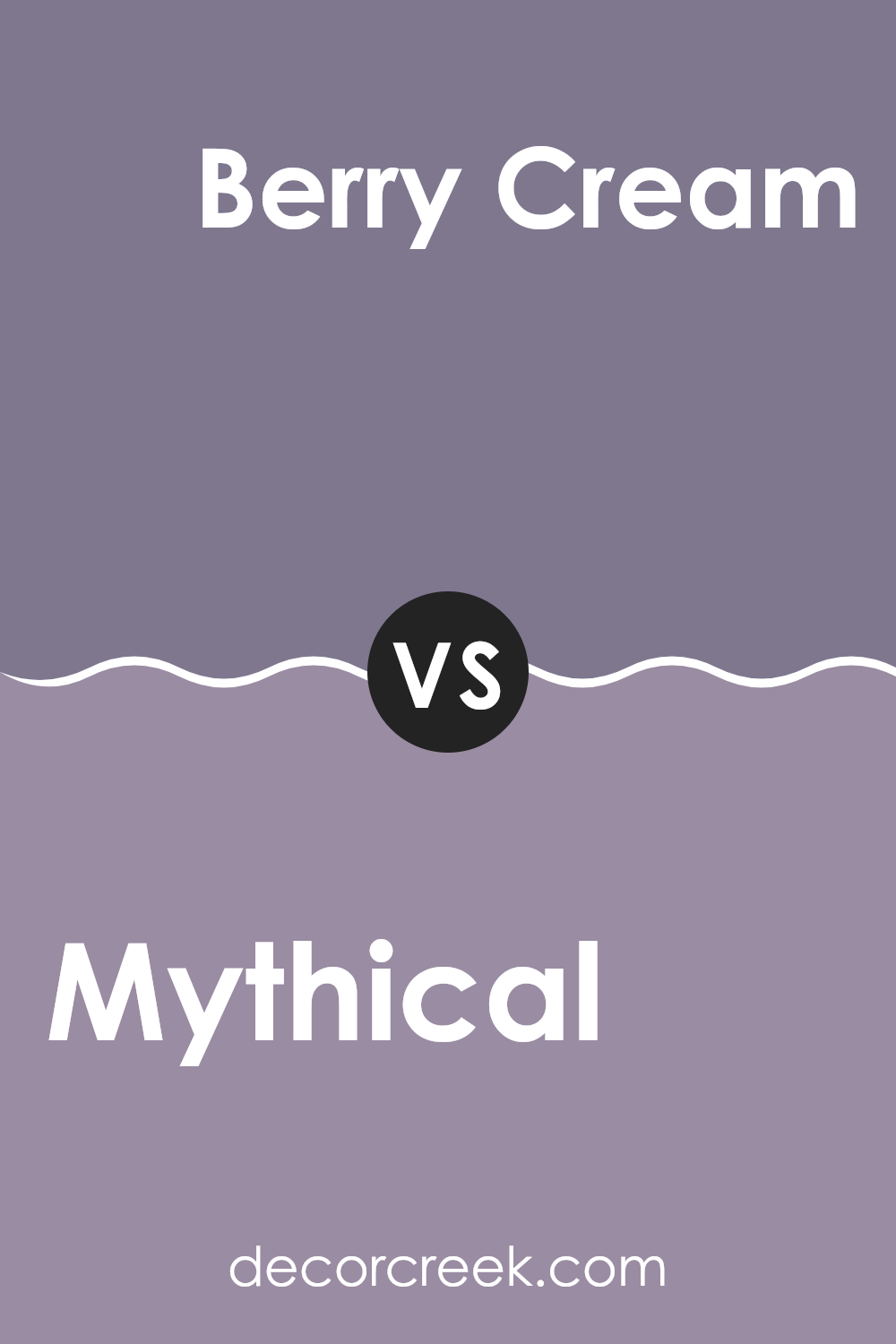
Mythical SW 6550 by Sherwin Williams vs Berry Cream SW 9075 by Sherwin Williams
Mythical SW 6550 by Sherwin Williams is a deep, enchanting shade that combines elements of purple, red, and blue. It’s a rich color that can add a dramatic touch to any room. This shade works well in areas where you desire a cozy and intimate setting, such as a bedroom or reading nook.
On the other hand, Berry Cream SW 9075 by Sherwin Williams is a lighter, more cheerful color. It combines soft pinks and subtle peach undertones to create a warm and inviting atmosphere. This color is perfect for areas where you want a light and airy feel, such as living rooms or kitchens.
While Mythical brings depth and mystery, Berry Cream adds a cheerful brightness. Used together, they can create a vibrant contrast that is both stylish and welcoming. Both colors are flexible and can fit various styles depending on the overall decor and accents used in the room.
You can see recommended paint color below:
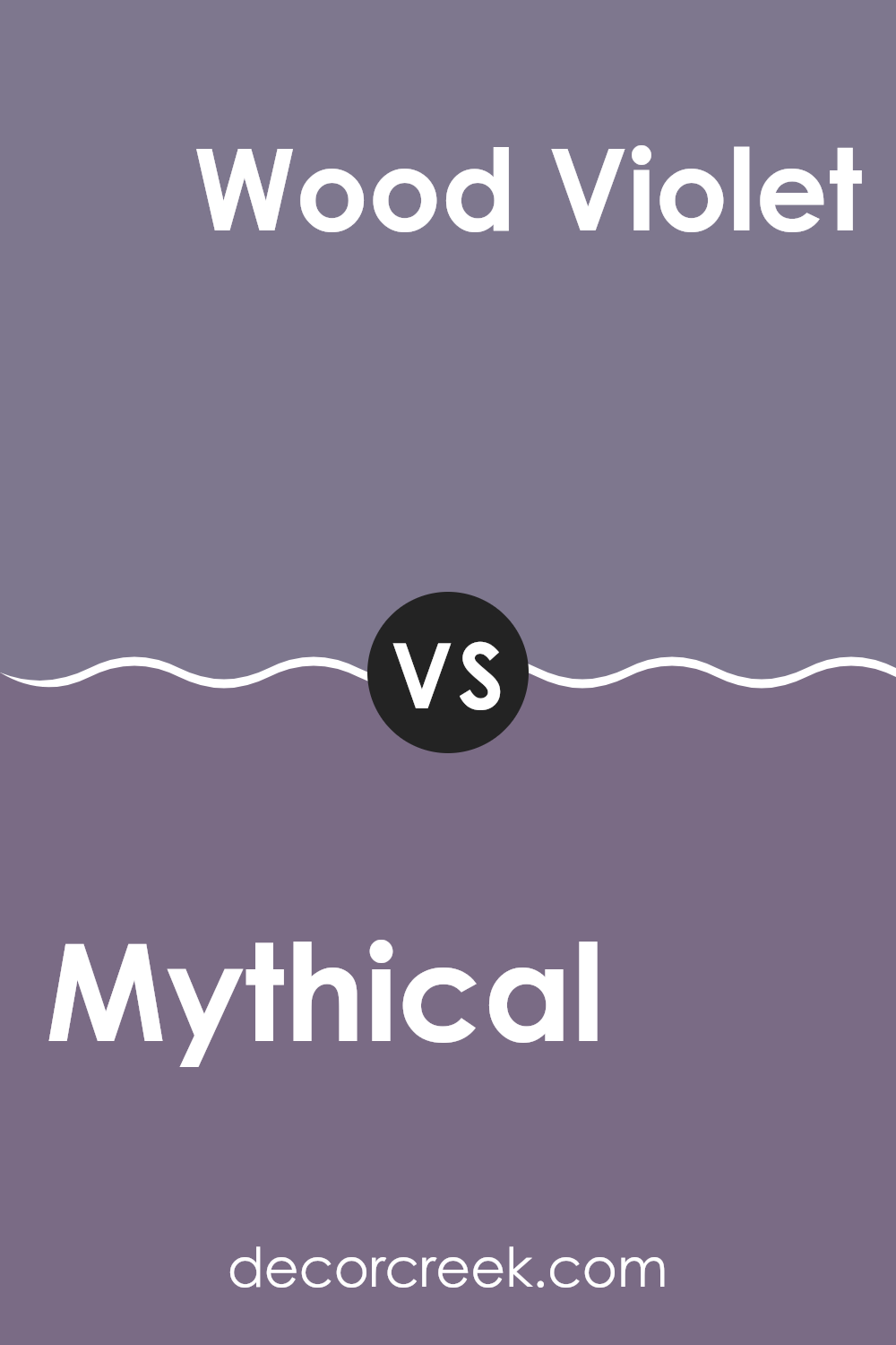
Mythical SW 6550 by Sherwin Williams vs Wood Violet SW 6557 by Sherwin Williams
Mythical SW 6550 and Wood Violet SW 6557 by Sherwin-Williams are two distinctive shades of purple, each offering its personality. Mythical is a cooler, muted purple with subtle gray undertones. It gives a calm and understated feel, making it flexible for different areas.
On the other hand, Wood Violet is a richer and more vibrant purple with red undertones, giving it warmth and depth. It can add a bold touch to any room, making a statement when used as an accent. While Mythical works well in areas where a soothing and neutral backdrop is desired, Wood Violet is perfect for adding a pop of color and character.
Both colors can be paired together for a harmonious look—use Mythical on larger areas for a calming effect and add Wood Violet in smaller accents or furniture for an eye-catching contrast. Together, they complement each other while maintaining their individual appeal.
You can see recommended paint color below:
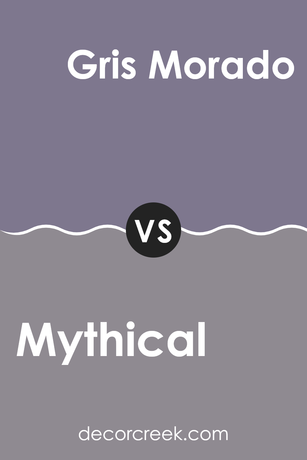
Mythical SW 6550 by Sherwin Williams vs Gris Morado SW 9156 by Sherwin Williams
Mythical SW 6550 by Sherwin Williams is a dusty pink with a muted, warm feel. It has a subtle touch that creates a gentle and cozy atmosphere. Mythical is ideal for areas where you want to introduce a soft and inviting element without it being overpowering. Its warm undertones make it very flexible, blending well with other colors and offering a welcoming feel.
Gris Morado SW 9156, on the other hand, is a deep, muted purple. It carries a refined edge, making it suitable for accent walls or rooms that aim for a bold statement. It has cooler undertones compared to Mythical, giving it a more modern and dramatic presence.
When comparing the two, Mythical feels more casual and approachable, fitting well in areas where comfort is key. Gris Morado presents a more striking choice, ideal for creating a focal point or adding depth to a room.
You can see recommended paint color below:
- SW 9156 Gris Morado
After learning about Sherwin Williams’ paint color SW 6550 Mythical, I feel it’s like having a little magic in a can. This unique shade reminds me of a soft, warm hug that can turn any room into a cozy place. When I picture Mythical, I imagine a calm and inviting color. It’s not too flashy or too plain—just right for making a room feel special.
If I had to choose where to use it, I’d probably pick a bedroom or a reading corner. It seems like it would be great for places where I want to feel relaxed and comfortable. The color has this gentle way of making everything seem nice and balanced. It could work really well with other colors too—like whites, grays, or even other soft colors. It’s like the paint can be friends with lots of different shades.
Thinking about how it would look during different times of the day is fun too. In the morning, it might look fresh and lively with sunlight. By evening, it could turn into a warm hug, perfect for unwinding after a long day.
Mythical seems like a perfect choice if you want your room to feel welcoming and cozy. It’s like having a bit of magic on your walls!
Ever wished paint sampling was as easy as sticking a sticker? Guess what? Now it is! Discover Samplize's unique Peel & Stick samples.
Get paint samples

