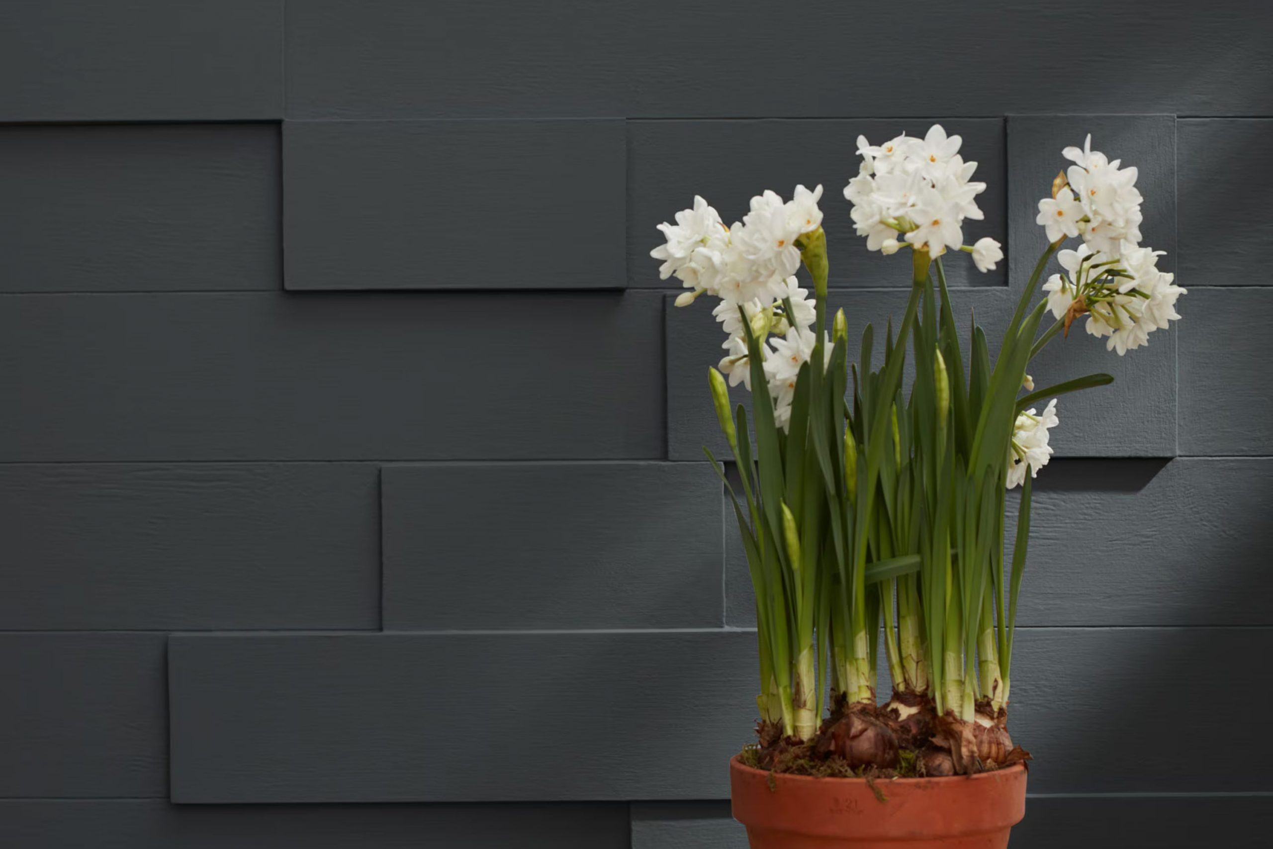
When you’re searching for the perfect shade of gray that subtly adds both warmth and refined character to your area, Benjamin Moore’s 1603 Graphite might just be the right choice. It’s a deep, charcoal gray that manages to stay remarkably neutral, making it adaptable enough to work in a variety of decorating styles. This color has the unique ability to provide a strong statement on accent walls or exterior details, yet it’s balanced enough not to overpower a room when used on all four walls.
I’ve seen 1603 Graphite paired with crisp white trim; the contrast really brings out its rich tone. It’s an ideal backdrop for artwork or can act as a grounding force for bold and vibrant colors. Whether in a modern loft or a traditional home, this shade provides a touch of elegance and a contemporary feel.
In my own experience, using Benjamin Moore’s 1603 Graphite in a home office or a cozy reading nook can particularly enhance the area’s aesthetic, offering a sense of calm and focus. It works wonderfully with natural wood elements, metallic accents, and even pastel linens, proving its flexibility in various design scenarios.
Overall, if you are looking to infuse a hint of refined style into your environment, 1603 Graphite is certainly a paint color to consider.
What Color Is Graphite 1603 by Benjamin Moore?
The color Graphite by Benjamin Moore is a deep, rich gray that carries an almost charcoal-like depth, making it an adaptable choice for those looking to add some drama and boldness to their areas without the starkness of black. This shade is unique because it combines the strength of a darker color with the softness and usability of gray. Its adaptability is further enhanced by a slight blue undertone, which keeps it cool and fresh.
Graphite is particularly effective in modern and industrial interior styles, where its depth can help to highlight architectural features and furnishings. It works beautifully in minimalist areas, providing a strong background color that allows lighter and more colorful decor elements to pop. In a more traditional setting, Graphite serves as an elegant backdrop that adds weight and definition to the room.
When considering materials and textures to pair with this color, natural elements work exceptionally well. Think along the lines of warm wood tones that complement its coolness, creating a balanced visual appeal. Metals such as brushed steel or copper also look stunning against a Graphite backdrop, enhancing its industrial vibe.
For textures, incorporating plush fabrics like velvet or wool in lighter colors can soften the intensity of Graphite while maintaining a cozy, inviting atmosphere.
Is Graphite 1603 by Benjamin Moore Warm or Cool color?
Graphite 1603 by Benjamin Moore is a bold, deep gray shade that adds a strong, modern feel to any room. Despite being so dark, it surprisingly doesn’t make areas feel smaller. Instead, it offers a grounding effect, making it a great choice for accent walls or cabinets. This color works well in homes because it serves as a neutral backdrop that pairs easily with brighter colors or other tones of wood and metal finishes, giving homeowners plenty of decorating flexibility.
Using Graphite 1603 in high-traffic areas, like living rooms or kitchens, can hide everyday wear and tear better than lighter colors. It’s also an excellent choice for exterior elements, like front doors, because it stands out well against natural outdoor light and complements most building materials.
Overall, Graphite 1603 by Benjamin Moore provides a modern, stylish look without being too intense, and it fits into many different home styles and tastes.
Undertones of Graphite 1603 by Benjamin Moore
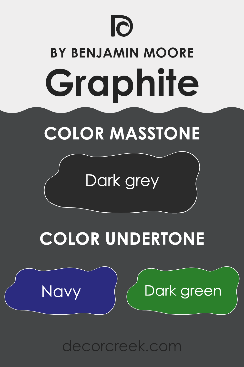
Graphite1603 is a unique paint color with a deep, rich base that might first appear simply as a dark gray. However, it includes a complex spectrum of undertones, making it an adaptable choice for interior walls.
The undertones in a paint color can significantly influence how it is perceived and how it interacts with different types of lighting and surrounding decor. For Graphite1603, the undertones are navy, dark green, brown, dark turquoise, purple, olive, and grey. These undertones can show through more prominently under certain lighting conditions or when the paint is adjacent to colors that highlight one of these undertones.
For instance, under natural light, navy and dark turquoise might give the walls a cool, calm feeling, which can make a room appear more refreshing. In artificial lighting, brown and olive might stand out, providing a warmer and more inviting atmosphere. Dark green can give a touch of nature’s vibe, which can be soothing. These undertones also mean that when used on interior walls, Graphite1603 can pair well with a variety of decor styles and colors.
The flexibility from the range of undertones allows it to fit seamlessly into various interior themes – from modern to vintage, or minimalistic to lush. Whether the base color or its undertones come through stronger, Graphite1603 can offer surprising depth and adaptability, making it more than just a simple gray. This adaptability ensures that each room can have its distinct feel, despite the use of the same paint color.
What is the Masstone of the Graphite 1603 by Benjamin Moore?
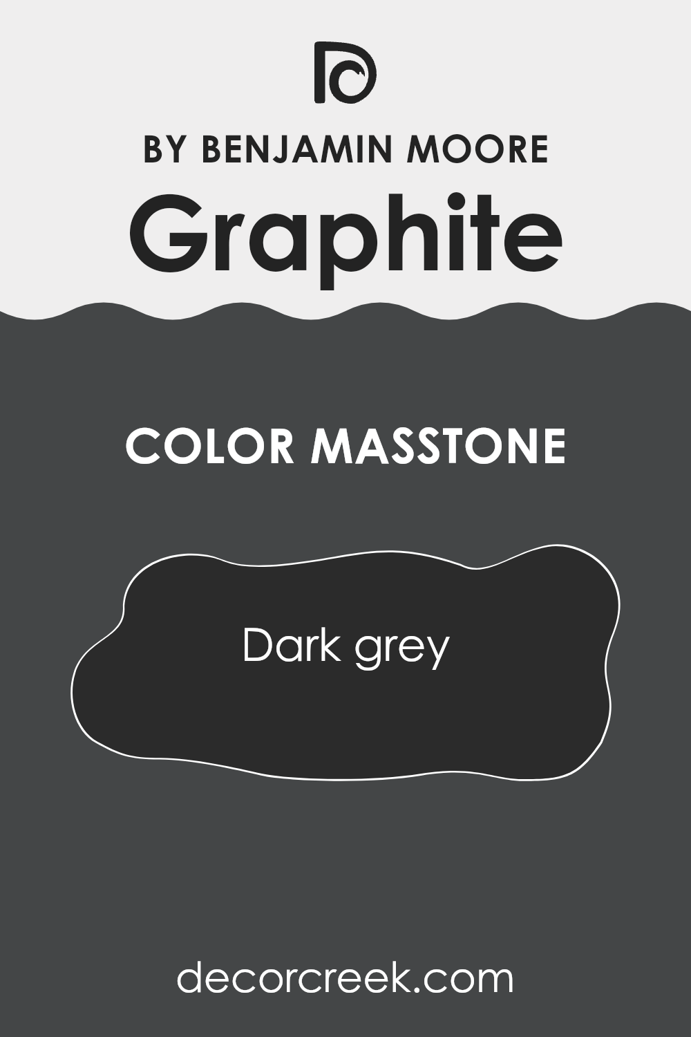
Graphite 1603 by Benjamin Moore, with its masstone of dark grey (#2B2B2B), brings a strong and stable feel to any room. This particular shade of grey works exceptionally well in homes because it offers a solid, grounding effect.
It provides an excellent backdrop that allows other colors, such as bright whites or bold colors, to stand out. This dark grey shade is adaptable and fits well in modern areas where a sleek, no-fuss look is desired. It’s also ideal for areas that aim for a minimalistic design, as it helps create a clean and uncluttered appearance.
The neutrality of the color makes it easy to pair with a wide range of decor styles and elements, from classic wood furniture to contemporary metal accents. Whether used for accent walls, cabinets, or even exteriors, this color ensures a modern, yet enduring appeal, making it suitable for various applications in homes. Its ability to absorb light also helps in creating a cozy, more intimate atmosphere in larger areas.
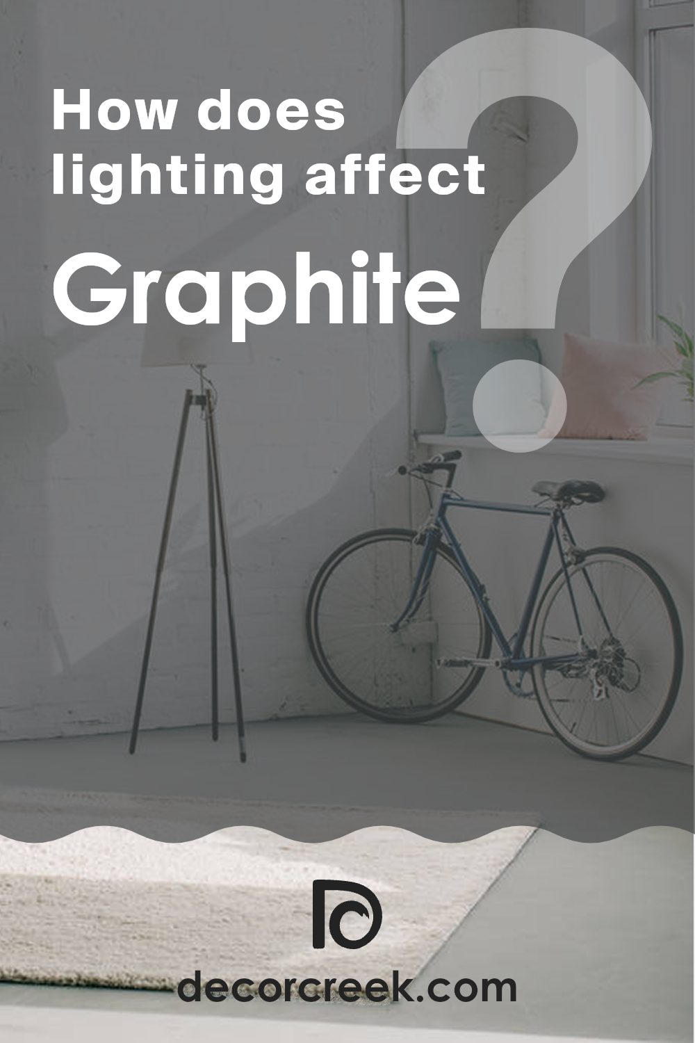
How Does Lighting Affect Graphite 1603 by Benjamin Moore?
Understanding how lighting affects colors is crucial when decorating a room. Different light sources can make the same paint color look different at various times of the day or in different settings. For instance, the color Graphite 1603 by Benjamin Moore can appear dramatically different under artificial and natural lighting.
Under artificial light, Graphite 1603 tends to look warmer and slightly softer. This is because most artificial lighting in homes casts a warm glow, enhancing the cozy aspects of this deep shade. This makes it a popular choice for areas like living rooms or bedrooms, where artificial light is often used in the evenings to create a relaxed, inviting atmosphere.
In natural light, Graphite 1603 can reveal more of its true color depth. Natural light, being cooler than most artificial lights, can bring out the subtle undertones in the paint. During the day, when sunlight is abundant, this color may appear more neutral or even take on a slightly bluish tinge, depending on the specific quality of light at any given time.
The appearance of Graphite 1603 also varies depending on the orientation of the room. In north-facing rooms, which receive cooler, more consistent light, this shade can look more muted and shadowy, potentially amplifying its darker qualities. This could make a small room feel smaller or a large room more dramatic.
In south-facing rooms, with more direct sunlight, Graphite 1603 may appear lighter and more dynamic throughout the day. The color can shift from being quite stark in bright midday light to softer and warmer in the evening as the natural light fades.
East-facing rooms get morning light, which is bright and warm. Here, Graphite 1603 might look beautifully vibrant in the morning but could lose some of its punch as the day progresses and the light becomes cooler.
Conversely, in west-facing rooms, the color may appear somewhat neutral or bland during the morning when the light is cooler and more indirect. However, it can come to life in the late afternoon and evening with the setting sun, showing off the warmer tones in the paint as the light becomes more golden.
Choosing the right lighting is key to making sure the colors in your home appear just as you wish them to. The color and quality of light can completely alter the mood and style of a room.
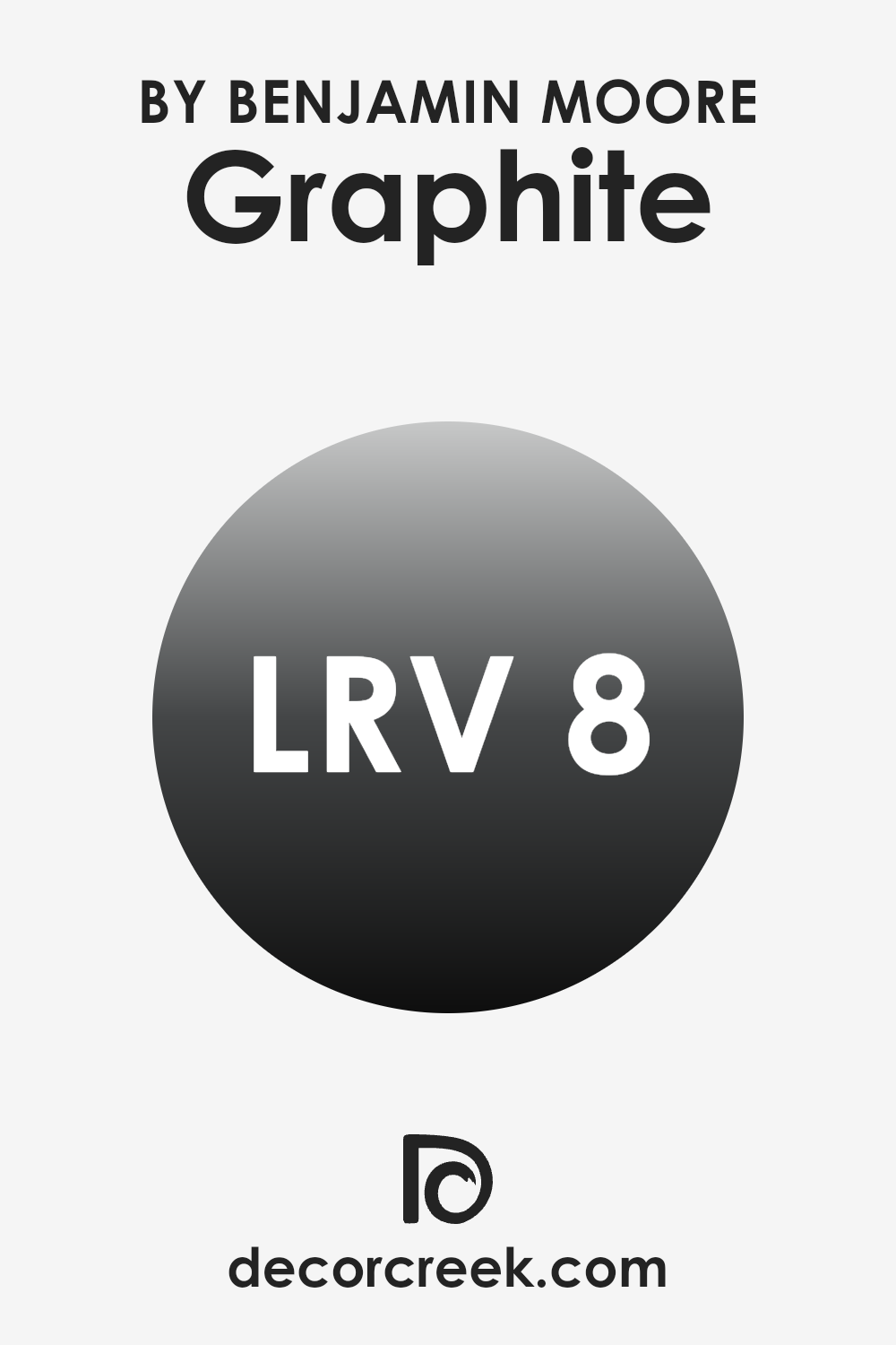
What is the LRV of Graphite 1603 by Benjamin Moore?
LRV stands for Light Reflectance Value. It measures the percentage of light a paint color reflects back into a room compared to the amount of light that shines on it. Essentially, LRV helps to understand how light or dark a color will appear when it’s applied to your walls.
This measurement can range from low values, indicating darker colors that absorb more light, to high values for lighter colors that reflect more light back into the area. This factor is important because it affects how bright or dim a room feels, which in turn can influence the mood and the perceived size of the area.
The LRV of 7.59 for Graphite 1603 by Benjamin Moore means it is a very dark color that absorbs much of the light that hits it rather than reflecting it back into the room. This attribute can make the color a bold choice for rooms, potentially making them feel smaller or more enclosed but also lending a strong character to the area.
If you’re considering this color for a smaller room, proper lighting is essential to prevent the area from feeling too dark. Moreover, this lower LRV means the color can be ideal for creating a focal point or accent wall in a larger, well-lit area, without overpowering the overall ambiance.
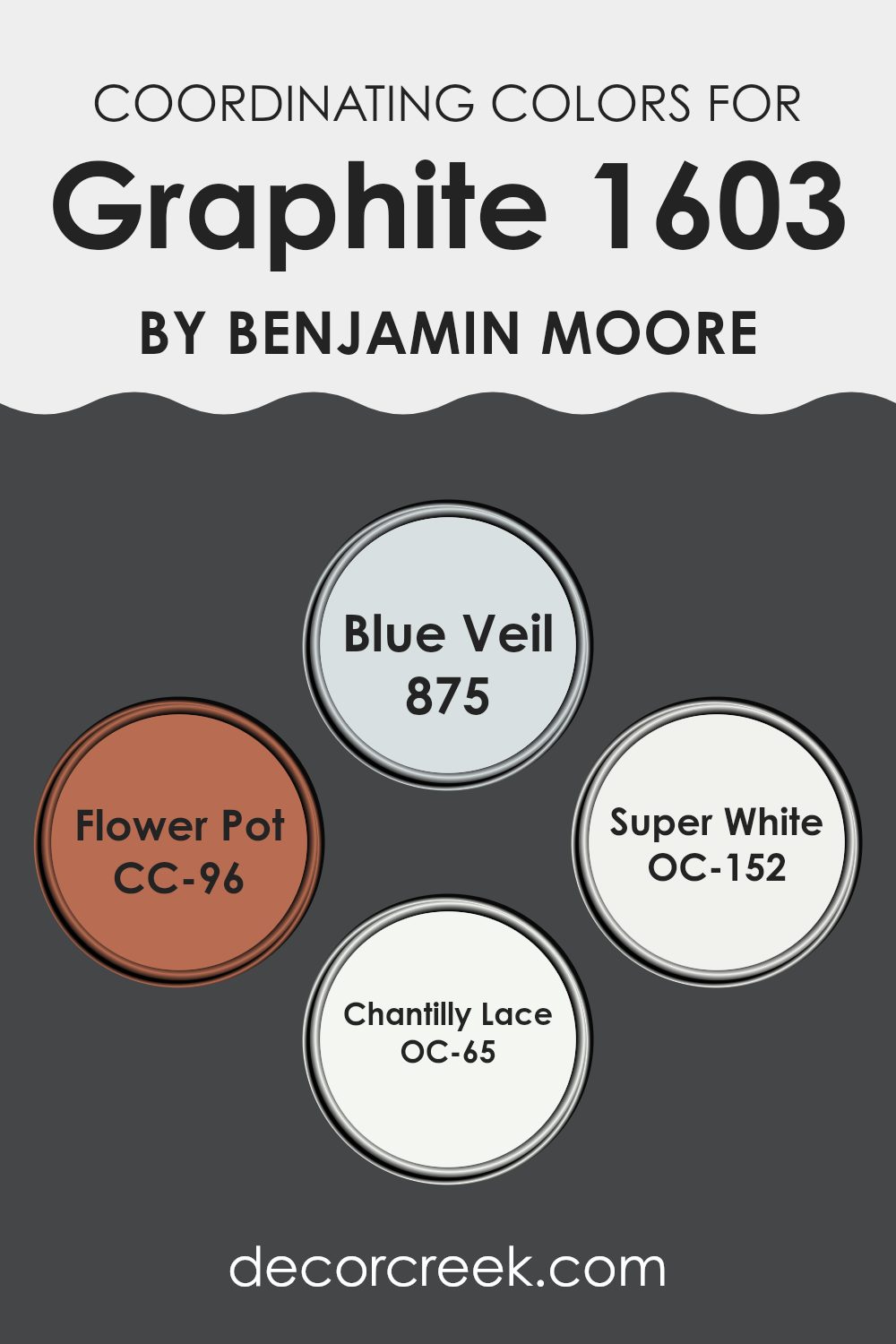
Coordinating Colors of Graphite 1603 by Benjamin Moore
Coordinating colors are shades that complement each other well and are used together to enhance the overall aesthetic of an area. When chosen thoughtfully, these colors create a cohesive look and can be used to highlight specific features of a room or to set a desired mood. They are often used across different elements such as walls, trims, furniture, and accessories to create a balanced and harmonious environment.
For example, 875 – Blue Veil, is a soft and gentle blue that emulates the sky on a clear day, providing a refreshing and light touch to areas. This color pairs well with deeper tones, bringing a sense of calmness and airiness to any room. On the other hand, CC-96 – Flower Pot is a warm terracotta color that can add warmth and earthiness, ideal for creating a cozy and inviting atmosphere.
OC-152 – Super White offers a clean and crisp backdrop that can make other colors stand out more vibrantly, perfect for modern areas seeking a sharp, clean look. Lastly, OC-65 – Chantilly Lace is a crisp white with subtle undertones that keep it from feeling too stark, ideal for achieving a refined but welcoming feel. Together, these colors provide adaptable options for designing an area that feels both connected and beautifully varied.
You can see recommended paint colors below:
- 875 Blue Veil
- CC-96 Flower Pot
- OC-152 Super White
- OC-65 Chantilly Lace
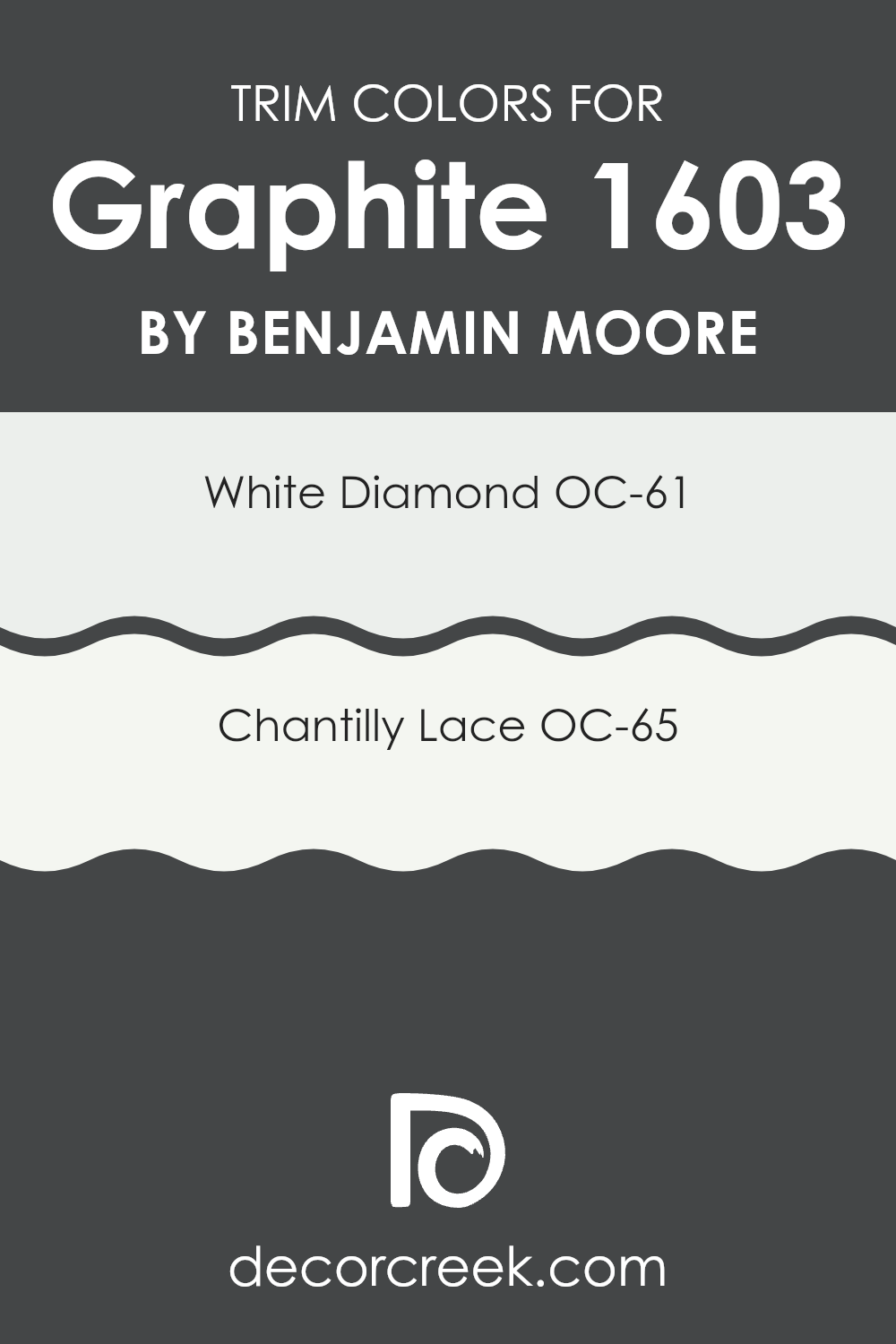
What are the Trim colors of Graphite 1603 by Benjamin Moore?
Trim colors are the accent colors used on the structural features such as door frames, baseboards, moldings, and window trims. Choosing the right trim color can significantly enhance the appearance of a room by adding contrast or highlighting specific architectural details.
For the color Graphite by Benjamin Moore, using a trim color like White Diamond OC-61 or Chantilly Lace OC-65 is quite effective as these colors create a clean and bright contrast against the darker graphite hue. This enhances the overall crispness and freshness of the room, drawing attention to the fine details of the architecture and providing a balanced finish.
White Diamond OC-61 is a luminous, almost ethereal white with just a hint of cool undertones that give it a barely-there sense of color. This makes it ideal for use as a trim color, where it captures the light and subtly defines the area without being too intense. On the other hand, Chantilly Lace OC-65 is a pure, unambiguous white that offers a striking clarity and brightness, making it perfect for a trim color as it stands out crisply against darker walls, ensuring that the trim is distinct and noticeable. Both colors are calming, offer a refreshing feel to an area, and help in creating a neat and polished look when paired with darker shades like Graphite.
You can see recommended paint colors below:
- OC-61 White Diamond
- OC-65 Chantilly Lace
Colors Similar to Graphite 1603 by Benjamin Moore
Similar colors play a crucial role in creating aesthetically pleasing environments, particularly when maintaining a coherent theme or setting a specific mood in an area. Colors that share a close relationship on the color spectrum can produce a subtle yet impactful visual experience, making them vital for design consistency and visual comfort.
Using similar colors such as Raccoon Fur, Black Panther, Wrought Iron, and Midnight Oil ensures that different elements in the room complement each other, creating a seamless look without stark contrasts that might otherwise be jarring.
Raccoon Fur is a deep, dark gray that mirrors the tone of a shadowy evening, providing a rich backdrop that’s both inviting and grounding. Black Panther offers an almost black shade that adds depth and mystery to areas, perfect for creating striking accents.
Wrought Iron, a slightly lighter shade of black with hints of gray, offers adaptability and can be soothing when used extensively in interiors. Midnight Oil is a navy blue that nearly verges on black, lending a touch of modern elegance and depth to areas, ideal for creating a focal point or anchoring lighter shades. Each of these colors can be used harmoniously to build a cohesive palette that adds depth and interest to interiors.
You can see recommended paint colors below:
- 2126-20 Raccoon Fur
- 2125-10 Black Panther
- 2124-10 Wrought Iron
- 1631 Midnight Oil

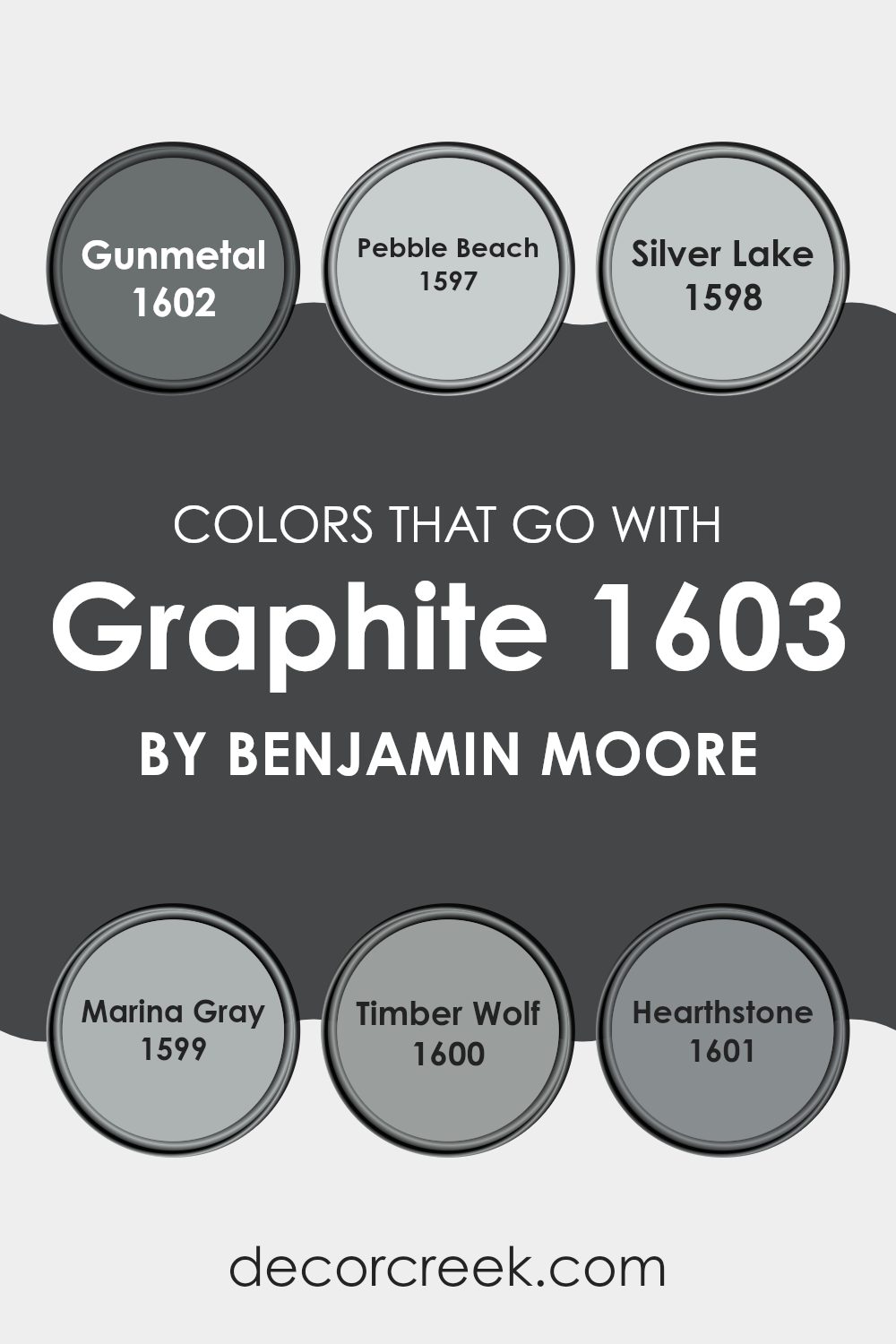
Colors that Go With Graphite 1603 by Benjamin Moore
Choosing the right colors to complement Graphite 1603 by Benjamin Moore can have a significant impact on the overall aesthetics and mood of an area. The selected accompanying shades like Gunmetal, Pebble Beach, Silver Lake, Marina Gray, Timber Wolf, and Hearthstone each play a critical role in enhancing the strong, dark hue of Graphite. When paired correctly, these colors can create a harmonious and appealing environment.
Gunmetal is a deep, almost metallic gray that provides a robust, pronounced contrast to Graphite, giving a grounded and powerful feel to the area. Pebble Beach is a softer, lighter gray that adds a gentle calmness, smoothing the intensity of darker shades.
Moving towards a slight shimmer, Silver Lake offers a mid-tone gray with hints of blue, which injects a subtle vibrancy and freshness. Marina Gray stays neutral but leans towards a warmer tone, making it adaptable for areas needing a touch of coziness alongside the cooler Graphite.
Timber Wolf is a balanced gray with warm brown undertones that provide a welcoming and comforting feel, ideal for living areas or bedrooms. Lastly, Hearthstone brings in a richer, brown-gray tone, adding depth and warmth, perfect for creating a refined yet inviting atmosphere. These color pairings ensure that each room feels balanced and well-thought-out, enhancing the overall decor.
You can see recommended paint colors below:
- 1602 Gunmetal
- 1597 Pebble Beach
- 1598 Silver Lake
- 1599 Marina Gray
- 1600 Timber Wolf
- 1601 Hearthstone
How to Use Graphite 1603 by Benjamin Moore In Your Home?
Graphite 1603 by Benjamin Moore is a rich, deep charcoal gray paint that brings a bold and strong presence to any room. This shade is adaptable and can be used in various ways around your home. For example, if you want to make a statement in your living room, painting one accent wall with Graphite 1603 can add depth and focus. It also looks stylish in a home office, giving it a professional and polished feel.
In the bedroom, using Graphite 1603 on the walls can create a cozy and intimate atmosphere, perfect for relaxing. If you prefer just a touch of this color, consider painting bookshelves or cabinets in your kitchen or bathroom. This can add a modern contrast to lighter walls or fixtures.
For those who enjoy outdoor areas, Graphite 1603 can also be used on exterior doors or trim to give your home’s facade a striking look. It’s a durable paint that holds up well, which is great for both indoor and outdoor use.
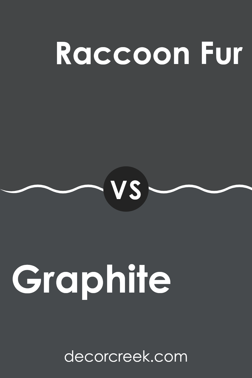
Graphite 1603 by Benjamin Moore vs Raccoon Fur 2126-20 by Benjamin Moore
The main color, Graphite 1603, is a bold, deep gray with a strong presence. It carries a strong visual weight, making it excellent for use as a statement wall or to accentuate furniture and trim. Its depth can help give a more grounded and defined look to an area.
On the other hand, Raccoon Fur 2126-20 is darker and has blue undertones, giving it a cooler feel compared to the more neutral hue of Graphite 1603. While also a deep color, the blue adds a unique layer, making it ideal for areas where a touch of subtle refined style is desired, yet it retains the impactful punch of a dark color.
Both colors work well in modern and traditional decors, but Raccoon Fur’s cooler tones might be preferable in settings where a hint of refined style is desired, while Graphite’s pure gray offers flexibility and a straightforward approach to any styling challenge.
You can see recommended paint color below:
Graphite 1603 by Benjamin Moore vs Midnight Oil 1631 by Benjamin Moore
Graphite 1603 and Midnight Oil 1631, both by Benjamin Moore, are intriguing choices for adding character to any area. Graphite 1603 is a deep, dark gray that echoes the color of pencil lead, offering a strong presence without the starkness of black.
It’s an adaptable shade that pairs well with a wide range of colors, lending a grounded feel to rooms. On the other hand, Midnight Oil 1631 is a rich navy that mimics the hue of a nighttime sky.
This color is darker and has blue undertones, making it a great option for creating a cozy and inviting atmosphere. It stands out more distinctly against light colors, providing striking contrast. Both colors bring their own unique flair to interiors, with Graphite serving as a neutral base and Midnight Oil offering a deeper, moodier vibe.
You can see recommended paint color below:

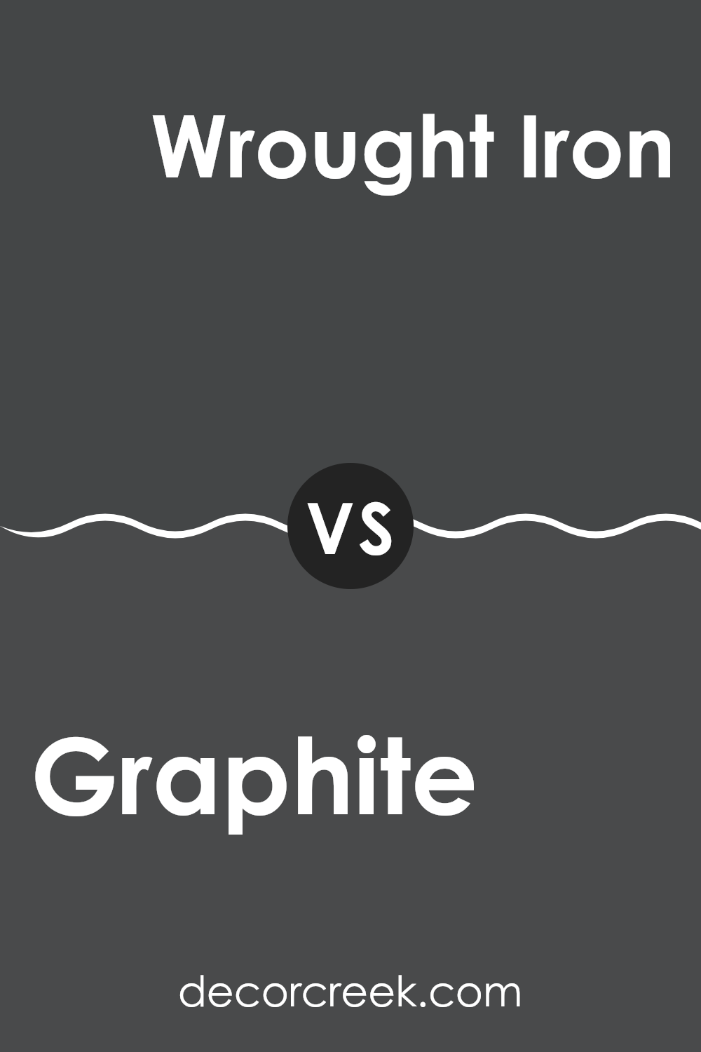
Graphite 1603 by Benjamin Moore vs Wrought Iron 2124-10 by Benjamin Moore
Graphite 1603 and Wrought Iron 2124-10 by Benjamin Moore are two dark shades that can create a strong impression in any area. Graphite 1603 is a deep, rich charcoal that leans slightly towards a cool gray. This color has a strong presence and is great for achieving a bold, striking look in rooms. It pairs well with bright colors and warm woods to balance its coolness.
On the other hand, Wrought Iron 2124-10 is a darker shade, very close to black but with hints of deep blue, giving it a unique tint. This color is perfect for making dramatic statements, and it fits well in places where you want a more grounding and intense atmosphere.
Although it’s almost black, its blue undertone makes it less harsh and adds depth, contrasting nicely with lighter colors and metallic finishes. Both colors are suitable for accent walls, exterior trims, or furniture, depending on the effect you’re looking for in your décor.
You can see recommended paint color below:
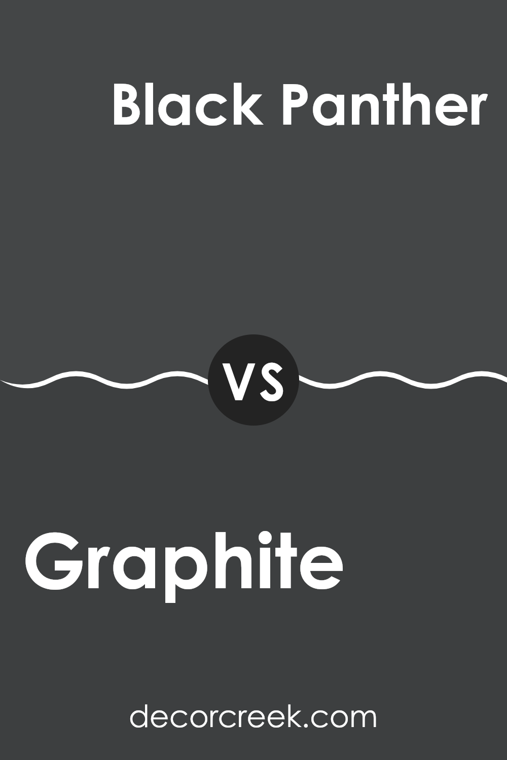
Graphite 1603 by Benjamin Moore vs Black Panther 2125-10 by Benjamin Moore
Graphite 1603 by Benjamin Moore is a rich, deep gray with a hint of warmth, making it an adaptable choice for a variety of areas. It’s not too dark, which allows it to pair well with both bright and subdued accent colors, and it can bring a cozy and inviting atmosphere to a room.
On the other hand, Black Panther 2125-10, also by Benjamin Moore, is a much darker shade, closer to a true black. It delivers a bold statement and provides strong contrast when used with lighter colors. This color is excellent for creating drama and emphasizing other elements of a room’s decor.
Both colors offer unique possibilities. Graphite 1603 is ideal for those who prefer a softer, more flexible backdrop that still holds some depth. Black Panther 2125-10 is suited for those looking to make a more striking visual impact, possibly in an area commanding more attention or designed with high contrast.
You can see recommended paint color below:
- 2125-10 Black Panther
After reading about 1603 Graphite by Benjamin Moore, I’ve learned a lot about this unique color. It’s a deep, dark shade of gray that looks almost like the color of pencil lead. What’s really cool about Graphite is how it can make a room feel cozy and interesting. Whether on a single accent wall or all over the room, this color adds a nice touch without making things too bright or too dark. It’s perfect if you want a color that’s not as harsh as black but still bold and strong.
I learned that Graphite works well with bright colors like yellow or fun blue tones, giving a nice background that makes these colors pop. It’s also great for places where you or guests hang out a lot like the living room or the kitchen because it doesn’t get dirty quickly.
In my opinion, 1603 Graphite by Benjamin Moore is a great choice if you’re looking for something different than the usual colors and want your room to look mature, kind of like a grown-up’s room, but still very welcoming and friendly.
This color might just be the right pick for someone wanting to give their room a fresh new look without going too crazy with color.
Ever wished paint sampling was as easy as sticking a sticker? Guess what? Now it is! Discover Samplize's unique Peel & Stick samples.
Get paint samples

