I recently had the chance to use Benjamin Moore’s 1631 Midnight Oil paint, and I want to share my experience with you. This deep, almost charcoal-like blue provides a calm and refined vibe to any room. I chose it for a bedroom remodel, looking for something that would offer both comfort and style. Midnight Oil delivered, filling the area with a unique aura that feels both inviting and modern.
This shade is adaptable enough to be used in various areas, from an office to a cozy living room corner. Compared to other dark paints, it stood out to me with its ability to blend seamlessly with different decor styles and lighting setups. The result was impressive; the color interacts beautifully with both natural and artificial light, shifting subtly throughout the day.
Benjamin Moore’s paint formula was also impressive, with excellent coverage that made application straightforward without the need for numerous coats.
If you’re considering a new paint color, I highly recommend considering Midnight Oil for its dynamic and modern charm that genuinely enhances a room’s character.
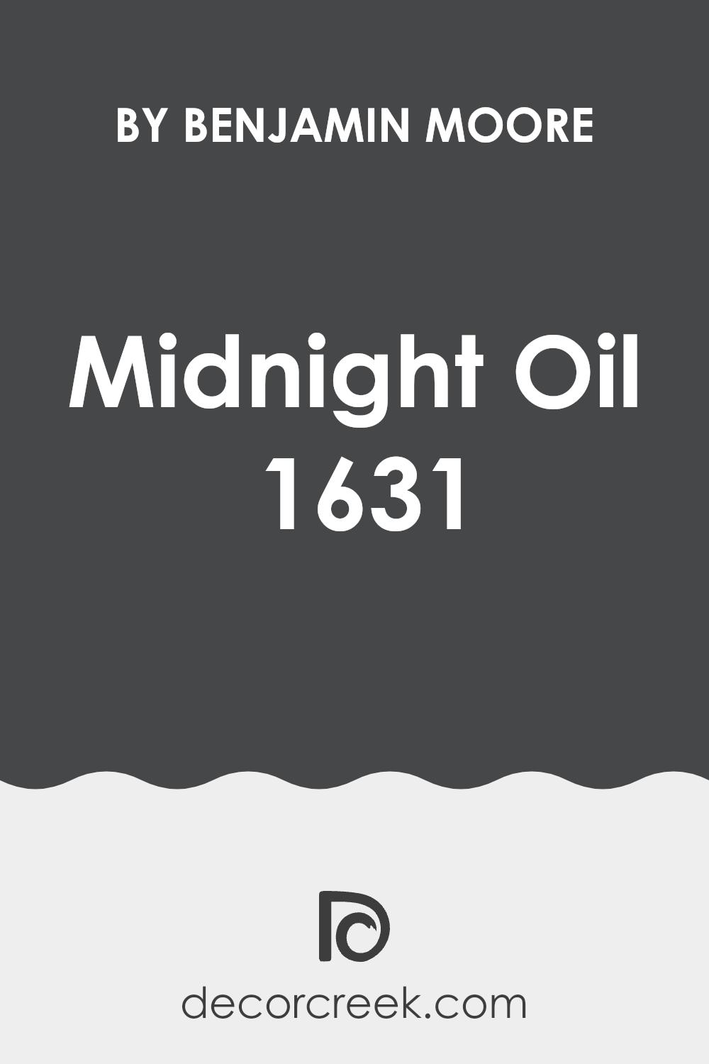
What Color Is Midnight Oil 1631 by Benjamin Moore?
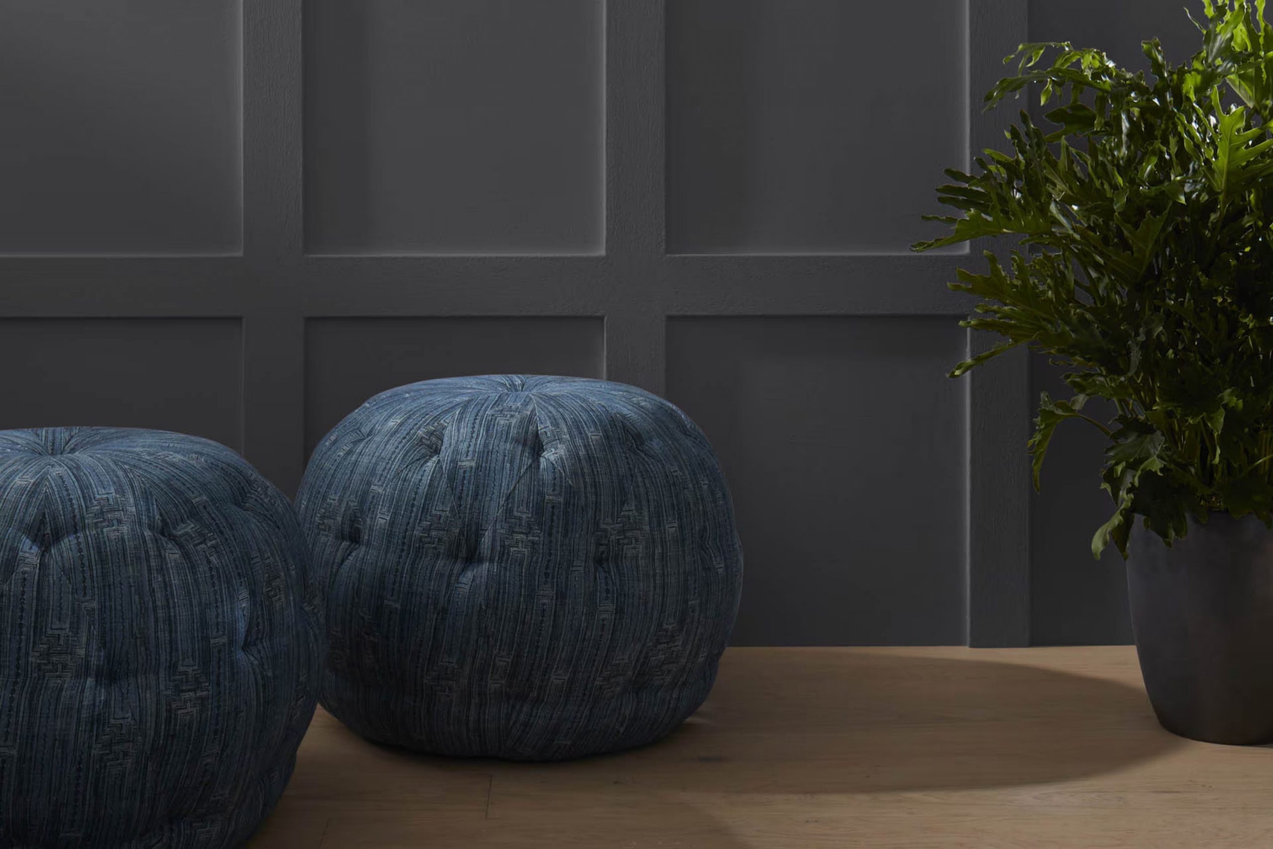
Midnight Oil (1631) by Benjamin Moore is a deep, saturated shade of blue that appears almost black under limited lighting. This intense hue can inject depth and drama into an area, making it a bold choice for those looking to make a statement. It works particularly well in modern and contemporary interior styles, though it can also add an unexpected twist to more traditional settings.
Midnight Oil is effective in creating a focal point in a room, whether it’s painted on an accent wall or used throughout a smaller area like a powder room or study. Its rich darkness pairs beautifully with materials like polished marble, which adds a touch of luxury, and natural wood, which provides warmth against the cool blue.
Soft textiles in lighter colors such as creams or soft greys can contrast well with the intensity of Midnight Oil, ensuring that the room doesn’t feel too intense.
Metallic finishes, particularly in brass or gold, also complement this deep blue, adding a touch of glam while highlighting its luxurious undertones. For those looking to integrate a modern yet cozy atmosphere, incorporating plush fabrics like velvet can enhance the overall appeal, making the room inviting and stylish.
This color’s adaptability and impactful presence make it a robust choice for anyone looking to create a stunning visual in their home.
Is Midnight Oil 1631 by Benjamin Moore Warm or Cool color?
Midnight Oil 1631 by Benjamin Moore is a deep, rich blue-black shade that brings a strong and cozy feel to any room. This color is perfect for creating a cozy nook or making a bold statement wall. In living rooms, it adds depth and a sense of intimacy, making large areas feel more inviting.
In bedrooms, using Midnight Oil on walls can give a snug, comforting feeling which is great for relaxation and sleep. This color works well in homes because it pairs beautifully with various textures and materials like wood, metal, and glass, offering flexible styling options.
It absorbs light, which helps in reducing the brightness of overly sunny rooms, making them easier on the eyes. Additionally, when used in well-lit areas or rooms with plenty of natural light, Midnight Oil can look stunning, providing a dramatic contrast to lighter colors used in decor or furniture, thus enhancing the overall aesthetic of the area.
Undertones of Midnight Oil 1631 by Benjamin Moore
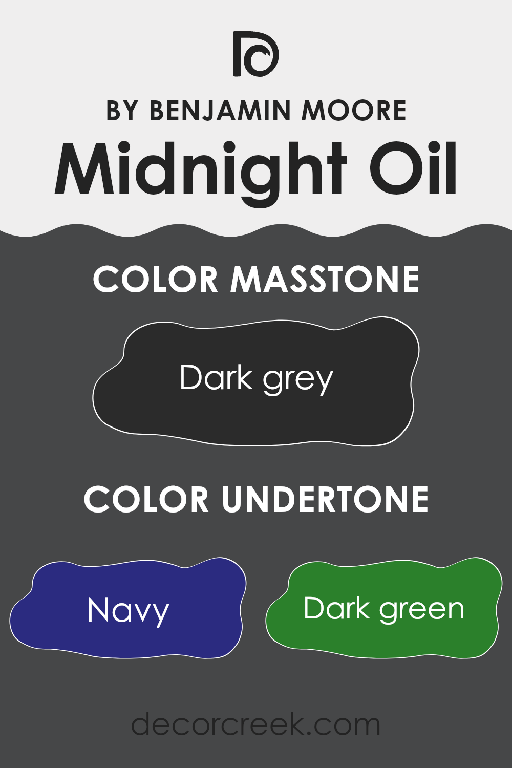
Midnight Oil by Benjamin Moore is a complex paint color that adds depth and intrigue to any room. Understanding the undertones of this shade can help you see why it looks different under various lighting conditions. Undertones are the colors that reside beneath the surface of the main color, subtly influencing the overall appearance and feel of the paint.
In the case of Midnight Oil, the undertones include navy, dark green, brown, dark turquoise, purple, olive, and grey. Each of these undertones contributes to how Midnight Oil is perceived. For instance, navy and dark turquoise give a sense of depth and richness, making the area feel more cozy and enclosed. On the other hand, brown and olive add a touch of warmth, which can make a room feel welcoming.
Furthermore, the purple undertone can introduce a slight hint of luxury and mystery, varying according to the lighting. For example, in natural daylight, the cooler undertones like navy and dark turquoise might become more prominent, making the walls appear more vibrant. In artificial light, warmer undertones like brown and olive might stand out, providing a more subdued and cozy atmosphere.
Overall, these undertones make Midnight Oil a flexible color choice for interior walls, suitable for creating various moods and styles depending on the room and lighting conditions. It’s perfect for those looking to add some depth and interest to their living area without making it feel too intense or overly bold.
What is the Masstone of the Midnight Oil 1631 by Benjamin Moore?
Midnight Oil 1631 by Benjamin Moore is a dark grey color with the code #2B2B2B. This deep shade brings a strong and grounding presence to any room. In homes, it works well in areas where a touch of drama is needed or where the goal is to create a cozy, secure feel.
For example, using Midnight Oil in a bedroom can make it feel more private and restful, while in a living room, it can add a bold backdrop, making furniture and artwork stand out.
This color is especially effective in rooms with ample natural light or well-planned artificial lighting, as it prevents the area from feeling too dark. Also, pairing it with lighter colors and textures can balance its intensity, ensuring the room doesn’t feel too enclosed. It’s a practical choice for areas that see a lot of use, as darker colors help hide marks and stains.

How Does Lighting Affect Midnight Oil 1631 by Benjamin Moore?
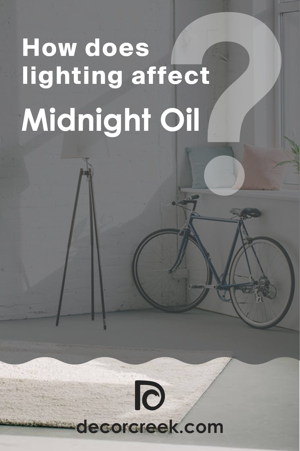
Lighting plays a crucial role in how we perceive colors. The color Midnight Oil by Benjamin Moore is a deep blue that can appear very different depending on the light it’s exposed to. Here’s how this color behaves under various lighting conditions and in rooms with different orientations.
Artificial Light: In artificial lighting, the impact on Midnight Oil depends on the type of bulbs used. Warm lights, like those from incandescent bulbs, will soften its deep blue tone, making it lean more towards a cozy navy. Cooler lights, such as LED or fluorescent lights, can keep the color more true to its dark, rich blue, enhancing its intensity.
Natural Light: In natural light, Midnight Oil can show its true depth. Sunlight brings out the complexities of this deep blue, highlighting subtle undertones. Depending on the intensity and angle of the light throughout the day, it can look vibrant or more subdued.
Room Orientation:
- North-Facing Areas: These typically get less direct sunlight, which can make colors appear slightly darker. In north-facing areas, Midnight Oil might look more shadowy and profound, possibly even appearing almost black in dimmer light.
- South-Facing Areas: With more direct and often brighter sunlight, south-facing areas can make Midnight Oil appear brighter and more dynamic. The color might reveal more of its blue depth when bathed in the ample sunlight typically found in these areas.
- East-Facing Areas: Morning light is warm and can make Midnight Oil look softer and slightly lighter early in the day. As the light fades, the color may return to its darker, more pronounced blue shade.
- West-Facing Areas: Evening light in west-facing areas can be golden and intense, potentially casting a slightly warmer tone on Midnight Oil, enlivening the blue with a subtle glow as the sun sets.
Overall, how Midnight Oil looks can significantly be affected by its lighting environment, making it adaptable in various settings but always maintaining a strong, dignified presence.
What is the LRV of Midnight Oil 1631 by Benjamin Moore?
LRV stands for Light Reflectance Value, which is a measurement that indicates how much light a paint color reflects back into the area compared to how much it absorbs. An LRV can range on a scale from very low to very high. High LRV colors reflect more light, making an area look brighter and often larger, while low LRV colors absorb more light, giving a room a cozier and sometimes smaller appearance.
When choosing a paint color, considering its LRV can help you understand how the color will affect the lighting and overall feel of your area. The LRV of Midnight Oil by Benjamin Moore is 7.67, which is a low number. This means that it is a dark color that absorbs most of the light that hits it, rather than reflecting it.
This characteristic will make walls painted with this color appear darker and can also make the entire area seem more enclosed and intimate. It’s important to have adequate lighting in areas with such dark walls to ensure the room doesn’t feel too dim. Additionally, furnishing and decor choices should complement the deep, absorbing nature of the paint to balance and enhance the area’s ambiance.

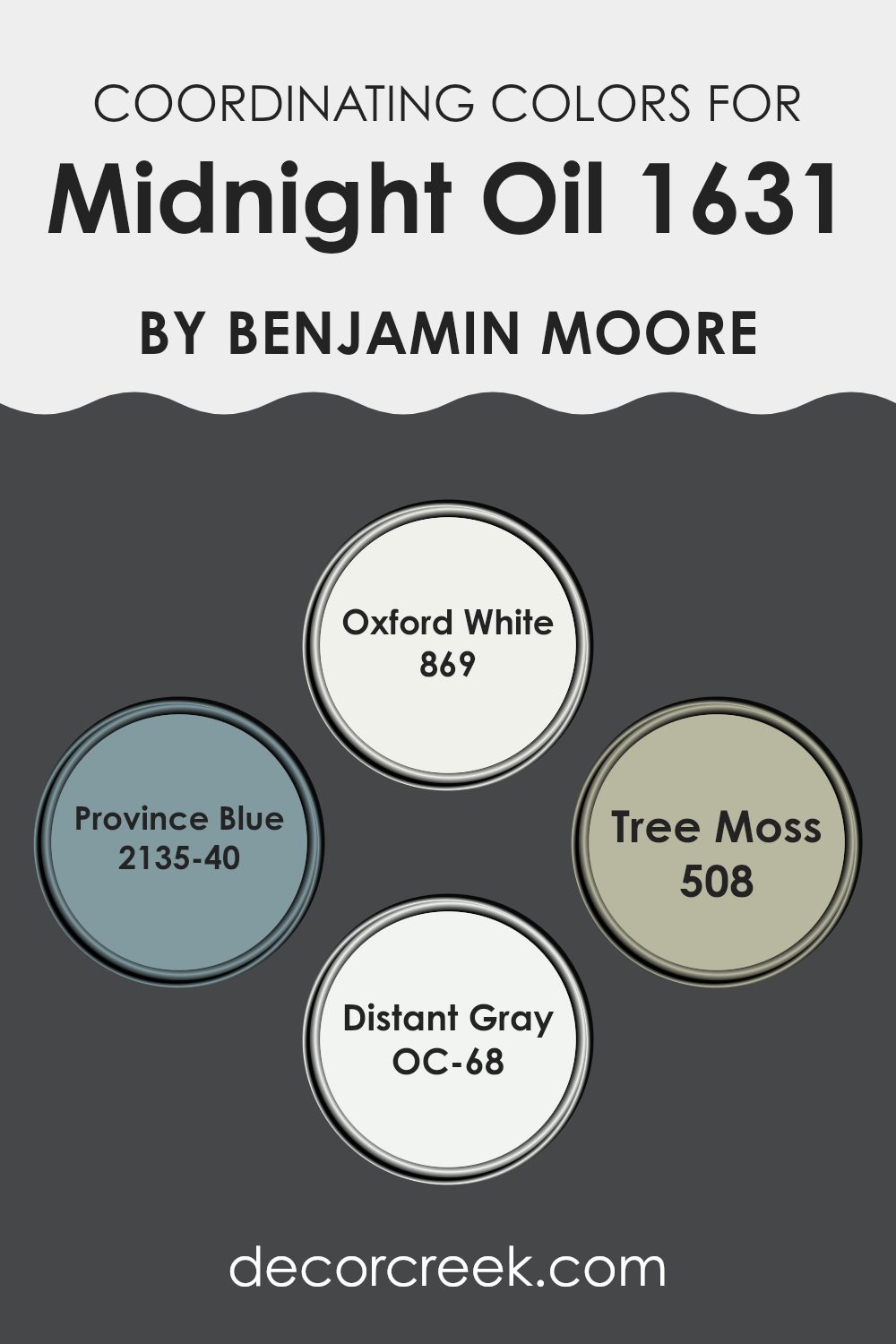
Coordinating Colors of Midnight Oil 1631 by Benjamin Moore
Coordinating colors are a palette of hues that complement or enhance each other, working in harmony to create a visually appealing scheme. When selected carefully, these colors can create a balanced and cohesive look in any area. This concept is particularly effective when decorating a room, as it helps achieve a consistent theme without each color overpowering the others.
A good example is how colors such as Oxford White, Province Blue, Tree Moss, and Distant Gray accompany Midnight Oil by Benjamin Moore. Oxford White 869 is a clean and bright white that brings light into any area, making it feel open and airy. It is ideal for trim and ceilings as it provides a crisp contrast to deeper tones like Midnight Oil.
Province Blue 2135-40 is a gentle blue with a hint of gray, offering a subtle splash of color that is neither too bold nor too muted, perfect for creating a calm and inviting atmosphere. Tree Moss 508 lends an earthy, natural green that echoes the shades found in a dense forest, great for adding depth and interest in conjunction with more neutral or dark tones. Lastly, Distant Gray OC-68 serves as a soft, light gray that works beautifully as a background color, helping other hues stand out without clashing. Together, these colors can form a delightful palette that enhances the ambiance of any area.
You can see recommended paint colors below:
- 869 Oxford White
- 2135-40 Province Blue
- 508 Tree Moss
- OC-68 Distant Gray
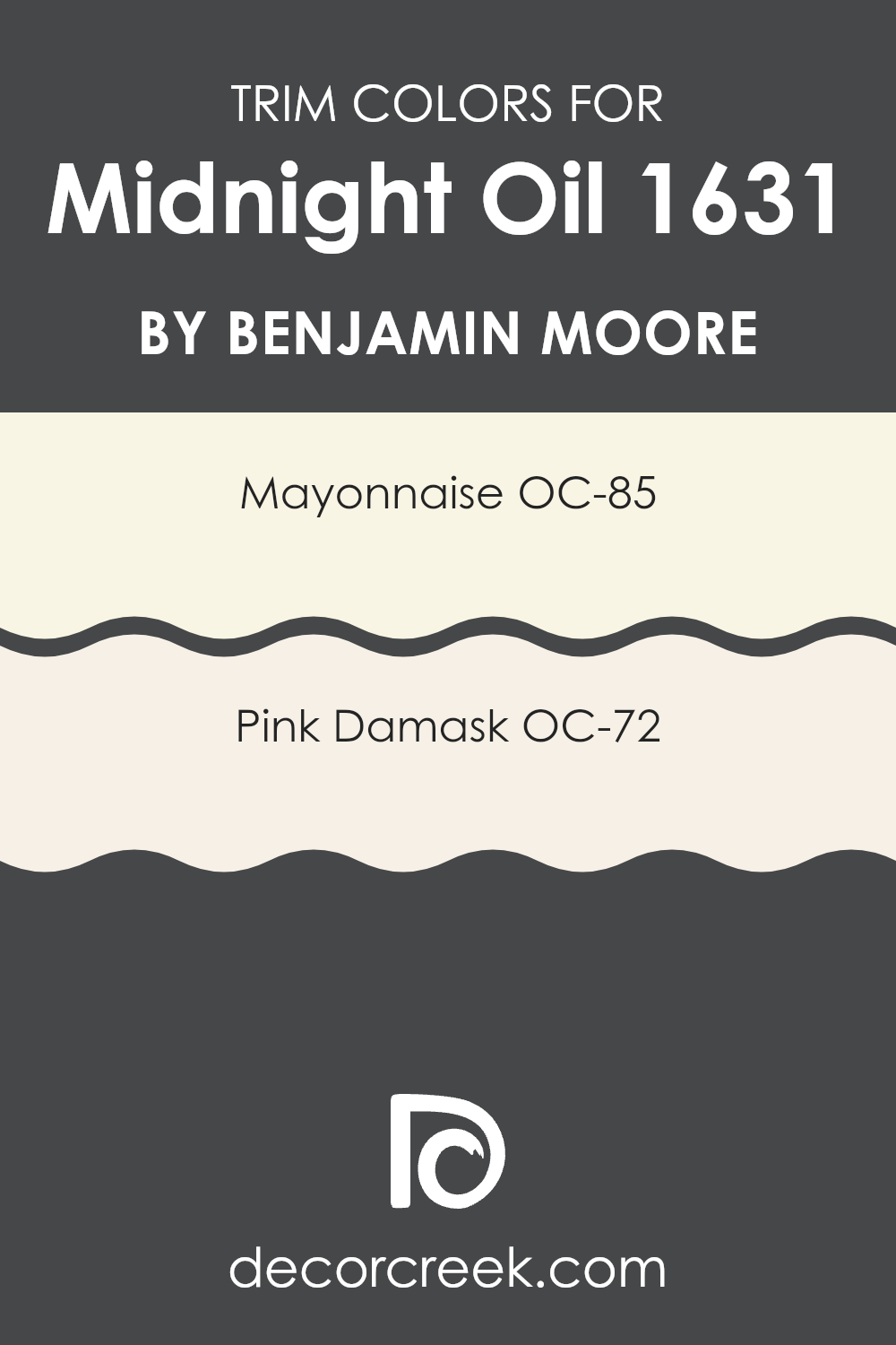
What are the Trim colors of Midnight Oil 1631 by Benjamin Moore?
Trim colors are integral for defining and accentuating the architectural details of rooms, such as window frames, skirting boards, doors, and moldings. By using contrasting or complementary colors for these elements, you can subtly enhance the overall aesthetics of an area and highlight its features.
For instance, when Midnight Oil, a deep and rich shade from Benjamin Moore, is used on walls, selecting suitable trim colors is crucial to prevent the area from feeling too dark or intense. The color OC-85 – Mayonnaise is a warm, creamy white that offers a gentle contrast against the darker tones of Midnight Oil, bringing a soft brightness to the edges and corners that naturally draws the eye and gives clarity to the room’s dimensions.
On the other hand, OC-72 – Pink Damask provides a mild, rosy hue that adds a hint of color, giving a subtle lift and injecting warmth into areas that might otherwise appear too somber. This color choice can enhance the cozy feeling of a room while keeping the overall appearance light and airy, turning basic architectural features into focal points of warmth and comfort.
You can see recommended paint colors below:
- OC-85 Mayonnaise
- OC-72 Pink Damask
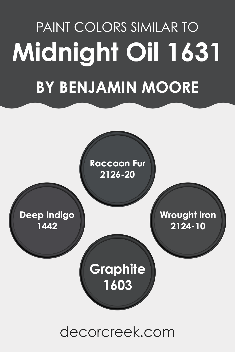
Colors Similar to Midnight Oil 1631 by Benjamin Moore
Similar colors play an essential role in interior design because they can create a cohesive and harmonious aesthetic. Utilizing colors like Midnight Oil and its related shades such as Raccoon Fur, Deep Indigo, Wrought Iron, and Graphite ensures that different elements in an area coordinate well without stark contrasts. This coordination can make a room feel more put-together and pleasant to be in.
These similar colors work well because they share underlying tones that naturally complement each other, providing depth and continuity without feeling too intense. For instance, Raccoon Fur is a deep, dark gray with hints of blue that give it a rich and subtle appearance, making it perfect for adding a touch of elegance to an area without overpowering other design elements.
Deep Indigo offers a hint of vibrant blue that suggests a nod to traditional styling while keeping things dark and moody. Wrought Iron, another similar shade, is a nearly black color that hints at metallic tones, offering a strong statement that works wonderfully in modern and industrial settings. Lastly, Graphite is a soft black with a slightly lighter tone, giving areas a substantial but less intense dark shade that can match a wide range of decor elements. All these colors can work beautifully together or with other tones to create a nuanced and stylish palette.
You can see recommended paint colors below:
- 2126-20 Raccoon Fur
- 1442 Deep Indigo
- 2124-10 Wrought Iron
- 1603 Graphite
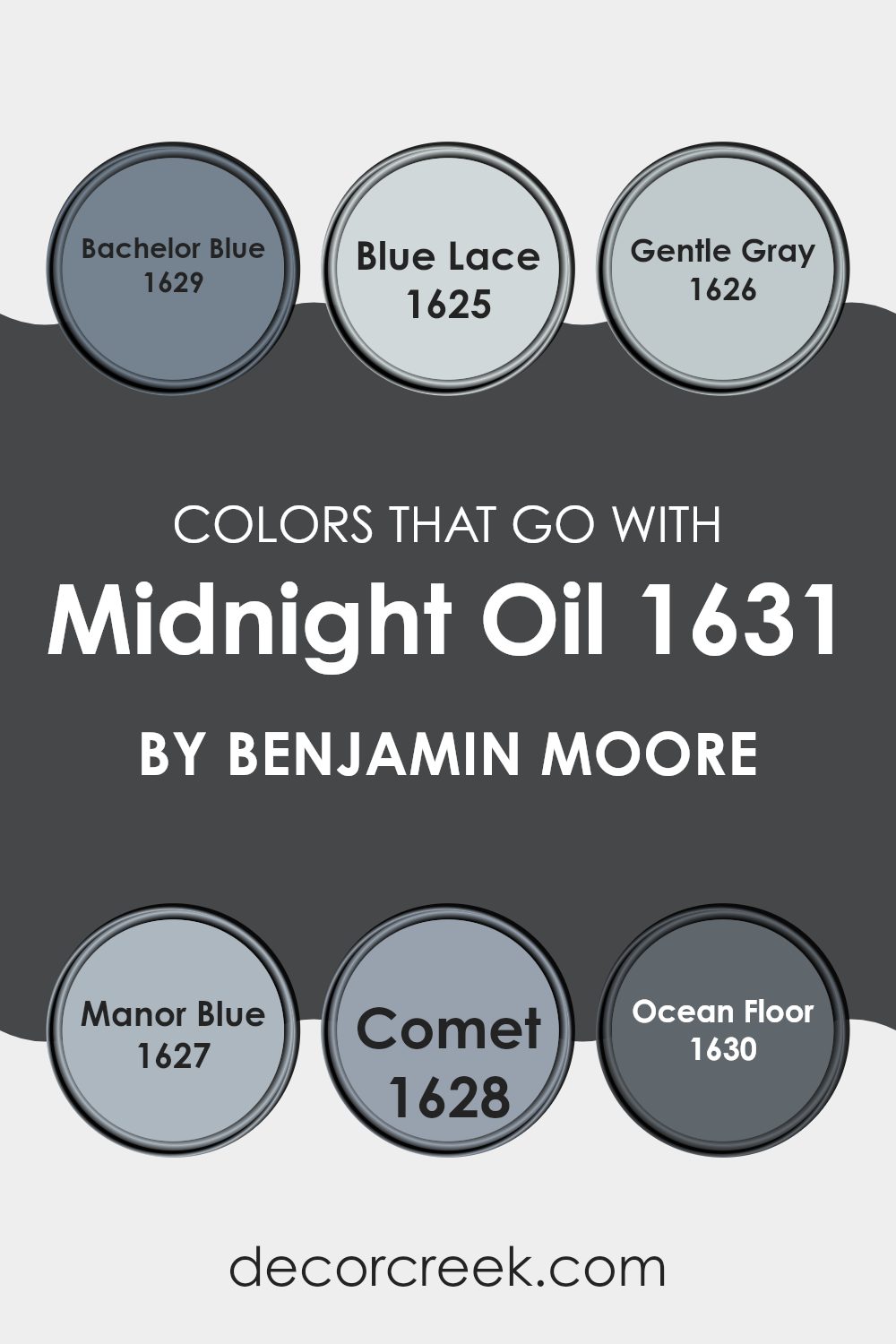
Colors that Go With Midnight Oil 1631 by Benjamin Moore
Choosing colors that complement Midnight Oil 1631 by Benjamin Moore is crucial because they help create a harmonious and appealing aesthetic in any living area. When paired correctly, these complementary colors enhance the deep and intense hue of Midnight Oil, which can make a room feel more inviting and balanced. For instance, using Bachelor Blue, a subtle blue with a hint of gray, provides a soft contrast that retains the coolness of the theme without overpowering the room.
Blue Lace offers a much lighter, almost airy touch, bringing brightness to areas that feature the darker midnight blue. Gentle Gray acts as a neutral, offering a bridge between lighter blues and the intense depth of Midnight Oil, making the area feel cohesive. Manor Blue, with a slightly stronger presence than Bachelor Blue, adds depth to the overall palette, enriching the environment.
Comet, on the other hand, introduces a stylish gray tone with a touch of blue, ensuring that the overall look remains connected and fluid. Lastly, Ocean Floor adds a grounding, earthy element with its deep gray-blue tone, anchoring the lighter shades and complementing the robust Midnight Oil. Together, these colors work to create a visually appealing and coherent area, where each hue contributes to a main theme but stands out on its own as well.
You can see recommended paint colors below:
- 1629 Bachelor Blue
- 1625 Blue Lace
- 1626 Gentle Gray
- 1627 Manor Blue
- 1628 Comet
- 1630 Ocean Floor
How to Use Midnight Oil 1631 by Benjamin Moore In Your Home?
Midnight Oil 1631 by Benjamin Moore is a deep, almost black blue that can give any room a rich and cozy feel. It’s a great choice for those looking to add depth and a hint of drama to their living areas.
One way to use it is on a feature wall in a bedroom or living room. This creates a strong focal point that draws attention and can make lighter colors or artwork stand out. It’s also ideal for a home office where a darker color might help focus and reduce glare on computer screens.
Additionally, painting cabinetry or shelves with Midnight Oil can refresh your kitchen or study without a complete renovation. This color pairs well with natural materials like wood or metal, enhancing their textures against its deep tone. If you’re not ready to commit to painting a whole wall, consider using it for smaller accents like a doorway or the backs of alcoves. With good lighting, this color can create a cozy and stylish atmosphere in your home.
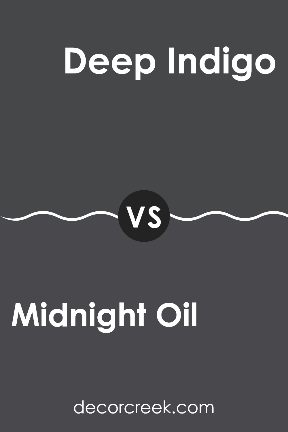
Midnight Oil 1631 by Benjamin Moore vs Deep Indigo 1442 by Benjamin Moore
Midnight Oil and Deep Indigo are both from Benjamin Moore’s color collection, but they offer distinct vibes due to their unique shades. Midnight Oil is a very dark, almost black color with a hint of navy blue that adds a bit of softness compared to a flat black. It works well in areas where you want depth and a bit of drama without the stark harshness black can sometimes have.
Deep Indigo, on the other hand, leans more towards a true dark blue. It’s noticeable that this color has a bluer base compared to Midnight Oil, giving it a cooler feel. This tone can make rooms feel more refreshing, while still keeping that rich, deep ambiance.
Both colors are excellent choices if you’re looking to create a moodier, more intense area. They differ in their undertones and the overall feel they lend to a room—Midnight Oil being slightly warmer and more subtle, while Deep Indigo offers a crisp coolness, making them suitable for different types of areas and design preferences.
You can see recommended paint color below:
Midnight Oil 1631 by Benjamin Moore vs Graphite 1603 by Benjamin Moore
Midnight Oil and Graphite, both by Benjamin Moore, are unique dark shades perfect for adding a strong and bold touch to any area. Midnight Oil has a deep blue undertone, making it reminiscent of a starry night sky.
This color would be excellent for creating a cozy, intimate feeling in a room. On the other hand, Graphite leans towards a charcoal gray, free of blue hues, giving it a clean and straightforward look. This makes it adaptable and fitting for a modern aesthetic that also aims to achieve a robust presence.
While both colors are dark, the subtle distinction in their undertones—blue for Midnight Oil and pure gray for Graphite—means that each can set a very different mood and work beautifully in different settings or alongside various decor styles. Whether used for accent walls or complete rooms, each brings its unique flair to interior areas.
You can see recommended paint color below:
- 1603 Graphite

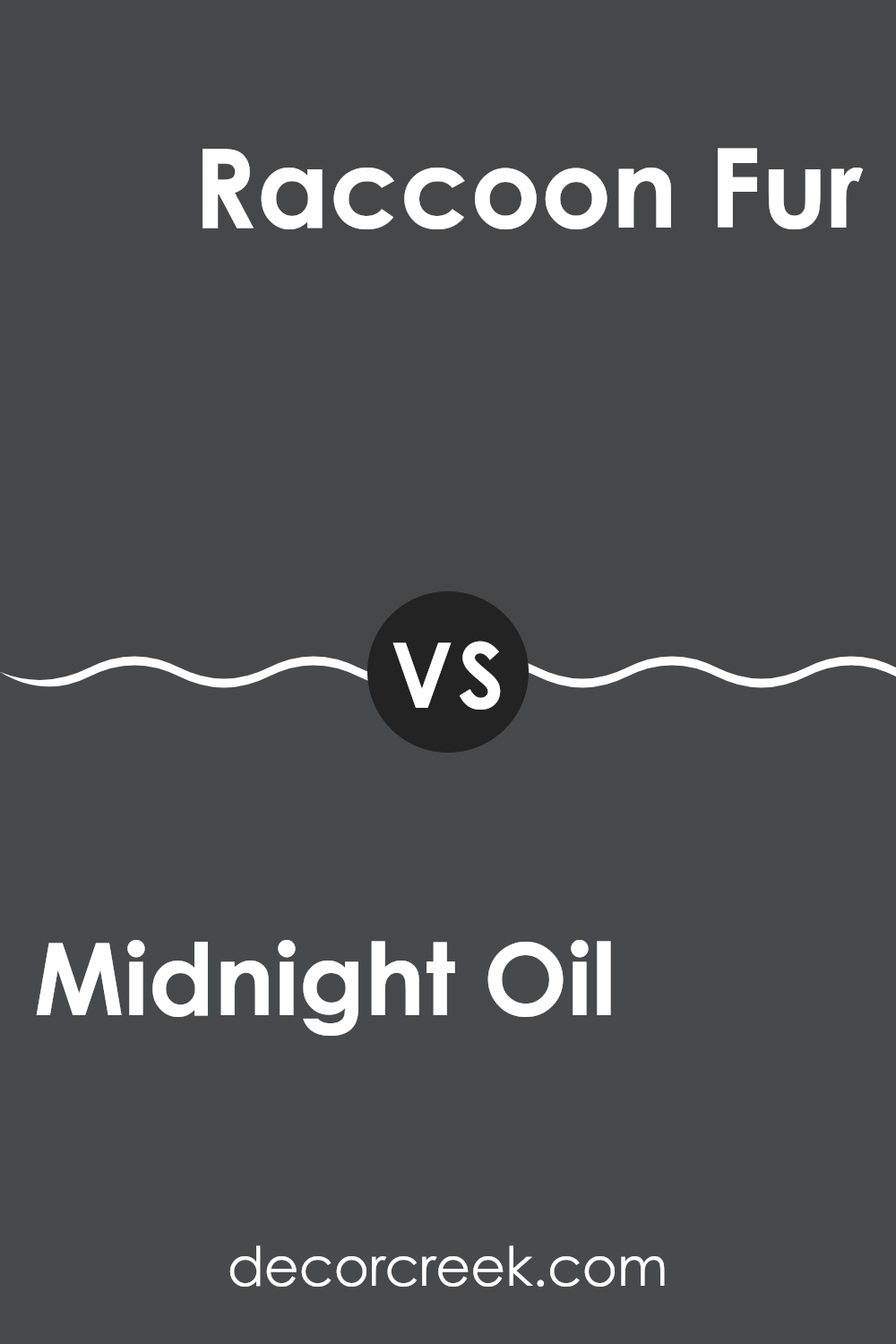
Midnight Oil 1631 by Benjamin Moore vs Raccoon Fur 2126-20 by Benjamin Moore
Midnight Oil and Raccoon Fur, both by Benjamin Moore, offer unique shades for adding depth and moodiness to an area. Midnight Oil has a deep blue tone, almost bordering on black, which gives it a strong, impactful presence.
This color can make small areas feel cozier and larger ones more dramatic. On the other hand, Raccoon Fur, while still in the dark spectrum, leans towards a softer gray with undertones of blue. It’s less intense than Midnight Oil, making it a bit more adaptable for various areas.
Raccoon Fur can work well in places where you want a dark color that isn’t too overpowering. Both colors are great for creating a modern look in your home, but your choice will depend on how bold or subtle you want the final impact to be.
You can see recommended paint color below:
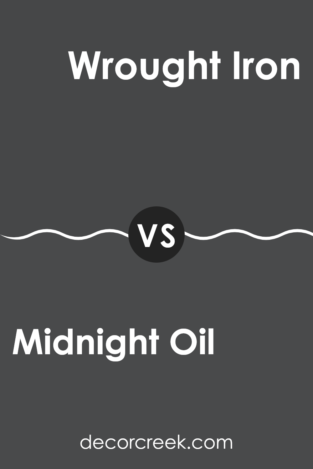
Midnight Oil 1631 by Benjamin Moore vs Wrought Iron 2124-10 by Benjamin Moore
Midnight Oil and Wrought Iron, both from Benjamin Moore, are two shades that exude a strong presence. Midnight Oil is a deep navy, almost leaning towards black, giving it a very strong, powerful look.
It feels very modern and can make any area feel more stylish and bold. On the other hand, Wrought Iron is a softer black with hints of gray. It’s less intense than Midnight Oil but still provides a sense of strength and reliability.
Both colors are great for making a statement in a room but in different ways. Midnight Oil tends to stand out more, drawing your eye immediately, while Wrought Iron is subtler, blending more smoothly into its surroundings. These shades can work beautifully together or separately, depending on how striking you want your color theme to be.
You can see recommended paint color below:
After researching and studying the color 1631 Midnight Oil by Benjamin Moore, I have to say, I’m quite impressed. This paint is more than just a basic shade of navy. It’s rich and deep, and it feels like looking into a starry night sky. When applied to the walls of a room, Midnight Oil creates a soothing and cozy atmosphere, perfect for areas where you want to relax or feel comforted. It can also make rooms look a bit more chic and stylish, which is great for places where people gather like living rooms or dining areas.
One exciting thing about Midnight Oil is how well it goes with different decorations and furniture. Whether your home is filled with modern pieces or cozier, more traditional items, this color seems to fit right in. It acts like a dark canvas, allowing other colors, like bright pillows or light furniture, to pop and catch your eye.
Using Midnight Oil in my own home taught me how a single change, like a new paint color, can really refresh a room’s look without the need to change everything else. It’s proof that something as simple as a quality coat of paint can make you feel good about your living area.
Overall, I would definitely recommend anyone considering a new look for their home to give this color a try. It’s not just paint; it’s a mood enhancer!
Ever wished paint sampling was as easy as sticking a sticker? Guess what? Now it is! Discover Samplize's unique Peel & Stick samples.
Get paint samples

