When you’re deciding on a paint color for your next home project, consider SW 6089 Grounded by Sherwin Williams. As a color, it’s an earthy brown that brings a sense of warmth and comfort to any room. It’s particularly attractive for rooms where you want to create a cozy, inviting atmosphere, like living rooms or bedrooms.
Often, finding the perfect shade of brown can be challenging; they can either be too dark, tipping into a blackish tone, or too light, losing that touch of grounding earthiness you might be looking for.
Grounded hits that sweet middle spot—rich but not overpowering, creating a perfect backdrop for both bold and muted furnishing choices.
Using Grounded could be a refreshing change if you’re used to opting for more traditional neutrals like grays and creams. It pairs beautifully with a wide range of colors, enabling you to maintain flexibility in your decor choices.
Whether you lean towards vibrant hues or more restrained tones, this color supports a diverse palette.
Want a tip? Try it in a room with good natural light to enhance its warm undertones.
This could be just the right paint to bring a comforting sense of stability to your home’s aesthetics.
What Color Is Grounded SW 6089 by Sherwin Williams?
The color Grounded by Sherwin Williams is a rich, deep brown that evokes a sense of warmth and comfort. This flexible shade functions beautifully across a variety of rooms, providing a cozy, inviting atmosphere. Its earthy tone makes it an ideal choice for those looking to create a natural, rustic vibe in their home.
Grounded works exceptionally well in interior styles that lean towards rustic, traditional, or country decor. It creates a soothing backdrop in living rooms or bedrooms and adds depth and warmth when used in dining areas. This color can also be applied effectively in more modern settings, particularly when paired with contemporary art and sleek furniture, offering a striking contrast that enhances the overall aesthetic of the room.
When coordinating materials and textures with Grounded, consider pairing it with natural wood, whether it’s dark walnut furniture or lighter, sandy oak floors, which will complement its deep brown hue. Adding elements like soft leather, creamy linen, or plush wool also works well, providing a tactile contrast that feels luxurious.
Metallic accents, particularly in copper or bronze, can add a touch of glamour to the earthy base provided by Grounded, rounding out the room with a harmonious balance of textures and colors.
Is Grounded SW 6089 by Sherwin Williams Warm or Cool color?
Grounded SW 6089 by Sherwin Williams is a rich, warm, and earthy hue that falls into the category of terracotta or deep beige. Its warm undertones make it a flexible and inviting color for any home. When used in living rooms, it creates a cozy and welcoming atmosphere, perfect for rooms where comfort is key such as living rooms or bedrooms.
Its neutrality means it pairs beautifully with a variety of decor styles and colors, from rustic woods and natural materials to more modern or minimalist furnishings. In smaller rooms, Grounded can make the area feel more intimate and protected, while in larger rooms, it helps to pull together disparate elements for a cohesive look.
Additionally, being a muted yet deep color, it helps hide imperfections on walls better than lighter shades, making it practical as well as visually appealing. This color is particularly useful for those looking to add warmth to their home without overpowering the senses with brighter colors.
Undertones of Grounded SW 6089 by Sherwin Williams
Grounded SW 6089 by Sherwin Williams is a unique paint color that brings a mix of subtle tones to any room. This color has a variety of undertones that can influence the mood and appearance of a room depending on the lighting and accompanying decor.
An undertone is a hint of color that affects the main hue subtly, often visible more under certain lighting conditions or when placed next to other colors. The primary undertones in this paint are brown, grey, and purple along with hints of dark green and dark turquoise. These undertones all contribute to making the room feel more cozy and inviting.
When applied to interior walls, Grounded SW 6089 creates a dynamic visual effect. During the day, as natural light changes, the color shifts subtly, sometimes appearing more brownish, reflecting a warm, earthy vibe, or showing more of its grey and purple undertones, providing a cooler, more neutral look.
The complex mix also includes touches of colors like orange, navy, and red which can pop under artificial lighting, adding depth and warmth to rooms. Conversely, undertones like dark grey and dark green might stand out in rooms with lots of natural plants or metallic fixtures, integrating seamlessly with both modern and traditional decor.
The flexibility of Grounded SW 6089 makes it an excellent choice for walls as it can complement a variety of styles and settings, bringing a dynamic and layered look to any interior room.
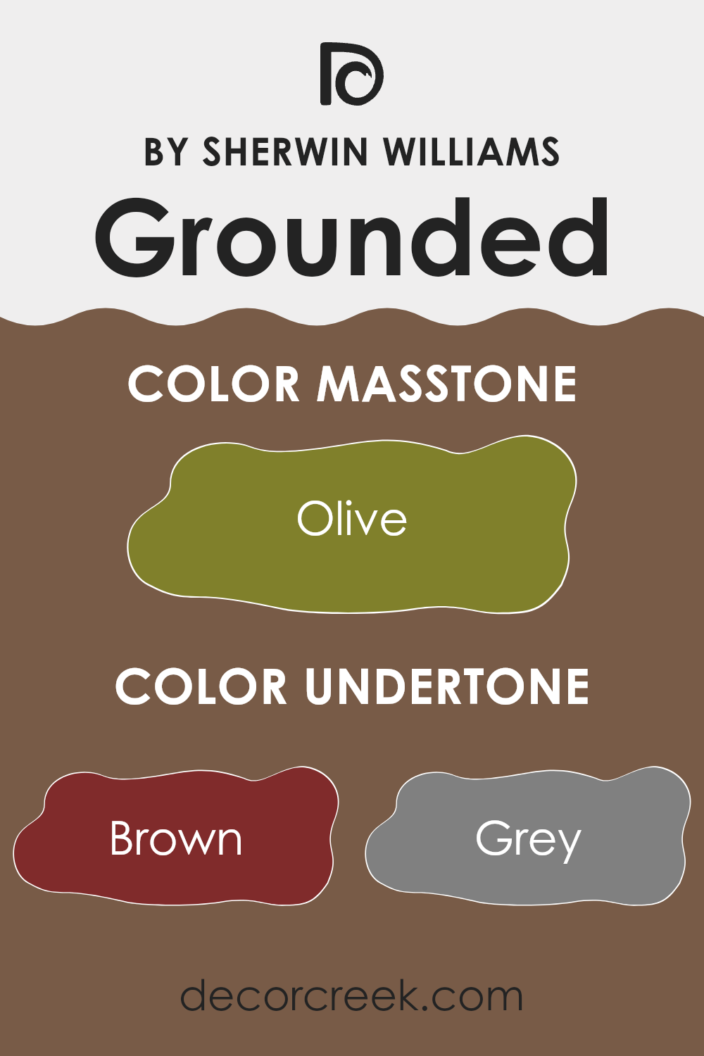
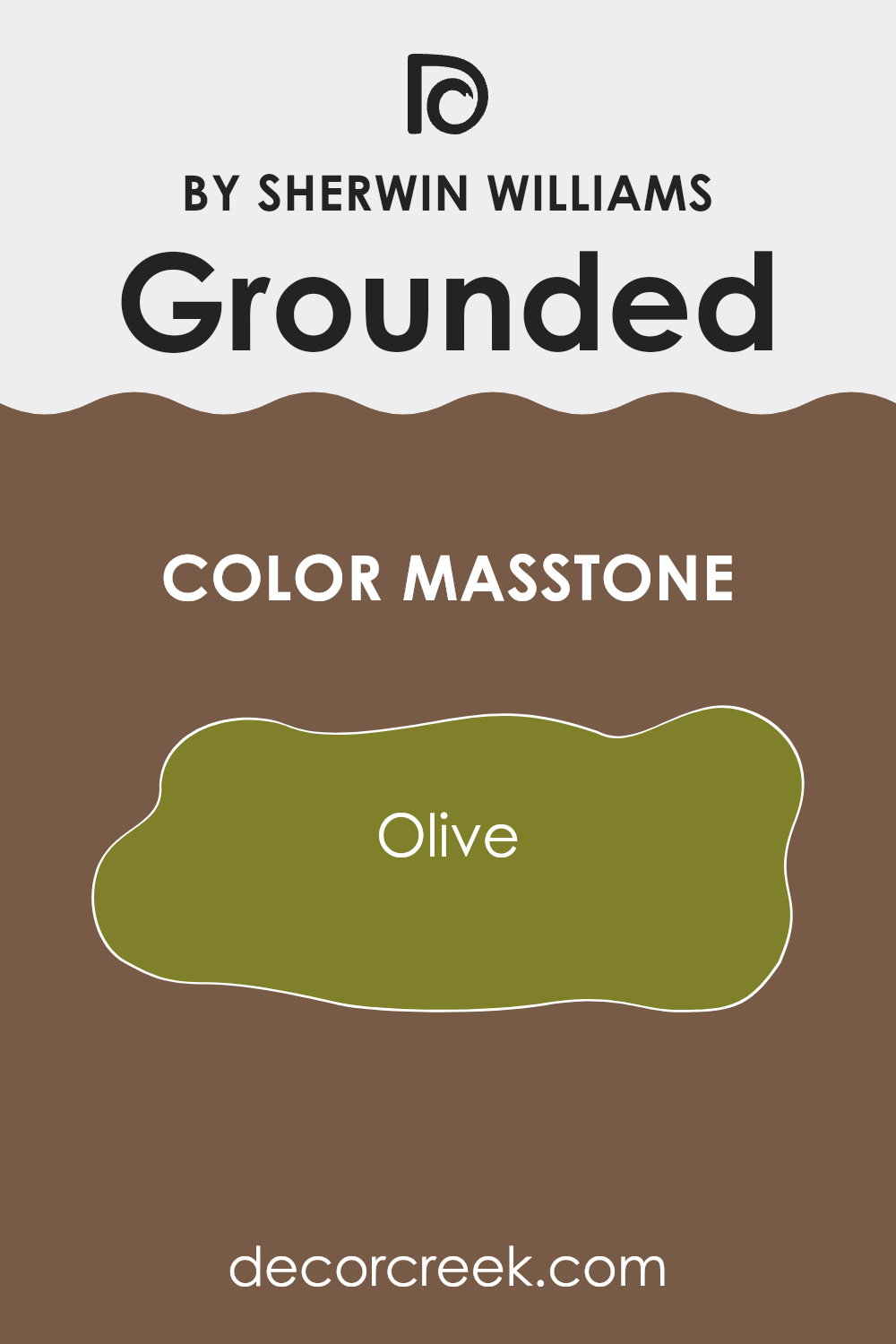
What is the Masstone of the Grounded SW 6089 by Sherwin Williams?
Grounded SW 6089 by Sherwin Williams has a masstone of olive, a rich, deep green with earthy brown undertones. When you use this paint in your home, it gives rooms a cozy and warm feeling. The olive tone is neutral enough to work well with many other colors, making it a flexible choice for decorating.
You can pair it with lighter creams or whites to make it stand out, or with darker woods for a more subtle, integrated look. This color is especially good for rooms where you want a calm and welcoming atmosphere, like living rooms or bedrooms.
It doesn’t overpower the room but adds depth and character. Also, this shade of green can help bring a bit of nature indoors, creating a connection to the outdoors which is refreshing and relaxing. The earthy vibe of olive makes it a great choice for those who prefer a more grounded and homey environment.
How Does Lighting Affect Grounded SW 6089 by Sherwin Williams?
Lighting plays a crucial role in how we perceive colors. Depending on the type of light—a sunny day, a cloudy sky, or different artificial lights—the same paint can look quite different. The color in question, a warm, earthy hue, shows how varying lighting conditions can impact the perception of colors.
In natural light, colors often appear in their truest form. For this specific color, when illuminated by natural sunlight, it looks warm and inviting. It brings a cozy, comforting vibe to the room, making it ideal for rooms where a welcoming atmosphere is desired.
Artificial light, however, can influence the way we see this color in different ways. Under warm, incandescent lighting, the color will appear richer and deeper, enhancing its warm undertones. On the other hand, fluorescent lighting tends to emit a bluish tone, which can make this already cool-toned color appear cooler, possibly muting its warmth slightly.
Room orientation also affects lighting and therefore color perception:
- North-faced rooms: These rooms get less direct sunlight, often resulting in a cooler, more shadowed room. This color used in north-facing rooms might appear slightly darker and less warm, giving off a more muted earthy tone.
- South-faced rooms: With ample sunlight throughout the day, south-facing rooms can make this color truly shine, by enhancing its warmth and earthiness. It’s probably at its best in these rooms, feeling brighter and more open.
- East-faced rooms: In the morning, east-facing rooms are filled with warm, bright sunlight, making the paint look vibrant and warm early in the day. However, it might appear cooler and duller in the afternoon and evening.
- West-faced rooms: This room benefits from the warm, golden light of the setting sun, so in the afternoon and evening, the paint will have a warm, glowing appearance, while it may appear less lively in the mornings.
Understanding how light affects color can help in making informed decisions about paint choices to achieve the desired effect in each room.
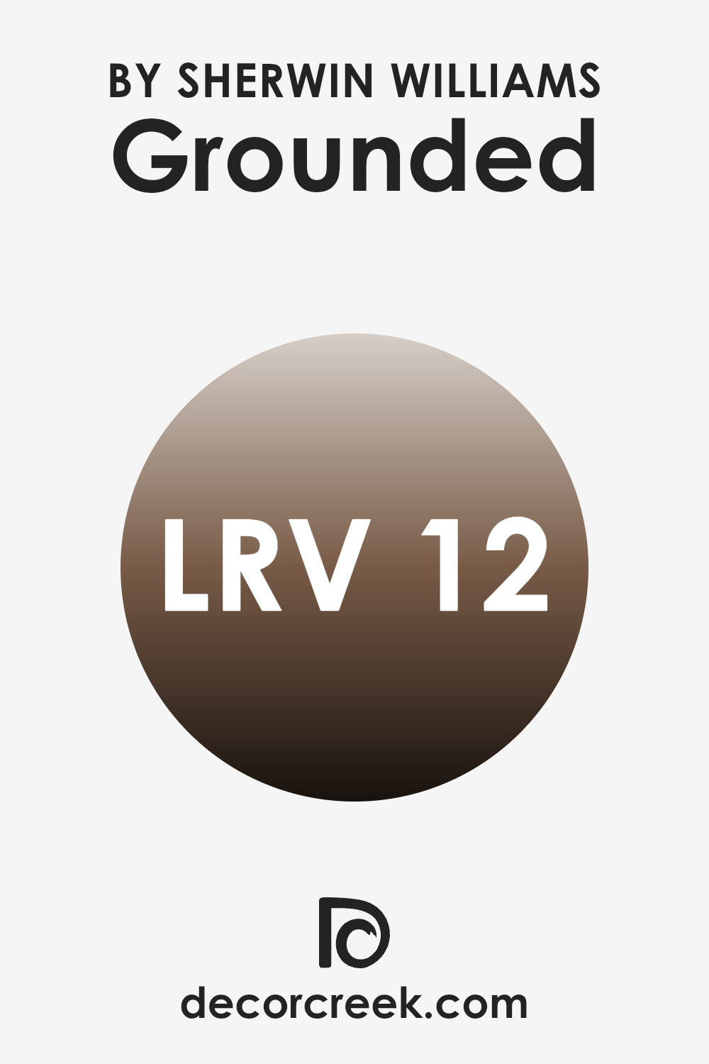
What is the LRV of Grounded SW 6089 by Sherwin Williams?
LRV stands for Light Reflectance Value, a measure that tells us how much light a paint color reflects back into a room, compared to how much it absorbs. An LRV scale runs from zero, which means no light is reflected and the surface appears perfectly black, to a high end where nearly all light is reflected, making the surface effectively appear white.
This measurement is crucial when choosing paint colors for a room because it affects how bright or dark a room feels. A higher LRV can make a room feel airier and more open, while a lower one can render it cozier but potentially gloomier if not well-lit.
The LRV of Grounded (SW 6089) is 11.928, positioning it on the lower end of the scale. This means it’s a dark color that absorbs more light than it reflects. A color with such a low LRV can make a smaller room feel more enclosed or smaller than it is, especially with limited natural light.
In ample rooms or rooms with plenty of natural or artificial light, the richness of Grounded can add a sense of warmth and depth, making it ideal for creating a more intimate atmosphere. Overall, when using this color, it’s important to consider lighting and the room’s natural features to ensure the room doesn’t end up feeling too dark.
decorcreek.com
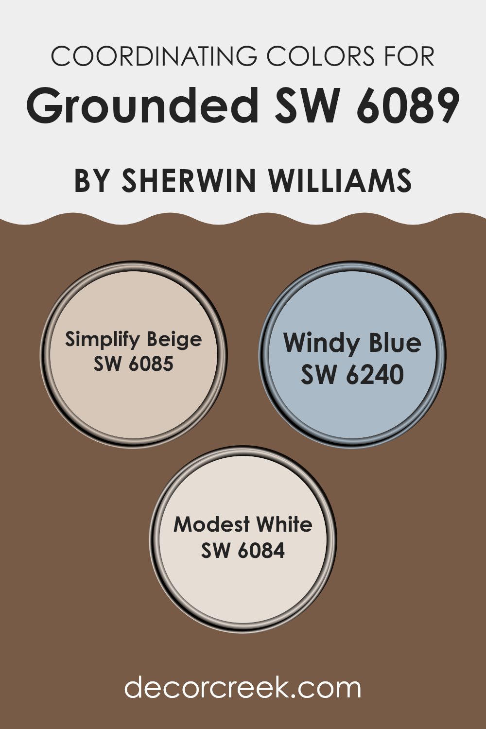
Coordinating Colors of Grounded SW 6089 by Sherwin Williams
Coordinating colors are complementary tones that work well with a primary color to enhance the overall aesthetic of a room. When using a base color like Sherwin Williams’ Grounded, a rich, warm neutral, it’s important to select coordinating hues that balance or complete the room’s color scheme. Paint manufacturers often suggest these colors to help create a cohesive look. They can really pull a room together, making it feel well-thought-out and pleasing to the eye.
For instance, Simplify Beige by Sherwin Williams is a soft and mellow beige that acts as a gentle complement to the richer tones of Grounded. It provides a lighter backdrop that can help the darker shades pop while maintaining a warm and inviting atmosphere.
Windy Blue, another suggested coordinate, is a cooler tone, offering a refreshing contrast that can add a breath of freshness to a room anchored by Grounded. Lastly, Modest White is a clean, crisp white that offers a stark but appealing contrast, brightening areas where deeper colors dominate and creating rooms that feel more open and airy.
You can see recommended paint colors below:
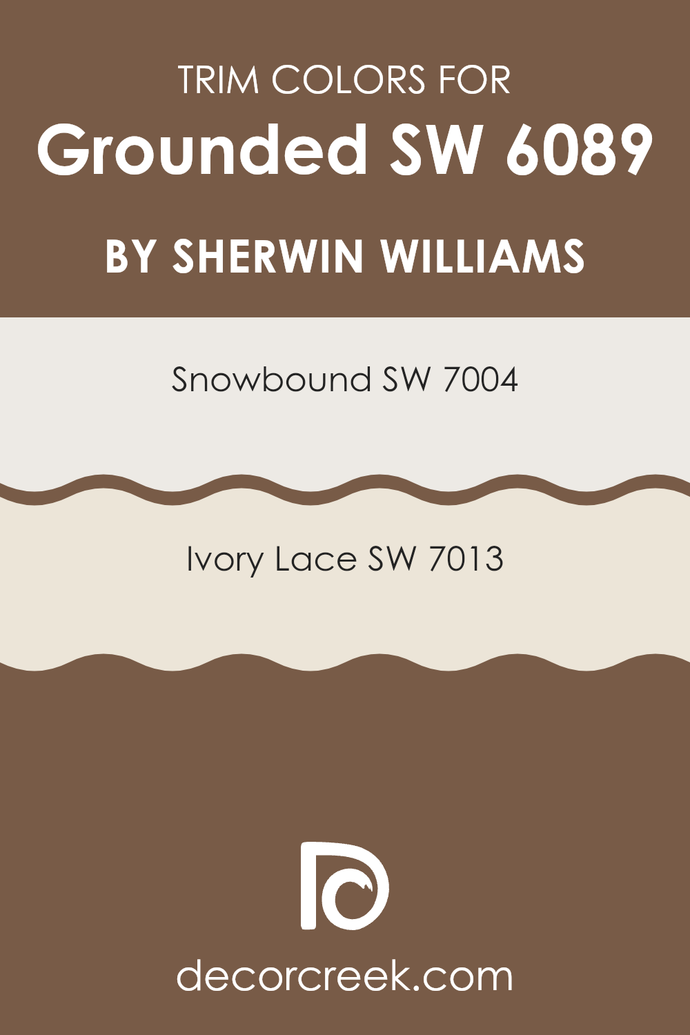
What are the Trim colors of Grounded SW 6089 by Sherwin Williams?
Trim colors are specific shades used to accentuate and define the edges, corners, door frames, and window sills of a room, setting off the main wall colors and enhancing the overall look of a room. When paired with Grounded (SW 6089) by Sherwin Williams, a rich and earthy hue, choosing the right trim color is crucial for achieving a harmonious balance.
Snowbound (SW 7004) and Ivory Lace (SW 7013) are excellent options for trims as they both offer a subtle contrast to Grounded’s deeper tones, brightening the room while keeping a natural flow. Snowbound (SW 7004) is a warm and light off-white with soft undertones that make it a perfect neutral for trimming.
It clearly outlines architectural details without overpowering the depth of Grounded. On the other hand, Ivory Lace (SW 7013) brings a slightly creamier touch that harmonizes beautifully with warmer colors and enriches the room with a gentle, welcoming vibe. Using these colors as trims not only defines the structure but also adds a refreshing layer to the overall aesthetic, ensuring the room feels balanced and thoughtfully designed.
You can see recommended paint colors below:
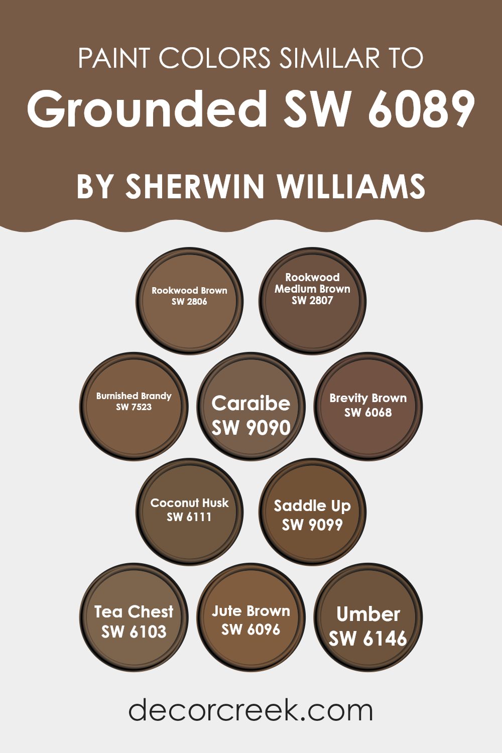
Colors Similar to Grounded SW 6089 by Sherwin Williams
When looking at decorating or design, using similar colors creates a harmonious and aesthetically pleasing effect. Colors such as SW 2806 Rookwood Brown and SW 2807 Rookwood Medium Brown are deep, rich browns that provide a solid foundation for any decor, giving a feeling of stability and warmth, which is perfect for creating a cozy room.
Colors like SW 7523 Burnished Brandy and SW 9090 Caraibe add a touch of elegance with their slightly reddish and deep ocean blue tones, respectively, allowing for dynamic yet cohesive interiors when used with similar shades.
On the other hand, browns like SW 6068 Brevity Brown and SW 6111 Coconut Husk are lighter, adding a subtle contrast while still blending smoothly with darker shades like SW 9099 Saddle Up and SW 6103 Tea Chest. These duo’s play off each other’s strengths effectively, increasing the depth and complexity of the room’s overall look.
Additionally, for those who prefer something between dark and light, SW 6096 Jute Brown and SW 6146 Umber are excellent mid-toned options. They provide a bridge between the darker and lighter hues, ensuring a smooth visual transition and maintaining the color scheme’s overall warmth and welcoming feel.
You can see recommended paint colors below:
- SW 2806 Rookwood Brown
- SW 2807 Rookwood Medium Brown
- SW 7523 Burnished Brandy
- SW 9090 Caraibe
- SW 6068 Brevity Brown
- SW 6111 Coconut Husk
- SW 9099 Saddle Up
- SW 6103 Tea Chest
- SW 6096 Jute Brown
- SW 6146 Umber
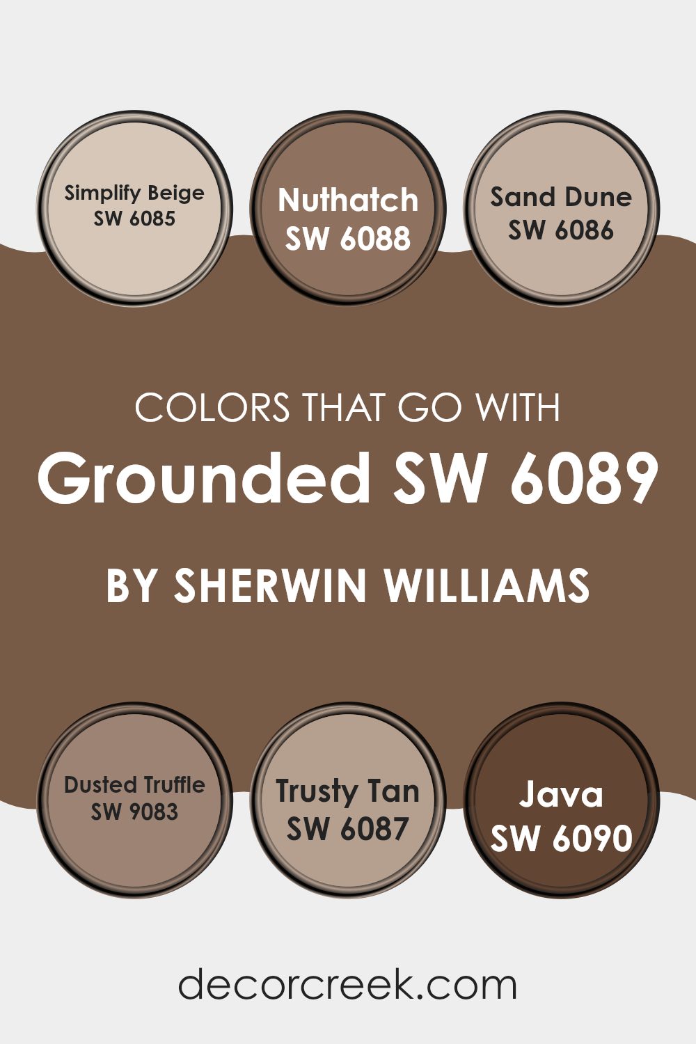
Colors that Go With Grounded SW 6089 by Sherwin Williams
Choosing colors that harmonize with Grounded SW 6089 by Sherwin Williams is essential for creating a cohesive and appealing color scheme in your room. Each complementary color plays a specific role, ensuring that the complete look is balanced and visually pleasing.
For instance, Simplify Beige SW 6085 is a gentle and light beige that adds a soft contrast to Grounded, making rooms feel warm and inviting. Nuthatch SW 6088 offers a deeper, gray-brown hue which provides a robust contrast and can help in making features stand out or add depth to a room.
Further, Sand Dune SW 6086 has an earthy, muted tone which works beautifully to create a soothing and grounded environment that pairs well with the solidity of Grounded. Dusted Truffle SW 9083 brings a more intense, dark gray-brown shade that is perfect for accent walls or highlighting architectural features, lending a touch of drama without overpowering the room.
Trusty Tan SW 6087, similar to Simplify Beige but with a slightly richer tone, works seamlessly to craft smooth transitions between the bolder shades. Lastly, Java SW 6090 is a rich and dark coffee color that adds an element of luxury and depth, perfect for adding weight and definition where required. All these colors together ensure that any room feels harmonious, balanced, and visually appealing.
You can see recommended paint colors below:
- SW 6085 Simplify Beige
- SW 6088 Nuthatch
- SW 6086 Sand Dune
- SW 9083 Dusted Truffle
- SW 6087 Trusty Tan
- SW 6090 Java
How to Use Grounded SW 6089 by Sherwin Williams In Your Home?
Grounded SW 6089 by Sherwin Williams is a rich, warm brown paint that brings a cozy and welcoming feel to any room. Its earthy tones make it a perfect choice for those looking to create a comfortable and inviting atmosphere in their home.
This color works well in living rooms or bedrooms, where it adds depth and a sense of comfort. Because it’s a neutral shade, it pairs beautifully with various colors, from soft creams and whites to vibrant teals and greens, allowing for flexible design choices.
Additionally, Grounded is an excellent choice for furniture pieces or accent walls, giving rooms a modern yet homey touch. It also looks great on exterior surfaces, enhancing curb appeal by complementing natural outdoor elements. Whether you’re painting a whole room or just adding a few touches here and there, Grounded can help make your room feel put-together and cozy.
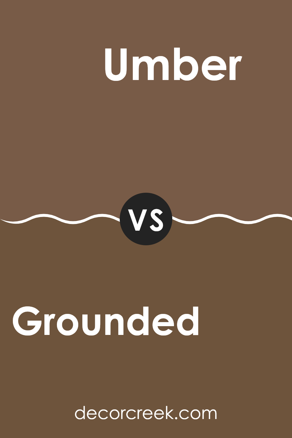
Grounded SW 6089 by Sherwin Williams vs Umber SW 6146 by Sherwin Williams
Grounded SW 6089 and Umber SW 6146, both by Sherwin Williams, offer distinct yet harmonious earthy tones suitable for various rooms. Grounded is a soft, muted brown with a sandy touch, making it great for creating a cozy and welcoming atmosphere.
It reflects warmth and comfort, ideal for living rooms or bedrooms where you want a relaxed vibe. In contrast, Umber is a darker shade that leans towards a richer, deeper brown.
This color has a strong presence and can add depth and grounding to a room, suitable for accent walls or in areas where you want to make a statement without overpowering. Together, these two colors can complement each other well, with Umber providing depth and Grounded bringing softness, both contributing to an overall harmonious look.
You can see recommended paint color below:
- SW 6146 Umber
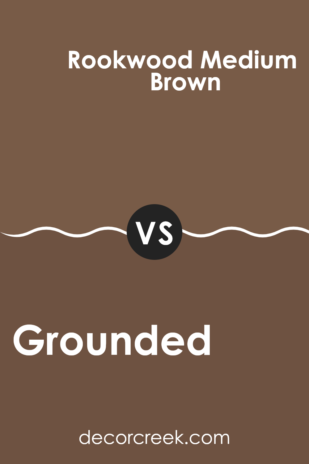
Grounded SW 6089 by Sherwin Williams vs Rookwood Medium Brown SW 2807 by Sherwin Williams
Grounded SW 6089 by Sherwin Williams is a rich, warm brown that creates a cozy and inviting atmosphere in any room. This shade exudes an earthy, natural feel that is both comforting and grounding, making it great for living areas and bedrooms.
On the other hand, Rookwood Medium Brown SW 2807, also by Sherwin Williams, is darker and more intense. It has a deep, robust quality that makes it ideal for creating a strong presence in a room. This color works well in rooms where a more dramatic, assertive feel is desired, like in dining rooms or home offices.
While both colors share a brown base, Grounded is lighter and tends to blend seamlessly with surroundings, offering a softer impact. Rookwood Medium Brown offers a bolder statement, standing out more distinctly against other elements in a room. Choosing between them depends on the mood and utility of the room, with Grounded offering a gentle warmth and Rookwood providing a more striking visual.
You can see recommended paint color below:
- SW 2807 Rookwood Medium Brown
Grounded SW 6089 by Sherwin Williams vs Saddle Up SW 9099 by Sherwin Williams
Grounded SW 6089 is a deep, earthy brown with a hint of understated warmth, reminiscent of rich soil or a hearty tree bark. This color lends a cozy and welcoming vibe to any room, making it especially suitable for living rooms or dens where a rustic, comforting atmosphere is desired.
On the other hand, Saddle Up SW 9099 takes a lighter approach to brown. It’s a bit less intense than Grounded and features a beige or sandy undertone that suggests an open, airy feeling. This lighter, softer brown works beautifully in rooms where you want a gentle touch of warmth without the heavier, darker feel of Grounded.
Together, Grounded offers depth and solidity, while Saddle Up provides a gentle breath of freshness, making each suitable for different moods and settings within a home.
You can see recommended paint color below:
- SW 9099 Saddle Up
Grounded SW 6089 by Sherwin Williams vs Caraibe SW 9090 by Sherwin Williams
Grounded SW 6089 by Sherwin Williams is a warm, deep brown shade that gives a cozy, earthy feel to any room. It has a rich, inviting tone that pairs well with natural textures and materials like wood or stone. This color works great in rooms where you want to create a snug and welcoming atmosphere.
In contrast, Caraibe SW 9090 is a vibrant teal that adds a fresh, lively splash of color. This shade is both cool and refreshing, making it perfect for energizing a room or adding a focal point through an accent wall. It’s particularly effective in rooms where you might want to stimulate creativity and openness, like in a home office or a creative room.
While both colors are from Sherwin Williams and offer unique appeal, Grounded is more about warmth and depth, whereas Caraibe is about vibrancy and energy, offering distinct choices depending on what mood or style you want to achieve in your design.
You can see recommended paint color below:
- SW 9090 Caraibe
Grounded SW 6089 by Sherwin Williams vs Jute Brown SW 6096 by Sherwin Williams
Grounded SW 6089 by Sherwin Williams is a warm, deep brown that gives off a cozy and inviting vibe, great for rooms where you want to feel relaxed and at ease. Its rich tone can help make large rooms feel more intimate and welcoming.
On the other hand, Jute Brown SW 6096 is slightly lighter and leans towards a more natural, earthy brown. This color is flexible; it works well in both bright and dim lighting, making it suitable for various rooms in your home.
Although both shades are brown, Grounded is darker and more intense, creating a stronger sense of warmth and comfort, while Jute Brown provides a softer and more neutral background, ideal for highlighting other decor elements in a room. Both colors pair well with natural materials, like wood and stone, enhancing the organic feel of a room.
You can see recommended paint color below:
- SW 6096 Jute Brown
Grounded SW 6089 by Sherwin Williams vs Tea Chest SW 6103 by Sherwin Williams
Grounded SW 6089 by Sherwin Williams is a rich, deep brown that offers a sense of stability and strength. It has a natural, earthy feel, making it a great choice for rooms where a calm and grounded atmosphere is desired.
On the other hand, Tea Chest SW 6103 is another warm brown but with a slightly redder undertone. This shade is a bit lighter than Grounded and provides a cozy, inviting ambiance. It’s especially suitable for living rooms or bedrooms where you want to create a welcoming and comfortable environment.
These colors, while similar, have distinct differences in tone and mood. Grounded is darker and more intense, making a strong statement, while Tea Chest is gentler and easier to pair with a variety of decor styles.
You can see recommended paint color below:
- SW 6103 Tea Chest
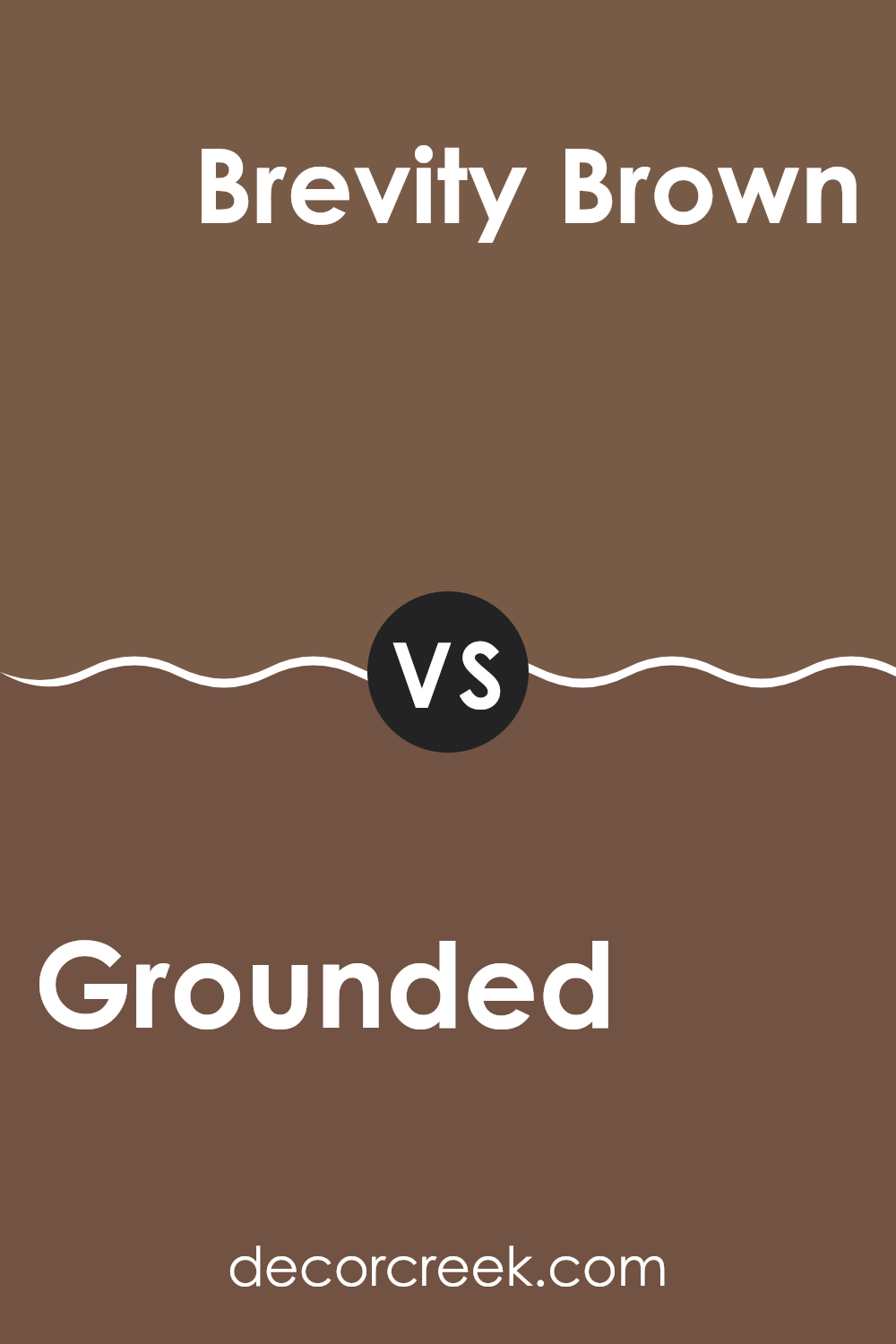
Grounded SW 6089 by Sherwin Williams vs Brevity Brown SW 6068 by Sherwin Williams
Grounded SW 6089 and Brevity Brown SW 6068 from Sherwin Williams are both warm, inviting browns, but they show some subtle differences. Grounded has a deeper, richer hue, leaning more towards a classic chocolate brown. This makes it a great choice for creating cozy, welcoming rooms.
On the other hand, Brevity Brown has a lighter, more muted appearance, which offers a softer vibe to a room. It’s close to a taupe, blending gray and brown, and works well in rooms you want to keep neutral but warm.
Both colors are flexible and fit well in various decor styles, from modern to rustic. However, Grounded might be better suited for larger areas or as an accent wall due to its bolder nature, while Brevity Brown could be excellent for overall wall color in rooms where you want a more subdued feel.
You can see recommended paint color below:
- SW 6068 Brevity Brown
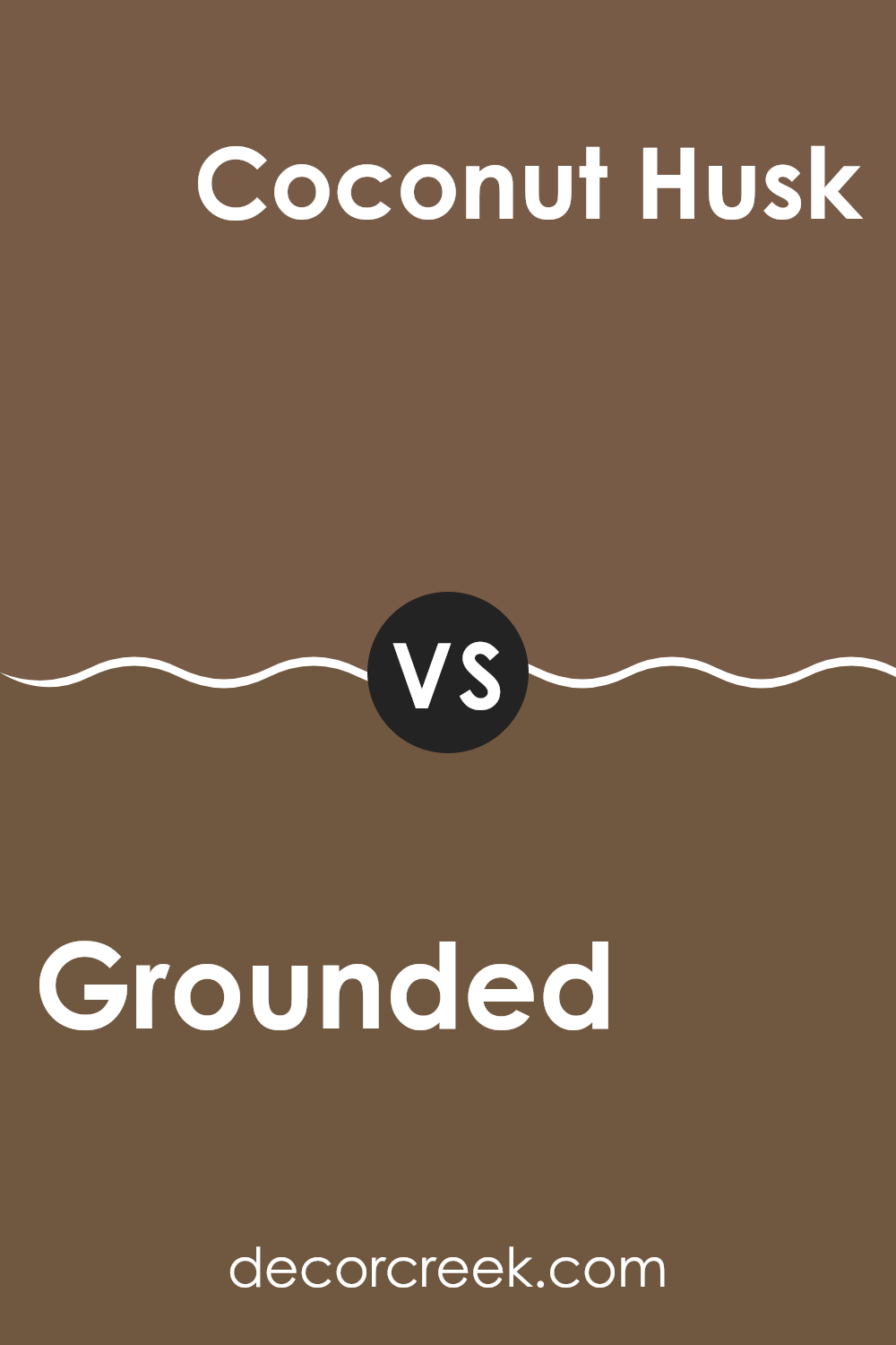
Grounded SW 6089 by Sherwin Williams vs Coconut Husk SW 6111 by Sherwin Williams
Grounded and Coconut Husk are two paint colors from Sherwin Williams. Grounded is a deep, warm taupe that adds a cozy feel to rooms. Its muted brown tone makes it flexible for rooms that need a touch of warmth and depth. On the other hand, Coconut Husk is slightly darker and has more of a chocolate brown shade.
It provides a richer, earthier feel than Grounded and is ideal for creating a strong, comforting atmosphere in any room. When comparing the two, Grounded is lighter and can make small rooms appear larger, whereas Coconut Husk, with its deeper tone, is better for larger rooms or accent walls where a bolder statement is desired.
Both colors have a natural vibe, making them perfect for homes that favor earthy, nature-inspired themes. The choice between them depends on the specific mood you want to set and how much light your room receives.
You can see recommended paint color below:
- SW 6111 Coconut Husk
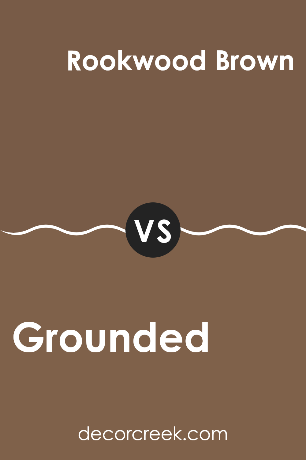
Grounded SW 6089 by Sherwin Williams vs Rookwood Brown SW 2806 by Sherwin Williams
Grounded (SW 6089) and Rookwood Brown (SW 2806) are two distinct paint colors offered by Sherwin Williams. Grounded, as suggested by its name, has a warm, earthy tone. It’s a medium-dark brown with noticeable hints of red and orange, giving it a cozy and inviting appearance. This color works well in rooms where you want to create a snug and comfortable feel, such as living rooms or reading nooks.
On the other hand, Rookwood Brown is a deeper, more robust shade. It leans more towards a traditional dark brown without the prominent reddish undertones found in Grounded. It’s a rich color that provides a strong presence in a room, making it ideal for accent walls or areas where you want to establish a sense of depth and richness.
Both colors contribute to a warm palette, but Rookwood Brown offers a more intense and classic brown look, while Grounded brings a softer, more approachable vibe. These colors can complement each other in a room, with Rookwood Brown acting as a powerful anchor and Grounded offering a gentler contrast.
You can see recommended paint color below:
- SW 2806 Rookwood Brown
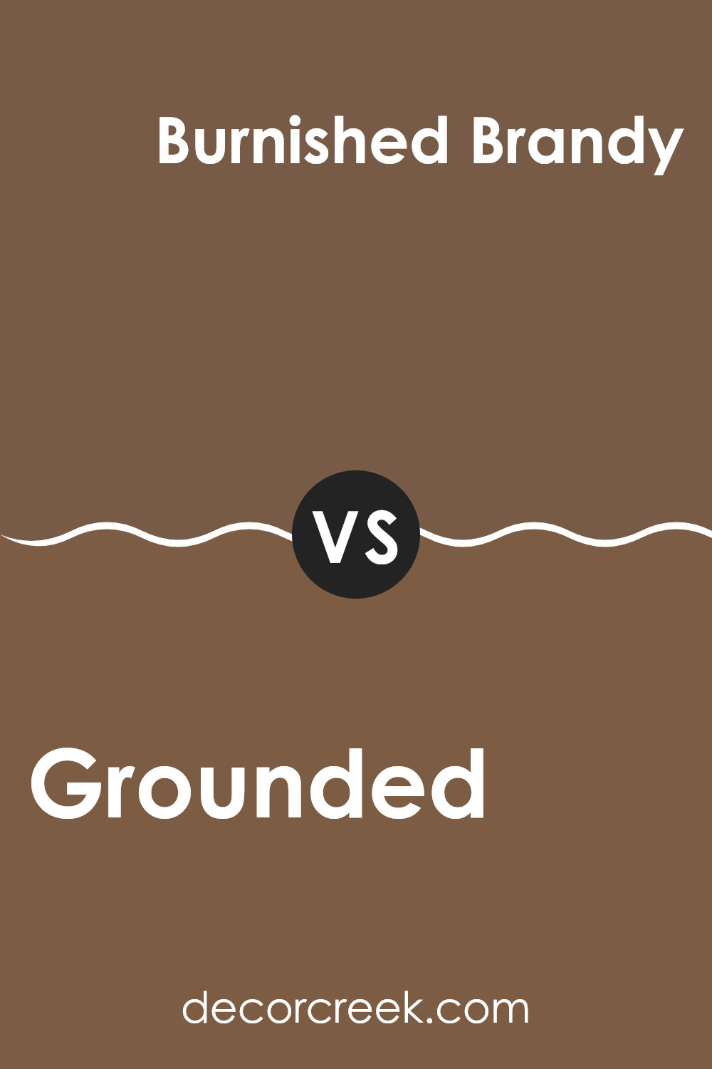
Grounded SW 6089 by Sherwin Williams vs Burnished Brandy SW 7523 by Sherwin Williams
Grounded SW 6089 and Burnished Brandy SW 7523, both by Sherwin Williams, offer distinct tones that can significantly affect the mood of a room. Grounded is a deep brown with a rich, earthy quality that can make a room feel warm and welcoming. It’s ideal for those looking to create a cozy and comfortable atmosphere in their home.
On the other hand, Burnished Brandy has a reddish tint, giving it a warmer feel compared to Grounded. This color can add a touch of warmth and can be quite inviting in a living room or dining area. Both colors are fairly deep and intense, making them suitable for accent walls or for bringing some warmth to a neutrally decorated room.
In terms of coordination, both can pair well with softer hues like creams or light grays, which can help balance their intensity. Whether one chooses Grounded or Burnished Brandy could depend on the desired warmth and the specific mood one hopes to achieve in their room.
You can see recommended paint color below:
- SW 7523 Burnished Brandy
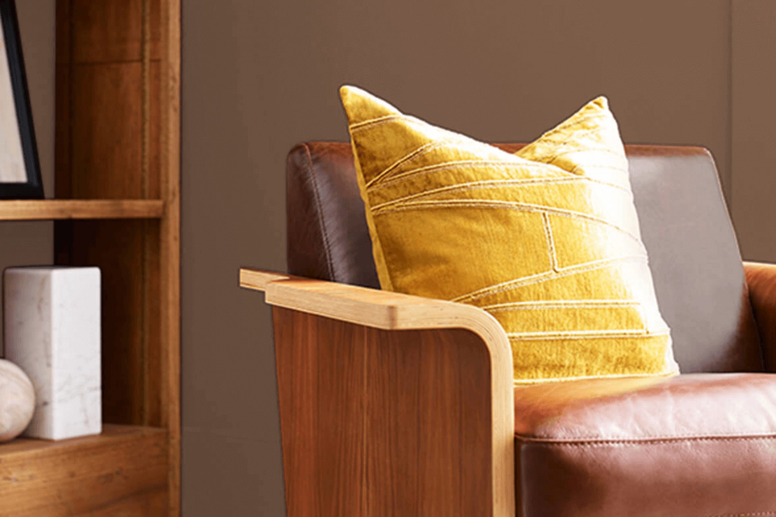
As someone who loves refreshing their home with color, I really think that SW 6089 Grounded by Sherwin Williams is a great choice. I’ve learned that this paint shade is a kind of warm, brownish-gray color that can make any room feel cozy and welcoming. The best part is that it doesn’t change much in different lights, so the color stays true whether you’re basking in sunny daylight or relaxing under soft lamps at night.
I’ve also found that it pairs beautifully with other colors! You can match it with brighter colors, like cheerful yellows, or keep it calm with cool blues or greens. Whether you’re painting a bedroom, a living room, or even the outside of your house, this color could be a great pick.
After using SW 6089 Grounded, I feel more confident recommending Sherwin Williams paints because they apply smoothly and last a long time. So, if you’re looking to give your home a fresh new look, trying out this color might be a fantastic idea!
Ever wished paint sampling was as easy as sticking a sticker? Guess what? Now it is! Discover Samplize's unique Peel & Stick samples.
Get paint samples

