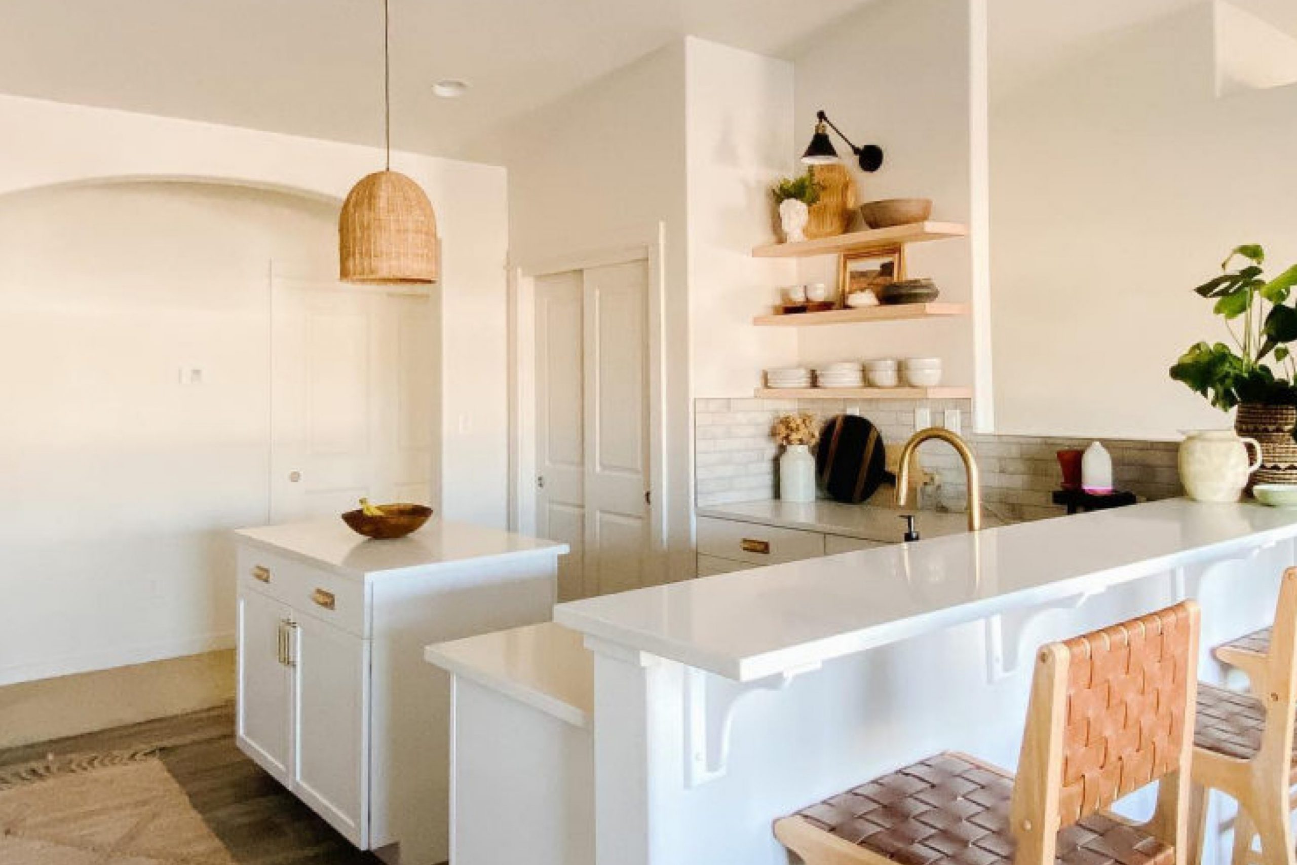
As someone who loves decorating and refurbishing spaces, I find this color particularly appealing due to its subtle warmth and understated elegance. It’s not stark or cold like some whites can be; instead, it offers a cozy, inviting backdrop to any room.
Whether you’re thinking of freshening up your living room or giving your kitchen a new vibe, Modest White is accommodating. It pairs beautifully with a wide range of other colors and decor styles. From modern minimalism to rustic charm, it helps enhance the space without overpowering it.
I’ve noticed that it works exceptionally well in areas with plenty of natural light, where it takes on a slightly creamy tone.
If you’re considering a new project in your home soon, don’t overlook SW 6084 Modest White as a strong contender. It’s an ideal choice if you’re aiming for a look that’s both sophisticated and soothing.
Plus, it’s versatile enough to support future decorating changes you might have in mind.
What Color Is Modest White SW 6084 by Sherwin Williams?
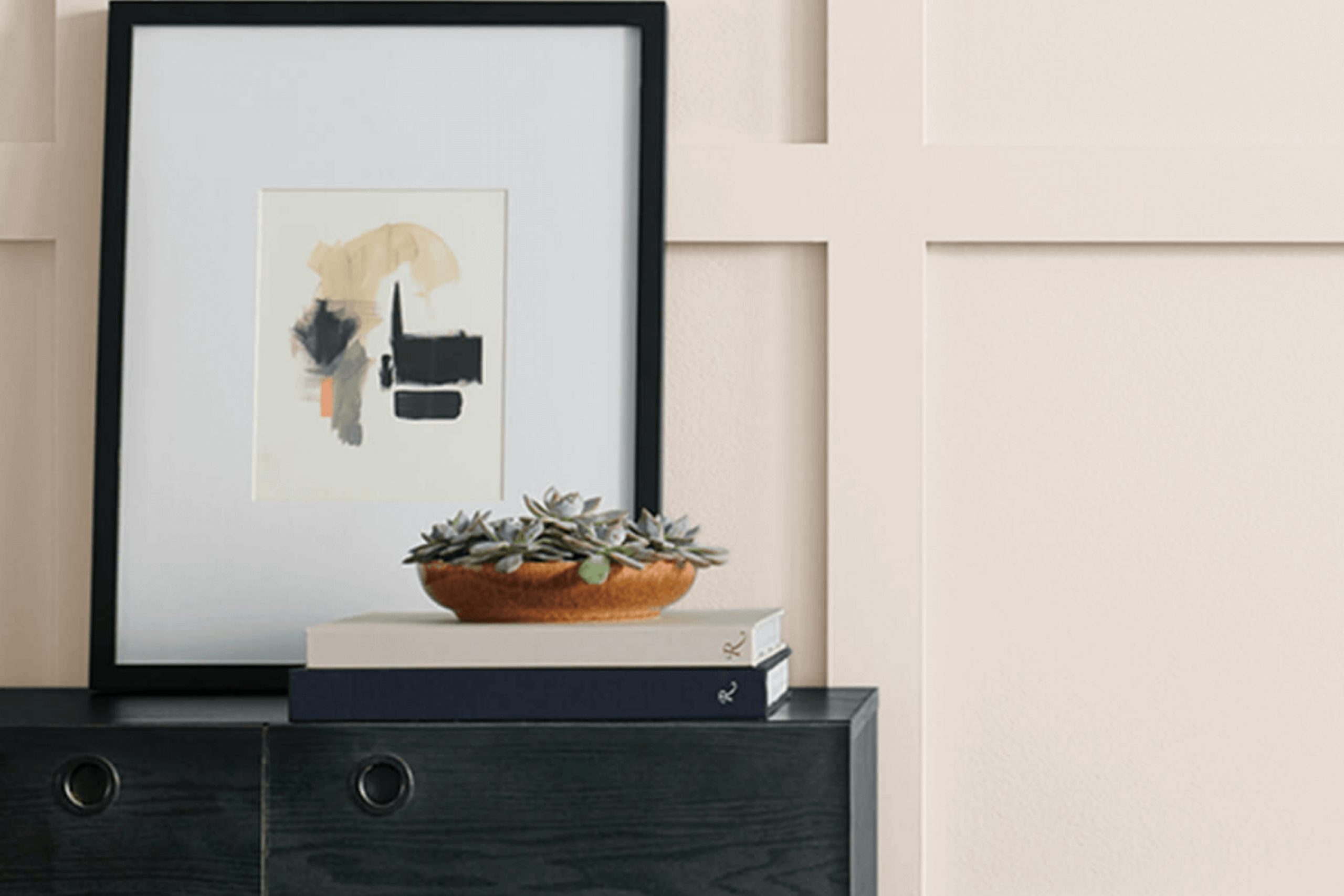
Modest White by Sherwin Williams is a warm and inviting neutral shade that is perfect for creating a cozy and comfortable atmosphere in any room. Its subtle ivory undertones provide a soft, welcoming glow that brightens spaces without overwhelming them. This color is incredibly versatile, making it an excellent choice for various interior styles, including traditional, modern, farmhouse, and Scandinavian.
Modest White offers a fresh, clean backdrop that enhances other decor elements rather than competing with them.
When it comes to pairing materials and textures, Modest White works wonderfully with natural wood, which helps to bring out its warm undertones. It also looks beautiful when matched with softer textures like linen or cotton, adding a sense of airiness and light to rooms.
For a bit of contrast, incorporating elements of brushed metal or glass can add a subtle modern twist to the décor while maintaining a gentle and inviting ambiance. This color also blends well with stonework or clay accents, providing an earthy balance that feels grounded yet light.
Overall, Modest White is an excellent choice for anyone looking to create a cozy, inviting space with lots of potentials to personalize decor accents.
Is Modest White SW 6084 by Sherwin Williams Warm or Cool color?
Modest White by Sherwin Williams is a warm and inviting paint color that works really well in many homes. This shade of white has a touch of creaminess, which makes it more forgiving than a stark, pure white. It is great for creating a cozy and comfortable atmosphere in a room without feeling too cold or clinical.
Because of its subtle warmth, Modest White is versatile and pairs nicely with a variety of other colors and decor styles. Whether you have a modern minimalist living room or a rustic kitchen, this color can fit right in. It’s particularly effective in spaces that don’t get a lot of natural light, as it helps to brighten the area without being too harsh.
Using Modest White on walls can also make small rooms look bigger and more open. It’s an excellent choice for bedrooms, living rooms, and kitchens where you want a light and airy feel without sacrificing a sense of warmth and welcome. Overall, it’s a very user-friendly color that helps make a home feel put together and comforting.
Undertones of Modest White SW 6084 by Sherwin Williams
Modest White is a versatile paint color, but its unique charm comes from the various undertones hidden within it. Undertones are subtle colors that influence the main hue, affecting how we perceive the color in different lighting conditions and environments. For Modest White, these undertones include pale yellow, light purple, light blue, pale pink, mint, lilac, and grey.
Each undertone plays a role in how the paint looks once applied to interior walls. For instance, the pale yellow undertone can make spaces feel warmer, especially in rooms with natural light, giving a cozy, inviting vibe. Light purple and lilac undertones add a hint of coolness, which can make the wall color look slightly cooler under certain lighting conditions.
The light blue and mint undertones give a fresh and airy feel, perfect for creating a calm and refreshing atmosphere in a room. The pale pink undertone, on the other hand, adds a soft, gentle touch, making the space feel more relaxed. Lastly, the grey undertone helps balance the warmth and coolness, ensuring the color remains neutral and flexible enough to match a variety of decor styles.
Overall, these undertones mean that Modest White can change subtly throughout the day, from warm and cozy in morning light to cool and soothing by evening. This makes it an excellent choice for anyone looking to achieve a fresh but complex look in their home without opting for a plain white.
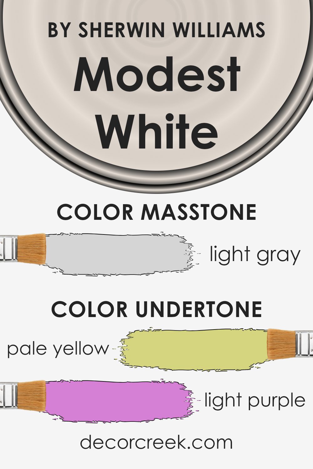
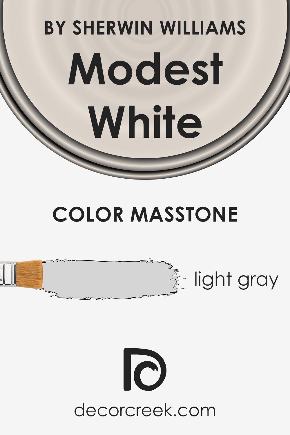
What is the Masstone of the Modest White SW 6084 by Sherwin Williams?
Modest White SW 6084 by Sherwin Williams has a masstone of light gray. The shade is neutral and mild, making it a great choice for various rooms in a home. Its light gray tone offers a clean and subtle background, perfect for showcasing artwork or bright furniture.
This color works well in spaces that receive a lot of natural light, as it can help the room look brighter and more open. It also blends seamlessly with other colors, allowing for flexibility in decorating without the risk of clashing.
In smaller spaces, this light gray can help make the area feel larger and more airy. Since it is not overpowering, it’s easy to pair with bolder colors in accents and fabrics, providing a balanced look throughout the home. This makes it an ideal choice for homeowners looking for a versatile and fresh backdrop to their interior designs.
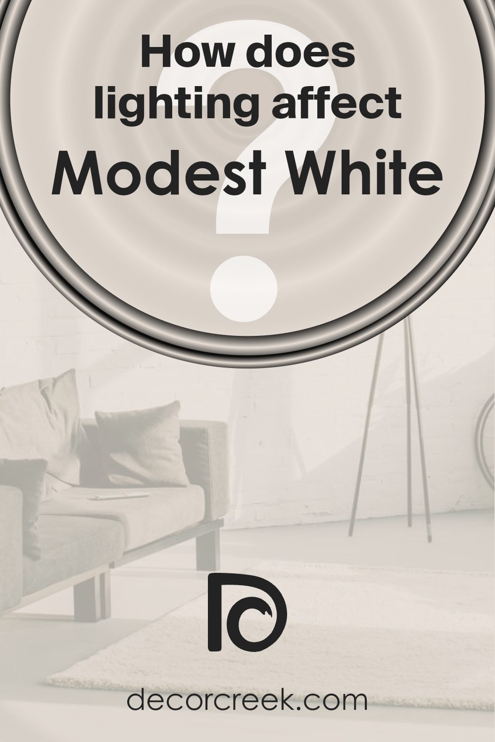
How Does Lighting Affect Modest White SW 6084 by Sherwin Williams?
Lighting has a significant impact on how colors appear in a room, affecting both the mood and the aesthetic. Different types of light can change the perception of paint colors, including the shade Modest White.
Under artificial lighting, Modest White tends to look warmer, absorbing hints of yellow or orange from typical indoor lighting. This makes the color feel cozier and more inviting, which is perfect for living spaces or bedrooms where a soft and welcoming atmosphere is desired.
In natural light, Modest White reflects light differently depending on the time of day and the weather conditions, showcasing a more true-to-swatch appearance. Natural light brings out the purity of this shade more accurately, illuminating its clean and fresh qualities.
In rooms that face north, natural light is cooler and may make Modest White appear slightly more muted and cooler, which might give the paint a subtle gray undertone. This cooler tone works well in spaces that aim for a calm and collected feel.
For south-facing rooms, which receive a broader spectrum of direct sunlight throughout the day, Modest White warms up beautifully, highlighting its creamy undertones. This warm glow creates a bright and airy feeling that enhances the openness of the space.
East-facing rooms get the most light in the morning, when the sun is rising. Here, Modest White will appear mildly warm in the morning, becoming more neutral as the day progresses. This makes east-facing rooms ideal for spaces used predominantly in the morning, like breakfast nooks.
Lastly, in west-facing rooms, the evening light can cast a warmer glow on Modest White, making the walls feel more vibrant during sunset hours. This is great for dining rooms or living spaces used heavily in the evenings.
In every instance, considering the room’s exposure and the type of light it receives can help in maximizing the effect of Modest White on your walls. It’s clear that both natural and artificial lights play essential roles in how we perceive and enjoy colors in our spaces.
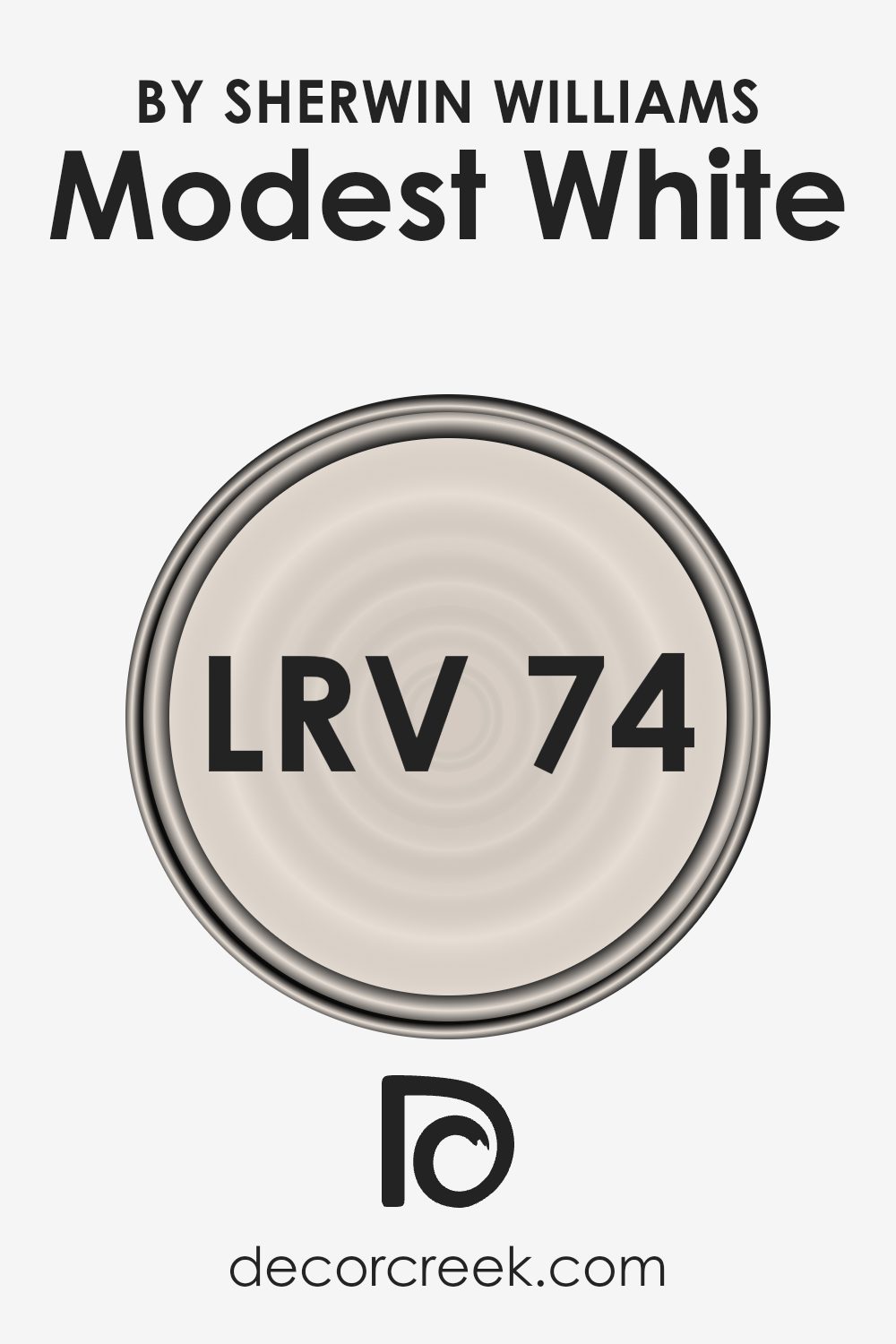
What is the LRV of Modest White SW 6084 by Sherwin Williams?
LRV stands for Light Reflectance Value, which is a measure of how much light a paint color reflects back into the room compared to how much it absorbs. In simple terms, if a paint’s LRV value is higher, it means it reflects more light and will appear lighter on your walls.
Conversely, a lower LRV value means the paint absorbs more light and will appear darker. Understanding LRV is crucial when choosing paint colors, as it helps you predict how light or dark a color will look in your space and how it will affect the overall mood and brightness of a room.
In the case of Modest White, with an LRV of 73.505, the color is on the lighter side of the scale, reflecting a substantial amount of light. This characteristic makes it an excellent choice for making a room feel airy and more open, especially in spaces that might not have a lot of natural light.
Because it doesn’t absorb a lot of light, it won’t darken a room but will instead contribute to a bright and welcoming atmosphere. This makes it a good option for smaller rooms or areas with limited light sources where you want to maximize brightness.
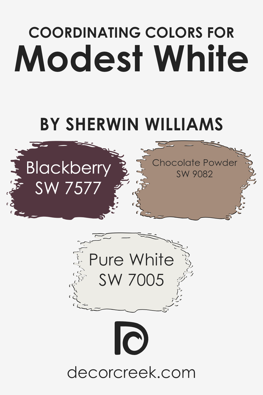
Coordinating Colors of Modest White SW 6084 by Sherwin Williams
Coordinating colors are those that complement and enhance one another in a color scheme, providing balance and aesthetic harmony in any decorating palette. When using a primary shade like Modest White from Sherwin Williams, it’s crucial to select coordinating hues that not only match its tone but also offer contrasting or accentuating features.
Colors like Blackberry, Pure White, and Chocolate Powder serve as excellent options for achieving a cohesive yet varied look.
Blackberry brings a rich, dark depth, acting as a bold contrast that elegantly offsets the lighter, more neutral Modest White. Its deep berry tone can add a dramatic flair to spaces, ideal for creating focal points or accent walls. Pure White, as a coordinating color, serves as a crisp, clean shade that can help to brighten and freshen the overall appearance, ensuring that rooms feel more spacious and airy.
Lastly, Chocolate Powder offers a warm, inviting brown that pairs naturally with Modest White, providing a subdued, cozy feeling perfect for creating a comforting and welcoming environment.
These colors together support a versatile palette that can adapt to various styles and preferences, ensuring a pleasing visual flow throughout the space.
You can see recommended paint colors below:
- SW 7577 Blackberry
- SW 7005 Pure White
- SW 9082 Chocolate Powder
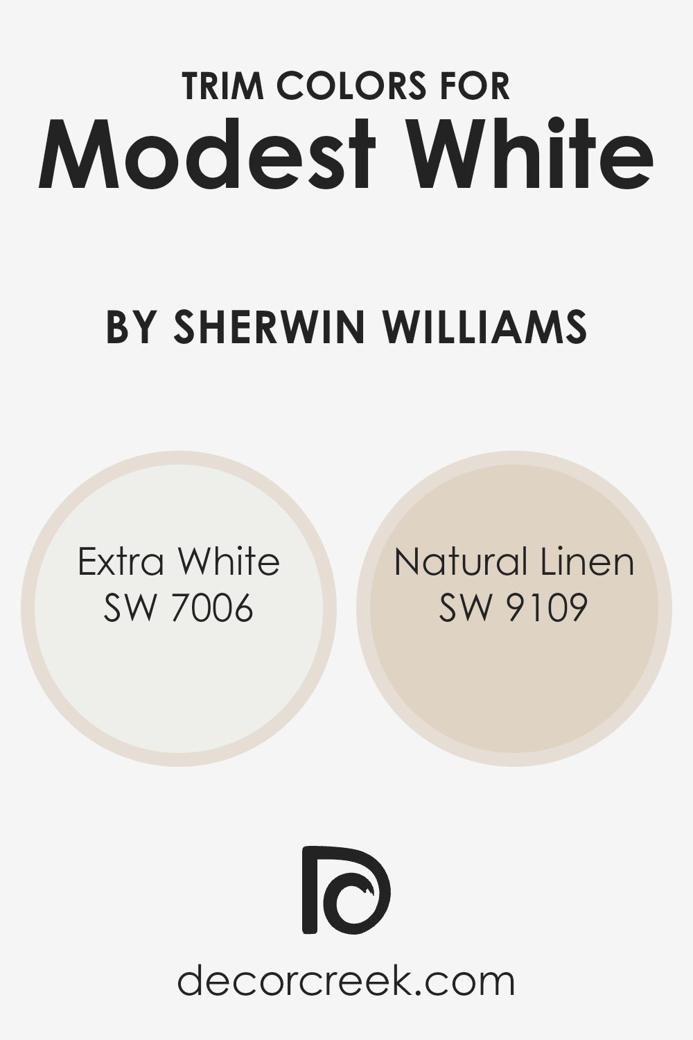
What are the Trim colors of Modest White SW 6084 by Sherwin Williams?
Trim colors are selected for their ability to complement and enhance the main color used on walls or other large areas. In the case of a gentle and inviting hue like Modest White (SW 6084) by Sherwin Williams, selecting the right trim colors can accentuate its warmth and make architectural details pop.
Trim colors frame the spaces and define the boundaries, creating a neat and finished look that adds to the overall aesthetics of a room. Both Extra White (SW 7006) and Natural Linen (SW 9109) serve as excellent trim options with Modest White, highlighting its subtle tones without overshadowing the primary color.
Extra White (SW 7006) is a clean, bright white that brings freshness and clarity as a trim color. Its crispness contrasts nicely against the softer tone of Modest White, providing a clear boundary that enhances visual clarity and making the spaces appear larger. On the other hand, Natural Linen (SW 9109) offers a warmer, slightly beige undertone that complements the cozy and warm atmosphere established by Modest White.
This color choice for trim subtly enriches the room’s palette, adding depth and warmth without creating an overwhelming contrast, promoting a cohesive yet detailed look.
You can see recommended paint colors below:
Colors Similar to Modest White SW 6084 by Sherwin Williams
Using similar colors, such as different shades of white, can play a vital role in creating a cohesive and harmonious look in your space. These closely related hues share a base but have varying undertones or intensities that make them unique, allowing them to complement each other effortlessly, providing subtle contrast and depth to interiors without overwhelming the eye.
Choosing from a palette of similar shades like those of Simple White, Aesthetic White, and Reliable White can help maintain a fluid theme throughout your home, making the transition from room to room feel seamless and visually appealing.
Simple White offers a straightforward, clean backdrop, perfect for enhancing other colors or standing alone for a crisp, fresh look. Aesthetic White brings a hint of warmth, making it ideal for spaces that need a cozy yet light atmosphere. Reliable White stands out with its reliability in different lighting conditions, adapting well and reflecting light beautifully to brighten spaces.
Everyday White, with its easy-going nature, works well in almost any space, laying a gentle foundation. Meanwhile, shades like Gauzy White, Porcelain, and Nice White lend a soft, airy feel to rooms, ideal for creating a calm, inviting environment.
Cultured Pearl adds a touch of elegance without being overpowering, and Polite White is subdued yet present, excellent for spaces that aim for a refined aesthetic. Gorgeous White, true to its name, provides a striking yet understated beauty, finishing off any room with a touch of sophistication without the complexity.
You can see recommended paint colors below:
- SW 7021 Simple White
- SW 7035 Aesthetic White
- SW 6091 Reliable White
- SW 6077 Everyday White
- SW 6035 Gauzy White
- SW 0053 Porcelain
- SW 6063 Nice White
- SW 6028 Cultured Pearl
- SW 6056 Polite White
- SW 6049 Gorgeous White

Colors that Go With Modest White SW 6084 by Sherwin Williams
Choosing the right colors that complement Modest White SW 6084 by Sherwin Williams is crucial because it can greatly enhance the overall look and feel of a space. Modest White itself is a warm and welcoming shade, providing a perfect backdrop for a variety of accents and styles.
When paired with harmonizing colors such as White Flour SW 7102 and Marshmallow SW 7001, it creates a smooth and coherent aesthetic. White Flour adds a subtle, creamy texture to the walls, bringing a gentle brightness without overwhelming the senses.
Marshmallow, with its slightly more pronounced creaminess than White Flour, offers a soft contrast that is still in harmony with the soothing ambience of Modest White.
Additional colors like Downy SW 7002 and Futon SW 7101 also provide beautiful options to pair with Modest White. Downy is a soft, airy white that injects a breath of fresh air into the room, making spaces seem larger and more open.
Futon, on the other hand, hints at a touch of gray, giving depth and definition to an area while staying true to the calm palette.
For those seeking a slightly more nuanced coordination, Pacer White SW 6098 and Reliable White SW 6091 are excellent choices. Pacer White bridges the gap with a hint of beige, providing warmth and elegance.
Reliable White, with its clean and straightforward approach, can pull the elements of a room together, offering a crisp finish that complements the understated charm of Modest White. Together, these colors work in harmony to create a pleasing and comfortable environment without overwhelming the space.
You can see recommended paint colors below:
- SW 7102 White Flour
- SW 7001 Marshmallow
- SW 7002 Downy
- SW 7101 Futon
- SW 6098 Pacer White
- SW 6091 Reliable White

How to Use Modest White SW 6084 by Sherwin Williams In Your Home?
Modest White by Sherwin Williams is a soft and neutral shade, perfect for giving your home a fresh and cozy feel. This color works well in any room, from the kitchen to the bedroom, because it offers a clean, soothing backdrop that makes your furniture and decor stand out.
If you’re thinking about painting your living room, Modest White can make it feel more open and inviting, great for relaxing or hosting friends.
In smaller spaces like bathrooms or hallways, this color can help to brighten the area and make it appear larger. It’s also versatile enough to pair with many other colors, whether you want to add bold accents or stick with a more muted palette.
For those who like changing up their decor frequently, Modest White is an excellent choice because it easily adapts to different styles and seasons, making it a practical and stylish option for any home.
Modest White SW 6084 by Sherwin Williams vs Nice White SW 6063 by Sherwin Williams
Modest White and Nice White by Sherwin Williams are two similar yet distinct shades. Modest White has a warm tone, providing a cozy and welcoming feel to any room. It’s perfect for spaces where you want a hint of comfort without overpowering brightness.
On the other hand, Nice White leans towards a cooler tone which makes it great for creating a fresh and clean look. It can help make small rooms appear larger and more open. Both colors are versatile but serve slightly different preferences in terms of warmth and atmosphere.
They can easily be used in various styles of decor, depending on your personal taste and the specific ambiance you’re aiming to achieve within your space.
You can see recommended paint color below:
- SW 6063 Nice White
Modest White SW 6084 by Sherwin Williams vs Aesthetic White SW 7035 by Sherwin Williams
Modest White and Aesthetic White by Sherwin Williams are two neutral colors, but they have distinct tones. Modest White is warmer, with a soft, creamy feel, making it cozy for any room. It pairs well with earthy or dark wood tones, adding a welcoming touch to spaces.
On the other hand, Aesthetic White is a bit cooler and has a hint of gray. This makes it great for a modern look and works well in rooms with a lot of natural light or with metallic and glass accents for a clean, contemporary vibe.
While both colors provide a subtle backdrop, Modest White offers warmth, whereas Aesthetic White steps back a bit, giving a more neutral, fresh look. Each can refresh a space in its own unique way, depending on the atmosphere you want to create.
You can see recommended paint color below:
Modest White SW 6084 by Sherwin Williams vs Simple White SW 7021 by Sherwin Williams
Modest White and Simple White are both popular choices from Sherwin Williams, but they offer different vibes for your rooms. Modest White has a slightly warmer tone, making it cozy and welcoming. It’s perfect for living areas and bedrooms where you want a soft, inviting atmosphere.
On the other hand, Simple White leans towards a cleaner, more neutral white. This makes it ideal for spaces that benefit from a bright and airy feel, like kitchens and bathrooms. Simple White reflects light beautifully, helping smaller spaces appear larger.
When choosing between these two, consider the mood you want to set and the natural light in your room. Modest White works well in spaces with less natural light or those seeking warmth, while Simple White is great for brightening up a room and giving it a fresh, clean look.
You can see recommended paint color below:
Modest White SW 6084 by Sherwin Williams vs Gauzy White SW 6035 by Sherwin Williams
Modest White and Gauzy White by Sherwin Williams are both subtle shades that offer a clean and simple look, but they have distinct differences. Modest White is a soft, creamy white with a slightly warm tone, making it ideal for creating a cozy and inviting atmosphere. It pairs well with a variety of decor styles, adding a gentle warmth to spaces without overwhelming them.
On the other hand, Gauzy White is lighter and appears almost ethereal. It has a cooler undertone compared to Modest White, which gives it a fresh and clean look. This color works beautifully in spaces that aim for a minimalist aesthetic or where you want to achieve a sense of openness and light.
Choosing between these two depends on the mood you’re aiming for. Modest White suits a warmer, more traditional feel, while Gauzy White is perfect for achieving a crisp, airy feel in a room. Both colors are versatile and can be used across different rooms and styles effectively.
You can see recommended paint color below:
- SW 6035 Gauzy White
Modest White SW 6084 by Sherwin Williams vs Cultured Pearl SW 6028 by Sherwin Williams
Modest White and Cultured Pearl, both by Sherwin Williams, are quite subtle in their differences. Modest White leans towards a soft, warm tone that brings a cozy feel to any space. It’s akin to a creamy off-white, making it perfect for creating a welcoming atmosphere without being too stark.
On the other hand, Cultured Pearl has a slightly cooler undertone. This color is reminiscent of a classic pearl, providing a clean and fresh look that brightens rooms while maintaining a gentle warmth. Both colors are versatile and can be used in various settings, from modern to traditional.
Modest White tends to add a bit more warmth, making it ideal for living areas or bedrooms. Cultured Pearl, with its slight coolness, is excellent for bathrooms or kitchens. Despite their subtleties, each color offers unique opportunities to enhance your home’s aesthetics in different but equally beautiful ways.
You can see recommended paint color below:
- SW 6028 Cultured Pearl
Modest White SW 6084 by Sherwin Williams vs Everyday White SW 6077 by Sherwin Williams
Modest White and Everyday White are two subtle shades offered by Sherwin Williams, each presenting a unique tone for decorating spaces. Modest White has a soft, warm undertone that makes it an excellent choice for creating a cozy and inviting atmosphere. It reflects light beautifully, enhancing a room’s natural brightness, perfect for living areas or bedrooms where comfort is key.
On the other hand, Everyday White leans a bit cooler compared to Modest White. This cooler tone gives it a slightly more neutral appearance, making it versatile for use in various lighting situations. It works well in spaces that aim for a clean, fresh look, such as kitchens and bathrooms.
When choosing between these two, consider the mood you want to set and the natural light in your room. Modest White works well in spaces with less natural light or where warmth is desired, while Everyday White is ideal for brighter rooms and a more balanced, neutral palette.
You can see recommended paint color below:
Modest White SW 6084 by Sherwin Williams vs Polite White SW 6056 by Sherwin Williams
Main color (Modest White) and Second color (Polite White) differ subtly but noticeably in their tones and potential uses within home decor. Modest White from Sherwin Williams leans towards a soft, warm white with a creamy feel, likely caused by a hint of yellow or beige undertones. This warmth makes it a great option for spaces where a cozy and inviting atmosphere is desired, such as living rooms or bedrooms.
On the other hand, Polite White, also by Sherwin Williams, presents itself as a cleaner, crisper white. This shade likely contains less of a yellow base and more of a neutral or slightly gray undertone, giving it a fresher appearance. Such a quality makes Polite White more suited for modern spaces or areas where a straightforward, clean look is favorable, like kitchens or bathrooms.
Both colors offer their unique charm and can dramatically affect the mood and visual size of a room, depending on the lighting and surrounding colors.
You can see recommended paint color below:
- SW 6056 Polite White
Modest White SW 6084 by Sherwin Williams vs Gorgeous White SW 6049 by Sherwin Williams
Modest White, in its essence, has a gentle off-white tone peppered with slight gray undertones. This neutrality makes it a reliable choice for backgrounds, blending seamlessly into most decor styles without demanding attention.
On the other hand, Gorgeous White stands out with its creamy texture that imparts a warm, welcoming feel to any space. Unlike the cooler presence of Modest White, Gorgeous White offers a tad more vibrance, making spaces feel cozy and inviting.
It works exceptionally well in areas that require a touch of softness without the starkness that sometimes comes with pure whites. When choosing between the two, consider the ambiance you’re aiming for: Modest White is perfect for minimalistic or modern aesthetics, while Gorgeous White adds a hint of warmth, ideal for classic or rustic styles.
You can see recommended paint color below:
- SW 6049 Gorgeous White
Modest White SW 6084 by Sherwin Williams vs Reliable White SW 6091 by Sherwin Williams
Modest White and Reliable White, both by Sherwin Williams, offer subtle differences that could affect the ambiance of a room. Modest White leans slightly toward a warm tone, giving off a cozy and welcoming feel. It works well in spaces that aim for a soft and subtle aesthetic, making rooms look inviting without becoming too stark or bright.
On the other hand, Reliable White has a bit of a cooler undertone, which can make spaces appear more open and fresh. This shade is great for areas that get a lot of natural light, as it tends to enhance the brightness in a room, making it feel airy and clean.
Both colors are versatile and can blend well with various decor styles and color schemes. Choosing between them depends on the specific mood or atmosphere you want to achieve in your space. Whether you’re going for a warmer, snug feel with Modest White or a brighter, more refreshing vibe with Reliable White, both are excellent choices for creating a beautiful and stylish interior.
You can see recommended paint color below:
- SW 6091 Reliable White
Modest White SW 6084 by Sherwin Williams vs Porcelain SW 0053 by Sherwin Williams
Modest White and Porcelain are both offered by Sherwin Williams, but they have distinct tones that set them apart. Modest White has a soft, warm undertone that makes it feel cozy and inviting, perfect for living rooms or bedrooms. This color can help create a relaxed, comfortable setting because of its soothing warmth.
On the other hand, Porcelain has a slightly cooler tone which appears more crisp and clean. It’s a great choice for spaces that aim for a fresh and airy feel, like kitchens or bathrooms. Porcelain reflects light beautifully, which can make small areas seem more spacious and luminous.
Both colors are neutral, making them versatile for a variety of decorating styles and easy to pair with other hues. However, the choice between Modest White’s warmth and Porcelain’s crispness will depend on the mood you’re trying to achieve in your space.
You can see recommended paint color below:
- SW 0053 Porcelain
This paint color is like a soft blanket—it’s gentle and calm, making every room feel cozy. It’s not too bright, yet it lights up a space just enough, making it perfect for places where you relax like bedrooms or living rooms.
One of the best parts about Modest White is how well it goes with almost anything. Whether you have lots of colorful decorations or prefer more simple designs, this color fits right in. It works particularly well in smaller areas, making them appear bigger and more open.
So, if you’re thinking about giving your home a new look, Modest White is a good pick. It’s like the friendly smile of colors—welcoming, soft, and sure to make any room a bit nicer. It’s ideal for anyone who wants their home to have a warm and inviting vibe without being too flashy.
This color helps make a house feel like a home.
Ever wished paint sampling was as easy as sticking a sticker? Guess what? Now it is! Discover Samplize's unique Peel & Stick samples.
Get paint samples

