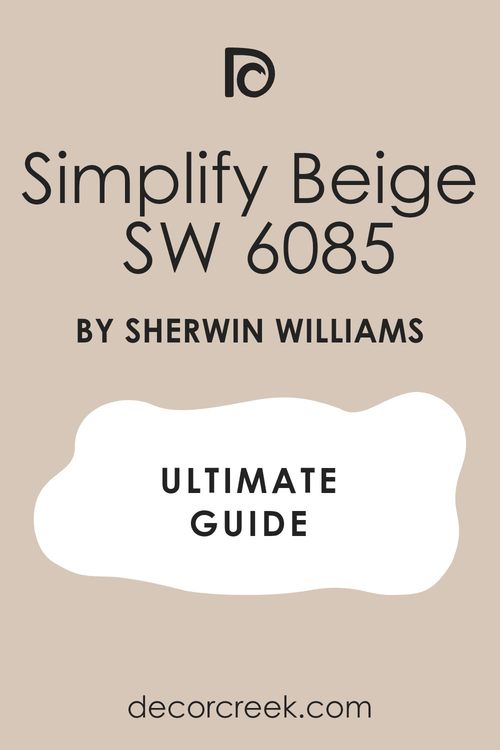
When you think of a color that brings warmth and comfort to a room, SW 6085 Simplify Beige by Sherwin Williams comes to mind. It’s more than just a neutral shade—it’s like a cozy blanket for your walls, offering a sense of calm and ease. The subtlety of this beige hue makes it incredibly flexible, perfect for any room in your home. Its soft undertones blend seamlessly with a wide range of colors, whether you’re going for a classic look or something more contemporary.
Imagine a living room where Simplify Beige forms the backdrop, allowing your furniture and décor to shine while creating a cohesive and inviting environment. Or picture a bedroom where the walls exude warmth and comfort, encouraging you to unwind and relax after a long day.
What I appreciate most about this color is its ability to adapt to different lighting, bringing out either a warm glow or a cooler tone depending on the time of day and the type of light. It’s not just a paint color—it’s a foundation upon which you can build your personal oasis.
Whether you’re renovating or just freshening up a room, SW 6085 Simplify Beige provides a perfect canvas to express your style.
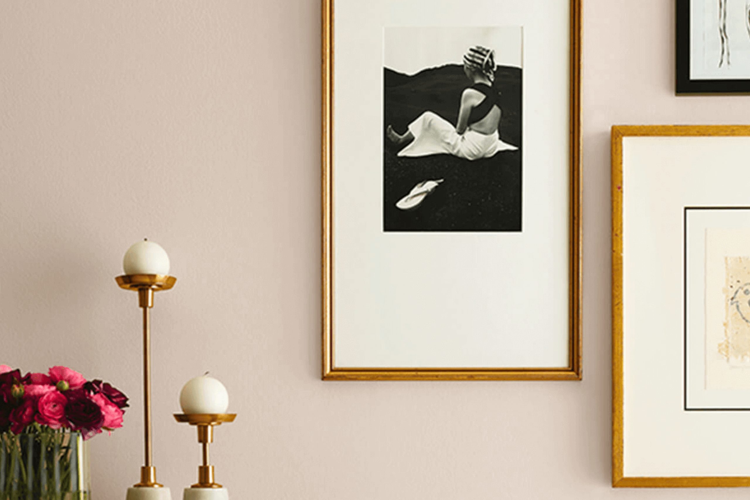
What Color Is Simplify Beige SW 6085 by Sherwin Williams?
Simplify Beige by Sherwin Williams is a warm, neutral color that brings a sense of calmness to any room. It is a flexible shade with a gentle taupe undertone, which makes it suitable for a variety of interior styles. This hue works particularly well in traditional, farmhouse, and modern minimalist designs due to its understated elegance.
Simplify Beige makes an excellent choice for living rooms, bedrooms, or any area where a welcoming ambiance is desired. The color can create a cozy atmosphere without being overpowering, making areas feel inviting yet relaxed. It acts as a neutral backdrop, allowing other colors and design elements to stand out.
When considering materials to pair with Simplify Beige, think of natural elements such as wood, stone, and woven textures. Wooden furniture with warm tones, cotton or linen fabrics, and rattan accents can complement its warmth beautifully. Stone surfaces like marble or quartz in lighter shades can enhance its subtlety and add a touch of refinement.
This color also pairs well with soft whites, muted greens, and gentle blues, adding depth to a room without clashing. Overall, Simplify Beige is a flexible, soft color choice that adapts to many different styles and preferences.
Is Simplify Beige SW 6085 by Sherwin Williams Warm or Cool color?
Simplify Beige by Sherwin Williams is a flexible color that offers a warm and inviting atmosphere for homes. Its neutral tone makes it an easy choice, blending with a variety of furnishings and decor styles. This beige hue provides a soft backdrop without being too intense. It works well in living rooms, bedrooms, and kitchens, offering a classic look that stays fresh over time.
The color’s warm undertones create a cozy feeling, making areas feel welcoming and comfortable. It’s an excellent choice for walls, as it reflects natural light beautifully, adding a sense of openness to rooms. Simplify Beige can complement both modern and traditional decor, enhancing wood accents or metal finishes alike.
Homeowners often choose this shade for its ability to harmonize with other colors, allowing for easy updates with accents like cushions, rugs, or artwork. Overall, Simplify Beige is a reliable color that brings warmth and elegance to any home setting.
Undertones of Simplify Beige SW 6085 by Sherwin Williams
Simplify Beige by Sherwin Williams is a warm, neutral paint color with several subtle undertones that affect its overall look. Undertones are the hints of color beneath the dominant color, and they can greatly influence how a paint color appears in different lighting conditions and when paired with other colors in a room.
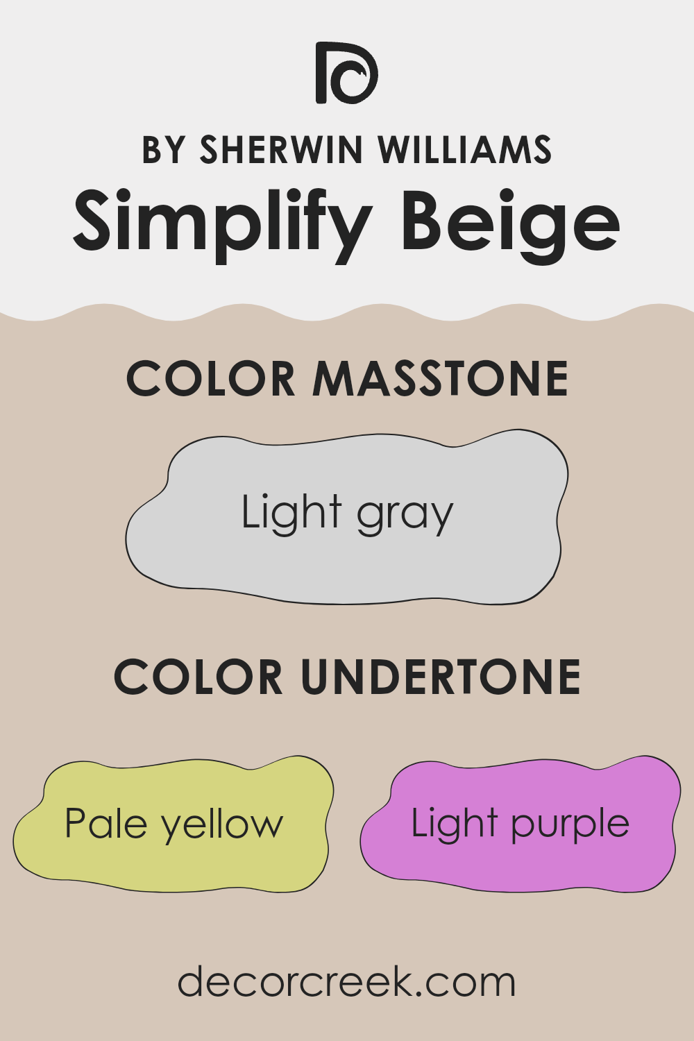
The undertones in Simplify Beige include pale yellow, light purple, light blue, pale pink, mint, lilac, and grey. These undertones can affect how the beige color appears on interior walls. For example, the pale yellow gives it a warm, sunny feeling, which can make a room feel cozy and inviting. The light purple and lilac can bring a soft, almost romantic feel, adding a bit of depth and interest.
The influence of light blue and mint can offer a slight freshness, helping the room feel airy and open. Grey undertones provide balance, adding a modern touch that keeps the color from feeling too warm.
Overall, these undertones in Simplify Beige allow it to adapt in various lighting and with different decor, making it a flexible choice for interior walls. Depending on the lighting and surroundings, it can appear slightly different, which lends a layer of richness and complexity to the room.
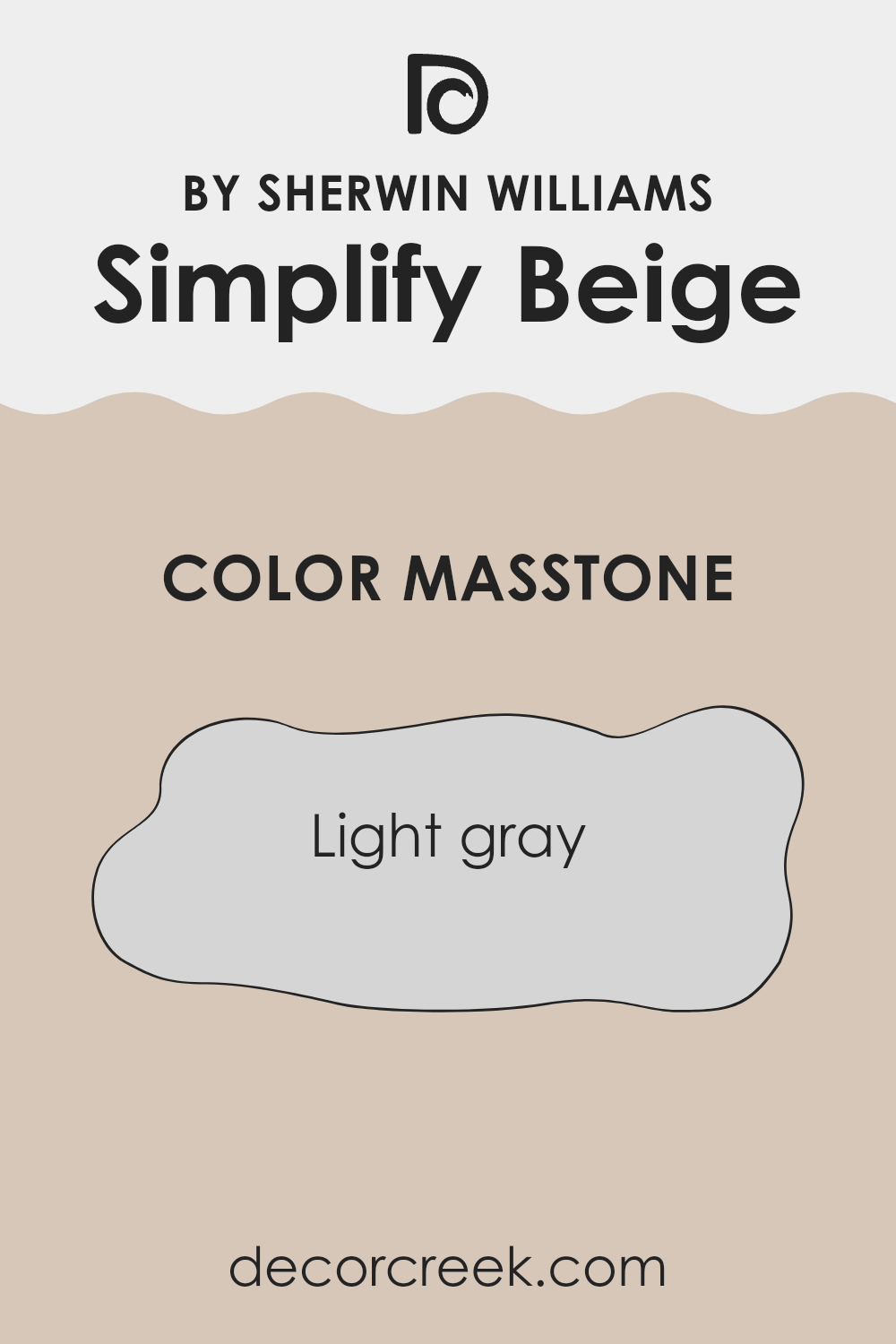
What is the Masstone of the Simplify Beige SW 6085 by Sherwin Williams?
Simplify Beige by Sherwin Williams has a primary color known as the masstone, which is light gray (#D5D5D5). This light gray undertone plays a significant role in how the color appears in different areas.
The masstone helps balance the beige by adding a subtle touch of coolness, preventing the color from looking too warm or yellow. In a home, this creates a flexible and neutral backdrop. Rooms can feel more open and airy because the light gray component reflects light well, brightening up the room.
This is especially beneficial in rooms with less natural light, as the color won’t feel too heavy or intense. Simplify Beige can pair well with both soft whites and bolder colors, adapting to various styles and furniture pieces. This balance of warmth and neutrality makes it an excellent choice for living rooms, bedrooms, or any area where a calm and welcoming atmosphere is desired.
How Does Lighting Affect Simplify Beige SW 6085 by Sherwin Williams?
Lighting plays a crucial role in how colors appear in a room, and this is true for Simplify Beige SW 6085 by Sherwin Williams. The type of light, whether natural or artificial, affects how this beige shade looks on your walls.
In natural light, the appearance of Simplify Beige can change based on the direction your room faces. In a north-facing room, which generally gets cooler and more indirect light, Simplify Beige may appear a bit grayer or cooler. This is because north light enhances bluish tones and can make warm colors seem more muted.
In contrast, a south-facing room gets abundant warm, direct sunlight. Here, Simplify Beige will look warmer and could show more of its yellow and beige undertones, making the room feel cozier and more inviting. The consistent light throughout the day also helps maintain its true color more effectively.
For rooms facing east, the morning light is typically bright and blue. Simplify Beige might look crisper and brighter in the early hours, then muting as the sun passes to the west. By late afternoon, the color may appear more subdued, highlighting its neutral qualities.
In west-facing rooms, the opposite occurs. These areas receive the warm, rich light of the afternoon sun. Simplify Beige can appear warmer and more golden as the day progresses, balancing with the cooler light earlier in the day.
Artificial lighting also influences Simplify Beige’s appearance. Under incandescent bulbs, which emit a warm light, this shade might appear richer and more traditionally beige. Conversely, LED lights, available in various tones, can either highlight its warmth or add a cooler undertone.
In summary, Simplify Beige’s appearance is dynamic, shifting with the light’s direction and artificial lighting, adapting to each room’s unique characteristics and creating varying moods and aesthetics.
What is the LRV of Simplify Beige SW 6085 by Sherwin Williams?
LRV, which stands for Light Reflectance Value, is a measurement used to determine how much light a color reflects. It’s a scale that ranges from 0 to 100, where 0 is absolute black, reflecting no light, and 100 is pure white, reflecting all the light. The LRV of a color can significantly influence how it appears in a room.
Higher LRV colors, which are lighter, reflect more light and can make a room feel larger and more open. In contrast, lower LRV colors, which are darker, absorb more light and can create a cozier, more intimate atmosphere. When choosing paint colors, understanding LRV is essential, as it helps predict how the color will behave in different lighting conditions.
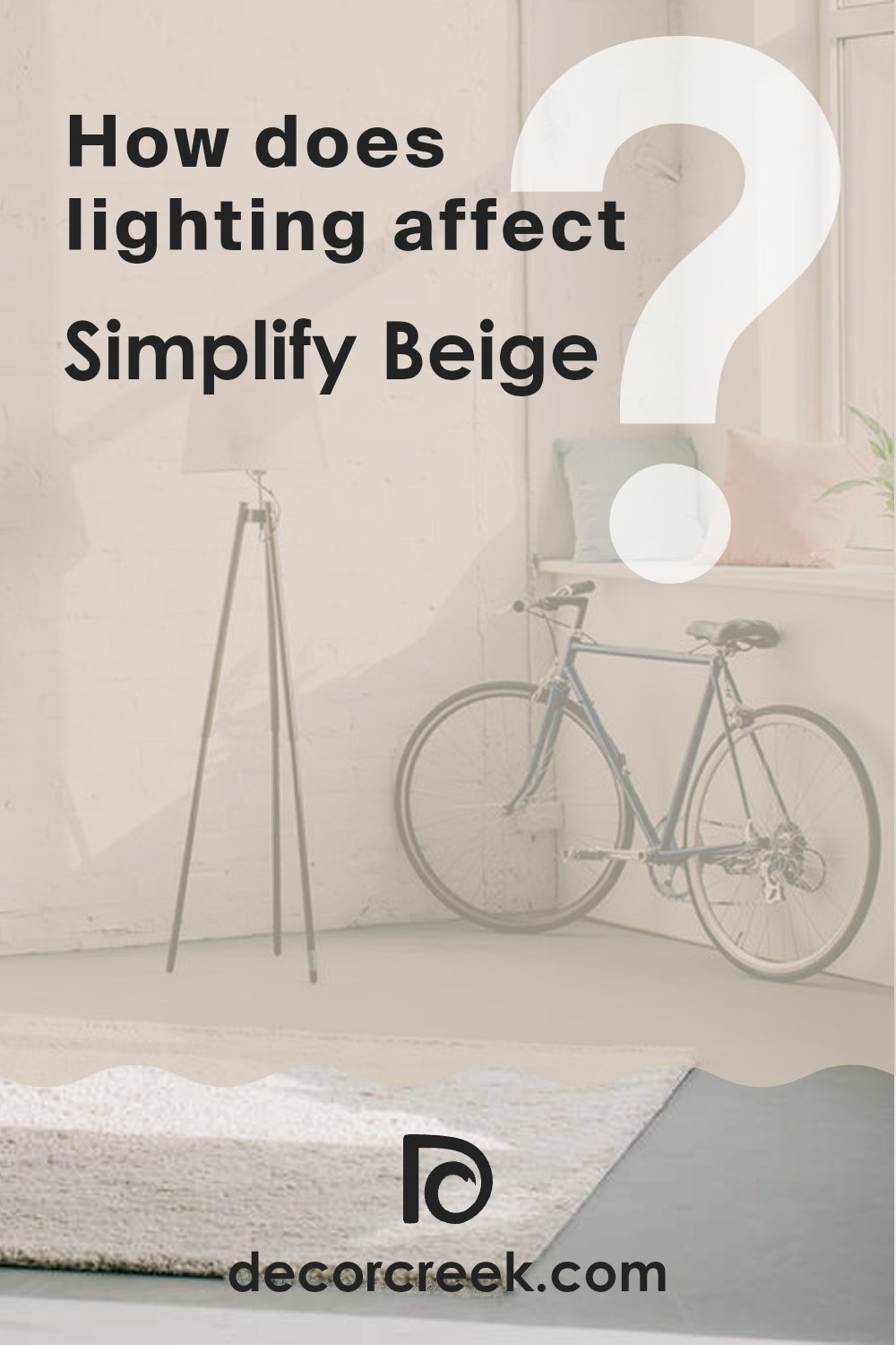
Simplify Beige has an LRV of 58.56, placing it on the lighter side of the scale, which means it reflects a good amount of light. This particular LRV indicates that Simplify Beige is a mid-range hue; it’s neither too dark nor too light. In a room, it will help keep areas feeling bright and airy without being stark or cold. It effectively bounces light around the room, which can make the room feel balanced and inviting. This LRV makes it a flexible choice, suitable for various rooms and lighting conditions.
Coordinating Colors of Simplify Beige SW 6085 by Sherwin Williams
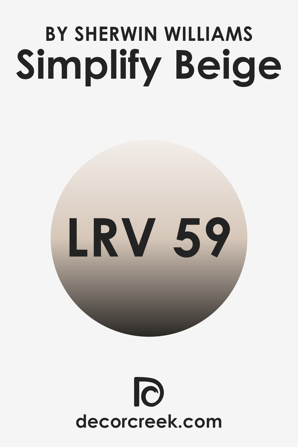
Coordinating colors are shades that complement one another when used together in a room. They create a balanced and harmonious look by enhancing each other’s characteristics and allowing each color to shine without being too intense. Simplify Beige by Sherwin Williams, a warm and flexible shade, serves as a neutral base that can be paired beautifully with a variety of colors.
For example, Greek Villa, a soft and creamy white, adds a touch of brightness and a clean, airy feel to any room. Its subtle warmth makes it a perfect partner that doesn’t overshadow the base color.Modest White is another excellent choice for coordination, offering a subtle hint of color while maintaining a light and inviting presence.
It’s a gentle option that complements the neutral tones of Simplify Beige. Meanwhile, Redend Point introduces a muted, earthy pink that brings a cozy and inviting energy into the mix. Its warm undertones match well, adding depth and a touch of color without clashing. Together, these colors work in harmony to bring a balanced and inviting atmosphere to any room, making them ideal for creating cohesive and pleasing interiors.
You can see recommended paint colors below:
- SW 7551 Greek Villa (CHECK A SAMPLE)
- SW 6084 Modest White (CHECK A SAMPLE)
- SW 9081 Redend Point (CHECK A SAMPLE)
What are the Trim colors of Simplify Beige SW 6085 by Sherwin Williams?
Trim colors are used to highlight and define the edges and details in a room, such as baseboards, moldings, window frames, and doors. They are important because they create contrast and help accentuate the wall color, making the overall design look more polished and cohesive. When using a color like Simplify Beige by Sherwin Williams for the walls, choosing complementary trim colors can enhance the warmth and versatility of the room.
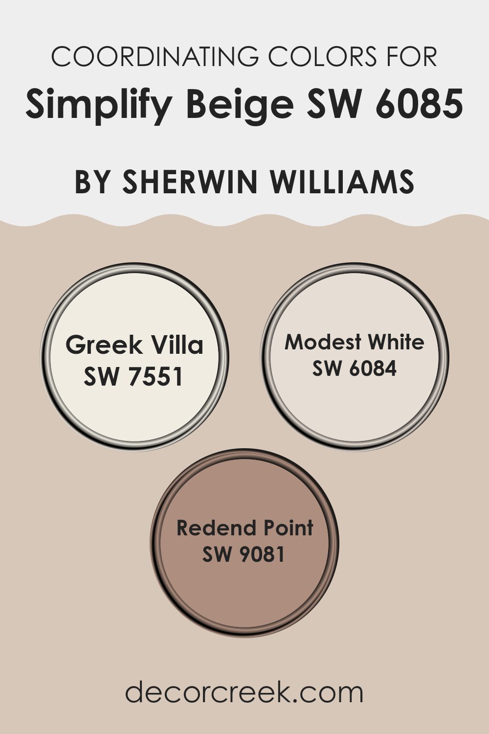
Simplify Beige is a soft, neutral tone that pairs well with various colors, making it a great choice for a calming environment. Using trim colors like Balanced Beige or Wool Skein can add depth and character to the room without overpowering it.
Balanced Beige, with its taupe hue, brings in a richer, earthy tone that adds a cozy yet elegant touch, perfectly balancing against the more muted Simplify Beige walls. On the other hand, Wool Skein offers a lighter, soft green-beige color that provides a subtle contrast, creating a clean and bright look. Both colors complement Simplify Beige beautifully, allowing you to feature either the warmth of Balanced Beige or the gentle freshness of Wool Skein, depending on the mood and style you want to achieve. These trim colors help to define the space and bring out the gentle qualities of the wall color, ensuring the room feels inviting and harmonious.
You can see recommended paint colors below:
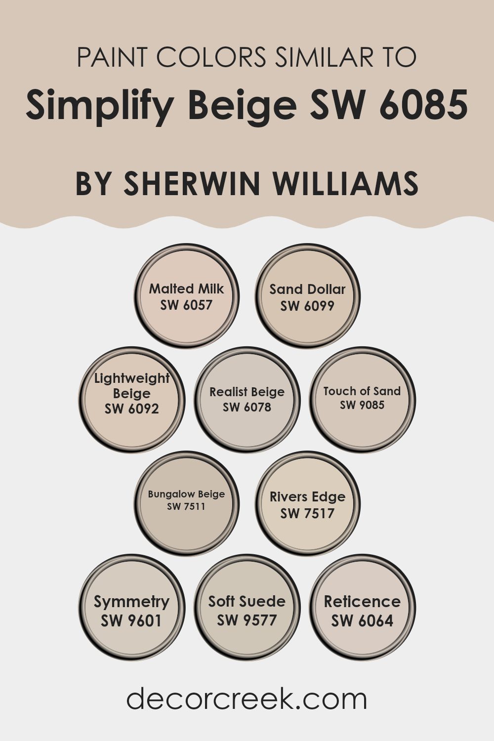
Colors Similar to Simplify Beige SW 6085 by Sherwin Williams
Similar colors are essential in design because they create harmony and cohesion in a room. Colors like SW 6057 Malted Milk and SW 6099 Sand Dollar are close to Simplify Beige but offer subtle differences. Malted Milk has a creamy undertone that adds a soft, warm touch, while Sand Dollar provides a light, sandy hue that feels natural and calming. SW 6092 Lightweight Beige and SW 6078 Realist Beige both provide a neutral vibe but with slight variations. Lightweight Beige feels airy and soft, perfect for creating a gentle atmosphere, whereas Realist Beige offers a touch more depth and substance.
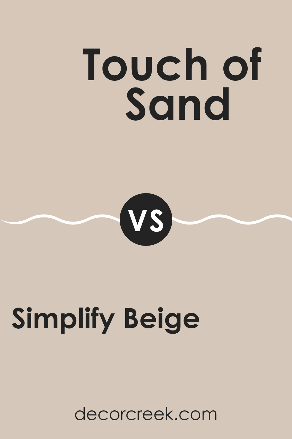
Then there’s SW 9085 Touch of Sand and SW 7511 Bungalow Beige, which bring in more rich and earthy undertones. Touch of Sand carries a hint of pink, providing a warm glow, while Bungalow Beige presents a more traditional beige, solid and comforting.
SW 7517 Rivers Edge and SW 9601 Symmetry add a bit more character. Rivers Edge has a darker, more grounded feeling, and Symmetry, with its balanced tone, offers a pleasing, even look. Lastly, SW 9577 Soft Suede and SW 6064 Reticence wrap it up with deeper hues, with Soft Suede delivering a soft, luxurious richness and Reticence offering understated elegance. These colors work together to create a balanced and inviting environment.
You can see recommended paint colors below:
- SW 6057 Malted Milk (CHECK A SAMPLE)
- SW 6099 Sand Dollar (CHECK A SAMPLE)
- SW 6092 Lightweight Beige (CHECK A SAMPLE)
- SW 6078 Realist Beige (CHECK A SAMPLE)
- SW 9085 Touch of Sand (CHECK A SAMPLE)
- SW 7511 Bungalow Beige (CHECK A SAMPLE)
- SW 7517 Rivers Edge (CHECK A SAMPLE)
- SW 9601 Symmetry (CHECK A SAMPLE)
- SW 9577 Soft Suede (CHECK A SAMPLE)
- SW 6064 Reticence (CHECK A SAMPLE)
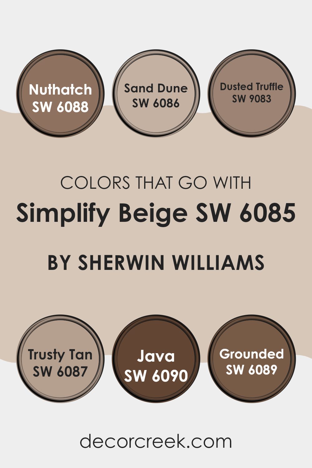
Colors that Go With Simplify Beige SW 6085 by Sherwin Williams
Colors that complement Simplify Beige SW 6085 by Sherwin Williams, such as SW 6088 – Nuthatch, SW 6086 – Sand Dune, SW 9083 – Dusted Truffle, SW 6087 – Trusty Tan, SW 6090 – Java, and SW 6089 – Grounded, play a crucial role in setting the mood of a room. These colors work together to create a harmonious and inviting atmosphere. Simplify Beige is a warm and flexible shade that serves as an excellent backdrop for these complementary colors.
Each color adds its own unique touch to a room, enhancing the overall look and feel. Nuthatch, a muted brown, adds depth and richness, making it a cozy choice for accent pieces. Sand Dune is a soft, earthy hue that blends effortlessly with Simplify Beige, providing a subtle layer of warmth.
Dusted Truffle brings a slightly darker brown into the mix, offering a touch of sophistication without being overpowering. Trusty Tan adds a light, sandy tone that brightens up any room, creating a comfortable and welcoming environment. Java, a deep and bold brown, provides contrast and drama, perfect for creating a focal point. Lastly, Grounded, with its rich, earthy undertones, ties all these colors together, offering a balanced and cohesive palette. Together, these colors enhance the beauty of a room, making it feel more unified and inviting.
You can see recommended paint colors below:
- SW 6088 Nuthatch (CHECK A SAMPLE)
- SW 6086 Sand Dune (CHECK A SAMPLE)
- SW 9083 Dusted Truffle (CHECK A SAMPLE)
- SW 6087 Trusty Tan (CHECK A SAMPLE)
- SW 6090 Java (CHECK A SAMPLE)
- SW 6089 Grounded (CHECK A SAMPLE)
How to Use Simplify Beige SW 6085 by Sherwin Williams In Your Home?
Simplify Beige SW 6085 by Sherwin Williams is a warm, inviting color that works well in various rooms in your home. Its natural, soft tone makes it a flexible choice for different rooms. You can use it in living rooms to create a cozy and comfortable atmosphere, making it a great backdrop for different styles of furniture and decorations.
In the bedroom, this shade can help make the room feel calm and relaxing, perfect for unwinding at the end of the day. Simplify Beige also pairs well with natural materials like wood and stone, adding warmth to a kitchen or dining area.
If you want to refresh a bathroom, this neutral hue can make it feel more open and airy. By using Simplify Beige on the walls, you can highlight other colors in your decor, making them pop without being too intense. This flexibility makes it a popular choice for many homeowners.
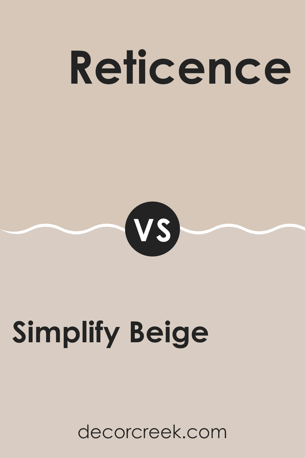
Simplify Beige SW 6085 by Sherwin Williams vs Reticence SW 6064 by Sherwin Williams
Simplify Beige SW 6085 and Reticence SW 6064 by Sherwin Williams are two shades that both offer warmth but differ in depth and tone. Simplify Beige is a warm, light neutral that gives areas an inviting and cozy atmosphere.
It’s flexible and works well in a variety of settings, making it a popular choice for living rooms or bedrooms. Reticence, on the other hand, is a bit darker with subtle hints of gray, providing a more muted and calming effect. This color is great for creating a soothing environment and pairs well with both warm and cool accents.
While Simplify Beige has a more traditional beige tone, Reticence leans slightly towards an earthier vibe. Both colors can adapt to different lighting conditions, but Simplify Beige generally feels lighter and more airy compared to the deeper and more subdued Reticence. Choosing between them depends on whether you prefer a lighter brightness or a soft, understated elegance.
You can see recommended paint color below:
- SW 6064 Reticence (CHECK A SAMPLE)
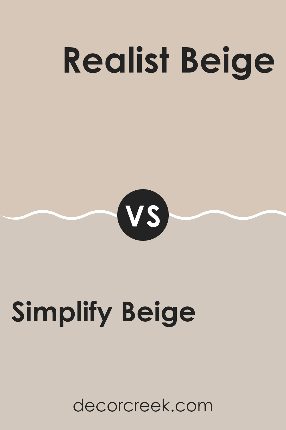
Simplify Beige SW 6085 by Sherwin Williams vs Realist Beige SW 6078 by Sherwin Williams
Simplify Beige SW 6085 and Realist Beige SW 6078 by Sherwin Williams are two similar but distinct neutral hues. Simplify Beige is a warm, inviting color that leans slightly towards a creamy off-white. It’s flexible and works well in various settings, offering a cozy and soft background.
On the other hand, Realist Beige is a bit darker with a subtle gray undertone, making it appear slightly cooler compared to Simplify Beige. This gives Realist Beige a more modern and refined look without being too bold.
Both colors are excellent choices for creating a neutral theme, but the slight difference in tone can significantly influence the mood of a room. Simplify Beige can make areas feel lighter and warmer, while Realist Beige adds depth and a touch of elegance. Their subtle distinctions allow each to serve different purposes depending on the atmosphere you’re aiming to create.
You can see recommended paint color below:
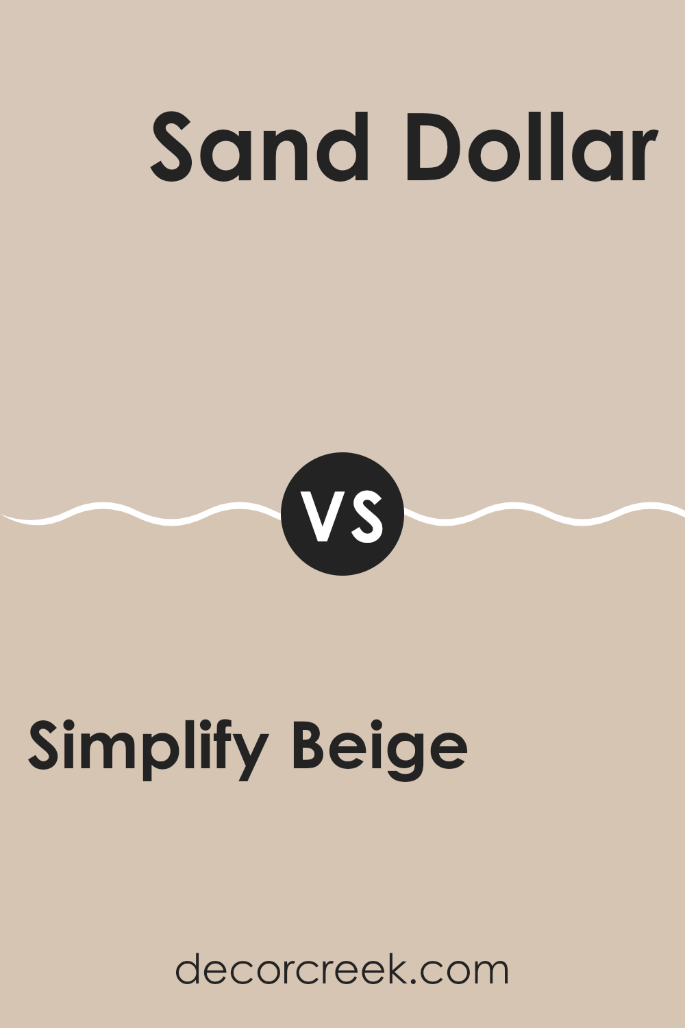
Simplify Beige SW 6085 by Sherwin Williams vs Sand Dollar SW 6099 by Sherwin Williams
Simplify Beige (SW 6085) and Sand Dollar (SW 6099) are two soft, neutral colors from Sherwin Williams that offer a warm and inviting feel. Simplify Beige is a light beige with subtle undertones that make it flexible and easy to coordinate with various décor styles.
It’s a classic choice for creating a cozy and comfortable environment. On the other hand, Sand Dollar has a slightly darker and richer tone than Simplify Beige. It leans more towards a sandy, earthy feel, making it ideal for adding depth and warmth to a room without being too intense.
Both colors can work as a backdrop for more vibrant accents or blend seamlessly with other neutral tones. Simplify Beige is perfect for those who prefer a light and airy atmosphere, while Sand Dollar suits those looking for a bit more warmth and substance in their interiors.
You can see recommended paint color below:
- SW 6099 Sand Dollar (CHECK A SAMPLE)
Simplify Beige SW 6085 by Sherwin Williams vs Rivers Edge SW 7517 by Sherwin Williams
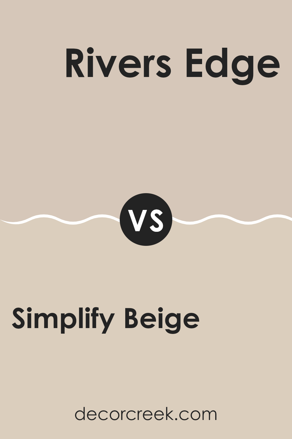
Simplify Beige SW 6085 by Sherwin Williams is a warm, neutral color that tends to blend effortlessly with various styles and moods. It’s a soft beige, perfect for creating an inviting and comfortable ambiance in living areas. Its understated versatility makes it ideal for both wall paint and interior accents, adding a touch of warmth without overpowering the room.
On the other hand, Rivers Edge SW 7517 by Sherwin Williams is an earthy brown color that adds richness and depth to a room. It’s a darker shade compared to Simplify Beige and can give rooms a cozy yet refined look. Rivers Edge works well for accent walls, cabinetry, and furniture, offering a more robust presence that complements natural elements like wood and stone.
While both colors have their unique charm, Simplify Beige is lighter and more airy, whereas Rivers Edge exudes a grounded, substantial feel. The choice between the two depends on whether you want a room to feel light and open or warm and grounded.
You can see recommended paint color below:
Simplify Beige SW 6085 by Sherwin Williams vs Symmetry SW 9601 by Sherwin Williams
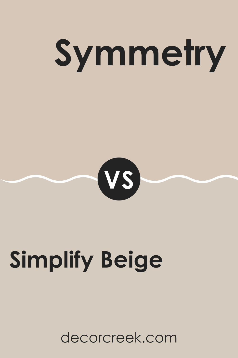
Simplify Beige (SW 6085) by Sherwin Williams is a warm, agreeable beige with a touch of softness that makes it quite flexible. It works well in many settings, offering a comforting and neutral backdrop. Its subtle warmth adds a cozy feel without being too intense.
On the other hand, Symmetry (SW 9601) presents a cooler and more balanced tone. It’s the type of color that brings a clean and crisp look to a room. This color offers more of a contemporary vibe when compared to the traditional warmth of Simplify Beige.
Both colors are neutral, but their differing undertones can set distinct moods in a room. Simplify Beige might be better suited for areas where you want to create a warm and welcoming atmosphere. In contrast, Symmetry offers a fresher, more modern look that can refresh a room. The choice depends on the feel you want in your home.
You can see recommended paint color below:
Simplify Beige SW 6085 by Sherwin Williams vs Lightweight Beige SW 6092 by Sherwin Williams
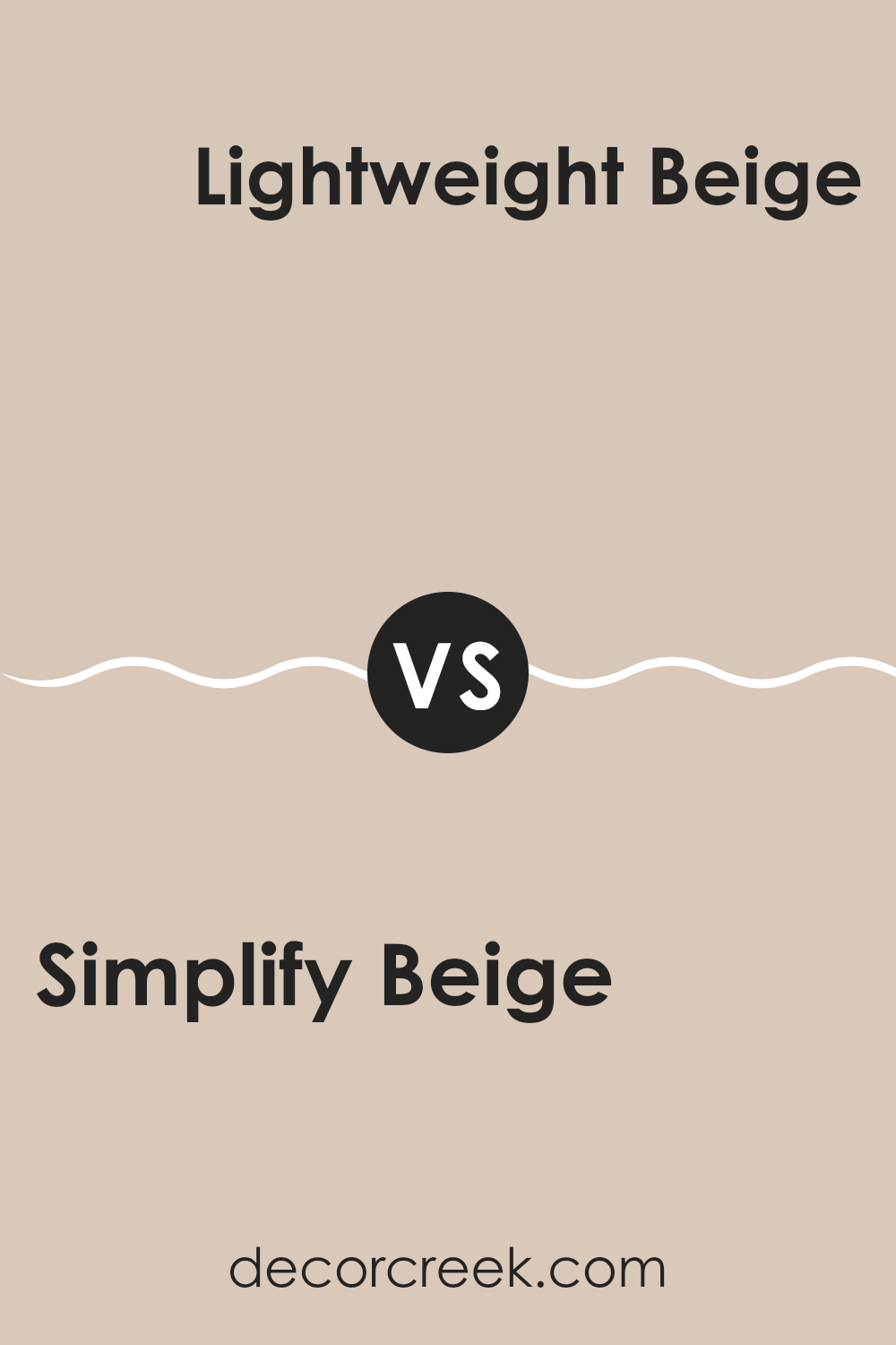
Simplify Beige SW 6085 and Lightweight Beige SW 6092 by Sherwin Williams are two different shades of beige, each bringing its own character to a room. Simplify Beige is a warm, mid-tone beige with a softness that makes it flexible for many rooms. It can create a cozy atmosphere, working well with both traditional and modern decor.
On the other hand, Lightweight Beige is slightly lighter and has a brighter, more airy feel. It offers a more neutral backdrop due to its lighter nature, which can help make a room feel more open and spacious.
While both colors can be used in similar settings, Simplify Beige might suit areas where a warmer and more intimate atmosphere is desired, whereas Lightweight Beige is ideal for brightening up a room and enhancing natural light. Both colors pair well with whites, browns, and other neutrals, lending themselves to a variety of interior styles.
You can see recommended paint color below:
- SW 6092 Lightweight Beige (CHECK A SAMPLE)
Simplify Beige SW 6085 by Sherwin Williams vs Bungalow Beige SW 7511 by Sherwin Williams
Simplify Beige (SW 6085) and Bungalow Beige (SW 7511) are both popular neutrals from Sherwin Williams, but each has distinct characteristics. Simplify Beige is a warm, light beige with a subtle yellow undertone, making it a flexible choice that adds warmth and coziness to a room. It can brighten up a room with its light tone while still providing a neutral backdrop.
Bungalow Beige, on the other hand, is slightly darker and richer, with more brown undertones. This color can create a grounded and cozy atmosphere, perfect for areas where you want a bit more depth and warmth.
While both colors complement a wide range of styles and decor, Simplify Beige works well in rooms that benefit from a lighter touch, and Bungalow Beige is suitable for creating a more intimate and inviting feel. Both colors can be paired with whites, browns, and other neutrals for a cohesive look.
You can see recommended paint color below:
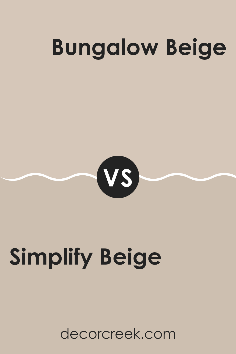
Simplify Beige SW 6085 by Sherwin Williams vs Soft Suede SW 9577 by Sherwin Williams
Simplify Beige (SW 6085) by Sherwin Williams is a warm, neutral tone. It’s a flexible color, often used for creating inviting, cozy areas. This beige brings a soft warmth to rooms, making them feel comfortable and welcoming without being too intense.
On the other hand, Soft Suede (SW 9577) is a slightly darker, richer shade with a hint of brown. This color has more depth compared to Simplify Beige, giving it a bolder presence. Soft Suede can add a touch of elegance and richness to a room, making it feel more intimate.
Both colors work well in interior rooms, but Simplify Beige is better for lighter, airier areas, while Soft Suede is perfect if you want a deeper, more grounded look. These shades can complement each other beautifully and can be used together for a harmonious yet varied look in any room.
You can see recommended paint color below:
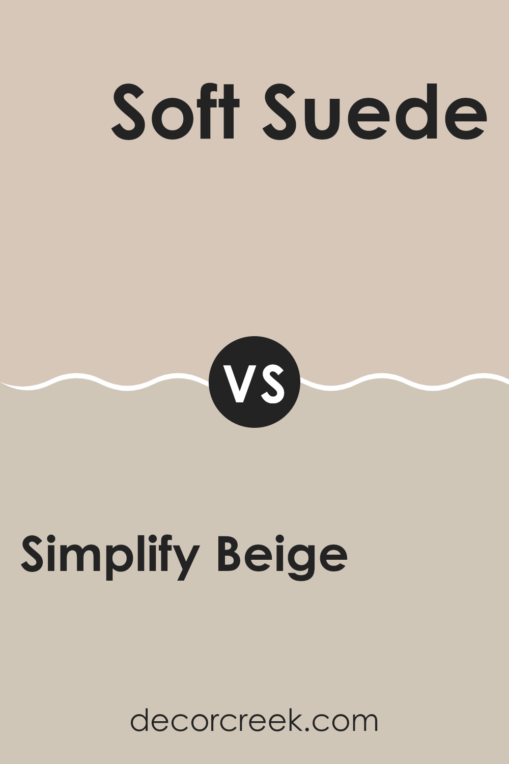
Simplify Beige SW 6085 by Sherwin Williams vs Malted Milk SW 6057 by Sherwin Williams
Simplify Beige SW 6085 and Malted Milk SW 6057 are two warm, neutral paint colors from Sherwin Williams, but they have distinct characteristics. Simplify Beige is a soft, light beige that creates a cozy and inviting atmosphere.
It’s flexible enough to work well with both traditional and modern designs, providing a warm backdrop without being too intense. On the other hand, Malted Milk is a bit richer and has a slight creamy undertone.
It tends to have a more pronounced warmth, making it ideal for making rooms feel comforting and snug. While both colors are neutrals, Simplify Beige leans towards a lighter and slightly cooler tone compared to the warmer, more indulgent feel of Malted Milk. Use Simplify Beige for a more subtle and airy feel, and Malted Milk if you prefer a richer, more enveloping hue for your room.
You can see recommended paint color below:
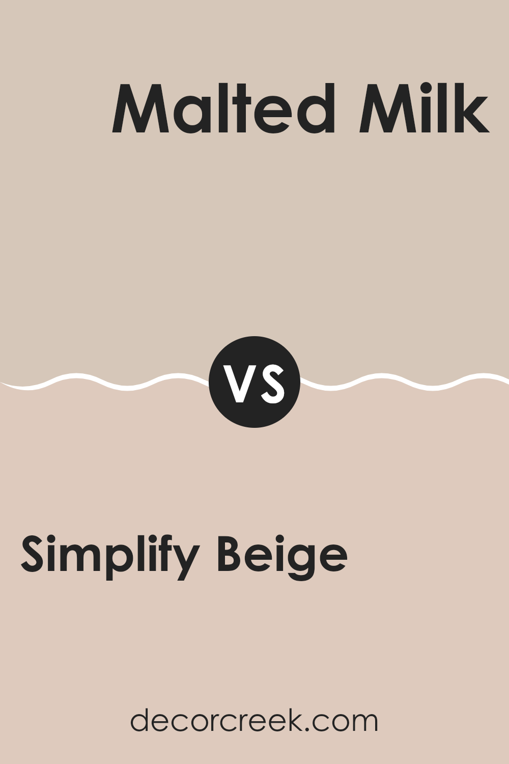
Simplify Beige SW 6085 by Sherwin Williams vs Touch of Sand SW 9085 by Sherwin Williams
Error making POST request: XMLHttpRequest error.
You can see recommended paint color below:
As I wrap up my thoughts on SW 6085 Simplify Beige by Sherwin Williams, I realize how much I appreciate this color. It’s a soft mix of warm brown and calming beige, perfect for any room in the house. Imagine touching a warm, smooth rock or seeing soft sand on a sunny day—that’s what it feels like to look at this color.
What I find special about Simplify Beige is its ability to work well with so many other colors. It can go with bright colors, making them pop, or with other soft colors, creating a peaceful feeling. Whether in the kitchen, living room, or bedroom, this shade brings a coziness that’s hard to beat.
Choosing Simplify Beige is a bit like choosing your favorite comfy sweater—it just feels right. If you want a color that’s friendly and comforting without being loud or too quiet, this could be the one. It feels like home and makes rooms feel welcoming and warm.
As I’ve talked about it, I feel sure that this color can make a big difference in making rooms feel just right. It’s gentle, comforting, and as easy as a warm hug from a loved one. So, in my view, if you’re looking for a gentle and cozy color, SW 6085 Simplify Beige is a wonderful choice!
Ever wished paint sampling was as easy as sticking a sticker? Guess what? Now it is! Discover Samplize's unique Peel & Stick samples.
Get paint samples


