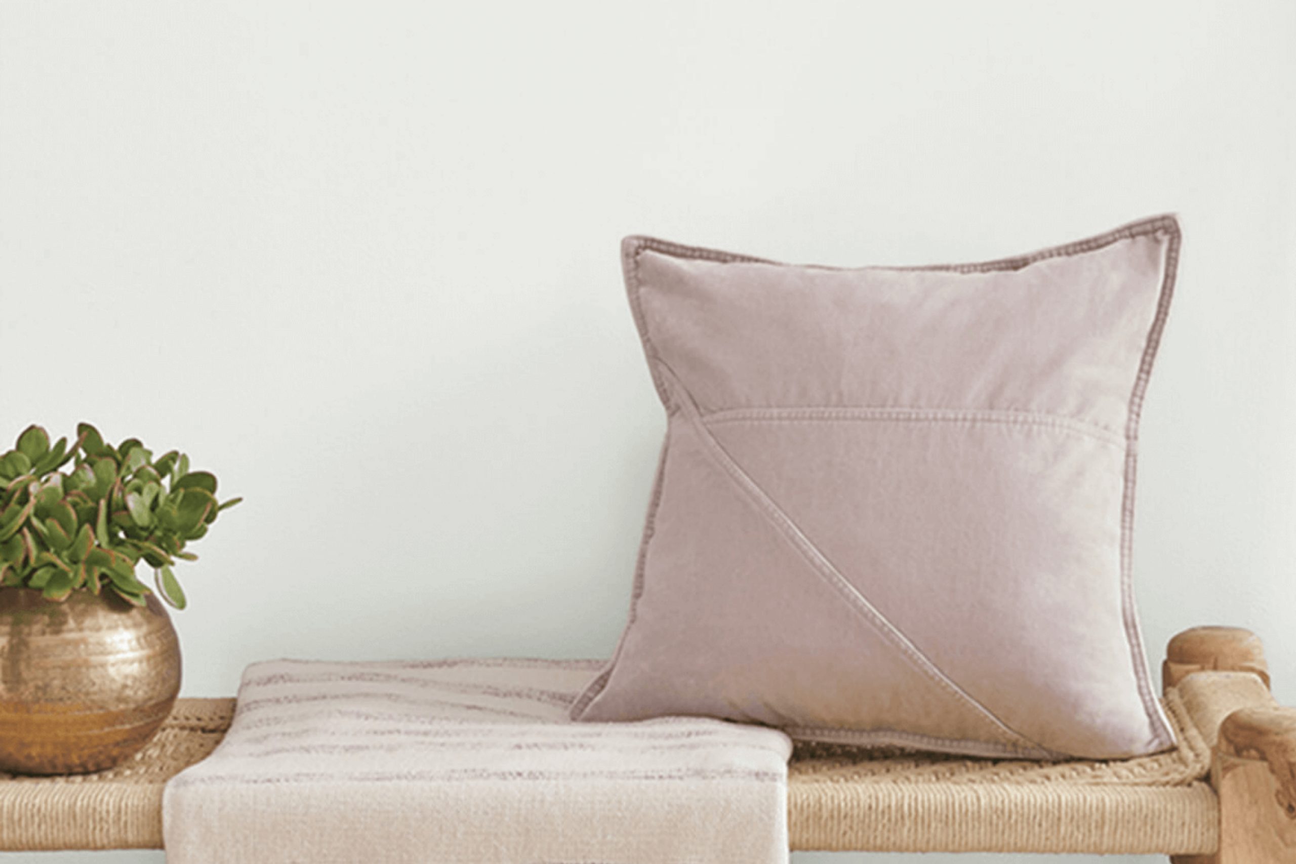
When I first came across SW 9543 Gypsum by Sherwin Williams, I was immediately drawn to its gentle, soothing hue. It’s a color that effortlessly brings a sense of calm and serenity to any space. Gypsum is a soft, muted off-white with a subtle undertone that feels both warm and inviting. It’s the kind of color that serves as a perfect backdrop for almost any room.
I started to imagine how it could impact different areas in my home. In the living room, it would create a cozy and welcoming space for relaxing or entertaining guests. In the bedroom, it offers a peaceful environment ideal for unwinding after a long day.
I can even picture it in a bathroom, adding to the clean and refreshing vibe one typically desires there.
What I love about Gypsum is its versatility. It pairs beautifully with a variety of colors and styles, whether your tastes lean more towards modern, traditional, or somewhere in between. The color is sophisticated yet simple, making it easy to coordinate with different textures and decor elements.
When I look at a wall painted in Gypsum, it feels balanced and harmonious, a foundation upon which I can build my design vision.
What Color Is Gypsum SW 9543 by Sherwin Williams?
Gypsum by Sherwin Williams is a soft, subtle shade that bridges the gap between white and beige. This warm, creamy color has a timeless quality, making it an excellent choice for a wide variety of interior styles. It’s gentle enough to serve as a neutral backdrop yet warm enough to add coziness to a space.
This color works beautifully in a minimalist or Scandinavian-style interior, where its light hue can make a room feel airy and open. It’s also well-suited for farmhouse or rustic styles, complementing wood accents and bringing out the charm of natural materials.
Gypsum pairs well with both light and dark woods, creating a harmonious balance. It looks particularly well with materials like linen, cotton, and wool, which add warmth and texture. In a modern setting, a splash of Gypsum against metal or glass elements can achieve a clean, elegant look. Additionally, it works well alongside soft, plush textures such as velvet or chenille, adding depth.
Whether it’s used on walls, ceilings, or trim, this color has a way of making spaces feel inviting and cohesive. Ideal for bedrooms, living rooms, or even kitchens, its versatile nature makes it an easy yet impactful choice for any home interior.
Is Gypsum SW 9543 by Sherwin Williams Warm or Cool color?
Gypsum SW 9543 by Sherwin Williams is a soft and versatile paint color. It is a light, warm beige that brings a sense of calm and warmth to any space. In homes, this color works well to create a cozy and inviting atmosphere. Its neutral tone makes it ideal for various rooms, whether it’s a living room, bedroom, or hallway.
Gypsum can complement many different materials and styles, from traditional wooden furniture to modern metal accents.
The lightness of the color also helps in making smaller spaces feel more open and airy. Since it reflects natural light well, it can brighten up areas that might otherwise feel dim. Pairing Gypsum with darker accents or vibrant decor can create a balanced contrast that adds character without overwhelming the space. Overall, Gypsum SW 9543 is a reliable choice for homeowners looking to create a warm and welcoming environment.
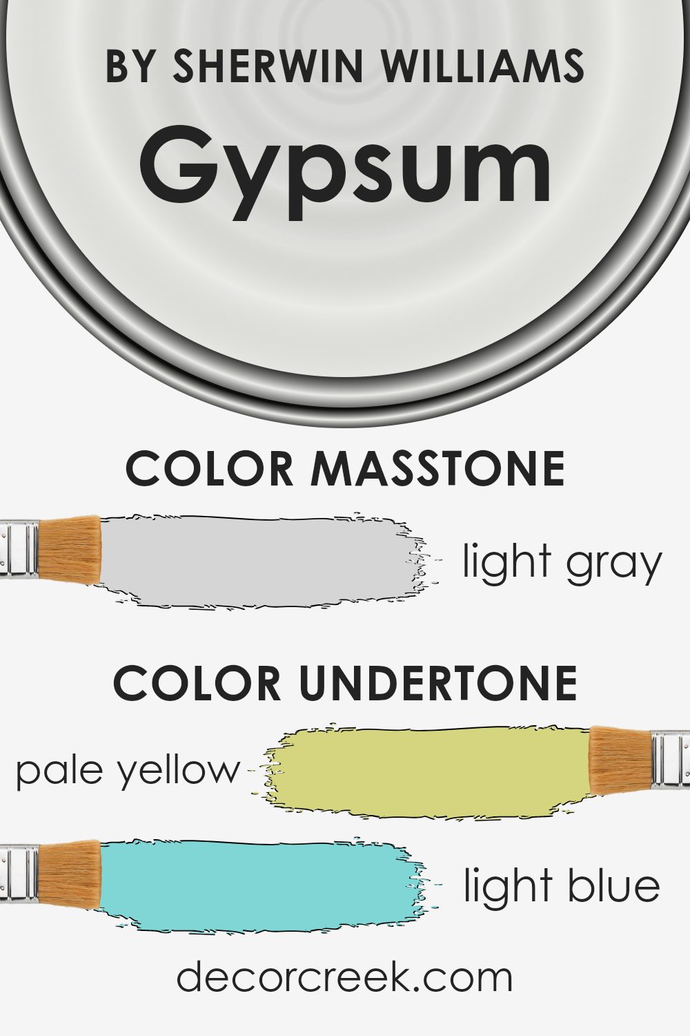
Undertones of Gypsum SW 9543 by Sherwin Williams
Gypsum SW 9543 by Sherwin Williams has a mix of undertones that make it unique. The main color is a soft, neutral shade that can appear different depending on the light and surroundings. Its pale yellow undertone adds a touch of warmth and brightness, making spaces feel inviting and cheerful.
The light blue undertone gives a cool and airy vibe, which can help rooms feel more relaxing and open. Meanwhile, the light purple and lilac undertones add a subtle touch of sophistication and can introduce a cozy atmosphere. The mint hint is refreshing, adding a crisp, clean feeling to the color.
Pale pink undertones bring a gentle, soft sense to the paint, rounding out the warmth and adding a sense of comfort. The presence of grey undertones provides a balancing effect, grounding the color and making it adaptable to different environments.
These undertones influence how we perceive Gypsum SW 9543. On interior walls, this means the paint can shift from warm to cool depending on the time of day and the type of lighting used. In north-facing rooms with less natural light, the cooler undertones might stand out more.
In contrast, in sunlit rooms, the warm undertones may become more prominent, creating a cozy feeling. This versatility makes it a fitting choice for various settings, as it can enhance the mood of a room and adapt to changing conditions.
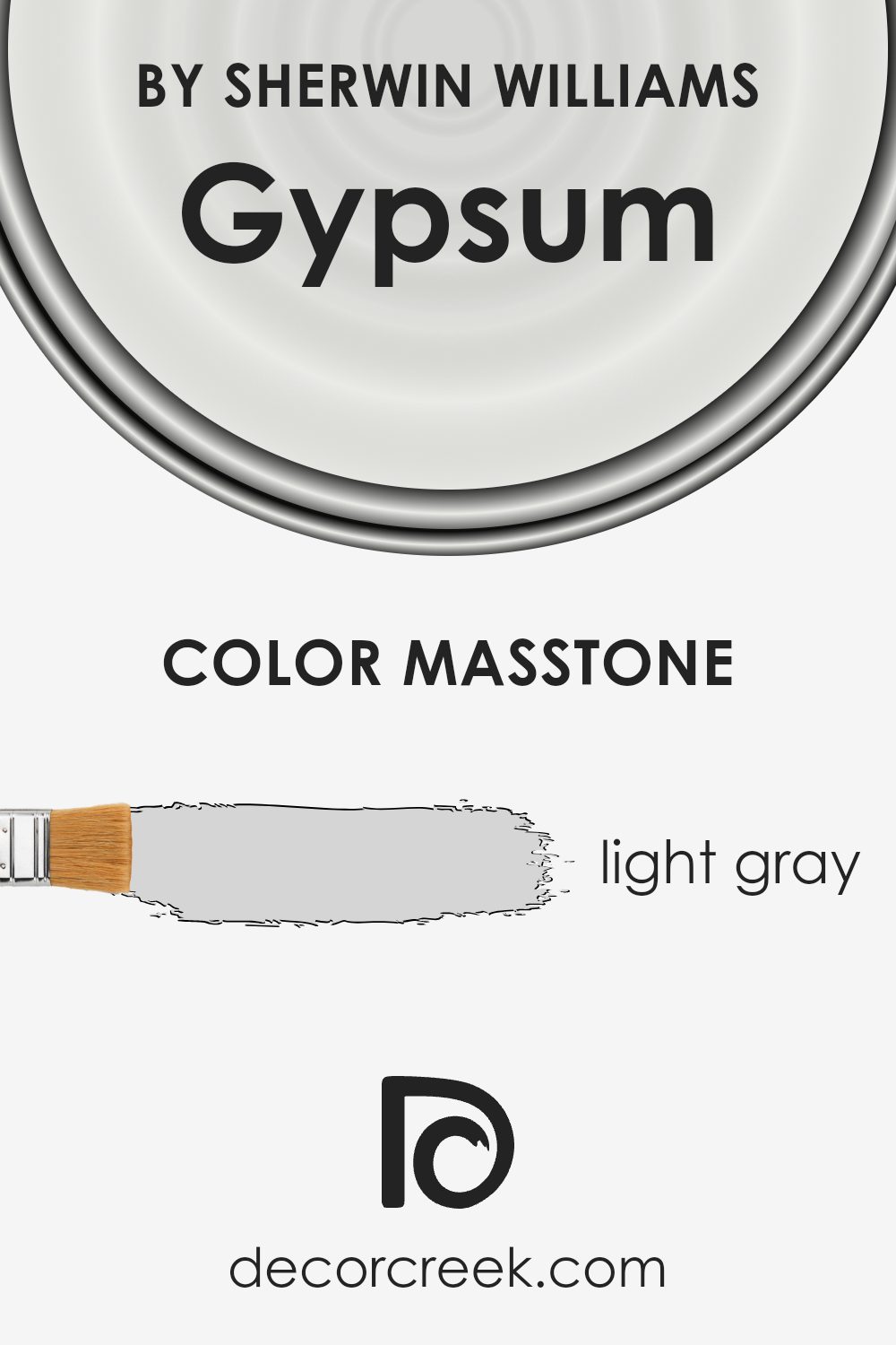
What is the Masstone of the Gypsum SW 9543 by Sherwin Williams?
Gypsum SW 9543 by Sherwin Williams is a light gray shade, with the masstone being a soft and neutral #D5D5D5. This gentle gray is versatile in home interiors due to its calming and unobtrusive nature. It offers a clean and fresh backdrop that pairs well with both bold and muted color schemes.
In living spaces, Gypsum provides an airy feel, making rooms appear larger and more open. It works well with natural light, reflecting it softly to create a bright and inviting atmosphere without overwhelming the senses. This color complements a variety of design styles, from modern minimalist to cozy traditional.
It can be used across all walls for a cohesive look or as an accent wall to create subtle contrast with deeper shades. Gypsum’s neutrality also makes it an excellent choice for spaces where you want to highlight other elements, such as artwork or furniture.
How Does Lighting Affect Gypsum SW 9543 by Sherwin Williams?
Lighting plays a crucial role in how we perceive color. The type and direction of light can change the appearance of a color in a room. The color Gypsum by Sherwin Williams, a soft and slightly warm beige, can look different under various lighting conditions.
In artificial light, such as LED or incandescent lighting, Gypsum may appear warmer. LED lights often have a bluish tone, which can make Gypsum look cooler, while incandescent lights, which have a yellow tint, might make the color feel warmer and cozier.
This is important to consider when choosing light bulbs for your lamps and fixtures.
When it comes to natural light, the direction from which the light enters a room significantly affects how Gypsum appears. In a north-facing room, natural light tends to be cooler and softer. This can make Gypsum look grayer and more subdued, as the cool light counteracts its warmth. North-facing rooms benefit from warmer colors, so Gypsum can help balance the coolness.
In contrast, a south-facing room receives the most consistent and warmest light throughout the day. Here, Gypsum will appear warm, highlighting its soft, beige undertones. This makes it a pleasant color choice for rooms that get a lot of sunlight.
East-facing rooms have more direct sunlight in the morning when the light is brighter and warmer. In the morning, Gypsum can look brighter and warmer, almost glowing. However, as the day progresses and the light becomes cooler, it may start to appear more muted.
West-facing rooms get warmer light in the afternoon and evening. In these rooms, Gypsum may appear warmer and richer in the afternoon sun, while appearing more neutral in the morning.
Understanding how Gypsum looks in different lighting conditions can help you decide if it’s the right color for your space.
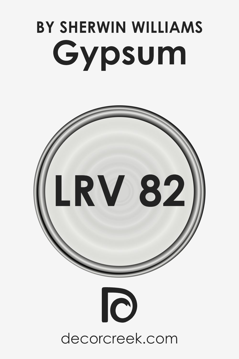
What is the LRV of Gypsum SW 9543 by Sherwin Williams?
Light Reflectance Value (LRV) is a measure of how much light a paint color reflects. It is on a scale from 0 to 100, with 0 being completely black, meaning it reflects no light, and 100 being completely white, meaning it reflects all light.
When it comes to paint, LRV is a vital consideration because it helps predict how light or dark a color will appear in a room. A higher LRV means the color will reflect more light, making spaces feel brighter and more open. This can be particularly useful for making small or dimly-lit rooms feel larger and more inviting.
For the color Gypsum with an LRV of 82.35, this value indicates that it is a very light color. The high LRV means Gypsum reflects a significant amount of light, which will make a room look brighter and more spacious. It can help to maximize natural light and give rooms an airy, open feeling.
This makes Gypsum a great choice for rooms that might be small or lack large windows, as its lightness helps brighten the space.
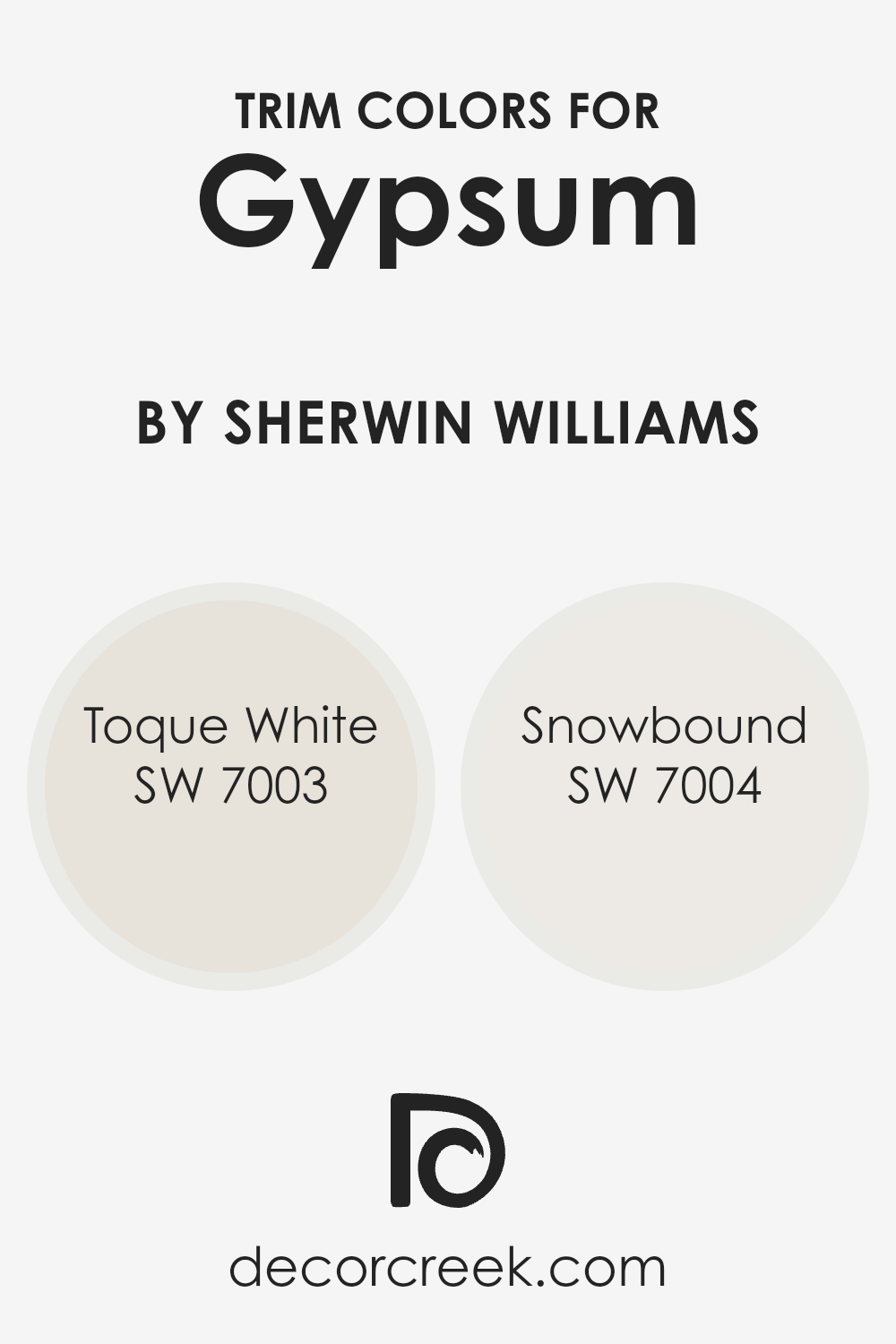
What are the Trim colors of Gypsum SW 9543 by Sherwin Williams?
Trim colors are the finishing touches that can make a significant difference in the overall appearance of a room. When used around windows, doors, baseboards, and other architectural features, they serve to highlight these areas and create visual contrast with the main wall color.
For a color like Sherwin Williams’ Gypsum, selecting the right trim colors is essential for achieving a cohesive and polished look. SW 7003 Toque White and SW 7004 Snowbound are excellent choices for trim alongside Gypsum because they provide subtle contrast without overpowering the soft and neutral tone of the walls.
The trim colors set the boundaries and add definition, ensuring that the space feels balanced and harmonious.
SW 7003 Toque White is a warm white that brings a touch of softness to any room. It is gentle and inviting, complementing both warm and cool tones. On the other hand, SW 7004 Snowbound is a cooler white with a slightly crisper edge, which gives a clean and refreshing look.
When paired as trim with Gypsum, these whites enhance the room’s brightness and add depth. They both subtly frame the space, allowing the neutral shade of Gypsum to serve as the main focus while adding an elegant and clean finish.
You can see recommended paint colors below:
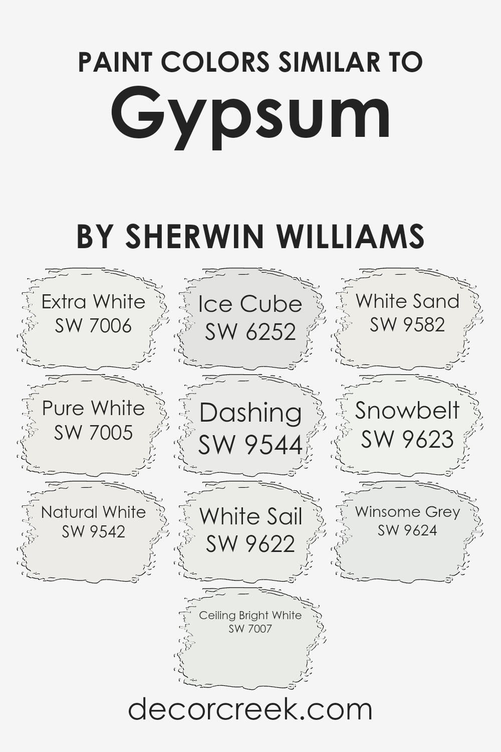
Colors Similar to Gypsum SW 9543 by Sherwin Williams
Similar colors are crucial in design because they create a sense of harmony and cohesion. When colors are close to each other on the color palette, such as those similar to Gypsum by Sherwin Williams, they naturally complement each other, ensuring a room feels balanced and inviting.
Extra White (SW 7006) acts as a bright and modern backdrop, making any space feel larger and airier. Pure White (SW 7005) is a versatile shade, offering a clean and classic look that works well in any setting.
Natural White (SW 9542) is a soft, warm white that adds a subtle touch of comfort to the décor, while Ceiling Bright White (SW 7007) is perfect for creating a pristine, spacious feel in any room.
Ice Cube (SW 6252) brings a touch of coolness with its slight blue undertone, ideal for adding a bit of freshness. Dashing (SW 9544) provides a gentle taupe-like color, which pairs excellently with other neutrals. White Sail (SW 9622) offers a light and breezy feel, reminiscent of warm, sunny days.
White Sand (SW 9582) features a hint of warmth, like a gentle, creamy beige, perfect for cozy, inviting spaces. Snowbelt (SW 9623) is a crisp, clean white that resembles freshly fallen snow.
Lastly, Winsome Grey (SW 9624) introduces a subtle gray hue, offering a sophisticated and timeless look that balances well with other shades.
You can see recommended paint colors below:
- SW 7006 Extra White
- SW 7005 Pure White
- SW 9542 Natural White
- SW 7007 Ceiling Bright White
- SW 6252 Ice Cube
- SW 9544 Dashing
- SW 9622 White Sail
- SW 9582 White Sand
- SW 9623 Snowbelt
- SW 9624 Winsome Grey
How to Use Gypsum SW 9543 by Sherwin Williams In Your Home?
Gypsum SW 9543 by Sherwin Williams is a soft, off-white paint color that can help create a warm and inviting atmosphere in any room. It has a subtle warmth that makes spaces feel cozy without overwhelming them. People often choose Gypsum for living rooms, bedrooms, or even kitchens because it complements a variety of furniture styles and materials.
This color works well as a base, allowing you to easily change the look and feel of a room with colorful accessories or bold artwork. It pairs nicely with natural wood tones and can highlight decorative features like moldings or built-in shelves.
If you’re looking to paint a small room, Gypsum’s light hue can make the space feel more open and airy.
Additionally, it can be used on ceilings or trim to create a cohesive look throughout your home. Overall, Gypsum SW 9543 is a versatile option for anyone looking to refresh their home’s interior with a classic and timeless color.
Gypsum SW 9543 by Sherwin Williams vs Natural White SW 9542 by Sherwin Williams
Gypsum SW 9543 and Natural White SW 9542 by Sherwin Williams are both light, neutral colors that add a touch of elegance to any space. Gypsum is slightly warmer with a subtle hint of beige, making it cozy and inviting. It’s a great choice for creating a warm and comfortable atmosphere.
On the other hand, Natural White is cooler and crisper, with a touch of gray. This gives it a clean and fresh look that can make spaces feel more open and airy.
While both colors are versatile and work well with many different styles, Gypsum fits nicely in spaces where you want a softly warm feeling. Natural White, by contrast, is ideal for modern or minimalist spaces where a clearer, more open-feeling white is desired. Both colors work beautifully on walls, giving them a gentle and neutral backdrop, but they offer slightly different moods due to their warmth and undertones.
You can see recommended paint color below:
- SW 9542 Natural White
Gypsum SW 9543 by Sherwin Williams vs Extra White SW 7006 by Sherwin Williams
Gypsum SW 9543 and Extra White SW 7006 are two popular paint colors from Sherwin Williams, each offering a distinct feel for any space. Gypsum is a soft, creamy hue with a warm undertone, creating a cozy and inviting atmosphere. It works well in rooms where you want a subtle touch of color without being overpowering.
Extra White, on the other hand, is a crisp, clean white that adds a sense of freshness and openness to any room. It’s perfect for spaces where you want a bright and clear look, and it pairs well with almost any other color.
While Gypsum provides warmth and a gentle backdrop, Extra White delivers a sharp, modern edge. Choosing between them depends on the mood you want to set: Gypsum for a warm, comforting vibe, or Extra White for a fresh and airy feel. Both colors are versatile and can complement a variety of styles and designs.
You can see recommended paint color below:
Gypsum SW 9543 by Sherwin Williams vs Winsome Grey SW 9624 by Sherwin Williams
Gypsum SW 9543 by Sherwin Williams is a soft, light color often described as a gentle off-white with a hint of warmth. It’s versatile and works well in a variety of spaces, offering a bright and airy feel. It easily complements both bold and neutral accents, making it a popular choice for creating a clean and inviting atmosphere.
On the other hand, Winsome Grey SW 9624 is a medium grey that brings a bit more depth and character. It offers a balanced look—not too dark, yet providing enough contrast to create interest in a room. This grey is great for adding a touch of sophistication without being overpowering. It pairs nicely with both lighter and darker hues, giving it flexibility in design.
When comparing the two, Gypsum is lighter and softer, enhancing brightness, while Winsome Grey provides a cooler, more grounded feel with its subtle depth. Both are excellent choices, depending on your desired ambiance.
You can see recommended paint color below:
- SW 9624 Winsome Grey
Gypsum SW 9543 by Sherwin Williams vs Ice Cube SW 6252 by Sherwin Williams
Gypsum SW 9543 and Ice Cube SW 6252 are two subtle and versatile paint colors from Sherwin Williams. Gypsum is a soft, warm white with gentle undertones of beige, making it feel cozy and welcoming. It’s a great choice for creating a calm and neutral space that works well with various decor styles.
In contrast, Ice Cube is a cool white with a hint of blue-gray, giving it a fresh and crisp appearance. This color can make spaces feel more open and airy, making it perfect for modern and contemporary designs. It pairs well with cool tones and can add a touch of sophistication to a room.
When placed side by side, Gypsum exudes warmth and comfort, while Ice Cube offers a cooler and more refreshing vibe. The choice between them depends on the atmosphere you want to create—cozy and inviting with Gypsum, or bright and clean with Ice Cube.
You can see recommended paint color below:
Gypsum SW 9543 by Sherwin Williams vs Dashing SW 9544 by Sherwin Williams
Gypsum SW 9543 and Dashing SW 9544 by Sherwin Williams are two soft, neutral colors that offer a gentle and pleasant ambiance to any space. Gypsum is a subtle, light off-white with a hint of warmth, providing a clean and fresh backdrop that enhances natural light.
It is versatile, making it a great choice for walls, ceilings, or trim, as it pairs well with various color schemes and styles.
On the other hand, Dashing is slightly darker and more robust compared to Gypsum. It possesses a richer, earthier tone that adds more depth and contrast to a room’s palette while still maintaining a welcoming feel. This color is excellent for creating accent walls or adding a bit of definition to your decor. When used together, Gypsum brings brightness and airiness, while Dashing provides balance and groundedness, ensuring a cohesive and inviting environment.
You can see recommended paint color below:
- SW 9544 Dashing
Gypsum SW 9543 by Sherwin Williams vs Ceiling Bright White SW 7007 by Sherwin Williams
Gypsum (SW 9543) and Ceiling Bright White (SW 7007) by Sherwin Williams are both light colors, ideal for creating a clean and open feel in a space. Gypsum is a soft, warm, off-white with subtle beige undertones. It’s versatile and works well in living rooms or bedrooms, providing a warm and inviting atmosphere.
This color is perfect if you’re looking for a gentle backdrop that adds warmth without overwhelming other elements in the room.
On the other hand, Ceiling Bright White is a cool, crisp white. It is often used on ceilings because of its bright and clean appearance, helping to reflect light and make a room feel larger and more open. This shade is ideal for modern spaces where a more minimalistic and pure white look is desired.
Both colors work well together, with Gypsum offering a bit of warmth while Ceiling Bright White complements with clarity and brightness.
You can see recommended paint color below:
Gypsum SW 9543 by Sherwin Williams vs White Sail SW 9622 by Sherwin Williams
Gypsum SW 9543 and White Sail SW 9622 are two popular colors from Sherwin Williams. Gypsum is a soft, warm white with subtle beige undertones, creating a cozy and inviting atmosphere. It’s perfect for spaces where you want to add warmth without overwhelming the senses.
This color is excellent for living rooms and bedrooms where a calm and welcoming vibe is desired.
On the other hand, White Sail is a clean, crisp white with slight gray undertones, lending it a cooler and more modern feel. It’s ideal for areas where a fresh, bright look is needed, like kitchens or bathrooms. White Sail pairs nicely with both bold and muted colors, offering versatility in various design styles.
Together, Gypsum and White Sail can complement each other well. Using Gypsum on walls and White Sail for trim can create a dynamic yet harmonious look, balancing warm and cool tones in any room.
You can see recommended paint color below:
- SW 9622 White Sail
Gypsum SW 9543 by Sherwin Williams vs Pure White SW 7005 by Sherwin Williams
Gypsum SW 9543 and Pure White SW 7005 are two popular colors by Sherwin Williams, each with its own unique appeal. Gypsum is a soft, warm white with subtle undertones, making it versatile for various spaces. It has a gentle, creamy quality that can add warmth to a room without overpowering it.
In contrast, Pure White is a clean, crisp white that offers a fresh and modern look. It provides a bright and airy feel, making it perfect for creating a sense of space and cleanliness. While Gypsum works well in cozy settings where comfort is desired, Pure White excels in areas where a minimalist and contemporary atmosphere is the goal.
Both colors can serve as excellent backgrounds for other colors or stand alone for a simple, elegant look. Choosing between them depends on whether you prefer a warmer or cooler aesthetic in your space.
You can see recommended paint color below:
Gypsum SW 9543 by Sherwin Williams vs White Sand SW 9582 by Sherwin Williams
Gypsum SW 9543 and White Sand SW 9582 by Sherwin Williams are both subtle, neutral colors, but they have their own distinct characteristics. Gypsum is a light gray tone with a gentle warmth. It feels soft and can create a cozy environment without being too heavy, making it a versatile choice for different rooms in a home.
White Sand, on the other hand, leans slightly more towards an off-white with a hint of beige. This gives it a slightly warmer, softer appearance compared to Gypsum. White Sand can add a touch of warmth to a space without being too intense or bold. Both colors are excellent backdrops for various design styles, offering a clean and fresh look
. Gypsum is ideal if you prefer a more subdued gray tone, while White Sand is perfect for those who want a hint of creamy warmth in their living space.
You can see recommended paint color below:
- SW 9582 White Sand
Gypsum SW 9543 by Sherwin Williams vs Snowbelt SW 9623 by Sherwin Williams
Gypsum SW 9543 and Snowbelt SW 9623 by Sherwin Williams are two soft, neutral colors that offer different vibes for home interiors. Gypsum SW 9543 is a light, warm beige that creates a cozy and inviting atmosphere. It pairs well with earthy tones and natural materials, making it a good choice for living rooms or bedrooms where a sense of warmth is desired.
On the other hand, Snowbelt SW 9623 is a very light gray with a hint of coolness, lending a more modern and crisp feel to a space. It works well in areas where you want a clean, airy look, like kitchens or bathrooms. Snowbelt is versatile and easy to coordinate with blues, greens, and other cool tones.
Both colors are subtle and can serve as excellent backdrops, but Gypsum feels warmer and more traditional, while Snowbelt gives off a cooler, more contemporary vibe.
You can see recommended paint color below:
- SW 9623 Snowbelt
Conclusion
This color makes any room look bright and cheerful without being too harsh or cold. Gypsum seems to get along well with other colors, which makes it a perfect backdrop for different styles or decorations.
When I think about using Gypsum in my own home, I imagine it in spaces where I want to feel at ease, like a living room or bedroom. It’s a color that doesn’t shout for attention but still makes a place look neat and tidy.
I realize that using Gypsum can make everything else in a room look even better, whether it’s colorful cushions, pretty art, or a nice wooden table.
It’s nice to know that just with the right paint color, I can make my home feel more comfortable and stylish. SW 9543 Gypsum seems to be a clever choice for anyone wanting to create a warm and friendly environment. It shows how a simple color change can have a big impact, making any area feel more homely and pleasant.
In thinking about my own decorating plans, this color could be a smart pick, helping me bring everything together beautifully.
Ever wished paint sampling was as easy as sticking a sticker? Guess what? Now it is! Discover Samplize's unique Peel & Stick samples.
Get paint samples

