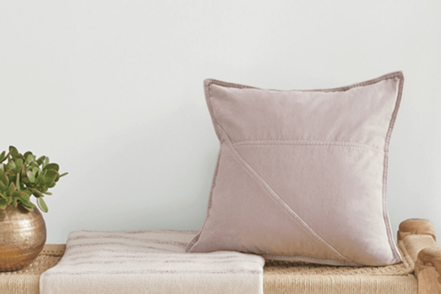
The Sherwin Williams shade SW 6252, also known as Ice Cube, is a popular choice for those looking to bring a fresh and airy feel to their space. As a cool and crisp color, Ice Cube sits perfectly on the spectrum where light gray meets the softest hint of blue. It’s a subtle hue that can make rooms feel more spacious and bright, without overwhelming the senses.
Choosing the right paint color is crucial for setting the tone and mood of a room, and Ice Cube offers a versatile option that works well in a variety of settings.
Whether you’re aiming to create a serene bedroom retreat, a productive home office, or a welcoming living area, Ice Cube can adapt to fit your aesthetic needs. Its light-reflecting properties help to enhance natural light, making it an excellent choice for spaces that could use a little lift.
Furthermore, Ice Cube pairs beautifully with a wide range of decor styles and other colors, from bold and vibrant accents to more muted and neutral palettes. Its understated elegance makes it a go-to for interior designers and homeowners looking to achieve a modern, yet timeless look.
Whether you’re planning a complete overhaul or a simple refresh, consider how Ice Cube by Sherwin Williams could transform your space.
What Color Is Ice Cube SW 6252 by Sherwin Williams?
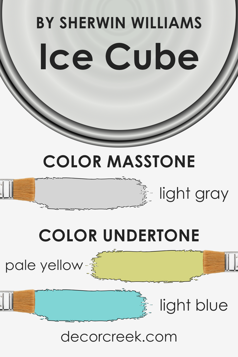
Ice Cube by Sherwin Williams is a sleek and subtle shade that brings a breath of fresh air into any space. This color stands out for its cool, almost transparent vibe, which mimics the clarity and crispness of an actual ice cube. It’s a very light gray with just a hint of blue undertone, making it versatile and refreshing.
This subdued hue works exceptionally well in modern and minimalist interior styles. Its clean and understated essence doesn’t overwhelm, making it perfect for creating a serene and inviting atmosphere. Because of its neutral yet distinctly cool palette, Ice Cube pairs beautifully with a wide range of materials and textures.
Think of the smoothness of marble countertops in a kitchen or the rich texture of a woolen throw in a living room. These combinations can bring warmth to the coolness of Ice Cube, creating a balanced and harmonious look.
In terms of materials, natural wood with its warm tones contrasts nicely with Ice Cube, adding a touch of warmth to the coolness of the walls. Metal accents, such as in frames or light fixtures, in silver or chrome, complement its subtle blue undertones, enhancing a modern aesthetic.
Ice Cube is also an excellent choice for spaces that aim for a light and airy feel, like bathrooms and bedrooms, as it reflects light beautifully, making the area appear more spacious and luminous. Combining it with soft textures, like cotton or linen, can soften the overall look and feel of the room, creating a cozy yet sophisticated space.
Ever wished paint sampling was as easy as sticking a sticker? Guess what? Now it is! Discover Samplize's unique Peel & Stick samples.
Get paint samples

Is Ice Cube SW 6252 by Sherwin Williams Warm or Cool color?
Ice Cube SW 6252 by Sherwin Williams is a unique color that brings a fresh and airy feel to any home. This shade has a subtle coolness to it, much like the name suggests, which can help to create a serene and calming atmosphere in a space. Its lightness allows it to reflect natural light beautifully, making rooms appear more spacious and bright. This makes it an excellent choice for smaller spaces or rooms that don’t get a lot of sunlight.
Its versatility is one of its strongest points. Ice Cube can fit seamlessly with a wide range of décor styles, from modern to rustic, without overpowering other elements in the room.
This color can be used in living rooms to create a peaceful setting or in bedrooms to encourage relaxation. Additionally, it works well in bathrooms and kitchens, adding a clean and crisp backdrop.
The beauty of Ice Cube also lies in its ability to pair well with both warm and cool tones, giving homeowners the flexibility to mix and match décor items and furniture. Whether you’re looking to create a soothing retreat or a bright and inviting space, Ice Cube can help achieve the desired atmosphere with its quiet elegance and understated charm.
Undertones of Ice Cube SW 6252 by Sherwin Williams
Ice Cube, a paint color by Sherwin Williams, has subtle undercurrents that play a crucial role in how it’s perceived. Specifically, it carries pale yellow and light blue undertones. Undertones are like a secret layer that can change the appearance of a color depending on the light and what’s around it. They can make a color feel warmer or cooler and affect how it blends with other colors in a room.
When we think about how undertones affect our view of colors, imagine wearing a white shirt in different lighting—it can look pure white, or it might pick up colors from around it, appearing slightly blue or yellow. That’s the power of undertones. They’re why a color can look different in the store than it does in your home.
For Ice Cube on interior walls, these pale yellow and light blue undertones add a unique character. In rooms with a lot of natural light, the pale yellow undertone might make the walls feel slightly warmer, adding a subtle cozy glow.
Meanwhile, in spaces with cooler, artificial light, the light blue undertone might become more pronounced, giving the room a fresh and serene vibe. This means Ice Cube is versatile, able to subtly shift and adapt to the lighting and furnishings of a room, making it a sophisticated choice for those looking to create a calm and inviting space.
What is the Masstone of the Ice Cube SW 6252 by Sherwin Williams?
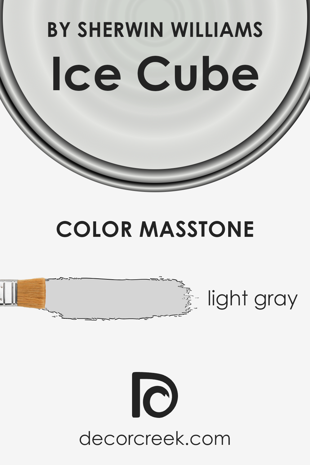
Ice Cube is a refreshing and light gray color that has a masstone of #D5D5D5. This subtle and soft shade is perfect for creating a calm and welcoming atmosphere in any room of the house. Its light gray tone brings a sense of openness and brightness, making small spaces appear larger and more inviting. Whether you’re looking to paint a cozy bedroom, a serene bathroom, or a peaceful living area, Ice Cube works beautifully by providing a neutral backdrop that complements a wide range of decor styles and colors.
This color’s versatility makes it an excellent choice for those looking to update their homes without committing to a bold or overpowering shade. Its lightness helps in reflecting natural light, enhancing the overall airy feel of a space. Additionally, Ice Cube’s understated elegance allows for creativity in decorating, as it pairs well with both soft pastels and bold accents, enabling personal expression in interior design.
How Does Lighting Affect Ice Cube SW 6252 by Sherwin Williams?
Lighting plays a huge role in how colors look in a room. Different kinds of light can make a color appear completely different. Let’s take a color like Ice Cube by Sherwin Williams as an example to see how it changes under various lighting conditions.
- In artificial light, which usually comes from bulbs in the ceiling or lamps, Ice Cube can look different based on the type of bulb. Warm bulbs can make it appear softer and slightly more inviting, while cool LEDs might make it lean more towards a crisp, clean look. The change might not be dramatic, but it’s definitely noticeable once you’re looking for it.
- Natural light, the light from the sun that streams in through windows, also affects how Ice Cube looks. Natural light changes throughout the day and depends on which direction your windows are facing:
- North-faced rooms get less direct sunlight, so Ice Cube might look a bit cooler and more subtle in these spaces. It keeps its crispness but doesn’t get warmed up by the light much.
- South-faced rooms are flooded with warm, bright sunlight for most of the day. Here, Ice Cube will look lighter and might even seem to glow a bit because of the bright conditions.
- East-faced rooms get a lot of light in the morning. This means Ice Cube will start off looking very bright and lively in the morning and then move towards a cooler tone in the afternoon and evening as the sunlight fades.
- West-faced rooms have the opposite effect. They’re cooler in the morning and then fill with warm, golden light in the late afternoon and evening. Ice Cube in these rooms transitions from a cool, neutral start to a warmer, richer look towards the end of the day.
All these differences show how lighting isn’t just about how bright a room is but also about the quality and direction of the light. Ice Cube’s versatility under various lighting conditions makes it a great choice for many spaces, adapting well to different atmospheres and times of day.
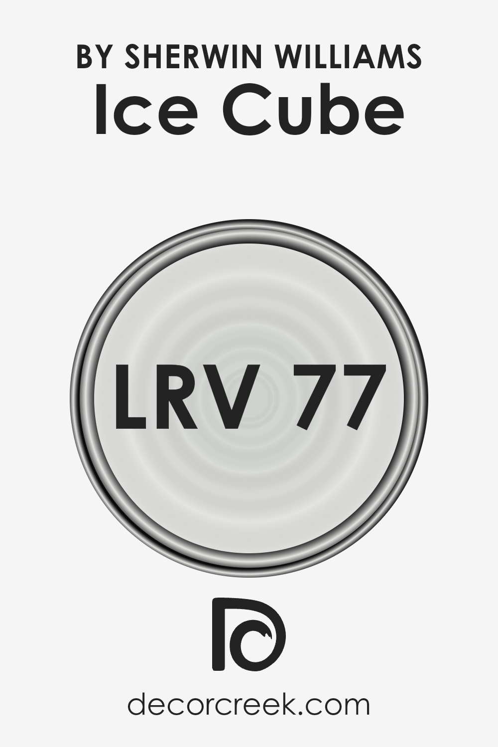
What is the LRV of Ice Cube SW 6252 by Sherwin Williams?
LRV stands for Light Reflectance Value. It’s a scale from 0 to 100 that tells you how much light a color can reflect. Imagine a black box; it would have an LRV close to 0 because it doesn’t reflect much light.
On the other hand, a white box could be close to 100, since it reflects most of the light it receives. This LRV thing is super useful when you’re picking out paint colors because it helps you understand how bright or dark a color will look on your walls. If a room doesn’t get a lot of light, a high LRV color can make it feel brighter and more welcoming.
The LRV of the color we’re talking about is 77.491, which means it’s pretty bright. It’s not pure white, but it’s up there. It’ll bounce back a lot of light, making the room feel airy and spacious. This is great for spaces that you want to feel open and relaxed.
If you’re thinking about using this color in a room that already gets a lot of sunlight, it’ll enhance that brightness. In a darker room, it can help lift the space and make it feel less cramped. So, in essence, this LRV level offers a lot of flexibility, working well in most spaces and bringing in a fresh, light feel wherever it’s applied.
Coordinating Colors of Ice Cube SW 6252 by Sherwin Williams
Coordinating colors are shades that harmonize well with a primary paint color, enhancing the overall aesthetic of a room or design. They play a crucial role in creating a balanced and visually appealing space. When chosen carefully, coordinating colors can bring out the best in your primary color, adding depth and character to your décor. In the case of a cool and subtle hue like Sherwin Williams’ Ice Cube, finding the right coordinating colors is key to achieving a cohesive look.
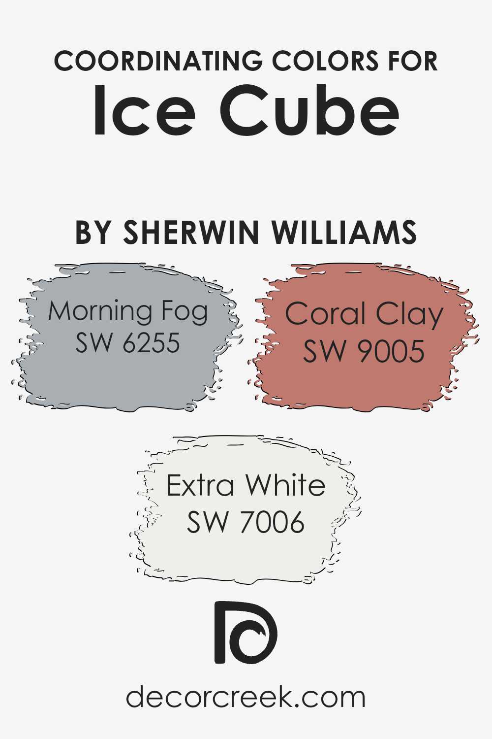
Among the coordinating colors for Ice Cube, Morning Fog offers a soft, serene backdrop that complements its coolness with a slightly warmer undertone, providing a soothing contrast.
It’s a versatile gray that bridges the gap between cool and warm tones, making it perfect for creating a tranquil space.
Extra White, on the other hand, serves as a bright, crisp canvas that allows the subtlety of Ice Cube to stand out. It’s ideal for trim, ceilings, and woodwork, offering a fresh and clean look that enhances the room’s sense of space.
Coral Clay introduces a gentle hint of color, adding warmth and a touch of earthiness to the palette. This muted, warm terra cotta shade brings a cozy feel to the room, balancing the coolness of Ice Cube and Morning Fog, and completing the spectrum of coordinating colors with a harmonious and inviting vibe. By understanding how these colors work together, one can create a space that feels both unified and beautifully layered.
You can see recommended paint colors below:
- SW 6255 Morning Fog
- SW 7006 Extra White
- SW 9005 Coral Clay
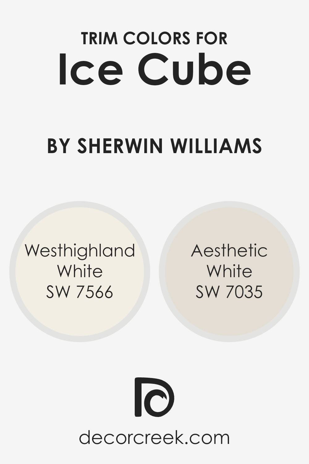
What are the Trim colors of Ice Cube SW 6252 by Sherwin Williams?
Trim colors play a crucial role in bringing out the best in a wall color, and this is especially true for a shade like Ice Cube by Sherwin Williams. They are essentially the accent colors applied to moldings, door frames, window frames, and other architectural features which outline or “trim” flat wall surfaces.
The choice of trim color can enhance the subtle tones of the main wall color, providing contrast or cohesion that elevates the overall aesthetic of a room. For Ice Cube, a soft, serene hue, the right trim colors can add depth and character, making the space feel more inviting and put-together.
Westhighland White (SW 7566) is a warm, creamy white that offers a smooth transition when used as a trim color with Ice Cube. It brings a soft, gentle contrast that highlights the architectural elements without overpowering the room’s tranquil vibe. Aesthetic White (SW 7035), on the other hand, is a slightly gray-toned white, producing a subtle, sophisticated framing for Ice Cube walls.
This shade leans towards a neutral palette, making it versatile and effortlessly chic, perfect for creating a refined backdrop that complements the cooler undertones of Ice Cube. Both colors work in harmony with Ice Cube, ensuring a polished, cohesive look that enhances the room’s aesthetic appeal.
You can see recommended paint colors below:
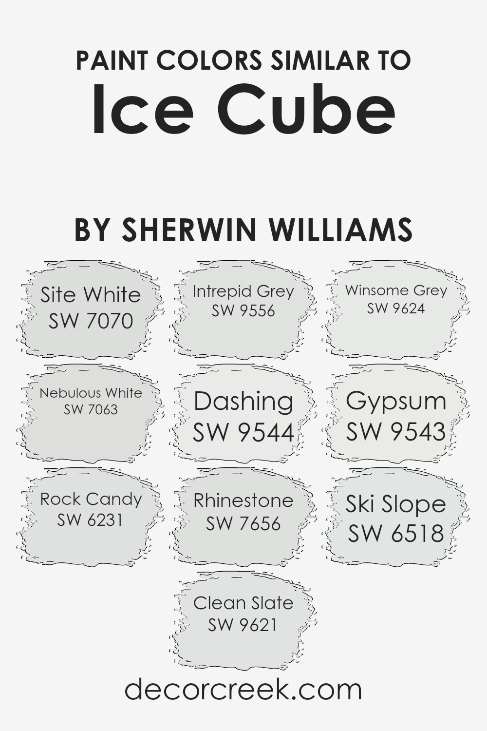
Colors Similar to Ice Cube SW 6252 by Sherwin Williams
Choosing similar colors is a crucial strategy in design, especially when aiming for a harmonious and balanced look. Similar colors, like those akin to Ice Cube by Sherwin Williams, share a cohesive palette that can subtly tie a room together or enhance a design’s aesthetic without overwhelming with contrast.
This palette ranges from the softness of neutrals to the depth of light greys, providing a spectrum that complements a variety of decor styles. Using shades like Site White, a clean and quiet whisper of color, and Nebulous White, which has a slightly more pronounced but still gentle grey undertone, allows for a seamless flow in spaces that aim for a light and airy feel.
- Meanwhile, Rock Candy offers a crisp backdrop, akin to a blank canvas, perfect for allowing furnishings and art to shine.
- Clean Slate introduces a touch of sophistication with its understated elegance, whereas Intrepid Grey brings a deeper, yet unobtrusive, strength to spaces, perfect for creating a statement without dominance.
- Dashing brings a dynamic, yet restrained, energy into rooms, appealing for its modern yet timeless quality.
- Rhinestone is another versatile player, lighting up spaces with its subtle luminosity.
- Winsome Grey, with its inviting warmth, bridges the gap between cool and cozy.
- Gypsum and Ski Slope, on the other hand, are the perfect complements to inject a serene and tranquil vibe into any design scheme.
All these colors, while similar, offer unique undertones and qualities that can either stand alone or pair beautifully, allowing for endless possibilities in creating sophisticated and cohesive interior spaces.
You can see recommended paint colors below:
- SW 7070 Site White
- SW 7063 Nebulous White
- SW 6231 Rock Candy
- SW 9621 Clean Slate
- SW 9556 Intrepid Grey
- SW 9544 Dashing
- SW 7656 Rhinestone
- SW 9624 Winsome Grey
- SW 9543 Gypsum
- SW 6518 Ski Slope
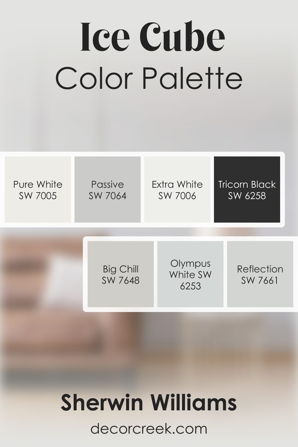
Ice Cube SW 6252 by Sherwin Williams Color Palette
The Ice Cube palette brings a cool breath of clarity, giving rooms a pleasant and airy feeling without ever feeling cold. Pure White and Extra White help the color shine at its brightest, while Big Chill and Olympus White add silky layers of gray that feel gentle and calm. Tricorn Black brings dramatic contrast that adds confidence and depth.
Reflection and Passive round out the palette with subtle gray-blue notes that feel light and uplifting.
Together, this group of colors creates an inviting blend that feels refreshing, modern, and easy to enjoy every day.
How to Use Ice Cube SW 6252 by Sherwin Williams In Your Home?
Ice Cube by Sherwin Williams is a cool, almost transparent shade of gray that brings a fresh and modern feel to any space. This color works great in rooms that get a lot of sunlight, as it helps to balance the brightness without overwhelming the space with color. It’s a perfect pick for someone looking to achieve a minimalist aesthetic but still wants a touch of sophistication.
You can use Ice Cube in various areas of your home. In the living room, it pairs well with soft whites and natural woods, creating a calm and inviting atmosphere. In the bedroom, it can help to create a peaceful retreat, coupling nicely with light blues or greens for a serene vibe. Even in a small bathroom, applying Ice Cube can make the space feel larger and more open.
This color is also a great choice for the kitchen, on cabinets or walls, providing a clean and crisp backdrop for both cooking and socializing. If you’re someone who likes to change up decor often, Ice Cube is a flexible foundation that can support a wide range of accent colors, from bold and vibrant to soft and pastel. In summary, Ice Cube by Sherwin Williams is a versatile paint color that can help refresh and revitalize your home with its subtle elegance.
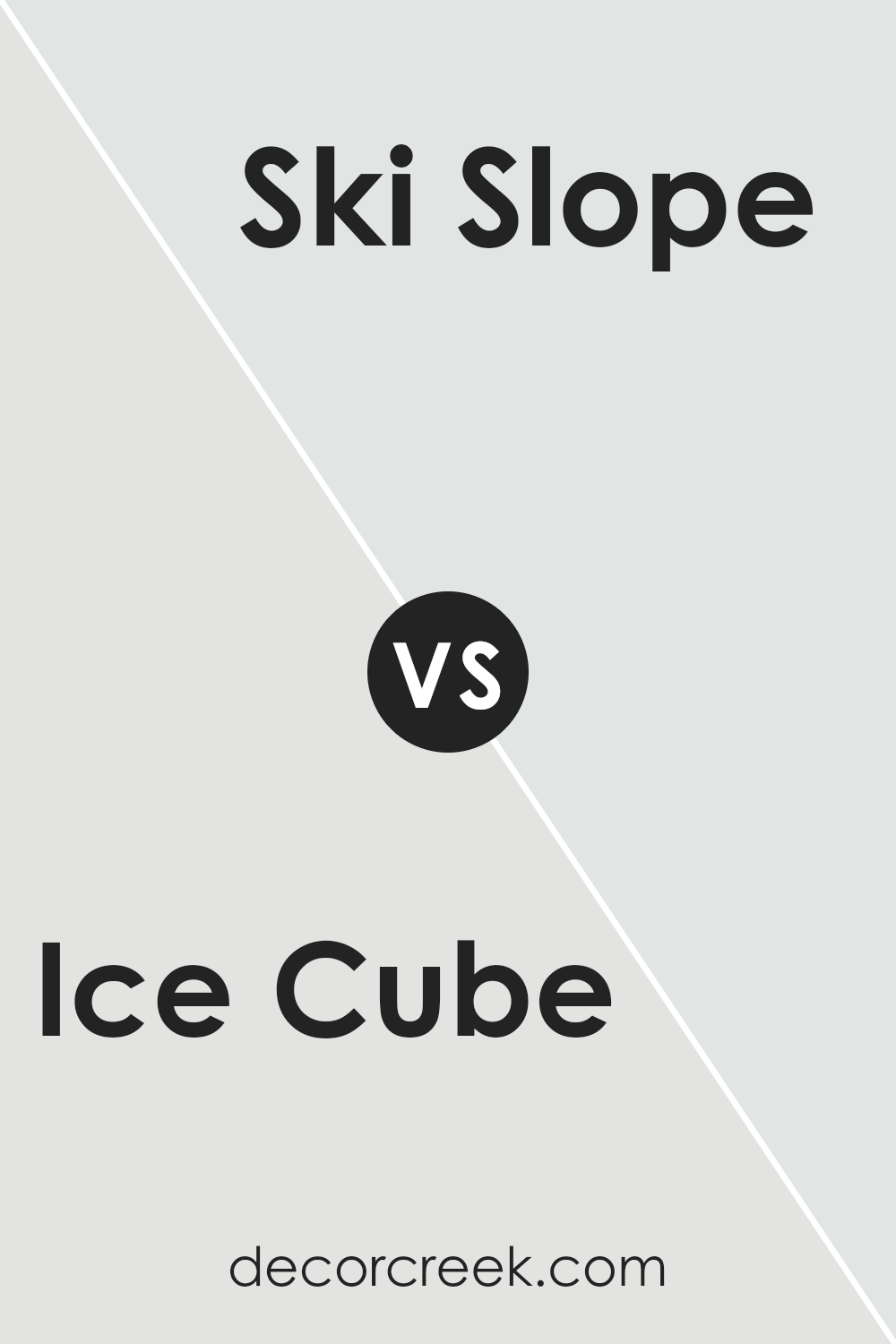
Ice Cube SW 6252 by Sherwin Williams vs Ski Slope SW 6518 by Sherwin Williams
Ice Cube and Ski Slope by Sherwin Williams are two distinct paint colors that bring their unique vibes to any space. Ice Cube is a light, airy blue with a subtle gray undertone, making it perfect for creating a calm and refreshing atmosphere. It works great in spaces where you want a touch of color without overwhelming the senses, like bedrooms or bathrooms.
On the other hand, Ski Slope has a soft, pale green tint that leans more towards a natural, earthy feel. It’s excellent for areas where you’re aiming to achieve a serene, peaceful environment, possibly in living rooms or kitchens. While both colors share a muted, pastel palette, Ice Cube provides a cooler temperature feel, reminiscent of a crisp winter day, whereas Ski Slope offers a more organic, soothing touch, akin to a gentle spring morning.
Choosing between them depends on the mood and style you’re looking to achieve, with each bringing its light, tranquil energy to your space.
You can see recommended paint color below:
- SW 6518 Ski Slope
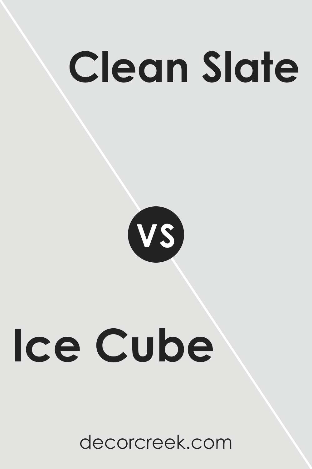
Ice Cube SW 6252 by Sherwin Williams vs Clean Slate SW 9621 by Sherwin Williams
Ice Cube and Clean Slate, both by Sherwin Williams, are distinct shades that serve different decorating purposes. Ice Cube is a light, airy blue with a touch of gray, giving it a cool, refreshing feel.
It’s great for making small rooms appear larger and brighter. On the other hand, Clean Slate steps in as a darker, more saturated color. It’s a blend of gray with hints of blue, offering a more grounded and serene vibe.
Think of Ice Cube as a gentle morning breeze, whereas Clean Slate resembles the stability and depth of the evening sky. Both colors are versatile, but while Ice Cube adds a subtle, calming background to any space, Clean Slate can make a stronger statement, perfect for creating a focal point or adding sophistication.
When choosing between them, consider the mood you want to set: Ice Cube for a light, fresh environment and Clean Slate for a deeper, more introspective space.
You can see recommended paint color below:
- SW 9621 Clean Slate
Ice Cube SW 6252 by Sherwin Williams vs Gypsum SW 9543 by Sherwin Williams
Ice Cube and Gypsum by Sherwin Williams are two distinctive shades that can breathe life into any space. Ice Cube is a light, cool gray shade that offers a very subtle hint of blue. This freshness makes it perfect for creating a serene and airy environment. It’s like a gentle breeze in a room, bringing a sense of calm and spaciousness.
On the other hand, Gypsum is a warmer tone, leaning towards a soft, creamy white. It has the knack for making rooms feel cozy and inviting. Unlike the cooler, crisp vibe of Ice Cube, Gypsum wraps you in a blanket of warmth, making it ideal for spaces where comfort is key.
Choosing between Ice Cube and Gypsum depends on the mood and atmosphere you want to set. If you prefer a clean, modern look that feels open and refreshing, Ice Cube is your go-to. For a more enveloping, snug feel, Gypsum will do the trick. Both colors stand out for their subtle nuances, offering different ways to light up a room.
You can see recommended paint color below:
- SW 9543 Gypsum
Ice Cube SW 6252 by Sherwin Williams vs Intrepid Grey SW 9556 by Sherwin Williams
Main color – Ice Cube is a cool, soft gray that feels like a gentle whisper against your walls. It’s light and airy, providing a subtle hint of color that’s perfect for creating a serene, calming space. This color is like a breath of fresh air, ideal for anyone looking to add a touch of simplicity and elegance to their home.
On the other hand, Intrepid Grey is a bit bolder and more pronounced. It’s still in the gray family but carries a stronger presence, making it a great choice for those wanting to make a more noticeable impact without going too dark.
Intrepid Grey walks that fine line between being neutral yet noticeable, giving your space a modern flair while still keeping things cozy.
When put side by side, Ice Cube offers a lighter, more ethereal feel, ideal for spaces that crave a subtle touch of color. Intrepid Grey, meanwhile, brings a tad more strength to the table, perfect for creating a statement while maintaining a sophisticated and welcoming atmosphere. Both colors work beautifully in their own right, depending on the mood and style you’re aiming for.
You can see recommended paint color below:
- SW 9556 Intrepid Grey
Ice Cube SW 6252 by Sherwin Williams vs Nebulous White SW 7063 by Sherwin Williams
Ice Cube and Nebulous White are both paints from Sherwin Williams. Ice Cube has a cool, refreshing look to it, somewhat like the clear, pale blue of a crisp winter morning. This color brings a touch of airy lightness to any room, giving it a clean, open feel. It’s perfect for creating a serene, calming environment.
On the other hand, Nebulous White leans towards a softer, warmer tone. It isn’t stark white; instead, it carries a hint of gray, making it incredibly versatile. This color can cozy up a space while keeping the overall look light and breezy. It works well in almost any setting, adding a gentle, inviting vibe.
When comparing the two, Ice Cube offers a cooler, more refreshing atmosphere, whereas Nebulous White provides a softer, warmer ambiance. Depending on the mood you want to achieve, Ice Cube lights up a space with its subtle blue undertones, while Nebulous White wraps a room in soft warmth. Both are excellent choices, but they serve slightly different purposes based on their underlying tones.
You can see recommended paint color below:
- SW 7063 Nebulous White
Ice Cube SW 6252 by Sherwin Williams vs Dashing SW 9544 by Sherwin Williams
Ice Cube and Dashing are both unique colors from Sherwin Williams, but they serve very different purposes in design. Ice Cube is a light, cool gray with a breath of blue, providing a fresh and airy feel to any room. It’s like the soft light of early morning, subtle and soothing, making spaces look larger and more open. This color works great in modern, minimalist, or Scandinavian-inspired interiors due to its crisp and clean nature.
On the other hand, Dashing is a vibrant, deep teal that adds a bold punch of color. Unlike Ice Cube’s understated vibe, Dashing isn’t afraid to stand out and make a statement. It’s the sort of color that brings energy and depth to a space, perfect for accent walls or to add a pop of color in a neutral room.
Dashing works well when you want to add a touch of drama or anchor a space with a strong, confident color.
In summary, while Ice Cube is all about creating a serene and open atmosphere with its light, cool tones, Dashing is about adding momentum and character with its vivid, deeper shades. Both colors offer something special to the design palette, but their uses are distinctively different based on the mood you want to create.
You can see recommended paint color below:
- SW 9544 Dashing
Ice Cube SW 6252 by Sherwin Williams vs Rhinestone SW 7656 by Sherwin Williams
Ice Cube and Rhinestone are two popular paint choices from Sherwin Williams, known for their subtle differences that can completely change the mood of a room. Ice Cube presents as a cool, light gray with a hint of blue undertones, giving off a fresh and airy vibe. It’s perfect for spaces where you want a clean, crisp look without it feeling too stark or cold. It reflects light beautifully, making it a great choice for small rooms or areas with limited natural light.
On the other hand, Rhinestone is a lighter gray that leans more towards a true neutral, without the noticeable blue undertones of Ice Cube. It’s almost like a soft, silvery gray that works wonderfully in spaces where you prefer a gentle, soothing neutral that blends seamlessly with other colors.
Rhinestone is incredibly versatile, working well in almost any space and complementing a wide range of decor styles, from modern to classic.
Both Ice Cube and Rhinestone offer subtle elegance and a modern touch to interiors but in slightly different shades of gray. While Ice Cube brings a cooler, crisper feel, Rhinestone offers a softer, more serene atmosphere. Choosing between them depends on the specific mood you want to create in your space.
You can see recommended paint color below:
- SW 7656 Rhinestone
Ice Cube SW 6252 by Sherwin Williams vs Winsome Grey SW 9624 by Sherwin Williams
Ice Cube and Winsome Grey by Sherwin Williams are two unique colors that bring their own vibe to a space. Ice Cube is like a breath of fresh air on a crisp winter morning, offering a light, almost ethereal feel to rooms. It has a cool undertone that makes it perfect for creating a serene, peaceful environment. Think of it as the kind of color that gently wakes you up, with its subtle, refreshing presence.
On the other hand, Winsome Grey has a bit more depth. It’s like the shadowy parts of a forest, not too dark but with a certain richness that adds complexity to spaces. This color offers warmth despite its name, making rooms feel cozy and inviting.
It’s the kind of grey that plays well with both natural light and artificial lighting, changing mood with the time of day.
Both Ice Cube and Winsome Grey can transform a space, but while Ice Cube leans towards a lighter, airy feel, Winsome Grey brings warmth and a hint of sophistication. Your choice between them depends on the atmosphere you’re aiming to create.
You can see recommended paint color below:
- SW 9624 Winsome Grey
Ice Cube SW 6252 by Sherwin Williams vs Rock Candy SW 6231 by Sherwin Williams
Ice Cube and Rock Candy are two colors by Sherwin Williams that have subtle differences, making them unique in their way. Ice Cube is a light, refreshing color with a hint of blue that gives a cool, airy feel to any space. It’s like looking at a piece of clear ice, with its soft, almost transparent appeal. This color is perfect for creating a calm and serene environment.
On the other hand, Rock Candy is a softer, more neutral color. It leans more towards a very light gray than a true pastel, providing a gentle and understated ambiance. While it still maintains a cool undertone, Rock Candy is warmer compared to Ice Cube. It’s like the difference between the light shade you might see on a cloudy day versus the crisp reflection off ice.
Both colors are excellent choices for anyone looking to freshen up their space with a modern and minimalistic touch. Ice Cube brings a sharper, more defined coolness, whereas Rock Candy offers a smoother, cozier feel. Whether you’re aiming for the crisp clarity of a winter morning or the soft embrace of early spring, these colors offer distinct vibes to suit your taste.
You can see recommended paint color below:
Ice Cube SW 6252 by Sherwin Williams vs Site White SW 7070 by Sherwin Williams
Ice Cube and Site White are two colors from Sherwin Williams that have their own unique vibes. Ice Cube is a light, cool gray that feels airy and fresh. It’s like the color of a very thin cloud on a sunny day, giving a sense of openness and calm. This color works great in spaces where you want a clean, modern look without going too stark or cold.
Site White, on the other hand, leans towards a soft, warm gray. It’s the kind of color that wraps a room in a cozy, welcoming atmosphere. It’s not as bright as Ice Cube, but it’s perfect for adding a subtle warmth to a space without overpowering it with too much color.
When comparing the two, Ice Cube brings a crisper, cooler tone that might feel more refreshing and modern. Site White offers a warmer touch that can make a room feel more intimate and homey. Depending on the mood you want to create in your space, either Ice Cube for a fresh, airy feel or Site White for a cozy, welcoming atmosphere could be the better choice.
You can see recommended paint color below:
- SW 7070 Site White
Conclusion
Ice Cube by Sherwin Williams is a paint color that has gained considerable attention for its understated elegance and versatility. It presents a refreshing, almost translucent quality, akin to the clarity and coolness suggested by its name. This color has a unique ability to complement a wide range of decor styles and settings, from modern minimalist to cozy cottage, making it a go-to choice for anyone looking to freshen up their space with a hue that seamlessly blends with various textures and color palettes.
What stands out about Ice Cube is its adaptability in different lighting conditions, where it reveals different facets of its character, from a crisp, cool tone in abundant natural light to a softer, warmer gray in spaces with limited sunlight.
This quality allows homeowners and designers to use it in a variety of spaces, including living areas, bedrooms, and bathrooms, achieving a serene and inviting atmosphere. It’s this balance of simplicity and depth that makes Ice Cube not just a paint color, but a transformative design element that elevates the aesthetic of any room.
Ever wished paint sampling was as easy as sticking a sticker? Guess what? Now it is! Discover Samplize's unique Peel & Stick samples.
Get paint samples
