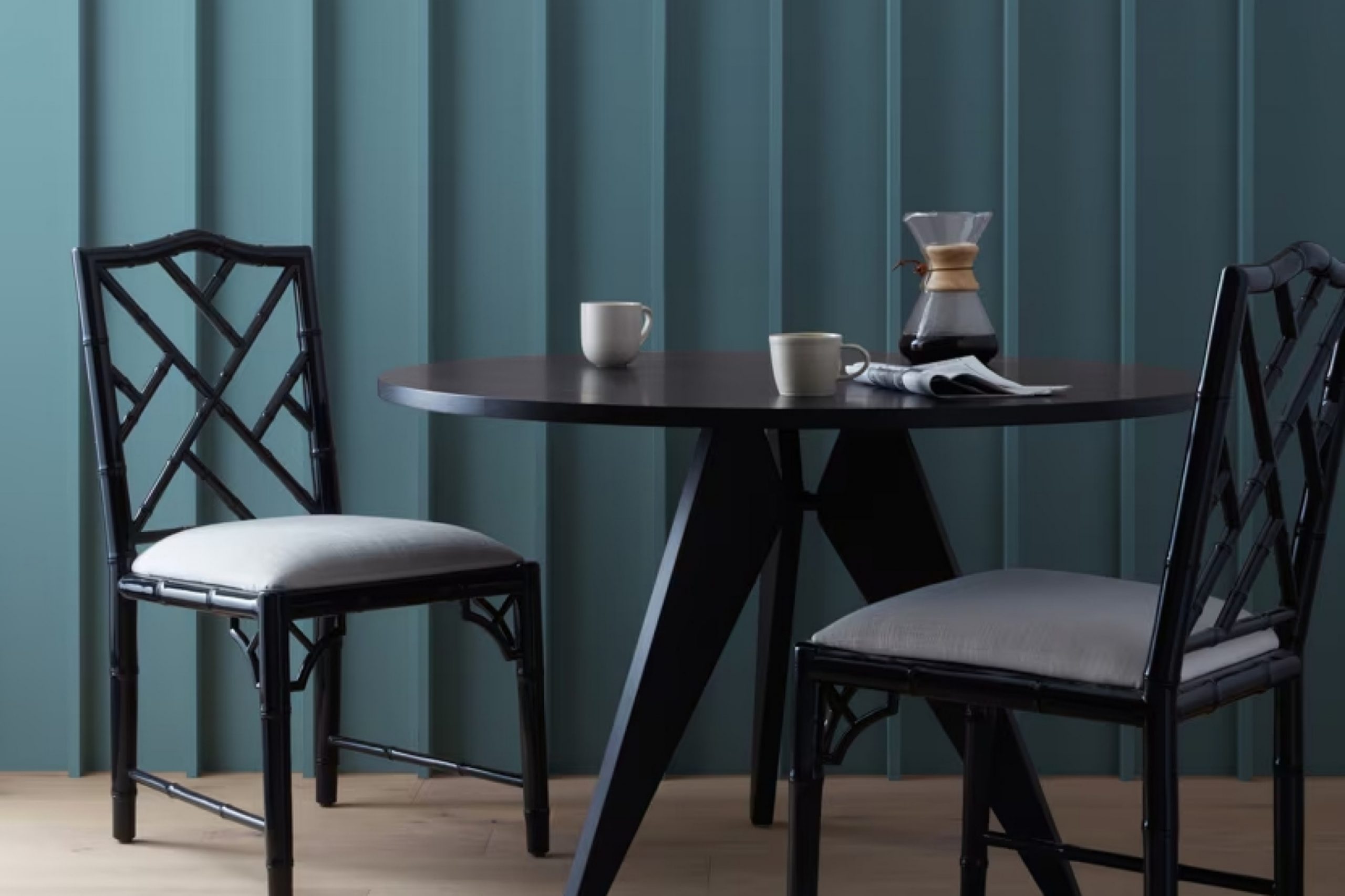
This paint color immediately caught my attention with its elegant blend of sophistication and vibrancy. As I worked with it, I noticed how it brought a sense of refinement to any space I chose to use it in.
Whether on an accent wall or across an entire room, Hamilton Blue has a remarkable way of transforming a space, making it feel both stylish and cozy.
Its deep, rich tones can add warmth and depth, creating an inviting atmosphere where you feel comfortable and at ease.
What I particularly enjoy about Hamilton Blue is how versatile it is. Paired with crisp whites or soft neutrals, it can create a balanced and harmonious look.
You can use it in a living room to add a hint of elegance or in a bedroom for a calming effect.
It’s not just about adding color; it’s about crafting a space you can truly appreciate.
So, if you’re considering a new hue, give Hamilton Blue a try. It might just be the perfect touch your space needs.
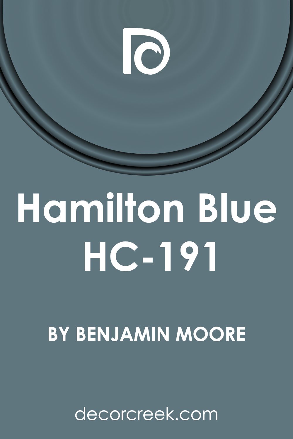
What Color Is Hamilton Blue HC-191 by Benjamin Moore?
Hamilton Blue (HC-191) by Benjamin Moore is a classic and timeless shade of blue. It’s a deep, rich color that can add depth and character to any space. The color has an understated elegance, making it versatile for various interior styles.
In traditional settings, Hamilton Blue works well because it adds a sense of history and depth. It pairs beautifully with classic elements like dark wood furniture, intricate moldings, and antique pieces.
In more contemporary spaces, it serves as a bold choice that contrasts well with modern furnishings and minimalistic decor.
For materials, Hamilton Blue pairs well with natural textures and finishes. It complements warm wood tones, adding contrast without overpowering the natural beauty of the wood. Metal fixtures in silver or brushed nickel can add a touch of modernity, while brass or gold accents bring warmth and luxury.
Textiles such as linen, cotton, and wool in neutral shades balance the depth of this blue, creating a cozy and inviting atmosphere. In coastal or nautical-themed interiors, it pairs excellently with white accents and seagrass textures, reflecting the calming essence of the sea.
Overall, Hamilton Blue is a versatile color that enhances spaces with its rich and classic hue, adaptable to various styles and materials.
Is Hamilton Blue HC-191 by Benjamin Moore Warm or Cool color?
Hamilton Blue is a lovely color from Benjamin Moore, perfect for adding charm to living spaces. It strikes a balance between bold and classic, making it versatile for various home styles. The color is deep and rich, yet not overpowering, which can make a room feel cozy and inviting.
When used in a room, Hamilton Blue can provide a dramatic backdrop for both modern and traditional decor. It pairs well with neutral tones, helping them stand out, but also complements warm wood accents beautifully.
In a bedroom, it can create a snug atmosphere, encouraging relaxation and comfort. Used in a living room, it can become a focal point, drawing attention without being too flashy. In kitchens or dining areas, it adds a touch of elegance, making meals feel special. Overall, Hamilton Blue offers a timeless appeal, allowing homeowners to enjoy a classic yet warm and welcoming environment.
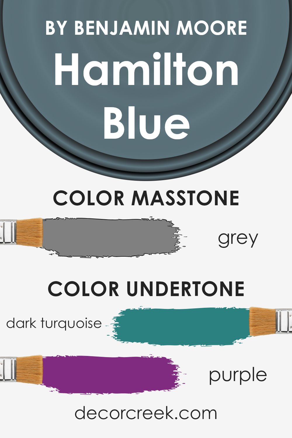
Undertones of Hamilton Blue HC-191 by Benjamin Moore
Hamilton Blue by Benjamin Moore, with its distinct mix of undertones, is a unique color choice for interiors. Undertones are subtle colors within a paint that can affect how the primary color appears in different lighting. They can make a color seem warmer or cooler, brighter or more muted.
The undertones in Hamilton Blue include shades like dark turquoise, purple, and olive, which give it a unique depth. These undertones can make the blue seem richer and more dynamic.
In a room, Hamilton Blue might appear cooler if the space has natural sunlight, bringing out the green and turquoise undertones.
On the other hand, under artificial lighting, hints of purple and navy might become more noticeable, making the room feel cozy.
The inclusion of warmer undertones like brown and pale pink can add balance, preventing the color from feeling too cold or stark. This blend can ground the color, making it versatile enough for both modern and traditional settings.
Using Hamilton Blue on interior walls can create an inviting atmosphere. Depending on the undertones highlighted by the room’s lighting, the walls might feel calming with a hint of elegance or vibrant with a touch of playfulness.
This adaptability allows Hamilton Blue to fit various moods and styles.
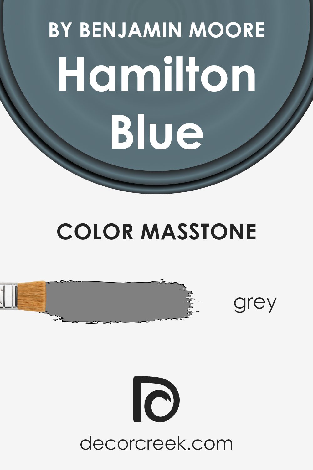
What is the Masstone of the Hamilton Blue HC-191 by Benjamin Moore?
Hamilton Blue HC-191 by Benjamin Moore is a rich and inviting blue that brings a touch of elegance to any space. The grey masstone, resembling a neutral shade like #808080, gives it a balanced and calming quality. This aspect helps the color fit seamlessly into various styles of homes, from modern to traditional.
In living rooms, Hamilton Blue can make the space feel cozy and grounded, providing a warm backdrop for other elements like furniture and artwork. In bedrooms, its soothing nature promotes relaxation, making it ideal for restful environments.
The grey undertones also allow Hamilton Blue to work beautifully with a wide range of other colors, whether they are soft pastels, vibrant tones, or earthy neutrals. The color’s versatility is one of its greatest strengths, making it suitable for both large spaces and small accents like doors and cabinets. Whether used on walls or trims, it offers a sophisticated yet timeless appearance.
How Does Lighting Affect Hamilton Blue HC-191 by Benjamin Moore?
Lighting plays a significant role in how we perceive colors. The color of an object can look different depending on the type of light it is in. This is also true for paint colors, like Hamilton Blue by Benjamin Moore. This shade can appear to change based on lighting conditions.
In natural light, Hamilton Blue reveals its truest shade. When sunlight shines directly on it, the color appears vibrant and rich. However, if the light is indirect, as is often the case in north-facing rooms, the color can seem cooler and a bit muted.
North-facing rooms usually receive less direct sunlight, which often results in cooler and dimmer light. As a result, Hamilton Blue might appear more subdued and take on a slightly gray undertone.
In contrast, south-facing rooms enjoy the most sunlight throughout the day. These rooms are typically flooded with warm and bright light, which can enhance the warm tones in Hamilton Blue, making it appear lighter and more vivid.
The abundant natural light helps the color come alive and look more inviting.
East-facing rooms receive soft, warm light in the morning, which can make Hamilton Blue look lighter and brighter in the early hours. As the day progresses and the light shifts, the room might look a bit cooler. In the late afternoon and evening, the color may take on a more muted tone.
West-facing rooms experience the opposite effect. They often have cooler light in the morning and warmer light in the afternoon and early evening. As the sun sets, the warm light can enrich the blue, making it feel cozy and dynamic.
In artificial light, the effect on Hamilton Blue depends on the type of bulbs used. Warm white bulbs can make the blue look slightly warmer, while cool white bulbs can emphasize any cooler undertones, making the color appear sharper. The type of lighting and its placement in the room will significantly influence how the paint color is perceived.
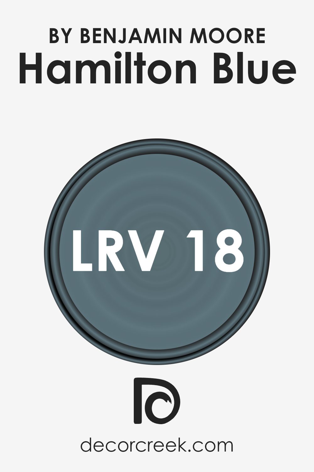
What is the LRV of Hamilton Blue HC-191 by Benjamin Moore?
LRV, or Light Reflectance Value, is a measure that helps us understand how much light a color reflects and absorbs. It is a scale that ranges from 0 to 100, with lower values indicating that a color absorbs more light, making it darker. Conversely, higher values mean the color reflects more light, making it appear lighter.
This concept is vital when choosing paint colors because it affects the feel and look of a room. Rooms painted with high LRV colors tend to feel more open and bright, while those with low LRV colors can feel cozy and intimate.
Understanding LRV helps make informed decisions about how light or dark a room will feel once the paint is on the walls.
For Hamilton Blue with its LRV of 18.25, this means it is a relatively dark color that absorbs most light rather than reflecting it. When used on walls, it can create a sense of depth and coziness within a room.
Because it does not reflect a lot of light, Hamilton Blue may make spaces feel smaller, which can be great for creating an intimate atmosphere in larger rooms.
However, in already small spaces, it could make the room feel even tighter unless balanced with other lighter elements or ample natural light.
Understanding this color’s LRV can help you decide whether it suits your space and how it might interact with the light sources in the room.
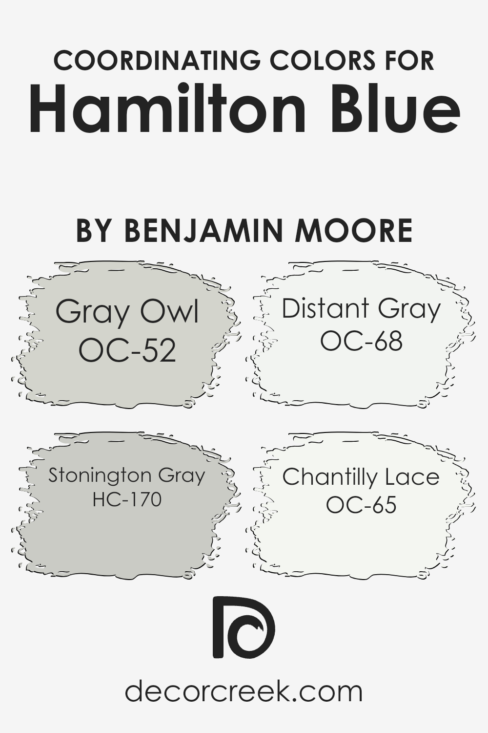
Coordinating Colors of Hamilton Blue HC-191 by Benjamin Moore
Coordinating colors are hues that harmonize well together, creating a balanced and visually appealing space. When choosing coordinating colors for Hamilton Blue by Benjamin Moore, it’s essential to pick shades that complement its rich and calming tones.
A perfect choice is Gray Owl OC-52, a soft and versatile gray with a hint of warmth, providing a gentle contrast to the boldness of Hamilton Blue.
Stonington Gray HC-170, a cool and slightly more pronounced gray, offers a classic elegance that can enhance the blue’s depth while keeping the color scheme cohesive and modern.
Distant Gray OC-68, a clean and crisp white, serves as an excellent backdrop, allowing Hamilton Blue to stand out while maintaining an airy and fresh feel in any environment. Chantilly Lace OC-65, another beautiful white with subtle warmth, adds a touch of sophistication without overpowering the other colors.
Together, these hues create a harmonious palette that balances vibrancy with subtlety, allowing Hamilton Blue to shine while the supporting shades contribute to a unified and inviting atmosphere in your space.
Whether used in a living room, bedroom, or any other area, these coordinating colors can help craft a timeless and welcoming ambiance.
You can see recommended paint colors below:
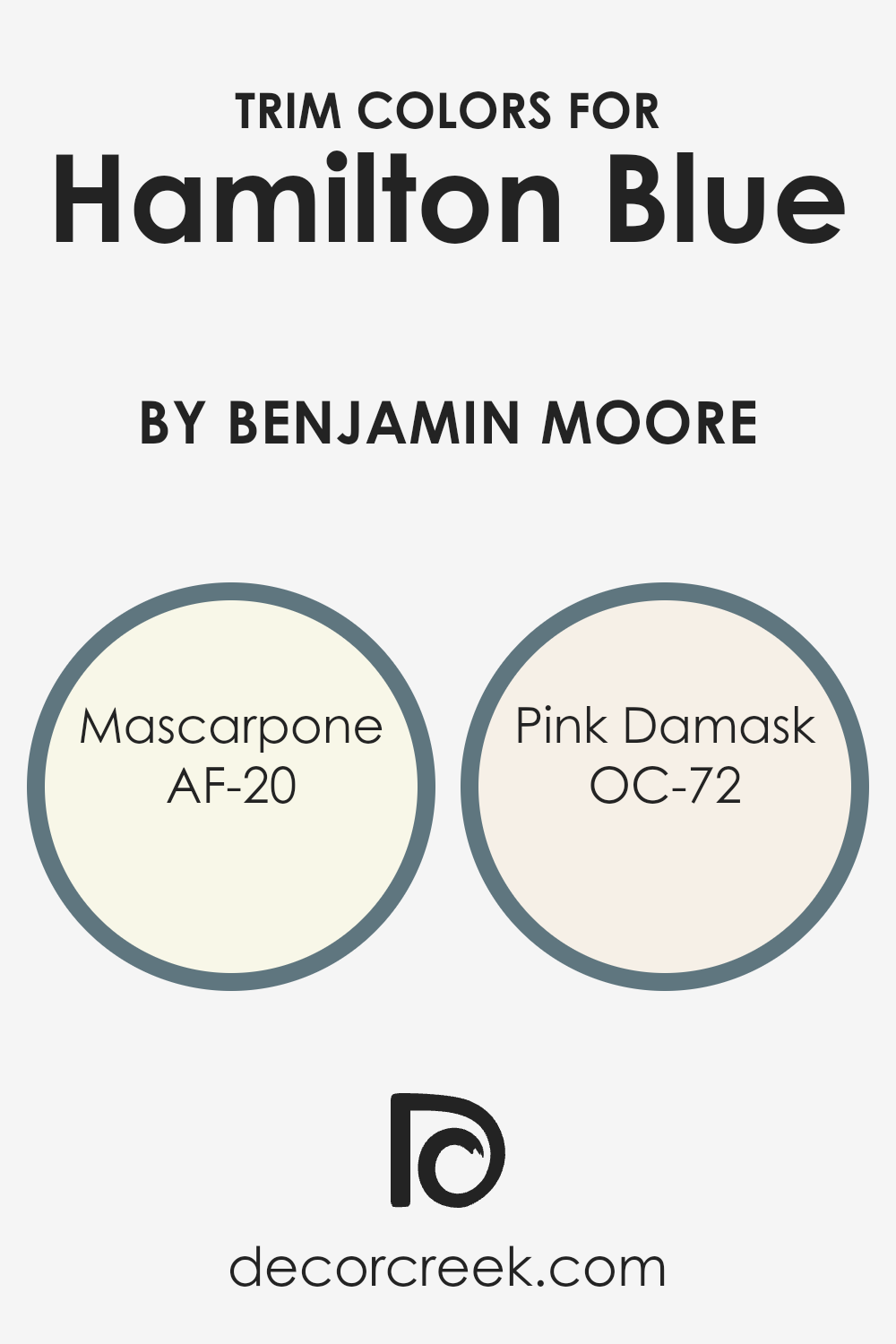
What are the Trim colors of Hamilton Blue HC-191 by Benjamin Moore?
Trim colors are the hues used for the edges and framework of a room, such as baseboards, window frames, and doorways. They complement or contrast with the main wall color to create a balanced look. Choosing the right trim colors for Hamilton Blue, a rich and deep shade with a touch of green, can enhance its depth and add visual interest to a space.
Trim colors can make the primary blue feel more vibrant, offering contrast that brings out its underlying tones. Neutral or lighter shades often work well as trim colors for a bold hue like Hamilton Blue.
Mascarpone (AF-20) is a warm, creamy white that adds a cozy touch. Its soft undertones play well with Hamilton Blue, making it feel inviting but classic. Pink Damask (OC-72) is a very light pink with a delicate and soft appearance.
This subtle and gentle color can add a hint of warmth to the room, providing a contrast that doesn’t overpower the main color.
The combination of these trim colors with Hamilton Blue creates a harmonious and inviting environment.
You can see recommended paint colors below:
- AF-20 Mascarpone
- OC-72 Pink Damask
How to Use Hamilton Blue HC-191 by Benjamin Moore In Your Home?
Hamilton Blue HC-191 by Benjamin Moore is a deep, rich blue that brings a classic and warm feel to a home. This timeless shade works well in many spaces, adding a feeling of comfort and style. In the living room, Hamilton Blue can be used on an accent wall to create a focal point without overwhelming the space.
The color pairs beautifully with neutral tones like white, gray, or beige, allowing furniture and decor to stand out.
In the bedroom, this blue gives a cozy and comfy atmosphere, perfect for relaxation. Consider pairing it with soft bedding in white or cream for a balanced look. In the kitchen, Hamilton Blue can be used on cabinets or as a backsplash color, providing a pleasant contrast with light countertops and stainless-steel appliances.
Overall, Hamilton Blue HC-191 is a versatile color that adds depth and warmth, making it suitable for different rooms and decorative styles in any home.
Conclusion
HC-191 Hamilton Blue by Benjamin Moore is a really nice paint color. When I look at it, I think about a cool and calm day. It’s like looking at the ocean or the sky on a peaceful afternoon. This color can make any room feel special. Imagine painting your bedroom or living room in this shade—it’s not too bright and not too dark, just the right mix. It’s like having a gentle hug from your favorite blanket.
In different lights, the color might look a bit different. When the sun shines, it feels bright and happy. At night, with indoor lights, it feels cozy and warm. This makes it a great choice for many rooms in a house. Even if you put it in a kitchen or bathroom, it still looks great.
It’s kind of like wearing your favorite jeans that match with everything.
I think Hamilton Blue is a perfect color if you want something calm and nice for your home.
It’s a color that can make you feel like you’re in a comforting and happy place, whether you are reading a book, playing with toys, or watching TV.
Ever wished paint sampling was as easy as sticking a sticker? Guess what? Now it is! Discover Samplize's unique Peel & Stick samples.
Get paint samples

