In the complex world of interior design, color is more than a visual delight; it’s a language that reflects style, mood, and personality. Among the myriad of hues that have adorned homes and public spaces, Refined AF-75 by Benjamin Moore stands out with its poised elegance
. This color is not just a trend but an expression of a refined lifestyle that is both modern and timeless. In this article, we will delve into the characteristics, undertones, and complements of Refined AF-75, and how they coalesce to create spaces that are both beautiful and emotive.
What Color Is Refined AF-75?
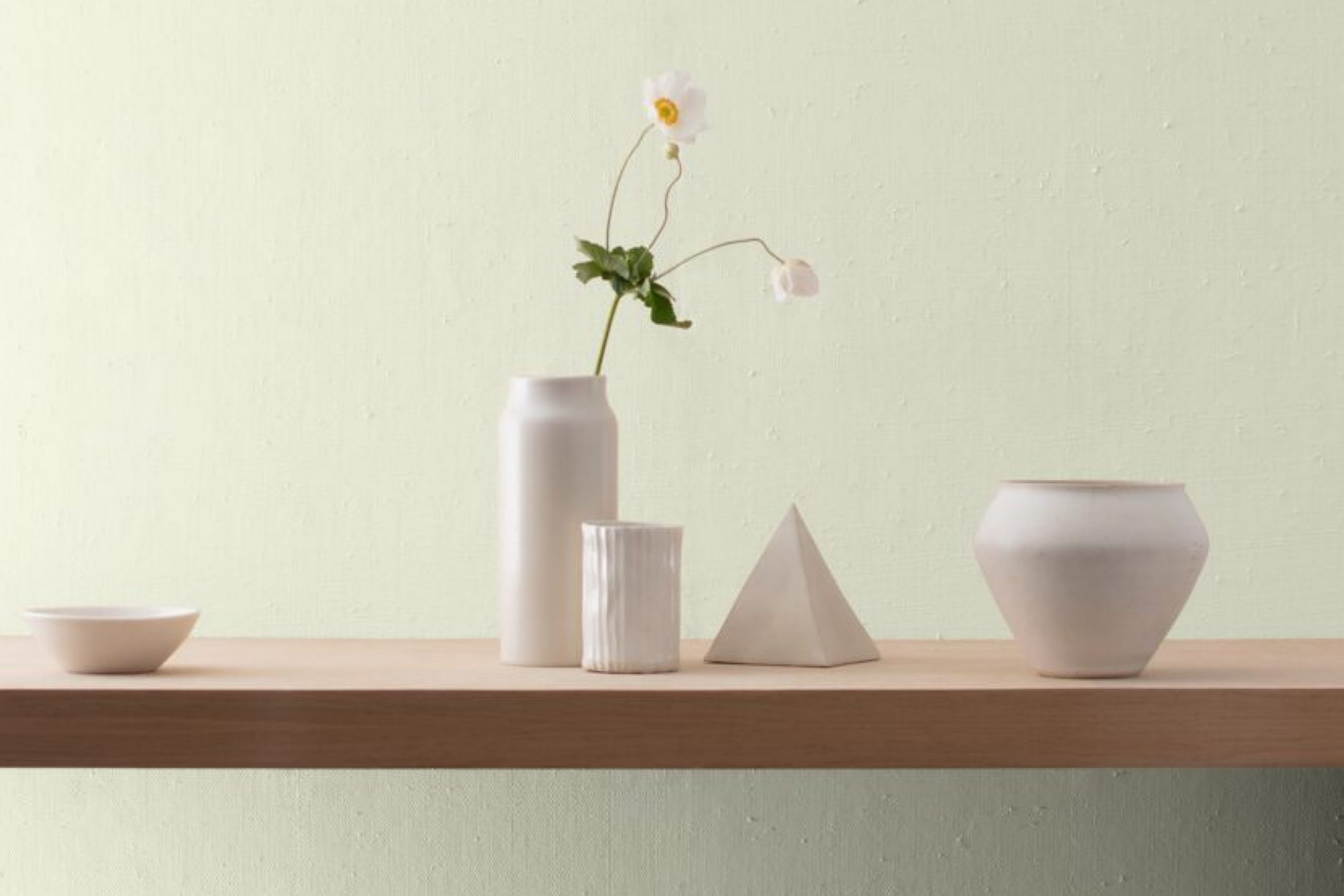
Refined AF-75 is a hue that embodies a serene elegance, a shade that whispers rather than shouts. It’s a subtle gray with a touch of beige, rendering it the perfect neutral that provides a soft backdrop for a variety of interior styles. This particular color finds its strength in its subdued nature, allowing it to work seamlessly within minimalist, Scandinavian, and even transitional spaces.
The color’s versatility is enhanced by the materials and textures it is paired with. Refined AF-75 complements natural wood grains, from bleached oak to walnut, creating an organic feel. It harmonizes with metallic finishes like brushed brass or nickel, adding a layer of sophistication.
Textiles in velvet or silk will amplify its luxe qualities, while linens and cotton bring out its more casual, airy side. This is a color that can truly transform a space, adapting to the aesthetic and mood you wish to convey.
Ever wished paint sampling was as easy as sticking a sticker? Guess what? Now it is! Discover Samplize's unique Peel & Stick samples.
Get paint samples

Is It a Warm Or Cool Color?
Determining whether Refined AF-75 leans warm or cool is essential to understanding its impact on a home’s interior. This hue sits on the fence, behaving as a chameleon that subtly shifts with its environment. Its underlying beige notes can pull it into the warm spectrum, creating an inviting and cozy ambiance.
However, its gray façade can just as easily tip it into a cooler territory, providing a sense of calm and serenity. This duality means that Refined AF-75 is incredibly adaptable and can be used to either warm up a room that feels too sterile or to cool down a space that needs a touch of calm.
It is a testament to its versatility and why it is favored by designers looking for a color that can accommodate various lighting conditions and complement diverse palettes.
Undertones of Refined AF-75
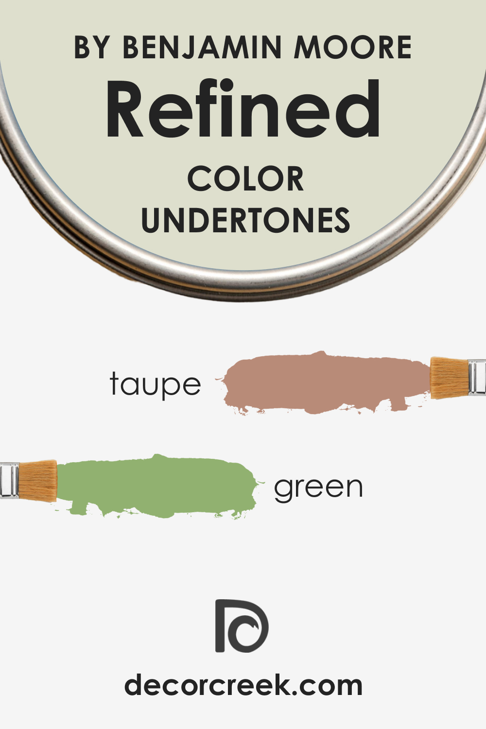
Every color carries undertones, and recognizing these subtle hues within the primary color is crucial. Refined AF-75, despite its neutral appearance, possesses complex undertones that can appear differently based on its surroundings. The undertones of this particular color are a blend of taupe and a hint of green, which gives it a grounded, earthy quality without overwhelming the primary gray-beige tone.
The impact of these undertones is significant; they add depth and dimension to walls, preventing the color from appearing flat. In interior walls, these undertones afford Refined AF-75 an adaptive quality, reflecting aspects of the environment, such as natural light and furnishings, which in turn can enhance the overall aesthetic of a room.
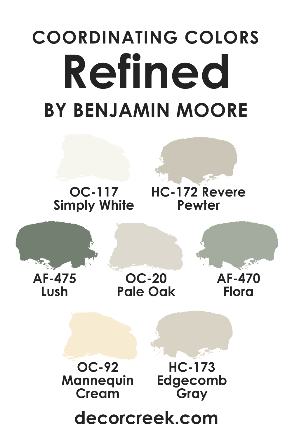
Coordinating Colors of Refined AF-75
Coordinating colors are those that complement and enhance the main color, and Refined AF-75 pairs beautifully with a variety of shades.
- OC-117 Simply White is a clean and clear white that provides crisp contrast to Refined AF-75, bringing out its depth.
- OC-92 Mannequin Cream offers a softer edge, a creamy white that harmonizes with the warmth of Refined AF-75.
- AF-470 Flora is a pale, dusty green that echoes the subtle green undertones of Refined AF-75, creating a gentle, organic transition between colors.
- AF-475 Lush is a deeper green that provides a bold accent, making the neutrality of Refined AF-75 stand out.
Additional colors that coordinate well include:
- Revere Pewter HC-172 : A light gray with warm undertones that complements the neutral balance of Refined AF-75.
- Pale Oak OC-20 : Another neutral with a blend of beige and gray, it pairs smoothly with Refined AF-75 for a cohesive look.
- Edgecomb Gray HC-173 : This is a slightly warmer gray that works well with the subtle warmth of Refined AF-75.
How Does Lighting Affect Refined AF-75?
Lighting plays a pivotal role in how colors are perceived, and Refined AF-75 is particularly sensitive to light due to its nuanced undertones. In natural light, Refined AF-75 displays a true neutral gray-beige that provides a soft, sophisticated backdrop. Under artificial lighting, it can take on a slightly warmer hue, offering a more inviting atmosphere.
In north-facing rooms, Refined AF-75 may appear more gray, as the cooler, indirect light emphasizes its cool tones. Conversely, in south-facing rooms, it will likely look warmer and more beige, as the abundant direct light accentuates its warmer base.
East-facing rooms will experience a transformation from cool in the morning light to warm in the afternoon, while west-facing rooms will have the opposite effect, demonstrating the color’s chameleon-like qualities throughout the day.
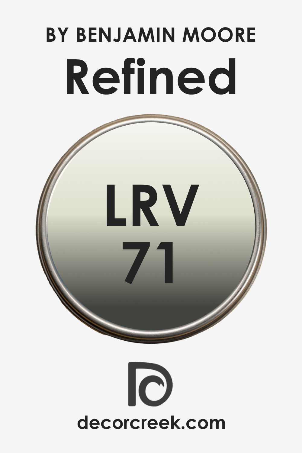
LRV of Refined AF-75
Light Reflectance Value (LRV) measures the percentage of light a paint color reflects. With an LRV of 71, Refined AF-75 is a color that reflects a considerable amount of light, making it a bright choice for interiors. The high LRV means that this color can help to make a space feel more open and airy, particularly beneficial in smaller or darker rooms.
The LRV of 71 also means that Refined AF-75 is versatile in its application; it can stand as a gentle statement on walls without overwhelming a space with color. It harmonizes with both the light and architecture of a room, enhancing spatial qualities without demanding attention.
LRV – what does it mean? Read This Before Finding Your Perfect Paint Color
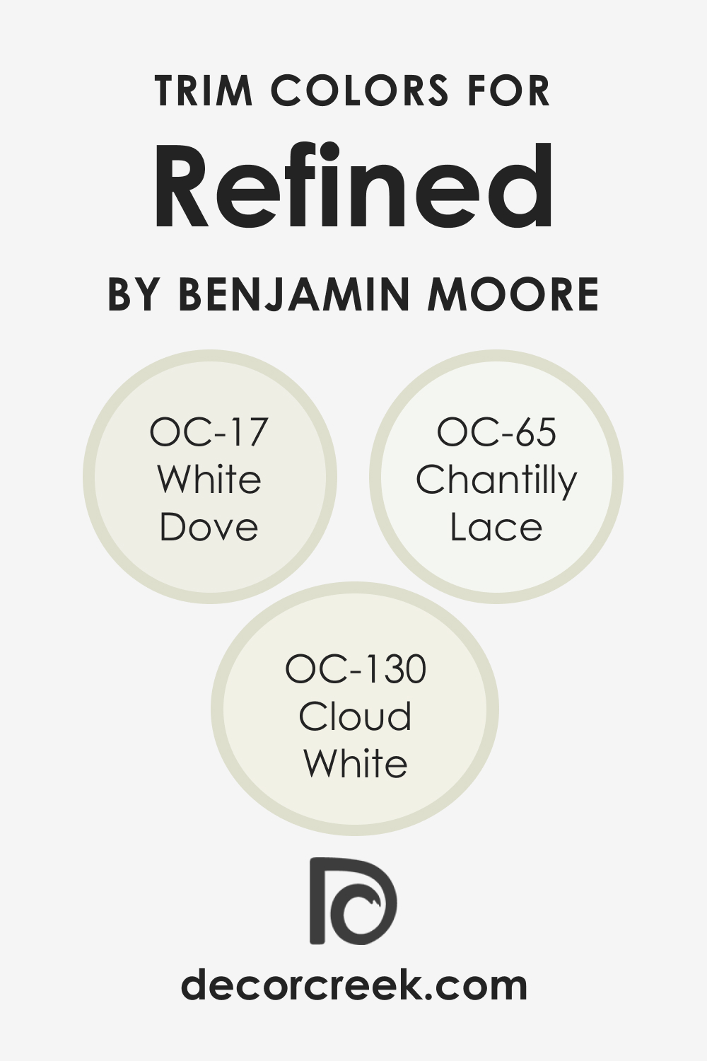
Trim Colors of Refined AF-75
Trim colors serve as an accent, highlighting the architectural details and transitions between walls and other surfaces. With Refined AF-75, the ideal trim colors are shades of white that can accentuate its neutrality without creating a stark contrast.
- White Dove OC-17 : A soft white with a hint of warm undertones, it complements the subtlety of Refined AF-75 without overwhelming it.
- Chantilly Lace OC-65 : A pure white that offers a crisp, clean line against the softer tone of Refined AF-75, providing a modern edge.
- Cloud White OC-130 : With a slightly creamier tone, it creates a harmonious flow with the warm aspects of Refined AF-75, ideal for a softer look.
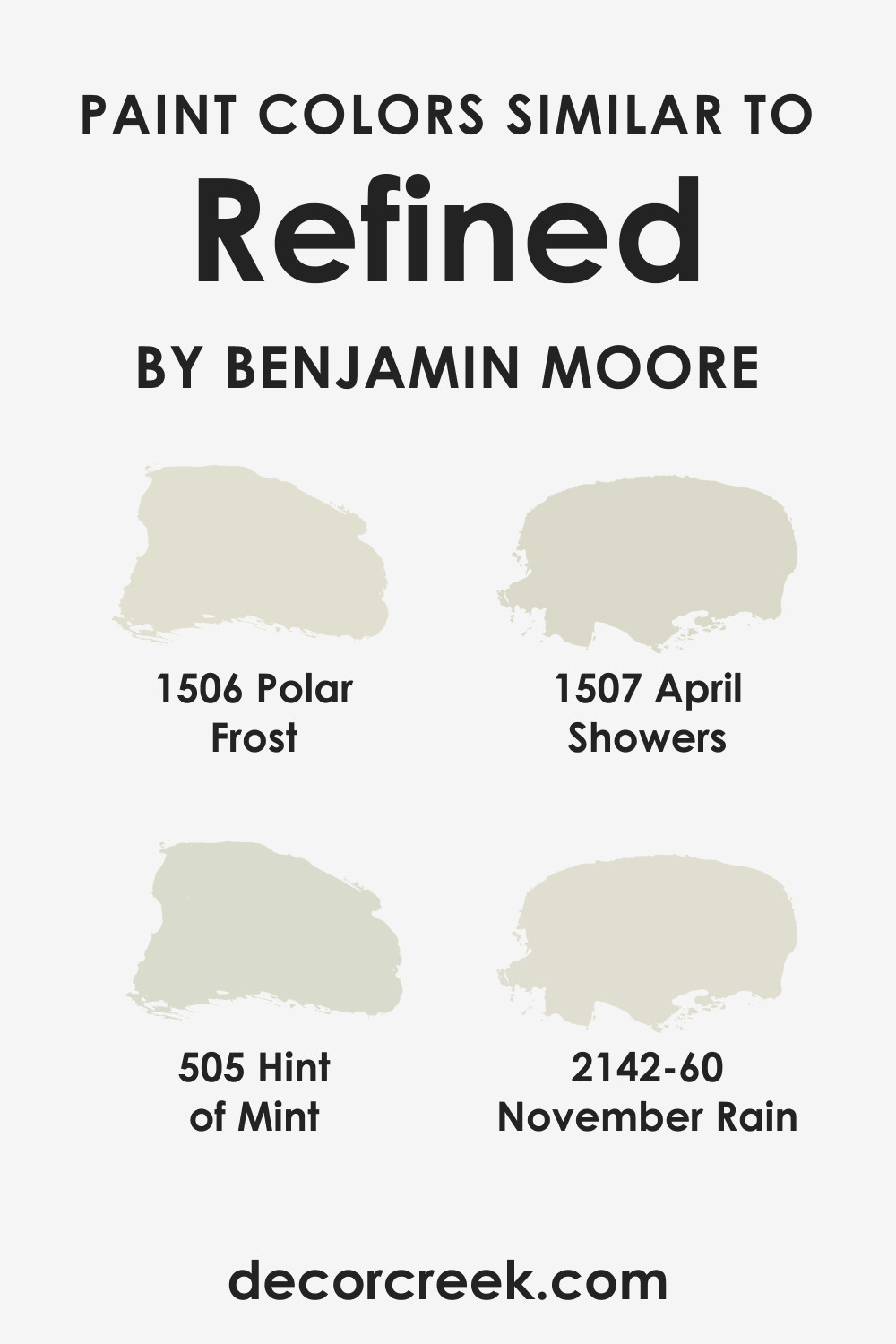
Colors Similar to Refined AF-75
Identifying colors similar to Refined AF-75 is valuable for creating a cohesive color scheme, especially if the desired color is out of stock, or if a slightly different hue is needed for another room or element within a space.
- BM 1506 Polar Frost : A light gray with a blue undertone that provides a cool, crisp look similar to Refined AF-75’s cooler side.
- BM 1507 April Showers : This color offers a soft, tranquil feel with a hint of blue, akin to the serenity of Refined AF-75.
- BM 505 Hint of Mint : A very light green with a refreshing feel that ties in with Refined AF-75’s subtle green undertones.
- BM 2142-60 November Rain : A neutral with a blend of green and gray undertones, it echoes the earthy neutrality of Refined AF-75.
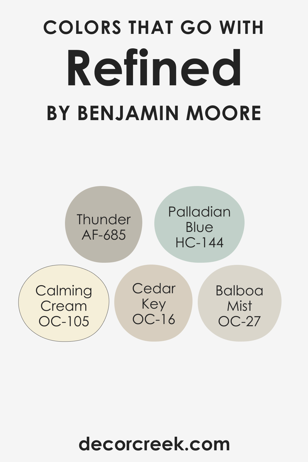
Colors That Go With Refined AF-75
Choosing complementary colors is crucial for designing a space with visual harmony. For Refined AF-75, Benjamin Moore offers a palette that enhances its understated elegance.
- Balboa Mist OC-27 : A warm light gray that pairs well with Refined AF-75 for a soft, monochromatic look.
- Calming Cream OC-105 : A warm off-white that provides a creamy contrast to the neutrality of Refined AF-75.
- Cedar Key OC-16 : A mid-tone beige that echoes the warmth of Refined AF-75.
- Palladian Blue HC-144 : A light blue that contrasts gently with Refined AF-75, bringing a breath of fresh air into the space.
- Thunder AF-685 : A darker gray that can create a striking depth when used with the lighter Refined AF-75.
In conclusion, Refined AF-75 is a versatile color that offers designers and homeowners a foundation for creating spaces that are both inviting and stylish. Its ability to pair with a wide range of materials, textures, and coordinating colors makes it a reliable choice for any interior.
Understanding its undertones, LRV, and the impact of lighting can ensure that Refined AF-75 is used to its full potential, providing an ambiance that is as refined as the color itself.
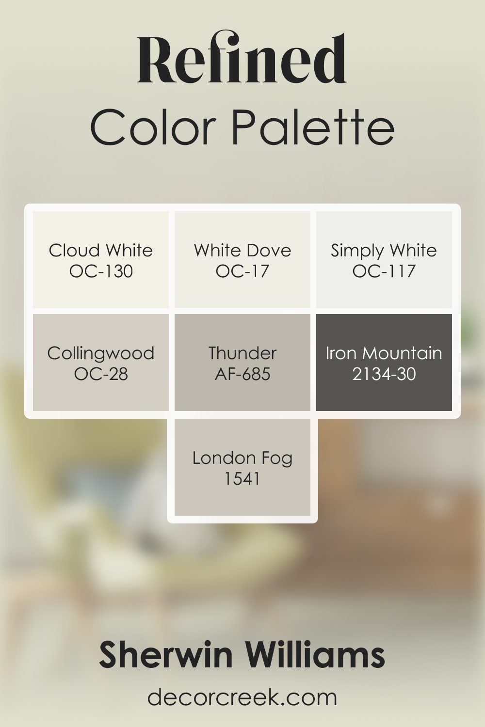
Refined AF-75 by Benjamin Moore Color Palette
Refined offers a clean, warm neutral tone that feels calm, polished, and inviting. This palette builds on that comfort with soft whites, grounded grays, and deep accents that add clarity and depth.
White Dove, Cloud White, and Simply White give the palette a fresh, bright foundation that highlights the smooth warmth of Refined.
Collingwood adds gentle gray warmth that blends seamlessly with Refined, creating a smooth transition and quiet harmony. Thunder deepens the palette with a warm, grounded gray that adds texture and natural character.
Iron Mountain introduces a strong, steady accent that enhances depth and structure, giving the palette more definition. London Fog rounds out the palette with a soft gray-beige warmth that enhances the calming atmosphere.
Together, these shades create a balanced, welcoming palette that feels warm, grounded, and easy to enjoy. It’s ideal for living spaces, offices, and bedrooms that aim for subtle warmth with thoughtful depth.
How to Use Refined AF-75 In Your Home?
Refined AF-75 is a versatile color that can breathe tranquility into any room. Its neutral tone makes it suitable for living rooms, creating a calming atmosphere for relaxation. Bedrooms benefit from its soothing presence, providing a restful backdrop for sleep.
In bathrooms, Refined AF-75 adds a spa-like quality, and in kitchens, it can make the space feel open and clean. This color aligns with various interior styles, from minimalist and modern to traditional and coastal, thanks to its ability to complement a wide range of textures and accent colors. Even exteriors can be enhanced with Refined AF-75, offering a sophisticated curb appeal.
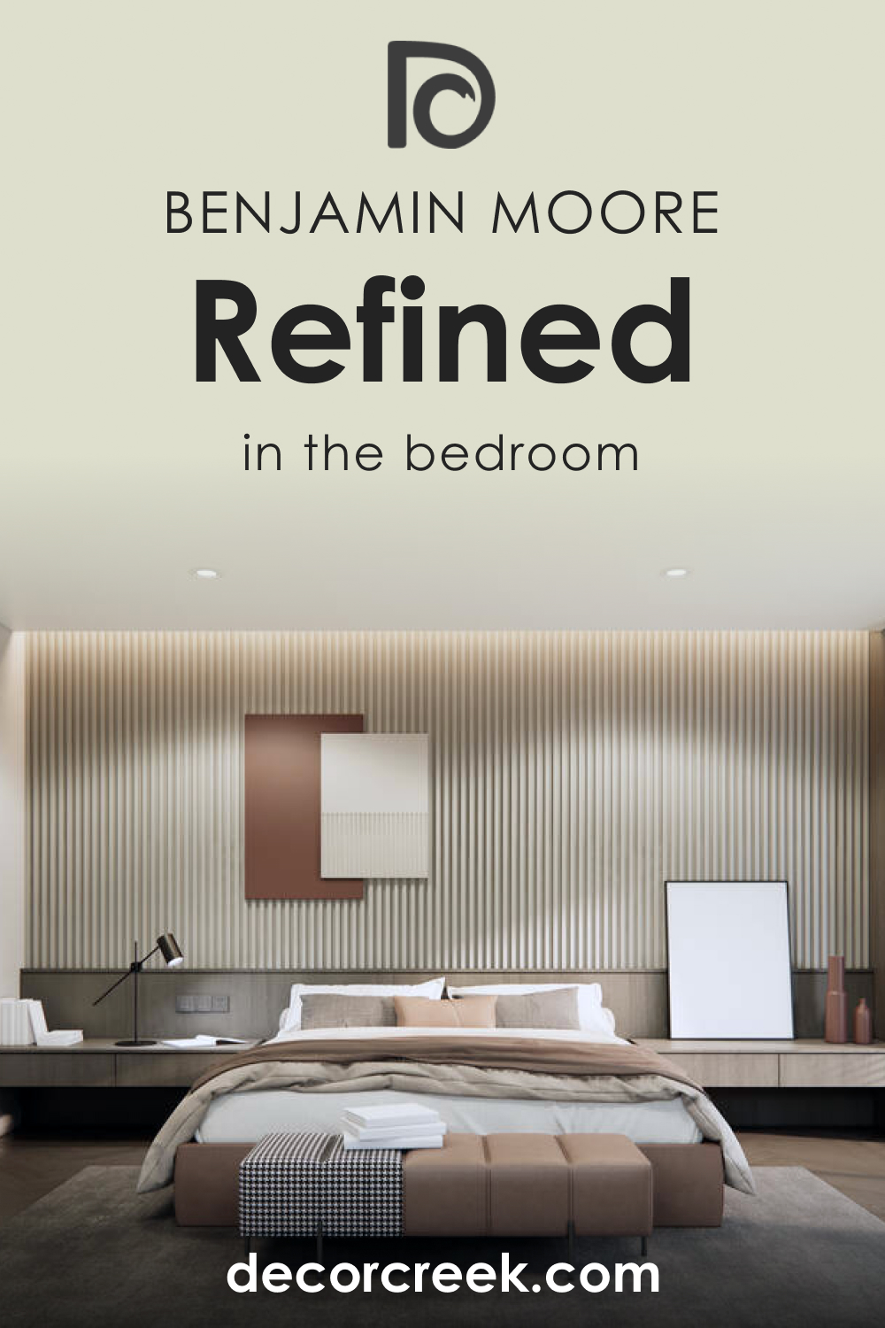
How to Use Refined AF-75 in the Bedroom?
In the bedroom, Refined AF-75 serves as a serene foundation that can be layered with various textures and finishes. It invites a restful energy, ideal for a space dedicated to relaxation and rejuvenation. Pair it with crisp white linens for a classic look, or add a pop of color with vibrant throws and pillows for contrast.
This color adapts well to both bright and dimly lit rooms, reflecting natural morning light softly and providing a warm, cozy feel in the evening under ambient lighting. It’s the perfect backdrop for a bedroom designed for peaceful slumber and a fresh start to every day.
How to Use Refined AF-75 in the Bathroom?
Refined AF-75 in the bathroom creates a serene and clean aesthetic reminiscent of a luxurious spa. It pairs beautifully with marble countertops and chrome or brushed nickel fixtures, which reflect the color’s subtle undertones. For a contemporary look, contrast Refined AF-75 with dark wood cabinets or flooring.
To enhance its tranquil vibe, introduce elements like bamboo accents, soft white towels, and potted greenery. This shade has the power to make small bathrooms appear larger and more inviting while giving larger bathrooms an air of sophistication.

How to Use Refined AF-75 in the Living Room?
In the living room, Refined AF-75 offers a neutral canvas that can be dressed up or down. It works harmoniously with a monochromatic scheme, paired with varying shades of grays and whites for a modern minimalist look. Alternatively, it can serve as a subtle backdrop for bold furniture and vibrant art pieces.
In rooms with ample natural light, Refined AF-75 radiates warmth, while in spaces with limited light, it remains poised and calming. It is perfect for creating a space where conversation flows and guests feel at ease.

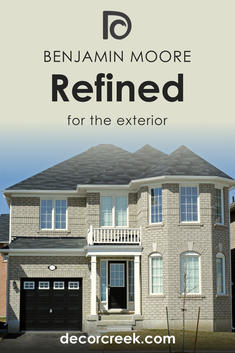
How to Use Refined AF-75 for an Exterior?
For exteriors, Refined AF-75 lends a stately and timeless look. It’s particularly stunning on colonial or shaker-style homes where it complements natural stone or brick. The color can make architectural details pop, especially when paired with bright white trim and dark shutters. It’s also a great choice for modern homes, giving a crisp contrast against natural wood or metal finishes.
This shade withstands the changing outdoor light beautifully, appearing warm and inviting at dusk and crisp and clean at high noon.
How to Use Refined AF-75 in the Kitchen?
Refined AF-75 in the kitchen strikes a balance between welcoming warmth and clean functionality. It pairs splendidly with stainless steel appliances, offering a modern twist, or with copper accents for a more rustic approach. This color works well in both ample spaces and smaller kitchens, where it can make the area feel more open and airy.
For a cohesive look, combine it with white marble or quartz countertops. Refined AF-75 is also an excellent choice for open-plan spaces, smoothly transitioning into dining or living areas.

How to Use Refined AF-75 on Kitchen Cabinets
On kitchen cabinets, Refined AF-75 can transform the heart of the home into a space that feels both sophisticated and soothing. It’s a less conventional choice than white or wood finishes, giving the kitchen a unique edge. This color pairs well with both matte black and brushed metal hardware, allowing flexibility in design choices.
In a kitchen with natural light, Refined AF-75 on cabinets can make the space feel larger, and in artificial light, it provides a soft, warm glow. For a complete transformation, pair it with a contrasting backsplash or countertops.

Comparing AF-75 Refined With Other Colors
Comparing different colors is crucial in design because it allows us to understand their relationships and how they affect each other visually. It also aids in creating a desired mood or style within a space. The juxtaposition of colors can enhance the perception of depth, volume, and even temperature in a room.
By comparing Refined AF-75 with other colors, we can better grasp its versatility and the range of looks that can be achieved when pairing it with contrasting or complementary hues.
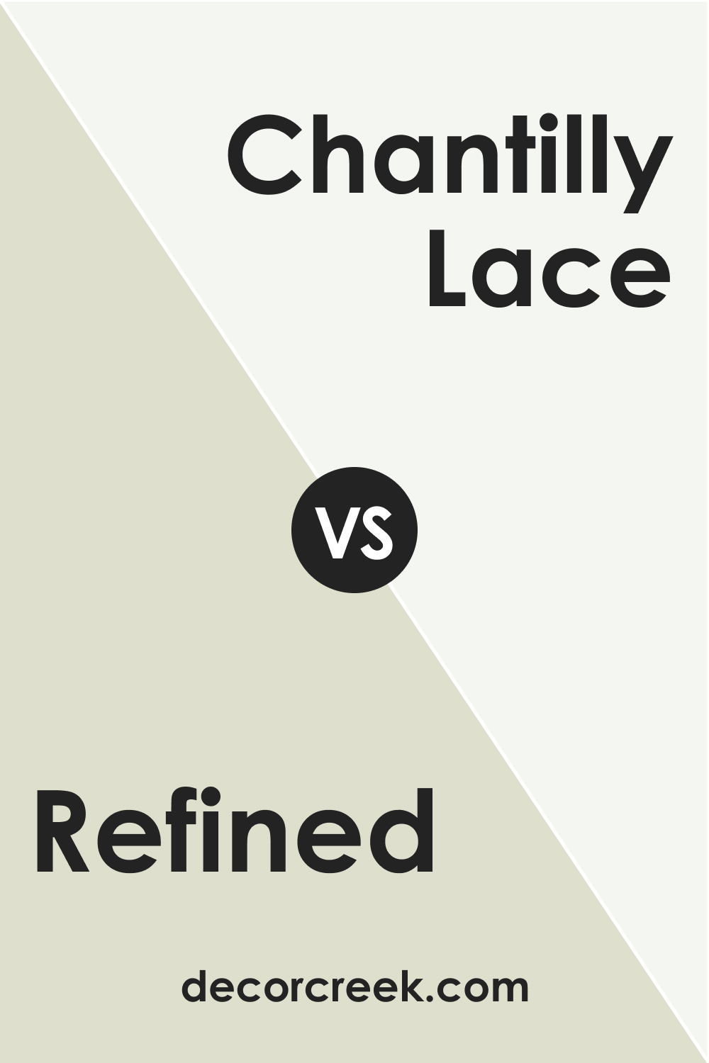
Refined AF-75 vs. OC-65 Chantilly Lace
Refined AF-75 and Chantilly Lace by Benjamin Moore offer starkly different contributions to interior spaces. Chantilly Lace is a pure, crisp white known for its clarity and absence of any warm or cool undertones. It serves as a stark contrast to the nuanced and gentle complexion of Refined AF-75, which carries a subtlety in its depth.
While Refined AF-75 brings a sense of calm and warmth to a room, Chantilly Lace creates a bright, clean, and more pronounced backdrop. The two could work in tandem, with Refined AF-75 providing a soft wall color and Chantilly Lace as the trim, delivering a fresh and inviting atmosphere.
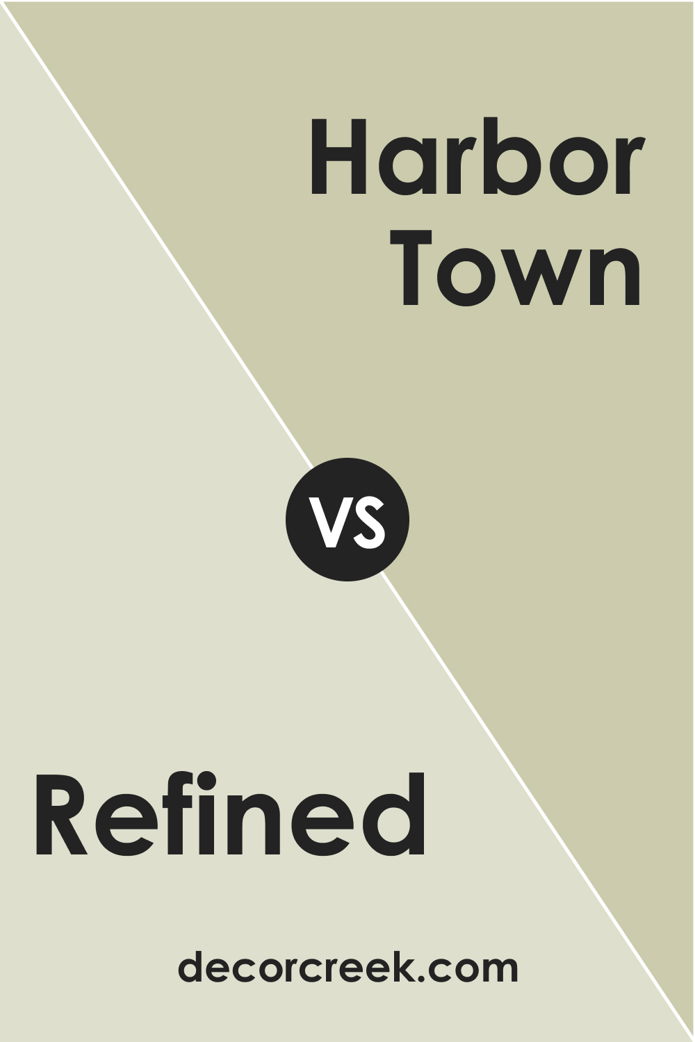
Refined AF-75 vs. BM 493 Harbor Town
Harbor Town is a darker, more saturated color compared to the muted elegance of Refined AF-75. It brings a stronger presence with its depth and would dominate the subtlety of Refined AF-75 if used in the same space. Harbor Town, with its rich and warm brown undertones, creates a cozy and enveloping feel, suitable for accent walls or spaces that aim for a more intimate setting.
In contrast, Refined AF-75 is better suited for creating an expansive and serene environment. Together, they could create a sophisticated palette if balanced correctly within a space.
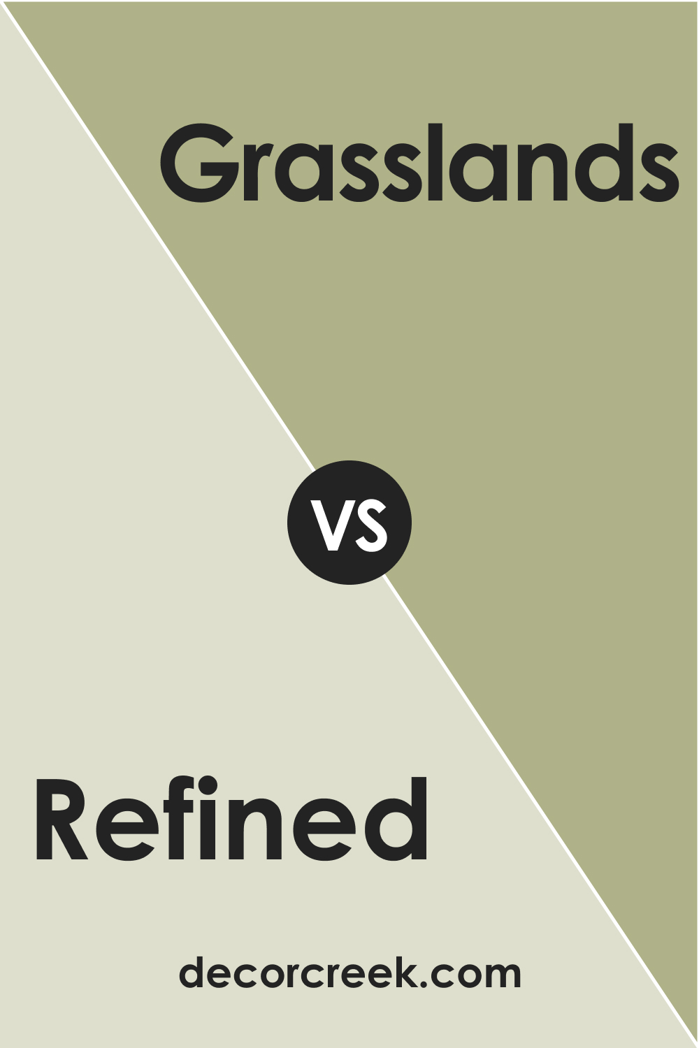
Refined AF-75 vs. BM 502 Grasslands
Grasslands is a green with a muted earthiness to it, providing a natural and grounding feel to interiors. Refined AF-75, while neutral, carries a faint echo of green in its undertones, making it a complimentary backdrop for the more pronounced green of Grasslands.
If Refined AF-75 is used as a main color, Grasslands could serve as an accent, bringing the outside in and creating a cohesive nature-inspired palette. The two together would evoke a sense of balance and tranquility, perfect for a space looking to harness the calming effects of nature.
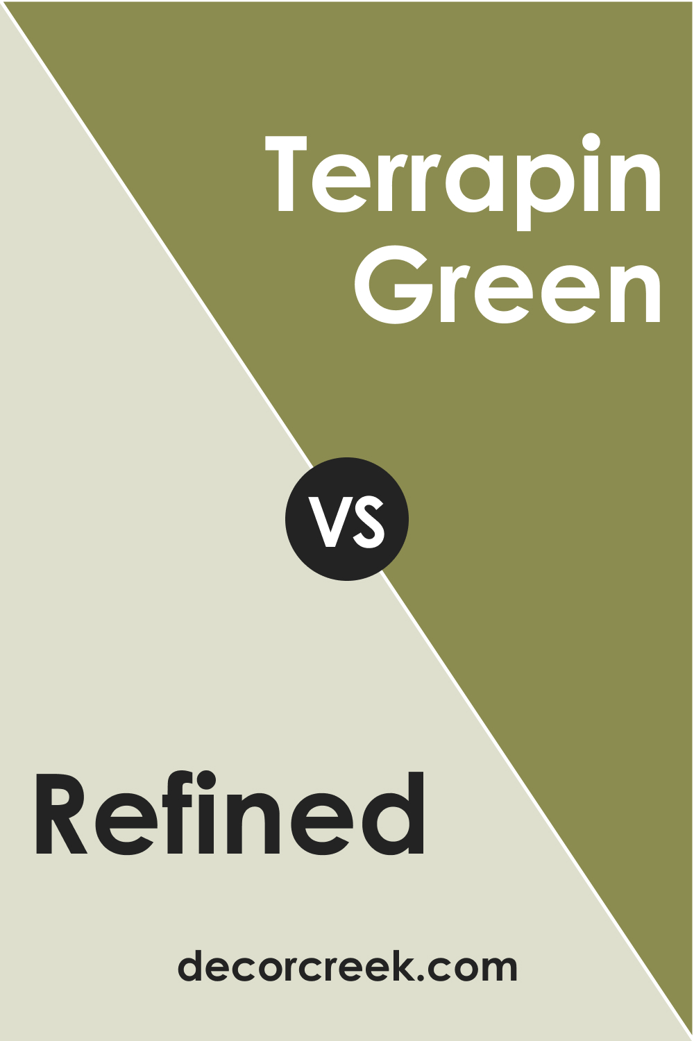
Refined AF-75 vs. BM 2145-20 Terrapin Green
Terrapin Green is a much deeper, moodier color with green-brown undertones, providing a rich backdrop that commands attention. Against the soft neutrality of Refined AF-75, Terrapin Green would stand out as a bold statement. While Refined AF-75 acts as a neutral field, Terrapin Green could be used for dramatic flair, ideal for creating focal points or for furniture pieces that one wishes to highlight.
Used together, they balance out; the neutrality of Refined AF-75 allows Terrapin Green to shine without overpowering the space.
Refined AF-75 vs. BM 2145-10 Avocado
Avocado by Benjamin Moore is a vibrant, lush green with a lot of personalities. It is significantly more saturated than Refined AF-75, offering a punch of energy and vitality. Where Refined AF-75 is subdued and calming, Avocado is vivacious and engaging, perfect for spaces that need a touch of dynamism.
In combination, Refined AF-75 would serve as a calming counterbalance to the exuberance of Avocado, creating a space that is both energetic and restful.
Refined AF-75 vs. BM 503 Fraser Fir
Fraser Fir is a robust, deep green, reminiscent of forest canopies. It presents a stark contrast to the soft and airy feel of Refined AF-75, carrying with it a sense of density and richness. Refined AF-75, in its lightness, could act as a gentle contrast to the boldness of Fraser Fir, suitable for a room that desires a touch of drama without sacrificing lightness and space.
These colors together can establish an elegant, yet comforting environment that draws inspiration from the great outdoors.
Conclusion
In conclusion, Refined AF-75’s versatile nature makes it a quintessential partner to a broad spectrum of colors, from the crisp purity of Chantilly Lace to the verdant depths of Fraser Fir. The juxtaposition of Refined AF-75 with these various hues demonstrates its chameleon-like ability to either assert its own presence or to step back and allow other colors to take center stage.
Whether seeking to create a space that feels expansive and serene, or one that is intimate and saturated with color, Refined AF-75 offers a foundation upon which numerous aesthetic visions can be realized. Understanding its relationship with other colors is a testament to the complexities of interior color schemes and the power of color in transforming spaces.
Ever wished paint sampling was as easy as sticking a sticker? Guess what? Now it is! Discover Samplize's unique Peel & Stick samples.
Get paint samples


