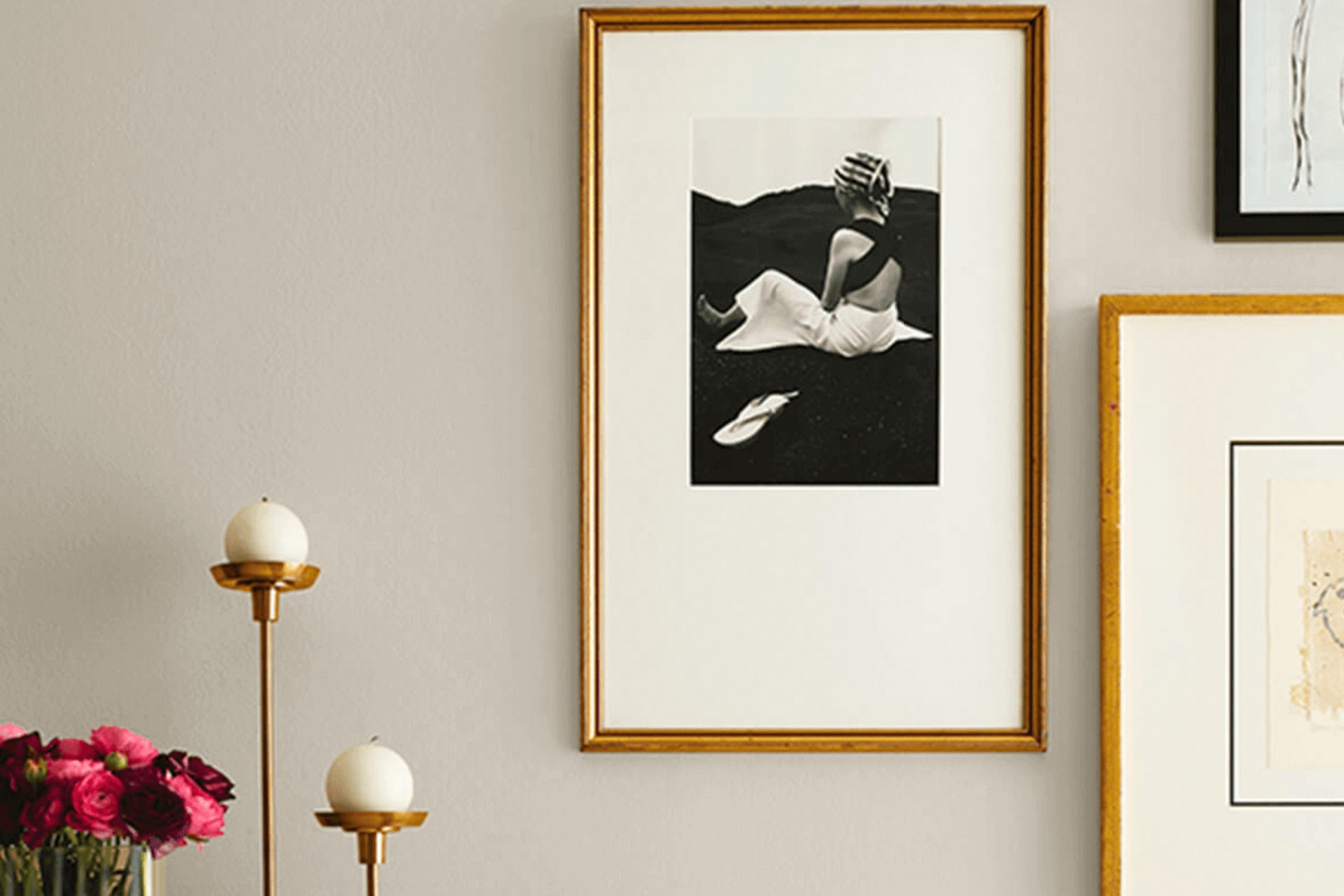
High Sierra, also known as SW 9588 from Sherwin Williams, brings to mind the cool whisper of mountain air and the quiet strength of towering peaks. It isn’t just a color; it evokes feelings of calm and a serene connection to nature. When I see High Sierra, I feel a sense of grounding. It’s as if the space around me draws inspiration from the gentle hues of nature itself.
This color has a unique way of adding depth without overwhelming. It offers balance, making it perfect for those who appreciate subtlety in design. Whether used on a feature wall, entire rooms, or simply in accents, High Sierra seems to calm the senses. Its versatile tone complements a variety of settings, from contemporary homes to rustic cabins.
High Sierra feels timeless. It invites contemplation and reflection. In a world that often feels fast-paced and chaotic, this color allows walls to breathe, creating an environment that encourages relaxation and thoughtfulness.
Choosing High Sierra for your space is like inviting the essence of the mountains inside, providing a backdrop that is soothing yet inspiring in its simplicity.
What Color Is High Sierra SW 9588 by Sherwin Williams?
High Sierra by Sherwin Williams is a soft, muted earthy tone that brings a sense of calmness and warmth to a space. This shade creates a subtle backdrop that works well with a variety of interior styles, from modern and minimalist to rustic and traditional. Its versatility makes it a favorite for living rooms, bedrooms, and even cozy reading nooks.
In modern interiors, High Sierra pairs well with sleek metals and glass, adding a touch of warmth to cool, streamlined designs. For more rustic or traditional spaces, it complements natural wood finishes beautifully, enhancing the grain and texture of the wood. The gentle color balances well with other natural materials like linen, cotton, and wool, providing a cohesive and inviting look.
Textures such as woven rugs, knit throws, and soft velvets harmonize effortlessly with this color, creating a layered and cozy atmosphere. High Sierra serves as an excellent choice for walls, as its subtlety allows artwork and decorative pieces to stand out without overwhelming the space.
It can also coordinate with a palette of other earthy tones, soft whites, or muted pastels for a harmonious look, allowing for diverse design possibilities within a room.
Is High Sierra SW 9588 by Sherwin Williams Warm or Cool color?
High Sierra (SW 9588) by Sherwin-Williams is a soft, muted green that brings a sense of calm and subtle nature into homes. This color is versatile, making it suitable for various spaces, whether it’s a living room, bedroom, or kitchen. The gentle green tone works well with both modern and traditional decor, complementing wood tones and neutral furnishings beautifully.
High Sierra pairs nicely with whites, beiges, and even darker shades like navy or charcoal, allowing homeowners to create a balanced and inviting atmosphere.
In spaces with ample natural light, High Sierra can brighten up a room without overwhelming it. In darker spaces, it lends a cozy and warm feel. This color can be used on all four walls or as an accent to highlight specific areas. Overall, High Sierra is an excellent choice for those looking to introduce a touch of nature-inspired color to their interiors while maintaining a welcoming environment.
Undertones of High Sierra SW 9588 by Sherwin Williams
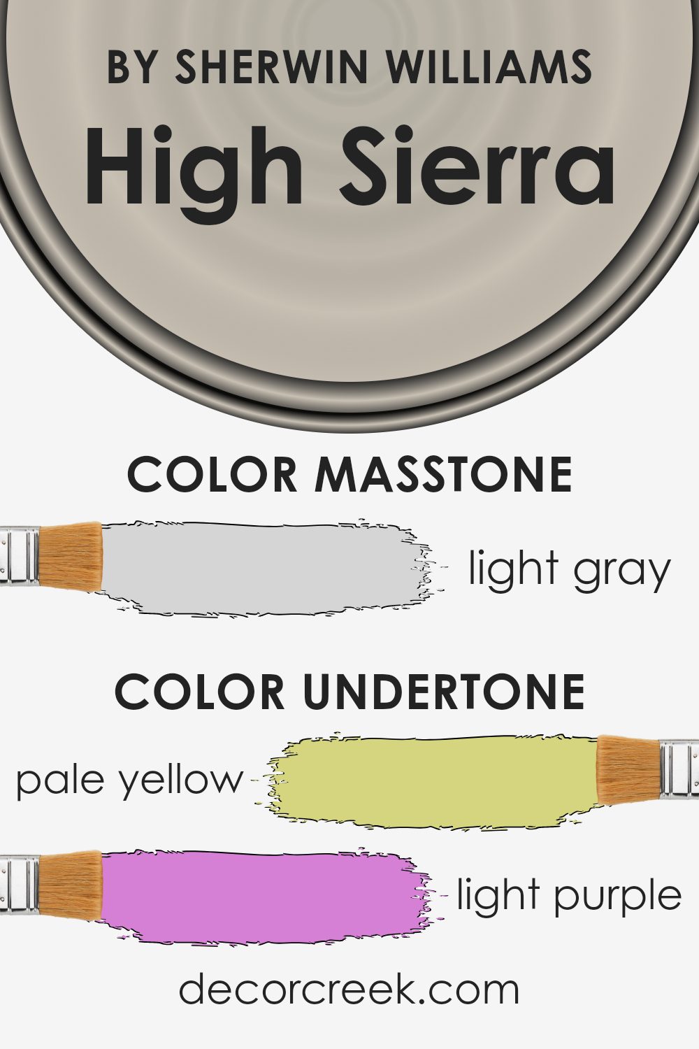
High Sierra by Sherwin Williams is a versatile paint color with several subtle undertones. These undertones can greatly influence how we perceive a color in different lighting conditions. High Sierra combines hints of pale yellow, light purple, light blue, pale pink, mint, lilac, and gray. These undertones interact to create a color that can appear differently depending on the setting.
When used on interior walls, the pale yellow undertone adds warmth and a gentle glow, making a room feel more inviting and cozy. The light purple and lilac undertones can introduce a hint of sophistication and calmness, which can be soothing in a bedroom or living area.
Light blue brings freshness and can make the space feel airy, while pale pink adds a soft, comforting touch. The minty undertone imparts a refreshing, clean vibe, which works well in kitchens or bathrooms. Lastly, the gray tone keeps the color grounded, balancing the brightness of the other undertones.
In changing light throughout the day, these undertones may subtly shift, so High Sierra can look warmer or cooler, brighter or more muted. It’s a dynamic color that reflects the complexity of its influences, making it suitable for a range of interior spaces.
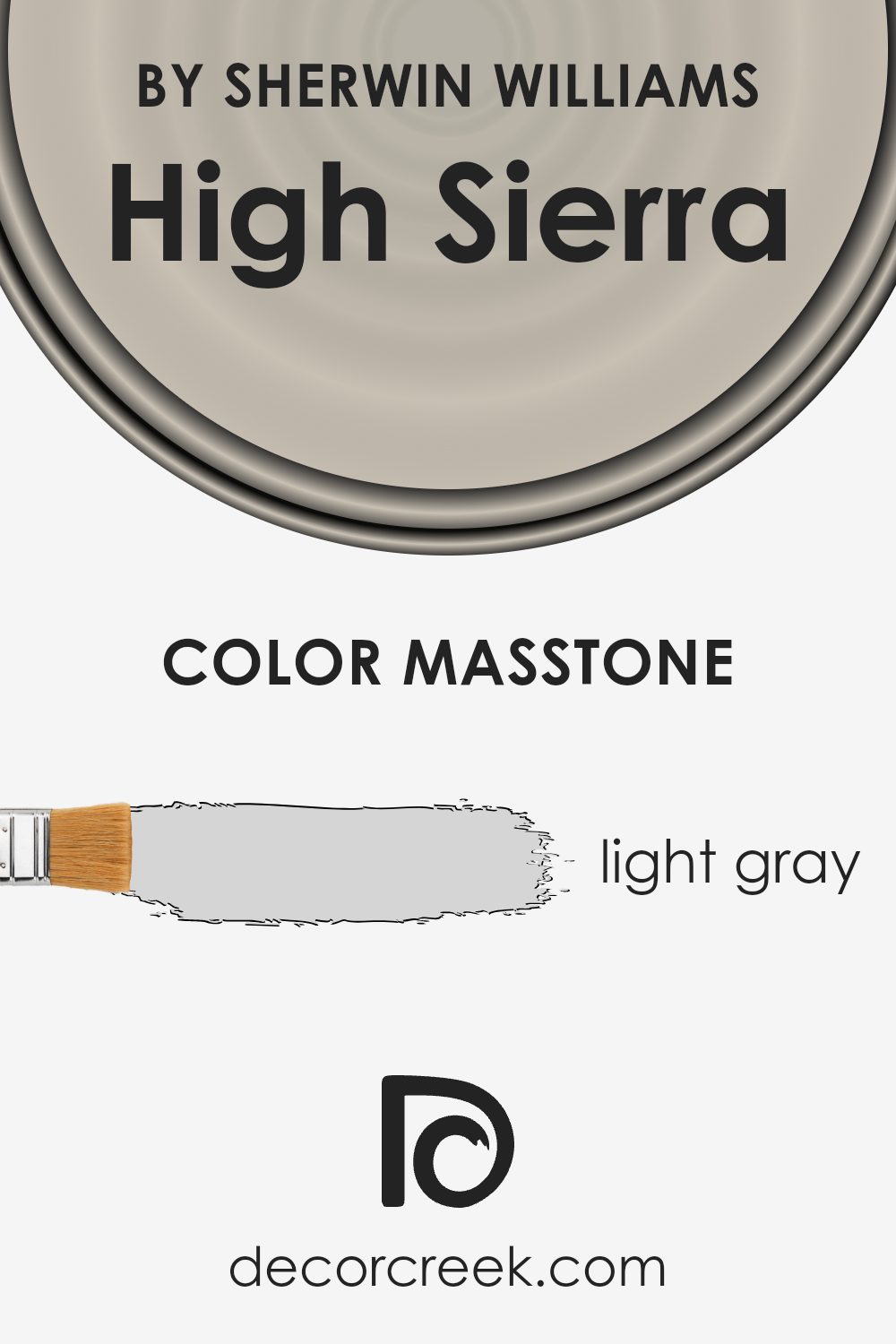
What is the Masstone of the High Sierra SW 9588 by Sherwin Williams?
High Sierra SW 9588 by Sherwin Williams has a light gray masstone (#D5D5D5), offering a soft and neutral feel. It can be an excellent choice for home interiors, providing a clean and fresh look that helps to create an open and airy ambiance.
Light gray is versatile, serving as a subtle backdrop that complements various design styles, from modern to traditional. It can work well in living rooms, bedrooms, or kitchens, adding a touch of sophistication without overwhelming the space. The neutral tone of High Sierra easily pairs with other colors, allowing homeowners to add accents and decorations in bolder shades without clashing.
It also enhances natural light, making rooms feel brighter and more inviting. Additionally, this color can lend a calming and relaxing vibe, which is especially beneficial in busy households. Overall, High Sierra’s soft light gray tone provides a timeless and adaptable choice for any room.
How Does Lighting Affect High Sierra SW 9588 by Sherwin Williams?
Lighting has a significant impact on how colors are perceived in a space. The same paint color can look quite different under various lighting conditions. This is true for the paint color High Sierra by Sherwin Williams.
In natural light, colors are often clearer and more vibrant. However, the direction from which natural light enters a room alters how colors appear. In north-facing rooms, natural light tends to be cooler and dimmer, which can make High Sierra appear a bit more muted and darker. It might show its gray undertones more prominently here, making the space feel cooler.
In contrast, south-facing rooms receive more direct sunlight throughout the day, which tends to be warmer. This type of lighting can make High Sierra look brighter and slightly warmer, enhancing any subtle warmth in the color. The room can feel more inviting and illuminated.
East-facing rooms get light in the morning, which can also be cooler. High Sierra in these spaces might seem softer in the early part of the day and gradually take on a neutral tone as the sunlight shifts. In the afternoon, the light becomes less intense, allowing the color to settle into its natural state.
West-facing rooms experience warmer, more golden light in the evening. Under this light, High Sierra can appear richer and warmer, lending a cozy atmosphere as the day progresses. During midday, it might look more neutral or subdued until the warmer light of the evening sets in.
In artificial light, the color’s appearance depends on the type of bulbs used. Warm light bulbs can enhance the warmer tones of High Sierra, while cool light bulbs might bring out the cooler, gray undertones. It’s essential to test the paint color in different lighting conditions to determine how it will look throughout the day in a particular space.

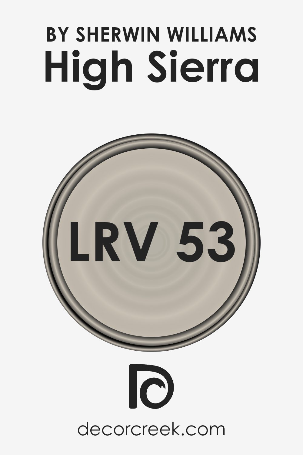
What is the LRV of High Sierra SW 9588 by Sherwin Williams?
LRV, or Light Reflectance Value, is a measure that tells us how much light a color reflects or absorbs. It’s based on a scale from 0 to 100, where 0 means no light is reflected and 100 means all light is reflected. Basically, the higher the LRV, the more light the color bounces back, while a lower LRV means the color absorbs more light.
This is important when choosing paint because it influences how bright or dark a room will appear. A color with a high LRV will make a space feel more open and brighter, and it’s often used in smaller or dimly lit rooms to enhance the lighting. In contrast, colors with a lower LRV can make a space feel cozier and more intimate, as they absorb light and create a sense of warmth.
For the color High Sierra by Sherwin Williams with an LRV of 53.172, it sits in the middle of the scale, meaning it reflects a moderate amount of light. This makes it a versatile choice for many spaces. High Sierra isn’t too bright or too dark, offering a balanced, neutral appearance. It can help a room have a soft, warm feel without becoming overly bright or overly dim.
This particular LRV suggests that High Sierra can work well in both well-lit rooms where you want to maintain a gentle, natural look and in slightly dimmer spaces where you need a bit more reflectiveness to prevent the room from feeling too dark.
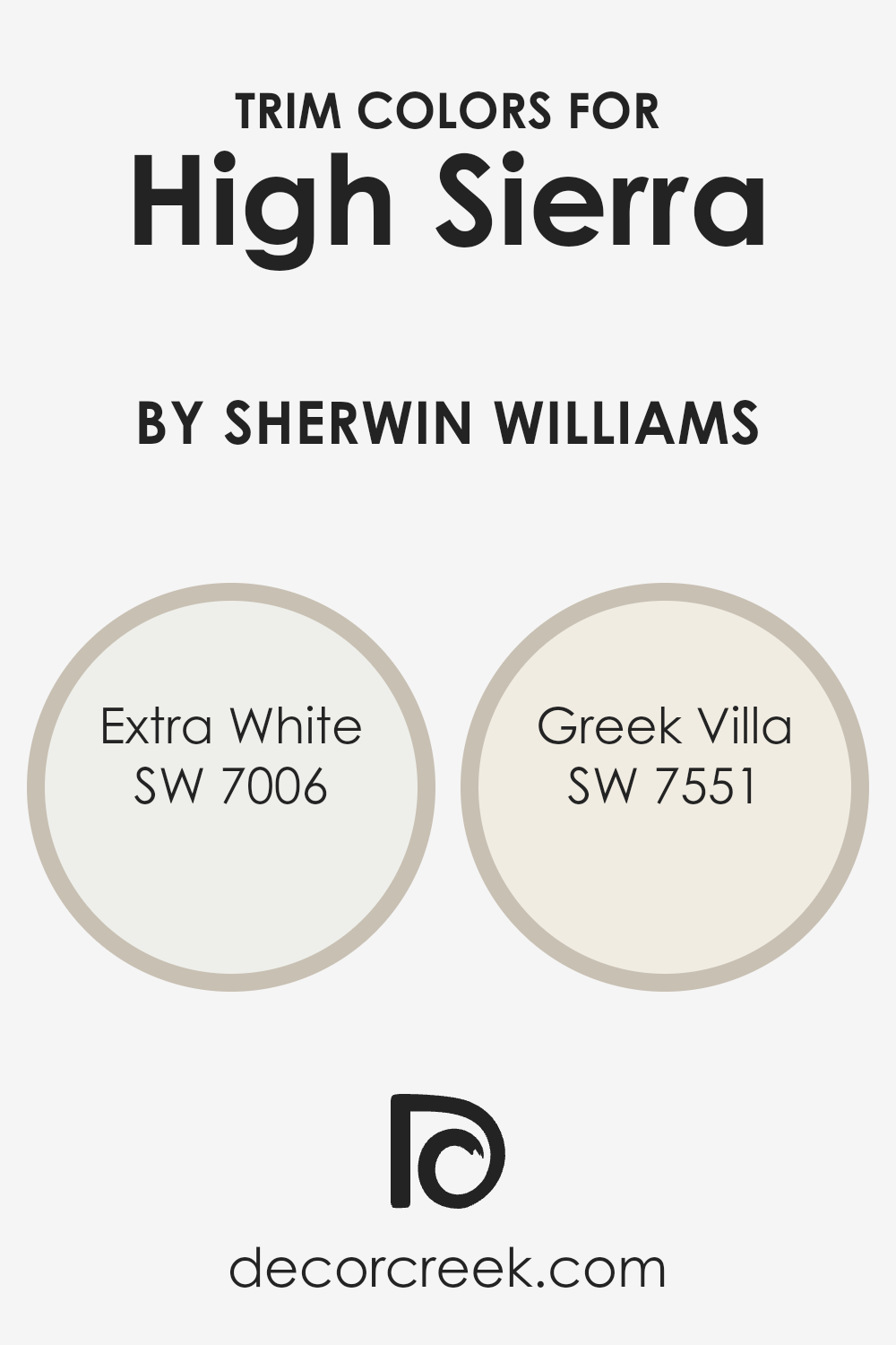
What are the Trim colors of High Sierra SW 9588 by Sherwin Williams?
Trim colors help define a room by highlighting edges, windows, doors, and other architectural features. They add depth and contrast, raising the overall appeal of a space. In the context of using High Sierra by Sherwin Williams, the right trim colors can enhance its warm, earthy tone, making it feel more inviting.
Choosing a suitable trim color such as Extra White or Greek Villa can significantly impact the room’s aesthetic. The bright, clean look of Extra White offers a crisp contrast against High Sierra’s warm hue, creating a dynamic yet harmonious look in any setting.
Extra White is a classic, pure white that provides a clean, modern feel, enhancing the brightness and openness of a space. This color works beautifully when you want sharp lines and a contemporary finish. On the other hand, Greek Villa is a soft, creamy white that adds warmth and subtlety, complementing High Sierra’s natural warmth.
Greek Villa offers a more subdued contrast that can make a room feel cozy and inviting. Both colors serve distinct purposes but can beautifully complete the look of a room where High Sierra is the main color.
You can see recommended paint colors below:
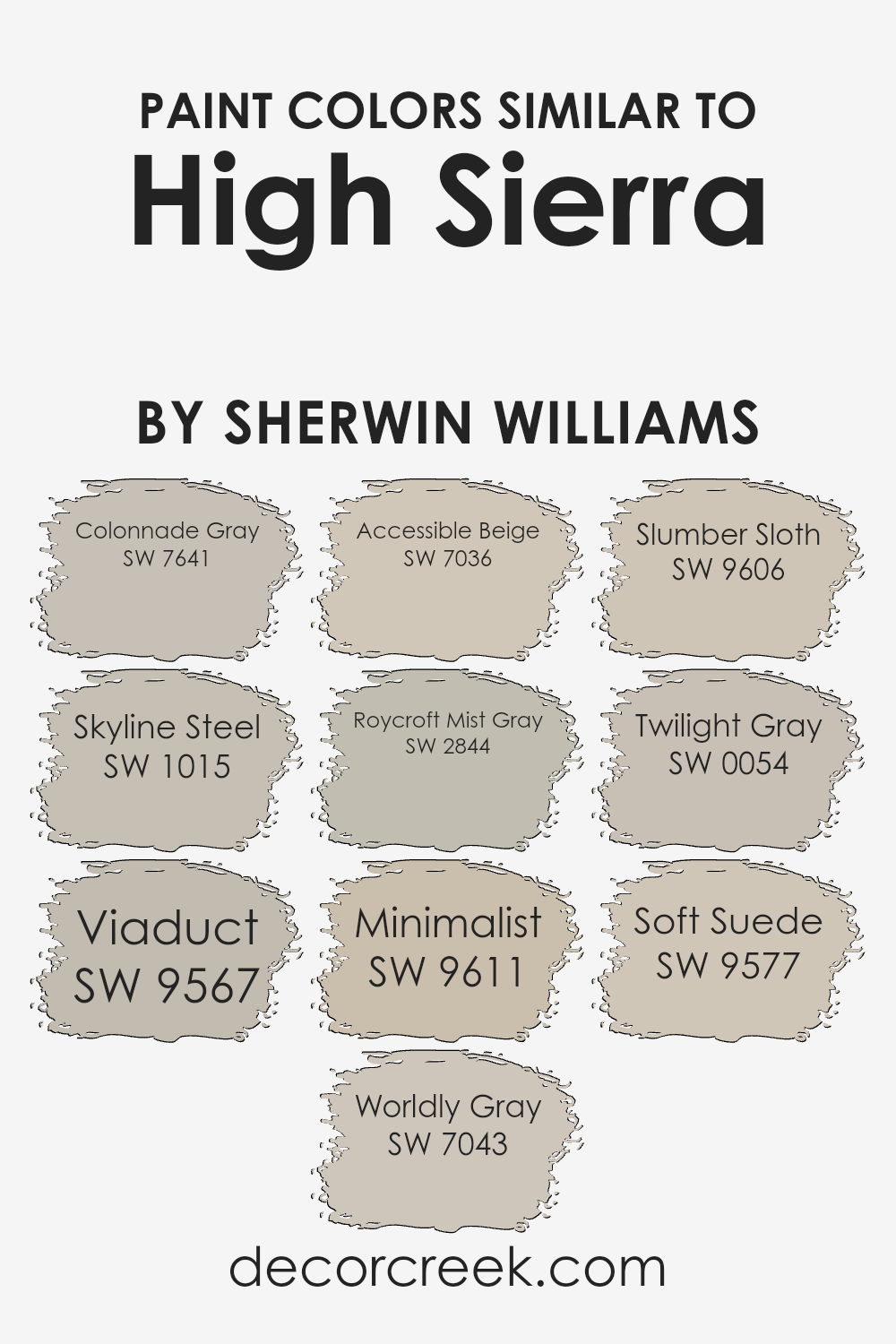
Colors Similar to High Sierra SW 9588 by Sherwin Williams
Similar colors play a vital role in creating a harmonious and cohesive look in any space. When you use shades that are alike, they blend easily, offering a balanced and comfortable environment that’s pleasant to the eyes. For instance, Colonnade Gray is a versatile shade that exudes warmth, making it perfect for any room in need of a subtle yet classic ambiance.
Skyline Steel is a soft neutral that adds a gentle touch, perfect for modern settings that demand quiet elegance. Viaduct carries earthy undertones that provide depth, adding richness to a palette without overpowering other elements. Worldly Gray, a refined gray with subtle warmth, can beautifully unify a room’s design.
Accessible Beige brings in a cozy undertone, making spaces feel inviting and welcoming. Roycroft Mist Gray offers a cool, misty nuance that invokes a calming atmosphere, ideal for spaces meant for relaxation. Minimalist is a gentle hue that encourages simplicity and cleanliness, providing a fresh backdrop for any decor.
Slumber Sloth, with its tranquil muted tone, is great for creating a peaceful, restful environment. Twilight Gray gives a mysterious depth, adding a touch of cool sophistication. Soft Suede offers a natural, velvety texture that adds quiet elegance to any interior design. These shades work together to form a subtle palette that complements the High Sierra tone beautifully, crafting spaces that feel cohesive and thoughtfully designed.
You can see recommended paint colors below:
- SW 7641 Colonnade Gray
- SW 1015 Skyline Steel
- SW 9567 Viaduct
- SW 7043 Worldly Gray
- SW 7036 Accessible Beige
- SW 2844 Roycroft Mist Gray
- SW 9611 Minimalist
- SW 9606 Slumber Sloth
- SW 0054 Twilight Gray
- SW 9577 Soft Suede
How to Use High Sierra SW 9588 by Sherwin Williams In Your Home?
High Sierra SW 9588 by Sherwin Williams is a versatile, warm, and earthy paint color that can add a cozy touch to various spaces in your home. Its neutral tone makes it easy to match with different decor styles and colors.
You could use High Sierra in a living room to create a welcoming and comfortable atmosphere for family gatherings. In the bedroom, it can help to make the space feel calm and restful, promoting relaxation and a good night’s sleep. This color works well in kitchens and dining areas too, enhancing the warmth of wooden cabinets or dining furniture.
High Sierra is a practical choice for a hallway or entryway, where it sets a neutral backdrop that highlights other aesthetic elements like artwork or colorful rugs. Due to its adaptability, this color is suitable for open-plan spaces, providing a cohesive look throughout your home.
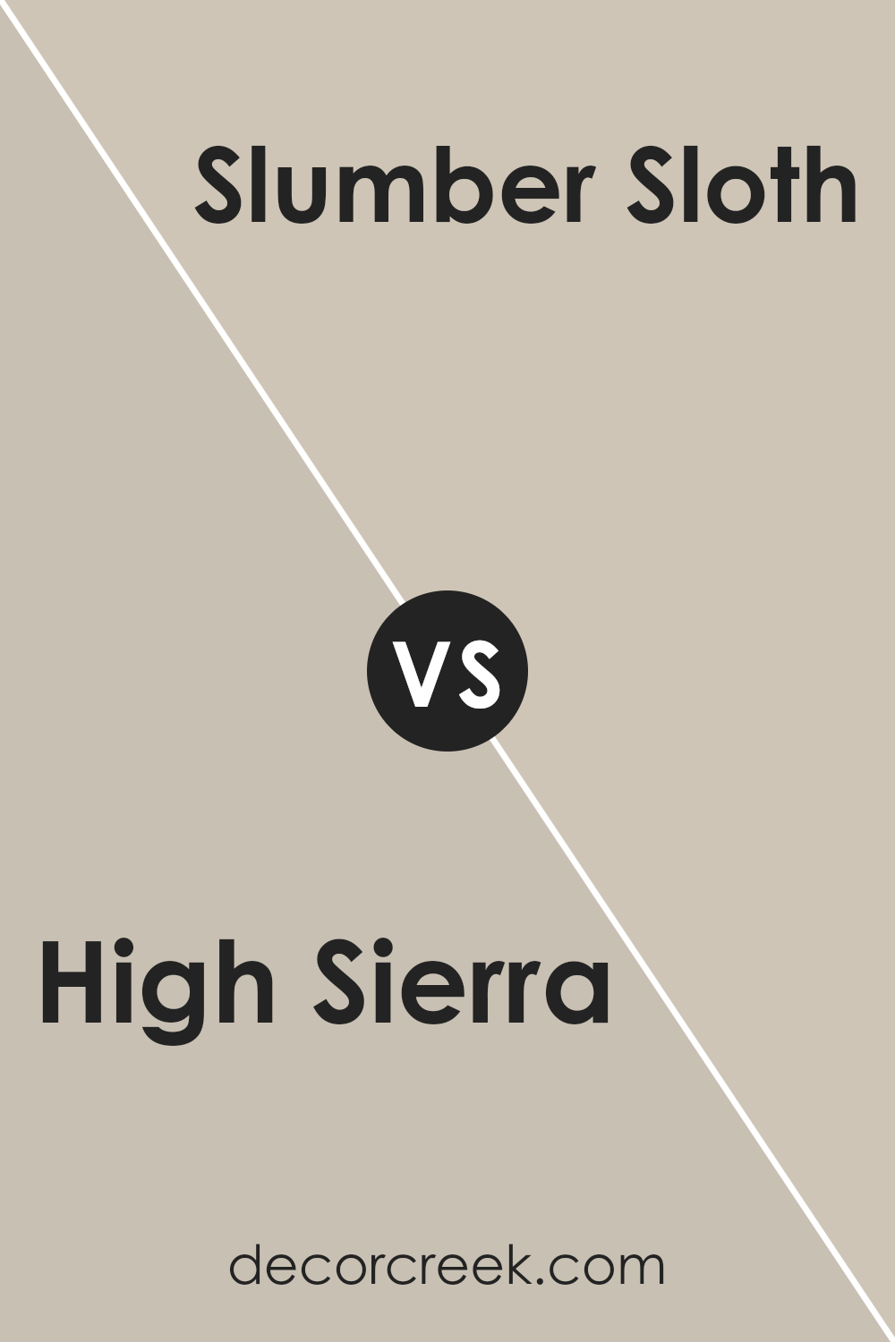
High Sierra SW 9588 by Sherwin Williams vs Slumber Sloth SW 9606 by Sherwin Williams
High Sierra SW 9588 by Sherwin Williams is a warm, earthy color with undertones of brown and green, giving it a natural and grounded feel. It’s versatile and works well in spaces that aim for a cozy, rustic, or nature-inspired look. The warmth of High Sierra can make a space feel inviting and comfortable, making it perfect for living rooms or bedrooms.
On the other hand, Slumber Sloth SW 9606 by Sherwin Williams is a soft, muted gray with a hint of blue. It creates a calm and soothing atmosphere, making it ideal for spaces where relaxation is key, like bedrooms or bathrooms. Its cooler tone can add a sense of lightness and openness to a room, contrasting with the warmth of High Sierra.
While High Sierra adds richness and warmth, Slumber Sloth brings a more relaxed and airy feel. Together, they can complement each other and create a balanced atmosphere.
You can see recommended paint color below:
- SW 9606 Slumber Sloth
High Sierra SW 9588 by Sherwin Williams vs Minimalist SW 9611 by Sherwin Williams
High Sierra SW 9588 and Minimalist SW 9611 by Sherwin Williams offer two distinct looks. High Sierra SW 9588 is a warm, earthy tone that adds a cozy and inviting feel to a space. It’s a muted, natural shade that can bring a sense of comfort and warmth to any room.
On the other hand, Minimalist SW 9611 is a lighter color with a clean and modern vibe. It offers a fresh and open atmosphere, perfect for spaces that aim for simplicity and calmness. While High Sierra provides a grounded and snug environment, Minimalist brings brightness and a sense of airiness.
Both colors are versatile but cater to different aesthetics: High Sierra with its warm embrace and Minimalist with its sleek appearance. Choosing between the two depends on whether you prefer the warm comfort of earth tones or the cool clarity of a more minimal style.
You can see recommended paint color below:
High Sierra SW 9588 by Sherwin Williams vs Accessible Beige SW 7036 by Sherwin Williams
High Sierra (SW 9588) and Accessible Beige (SW 7036) are both popular colors by Sherwin Williams, but they have distinct differences. High Sierra is a warm, earthy tone with a soft greenish-brown hue. It brings a natural, subdued feeling to a space, adding warmth and depth without being overwhelming. It’s reminiscent of a calm, forest-inspired environment.
On the other hand, Accessible Beige is a versatile, neutral color with a warm, beige tint. It balances well with many other colors and suits various styles, from traditional to modern. It provides a cozy backdrop without dominating a room’s design.
While both colors are warm and inviting, High Sierra leans more towards a nature-inspired palette with its green undertones, while Accessible Beige remains a classic neutral. Choosing between the two depends on whether you desire a hint of nature or a straightforward, adaptable backdrop.
You can see recommended paint color below:
High Sierra SW 9588 by Sherwin Williams vs Colonnade Gray SW 7641 by Sherwin Williams
High Sierra SW 9588 by Sherwin Williams and Colonnade Gray SW 7641 are both versatile colors, but they offer different moods. High Sierra is a warm, earthy tone with a subtle hint of green, making it ideal for creating a cozy, natural atmosphere. It’s perfect for spaces where you want a calm and inviting feel, such as living rooms or bedrooms.
On the other hand, Colonnade Gray is a cooler, more neutral gray with a touch of beige, providing a balanced backdrop that works well with various color schemes. It’s a great choice for those who prefer a modern, understated look, suitable for any room in the house.
While High Sierra brings warmth and a touch of nature into a space, Colonnade Gray offers a clean and adaptable foundation. Both colors have their unique charm and can be chosen based on the ambiance you want to create.
You can see recommended paint color below:
High Sierra SW 9588 by Sherwin Williams vs Worldly Gray SW 7043 by Sherwin Williams
High Sierra SW 9588 by Sherwin Williams is a warm and earthy color, reminiscent of natural landscapes and rugged terrains. It has a soft, muted tone that creates a cozy and inviting atmosphere. This shade works well in spaces where you want to feel grounded and connected to nature.
On the other hand, Worldly Gray SW 7043 is a greige, which is a blend of gray and beige. It’s a versatile neutral that fits well in modern or classic settings. Worldly Gray has a subtle warmth but leans towards a light gray, offering a clean and balanced look.
Both colors can be used in various spaces to bring different vibes. High Sierra is ideal for creating a warm, earthy feel, while Worldly Gray gives a more neutral, calming backdrop. These colors can complement each other when paired in a room, providing both warmth and neutrality to the overall design.
You can see recommended paint color below:
High Sierra SW 9588 by Sherwin Williams vs Viaduct SW 9567 by Sherwin Williams
High Sierra SW 9588 and Viaduct SW 9567, both by Sherwin Williams, are earthy paint colors with distinct personalities. High Sierra is a warm, neutral hue with soft brown and beige undertones, making it ideal for cozy spaces.
It provides a grounded, welcoming atmosphere, and pairs well with natural elements like wood and stone. On the other hand, Viaduct is a cooler and darker shade, leaning more towards a deeper gray with hints of blue. It can create a more modern look and adds a touch of elegance to any room. While High Sierra is great for creating a sense of warmth and comfort, Viaduct offers a sleek and more sophisticated aesthetic.
Together, they can complement each other, offering a balance between warmth and coolness that works well in various settings, from living rooms to bedrooms.
You can see recommended paint color below:
- SW 9567 Viaduct
High Sierra SW 9588 by Sherwin Williams vs Soft Suede SW 9577 by Sherwin Williams
High Sierra SW 9588 and Soft Suede SW 9577 by Sherwin Williams are two warm, earthy tones that create a cozy atmosphere. High Sierra is a soft brown with a hint of green, bringing to mind the calming presence of nature. It’s a versatile color that can add warmth and comfort to any space.
On the other hand, Soft Suede is a gentle, earthy brown with slightly more depth. It is reminiscent of desert landscapes and offers a bit more richness compared to High Sierra. Both colors work well in living spaces where you want a welcoming feel, but Soft Suede might provide a bit more contrast against lighter neutral décor.
High Sierra is perfect for achieving a light, natural look, while Soft Suede gives you a slightly deeper tone. When used together, they can complement each other, with High Sierra brightening and Soft Suede adding a grounded feel to a room.
You can see recommended paint color below:
- SW 9577 Soft Suede
High Sierra SW 9588 by Sherwin Williams vs Roycroft Mist Gray SW 2844 by Sherwin Williams
High Sierra SW 9588 by Sherwin Williams is a warm, earthy beige that brings coziness to a room. It’s ideal for spaces where you want a comforting and welcoming atmosphere. The color has undertones of soft taupe, making it versatile enough to pair with various other shades for a natural look.
On the other hand, Roycroft Mist Gray SW 2844 by Sherwin Williams is a cool, muted gray with a hint of blue. This color creates a calm and refreshing ambiance, perfect for spaces where relaxation is the goal. It works well in both modern and traditional settings and can add a sophisticated touch to any room.
While High Sierra leans towards warmth and coziness, Roycroft Mist Gray offers a cool and calm essence. Both colors are excellent choices, but they set very different moods: High Sierra for warmth and comfort, Roycroft Mist Gray for a cool, collected vibe.
You can see recommended paint color below:
- SW 2844 Roycroft Mist Gray
High Sierra SW 9588 by Sherwin Williams vs Twilight Gray SW 0054 by Sherwin Williams
High Sierra SW 9588 and Twilight Gray SW 0054 by Sherwin Williams are two distinct colors that each bring their own character to a space. High Sierra is a warm, muted beige, providing a neutral backdrop that feels cozy and inviting.
It can make a room feel soft and welcoming, complementing a wide range of other colors. In contrast, Twilight Gray is a deep, classic gray with cool undertones. It offers a sense of depth and sophistication, perfect for adding a more dramatic feel to a room. While High Sierra can brighten up a space with its warmth, Twilight Gray adds a touch of elegance and moodiness.
When used together, High Sierra’s warmth can balance Twilight Gray’s cooler tones, creating a harmonious and well-rounded color scheme in any interior setting. Both colors work well in modern or traditional spaces, depending on the look you’re aiming to achieve.
You can see recommended paint color below:
- SW 0054 Twilight Gray
High Sierra SW 9588 by Sherwin Williams vs Skyline Steel SW 1015 by Sherwin Williams
High Sierra SW 9588 and Skyline Steel SW 1015 by Sherwin Williams are both subtle colors but offer different vibes. High Sierra is a gentle, earthy beige with warm undertones, bringing a cozy and inviting feel to any room.
It works well in spaces where you want a soft, natural backdrop. Skyline Steel, on the other hand, is a cool, muted gray with a hint of blue. This color provides a sleek and modern touch, ideal for creating a calm and neutral environment. While High Sierra adds warmth and a sense of comfort, Skyline Steel brings a fresh, airy quality to a space.
Both colors can be versatile, matching different styles and furniture. Choosing between them depends on whether you prefer a warm and snug atmosphere or a cool and modern one in your living space.
You can see recommended paint color below:
Conclusion
This color is a warm shade that feels like a gentle hug, reminiscent of the Earth and nature. It’s the kind of color that makes you think of a cozy day in the mountains or a quiet walk in the woods.
High Sierra is fantastic because it works well in lots of different places. Whether you’re thinking about adding it to your bedroom for a snug feel or putting it in the kitchen to add warmth, it just fits. It doesn’t shout or try to grab attention; instead, it nicely balances other colors and décor.
What’s more, using High Sierra on your walls is like bringing a little piece of the outside world inside your home. It helps create a peaceful and comfy atmosphere, just like you would feel on a calm day spent outdoors.
In short, SW 9588 High Sierra is a great choice for anyone who wants their home to feel inviting and warm. It’s like painting your room with nature’s own colors. I think it’s a wonderful way to make any room feel welcoming and cozy.
Ever wished paint sampling was as easy as sticking a sticker? Guess what? Now it is! Discover Samplize's unique Peel & Stick samples.
Get paint samples

