I recently checked out Benjamin Moore’s 2114-60 Hint of Violet. Surprisingly subtle, this color is way softer than one might expect from its name. It carries a slight lavender undertone that makes it quite adaptable, perfect whether you’re looking to freshen up a room’s vibe or just add a touch of uniqueness without overpowering the room.
You might find it ideal for creating a calm backdrop in your bedroom or giving your bathroom a light, airy feel. The beauty of Hint of Violet lies in its ability to pair well with a wide range of decor styles and hues.
It works particularly well with natural light, where the true softness and flexibility of the color come to life.
This paint could help you achieve that gentle yet refreshing atmosphere in your room.

What Color Is Hint of Violet 2114-60 by Benjamin Moore?
Hint of Violet by Benjamin Moore is a soft and subtle shade of purple that carries a very light lavender touch. This color is mild and understated, making it a perfect choice for creating a calm and welcoming atmosphere in any room. Its gentle hue works well in areas that aim for a soothing and light feel, such as bedrooms, bathrooms, or any area meant for relaxation.
This color is flexible when it comes to interior design styles. It pairs wonderfully with minimalist designs, where its light tone can help keep the room feeling open and airy. It also fits beautifully in Scandinavian decor, where natural light and soft colors are key elements. Furthermore, this shade can easily fit into a shabby chic room, where its gentleness complements distressed furniture and vintage touches.
When thinking about materials, Hint of Violet pairs excellently with light woods like pine or ash, which help maintain the airy feel of the room. It also goes well with metallic finishes like brushed silver or soft gold, adding a touch of elegance without overpowering the gentle nature of the color. For textures, think of adding linen curtains or a woolen throw in a similar soft color to enhance the cozy feel of the room.
decorcreek.com
Is Hint of Violet 2114-60 by Benjamin Moore Warm or Cool color?
Hint of Violet 2114-60 by Benjamin Moore is a subtle yet beautiful shade that can bring a fresh feel to any room. This color has a soft purple tone that’s really subtle, almost like a whisper of lavender. The softness of this color makes it perfect for creating a calm and relaxing atmosphere, ideal for bedrooms and living areas where you want to unwind after a long day.
When used on walls, Hint of Violet adds a touch of color without feeling too strong. This makes it easy to match with different decor styles and furniture colors, from whites and grays to more vibrant hues. It’s also a great choice for a nursery or a child’s room because of its gentle and cheerful vibe. Additionally, it works well in bathrooms, providing a light and clean look that’s very inviting.
Overall, Hint of Violet is a flexible paint color that can help freshen up a home while keeping the environment cozy and welcoming.
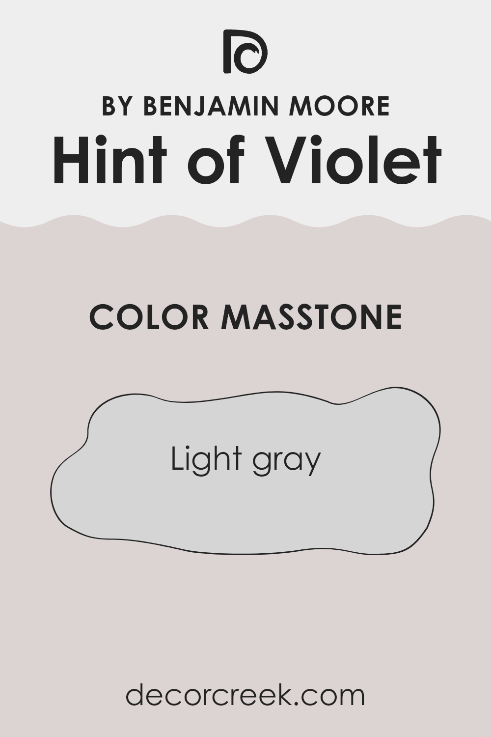
What is the Masstone of the Hint of Violet 2114-60 by Benjamin Moore?
Hint of Violet2114-60 by Benjamin Moore is a light gray color with a masstone represented by the hex code #D5D5D5. This shade of gray has a subtle violet undertone that gives it a unique twist, making it different from a pure, neutral gray.
The lightness of this color makes it a great choice for many parts of a home because it helps rooms look larger and more open. This color is particularly effective in rooms that don’t get a lot of natural light, as it can help make such areas feel brighter and more welcoming.
When used on walls, Hint of Violet has a soft and gentle appearance that works well with various decor styles, from modern to traditional. It pairs beautifully with white trims, adding a clean and fresh look to the room. Additionally, this color goes well with other colors, which makes it very adaptable for decorating. It’s an excellent backdrop for artwork or can be used alongside brighter colors for a lively contrast.
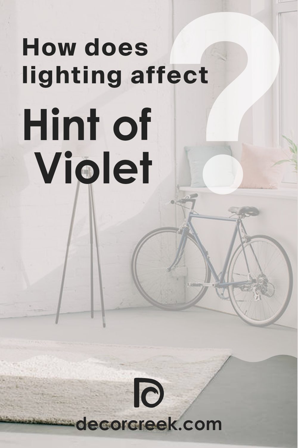
How Does Lighting Affect Hint of Violet 2114-60 by Benjamin Moore?
Lighting plays a crucial role in how colors appear in a room. Different types of light can alter the appearance of paint colors drastically. Taking the color “Hint of Violet” by Benjamin Moore as an example, we can observe these effects clearly.
In natural light, “Hint of Violet” generally appears true to its color as seen on the swatch. Natural daylight provides a balanced light source that tends to reveal the truest hue of colors. However, the direction your room faces affects this:
- North-Faced Rooms: North-facing rooms get less sunlight, which makes light cooler and somewhat blueish. This can make “Hint of Violet” appear slightly more muted and less vibrant.
- South-Faced Rooms: These rooms receive the most amount of sunlight throughout the day, offering bright, warm light. Here, “Hint of Violet” will appear lighter and somewhat more lively, highlighting its subtle purple tones.
- East-Faced Rooms: In east-facing rooms, the color will be brighter in the morning due to the warm, yellow morning light. This lighting brings out the warm notes in the paint, making the color look softer and warmer.
- West-Faced Rooms: In these rooms, the light is cooler in the morning but becomes intense and warm in the late afternoon and evening. Thus, “Hint of Violet” can shift from looking a bit subdued in the morning to more pronounced and vibrant in the evening.
As for artificial lighting, the type of bulb can affect “Hint of Violet” differently:
- Incandescent Lighting: These bulbs give off warmer light, enhancing the purple and red tones in “Hint of Violet,” making it look warmer and richer.
- Fluorescent Lighting: This light is generally cooler and can wash out the color, making it appear bluer and less vibrant.
Overall, “Hint of Violet” is a flexible color that changes subtly depending on the lighting conditions. This makes it an interesting choice for various rooms and settings, provided you consider how light affects its appearance throughout the day.
decorcreek.com
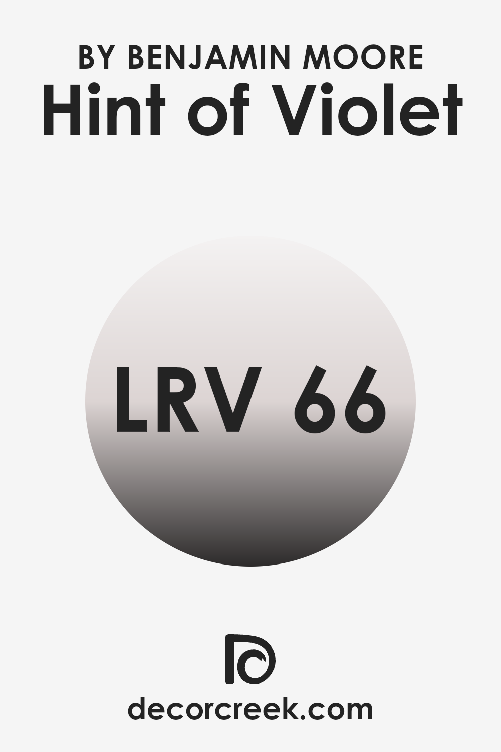
What is the LRV of Hint of Violet 2114-60 by Benjamin Moore?
Light Reflectance Value (LRV) measures the percentage of light a paint color reflects back into a room. The scale ranges between zero (absolute black, absorbing all light) and one hundred (pure white, reflecting all light back). Therefore, colors with a higher LRV can make a room feel brighter as they reflect more light. Paint colors with a lower LRV can make a room feel smaller or cozier as they absorb more light.
With an LRV of 66.18, Hint of Violet is a fairly light color and will reflect a decent amount of light back into the room. This can make rooms painted in this shade feel more open and airy.
The light quality of the room can significantly influence the appearance of this paint, appearing slightly brighter in well-lit areas and slightly more muted in rooms with less natural light. This is important to consider as it can help determine the overall mood of the room based on how much natural or artificial light is present.
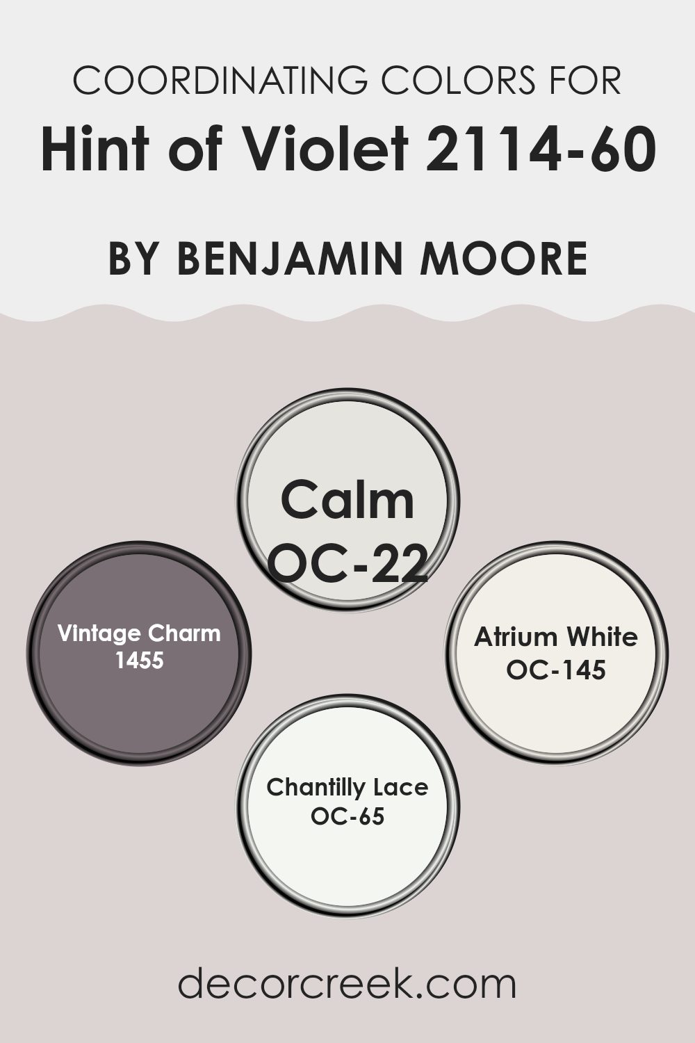
Coordinating Colors of Hint of Violet 2114-60 by Benjamin Moore
Coordinating colors are shades that harmonize with one another, and they can be used together in design to create a balanced and visually appealing look. They typically include colors that complement or contrast effectively with the main color, in this case, Hint of Violet by Benjamin Moore.
When used skillfully, coordinating colors improve the room by adding depth and interest, making your decor scheme look cohesive and well thought out. For instance, subtle nuances or vibrant dashes of these colors in textiles, wall art, or furniture can add texture and personality to a room.
Each of the coordinating colors selected for Hint of Violet has its unique tone, starting with OC-22 – Calm, which is a soft, muted shade of gray that provides a gentle contrast. Think of it as a quiet background that allows other colors to stand out, yet holds its ground with understated elegance. Then there’s 1455 – Vintage Charm, a warm, dusty pink that offers a touch of nostalgia and softness, ideal for creating a cozy atmosphere.
OC-145 – Atrium White is as crisp and clean as it gets, adding brightness and a sense of freshness wherever it’s used. Lastly, OC-65 – Chantilly Lace is another white but with a slightly different undertone that, when paired with other shades, enhances the overall look without feeling too strong. Each of these colors works subtly to support and complement the gentle tone of Hint of Violet, ensuring transitions within the room are smooth and appealing.
You can see recommended paint colors below:
- OC-22 Calm
- 1455 Vintage Charm
- OC-145 Atrium White
- OC-65 Chantilly Lace
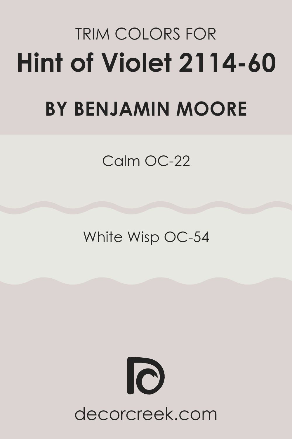
What are the Trim colors of Hint of Violet 2114-60 by Benjamin Moore?
Trim colors are the shades used for the architectural details and finishes in a room, like baseboards, moldings, door frames, and window frames. Choosing the right trim color is crucial because it helps define and accentuate the boundaries of different surfaces, enhancing the overall aesthetic of a room. When paired with a subtle and gentle color like Hint of Violet by Benjamin Moore, trim colors play a significant role by creating a striking yet harmonious contrast that adds depth and definition to the room’s design.
For an understated and clean look, OC-22, known as Calm, is a light and airy color that can work beautifully as a trim color alongside Hint of Violet. It offers a soft white hue with a hint of gray, providing a fresh and neat appearance that isn’t overpowering.
OC-54, or White Wisp, is another ideal choice for trim, bringing a brighter white with subtle undertones of blue and gray that can make the edges in a room crisp and distinct. Both colors have the ability to gently frame Hint of Violet, allowing its unique tones to stand out beautifully while maintaining a harmonious and polished atmosphere in the decor.
You can see recommended paint colors below:
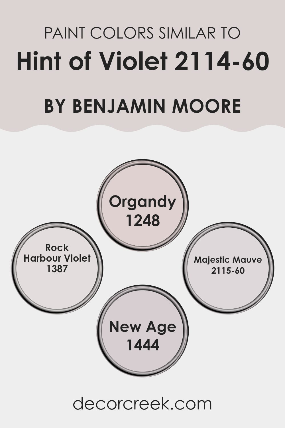
Colors Similar to Hint of Violet 2114-60 by Benjamin Moore
Choosing similar colors when designing a room is essential for creating a cohesive and harmonious atmosphere. By selecting shades that are closely aligned in hue, such as those similar to Hint of Violet by Benjamin Moore, you create a smooth visual flow from one area to another.
This technique allows distinct design elements to blend seamlessly, giving the room an overall unified appearance. Colors like Organdy, Rock Harbour Violet, Majestic Mauve, and New Age work well together because they share common undertones that help in linking different textures and decor elements without feeling too strong.
Organdy is a subtle color, offering a gentle whisper of lavender that’s perfect for a calming effect in a room. It pairs nicely with soft textiles and light woods, providing a backdrop that’s easy on the eyes. Rock Harbour Violet has a deeper, dustier hue, which brings a touch of warmth and is ideal for areas that need a bit more depth.
Majestic Mauve is another low-key option that leans toward a neutral palette with its understated elegance. It works exceptionally well in rooms that aim for a muted yet inviting feel. Lastly, New Age is a modern grey with a hint of violet that offers a contemporary look, excellent for pairing with metallic accents and glass for a fresh, modern vibe. Together, these colors create a soothing palette that is pleasing and effortlessly stylish.
You can see recommended paint colors below:
- 1248 Organdy
- 1387 Rock Harbour Violet
- 2115-60 Majestic Mauve
- 1444 New Age
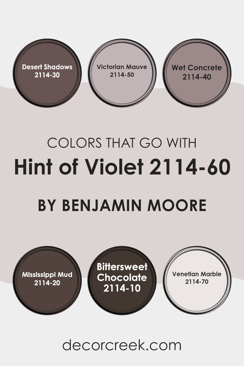
Colors that Go With Hint of Violet 2114-60 by Benjamin Moore
Choosing the right colors to complement Hint of Violet 2114-60 by Benjamin Moore is crucial for creating a cohesive and visually appealing room. These colors, ranging from deep and rich to soft and subdued, work together by balancing tones and enhancing the overall aesthetic of a room.
For instance, Desert Shadows 2114-30 acts as a dark, grounding force that can add depth to rooms when paired with the lighter Hint of Violet. Victorian Mauve 2114-50 offers a more flushed and gentle purple that provides a subtle transition between the more intense shades and the softness of Hint of Violet.
Wet Concrete 2114-40 introduces a medium gray tone that serves as a stable neutral, making it easier to blend various decor elements without clashing. On a darker note, Mississippi Mud 2114-20 brings in a warm brown, offering a rich contrast that is both inviting and comforting. Looking deeper, Bittersweet Chocolate 2114-10 is nearly black, perfect for accentuating features and creating focal points in a room that command attention without feeling too intense.
On the other end of the spectrum, Venetian Marble 2114-70 is a much lighter, almost ethereal gray that can open up a room and illuminate corners, playing well with the light purple hues of Hint of Violet. Together, these colors help in crafting rooms that feel complete and balanced, providing not just beauty but also a sense of welcoming and consistency.
You can see recommended paint colors below:
- 2114-30 Desert Shadows
- 2114-50 Victorian Mauve
- 2114-40 Wet Concrete
- 2114-20 Mississippi Mud
- 2114-10 Bittersweet Chocolate
- 2114-70 Venetian Marble
How to Use Hint of Violet 2114-60 by Benjamin Moore In Your Home?
Hint of Violet 2114-60 by Benjamin Moore is a soft, light purple hue that offers a subtle touch of color to any room without feeling too strong. This shade works exceptionally well in rooms that need a gentle boost to their aesthetic.
For example, using Hint of Violet in a bedroom can create a calming atmosphere, making it a great choice for walls or as an accent. In living areas, pairing this paint with neutral furnishings highlights the color, giving the room a fresh and clean look.
In bathrooms, Hint of Violet can add a splash of warmth, especially when used with white tiles or fixtures, bringing a cozy feel to the room.
If you’re hesitant about committing to painting entire walls, you might consider using it for smaller projects like painting a piece of furniture or the insides of bookshelves. This approach keeps the room’s overall feel light and airy, allowing for creative expression without permanent changes.
Hint of Violet 2114-60 by Benjamin Moore vs Rock Harbour Violet 1387 by Benjamin Moore
“Hint of Violet” and “Rock Harbour Violet” are two colors by Benjamin Moore that both include violet tones, yet they have distinct characteristics. “Hint of Violet” is a very light lavender that leans towards a soft, pale vibe, making it perfect for rooms where you want a touch of mild color with a mostly neutral effect.
It’s gentle and doesn’t overpower a room, providing a calm, fresh look. On the other hand, “Rock Harbour Violet” is a richer, deeper hue of violet.
It has a strong presence and can infuse a room with personality and warmth, making it ideal for adding a splash of color without going too bright. While both colors share a violet base, “Hint of Violet” offers subtlety and “Rock Harbour Violet” brings depth, showcasing how different shades can really influence the feel and atmosphere in any room.
You can see recommended paint color below:
- 1387 Rock Harbour Violet
Hint of Violet 2114-60 by Benjamin Moore vs Organdy 1248 by Benjamin Moore
The color “Hint of Violet” from Benjamin Moore has a subtle touch of violet, giving it a gentle and soft appearance. It’s a light color that brings a fresh and calm feel to any room.
On the other hand, “Organdy” by Benjamin Moore moves towards a bluish tone, inserting a cooler and slightly sharper character into rooms where it is used. While both colors foster a calm atmosphere, “Hint of Violet” leans towards a warmer tone due to its pinkish hue, making it cozy and inviting.
“Organdy,” with its leanings towards blue, offers a fresher and crisper look, potentially making rooms feel more spacious and airy. Both are great for achieving a light and peaceful environment but will give the room a different character depending on the warmth or coolness you prefer.
You can see recommended paint color below:
- 1248 Organdy
Hint of Violet 2114-60 by Benjamin Moore vs New Age 1444 by Benjamin Moore
Both “Hint of Violet” and “New Age” by Benjamin Moore are subtle, muted colors, but they carry different tones and feelings. “Hint of Violet” is a very soft lavender color with just enough purple to give it a noticeable coolness. This color is light and airy, making it a good choice for creating a calming and gentle atmosphere in a room.
On the other hand, “New Age” is a soft gray with blue undertones. It is considerably more neutral than “Hint of Violet,” giving off a calm and clean vibe. This color is flexible and can easily fit into various decorative styles, making it suitable for any room looking for a touch of modernity without being too bold.
Both colors are excellent for those who prefer understated elegance. While “Hint of Violet” brings a hint of color into a room, “New Age” keeps things more straightforward with its cool gray tone. Choosing between them depends on whether you prefer a touch of color or a sleek, neutral palette.
You can see recommended paint color below:
- 1444 New Age
Hint of Violet 2114-60 by Benjamin Moore vs Majestic Mauve 2115-60 by Benjamin Moore
Hint of Violet 2114-60 by Benjamin Moore is a soft, subtle lavender shade that brings a gentle, calming atmosphere to any room. It’s an excellent choice if you’re looking to create a soothing bedroom or a relaxing corner in your home. The color has a light, airy feel to it, which makes it ideal for smaller rooms or areas that don’t get much natural light.
On the other hand, Majestic Mauve 2115-60 by Benjamin Moore is also a light color but leans more towards a pinkish tone. This color adds a warm and cozy feel to rooms, making them feel more inviting. Majestic Mauve is slightly richer than Hint of Violet, giving a bit more presence without overpowering the room.
Both colors are muted and understated, perfect for those who prefer their walls to support rather than dominate the decor. Whether you choose Hint of Violet for its hints of blue undertones or Majestic Mauve for its touch of pink, both options provide a peaceful backdrop for daily life.
You can see recommended paint color below:
- 2115-60 Majestic Mauve
In wrapping up, I’ve found that 2114-60 Hint of Violet by Benjamin Moore is quite the unique paint choice! Though the name might make you think it’s very purple, it’s actually more subtle than that.
It has a calm sort of purple mixed lightly with gray, which makes it perfect for rooms where you want a gentle touch of color without making it too loud or bright. This color seems like it would work really well in bedrooms, bathrooms, or any area where you want to add a little bit of a soothing feeling.
It can pair easily with different shades, such as darker purples or soft grays, which means it’s really easy to use when you’re decorating. Overall, Hint of Violet offers a lovely whisper of purple that can make your room look special without shouting for attention. It’s a great choice if you want to add just a hint of color in a way that’s soft and pretty.
decorcreek.com
Ever wished paint sampling was as easy as sticking a sticker? Guess what? Now it is! Discover Samplize's unique Peel & Stick samples.
Get paint samples

