As you consider your next painting project, let me share some insights into how SW 9154 Perle Noir can offer both style and functionality to your home environment.
What Color Is Perle Noir SW 9154 by Sherwin Williams?
Perle Noir by Sherwin Williams is a deep, rich black that carries a subtle hint of gray, giving it a soft yet impactful presence. This versatile color can instantly add depth and definition to any space. As a neutral, Perle Noir is incredibly adaptable and works beautifully in a variety of interior styles such as modern, minimalist, industrial, and contemporary decors. Its ability to act as a strong backdrop makes it ideal for showcasing artwork, furniture, and accessories without overpowering them.
This color pairs exceptionally well with a range of materials and textures. In a room with lots of natural wood, Perle Noir can enhance the warm tones of the wood, creating a cozy yet stylish feel. When combined with metals like stainless steel or brass, it brings out an elegant contrast that is both eye-catching and chic.
For those who prefer a softer palette, incorporating fabrics like velvet or silk in lighter shades can create a delightful balance against the deep hue of Perle Noir, adding a touch of luxury and comfort to the room. Whether you’re looking to create a statement wall, update your cabinets, or give your exterior a new look, Perle Noir provides a timeless charm that adapts seamlessly to various design approaches and elements.
Is Perle Noir SW 9154 by Sherwin Williams Warm or Cool color?
Perle Noir by Sherwin Williams is a deep, rich black that offers a bold and powerful look. It’s excellent for creating strong contrasts in your home, especially if you are looking to make other colors stand out.
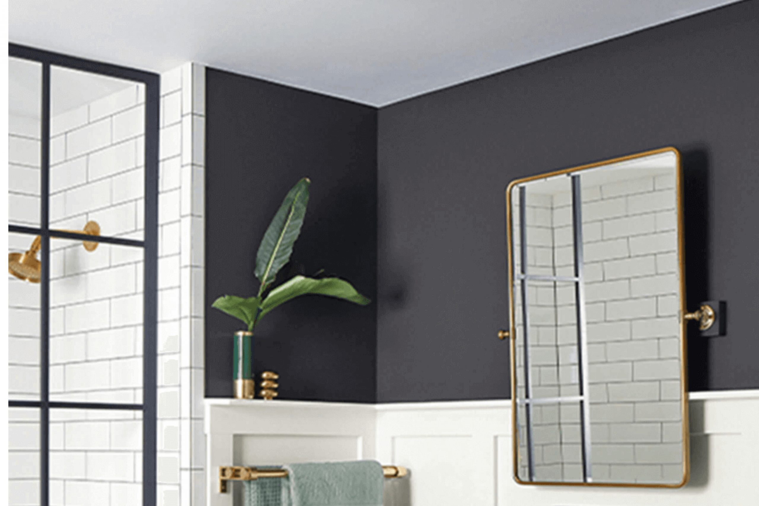
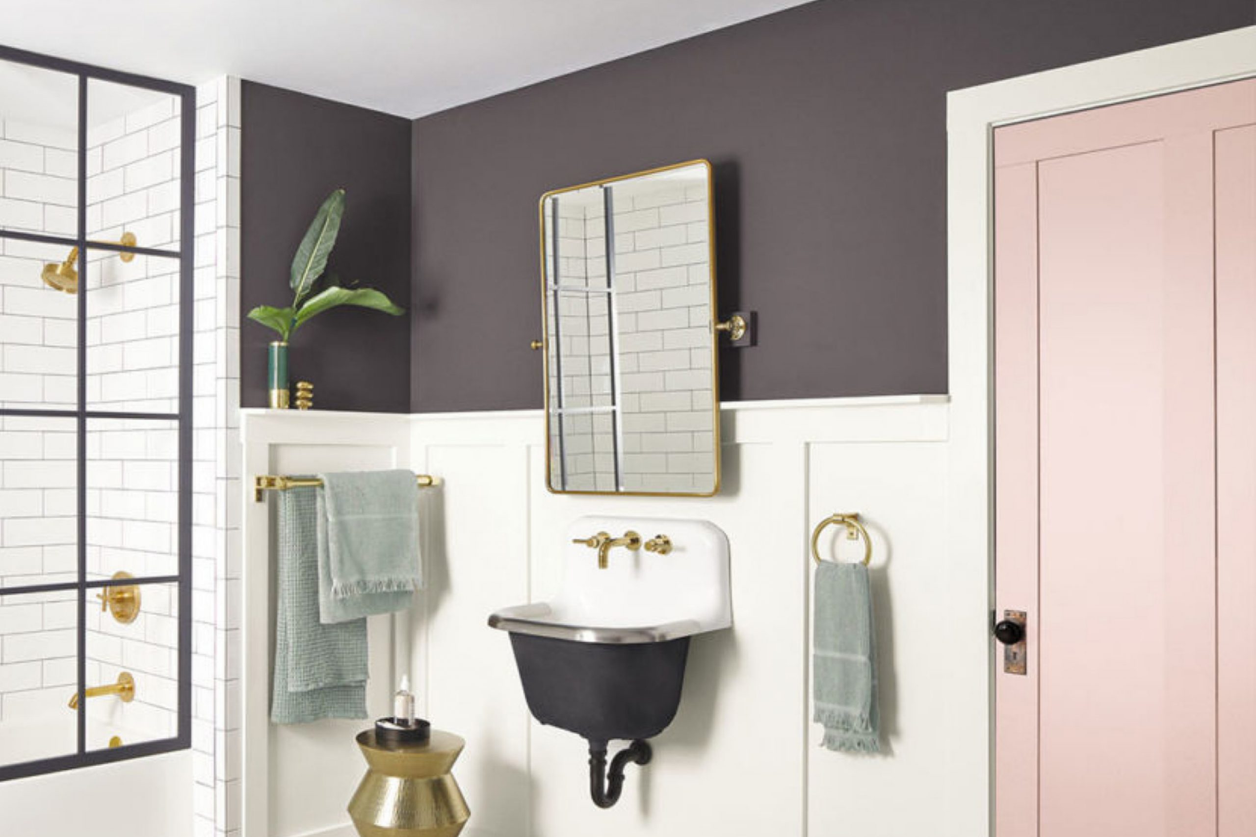
It can work well on an accent wall to highlight artworks or decorative pieces. This shade is versatile enough to be used in various rooms, from a cozy living room to an elegant dining area, and even in smaller spaces like a bathroom for a dramatic touch.
When used wisely, Perle Noir helps define spaces clearly and can make furniture and decor items pop, giving your home a fresh and modern feel. To balance its intensity, pair it with lighter colors like whites or soft grays. This will prevent the room from feeling too dark while maintaining its stylish impact.
Undertones of Perle Noir SW 9154 by Sherwin Williams
Perle Noir is a rich color that blends deep black with hints of various subtle undertones. These undertones include navy, brown, dark green, purple, dark turquoise, olive, and grey. Each undertone brings its own unique influence to the overall appearance of the color.
Undertones are crucial because they subtly influence the primary color’s appearance under different lighting conditions. For instance, in natural daylight, a color might lean more towards its green undertone, while artificial light could highlight its purple or navy nuances. This can make the color appear to shift throughout the day.
When Perle Noir is used on interior walls, these undertones can affect the mood and feel of a room. The navy can give a sense of depth and stability, while the brown can add warmth. The dark green and dark turquoise undertones can bring in a touch of natural freshness. Purple undertones add a touch of richness, enhancing the room’s overall aesthetic when highlighted through accessories or natural light. Grey undertones keep the color grounded, giving it a more neutral appearance which can be quite versatile.
Overall, the multiple undertones make Perle Noir a dynamic choice for walls. It can adapt to various decor styles and preferences by bringing out different facets of its personality through lighting and surrounding elements. This makes it a viable option for those looking to add depth and interest to their living space without overwhelming it with color.
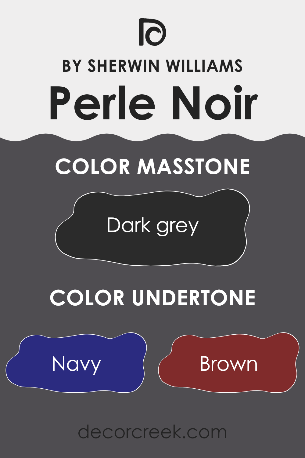
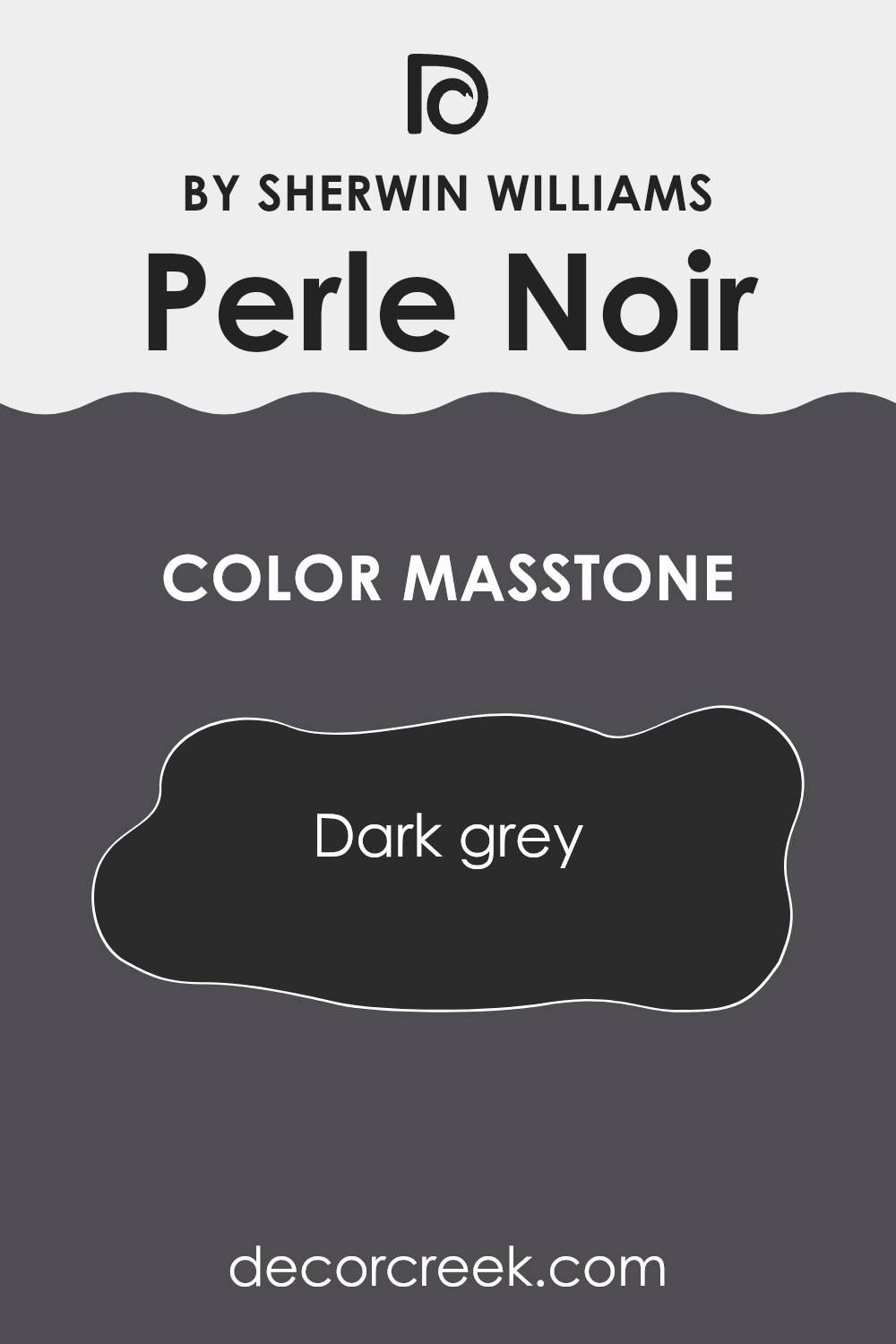
What is the Masstone of the Perle Noir SW 9154 by Sherwin Williams?
Perle Noir, with a masstone of dark grey (#2B2B2B), is a versatile color choice for home interiors. This deep, almost black hue provides a strong foundation that works well in various design styles. In rooms with plenty of natural light, Perle Noir adds depth and richness, making spaces look more refined and cozy. When used in smaller or dimly-lit areas, it can create a snug, intimate feel, perfect for creating a cozy corner or a dramatic accent wall.
Furthermore, this color pairs well with a wide range of other shades. Lighter colors like whites and pastels stand out against Perle Noir, offering a striking contrast. Bright colors, such as red or yellow, pop vibrantly when set against this dark background, providing an exciting visual dynamic to any space.
Neutral furnishings and decor are subtly enhanced, maintaining a balanced, harmonious look. Hence, it’s great for those who enjoy changing their decor frequently, since it blends seamlessly with various styles and accessories.
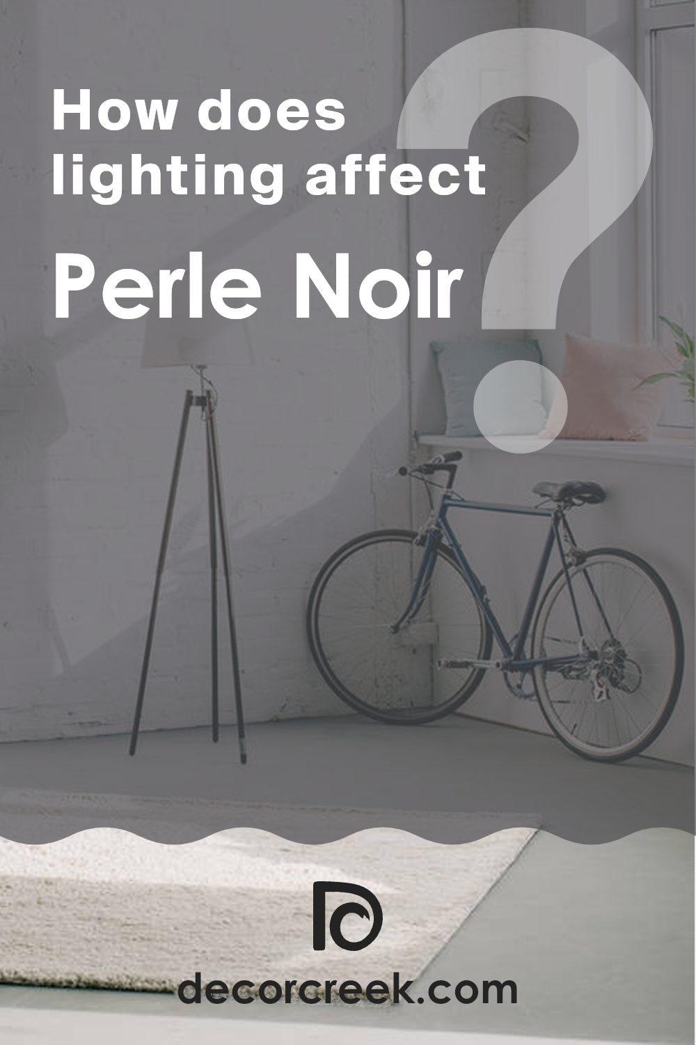
How Does Lighting Affect Perle Noir SW 9154 by Sherwin Williams?
Lighting significantly influences how we perceive colors in a space. Different light sources can change how a color appears, with variations noticeable when comparing under the artificial and natural light. A specific color, such as a deep, charcoal grey, might showcase these differences quite distinctly.
In artificial light, this deep grey shade can appear almost black or exhibit a slight lilac undertone, depending on the type of bulb used. Fluorescent bulbs typically bring out cooler tones in the color, making the grey look more austere. In contrast, incandescent or warm LED bulbs enhance warm tones, giving the grey a more plush, inviting feel.
Natural light, however, interacts with this grey differently throughout the day and depending on the direction the room faces. In north-facing rooms, where light is cooler and more consistent throughout the day, this grey maintains a steady, true-to-swatch appearance without significant variation. It provides a neutral, consistent backdrop in such spaces.
South-facing rooms receive the most intense, warm light, especially in the afternoon. Here, this grey can warm up considerably, showing off more of its underlying warm tones. It creates a richer, more welcoming environment as the light changes.
East-facing rooms see the most change in this grey during mornings when the light is warm and bright. The grey will brighten up beautifully but could appear somewhat cooler and more neutral as the day progresses and natural light becomes less intense.
West-facing rooms get a lot of afternoon and evening light, which is warmer. Here, the grey will feel softer and warmer later in the day, making the space feel cozy as the sun sets.
Understanding these nuances can help in choosing the right paint color and the purpose of the room, ensuring the color behaves as expected under different lighting conditions.
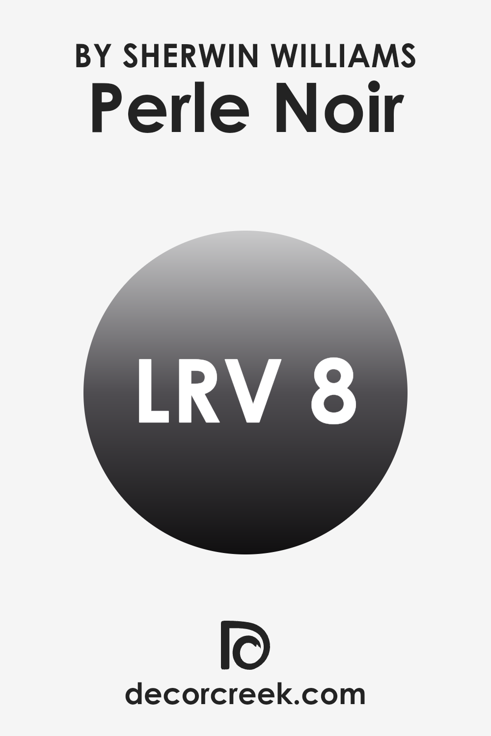
What is the LRV of Perle Noir SW 9154 by Sherwin Williams?
LRV stands for Light Reflectance Value, a measurement that indicates how much light a color reflects back into the room. Measured from 1 to 100, where 1 is the darkest and 100 is the brightest, this scale helps in choosing paint colors based on how light or dark you want your space to appear. Lighter colors tend to make rooms feel larger and more open because they reflect more light, while darker colors, reflecting less light, make a room feel smaller and cozier.
Perle Noir has an LRV of 7.523, placing it on the darker end of the spectrum. This means it absorbs more light than it reflects, which can make a significant impact in a room’s ambiance. Using a color like Perle Noir on walls can create a more intimate and grounded atmosphere.
However, because it reflects very little light, it’s crucial to use this color in spaces that either receive ample natural light or are well-lit with artificial lighting to avoid making the room feel too dark and confined. In spaces with ample light, this color can add depth and dramatic flair.
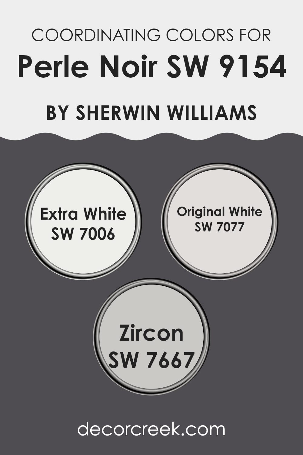
Coordinating Colors of Perle Noir SW 9154 by Sherwin Williams
Coordinating colors are shades that complement each other when used together in decorating and design. They work by balancing visual appeal, enhancing the overall aesthetics without overpowering the primary color. In the case of Perle Noir by Sherwin Williams, a deep and intense shade, the coordinating colors selected serve to either contrast or complement its boldness to achieve a harmonious look.
Extra White (SW 7006) is a clean, bright white that offers a sharp contrast to the deep tones of Perle Noir, making it ideal for trim, ceilings, and woodwork to provide a crisp, fresh look. Original White (SW 7077) is a softer white with a subtle warmth, providing a more muted contrast that works well in spaces that seek a gentle yet distinct separation from darker hues.
Zircon (SW 7667) is a light gray with a hint of blue, offering a cool balance that goes well with Perle Noir to create a nuanced, modern ambiance. These shades work collectively to enhance the environment, making them versatile choices for various applications in home décor.
You can see recommended paint colors below:
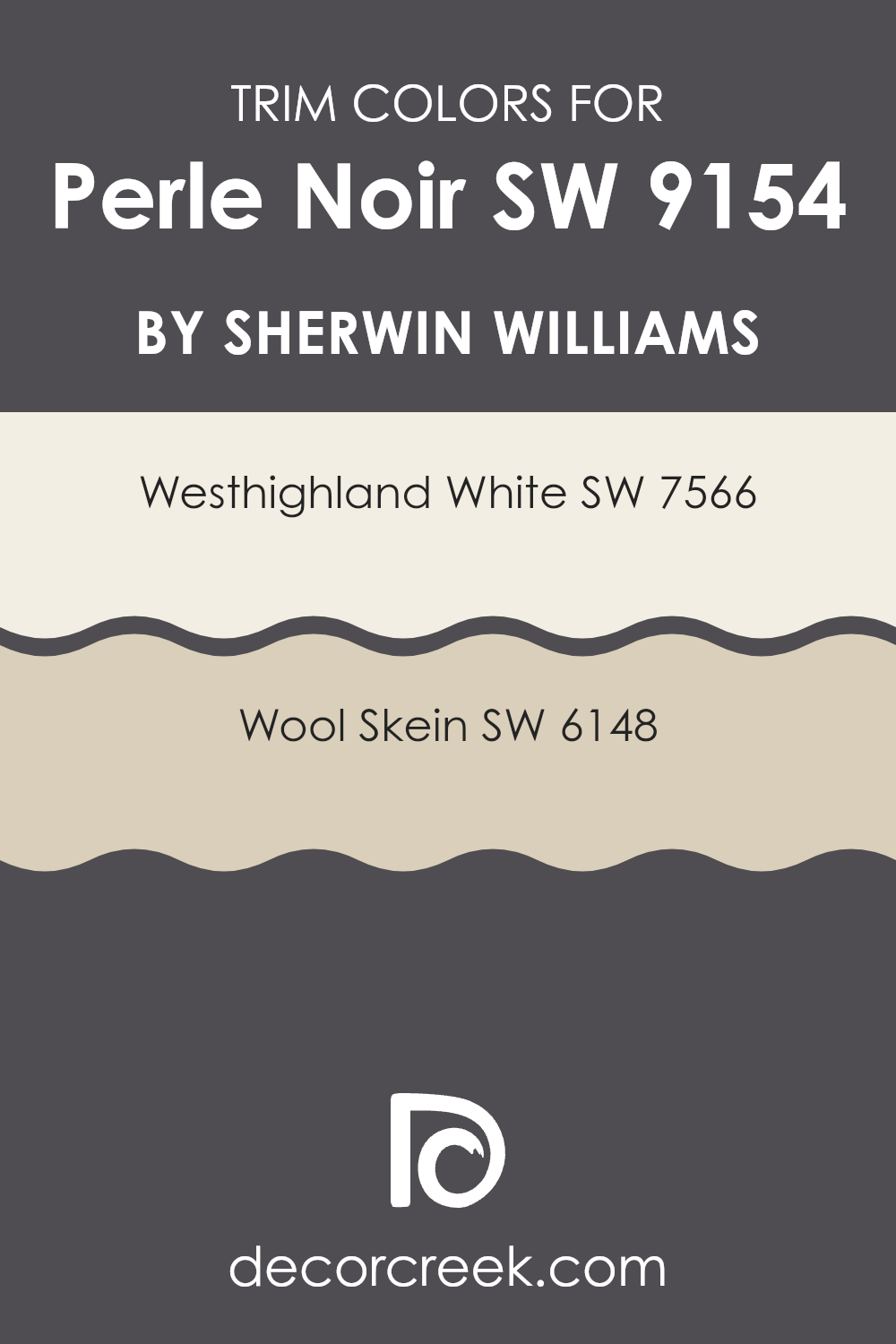
What are the Trim colors of Perle Noir SW 9154 by Sherwin Williams?
Trim colors are used to accentuate and complement the main color on walls by adding definition and contrast to the architectural details like door frames, moldings, and baseboards. When paired with a bold and deep hue like Perle Noir by Sherwin Williams, selecting the right trim color is crucial to highlight the elegance and depth of the main shade without overwhelming it. Westhighland White and Wool Skein are two such colors that can effectively draw attention to Perle Noir, ensuring the dark tone doesn’t make the space feel too enclosed.
Westhighland White (SW 7566) is a warm and creamy white that brings a bright and welcoming feel when used as a trim alongside the darker shades. It works well by providing a crisp border that can make the walls seem more pronounced and cleaner.
On the other hand, Wool Skein (SW 6148) offers a subtler contrast with its soft, beige tone that harmonizes beautifully with richer colors. It’s an excellent choice for creating a seamless, gentle transition between the wall and the trim, suitable for spaces aiming for a cohesive yet distinctly layered look.
You can see recommended paint colors below:
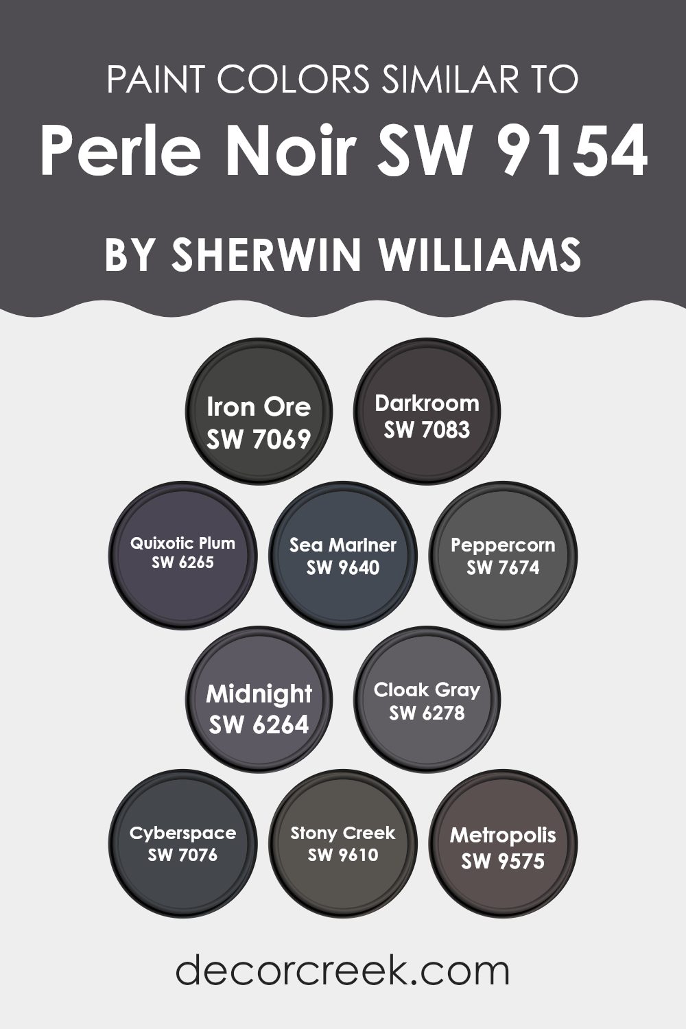
Colors Similar to Perle Noir SW 9154 by Sherwin Williams
Similar colors play a crucial role in creating a harmonious and coherent look in any space. When colors, like the shades similar to Perle Noir by Sherwin Williams, are closely related on the color spectrum, they can seamlessly pull a room together or enhance design elements without overwhelming the senses.
Using shades such as Iron Ore, Darkroom, or Peppercorn, which are darker and often embody a sense of depth and stability, one can create a sophisticated backdrop or accentuate certain areas of a room. More vibrant options, like Quixotic Plum or Sea Mariner, introduce a subtle yet noticeable splash of color, which can add character and vivacity to an otherwise muted palette.
Each color, while similar, has its unique aura. Iron Ore appears as a strong, almost black gray with a robust charisma, perfect for accent walls or cabinet colors. Darkroom, slightly less intense, serves beautifully as a moody main color for cozy spaces.
Quixotic Plum offers a deeper, berry-infused hue that can add a dramatic yet warm touch to interiors. For a nautical twist, Sea Mariner brings a deep blue that reflects a maritime charm, ideal for bathrooms or themed rooms. Peppercorn is a softer, charcoal gray that works well in modern décor, offering a clean, chic look without going full black.
Midnight and Cloak Gray offer options in deep blues and grays, suitable for creating a night-themed or industrial style space. Cyberspace, Stony Creek, and Metropolis provide rich, shadowy grays that pair excellently with a variety of textures and finishes, giving decorators creative freedom to experiment with different interior styles.
You can see recommended paint colors below:
- SW 7069 Iron Ore
- SW 7083 Darkroom
- SW 6265 Quixotic Plum
- SW 9640 Sea Mariner
- SW 7674 Peppercorn
- SW 6264 Midnight
- SW 6278 Cloak Gray
- SW 7076 Cyberspace
- SW 9610 Stony Creek
- SW 9575 Metropolis
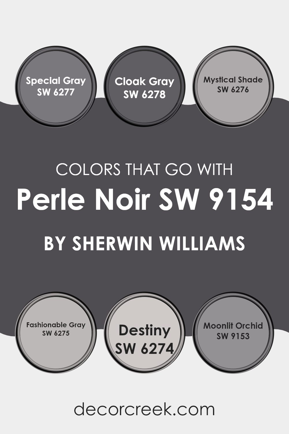
Colors that Go With Perle Noir SW 9154 by Sherwin Williams
Choosing the right colors to complement Perle Noir SW 9154 by Sherwin Williams can significantly enhance the aesthetic appeal of any space. Perle Noir is a deep, almost black shade that can create a stunning impact when paired with the right colors. Colors such as Special Gray, Cloak Gray, Mystical Shade, Fashionable Gray, Destiny, and Moonlit Orchid are ideal companions for Perle Noir as they add depth and variety while maintaining a cohesive look.
Special Gray is a subtle gray that offers a light contrast to the intensity of Perle Noir, making it perfect for balanced interiors. It works well in spaces that aim for a soft yet impressive look. Cloak Gray is another great match; it’s slightly darker than Special Gray and works well in adding a bit of mystery and depth without overwhelming the room.
Mystical Shade is a bluer version of gray that injects a hint of color into the palette, giving a refreshing twist to the standard grays. Fashionable Gray, a mid-tone gray, provides a neutral backdrop that allows Perle Noir to stand out without clashing. Destiny adds a touch of beige into the gray, offering warmth to spaces that use Perle Noir, making the area feel more welcoming.
Lastly, Moonlit Orchid adds a discreet hint of purple, offering a unique, gentle pop of color that is neither too bold nor too dull, perfect for spaces aiming for a soft, unique aesthetic. These colors together build an inviting, stylish atmosphere around the robust character of Perle Noir.
You can see recommended paint colors below:
- SW 6277 Special Gray
- SW 6278 Cloak Gray
- SW 6276 Mystical Shade
- SW 6275 Fashionable Gray
- SW 6274 Destiny
- SW 9153 Moonlit Orchid
How to Use Perle Noir SW 9154 by Sherwin Williams In Your Home?
Perle Noir SW 9154 by Sherwin Williams is a unique and striking shade that could be a great choice for adding a touch of elegance to any home. Its rich, deep black has hints of pearl which gives it a subtle softness, unlike a stark black. This paint color is versatile and can work wonderfully in various spaces.
For instance, it could make a strong statement on a feature wall in a living room or dining area, adding depth and contrast against lighter furnishings and decor. In a bedroom, using Perle Noir on the walls could create a cozy, intimate atmosphere, perfect for relaxing after a long day.
It’s also an ideal color for painting cabinets or accent pieces, updating the look with a modern flair. For those looking to add some drama without overwhelming a room, Perle Noir can be used on interior doors or trim, pairing nicely with softer greys or vibrant whites to keep the space balanced and inviting.
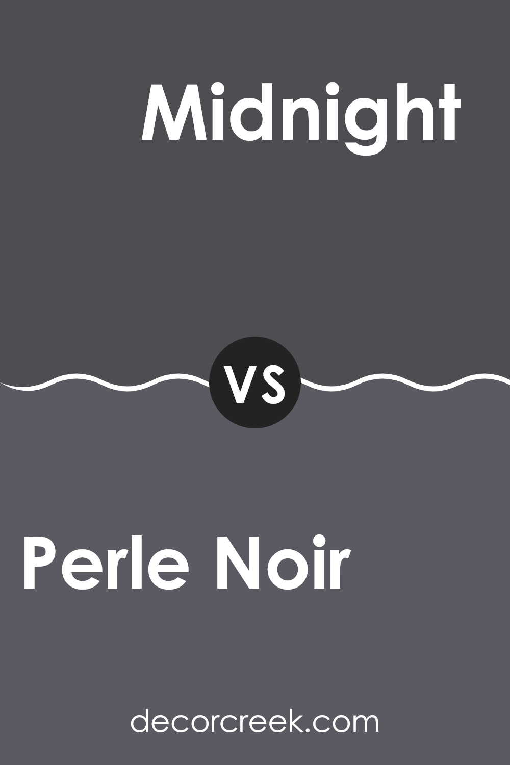
Perle Noir SW 9154 by Sherwin Williams vs Midnight SW 6264 by Sherwin Williams
Perle Noir and Midnight, both from Sherwin Williams, offer unique aesthetic qualities suitable for creating striking spaces. Perle Noir presents a deep, intense black that can make any room feel bold and distinct.
It’s an excellent choice for adding drama or making other colors stand out in a design. In contrast, Midnight is not as stark; it’s a rich navy blue that can also bring depth to spaces but with a slightly softer edge compared to the sharpness of Perle Noir.
Midnight works well when you want a dark color with a bit of warmth, making it perfect for cozy, inviting atmospheres without going full black. While both colors are dark, Perle Noir leans towards a true black, whereas Midnight adds a touch of blue, offering a nuanced alternative for different design needs.
You can see recommended paint color below:
- SW 6264 Midnight
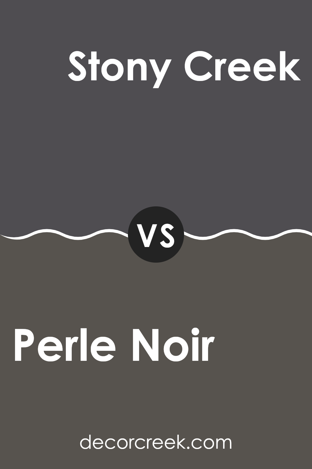
Perle Noir SW 9154 by Sherwin Williams vs Stony Creek SW 9610 by Sherwin Williams
Perle Noir is a deep and dark charcoal gray that brings a bold and strong presence to any room. It’s almost black, offering a dramatic tone that is ideal for creating a striking accent wall or for use in spaces where a dark color can make other elements stand out.
In contrast, Stony Creek falls into the realm of mid-tone grays. It has a softer, earthier look that feels welcoming and warm. This color works well in various settings, providing a calm backdrop that complements both bright and subdued accent colors.
While Perle Noir leans towards a cooler, more intense vibe, Stony Creek is lighter and tends to blend more seamlessly into a space without making as bold of a statement. Together, these colors could complement each other in a space that utilizes dark and light contrasts to create depth and interest.
You can see recommended paint color below:
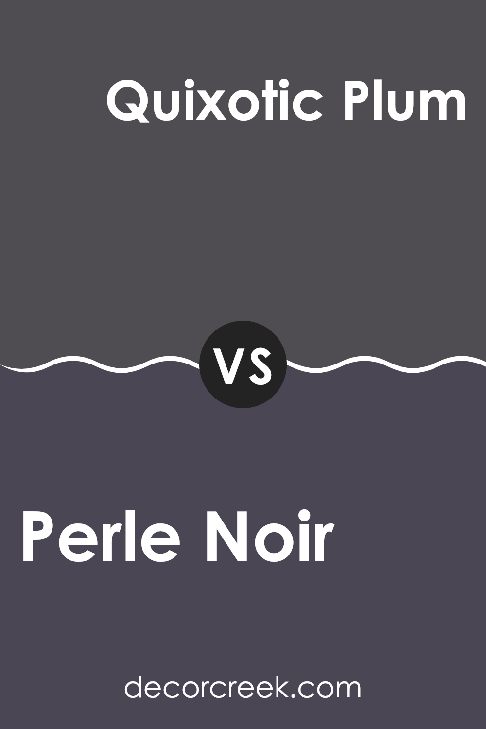
Perle Noir SW 9154 by Sherwin Williams vs Quixotic Plum SW 6265 by Sherwin Williams
Perle Noir and Quixotic Plum by Sherwin Williams are two distinct shades that serve different design needs. Perle Noir is a deep, almost black color with a subtle hint of warmth. This makes it excellent for creating a strong, bold statement in spaces. It pairs well with bright colors and can also be used to offer a stunning contrast with lighter tones, providing an atmosphere filled with depth and elegance.
On the other hand, Quixotic Plum has a rich, deep purple tone that exudes charm and character. It’s less intense than Perle Noir and injects a vibrant yet cozy mood into a room. This color works wonders in spaces that aim for a bit of drama without the starkness of a near-black shade. It also tends to illuminate a room by drawing in light and reflecting it in its unique hue.
Both colors are versatile and can be used in various settings, from modern to traditional, depending on what they are paired with and the desired final effect.
You can see recommended paint color below:
- SW 6265 Quixotic Plum
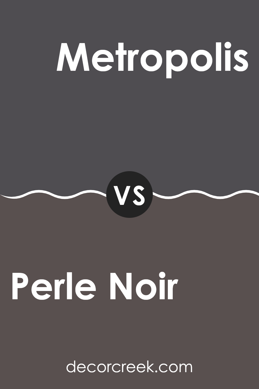
Perle Noir SW 9154 by Sherwin Williams vs Metropolis SW 9575 by Sherwin Williams
Sherwin Williams’ Perle Noir is a deep, dark shade almost like charcoal, offering a strong and bold choice for spaces. This color is very close to black, providing a rich backdrop that can make other colors stand out more in a room’s décor. It lends itself well to modern or minimalist styles, where its darkness can create striking contrasts, especially with lighter colors.
On the other hand, Metropolis falls into a lighter category of grays compared to Perle Noir, acting as a mid-tone gray with cool undertones. This makes it more versatile across various settings, from casual to formal. Metropolis offers a softer option that works well in spaces needing a sense of calm without the heaviness that darker colors can sometimes bring.
Both colors offer distinct vibes: Perle Noir adds drama and depth, while Metropolis provides a lighter, more open feel, useful for smaller or less brightly lit spaces.
You can see recommended paint color below:
- SW 9575 Metropolis
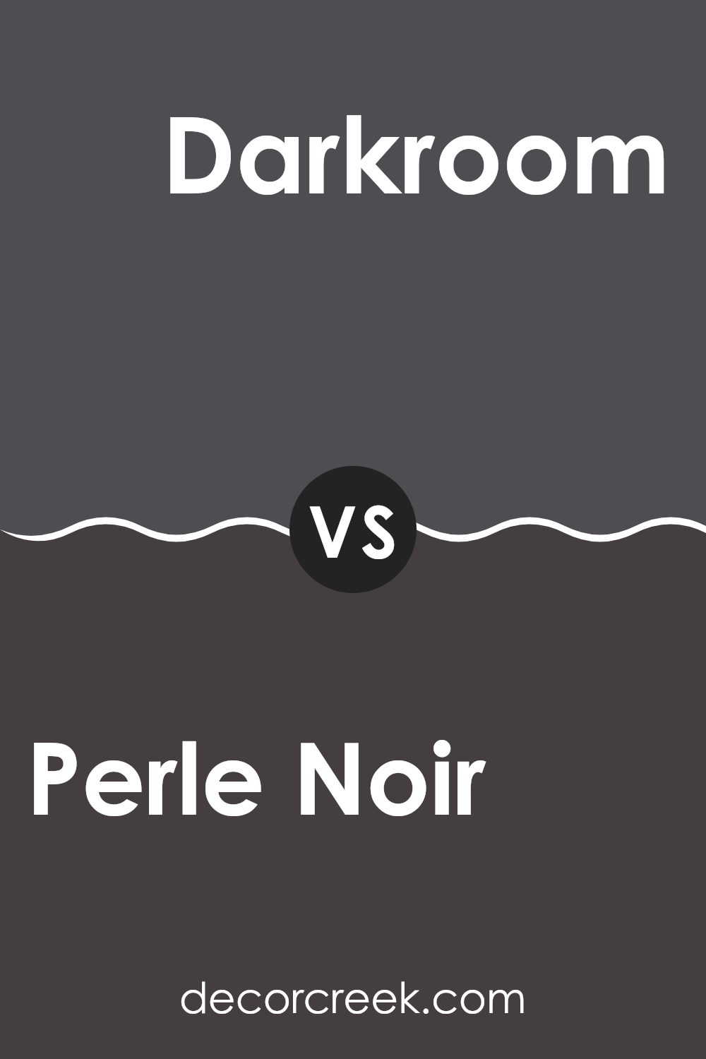
Perle Noir SW 9154 by Sherwin Williams vs Darkroom SW 7083 by Sherwin Williams
Perle Noir and Darkroom, both by Sherwin Williams, are distinct yet subtly different shades of dark paint colors. Perle Noir is a deep, nearly black shade with a hint of warmth making it versatile for spaces where you want depth without the harshness of pure black.
It tends to create a cozy feeling, which makes it suitable for living areas or bedrooms. On the other hand, Darkroom leans more towards a charcoal color with a slightly cooler undertone. This color is great for adding drama and can be particularly striking when used in well-lit rooms or as an accent wall, helping to add a modern touch.
Both colors pair well with a range of other hues, from bright whites for a sharp contrast to softer creams for a more blended look. When choosing between the two, consider the lighting and the mood you want to set in the room.
You can see recommended paint color below:
- SW 7083 Darkroom
Perle Noir SW 9154 by Sherwin Williams vs Sea Mariner SW 9640 by Sherwin Williams
Perle Noir and Sea Mariner are two distinct colors from Sherwin Williams that serve entirely different design needs. Perle Noir is a deep, dark shade, almost black, that adds a strong presence to a space. It’s perfect for creating a striking contrast in a room or making a bold statement on an accent wall.
On the other hand, Sea Mariner stands out with its vibrant blue tone, reminiscent of the ocean, bringing energy and a splash of brightness to any area. This color works wonderfully in spaces that benefit from a lively, cheerful atmosphere like a kitchen or a child’s room.
While Perle Noir provides a grounded, powerful base or backdrop, Sea Mariner offers a fresh pop of color, ideal for more animated settings. Choosing between them depends on whether you want the drama and impact of near-black or the lively, spirited vibe of a bright blue.
You can see recommended paint color below:
Perle Noir SW 9154 by Sherwin Williams vs Peppercorn SW 7674 by Sherwin Williams
Perle Noir and Peppercorn, both by Sherwin Williams, share a similar dark palette but differ subtly in tone and impact. Perle Noir leans toward a very deep, almost black shade. It’s a bold choice, perfect for creating striking contrast in spaces or as an accent wall to draw attention in a room. On the other hand, Peppercorn, while also dark, features a gray undertone, making it slightly lighter than Perle Noir. This color is versatile enough to use across larger areas without making the space feel too closed in.
Peppercorn can be a good fit for exterior trim or cabinets, especially when paired with lighter colors. Together, these two colors offer varied options for those looking to use dark tones effectively, with Perle Noir suited for dramatic flair and Peppercorn for a more subdued but equally impactful presence.
You can see recommended paint color below:
Perle Noir SW 9154 by Sherwin Williams vs Cloak Gray SW 6278 by Sherwin Williams
Perle Noire and Cloak Gray by Sherwin Williams are both unique, but they bring different moods to a space. Perle Noire is a deeper color that verges on black with just a hint of charcoal. It’s bold and can make furniture or decor elements in lighter colors really stand out. It’s perfect for creating a striking feature wall or for accents in a room that has a lot of natural light.
On the other hand, Cloak Gray is softer and more subdued. It’s a true gray that can make spaces feel more open and airy. It works well in rooms that need a neutral backdrop without feeling too stark or cold. Cloak Gray is versatile and can blend with a variety of styles and colors without overpowering them.
In summary, if you want a strong, commanding presence, go with Perle Noire. If you’re looking for something more neutral and understated, Cloak Gray is a great choice.
You can see recommended paint color below:
- SW 6278 Cloak Gray
Perle Noir SW 9154 by Sherwin Williams vs Iron Ore SW 7069 by Sherwin Williams
Perle Noir and Iron Ore, both by Sherwin Williams, are stylish shades of dark gray, yet they have different vibes due to their undertones and darkness. Perle Noir leans more towards a charcoal black, offering a deeper, almost black shade that’s perfect for creating a bold, moody feel in a room. It absorbs light, making it a great choice for a dramatic and cozy atmosphere.
Iron Ore, on the other hand, is lighter compared to Perle Noir, and has a softer, warm gray tone. It’s versatile for spaces that aim for a strong presence without going too dark, providing a balanced look that works well with various decor styles.
Both colors are excellent for accent walls, cabinets, or exterior trims. Your choice between them would depend on how dark you want your space to feel. Iron Ore brings a touch of warmth and is slightly more forgiving in smaller spaces than the darker Perle Noir.
You can see recommended paint color below:
Perle Noir SW 9154 by Sherwin Williams vs Cyberspace SW 7076 by Sherwin Williams
Perle Noir and Cyberspace, both from Sherwin Williams, are dark shades that bring a bold touch to any space. Perle Noir is a deep, intense black that adds a strong and decisive character to rooms. It’s ideal for creating dramatic accents or for use in a chic, modern design.
In contrast, Cyberspace is a dark gray that, while still strong, is softer than Perle Noir. It carries a hint of blue, giving it a cooler tone that works well for a contemporary look while keeping the environment welcoming and less intense than a pure black.
Both colors are great options for making striking statements in home decor, but your choice between them could depend on whether you prefer the sharper contrast of a true black or the subtler, softer approach of a dark gray with blue undertones.
You can see recommended paint color below:
Conclusion
In wrapping up, the color SW 9154 Perle Noir by Sherwin Williams really caught my attention. I learned that this color is a deep and strong shade of black that can make any room look more interesting. When used inside a house, it can make the walls stand out, especially when matched with lighter colors like white or light gray. This creates a cool contrast that can make everything look nicer and more put together.
I found out that even though Perle Noir is so dark, it doesn’t make a room feel small or cramped. Instead, it gives a feeling of coziness and makes the room feel like a cozy little hideaway. This is great for places in your home where you want to relax, like a reading nook or a bedroom.
I also think that because Perle Noir is such a powerful color, it’s not just for any place; it needs to be used thoughtfully. It could be the perfect choice for one special wall in a room, also called a feature wall, which can then become the main point of interest.
Overall, Perle Noir by Sherwin Williams is a bold and beautiful color that can add a lot of character to a space if used wisely. It’s quite the choice for anyone looking to add a touch of drama and style to their home without going too wild.
Ever wished paint sampling was as easy as sticking a sticker? Guess what? Now it is! Discover Samplize's unique Peel & Stick samples.
Get paint samples

