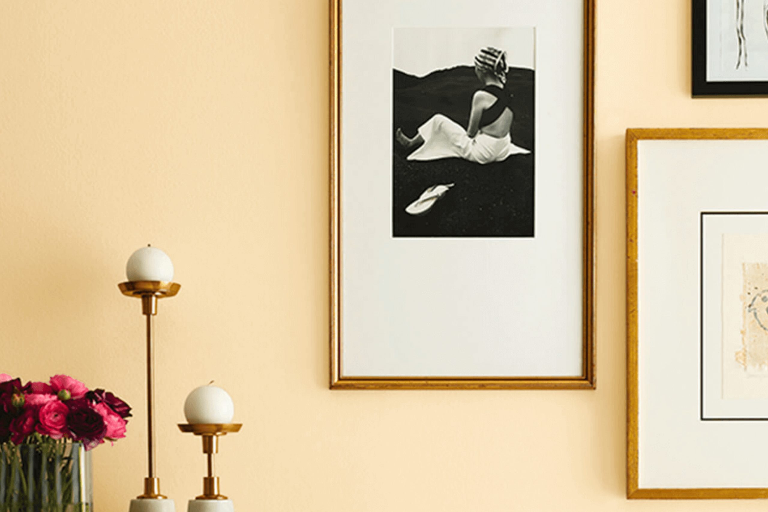
Think about – you’re standing in front of a freshly painted wall, the color bright and inviting. That’s the feeling you get with SW 9663 Honeypot by Sherwin Williams. As a color enthusiast, I can tell you that Honeypot is not your everyday yellow.
It’s a warm, rich shade that seems to infuse any space with a cheerful glow. Whether you’re looking to freshen up your living room or add a bit of sunshine to your kitchen, this color brings a cozy, inviting vibe that makes every room feel more like home.
In my own experience, using Honeypot was a breeze. The paint went on smoothly, and the color looked even better than I had hoped once it dried. It paired beautifully with natural woods, whites, and even soft greens, creating a balanced and harmonious look.
For anyone tired of stark, cold spaces or overly bold hues, Honeypot offers the perfect middle ground—a gentle burst of color that feels both soothing and lively.
What Color Is Honeypot SW 9663 by Sherwin Williams?
Honeypot by Sherwin Williams is a warm, inviting shade that resembles the rich, golden hue of honey. This cozy color has a mellow brightness that brings a sunny and cheerful atmosphere to any room. It exudes warmth and is versatile enough to work well in various living spaces such as living rooms, kitchens, and dining areas.
This color pairs beautifully with natural materials like wood and stone, enhancing their natural beauty without overwhelming them. Textures like linen, wool, and cotton also complement this hue, adding to a sense of comfort and warmth. Honeypot works exceptionally well in interior styles that favor a touch of rustic charm or a farmhouse feel, as it aligns with natural elements and soft, muted tones.
For a more modern look, it can be paired with sleek metals like brushed nickel or copper, which contrast nicely with its warm tones. In terms of color combinations, creamy whites, soft grays, and earthy greens create a balanced and inviting palette that allows Honeypot to shine without dominating.
This makes it perfect for anyone looking to create a cozy, welcoming space with a hint of earthy color.

Is Honeypot SW 9663 by Sherwin Williams Warm or Cool color?
HoneypotSW 9663 by Sherwin Williams is a warm, inviting shade that adds a cozy touch to any room. This color resembles the rich, golden hue of honey, making it perfect for creating a welcoming atmosphere in the house. It’s an excellent choice for living areas or dining rooms where you want guests to feel comfortable and relaxed.
When used in smaller spaces, Honeypot can make the area feel more intimate and cheerful. Its warm tones help brighten up spaces that don’t get much natural light. For larger rooms, this color works well on accent walls to add a pop of warmth without overwhelming the space with too much intensity.
Additionally, it pairs beautifully with a wide range of other colors, from soft creams to bold blues, allowing for versatile decor options. Whether you’re aiming for a traditional look or something more modern, Honeypot can be easily integrated into various design styles, making it a practical choice for updating your home.
Undertones of Honeypot SW 9663 by Sherwin Williams
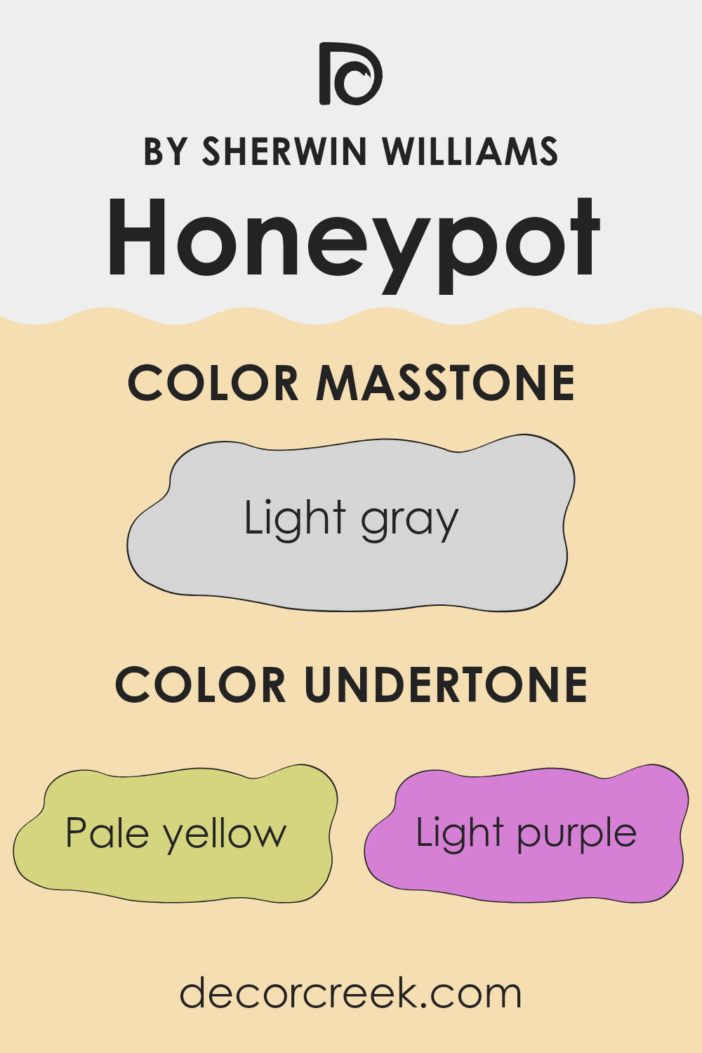
Honeypot is a unique paint color that carries various undertones affecting how it looks in different lighting and surroundings. Understanding these undertones—pale yellow, light purple, pale pink, light blue, mint, lilac, and grey—is key to using the color effectively.
Undertones are subtle colors that influence the main hue. For instance, pale yellow can add a subtle warmth making the color feel cozy, while light blue might give it a cooler feel, making the room seem more refreshing. The mix of undertones like lilac and light purple can add a slightly playful character without overpowering the primary color.
When used on interior walls, Honeypot’s undertones interact with factors like natural and artificial light, changing its appearance throughout the day. In a room with lots of natural light, pale yellow and mint undertones might make the walls look vibrant and airy. In artificial lighting, grey or lilac undertones could become more pronounced, giving the walls a muted, yet distinct look.
These undertones also affect color coordination. Warm undertones like pink and yellow make it easier to match with wood furniture or earthy accents, while cooler tones like blue and mint pair well with metallic finishes or modern decor. Being mindful of these nuances allows you to use Honeypot to its full potential, ensuring it complements the space while reflecting the desired mood.
What is the Masstone of the Honeypot SW 9663 by Sherwin Williams?
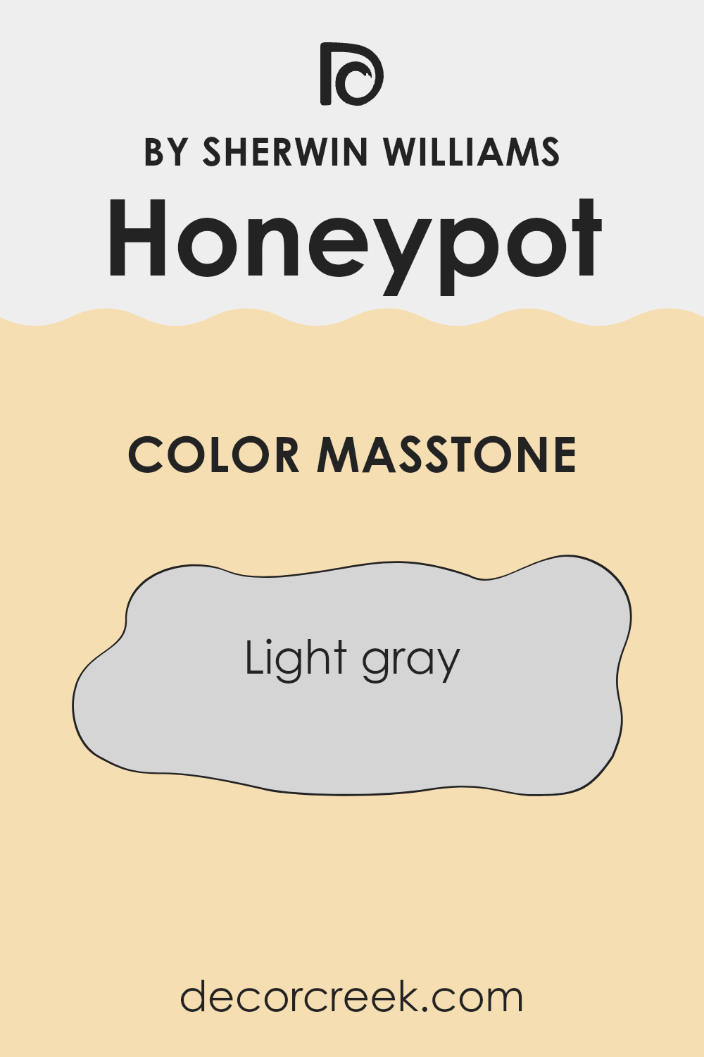
HoneypotSW 9663 by Sherwin Williams has a masstone of light gray, marked with the hex code #D5D5D5. This color is pleasantly soft and neutral, making it an excellent choice for various home settings.
When used on walls, its light gray tone helps to make small rooms appear bigger and brighter, reflecting natural light beautifully during the day. It’s also versatile enough to blend well with different decorating styles, whether you’re leaning towards modern minimalism or a cozier, rustic theme.
Light gray serves as a great foundation, allowing you to add splashes of color through furniture and accessories without the fear of clashing. It’s also calming to look at, which is perfect for spaces where you want to relax such as bedrooms and living areas. Additionally, light gray is forgiving when it comes to marks and smudges, making it ideal for high-traffic areas or homes with young children.
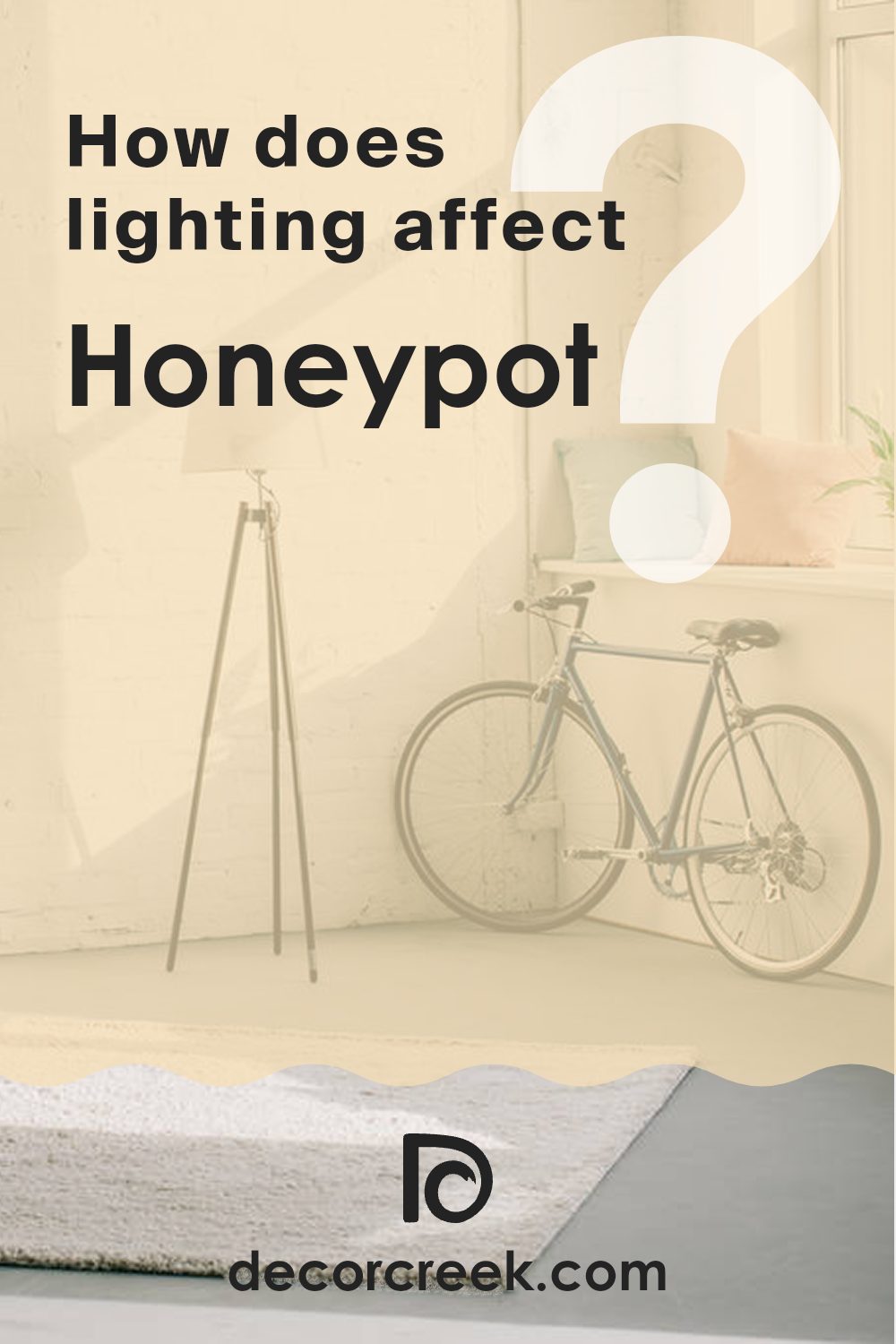
How Does Lighting Affect Honeypot SW 9663 by Sherwin Williams?
Lighting plays a critical role in how colors appear in any space. Different light sources can dramatically change the way a color looks on your walls. For instance, the color Honeypot by Sherwin Williams might look different under various lighting conditions due to its warm, yellow tones.
In artificial light, Honeypot tends to bring warmth to rooms. Rooms with warm-toned lights, like soft white LED bulbs, will enhance the yellow and make it cozier and more welcoming. In contrast, cooler lights, such as those with a daylight hue, might make Honeypot appear slightly muted, losing some of its warmth.
In natural light, the appearance of Honeypot can vary throughout the day. Morning light, which is usually softer and cooler, might make Honeypot appear softer and less intense. As the day progresses and the light becomes brighter and warmer, the color will look more vibrant and warm.
When it comes to different rooms and their orientation:
1. North-faced rooms often get less direct sunlight, which can make a warm color like Honeypot appear more subdued and cooler. It’s a good choice if you want to warm up these typically cooler, darker rooms.
2. South-faced rooms receive a lot of bright, warm light throughout the day, which can amplify the warmth of Honeypot, making it appear brighter and more cheerful. This setting is ideal to exploit the richness of the color.
3. East-faced room get bright light in the morning followed by cooler, indirect light for the rest of the day. In the morning, Honeypot will look very warm and lively, but might appear slightly dimmer in the afternoon.
4. West-faced rooms experience the opposite lighting pattern. The color may look more muted in the morning but becomes vibrant and warm in the late afternoon and evening as the sun sets.
Choosing the right color and understanding how it reacts to light can greatly influence the atmosphere of your space. Honeypot, with its warm, cheerful hue, can help in creating a welcoming space when paired wisely with the right room orientation and lighting.
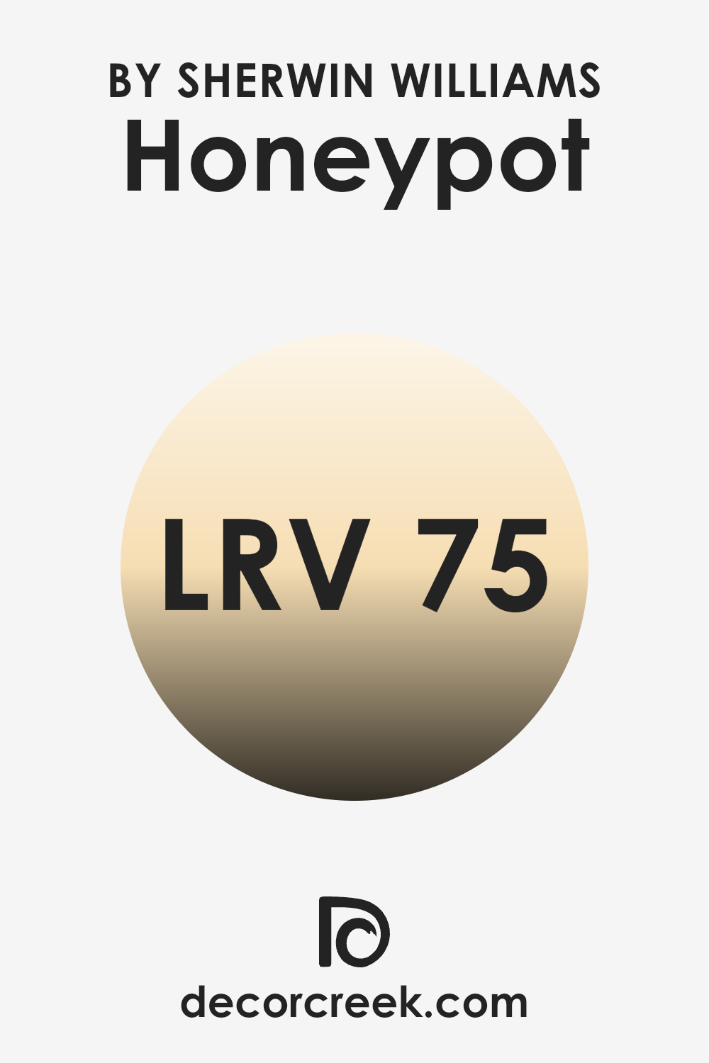
What is the LRV of Honeypot SW 9663 by Sherwin Williams?
LRV stands for Light Reflectance Value, which is a measure of how much light a paint color reflects back into a room as opposed to absorbing it. This number can greatly influence the feel and ambiance of a space. Essentially, the higher the LRV, the more light the color reflects.
Colors with high LRV make rooms feel brighter and more open, as they bounce more light around the space. In the case of Honeypot SW 9663 by Sherwin Williams, with an LRV of 74.882, it falls into the higher end of the scale, meaning it is quite reflective.
This paint color will make a room feel luminous and airy, as it does a good job of reflecting indoor lighting or sunlight. It’s an excellent choice for areas that are smaller or have limited natural light, as it can help make the space appear larger and more welcoming.
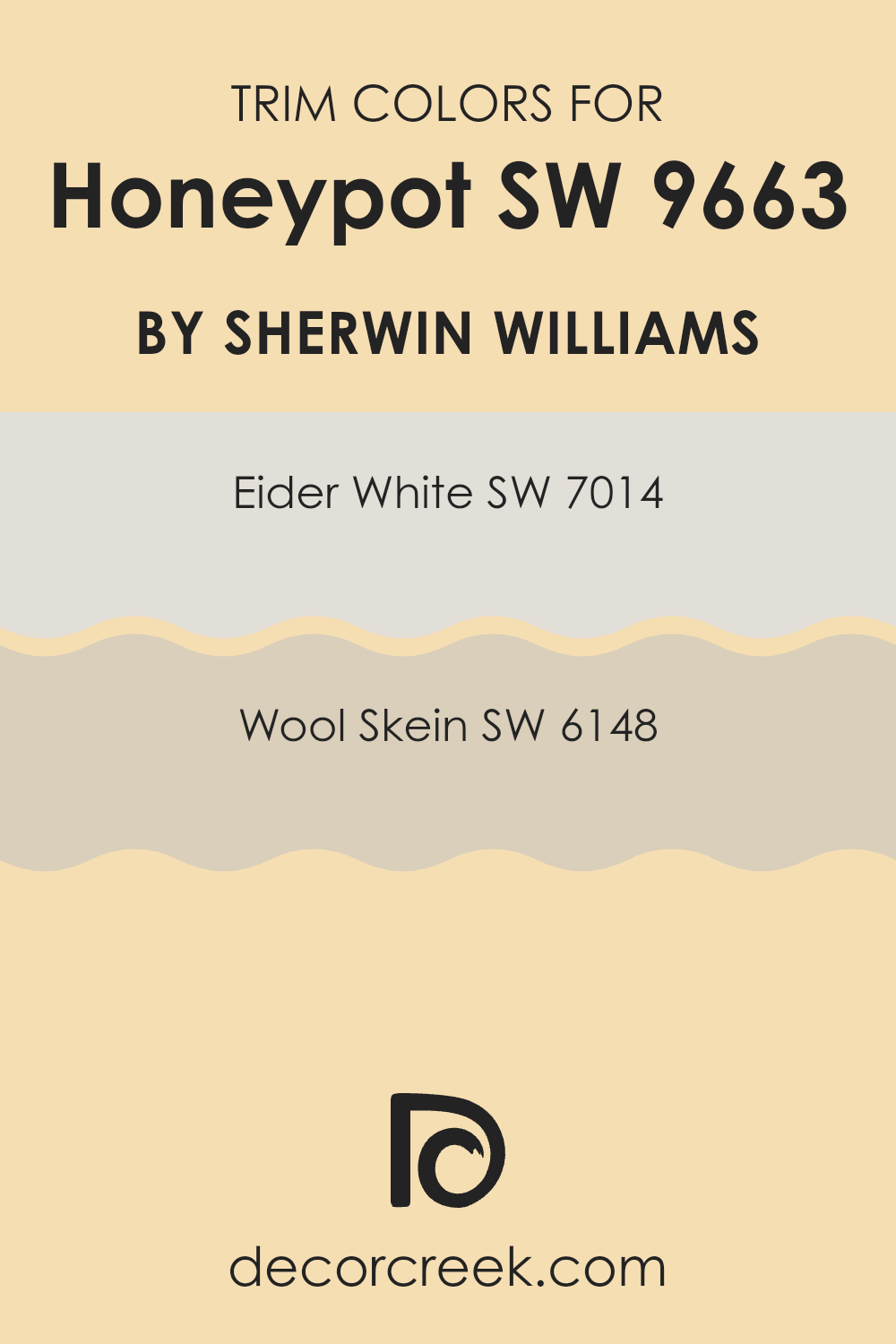
What are the Trim colors of Honeypot SW 9663 by Sherwin Williams?
Trim colors are the accents used on the architectural elements of a room like door frames, window sills, and moldings to add contrast and highlight their features. Opting for the right trim color can significantly affect the aesthetic and overall feel of a space. When used with a base color such as Honeypot (SW 9663) by Sherwin-Williams, selecting complementary trim colors can create a cohesive look that enhances the visual appeal of a room.
SW 7014 – Eider White and SW 6148 – Wool Skein are two colors that coordinate well as trim choices for enhancing the warm tones of Honeypot. Eider White (SW 7014) is a gentle gray with subtle undertones of white, offering a clean and subtle boundary that beautifully frames the richer hues of a wall painted in Honeypot.
This color is not stark or overly bright, making it a good choice for creating a smooth transition between the wall color and the room’s trim details. On the other hand, Wool Skein (SW 6148) features a softer, beige tone that adds a touch of warmth to the overall decor. It provides a natural and inviting highlight to the edges and details of a room, thereby adding depth and dimension when paired with the creamy, rich yellow of Honeypot.
You can see recommended paint colors below:
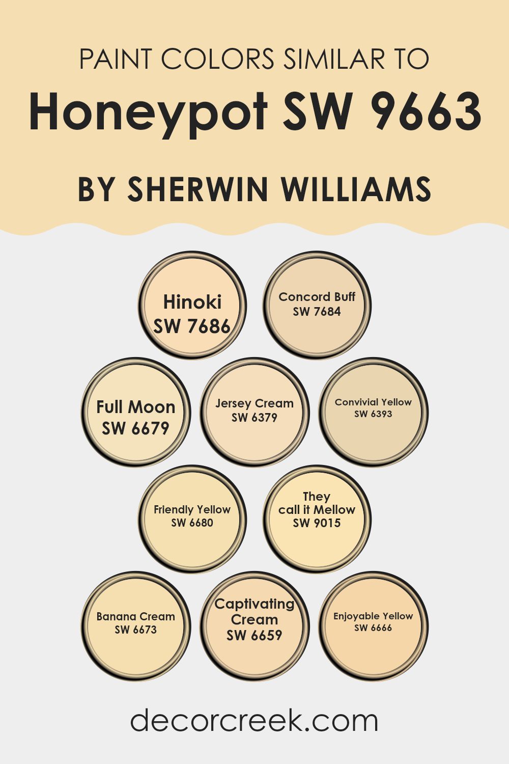
Colors Similar to Honeypot SW 9663 by Sherwin Williams
Similar colors are crucial in design because they create a sense of harmony and balance. When colors are closely related on the color spectrum, they naturally complement each other, making a space feel cohesive and pleasant. Such similarity helps in achieving a gentle transition between hues, enhancing the aesthetic appeal without overwhelming the senses. Using similar colors can also amplify the impact of contrasting elements, making both stand out while maintaining an overall unity.
For instance, Hinoki is a soft, muted beige that offers a warm, inviting touch to any room. It pairs subtly with other colors like Concord Buff, a slightly richer, golden beige that adds depth and warmth. Full Moon offers a lighter variation, bringing in a pale, creamy yellow that reflects light beautifully and creates a sense of openness.
Jersey Cream takes a bolder step with its vibrant buttery tone, enriching environments with a sunny, cheerful vibe. Convivial Yellow introduces a lively, spirited yellow that energizes spaces without overpowering, while Friendly Yellow has a soft, welcoming presence. They Call It Mellow is a gentle, subdued yellow, providing a calm, understated backdrop. Banana Cream displays a playful and light-hearted tone, hinting at sweetness and light.
Further stepping into the realm of creams, Captivating Cream presents a gentle vanilla hue that offers a soft, neutral base, and Enjoyable Yellow brightens spaces with a hint of sun-kissed vibrancy, perfect for adding a pinch of joy to any setting. Each color, while similar, holds its unique charm and contributes to a harmonious palette that enriches living spaces with warmth and comfort.
You can see recommended paint colors below:
- SW 7686 Hinoki
- SW 7684 Concord Buff
- SW 6679 Full Moon
- SW 6379 Jersey Cream
- SW 6393 Convivial Yellow
- SW 6680 Friendly Yellow
- SW 9015 They call it Mellow
- SW 6673 Banana Cream
- SW 6659 Captivating Cream
- SW 6666 Enjoyable Yellow
How to Use Honeypot SW 9663 by Sherwin Williams In Your Home?
Honeypot SW 9663 by Sherwin Williams is a warm, rich yellow paint color that adds a cozy, welcoming feel to any room in your home. This shade is perfect for creating a cheerful and inviting atmosphere, making it ideal for spaces where you gather and spend a lot of time, like the living room or kitchen. Its sunny tones can also make small spaces appear larger and more open.
You can use Honeypot on an accent wall to add a pop of color without overwhelming the space. It pairs beautifully with neutral colors such as whites, grays, and tans, which help balance its brightness.
For a harmonious look, consider using it in rooms with a lot of natural light to enhance its golden hues. Additionally, this color works well with wooden furniture and decor, as it complements natural materials. Whether you’re adding a splash of color to your kitchen or brightening up your entryway, Honeypot creates a warm, inviting environment in your home.
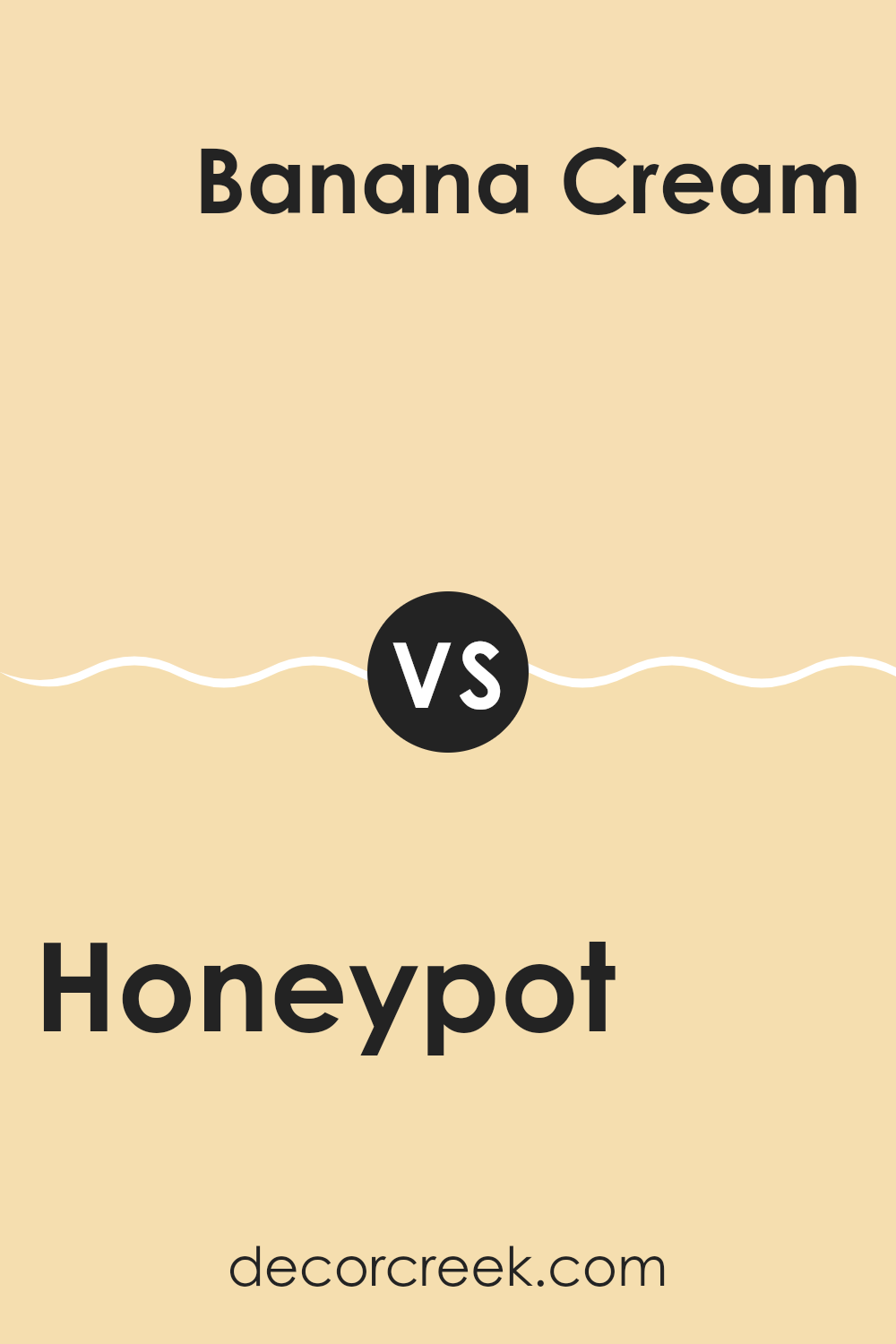
Honeypot SW 9663 by Sherwin Williams vs Banana Cream SW 6673 by Sherwin Williams
Honeypot and Banana Cream are both warm, inviting colors from Sherwin Williams. Honeypot has a deeper, richer hue resembling the golden color of actual honey. It’s perfect for creating a cozy atmosphere in spaces like living rooms or intimate dining areas.
On the other hand, Banana Cream has a lighter, softer yellow tone, closely mimicking the pastel shade of a ripe banana mixed with a touch of cream. This color is excellent for brightening up smaller or darker spaces by giving them a cheerful touch and making them appear more spacious.
Both colors pair well with neutrals and can add a burst of warmth to your home, though Honeypot offers a more grounded feel and Banana Cream lends a fresher look.
You can see recommended paint color below:
- SW 6673 Banana Cream
Honeypot SW 9663 by Sherwin Williams vs Full Moon SW 6679 by Sherwin Williams
The two colors, Honeypot and Full Moon, both by Sherwin Williams, offer distinctly different vibes for any space. Honeypot is a rich, warm yellow that gives off a cozy and welcoming feel, ideal for livable spaces such as living rooms or kitchens. It has the brightness that can make a room feel sunny and cheerful even on a cloudy day.
On the other hand, Full Moon is a vibrant shade of yellow that leans more towards a sunny and playful side. It’s bolder and can instantly make a statement in a space, suitable for areas where energy and vibrancy are desired, like a children’s playroom or a creative workspace.
While Honeypot is deeper and more muted, making it easier to match with other colors, Full Moon stands out due to its bright intensity, which can be a central color in a color scheme. Depending on the atmosphere you want to create, each color offers its unique charm and effect in interior spaces.
You can see recommended paint color below:
- SW 6679 Full Moon

Honeypot SW 9663 by Sherwin Williams vs Enjoyable Yellow SW 6666 by Sherwin Williams
The color Honeypot and Enjoyable Yellow by Sherwin Williams are both vibrant, welcoming shades, yet they have distinct qualities. Honeypot is a deeper, rich gold that brings a warm, cozy feel to any space. It’s reminiscent of amber and has an earthy, natural appeal that’s quite inviting. This color is great for creating a snug and homey atmosphere in living rooms or dining areas.
On the other hand, Enjoyable Yellow is a bright, cheerful yellow. It’s lighter and has a sunnier feel compared to Honeypot. This color is perfect for spaces where you want to promote a happy and energetic environment, such as kitchens or children’s playrooms. It tends to add a burst of brightness, making small spaces appear larger and more open.
Both colors offer warm tones, but where Honeypot leans more towards a muted, golden hue, Enjoyable Yellow offers a vivid punch that can liven up any area. Choosing between them depends on the mood you want to set and the specific characteristics of the room you’re decorating.
You can see recommended paint color below:
- SW 6666 Enjoyable Yellow
Honeypot SW 9663 by Sherwin Williams vs Friendly Yellow SW 6680 by Sherwin Williams
Honeypot and Friendly Yellow are both inviting colors from Sherwin Williams that offer warmth to any space but in different ways. Honeypot presents a deeper, amber-like tone that echoes the richness of actual honey. It’s a robust color that brings a cozy and welcoming feel, perfect for living areas or dining rooms where you gather for lengthy conversations.
On the other hand, Friendly Yellow has a light and bright quality that resembles sunshine. It’s livelier and can instantly perk up a space, making it ideal for kitchens, bathrooms, or any area you want to infuse with energy and cheerfulness.
Although both colors share a base in sunny yellow, Honeypot leans towards a more muted, golden hue, while Friendly Yellow stands out with its vibrant, lemony vibe. Together, these hues can create a joyful and warm palette, but each establishes a distinct mood through its intensity and depth.
You can see recommended paint color below:

Honeypot SW 9663 by Sherwin Williams vs Hinoki SW 7686 by Sherwin Williams
Honeypot is a warm, inviting yellow with a sunny disposition that brightens any space, making it feel cheerful and welcoming. It’s ideal for areas where you want to add a splash of energy and optimism, like kitchens or living rooms.
On the other hand, Hinoki is a soft, muted gray that provides a neutral backdrop suitable for any room in your home. This color is versatile, easily blending with different decor styles and color schemes. While Honeypot injects vibrancy and a hint of playfulness into interiors, Hinoki offers a calm and understated elegance that can make small spaces seem larger and more open.
The contrast between the two is striking: Honeypot is clearly for those looking to add warmth and brightness, whereas Hinoki is perfect for creating a subtle, sophisticated atmosphere without commanding too much attention.
You can see recommended paint color below:
Honeypot SW 9663 by Sherwin Williams vs Jersey Cream SW 6379 by Sherwin Williams
Honeypot and Jersey Cream by Sherwin Williams are two warm shades that each have their unique appeal. Honeypot is a rich, deep yellow with a vibrant intensity that can make a space feel cozy and inviting. It tends to add a bold touch to rooms, especially when used on accent walls or for decorating larger areas.
On the other hand, Jersey Cream has a softer, more subdued yellow tone. This color is lighter and creamier, making it an excellent choice for those who prefer a gentle hint of color. Jersey Cream can contribute to a soothing atmosphere in a room, ideal for spaces meant for relaxation or gatherings.
Both colors work well in spaces that benefit from warm tones but have different impacts due to their intensity and depth. Honeypot can command attention and works well in busy, energetic spaces, while Jersey Cream is better suited to creating a calm and cozy backdrop in a less vibrant room.
You can see recommended paint color below:
- SW 6379 Jersey Cream
Honeypot SW 9663 by Sherwin Williams vs They call it Mellow SW 9015 by Sherwin Williams
Honeypot and They Call It Mellow are both colors by Sherwin Williams, but they have distinctly different tones. Honeypot is a deep, rich yellow with a bit of a golden hue, offering a hearty warmth that feels cozy and welcoming.
It’s a bold color that can cheer up a room and make it feel more inviting. On the other hand, They Call It Mellow is a much softer shade, closer to cream or a very pale yellow. It gives off a gentle and calming effect, perfect for creating a relaxed, soothing atmosphere in spaces like bedrooms or living rooms.
While Honeypot stands out and draws attention, They Call It Mellow blends into the background, providing a subtle, light enhancement to a room without overwhelming it. Combining them can add depth and interest to your decor, with Honeypot as a focal point and They Call It Mellow supporting as a neutral base.
You can see recommended paint color below:
- SW 9015 They call it Mellow
Honeypot SW 9663 by Sherwin Williams vs Convivial Yellow SW 6393 by Sherwin Williams
Honeypot and Convivial Yellow by Sherwin Williams are both warm, inviting colors but they have distinct tones that set them apart. Honeypot is a deep, rich yellow with a golden hue that can create a cozy and welcoming atmosphere in any room. It’s darker and has a bit of earthiness, making it ideal for a space where you want a sense of warmth and comfort without being too bright.
On the other hand, Convivial Yellow is a much lighter and vibrant shade. It’s brighter and brings a cheerful energy to spaces, perfect for kitchens, dining areas, or anywhere you’d like a sunny lift. Its lightness makes it seem more open and airy compared to Honeypot.
Both colors work well in spaces that benefit from a splash of warmth, but the choice between them depends on how bold or subtle you want the yellow in your room to be. Honeypot offers depth and coziness, while Convivial Yellow offers freshness and cheer.
You can see recommended paint color below:
- SW 6393 Convivial Yellow
Honeypot SW 9663 by Sherwin Williams vs Concord Buff SW 7684 by Sherwin Williams
Honeypot and Concord Buff are two warm colors by Sherwin Williams that offer cozy vibes but in different intensities and shades. Honeypot is a vivid, bright yellow with a rich intensity that can energize a space and make it feel more open and cheerful. It’s ideal for areas where you want to add brightness or a focal point due to its striking nature.
On the other hand, Concord Buff has a more muted, creamy appearance. This shade is a soft, sandy beige that brings a gentle warmth to any room, making it perfect for creating a relaxed and welcoming environment. It’s less bold than Honeypot, providing a subtle backdrop that easily pairs with various decor styles and colors.
While Honeypot is great for adding a pop of color, Concord Buff serves as a versatile neutral. Both colors can warm up a room, but your choice depends on how subtle or dynamic you want the vibe to be.
You can see recommended paint color below:
Honeypot SW 9663 by Sherwin Williams vs Captivating Cream SW 6659 by Sherwin Williams
Honeypot and Captivating Cream by Sherwin Williams are two distinct shades that can add character to any space. Honeypot is a deep, rich yellow with a hint of amber, warm and cozy, perfect for creating a welcoming atmosphere.
On the other hand, Captivating Cream is a soft, creamy white. It’s a lighter, more neutral color that offers a clean and subtle backdrop to any room. While Honeypot could bring a cheerful vibrancy to a kitchen or living room, Captivating Cream works well in areas where you want to set a calm, gentle tone, such as bedrooms or bathrooms.
These colors work well alone or can be paired together for a pleasant contrast that highlights each other’s features.
You can see recommended paint color below:
- SW 6659 Captivating Cream
Conclusion
In wrapping up my thoughts on SW 9663 Honeypot by Sherwin Williams, I’ve found that this paint is a great choice for anyone wanting to brighten up their room. Its rich, golden yellow color is just like a sunbeam, making any space feel warm and welcoming. Perfect for places like the living room or a kitchen, where everyone gathers and you want them to feel cozy and happy.
I also tried this paint and it goes on the wall smoothly, covers well, and dries fast, which makes it pretty easy to use, even if you’re not a pro. Plus, it’s strong enough to handle a few bumps and scratches, which is really helpful in a busy house.
Overall, if you or your family love colors that make you think of sunshine and joy, then SW 9663 Honeypot could be just the right paint for you. It helps turn dull rooms into cheerful spots where you’ll want to spend more time. Whether you’re updating your home for a new look or just adding a splash of color, Honeypot is a cheerful choice that brings a lot of warmth.

Ever wished paint sampling was as easy as sticking a sticker? Guess what? Now it is! Discover Samplize's unique Peel & Stick samples.
Get paint samples

