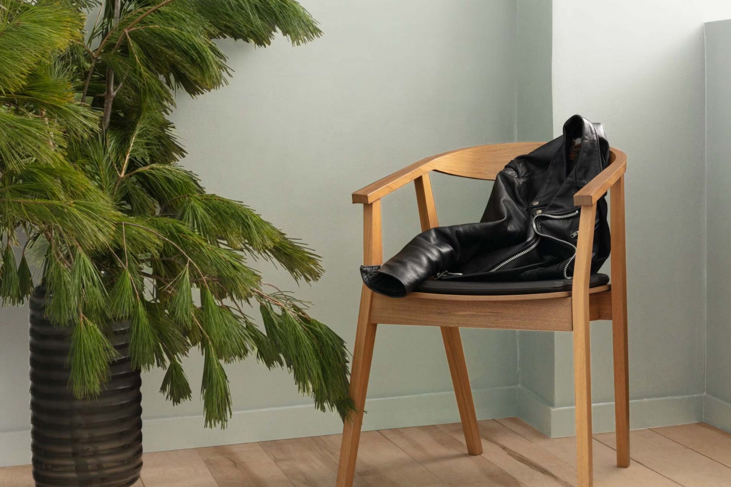
I recently repainted my bedroom, and I chose OC-53 Horizon by Benjamin Moore for the walls. If you’re considering a new look for any area, I highly recommend this color. OC-53 Horizon isn’t just another shade of gray; it has subtle blue undertones that give it a soothing, calm effect, making it perfect for a relaxing environment like a bedroom or bathroom.
The great thing about Horizon is its adaptability. It pairs beautifully with both modern and traditional decor, making it a fantastic choice whether you’re updating a single room or revamping your entire home. Its lightness helps to brighten up areas that don’t get a lot of natural sunlight, turning dim corners into welcoming spots.
I used this color because it has the power to project cleanliness and simplicity while maintaining a hint of refinement.
Honestly, since painting my room with Horizon, I feel like it breathes a bit more life into my personal area – the shade interacts so nicely with different lightings throughout the day, which keeps the room feeling fresh and airy from dawn until dusk.
What Color Is Horizon OC-53 by Benjamin Moore?
The Horizon OC-53 by Benjamin Moore is a pale gray with hints of blue, making it a flexible choice when painting your interior. Its lightness brings a bright and airy feel to any area, helping rooms appear more open and expansive. As a result, it’s an excellent pick for small rooms or areas with limited natural light.
This color works beautifully in a variety of styles, especially modern and minimalist designs. Its clean and subtle tone provides a neutral backdrop, allowing furniture and artworks to stand out. For coastal-style interiors, Horizon adds a touch of freshness reminiscent of a breezy, beachy environment.
When it comes to pairing materials, Horizon complements natural wood beautifully, enhancing its warm tones. It also looks crisp when contrasted with white trim or used alongside metallic finishes like stainless steel or chrome, adding a sleek, refined edge. For textures, soft fabrics such as cotton, linen, or wool in neutral shades work well with Horizon, creating a cozy yet stylish look.
Together with the right materials and textures, this color helps craft a fresh and welcoming atmosphere in any home.

Is Horizon OC-53 by Benjamin Moore Warm or Cool color?
Horizon OC-53 by Benjamin Moore is a light gray color with a touch of blue. This color has a calming effect, making it a popular choice for many homes. It works well in areas that need a fresh and clean look, such as bedrooms and bathrooms.
This shade is especially good for smaller rooms, as its light tone helps to make rooms appear larger and more open. The cool undertones of Horizon can complement modern furniture and decorations by providing a gentle backdrop that doesn’t overpower the room’s other elements.
It’s also adaptable enough to match various styles, whether you’re aiming for a minimalist design or a more traditional setting. In areas with plenty of natural light, Horizon reflects the light beautifully, enhancing the overall airy feel of the room. Adding this color to your home can help create a peaceful and refreshing environment.
Undertones of Horizon OC-53 by Benjamin Moore
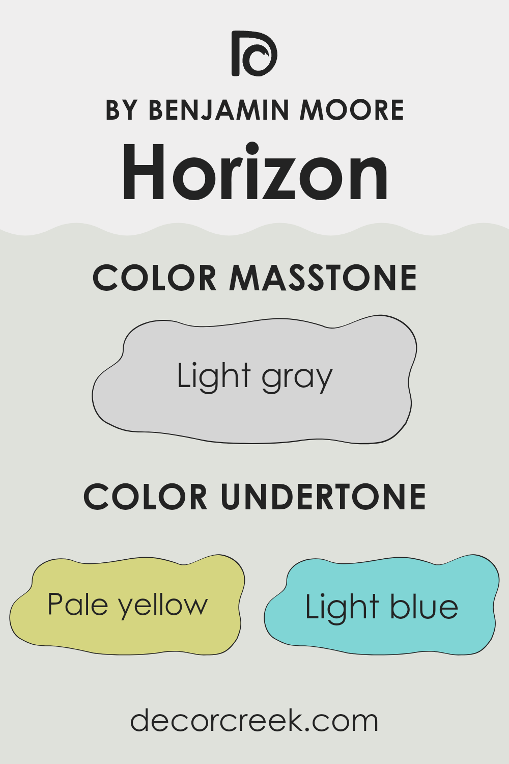
Horizon is a subtle and adaptable paint color that features a blend of unique undertones. These undertones include pale yellow, light blue, light purple, mint, pale pink, lilac, and grey. This mix adds depth and complexity to the paint, affecting how it appears under different lighting conditions and in different settings.
Undertones are slight hints of color that influence the main hue. They can change the way a color looks based on the amount of light in a room or the colors nearby. For example, with pale yellow undertones, an area might feel warmer, while light blue undertones can give a cooler, more airy feel.
When Horizon is used on interior walls, its variety of undertones allows it to adapt beautifully to different decor styles and themes. The grey and light blue undertones can make a room feel more open and fresh, great for a modern look. Meanwhile, the notes of mint and lilac can softly enrich the ambiance, making the room feel more welcoming.
The adaptability of Horizon ensures it complements various furniture colors and materials, from wooden earth tones to metallic finishes. It works well in rooms with plenty of natural light or in areas where a subtle pop of color is desired without creating an overpowering effect. The result is a balanced and harmonious interior that feels cohesive and thoughtfully designed.
What is the Masstone of the Horizon OC-53 by Benjamin Moore?
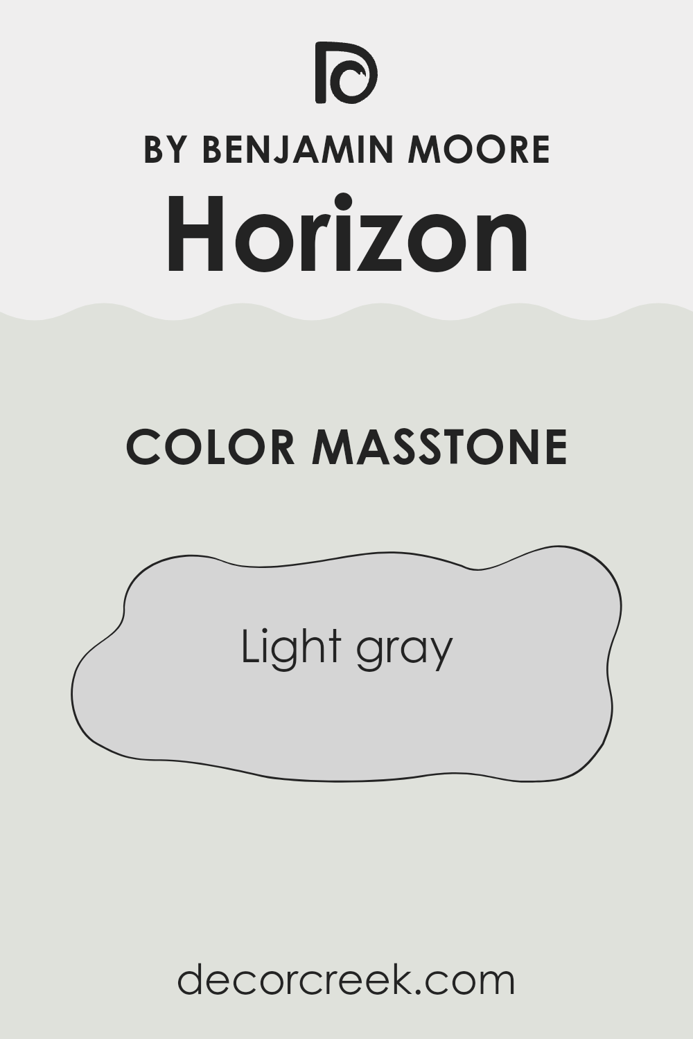
When choosing a paint color for your home, Horizon OC-53 by Benjamin Moore, which has a masstone of light gray (#D5D5D5), is an adaptable choice. This particular shade of gray is neutral, making it easy to match with a variety of decor styles and colors.
Light gray walls can make small rooms feel larger and more open because the color reflects light well. In rooms with lots of natural light, this shade maintains its soft, consistent look without darkening the area.
Additionally, light gray like Horizon OC-53 is gentle on the eyes, which means it can help create a comfortable and relaxing environment in areas like the living room or bedroom. This color also hides minor wall imperfections well compared to darker colors, which can highlight flaws. Whether you prefer modern, minimalist, or traditional decor, this light gray can work beautifully in your home.
How Does Lighting Affect Horizon OC-53 by Benjamin Moore?
Lighting has a significant impact on how colors appear in an area. The perception of color can change dramatically under different light sources. Natural light varies during the day and by direction, while artificial light can consist of several types including LED, fluorescent, and incandescent, each casting a unique glow.
Taking the color Horizon OC-53 by Benjamin Moore as an example, let’s look at how it behaves under various lighting conditions. Horizon OC-53 is a subtle, neutral gray with hints of blue. In artificial light, especially warm bulbs, this color tends to appear slightly warmer and more inviting. If fluorescents are used, it might look crisper and cooler, enhancing its blue undertones.
In natural light, Horizon OC-53’s true character is more visible, but it still depends on the direction of the light. North-facing rooms often receive the least direct sunlight, displaying this color as more of a pure, calm gray throughout the day, very consistent and stable. This can make the room feel cooler.
South-facing rooms enjoy abundant light most of the day, which can make Horizon OC-53 look brighter and slightly warmer, especially during midday when the sun is brightest. This can help the room feel airy and light.
In east-facing rooms, morning light can make this color appear soft and pleasantly warm. As the day progresses, it shifts back to a more balanced neutral as the natural light decreases in intensity.West-facing rooms will show Horizon OC-53 in shadowy tones in the morning, but it blooms into a warmer, more welcoming hue during the late afternoon and evening as sunlight fills the room.
The appearance of this adaptable color in different settings shows how lighting can alter our perception of color, affecting the overall mood and atmosphere of a room.

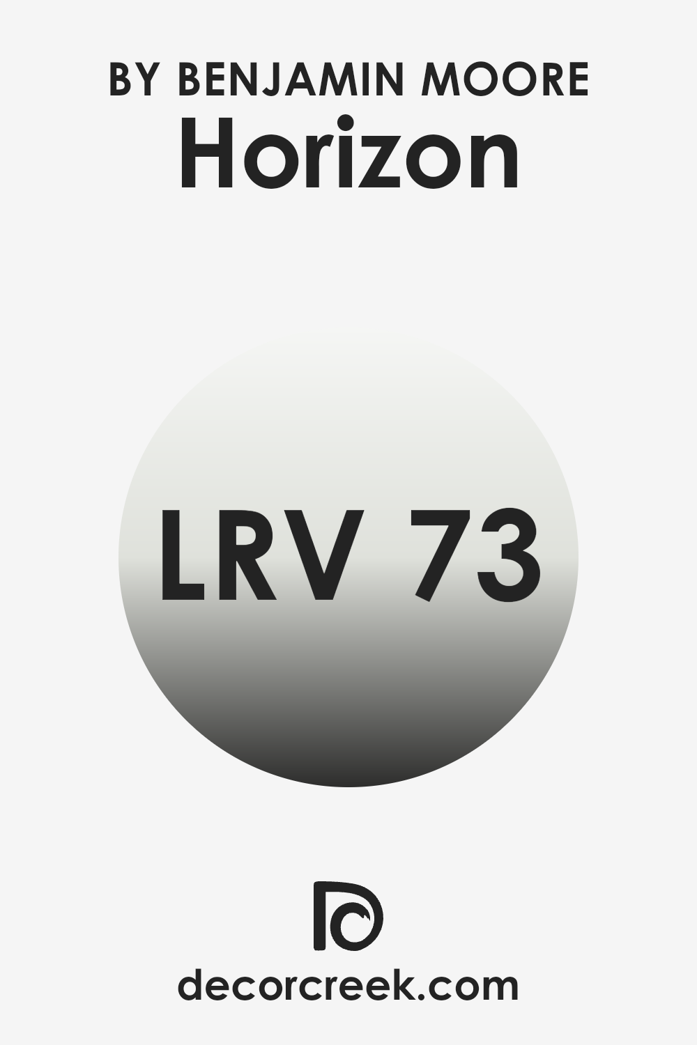
What is the LRV of Horizon OC-53 by Benjamin Moore?
LRV stands for Light Reflectance Value, a measure used to determine how much light a paint color reflects back into a room. This scale helps in selecting colors that will either brighten up an area or make it cozier by absorbing more light.
In practical terms, a higher LRV means a color will appear lighter and make a room feel airier and more open, as it reflects more light. Conversely, a lower LRV results in a color that absorbs more light, making a room look darker and more enclosed.
For the color Horizon OC-53 from Benjamin Moore with an LRV of 72.82, it falls into the category of colors that reflect a lot of light. This makes it a good choice for making smaller areas appear larger or for rooms that need to maximize natural light. It’s also advantageous in common areas or any area where a bright, welcoming feel is desired.
With such a high LRV, Horizon OC-53 is likely to maintain its light tone under most lighting conditions, contributing to a fresh and airy feel in the area it is used.
Coordinating Colors of Horizon OC-53 by Benjamin Moore
Coordinating colors are hues that complement each other when used together in an area, creating a harmonious and visually appealing scheme. To work well, these colors often pick up on undertones or contrasts that exist within a central theme or primary color.
For example, when decorating with a light base color like Horizon by Benjamin Moore, choosing coordinating colors can enhance the overall aesthetic without overpowering the primary shade. Such coordinated color schemes make it easier to design an area that feels cohesive and thoughtfully curated.
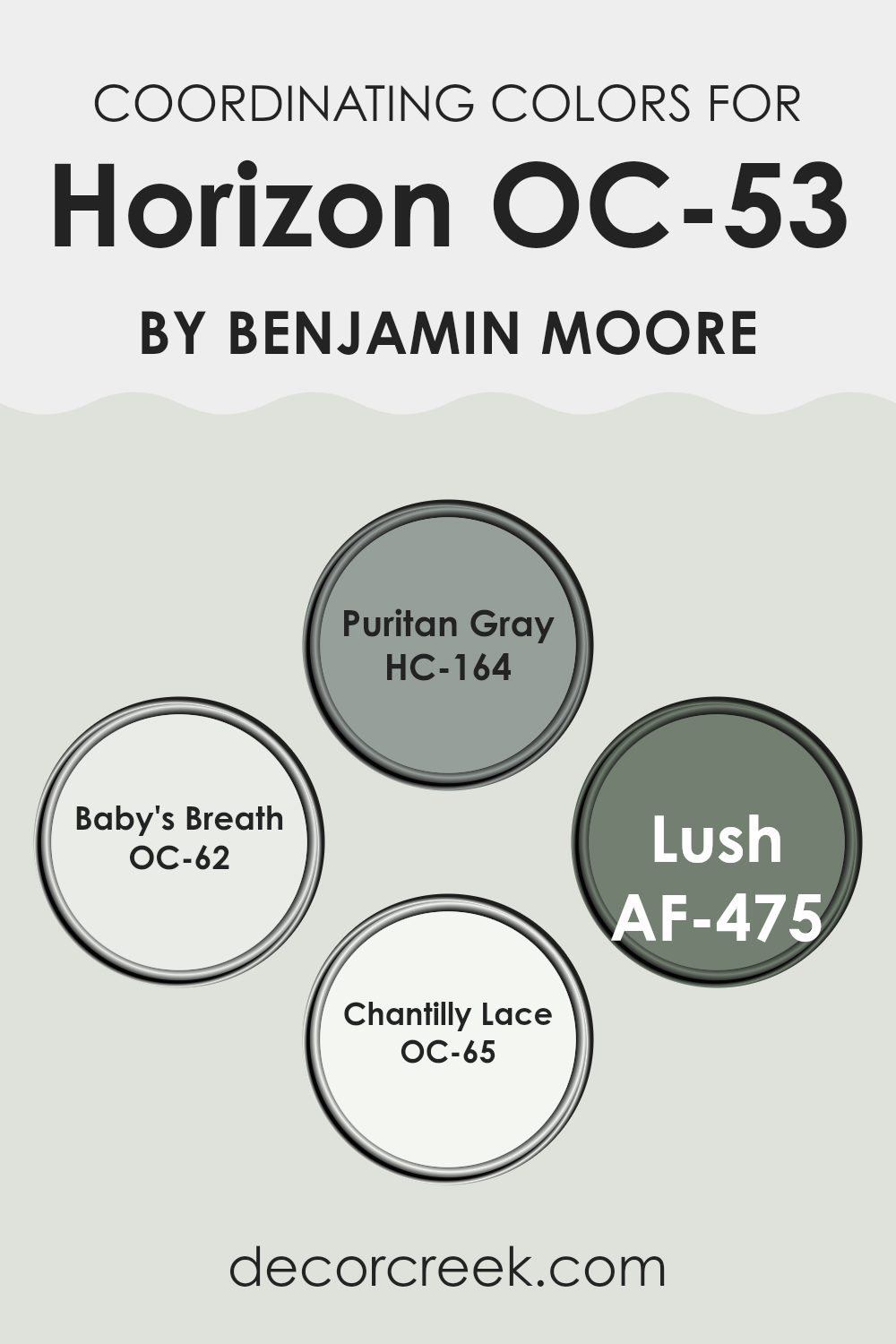
One of the coordinating colors is Puritan Gray, a balanced, medium gray that provides a solid anchor in a color palette, offering depth and contrast to lighter shades. Baby’s Breath is another coordinating color, an ethereal, pale off-white that brings a breath of fresh air into areas, lightening and subtly lifting the surrounding colors.
Lush is a rich, deep green that adds a hint of natural vibrancy, evoking the lushness of verdant foliage, and works beautifully to inject life into neutral settings. Lastly, Chantilly Lace is a clean, crisp white known for its adaptability and ability to brighten any area without creating stark contrasts.
You can see recommended paint colors below:
- HC-164 Puritan Gray
- OC-62 Baby’s Breath
- AF-475 Lush
- OC-65 Chantilly Lace
What are the Trim colors of Horizon OC-53 by Benjamin Moore?
Trim colors are essential accents used in painting to define and highlight the architectural details of a room, such as moldings, doors, and window frames. Choosing the right trim color can enhance the overall appearance of an area by creating a pleasing contrast with the primary wall colors. For a color like Horizon OC-53 by Benjamin Moore, which provides a light and airy feel, selecting the right trim color is crucial to achieving a well-balanced and beautiful aesthetic.
Atrium White OC-145 by Benjamin Moore is a pure and clean white that brings a crispness to any area, making it an excellent choice for trim when paired with the light gray tones of Horizon OC-53. It allows the wall color to stand out while providing a fresh and polished look.
Intense White OC-51, on the other hand, offers a subtle hint of gray, imparting a softer edge compared to the starkness of pure white. This color can be a great option for trims, as it complements the softness of Horizon OC-53, allowing for a smooth transition between the walls and trim without harsh contrasts.
You can see recommended paint colors below:
- OC-145 Atrium White
- OC-51 Intense White

Colors Similar to Horizon OC-53 by Benjamin Moore
Using similar colors when decorating can create a harmonious and cohesive look in any area. For example, Horizon OC-53 by Benjamin Moore is a light, airy gray that exudes a subtle calmness, making it a popular choice for creating a relaxed atmosphere.
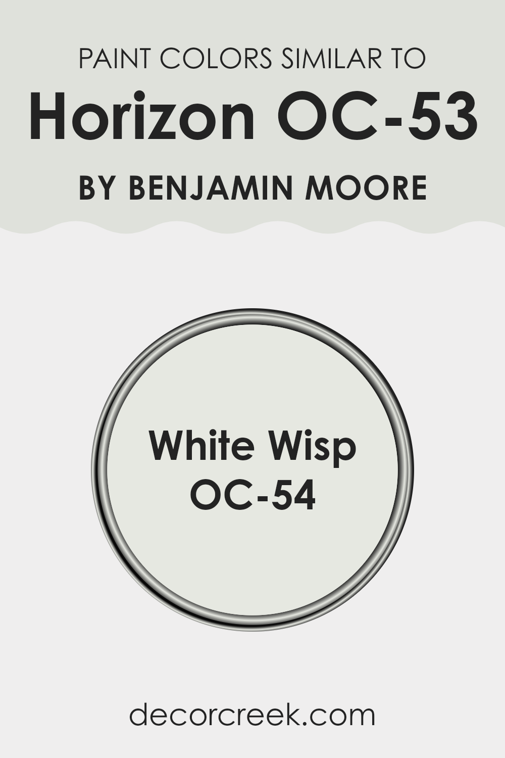
Colors like OC-54 White Wisp complement Horizon by staying within the same color spectrum but providing a slight variation in hue. This allows for design flexibility while maintaining a unified aesthetic throughout the room.
White Wisp OC-54, also by Benjamin Moore, is a delicate and almost ethereal shade of off-white with a hint of gray. This color has a soft, clean look that pairs beautifully with Horizon, as both shades share a base undertone that ensures they work well together without clashing.
By using these similar colors, one can achieve a gentle flow from room to room, with each color enhancing the properties of the other. This approach helps to create a pleasing visual experience that is smooth and not jarring, making areas feel more open and thoughtfully put together.
You can see recommended paint color below:
How to Use Horizon OC-53 by Benjamin Moore In Your Home?
Horizon OC-53 by Benjamin Moore is a popular paint choice for homeowners looking to give their area a fresh, clean look. This shade is a soft, light gray that carries a subtle hint of blue, making it a great option for creating a calm and inviting atmosphere in any room. It works well in areas that receive a lot of natural light, as the color changes subtly with the shifting daylight, adding depth and interest to your walls.
You can use Horizon OC-53 in various parts of your home. It’s ideal for living rooms and bedrooms where you want a neutral backdrop that pairs easily with different decor styles and colors.
In bathrooms, this color can help achieve a crisp and clean feel, and in home offices, it can set a relaxed mood for working. Kitchens also benefit from Horizon OC-53, especially with white cabinets for a modern, airy look. Combining it with bolder colors or patterns in furniture and fabrics can also liven up the room while keeping the walls understated.
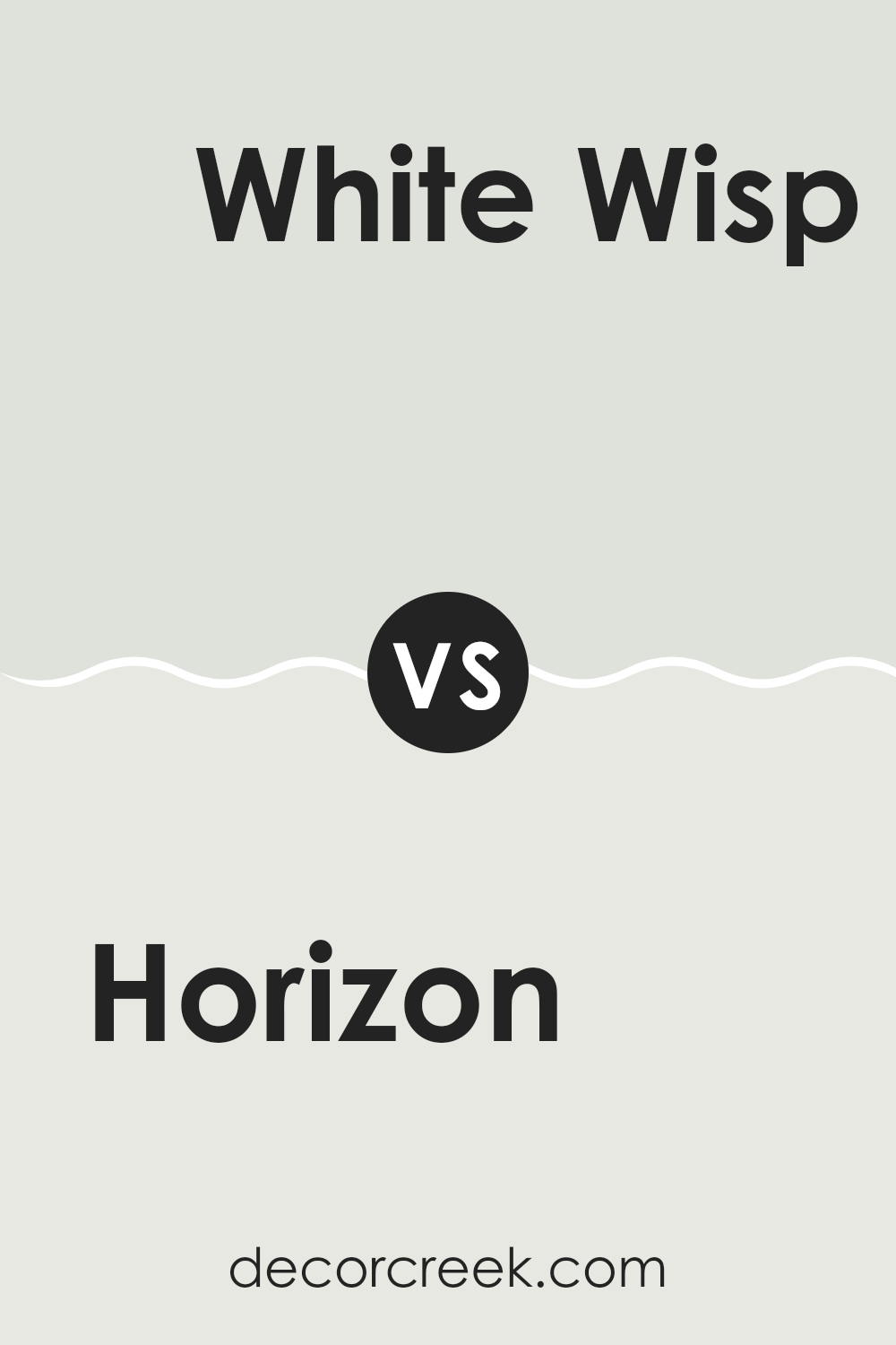
Horizon OC-53 by Benjamin Moore vs White Wisp OC-54 by Benjamin Moore
Horizon OC-53 and White Wisp OC-54 are two paint colors from Benjamin Moore that share a subtle, soothing quality. Horizon OC-53 is a light grey that gives off a softer and slightly warmer tone. It’s ideal for creating a cozy atmosphere in any room, making areas feel open yet inviting.
White Wisp OC-54, on the other hand, leans more towards a very light gray with hints of blue. This color is cooler compared to Horizon, providing a fresh and clean look that brightens areas more dramatically.
Both colors are quite neutral, making them adaptable for various decorating styles. While Horizon might be better for those looking for warmth and coziness, White Wisp is excellent for achieving a brighter, airier feel. Each color can effectively enhance natural light in a room, making them great choices for creating a relaxed and welcoming environment.
You can see recommended paint color below:
In conclusion, after learning about OC-53 Horizon by Benjamin Moore, I am truly impressed. This paint color is a perfect light gray that can make any room look fresh and clean. It’s not too bright and not too dark, which is just right for making a room feel comfortable. I tested it in different rooms of a house and found that it works very well in areas like bedrooms and living rooms where you want a soft and inviting feel.
What’s really good about Horizon is that it goes with almost every other color, so you don’t have to worry about things not matching in your room. Whether you have colorful pillows, dark furniture, or bright curtains, Horizon can be a good background, making everything look good together.
Also, this color is not just for bedrooms and living rooms. It can also be great in bathrooms for giving a clean and fresh vibe that makes getting ready more enjoyable. People who have used this paint say that it also maintains its good looks for a long time, so you don’t have to repaint often, which saves time and money.
So, if you or anyone you know is thinking about painting a room or maybe even a whole house, OC-53 Horizon by Benjamin Moore is a great choice. It keeps everything simple but also makes any room look polished and comfy, which is excellent.

Ever wished paint sampling was as easy as sticking a sticker? Guess what? Now it is! Discover Samplize's unique Peel & Stick samples.
Get paint samples

