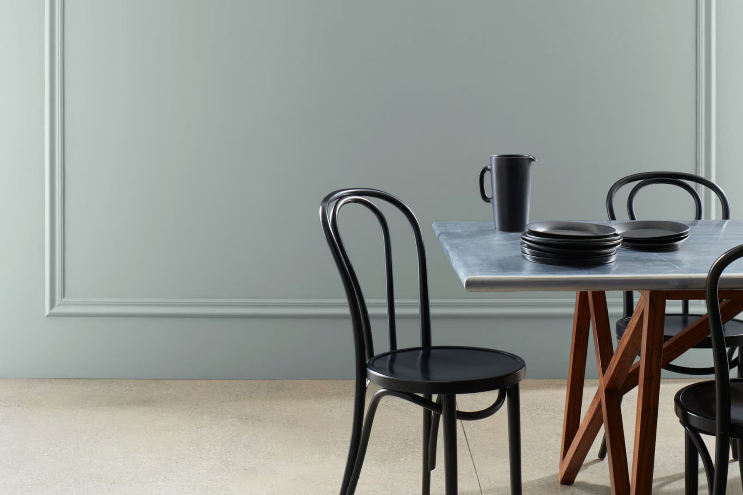
There’s something uniquely comforting about HC-164 Puritan Gray by Benjamin Moore. It’s one of those shades that instantly makes any room feel inviting and calm. I remember the first time I decided to use it in my living room. I wanted a color that was flexible but also had its own personality.
Puritan Gray seemed to strike that perfect balance between being neutral and having a subtle character that enhances the room. This color has a rich, muted tone that works well with a variety of styles and decor. Whether you’re aiming for a modern look or something more traditional, Puritan Gray seems to adapt effortlessly.
I found it particularly effective in creating a calming atmosphere without being too plain or overpowering. The hue is subtle enough to provide a soothing backdrop but distinct enough to add depth to the room. Moreover, it’s a shade that beautifully complements other colors, allowing for creativity in accents and furnishings.
I paired it with soft whites and deep blues, and the effect was both harmonious and elegant. What I enjoy most about Puritan Gray is how it changes slightly with the light – it can range from a cool gray in the morning to a warmer tone by the afternoon, giving the room a dynamic quality throughout the day.
What Color Is Puritan Gray HC-164 by Benjamin Moore?
Puritan Gray, designated HC-164 by Benjamin Moore, is a flexible shade that sits comfortably between gray and green. It offers a cool, muted tone that can lend a sense of calm to any room. Its subtle hints of green make it more dynamic than a standard gray, adding a touch of natural warmth and depth.
This shade works beautifully in a range of interior styles. In a modern areas, Puritan Gray can add a soft contrast to sleek lines and minimalistic decor. It suits traditional styles too, where it complements classic furniture and intricate moldings. In farmhouse settings, this color enhances the cozy, lived-in feel, pairing well with rustic wood and natural fibers.
When it comes to materials and textures, Puritan Gray pairs well with both soft and hard finishes. It meshes seamlessly with natural woods, such as oak and walnut, emphasizing their grain and character. It also looks great alongside brushed metals like brass or stainless steel, which highlight the color’s cool tones. Soft furnishings in fabrics like linen and cotton can emphasize its warmth, offering a comfortable feel. Whether on walls, cabinetry, or accents, Puritan Gray brings a balanced, inviting look to any room.
Is Puritan Gray HC-164 by Benjamin Moore Warm or Cool color?
Puritan Gray HC-164 by Benjamin Moore is a flexible paint color that can enhance the atmosphere of any home. This shade is a soft, muted gray with subtle green undertones, making it a calming choice for various rooms. Its neutral character allows it to blend well with different styles and color schemes, adding depth without overpowering a room.
In living rooms, Puritan Gray creates a cozy and inviting environment, perfect for relaxing or entertaining guests. In bedrooms, it provides a restful backdrop, encouraging relaxation after a long day. Kitchens and bathrooms can benefit from its clean and fresh appearance, which pairs nicely with both modern and traditional fixtures.
The ability of Puritan Gray to adapt to changing light throughout the day adds interest to a room, as it may appear slightly warmer or cooler depending on natural sunlight or artificial lighting. Overall, Puritan Gray is a classic choice that complements a wide range of interior designs.
Undertones of Puritan Gray HC-164 by Benjamin Moore
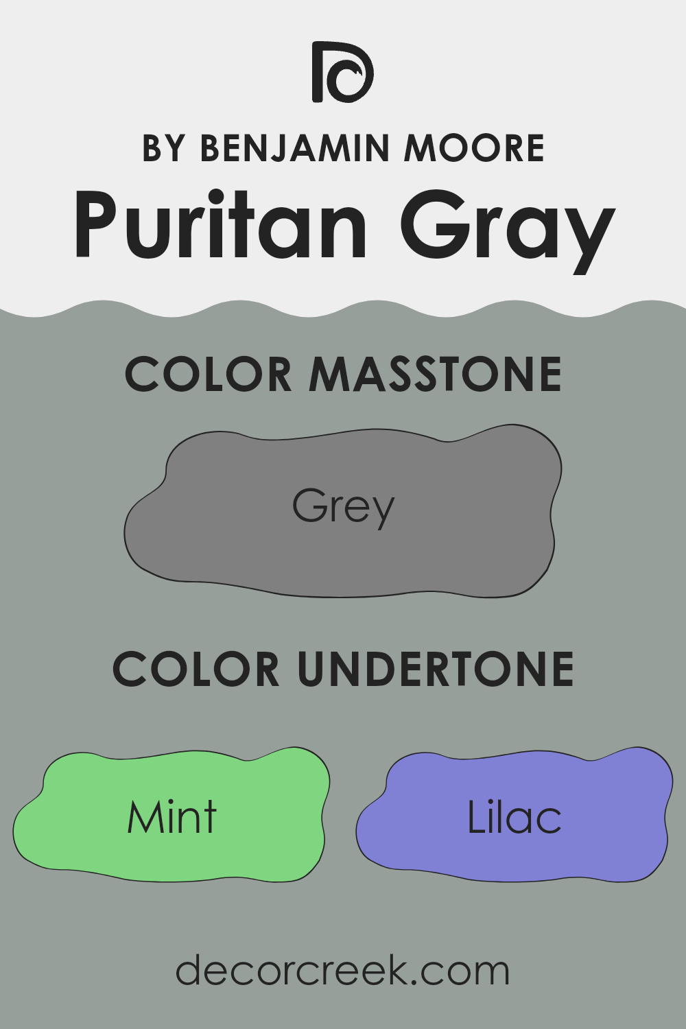
Puritan Gray HC-164 by Benjamin Moore is a flexible color with complex undertones that play a significant role in how it appears in different settings. Undertones are subtle color hues that can influence how the main color is perceived. In Puritan Gray, these undertones include shades like mint, lilac, pale pink, light blue, and others, which can shift the way the gray is seen, depending on the lighting and surroundings.
For example, in a room with cooler lighting, the lilac or blue undertones might be more noticeable, giving the walls a cooler or slightly purple hue. In contrast, warmer lighting may emphasize the pale pink or yellow undertones, making the color appear warmer and cozier.
This ability to adapt to different lighting conditions makes Puritan Gray a popular choice for many interiors, as it can complement a wide range of color schemes and styles. In rooms with lots of natural light, the paint color might seem lighter and more airy, while in darker or artificially lit areas, it might take on a richer, more saturated look. These subtle changes can affect the mood and atmosphere of a room, making it important to consider lighting and decor when choosing a paint color with varied undertones like Puritan Gray.
What is the Masstone of the Puritan Gray HC-164 by Benjamin Moore?
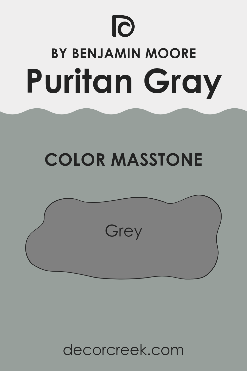
Puritan Gray, with its masstone of Grey (#808080), is a flexible and balanced color choice for homes. This particular shade by Benjamin Moore strikes a perfect middle ground, offering a true gray tone that doesn’t lean too much toward blue or green. This neutrality makes it adaptable, ensuring it blends well with various design styles and other colors within a room.
In living rooms and bedrooms, Puritan Gray creates a calming atmosphere. It is neither too dark nor too light, which makes rooms feel cozy without being overpowering. When used in kitchens and bathrooms, it provides a clean and modern look, working well with stainless steel appliances and white fixtures.
Puritan Gray serves as an excellent backdrop for artwork, furniture, and decorative elements. Wood tones, especially warm ones, stand out beautifully against this color. This makes it an excellent choice for anyone looking to create a welcoming and stylish home environment.
How Does Lighting Affect Puritan Gray HC-164 by Benjamin Moore?
Lighting plays a crucial role in how we see colors. Different lighting conditions can change the appearance of a color, sometimes dramatically. Puritan Gray HC-164 by Benjamin Moore is a subtle gray with green undertones, and its appearance can vary depending on the type of light it is exposed to.
In natural light, Puritan Gray can look quite different depending on the direction the room faces. In north-facing rooms, the light is usually cooler and softer. This can make Puritan Gray appear more muted and can enhance its green undertones, giving it a cooler appearance overall. North-facing rooms often have less intense light, so the color may look slightly darker.
In contrast, rooms that face south receive the most intense natural light, which is warm and bright. In these conditions, Puritan Gray can appear lighter and its green undertones may be less noticeable, giving the color a warmer and more neutral look. The plentiful light in south-facing rooms helps the color look more vibrant.
East-facing rooms get the warm morning light, which tends to be softer and can give the color a warmer, more lively appearance early in the day. However, as the sun moves and the light cools, Puritan Gray might start to look a bit more subdued and cooler as the day progresses.
West-facing rooms experience the opposite, with cooler light in the morning and warm, golden light in the afternoon and early evening. In the afternoon light, Puritan Gray can adopt a cozier, warmer feel, similar to how it appears in south-facing rooms during bright daylight.
Under artificial lighting, Puritan Gray’s appearance will depend on the light bulb’s color temperature. Warm bulbs will enhance its cozy, warm qualities, while cool bulbs might bring out its cooler, green undertones, affecting how you perceive the color.
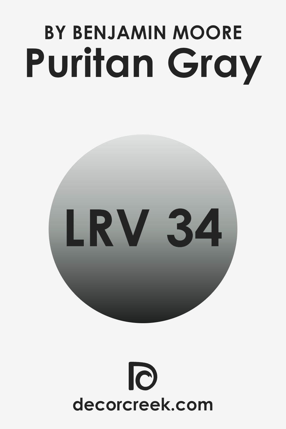
What is the LRV of Puritan Gray HC-164 by Benjamin Moore?
The Light Reflectance Value (LRV) measures how much light a color reflects or absorbs. It’s a scale from 0 to 100, where 0 means the color absorbs all light (like black) and 100 means it reflects all light (like white). Understanding LRV is important when choosing paint colors because it influences how bright or dark a room will feel.
A color with a high LRV will make a room feel brighter and more open because it reflects more light. On the other hand, a color with a low LRV will make a room feel cozier and more intimate since it absorbs more light.
Puritan Gray by Benjamin Moore has an LRV of 34.29, which is on the lower end of the scale. This means that it is a medium-dark color that will absorb more light than it reflects. In a room with little natural light, Puritan Gray might make the room feel a bit darker and more enclosed, but in a room with plenty of natural or artificial light, it can add depth and offer a refined backdrop. Its LRV suggests that while it won’t make a room very bright, it can provide a nice balance of warmth and depth, making it flexible for different settings depending on the lighting.
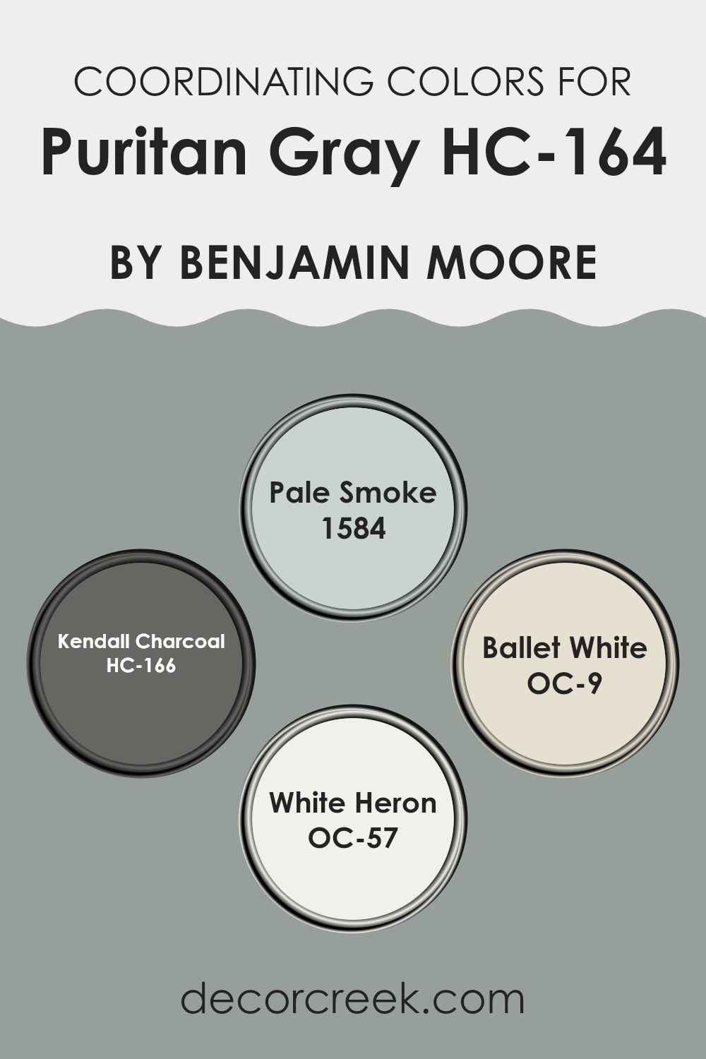
Coordinating Colors of Puritan Gray HC-164 by Benjamin Moore
Coordinating colors are a group of hues that complement each other when used together in design projects, creating a harmonious look. When paired with Puritan Gray by Benjamin Moore, these colors blend beautifully to enhance the overall appearance of a room. Puritan Gray is a medium cool gray that works as a neutral backdrop, allowing you to play with both contrast and harmony using different shades around it.
Pale Smoke, a gentle blue-gray, adds a light and airy feel, perfect for maintaining a crisp and fresh atmosphere without overpowering the senses. On the other hand, Kendall Charcoal is a deep, rich charcoal gray that brings depth and boldness, adding a striking contrast to Puritan Gray.
Ballet White is a warm off-white with subtle beige undertones, offering a soft, comforting vibe while remaining flexible enough to pair with almost any decor. Lastly, White Heron is a bright, clean white that exudes clarity and light, giving any area a touch of elegance and spaciousness. When these colors are combined, they create a cohesive and inviting environment, highlighting the beauty of each individual hue while maintaining a balanced visual rhythm.
You can see recommended paint colors below:
- 1584 Pale Smoke
- HC-166 Kendall Charcoal
- OC-9 Ballet White
- OC-57 White Heron
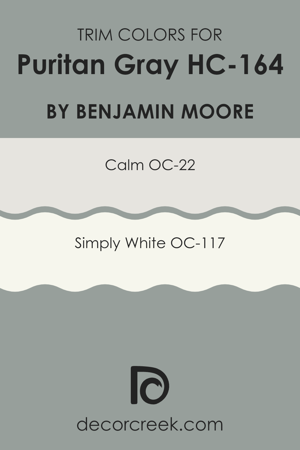
What are the Trim colors of Puritan Gray HC-164 by Benjamin Moore?
Trim colors are the hues you use on the edges of walls, moldings, doors, and windows to create contrast and highlight architectural features in a room. They play an important role when painting with a color like Puritan Gray by Benjamin Moore. This gray shade has a balanced tone that provides a neutral backdrop, and the right trim colors can make the room visually appealing by adding depth and dimension. When you choose complementing trim colors, it allows the main wall color, such as Puritan Gray, to stand out more distinctly and add character to the room.
Calm, designated as OC-22, is a light and soft tone that has a gentle feel, making it easy on the eyes and giving your area an airy touch. Simply White, known as OC-117, offers a fresh, clean look that is crisp and classic, perfect for creating sharp contrasts with darker wall colors.
By using Calm or Simply White as trim colors with Puritan Gray, you ensure the gray doesn’t become overpowering, but instead offers a balanced and inviting atmosphere. These trim colors help in highlighting your room’s finer details while ensuring the overall design looks cohesive and polished.
You can see recommended paint colors below:
Colors Similar to Puritan Gray HC-164 by Benjamin Moore
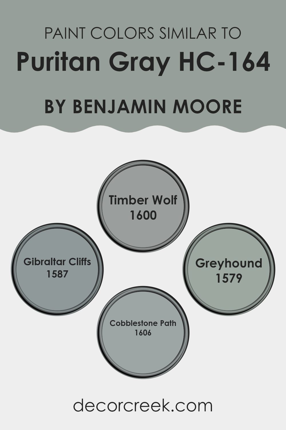
Similar colors play a crucial role in design and decoration, as they create a cohesive and harmonious atmosphere. By using hues that are close to each other on the color spectrum, areas feel unified and balanced. For instance, Timber Wolf is a soft, muted gray that adds a gentle touch, while Gibraltar Cliffs offers a slightly darker tone that enhances depth without overpowering.
Greyhound introduces a warmer undertone, providing a cozy and inviting feel, which makes areas feel more welcoming. Cobblestone Path presents a medium gray shade that is flexible and works well in various settings, linking all the shades together effectively.
Together, these colors work seamlessly to complement Puritan Gray. They share a similar essence, yet each one adds a unique touch to the palette. Whether used in living areas, bedrooms, or workspaces, these shades provide a backdrop that feels consistent and soothing.
They also allow for easy decoration changes, pairing well with other accent colors or textures. Using these similar colors ensures that rooms have a gently blended look, avoiding harsh transitions, and promoting an overall calm and inviting environment. This subtle unity maximizes the visual appeal while maintaining simplicity and elegance in any room.
You can see recommended paint colors below:
- 1600 Timber Wolf
- 1587 Gibraltar Cliffs
- 1579 Greyhound
- 1606 Cobblestone Path
Colors that Go With Puritan Gray HC-164 by Benjamin Moore
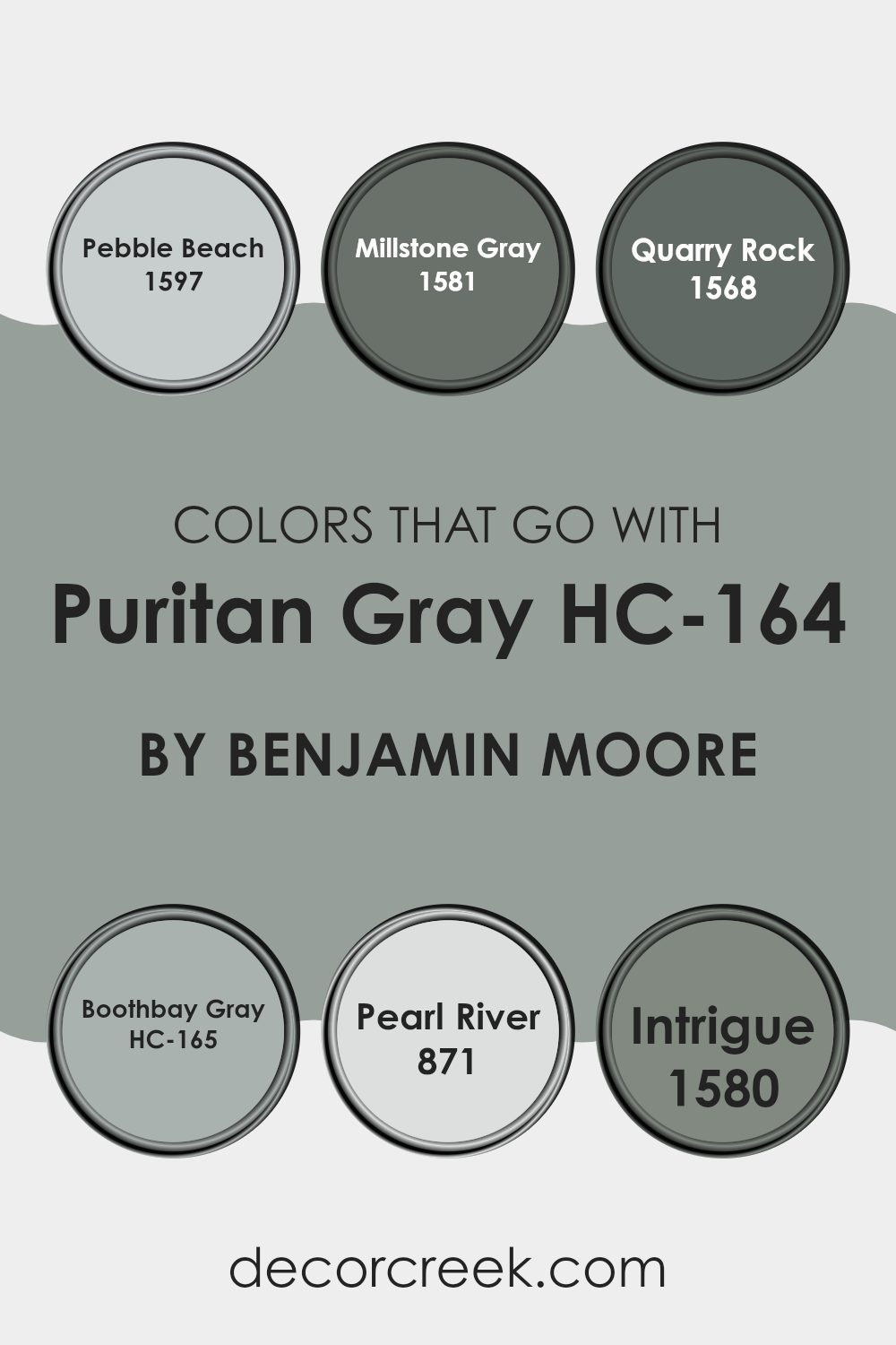
Colors that complement Puritan Gray HC-164 by Benjamin Moore play an important role in creating a cohesive and pleasing environment. Each one enhances the subtle blue undertones in Puritan Gray, bringing depth and warmth to the room. For instance, 1597 – Pebble Beach is a soft, muted gray that acts as a gentle backdrop, enhancing Puritan Gray’s mild coolness.
Meanwhile, 1581 – Millstone Gray offers a slightly warmer tone, balancing and softening the overall color palette. These combinations can turn a room into a calming retreat, making the room feel more inviting and comfortable.
Similarly, 1568 – Quarry Rock provides a darker, more dramatic tone that pairs well with Puritan Gray, adding a sense of depth and grounding the room. HC-165 – Boothbay Gray, with its hint of blue, brings out the mild blue hues in Puritan Gray, creating a soothing and harmonious atmosphere. The lightness of 871 – Pearl River enhances the brightness, helping small areas appear larger.
Lastly, 1580 – Intrigue, with its rich and bold presence, complements the coolness of Puritan Gray, adding a touch of elegance. Together, these colors create a balanced and appealing setting, enhancing the charm and versatility of Puritan Gray.
You can see recommended paint colors below:
- 1597 Pebble Beach
- 1581 Millstone Gray
- 1568 Quarry Rock
- HC-165 Boothbay Gray
- 871 Pearl River
- 1580 Intrigue
How to Use Puritan Gray HC-164 by Benjamin Moore In Your Home?
Puritan Gray HC-164 by Benjamin Moore is a flexible paint color that’s popular for its classic appeal. It’s a warm gray with subtle undertones, making it a great choice for various rooms in your home. You can use it in the living room to create a cozy and inviting atmosphere. In the bedroom, Puritan Gray offers a relaxed and calming vibe, helping you unwind after a long day.
In the kitchen, this shade complements both classic and modern styles, pairing well with white cabinets and stainless steel appliances. If you have an open floor plan, Puritan Gray can provide a cohesive look, seamlessly connecting different areas.
This color also works well as a neutral backdrop for artwork and colorful decor. With its balanced tone, Puritan Gray is suitable for nearly any room, bringing a sense of comfort and warmth into your home without overpowering the room.
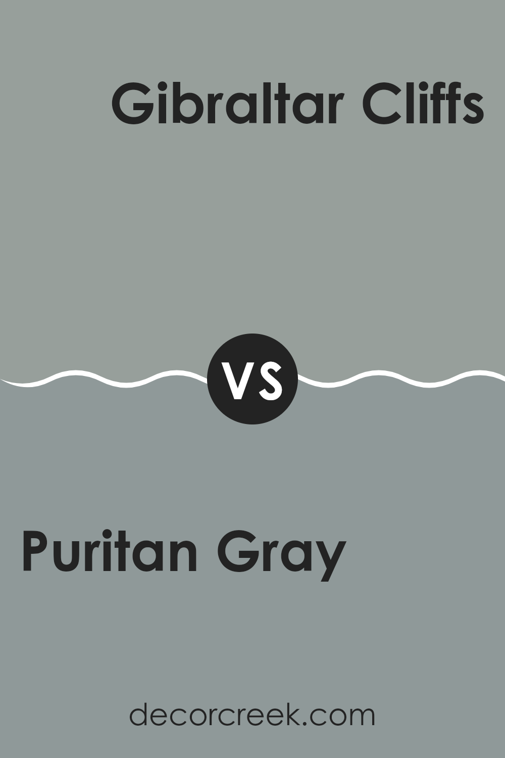
Puritan Gray HC-164 by Benjamin Moore vs Gibraltar Cliffs 1587 by Benjamin Moore
Puritan Gray and Gibraltar Cliffs are both popular paint colors by Benjamin Moore, but they have distinct characteristics. Puritan Gray is a medium gray with subtle green undertones. It often gives a soft, calming atmosphere and can appear warmer in a room with good lighting. It’s flexible, making it a good fit for many different styles and areas.
Gibraltar Cliffs, on the other hand, is a deeper, richer gray. It leans more towards a cool tone, adding a refined look to a room. It can create a cozy and intimate environment, especially in larger rooms or those with lots of natural light.
Both colors work well with white trim, but they convey different moods. Puritan Gray is calming and approachable, while Gibraltar Cliffs is bold and striking. Choosing between them depends on whether you prefer a softer gray or a more dramatic, darker shade.
You can see recommended paint color below:
- 1587 Gibraltar Cliffs
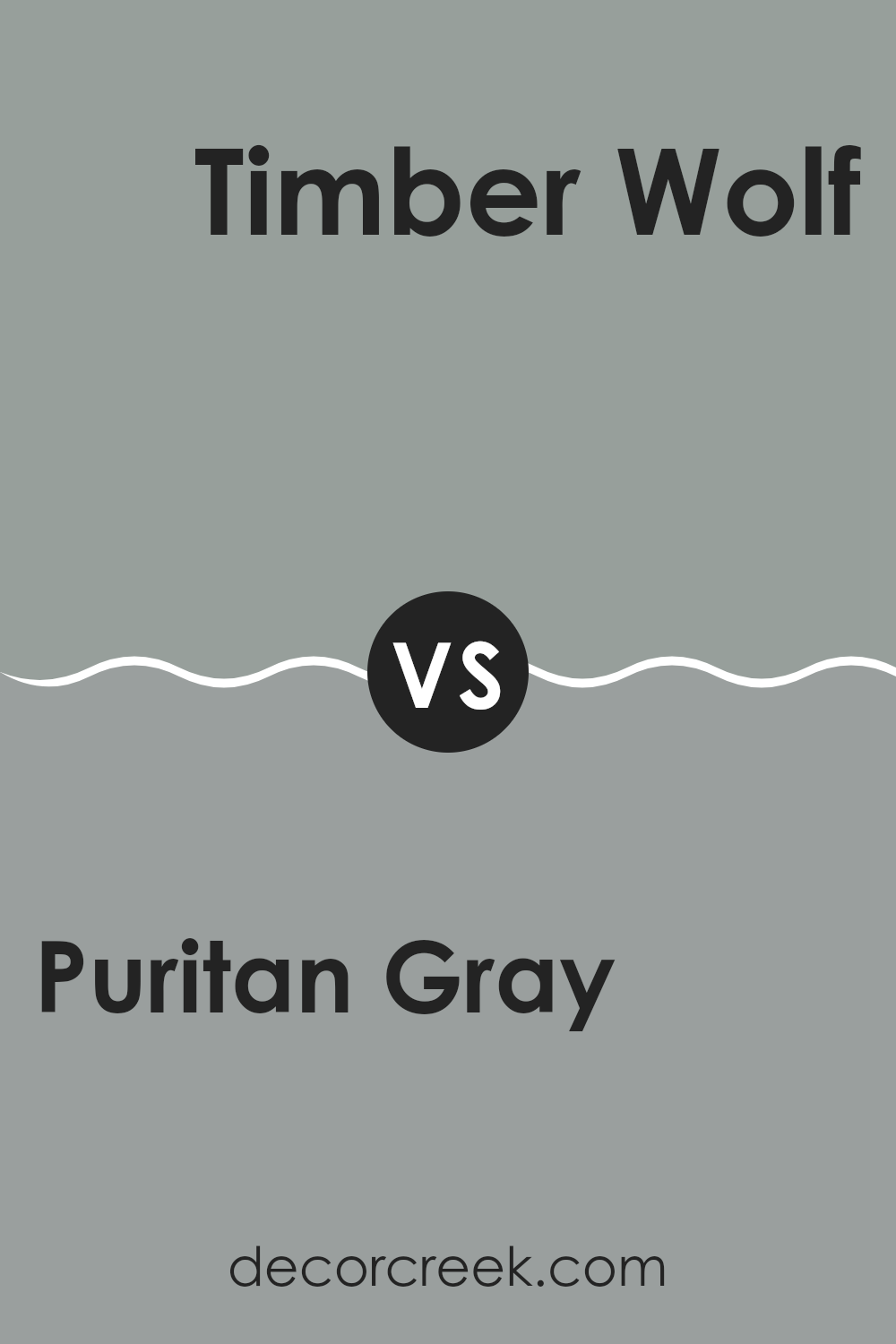
Puritan Gray HC-164 by Benjamin Moore vs Timber Wolf 1600 by Benjamin Moore
Puritan Gray and Timber Wolf are two popular paint colors by Benjamin Moore that offer distinct looks. Puritan Gray is a soft, muted gray with blue undertones, providing a cool and calming vibe. It’s flexible and pairs well with both light and dark accents, making it suitable for various rooms and styles.
On the other hand, Timber Wolf is a slightly warmer gray with subtle taupe undertones. It feels cozy and inviting, which makes it great for living areas where you want a welcoming atmosphere. This color can work well with earthy tones and complements natural materials like wood and stone.
While both colors are neutral and adaptable, Puritan Gray leans toward a cooler palette, ideal for areas where a fresh and airy feel is desired. Timber Wolf’s warmth gives a comfortable and relaxed aura. Choosing between these colors depends on the mood you want to create in your room.
You can see recommended paint color below:
- 1600 Timber Wolf
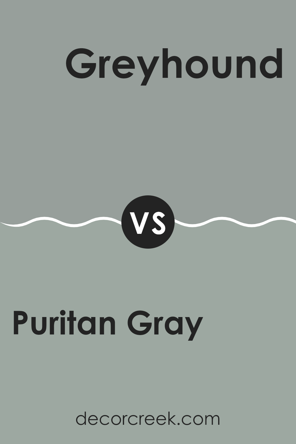
Puritan Gray HC-164 by Benjamin Moore vs Greyhound 1579 by Benjamin Moore
Puritan Gray and Greyhound, both by Benjamin Moore, are flexible gray shades but offer different vibes. Puritan Gray, a part of the Historical Collection, is a blue-gray that can appear cool and soothing. It’s perfect for areas where you want a calm but stylish look. This gray can show a bit of blue under certain lighting, adding a subtle hint of color without being too bold.
On the other hand, Greyhound is a warmer gray. It doesn’t have the same blue undertones, making it feel more neutral and cozy. This shade often works well in living rooms or bedrooms where a warm, inviting atmosphere is desired.
Both colors can match well with various furniture styles and other colors, but the blue hint in Puritan Gray might make it a better choice for cooler color schemes, while Greyhound might complement warmer hues.
You can see recommended paint color below:
- 1579 Greyhound
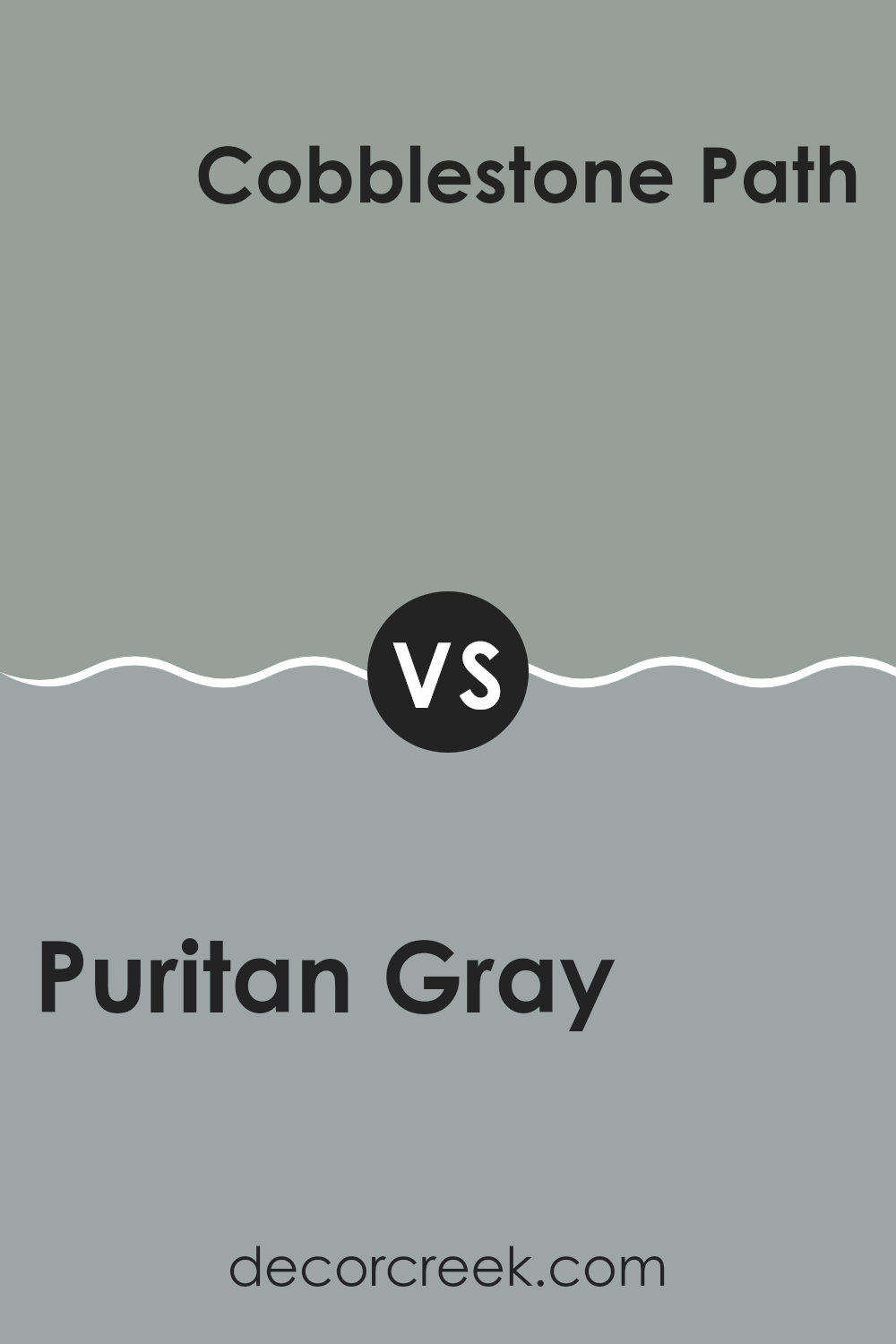
Puritan Gray HC-164 by Benjamin Moore vs Cobblestone Path 1606 by Benjamin Moore
Puritan Gray HC-164 and Cobblestone Path 1606 are two popular paint colors by Benjamin Moore. Puritan Gray is a soft, cool gray with blue undertones. It’s a flexible color that works well in both traditional and modern areas. The blue hints give it a calming and fresh feel, making it suitable for bedrooms or living rooms where a relaxing atmosphere is desired.
On the other hand, Cobblestone Path 1606 is a warmer gray with brown undertones. This gives it a more earthy and cozy vibe compared to the cooler Puritan Gray. Cobblestone Path can create a welcoming feel in a room, making it great for areas like the kitchen or family room where warmth and comfort are important.
In summary, Puritan Gray offers a cooler, serene look, while Cobblestone Path provides warmth and coziness. Choosing between them depends on whether you want a fresh, airy atmosphere or a warm, inviting room.
You can see recommended paint color below:
- 1606 Cobblestone Path
When I think about HC-164 Puritan Gray by Benjamin Moore, it feels like meeting a new friend who easily fits in and gets along with everyone. This paint color is like a gentle hug for the eyes. It isn’t too bright or too dull; it’s just right. When you use this color on walls, it makes rooms feel calm and cozy. It’s like magic, because it looks good with lots of other colors too. Imagine your favorite tee that matches all your pants—that’s Puritan Gray for your walls.
Sometimes, rooms can feel too busy or noisy, like when there are too many toys scattered around. But with Puritan Gray, things feel neat and tidy. It’s like when you put your toys back in their place, and suddenly the room feels bigger and nicer.
People often say Puritan Gray is good for any room—whether it’s where you sleep, eat, or play. It’s also perfect for showing off pictures, furniture, or anything you love, like a frame for your favorite artwork. So, if you want your rooms to feel balanced and friendly, like they’re saying, “Hey, come in and stay a while,” then Puritan Gray is a great choice.
It’s like having a color that says, “Welcome home” every time you walk in.
Ever wished paint sampling was as easy as sticking a sticker? Guess what? Now it is! Discover Samplize's unique Peel & Stick samples.
Get paint samples

